(Headline #23 – #25)
In chapter 1 I described Prize’s comics in 1946 as tired. With the arrival of Simon and Kirby things would never be the same for that company. Their effect on Headline is obvious. With issue #23 (March 1947), the title made a sudden transition from an anthology with an emphasis on the hero genre into a crime comic. That was significant, but more important was Simon and Kirby’s effect on the entire Prize comic line. Treasure Comics #10 (December 1946), the same issue that ran the first promotional S&K crime story, would be the last bimonthly for that title. Issue #12 (Fall 1947) would be the last Treasure Comics issued. In September 1947 Simon and Kirby would introduce a new title and another genre with Young Romance. The crime version of Headline must have been a success because Simon and Kirby and Prize would start Justice Traps the Guilty in October. Wonderland, Prize’s comic of funny stories for the younger readers, would end with issue #8 (December 1947). Prize Comics, the last of Prize’s hero anthologies, would become Prize Comics Western with issue #69 (May 1948). I have no reason to believe Simon and Kirby had any direct involvement with the switch of Prize Comics to the western genre. However once Simon and Kirby showed the value of publishing the more modern comics it would not have taken a genius to come up with the idea of publishing another of those popular genre. The only one of Prize’s original titles that was unaffected was Frankenstein. In a little over a year Prize went from having a tired comic line to a more modern one. Simon and Kirby would not produce every title that Prize would publish from this point on but they would dominate the company’s output and even have influence on titles other then their own. Prize would never become a big publisher but it is clear that Simon and Kirby generated a lot of income for the company and I cannot help but doubt that the publisher would have survived much longer without their arrival.
The attribution question for the first two issues of the crime version of Headline is simple, it is Jack Kirby. It was part of Simon and Kirby’s modus operandi to start a new title with Jack penciling much, if not most, of the art. However these two issues take it to an unusual extreme in not just most but all of the art is by Kirby. Such exclusion is not part of the Simon and Kirby MO. The starting issues for Young Romance, Justice Traps the Guilty, and Boys’ Ranch would all include some work by other artists. All Kirby issues would not appear again until Fighting American (1954) and the even more exceptional case of the Young Romance, Young Love and Young Bride comics of 1956. Surely the explanation for the all Kirby Headline issues was that it was a consequence of the failure of the Stuntman and Boy Explorers titles of 1946. With the sudden termination of those titles Simon and Kirby had both the time to produce stories and the need to generate money. It was only when Joe and Jack were once again regularly producing comics that they had both the need and the ability to bring other artists into their projects.
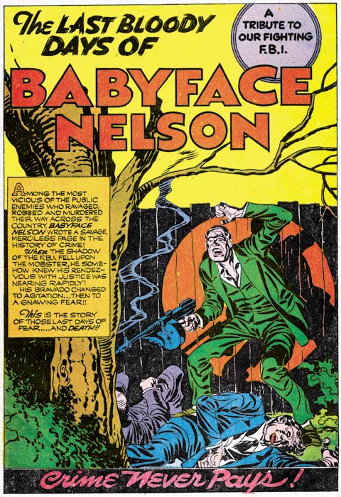
Headline #23 (March 1947) “The Last Bloody Days of Babyface Nelson”, art by Jack Kirby
The first page of Headline would exemplify the Simon and Kirby approach to crime, at least in its beginning. There in the spotlight is Baby Face Nelson standing with his smoking machine gun over two victims. Baby Face Nelson, whose name was actually Lester Gillis, was a real person and at one time was Public Enemy Number One. The story that Simon and Kirby provide is a true one, or at least as true as any made by the entertainment media. We are told of a chance encounter on a country road of one car that included Baby Face Nelson and John Chase with another car occupied by two federal agents. In the ensuing gun fight the two agents were killed and Baby Face mortally wounded only to die later. At the end of the story we find Chase behind bars. Missing from S&K’s account are Helen Gillis, Baby Face’s wife, who was also present. Also missing was a previous encounter with another vehicle with federal agents. But the gist of the story was all there and dramatically portrayed. By today’s standards, the story is very moralistic. Baby Face Nelson is not presented in a favorable light and while his end had a certain courage it was above all shown to be the act of a brutal nature. The persistent theme of all the Simon and Kirby crime stories is shown in large letters at the bottom of the splash page, “Crime Does Not Pay”. In light of all this it is surprising that critics of crime comics at the time could not see this and would instead insist that these stories glorified the criminals.

Headline #23 (March 1947) “To My Valentine”, art by Jack Kirby
“To My Valentine” is another example of a great splash and a story based a real event. The machine gun toting cupid is a nice touch. The truth of the story as presented is debatable as no one was ever convicted of the gangland murder. Sometime later there was a gang member under custody who claimed to have taken part. However there seem to be some conflicts in his testimony as compared with that of other witnesses present on the scene (but not viewing the actually killing). In this splash there is no question about the brutal nature of the death of the gang members. What with their contorted posses and obvious bullet holes in the wall. But note the lack of bullet holes or blood on the actual victims. This is typical for Kirby who was actually restrained in his portrayal of violence. Jack would on occasion include blood in a crime scene but no where near to the amounts that could logically be expected.
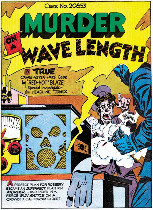
Headline #24 (May 1947) “Murder on A Wave Length”, art by Jack Kirby
A lot of the splashes by Kirby for the crime genre are just masterpieces. Even though we have a good view of both the gun and the victim Kirby hides the effect of the bullet behind of a screen of gun smoke. The dramatic effect of this splash is based on the victims grimace of pain and not on the depiction of any gruesome details. The story theme of the connection of a radio broadcast to a crime is an old one for Simon and Kirby having been used in a Captain America story in 1942. Note the presence of an abstract arch shadow on the side of the radio set (see my Inking Glossary for an explanation for the inking terms I use ).

Headline #25 (July 1947) “Death Takes a Honeymoon”, art by Jack Kirby
The Simon and Kirby art for these issues of Headline made was pretty much the same as used in the promotional pieces discussed in the last chapter. Figures do not extend beyond the panel borders; a motif that S&K used frequently during their years with Timely and DC and occasionally for Stuntman and Boy Explorers as well. Page layouts still include the frequent use of non-rectangular panels. For example in “You Can’t Forget a Killer” (Headline #24) circular and semi-circular examples comprise 18% of the story panels. This is the same level of semi-circular panels as found in Stuntman. (Remember that if the all pages were the standard 6 panels with 17% there would on average be a semi-circular panel on each page). While this level of the use of semi-circular panels is typical of all the stories in Headline #23 and #24, there is a change in Headline #25. “Pay Up or Die” is the only Kirby story in Headline #25 that continues to use semi-circular panels (20%), such panels are completely absent from the other three Kirby stories.
The inking still is done in what I call the Sculptural style with some of the hallmarks of the Studio style (picket fence crosshatching and shoulder blots) are rarely found and when used it was generally not done in the soon to be typical manner. However drop strings, another characteristic feature of the Studio style, begins to become common in use. It was not abundantly used in the first crime issue of Headline but by the third it can be quite commonly and distinctively used as for example in the splash page shown above. Abstract arch shadows, another Studio style technique, also were beginning to become more frequent.
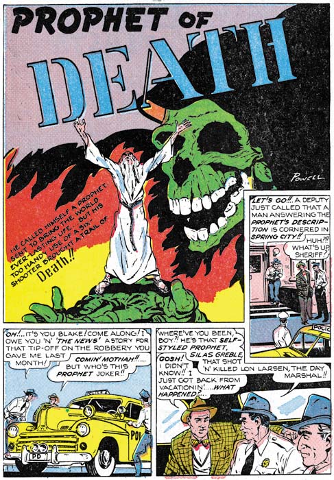
Headline #25 (July 1947) “Prophet of Death”, art by Bob Powell
For Headline #25 I can only provide the credits for one of the artists other then Kirby. “Prophet of Death” is signed, but Bob Powell’s style is so distinctive that his work in this story would have been easily recognized anyway. I am a great admirer of Powell’s work, although I am mostly familiar with the romance stories he did for Harvey Comics. Powell’s style is different from that of Kirby’s and although he is not as great an artist as Jack (who was?) he was still immensely talented. I find it ironic that here he is working for Jack and yet he is quite free to render this story in his own unique manner. Years later when he would work for Marvel, in response to Stan Lee’s desire to do art the Kirby way, Powell altered his style. In my opinion the results was most unfortunate and Bob’s late work is but a shadow of his former art.
Bob Powell was said to have done some work for Fox Comics. Perhaps Simon and Kirby first met Powell there. However I have not recognized Powell’s work in the Fox comics issued during the time Joe Simon was an editor. Most likely Bob came to Joe and Jack’s notice during the time that Simon and Kirby were first producing Stuntman and Boy Explorers for Harvey Comics. After the war Bob Powell had his own studio and Harvey was one of his important customers. Considering Powell’s obvious talent, his presence in this early Simon and Kirby production is perfectly understandable. What is surprising is that this would be the only work he did for the Simon and Kirby studio. I have no idea why that should be since Powell did not work exclusively for Harvey. After the break up of the S&K studio, there would be a number of occasions where Bob would work for Joe Simon.
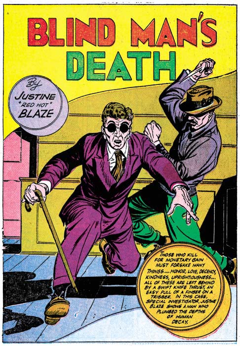
Headline #25 (July 1947) “Blind Man’s Death”, art by unidentified artist
There is one other artist in Headline #25 who I have not been able to identify. Interestingly he provided two stories. This is particularly regrettable in this case because he really is an excellent artist. What a great splash page. The exaggerated perspective is not at all the way Jack Kirby would have handled it but it is very effective nonetheless. You can really feel the blind man’s predicament as he stumbles while knowing he is in danger. The murderer’s pose is very effective as well.
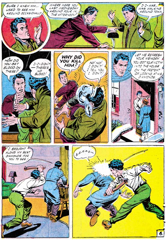
Headline #25 (July 1947) “Murder’s Reward” page 6, art by unidentified artist
Frankly I am not as impressed with the splash page this artist did for “Murder’s Reward”. But his talents were not limited to splash art but extended to graphic story telling as well. Again the artist presents action in a way different from Jack Kirby but he it still is very effective.
When doing these examinations I am always on the lookout for indications of whether Kirby provided layouts for the artists (a claim some have made). Often the layout of just the panels is enough to decide the issue. Both Kirby and this unidentified artist use semi-circular panels but the manner of their use differs. Kirby’s semi-circular panels are generally as large the standard panels. This artist uses circular panels that largely are about 3/4 the height of the standard panels and he then uses area above, or less commonly below, the round panel for a speech balloon or caption. (While the round panel in the page above has some of these characteristics, it is not typical of the artist’s method).
Like the promotional pieces I discussed in my last chapter, none of the Simon and Kirby pieces for Headline #23 to #25 were signed. With 3 covers and 16 stories (19 if you include the promotional stories) this is highly uncharacteristic for Joe and Jack. Why were the normally self-promoting Simon and Kirby circumspect about their contributions to Feature Publications? The answer is not hard to find because in the same month that Headline #23 was released by Prize Comics, Simon and Kirby’s work would also appear in Clue Comics, a crime genre comic by another publisher, Hillman. Simon and Kirby had no problems with working for different publishers at the same time but knew that it was best not to be too obvious about it. The Simon and Kirby work for Clue will be the subject of my next chapter.
Chapter 3, Competing Against Themselves
Chapter 4, Crime Gets Real
Chapter 5, Making a Commitment
Chapter 6, Forgotten Artists
Chapter 7, A Studio With Many Artists
Chapter 8, The Chinese Detective
Chapter 9, Not The Same
Chapter 10, The Master and His Protege
Chapter 11, The New Team

