Tag Archives: Joe

Young Allies and the L Word


Young Allies #1 (Summer 1941), art by Jack Kirby

Recently there was discussion on one of Yahoo’s comic book lists about the correct attribution for the art for Young Allies #1 and #2. I do not want to get into details of that interchange, although I may disagree with some of the participants they are entitled to their opinions. But I thought I would write a post on Young Allies #1 to explain my position. The cover for Young Allies #2 presents its unique problems so I will discuss it some other time.

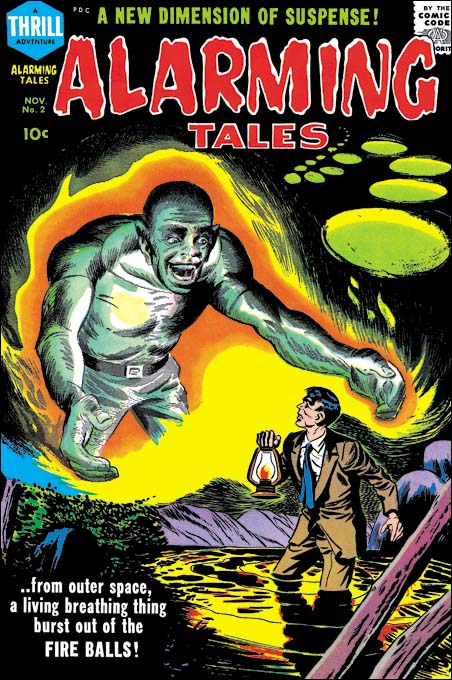
There can be no question about Simon and Kirby’s involvement with Young Allies #1. The punch throwing Bucky on the cover is so typical of Kirby that there can be no doubt that he drew the figure. I would go even further and confidently credit Jack with the Red Skull and Hitler as well. Normally that would be enough for me to attribute the entire cover to Jack Kirby; it was not Simon and Kirby typical procedure for Kirby to draw part of a cover then pass it on to someone else to finish it up (there are two exceptions that I know of, the covers for Detective #65 and In Love #1).

Three of the bound Young Allies, those on our left, have enough similarity to other Simon and Kirby creations that I would conclude Jack probably drew them. The soldier firing a pistol is a typical Simon and Kirby motif and although he is a little stiff I would assign him to Jack as well. I do have trouble attributing the last Young Ally, Whitewash, to Jack. While Simon and Kirby produced some stereotypical characters none of them ever went as far as this troubling image. Finally there is Toro. Frankly there is not much in Toro’s depiction that suggests Kirby but then there is little in the Simon and Kirby repertoire to compare Toro with.

To sum up there are parts of the YA #1 cover that clearly were done by Kirby, some parts that might be Jack’s as well, but other parts that may be someone else’s work. I will return to the cover after I have considered the story art as well.


Young Allies #1 (Summer 1942) chapter 3 page 3

The book is one long story with 6 chapters. Each chapter, with the exception of the first, starts with a full pages splash. The first chapter begins with a sort of table of contents in the form of a matrix of reduced versions of the chapter splashes. This format of turning the comic into one long story is a device that Simon and Kirby would return to in Boy Commandos. While some of their later work did not take up the entire book Simon and Kirby did return every so often to long stories requiring multiple chapters. It is clear that different hands were involved in drawing this story. The story art certainly was not drawn by Simon and Kirby. I really have not carefully examined it and so I will not be discussing credits for the story art at this time.


Young Allies #1 (Summer 1941) enlarged Chapter 1 section of the table of contents

Although the first chapter actually starts with a table of contents that table includes an image that may have been the originally intended splash. For the most part everything seems drawn by Kirby. Fists are square in shape as is typical for Kirby. Bucky’s legs have a form often used by Jack. Of course nobody could depict a punch like Jack and this is a good example of a Kirby slugfest. In fact we shall see the attribution of this panel to Jack Kirby is the most secure of all the splashes. There are two troublesome aspects and they are the same ones found in the cover: Whitewash and Toro. Toro is an important part of the composition and the fall of the topmost Nazi soldier makes no sense without him. Yet the figure of Toro is as stiff and uninteresting as his depiction on the cover. Whitewash on the other hand just seems out of place.


Young Allies #1 (Summer 1941) Chapter 2

Bucky looks like he could have step out of a page from Captain America and I am quite comfortable attributing him to Kirby. The Red Skull is a bit awkward but this is not unusual for Jack’s work at this period. Otherwise the Red Skull looks like Jack’s work. Note how Whitewash is placed in the background. His attempt to escape the graveyard was meant to provide comic relief but his small size hides what would otherwise be his stereotypical facial features. Once again Toro seems stiff and uninteresting but still plays an important part of the composition.


Young Allies #1 (Summer 1941) Chapter 3

I am not sure why anyone would have problem with Chapter 3 being penciled by Jack Kirby; what with square fingertips, Bucky’s wild hair, and the disarrayed posses of the Nazi seamen. This splash more then any of the others is centered on Bucky with all other Young Allies delegated to the background. Toro, with his stiff flight, seems little more then a smaller version of the Toro depicted on the cover.


Young Allies #1 (Summer 1941) Chapter 4

Only in the splash for Chapter 4 do we find some decidedly non-Kirby elements. While there are some square fists (a cautionary example to depending on this trait alone when identifying Kirby art) the rest of the hands look very different from Kirby’s usual manner. The pile of Young Allies pinning Hitler lacks the action of typical Kirby art. Even the heavy boy’s readiness to use a hammer on Hitler’s rear end is not typical Simon and Kirby humor. Bucky has not only been placed in the background but now Whitewash gets to be the centerpiece of the splash which makes his stereotypic features all that more repulsive to our modern sensibilities. Toro is given the most dynamic pose of all the splashes or the cover. In short I do not think Kirby had anything to do with this splash, nor for that matter Joe Simon.


Young Allies #1 (Summer 1941) Chapter 5

The low viewing angle, the wide running stance of the Red Skull and the lower of the two Boy Commandoes Young Allies, and the soldier firing his pistol from above all are classic features of Jack Kirby’s art. Also note the Red Skull’s square fists; while I caution against depending on this feature its presence should not be ignored either. There is a crudeness to the art that makes this splash distinctive compared to the other splashes we have examined so far.


Young Allies #1 (Summer 1941) Chapter 6

Most Simon and Kirby splashes and covers have an emphasis on design that makes me believe that they had been laid out by Joe Simon (see my serial post The Wide Angle Scream). But there are others where the figures are distributed all over the image and interlink with one another like some complicated puzzle. I believe these “all over compositions” are Jack’s alone. The splash for Chapter 6 is an example of this type of composition. Jack really did not try to provide accurate anatomy but he paid careful attention to the underlying form. Kirby might distort the figure but he always did it without “breaking” the structure. It is just that sort of distortion that is found here in the legs found on Bucky and his thrown (and barely clad) opponent. Some of the Young Allies have been excluded from this splash, in particular Whitewash. Toro gets one of his most energetic posses but he still presents a stiff and awkward appearance.

Now that the cover and all the splashes have been presented what can be concluded? As I mentioned above the splash for Chapter 4 does not seem to me to have any significant Simon and Kirby involvement and I will be excluding it from my discussion. Otherwise all the splashes and the cover had Simon and Kirby involvement at some level. Jack Kirby brought to Captain America a dynamic art style that no other artist at that time came close to. That dynamism is found in the cover and all the splashes (again excluding Chapter 4). While Simon and Kirby’s presence seems pretty certain much of the art seems crude compared to what Kirby was penciling in Captain America at the same time. Although Joe may have been involved in some of the inking, I do not think Simon was stepping in to help with the pencils either. Thus one or more other artists are likely to have had a hand in this work as well.

It was probably the combination of the Kirby dynamic action with the crudeness of the drawing that has caused some to use the L word. Yes some are saying Kirby only did the layouts. Frankly I am getting pretty disgusted with the L word when applied to Jack Kirby. Normally when the term layouts implies that one artist would provide very rough or outline drawings with another artist then providing the details. A good example are the layouts that Carl Burgos did for Joe Simon (Carl Burgos does the Fly). When I say that I believe Joe would often provide Jack with a splash or cover layout that is what I am talking about. But my study of Simon and Kirby productions (particularly the romance comics) and Marvel silver age comics convinces me that Jack never did layouts of that type. Unfortunately we no longer have any examples of Kirby “layouts”, that is those left unfinished by another artist. But it is obvious even in the finished product that Kirby provided much more then mere outlines. Kirby “layouts” may have been a little rough but they were tight enough that his hand is still often detectable in the final product. In some places Kirby’s presence would be so strong that Jack must have provided very tight drawing. To call this type of work layouts is completely unfair to Kirby. Frankly I blame Stan Lee for first using this term for some work that Jack did during the 60’s. The only problem is that I have yet to come up with a better term. However it is clear that the proper credit for the pencils for cases like the cover and splashes for Young Allies is that Jack Kirby drew them working with other artists.

As for Young Allies I believe the cover and splashes (still excluding Chapter 4) all were done by Jack Kirby but with some portions tighter then others. Bucky invariably got the best treatment and Toro the roughest. It may sound like heresy but I do not believe that at this time Jack had any idea how to handle a human torch and since it was someone else’s creation little interest in figuring it out. While Kirby would carefully place Toro into the composition he left it the finishing artists to flesh him out and frankly they were not up to the job. As for Whitewash Kirby always seem to place him far in the background of the splashes, or leave him out entirely. I suspect that Jack really was not comfortable with Whitewash and this suggests that his presence in the Young Allies was dictated by someone else.

Fighting American, Chapter 2, Fighting With Humor

For two of the patriotic heroes created by Simon and Kirby the alter ego was a soldier (Captain America and the Shield) but for Fighting American it was as a television commentator. These two career choices are not as dissimilar as might be assumed because both provide the alter ego with a patriotic background. The patriotism of soldiers is self evident while as a commentator Johnny Flag can show his patriotism by denouncing Communist supporters. This probably seemed a good choice at first, but not as events progressed in America politics. As mentioned in the last chapter of this serial post, Joseph McCarthy had obtained great popularity in his crusade against Communist and their sympathizers that he declared were imbedded in the government and many American institutions. McCarthy was not without critics and his popularity began to plummet following a television show with Edward Murrow, called See It Now, which aired on March 9, 1954. Afterwards Johnny Flag denouncing Communists seem much too close to McCarthy’s tactics. Further the Red Menace no longer looked as threatening as the Nazi’s during WWII. Apparently Atlas either ignored the shift in American politics or did not know how to respond to it as the Captain America stories they published went unchanged. However Simon and Kirby both saw and knew that something had to be modified if Fighting America would have any chance of becoming popular.


Fighting American #3 (August 1954) “The Man Who Sold out Liberty”, art by Jack Kirby

Joe Simon admits that they changed the type of stories for Fighting American because of McCarthy’s political downfall (as told in “The Comic Book Makers”). The timeline supports his statement as well. The creation of a comic book would start 5 months earlier then the final cover date (1 month to create the art, 1 month to print it, 1 month to distribute and cover dates were 2 months after the comic was actually released). Murrow’s television show on McCarthy was early March so the first Fighting American issue to reflect the impact of the show should be cover dated August which was the cover date for issue #3. In fact the first story for FA #3, “The Man Who Sold Out Liberty”, would have been quite at home in either of the first two issues; criminals and spies, lots of action and no particular emphasis on humor. The only thing that sets this story apart from earlier Fighting American issues is the villain “Square Hair Malloy” who seems like someone out of Dick Tracy.


Fighting American #3 (August 1954) “Poison Ivan”, art by Jack Kirby

Enemy spies appear in another story in issue #3 but how serious could any reader take Hotsky Trotski and Poison Ivan? It wasn’t just the names that were funny, Simon and Kirby poked fun at them as well. Poison Ivan is shown corrupting a small group of boys with outlandish propaganda:

All the great sports were invented by communists heroes… basketball, football, gin rummy – hide and seek – and bingo.

In one scene Poison Ivan is shown poking his little finger into his ear. While humor was also an element found in even their most serious work, Simon and Kirby has taken Fighting American to a whole new level. Comedy would now be an essential part of almost all the stories.


Fighting American #3 (August 1954) “Poison Ivan” page 7, art by Jack Kirby

Poison Ivan may have been portrayed as a fool throughout the story but when it came time for a confrontation with the Fighting American he suddenly became a worthy opponent. Jack Kirby drops into a 3 X 3 panel arrangement and has each panel focus on only the fighters. The result is a fast moving, action filled, fight sequence of the kind that Kirby did better then anyone else. Fighting American may have become a predominately humor comic but Jack never seem willing to completely abandon action in any genre.


Fighting American #3 (August 1954) “Stranger from Paradise”, art by Jack Kirby

One of the oddest stories in issue #3, or perhaps in the entire Fighting American series, is “Stranger from Paradise”. It is a modest 2 pages long with a almost strict 3 X 2 panel grid and a splash panel that is little different from the rest of the story panels. The Fighting American only appears in two panels and is easy to overlook in one of them. Speedboy plays a bigger roll but the true hero of the story is young boy from Russia. It is unusually wordy story for a Simon and Kirby production and perhaps the only one they did where the art takes a backseat to the text. That is not to say the art isn’t great just that so much of the humor is found in the script.


Fighting American #4 (October 1954) “Tokyo Runaround”, art by Jack Kirby

“Tokyo Runaround” is a great story full of action and humor. But check out the splash, what a masterpiece! The design works well with the story’s theme and of course no one could make such effective use of the oddly placed running figures as Kirby.


Fighting American #4 (October 1954) “Operation Wolf” page 4 panel 3, art by Jack Kirby

The Communists were not the only ones to be made fun of by Simon and Kirby; even Fighting American could be on the receiving end. The annoyed gun bearer was Rhode Island Red.


Fighting American #4 (October 1954) “Homecoming: Year 3000” page 4, art by Jack Kirby

While the Fighting American title now combined humor and action, “Homecoming: Year 3000” from issue #4 was pure science fiction. Even more oddly the Fighting American never even makes an appearance and his alter ego, Johnny Flag, only shows up at the very beginning and ending of the story (the story is presented as Johnny Flag’s dream). The simple explanation for this anomaly is provided by the name of the story’s hero, Starman Zero. Starman Zero was the protagonist for syndication strip that Simon and Kirby created called Tiger 21. Tiger 21 was never picked up, actually all the original art for the strip never got past the lettering stage with all the strip art remaining as uninked pencils. Thus “Homecoming: Year 3000” was Simon and Kirby recycling unused material. Starman Zero does share a special connection with Fighting American; they both have an origin where a machine is used to transfer the mind of one individual into another body.

Fighting American, Chapter 1, Captain America Returns

Fighting American, Chapter 3, Jumping the Shark

Cover for Alarming Tales #2, My Third Attribution Attempt

Alarming Tales #2
Alarming Tales #2 (November 1957)

Trying to provide the proper credit for comic book art is always filled with uncertainties in certain cases. All one can do is use what evidence is available and make the best judgment possible. The willingness to try must be joined with acceptance of the errors that will sometimes be made. Case in point, the cover for Alarming Tales #2.

Alarming Tales #4
Alarming Tales #4 (March 1958), art by Joe Simon

My original take on the cover for AT #2 was that Joe Simon was the artist. Joe can be a difficult artist to identify. While he signed much of his work at the start of his career a lot of his later work lacks a signature. An even greater difficulty lies in Joe’s skill in adopting different styles. Experts have attributed some Fox covers to Lou Fine having overlooked Joe’s small signature. Joe did so good a job at mimicking Jack Kirby that much of the admittedly limited amount of work Simon did while collaborating with Kirby continues to be attributed to Jack. I do not claim to be able to identify all Joe Simon’s work; there is some late romance cover work that I do not a good understanding of and I sometimes doubt that it will ever be possible to confidently determine which Dick Tracy covers Simon ghosted. The Art of Joe Simon provides an overview of Joe’s career although I have changed my opinion about a few of the attributions in that serial post*. Among the styles Joe used was one more personal in that it does not seem to be an attempt at mimicking another artist. One of the best examples of this style can be found on the cover for Alarming Tales #4. The man in the cover for Alarming Tales #2 shares that style and for that reason I first assigned AT #2 to Joe Simon.

Alarming Tales #2
Alarming Tales #2, original art from the collection of Paul Handler

But there were problems with my original attribution of this cover to Joe Simon, the most important of which was that the spaceman look like he was done by Mort Meskin. Mort Meskin had not worked for Joe Simon since the breakup of the Simon and Kirby studio and there are no examples of Mort’s work in any Joe’s productions after that time. However when the original art for the cover surfaced I reevaluated my position. The original art clearly shows that the cover was made by joining two separate pieces of art. I therefore concluded that Joe had used an old piece of art by Mort Meskin combined with new art by his own hand. But a Simon and Meskin joint attributions was not completely satisfactory. What was the original source for the Meskin art? It was too large to be story art. The only comic that the art might have been meant for was Black Magic. Jack Kirby did all the covers for the first run of Black Magic so this left the possibility that the spaceman was originally for a splash page of a story meant for Black Magic left over from the sudden cancellation of that title.


Black Magic #5 (June 1951) “Sleep, Perchance to Die” page 3 panel 4, art by Mort Meskin

That is how my opinion stood for almost two years. Recently, however, I was reviewing some Black Magic comics when I noticed a page from Mort Meskin’s “Sleep, Perchance to Die”. The story concerns a rivalry so intense that it carried over into prophetic dreams. The protagonist was a bookish student and one of his dream involved being chases by an overgrown version of his athletic rival (but no bites from a radioactive spider). There can be no doubt that the oversized and somewhat monstrous figure was the bases for the spaceman of the Alarming Tales #2 cover. The final, and almost certainly the correct, conclusion was that Joe Simon drew the entire AT #2 cover using the panel from Meskin’s Black Magic story from 1951 as source material. While the AT #2 figure retains enough of the original that Meskin’s touch can still be recognized, a comparison between the two shows how much Simon has transformed it. This is the first case of Simon swiping from Meskin that I have seen but I am sure there are other examples yet to be found. Joe still has great admiration for Mort Meskin’s talent. The Joe Simon collection includes a group of proofs of various Meskin splash pages. No other artist received a similar treatment, not even Jack Kirby.

footnotes:

* I no longer believe Joe Simon penciled “The Woman Who Discovered America 67 Years Before Columbus” (Black Cat Mystic #60, November 1957) or the cover for The Spirit #12 (Super Comics, 1963).

Captain America #600

What is with Marvel and their numbering? Captain America Comics #1 was indexed back in 1941 as volume 2 number 1. What happened to volume 1? There was no issue 1 for silver age Captain America, the first issue of that title was #100. Prior to that Captain America appeared in Tales of Suspense starting in issue #59 but he appeared in the Iron Man story for TOS #58. The first volume of Captain America did have a long run ending with, I believe, #454. It was not bad sales that ended that run but rather the desire to increase profits by issuing a new first issue for speculators to grab up, never mind it was just the first issue of an arbitrary volume. Did it work? I do not know but current run of Captain America is volume 5. But now Marvel has seen the light and will be returning to volume 1 numbering starting with issue #600. I do not know about you, but I think this concern about numbering is all somewhat bizarre.

But there is a good reason for Simon and Kirby fans to pick up Captain America #600 whenever it comes out. It will include “My Bulletin Board” an essay by Joe Simon. I was going to say that it was the first time that new work by Joe appeared in Marvel since he and Jack Kirby left the original Captain America Comics in 1942. But then I remembered Joe did a variant cover for Captain America issue from volume 3. In any case Joe is a great writer and story teller and I think fans will enjoy his latest essay.

Joe Simon’s House Is Up For Sale

No Joe is not being thrown out on the street; his old house at Stony Brook is currently up for sale . At $2,950,000 it is a little out of my price range (okay, okay, a lot out of my price range) but as Joe said “worth every penny”. Here is the real estate agent’s pitch:

A Rare Opportunity! A Truly Magnificent Waterfront Home In The Heart Of Stony Brook Village With Direct Access To The Water And Superior Panoramic Views In Every Season.This Property Epitomizes The Charm Of Refined Country Living While Maintaining Easy Access To All. Separate Guest Quarters Privately Situated On Property.Call For Further Details And Private Showing

The house was original built in 1910 and is therefore three years older then Joe but both have remained in great shape.

The Art of Romance, Chapter 13, Romance Bottoms Out

(November 1950 – January 1951: Young Romance #27 – #29, Young Love #15 – #17)


Number of Romance Titles 1947 – 1951 (the period covered in this chapter shaded in blue)

Besides the monthly Young Romance and Young Love, Simon and Kirby were now also producing bimonthly titles Black Magic for Prize and Boys’ Ranch for Harvey. Boys’ Ranch was the first work that Joe and Jack had done for Harvey since Stuntman and Boy Explorers were cancelled in 1946 (other Simon and Kirby features that Harvey had published since then were inventoried material left over from the sudden cancellation of those titles). It was too soon to tell whether Black Magic and Boys’ Ranch would be successful (Black Magic would be, Boys’ Ranch would fail) but the romance titles still seemed to be very lucrative. Both romance titles had returned to art covers (YL in August and YR in October) but after just two art covers, Young Romance reverted back to photo covers. As for other publishers, the romance glut had finally reached a relative low point and in future months the number of love titles would begin to increase. While the number of romance titles was much lower then at the height of the glut there were still a respectable 45 romance comics books on the racks.


Young Romance #28 (December 1950) “Hot Rod Crowd”, art by Jack Kirby

Once again Jack Kirby was the primary artist during this period with 4 covers, 13 stories and 69 pages. Jack would provide the lead feature for 5 of the issues. The lead stories Kirby did for Young Romance would still be longer then those by any other artists (10 to 12 pages for Kirby compared to a maximum of 9 pages in a story by Bill Draut and another by Leonard Starr). While I was less then enthusiastic about some of the Kirby splashes in the last chapter some of those that Jack provided in these issues are back to his high standards. Kirby continues to use the confessional format for his lead feature splashes. Actually Kirby’s contribution was somewhat greater then I have outlined because as we will see below he provided some layouts as well.


Young Romance #28 (December 1950) “Will You Help Me?”, pencils by Jack Kirby, inks by Bill Draut

It should always be kept in mind when I point out that Kirby was the primary artist that Jack had a substantial advantage over the rest of the studio artists. I am not talking about his greater talent (although that is true) but on the availability of inkers. The Simon and Kirby studio operated very different from say the Marvel studio under Stan Lee during the silver age. Artists working for Simon and Kirby were expected to provide finished art while Stan Lee would typically assign pencils to one artist and afterwards pass the work on to another to do the inking. Most S&K studio artists did their own inking but some made their own arrangements with another artist to do the inking (for instance John Severin would often have Bill Elder ink his work). However Jack Kirby’s pencils were most often inked by others. Joe has described it as an assembly line approach with different hands doing different inking chores. Under that arrangement it is not possible to recognize all the inkers who worked on a particular piece. To make matters worse Kirby inkers never signed their work (that is other then Joe Simon and a Simon and Kirby signature does not necessarily mean Joe inked it). Nonetheless comparing brush techniques on work penciled by Kirby with art drawn as well as inked by other artists allows some of Kirby’s inkers to be identified. For instance the simple eyebrows found on the woman and the cloth folds of the man’s jacket in the last panel of the page above indicate that story had been inked by Bill Draut.


Young Romance #29 (January 1950) “Love Also Ran”, art by Bill Draut

The second most used artist was Bill Draut (7 stories with 53 pages). Previously Draut primarily did horizontal half page splashes but recently has been doing some full page splashes as well. I greatly admire Draut’s art and he has done some nice half page splashes but I must admit that I am underwhelmed by most of his full page romance splashes. They are not bad just not very exciting. That is except for the splash for “Love Also Ran”. Unlike some of his other full pages splashes, here Draut has concentrated on the drama and leaves the background to provide visual interest without overwhelming the image. It is not how Simon and Kirby would have laid it out but it still works just fine.


Young Love #17 (January 1951) “I Saw Him First”, art by Mort Meskin

The third most used romance artist was Mort Meskin (7 stories with 52 pages) although with just one less page then Draut. Generally Meskin provided half pages splashes but for “I Saw Him First” he does a full pages one. Mort does his own take of the confessional splash. What first appears to be a story panel in the corner turns out on reading to be the protagonist introducing the story. And unlike in Simon and Kirby’s confessional splashes, her introduction does not provide the story title. In fact the design of the title is quite unusual for a Simon and Kirby production so perhaps Meskin created the logo as well. It all works out quite well and one wonders why Meskin did not do this sort of thing more often.


Young Love #15 (November 1950) “Lover Boy”, pencils by John Severin, inks by Bill Elder

Kirby, Draut and Meskin did most of the work in these six issues of the romance comics. There are few other artists used and what artists there are supplied limited amounts of material. The next most prolific artist was John Severin who did the art for 4 features but because only one story had more then 2 pages this meant John only did 13 pages of art. John provides his usual quality art but just as typically he seems to be a little out of place in the romance genre. There is not a single kiss to be found in this work.


Young Love #15 (November 1950) “Beauty and The Benefactor”, art by Leonard Starr

Leonard Starr provides a single 9 page romance story in this period. While Starr had not been one of the primary artists for Simon and Kirby productions, he had been a steady presence since April 1949. “Beauty and the Benefactor” will not be the last work by Starr to be used by Joe and Jack but the rest will be more infrequent. The splash shown above is unusual for Leonard who normally did half page splashes and favored vertical ones in particular. This is the only splash Starr did for S&K with a row of floating heads. Further the posses are not typical of Starr either. All of these features are however found in some Simon and Kirby splashes and I am sure that here Starr is working from their layout.


Young Love #15 (November 1950) “Beauty and The Benefactor” page 9, art by Leonard Starr

Starr generally had his own way of laying out story panels. Often he would use tall narrow panels constructed by dividing a row into three panels instead of the normal two and either limiting the page to two rows (thereby making a 2 X 3 panel arrangement instead of the typical 3 X 2, as seen in Chapter 7) or by reducing the vertical dimensions of two of the rows (Chapter 10). While tall narrow panels would not occur on every page they would be found on many. Tall narrow panels are not found at all in “Beauty and The Benefactor” nor were they used in “Hired Wife” published in the previous month (and briefly discussed in the last chapter). Their absence calls for an explanation but unfortunately I can only offer a guess. Since Simon and Kirby provided a layout for the “Beauty and The Benefactor” splash (but not the one for “Hired Wife”) one suggestion might be that they laid out the stories as well. However I do not think that is the case. The page layouts are not a perfect grid of three rows and two columns on all pages but they approximate that arrangement more then was typical for Simon and Kirby. Further the way these stories by Starr are graphically told does not appear to match Kirby’s more cinematic approach.

I would instead propose two, not mutually exclusive, explanations for Starr’s change in panel layouts. One was to speed up the work. With Starr’s previous layouts he could not construct the panels until he had decided what he was going to draw on each page. By adhering to a 3 by 2 panel layout he could construct the horizontal rows for an entire story before actually beginning to draw it and then supply the vertical separation between the two panels in a row as he worked. Simon and Kirby had used this technique on their more complicated panel layouts found in Stuntman and Boys Explorer. The other explanation for Starr’s change in panel layouts may have to do with his desire to break into syndication strips. While the tall narrow panels were very effective in a comic book they would not work well in a syndication strip. Perhaps Starr was consciously changing his working methods to gain experience working in a format more appropriate for syndication work. Starr would in a few years succeed in breaking into syndication with his “Mary Perkins on Stage”.


Young Love #17 (January 1951) “She Loves Too Wisely” page 4, art by unidentified artist

While most of the romance issues covered in this chapter were produced using artists that we have seen often before, there are some artists that seem to be new. I am not sure what to say about “She Loves Too Wisely”. Some of the men in it look like they might have been done by John Severin but not all and none of the women look like his work. Perhaps what makes the art for this story so hard to place is that it would appear from the cinematic approach used in this story that it was drawn from a Simon and Kirby layout. It is even inked in a version of the Studio Style. Note the abstract arch in panel 2 and the frequent shoulder blots (Inking Glossary).


Young Love #17 (January 1951) “Go Home and Grow Up”

Another artist did “Go Home and Grow Up”. This is one of those artist that, although they are not bad, are not as talented as most artists employed by Simon and Kirby.


Young Romance #28 (December 1950) “A Shattered Dream” page 2

Here is the same artist in “A Shattered Dream”. Again not bad but not particularly great either.


Young Romance #28 (December 1950) “A Shattered Dream” page 8

Unlike “Go Home and Grow Up”, not all the art in “A Shattered Dream” is forgettable. Some of it looks very much like Jack Kirby drew it. This is particularly true for page 8. Can there be little doubt about Jack’s hand in the woman in the panel 4? These two pages are the extremes with page 2 showing little evidence of Jack while page 8 looks like almost pure Kirby and the rest of the story falling in between. The layouts of most of the pages look like Kirby’s cinematic approach. If all the pages looked consistently the same I would say that this was the result of some artist’s heavy handed approach to inking Kirby’s pencils. But in a case like this were the art varies I conclude Kirby provided layouts that another artist finished and then inked. Apparently Kirby’s layouts typically were tighter in some spots and loose in others.


Young Romance #27 (November 1950) “Heart of Steel”

Each publisher had his own house style. This certainly was true with the comics that Simon and Kirby produced. I doubt that Joe and Jack actually told their artists what style to use. I am sure part of the Simon and Kirby house style came from the artists that they selected to work for them. I also believe that Jack Kirby was so well known and respected that he had a great influence on other studio artists. But there are two stories in a single Young Romance issue (YR #27, November 1950) that do not seem to share in the Simon and Kirby house style. In fact they look very much like the very different house style found in Harvey romance comics. This is particularly true of “Heart of Steel”. One of the things that gave Simon and Kirby productions their own unified look was that a single letterer was used (first Howard Ferguson and later Ben Oda). But look at the lettering in the captions above; the lettering is very small in size and uses lower case letters. This is so very different from the lettering used in Simon and Kirby comics that there can be little doubt that it was done by a different letter. Unfortunately I have not had a chance to compare this with Harvey comics from the same period but I have looked at a couple of Hi-School Romance issues from about a year latter and exactly this same lettering is found in them.


Young Romance #27 (November 1950) “My Tormented Heart”

“My Tormented Heart” does not use the same letterer but then again not all Harvey comics that I have seen do. Both stories use the same splash page layout that is found in almost all Harvey romance comics. The title logo and the small circular caption are not typical for Simon and Kirby but can be found in Harvey romance comics. Even the coloring for these two stories has a lighter quality more typical of Harvey then Simon and Kirby productions.

But why would stories with the Harvey house style appear in Young Romance? I think part of explanation can be found in the aftermath of the love glut. While not as big a contributor to the glut as Timely, Fox, Fawcett and Quality, Harvey still had 7 romance titles at the height of the glut. However between April and June of 1950 6 of these titles would either be suspended or cancelled. Only First Love would be continually published during this period. Simon and Kirby had a long history with Al Harvey and had recently starting producing Boys’ Ranch for Harvey. So it would seem that Joe and Jack were picking up some inventory from Harvey. I believe the art was from Harvey and not his artists because it was completed including the lettering and possibly the coloring as well. The question then becomes not so much why Simon and Kirby obtained art from Harvey but rather why they did not pick up more? While Harvey was, like many other publishers, hurt by the love glut it was still obvious that there was good money to be made in romance comics. Harvey would relaunch Hi-School Romance in December, Love Problems and Advice in January and First Romance in June (Love Lessons, Sweet Love and Love Stories of Mary Worth would never resume).

Unfortunately I have no idea who either of the two artists was. I am sure I have seen the artist for “Heart of Steel” in other Harvey romance comics. He provides his women with eyebrows that are reminiscent of Bob Powell. I have heard that Powell often used assistants but I do not believe that is what happened to “Heart of Steel”. Unfortunately it is hard to be sure about anything when it comes to artists working on Harvey’s romance comics. Only Lee Elias, who had a long association with Harvey, ever signed romance art (some covers) so I suspect there was a policy against signatures in Harvey romances. Joe Simon has told me there was such a policy about signing art for Harvey’s humor comics and Joe felt that was why Warren Kramer did not get the recognition that he deserved.

During this period the romance comics were largely made by just three artists; Jack Kirby, Bill Draut and Mort Meskin. While I greatly admire all of those artists I feel that the absence or near absence of Bruno Premiani? and Leonard Starr left a big hole in Young Romance and Young Love. Even Vic Donahue’s presence would have gone a long way to making these more satisfying comic books.

Chapter 1, A New Genre (YR #1 – #4)
Chapter 2, Early Artists (YR #1 – #4)
Chapter 3, The Field No Longer Their’s Alone (YR #5 – #8)
Chapter 4, An Explosion of Romance (YR #9 – #12, YL #1 – #4)
Chapter 5, New Talent (YR #9 – 12, YL #1 – #4)
Chapter 6, Love on the Range (RWR #1 – #7, WL #1 – #6)
Chapter 7, More Love on the Range (RWR #1 – #7, WL #1 – #6)
Chapter 8, Kirby on the Range? (RWR #1 – #7, WL #1 – #6)
Chapter 9, More Romance (YR #13 – #16, YL #5 – #6)
Chapter 10, The Peak of the Love Glut (YR #17 – #20, YL #7 – #8)
Chapter 11, After the Glut (YR #21 – #23, YL #9 – #10)
Chapter 12, A Smaller Studio (YR #24 – #26, YL #12 – #14)
Chapter 13, Romance Bottoms Out (YR #27 – #29, YL #15 – #17)
Chapter 14, The Third Suspect (YR #30 – #32, YL #18 – #20)
Chapter 15, The Action of Romance (YR #33 – #35, YL #21 – #23)
Chapter 16, Someone Old and Someone New (YR #36 – #38, YL #24 – #26)
Chapter 17, The Assistant (YR #39 – #41, YL #27 – #29)
Chapter 18, Meskin Takes Over (YR #42 – #44, YL #30 – #32)
Chapter 19, More Artists (YR #45 – #47, YL #33 – #35)
Chapter 20, Romance Still Matters (YR #48 – #50, YL #36 – #38, YB #1)
Chapter 21, Roussos Messes Up (YR #51 – #53, YL #39 – #41, YB #2 – 3)
Chapter 22, He’s the Man (YR #54 – #56, YL #42 – #44, YB #4)
Chapter 23, New Ways of Doing Things (YR #57 – #59, YL #45 – #47, YB #5 – #6)
Chapter 24, A New Artist (YR #60 – #62, YL #48 – #50, YB #7 – #8)
Chapter 25, More New Faces (YR #63 – #65, YLe #51 – #53, YB #9 – #11)
Chapter 26, Goodbye Jack (YR #66 – #68, YL #54 – #56, YB #12 – #14)
Chapter 27, The Return of Mort (YR #69 – #71, YL #57 – #59, YB #15 – #17)
Chapter 28, A Glut of Artists (YR #72 – #74, YL #60 – #62, YB #18 & #19, IL #1 & #2)
Chapter 29, Trouble Begins (YR #75 – #77, YL #63 – #65, YB #20 – #22, IL #3 – #5)
Chapter 30, Transition (YR #78 – #80, YL #66 – #68, YBs #23 – #25, IL #6, ILY #7)
Chapter 30, Appendix (YB #23)
Chapter 31, Kirby, Kirby and More Kirby (YR #81 – #82, YL #69 – #70, YB #26 – #27)
Chapter 32, The Kirby Beat Goes On (YR #83 – #84, YL #71 – #72, YB #28 – #29)
Chapter 33, End of an Era (YR #85 – #87, YL #73, YB #30, AFL #1)
Chapter 34, A New Prize Title (YR #88 – #91, AFL #2 – #5, PL #1 – #2)
Chapter 35, Settling In ( YR #92 – #94, AFL #6 – #8, PL #3 – #5)
Appendix, J.O. Is Joe Orlando
Chapter 36, More Kirby (YR #95 – #97, AFL #9 – #11, PL #6 – #8)
Chapter 37, Some Surprises (YR #98 – #100, AFL #12 – #14, PL #9 – #11)
Chapter 38, All Things Must End (YR #101 – #103, AFL #15 – #17, PL #12 – #14)

Fighting American, Chapter 1, Captain America Returns

When comic book enthusiasts discuss the golden age of comics they generally are referring to superhero comics from before and during World War II. While it is not clear, at least to me, whether there was a real connection between the war and the popularity of superheroes, there is little doubt of the relationship of the patriotic heroes and the war. Simon and Kirby did not create the first patriotic hero (that honors went to Irving Novick’s Shield) but their Captain America was such a mega-hit that it spawned a multitude of imitations. Joe and Jack only did ten issues of Captain America but what they did was so dynamic and imaginative that superhero comics were never the same. Simon and Kirby’s issues of Captain America were all done before America had entered the war but with Adolf Hitler on the covers of the first two issues there was little doubt as to who the enemy truly was. While most other superheroes had been battling criminals Captain America fought against spies and saboteurs.

After the war ended superheroes declined in popularity as other genres (in particular crime, horror and romance) became the big sellers. America was officially at peace but it was not long before tensions developed with our previous ally Russia. Tensions that became so serious that it was to be called the Cold War. The chill became particularly deep when America lost China to the Communists. Never mind that China was never America’s to lose or that the side America backed was corrupt while the Communists were popular among the Chinese population. Those explanations were considered inadequate by many Americans who felt someone was to blame. It was an all too small step from placing the blame on incompetence to declaring it was deliberate. Joe McCarthy would lead a crusade against all the communists that he said had infiltrated the U.S. government.

Captain America #76
Captain America #76 (May 1954)

It would not have been hard to draw the parallels between America prior to WWII and that in the midst of the Cold War. If superheroes were popular then maybe the time had come to reintroduce them. Perhaps this was the logic behind the Atlas re-launched of the Human Torch, Sub-Mariner and Captain America in Young Men #24 (December 1953).

Fighting American #1
Fighting American #1 (April 1954) pencils by Jack Kirby

Did Simon and Kirby make the same comparison between the Axis and the Communist treats? Or did they notice the return of Captain America to the comic book racks? The timing is just possible as it takes three to four months to produce a comic and so the earliest cover date following YM #24 appearance would be March or April 1954. April is exactly the date that appears on the cover of Fighting American #1. Even if Simon and Kirby were not aware of the Atlas superhero revival they were well aware that nobody did Captain America better then they did and they would use the Fighting American to prove it.


Fighting American #1 (April 1954) “Break the Spy Ring” page 9, pencils by Jack Kirby

The origin story of Captain America seems little more then something for Simon and Kirby to get quickly past before going on to the stories they really wanted to tell. The origin of the Fighting American is told in only a couple of more pages but it is a much more interesting read. It is not the method that provides the two heroes with their powers is all that different it is the circumstances surrounding them. Before Captain America gets his powers we are shown suffer the humiliation of being a 4F. But that pales before what physical humiliation that the pre-Fighting American endures. The action in the Simon and Kirby Captain America may have been unlike anything seen in other comics in those days but by the time Fighting American came out Jack Kirby had taken action to a new, much higher, level. While in the origin story Captain America got to use his new powers against a single spy, the Fighting American takes on a roomful of armed opponents. I love the way Fighting American’s punches his opponent through the wall and leaves him hanging there!


Fighting American #1 (April 1954) “Baby Buzz Bombs” page 3, pencils by Jack Kirby

Even the patriotic hero’s sidekick got upgraded. Bucky became Cap’s partner by doing nothing more then discovering his secret identity at the end of the origin story. Simon and Kirby would devote an entire story, “Baby Buzz Bombs”, for the introduction of Speedboy. Yes Speedboy finds out the Fighting American’s alter ego but he also manages to save FA’s life more then once.


Fighting American #2 (June 1954) “The League of the Handsome Devils”, pencils by Jack Kirby

Communist spies were the villains for all three stories in the first issue of Fighting American, but with the second issue criminals were also fought. Was the shift from spies to criminals on purpose or were Simon and Kirby just trying to keep variety in the stories?


Fighting American #2 (June 1954) “Find the King of the Crime Syndicate”, pencils by Jack Kirby

Okay I do not have anything more to say about Fighting American confrontations with the criminal element. But I just love these two stories and wanted to include images of the great splash pages. All of the original art for “The League of the Handsome Devils” was included in Mark Evanier’s “Kirby: King of Comics”. A newly restored “Find the King of the Crime Syndicate” will be appearing in Titan’s “The Best of Simon and Kirby” which hopefully will be out in May.


Fighting American #2 (June 1954) “City of Ghouls” page 7, pencils by Jack Kirby

Even in the story from FA #2 with Communist spies as villains, Simon and Kirby would throw in a horde of ghouls. It is hard to escape the conclusion that in the end the Communists were not seen as quite the foes for the Fighting American that the Axis powers had been for Captain America.

Note the drawing of the Fighting American rising above the fight and just about to hurl an opponent. It is just one among many great panels but it would have a lasting impact. It would be swiped by Mort Meskin for a cover for Tom Corbett Space Cadet #2 (July 1955) the only example of Meskin lifting from Kirby that I am aware of. Years later Jim Steranko would use the design for a splash page in Captain America #113 (May 1969).

Simon and Kirby followed their standard modus operandi when producing the initial issues for Fighting American. That is Jack Kirby provided all the artwork for the Fighting American stories. New anthology comics might get some help from other studio artists but with titles for a new feature, like Fighting American or Boys’ Ranch, Kirby would invariably do all the important art in the first issues.

I consider the art from this period to be the best that Simon and Kirby did. I am not talking about the pencils because Jack Kirby never stopped pushing his art in new directions. Kirby fans invariably favor one period of Jack’s art but just as invariably they do not agree what period that was. What makes this particular period so appealing to me really is the inking. The Studio Style inking was at its peak and, with its combination of subtlety and boldness. It was the best inking ever applied to Kirby pencils (although Jack would later do some real nice work using the Austere Style). Some of the inking for these first two issues of Fighting American looks like it was done by Kirby himself. Kirby had been inked by some great inkers during his career but there is always something special when he inked his own pencils. But do not use the Marvel Fighting American reprint to judge. Some of it was restored from chemically bleached pages but alas some of it was done by inking on tracing paper. Hopefully Titan will be publishing a newly restored version of Fighting American in the not too distant future.

The first two issues of Fighting American were just spectacular. Nobody could do this type of action hero better then Simon and Kirby. Not only that, but their Fighting American was far in advance of what they had done years before on Captain America. Comparing these two issues of Fighting American with the contemporary version of Captain America being published by Atlas… well you just cannot compare them the Atlas Captain America seems so weak in story and art. It would appear that Simon and Kirby had set the tone for some exciting Fighting American issues to come. But wait, there at the bottom of the last page (see image above) “In the next issue – you’ll get goose pimples, when you meet POISON IVAN”. Could anyone take a villain named Poison Ivan seriously?

Fighting American, Chapter 2, Fighting with Humor

The Little Shop of Horrors, Chapter 1, Expanding Their Fields

(October 1950 to February 1951, Black Magic #1 – #3)

In the early part of 1950 Simon and Kirby had established their studio and were producing comics with a relative small but generally talented group of artists. Their most important, perhaps only, product were two monthly romance titles, Young Romance and Young Love. I do not believe Joe and Jack were still producing the Prize crime titles (Headline and Justice Traps the Guilty) but if they were their involvement was minimal and coming to an end. Few of the studio artists found in the romance titles contributed to the crime titles. Further Jack Kirby would provide some cover art for the crime titles but no interior stories. Simon and Kirby’s deal with Prize for the romance titles was very lucrative but the two were always ambitious and keen to try new challenges.


Young Romance #23 (July 1950) house ad, art by Jack Kirby

The July issues of Young Romance and Young Love featured a full page house ad for a new Prize title, Black Magic. The ad does not provide a date for the first issue but it would be three months before it was released. Synopsis and titles are given for four stories all of which would be in BM #1 although “I’ll Never Sleep Again” was renamed “Last Second of Life”. The cover illustrated was never published. It is one of three versions that I am aware of (another was eventually published, with some additions, on a DC reprint comic). Despite all their efforts, in the end the cover was replaced with one based on the “My Dolly is the Devil” story. The cover title logo would also be modified when the comic was finally released.


Black Magic #2 (December 1950) “The Scorn of the Faceless People”, art by Jack Kirby

The modus operandi for new Simon and Kirby titles was for a lot of the art to have been drawn by Jack at least for the first couple of issues. This was not true for Black Magic. While Jack was the primary artist and provided more pages of art (41 pages) then the other artists (Meskin was the second most used with 24 pages) the difference was not as great as usually found in the initial issues for a new title. One explanation is provided by Mark Evanier (introduction to the DC Demon archive) where he has stated that horror was not a particular favorite of Kirby’s. I must admit I was a bit surprised by that comment since I have always found Kirby’s work in Black Magic as having the same high quality as anything else he every did for Simon and Kirby. There is another explanation for the lack in Black Magic of the typical Simon and Kirby start off and that is Jack was putting his efforts into another new title that came also out in October 1950, Boys’ Ranch. Except for some single page features and a single story from issue #3, Kirby provided all the art for the first three issues of Boys’ Ranch. Did Kirby prefer the western theme of Boys’ Ranch over the horror of Black Magic? Or was it simply that Simon and Kirby made a better deal with Harvey then with Prize? I will leave that answer to the reader. (I will not be posting on Boys’ Ranch at this time as I wrote about not too long ago: part 1 and part 2).


Black Magic #2 (December 1950) “The Scorn of the Faceless People” page 3, art by Jack Kirby

“The Scorn of the Faceless People” is a masterpiece that stands out among all the great work found in Black Magic. The dream analysis theme is unusually and would have been very much at home in a title that Simon and Kirby would produce a couple years later, Strange World of Your Dreams. This story suggests that Simon and Kirby were already feeling the influence of Mort Meskin who had a particular interest in this subject. There is much to commend the art in this story, but check out the unconventional layout of page 3. The carefully use of perspective in the splash-like panel is such that the other two panels really are not intrusive. It is a panel layout that Jack would rarely, if ever, repeat. But then again it was a measure of Kirby’s genius that he would do the unexpected and make it work. There really is nothing much happening in this page but nonetheless it is filled with drama.


Black Magic #3 (February 1951) “A Silver Bullet for Your Heart”, art by Jack Kirby

I remarked in my serial post The Art of Romance chapter 11 (covering a period just prior to this one) that the punch seemed to have gone out of Kirby’s romance splashes. I do not think that is the case for Kirby’s Black Magic splashes. “A Silver Bullet for Your Heart” is just one of many splashes throughout the Black Magic run that are just terrific. As with all truly great comic book splashes it presents the theme of the story in a single scene without, however, revealing how this dramatic point was reached or how it would be resolved (for that you were expected to buy the comic).


Black Magic #1 (October 1950) “His Father’s Footsteps”, art by Mort Meskin

While Kirby was the primary artist for Black Magic, as he usually was for Simon and Kirby productions, other studio artists did great work as well. Perhaps the most outstanding of the other studio artists was Mort Meskin. While Meskin’s romance art was first rate he seemed to particularly shine in the horror genre. Unfortunately his carefully orchestrated horror stories are often neglected by the modern audience whose main interest is in superheroes. Mort developed his own cinematic approach to graphic story telling which fully complemented the scripts.


Black Magic #1 (October 1950) “Don’t Look Now”, art by Bill Draut

Bill Draut was an important artist in the Simon and Kirby studio. Joe Simon has often remarked to me about how much he could depend on Draut. However it seems to me that Bill’s romance art was getting into a routine. It was still fine art and Bill was great at graphically telling a story but I get the feeling he was not pushing himself as much anymore. Black Magic seems to have shaken him out of that in a big way. I recently posted  an example of a full page romance splash just because it was an unusual deviation from his standard half pages splashes. Above I provide another full page splash whose merit goes way beyond the untypical splash size.


Black Magic #1 (October 1950) “My Dolly is the Devil”, art by Leonard Starr

I have discussed Leonard Starr a number of times in The Art of Romance. Starr provided great romance art for Simon and Kirby and of course he is most well known for his long running syndication strip Mary Perkins On Stage. All of which makes his “My Dolly is the Devil” that more interesting as an example of Starr’s art in another genre. Although this story is unsigned it truly was done by Leonard. The mother of the story has the pixie look that Starr used often in Simon and Kirby productions (wide forehead, widely separated eyes and narrow chin). Further the tall narrow panels that Starr preferred appear on a number of pages. A satisfying graphic story but unfortunately “My Dolly is the Devil” would be the only story that Starr ever did for Black Magic.

Note how in the light cast by the lamp transforms the doll’s hair into what looks like horns in the shadow.


Black Magic #2 (December 1950) “I’ve Seen You Before”, art by Bruno Premiani?

An ancient curse, an Egyptian mummy come back to life, a cast off lover’s cruel fate, what more could you want? I know many comic fans consider EC horror comics as the epitome of the genre but I prefer stories that are less gruesome and rely more on plot development. Bruno Premiani is another artist we have seen often in the Prize romance titles but it is nice to see his hand in another genre. Of course if this is really Premiani then he also did work for DC superheroes and westerns but that work is drawn in such a different manner it is not at all clear that they were done by the same artist. Premiani did only two stories for Black Magic and “I’ve Seen You Before” would be the last Simon and Kirby work by the artist.


Black Magic #3 (February 1951) “The Voices in the Night”, art by Marvin Stein

We have seen Marvin Stein often in Headlines, Justice Traps the Guilty and Prize Comics Western. In fact he would become a fixture in Prize publications not produced by Simon and Kirby. But he would appear in Simon and Kirby productions as well although perhaps not as frequently or so prominently placed. “The Voices in the Night” is signed and the style agrees well with other work Stein did at this time. This is not his mature style and frankly is a little bit on the primitive side. Joe Simon once remarked to me that he did not originally care that much for Marvin Stein’s art but that latter he became quite good.


Black Magic #3 (February 1951) “The World of Shadows”, art by George Roussos

I am sure that, when they were young and in a darken room, most of my readers have placed a flashlight below their face to provide eerie shadows. Well it seems many of the artists in Black Magic had done that as well. But perhaps none of them used that type of dramatic lighting as often as George Roussos. Roussos is a name we have not encountered yet in the serial posts The Art of Romance or It’s A Crime. George is perhaps most famous as a silver age inker of Jack Kirby at Marvel under the alias George Bell. “The World of Shadows” is unsigned but the art is so similar to other work with signatures that there is little question about the attribution. The artwork is a bit of a hodge-podge but I am unsure if this is due to the use of swipes or a style that has not set settled into place. In places the art clearly shows the influence of Mort Meskin whose work Roussos had inked previously. In all honesty Roussos is not among my favorite Simon and Kirby studio artists.

The Little Shop of Horrors, Chapter 2 (#4 – 6), Up and Running
The Little Shop of Horrors, Chapter 3 (#7 – 8), The Same Old Gang
The Little Shop of Horrors, Chapter 4 (#9 – 11), Another Hit
The Little Shop of Horrors, Chapter 5 (#12 – 14), New Faces
The Little Shop of Horrors, Chapter 6 (#15 – 17), Mix Bag
The Little Shop of Horrors, Chapter 7 (#18 – 20), Kirby Returns
The Little Shop of Horrors, Chapter 8 (#21 – 23), The Gang’s All Here
The Little Shop of Horrors, Chapter 9 (#24 – 26), The Party’s Ovetr
The Little Shop of Horrors, Chapter 10 (#27 – 29), A Special Visitor
The Little Shop of Horrors, Chapter 11 (#30 – 33), The End

It’s A Crime, Chapter 10, The Master and His Protégé

(Justice Traps the Guilty #13 – #23, Headline #39 – #45)

This chapter will cover the Prize crime comics from the period December 1949 through February 1951. This is a longer period then I have lately been using in my serial posts but it defines a period where the art and artists are consistent. Actually the period started with JTTG #12 and Headline #38 that were included in the previous chapter.


Headline #43 (September 1950)

For much of this period the covers of the crime titles used photographs. When the photo covers began some months before (Headline #36 July 1949, JTTG #12 October 1949) it is clear that Simon and Kirby had a hand in them because both are present on the cover for Headline #37 (September 1949).


Justice Traps the Guilty #5 (July 1948), art by Jack Kirby

While neither artist shows up on any further covers, Simon and Kirby at least influenced the cover for Headline #43. The same theme appeared previously on the cover for JTTG #5 drawn by Jack Kirby. In both the criminal threatens to jump rather then allow himself to be arrested, the policeman has a personal relationship to the criminal (brother-in-law in one and old friend in the other), and a woman, presumably the criminal’s wife, looks on behind the protection provided by the cop. While the two covers have the same theme in reality they could hardly be more different. I do not know who was responsible for the switch to photo covers, but did they really believe that cheesy covers like that were better then those drawn by Kirby? What were they thinking?


Justice Traps the Guilty #18 (September 1950), art by Jack Kirby

Eventually the use of photographic covers ended for four Prize titles. This did not happen at once but was done over a three month period. The last photo cover were Prize Comics Western #82 (July 1950), Young Love #1 (July 1950), Justice Traps the Guilty #17 (August 1950), and Headline #43 (September 1950). The western romance titles had ended prior to the drop of photo covers but interestingly Young Romance did not switch like the other titles and photo covers continued to be used until 1954 (with a couple very short lived revival of art covers; issues #26, #27, #33 and #34). Photo covers for Young Love resumed with issue #23 (July 1951) and then also continued until 1954.

When drawn covers were resumed it was Jack Kirby who provided the initial cover art. In the case of Prize Comics Western this was only for one issue (PCW #83, August 1950) before another artist (so far unidentified) took over. For Headline Kirby would produce two covers (issues #44 November 1950 and #45 January 1951). Justice Traps the Guilty got five Kirby covers (issues #18, #19, #21, #22 and #23, September 1950 to February 1951. Note that the last Kirby covers for JTTG and Headline were dated about the same time but there are over twice as many JTTG Kirby covers. This can be explained by the fact that photo covers were dropped on JTTG before Headline and JTTG was at this point a monthly title while Headline remained a bimonthly.


Justice Traps the Guilty #20 (November 1950), art by Marvin Stein

Perhaps the reader noticed that in the middle of all final Kirby crime covers there was one missing, JTTG #20. This cover is unsigned but clearly was not done by Jack. Instead it was done by an artist, Marvin Stein, who has not yet been discussed in this serial post, It’s a Crime, or The Art of Romance but was discussed briefly in Prize Comics Western, a Rough History. I will be writing about Stein further below but here I would like to say that my attribution of JTTG #20 is based mainly on the policemen. The head of the cop in the foreground has a shallow depth to it that is characteristic of Marvin Stein when he draws a head from slightly behind side view. Stein also has a particular visual shorthand for more distant faces that can be seen in the background policeman.


Justice Traps the Guilty #22 (January 1951) “Brute Force”, art by Marvin Stein

Marvin Stein had an extended relationship with Prize Comics but how long he was actually employed by the Simon and Kirby studio is more uncertain. When interviewed by Jim Amash (Alter Ego #76 March 2008) Joe Simon said that they traded Marvin like he was some baseball player to Crestwood (otherwise known as Prize Comics). However Stein continued to work in the Simon and Kirby studio as Prize Comics had no art department. It would be nice to know when this “trade” occurred and although I will be offering a couple of possibilities the fact none is of my suggestions seems fully satisfactory.

Joe Simon once said to me that initially he did not think Stein’s art was that good but later Marvin improved greatly. Marvin signed many of his work and had a distinctive style over most of his career. The earliest signed work by Marvin Stein that I am aware of is “Brute Force”. The presence of his autograph is particularly important because otherwise it would be hard to provide an attribute since it does not exhibit many of the features that make Stein’s style so distinctive. Frankly I am fully in agreement with Joe’s negative evaluation of Marvin’s early work.


Young Love #19 (March 1951) “The Girl Who Loves Him”, art by Marvin Stein

Marvin Stein’s early work shows much variation. “The Girl Who Loves Him” was published only a couple of months after “Brute Force”. I have included this romance story here because if provides a better example of what Marvin’s early work looked like. While on a whole this early art looks different from later, and more typical, work by Stein, some of his style traits can be detected. Marvin often shows a man from above and to the side and when doing so draws them in a distinctive fashion. This can be seen in the man in the second panel. The woman in the third panel has eyebrows that extend into a thought line without much of a demarcation to distinguish the two facial features; this is also a trait often found in Stein’s later period. In particular, make note of how the woman is drawn in the second, third and fifth panels. Here Marvin’s style is different from his typical period but we will see it again in some unsigned works.


Justice Traps the Guilty #18 (September 1950) “Pirates of the Poor” page 6, art by Jack Kirby and Marvin Stein

While it is clear that during this period Jack Kirby contributed some covers, did he provide any art? Well if you believe The Jack Kirby Checklist, Jack provided two stories, one of them being “Pirates of the Poor”. I must admit that some time ago I had excluded this story from works attributable to Kirby. But one nice thing about the writing these posts that focus on specific periods is that it gives a better perspective when I review the material. There are parts of the art of this story that do look like they were done by Jack as for instance the man in the first panel. There are other parts that look like pure Marvin as in the shallow depths of the head of the men seen from behind in the second and last panels.


Justice Traps the Guilty #18 (September 1950) “Pirates of the Poor” page 9, art by Jack Kirby and Marvin Stein

The third panel has a distinctive Kirby touch to it and is very different from Stein’s manner of drawing either men or women at this time. For me the big giveaway is the manner of graphically telling the story. The use of “camera” angles just looks too advanced compared to other work by Stein in this period. It is, however, just the thing Kirby was so good at. But look how awkward the last two panels are, not the sort of thing you would expect from Kirby. While some may think this story was penciled by Jack and just inked by Stein I believe this is another case of Kirby providing layouts and another artist, in this case Stein, doing the finishing work and inking. In cases like this I credit the art to both artists.


Justice Traps the Guilty #19 (October 1950) “Alibi Guy” page 7, art by Marvin Stein

The other story that The Jack Kirby Checklists credits to Jack is “Alibi Guy”. Again this is a work that for a long time I did not believe was done by Jack. Having changed my mind about “Pirates of the Poor” I gave particular attention in my review of “Alibi Guy”. In this case, however, I still believe that the pencils were not done by Kirby. All the faces look like they were drawn by Stein; the man in the second panel of page 7 is the closest any of them come to Kirby’s style. Perhaps Jack did give a hand in that panel or perhaps Marvin just swiped it. The use of viewpoints in graphically telling the story is handled rather well, but is not suspiciously well done. Nothing in the use of “camera” angles convinces me Kirby was involved in even the layouts. There really is no comparison between “Alibi Guy” and “Pirates of the Poor” and I continue to exclude “Alibi Guy” from Jack’s work.

Marvin Stein was obviously very influenced by Jack Kirby. Even when Marvin was no longer working on Simon and Kirby productions he continued to work in the studio. Which brings the question about exactly when Marvin was “traded” off by Simon and Kirby to Prize? On possible date could be at the start of this period. But we have seen that during this Kirby provide layouts to Stein in “Pirates of the Poor”. So perhaps a better date would be at the end of the period covered in this chapter, which is after February 1951. It will be the subject of a future chapter for It’s A Crime but Stein played an important part in both Headline and Justice Traps the Guilty from March 1951 on. But art by Stein was still appearing in Young Romance and Young Love throughout 1951 and he was involved in Boys’ Ranch as well which ended in August 1951. Putting the “trade” at the end of 1951 would solve that problem but by then Marvin had been fully involved in the Prize crime titles for some time so what was he being “traded” to? Perhaps it is not wise to take the trading of Marvin Stein too literally and remember Joe Simon’s saying “never let facts get in the way of a good story”.

Of course Jack Kirby and Marvin Stein were not the only artists working on Headline and Justice Traps the Guilty during this period. But that will be the subject of the next chapter of It’s A Crime.

Chapter 1, Promoting Crime
Chapter 2, A Revitalized Title
Chapter 3, Competing Against Themselves
Chapter 4, Crime Gets Real
Chapter 5, Making a Commitment
Chapter 6, Forgotten Artists
Chapter 7, A Studio With Many Artists
Chapter 8, The Chinese Detective
Chapter 9, Not The Same

Chapter 11, The New Team

Joe Simon at New York ComicCon 2009

As promised I have some more information about Joe Simon’s appearance at this year’s ComicCon. Joe will be doing a signing at the Titan booth on Saturday (Feb. 7) from 2:30 to 3:30. Then from 4:00 to 5:00 will be the subject of a special panel “Secret Origins of the Comic Book World”. Joe will then return for more signing at the Titan booth from 5:30 to 6:30. This is all of the Joe Simon appearances that have been announced, but if that changes I will post about that as well.


Fighting American Lithograph

Titan first book, “The Best of Simon and Kirby”, will not be released until this summer, so what will Joe be signing? Well for one thing Titan will be offering two limited editions lithographs. One will be featuring the cover from Fighting American #1 (see above) while the other will be from the splash from the story “The Girl Who Tempted Me” from Young Romance #17 (see below). I have not seen the actually lithographs but I understand that the image size will be 11 by 16 inches (Fighting American) and 11 1/2 by 16 (Young Romance). The paper size I believe will be 14 by 18 inches. The edition size of each lithograph will be limited to 100, each signed by Joe Simon and are priced at $75 a piece. The two lithographs are being made specifically for this ComicCon and have never been offered elsewhere.


Young Romance Lithograph

At this point I have to admit that my observations and opinions are completely biased, I did the restorations for these lithographs. So take that in account when I say both are just stunning. No line art recreations here, both are based on scans from the original comics; pure Simon and Kirby. Colors were carefully done to accurately restore the original colors while correcting comic book printing problems such as registration errors. What can I say I am truly pleased with how they came out. With such a small edition size I am sure that these lithographs are going to quickly become collectors items.