Tag Archives: Joe

Titan Announces Expanded Simon and Kirby Library

The following is a press release from Titan:

THE OFFICIAL SIMON AND KIRBY

Titan to Collect the Works of Two Comic Book Legends


Titan Books Signs Exclusive Agreement to Publish Works by Comics’ Greatest Creative Team, with Full Involvement of Living Legend Joe Simon and the Jack Kirby Estate

Titan Books has expanded its publishing agreement with comic book pioneer Joe Simon, co-creator of Captain America, to launch The Official Simon and Kirby Library beginning in 2009. In addition to the previously announced volumes The Best of Simon and Kirby and The Simon and Kirby Superheroes, the library will include volumes collecting the greatest horror, detective, and romance stories ever produced by the legendary Dream Team of comics.

Joe Simon and Jack Kirby first joined forces on the superhero character Blue Bolt in 1940, and later that year created the seminal hero Captain America (soon to be featured in a major motion picture by Marvel Studios). “When Jack and I created Captain America, it sent a shock across the nation even before America had entered World War II,” Simon noted. “But that was only the beginning, and we followed it up with titles like Boy Commandos and Young Romance. They weren’t superhero books, but each one sold millions of copies.”

Beginning in summer 2009 with The Best of Simon and Kirby, Titan Books will release full-color hardcover editions featuring some of the greatest stories ever told in the graphic medium, painstakingly restored by Simon and Kirby historian Harry Mendryk. Simon himself will oversee the process, and will offer original insights and secrets from behind the scenes.

The volume will feature the team’s most famous characters, including Fighting American, Stuntman, and The Fly, as well as genre adventures from such legendary titles as Black Magic, Justice Traps the Guilty, and the industry’s first romance title, Young Romance. Through the generous support of Marvel Comics and DC Comics, The Best of Simon and Kirby will include stories featuring Captain America, The Vision, Sandman, and The Boy Commandos.

“It’s simply astonishing, the materials Joe has kept over the years,” Titan owner and publisher Nick Landau said. “It shows uncanny foresight that he retained so many rights, and preserved those wonderful stories so that today’s readers will be able to enjoy some of the finest comics ever produced.” Details on the contents and format of the books are still being determined, as Landau added, “We want to come up with editions that are as perfect as they can be.”

Simon will attend the February 2009 New York ComicCon to celebrate the launch of The Official Simon and Kirby Library, and will sign exclusive limited edition lithographs. Titan plans to release two books a year, and these will be the only editions authorized by both Joe Simon and the estate of Jack Kirby. In addition to The Official Simon and Kirby Library, Titan will publish the autobiography of Joe Simon in 2010.

Titan Books is a leading publisher of licensed entertainment. The UK’s top publisher of graphic novels and World renowned for television and film companions, including Tim Burton’s Sweeney Todd, Frank Miller and Will Eisner’s The Spirit, Watching the Watchmen by Dave Gibbons, plus the official Watchmen and Terminator: Salvation movie tie-ins. Titan Books also publishes a series of high-end art books, and biographies such as the New York Times bestselling My Boring-Ass Life: The Uncomfortably Candid Diary of Kevin Smith.

I would like to emphasize of few points found in the release. The first is that I did not write this release and was surprised to find that I was mentioned in it. I am sure I will comment further on my contribution; most likely when the first book, “The Best of Simon and Kirby”, gets released this summer.

When Titan told me they wanted to include some stories from Marvel and DC in “The Best of Simon and Kirby” I must admit I was a bit skeptical. I have never been so pleased to have been proven wrong. The release describes DC Comics and Marvel Comics support as “generous” with which I heartedly agree.

I said this before, but it is worth repeating. Both Joe Simon and the Jack Kirby estate will financially benefit from these books.

Most immediately important is that the release mentions Joe Simon will be appearing at upcoming New York ComicCon. Joe does not make many appearances so this will be a special chance for fans to meet him. I will have further announcements in the near future when his schedule becomes firmed up.

Joe Simon’s Newspaper Art

I recently wrote about Joe Simon’s newspaper career (Joe Simon, Editor) and earlier as well (Joe Simon as a Newspaper Staff Artist). I discussed how Joe did more then just sport illustrations. I never expected that someone would actually check to see if I was right. But that is exactly what Ger Apeldoorn did and he posted his initial results on his blog (previously called Those Fabulous Fifties, but now apparently unnamed). He is using microfiche copies of the Syracuse Herald, a search I also mean to do if I can ever find the time.

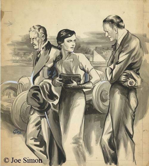
I am all for preserving old newspapers with techniques such as microfiche otherwise much would be lost about the history of our culture. Even so the quality leaves much to be desired. Ger attributed one illustration dated December 13, 1936 to Joe but could not find his signature. Was that because it was removed before publication, or has it been obscured by scratches on the microfiche film? In this case we are fortunate because Joe still has the original art in his collection. Ger may not have needed a signature to recognize Simon’s hand, but it is always nice to have confirmation.

Joe Simon’s Political Comics

Joe Simon’s book, “The Comic Book Makers” (written with Jim Simon), includes a chapter “Marty, The Unknown Writer” that discusses Joe’s work on political comic books and how it came about. As usual it is interesting reading, however no examples of the comic books were provided. I thought they might provide the subject of a further post of Joe’s work outside the standard comic book field.


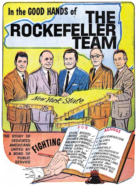
“The Rockefeller Team”, art by Joe Simon, script by Martin A. Bursten

The above image is from the cover but like all examples that I provide here the covers were done on the same newsprint paper as the rest of the comic book. The individuals shown are, from left to right, Judge John P. Lomenzo, U. S. Senator Jacob K. Javits, New York Governor Nelson Alodrich Rockefeller, N. Y. Attorney General Louis J. Lefkowitz, and N. Y. Lieutenant Governor Malcolm Wilson. Actually those are the titles they had at the time, but some went on to hold other positions. For instance Nelson Rockefeller was selected to be U. S. Vice President with Gerald Ford after Richard Nixon resigned from the presidency. The comic book is undated but had to been done between 1959 when Nelson first became Governor and 1974 when he left that position to become Vice President.


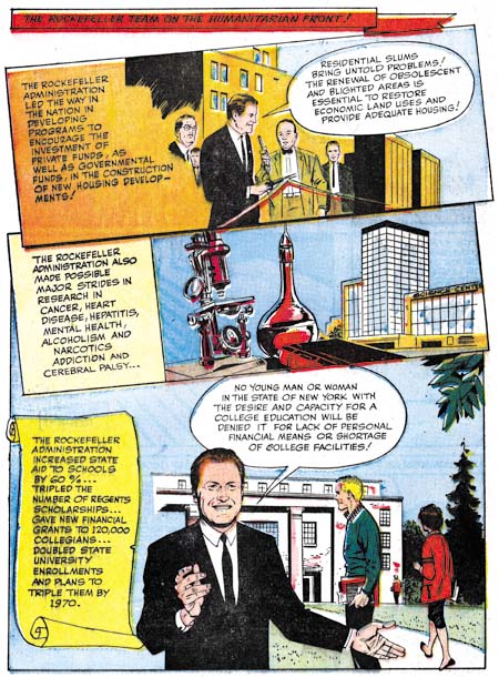
“The Rockefeller Team”, art by Joe Simon, script by Martin A. Bursten

The art for all these comics was done in a realistic style which is not unexpected given the political purpose they were created for. They are all short in length having only 8 pages (including the cover). Generally the layout have the standard comic book panels, but occasionally, as shown above, a more interesting panel arrangement is presented.


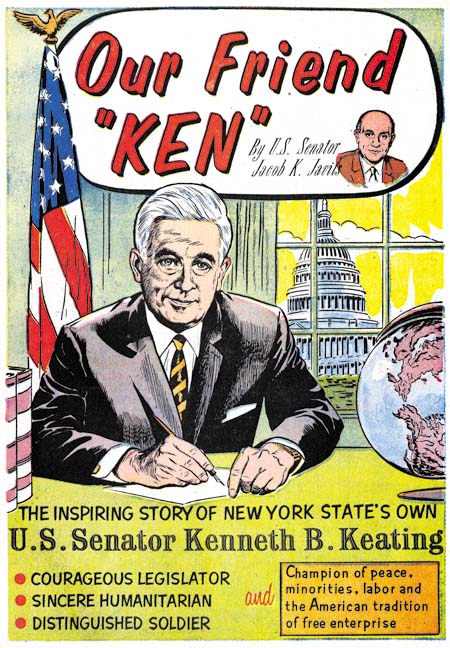
“Our Friend Ken”, art by Joe Simon, script by Martin A. Bursten

The Ken of this comic is Kenneth B. Keating, U. S. Senator from 1959 until 1965 when he lost the seat to Robert F. Kennedy. This provides a narrower period for when the comic was published and Keating’s absence from “The Rockefeller Team” suggests that comic was produced after 1965.

Joe Simon is credited with the art to both of these comics while the script is by Martin A. Bursten. This is the same Bursten whose name appeared in “Mercury in the 20th Century” (Red Raven #1, August 1940) that Jack Kirby drew which previously led to the mistaken idea that the name was an alias of Jack’s. In “The Comic Book Makers” Joe explains that he did this political comic book work on a free lance basis for Bursten’s advertising and public relation firm. The name of that firm was Burstein and Newman and was located in Marty’s home in Great Neck. Both “The Rockefeller Team” and “Our Friend Ken” were produced by Country Art Studios in Woodbury, which is where Joe lived at the time.


“Solo en America, La Historia de Louis J. Lefkowitz” art by Joe Simon, script by Martin A. Bursten, translation by Dr. Carmen Marrero

Lefkowitz appears a little older then in “The Rockefeller Team” so I believe this was done even later. There are no art credits in this comic but the style is so similar to the others that I have no doubt that Joe Simon was responsible for it as well. Unfortunately I cannot read Spanish so I am unsure if this was just a translated version or if the comic was made specifically for a Hispanic reader.

These three are the only political comics by Simon that I have seen. But given their use in political campaigns their survival is even more unlikely then standard comics. These copies were all given to me by Joe himself and I have never seen examples anywhere else. But although Joe liked to keep copies of his work for his own collection that does not mean that these were the only ones he did. Perhaps others will eventually be found.

Joe Simon’s Career in Advertising

In the comments to my post on Joe Simon, Art Director Steven Brower asked whether Joe Simon worked in advertising as an art director. I did not answer Steven then because I decided it was time I wrote a little about Joe’s career outside of comics.


Interior of a folded brochure for Cyder House

There were a number of comic book artists who made the transition into advertising. Generally those that did ended up working for some advertisement agency. Joe followed a different route, he established his own company, Northart Concepts Inc., and sold his services. Much of this work was designing brochures and advertisements. This amounted to laying out art, photographs and text where the art was not his own. Perhaps not very exciting but it was bread and butter worked that supplied income.


Advertisement for Miller Cardboard

The above is an example of an ad Simon designed for Miller Cardboard. Joe created a number of advertisements for Miller. This is an interesting connection because most of the Simon and Kirby art was done on illustration boards manufactured by Miller or King. There is an ad Joe did, I believe for King, which unfortunately I cannot locate right now. In it Simon endorses the illustration board and says he used them to create comic book characters. The ad is provided with a drawing of a patriotic superhero that looks very much like, but is not identical, to Captain America.


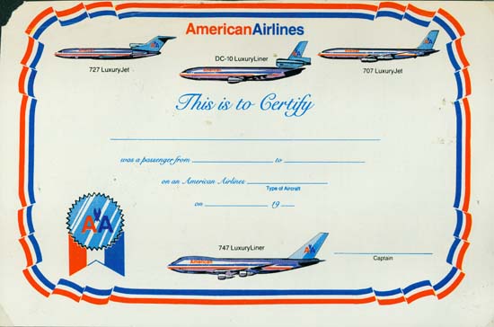
Certificate for American Airlines

Most of Joe’s customers were small clients, too small to have their own art department. But Simon also did some work for large businesses such as American Airlines. The above is certificate Joe did. Today air travel is so common it is hard to imagine a day not that long ago where a company might give a certificate to a customer for taking a flight.


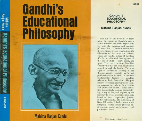
Dust Jacket for Pageant Books (missing back portion)

Joe Simon even did some book cover designs. Pageant Books is still in business today.


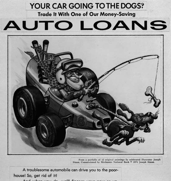
Auto Loan Advertisement for Mechanics National Bank

Sometimes Joe would provide the art as well. In the early ’70s Joe did a number of illustrations for Mechanics National Bank. The Internet provides information about Mechanics National Bank but this all seems about a particular bank building in Philadelphia. I believe Joe’s art was for banks in New Jersey. These are among his best work but are unknown to comic book fans. Joe still has the original art but unfortunately I have not scanned any of it yet. Instead I will use some copies Joe made of some of the ad layouts. The original art is all nicely colored but these particular layouts were done in black and white.


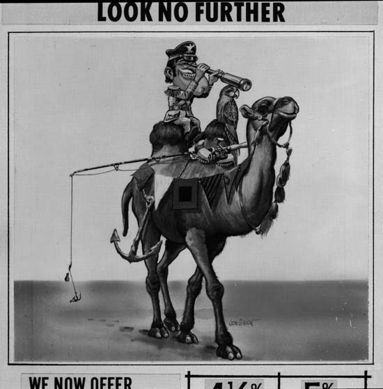
Advertisement for Mechanics National Bank

The Mechanics National art all uses the same character. Occasionally Joe refers to him as Forester Bill, but most commonly as Hector Protector. The name comes from a nursery rhyme:

Hector Protector was dressed all in green;
Hector Protector was sent to the Queen.
The Queen did not like him,
Nor more did the King;
So Hector Protector was sent back again.

The humor found in these Hector Protector pieces is obviously related to that found in Sick. There is, however, a greater emphasis on the odd juxtaposition of imagery; here a ship caption with his anchor, fishing rod and parrot atop of a camel in the desert.

The Wide Angle Scream, What Was Old Is New Again

Sometime after the demise of Mainline, Simon and Kirby’s attempt at becoming publishers, Joe and Jack’s partnership broke up. Jack returned to being a freelance artist but whenever Joe had some comic to produce Jack would always give a hand, at least for the initial issues. In 1959 Archie Comics asked Joe Simon to produce a couple of superhero comic titles for them. For one of the new titles Joe decided to resurrect an old proposal. Years before Simon along with the artist C. C. Beck and the writer Jack Oleck had created Silver Spider. Oleck wrote some scripts and Beck drew the origin story and it was proposed to Harvey Comics but was then rejected. Joe retrieved the original art and at least one script (which he still has) from Harvey but decided, probably because of the previous rejection, the hero should be changed from the Silver Spider into the Fly. Simon asked his former partner, Jack Kirby, to draw the art for the first issue using the C. C. Beck art as the basis for the origin story. (What happened to the C. C. Beck art is a tale that I will not repeat here, suffice it to say that through no fault of Jack’s the Beck art was never returned to Joe. All Simon has now are large photocopies of the original art. You can see some images of the Silver Spider in Chapter 10 of The End of Simon and Kirby) Kirby was also apt to turn to old ideas and so he based the Fly’s costume on an unused Simon and Kirby creation, the Night Fighter. (It is not pertinent to the theme of this post, but this was not the end of the recycling of the Silver Spider as years later it played a part in the creation of Marvel’s Spider-Man.)


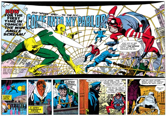
Adventures of the Fly #1 (August 1959) “Come Into My Parlor”, art by Jack Kirby
Enlarged view

The centerfold of the first issue of The Adventures of the Fly featured a double page splash with the declaration:

NOW FOR THE FIRST TIME IN COMICS: THE WIDE ANGLE SCREAM

This is of course where I have derived the name for this serial post about the Simon and Kirby wide splashes. Since Joe and Jack have been using double page spreads since Captain America #6 (September 1941), this issue of the Fly was hardly the first time for the use of this dramatic opening for a story. But in 1959 comic book readers were young and unlikely to know about the earlier comics.

The Fly splash pages are divided into two sections, the splash proper and the start of the story. At the top and bottom of the splash are two parabolic shaped borders making the image wider at the sides then in the center. The background buildings on the two sides of the splash tilt in different directions. All of this was to give the feeling of a wide angle presentation. But this was all just suggestive as a true wide angle lens would not distort the scene in these manners.

The two adversaries face off from opposites sides of the splash. The Fly seems quite at home on the Spider Spry’s web while it is the criminal cohorts of the Spider that seem to be most encumbered. The scale of the figures makes no literal sense. No realistic perspective would cause the rest of the criminals to be so much smaller then either the Fly or the Spider. The size difference is not due to any problem Kirby had with rendering perspective; he was the master of the illusion of space. Rather Jack has reverted to a pre-Renaissance technique, actually common to a great number of art cultures, were size indicates importance.

Not Jack’s best splash but still superior then most artists of the day could have produced. Some have said this was inked by Kirby but I cannot see Jack’s hand in any of the inking of these Archie comics. I doubt Joe Simon did the inking on the splash either.

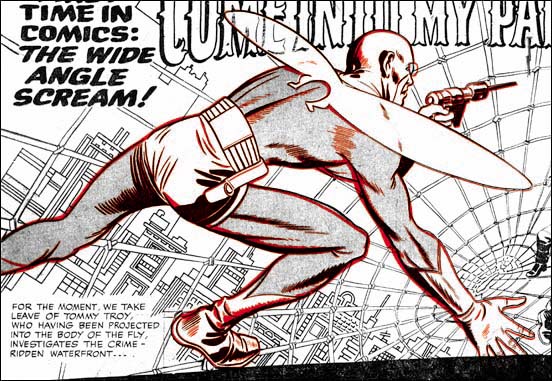
Adventures of the Fly #1
Overlay of the figure of the Fly from the cover (red) and the splash (black)

The cover for the first issue of the Fly is basically the same scene as this splash with the composition altered for the vertically oriented space. As I have shown previously, the cover is based on the splash and not the other way around. (See The Fly, A Case Study of Swiping, for further details.) First a stat was made of the splash and then cutup and reorganized for the cover. Then someone, most likely Simon, touched up some of the inking. It was all well done because cover is every bit as good a designed as the splash.

Joe Simon, Art Director

I have previously discussed Joe Simon’s work as an art director for Timely’s detective magazines. In this post I will therefore be going over familiar ground, but I cannot resist including in my blog some further example that Tom Morehouse has kindly provided. While in my previous post I was largely about the art, this one will chiefly be concerned with layouts that do not use art.


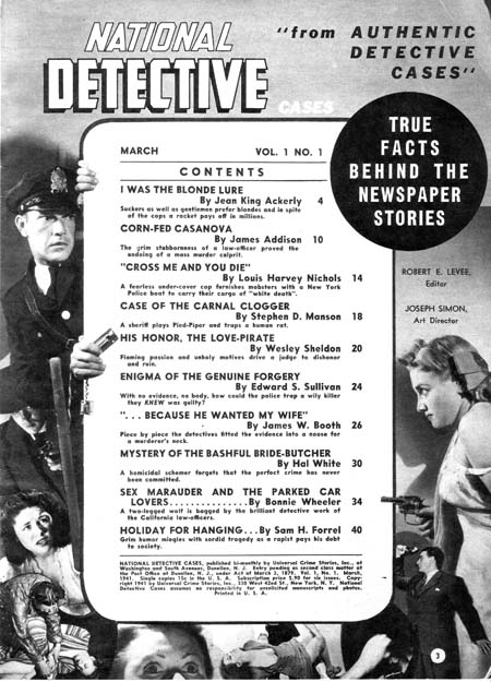
National Detective Cases vol. 1 no. 1 (March 1941)

Joe Simon (since he is listed as the art director, I attribute the layouts to Joe) surrounds the table of contents with a collage. Note how some of the figures encroach across the content’s border. This is of course the converse of having figures extend beyond the panel boarder that Simon and Kirby made such effective use in Captain America at this time. I have seen something similar in the table of contents in a later competitor detective magazines; one wonders whether it already was a common technique in such magazines when this issue of National Detective Cases came out or whether Joe introduced this device and others followed? In any case I particularly like the way the policeman on the left seems to be peering around the content edge.


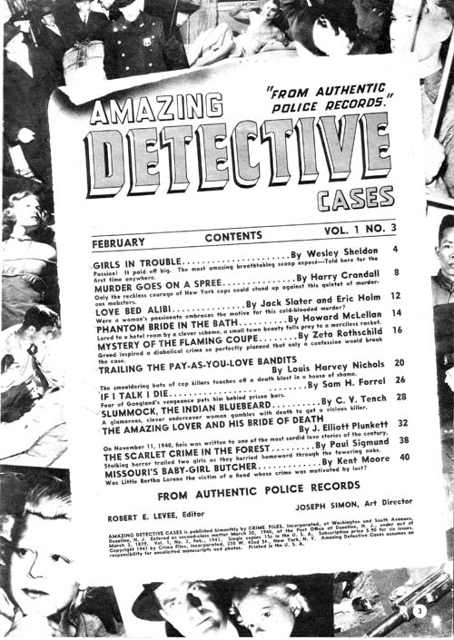
Amazing Detective Cases vol. 1 no. 3 (February 1941)

Above is another content page with a collage background. Nothing crosses the edges of the content proper but Joe gives it all a very 3-D effect by placing the contents at an angle and providing a trompe l’oeil curled top edge.


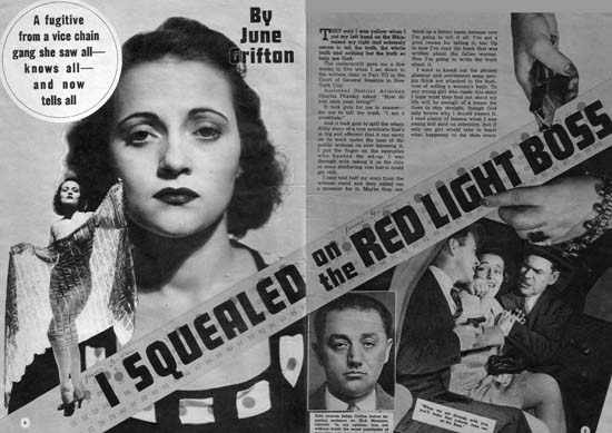
Complete Detective Cases vol. 3 no. 1 (January 1941) “I Squealed on the Red Light Boss”

But it is the opening pages of the stories that Simon provides his most interesting efforts. Pages like those in the image above can obviously be compared to the double page splashes that Simon and Kirby would in a few months do in Captain America (#6, #7, #8, #9 or #10). In some ways there are valid correspondences between the Timely detective layouts and the Captain America double page spreads. Both have designs that include a number of elements in innovative manners. For instance, both share the use of design elements such as circular fields. However the similarity between the magazine and comic spreads is not complete. The magazine layout uses some design techniques that I do not believe were ever used by Simon and Kirby in their comic book work. One of these, the placing of the start of the text at the top and almost in the center, can be explained. The equivalent in a wide splash would be putting the initial story panels in a similar location but that would not be good design because it would result in a confusing layout. This problem does not exist in the magazine layout because by its nature the text is easily distinguishable from the imagery of the rest of the layout. Another design feature for the magazine that I do not believe S&K every used in comics is the diagonally position title. In this case there was no reason why this design technique could not have been incorporated into comic books but I cannot remember any comics where Joe and Jack every used it.


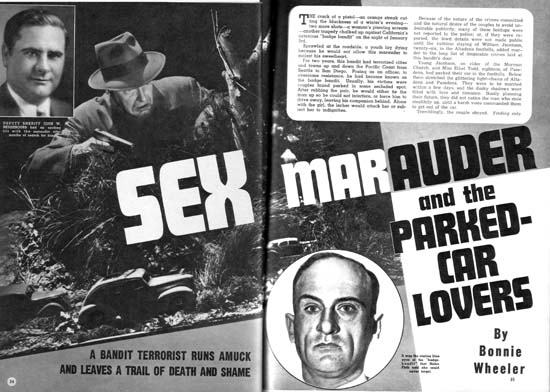
National Detective Cases vol. 1 no. 1 (March 1941) “Sex Marauder and the Parked-Car Lovers”

Above is another layout with a layout with emphasis on the diagonal and the text starting at the top of the second page.


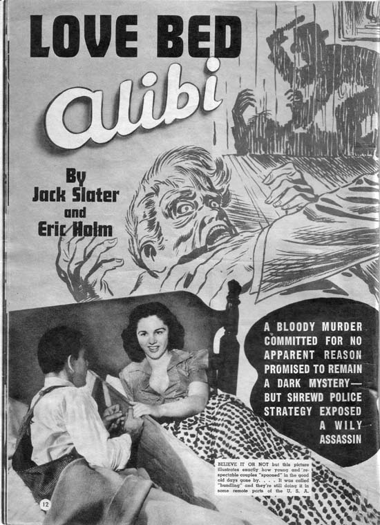
Amazing Detective Cases vol. 1 no. 3 (February 1941)

Of course layouts did sometimes include art so I will close this post with one of Jack Kirby’s best efforts for the Timely detective magazines. In “The Amazing World of Carmine Infantino” Carmine describes Kirby’s advice on how to draw a man hitting a woman:

No, try it like this: Do the scene but don’t show the people; just put the shadow on the wall. Let the reader’s imagination fill in the details.

“Love Bed Alibi” shows Jack using a shadow for somewhat different reasons. It is not so much an attempt to mitigate a violent scene as to force the viewer to go to the background shadows in order to make sense of the foreground action. It is as good a crime drawing as any Jack would do years later for Headline or Justice Traps the Guilty. The only detrimental aspect is the photo of the “bundling” bed placed on the bottom of the layout. While it is an interesting digression a more appropriate photograph should have been used.

Joe Simon, Editor

Joe Simon’s first comic book art was published in January 1940 (cover dates for Keen Detective #17, Daring Mystery #1, and Silver Streak #2). Yet just five months later he was already an editor for Fox Comics. On the face of it this was a rather dramatic rise in his career. Joe was (and still is) a talented artist but during those early days of the comic book industry there were other even more talented artists who never got further then the drawing board.

Some have attributed Joe’s success to having come from a more privilege background. Joe’s family did not live in one of the boroughs of New York City but that does not mean they were well off. Most of the time the family lived in Rochester where Joe’s father, Harry, struggled to support the family. Harry was a tailor by trade but his attempts at union organizing made finding jobs difficult. At one point the family moved to Chicago into a particularly rough neighborhood. Joe tells how at age ten he was in a fight almost every day as other boys tried to take from him what little he had. (Afterwards Harry would examine Joe’s knuckles to verify that he had given a good account of himself.) No there is nothing in Joe Simon’s background to suggest he had some advantage over his contemporaries.

Others have suggested that Joe’s college education was the reason for his quick career rise. One of the originators of this idea was, of all people, Jack Kirby. Jack should have known better. Joe did not attend any college and never received a degree.

Of course it was not just luck that Simon became an editor. Joe was obviously ambitious and a self promoter. One evidence of this can be seen in how Joe made sure to include his signature on much of his early art. Joe was not alone in being ambitious, other artists were as well. Will Eisner started as an artist before quickly seeing an opportunity of starting studio with Jerry Iger. Al Harvey started as an artist before becoming a publisher. But not all artists were so quick to try new opportunities. Perhaps if he had started earlier or had more money, Joe also would have tried setting up a studio but he did apply for the Fox editor position instead. Although not all artists were ambitious as Joe, there must have been some others who applied for the Fox editorial job. The other artist would likely have more experience in the comic book industry then Joe’s 5 short months. How did Joe manage to get the job?

Actually the experience of most, if not all, of Joe’s possible job competitors did not amount to much. It really amounted to having spent more time drawing comic books. Being a good artist, however, really was not a necessary feature of an editor. There were other tasks that an editor would need to do such as providing layouts, putting together an entire book, or interfacing with the printer or publisher. Joe had an edge up on other applicants in some of these other tasks. Previous to entering the comic book industry, Simon spent about seven years as a newspaper staff artist. “Meanwhile”, the Milton Caniff biography by Robert C. Harvey, provides a wonderful examination of his experiences as a staff artist and I am sure Joe’s was not that much different. Yes the job consisted in providing illustrations and such for the paper, but it also doing meant doing layouts, creating decorative embellishments (dingbats) and other similar choirs. It was the experience as a staff artist for a period of seven years that Joe could use to promote himself as a good candidate for the editorial position.


Acton Langslow

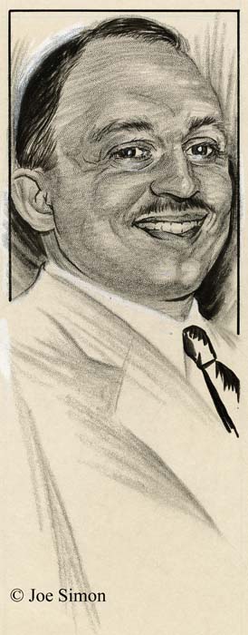
My thinking about Joe’s time as a staff artist was brought on by recent work that I have been doing on inventorying Joe’s personal collection. I have previously discussed some of Simon’s newspaper work. Work like sport and fiction illustrations, and political commentary cartoons. Recently I have scanned another aspect of his newspaper career, political portraits. There are 21 portraits all done on stipple board in crayon, ink and white out. Most of them are stamped on the back at the time of delivery. Unfortunately this stamp includes the day but not the year; the dates range from October 1 to 23. Some have names on the front and through the wonders of Google and the Internet I have found some of the names on a site called The Political Graveyard. Those that I have been able to identify are all politicians from Monroe County, New York. It is there fore likely that this was done while Joe was working for the Rochester Journal which according to his book, “The Comic Book Makers”, was from 1932 to 1934.

The above portrait was of Acton Langslow who, according to The Political Graveyard, was a Democrat, Candidate for New York state assembly from Monroe County 1st District in 1935. The two I selected for this post were both Democrats, but there were some Republicans as well.


Francis J. D’Amanda

Another has the name D’Amanda, which based on The Political Graveyard, was Francis J. D’Amanda a Democrat. Candidate for New York state assembly from Monroe County 3rd District, 1928, 1932; candidate for New York state attorney general, 1950; delegate to Democratic National Convention from New York, 1952 (alternate), 1956.

The manner of execution is quite interesting. The crayon (by this term I am referring to artist crayon, not those used by children) is used in a very loose manner with distinctive individual marks by the crayon. The hair and ties are done in ink using a brush with the ties being particularly rough. Yet when the original art is shrunk down in size, as it would have been for publication, the rough mannerisms disappear into an almost photographic representation. It was quite a performance by an artist who, if my dates are correct, was just out of high school.

Tiger 21

Joe Simon’s personal collection includes two large illustration boards of an unfinished syndication proposal, Tiger 21. The art on each board is composed of a long title section (empty on one of them) and three rows of panels each row nominally with four panels. They therefore were intended for use in the Sunday comics section. The work was never completed; the outlines for the panels, captions and word balloons were all inked and the lettering finished however all the pencils remain uninked. In the upper left corner of each board, outside of the actually art area, are the numbers 1 and 4 which represent the individual page numbers.

This posting is by no means the first report of Simon and Kirby’s Tiger 21. John Morrow wrote an article about them in The Jack Kirby Collector #15 (April 1997). Morrow discussed six pages but the illustrations he provides indicate that he worked with copies, probably stats, of the original art. However the copies were made the process had difficulty in reproducing the pencils. John provides an outline of the story which I will not repeat here. If interested you read it in Google Books. Basically Tiger 21 is science fiction about adventures in space. There was also a concept presentation piece for Tiger 21 that was included in Kirby Unleashed and Volume 2 of the Jack Kirby Treasury has a full page reproduction (page 5), again apparently from a second generation copy, of the original art.

Simon and Kirby were apt to recycle syndication proposals into comic books. I previously discussed the work they did in turning the strip “Inky” into “Artist Loves Model” published in In Love #3 (December 1954). Joe and Jack also transformed a Tiger 21 story (not one of those reported in TJKC #15) into “Homecoming: Year 3000” for Fighting American #4 (October 1954). The Fighting American only appears at the start and the end while the rest of the story is given over to Tiger 21’s Starman Zero.


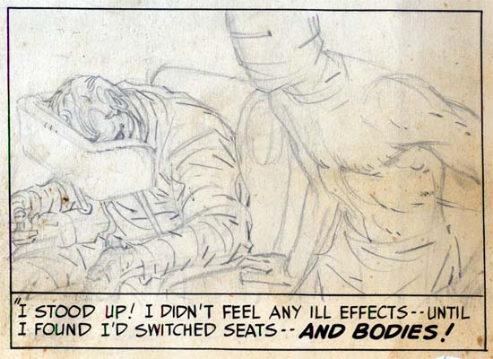
Tiger 21, page 1, panel 11, art by Jack Kirby

Starman’s appearance in Fighting American was somewhat apt as the two shared a similar origin. Both involved the use of a machine to transfer the mind from one body to another. In Fighting American it was the mind from a frail body into that of his recently deceased brother. For Starman Zero it was into a synthetic body much more durable then that of a human.


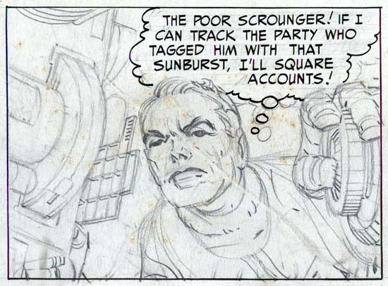
Tiger 21, page 4, panel 3, art by Jack Kirby

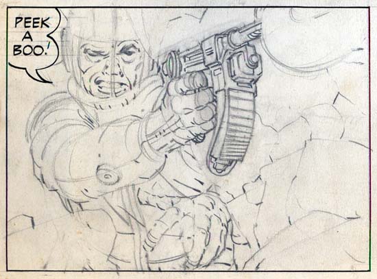
The artwork is quite well done in tight pencils which can be very light in certain areas. As was his practice during this period, Jack provided only lines with nothing to indicate how the spotting should be done. Cloth folds were indicated by simple lines and it was up to the inker on how to interpret them. Shadows and inking techniques were all left to the inker as well.


Tiger 21, page 4, panel 9, art by Jack Kirby

The pencils are very bold with lots of effective use of exaggerated perspectives. The best comparison that can be made is art that Kirby did toward the end of the Simon and Kirby studio for titles like Foxhole. This would suggest a dating to the mid ’50s. This is at odds with John Morrow’s article which assigned Tiger 21 to the late ’40s. The best way to resolve this issue would be the lettering. Howard Ferguson was Simon and Kirby’s first letterer while later this job was done by Ben Oda. I must admit I have not done a careful study of the lettering but that for Tiger 21 seems to match that used for Stuntman and Boy Explorers which were presumably done by Ferguson. Based just on a casual examination and therefore quite possibly in error, it seems to me that the switch of Ferguson lettering to that by Oda seemed to occur in early 1950. Therefore, admittedly with much uncertainty, a late 40’s date seems the most likely.

Although in his article John Morrow wrote that the title of the newspaper strip was Starman Zero, the first art page clearly shows it was actually Tiger 21. The oddly named title refers to a distant star that, in the strip, is reachable via something called the time jump. Tiger 21 was also the name of a television science fiction show that Kirby proposed to NBC in the early ’50s. For the television version, Tiger 21 was the name of the hero’s space ship. NBC eventually picked up another show instead called “Man In Space” that starred William Landigan.

Joe Genalo, Prize Editor and Colorist

Recently Lawrence Genalo, Joe Genalo’s son, left a comment to my post The Lineup. He mentioned that the center man in the lineup of the comic cover, who Joe Simon had identified as Joe Genalo, did not look like his father.

Simon and Kirby Studio
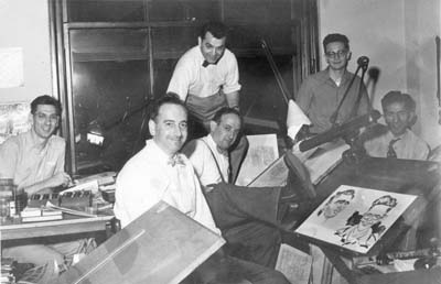
Simon and Kirby studio (probably from 1951 or 1952). Left to right: Joe Genalo, Joe Simon, Jack Kirby, Mort Meskin, Jimmy Infantino and Ben Oda

I sent Larry a copy of the studio photograph (shown above) and he has verified that the man on the left is his father. Joe Genalo is shown working on a color guide. Before him are two low boxes filled with small jars, these are the dyes he is using for his coloring. You cannot tell it from this image, but a blowup of the original photograph reveals that Genalo is working on a cover for Prize Comic Western. Joe Simon has told me that color guides were the responsibility of the publisher, Prize Comics. Joe Genalo was therefore being paid by Prize and although he worked in the studio (the publisher did not have their own bullpen) he did not actually work for Simon and Kirby. In a further email Larry mentioned that as a teenager, he and his older brother (also named Joe) would help color proofs that their father brought home.

Please allow me a brief digression. In the photograph on Joe Simon’s drawing board are two caricatures. I am usually critical about identifications based on similar photographs, but the art looks like Simon’s work. The caricature on the right is obviously of Jimmy Infantino, but the one on the left does not match anyone in the photograph. In a recent issue of Alter Ego (#76) provided in Jim Amash’s interview of Joe Simon is a photo of Jack Kirby, Joe Simon, Bill Draut, Ben Oda and Marvin Stein. When I saw the second photograph I immediately recognized the left caricature was of Stein. I strongly suspect that the reason that Marvin did not appear in the first photograph is that he was the one taking the picture.

Besides being a colorist, Joe Genalo was also an editor for Prize. The Postal Statements issued annually in comics may not be completely reliable but at least in the case of Prize comics there is no reason to discount them either. The GCD list Joe as the editor for Frankenstein Comics throughout its run (1945 to May 1956). Unfortunately I am unable to confirm that. I am in a better position for some of the other Prize titles but even with those there still are gaps due to issues that I do not have access to. The postal statements that I can verify that list Joe Genalo as the editor are:


All For Love
     #12  (v.3, n1)  April 1959

Headline
     #58  (v.8, n4)  March 1953
     #65  (v.9, n5)  May   1954
     #71  (v.10, n5) May   1955
     #76  (v.11, n4) May   1956

Justice Traps the Guilty (Prize)
     #48  (v.6, n6)  March   1953
     #60A (v.7, n6)  March   1954
     #72  (v.8, n6)  March   1955
     #81  (v.9, n3)  Aril    1956
     #89  (v.10, n5) October 1957

Personal Love
     #10  (v.2, n4)  March 1959

Prize Comics Western
     #98   March 1953
     #105  May   1954
     #111  May   1955

From this I would say that Joe Genalo was the editor for all Prize comics not produced by Simon and Kirby from at least 1953 until 1960. In 1960 Joe Simon returned to edit the romance comics, which were the only titles that Prize was still publishing. Genalo continued to work for Prize even after Simon’s return although I cannot say in what capacity.

On a more personal level, Joe Genalo was born in Brooklyn on October 21, 1920. He was actually Joseph Genalo Jr. but is never listed as such in the comic books. When young, Joe played baseball for the Brooklyn Eagles, a semi-pro team. He was an outfielder and eventually a first baseman. Joe lived in Brooklyn until moving with his family to Levittown in 1950 and in 1958 to North Bellmore. In the 50’s he was an excellent bowler, according to his son one of the best in the New York region. Other members of the Simon and Kirby studio joined Genalo in some bowling games but none were quite as good.

From his son Lawrence I learned that as a child Joe had rheumatic fever which caused two valves of his heart to be smaller then normal. Apparently Genalo did not talk about his heart problems because Simon was unaware of it until the day before Genalo left for Houston to have it operated on. His doctors were Denton Cooley and Michael DeBakey. These doctors would later become famous for their work in heart transplants, the first to be performed in the United States. Unfortunately when operating on Genalo the doctors were only aware of the problem with one of the valves. When the single valve was replaced, the other faulty valve could not take the increased pressure and it burst during the surgery. Joe Genalo died on March 15, 1963. He wife, Lorraine Mandella Genalo, lived until the age of 49 dying in 1973. They had three sons that are all still living, Joe Genalo III is now 64, Lawrence is 62 and Don is 50. Larry tells me that all are active bowlers but Don is the most successful. Don has won six national PBA titles from 1981 to 1991 and is ranked among the top 50 pros for financial success.

I am grateful for the information that Joe’s son, Lawrence Genalo, has provided. It is nice to put a more human face to one of the contributors to Prize Comics. It is also rewarding to be able to identify with certainty all the people in the above photograph of the Simon and Kirby studio. Unfortunately it also means that the man in the center of Marvin Stein’s lineup cover remains to be identified.

It’s A Crime, Chapter 9, Not The Same

(Justice Traps the Guilty #9 – #12, Headline #35 – #38)

This chapter will cover the Prize crime comics from the period March through November 1949. Both Justice Traps the Guilty and Headline were bimonthly titles. The other nominally crime title, Charlie Chan, had been discontinued after February. Simon and Kirby were also producing Young Romance at the start of this period as a bimonthly but switching to a monthly in September. The first Young Love was released just prior to this period in February and would be a bimonthly throughout the time covered by this chapter. The western romance titles came out during this period; Real West Romance in April and Western Love in July. They were both bimonthlies. Thus at the start of this period Simon and Kirby were producing 4 titles and by the end 6 titles. Most of the titles were bimonthlies and I find it more significant to count bimonthlies as half a title. Using that counting technique at the start S&K were producing 2 titles and by the end 3.5 titles.
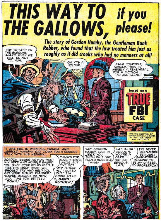

Justice Traps the Guilty #9 (April 1949) “This Way to The Gallows”, art by Jack Kirby

As is generally the case when discussing Simon and Kirby productions, Jack was the primary artist during the time covered by this chapter. This is however a little misleading as Kirby only supplied 5 stories with 38 pages out of a total of 43 stories with 325 pages. While not quite at Kirby’s level, other artists supplied significant amount of work. John Serevin did 5 stories and 32 pages; Vic Donahue had 4 stories and 30 pages and Warren Broderick may have done 4 stories with 31 pages.

A trend that started earlier was continued; Jack’s splashes for the crime titles no longer seemed to have the impact that they did with the earlier issues. Part of this due to all of the splashes now being half pages splashes, but part was the result of the art itself. This may not have just been a declining interest on Kirby’s part; it is possible that he was toning down the violence because of the criticism that crime comics were receiving at this time. Whatever the reason, if you want to see great Kirby splashes from this period you have to look at the romance titles where Jack was turning out some of his best splashes.
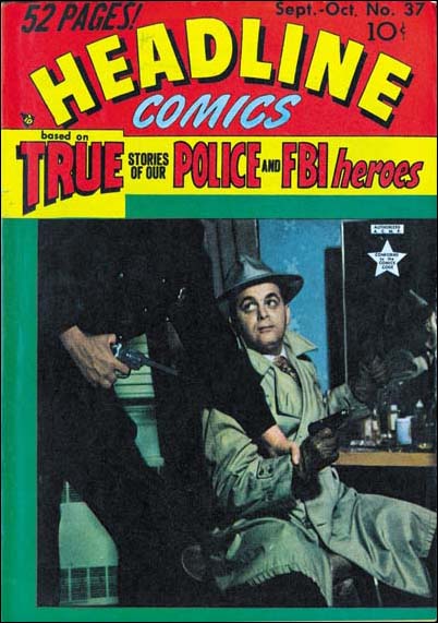
Headline #37
Headline #37 (September 1949) That is Jack Kirby in the cover photograph. An uncropped version of the photograph shows that the policeman was actually Joe Simon.

Jack also supplied 4 of the 8 covers, and the covers that Kirby did were all excellent. Starting with Justice Traps the Guilty #11 (August) and Headline #37 (September) the crime titles began to use photographs for their covers. A similar change over occurred for the romance titles; Young Romance with issue #13 (September); Young Love seemed to start it all with issue #2 (April). The western romance titles (Western Love and Real West Romance) were both introduced with photographic covers. Simon and Kirby’s involvement in the crime photographic covers is shown by the presence of Jack himself in one of them.
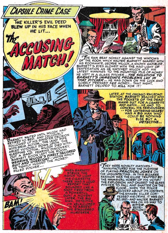

Headline #37 (September 1949) “The Accusing Match””, art by Jack Kirby

Jack Kirby’s declining contributions to the crime titles is even greater then the numbers indicate. That is because this chapter covers a transition in these titles. While Jack contributed to Headline #35 to #37 and JTTG #9 to #11, he would provide no work for Headline #38 or JTTG #12. “The Accusing Match” would be the last Kirby crime story released until Simon and Kirby published Police Trap. A drop in Bill Draut’s contribution to the crime genre comics was noted in previous chapters. Bill’s last crime story, and the only for this chapter’s time period, would be “Willie the Actor” from JTTG #9 (April). Draut’s drop in from the crime genre was not a reflection about his art in general because he still played a leading roll in the standard romance titles as well showing up often in the western romance comics all of which were produced by Simon and Kirby. Other artists who worked for the Simon and Kirby studio also stopped appearing about this time in Headline and Justice Traps the Guilty. I will touch on this subject as I review some of these artists and at the end of this post draw my conclusions.
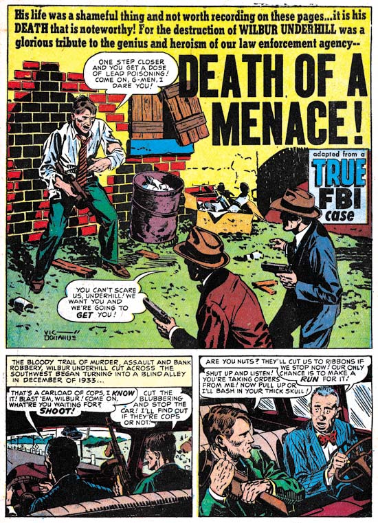

Headline #37 (September 1949) “Death of a Menace”, art by Vic Donahue

Vic Donahue’s provided 4 stories and 30 pages which is a surprisingly high number relative to Jack Kirby. He is one of the Simon and Kirby studio artists that would disappear from the crime titles. The last work that I know of appeared in JTTG #12 (October). Donahue appears in Simon and Kirby production often enough during this period that I consider him among the second tier of studio artists (along with John Severin, Leonard Starr, Bruno Premiani?, Jo Albistur and Ann Brewster).

Donahue art during this period is consistent with what I have presented before. Traces of the Studio style inking are found sporadically in Vic’s art. Note the abstract shadow arc in the splash panel, the drop string on the back of the car seat in story panel 1 and the picket fence crosshatching in the second panel (see the Inking Glossary for explanations of the term I use to describe inking techniques). I am increasingly becoming convinced that in Vic Donahue’s case, the presence of Studio style is due to Joe or Jack coming in afterwards as an art editor and strengthening Donahue’s work.
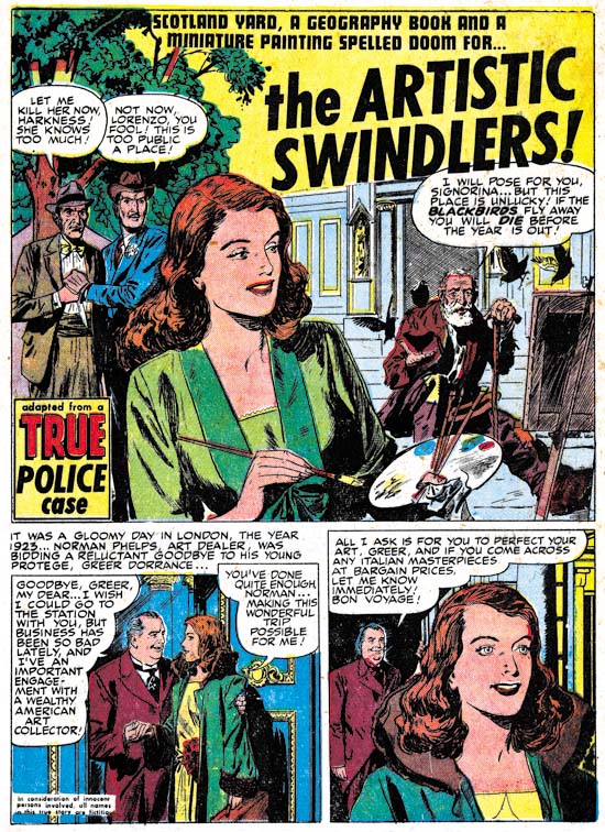

Headline #37 (September 1949) “The Artistic Swindler”, art by Bruno Premiani?

Bruno Premiani first appeared in a Simon and Kirby production in August (“Two-Timer”, Young Love #4). The story “The Artistic Swindler” that appeared in the following month was Premiani’s only crime genre art for Simon and Kirby. Bruno only worked for Joe and Jack until December 1950 but during that time he was an important contributor. Although he would not appear in another crime genre, he would be used for all other Simon and Kirby productions.

Perhaps I should explain (for those readers who have not read my previous explanation) why I provide Bruno Premiani attributions with a question mark. The Simon and Kirby stories whose art I attribute to Premiani are all quite similar and easily recognized. The problem is none of them were signed. Crediting of this work to Premiani is based on the credits found in the trade back “Real Love”. Unfortunately that publication does not explain the reason for the attribution. Bruno Premiani is also credited with work at DC but that work looks very different then the art for Simon and Kirby. While none of this means the S&K studio artists could not have been Bruno Premiani, neither is there good evidence to support that attribution. Until I find some way out of this conundrum, I will continue to indicate by uncertainty by adding a question mark to the Premiani attribution.
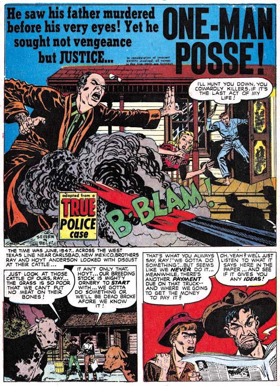

Headline #37 (September 1949) “One-Man Posse”, art by John Severin and John Belfi

Another prominent artist during this period was John Severin who contributed 5 stories with 32 pages of art. He would, however, appear in all four Headline comics covered by this chapter as well as JTTG #11 (August). He would also show up in JTTG #14 (February 1950). Severin’s appearance in the Simon and Kirby comics seems somewhat sporadic, but unlike some of the other S&K studio artists, his contributions to the Prize crime comics seems to continue after this period. I am unclear exactly when it started, but Severin was an important artist for Prize Comics Western. As far as I can tell, outside of producing a couple of covers, Simon and Kirby had little to do with that title.
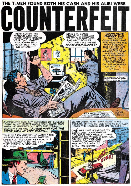

Justice Traps the Guilty #10 (June 1949) “Counterfeit”, art by John Belfi

Many of John Severin’s art at this time were signed. The signature often included the inker and that was almost always John Belfi. I gather Belfi was primarily an inker and “Counterfeit” from JTTG #10 is the sole example of pencils by John Belfi for a Simon and Kirby production. Because his pencil work is not very often seen I thought I would include an image. Frankly John Belfi is not one of the better artists that worked for Simon and Kirby.
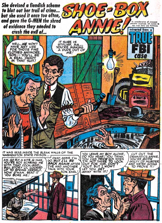

Headline #36 (July 1949) “Shoe-Box Annie”, art by Warren Broderick

Warren Broderick was one of the lesser artists of the Simon and Kirby studio. Yet he did a surprising 4 stories and 31 pages for the crime comics covered in this chapter. His last crime story seems to be “Hijackers” in JTTG #11 (August). However he normally does not sign his work and I have only fairly recently identified him. I have made an examination of some of the following Prize crime comics and so far failed to detect him. However he seems to have only rarely was used for the Simon and Kirby romance comics. So he is not a good example of the transition that seems to be occurring in the crime titles.
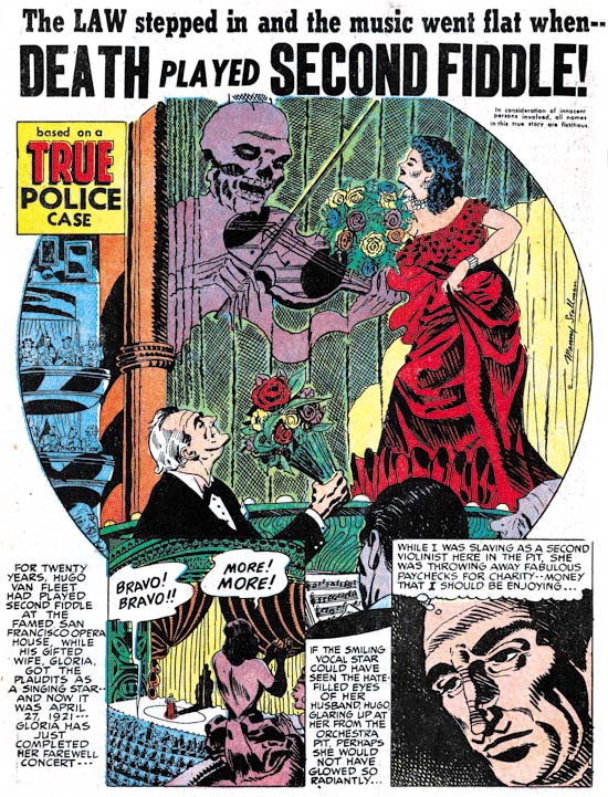

Justice Traps the Guilty #10 (June 1949) “Death Played Second Fiddle”, art by Manny Stallman

Manny Stallman work for the Simon and Kirby studio has an interesting aspect. I have previously presented examples by Stallman (It’s A Crime, Chapter 6 and Chapter 8 and remarked at the time that they seemed to be done in two different styles neither one of which was a good match for what Stallman did at Atlas a few years later. Yet a third style is evident with “Death Played Second Fiddle”. This style seems particularly crude compared to the art that I previously shown.
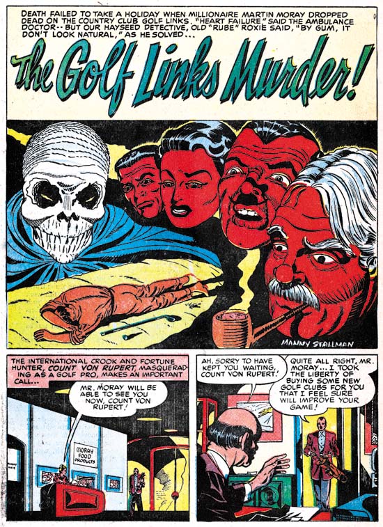

Headline #35 (May 1949) “The Golf Links Murder”, art by Manny Stallman

If the presence of three styles by Manny Stallman was not bad enough, “The Golf Links Murder” is done in yet another style. This one is done in a manner that does look similar to Stallman’s Atlas work. Note in particular the almond shaped eyes. Similar eyes can be found in older work as well (The Captain Aero Connections) I believe the existence of four distinct styles over such a very short period of time is good evidence that Manny Stallman was providing work to Simon and Kirby most of which was actually drawn by ghost artists.
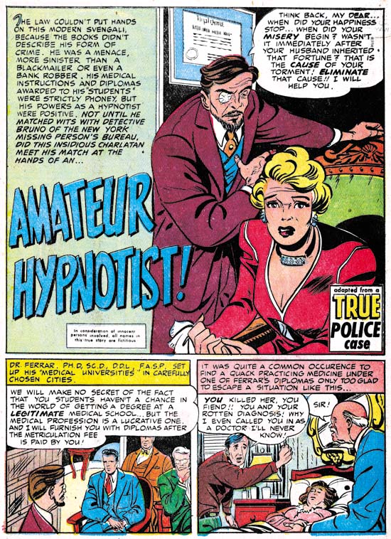

Justice Traps the Guilty #11 (August 1949) “Amateur Hypnotist”, art by Dick Briefer

Dick Briefer makes a surprise appearance in this chapter. Well it was a surprise to me. Briefer is mostly known for his work on Frankenstein but we previously saw him supply work for some Charlie Chan issues. Now to the work that he did for Simon and Kirby can be added “Dutch Joe Cretzer’s Other Business” (Headline #36, July), “Amateur Hypnotist” (JTTG #11, August) and “The Nightmare Murder Mystery” (JTTG #12, October). All of the work that he did for Simon and Kirby was unsigned and these three examples are more realistic then what he did in Charlie Chan. But enough of his stylistic tendencies are present to leave little doubt that he was the artist. In the example page shown above note the triangular head give to the man in the splash, the shallow depth to the face of the man on the left of the first story panel, and the small head of the man with the blue suit in the same panel. Dick Briefer’s appearance in these Prize crime comics and work done at the same time for other publishers was undoubtedly due to the cancellation of Frankenstein after issue #17 in February 1949. Frankenstein Comics would resume, with Dick Briefer, in March 1952.
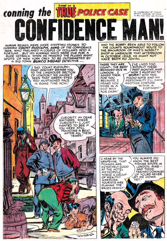

Justice Traps the Guilty #10 (June 1949) “Confidence Man”, art by Bernie Krigstein

The story “Confidence Man” was signed B. B. Krig in the splash. I must admit that I did not realize who it really was until I went searching to the Internet for Krig. I quickly found that B. B. Krig was actually Bernie Krigstein. In fact I had missed an earlier unsigned work by Krigstein (“First Great Detective”, JTTG #8, January 1949). These are the only two works by Bernie for Simon and Kirby. I do not know if part of the reason for that was the transition in the Prize crime comics that happened at this time. Krigstein had a great style for crime stories, but I doubt that it would have been very effective for the romance genre. Whatever the reasons for his short stay at the Simon and Kirby studio, it was certainly a shame he was not around longer as he went on to do some great art for some other publishers and especially for EC.

When the Simon and Kirby’s Young Romance first came out it primarily used Jack Kirby and Bill Draut as artists. After that initial period, the artists used for the romance comics would largely be the same ones used for the Prize crime genre as well. The core artists for Simon and Kirby around the time covered by this chapter were Jack Kirby, Bill Draut, Vic Donahue, Leonard Starr and John Severin. I would include Manny Stallman, but as I mentioned above he appears to be using ghost artists and thus sorting out the unsigned work is problematical. Bruno Premiani? was an important S&K studio artist who started working for Joe and Jack just at this time. Mort Meskin was an even more important studio artist who started just after the period covered by this chapter (December). Kirby’s last crime story was for September, Draut’s was April, and Donahue last was October. Starr never did much crime and his only work in that genre appeared in February. Severin does not follow the same history; he would do a crime story in November 1949 and again in February 1950. Severin would later become an important contributor to Prize Comics Western. Bruno Premiani started working for Simon and Kirby during this time period; he would only do a single crime story (September) but would provide a lot of work for the romance titles for the following year. Mort Meskin would arrive shortly after the period covered in this chapter. While initially Mort would only work on the romance titles before long he would provide occasional stories for Headline and JTTG and would do so for the rest of stay with Simon and Kirby. So to summarize there were 4 artists (Kirby, Draut, Donahue and Premiani) who stopped providing crime stories during this period and 2 (Severin and Meskin) who continued to work on the crime titles.

However it was not just a question of the important S&K studio artists there were also a number of minor, mostly unidentified, artists as well. These minor artists were used in the romance titles but only in limited amounts. In the crime they became more commonly used especially after the S&K studio artists were no longer providing art. They are particularly abundant in the crime titles during the period covered by this chapter where the artist for 13 out of the 46 stories have not been identified. Two other stories have signatures (Dick Rockwell on one and Nicholson and Belfi on the other) but otherwise similar to the unidentified artists as being lesser talents. If Nicholson and Rockwell are included, these artists account for 103 pages of art out of 325 total.

In the first story of Real West Romances #3 (August 1949) there is a label with the declaration: “Produced by Simon and Kirby”. This label would then appear on the first story of nearly every Young Romance, Young Love, Young Brides, Black Magic and Strange World of Your Dreams until near the end of 1954. Some have mistaken it for a claim that Joe and Jack drew that story, but it really meant that Simon and Kirby put together the entire comic. The “Produced by Simon and Kirby” label never appeared in any issue of Headline of Justice Traps the Guilty.

The interpretation that I draw from all of this is that at about this time the Prize comics would begin being made “on the cheap”. That is that the pay rate given to artists working for these titles was lowered. The new pay rate could no longer attract the better artists. Artists like Bill Draut, Bruno Premiani, Vic Donahue and Jack Kirby had work they could do for the Prize romance comics where the pay rate had not changed and Jack had a share of the profits. As for Mort Meskin, he was so prolific that to pick up extra money beyond what he could get from the S&K studio he would accept the lower page rate for the crime titles. Perhaps the same was true for John Severin. Lowering the costs of producing a title was a strategy that Prize would repeat in the future.

But if the Prize crime comics were now being cheaply made, were Simon and Kirby still producing them? That is a question that is harder to provide a satisfactory answer. The lack of the “Produced by Simon and Kirby” label might suggest they were not producing the crime comics. But when the use of photographic covers was dropped for the crime titles, Jack Kirby provided cover art for 7 issues over the period from September 1950 to February 1951. My tentative conclusion is that in 1949 Prize directed Simon and Kirby to produce a cheaper version of the crime titles. By October or so they had achieved that end but continued to be involved in the production of the titles. Because Headline and JTTG were now inferior comics, Joe and Jack purposely left out the “Produced by Simon and Kirby” label. This was the state of affairs until early 1951 after which Simon and Kirby’s involvement in the Prize crime comics completely ended.

Chapter 1, Promoting Crime
Chapter 2, A Revitalized Title
Chapter 3, Competing Against Themselves
Chapter 4, Crime Gets Real
Chapter 5, Making a Commitment
Chapter 6, Forgotten Artists
Chapter 7, A Studio With Many Artists
Chapter 8, The Chinese Detective

Chapter 10, The Master and His Protege
Chapter 11, The New Team