Category Archives: 6 Mainline

Little Shop of Horrors, Chapter 11, The End

(May 1954 – November 1954, Black Magic #30 – #33)

This final chapter of the serial post Little Shop of Horrors occupies the same time period as Chapter 27 and Chapter 28 of the Art of Romance. Black Magic mirrors, on a smaller scale, what happened at the same time in the Simon and Kirby romance titles. Basically there was an influx of art by artists new to Simon and Kirby productions. This can be shown by the fact that there were 58 pages by indentified artists and 45 pages by new unidentified artists. However there is one significant difference, so far I have not detected any Black Magic stories that looked like they were originally meant for another publisher.

The four identified artists were Jack Kirby (33 pages), Mort Meskin (17 pages), Bill Draut (4 pages) and Al Eadeh (4 pages). While during most of the Simon and Kirby collaboration it was typical for Kirby to be the most featured artist, during this period it was surprising indeed. It was during this time that Joe and Jack setup their own publishing company, Mainline, and Jack’s contributions as a penciller plummeted. Jack drew relatively little for the romance, western, or crime genre all of which were produced by Simon and Kirby. However at the same time Kirby was a consistent presence in superhero and horror. Mark Evanier has remarked that horror was not one of Kirby’s favorites but at least during this period that does not seem to be at all true.

Black Magic #31
Black Magic #31 (July 1954) “Slaughter-House”, pencils by Jack Kirby

There were more science fiction stories toward the end of the Black Magic run. Kirby would often use such stories, as he did in some of the romance genre stories, as social commentary. “Slaughter-House” may seem to be a classic monster story but it is not. It is actually about the extremes people will take in order to try to survive in an impossible situation. This story was greatly influenced by stories that came out of the Nazi death camps. The Nazis might not have been bug-eyed monsters but their death camps forced desperate people to the extremes.

The splash panel is actually part of the story a technique that was commonly used in the period covered in the last chapter. Another typical feature that this splash shares with those from previous issues was its smaller size. Larger more standard splash would return in the last issues of Black Magic.

Black Magic #32
Black Magic #32 (September 1954) “Maniac”, pencils by Jack Kirby

A more standard splash is found in “Maniac” but note the odd design where the title extends beyond the splash border.

Black Magic #33
Black Magic #33 (November 1954) “Lone Shark”, pencils by Jack Kirby

While keeping a large splash, Kirby has returned to using it as part of the story. Jack did this so well that it is easy to assume this is a standard splash. However the first story panel makes no sense without the splash.

Black Magic #31
Black Magic #31 (July 1954) “Gargoyle”, art by Mort Meskin

Mort Meskin seemed to have a particular interest in the horror genre. While I am a great admirer of his work, I find his attempts to depict gruesome things not all that successful. This might seem to be a fatal defect for a horror artist but Mort is so good at graphically telling a story that it really is not much of a problem. I have to wonder what Meskin’s drawing of the protagonist’s mouth is meant to represent.

Black Magic #32
Black Magic #32 (September 1954) “The Devil Doll”, art by Mort Meskin

While I do not find the character in “Gargoyle” to be truly gruesome the witch doctor in “The Devil Doll” puts a chill down my spine. This has got to be one of his most successful efforts in drawing a truly disturbing character.

Black Magic #32
Black Magic #32 (September 1954) “The Monsters”, art by Bill Draut

Bill Draut has not appeared very often in Black Magic in the more recent issues. This must have been by design as Bill was playing an important roll in the romance comics at this same time. I admit that while I feel Draut does quite well in his horror stories his romance art is much more successful.

Black Magic #30
Black Magic #30 (May 1954) “Ghost in the House”, art by Al Eadeh

It is interesting how the art of Al Eadeh shows a slow but steady improvement over the years. His earliest work for Simon and Kirby is rather stiff but that characteristic disappears in his later work. “Ghost in the House” is probable his most successful piece for Simon and Kirby. Unfortunately it is also seems to be his last for that team.

Black Magic #30
Black Magic #30 (May 1954) “The Devil, You Say?”, art by unidentified artist

What a terrific splash is found in “The Devil, You Say?”. I cannot identify the artist and frankly the rest of the story art is not nearly as good.

Black Magic #32
Black Magic #32 (September 1954) “The Little People”, art by unidentified artist

Another unidentified artist. As I mentioned above, there seems to have been an influx of new artists in Simon and Kirby productions. I cannot get very enthusiastic about most of them, but the artist who did “The Little People” was pretty good.

Issue #32 marked the end of the first run of Black Magic. Initially Black Magic had been popular enough to warrant a monthly release schedule. However for the last year it had been a bi-monthly schedule. Certainly the quality of the stories or the artists that drew them had not changed so why had it become unpopular enough to discontinue? While I cannot completely dismiss that it was just a victim of changing tastes the timing suggests that the problem most likely came from another source. This was the time there was a decline in comics across the board initiated largely by Dr. Wertham (The Real Reason for the Decline of Comics). While Dr. Wertham condemned pretty much all comics, he and other critics were particularly negative about the crime and horror genre. While in reality the contents of Black Magic were mild compared to those horror comics released by other publishers, at that time critics were not too discerning; the title alone made Black Magic a target. The rising public criticism influenced many newsstands to stop selling some of the more objectionable titles.

Black Magic would return in a few years and perhaps I will someday post about the second run. Except for a single story by Steve Ditko, none of the better artists involved with the first run of Black Magic returned for the second one. Joe Simon would be the editor of the reincarnated title but he has described it as being done on the cheap. As a business model this might have been a smart approach but it did result in a serious decline in quality.

Most fans of horror comics cite the EC titles as the best of the genre. That may be a true assessment if gruesome art is what is desired, but if the reader wants more tasteful art and more interesting stories than the Simon and Kirby Black Magic cannot be beat.

The Little Shop of Horrors, Chapter 1 (#1 – 3), Expanding Their Fields
The Little Shop of Horrors, Chapter 2 (#4 – 6), Up and Running
The Little Shop of Horrors, Chapter 3 (#7 – 8), The Same Old Gang
The Little Shop of Horrors, Chapter 4 (#9 – 11), Another Hit
The Little Shop of Horrors, Chapter 5 (#12 – 14), New Faces
The Little Shop of Horrors, Chapter 6 (#15 – 17), Mix Bag
The Little Shop of Horrors, Chapter 7 (#18 – 20), Kirby Returns
The Little Shop of Horrors, Chapter 8 (#21 – 23), The Gang’s All Here
The Little Shop of Horrors, Chapter 9 (#24 – 26), The Party’s Ovetr
The Little Shop of Horrors, Chapter 10 (#27 – 29), A Special Visitor

Art of Romance, Chapter 29, Trouble Begins

(December 1954 – June 1955: Young Romance #75 – #77, Young Love #63 – #65, Young Brides #20 – #22, In Love #3 – #5)

Number of Romance titles 1947 - 1958
Number of Romance titles 1947 – 1958 (the period covered in this chapter is shaded in blue)

Comic book publishers were in trouble. One indication of this is the number of romance titles had reached a low point. This had happened a couple times before but previously there was a recovery, however not this time. While the number of romance titles will plateau for a while the number of romance comic publishers would continue to decline (The Real Reason for the Decline of Comics).

Simon and Kirby might not have noticed the trouble in the industry before but they could hardly miss it now. Young Romance and Young Love, two of the titles that Joe and Jack produced for Prize, had been monthlies for many years but with the December issues became bimonthlies. Something very odd happened with the February releases, there were none. Both Young Romance and Young Love should have come out that month but would only reappear in April (their next schedule date). In “The Comic Book Makers” Joe remarks on some problems that developed when the owners of Prize noticed that Simon and Kirby had recycled old art. Perhaps this is the explanation for the lost February. (So far I have not identified this reused art but this is not surprising considering the thousands of pages of romance art that Simon and Kirby produced. But there was Fighting American story from this time period that was based on an old Manhunter story (Fighting American, Jumping the Shark). In his book Joe mentions a November 1954 meeting that came about due to this problem. Add a couple of months (because comic cover dates are advanced) and that would be January very near the lost February.

Joe and Jack were also publishing their own comics but there were no lost months for their In Love. However In Love #4 (March 1955) would be the last issue Simon and Kirby would publish themselves. Their distributor, Leader News, was particularly hit by a public backlash against comics. With the failure of Leader News, Simon and Kirby would turn to Charlton to publish their titles. Charlton was notorious for their low pay scale so I suspect that whatever deal they made with Joe and Jack was not that great.

In this serial post I like to provide the line up of the artists based on their productivity. During the period covered in this chapter that would be Bill Draut (61 pages), Jo Albistur (31 pages), Bob McCarty (26 pages), Ann Brewster (25 pages), Jack Kirby (19 pages), John Prentice (11 pages), Ross Andru (12 pages), Leonard Starr (4 pages), Art Gates (3 pages) and Mort Meskin (2 pages). I will comment on most of these artists below. However this list is very incomplete as there are a number of artists that I have not been able to identify. While the individual contributions of these unidentified artists were not great, combined they provided 107 pages of art.

Young Brides #20
Young Brides #20 (December 1954) “Sinner by Night”, art by Bill Draut

Bill Draut was not only the most productive romance artists during this period he was the most important one in other ways as well. Bill did 8 of the 9 lead stories for the Prize titles. He also provided 6 covers for Prize and 1 for In Love. All these covers appear to be created by Bill specifically for the cover and were not recycled art from a story splash as recently was often the case.

Young Love #63
Young Love #63 (December 1954) “Another Love”, art by Bill Draut

Draut was a real work horse of the Simon and Kirby studio. While not as prolific as Jack Kirby or Mort Meskin, it seems Simon and Kirby could always count on Bill to provide great art. But there is something very unusual about “Another Love”. It starts out in a typical Draut manner but the following pages look different. The characters all look like they were drawn by Draut but the way the story is graphically told does not look like his.

Young Love #63
Young Love #63 (December 1954) “Another Love” page 6, pencils by unidentified artist

The last page of “Another Love” provides the answer. Panels 4 to 6 do not look like Draut’s pencil at all. It would appear that this story was drawn, or at least laid out, by another artist. Draut’s inking through most of the story helps hide this fact but either he did not ink the last page or did so with less deviation from the original pencils. Some experts have claimed that Simon and Kirby provided Draut with layouts, at least on occasion. However I have found no evidence to support that claim. This is the first example that I have seen of Draut working on art provided by another artist, although in this case it is not Kirby. Bill Draut was not a naturally prolific artist and I suspect that his recent workload caused him to turn to another artist for help. “Another Love” is the only story from this period that this seemed to be the case; all others look like Draut’s work alone.

Young Brides #22
Young Brides #22 (May 1955), art by Mort Meskin

In terms of numbers Mort Meskin’s contribution to this period was pretty meager two pages. Meskin’s period of work for Simon and Kirby is drawing to an end as he increasingly depends on working for DC. It is clear, however, that Simon and Kirby still valued Meskin’s contribution as both pages were covers.

Young Brides #20
Young Brides #20 (December 1954) “My Heart’s Torment”, art by John Prentice

John Prentice’s contribution was rather meager during this period (11 pages and no covers). Prentice was normally an active presence in Simon and Kirby’s romance comics and his contribution during the period covered by the last chapter was significant. I have no explanation for his relative absence now. “My Heart’s Torment is a rather nice story and although it may not be obvious at a glance the splash panel is actually part of the story. This format was very commonly used by all artists about a year earlier but almost completely abandoned since. Prentice seems to be the last artist who would sometime use this technique.

Young Brides #21
Young Brides #21 (March 1955) “Bad Impression”, art by Bob McCarty

In the past I have often confused Bob McCarty’s work from this period with that by John Prentice. McCarty style is much easier to distinguish in both earlier and later periods but for a while his style look liked Prentice’s. I suspect that this was due to both artists being influenced by Alex Raymond’s Rip Kirby syndication strip. The easiest way to distinguish the two is that McCarty’s men have larger eyes and faces that are not quite so long. While Bob was absent from the previous period his productivity exceeds Prentice during the current one (26 pages).

Young Love #65
Young Love #65 (June 1955) “The Wild One”, art by Jo Albistur

Jo Albistur was a recent contributor to the Simon and Kirby productions. Jo was from Argentina and would only work for Joe and Jack for about a year. He did some other comic book work but not a lot. Ger Apeldoorn has sent me scans of a cartoon that Albistur did for Humorama. I do not include it her because they are stylistically far removed from his comic book work and I prefer to keep my blog at a GP level and the Humorama pieces are decidedly rated R. While only a relatively newcomer, Albistur provided a substantial amount of art for this period (31 pages). While Albistur is not very well known he is one of my favorite romance artists.

Young Romance #77
Young Romance #77 (June 1955) “The Hangout”, art by Ann Brewster

Ann Brewster was another recent but much used artists. Some years ago she had done a little work for Simon and Kirby (Art of Romance, Chapter 9). Ann is another of my favorites and Simon and Kirby were obviously impressed by her as well. In fact she was one of the small group of artists who provided cover art for the Prize romance comics while Kirby was busy taking care of business (the other cover artists were Bill Draut, Mort Meskin, John Prentice and Bob McCarty). However Brewster’s covers art was not originally created for that purpose but rather derived from the splash from her story art. Simon and Kirby had converted splash art into covers before. It is the sort of thing Joe Simon would do in the future so I suspect he rather than Jack was behind these efforts.

Young Romance #75
Young Romance #75 (December 1954) “Too Wise to fall in Love”, art by Art Gates

Art Gates has returned to providing only single page pieces and not many of them either (3 pages). But such single page works seemed to have been a specialty of Gates. Art could provide either cartoons or more realistic art but there seemed no place for his gag cartoons in the Simon and Kirby romance comics.

Young Romance #75
Young Romance #75 (December 1954) “Too Plain for Love”, pencils by Ross Andru

There are two stories (12 pages) by Ross Andru during this period. As I mentioned in the last chapter, these stories by Andru were almost certainly obtained from left over work when Mikeross publishing failed (the publishing company owned by Mike Esposito and Andru Ross). “Too Plain for Love” was converted into a Nancy Hale story but it is not clear if there were any modifications beyond the title added to the top of the splash page. The story is very unusual in have the captions written in a cursive script.

Young Love #63
Young Love #63 (December 1954) “College Romeo”, art by unidentified artist and Ross Andru

The lady in the splash in “College Romeo” also appears to be drawn by Ross Andru. The rest of the art, however, was clearly done by another, less talented, artist. I suspect this is another worked picked up from the failed Mikeross publishing. The panel layout for the splash page is the same as that used by the stories that were completely done by Andru but this is not too significant because this was a commonly used formula.

Young Love #63
Young Love #63 (December 1954) “Lovely Liar”, art by unidentified artist

As I mentioned at the start of this post, there were quite a few artists working for Simon and Kirby during this period that I have not been able to identify. I will not be discussing them all but I thought I would provide a few examples.

Young Romance #75
Young Romance #75 (December 1954) “Personal “Secretary”, art by unidentified artist

The artist for “Personal Secretary” might have been the same one who did the previous example, “Lovely Liar”.

Young Romance #75
Young Romance #75 (December 1954) “Light of Love”, art by unidentified artist

The woman in the splash panel of “Light of Love” was done in a style somewhat like that of Ross Andru. I am not, however, convinced that Andru actually worked on this piece and it maybe nothing more then the actual penciler being influenced by Andru. Note the panel layout common to this page and the two previous examples. While a vertical splash panel is not that unusual in Simon and Kirby productions, that combined with tall narrow story panels is. Nor is this format found in any of the stories drawn by Ross Andru. I am sure that these pieces were picked up from a failed comic book title but perhaps from a publisher other than Mikeross.

Young Brides #20
Young Brides #20 (December 1954) “My Darkest Hour”, art by unidentified artist

Parts of “My Darkest Hour” remind me of the work of Bob Powell but not enough to convince me he actually drew the piece. I remember it has been said that he employed artists to help with his work load. Perhaps this is a case of a studio hand producing a Powell imitation. Note the rather nice touch of placing the story title in the theater marquee.

In Love #5
In Love #5 (May 1955) “New Flame”, art by unidentified artist

Artists new to Simon and Kirby romance productions were not limited to the Prize titles but appeared in their own In Love as well. The first three issues of In Love included a very long story that left room only for a single backup story and some single page pieces. However use of a long story was dropped with In Love #4. This allowed for a greater number of artists to appear. Some of the artists such as Bill Draut, Bob McCarty and Art Gates appeared in the Prize titles as well. One artist, Leonard Starr, had worked for Simon and Kirby in the past but only infrequently in recent times. And yes there are artists that I have not yet identified.

Each publisher tended to have his own house style. While “New Flame” is not too different from the typical Simon and Kirby story it reminds me much more of work that appeared in the Harvey romance comics. In fact the use of lower case letters in captions was typical of one of the letters employed by Harvey. The use by Simon and Kirby of art that originally was meant for Harvey occurred previously (Art of Romance, Chapter 13) but that was during the romance glut. During the glut Harvey cancelled some romance titles and put other on hold. Therefore it seems reasonable that Harvey might have wanted to unload some of his art. But while Harvey probably suffered decreased sales during this period, I do not believe he cancelled any titles. So was this really Harvey art? And if so, how did Simon and Kirby get a hold of it?

In Love #3
In Love #3 (January 1955) “Search for Inspiration” (original art), pencils by Jack Kirby, inks by Joe Simon

I have previously written on Jack Kirby’s contribution to In Love #3 (In Love #3 and Artist Loves Model). While Kirby’s piece for In Love #3 was a long one most of it was recycled art from a failed syndication attempt. This relative absence of Kirby from even his and Joe’s Mainline comics suggests that Jack was more involved in business matters then he previously had been.

In Love #5
In Love #5 (May 1955), art by Jack Kirby

As mentioned earlier, Simon and Kirby’s own publishing company, Mainline, failed due to financial difficulties that the distributor Leader News encountered during a public backlash at comic books. Joe and Jack made a deal with Charlton comic to publish the Mainline titles including In Love. The fifth issue was the first Charlton published one and it featured a beautiful Kirby drawn and inked cover. The original art still exists but has the title Exciting Romances. Apparently Simon and Kirby were using it as portfolio piece to show perspective publishers.

If nothing else it makes a nice end to a chapter for a period with very little Kirby art.

Chapter 1, A New Genre (YR #1 – #4)
Chapter 2, Early Artists (YR #1 – #4)
Chapter 3, The Field No Longer Their’s Alone (YR #5 – #8)
Chapter 4, An Explosion of Romance (YR #9 – #12, YL #1 – #4)
Chapter 5, New Talent (YR #9 – 12, YL #1 – #4)
Chapter 6, Love on the Range (RWR #1 – #7, WL #1 – #6)
Chapter 7, More Love on the Range (RWR #1 – #7, WL #1 – #6)
Chapter 8, Kirby on the Range? (RWR #1 – #7, WL #1 – #6)
Chapter 9, More Romance (YR #13 – #16, YL #5 – #6)
Chapter 10, The Peak of the Love Glut (YR #17 – #20, YL #7 – #8)
Chapter 11, After the Glut (YR #21 – #23, YL #9 – #10)
Chapter 12, A Smaller Studio (YR #24 – #26, YL #12 – #14)
Chapter 13, Romance Bottoms Out (YR #27 – #29, YL #15 – #17)
Chapter 14, The Third Suspect (YR #30 – #32, YL #18 – #20)
Chapter 15, The Action of Romance (YR #33 – #35, YL #21 – #23)
Chapter 16, Someone Old and Someone New (YR #36 – #38, YL #24 – #26)
Chapter 17, The Assistant (YR #39 – #41, YL #27 – #29)
Chapter 18, Meskin Takes Over (YR #42 – #44, YL #30 – #32)
Chapter 19, More Artists (YR #45 – #47, YL #33 – #35)
Chapter 20, Romance Still Matters (YR #48 – #50, YL #36 – #38, YB #1)
Chapter 21, Roussos Messes Up (YR #51 – #53, YL #39 – #41, YB #2 – 3)
Chapter 22, He’s the Man (YR #54 – #56, YL #42 – #44, YB #4)
Chapter 23, New Ways of Doing Things (YR #57 – #59, YL #45 – #47, YB #5 – #6)
Chapter 24, A New Artist (YR #60 – #62, YL #48 – #50, YB #7 – #8)
Chapter 25, More New Faces (YR #63 – #65, YLe #51 – #53, YB #9 – #11)
Chapter 26, Goodbye Jack (YR #66 – #68, YL #54 – #56, YB #12 – #14)
Chapter 27, The Return of Mort (YR #69 – #71, YL #57 – #59, YB #15 – #17)
Chapter 28, A Glut of Artists (YR #72 – #74, YL #60 – #62, YB #18 & #19, IL #1 & #2)
Chapter 29, Trouble Begins (YR #75 – #77, YL #63 – #65, YB #20 – #22, IL #3 – #5)
Chapter 30, Transition (YR #78 – #80, YL #66 – #68, YBs #23 – #25, IL #6, ILY #7)
Chapter 30, Appendix (YB #23)
Chapter 31, Kirby, Kirby and More Kirby (YR #81 – #82, YL #69 – #70, YB #26 – #27)
Chapter 32, The Kirby Beat Goes On (YR #83 – #84, YL #71 – #72, YB #28 – #29)
Chapter 33, End of an Era (YR #85 – #87, YL #73, YB #30, AFL #1)
Chapter 34, A New Prize Title (YR #88 – #91, AFL #2 – #5, PL #1 – #2)
Chapter 35, Settling In ( YR #92 – #94, AFL #6 – #8, PL #3 – #5)
Appendix, J.O. Is Joe Orlando
Chapter 36, More Kirby (YR #95 – #97, AFL #9 – #11, PL #6 – #8)
Chapter 37, Some Surprises (YR #98 – #100, AFL #12 – #14, PL #9 – #11)
Chapter 38, All Things Must End (YR #101 – #103, AFL #15 – #17, PL #12 – #14)

Art of Romance, Chapter 28, A Glut of Artists

(August 1954 – November 1954: Young Romance #72 – #74, Young Love #60 – #62, Young Brides #18 & #19, In Love #1 & #2)

Number of Romance Titles 1947 - 1958
Number of Romance Titles 1947 – 1958 (the period covered in this chapter is shaded in blue)

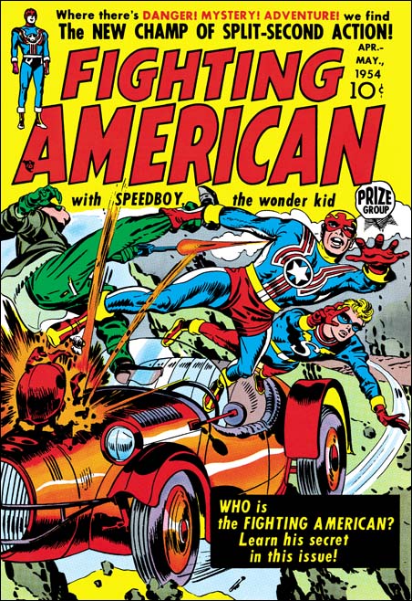
As can be seen in the above chart romance comics had entered into a decline during this period. Did Joe Simon and Jack Kirby notice this? Had they been observant they might have for as will be shown they benefited from the failure of other titles. But then again there were always fluctuations in the number of titles and publishers so perhaps Joe and Jack were not aware that things had become very different. Or perhaps they were too caught up in their own business to notice the bigger picture. August 1954 (cover date) marked the release of Bullseye the first title for Mainline, Simon and Kirby’s own publishing company. In Love, the romance title for Mainline, would be released in September. Starting their own publishing company was a big step for Simon and Kirby but unfortunately their timing was particularly bad.

In chapter 27 I noted the appearance of some new artists in the Simon and Kirby productions (unfortunately as of yet unidentified). The art covered in the last chapter was created by 8 artists which in itself was an increase over the earlier period. I have identified 12 artists for the period covered by this chapter and that does not include unidentified artists. There are more pages of unattributed art than those by any identified artist. Frankly I have not sorted them all out but I believe that there are at least 5 or 6 artists that I cannot identify. A couple of these additions to the studio had appeared previously in Simon and Kirby productions and almost all would only provide a few pieces before disappearing from the studio. Oddly one artist, Bob McCarty, who played an important part in the two previous chapters, is completely missing in this one. However McCarty will be returning in future chapters.

The artist line-up based on their productivity was Bill Draut (42 pages), John Prentice (41 pages), Jack Kirby (25 pages), Mort Meskin (20 pages), Art Gates (19 pages) with Leonard Starr and Jo Albistur tied (12 pages). The rest of the artists provide a single story or a small number of single page features. There are 65 pages by unidentified artists but as I wrote above these were distributed among 5 or more artists.

With one exception the covers for the Prize romance titles were done by Draut and Prentice. As seen previously, some of the covers were made from stats of a splash panel (or visa versa). The one exception is the cover of Young Brides #19 (November 1954) which I have tentatively attributed to Joe Simon. This assignment is not based on art style but rather on evidence from Joe Simon’s art collection. I hope that someday I will be able to write about this cover.

In Love #1
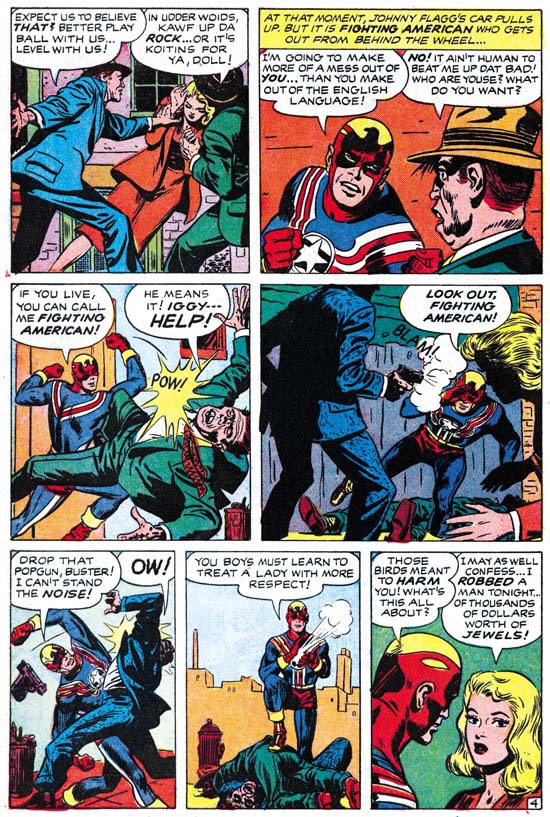
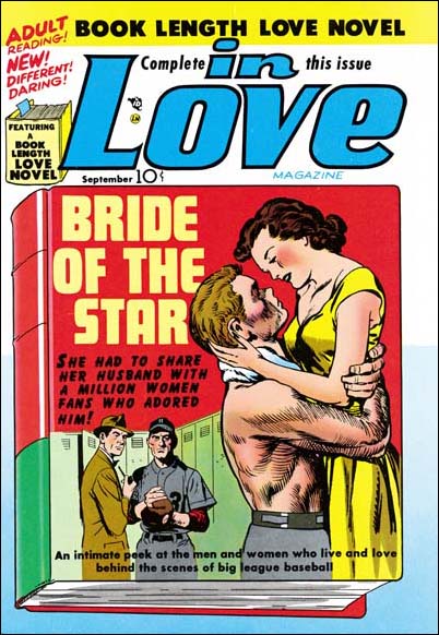
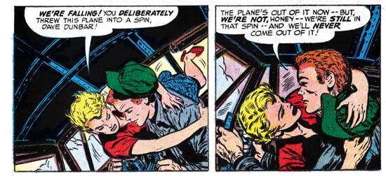
In Love #1 (September 1954) “Bride of the Star” Chapter 1 “The First Pang of Love”, art by Jack Kirby

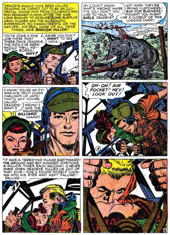
As I promised last chapter, Jack Kirby returns to romance comics after a short absence. However he appears only in Mainline’s In Love and not in any of the Prize romance titles. Kirby’s absence from Prize romances will continue for some time. In Love was an interesting title whose “hook” was the long story contained in each issue. Kirby did all 20 pages of the art for the “Bride of the Star” from In Love #1. I will not write much about this story here because I covered it in a previous post on In Love #1.

Besides the length of the story, one of the things that distinguish In Love from the Prize romance titles is that Jack returns to full page splashes for all the three chapters. Frankly I already illustrated the best splash in my previous post but I felt I must include one of the other ones here. To be honest it is not one of Kirby’s best pieces but I feel that the splash for the other chapter to be even more inferior. But all of the story art is actually quite good.

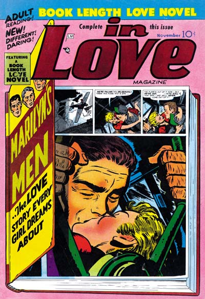
Kirby on contributed a small part to the featured story “Marilyn’s Men” from In Love #2 (November 1954) with most of the work being done by Bill Draut. Since the post whose link I provided covers this story I will forego further comments here.

The cover for In Love #1 was one of the rare collaborations between Jack Kirby and an artist other the Joe Simon, in this case John Prentice (Jerry Robinson at the Jack Kirby Tribute Panel). Not only was the cover drawn by different artists but inked by different hands as well. Prentice’s back was clearly inked by himself and I suspect, though I am by no means certain, that Jack inked his own pencils as well.

Young Romance #74
Young Romance #74 (November 1954) “The Kissoff”, art by Bill Draut

Bill Draut was the most prolific artist during this period but not by much. His recent decreased presence in S&K productions is a bit hard to understand. I once surmised that it might be due because of the work he was doing in preparation for the launch of Mainline. But on reflection there just does not seem enough work by Draut in those early issues of the Mainline comics to impact his normal work load. So I now suppose that his recent decreased contribution was due to some personal reason. Draut is one of the more consistent artists to work for Simon and Kirby but his style did not change much over the years. This makes it difficult to have new things to say about him. The same link I provided above for my post on In Love #2 goes into more detail about Draut’s work on “Marilyn’s Men”. I also did a post (Swiping Off of Kirby) about the use Bill made of art from an earlier story by Kirby.

Young Romance #73
Young Romance #73 (September 1954) “Girl from the Old Country”, art by John Prentice

John Prentice was just behind Draut in productivity. This is one of the examples where a stat of the splash for this story was used to create the cover. Note that while story splashes were no longer being used in the Prize romance titles, Prentice is still providing a smaller than typical splash panel.

Young Love #60
Young Love #60 (August 1954) “Outcast”, art by Mort Meskin

There was an unexpected surge in productivity by Meskin in the last chapter and now there is a just as sudden drop in his output. I must admit that I am a little perplexed about what is going on with Mort. He was working for other publishers and that suggests that he was no longer working in the actual Simon and Kirby studio. But how does one explain the ups and downs since then? I have heard of discussion somewhere on the web where it has been suggested that when Meskin left the S&K studio to work in his own studio that Mort was once again plagued with difficulties in starting work on a blank page. I have no way of saying whether this is true but perhaps it would explain his varied, but often unusually low, output in Simon and Kirby productions. Even if Meskin’s productivity was poor during this period he still did some very nice work. “Outcast” is a good example of a real nice piece by Meskin (I believe he inked it as well). I previously posted on a Mort’s “After the Honey-Moon” from In Love #1 which while very short is one of his masterpieces.

Young Brides #18
Young Brides #18 (September 1954) “My Cheating Heart”, art by Mort Meskin

“My Cheating Heart” is another great piece by Mort Meskin. I particularly like the inking in this piece. The solid blacks are used very effectively. I am pretty sure this is not Meskin’s own inking or that of George Roussos either but I cannot suggest who the inker was.

Young Romance #74
Young Romance #74 (November 1954) “A Holiday for Love”, art by Art Gates

Art Gates continue to supply numerous single page features but he is also did a few 3 page stories. At 6 pages, “A Holiday for Love” is the longest work Gates has yet done for Simon and Kirby. I cannot say that Art is one of my favorite Simon and Kirby artists but I admire the way he can do pieces like this a more cartoon-like gag features as well.

Young Love #61
Young Love #61 (September 1954) “Miss Moneybags”, art by Leonard Starr

Leonard Starr was not a new artist for Simon and Kirby productions but a returning one. He played an important part in the Prize romance titles for a little under two years ending in February 1951. His style has not changed that much during his absence and even without a signature “Miss Moneybags” (Young Love #61, September 1954) and “Cinderella’s Sisters” (Young Love #62, November 1954) were clearly done by Starr. However Leonard style had evolved somewhat so it is just as clear that this is not left over material. Although Starr was no longer using page formats that provided a series of tall and narrow panels he still had a predilection for such panels and was using alternative ways to introduce them. While it is possible that the reviews I perform for future chapters of this serial post may uncover one or two other stories by Starr, I am pretty confident that there will not be more than that. Leonard Starr would be like a number of artists from this chapter in that he made a brief appearance and then disappeared from Simon and Kirby productions. In Starr’s case he would be starting his own syndication strip, “Mary Perkins on Stage”, in a year or so.

Young Love #61
Young Love #61 (September 1954) “Mother Never Told Me”, art by George Roussos?

I am by no means certain, but “Mother Never Told Me” looks like it might have been done by George Roussos. The resemblance is mostly in the men with the woman reminding a little bit like the work of Marvin Stein. But overall I believe the Roussos seems the best fit. George last appeared in a Simon and Kirby production in Black Magic #24 (May 1953). If this attribution is correct, Roussos like Starr will not appear in a future Simon and Kirby productions.

Young Romance #73
Young Romance #73 (September 1954) “Afraid of Marriage”, art by Jo Albistur

Although unsigned, “Afraid of Marriage” and “Just For Kicks” (Young Love #61, September 1954) are both clearly the work of Joaquin Albistur (he also appeared in Police Trap #1 in this same month). I had previously used Joe as the first name for this artist but it is now clear that he was an artist from Argentine (Joaquin Albistur the Same As Joe Albistur?). Joe Simon does not remember Albistur by name, but he does recollect someone from South America doing work for Simon and Kirby. Most people assume Simon was thinking of Bruno Premiani, but I believe it is even more likely that it was Albistur that Joe was recalling.

Unlike most of the new artists in this chapter, Albistur will play an important part in Simon and Kirby productions in the coming year. Jo is not well known among fans and I am not sure how much comic book work he did outside of Simon and Kirby productions. I have seen some original art from “The World Around Us” from 1961 that has been attributed to Albistur. I am not convinced but if it was his work Albistur had adopted a particularly unpleasing dry style. Despite Jo’s short time working for Simon and Kirby he is one of my favorite studio artists. His woman have an earthy beauty that I like, he had an eye for gestures, used interesting compositions and was skillful at graphically telling a story.

Young Love #62
Young Love #62 (November 1954) “Too Darned Innocent”, art by W. G. Hargis

There is one signed piece by W. G. Hargis, “Too Darned Innocent”. However given the number of unidentified artists appearing in Simon and Kirby productions there is the distinct possibility that other unsigned worked may have been done by Hargis during this period as well. In fact I have heard of suggestions that Hargis may have been responsible for a story in Police Trap.

In Love #2
In Love #2 (November 1954) “Mother by Proxy”, art by Tom Scheuer

Tom Scheuer is another artist that only did one signed work for Simon and Kirby. Scheuer (who much later changed his name to Sawyer) is perhaps better known for his advertisement comic work (see For Boys Only from Those Fabulous Fifties and Comic Strip Ad Artist Tom Scheuer from Today’s Inspirations; both great blogs).

Joe Simon’s collection includes the original art for a page from this story. On the back is the name Art Sehrby, a telephone number and a street address. This raises the possibility that Simon and Kirby obtained Scheuer’s piece, and perhaps those of some other artists, from an agent.

Young Brides #19
Young Brides #19 (November 1954) “Love for Sale”, pencils by Ross Andru, inks by Martin Thall

There is a story behind “Love for Sale” that has been discussed on the Kirby list but I do not believe I have written about in my blog. Mike Esposito and Ross Andru launched their own publishing company Mikeross with their earliest comic having a cover date of December 1953 (3-D Love). This then was well in advance of Simon and Kirby’s Mainline Comics whose first issue (Bullseye) came out in August.

Mikeross only published four titles (3-D Love, 3-D Romance, Get Lost and Heart and Soul. The 3-D romance titles were single issues and I suspect that their timing was a little off. The initial 3D comics sold very well but were apparently a novelty item. My understanding is that Simon and Kirby’s Captain 3-D which came out in December 1953 was already a bit late and sales were not that great. Since the Mikeross 3D romance titles have cover dates of December and January, I suspect they suffered from lower sales as well. Get Lost went to issue #3 while Heart and Soul only lasted to issue #2. Usually when a title is cancelled after just 2 or 3 issues it is a sign that something other than poor sales was involved. I suspect that the returns from their first comic, 3-D Love were so poor that the distributor pulled the plug on the whole deal.

I do not have the biography of Mike Esposito that came out a few years ago but I did have the chance to flip through it to see what he had to say about what happened next. If I remember correctly Esposito claimed that the distributor forced them to hand over their unpublished artwork to Simon and Kirby. Frankly this is a pretty suspicious claim because a distributor does not have any legal claim to the artwork. Further in my discussions with Joe Simon he has vigorously denied that it happened. Martin Thall gave an interview published in Alter Ego #52 where he stated that in order to recover some money they sold some art to Simon and Kirby and that Kirby was the one who arranged and received it. This makes a lot more sense and is the version that I accept.

The last issue of Heart and Soul was cover dated June so the next one would be expected for August. “Love for Sale” was used in Young Brides #19 (November). The timing is so perfect that there is little doubt that this story was among the art sold to Simon and Kirby. What makes that even more convincing is that the lettering was not done by Ben Oda like almost all of Simon and Kirby’s productions.

This is not Ross Andru’s first appearance in Simon and Kirby productions as a story by him appeared in May 1952 (Chapter 16) and two in May and June of 1953 (Chapter 19). Another Andru story will be seen in the next chapter which also was probably bought from the defunct Mikeross publishing company.

Young Brides #19
Young Brides #19 (November 1954) “Telephone Romeo”, art by unidentified artist

Since one story from Mikeross has been identified the question becomes can any others be found? Such art need not have been used right away but it is interesting that Young Brides #19 contains another story, “Telephone Romeo” that was not lettered by Ben Oda. However the letterer is not the same one that did “Love for Sale”. I have only examined the 3-D Love, 3-D Romance and Heart and Soul #1 but none of them used this artist. Actually I find Andru’s hand through most of them and I suspect Ross and Mike did all the art themselves. So it cannot be said with any certainty that “Telephone Romeo” was another piece sold by Mikeross but it can be confidently said that is was bought from some distressed publisher or artist stuck with unused art.

Young Love #62
Young Love #62 (November 1954) “My Scheming Sister”, art by unidentified artist

There is yet another piece, “My Scheming Sister”, with lettering clearly not done by Ben Oda. Look at the caption to the first story panel, Simon and Kirby productions did not typically use lower case letters in their captions. Once again this was a piece bought by Simon and Kirby but not necessarily from Mikeross. Whoever the artist was he was one of the better of the unknowns from this period. A smooth confident line and great characterization.

Young Romance #72
Young Romance #72 (August 1954) “Reform School Babe”, art by unidentified artist

Not all the unidentified artists were new; the one that did “Reform School Babe” had been an important contributor to Simon and Kirby productions for some months. I believe one of my commenters suggested Vince Colletta, at least for the inking, but I am not sufficiently knowledgeable about that artist/inker to hazard a guess.

Young Romance #74
Young Romance #74 (November 1954) “Idol Worship”, art by unidentified artist

I will not be supplying examples of all the unidentified artists from these romance titles as I have not sorted them all out and anyway some are not that great. But I did want to provide an image from “Idol Worship” by one of the better artists working at this time for Simon and Kirby.

In summary, Simon and Kirby were using a number of new artists. Some like Jo Albistur would play important contribution to S&K productions; others like Tom Scheuer would make a brief appearance and not be seen again. Some may have been hired from the street but there is also the suggestion that some work may have come from an art agent. Further there is good evidence that some of the work came from the failed Mikeross publishing and perhaps other publishers as well. I have not yet done a review of Ben Oda’s lettering like I have those by Joe Simon, Jack Kirby and Howard Ferguson. I suspect a careful comparison of Ben Oda’s lettering with that used in the stories from this period will reveal others that came from romance titles that were failed. Simon and Kirby’s use of such material is not surprising because they had previously obtained art from Harvey after the love glut (Chapter 13, Romance Bottoms Out).

Chapter 1, A New Genre (YR #1 – #4)
Chapter 2, Early Artists (YR #1 – #4)
Chapter 3, The Field No Longer Their’s Alone (YR #5 – #8)
Chapter 4, An Explosion of Romance (YR #9 – #12, YL #1 – #4)
Chapter 5, New Talent (YR #9 – 12, YL #1 – #4)
Chapter 6, Love on the Range (RWR #1 – #7, WL #1 – #6)
Chapter 7, More Love on the Range (RWR #1 – #7, WL #1 – #6)
Chapter 8, Kirby on the Range? (RWR #1 – #7, WL #1 – #6)
Chapter 9, More Romance (YR #13 – #16, YL #5 – #6)
Chapter 10, The Peak of the Love Glut (YR #17 – #20, YL #7 – #8)
Chapter 11, After the Glut (YR #21 – #23, YL #9 – #10)
Chapter 12, A Smaller Studio (YR #24 – #26, YL #12 – #14)
Chapter 13, Romance Bottoms Out (YR #27 – #29, YL #15 – #17)
Chapter 14, The Third Suspect (YR #30 – #32, YL #18 – #20)
Chapter 15, The Action of Romance (YR #33 – #35, YL #21 – #23)
Chapter 16, Someone Old and Someone New (YR #36 – #38, YL #24 – #26)
Chapter 17, The Assistant (YR #39 – #41, YL #27 – #29)
Chapter 18, Meskin Takes Over (YR #42 – #44, YL #30 – #32)
Chapter 19, More Artists (YR #45 – #47, YL #33 – #35)
Chapter 20, Romance Still Matters (YR #48 – #50, YL #36 – #38, YB #1)
Chapter 21, Roussos Messes Up (YR #51 – #53, YL #39 – #41, YB #2 – 3)
Chapter 22, He’s the Man (YR #54 – #56, YL #42 – #44, YB #4)
Chapter 23, New Ways of Doing Things (YR #57 – #59, YL #45 – #47, YB #5 – #6)
Chapter 24, A New Artist (YR #60 – #62, YL #48 – #50, YB #7 – #8)
Chapter 25, More New Faces (YR #63 – #65, YLe #51 – #53, YB #9 – #11)
Chapter 26, Goodbye Jack (YR #66 – #68, YL #54 – #56, YB #12 – #14)
Chapter 27, The Return of Mort (YR #69 – #71, YL #57 – #59, YB #15 – #17)
Chapter 28, A Glut of Artists (YR #72 – #74, YL #60 – #62, YB #18 & #19, IL #1 & #2)
Chapter 29, Trouble Begins (YR #75 – #77, YL #63 – #65, YB #20 – #22, IL #3 – #5)
Chapter 30, Transition (YR #78 – #80, YL #66 – #68, YBs #23 – #25, IL #6, ILY #7)
Chapter 30, Appendix (YB #23)
Chapter 31, Kirby, Kirby and More Kirby (YR #81 – #82, YL #69 – #70, YB #26 – #27)
Chapter 32, The Kirby Beat Goes On (YR #83 – #84, YL #71 – #72, YB #28 – #29)
Chapter 33, End of an Era (YR #85 – #87, YL #73, YB #30, AFL #1)
Chapter 34, A New Prize Title (YR #88 – #91, AFL #2 – #5, PL #1 – #2)
Chapter 35, Settling In ( YR #92 – #94, AFL #6 – #8, PL #3 – #5)
Appendix, J.O. Is Joe Orlando
Chapter 36, More Kirby (YR #95 – #97, AFL #9 – #11, PL #6 – #8)
Chapter 37, Some Surprises (YR #98 – #100, AFL #12 – #14, PL #9 – #11)
Chapter 38, All Things Must End (YR #101 – #103, AFL #15 – #17, PL #12 – #14)

Fighting American, Chapter 4, The End Game

Fighting American #7
Fighting American #7 (April 1955) “Sneak Of Araby”, art by Jack Kirby

The lead story for issue #7 has Fighting American fighting the commies in Arabia over oil (of course). A clever splash but one with a frequently used theme of villains trying to avoid detection but clueless as to their impending encounter with Fighting American and Speedboy.

Fighting American #7
Fighting American #7 (April 1955) “Sneak Of Araby” page 4, art by unidentified artist

The Jack Kirby Checklists assigns 4 pages of this 8 page story to Kirby but other then the splash page none of it looks like his work to me and I do not think they are his layouts either. Panel 5 of page 4 looks to me like Kirby’s pencils and inking but that panel is the only convincing work by Kirby in the story. I suspect this particular case was Kirby acting as art editor and fixing up a poorly done panel. So far I have not been able to identify the artist.

Fighting American #7
Fighting American #7 (April 1955) “Three Coins In The Pushcart”, art by John Prentice

For “Three Coins In The Pushcart” the Jack Kirby Checklist only credits the splash to Jack. Frankly I do not see Kirby in any part of the story including the splash and again not even the layouts.

Fighting American #7
Fighting American #7 (April 1955) “Three Coins In The Pushcart” page 4, art by John Prentice

There a clues on the splash page that John Prentice is the correct artist to attribute this story to but it can best be seen with page 4. As far as I know Prentice did no other superhero work so there is nothing to compare this story to. However John’s women are usually quite distinctive and the lady in the second panel was clearly done by him. Comparison of this work to four pages of “Super Khakalovitch” from Issue #6 convinces me that John Prentice was also the artist for part of that work as well. This may not have been his finest work but he handles both the action and humor surprisingly well considering both are elements not normally associated with Prentice.

Fighting American #7
Fighting American #7 (April 1955) “Space-Face”, pencils by Jack Kirby and inks by Mort Meskin

What a delightful set of characters in the splash panel for “Space-Face” each with their own distinctive features and emotions. The inking for this splash is has a characteristic simplicity particularly in the eyebrows that identifies Mort Meskin as the inker. One striking feature of the splash is the way the bottom edge cuts off the lower part of two faces. While I am not going to say Kirby never does this, it certainly is not typical for Jack but it was a frequently used device by Meskin particularly in the Vigilante work Mort did for DC during the war (link). Because of this I briefly entertained the notion that the splash was actually drawn by Mort but the faces are so typical of Kirby that I just as quickly rejected the idea. In particular note the one guy to our left of Speedboy; take away the cigarette and he looks just like Scrapper from the Newsboy Legion.

Fighting American #7
Fighting American #7 (April 1955) “Space-Face” page 4, pencils by Jack Kirby and inks by Mort Meskin

Because of the splash panel I paid close attention to the story pages to check if they were done by Kirby or Meskin. Well the layouts generally look like Jack’s and page 4 is especially convincing. The way the figures run in the top panels is typical for Kirby. Note how the sole of the foot of the running boy in panel 3 turns to the viewer. This device was frequently used by Kirby (also by Joe Simon) but I have never seen Mort do it. So while I believe Mort Meskin did the inks, I am convinced Jack Kirby did the actual pencils. Fighting American #7 was the last issue published by Prize Comics. Occasionally you will come across a claim that Fighting American was cancelled because of the Comic Code. However the evidence does not support that view. It is true that the earlier issues had art that would have been unacceptable under the Comic Code, but issue #7 was published with the Comic Code stamp without any apparent problems. Further the art work had been completed for issue #8 and would be published years later again without any difficulties with the Comic Code. Because Fighting American is today viewed by many as one of Simon and Kirby’s greatest creations it would have been nice to blame its failure on the Comic Code but the correct explanation is simply that it did not sell well enough. That it was a tough time for comics in general and superheroes in particular probably did not help.

Fighting American #1 (Harvey)
Fighting American #1 (October 1966) “Round Robin”, art by Jack Kirby

In 1966 Harvey published a Fighting American comic that was a combination of reprint material and previously unpublished stories. The cover and the “new” art were all done by Jack Kirby and were inked in a manner typical of the original Simon and Kirby productions. Fighting American #7 had 20 pages of Fighting American stories and that is exactly the same number of pages for the new stories found in the Harvey’s Fighting American #1. There is little doubt that this material was originally meant for issue #8 of Prize’s Fighting American but went unused when that comic was cancelled. The biggest difference between FA #7 and what would have been FA #8 was that Kirby contributed all the art for the cancelled Fighting American stories while he did not do all the art for FA #7.

The lead story for the Harvey FA comic was “Round Robin”. The shortness of this story (only 5 pages) is not obvious because it is broken up by the inclusion of a reprint of the Fighting American origin story. The splash seems to have been modified specifically for the Harvey comic. I believe the “the original one and only” text in the title as well as the small Fighting American and flying figures were late additions. Also the Simon and Kirby signature is in Joe Simon’s handwriting and does not match the original style and was added later.
There was a lot of variation in the costumes in the original Fighting American series. The most glaring was perhaps the way Speedboy would usually have blue trunks and red leggings but sometimes red trunks and blue leggings. But for the Harvey comic invariably both the trunks and leggings of Speedboy are red, a combination not seen previously.

Fighting American #1 (Harvey)
Fighting American #1 (October 1966) “Roman Scoundrels”, art by Jack Kirby

The splash for “Roman Scoundrels” has the car touche that reads “produced by Simon and Kirby”. Comics put together by the Simon and Kirby studio almost always had this car touche on the lead story. Thus this is another indication that the new art in the Harvey comic was original intended as issue #8 of the Prize title and that “Roman Scoundrels” was meant to have been the lead story for that cancelled issue.

In “Roman Scoundrels” the heroes take part in the filming of a Hollywood movie where the villain replaces harmless stunts with ones meant for lethal consequences. I am sure that Simon and Kirby had used this plot before, but at this moment I do not remember where.

Fighting American #1 (Harvey)
Fighting American #1 (October 1966) “Yafata’s Moustache”, art by Jack Kirby

I may feel that Simon and Kirby jumped the shark in “Super Khakalovitch” from FA #6, however all the stories for the defunct issue #8 are actually quite good. My favor ate is “Yafata’s Moustache” a story that perfectly balances the action and humor the two elements that made Fighting American such a unique superhero.

Superheroes were once again a big thing in 1966 and at least a second issue of Fighting American was initially planned by Harvey. It was to be a combination of reprint and new material like the previous issue. However there was no more unpublished Fighting American art left over from the Prize series so Joe Simon created a new cover and had George Tuska create the art for two new stories (“The Beef Box” and “The Mad Inker”). Unfortunately Harvey’s Fighting American #2 was cancelled. “The Beef Box” would eventually be included in the Fighting American reprint book published by Marvel in 1986. “The Mad Inker” has never been published probably because the splash page was already missing from Joe Simon’s collection by 1986.

Fighting American, Chapter 3, Jumping the Shark

Joe Simon and Jack Kirby had launched their own publishing company, Mainline, starting with Bullseye #1 (cover date August 1954). In an uncharacteristic move, Simon and Kirby did not advertise their involvement in the Mainline titles (Bullseye, Foxhole, In Love and Police Trap). This unusual reticent was undoubtedly due to a desire to avoid conflicts, at least initially, with Prize Comics for whom Joe and Jack continued to produce comics including Fighting American. The extra work Simon and Kirby had taken on was not without consequences as there was a drop in the quantity and quality of the work drawn by Kirby. The art for the earlier issues of Fighting American was top notch but in my opinion most of the art for the issues covered in this chapter were relatively inferior (but an inferior Jack Kirby was still better then the best of most other comic book artists).


Fighting American #5 (December 1954) “Jiseppi, The Jungle Boy” page 3, art by Jack Kirby

The decline in art quality that I mentioned above does not seem to have occurred in “Jiseppi, The Jungle Boy”. This is a delightfully nonsensical tale about a jungle boy in India that speaks English with a distinct Italian accent. Actually in the end it turns out there is a perfectly logical explanation for this incongruity (okay maybe only as logical as can be expected in a comic book). As seen in the previous chapter, Simon and Kirby’s humor includes making fun of the comic’s heroes. Above we see Fighting American trying to track Jiseppi through the jungle completely oblivious to all the dangers that his quarry saves him from. I love the way that the jungle boy’s tiger speaks in stick figures.


Fighting American #5 (December 1954) “The Year Bender” page 4, art by Jack Kirby

Simon and Kirby would throw in some science fiction-fantasy into their humor as well as seen in “The Year Bender”. They travel in time is said to be about 3000 years in the past. It looks like Rome but that could not be since at 1000 BC Rome was just one of many small Italian cities and the arena games presented here would not be held for many years from then. But historical accuracy was never an important criteria for Simon and Kirby particularly if it got in the way of a good story. Check out the fun Jack had in drawing the ancient helmets; I do not believe any two head gear were drawn the same throughout the story.

As delightful a tale as this is, the decline in art quality that I mentioned is pretty obvious. It would be easy to blame the inker but Jack had some pretty poor inkers in the past but Simon and Kirby would usually rescue it by doing the final touchups.

The final panel reads:

AND THAT NEXT TRIP INTO THE PAST MAY BE COMING UP SOONER THAN SPEEDBOY SUSPECTS! YOU’LL SEE WHAT WE MEAN WHEN YOU GET THE NEXT BIG ISSUE OF FIGHTING AMERICAN!

Despite what they promised issue #6 had no time travel tale.


Fighting American #5 (December 1954) “Invisible Irving”, art by Jack Kirby

The villain for “Invisible Irving” makes use of invisible paint although oddly enough often comes off just part of his body leaving him looking like a flying head.

The tale ends with a caption:

FIGHTING AMERICAN AND SPEEDBOY HAVE A SPECIAL TREAT FOR YOU IN THE NEXT ISSUE. COME ALONG WITH THEM AS THEY UNCOVER A LOST CIVILIZATION IN “CITY BENEATH THE SEA”

Perhaps this refers to the same story mentioned at the end of “The Year Bender”. Even so “City Beneath the Sea” is a story that would never appear and as far as is known was never drawn.

Fighting American #6
Fighting American #6 (February 1955) “Deadly Doolittle” page 4, art by Joe Simon

The art for “Deadly Doolittle” is generally attributed to Jack Kirby, and with good reason since many Kirby mannerisms can be found in the story. However as I have previously pointed out (Art of Joe Simon, Chapter 11) this story is actually a rewrite of a Manhunter story (Adventure Comics #75, June 1942, “Beware Of Mr. Meek”). In “The Comic Book Makers” Joe Simon describes how he and Jack got into hot water with Prize Comics for using re-scripted old romance art. While I have never been able to trace down the specific romance work in question (not that surprising considering the thousands of romance pages that Simon and Kirby produced) this recycling of an old Manhunter story occurred about the same time and was a similar cost saving measure. Attributing the actual pencils for “Deadly Doolittle” to Joe Simon is not based on the use of swipes. Some use the false swiping criteria (non-swipe = Kirby, swipe = Simon) but it has been amply shown that Jack would swipe as well. Rather I credit Simon for this particular story because of the art, especially the woman in the last panel of page 4. Similar women can even be found in the reworked Black Magic that Joe did for DC many years later (Black Magic at DC).


Fighting American #6 (February 1955) “The Making of Fighting American”, art by Jack Kirby

Four pages of issue #6 are used for the retelling of the origin of Fighting American and Speedboy. This was all art selected from the first issue except for the splash panel. Not that the splash was new, it was originally meant as the cover for Fighting American #4.


Fighting American #6 (February 1955) “Super Khakalovitch”, art by Jack Kirby

For me “Super Khakalovitch” is where Simon and Kirby had finally jumped the shark in Fighting American. It may be just me, but I find the humor forced and the story dull. Further the story is not helped by the fact that not all the art was drawn by Jack Kirby. I judge that Jack did pages 1, 2, 4, 5, 6 and 7.


Fighting American #6 (February 1955) “Super Khakalovitch” page 8, art by unidentified artist

The other pages (3, 8, 9 and 10) were done by an artist that I have not been able to identify; he does not look like any of the artists working for Simon and Kirby at the time.

Simon and Kirby may have jumped the shark but they produced enough art for two more issues although one would not be published for years later.

Fighting American, Chapter 2, Fighting With Humor

Fighting American, Chapter 2, Fighting With Humor

For two of the patriotic heroes created by Simon and Kirby the alter ego was a soldier (Captain America and the Shield) but for Fighting American it was as a television commentator. These two career choices are not as dissimilar as might be assumed because both provide the alter ego with a patriotic background. The patriotism of soldiers is self evident while as a commentator Johnny Flag can show his patriotism by denouncing Communist supporters. This probably seemed a good choice at first, but not as events progressed in America politics. As mentioned in the last chapter of this serial post, Joseph McCarthy had obtained great popularity in his crusade against Communist and their sympathizers that he declared were imbedded in the government and many American institutions. McCarthy was not without critics and his popularity began to plummet following a television show with Edward Murrow, called See It Now, which aired on March 9, 1954. Afterwards Johnny Flag denouncing Communists seem much too close to McCarthy’s tactics. Further the Red Menace no longer looked as threatening as the Nazi’s during WWII. Apparently Atlas either ignored the shift in American politics or did not know how to respond to it as the Captain America stories they published went unchanged. However Simon and Kirby both saw and knew that something had to be modified if Fighting America would have any chance of becoming popular.


Fighting American #3 (August 1954) “The Man Who Sold out Liberty”, art by Jack Kirby

Joe Simon admits that they changed the type of stories for Fighting American because of McCarthy’s political downfall (as told in “The Comic Book Makers”). The timeline supports his statement as well. The creation of a comic book would start 5 months earlier then the final cover date (1 month to create the art, 1 month to print it, 1 month to distribute and cover dates were 2 months after the comic was actually released). Murrow’s television show on McCarthy was early March so the first Fighting American issue to reflect the impact of the show should be cover dated August which was the cover date for issue #3. In fact the first story for FA #3, “The Man Who Sold Out Liberty”, would have been quite at home in either of the first two issues; criminals and spies, lots of action and no particular emphasis on humor. The only thing that sets this story apart from earlier Fighting American issues is the villain “Square Hair Malloy” who seems like someone out of Dick Tracy.


Fighting American #3 (August 1954) “Poison Ivan”, art by Jack Kirby

Enemy spies appear in another story in issue #3 but how serious could any reader take Hotsky Trotski and Poison Ivan? It wasn’t just the names that were funny, Simon and Kirby poked fun at them as well. Poison Ivan is shown corrupting a small group of boys with outlandish propaganda:

All the great sports were invented by communists heroes… basketball, football, gin rummy – hide and seek – and bingo.

In one scene Poison Ivan is shown poking his little finger into his ear. While humor was also an element found in even their most serious work, Simon and Kirby has taken Fighting American to a whole new level. Comedy would now be an essential part of almost all the stories.


Fighting American #3 (August 1954) “Poison Ivan” page 7, art by Jack Kirby

Poison Ivan may have been portrayed as a fool throughout the story but when it came time for a confrontation with the Fighting American he suddenly became a worthy opponent. Jack Kirby drops into a 3 X 3 panel arrangement and has each panel focus on only the fighters. The result is a fast moving, action filled, fight sequence of the kind that Kirby did better then anyone else. Fighting American may have become a predominately humor comic but Jack never seem willing to completely abandon action in any genre.


Fighting American #3 (August 1954) “Stranger from Paradise”, art by Jack Kirby

One of the oddest stories in issue #3, or perhaps in the entire Fighting American series, is “Stranger from Paradise”. It is a modest 2 pages long with a almost strict 3 X 2 panel grid and a splash panel that is little different from the rest of the story panels. The Fighting American only appears in two panels and is easy to overlook in one of them. Speedboy plays a bigger roll but the true hero of the story is young boy from Russia. It is unusually wordy story for a Simon and Kirby production and perhaps the only one they did where the art takes a backseat to the text. That is not to say the art isn’t great just that so much of the humor is found in the script.


Fighting American #4 (October 1954) “Tokyo Runaround”, art by Jack Kirby

“Tokyo Runaround” is a great story full of action and humor. But check out the splash, what a masterpiece! The design works well with the story’s theme and of course no one could make such effective use of the oddly placed running figures as Kirby.


Fighting American #4 (October 1954) “Operation Wolf” page 4 panel 3, art by Jack Kirby

The Communists were not the only ones to be made fun of by Simon and Kirby; even Fighting American could be on the receiving end. The annoyed gun bearer was Rhode Island Red.


Fighting American #4 (October 1954) “Homecoming: Year 3000” page 4, art by Jack Kirby

While the Fighting American title now combined humor and action, “Homecoming: Year 3000” from issue #4 was pure science fiction. Even more oddly the Fighting American never even makes an appearance and his alter ego, Johnny Flag, only shows up at the very beginning and ending of the story (the story is presented as Johnny Flag’s dream). The simple explanation for this anomaly is provided by the name of the story’s hero, Starman Zero. Starman Zero was the protagonist for syndication strip that Simon and Kirby created called Tiger 21. Tiger 21 was never picked up, actually all the original art for the strip never got past the lettering stage with all the strip art remaining as uninked pencils. Thus “Homecoming: Year 3000” was Simon and Kirby recycling unused material. Starman Zero does share a special connection with Fighting American; they both have an origin where a machine is used to transfer the mind of one individual into another body.

Fighting American, Chapter 1, Captain America Returns

Fighting American, Chapter 3, Jumping the Shark

Fighting American, Chapter 1, Captain America Returns

When comic book enthusiasts discuss the golden age of comics they generally are referring to superhero comics from before and during World War II. While it is not clear, at least to me, whether there was a real connection between the war and the popularity of superheroes, there is little doubt of the relationship of the patriotic heroes and the war. Simon and Kirby did not create the first patriotic hero (that honors went to Irving Novick’s Shield) but their Captain America was such a mega-hit that it spawned a multitude of imitations. Joe and Jack only did ten issues of Captain America but what they did was so dynamic and imaginative that superhero comics were never the same. Simon and Kirby’s issues of Captain America were all done before America had entered the war but with Adolf Hitler on the covers of the first two issues there was little doubt as to who the enemy truly was. While most other superheroes had been battling criminals Captain America fought against spies and saboteurs.

After the war ended superheroes declined in popularity as other genres (in particular crime, horror and romance) became the big sellers. America was officially at peace but it was not long before tensions developed with our previous ally Russia. Tensions that became so serious that it was to be called the Cold War. The chill became particularly deep when America lost China to the Communists. Never mind that China was never America’s to lose or that the side America backed was corrupt while the Communists were popular among the Chinese population. Those explanations were considered inadequate by many Americans who felt someone was to blame. It was an all too small step from placing the blame on incompetence to declaring it was deliberate. Joe McCarthy would lead a crusade against all the communists that he said had infiltrated the U.S. government.

Captain America #76
Captain America #76 (May 1954)

It would not have been hard to draw the parallels between America prior to WWII and that in the midst of the Cold War. If superheroes were popular then maybe the time had come to reintroduce them. Perhaps this was the logic behind the Atlas re-launched of the Human Torch, Sub-Mariner and Captain America in Young Men #24 (December 1953).

Fighting American #1
Fighting American #1 (April 1954) pencils by Jack Kirby

Did Simon and Kirby make the same comparison between the Axis and the Communist treats? Or did they notice the return of Captain America to the comic book racks? The timing is just possible as it takes three to four months to produce a comic and so the earliest cover date following YM #24 appearance would be March or April 1954. April is exactly the date that appears on the cover of Fighting American #1. Even if Simon and Kirby were not aware of the Atlas superhero revival they were well aware that nobody did Captain America better then they did and they would use the Fighting American to prove it.


Fighting American #1 (April 1954) “Break the Spy Ring” page 9, pencils by Jack Kirby

The origin story of Captain America seems little more then something for Simon and Kirby to get quickly past before going on to the stories they really wanted to tell. The origin of the Fighting American is told in only a couple of more pages but it is a much more interesting read. It is not the method that provides the two heroes with their powers is all that different it is the circumstances surrounding them. Before Captain America gets his powers we are shown suffer the humiliation of being a 4F. But that pales before what physical humiliation that the pre-Fighting American endures. The action in the Simon and Kirby Captain America may have been unlike anything seen in other comics in those days but by the time Fighting American came out Jack Kirby had taken action to a new, much higher, level. While in the origin story Captain America got to use his new powers against a single spy, the Fighting American takes on a roomful of armed opponents. I love the way Fighting American’s punches his opponent through the wall and leaves him hanging there!


Fighting American #1 (April 1954) “Baby Buzz Bombs” page 3, pencils by Jack Kirby

Even the patriotic hero’s sidekick got upgraded. Bucky became Cap’s partner by doing nothing more then discovering his secret identity at the end of the origin story. Simon and Kirby would devote an entire story, “Baby Buzz Bombs”, for the introduction of Speedboy. Yes Speedboy finds out the Fighting American’s alter ego but he also manages to save FA’s life more then once.


Fighting American #2 (June 1954) “The League of the Handsome Devils”, pencils by Jack Kirby

Communist spies were the villains for all three stories in the first issue of Fighting American, but with the second issue criminals were also fought. Was the shift from spies to criminals on purpose or were Simon and Kirby just trying to keep variety in the stories?


Fighting American #2 (June 1954) “Find the King of the Crime Syndicate”, pencils by Jack Kirby

Okay I do not have anything more to say about Fighting American confrontations with the criminal element. But I just love these two stories and wanted to include images of the great splash pages. All of the original art for “The League of the Handsome Devils” was included in Mark Evanier’s “Kirby: King of Comics”. A newly restored “Find the King of the Crime Syndicate” will be appearing in Titan’s “The Best of Simon and Kirby” which hopefully will be out in May.


Fighting American #2 (June 1954) “City of Ghouls” page 7, pencils by Jack Kirby

Even in the story from FA #2 with Communist spies as villains, Simon and Kirby would throw in a horde of ghouls. It is hard to escape the conclusion that in the end the Communists were not seen as quite the foes for the Fighting American that the Axis powers had been for Captain America.

Note the drawing of the Fighting American rising above the fight and just about to hurl an opponent. It is just one among many great panels but it would have a lasting impact. It would be swiped by Mort Meskin for a cover for Tom Corbett Space Cadet #2 (July 1955) the only example of Meskin lifting from Kirby that I am aware of. Years later Jim Steranko would use the design for a splash page in Captain America #113 (May 1969).

Simon and Kirby followed their standard modus operandi when producing the initial issues for Fighting American. That is Jack Kirby provided all the artwork for the Fighting American stories. New anthology comics might get some help from other studio artists but with titles for a new feature, like Fighting American or Boys’ Ranch, Kirby would invariably do all the important art in the first issues.

I consider the art from this period to be the best that Simon and Kirby did. I am not talking about the pencils because Jack Kirby never stopped pushing his art in new directions. Kirby fans invariably favor one period of Jack’s art but just as invariably they do not agree what period that was. What makes this particular period so appealing to me really is the inking. The Studio Style inking was at its peak and, with its combination of subtlety and boldness. It was the best inking ever applied to Kirby pencils (although Jack would later do some real nice work using the Austere Style). Some of the inking for these first two issues of Fighting American looks like it was done by Kirby himself. Kirby had been inked by some great inkers during his career but there is always something special when he inked his own pencils. But do not use the Marvel Fighting American reprint to judge. Some of it was restored from chemically bleached pages but alas some of it was done by inking on tracing paper. Hopefully Titan will be publishing a newly restored version of Fighting American in the not too distant future.

The first two issues of Fighting American were just spectacular. Nobody could do this type of action hero better then Simon and Kirby. Not only that, but their Fighting American was far in advance of what they had done years before on Captain America. Comparing these two issues of Fighting American with the contemporary version of Captain America being published by Atlas… well you just cannot compare them the Atlas Captain America seems so weak in story and art. It would appear that Simon and Kirby had set the tone for some exciting Fighting American issues to come. But wait, there at the bottom of the last page (see image above) “In the next issue – you’ll get goose pimples, when you meet POISON IVAN”. Could anyone take a villain named Poison Ivan seriously?

Fighting American, Chapter 2, Fighting with Humor

Jerry Robinson at the Jack Kirby Tribute Panel

Detective Comics #65
Detective #65 (July 1942), art by Jack Kirby and Jerry Robinson

I mentioned in a previous post a review of the Jack Kirby Tribute Panel that Comic Book Resources has posted (written by Jim MacQuarrie).

At the very end of the article is found:

Jerry Robinson closed the panel by recalling his participation in one of the very few collaborations that Kirby did with anyone but Joe Simon. “The only time Jack collaborated with anyone but Simon on a cover was an issue of “Detective Comics” when the Boy Commandos joined the book. The cover showed Batman and the Boy Commandos shaking hands. I drew Batman and Jack drew the Commandos.”

In Love #1
In Love #1 (September 1954), art by Jack Kirby and John Prentice

While of course Jerry is right about his contributions to the cover of Detective #65, he is not correct about being the only artist, other then Joe Simon, to collaborate on a cover with Jack Kirby. John Prentice, one of the usual suspects of the Simon and Kirby studio, also had that honor. Jack did the foreground couple while John did the two background figures.

Jerry Robinson and Joe Simon
Jerry greeting Joe Simon at the Big Apple Con of 2006

Jerry Robinson and Joe Simon
Jerry and Joe at New York ComicCon 2008

The Wide Angle Scream, Almost an Afterthought


Win A Prize #1 (February 1955) pinup, art by Jack Kirby
Enlarged view

Pinups, both single and double paged, played an important part of Boys’ Ranch (October 1950 to August 1951) but they did not appear at all in Black Magic which also started in October 1950. Nor did they appear in either Strange World of Your Dreams (August 1952 to March 1953) or Fighting American (April 1954 to April 1955). Pinups did play a marginal roll in some other titles. A single page pinup, “Desk Sergeant”, appeared in Police Trap #2 (November 1954) and a double page spread was used in Bullseye (discussed below). There is also the pinup from Win A Prize #1. While printed on a single page, its horizontal format leaves little doubt that originally the Win A Prize splash was meant to be a double page centerfold. Joe Simon has said that initially this pinup was to have been used in Captain America #11 but Joe and Jack’s sudden exit meant that issue was done by other artists. If Joe’s story is true, this pinup underwent modification before it was finally used. Of course Captain America would have had to have been removed. Sikorsky was just beginning their efforts in building helicopters while Simon and Kirby were working on Captain America and helicopters would not play a significant part in the military until after World War II. The helicopter in this pinup has a USAF marking, but the Air Force was not an independent military unit until after the war. At the bottom center of the splash is what looks very much like a television camera crew. While televisions were created before the war they did not really come into use until the late’40s.

The pinup’s theme of a modern day Gulliver is an interesting twist, particularly in using a futuristic spaceman as the giant. There are a score of little soldiers and civilians scattered about each involved in the individual tasks. The image presents a number of questions. Since no nearby rocket or flying saucer is shown, where did the spaceman come from? Although lying prone with eyes closed, the spaceman appears uninjured. With all the tanks and guns aimed at him the suggestion is that he still is alive. If that is so why are all the soldiers crawling over the spaceman even though he is not tied down or restrained in any way? There does not appear to be much in the way of ropes or cable, so what is the soldiers’ intention? Of course such unanswered question was the whole point as Uncle Giveaway is offering prizes for short stories based on this pinup. I wonder if it is too late to enter?


Bullseye #7 (August 1955) “The Stolen Rain God”, art by Jack Kirby
Enlarged view

During the final period of the Simon and Kirby studio, the only double page splash to actually get printed as such appeared in Bullseye. Oddly it was in the final issue published by Charlton. It is hard to believe that Joe and Jack thought this splash would help save the title. Having Charlton’s print the former Mainline comics looks more an attempt to get some money for art that Joe and Jack could no longer afford to publish themselves due to problems with their distributor. Charlton was notorious for their low pay so I am sure they did not offer much to Simon and Kirby, but it was better then nothing. If by some miracle they sold well enough to warrant continuation, so much the better. But for the most part Charlton used up the final art and cancelled the titles. Foxhole was extended for a single issue produced by Charlton artists with Joe and Jack probably having nothing to do with it. The postal permit for In Love was transferred to Charlton’s new romance title I Love You, which, although having a Kirby drawn cover for its initial issue, was again filled with story art probably created by Charlton artists. I suspect that careful investigation of other Charlton comics will reveal the transfer of the postal permit from the other former Mainline titles Police Trap and Bullseye as well. The only Simon and Kirby title that Charlton ran with for a few issues was not a Mainline title at all. It was Charlie Chan, a title previously licensed to Prize some years before. It was more of a Joe Simon production with Jack Kirby only providing the cover art for the first Charlton issue (#6 June 1955). Joe would help put it together for Charlton until it too was cancelled with issue #9 (December 1955). So I believe the wide splash in Bullseye #7 came too late to be considered a serious attempt to bolster sales of the Bullseye title. I cannot help but wonder if when the breakup of the Simon and Kirby studio was clearly possible, if it had not happened already, whether the presence of this splash was brought on by a nostalgic memory of Simon and Kirby’s use of the centerfold splash in their first big hit, Captain America.

Jack has drawn a good splash. It is just that after so many marvelous double page spreads in the past it is hard for me to get too enthusiastic about this one. It is a well balanced composition with the prominent Indian chief on our left offset by the plateau and title on the right. The chief certainly presents an impressive figure what with his large headdress (could that really be expected to stay on during the charge?) and ornate apparel. The horse cut off on our left showing only a mouth and knee makes the viewer really feel that he is at the head of the line of charging warriors. The colorist wisely blocked out the smaller figures in simple colors otherwise the foreground figures would have been lost among a patchwork of colors. This allowed the small figure of Bullseye on our right to still stand out. The most unusually aspect of this splash, unique among Simon and Kirby wide angle screams, was that it is actually an oversize story panel. We find Bullseye racing in front of the attacking Indians as he tries to prevent the unfolding tragedy that the war will certainly bring. It is a very risking thing for Bullseye to do since his racing across Indian line could easily make him the victim of friendly fire. The two smaller panels on the bottom provide an explanation on Bullseye’s objective.

The splash for “The Stolen Rain God” was the last double page art for a Simon and Kirby production. Even though the studio and their partnership was over, Kirby always seemed willing to give Simon a hand whenever Joe tried to launch new comics. One such effort included the wide angle screams that will be the subject of the next chapter of my serial post.

Swiping off of Kirby

Young Romance #8
Young Romance #8 (November 1948) “Love Can Strike So Suddenly”, art by Jack Kirby

Jack Kirby’s take on romance always seemed to have more of an emphasis on action then most other comic book artists. The above sequence from an early Young Romance is a great example of this. The dramatic plunge of the airplane after hitting an air pocket literally lands a seemingly indifferent lady onto the lap of a reluctant man. The analogy of the airplane’s occupants fall and their falling in love is presented by both the images and accompanying text. It took chance to supply the action needed to overcome the barriers each had placed before their true feelings. This sequence may have played a small part in the overall story but it was pivotal. It was also the quintessence of Kirby’s vision of romance.

In Love #2
In Love #2 (October 1954) “Marilyn’s Men” page 14 panels 5 and 6, art by Bill Draut

In Love #2
In Love #2 (October 1954) “Marilyn’s Men” page 15 panel 1, art by Bill Draut

Kirby’s predilection for action in romance stories stayed with him. Although most of the story “Marilyn’s Men” from In Love #2 was drawn by Bill Draut, I believe that much of the plotting and at least some of the scripting came from Jack. Therefore I feel that the occurrence of essentially the same three panels from Young Romance #8 was not Draut trying to pull something over on his bosses, instead Bill was just following Simon and Kirby’s direction. The premise was similar between the two stories, both involved a plane flight where the relationship between the man and woman changes during the trip. There are significant differences between the two stories as well. In YR it is an accident that breaks down the resistance of both parties, whereas with In Love the pilot’s maneuver is purposeful, showing that it was only Marilyn’s reluctance to love that had to be overcome.

Draut’s swipe is not a close copy of Kirby’s art. Most of the deviation in the art can be attributed to differences in the two stories. Unlike most of the female characters in S&K romances, Marilyn had relatively short hair. Undoubtedly this was visual shorthand for her success as a businesswoman. Unfortunately Marilyn’s shorter hair could not provide the same affect to the first panel where she first is lifted out of her seat. Draut does what he can but Kirby’s heroine had more hair to add drama with. In Kirby’s story the heroine is seated behind the pilot while Marilyn is on his side. Jack therefore can show more of the lady as she goes from her seat to the pilot’s lap. Draut must provide a more foreshortened view and even rotated the pilot in relation to the cabin so that in the end the visual logic of the first scene breaks down. In the second panel Draut has everything under control. In fact here Draut improves on Kirby’s composition by having Marilyn ending up gazing into the pilot’s face, while Kirby left her looking to the side. There is one logical peculiarity in Draut’s presentation. In the first panel Marilyn’s left arm is already on the pilot’s shoulder while his hat is just beginning to come off his head. Yet in the second panel Marilyn’s left hand holds the hat down. How did that transition happen? Jack provides the answer by using the pilot’s headset to constrain the hat’s travel. The final panel, the dramatic view of the kiss, is very similar between the two versions, but by no means identical. The pilot’s face is typical Draut and not a close copy of Kirby’s version. Bill has also added some shadows of the window frames to add even more drama to the scene. While Kirby has good control over the unusual perspective, in Draut’s rendition where is Marilyn’s nose? It does not seem possible to trace its position without violating the man’s facial structure.

In Love #2
In Love #2 (October 1954) art by Bill Draut

Jack was a master at visual storytelling so it comes as no surprise that the dramatic kiss occupies the last panel of his page. In “Marilyn’s Men” the kiss has been placed on the first panel of the page following the other two scenes. This greatly diminishes the impact of the story line. This may not have been Draut’s fault, the layout of the page suggests that the kiss panel was placed there afterwards. Perhaps editing was required to reduce the page count. That it was known then what the proper layout for this sequence was is shown in the cover where not only is the kiss the last panel, but it has also been enlarged.

The three panel sequence from Young Romance #8 hardly stands out as the most memorable panels from Kirby’s early romance work. Even so someone remembered and then used them as a reference for a comic done almost six years later.