Tag Archives: bill draut

Lettering S&K Chapter 6 Post Studio

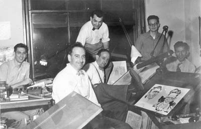
1955 was a tough time for comics in general. Simon and Kirby’s own publishing company, Mainline, failed with the last comics cover dated April 1955. The remaining issues of Mainline, the work for which was probably already completed, would be published by Charlton (well known for their low payment). The amount of work Joe and Jack did for Prize Comics would also see cutbacks. The only titles that Simon and Kirby did for Prize would by Young Romance, Young Love and Young Brides. But Young Brides and Young Love would both be cancelled (respectively November and December 1956). It was also in November 1956 that Jack Kirby would be doing work first for Marvel and later DC. It is not clear exactly when, but sometime during this time line the Simon and Kirby bullpen was disbanded. Simon and Kirby would continue to be listed as the editors for Young Romance until 1960 when Joe would be declared the sole editor. Various work would be done by Joe and Jack for Harvey and later Archie Comics but none of that successful enough to reestablish the Simon and Kirby studio. However their later collaboration was done, it was not like the earlier team work.

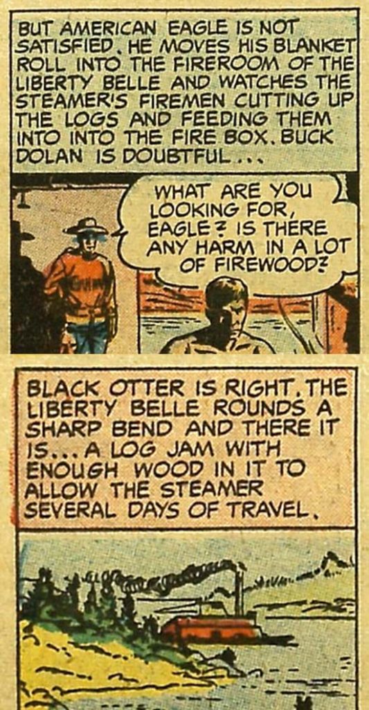
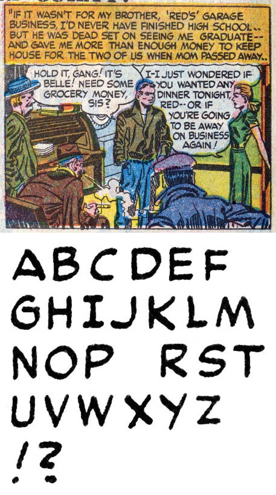
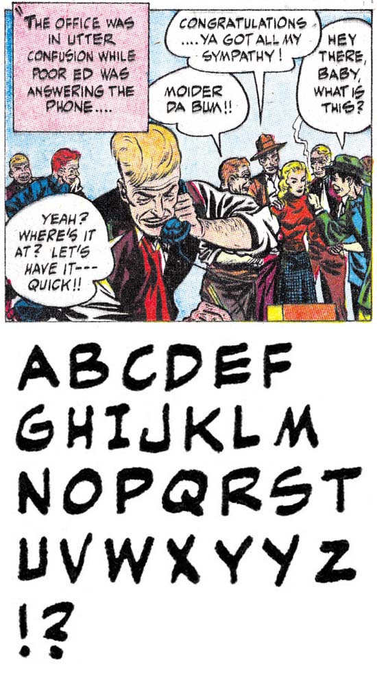
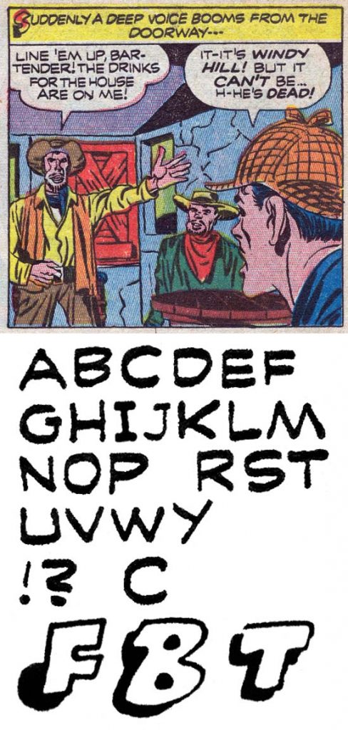
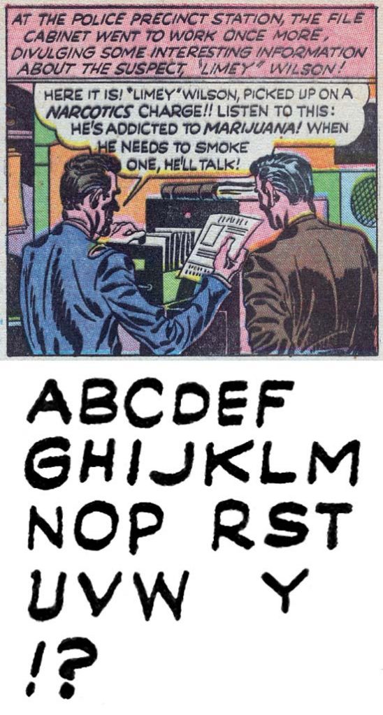
Prize Comics Western #118 (July 1956) “Liberty Belle” by Ben Oda

Previous to 1956 lettering for Simon and Kirby was done by both Ben Oda and Howard Ferguson (?). But Young Love #68 (cover dated December 1955) would be the last Simon and Kirby comic with lettering by Ben. That was not, however, the last lettering Oda would do for Prize Comics. Oda would continue to do lettering for those Prize titles with other editors; Headline, Justice Traps the Guilty, Prize Comics Western and later All For Love. He would do so until cover date October 1957. We can only speculate why Oda stopped working for Simon and Kirby but a falling out of some kind seems likely. Prize cancelled Headline and Prize Comics Western with September 1956 being the last issues. So perhaps there just not enough work from Prize to make it worth Oda’s efforts.

I no longer have access to any of the comics with Oda lettering from this period so I have provided some examples taken from the Digital Comic Museum. This is not much of a problem because Ben Oda’s lettering has not undergone much of a change from when we examined him in the last chapter.

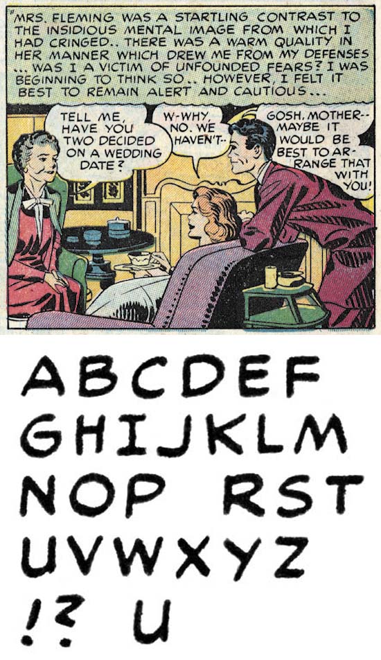
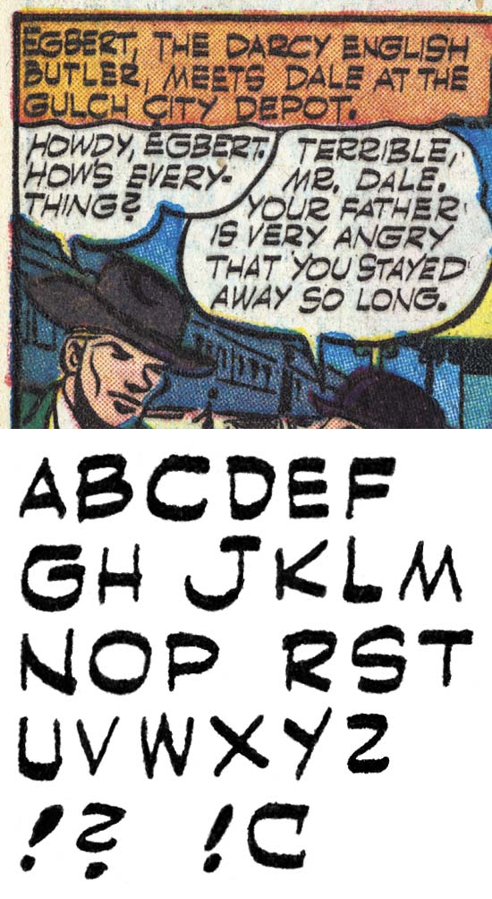
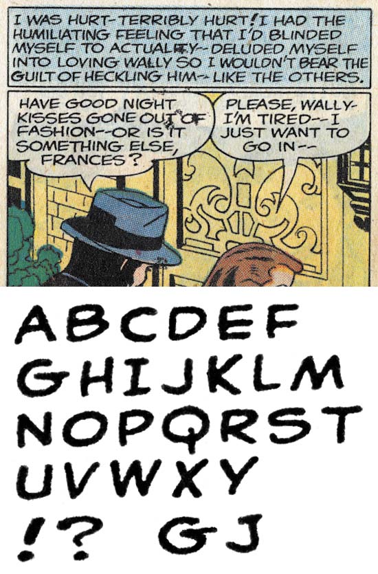
Young Romance #83 (June 1956) “Dancing Doll” by Howard Ferguson?

Howard Ferguson(?) continued to do lettering for Simon and Kirby but never end up lettering any of the Prize titles with other editors. Ferguson would even letter Simon and Kirby work that was published by Harvey. The last published lettering by Howard Ferguson(?) would be in Alarming Tales #4 (March 1958). However even if I am correct in crediting Ferguson (or at least the letterer I have questionably refer to him) Harvey Comics has been repeated shown to publish inventoried work long after it was actually created. Excluding cancelled titles, Simon and Kirby ran for Prize a much more tight operation without keeping work as inventory. The last work I credit to Ferguson appeared in Young Romance #90 (cover dated October 1957).

Young Romance #83 (June 1956) “Only You” by Howard Ferguson?

Starting in comics cover dated June 1956, Ferguson(?) would start to provide simple drop caps to his captions. This would become a regular feature until much later. Other than the drop caps, the lettering is identical to those without drop caps so I am confident that both were done by the same letterer.

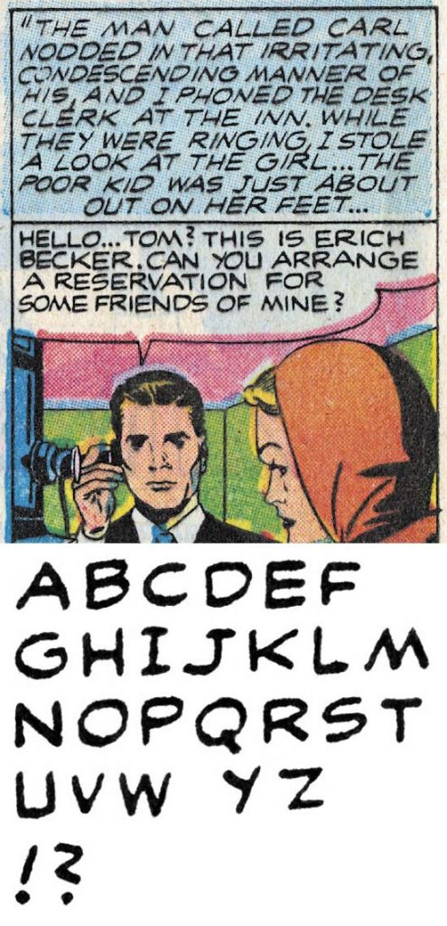
Young Romance #90 (October 1957) “Girl In the Middle” by Howard Ferguson?

I just wanted to close my discussion of Howard Ferguson(?) with an example of the last work for Prize that I credit to him. As can be see above, not much has changed.

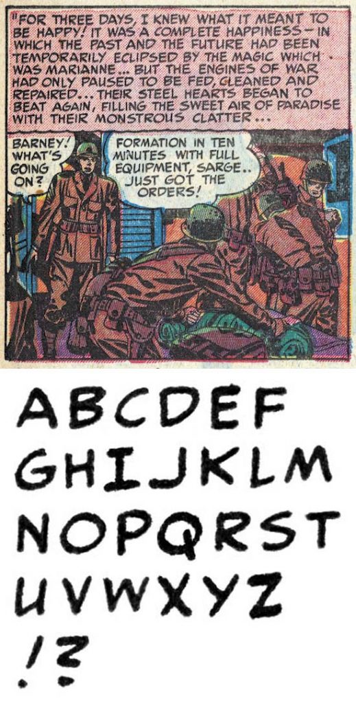
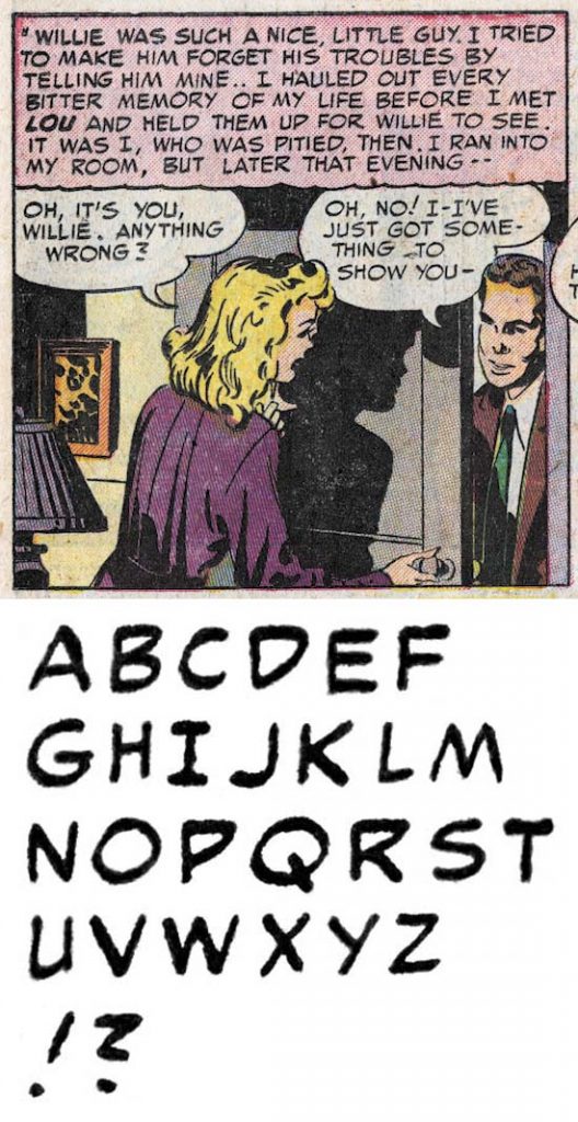
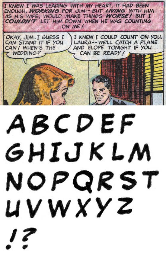
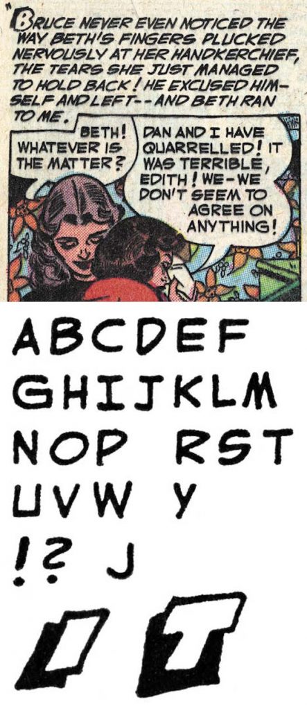
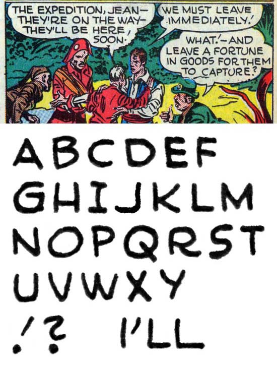
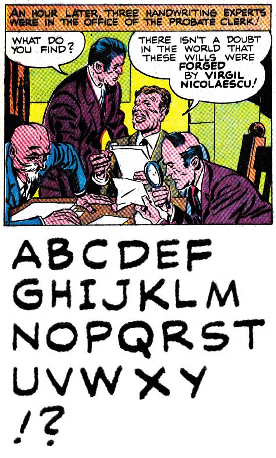
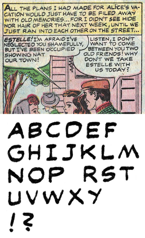
Young Romance #86 (March 1957) “His Heart Was Blind” by Toobie

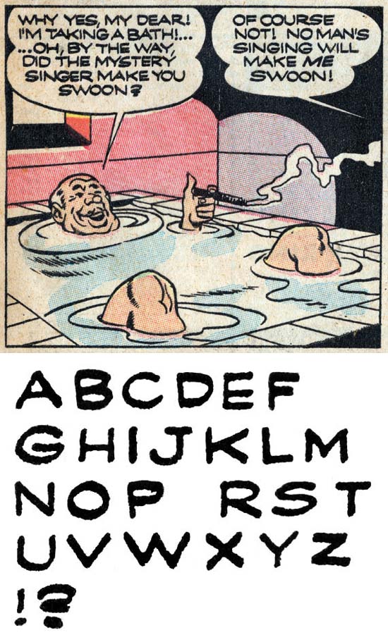
Ferguson(?) was the go to guy for Simon and Kirby during the time discussed in this chapter. But even before Ferguson’s disappearance, Joe and Jack would turn to one I nick-named Toobie. Toobie letters rather like Ben Oda, even with a ‘Z’ shape question mark and ‘J’ without a topping serif. However Toobie’s ‘J’ has a more strongly curved lower portion. There are serifs on first person singular ‘I’ except when used in a contraction.

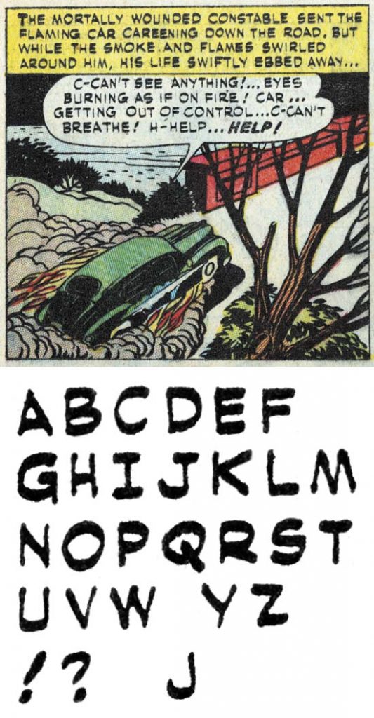
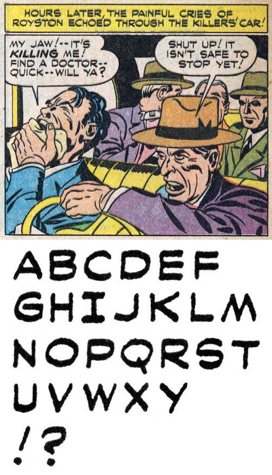
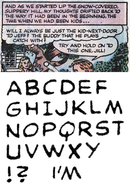
Young Love #71 (June 1956) “Love Me Or Leave Me” by Bill Draut

Bill Draut would return to lettering his own art one last time in “Love Me Or Leave Me”. Despite the fact that the last time we saw Bill lettering was in 1947, not much has changed. The ‘J’ still has Draut’s characteristic hock and the question mark still has the shape of a ‘2’. Not much later Bill would stop doing work for Simon and Kirby (in Young Love #73 December 1956) as well as the other Prize titles that were under other editors (in Justice Traps the Guilty #84 December 1956).

With both Ferguson(?) and Oda no longer appearing in the Prize work produced by Simon and Kirby, Joe and Jack would turn to a number of different letters. Each would appear to letter for a relatively short time and then disappear never to return. I saw little to be gained by analyzing each of them particularly since I would never be able to provide a real name to any of them. But I was curious about those who lettered art that Jack Kirby drew. Did they letter other artists besides Jack? Did their lettering appear in any of the art Jack did early in his return to Marvel and DC?

The answer to the first question (did they letter other artists besides Jack) would indicate how they were assigned. If they only lettered Kirby, than Jack was probably responsible for giving them the work. If they lettered other artists, than whoever was assigning the work for Young Romance was responsible (which probably was Joe). The short answer is all the Kirby letterers would also letter other artists.

The second question (did their lettering appear in any of the art Jack did early in his return to Marvel and DC) had the potential to answer a bigger question. There has been some speculation that some of work early in Kirby’s return to Marvel or DC was actually done by Simon and Kirby in some cases originally meant for Harvey. Actually in the case of Challengers of the Unknown it is more than just speculation as both Joe and Jack have said that was the case. Any early Marvel or DC work by Jack with any of these letterers would strongly indicate that art would supplied to Marvel or DC in largely completed form and therefore almost certainly Simon and Kirby creations. Unfortunately the short answer to this question is no. However while this does not offer evidence that the pieces in questions were Simon and Kirby creations it does not prove the reverse, that they were not done by Simon and Kirby. Just that any Simon and Kirby products delivered to Marvel or DC were not in a completed form.

I fear there will not be much interest in this serial post to as it has been up to this point, but I suspect there will be very less interest in my investigation into these particular unknown letterers. For any of those readers who have managed to make this far, but lack a desire to pursue a study of these marginal individuals, feel free to stop reading this chapter here. You may want to return to read my final chapter which mercifully will be short.

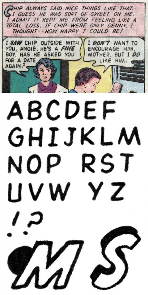
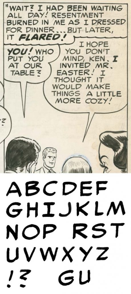
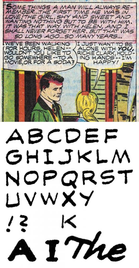
Young Romance #91 (December 1957) “The Waiting Game” by Slim

Slim’s lettering is narrower than most of the letterers we previously looked at, this is most obvious in his ‘O’ which is higher than wide. His ‘J’ has a small serif and the lower portion is short but strongly curved. The question mark is pretty much how I was taught, a curved portion like a reversed ‘C’ and a straight lower stroke. Shadow and geometric drop caps are used in captions.

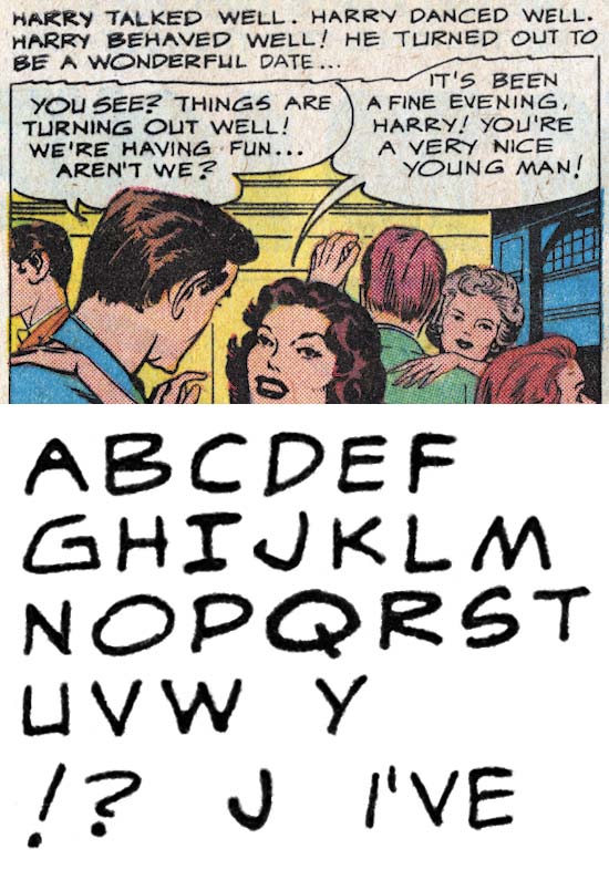
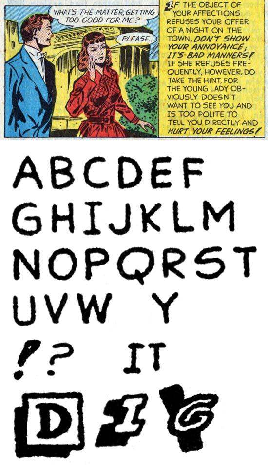
Young Romance #95 (August 1958) “Listening To Love” by Albert

Albert’s lettering is a bit variable but tends to be a bit wide. This is particularly noticeable in ‘O’ and ‘Q’. ‘J’ lacks a topping serif and has a distinctive hock. Perhaps the most unique letter is Albert’s ‘G’ which can be quite angular. Question marks have a ‘S’ shape but with the lower curve much smaller than the upper one.

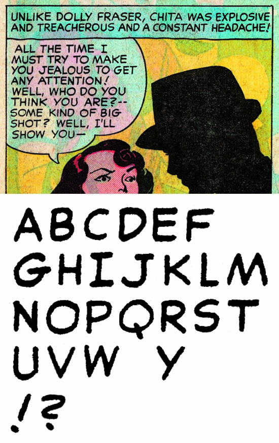
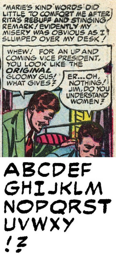
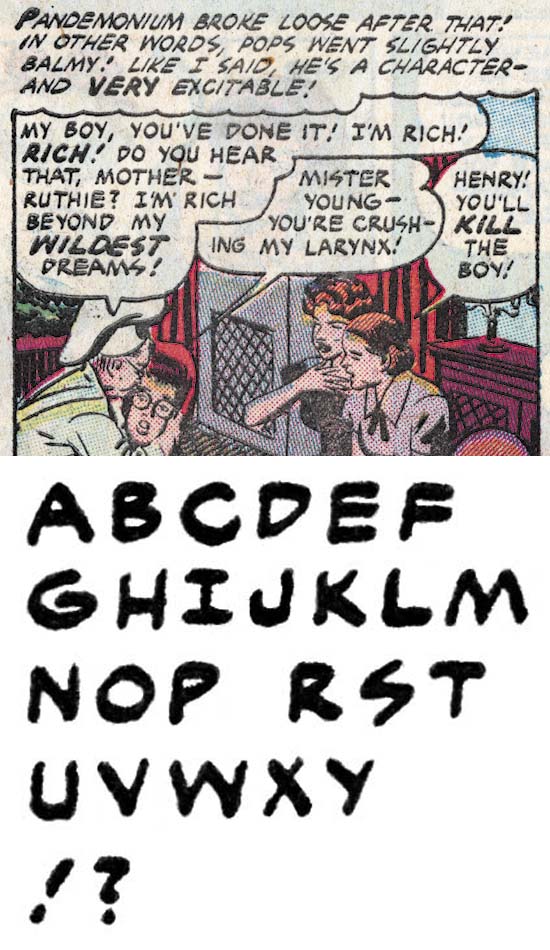
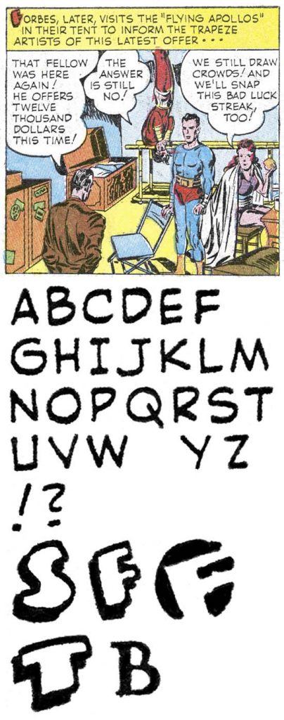
Young Romance #97 (December 1958) “Hearts and Flowers” by Steve

Steve has a more professional look to his lettering. The serif on the top of ‘J’ distinguishes him from Oda and the lower portion tends to be slightly more curved than either Oda or Ferguson. The horizontal bar of ‘G’ extends slightly to the right to form a small serif. Perhaps most important is the ‘S’ shape to the question mark with the upper and lower portions more, but not completely, equal.

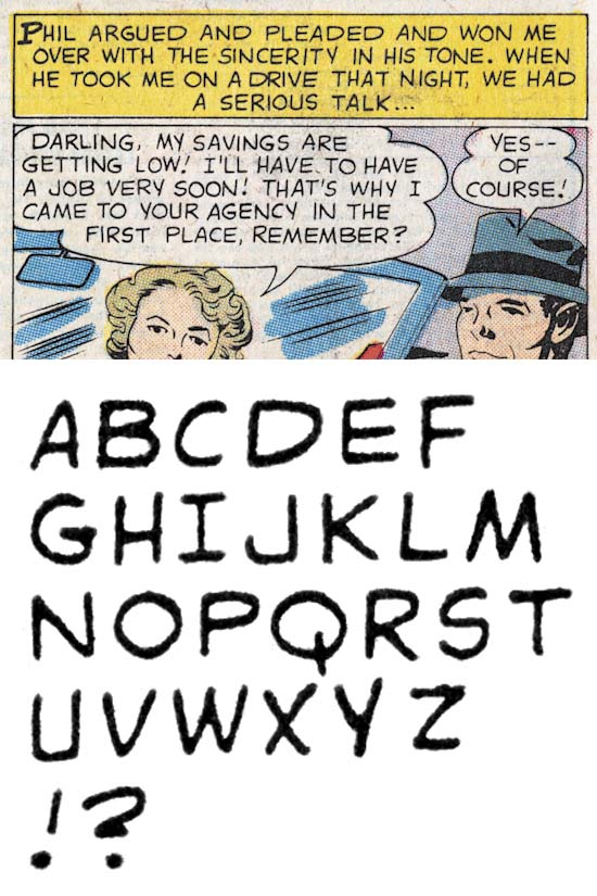
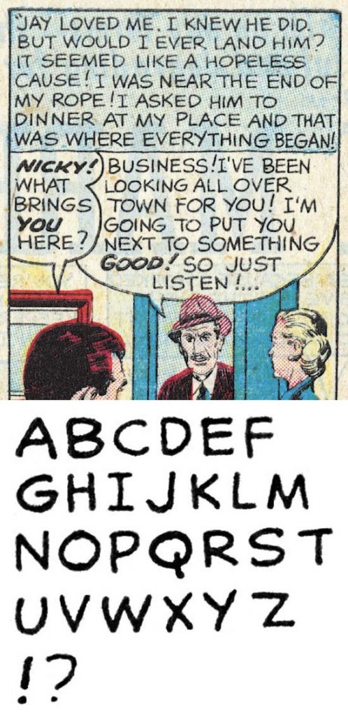
Young Romance #99 (April 1959) “Man Wanted” by Doug

Doug has a wide ‘D’ and ‘P’, but a generally circular ‘O’. The ‘J’ lacks a topping serif, a wide lower portion that ends in a well developed up turn. The question mark has a shape sort of like a ‘2’ but with the lower horizontal bar short and so close the the upper curve that it is easily missed. Captions can have simple drop caps.

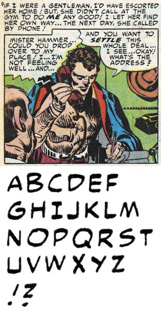
Young Romance #103 (December 1959) “The Man For Me” by Phillip

Finally we come to Phillip. Actually Phillip is quite like Oda with the obvious exception of his question mark which is not at all like a ‘Z’. Most ‘J’ lack a serif but Phillip is not consistent and some times adds one. The horizontal stroke of ‘G’ forms a small serif to the right.

Lettering S&K Chapter 1 The Beginning
Lettering S&K Chapter 2 Timely, DC and the War
Lettering S&K Chapter 3 Return from the War
Lettering S&K Chapter 4 The Oda Monopoly
Lettering S&K Chapter 5 Mainline and the Studio End

Lettering S&K Chapter 7 Conclusion

Lettering Checklists:

Alias
Draut, Bill
Ferguson, Howard
Kirby, Jack
Oda, Ben
Simon, Joe

Lettering S&K Chapter 4 The Oda Monopoly

Simon and Kirby studio Left to right: Joe Genalo, Joe Simon, Jack Kirby, Mort Meskin, Jimmy Infantino and Ben Oda. Caricatures (probably drawn by Joe Simon) of Marvin Stein and Jimmy Infantino.

September 1947 saw the launch of a new comic book produced by Simon and Kirby for Prize, Young Romance. From this point on until they launched Mainline Comics, Simon and Kirby would concentrate their efforts on producing comics for Prize. Work for Hillman would continue but in lesser numbers until finally being finished with My Date #4 (cover dated January 1948). More importantly for the topic of this post, Ben Oda would become the chief letterer for Simon and Kirby productions. And there were a lot of comic features to letter. For the period covered in this chapter (September 1947 to July 1954) and excluding titles that Simon and Kirby or their studio artists had no hand in there were 1757 features to be lettered for a total of 11,281 pages. While my calling this period an Oda monopoly is not literally true, Ben would letter at least 10,718 of these pages which is 95% of them. (Actually more because I no longer have access to a few Black Magic issues).

Which brings me to the question on how I am confident that Ben Oda lettered these pages given that lettering credits were never supplied in them. Fortunately there is a studio photo graph taken from this period (see above). In it we find all the people who worked in the bullpen with the exception of Marvin Stein who was probably the photographer. Among them is Ben Oda. The photograph is not dated but the art that Mort Meskin is working on can be identified as “His Dancing Teacher” which would end up with an October 1951 cover date. As Oda is the only letterer in the photograph we can be pretty certain he would do the lettering for that feature. Using “His Dancing Teacher” as a base, I then worked both forward and backwards to establish what was lettered by Oda and how that lettering changed over time.

Justice Traps the Guilty #4 (May 1948) “Queen of the Speed-Ball Mob” by Ben Oda

The last example I provided of Ben Oda lettering was cover dated May 1947. In truth not much has changed. The horizontal stroke for ‘G’ barely goes to the right of the curved portion, if at all. The ‘J’ still has no serif on its top and the lower portion is wide with only a slight curve. The biggest change, and even there it is not much, is in the question mark where the bottom portion extends backward a little more to form almost a ‘2’ shape but with the upper region a little more angular. Standard lettering for both captions and balloons with italics limited to bold lettering. As a rule Oda does not use drop caps in his captions but there were some exceptions in Young Romance #1 (“Misguided Heart” “Summer Song”).

Young Romance #10 (March 1949) “Mama’s Boy” by Ben Oda

Almost a year later, the lettering largely has remained the same. The ‘U’ often shows a small serif by extending the right vertical arm just slightly below the bottom curve. I am convinced even in the earlier lettering by Oda he wrote ‘U’ as two strokes; a left one with a vertical bar curving into bottom section and a second vertical bar on right. However previously Oda was careful to end the right bar where it met the curve portion so that no serif was formed. Now Ben entered a period where he often provided a small serif on his ‘U’. Another slight change is to the letter ‘D’ where the lower portion curves up more than the upper portion curves down. However experience has shown me that this is not unusual for letterers besides Oda. So it must be used with caution and never used by itself to identify Oda. The most significant change is in the question mark which as progress from an almost ‘2’ shape to become more angular to approach more of a ‘Z’ with the lower bar sloping down. But Oda is not a machine and this description is for the mean of the examples. Some still look like the shape seen a year ago and some with a form that will be found later.

Young Romance #19 (March 1950) “That Kind of Girl” by Ben Oda

Yet another year later Oda’s serif on the bottom of the right vertical bar on the ‘U’ has become even more obvious. The difference in slopes of the lower and upper curved portions for ‘D’ have become more extreme so that the rightmost portion is higher up. Most significantly the question mark has become more like a ‘Z’ with very angular transitions and an almost horizontal lower bar. But again there is some variations in Oda’s question marks.

Young Romance #30 (February 1951) “Weekend For 3” by Ben Oda

At this point the serif on ‘U’ has all but disappeared. A small serif can be formed by extending the horizontal bar of ‘G’ slightly to the right, but it is so small it probably was not intentional. I have provided an single example of ‘G’ on the bottom line that shows how Oda executed it as two separate strokes. The question mark has become even more angular and more like a ‘Z’ with the bottom sloping down slightly.

Young Romance #38 (October 1951) “His Dancing Teacher” by Ben Oda

We have now reached the lettering for the Mort Meskin art that I used to start my investigation of Ben Oda lettering. By coincidence it is here that Oda’s question mark is most like a ‘Z’. The difference between the upper and lower portions seen in ‘D’ can also be seen in ‘P’ and ‘R’.

Young Romance #45 (May 1952) “The Things I Didn’t Know About Him” by Ben Oda

Not much change but I just wanted to provide another later example of Ben Oda lettering.

Young Romance #53 (January 1953) “That Girl In My Corner” by Ben Oda

One final example of Ben Oda during the period covered by this chapter. Not much has changed except ‘U’ often has a bottom portion that is almost flat.

As mentioned previously, Ben Oda lettered 95% of the pages for Prize during the period covered by this chapter. He also lettered almost all of the pages for Boys’ Ranch that Simon and Kirby produced to Harvey in 1950 and 1951. But It pays to examine some of the letterers who did the other 5%.

Young Romance #2 (November 1947) “My Broken Heart” by Bill Draut

Like he did earlier for Harvey, Bill Draut would do his own lettering for the features he drew for Young Romance #1 and #2 along with Justice Traps the Guilty #1, all from late 1947. Draut’s lettering really has not change much from the work he did for Harvey. It’s most distinctive feature remains the hook shaped lower portion of ‘J’. Bill is erratic in whether he supplies a serif to the upper part of ‘J’ but he usually is consistent within a story. Draut’s ‘S’ is also somewhat distinctive with is straight and horizontal middle portion. Note the shape used for ‘D’, ‘P’ and ‘R’. As I mentioned before a number of letterers exhibit this feature. At least in “My Broken Heart” Draut seems undecided as to which for of ‘Y’ to use. After these startup issues were done, Draut’s art would usually be lettered by Ben Oda and we will not see him letter his own work again for some time.

Prize Comics Western #77 (September 1949) “Black Bull Bulldogs a Bandit” by Dick Briefer

Dick Briefer was another artist who would letter his own work. Mostly Briefer worked on Frankenstein Comics and the Frankenstein features from Prize Comics. Those were not Simon and Kirby productions and will not be discussed here. Prize Comics would turn into Prize Comics Western and while it is not clear if Simon and Kirby were its editors they were examined as part of my investigation. Briefer did some art and letters for Prize Comic Western #69 (May 1948 “Rod Roper”), #71 (September 1948) and #77 (September 1949 “Black Bull Bulldogs a Bandit”). He also drew and lettered three features for Charlie Chan #5 (February 1949 “The Antique Burglar”, “Murder On Ice” and “The Dude Ranch Hold-Up”) which was a Simon and Kirby production. Briefer is a very inconsistent letterer. In the example above balloons are done in italics while captions are not. In some others he did everything in italics and in others all in standard lettering. His variations for individual lettering and over all appearance makes it easy to distinguish Briefer from Oda.

Young Romance #26 (October 1950) “Hired Wife” by Sir

Justice Traps the Guilty and Headline from issue #23 were Simon and Kirby productions. But at some point it seems to have been passed on to others. The postal statement for Headline #49 (March 1950) and Justice Traps the Guilty #25 (April 1950) lists Nevin Fiddler as the editor. Except for the initial Simon and Kirby issues of Headline and Guilty, Ben Oda would dominate the lettering as he did in the other Simon and Kirby titles. However under the new editors other letterers would make appearances. I will not be discussing all of them, some came and went quickly. Others were around for more features and one I nick-named Sir would even letter a Simon and Kirby production, the “Hired Wife” that I use for the letter set above. Sir shares Oda’s tendency to push ‘D’, ‘P’ and ‘R’ up, as well as providing a serif to the bottom right of ‘U’ (which Ben was also doing at this time). Sir can be distinguished from Oda by his more angular ‘G’ were the horizontal stroke meets with the lower right portion with no sign of a vertical. Sir is a little erratic on whether he supplied a small serif to the top of ‘J’ but in any case his has a distinct hook. Finally the question mark do not have the more distinctive ‘Z’ shape of Oda’s with the lower stroke is much shorter than Oda from this same time.

Justice Traps the Guilty #31 (October 1951) “335 Days of Terror” by Georgie

Georgie is another unidentified letterer found in Justice Traps the Guilty from July 1951 to April 1952 (oddly he was never used for Headline). The hook provided to ‘J’ is distinctive from Oda while the small vertical serif at its end is distinctive from Sir. Even more significant is the question mark which lacks a lower vertical or horizontal portion. Georgie usually supplied a serif to the top of ‘J’ but not always. Georgie used simple drop caps in his captions that were only slightly larger and bolder than the rest of the letters.

Young Romance #55 (March 1953) “The Other Woman” by Sid

Sid only did the lettering for two Simon and Kirby features both appearing in Young Romance #55 (“Heartless” and “The Other Woman”). Because he worked on so few Simon and Kirby productions, I would certainly have neglected writing about Sid if he lettered at a time covered by other chapters of this series. But during this time of Oda predominance, it is worth pondering why Sid was used. The two features Sid lettered were not only used in the same issue but were also done by the same artist who was not one of Simon and Kirby’s regulars. This suggest that the work was picked up by Simon and Kirby already lettered. Possibly some unused art from another publisher’s discontinued title or perhaps something lettered by the artist himself.

Sid has the same upward tilting for ‘D’, ‘P’ and ‘R’ and although I had not mentioned it before the longest axis of ‘O’ sloping upward is also often found in other letterers. One thing more distinctive for Sid is his ‘J’ with a unusually shorter lower portion that in itself has only a slight curve but which is attached to the vertical at an acute angle. Sid usually provides a serif to the top of ‘J’ but not always. His ‘G’ has a small but distinct vertical portion with a right angle attachment to the horizontal bar. The ‘S’ is similar to Bill Draut’s with a straight and horizontal mid section. The question mark is most distinctive having a shape almost like an ‘S’. Sid would use shadow and geometric drop caps.

Young Romance #39 (November 1951) “Marvin’s Pearl” by unidentified letterer

I have not bothered to provide a nick-name for the letterer used for “Marvin’s Pearl” as he was used only this one time. What is specially unusual here is the artist for this piece as a Simon and Kirby regular, Mort Meskin. This is the only occasion where Meskin was not lettered by Oda in a Simon and Kirby production. Although there were a few times other letterers would be used for Meskin’s art in Justice Traps the Guilty after that title passed to other editors. It is possible that this is Meskin lettering himself. Mort sometimes got help from others so perhaps someone else lettered it for him directly. In any case with just a single example it is hard to be sure and so it remains an interesting anomaly.

Young Romance #63 (November 1953) “Mock Marriage” by unidentified letterer

There is another case similar to the previous one, that is a letterer who was not Oda who would letter just 2 features both drawn by artists regular to the studio (“Mock Marriage” by John Prentice from Young Romance #63 and “Speed” by Bob McCarty from Young Love #51 both November 1953). Since two different artists were involved we can be certain that they were not the letterer. This letterer’s most distinctive feature is his question mark. His horseshoe shaped ‘U’ is also distinctive and reminiscent of that by Jack Kirby.

Young Romance #63 (November 1953) “Good Manners” by Marty

There was one artist that drew a number of “fillers” for Simon and Kirby romances. Fillers are short pieces used when just a page or two is needed to complete a comic book. In the case of this artist many are half a page. All but one of these fillers was for “Good Manners” which almost but not quite became a regular feature. Since all this work is done by the same artist and all using the same letterer it might be thought that he was lettering his own work. However we will see in the next chapter the same letterer was used for the work by another artist. So I have supplied the nick-name Marty for this letterer and will explain what I think is going on in the next chapter.

Marty uses a ‘M’ with vertical outer strokes and the inner stokes not quite reaching the bottom of the letter. However towards the end of his work for Joe and Jack he adopted the more standard ‘M’ with sloped outer strokes and inner lines reaching the bottom. Marty also uses a ‘Y’ with a vertical lower portion, a ‘G’ with a distinctive vertical portion at right angles with the horizontal stroke, a ‘J’ with lower portion distinctly curved, a ‘S’ with a horizontal mid section, an angular exclamation point sometimes with an unfilled section and finally a question mark with a short but basically vertical lower section. Oddly Marty adds serifs to ‘I’ whenever it is the first letter of a word such as “IT”. Marty uses various drop caps some of which are quite distinctive.

Scanned by the Authentic History Center

Battle Cry #4 (November 1952) “The Treatment” by Howard Ferguson

We last saw Howard Ferguson doing work on Stuntman and Boy Explorers. His lettering continued to appear in various Harvey titles up to November 1948 but that was all inventoried features left over from the sudden cancelling of Stuntman and Boy Explorers. It is not known why Ferguson was not involved with Simon and Kirby’s earlier work for Hillman and Prize. Howard can be found lettering for Avon (March 1949 to October 1950) and later for Stanley Morse (May 1952 to February 1954). We can be especially sure this was Howard’s work because in some cases he actually signed it making it a rare example of golden age lettering credits. The GCD also has him doing some work for Gilberton and Seaboard Publishing but I have not been able to verify that. Unfortunately I cannot provide my usual letter sets because I do not have access to the comics and the scans in the Digital Comic Museum are of too low a resolution.

The GCD attributes to Ferguson some of the Hillman and Prize work that I credit to Ben Oda. This is understandable because their lettering is quite similar. As I mentioned earlier, I have traced Ben Oda’s lettering from a story that I can confidently credit to Oda. But the two can be distinguished. Both have a similar ‘J’ with the lower portion only slightly curved and at right angles to the vertical arm. Earlier in his lettering Ferguson would sometimes add a serif to the top of ‘J’ and sometimes did not. However at this stage a serif would consistently be supplied by Ferguson while Oda did not. Their question mark have a similar ‘Z’ shape but when the upper and lower arm deviate from the horizontal they slope down when done by Ferguson and slope upward when lettered by Oda. Finally Oda as a rule does not use drop caps or banner captions (except in Young Romance #1) while both are common in Ferguson lettering.

Mister Mystery #15 (February 1954) “Nightmare” by Howard Ferguson

Lettering S&K Chapter 1 The Beginning
Lettering S&K Chapter 2 Timely, DC and the War
Lettering S&K Chapter 3 Return from the War

Lettering S&K Chapter 5 Mainline and the Studio End
Lettering S&K Chapter 6 Post Studio
Lettering S&K Chapter 8 Conclusion

Lettering Checklists:

Alias
Draut, Bill
Ferguson, Howard
Kirby, Jack
Oda, Ben
Simon, Joe

Lettering S&K Chapter 3 Return from the War

Real Fact #1 (March 1946) “Pirate Or Patriot?” by Ray

The first post-war Simon and Kirby features to be published were possibly done while Jack Kirby was still in the Army and certainly while Joe Simon was in the Coast Guard. I have nick-named the letterer as Ray. Ray used vertical outer strokes for ‘M’ but his most distinguished feature is the curved provided to the diagonal lower stroke for ‘R’. Ray is a bit of an enigma. There was a time I thought Ray might actually be Simon. Both use the same type of ‘M’ and early in his career Joe sometimes used a similar ‘R’. Further Simon’s work on Adventure Is My Career and True Comics showed that he could letter without his classic ‘W’ and in a more professional and careful manner. However Ray would letter some Simon and Kirby work right up to cover date January 1947. This is well beyond Simon and Kirby’s work on Stuntman and Boy Explorers for Harvey that I will discuss below. It is hard to believe that Joe would sacrifice time on lettering better served for the Harvey features. The earliest lettering by Ray appears to be “Coast Guard Reconnaissance” that appeared in Boy Commandos #12 (September 1945). This was certainly done while Joe was still in the Coast Guard and Jack in Europe. Joe was not in a position to find someone new to do the lettering. Perhaps DC had the lettering done. This seems reasonable because Ray would not letter any of Simon and Kirby’s work for Harvey. The only problem with that idea is that Ray lettered “You Can’t Loose A Faithful Dog” from Picture News #1 published, not by DC but by Lafayette Street Corp.

With both Joe Simon and Jack Kirby back in civilian life a deal was made to produce Stuntman and Boy Explorer titles for Harvey. Whether it was a reaction that DC had because of this, or the general changes in comic books that followed the war, DC curtailed the work that Simon and Kirby did for them. Simon and Kirby’s Sandman would end with Adventure Comics #102 (February 1946). The Newsboy Legion would continue in Star Spangled Comics until issue #64 (January 1947). These would be lettered by Ray (#53, #54, #55, #59, #60, #63 and #64), Howard Ferguson (#61 and #62), and another unidentified letter (#56, #57 and #58). The Boy Commandos would last the longest with the last issue being #36 (November 1949). But Simon and Kirby would only provide story art for some of the issues (#15, #17, #19, #21, #23, #24, #29, #30, #31, #32 and #33). Unfortunately I no longer have access to any of these issues. Nor do I have access to Detective Comics #95, #110, #134, #136, #137, #140 and #150 which also had Boy Commando features done by Simon and Kirby. I do have scans for Detective Comics #128 (October 1947) and there the Boy Commandos lettering was done by Ben Oda. That however does not make up for all the DC work I am missing which would have shed light to an interesting aspect of Simon and Kirby history.

Stuntman Comics #1 (April 1946) “Killer in the Big Top” by Howard Ferguson

Howard Ferguson would return to working for Simon and Kirby for the comic titles Stuntman and Boy Explorers produced for Harvey. His lettering really has not changed much from the work he did for Joe and Jack at DC before they went to do their military service.

Boy Explorers #1 (May 1946) “Talent for Trouble” by Howard Ferguson

As work on the Harvey features progressed, Ferguson would change his style in one small but important way. In “Talent for Trouble” the serif on ‘C’ would be come smaller and some ‘C’ would lack it altogether.

Stuntman Comics #3 (October 1946) “Rest Home for Criminals” by Howard Ferguson (but the example above is actually from the reprint in Green Hornet #39)

Ferguson’s changing ‘C’ would continue so that only an occasional ‘C’ would exhibit a small serif an example shown above in the second from last line. Stuntman and Boy Explorers would be casualties of the post-war comic glut. However unused work for these titles would continue to appear in Harvey titles such as Green Hornet, Terry and the Pirates, Black Cat and Joe Palooka. But this provides a misleading indication of when Howard Ferguson lettered for Simon and Kirby as it was inventoried work published well after it was actually created.

Stuntman Comics #2 (June 1946) “Triangular Troubles” by Bill Draut

As in previous times, Howard Ferguson was the go to guy for lettering the Simon and Kirby Harvey productions done just after the war. Besides Joe and Jack, other artists did art for Simon and Kirby Harvey titles. One was Bill Draut, an artist Joe Simon met while serving in the Coast Guard. All the features that Draut did for the Simon and Kirby’s Harvey titles was lettered by himself. Actually there are a few of exceptions where the splash would be done by others. His ‘S’ has a almost straight and horizontal middle portion. Even more distinctive is the hook shape to his ‘J’. Generally Draut’s ‘J’ will have a small horizontal serif on the top, but sometimes this is left out. Bill’s art and lettering would continue to be found in Harvey’s other titles after Stuntman and Boy Explorers were cancelled. Once again this is inventory work and should not be used to establish dates.

Stuntman Comics #3 (October 1946) “Bust of Adonis” by unidentified letterer (example here from reprint in Green Hornet #37)

There is one other letterer who worked on a single Simon and Kirby’s Harvey feature. Normally I do not include such a letterer here because he only did this one lettering for Joe and Jack. However some of the ‘C’s that he used can appear to have an serif somewhat similar to Ferguson’s (see the text balloon in the image above). But this unidentified individual has a distinctive ‘J’ where the lower portion meets the vertical at an acute angle and his question mark is quite different from that used by Ferguson.

Clue Comics vol. 2 no. 1 (March 1947) “King of the Bank Robbers” by Wyatt

Having soured their relationship with DC by the Harvey deal and then having the Harvey titles cancelled, Simon and Kirby had to search elsewhere for work. Initially they would produce comic book features for Hillman and Prize. One might have expected the lettering for this work would be done by Howard Ferguson but that was not the case. We will return to what happened to Ferguson in a later chapter but for now the lettering would be done by others we have not previously encountered. The first published post-Harvey work would be cover dated March 1947 and all but one of the eight features that included would be done by one letterer, nick-named Wyatt. I have not found any previous lettering by Wyatt in \neither comics by Hillman or Prize. Wyatt’s lettering is very professional; clear letters with good and even line spacing. He can easily be distinguished from either Howard Ferguson or Ben Oda by his ‘M’ with vertical outer strokes and his ‘Y’ with a vertical lower branch. In his earlier lettering the top of ‘J’ lacks a serif.

Headline Comics #24 (May 1947) “Trapping New England’s Chain Murderer” by Wyatt

While the previous example showed standard lettering in the captions, in all other lettering by Wyatt he used italics in the captions. Bold lettering would also be italicized but that was pretty common. Unlike Ferguson, Wyatt does not use drop caps or banners in his captions to panel art. Wyatt would also do all the lettering for Headline #24 (May 1947) but his other work for Simon and Kirby would be more sporadic.

Prize Comics #63 (March 1947) “Romania’s Strangest Killer” by Ben Oda?

The one initial feature from post-Harvey that was not done by Wyatt was questionably lettered by Ben Oda. Like Wyatt I have not been able to find any previous lettering by Oda in either Hillman or Prize comics. As previously mentioned, Oda can easily be distinguished from Wyatt by the letters ‘M’ and ‘Y’. However Oda’s letters are very similar to those by Howard Ferguson. Unlike Ferguson, Ben did not use drop caps or banners in the panel art for Simon and Kirby productions. Oda used italics only for bold lettering and not in captions like Wyatt. The only reason I question that Oda lettered “Romania’s Strangest Killer” is that there is a small serif on the top of the ‘J’s while typically Ben’s ‘J’ lack such a serif.

Golden age comics rarely include credits and I have never seen any for Ben Oda. Therefore one might reasonably wonder why this and others lettering I will be discussing should not be credited to Ferguson. The answer is that I had to work backwards from a period where I am confident that the lettering was done by Oda. Why I am confident in this will be discussed when I reach that time period. What I can say for now is that Ben’s lettering for Simon and Kirby can be traced with numerous examples from this point on. While Oda’s lettering does change over time the changes are small and gradual. And they reach a point where Oda can be compared to Ferguson’s work at the same dates and while close, they can be distinguished.

Clue Comics vol. 2 no. 3 (May 1947) “The Case of the Superstitious Slayers” by Ben Oda

Because my previous Ben Oda example was questionable, I thought I would provide an early lettering that I am more confidently attribute to him. While Wyatt would be used a lot for Simon and Kirby’s initial post-Harvey lettering, as time went on Ben Oda would be used more frequently until he would dominate.

Headline Comics #25 (July 1947) “Death Takes a Honeymoon” by Fred

Headline Comics #25 (July 1947) had seven features, four of which were lettered by yet another letterer I call Fred. Fred’s ‘M’ and ‘Y’ have the same form used by Wyatt but Fred’s question marks are quite different from Fred’s. Further captions by Fred use standard lettering unlike the italics that Wyatt preferred (except for one early work). Fred had captions that included outline drop caps, a feature not used by Wyatt.

Punch & Judy Comics vol. 2 no. 12 (August 1947) “The Mystery Crooner” by Wyatt

I want to close this chapter with one final example by Wyatt. Wyatt’s lettering had not change much over the time being discussed here, not surprising because it is only a mater of five months. But the question mark has become like a squat ‘2’.

Simon and Kirby was about to introduce a new comic book title for Prize after which their work for Hillman would dwindle to end shortly later.

Lettering S&K Chapter 1 The Beginning
Lettering S&K Chapter 2 Timely, DC and the War

Lettering S&K Chapter 4 The Oda Monopoly
Lettering S&K Chapter 5 Mainline and the Studio End
Lettering S&K Chapter 6 Post Studio
Lettering S&K Chapter 7 Conclusion

Lettering Checklists:

Alias
Draut, Bill
Ferguson, Howard
Kirby, Jack
Oda, Ben
Simon, Joe

Speaking of Art, Secondary Artists

Joe Simon had accumulated a rather large collection of art. Not surprisingly many were works that he created over his long career starting when he was a staff artist for a newspaper. Also as might be expected there are a fair number of works drawn by Joe’s long time collaborator, Jack Kirby. However that does not mean, as I suspect some people believe, that Kirby material dominates the collection. Rather much of Joe’s art collection consists of work by a variety of lesser known artists. I thought I would discuss just a few of them selected for various reasons.


Police Trap #3 (January 1955) “Tough Beat”, pencils and inks by Bill Draut

Long time readers of this blog are by now quite aware that Simon and Kirby were not just a great artistic team but also produced comic books that included work by a large assortment of artists. I have spent much time trying to identify the various artists who worked for Joe and Jack with some, but by no means complete, success. However any reader can correctly attribute the artist for a large majority of Simon and Kirby productions if they can learn to spot three particular artists. I have been fond of calling the three artists the usual suspects. Foremost among the usual suspects was Bill Draut who had a long history of working for Joe and Jack. While Draut contributed a lot of art to S&K productions, Simon’s collection only has work by Bill from three periods; from right after the war at the time S&K were producing Stuntman and Boy Explorers for Harvey Comics, from S&K own publishing company Mainline Comics, and from the 60’s when Harvey briefly tried to cash in the renewed interest in superheroes. The reason for the rather limited periods found in Joe’s collection is that Joe’s collected primarily from work on hand when a projects terminated or art he recovered years later from Harvey, Archie and DC.

Joe’s collection has a fair amount of work created by Bill Draut and the example I provide is from Police Trap a Mainline comic book. Although Draut did a lot of romance work (as did all the Simon and Kirby artists) he could be quite adept at depicting action as can be seen in the lower splash panel. What a great assortment of characters. Note the way Draut depicts the bricks in the background building; inked as simple rectangular black shapes obviously executed without the use of a straight edge and forming small isolated groups. This manner of drawing bricks was quite typical of Draut.

It is hard to tell from the low resolution image that I have provided, but the discoloration at the top of the page is not due to some odd staining but rather the yellowing of tracing paper that has been attached to the illustration board. Bill did this as a time saving device. The final panel of the last page of the story is the same street scene differently inked to suggest another time of day. Rather than redraw the same scene, Draut put tracing paper over the final panel and inked directly on the tracing paper. When finished he just attached the results to the top of the first page.


Chamber of Chills #24 (July 1954) “Credit and Loss”, pencils and inks by Mort Meskin

Simon’s collection does not include many examples of original art by the second of the usual suspects, Mort Meskin. This is not because Joe did not like Mort’s art. Quite the contrary as shown by the fact that Joe had gathered together flats* for many of Meskin’s splash pages. This was something that Simon had done for Mort and no other artist. But the absence of Meskin original art was due to the fact that Mort did not work for Simon and Kirby during the Stuntman period and did little work during the Mainline period except for some covers (where apparently Meskin kept the original art). The one good example of Meskin original art that Joe had was not created for Simon and Kirby but for Harvey Comics. I suspect that Joe had retrieved it from the Harvey inventory some years later. It was fortunate that Simon had done so because it is, in my opinion, the finest comic book work that Meskin had ever done since the war. Great control of the story telling through devices like use of the viewpoint, marvelous drawing and superb inking.

OrigArtPrentice3
Bullseye #1 (August 1954) “Bullseye, the Man”, pencils and inks by John Prentice

John Prentice is the final of the three usual suspects. Prentice started working for Simon and Kirby even later then Mort Meskin. Joe’s collection had some examples of Prentice’s art but perhaps the most interesting is the art he did for Bullseye. There was a time that many claimed that Kirby provided layouts for the artists that worked for Simon and Kirby. One of the primary methods that I have used to investigate that claim was the way different artists used panel shapes. From that I feel quite confident that as a rule Kirby did not provide layouts for the other artists. But there are exceptions to that rule and Bullseye maybe one of them. I am not saying that Kirby provided complete layouts for Prentice’s Bullseye work but did appear to do so for at least some parts.

Unfortunately when Simon and Kirby wanted to retell the origin story for Bullseye #3 rather than redraw it Joe simply cut desired panels out of the earlier original art and pasted them together. Because of this it is not unusual to see original art from the first issue of Bullseye missing a panel or two.


Bullseye #3 (December 1954) “The Adventures of Sheriff Shorty”, pencils and inks by Leonard Starr

Joe’s collection not only included art by the three usual suspects but other artists as well. Leonard Starr is much better known for his work on the syndication strip Mary Perkins On Stage but he also had a long career as a comic book artists included occasional work for Simon and Kirby. The example I select comes from Bullseye #3. As it was published the story appears to be unsigned but careful examination of the original art shows otherwise. The vertically oriented signature appears the bottom left edge of the splash panel. Or rather half the signature is there as the panel border now cuts through it. But enough remains to show that it is in facts Starr’s autograph.


Foxhole #3 (February 1955) “The Face”, pencils and inks by Joaquin Albistur

Some artists that worked for Simon and Kirby are pretty much unknown entities for today’s fans. Jo Albistur only worked for Joe and Jack for a little over a year but produced a fair amount of art during that time. But Albistur did very little comic book art for any other publisher and only a small number of his original art have ever appeared on the market. The gimmick used for Foxhole was that the stories were created by actual war veterans. Because Albistur was from Argentina and had not served in the U. S. military, he was not suitable to receive any credit in Foxhole. But when credit was provided in Foxhole it was not always just for the graphic artists for instance writer Jack Oleck also occasionally received Foxhole credits. For “The Face” credit is given to Jack Kirby. Now Kirby certainly was a war veteran but he neither drew nor laid out this story. Further (and I may get in trouble among certain fans) I am convinced he did not write this story either. However it is known that Jack provided plots to some of the script writers that Simon and Kirby employed and perhaps it was in that capacity that this story is credited to him.


Chamber of Chills #24 (July 1954) “Grim Years”, pencils? and inks? by Manny Stallman

The Simon collection includes work by Manny Stallman. I attribute the work to Stallman with some trepidation. Stallman provided signed work for Simon and Kirby productions but when that art is carefully examined it becomes obvious that four different artists did the penciling (It’s A Crime Chapter 7, Chapter 8 and Chapter 9). Apparently Stallman was using ghost artists to pencil the work that he would then ink and often sign as his own. The work by Stallman from Joe’s collection was not created for Simon and Kirby but rather for Harvey Comics. Unfortunately it was unsigned and the pencils done in yet another style so the attribution is very provisional. But whoever penciled and inked the work the final results are rather nice.

Artists like the ones discussed in this post do not get much recognition these days. That is a shame because they really were talented artists. Now I do not want sound disdainful of contemporary artists because there is a lot of great comic book work being produced today. But let us face it, not all of them are superstars. But I am sadden that original art by secondary contemporary artists sell for much, much more than that by earlier artists. That despite the fact that relatively little of the work of the older artists has survived. It is obvious that most of today’s fans really have little interest in older original comic book art. If the reader is a collector of original art that does not share this low opinion of older work, keep an eye on the upcoming Heritage auctions as I am sure some great deals can be made.

* flats – Proofs of the line art printed on sheets in the same way finished comic book would be.

Speaking of Art, Young Love #66


Young Love #66 unused cover (August 1955), pencils by Joe Simon and Jack Kirby, inks by Bill Draut? and Jack Kirby

Joe Simon’s collection includes the original art for an unused cover. I do not believe that this cover art has every been made public before and once again I have permission from the Simon estate to do so here. Although subsequently crossed out, the notation in the upper left indicates it was initially intended for Young Love #66. This work was created during a difficult period for Simon and Kirby. Joe and Jack had launched their own publishing company, Mainline, with Bullseye #1 (cover date July 1954). But Mainline quickly became in trouble as its distributor, Leading News, entered into its own difficulties. By the time of Young Love #66 the former Mainline titles would be published by Charlton, notorious for their low payment to their artistic creators.

While previously Jack Kirby had provided the pencils for almost all the cover art for the titles that Simon and Kirby produced, his contributions during the Mainline and subsequent period was very limited. In particular the covers for the Prize romance titles were done by other artists such as Bill Draut, Mort Meskin, John Prentice and Bob McCarty. Joe Simon’s drawing of any comic book art was even more limited. Basically Joe and done no actual pencils since the Stuntman and Boy Explorers titles failed in 1946 except for 48 Famous Americans (a J.C. Penny giveaway from 1947). So Joe and Jack’s involvement in this cover is quite unusual.


Young Love #66 unused cover (August 1955), pencils by Joe Simon, inks by Bill Draut?

The art is a bit of an construction on the illustration board that Simon and Kirby preferred. Only the foreground young couple were executed on the original illustration board. They were penciled by Joe Simon however the inking does not appear to be his. I am not certain but the brushwork looks like it was done by Bill Draut. The final results does look like a cross between the styles of the two artists.


Young Love #66 unused cover (August 1955)

Another layer was added to the illustration board; a larger piece on the left side and a smaller one on the right together covering the former background. Unfortunately the larger piece has been almost completely covered up and cannot be examined. The smaller piece was also covered up but the glue (probably rubber cement) has subsequently failed. That is the part that is shown above. Regrettably it does not seem sufficient for determining of an attribution and I would not want to hazarded a guess.


Young Love #66 unused cover (August 1955)

The third layer is also in two parts; a larger left piece and a smaller right that pretty much match the shape and size of the underlying pieces. However they two pieces are of different paper. The right piece seems to have been tracing paper with white-out applied to make it more opaque. The art work consists of little of a couple of pencil lines depicting drapery.


Young Love #66 unused cover (August 1955), pencils and inks by Jack Kirby

The more substantial third layer from the left side was drawn and inked by Jack Kirby. Kirby is well known, and rightly so, for his action drawing but here we have as simple yet warm portrayal as one could hope to find.

It is simply no longer possible to determine what the background was for the initial work on the illustration board. A small area of white-out remains that covers some inking indicates that there was some sort of background. What little can be seen of the second layer suggests a poorly constructed fence, perhaps a street scene from a poor neighborhood. The final layer has hanging drapery, maybe a wedding chapel.


Young Love #66 (August 1955), pencils and inks by Mort Meskin

The back of the original art has two Comic Code Authority Approval Stamps; one dated March 2, 1955 and the other March 8. But note that both are approval stamps and  therefore the rework was not due to any rejection from the Comic Code. The changes appear to be an effort to improve the cover but in the end they decided to use a cover created by Mort Meskin. While I find the Simon and Kirby cover interesting I believe it was the correct decision. The Meskin cover is just a wonderful one with the contrast between the casually dressed teenager and the fancifully attired couple that she is daydreaming about.

Police Trap #5

Police Trap and the other Mainline titles had been distributed by Leader News. During this period there was a renew public protest about the contents of comic books. The publisher that attracted the greatest amount of negative criticism was probably EC and some newsstands refused to accept their comics. Unfortunately Leader News also distributed EC and the boycott lead to their eventual failure. Without a distributor this meant the end of Simon and Kirby’s publishing company as well. But work had already begun on the art for the unpublished issues of the Mainline comics so Joe and Jack looked for a publisher willing to take on the titles. They made a deal Charlton and after an addition two month delay Police Trap #5 finally made it to the newsstands. This was the first issue of Police Traps to be submitted to the new Comic Code Authority although I doubt there was much of a problem with getting approval.


Police Trap #5 (July 1955), pencils and inks by Jack Kirby

Compared to previous issue, the cover was not all that great. I cannot think of a Simon and Kirby cover that I would describe as poor but obviously some were better than others and this one was one of their poorest. I suspect that with the failure of Mainline and the search for a new publisher, Simon and Kirby just did not give the cover art as much attention as they previously would have.


Police Trap #5 (July 1955) “The Gun”, pencils and inks by Bill Draut

Bill Draut had drawn stories for Police Trap #1 and #3 so his presence here comes as no surprise. Draut provides “The Gun” with his usual well crafted art. However coming after his really great work on “Tough Beat” (Police Trap #3) this story can seem to be a bit of a let down. Due to financial problems arising from the collapse of Mainline, Simon and Kirby were forced to close down their studio. It seems that Joe and Jack continued to work together for a time but limited or stopped employing other artists. “The Gun” was probably work already completed before Mainline’s sudden collapse. Simon and Kirby would use some further work by Draut in the coming months but not much. Draut would work for other publishers but with the collapse of the comic book industry it must have been a difficult time for him. I am sure he eventually looked back at his time with Simon and Kirby as the golden age of his career.


Police Trap #5 (July 1955) “The Test”, pencils and inks by Joaquin Albistur

“The Test” was another fine piece of work by Joaquin Albistur. Albistur only worked for Simon and Kirby for a limited period of time, a little over a year. Probably Joaquin also looked for work after the closing of the Simon and Kirby studio. I have seen some original art for a smaller publisher but I am not sure when it was done. Albistur may have found some work but it does not appear he found much. At some point he returned to his native country Argentina.


Police Trap #5 (July 1955) “Bad Influence”, art by an unidentified artist

I am not sure who the artist was that drew “Bad Influence”. I will not claim he was one of my favorite Simon and Kirby artists but he did a good job on this story.


Police Trap #5 (July 1955) “Short Visit”, art by an unidentified artist

Another unidentified artist only in this case not nearly as talented as the one who did “Bad Influence”. Note the rather awkward pose of the policeman.


Police Trap #5 (July 1955) “Alibi?”, pencils by Jack Kirby, inks by Mort Meskin?

Up to now, Jack Kirby’s contribution to Police Trap was limited to the covers, one pinup (derived from an unused cover) and one splash panel. Was “Alibi” originally planned for issue #5 or was Jack filling in for working missing at the time of the collapse of Mainline? Who can say? But it is nice to see a Kirby working on a crime story again since the last one he did back in 1950. The tall vertical splash was rather unusual for Kirby and a reminder that Kirby was comfortable with any panel layout.

I am a little puzzled by the inking of this piece. Previously I have attributed the inking to Mort Meskin and there are parts that remind me of his work. Particularly the elderly woman in the second story panel. However there are other portions that do not look like Meskin’s brush for instance the sleeve of the older detective in the splash panel. During earlier periods I would explain this by the use of multiple artists sometimes used to ink Kirby’s art (describe by Joe Simon as an assembly line). With the bust up of the Simon and Kirby studio this now seems likely that only a single inker would be used (although either Simon or Kirby could be expected to do some touch up work). While I may hesitate to attribute the inking of this piece to Meskin, Mort was the inker for some other Kirby pencils that will be discussed when issue #6 is covered.

Police Trap #3


Police Trap #3 (January 1955), pencils and inks by Jack Kirby

The cover for Police Trap #3 departed from the more serene covers used for the first two issues. Instead PT #3 was a typically well done Kirby slugfest. Such dramatic punches were often found in Simon and Kirby stories but rarely appeared on the crime covers. I can think of only one other case (Headline #45, January 1951) and that one was not nearly as nicely done as this cover. There was another cover considered for issue #3 but in the end never used. The alternative cover featured some motorcycle policeman and while a good cover it was not nearly as dramatic as this one.


Police Trap #3 (January 1955), “Hick Cop”, art by W. E. Hargis

It is always nice when an artist signs his work. Otherwise it becomes difficult to determine attributions since credits were not usually provided. There was also another signed S&K production piece by William Hargis (Young Love #62, October 1954, “Too Darned Innocent” ). I really need to do some careful comparison with some of the other unattributed pieces from this period as it is likely there exists some unsigned pieces by Hargis as well. Still it appears that Hargis only worked for Joe and Jack during a short period. Most of his work at this time seemed to have been for Quality Comics.

A number of artists appeared for a short time in Simon and Kirby productions from this period. Most were not that impressive but Hargis was an exception. He graphically tells the story well and has a pleasing drawing style. Hargis uses details to provide insight into his characters. I love the way that the sheriff has a hole in the sole of his shoe in the first story panel.


Police Trap #3 (January 1955), “The Mountie”, pencils and inks by Joaquin Albistur

Albistur is one of my favorite S&K artists from this period. “The Mountie” is a typical example of his talent. The mounted policemen have disappeared from most American cities but still have a presence, although diminished, in New York City. I have not seen any in the last few months but I would regularly hear them go down my street. It is not at all clear to me whether horses are an effective police tool but they certainly make for great public relations. Whenever I see them they always attract photographers and animal lovers.


Police Trap #3 (January 1955), “Murder At The Frolics”, art by an unidentified artist

AS I have said, there were a number of artists that worked a short time for Joe and Jack during this period. Of course I wish I could identify them all but for academic reasons as frankly many were little more than adequate. The biggest problem with this particular artist is that his figures tend to be a bit stiff as, for instance, in the last panel of this page.


Police Trap #3 (January 1955), “Tough Beat”, pencils and inks by Bill Draut

I really like Bill Draut’s art, at least while he worked for Simon and Kirby. But this particular splash page has got to be one of my favorites. Generally Bill did not do full page splashes and in a way this is not one either. What Draut has done was combine two splashes separated by the title caption. The top shows a deserted neighborhood with only a single policeman in the background. Very simple but lovingly handled with great attention to the tenement buildings. The bottom seems pure chaos but actually is not. Helped by nice work by the colorist, the lower splash focuses on the confrontation between a cop and some locals seemingly concerning some youth the policeman has apprehended. Bill has provided an interesting and varied crowd. The juxtaposition of the quiet and noisy street scenes makes the page all that more interesting.


Police Trap #3 (January 1955), “Tough Beat” last panel of page 6, pencils and inks by Bill Draut

I have seen the original art for “Tough Beat” and the upper portion of the splash page, the quiet street scene, was inked on tracing paper. I found this puzzling until I noticed the last panel of the story was the same street scene with different inking. Apparently Draut placed the tracing paper over the final panel and used it as a guide for working on the upper part of the splash page. Faster than manually copying the art onto the actual illustration board while the use of tracing paper would be undetectable in the final printed version.

Police Trap #1, Title for the Heroes


Police Trap #1 (September 1954), pencils and inks by Jack Kirby

Crime comics received a lot of undesirable attention during their heyday. It is generally acknowledged now that this criticism was pretty much unwarranted but at that time it accepted by most of the public. One criticism was that crime comics glorified the criminals. Again any modern reader would see that this clearly was not the case, at least for the great majority of crime comics and especially for those that had been produced by Simon and Kirby. But Joe and Jack were well aware of this criticism and so when they launched their own publishing company, Mainline, they included a title Police Trap where the focus was not on the criminals but rather on the police.


Police Trap #1 (September 1954) “The Capture”, pencils and inks by Mort Meskin

Mort Meskin was one of the “usual suspects” of artists that contributed frequently to Simon and Kirby productions. He not only arrived in the studio in time to provide art for some of the crime comics produced by Simon and Kirby but he also continued to supply art for the titles even after they were no longer put together by Joe and Jack (Criminal Artists, Mort Meskin). However this would be the only piece that Mort drew for Police Trap. In fact Meskin typically prolific output seems to have decreased greatly at about this time. He would continue to supply work for the Prize romances but very little for any of the Mainline titles.


Police Trap #1 (September 1954) “Masher”, pencils and inks by Bill Draut

“Usual suspect” Bill Draut drew and inked “Masher”. Draut is most famous for his romance art but he does a fine job on this story. This is probably the most unusual story of this issue and certainly my favorite. The main protagonist is a female police officer. On a personal note my great grandmother was one of the earliest female detective of the New York Police Department. Unfortunately I know very little about her career but among other things she was used as a decoy. She was not very tall but when it came time to apprehend someone she would hold on to them so tightly that the suspects would be unable to escape before her backup arrived to secure the arrest.


Police Trap #1 (September 1954) “Beer Party”, pencils and inks by John Prentice

John Prentice was also a regular contributor to Simon and Kirby productions which means this issue of Police Trap has all the usual suspects. Prentice first work for Joe and Jack appeared in a May 1951 issue of Young Love and he continued to provide art up until the end of the Simon and Kirby studio. John was used primarily for romance comics but he did provide some art for Black Magic. Unfortunately Simon and Kirby were no longer producing crime titles at the time of Prentice’s first appearance but John did so some really nice work in the crime genre prior to that. So “Beer Party” marks a much appreciated return of Prentice to crime. With some nicely handled action and such beautiful art, what is not to like? I particularly love the splash panel. Nobody appears in the splash but it still is a marvelous portrait. Missing plaster and cracked walls show how run down the police station has become. If anything the minimal decorations seem make the room even more depressing. The title captions talks about a shindig but obviously this was going to be a rather small affair. But could you image having a beer party inside a police station today?


Police Trap #1 (September 1954) “The Grafter”, art by unidentified artist

At this time Simon and Kirby were producing four Mainline and four Prize titles. Most of the titles were bimonthlies except for Young Romance and Young Love which were monthly. I suspect producing these titles and running Mainline required a lot of effort for both Joe and Jack. The amount of art that Kirby penciled seems to have dropped and his only contribution to this Police Trap issue was the cover. Further artists new to Simon and Kirby productions make their appearance. One such artist provided the art for “The Grafter”. I cannot claim to be very excited about art but he did an adequate job.


Police Trap #1 (September 1954) “The Beefer”, pencils and inks by Joaquin Albistur

I have recently discussed the part that “The Beefer” played in relationship to the pinup used in Police Trap #2 (The Police Trap Pinup). This story and two others that appeared in Young Romance and Young Love marked the first appearance of Joaquin Albistur in the Simon and Kirby studio. Most of the artist that appeared during this period made rather limited contributions to Simon and Kirby productions but Albistur would provide much work for the relatively short period that he was employed by Joe and Jack (13 months).

Criminal Artist, Chapter 3, Bill Draut

After Simon and Kirby stopped producing the Prize crime titles, Bill Draut did not contribute much as compared to artists previously discussed in this serial post, Marvin Stein and Mort Meskin. But he is an artist that I admire and it is nice to see him get a chance to work on a genre other than romance.


Justice Traps the Guilty #71 (February 1955) “Escape” page 3, pencils and inks by Bill Draut

Draut’s first return to the Prize crime titles occurring in Justice Traps the Guilty #71 (“Escape”, February 1955). I do not understand why Bill decided to do this piece. Draut seemed to be getting a fair amount of work from Joe and Jack so why do work for the Prize crime comics which I believed offered less money? But whatever the motivation, Draut did a nice job. I provide an example of an action sequence which Bill handles quite well. Still it does not read quite as well as say similar fight sequences by Marvin Stein. How did the hero manage to flip the attacking criminal in the last two panels?

Draut did his own inking on just about everything he did, well at least up to 60’s. His inking manner in “Escape” pretty much matches what he had been using earlier. I guess the best description would be splotchy. Not really messy but with clothing dominated by rounded areas of black and with little use of narrow smooth folds.


Headline #74 (January 1956) “Never See Morning”, pencils and inks by Bill Draut

Whatever reasons Draut had for doing “Escape” it was an isolated piece. Draut would not do any other crime work for the rest of 1955 (cover date). His return to the crime titles in 1956 is easy to explain. During that year Jack Kirby began to draw pretty much all the contents of the Prize romance comics. Since those romance titles were the main source of work for Draut, this left him much in need of other sources of income.

Draut would draw a peculiar series for Headline. The hero of the feature was a gossip columnist whose evening work at places like night clubs placed him in a position to fight crime as well. But that is not was peculiar about the feature, what was odd was that there never was anything in the title to indicate that this was a serial feature. You learned his name, Nick Kolby, in the story but it was only once mentioned in the title and even then not prominently. There seemed no reason not promote the feature as that was done for another returning feature in Headline at that time, Flash Cameron, a newspaper photographer who also fights crime. If Prize thought another newspaper crime fighter was too much, then why have not have Draut do some other type of crime fighter?


Headline #75 (March 1956) “Hot Stuff”, pencils and inks by Bill Draut

Nick Kolby could handle himself pretty well for a gossip columnist. This gave Draut a chance to do some action scenes which were something that he did not often get to do for the romance art that predominated his work for Simon and Kirby. Much earlier in his career Bill did action in some features like the Red Demon and Calamity Jane and Draut has greatly improved in his ability to draw convincing and effective action.

Draut inking seems to be changing having less of the splotchy effect with cleaner lines and an over all lighter look. Previously I had credited his style change as due to working for DC but I do not believe Bill had started with DC yet. However it was his inking style that was changing, not the way he did his pencils.


Headline #75 (March 1956) “Hot Stuff” page 4, pencils and inks by Bill Draut

“Hot Stuff” also provides and example of Draut handling an action sequence. He does it quite well although panel 5 takes a closer examination in order to figure out what the hero was doing (tripping his first pursuer). This is not quite the action choreography as used by Jack Kirby or even Marvin Stein, but Bill does have his own way of handling it.


Headline #76 (May 1956), pencils and inks by Bill Draut

I used to think that Jack Kirby and Marvin Stein were the only artists who drew covers for Headline Comics. However Headline #76 (May 1956) eluded me until recently and I previously believed it was by Stein based on some low resolution scans I had seen. But when I finally got a copy I saw I had clearly been mistaken. There were Bill’s classic eyebrows and the way the bricks are clustered into isolated patches is a typical Draut technique. It is surprising that Draut instead of Stein did this cover since Marvin was the primary artist at this time. Also surprising is that Bill’s cover illustrates Flash Cameron a feature that Ted Galindo drew in this issue. Now there are any number of contingencies that we would never know about that might brought about Draut providing this cover, but I would like to suggest one possibility. Perhaps the cover was originally meant to portray Nick Kolby, a feature that Bill drew. Take away the camera and the press pass in the hat and this is a good match for Kolby. Those two features could have easily been added by Bill or another artist to convert it from Kolby to Cameron. Without the original art we will never know for sure.


Headline #77 (September 1956) “Hide and Seek”, pencils and inks by Bill Draut

I could not resist on last example from Draut’s Nick Kolby feature. This was also Bill’s last appearance in Headline and Nick Kolby ended here as well. Since this feature was drawn by Draut and no other artist, it seems likely that Draut was involved in its creation. I never heard of Draut writing scripts but perhaps he teamed up with some writer.


Justice Traps the Guilty #82 (May 1955) “Doomsday”, pencils and inks by Bill Draut

I do not want to convey the false impression that Bill Draut was only providing work for Headline during this period. Draut was doing work for Justice Traps the Guilty as well. However that work was for individual stories and not some continuing feature.

Art of Romance, Chapter 33, End of an Era

(November 1956 – April 1957: Young Romance #85 – #87, Young Love #73, Young Brides #30, All For Love #1)

Number of Romance titles 1947 - 1958
Number of Romance titles 1947 – 1958 (the period covered in this chapter is shaded in blue)

We now come to the end of the all Kirby Price romance comics and transition into a new and significantly different period of Prize Comics. Young Brides #30 (November 1956) and Young Romance #85 (December 1956) qualify as all-Kirby comics but only half of Young Love #73 (December 1956) was drawn by Kirby with the rest of the art done by Bill Draut. Unfortunately the comic book crash had finally caught up to Prize Comics. Young Love #73 and Young Brides #30 would be the final issues of those two titles although Young Love would be resurrected in 1960. At the point of cancellation Prize Comics would only be publishing three titles; Young Romance, Justice Traps the Guilty and Prize Comics Western. Since all were bi-monthlies this was a rather small line-up even for such a small company.

Starting with issue #86, Young Romance was a very changed title. The annual postal statements still listed Joe Simon and Jack Kirby as the editors but whatever working arrangement the two had it clearly was not the same as before. Kirby had started doing freelance work for DC and Atlas while Simon was doing some editorial work for Harvey Comics. Most, but not all, issues would include art drawn by Jack Kirby. Previously cover art was typically done by Kirby alone but now most covers would be done by other artists. The biggest change that came over the title was the largely complete absence of the earlier S&K Studio artists. Artists who previously played prominent rolls in the title such as Bill Draut, Mort Meskin, John Prentice and Bob McCarty would never again appear in Young Romance. The fact that some of these artists would show up in Prize romance titles not edited by Simon and Kirby suggests that there may have been some hard feelings between the artists and their former employers.

The change in Prize Comics was not a complete retreat but rather a reorganization. In April 1957 Prize came out with a new romance title, All For Love. It may seem strange to cancel two romance titles only to start up a new one. The answer is suggested by the Postal Statements which list Joe Genalo as the editor for All For Love. Prize not only wanted a new title, they particularly did not want Simon and Kirby to produce it.

Young Romance #85
Young Romance #85 (December 1956) “Lizzie’s Back In Town”, pencils by Jack Kirby

As I mentioned earlier, YR #85 was one of the issues that was drawn entirely by Jack Kirby. While the story art was often first rate, the splashes frequently left something to be desired. At least compared to the work Kirby had done in earlier years. The splash for “Lizzie’s Back In Town” is a good example of this. There is nothing wrong with the splash and granted it was probably a challenge to instill interest into some standing figures, but it was just this sort of romance splash that earlier Kirby was so good at. I suspect Kirby was just trying to do too much romance art in too little time. Some interesting splashes will be found in the future issues when Jack had returned to a more measured output of romance stories.

Young Romance #86
Young Romance #86 (February 1957) “Reject”, pencils by Jack Kirby

There are exceptions to lackluster splashes. I certainly like the one for “Reject”. This is not because of the subject matter because once again all there is are some standing figures. Nor is it the how well the art was handled; I suspect the original pencils were much better than what was left after the inker got finished with it. I think what appeals to me is the characterizations of the players; the stern central figure and the gossipers in the background. I also like the way the title of the story is placed on a placard worn by the lady.

Young Brides #30
Young Brides #30 (November 1956) “The Unhappy Housewife”, pencils by Jack Kirby

There seems to have been one inker used for all the works penciled by Kirby during this period and a good portion of the art from the all-Kirby romance issues. In the past I had considered it likely that the inker was Marvin Stein. I have heard others advance Bill Draut and Joe Simon as candidates. During the review for this chapter I have come to the conclusion that I am just not sure who he was. In some places it looks like Bill Draut, other Marvin Stein or even Joe Simon. But I also feel it is quite possible that it was someone else entirely.

One interesting feature of the inking of the splash for “The Unhappy Housewife” is the presence of picket fence crosshatching (Inking Glossary). This technique was once a staple of the inking of Kirby pencils during much of the Simon and Kirby collaboration. Part of what I refer to as the Studio style inking. Picket fence crosshatching appears on some of the covers from this period but is largely absent in the stories.

Young Romance #85
Young Romance #85 (December 1956) “Resort Romeo” page 2, pencils by Jack Kirby

The inking of eyebrows during this period were often done in a simplified but exaggerated manner. The women in panel 5 of the page shown above is a good example. There is some resemblance between these eyebrows and those used by Bill Draut which is the main reason to suggest Draut was the inker for these Kirby pencils. Unfortunately I cannot find any other evidence to support crediting Draut as Kirby’s inker during this period. But I will return to this subject below.

Young Romance #87
Young Romance #87 (April 1957) “Rock n’ Roll Sweetheart” page 4, pencils by Jack Kirby

Note the inking of the man’s face in the last panel from page 4 of “Rock n’ Roll Sweetheart”. The black shadow down one side of the face is what I refer to as negative highlights. I have never seen Bill Draut use negative highlights but Marvin Stein did and his looked very much like this example. Because the inking evidence does not consistantly suggest one inker, I have decided to no longer attribute the inking to Marvin Stein and for now leave it as an open question.

Young Love #73
Young Love #73 (December 1956) “Soldier’s Homecoming”, pencils and inks by Bill Draut

Bill Draut provided two of the four stories from the final issue of Young Love. The style is similar to that he was using just prior to the start of the all-Kirby run. However even that was somewhat different from his earlier work. This is most notably seen in the clothing folds which earlier had been somewhat splotchy but now where cleaner and more streamlined.

Young Romance #86
Young Romance #86 (February 1957) “I Took The Easy Way Out”, art by unidentified artist

The first issue (YR #87) of Young Romance after the cancellation of Young Love and Young Brides had only a single Kirby story. Oddly the other three stories were all done by the same artist. He is not a bad artist, but I do not believe I have seen him in a Simon and Kirby production before. It is a puzzle why he suddenly achieved such dominance in this romance title.

All For Love #1
All For Love #1 (April 1957) “Dream Wedding”, art by Bill Draut

As mentioned above, the new Prize romance title All For Love, was not produced by Simon and Kirby. One of the things I will be looking for in future chapters of the Art of Romance was whether the same artists would appear in Young Romance and the Prize titles that were not produced by Simon and Kirby. One artist that shows up in the first issue is Bill Draut. Not only does Draut provide a story but he did the cover art as well. Here Bill is working in the same style we saw Young Romance #86 (February 1957).

Bill had also been appearing in some of the Harvey romance titles at this time which I believe were edited by Joe Simon. But it is unclear whether these were new stories or reprints of older material. In any case work by Draut for Harvey would end at this same time. Draut would not work with Joe Simon on comics until 1966. Bill did work on Sick but right now I am not sure when that was.

All For Love #1
All For Love #1 (April 1957) “Hollow Triumph” page 3, art by Mort Meskin?

There are two stories in All For Love #1 that I am somewhat uncertain about. I some ways “Hollow Triumph” reminds me of the work of Mort Meskin. The way the eyebrows are inked might suggest Bill Draut but the story lacks any of Draut’s mannerisms of graphically telling the story, in particular the body language depicted and how the use of view points. Meskin is a better fit in just these graphic qualities. However if this was drawn by Mort I am certain it was not inked by him. Some of the inking reminds me of the unidentified inker for Kirby that I discussed above.

All For Love #1
All For Love #1 (April 1957) “My Wishful Heart”, art by Bill Draut?

“My Wishful Heart” is the other story that I questionably attribute to Mort Meskin. Although not identical to “Hollow Triumph” it is close enough to suggest it was done by the same artist.

All For Love #1
All For Love #1 (April 1957) “I Was Only Cheating Myself”, art by Ted Galindo

The only other romance artist from this period that I can identify other than Jack Kirby, Bill Draut and possibly Mort Meskin was Ted Galindo. Ted does a real nice job on his romance stories. His women are attractive and his art style more modern than most of the artists that I have discussed so far. Galindo’s use of changing viewpoints keeps his stories graphically interesting. we will be seeing more of his work

We are now coming into the final period covered by the Art of Romance. It was always my intention to take this serial post up to 1960. However I am really uncertain how many chapters remain. Frankly overall I find the Prize romance titles from this point on the least interesting of the series. If not for the presence of Jack Kirby I might be tempted to cover it in some future serial post. But there is some really great Kirby art, much of it inked by Jack himself. Plus some other interesting artists appeared from time to time.

Chapter 1, A New Genre (YR #1 – #4)
Chapter 2, Early Artists (YR #1 – #4)
Chapter 3, The Field No Longer Their’s Alone (YR #5 – #8)
Chapter 4, An Explosion of Romance (YR #9 – #12, YL #1 – #4)
Chapter 5, New Talent (YR #9 – 12, YL #1 – #4)
Chapter 6, Love on the Range (RWR #1 – #7, WL #1 – #6)
Chapter 7, More Love on the Range (RWR #1 – #7, WL #1 – #6)
Chapter 8, Kirby on the Range? (RWR #1 – #7, WL #1 – #6)
Chapter 9, More Romance (YR #13 – #16, YL #5 – #6)
Chapter 10, The Peak of the Love Glut (YR #17 – #20, YL #7 – #8)
Chapter 11, After the Glut (YR #21 – #23, YL #9 – #10)
Chapter 12, A Smaller Studio (YR #24 – #26, YL #12 – #14)
Chapter 13, Romance Bottoms Out (YR #27 – #29, YL #15 – #17)
Chapter 14, The Third Suspect (YR #30 – #32, YL #18 – #20)
Chapter 15, The Action of Romance (YR #33 – #35, YL #21 – #23)
Chapter 16, Someone Old and Someone New (YR #36 – #38, YL #24 – #26)
Chapter 17, The Assistant (YR #39 – #41, YL #27 – #29)
Chapter 18, Meskin Takes Over (YR #42 – #44, YL #30 – #32)
Chapter 19, More Artists (YR #45 – #47, YL #33 – #35)
Chapter 20, Romance Still Matters (YR #48 – #50, YL #36 – #38, YB #1)
Chapter 21, Roussos Messes Up (YR #51 – #53, YL #39 – #41, YB #2 – 3)
Chapter 22, He’s the Man (YR #54 – #56, YL #42 – #44, YB #4)
Chapter 23, New Ways of Doing Things (YR #57 – #59, YL #45 – #47, YB #5 – #6)
Chapter 24, A New Artist (YR #60 – #62, YL #48 – #50, YB #7 – #8)
Chapter 25, More New Faces (YR #63 – #65, YLe #51 – #53, YB #9 – #11)
Chapter 26, Goodbye Jack (YR #66 – #68, YL #54 – #56, YB #12 – #14)
Chapter 27, The Return of Mort (YR #69 – #71, YL #57 – #59, YB #15 – #17)
Chapter 28, A Glut of Artists (YR #72 – #74, YL #60 – #62, YB #18 & #19, IL #1 & #2)
Chapter 29, Trouble Begins (YR #75 – #77, YL #63 – #65, YB #20 – #22, IL #3 – #5)
Chapter 30, Transition (YR #78 – #80, YL #66 – #68, YBs #23 – #25, IL #6, ILY #7)
Chapter 30, Appendix (YB #23)
Chapter 31, Kirby, Kirby and More Kirby (YR #81 – #82, YL #69 – #70, YB #26 – #27)
Chapter 32, The Kirby Beat Goes On (YR #83 – #84, YL #71 – #72, YB #28 – #29)
Chapter 33, End of an Era (YR #85 – #87, YL #73, YB #30, AFL #1)
Chapter 34, A New Prize Title (YR #88 – #91, AFL #2 – #5, PL #1 – #2)
Chapter 35, Settling In ( YR #92 – #94, AFL #6 – #8, PL #3 – #5)
Appendix, J.O. Is Joe Orlando
Chapter 36, More Kirby (YR #95 – #97, AFL #9 – #11, PL #6 – #8)
Chapter 37, Some Surprises (YR #98 – #100, AFL #12 – #14, PL #9 – #11)
Chapter 38, All Things Must End (YR #101 – #103, AFL #15 – #17, PL #12 – #14)