Category Archives: 5 Studio

Little Shop of Horrors, Chapter 2, Up and Running

(April to August 1951, Black Magic #4 – #6)

Black Magic #4 to #6 were released during the same period as Boys’ Ranch #4 to #6 (for Harvey Comics). Both titles were bimonthlies which mean that the greatest amount of work produced by the Simon and Kirby studio was for Young Romance and Young Love both of which were monthlies. This is not at all unusual for while Simon and Kirby are most famous for their superheroes most of the work they did during their collaboration was for love comics.

The period discussed in this chapter roughly corresponds with chapter 15 of my serial post The Art of Romance.

While Jack Kirby did all the covers for Black Magic (as he would throughout the first run) in terms of the number of pages drawn he was not the primary artist for Black Magic like he was in the earlier issues. That honors now went to Mort Meskin who did 37 pages compared to Jack’s 17 pages. Even Bill Draut with 18 pages of art did more then Kirby. But even Bill was not the second most prolific artist in the issues covered; surprisingly that would go to the newcomer George Roussos who did 20 pages. Vic Donahue who has been absent from Simon and Kirby productions for some months does a single 5 page story. John Prentice is new to the studio and only provides a single 7 page story. Two stories remain without attributions but one of them is a single page feature.
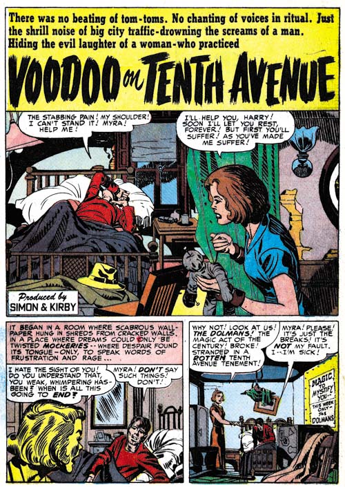

Black Magic #4 (April 1951) “Voodoo on Tenth Avenue”, art by Jack Kirby

Kirby has scaled back on his splash for his only large piece for Black Magic. Still even with half a page Jack could get a lot of impact. It is amazing how Kirby has managed to make the woman both beautiful and evil; no haggard witch here is just a cold and angry heart. What a text book example of the use of abstract arch shadows (see my Inking Glossary). I count 6 of them in this small splash.


Black Magic #5 (June 1951) “The World of Spirits”, art by Jack Kirby

While Kirby’s other contribution to Black Magic #4 to #6 were very short pieces one of them, “The World of Spirits” is not to be neglected. It is a small masterpiece. It is one of those cases where Jack, so famous for his action, has managed to make exciting art out of nothing more then talking heads. Part of what makes a page like the one shown above so vital is how Kirby changes the expressions in every panel. Since the characters are all past their youth Jack can push his already exaggerated eyebrows to much advantage. The inking is also superb. I am not one to automatically attribute good inking jobs to Kirby but the way the spotting is done on the white shirt in the splash and the use of bold cloth folds make me believe that at least much of the spotting was done by Jack himself. A lot of the times these very short pieces just did not seem to get the same attention from the various studio artists as they gave to the more substantial stories. But not Kirby; some of his greatest masterpieces are short stories such as this one.
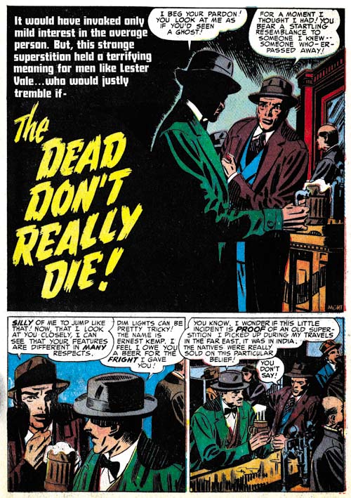


Black Magic #4 (April 1951) “The Dead Don’t Really Die”, art by Mort Meskin

I am afraid I am giving short shift to Mort Meskin by only including one example despite the fact that he produced far more work then any other artist. This certainly does not reflect on the quality of the work that Mort was producing; Meskin’s Black Magic work is among the best that he ever did. I admit that Mort did some great work for DC after leaving the Simon and Kirby studio but that unfortunately was done under the severely detrimental effects of Comic Code censoring.

I have selected this particular splash page because of its unusual design. Not that the half page splash is so visually different but the fact that the splash panel is actually the first story panel. Typically splash panels are used as the comic book equivalent of a movie trailer; they provide a sort of a synopsis of the story to entice the reader. I do not remember a story splash panel being used in any prior Simon and Kirby production. The use of this device in “The Dead Don’t Really Die” is still pretty much an isolated case but it would become very typical of Simon and Kirby romance comics in the future.
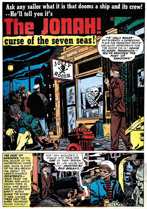

Black Magic #4 (April 1951) “The Jonah”, art by Bill Draut

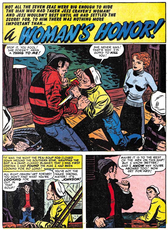
Black Magic seems to have given Bill Draut the confidence to draw the type of characters that had all but disappeared from his romance work. You normally would not see something like the sailor with the white hat in Bill’s love stories at this time. The splash panel is also something not to be seen in a romance work. How seedy can you get? Beat up trash cans, littered bottles and yeah I am sure that man in the background is just asking directions from the woman. Note the building on our right; the way the bricks are roughly inked as solid black is a mannerism often used by Draut.
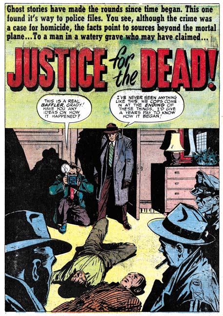

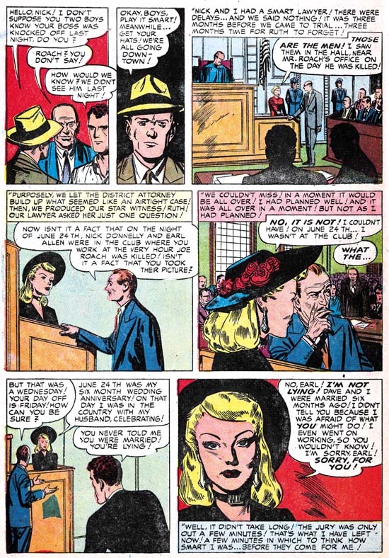
Black Magic #5 (June 1951) “Justice for the Dead”, art by John Prentice

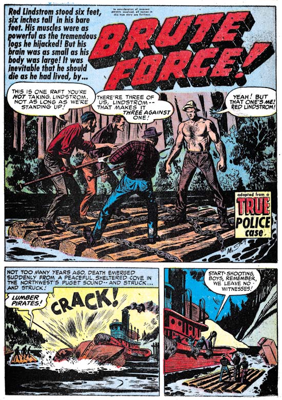
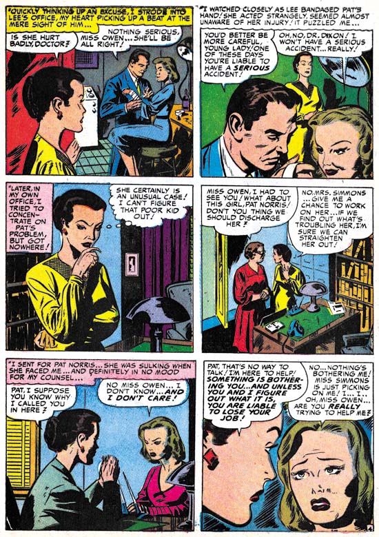
I am not sure why but John Prentice did not seem to do as much work for Black Magic as compared to what he did for the romance titles. It certainly is not because he did a poor job on them; quite the contrary. “Justice for the Dead” is a typical Black Magic piece but with a crime slant that shows that John would have made a great crime comic book artist. He had previously worked for Hillman so perhaps he had done some drawing in that genre there. The GCD lists Prentice as also having worked in Gang Busters and Mr. District Attorney for DC but I have not yet verified that. Years later John would do some work for Simon and Kirby’s Police Trap and later yet take over the syndication detective strip Rip Kirby. My knowledge of John Prentice work outside of the Simon and Kirby studio is sadly incomplete but I am working on rectifying that defect.
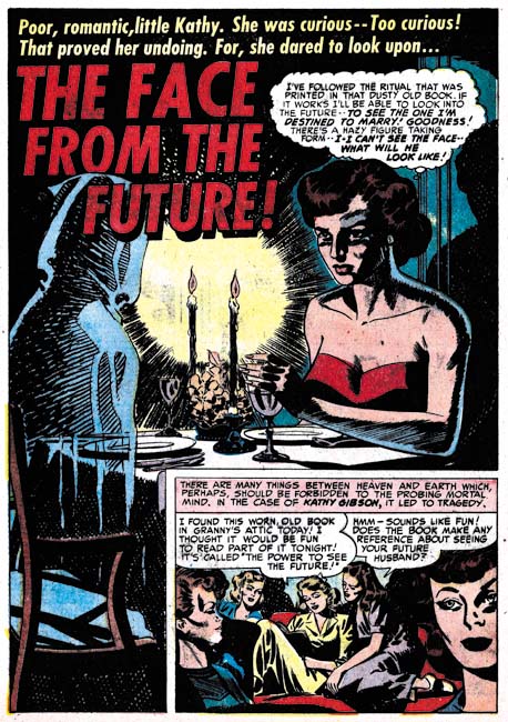

Black Magic #5 (June 1951) “The Face from The Future”, art by George Roussos

BM #3 (February) marked the earliest appearance of pencils by George Roussos in a Simon and Kirby production. Despite having two stories in that BM #5 and one in the next issue, it is odd that Roussos has not yet appeared in either Young Romance or Young Love. Since George did a lot of inking and was well known to Joe and Jack there is the possibility that he has help with inking Kirby’s work prior to this but I have seen nothing that confirms that conjecture. That Simon and Kirby both knew Roussos is indicated by a sketches both did for him in 1942 (Joe did Hitler in a zoot suite (Poking Fun at Hitler) and Jack did the Boy Commands (A Belated Happy Birthday to Jack Kirby). George also knew Mort Meskin and had inked some of Mort’s work for DC (Early Mort Meskin).

As often happens in Simon and Kirby productions, George Roussos’ splash for “The Face from the Future” uses some inking technique that seemed borrowed from the Studio Style inking. In this case we find picket fence crosshatching (Inking Glossary) on the hooded figure and a rounded shadow in the upper right corner. However it is clearly Roussos doing the inking and not Joe or Jack touching it up. While there is classical picket fence crosshatching on the right ghostly figure it changes as it proceeds to the left and becomes an inking technique not found in the Studio Style. There the shadow is built with short strokes that initially look like the pickets from the picket fence crosshatching but without the rails. The rounded shadow in the upper corner has a ragged edge that again is not typical of the way it usually is done in the Studio Style.
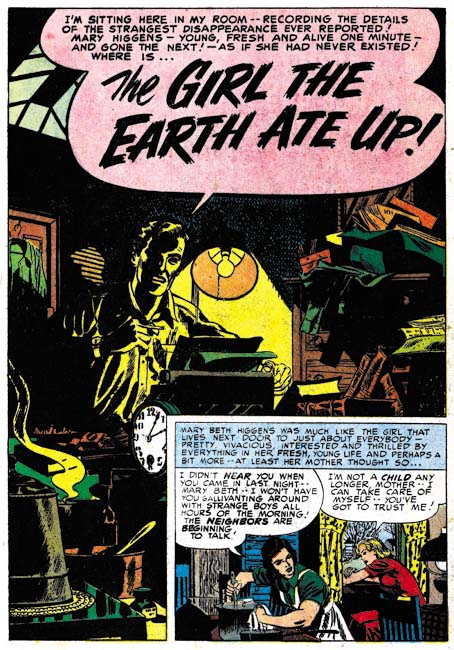

Black Magic #6 (August 1951) “The Girl the Earth Ate Up”, art by George Roussos

George does such a great job on the splash for “The Girl the Earth Ate Up” I could not resist including it. Do not get me wrong Roussos pencils and inking are on the crude side but his use of blacks makes it really work.
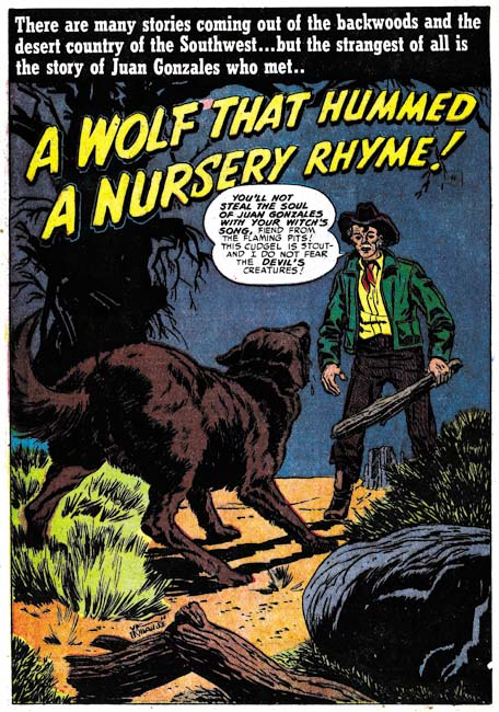

Black Magic #6 (August 1951) “A Wolf That Hummed a Nursery Rhyme”, art by Vic Donahue

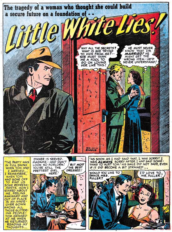
Vic Donahue has not been appearing in Simon and Kirby productions for a while and this is the only work that I have assigned to him for 1951. It is an odd story and it allows Vic to draw the type of characters that would not have been appropriate for romance work. Even so I just cannot get enthusiastic about Donahue’s effort. Vic was one of the lesser talents in the Simon and Kirby studio and now that all three of the usual suspects (Bill Draut, Mort Meskin and John Prentice) are present Donahue will rarely appear again if at all (my database has no more entries for him after this one).


Black Magic #5 (June 1951) “Follow Me”, art by unidentified artist

There is one Black Magic artist from this period that I have not been able to identify but he does a nice job on “Follow Me”. Good characterization, excellent inking and good graphic story telling.

The Little Shop of Horrors, Chapter 1 (#1 – 3), Expanding Their Fields

The Little Shop of Horrors, Chapter 3 (#7 – 8), The Same Old Gang
The Little Shop of Horrors, Chapter 4 (#9 – 11), Another Hit
The Little Shop of Horrors, Chapter 5 (#12 – 14), New Faces
The Little Shop of Horrors, Chapter 6 (#15 – 17), Mix Bag
The Little Shop of Horrors, Chapter 7 (#18 – 20), Kirby Returns
The Little Shop of Horrors, Chapter 8 (#21 – 23), The Gang’s All Here
The Little Shop of Horrors, Chapter 9 (#24 – 26), The Party’s Ovetr
The Little Shop of Horrors, Chapter 10 (#27 – 29), A Special Visitor
The Little Shop of Horrors, Chapter 11 (#30 – 33), The End

The Art of Romance, Chapter 15, The Action of Romance

(May 1951 – July 1951: Young Romance #33 – #35, Young Love #21 – #23)


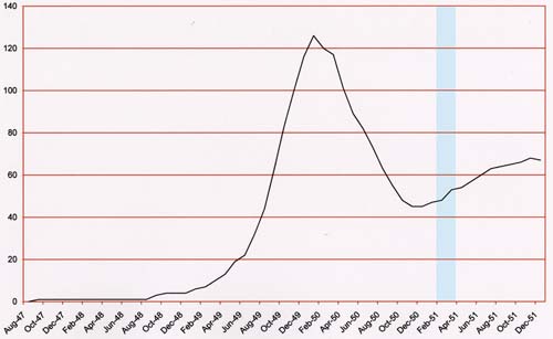
Number of Romance Titles 1947 – 1952 (the period covered in this chapter is shaded in blue)

Besides the two romance titles, Simon and Kirby were also producing bimonthly Black Magic (for Prize) and Boys’ Ranch (for Harvey). At this point I believe it can safely be said that Joe and Jack had little to do with the Prize crime titles. While Mort Meskin and Marvin Stein would appear in Prize comics both produced by Simon and Kirby and those that were not, they were the only artists that seemed to do so. John Severin had been another artist that worked in both the romance and crime titles but at this point the only Prize title he was working on was Prize Comics Western (also not a Simon and Kirby production).

Young Romance switched back to drawn covers for May and June (Young Love had already been using art covers). Both titles would revert to photographic covers for their July issues and would remain using photo covers until 1954. I really do not know what to make of YL consistently and YR sporadically using art covers for a period of about a year.

In a certain respect Jack Kirby was the primary studio artist during this period as in fact he was during the entire time Joe and Jack produced comics together. Except for a period in 1954 and My Date #4, Jack would provide the art for the cover of all Simon and Kirby productions that did not use a photograph. During this period Kirby would also do the lead story for all the issues of Young Romance and one for Young Love (YL #21). But if the total number of pages of art produced is used to judge who was the primary artist then Mort Meskin wins out be a large margin. For these six romance issue Jack did a total of 51 pages of art while Mort did 80. The difference is all the more striking with the knowledge that Meskin did all his own inking while Kirby did not. I will say that I feel that Meskin’s art sometimes suffers from his higher rate at producing art while Kirby always seems to provide high quality work no matter how many pages he drew. It also pays to compare Jack’s 51 pages with Bill Draut’s 36 and John Prentice’s 34 or 37 pages (the uncertainty about Prentice page count is due to the short feature “Will You Help Me?” from YL #21 which I will discuss below). Jack was still working at a high rate; it is just that Mort was even more exceptional. Marvin Stein is another contributor during this period with only 3 stories and 23 pages. There are 3 very short pieces (a total of 7 pages) that I have not been able provide artistic credits for.


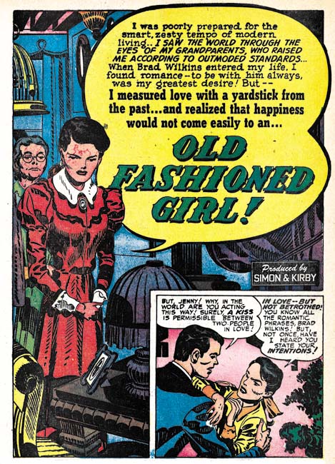
Young Romance #34 (June 1951) “Old Fashioned Girl”, art by Jack Kirby

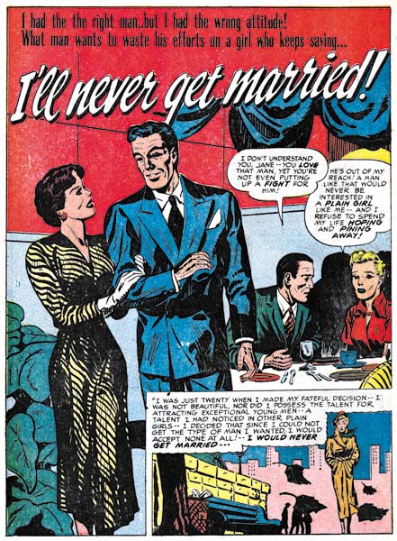
Perhaps others do not share my view, but I find Kirby’s confessional splashes powerful drawings despite their lack of action. While Kirby is generally (and quite reasonably) famous for his dynamic drawing it was a mark of his genius that he could be so effectively in such static compositions. Much of this has to do with Jack’s careful use of characterization. I have said it before but it is worth repeating, I do not agree with those who claim that Kirby did not draw beautiful women. It is true the protagonist in the splash for “Old Fashioned Girl” does not have the type of attractiveness that would be found in a beauty pageant contestant. But her frail like form has its own beauty and most importantly is totally appropriate for her antique dress style. The thing is Kirby did not draw the same women over and over but created unique individuals that were well matched to the theme of the story. The woman’s downcast eyes and the demur way she holds her hands augment the characterization. The old woman looking on and all the antique surroundings complete the picture. If all that was not enough, Jack has added a small panel that is not a story panel but another means of showing the conflict between the lady’s old fashioned ways and what was then modern society.

I feel that Jack Kirby’s romance splashes are much more interesting then the covers. I present the line art for the cover of YR #34 which is based on the “Old Fashioned Girl” story in a post above (My Two Cents). The reader can compare the two and reach their own conclusion.


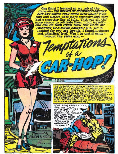
Young Romance #35 (July 1951) “Temptations of a Car Hop”, art by Jack Kirby

The splash for “Temptations of a Car Hop” provides a nice contrast to the one in “Old Fashioned Girl”. The protagonist was certainly meant to represent a thoroughly modern woman, or at least what would have been modern in 1951. However 58 years later and the car-hop has disappeared a casualty of the fast food drive through. I do remember them from my younger days but none that I ever visited had such and attractive waitress wearing such a short dress.


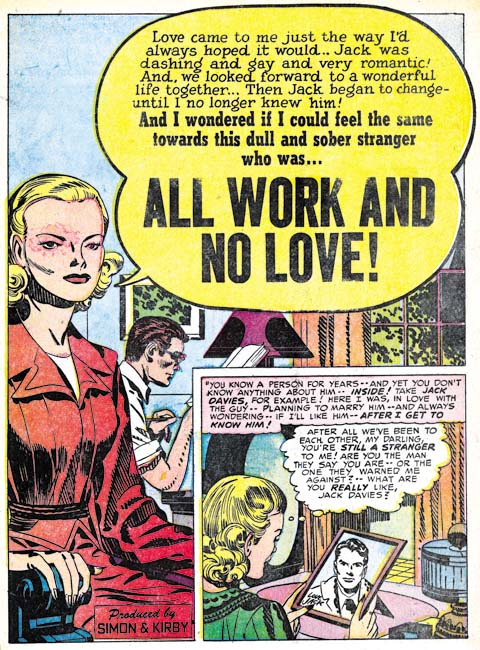
Young Love #21 (May 1951) “All Work and No Love”, pencils by Jack Kirby inks by Marvin Stein

With all the work I am doing for Titan’s Simon and Kirby library, I have not had time to devote to investigating the various inkers of Jack Kirby’s work. Still from time to time I come across a piece that just screams a particular inker. Such is the case with “All Work and No Love”. In the splash the simplicity of the woman’s eyes and eyebrows and the slight angle they have in relation to one another leaves little doubt that Marvin Stein was involved in the inking. The same sort of eyes appears elsewhere in the story as well. Also there are some cases where the eyebrow is extended into a crease of the forehead which is a trait often found in Stein’s own art. I should point out that inking of Kirby pencils in the Simon and Kirby studio was like an assembly line with various artists taking care of different chores. So when I say Marvin Stein inked this story I am saying no more then he was the one inker of this work that I have been able to identify but there are others that I have not. In this case Marvin seems to have done the outline inking, the first step in the inking process. Note however how the spotting uses the picket fence crosshatching, drop strings and shoulder blots that are characteristics of the Studio Style inking (see my Inking Glossary for explanations of the inking terminology that I use). Stein’s inking of his own work does not use such techniques. Further Stein’s own inking was a bit rough and lacked control. It would improve greatly in future years but at this point I cannot believe he could have been the artist that did the spotting.


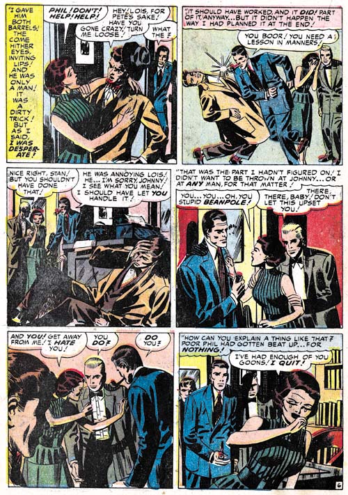
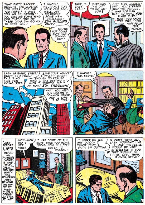
Young Romance #33 (May 1951) “Take a Letter, Darling” page 6, art by Mort Meskin

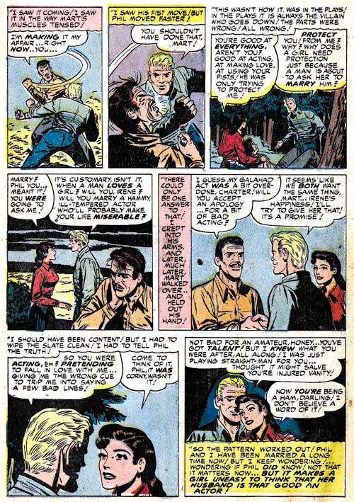
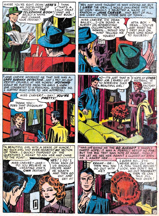
While I have frequently remarked how action is more often found in the romance stories Jack Kirby draws I do not want to leave the impression that action played no part in stories drawn by other studio artists. So I thought I would provide some examples. First up is a page by Mort Meskin. Meskin has his own unique and very stylized version of a slugging as can be seen in the second panel. Note in particular how the angular position of the victim’s head and how his legs are folded up beneath him. I say it is stylized both because Mort uses it over and over again and because it appears nothing like how a photograph a fight would look. I am not using the term stylized in a negative manner because I believe a comic artist job is to tell a story, not to try to produce a sequence of photorealistic images. With his technique Meskin has condensed several instants of time into one image (the victims head responding to being struck by the fist is the first instant, with the torso soon following and finally the loss of control of the legs as the effect of the knock out is completed).


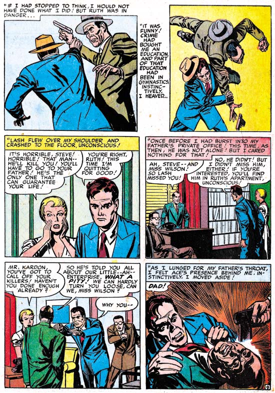
Young Romance #33 (May 1951) “Not in the Act” page 8, art by Bill Draut

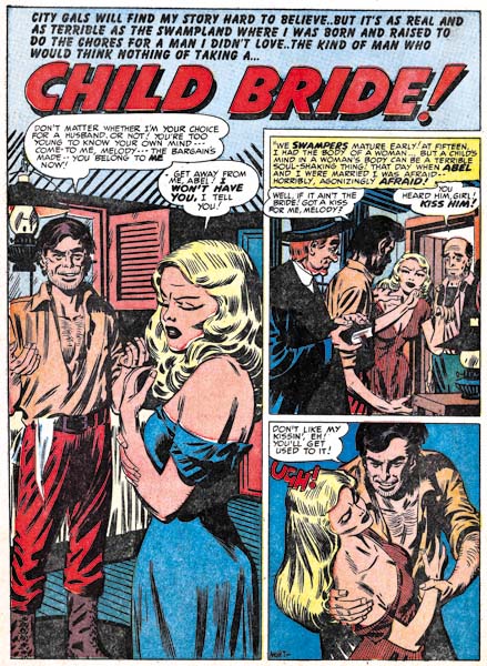
The second example of a fight comes from Bill Draut’s “Not in the Act”. Draut uses an interesting compositional device of presenting the fighters in depth. I am not sure where Bill got this idea but it is pretty effective. I do not believe I have seen Draut use it before so it is not as an important part of his repertoire as Meskin’s or Kirby’s more stylized slugging.


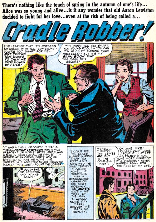
Young Love #23 (July 1951) “Cradle Robber”, art by John Prentice

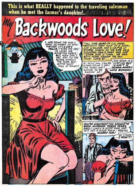
The splash for “Cradle Robber” provides an example of a fight as portrayed by the more recently arrived studio artist. Actually calling it a fight is not quite correct as Prentice has chosen to present the moment just before the punch is thrown. The other thing about this splash is that it is actually a teaser as there would be no fight seen in the story. It is however the closest example of a fight that I could find by John Prentice in the period covered by this chapter.


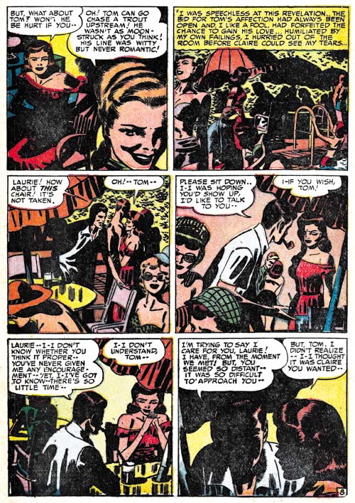
Young Romance #35 (July 1951) “The Catskill Man-Chasers” page 8, art by Mort Meskin

Mort Meskin is famous for his use of blacks but that does not always show up in his romance art. That may in part be a result of his high rate of art production. But it may also be because for Meskin telling the story properly had become a higher priority then making interesting art. Sometimes Meskin would have the best of both worlds (story and art) as in this page from “The Catskill Man-Chasers”. For many comic artists only night scenes would get an abundance of black but here Mort uses it to make the light parts so much brighter as would be appropriate for a hot summer day by the pool. Mort also uses it in the second panel to hide in plain sight Tom, the love interest of the story. Tom’s presence in the panel is not obvious at a glance because Mort only provides a silhouette but at closer examination the pipe clearly indicates that the shadowed figure is Tom. Starting with the second panel, Meskin moves in closer and closer so that the view progresses from a crowded scene to one that focuses on just the couple. While Meskin is restricting the focus he is paradoxically increasing the use of black until in the final panel the reader can make out only a little of the faces. While Mort has obscured the features he has made the scene all the more intimate. It is a masterly orchestrated page all the more so because nobody else working for Simon and Kirby, including Kirby, worked blacks anything like this.


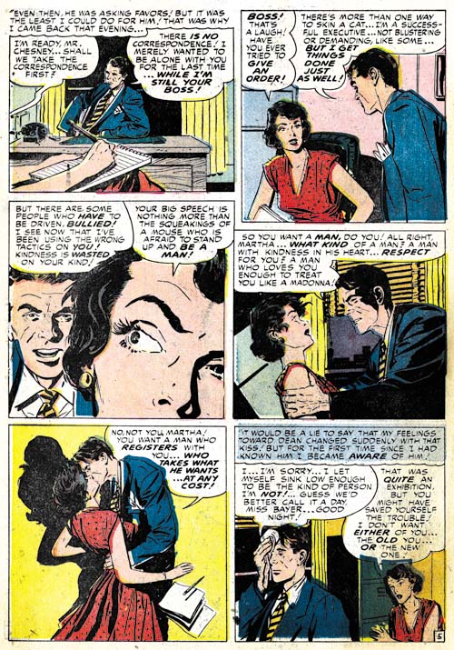
Young Romance #33 (May 1951) “Charity Case” page 5, art by John Prentice

Since John Prentice is a new addition to the Simon and Kirby studio it behooves me to begin to try to discredit the opinion that too many Kirby fans have that Jack supplied layouts for the various studio artists. While that is true for some of the more minor artists that Simon and Kirby occasionally used it is decidedly not true for the more common talented artists. John Prentice certainly falls in the talented group and except for a special case from years later and from outside the romance genre Prentice did not work from Kirby layouts. One piece of evidence in Prentice’s case comes from the dramatic close-ups like panel 3 in the page shown above. While Jack Kirby occasionally did close-ups they generally are not as radically cropped as Prentice often uses.


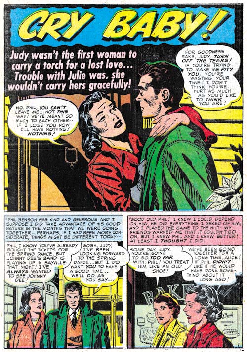
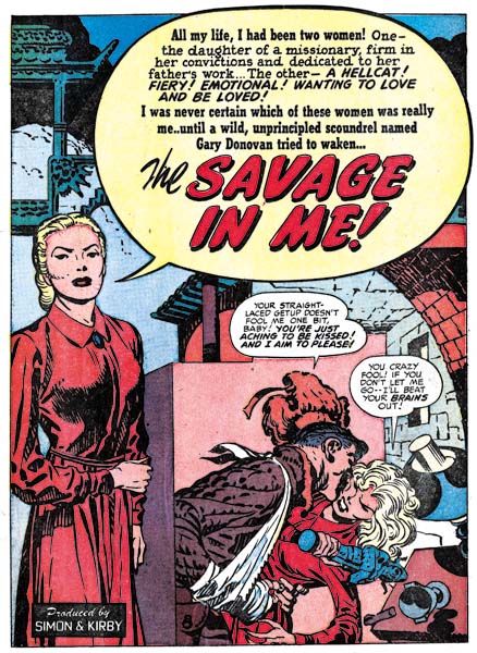
Young Love #22 (June 1951) “Cry Baby”, art by John Prentice

It was not uncommon for Studio Style inking techniques to show up in splashes of stories of the artists that otherwise were inked with other brush mannerisms. Often I suspect it was the work of Joe or Jack stepping in to touch up the art. That is not however what I judge happened to “Cry Baby”. All the major features of the studio style are present in this page if not in the splash itself; picket fence crosshatching, drop strings, abstract shadow arch and shoulder blots (see my Inking Glossary). What makes me believe this was not the work of Simon or Kirby is the way the picket fence crosshatching is done particularly on the man’s jacket. The rails are not done in the standard way of the Studio Style but match Prentice’s cloth folds. The pickets vary in both spacing and execution in ways not typical of Simon and Kirby. This leads me to believe that the spotting was actually done by Prentice himself.


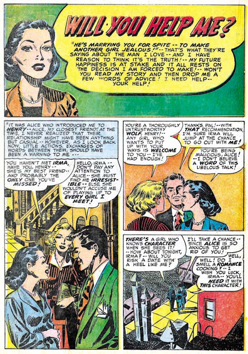
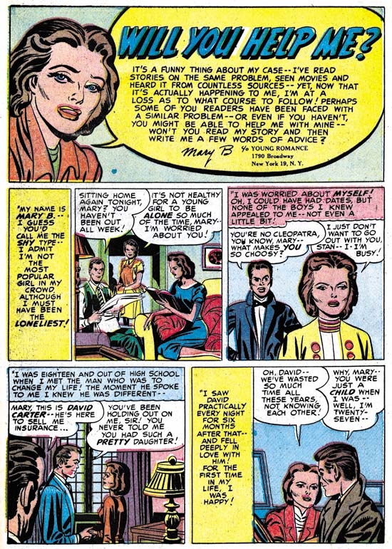
Young Love #21 (May 1951) “Will You Help Me?”, art in part by John Prentice

I must admit I am uncertain what to make of “Will You Help Me?” from YL #21. The overall simplicity of the style is different then work assigned to Prentice yet the brunette has the elegant beauty so typical of John’s work. The inking of the splash panel looks like a combination of that by Prentice and another artist. The spotting of the hair is typical of Prentice’s technique but the cloth folds are not nor are the way they are arranged along the edge of her sleeve which suggests either Simon or Kirby. The inking in the first story panel all looks like it was done by Prentice. On the other hand the crosshatching in the last story panel is not typical of any of the parties considered so far. It is possible that Prentice is inking Kirby pencils but the way the brunette turns to talk to someone behind her is a common Prentice mannerism. The other possibility is that Prentice is working from Kirby layouts with which he takes liberties in some places. It could be that John did the pencils and final spotting but that the outline inking was done by someone else. At the present I am undecided except that John Prentice participated in the art in some fashion.


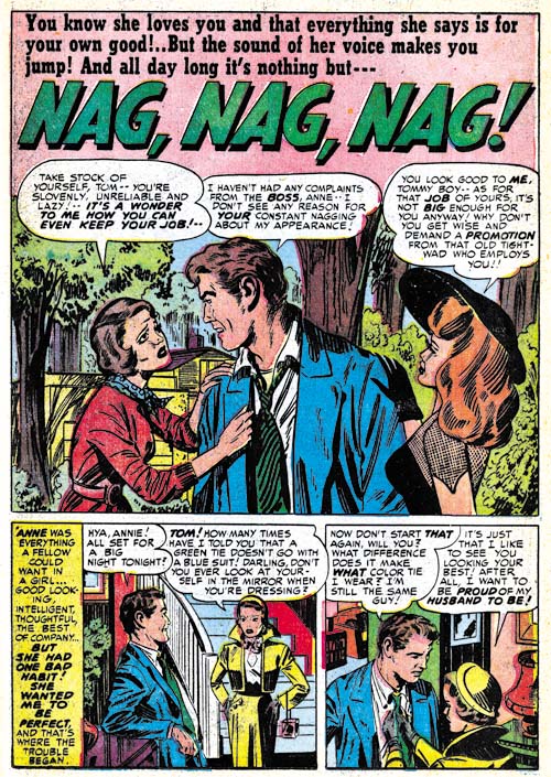
Young Love #23 (July 1951) “Nag, Nag, Nag”, art by Marvin Stein

I thought I would close off with an example of what Marvin Stein was doing during this period. The style is still typical of Stein’s early period but there are hints like the man in the second story panel that are typical of the style he would develop later.

Chapter 1, A New Genre (YR #1 – #4)
Chapter 2, Early Artists (YR #1 – #4)
Chapter 3, The Field No Longer Their’s Alone (YR #5 – #8)
Chapter 4, An Explosion of Romance (YR #9 – #12, YL #1 – #4)
Chapter 5, New Talent (YR #9 – 12, YL #1 – #4)
Chapter 6, Love on the Range (RWR #1 – #7, WL #1 – #6)
Chapter 7, More Love on the Range (RWR #1 – #7, WL #1 – #6)
Chapter 8, Kirby on the Range? (RWR #1 – #7, WL #1 – #6)
Chapter 9, More Romance (YR #13 – #16, YL #5 – #6)
Chapter 10, The Peak of the Love Glut (YR #17 – #20, YL #7 – #8)
Chapter 11, After the Glut (YR #21 – #23, YL #9 – #10)
Chapter 12, A Smaller Studio (YR #24 – #26, YL #12 – #14)
Chapter 13, Romance Bottoms Out (YR #27 – #29, YL #15 – #17)
Chapter 14, The Third Suspect (YR #30 – #32, YL #18 – #20)
Chapter 15, The Action of Romance (YR #33 – #35, YL #21 – #23)
Chapter 16, Someone Old and Someone New (YR #36 – #38, YL #24 – #26)
Chapter 17, The Assistant (YR #39 – #41, YL #27 – #29)
Chapter 18, Meskin Takes Over (YR #42 – #44, YL #30 – #32)
Chapter 19, More Artists (YR #45 – #47, YL #33 – #35)
Chapter 20, Romance Still Matters (YR #48 – #50, YL #36 – #38, YB #1)
Chapter 21, Roussos Messes Up (YR #51 – #53, YL #39 – #41, YB #2 – 3)
Chapter 22, He’s the Man (YR #54 – #56, YL #42 – #44, YB #4)
Chapter 23, New Ways of Doing Things (YR #57 – #59, YL #45 – #47, YB #5 – #6)
Chapter 24, A New Artist (YR #60 – #62, YL #48 – #50, YB #7 – #8)
Chapter 25, More New Faces (YR #63 – #65, YLe #51 – #53, YB #9 – #11)
Chapter 26, Goodbye Jack (YR #66 – #68, YL #54 – #56, YB #12 – #14)
Chapter 27, The Return of Mort (YR #69 – #71, YL #57 – #59, YB #15 – #17)
Chapter 28, A Glut of Artists (YR #72 – #74, YL #60 – #62, YB #18 & #19, IL #1 & #2)
Chapter 29, Trouble Begins (YR #75 – #77, YL #63 – #65, YB #20 – #22, IL #3 – #5)
Chapter 30, Transition (YR #78 – #80, YL #66 – #68, YBs #23 – #25, IL #6, ILY #7)
Chapter 30, Appendix (YB #23)
Chapter 31, Kirby, Kirby and More Kirby (YR #81 – #82, YL #69 – #70, YB #26 – #27)
Chapter 32, The Kirby Beat Goes On (YR #83 – #84, YL #71 – #72, YB #28 – #29)
Chapter 33, End of an Era (YR #85 – #87, YL #73, YB #30, AFL #1)
Chapter 34, A New Prize Title (YR #88 – #91, AFL #2 – #5, PL #1 – #2)
Chapter 35, Settling In ( YR #92 – #94, AFL #6 – #8, PL #3 – #5)
Appendix, J.O. Is Joe Orlando
Chapter 36, More Kirby (YR #95 – #97, AFL #9 – #11, PL #6 – #8)
Chapter 37, Some Surprises (YR #98 – #100, AFL #12 – #14, PL #9 – #11)
Chapter 38, All Things Must End (YR #101 – #103, AFL #15 – #17, PL #12 – #14)

The Art of Romance, Chapter 14, The Third Suspect

(February 1951 – April 1951: Young Romance #30 – #32, Young Love #18 – #20)


Number of Romance Titles 1947 – 1952 (the period covered in this chapter is shaded in blue)

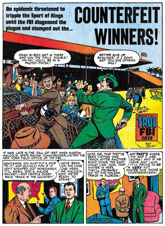
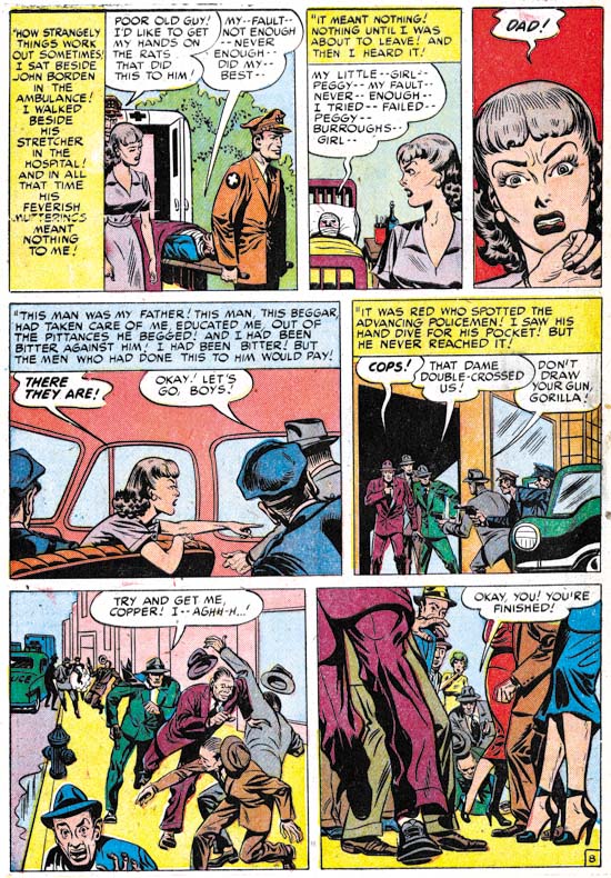
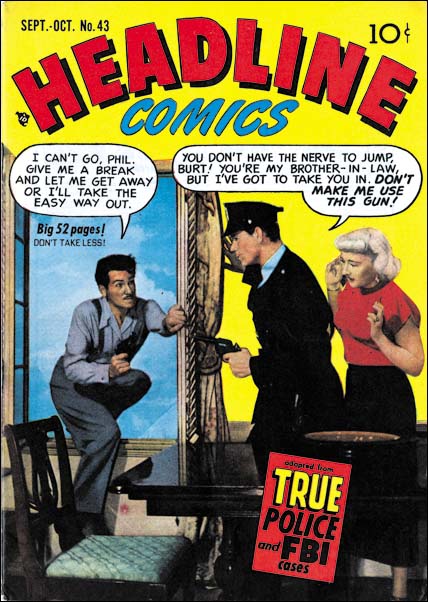
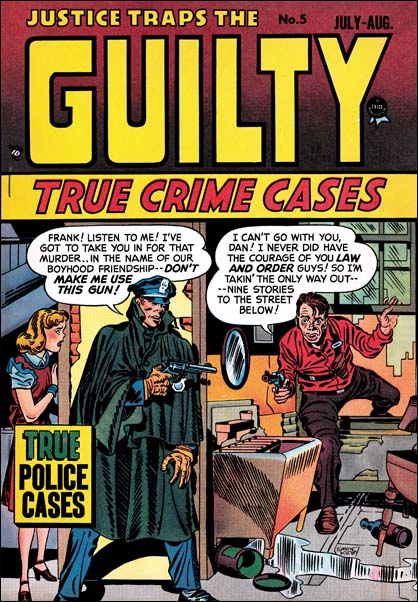
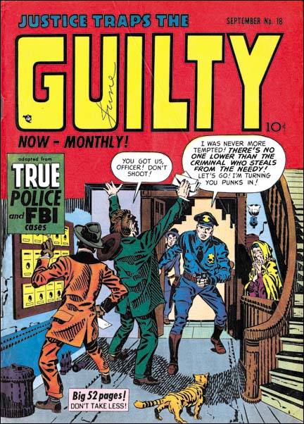
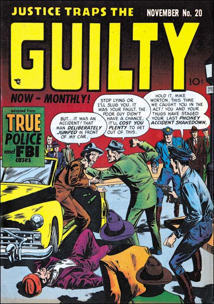
Besides Young Romance and Young Love, Simon and Kirby were also producing Black Magic and Boys’ Ranch during this period. Jack Kirby supplied some covers for Headline and Justice Traps the Guilty so it is possible that Joe and Jack still had something to do with the Prize crime titles as well. However Kirby, Draut and Starr, artists important to the other Simon and Kirby productions, did not appear in the crime titles. That plus the lack of a Simon and Kirby production cartouche seems to indicate that Headline and Justice Traps the Guilty were no longer produced by Joe and Jack. Romance comics in general were just starting to rebound from the relative low that followed the love glut. However with more then 45 titles, romance comics were still a lucrative part of the industry. Since both Young Romance and Young Love were both monthly titles it can be presumed that they were still selling quite well.


Young Romance #31 (March 1951) “One Way to Hold Him”, art by Jack Kirby

Since Joe Simon did not do much penciling anymore, Jack Kirby was by one definition the primary artist for the studio. Jack would provide the cover art that was still appearing on Young Love (Young Romance had converted back to using photographic covers). The all important lead stories for Young Romance were all done by Kirby. At 12 to 14 pages long, Jack’s lead stories for YR were longer then the work by any other studio artist (a maximum of 9 pages). But if the primary artist is considered the one producing the greatest number of pages of art, Kirby was no longer the primary romance artists. During this period Kirby produced 55 pages of romance art while Mort Meskin did 66 pages. Jack’s work for Boys’ Ranch #3 (February) meant that for February Jack produced the greatest number of pages in the studio for all genres but by April that was no longer true and Mort would take the lead.

About three and a half years since the start of Young Romance and Kirby is still finding ways to put special interest into his romance stories. Jack could write a story without action but he certainly like to add it when possible. Who else would use the rough and tumble roller derby world to tell a love story. I often wonder how the original teenage girl readers thought of Jack’s stories but for the modern comic reader there is no question that Kirby’s romance stories are fascinating reads.


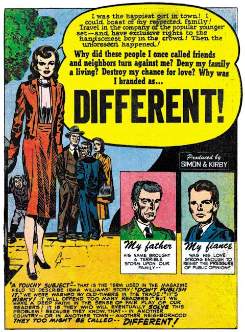
Young Romance #30 (February 1951) “Different”, art by Jack Kirby

Jack Kirby was not averse to using a love story to tackle social themes as well. “Different” is not really about romance but about intolerance instead. Initially when the family moved into the neighborhood they were well received. Only after the visit of the grandparents reveals that the family’s original name had been Wilheims did the community turn against them. Love is just a background to the story of initial acceptance followed by rejection based only on the towns prejudiced perception of the family’s background.


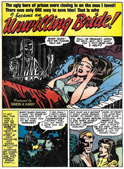
Young Love #18 (February 1951) “Unwilling Bride”, art by Mort Meskin

As discussed above, it was during this period that for the first time Mort Meskin output exceeded Jack Kirby’s. Meskin’s art production rate is all the more remarkable considering that Mort did all his own inking while Jack’s work was mostly inked by others. I wish the original art for the splash from “Unwilling Bride” was available as I would love to know how the negative figure of the jailed man was done. The spotting looks like it was brushed with white ink but I would think it would have been difficult to work white over a black background. Would Simon and Kirby have agreed to the extra expense to make a negative stat? However it was done it provides an effective way to put an image to the troubled girl’s thoughts.


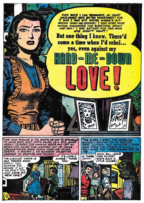
Young Romance #32 (April 1951) “Hand-Me-Down Love”, art by Bill Draut

Once again Bill Draut takes third place in the amount of work provided; 6 stories with 45 pages.

Previously Bill Draut’s splash art seemed to be in a bit of a rut; not bad but not particularly exciting. Perhaps because of his work in the new Black Magic title Draut seems to have his mojo working again. Whatever the reason Bill has some nice splashes during this period. “Hand-Me Down Love” is a confessional splash which makes me suspect that it was originally meant to be the lead story for Young Love but was moved to Young Romance instead. Since Kirby was doing all the lead stories in Young Romance Draut’s work then became one of the backup stories. Like many of Kirby’s romance splashes at the time there really is not much going on but what is presented tells a whole story. The woman’s apron identifies her as a housewife. The drab background with a wall having small flaws indicates her humble surroundings. Two photographs should be her loved ones. The man obviously would be her husband but what can be made of the woman? While the splash tells a story it purposely leaves some things unanswered to entice the viewer to read the story.


Young Romance #31 (March 1951) “The Things You’re Missing”, art by Marvin Stein

The fourth most used artist was Marvin Stein with 4 stories and 32 pages. Stein would produce some nice work for the crime titles in the future but at this point his style is a bit clumsy. Some of Marvin’s characteristic traits can be found at this earlier stage, such as the shallow depth to the face of the man in the splash. When inking his own work Stein was always a bit rough but at this point his brush also lacks the assurance he would eventually gain. Without that confidence his inking just looks as clumsy as his pencil work.


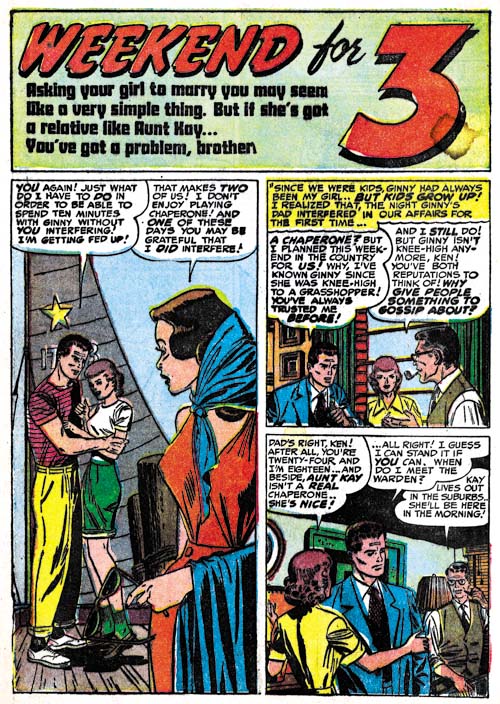
Young Romance #30 (February 1951) “Weekend For 3”, art by Leonard Starr

For whatever reason, Leonard Starr only provided a single story in the period covered in the last chapter but now he does 3 stores with 22 pages. Starr seems to have completely abandoned the tall and very narrow panels that he had previously favored. Occasionally he would divide a panel row into three panels and even more rarely extend the height slightly but the panels never become as narrow as before. For the most part now Starr adhered to a standard panel layout of 3 rows with 2 panels per row. Leonard still likes to use a vertical splash as for example “Weekend For 3”.


Young Love #18 (February 1951) “The Cave Man Type”, art by Leonard Starr

It was not just Starr’s panel layouts that were evolving. I mentioned in the Chapter 12 how Leonard had begun using a sultrier female along with the more pixie look his females previously had. In “The Cave Man Type” Starr uses what was for him a very different type of man.

My database indicates that February 1951 was when Starr would do his last work for Simon and Kirby until 1954 (and I have gone back to verify the attribution of the two 1954 pieces). But originally my database only included a single Starr work for February but with this recent review I now add two more. Considering that Starr stopped providing signatures on his later S&K work and that his style was changing I wonder if I will find more of his work when I write the next couple of chapters to this serial post?


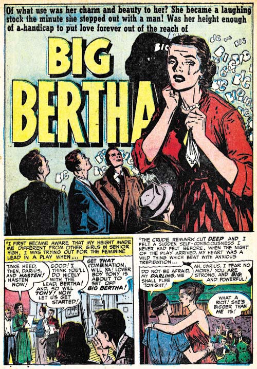
Young Love #20 (April 1951) “Big Bertha”, art by John Prentice

“Big Bertha” from YL #20 marks the first appearance in a Simon and Kirby production of work by John Prentice. My previous short biography on John Prentice (John Prentice, Usual Suspect #3) is seriously flawed* and incomplete and I really should put together a better one. Prior to coming to work for Joe and Jack, Prentice had been working for Hillman and perhaps some other publishers as well. Prentice shared an apartment with Starr so perhaps Leonard aided John in getting work from Simon and Kirby. Most artists that worked for Simon and Kirby had adopted (directly or indirectly) aspects of Milt Caniff’s style but John was greatly influenced by Alex Raymond. So much so that when Raymond died suddenly in 1956, Prentice was able to easily take over his syndication strip Rip Kirby. John’s arrival in the S&K studio filled a significant gap created when Bruno Premiani left. Artists would come and go in Joe and Jack’s studio, but the presences of Bill Draut, Mort Meskin, John Prentice, and of course Jack Kirby meant that all Simon and Kirby productions would have a healthy and interesting combination of artists.


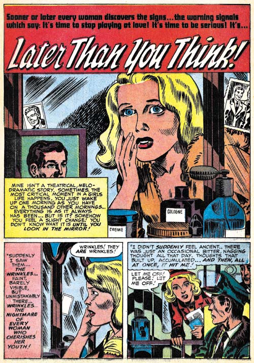
Young Love #19 (March 1951) “Later Then You Think”, layout by Jack Kirby

I have been able to provide attributions for all of the romance work during the period covered by this chapter with the exception of “Later Then You Think”. This looks like the work of some minor artist working from layouts provided by Jack Kirby. Normally when I describe a work as based on Kirby layouts I am uncomfortable using that term because it was obvious that what Jack had provided were very tight in some places. In this particular case that is not true; the artist style is present throughout and no parts have an overly Kirby look. The only exceptions are the photographs in the splash panel that totally look like they were done by Jack. Interestingly the entire story is inked in the Studio Style; shoulder blots, abstract shadow arches, and picket fence crosshatching are found throughout.

Footnotes:

* The most serious error in my previous post on John Prentice is my attributing to him “Two-Timer” from Young Love #4 a piece that I now questionably credit to Bruno Premiani.

Chapter 1, A New Genre (YR #1 – #4)
Chapter 2, Early Artists (YR #1 – #4)
Chapter 3, The Field No Longer Their’s Alone (YR #5 – #8)
Chapter 4, An Explosion of Romance (YR #9 – #12, YL #1 – #4)
Chapter 5, New Talent (YR #9 – 12, YL #1 – #4)
Chapter 6, Love on the Range (RWR #1 – #7, WL #1 – #6)
Chapter 7, More Love on the Range (RWR #1 – #7, WL #1 – #6)
Chapter 8, Kirby on the Range? (RWR #1 – #7, WL #1 – #6)
Chapter 9, More Romance (YR #13 – #16, YL #5 – #6)
Chapter 10, The Peak of the Love Glut (YR #17 – #20, YL #7 – #8)
Chapter 11, After the Glut (YR #21 – #23, YL #9 – #10)
Chapter 12, A Smaller Studio (YR #24 – #26, YL #12 – #14)
Chapter 13, Romance Bottoms Out (YR #27 – #29, YL #15 – #17)
Chapter 14, The Third Suspect (YR #30 – #32, YL #18 – #20)
Chapter 15, The Action of Romance (YR #33 – #35, YL #21 – #23)
Chapter 16, Someone Old and Someone New (YR #36 – #38, YL #24 – #26)
Chapter 17, The Assistant (YR #39 – #41, YL #27 – #29)
Chapter 18, Meskin Takes Over (YR #42 – #44, YL #30 – #32)
Chapter 19, More Artists (YR #45 – #47, YL #33 – #35)
Chapter 20, Romance Still Matters (YR #48 – #50, YL #36 – #38, YB #1)
Chapter 21, Roussos Messes Up (YR #51 – #53, YL #39 – #41, YB #2 – 3)
Chapter 22, He’s the Man (YR #54 – #56, YL #42 – #44, YB #4)
Chapter 23, New Ways of Doing Things (YR #57 – #59, YL #45 – #47, YB #5 – #6)
Chapter 24, A New Artist (YR #60 – #62, YL #48 – #50, YB #7 – #8)
Chapter 25, More New Faces (YR #63 – #65, YLe #51 – #53, YB #9 – #11)
Chapter 26, Goodbye Jack (YR #66 – #68, YL #54 – #56, YB #12 – #14)
Chapter 27, The Return of Mort (YR #69 – #71, YL #57 – #59, YB #15 – #17)
Chapter 28, A Glut of Artists (YR #72 – #74, YL #60 – #62, YB #18 & #19, IL #1 & #2)
Chapter 29, Trouble Begins (YR #75 – #77, YL #63 – #65, YB #20 – #22, IL #3 – #5)
Chapter 30, Transition (YR #78 – #80, YL #66 – #68, YBs #23 – #25, IL #6, ILY #7)
Chapter 30, Appendix (YB #23)
Chapter 31, Kirby, Kirby and More Kirby (YR #81 – #82, YL #69 – #70, YB #26 – #27)
Chapter 32, The Kirby Beat Goes On (YR #83 – #84, YL #71 – #72, YB #28 – #29)
Chapter 33, End of an Era (YR #85 – #87, YL #73, YB #30, AFL #1)
Chapter 34, A New Prize Title (YR #88 – #91, AFL #2 – #5, PL #1 – #2)
Chapter 35, Settling In ( YR #92 – #94, AFL #6 – #8, PL #3 – #5)
Appendix, J.O. Is Joe Orlando
Chapter 36, More Kirby (YR #95 – #97, AFL #9 – #11, PL #6 – #8)
Chapter 37, Some Surprises (YR #98 – #100, AFL #12 – #14, PL #9 – #11)
Chapter 38, All Things Must End (YR #101 – #103, AFL #15 – #17, PL #12 – #14)

The Art of Romance, Chapter 13, Romance Bottoms Out

(November 1950 – January 1951: Young Romance #27 – #29, Young Love #15 – #17)


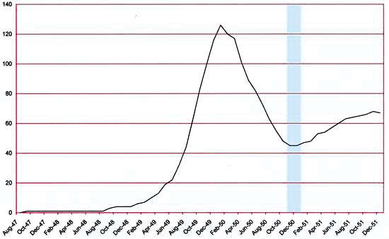
Number of Romance Titles 1947 – 1951 (the period covered in this chapter shaded in blue)

Besides the monthly Young Romance and Young Love, Simon and Kirby were now also producing bimonthly titles Black Magic for Prize and Boys’ Ranch for Harvey. Boys’ Ranch was the first work that Joe and Jack had done for Harvey since Stuntman and Boy Explorers were cancelled in 1946 (other Simon and Kirby features that Harvey had published since then were inventoried material left over from the sudden cancellation of those titles). It was too soon to tell whether Black Magic and Boys’ Ranch would be successful (Black Magic would be, Boys’ Ranch would fail) but the romance titles still seemed to be very lucrative. Both romance titles had returned to art covers (YL in August and YR in October) but after just two art covers, Young Romance reverted back to photo covers. As for other publishers, the romance glut had finally reached a relative low point and in future months the number of love titles would begin to increase. While the number of romance titles was much lower then at the height of the glut there were still a respectable 45 romance comics books on the racks.


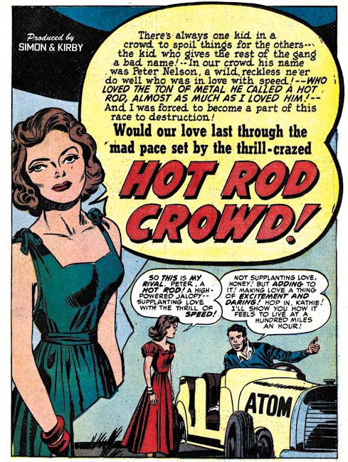
Young Romance #28 (December 1950) “Hot Rod Crowd”, art by Jack Kirby

Once again Jack Kirby was the primary artist during this period with 4 covers, 13 stories and 69 pages. Jack would provide the lead feature for 5 of the issues. The lead stories Kirby did for Young Romance would still be longer then those by any other artists (10 to 12 pages for Kirby compared to a maximum of 9 pages in a story by Bill Draut and another by Leonard Starr). While I was less then enthusiastic about some of the Kirby splashes in the last chapter some of those that Jack provided in these issues are back to his high standards. Kirby continues to use the confessional format for his lead feature splashes. Actually Kirby’s contribution was somewhat greater then I have outlined because as we will see below he provided some layouts as well.


Young Romance #28 (December 1950) “Will You Help Me?”, pencils by Jack Kirby, inks by Bill Draut

It should always be kept in mind when I point out that Kirby was the primary artist that Jack had a substantial advantage over the rest of the studio artists. I am not talking about his greater talent (although that is true) but on the availability of inkers. The Simon and Kirby studio operated very different from say the Marvel studio under Stan Lee during the silver age. Artists working for Simon and Kirby were expected to provide finished art while Stan Lee would typically assign pencils to one artist and afterwards pass the work on to another to do the inking. Most S&K studio artists did their own inking but some made their own arrangements with another artist to do the inking (for instance John Severin would often have Bill Elder ink his work). However Jack Kirby’s pencils were most often inked by others. Joe has described it as an assembly line approach with different hands doing different inking chores. Under that arrangement it is not possible to recognize all the inkers who worked on a particular piece. To make matters worse Kirby inkers never signed their work (that is other then Joe Simon and a Simon and Kirby signature does not necessarily mean Joe inked it). Nonetheless comparing brush techniques on work penciled by Kirby with art drawn as well as inked by other artists allows some of Kirby’s inkers to be identified. For instance the simple eyebrows found on the woman and the cloth folds of the man’s jacket in the last panel of the page above indicate that story had been inked by Bill Draut.


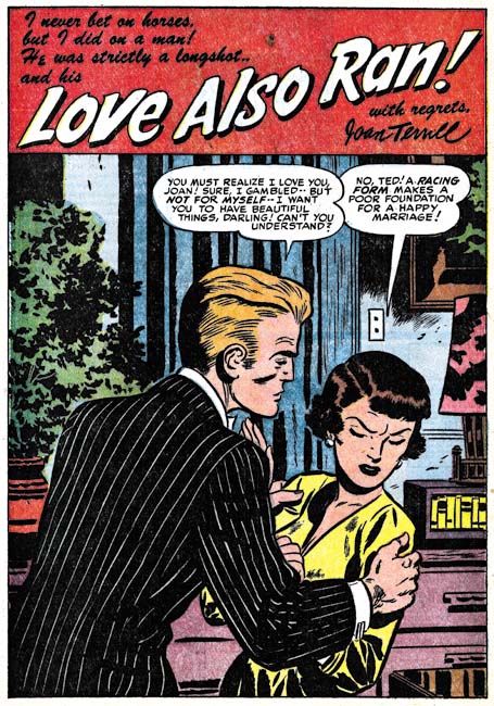
Young Romance #29 (January 1950) “Love Also Ran”, art by Bill Draut

The second most used artist was Bill Draut (7 stories with 53 pages). Previously Draut primarily did horizontal half page splashes but recently has been doing some full page splashes as well. I greatly admire Draut’s art and he has done some nice half page splashes but I must admit that I am underwhelmed by most of his full page romance splashes. They are not bad just not very exciting. That is except for the splash for “Love Also Ran”. Unlike some of his other full pages splashes, here Draut has concentrated on the drama and leaves the background to provide visual interest without overwhelming the image. It is not how Simon and Kirby would have laid it out but it still works just fine.


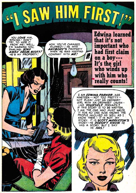
Young Love #17 (January 1951) “I Saw Him First”, art by Mort Meskin

The third most used romance artist was Mort Meskin (7 stories with 52 pages) although with just one less page then Draut. Generally Meskin provided half pages splashes but for “I Saw Him First” he does a full pages one. Mort does his own take of the confessional splash. What first appears to be a story panel in the corner turns out on reading to be the protagonist introducing the story. And unlike in Simon and Kirby’s confessional splashes, her introduction does not provide the story title. In fact the design of the title is quite unusual for a Simon and Kirby production so perhaps Meskin created the logo as well. It all works out quite well and one wonders why Meskin did not do this sort of thing more often.


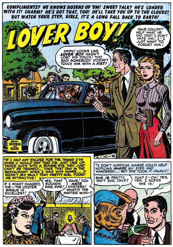
Young Love #15 (November 1950) “Lover Boy”, pencils by John Severin, inks by Bill Elder

Kirby, Draut and Meskin did most of the work in these six issues of the romance comics. There are few other artists used and what artists there are supplied limited amounts of material. The next most prolific artist was John Severin who did the art for 4 features but because only one story had more then 2 pages this meant John only did 13 pages of art. John provides his usual quality art but just as typically he seems to be a little out of place in the romance genre. There is not a single kiss to be found in this work.


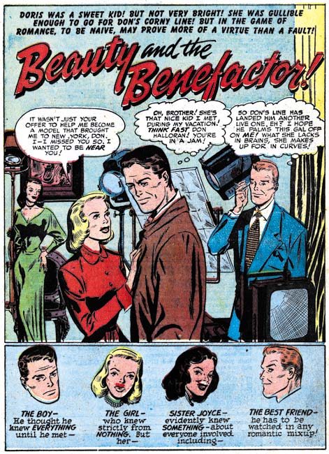
Young Love #15 (November 1950) “Beauty and The Benefactor”, art by Leonard Starr

Leonard Starr provides a single 9 page romance story in this period. While Starr had not been one of the primary artists for Simon and Kirby productions, he had been a steady presence since April 1949. “Beauty and the Benefactor” will not be the last work by Starr to be used by Joe and Jack but the rest will be more infrequent. The splash shown above is unusual for Leonard who normally did half page splashes and favored vertical ones in particular. This is the only splash Starr did for S&K with a row of floating heads. Further the posses are not typical of Starr either. All of these features are however found in some Simon and Kirby splashes and I am sure that here Starr is working from their layout.


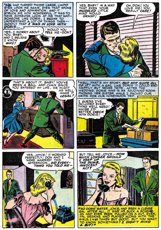
Young Love #15 (November 1950) “Beauty and The Benefactor” page 9, art by Leonard Starr

Starr generally had his own way of laying out story panels. Often he would use tall narrow panels constructed by dividing a row into three panels instead of the normal two and either limiting the page to two rows (thereby making a 2 X 3 panel arrangement instead of the typical 3 X 2, as seen in Chapter 7) or by reducing the vertical dimensions of two of the rows (Chapter 10). While tall narrow panels would not occur on every page they would be found on many. Tall narrow panels are not found at all in “Beauty and The Benefactor” nor were they used in “Hired Wife” published in the previous month (and briefly discussed in the last chapter). Their absence calls for an explanation but unfortunately I can only offer a guess. Since Simon and Kirby provided a layout for the “Beauty and The Benefactor” splash (but not the one for “Hired Wife”) one suggestion might be that they laid out the stories as well. However I do not think that is the case. The page layouts are not a perfect grid of three rows and two columns on all pages but they approximate that arrangement more then was typical for Simon and Kirby. Further the way these stories by Starr are graphically told does not appear to match Kirby’s more cinematic approach.

I would instead propose two, not mutually exclusive, explanations for Starr’s change in panel layouts. One was to speed up the work. With Starr’s previous layouts he could not construct the panels until he had decided what he was going to draw on each page. By adhering to a 3 by 2 panel layout he could construct the horizontal rows for an entire story before actually beginning to draw it and then supply the vertical separation between the two panels in a row as he worked. Simon and Kirby had used this technique on their more complicated panel layouts found in Stuntman and Boys Explorer. The other explanation for Starr’s change in panel layouts may have to do with his desire to break into syndication strips. While the tall narrow panels were very effective in a comic book they would not work well in a syndication strip. Perhaps Starr was consciously changing his working methods to gain experience working in a format more appropriate for syndication work. Starr would in a few years succeed in breaking into syndication with his “Mary Perkins on Stage”.


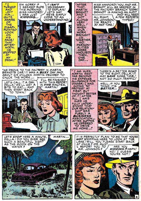
Young Love #17 (January 1951) “She Loves Too Wisely” page 4, art by unidentified artist

While most of the romance issues covered in this chapter were produced using artists that we have seen often before, there are some artists that seem to be new. I am not sure what to say about “She Loves Too Wisely”. Some of the men in it look like they might have been done by John Severin but not all and none of the women look like his work. Perhaps what makes the art for this story so hard to place is that it would appear from the cinematic approach used in this story that it was drawn from a Simon and Kirby layout. It is even inked in a version of the Studio Style. Note the abstract arch in panel 2 and the frequent shoulder blots (Inking Glossary).


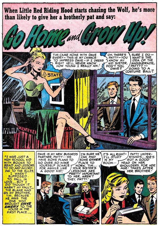
Young Love #17 (January 1951) “Go Home and Grow Up”

Another artist did “Go Home and Grow Up”. This is one of those artist that, although they are not bad, are not as talented as most artists employed by Simon and Kirby.


Young Romance #28 (December 1950) “A Shattered Dream” page 2

Here is the same artist in “A Shattered Dream”. Again not bad but not particularly great either.


Young Romance #28 (December 1950) “A Shattered Dream” page 8

Unlike “Go Home and Grow Up”, not all the art in “A Shattered Dream” is forgettable. Some of it looks very much like Jack Kirby drew it. This is particularly true for page 8. Can there be little doubt about Jack’s hand in the woman in the panel 4? These two pages are the extremes with page 2 showing little evidence of Jack while page 8 looks like almost pure Kirby and the rest of the story falling in between. The layouts of most of the pages look like Kirby’s cinematic approach. If all the pages looked consistently the same I would say that this was the result of some artist’s heavy handed approach to inking Kirby’s pencils. But in a case like this were the art varies I conclude Kirby provided layouts that another artist finished and then inked. Apparently Kirby’s layouts typically were tighter in some spots and loose in others.


Young Romance #27 (November 1950) “Heart of Steel”

Each publisher had his own house style. This certainly was true with the comics that Simon and Kirby produced. I doubt that Joe and Jack actually told their artists what style to use. I am sure part of the Simon and Kirby house style came from the artists that they selected to work for them. I also believe that Jack Kirby was so well known and respected that he had a great influence on other studio artists. But there are two stories in a single Young Romance issue (YR #27, November 1950) that do not seem to share in the Simon and Kirby house style. In fact they look very much like the very different house style found in Harvey romance comics. This is particularly true of “Heart of Steel”. One of the things that gave Simon and Kirby productions their own unified look was that a single letterer was used (first Howard Ferguson and later Ben Oda). But look at the lettering in the captions above; the lettering is very small in size and uses lower case letters. This is so very different from the lettering used in Simon and Kirby comics that there can be little doubt that it was done by a different letter. Unfortunately I have not had a chance to compare this with Harvey comics from the same period but I have looked at a couple of Hi-School Romance issues from about a year latter and exactly this same lettering is found in them.


Young Romance #27 (November 1950) “My Tormented Heart”

“My Tormented Heart” does not use the same letterer but then again not all Harvey comics that I have seen do. Both stories use the same splash page layout that is found in almost all Harvey romance comics. The title logo and the small circular caption are not typical for Simon and Kirby but can be found in Harvey romance comics. Even the coloring for these two stories has a lighter quality more typical of Harvey then Simon and Kirby productions.

But why would stories with the Harvey house style appear in Young Romance? I think part of explanation can be found in the aftermath of the love glut. While not as big a contributor to the glut as Timely, Fox, Fawcett and Quality, Harvey still had 7 romance titles at the height of the glut. However between April and June of 1950 6 of these titles would either be suspended or cancelled. Only First Love would be continually published during this period. Simon and Kirby had a long history with Al Harvey and had recently starting producing Boys’ Ranch for Harvey. So it would seem that Joe and Jack were picking up some inventory from Harvey. I believe the art was from Harvey and not his artists because it was completed including the lettering and possibly the coloring as well. The question then becomes not so much why Simon and Kirby obtained art from Harvey but rather why they did not pick up more? While Harvey was, like many other publishers, hurt by the love glut it was still obvious that there was good money to be made in romance comics. Harvey would relaunch Hi-School Romance in December, Love Problems and Advice in January and First Romance in June (Love Lessons, Sweet Love and Love Stories of Mary Worth would never resume).

Unfortunately I have no idea who either of the two artists was. I am sure I have seen the artist for “Heart of Steel” in other Harvey romance comics. He provides his women with eyebrows that are reminiscent of Bob Powell. I have heard that Powell often used assistants but I do not believe that is what happened to “Heart of Steel”. Unfortunately it is hard to be sure about anything when it comes to artists working on Harvey’s romance comics. Only Lee Elias, who had a long association with Harvey, ever signed romance art (some covers) so I suspect there was a policy against signatures in Harvey romances. Joe Simon has told me there was such a policy about signing art for Harvey’s humor comics and Joe felt that was why Warren Kramer did not get the recognition that he deserved.

During this period the romance comics were largely made by just three artists; Jack Kirby, Bill Draut and Mort Meskin. While I greatly admire all of those artists I feel that the absence or near absence of Bruno Premiani? and Leonard Starr left a big hole in Young Romance and Young Love. Even Vic Donahue’s presence would have gone a long way to making these more satisfying comic books.

Chapter 1, A New Genre (YR #1 – #4)
Chapter 2, Early Artists (YR #1 – #4)
Chapter 3, The Field No Longer Their’s Alone (YR #5 – #8)
Chapter 4, An Explosion of Romance (YR #9 – #12, YL #1 – #4)
Chapter 5, New Talent (YR #9 – 12, YL #1 – #4)
Chapter 6, Love on the Range (RWR #1 – #7, WL #1 – #6)
Chapter 7, More Love on the Range (RWR #1 – #7, WL #1 – #6)
Chapter 8, Kirby on the Range? (RWR #1 – #7, WL #1 – #6)
Chapter 9, More Romance (YR #13 – #16, YL #5 – #6)
Chapter 10, The Peak of the Love Glut (YR #17 – #20, YL #7 – #8)
Chapter 11, After the Glut (YR #21 – #23, YL #9 – #10)
Chapter 12, A Smaller Studio (YR #24 – #26, YL #12 – #14)
Chapter 13, Romance Bottoms Out (YR #27 – #29, YL #15 – #17)
Chapter 14, The Third Suspect (YR #30 – #32, YL #18 – #20)
Chapter 15, The Action of Romance (YR #33 – #35, YL #21 – #23)
Chapter 16, Someone Old and Someone New (YR #36 – #38, YL #24 – #26)
Chapter 17, The Assistant (YR #39 – #41, YL #27 – #29)
Chapter 18, Meskin Takes Over (YR #42 – #44, YL #30 – #32)
Chapter 19, More Artists (YR #45 – #47, YL #33 – #35)
Chapter 20, Romance Still Matters (YR #48 – #50, YL #36 – #38, YB #1)
Chapter 21, Roussos Messes Up (YR #51 – #53, YL #39 – #41, YB #2 – 3)
Chapter 22, He’s the Man (YR #54 – #56, YL #42 – #44, YB #4)
Chapter 23, New Ways of Doing Things (YR #57 – #59, YL #45 – #47, YB #5 – #6)
Chapter 24, A New Artist (YR #60 – #62, YL #48 – #50, YB #7 – #8)
Chapter 25, More New Faces (YR #63 – #65, YLe #51 – #53, YB #9 – #11)
Chapter 26, Goodbye Jack (YR #66 – #68, YL #54 – #56, YB #12 – #14)
Chapter 27, The Return of Mort (YR #69 – #71, YL #57 – #59, YB #15 – #17)
Chapter 28, A Glut of Artists (YR #72 – #74, YL #60 – #62, YB #18 & #19, IL #1 & #2)
Chapter 29, Trouble Begins (YR #75 – #77, YL #63 – #65, YB #20 – #22, IL #3 – #5)
Chapter 30, Transition (YR #78 – #80, YL #66 – #68, YBs #23 – #25, IL #6, ILY #7)
Chapter 30, Appendix (YB #23)
Chapter 31, Kirby, Kirby and More Kirby (YR #81 – #82, YL #69 – #70, YB #26 – #27)
Chapter 32, The Kirby Beat Goes On (YR #83 – #84, YL #71 – #72, YB #28 – #29)
Chapter 33, End of an Era (YR #85 – #87, YL #73, YB #30, AFL #1)
Chapter 34, A New Prize Title (YR #88 – #91, AFL #2 – #5, PL #1 – #2)
Chapter 35, Settling In ( YR #92 – #94, AFL #6 – #8, PL #3 – #5)
Appendix, J.O. Is Joe Orlando
Chapter 36, More Kirby (YR #95 – #97, AFL #9 – #11, PL #6 – #8)
Chapter 37, Some Surprises (YR #98 – #100, AFL #12 – #14, PL #9 – #11)
Chapter 38, All Things Must End (YR #101 – #103, AFL #15 – #17, PL #12 – #14)

The Little Shop of Horrors, Chapter 1, Expanding Their Fields

(October 1950 to February 1951, Black Magic #1 – #3)

In the early part of 1950 Simon and Kirby had established their studio and were producing comics with a relative small but generally talented group of artists. Their most important, perhaps only, product were two monthly romance titles, Young Romance and Young Love. I do not believe Joe and Jack were still producing the Prize crime titles (Headline and Justice Traps the Guilty) but if they were their involvement was minimal and coming to an end. Few of the studio artists found in the romance titles contributed to the crime titles. Further Jack Kirby would provide some cover art for the crime titles but no interior stories. Simon and Kirby’s deal with Prize for the romance titles was very lucrative but the two were always ambitious and keen to try new challenges.


Young Romance #23 (July 1950) house ad, art by Jack Kirby

The July issues of Young Romance and Young Love featured a full page house ad for a new Prize title, Black Magic. The ad does not provide a date for the first issue but it would be three months before it was released. Synopsis and titles are given for four stories all of which would be in BM #1 although “I’ll Never Sleep Again” was renamed “Last Second of Life”. The cover illustrated was never published. It is one of three versions that I am aware of (another was eventually published, with some additions, on a DC reprint comic). Despite all their efforts, in the end the cover was replaced with one based on the “My Dolly is the Devil” story. The cover title logo would also be modified when the comic was finally released.


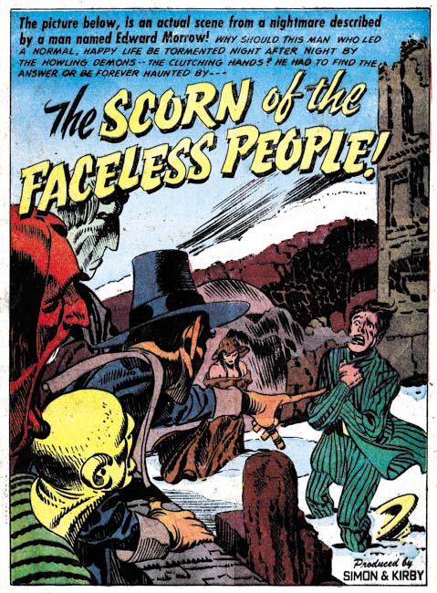
Black Magic #2 (December 1950) “The Scorn of the Faceless People”, art by Jack Kirby

The modus operandi for new Simon and Kirby titles was for a lot of the art to have been drawn by Jack at least for the first couple of issues. This was not true for Black Magic. While Jack was the primary artist and provided more pages of art (41 pages) then the other artists (Meskin was the second most used with 24 pages) the difference was not as great as usually found in the initial issues for a new title. One explanation is provided by Mark Evanier (introduction to the DC Demon archive) where he has stated that horror was not a particular favorite of Kirby’s. I must admit I was a bit surprised by that comment since I have always found Kirby’s work in Black Magic as having the same high quality as anything else he every did for Simon and Kirby. There is another explanation for the lack in Black Magic of the typical Simon and Kirby start off and that is Jack was putting his efforts into another new title that came also out in October 1950, Boys’ Ranch. Except for some single page features and a single story from issue #3, Kirby provided all the art for the first three issues of Boys’ Ranch. Did Kirby prefer the western theme of Boys’ Ranch over the horror of Black Magic? Or was it simply that Simon and Kirby made a better deal with Harvey then with Prize? I will leave that answer to the reader. (I will not be posting on Boys’ Ranch at this time as I wrote about not too long ago: part 1 and part 2).


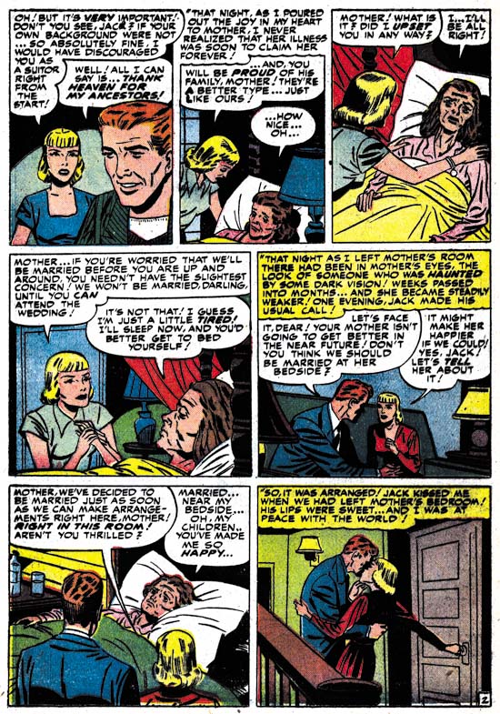
Black Magic #2 (December 1950) “The Scorn of the Faceless People” page 3, art by Jack Kirby

“The Scorn of the Faceless People” is a masterpiece that stands out among all the great work found in Black Magic. The dream analysis theme is unusually and would have been very much at home in a title that Simon and Kirby would produce a couple years later, Strange World of Your Dreams. This story suggests that Simon and Kirby were already feeling the influence of Mort Meskin who had a particular interest in this subject. There is much to commend the art in this story, but check out the unconventional layout of page 3. The carefully use of perspective in the splash-like panel is such that the other two panels really are not intrusive. It is a panel layout that Jack would rarely, if ever, repeat. But then again it was a measure of Kirby’s genius that he would do the unexpected and make it work. There really is nothing much happening in this page but nonetheless it is filled with drama.


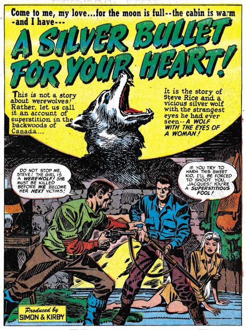
Black Magic #3 (February 1951) “A Silver Bullet for Your Heart”, art by Jack Kirby

I remarked in my serial post The Art of Romance chapter 11 (covering a period just prior to this one) that the punch seemed to have gone out of Kirby’s romance splashes. I do not think that is the case for Kirby’s Black Magic splashes. “A Silver Bullet for Your Heart” is just one of many splashes throughout the Black Magic run that are just terrific. As with all truly great comic book splashes it presents the theme of the story in a single scene without, however, revealing how this dramatic point was reached or how it would be resolved (for that you were expected to buy the comic).


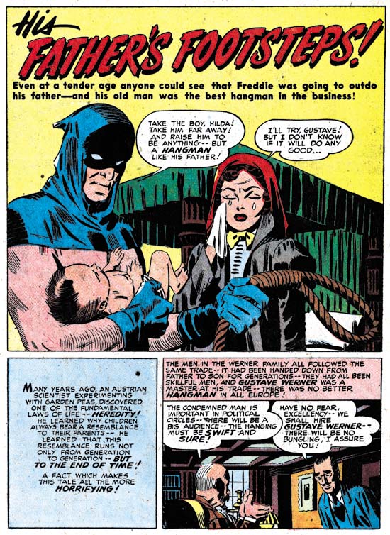
Black Magic #1 (October 1950) “His Father’s Footsteps”, art by Mort Meskin

While Kirby was the primary artist for Black Magic, as he usually was for Simon and Kirby productions, other studio artists did great work as well. Perhaps the most outstanding of the other studio artists was Mort Meskin. While Meskin’s romance art was first rate he seemed to particularly shine in the horror genre. Unfortunately his carefully orchestrated horror stories are often neglected by the modern audience whose main interest is in superheroes. Mort developed his own cinematic approach to graphic story telling which fully complemented the scripts.


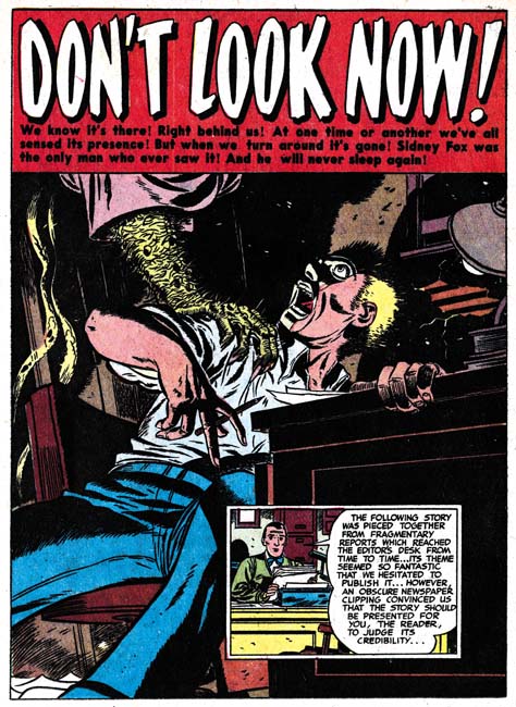
Black Magic #1 (October 1950) “Don’t Look Now”, art by Bill Draut

Bill Draut was an important artist in the Simon and Kirby studio. Joe Simon has often remarked to me about how much he could depend on Draut. However it seems to me that Bill’s romance art was getting into a routine. It was still fine art and Bill was great at graphically telling a story but I get the feeling he was not pushing himself as much anymore. Black Magic seems to have shaken him out of that in a big way. I recently posted  an example of a full page romance splash just because it was an unusual deviation from his standard half pages splashes. Above I provide another full page splash whose merit goes way beyond the untypical splash size.


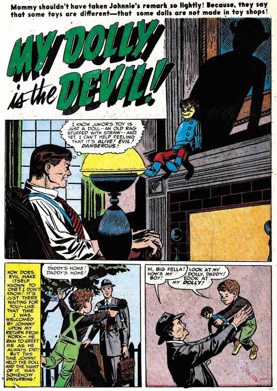
Black Magic #1 (October 1950) “My Dolly is the Devil”, art by Leonard Starr

I have discussed Leonard Starr a number of times in The Art of Romance. Starr provided great romance art for Simon and Kirby and of course he is most well known for his long running syndication strip Mary Perkins On Stage. All of which makes his “My Dolly is the Devil” that more interesting as an example of Starr’s art in another genre. Although this story is unsigned it truly was done by Leonard. The mother of the story has the pixie look that Starr used often in Simon and Kirby productions (wide forehead, widely separated eyes and narrow chin). Further the tall narrow panels that Starr preferred appear on a number of pages. A satisfying graphic story but unfortunately “My Dolly is the Devil” would be the only story that Starr ever did for Black Magic.

Note how in the light cast by the lamp transforms the doll’s hair into what looks like horns in the shadow.


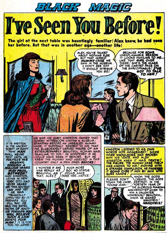
Black Magic #2 (December 1950) “I’ve Seen You Before”, art by Bruno Premiani?

An ancient curse, an Egyptian mummy come back to life, a cast off lover’s cruel fate, what more could you want? I know many comic fans consider EC horror comics as the epitome of the genre but I prefer stories that are less gruesome and rely more on plot development. Bruno Premiani is another artist we have seen often in the Prize romance titles but it is nice to see his hand in another genre. Of course if this is really Premiani then he also did work for DC superheroes and westerns but that work is drawn in such a different manner it is not at all clear that they were done by the same artist. Premiani did only two stories for Black Magic and “I’ve Seen You Before” would be the last Simon and Kirby work by the artist.


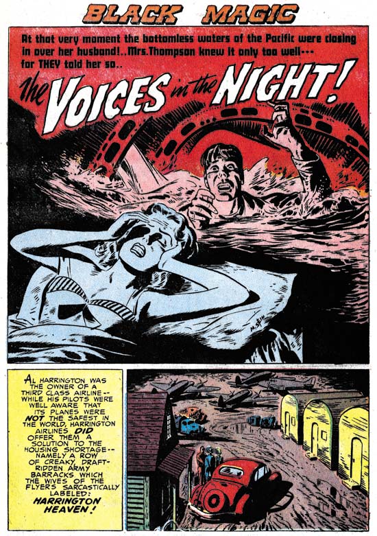
Black Magic #3 (February 1951) “The Voices in the Night”, art by Marvin Stein

We have seen Marvin Stein often in Headlines, Justice Traps the Guilty and Prize Comics Western. In fact he would become a fixture in Prize publications not produced by Simon and Kirby. But he would appear in Simon and Kirby productions as well although perhaps not as frequently or so prominently placed. “The Voices in the Night” is signed and the style agrees well with other work Stein did at this time. This is not his mature style and frankly is a little bit on the primitive side. Joe Simon once remarked to me that he did not originally care that much for Marvin Stein’s art but that latter he became quite good.


Black Magic #3 (February 1951) “The World of Shadows”, art by George Roussos

I am sure that, when they were young and in a darken room, most of my readers have placed a flashlight below their face to provide eerie shadows. Well it seems many of the artists in Black Magic had done that as well. But perhaps none of them used that type of dramatic lighting as often as George Roussos. Roussos is a name we have not encountered yet in the serial posts The Art of Romance or It’s A Crime. George is perhaps most famous as a silver age inker of Jack Kirby at Marvel under the alias George Bell. “The World of Shadows” is unsigned but the art is so similar to other work with signatures that there is little question about the attribution. The artwork is a bit of a hodge-podge but I am unsure if this is due to the use of swipes or a style that has not set settled into place. In places the art clearly shows the influence of Mort Meskin whose work Roussos had inked previously. In all honesty Roussos is not among my favorite Simon and Kirby studio artists.

The Little Shop of Horrors, Chapter 2 (#4 – 6), Up and Running
The Little Shop of Horrors, Chapter 3 (#7 – 8), The Same Old Gang
The Little Shop of Horrors, Chapter 4 (#9 – 11), Another Hit
The Little Shop of Horrors, Chapter 5 (#12 – 14), New Faces
The Little Shop of Horrors, Chapter 6 (#15 – 17), Mix Bag
The Little Shop of Horrors, Chapter 7 (#18 – 20), Kirby Returns
The Little Shop of Horrors, Chapter 8 (#21 – 23), The Gang’s All Here
The Little Shop of Horrors, Chapter 9 (#24 – 26), The Party’s Ovetr
The Little Shop of Horrors, Chapter 10 (#27 – 29), A Special Visitor
The Little Shop of Horrors, Chapter 11 (#30 – 33), The End
The Art of Romance, Chapter 12, A Smaller Studio

(August – October 1950: Young Romance #24 – #26, Young Love #12 – #14)

Romance Titles to 1951
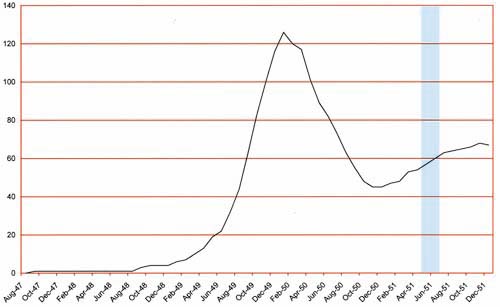
Number of Romance Titles 1947 – 1950 (the period covered in this chapter shaded in blue)

The trend of the decreasing number of romance titles that was found in the period covered in the previous chapter has continued. As far as can be judged the Prize love comics, Young Romance and Young Love, were still successful; at least enough to continue on a monthly schedule. Young Romance is now entering its third year of publication. The most obvious change is that Young Love replaced the previous photographic covers with drawn versions for the August issue and Young Romance would follow a couple months later. Frankly I am unclear what drove the use of photos on comic covers but as we will see in future chapters the use of art covers would be temporary for Young Romance and a little more extended for Young Love. Printing is somewhat more expensive for photographic covers but according to Joe Simon for the publication sizes involved the extra cost was very minimal.

I have noted in previous chapters a decrease in the number of artists used in producing YR and YL. This trend continues to the extent that a total of six artists were used in the six issues issued during the period covered in this chapter. In fact this is the first period that I have covered in this serial post where I can confidently identify all the artists involved (or as confidently as I can where Bruno Premiani is concerned). The drop in the number of contributing artists is not random; it is the less talented artists that are no longer used. Some, like George Gregg, would continue to appear in the Prize crime comics (Headline and Justice Traps the Guilty). There is one exception to dropping the less talented artists and that is John Severin. Although Severin does not show up in any of the comics from this period he has not yet been truly dropped as he will appear again in the next chapter. In any case as talented an artist on western stories that Severin was he really was not very good at romance stories. His diminished appearances in the romance titles seemed to have been offset by his work for Prize Comics Western.


Young Love #13 (September 1950) “Everybody Wants My Girl”, art by Jack Kirby

Jack Kirby would be, as he has been, the primary artist for the Prize romance titles. In these six issues he provided 4 covers, 7 stories and a total of 62 pages. Jack would do all the lead stories for Young Romance and one of them for Young Love. These lead stories would start with a confessional splash (where someone is introducing the story and their speech balloon is used for the title). All but one of the splashes would be half page designs and none of them had quite the punch as those from the earlier issues. Perhaps this is because Simon and Kirby’s creative juices were directed elsewhere but that will be discussed in a separate post.


Young Romance #24 (August 1950) “Buy Me That Man” page 14, art by Jack Kirby

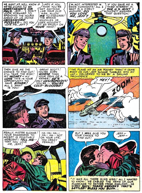
Jack Kirby drew a lot of romance stories and it is clear he had a hand in plotting these stories as well. So it is not surprising that some plot devices would be used more then once. The use of an sudden plunge in a plane to throw a couple into each others arms found in YR #24 (see above) was used previously in YR #8 (November 1948 “Love Can Strike So Suddenly”, see Swiping off of Kirby). It would be found again in In Love #2 (October 1954, “Marilyn’s Men”). While Marilyn’s Men was mostly drawn by Bill Draut, Jack probably was involved in the plotting of that as well.


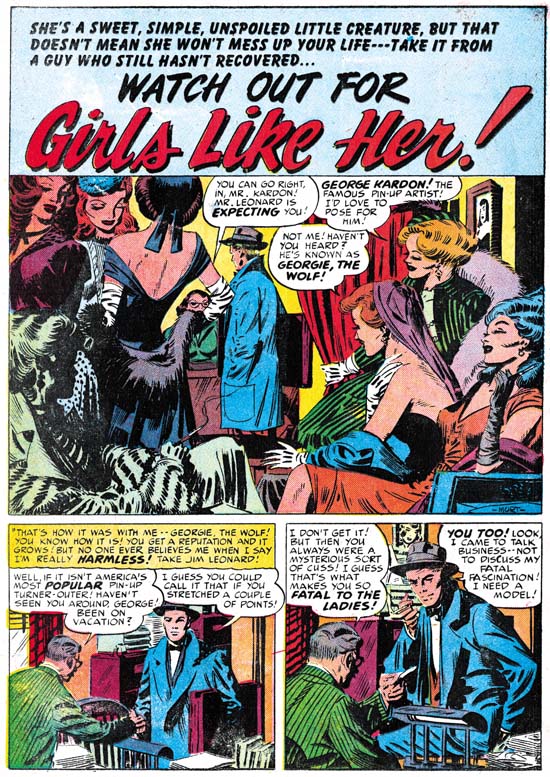
Young Love #14 (October 1950) “Girls like Her”, art by Mort Meskin

As with last chapter, Mort Meskin would be the second most used artist for this period drawing 14 stories with 54 pages. While the number of features is doubled that done by Kirby most of them are very short, 1 to 3 pages long. Previously these featurettes were done by a number of different artists but during this period Mort did all but two of them (the two Meskin did not do were done by Kirby). Mort would provide one of the lead features (Young Love #12).


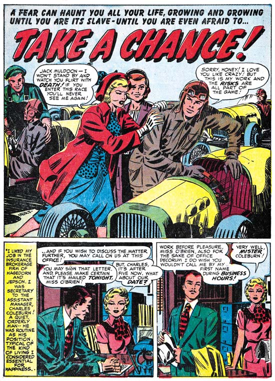
Young Romance #24 (August 1950) “Take a Chance”, art by Mort Meskin

Although I have not found any evidence that the more talented artists working for Simon and Kirby were ever supplied layouts for the stories they drew, Joe and Jack did seem to be involved in at least the plotting of the scripts. Therefore recurring themes would also show up among other artists. The theme of a woman’s love of a racecar driver and the fear of the risks involved in that occupation can be found in “Take a Chance” shown above. It also would return many years later in a cover a story drawn by John Prentice (“Take Me as I Am”, Young Brides #14, April 1954).


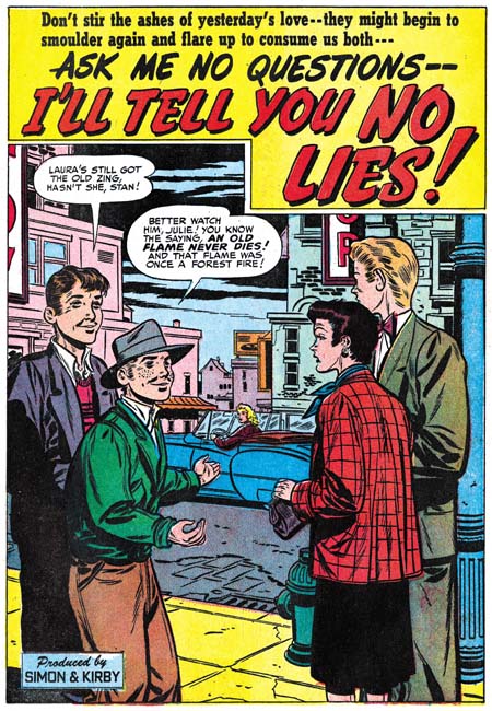
Young Love #14 (October 1950) “I’ll Tell You No Lies”, art by Bill Draut

Bill Draut continues in the number three spot with 6 stories and 46 pages but as we shall see he barely holds that position. At this point Draut arrives at a style that will not change very much for the rest of the work that he would do for the Prize romance titles or for that matter Harvey’s love comics as well. I do not say that disparagingly as he has a clean style and is good at portraying body language. Bill generally uses half page splashes so I have provided an image from “I’ll Tell You No Lies” even though it is well below Draut’s usual quality.


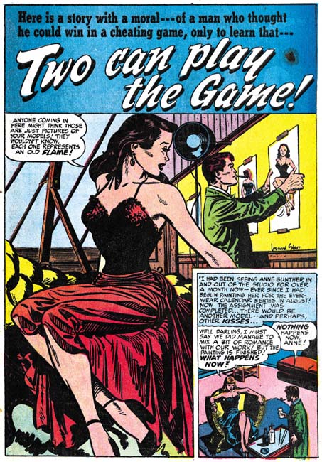
Young Love #13 (September 1950) “Two Can Play the Game”, art by Leonard Starr

Leonard Starr was used often during this period with 6 stories and 45 pages, only one page less the Bill Draut. Starr had his own style of inking but compare the brush work between the man’s jacket and the woman’s dress in the splash for “Two Can Play the Game”. The inking on the man is typical of Starr but the picket fence crosshatching found in the dress is not. This looks like typical S&K studio style inking and suggests that either Joe or Jack did that particular spotting. I am not sure why this was done but it was not that unusual for studio style inking to appear in splashes that were otherwise inked by the artist.


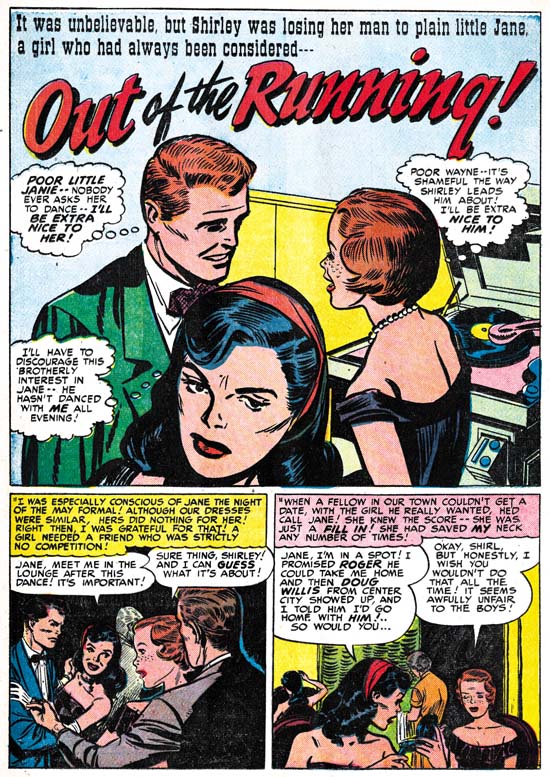
Young Romance #25 (September 1950) “Out of the Running”, art by Leonard Starr

In two stories from this period (“Out of the Running” YR #25 and “Hired Wife” YR #26) Starr introduces a new type of beauty. Previously his women a pixie or elfin look to them; wide foreheads, widely separated eyes, smaller mouths and narrow chins. The pixie look can still be found in some characters in these stories but there are also women with larger eyes, smaller foreheads, and fuller lips giving them a more sultry appearance. This new type of beauty will play an important part in the syndication strip “Mary Perkins on Stage” that Starr will launch in 1957.

Note the inking on the man’s jacket in the splash panel. The shoulder blot and blunt brushwork is not typical of Starr’s inking. Once again Simon or Kirby has step in as art editor to alter the art. This splash is actually based on a stat of a blowup of a story panel. The panel chosen was one of Starr’s tall and narrow ones that had to be expanded on both sides to accommodate the more horizontal splash panel. Most of the jacket was not present in the story panel and the inking was touched up even in that portion that was original present. Although this technique of using a stat in the creation of comic book art is rarely found in Simon and Kirby productions it was a method that would be turned to when needed. I suspect that Joe and Jack were unhappy with Starr’s original splash.


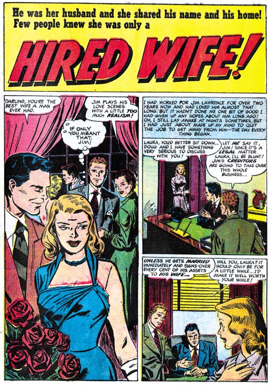
Young Romance #26 (October 1950) “Hired Wife”, art by Leonard Starr

Above is the splash page for the other example of Starr’s more sultry beauty. This story is unusual in that the tall narrow panel that is found in all previous stories by Starr occurs only in the splash panel of “Hired Wife”. I am not sure what to make of this change in panel layouts but it suggests that he may have been working from someone else’s layouts. I will return to this subject in the next chapter of this serial post where we will find another example.


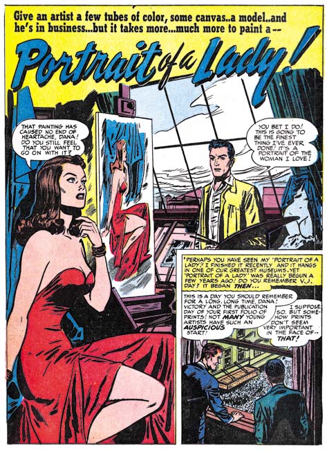
Young Romance #24 (August 1950) “Portrait of a Lady”, art by Bruno Premiani?

Bruno Premiani(?) has been a persistent presence in Simon and Kirby productions since August 1949. During this period Bruno provided 3 stories and 26 pages. While he did not appear as much as Kirby, Draut or Meskin what art he did was all first rate work. The romantic interest between an artist and his model is a recurring theme in Simon and Kirby productions. It is found in the very first cover for Young Romance (The First Romance Comic) and can be found many years later as well (Artist and Model). The artist and model theme appears to be particularly popular for this period since it occurs in three stories. We have previously seen Leonard Starr’s splash from “Two Can Play the Game” (see above) now we can compare it with Premiani’s version “Portrait of a Lady”. For me this is not a question of which was the better artist but rather individual interpretations from two talented practitioners of comic book art.


Young Romance #26 (October 1950) “Simpson and Delilah”, art by Bruno Premiani?

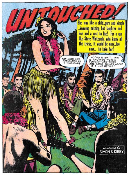
Premiani repeats the use of a dancing woman for the splash of “Simson and Delilah” (a south Pacific dancer graced “Untouched” from Young Love #10, June 1950). Although this is a repeat performance of the theme it is by no means a duplicate of the previous version.

This would be the last romance story that Bruno Premiani(?) would do for Simon and Kirby. As I have mentioned in the past this body of works were all unsigned in Simon and Kirby productions and were done in a style dissimilar to that used in art done for other companies that were signed by Premiani. While this does not disprove that the artist was Bruno Premiani it does beg the question as to why he was originally credited with this work. Although I am hesitant to fully accept Bruno Premiani as the artist (hence my use of question marks) I have no doubts as to the talent of this creator. His absence would leave a hole in the romance titles that would not be filled for some months to come.


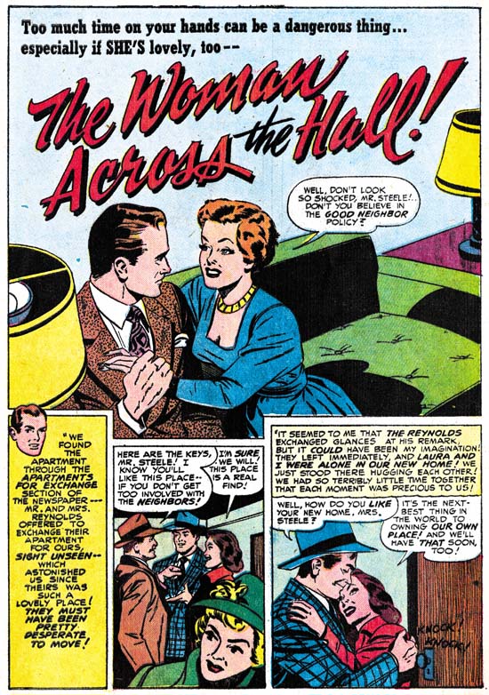
Young Love #13 (September 1950) “The Woman Across the Hall”, art by Vic Donahue

Vic Donahue played a minor part in the romance titles of this period providing only 2 stories with 15 pages. His art is improving both in his in his ability to depict figures and to graphically tell a story. His women in particular have become more interesting largely because his use of arching eyebrows brings more emotion into their faces. My database indicates that these are Vic’s last work for Simon and Kirby but I hesitate to say that with conviction until I had a chance to more carefully review future issues. In any case I do not feel the same about Donahue’s absence then I do about Premiani’s disappearance.

Chapter 1, A New Genre (YR #1 – #4)
Chapter 2, Early Artists (YR #1 – #4)
Chapter 3, The Field No Longer Their’s Alone (YR #5 – #8)
Chapter 4, An Explosion of Romance (YR #9 – #12, YL #1 – #4)
Chapter 5, New Talent (YR #9 – 12, YL #1 – #4)
Chapter 6, Love on the Range (RWR #1 – #7, WL #1 – #6)
Chapter 7, More Love on the Range (RWR #1 – #7, WL #1 – #6)
Chapter 8, Kirby on the Range? (RWR #1 – #7, WL #1 – #6)
Chapter 9, More Romance (YR #13 – #16, YL #5 – #6)
Chapter 10, The Peak of the Love Glut (YR #17 – #20, YL #7 – #8)
Chapter 11, After the Glut (YR #21 – #23, YL #9 – #10)
Chapter 12, A Smaller Studio (YR #24 – #26, YL #12 – #14)
Chapter 13, Romance Bottoms Out (YR #27 – #29, YL #15 – #17)
Chapter 14, The Third Suspect (YR #30 – #32, YL #18 – #20)
Chapter 15, The Action of Romance (YR #33 – #35, YL #21 – #23)
Chapter 16, Someone Old and Someone New (YR #36 – #38, YL #24 – #26)
Chapter 17, The Assistant (YR #39 – #41, YL #27 – #29)
Chapter 18, Meskin Takes Over (YR #42 – #44, YL #30 – #32)
Chapter 19, More Artists (YR #45 – #47, YL #33 – #35)
Chapter 20, Romance Still Matters (YR #48 – #50, YL #36 – #38, YB #1)
Chapter 21, Roussos Messes Up (YR #51 – #53, YL #39 – #41, YB #2 – 3)
Chapter 22, He’s the Man (YR #54 – #56, YL #42 – #44, YB #4)
Chapter 23, New Ways of Doing Things (YR #57 – #59, YL #45 – #47, YB #5 – #6)
Chapter 24, A New Artist (YR #60 – #62, YL #48 – #50, YB #7 – #8)
Chapter 25, More New Faces (YR #63 – #65, YLe #51 – #53, YB #9 – #11)
Chapter 26, Goodbye Jack (YR #66 – #68, YL #54 – #56, YB #12 – #14)
Chapter 27, The Return of Mort (YR #69 – #71, YL #57 – #59, YB #15 – #17)
Chapter 28, A Glut of Artists (YR #72 – #74, YL #60 – #62, YB #18 & #19, IL #1 & #2)
Chapter 29, Trouble Begins (YR #75 – #77, YL #63 – #65, YB #20 – #22, IL #3 – #5)
Chapter 30, Transition (YR #78 – #80, YL #66 – #68, YBs #23 – #25, IL #6, ILY #7)
Chapter 30, Appendix (YB #23)
Chapter 31, Kirby, Kirby and More Kirby (YR #81 – #82, YL #69 – #70, YB #26 – #27)
Chapter 32, The Kirby Beat Goes On (YR #83 – #84, YL #71 – #72, YB #28 – #29)
Chapter 33, End of an Era (YR #85 – #87, YL #73, YB #30, AFL #1)
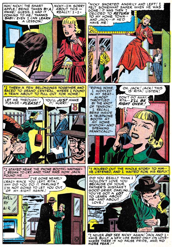
Chapter 34, A New Prize Title (YR #88 – #91, AFL #2 – #5, PL #1 – #2)
Chapter 35, Settling In ( YR #92 – #94, AFL #6 – #8, PL #3 – #5)
Appendix, J.O. Is Joe Orlando
Chapter 36, More Kirby (YR #95 – #97, AFL #9 – #11, PL #6 – #8)
Chapter 37, Some Surprises (YR #98 – #100, AFL #12 – #14, PL #9 – #11)
Chapter 38, All Things Must End (YR #101 – #103, AFL #15 – #17, PL #12 – #14)
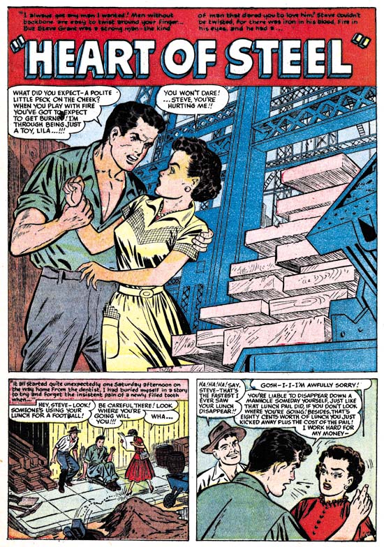
It’s A Crime, Chapter 11, The New Team

(Justice Traps the Guilty #13 – #23, Headline #39 – #45)

This chapter will continue the coverage of the Prize crime comics from the period December 1949 through February 1951. In the last chapter I discussed the work of Jack Kirby and Marvin Stein; this post will be concerned with some of the other artists.
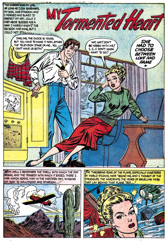
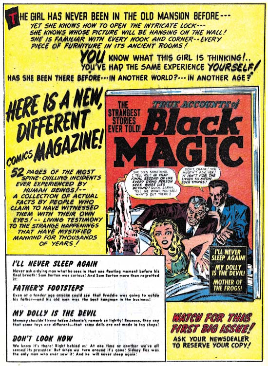

Justice Traps the Guilty #17 (August 1950) “The Statue Screams”, art by Mort Meskin

While most artists associated with Simon and Kirby productions were no longer found in the Prize crime titles there are a couple of glaring exceptions. Probably the most significant artist to jointly work the crime and S&K titles was Mort Meskin. At this point Meskin had become the second most used artist for Simon and Kirby productions (Jack Kirby retained the first place position although that would not always be true in the future). Even though Kirby’s presence in Headline and Justice Traps the Guilty had greatly diminished, Mort still did not achieve the status of primary artist in those titles; he never provided a cover nor did he ever do any lead story. Still he became a frequent contributor appearing in most crime comics and sometimes showed up twice in a single issue.

The crime titles provided Meskin with more opportunities for the depiction of action then the romance art that dominated his work for Simon and Kirby. Not that the diminished use of violence hindered Mort for those occasions when he was to draw it. However Meskin’s Prize comic work had greater similarities to his romance work then it did to the hero genre stories he had previously done such as the Vigilante.


Justice Traps the Guilty #18 (September 1950) “The Way to Prison”, art by John Severin

John Severin also did art for both the crime and romance titles during this period. John is probably best known for his western and war genre comic book work. He may not have done that much crime stories for Prize, but they are very well done (I wish I could say the same thing about his S&K romance art). Not a criticism against Severin, because the same thing can be found in much of the crime comics from the 50’s, but note how well dressed the stick-up criminals are!


Headline #42 (July 1950) “Jewels of Death”, art by George Gregg

George Gregg is not in the same category as Meskin or Severin. While he previously had provided some work for the Simon and Kirby romance titles during the period covered in this chapter that was no longer the case but he would supply a small number of stories for the crime titles. “Jewels of Death” is not most typical of Gregg’s work but I still think that is the correct attribution. But what a great splash! Gregg’s females generally are rather stiff but not this native beauty. While the Prize crime titles are really pretty tame stuff by this time, they still could be quite suggestive (“we have ways of inspiring speech”).


Headline #40 (March 1950) “Counterfeit Winners”, art by Mart Bailey

I have discussed Mart Bailey previously in Prize Comics Western, a Rough History. For about a year and a half he was the primary artist for that western title. He was originally brought in to draw the movie adaptations that PCW featured when they switched to photographic covers. He remained the principal artist until the photographic covers were dropped at which point John Severin became the principal artist for the title. However Bailey continued to provide backup stories. Mart was not as important an artist in the crime titles but he did draw a number of backup stories but he never provided any art for any Simon and Kirby production. Bailey drew in a realistic style which was probably why he was used for the movie adaptations in PCW. While his art is technically fine it is a bit dry for my tastes.


Headline #45 (January 1951) “Penny Shakedown”, art by unidentified artist

There are a number of artists appearing in Headline and Justice Traps the Guilty during this period that I have not been able to identify. Frankly in most cases it is not a big loss as their art work is really not that great. However there is one story, “Penny Shakedown”, that I wish I could provide an attribution. This story is certainly one of the best from the Prize crime titles during this period. Note how in the splash panel the woman is speaking to the reader, Simon and Kirby often used this type of confessional splash design.


Headline #45 (January 1951) “Penny Shakedown” page 8, art by unidentified artist

This story is so good that I once suspected that Kirby supplied layouts. However the “cinematic” approach is not quite the same as Kirby’s. For instance in one panel the artist uses a very low viewing angle of a crowded sidewalk where the foreground consists of mostly legs and the arrest of a criminal is almost lost in the background. Not the sort of thing Jack would do.

This period, from October 1949 until January 1951, is the one that I am most uncertain about. It is clear that previously Simon and Kirby produced the Prize crime comics; basically the same artists were used in both the crime and romance titles. During this period, however, only a few artists worked both genres. Kirby did some cover art and probably provided a layout for one story. Both Mort Meskin and John Severin drew stories for both crime and romance. On the other hand, Mart Bailey was a significant presence in the crime titles and Prize Comics Western but never did any romance stories for Joe and Jack. At this time the first story of both Young Romance and Young Love always had a “produced by Simon and Kirby” credit but that cartouche never appeared in Headline or Justice Traps the Guilty. This despite Simon and Kirby’s long history of self promotion. While it may never be possible to say with certainty, in my opinion Joe and Jack were no longer producing the Prize crime titles during this period.

Whatever the reason for the changes in Headline and Justice Traps the Guilty, is was not due to poor sales. While I have no figures on the number of copies sold there are clear indications Prize was still making good money on these two titles. Why else would Justice Trap the Guilty go from a bimonthly to a monthly publication schedule with issue #18 (September 1950)? While Headline would never become a monthly, JTTG remained one until September 1955.

Chapter 1, Promoting Crime
Chapter 2, A Revitalized Title
Chapter 3, Competing Against Themselves
Chapter 4, Crime Gets Real
Chapter 5, Making a Commitment
Chapter 6, Forgotten Artists
Chapter 7, A Studio With Many Artists
Chapter 8, The Chinese Detective
Chapter 9, Not The Same
Chapter 10, The Master and His Protege

It’s A Crime, Chapter 10, The Master and His Protégé

(Justice Traps the Guilty #13 – #23, Headline #39 – #45)

This chapter will cover the Prize crime comics from the period December 1949 through February 1951. This is a longer period then I have lately been using in my serial posts but it defines a period where the art and artists are consistent. Actually the period started with JTTG #12 and Headline #38 that were included in the previous chapter.


Headline #43 (September 1950)

For much of this period the covers of the crime titles used photographs. When the photo covers began some months before (Headline #36 July 1949, JTTG #12 October 1949) it is clear that Simon and Kirby had a hand in them because both are present on the cover for Headline #37 (September 1949).


Justice Traps the Guilty #5 (July 1948), art by Jack Kirby

While neither artist shows up on any further covers, Simon and Kirby at least influenced the cover for Headline #43. The same theme appeared previously on the cover for JTTG #5 drawn by Jack Kirby. In both the criminal threatens to jump rather then allow himself to be arrested, the policeman has a personal relationship to the criminal (brother-in-law in one and old friend in the other), and a woman, presumably the criminal’s wife, looks on behind the protection provided by the cop. While the two covers have the same theme in reality they could hardly be more different. I do not know who was responsible for the switch to photo covers, but did they really believe that cheesy covers like that were better then those drawn by Kirby? What were they thinking?


Justice Traps the Guilty #18 (September 1950), art by Jack Kirby

Eventually the use of photographic covers ended for four Prize titles. This did not happen at once but was done over a three month period. The last photo cover were Prize Comics Western #82 (July 1950), Young Love #1 (July 1950), Justice Traps the Guilty #17 (August 1950), and Headline #43 (September 1950). The western romance titles had ended prior to the drop of photo covers but interestingly Young Romance did not switch like the other titles and photo covers continued to be used until 1954 (with a couple very short lived revival of art covers; issues #26, #27, #33 and #34). Photo covers for Young Love resumed with issue #23 (July 1951) and then also continued until 1954.

When drawn covers were resumed it was Jack Kirby who provided the initial cover art. In the case of Prize Comics Western this was only for one issue (PCW #83, August 1950) before another artist (so far unidentified) took over. For Headline Kirby would produce two covers (issues #44 November 1950 and #45 January 1951). Justice Traps the Guilty got five Kirby covers (issues #18, #19, #21, #22 and #23, September 1950 to February 1951. Note that the last Kirby covers for JTTG and Headline were dated about the same time but there are over twice as many JTTG Kirby covers. This can be explained by the fact that photo covers were dropped on JTTG before Headline and JTTG was at this point a monthly title while Headline remained a bimonthly.


Justice Traps the Guilty #20 (November 1950), art by Marvin Stein

Perhaps the reader noticed that in the middle of all final Kirby crime covers there was one missing, JTTG #20. This cover is unsigned but clearly was not done by Jack. Instead it was done by an artist, Marvin Stein, who has not yet been discussed in this serial post, It’s a Crime, or The Art of Romance but was discussed briefly in Prize Comics Western, a Rough History. I will be writing about Stein further below but here I would like to say that my attribution of JTTG #20 is based mainly on the policemen. The head of the cop in the foreground has a shallow depth to it that is characteristic of Marvin Stein when he draws a head from slightly behind side view. Stein also has a particular visual shorthand for more distant faces that can be seen in the background policeman.


Justice Traps the Guilty #22 (January 1951) “Brute Force”, art by Marvin Stein

Marvin Stein had an extended relationship with Prize Comics but how long he was actually employed by the Simon and Kirby studio is more uncertain. When interviewed by Jim Amash (Alter Ego #76 March 2008) Joe Simon said that they traded Marvin like he was some baseball player to Crestwood (otherwise known as Prize Comics). However Stein continued to work in the Simon and Kirby studio as Prize Comics had no art department. It would be nice to know when this “trade” occurred and although I will be offering a couple of possibilities the fact none is of my suggestions seems fully satisfactory.

Joe Simon once said to me that initially he did not think Stein’s art was that good but later Marvin improved greatly. Marvin signed many of his work and had a distinctive style over most of his career. The earliest signed work by Marvin Stein that I am aware of is “Brute Force”. The presence of his autograph is particularly important because otherwise it would be hard to provide an attribute since it does not exhibit many of the features that make Stein’s style so distinctive. Frankly I am fully in agreement with Joe’s negative evaluation of Marvin’s early work.


Young Love #19 (March 1951) “The Girl Who Loves Him”, art by Marvin Stein

Marvin Stein’s early work shows much variation. “The Girl Who Loves Him” was published only a couple of months after “Brute Force”. I have included this romance story here because if provides a better example of what Marvin’s early work looked like. While on a whole this early art looks different from later, and more typical, work by Stein, some of his style traits can be detected. Marvin often shows a man from above and to the side and when doing so draws them in a distinctive fashion. This can be seen in the man in the second panel. The woman in the third panel has eyebrows that extend into a thought line without much of a demarcation to distinguish the two facial features; this is also a trait often found in Stein’s later period. In particular, make note of how the woman is drawn in the second, third and fifth panels. Here Marvin’s style is different from his typical period but we will see it again in some unsigned works.


Justice Traps the Guilty #18 (September 1950) “Pirates of the Poor” page 6, art by Jack Kirby and Marvin Stein

While it is clear that during this period Jack Kirby contributed some covers, did he provide any art? Well if you believe The Jack Kirby Checklist, Jack provided two stories, one of them being “Pirates of the Poor”. I must admit that some time ago I had excluded this story from works attributable to Kirby. But one nice thing about the writing these posts that focus on specific periods is that it gives a better perspective when I review the material. There are parts of the art of this story that do look like they were done by Jack as for instance the man in the first panel. There are other parts that look like pure Marvin as in the shallow depths of the head of the men seen from behind in the second and last panels.


Justice Traps the Guilty #18 (September 1950) “Pirates of the Poor” page 9, art by Jack Kirby and Marvin Stein

The third panel has a distinctive Kirby touch to it and is very different from Stein’s manner of drawing either men or women at this time. For me the big giveaway is the manner of graphically telling the story. The use of “camera” angles just looks too advanced compared to other work by Stein in this period. It is, however, just the thing Kirby was so good at. But look how awkward the last two panels are, not the sort of thing you would expect from Kirby. While some may think this story was penciled by Jack and just inked by Stein I believe this is another case of Kirby providing layouts and another artist, in this case Stein, doing the finishing work and inking. In cases like this I credit the art to both artists.


Justice Traps the Guilty #19 (October 1950) “Alibi Guy” page 7, art by Marvin Stein

The other story that The Jack Kirby Checklists credits to Jack is “Alibi Guy”. Again this is a work that for a long time I did not believe was done by Jack. Having changed my mind about “Pirates of the Poor” I gave particular attention in my review of “Alibi Guy”. In this case, however, I still believe that the pencils were not done by Kirby. All the faces look like they were drawn by Stein; the man in the second panel of page 7 is the closest any of them come to Kirby’s style. Perhaps Jack did give a hand in that panel or perhaps Marvin just swiped it. The use of viewpoints in graphically telling the story is handled rather well, but is not suspiciously well done. Nothing in the use of “camera” angles convinces me Kirby was involved in even the layouts. There really is no comparison between “Alibi Guy” and “Pirates of the Poor” and I continue to exclude “Alibi Guy” from Jack’s work.

Marvin Stein was obviously very influenced by Jack Kirby. Even when Marvin was no longer working on Simon and Kirby productions he continued to work in the studio. Which brings the question about exactly when Marvin was “traded” off by Simon and Kirby to Prize? On possible date could be at the start of this period. But we have seen that during this Kirby provide layouts to Stein in “Pirates of the Poor”. So perhaps a better date would be at the end of the period covered in this chapter, which is after February 1951. It will be the subject of a future chapter for It’s A Crime but Stein played an important part in both Headline and Justice Traps the Guilty from March 1951 on. But art by Stein was still appearing in Young Romance and Young Love throughout 1951 and he was involved in Boys’ Ranch as well which ended in August 1951. Putting the “trade” at the end of 1951 would solve that problem but by then Marvin had been fully involved in the Prize crime titles for some time so what was he being “traded” to? Perhaps it is not wise to take the trading of Marvin Stein too literally and remember Joe Simon’s saying “never let facts get in the way of a good story”.

Of course Jack Kirby and Marvin Stein were not the only artists working on Headline and Justice Traps the Guilty during this period. But that will be the subject of the next chapter of It’s A Crime.

Chapter 1, Promoting Crime
Chapter 2, A Revitalized Title
Chapter 3, Competing Against Themselves
Chapter 4, Crime Gets Real
Chapter 5, Making a Commitment
Chapter 6, Forgotten Artists
Chapter 7, A Studio With Many Artists
Chapter 8, The Chinese Detective
Chapter 9, Not The Same

Chapter 11, The New Team

The Art of Romance, Chapter 11, After the Glut

(May – July 1950: Young Romance #21 – #23, Young Love #9 – #11)


Number of Romance Titles 1947 – 1950 (the period covered in this chapter shaded in blue)

This chapter will cover the period from May to July 1950. This is during the rapid decline of romance titles that followed the love glut. Simon and Kirby were not immune to the effects of the over abundance of romance comics; their most recent titles, Real West Romance and Western Love had been cancelled. There were other western romance comics published during the glut as well but all ended up being terminated. Western love titles would never again be tried by any publisher. Although Joe and Jack failed with their western love titles, their standard romance titles, Young Romance and Young Love, seemed unaffected. Both titles had gone monthly during the glut and would remain so for years afterwards. The name brand recognition that Simon and Kirby’s Young Romance had achieved before the glut had allowed it to find a place on the comic racks while newer titles often never had a chance. Young Love’s similar name and logo let it join it Young Romance on the racks as well. Apparently both titles did very well during the period when other titles were rapidly disappearing.

As I discussed previously in It’s A Crime, it is unclear exactly what Simon and Kirby’s contribution was at this time for the Prize crime comics, Headline and Justice Traps the Guilty. These titles seem now to have been made on the cheap. Either Joe and Jack were doing nothing more then supplying some covers, or they were still producing them but because less money was involved they were not putting much effort into it. So Simon and Kirby’s source of income was largely based on two monthly romance titles.


Young Romance #22 (June 1950) “The Savage in Me”, art by Jack Kirby

Jack Kirby was still the primary artist for the romance titles although still somewhat below his normal output. For the 6 issues discussed here Kirby did 6 stories for a total of 56 pages. Kirby drew no covers as they were done with photographs. Jack did all the lead stories for Young Romance and all were much longer then any of the other stories in the issues (14 or 15 pages for the lead stories as compared to 7 or 8 for the longest of the other stories. Jack’s contributions to Young Love were more limited and all the lead stories of that title were done by other artists.

For two of the lead stories Jack used full page splashes with what I describe as the confessional  splash where someone talks about the story to the reader with the word balloon used to include the title of the story. Kirby’s lead stories are still very different from stories by other studio artists. They generally are more complicated, include more action, and sometimes use exotic locations. While original writers have indicated that Jack contributed to the plotting of their stories, it is clear that Jack had even further impact on the scripting of the stories that he drew. It was just a few months short of the third anniversary of the Young Romance title, but Kirby was still putting much effort to make his stories as interesting as possible, and I may add succeeding. This was particularly true with “The Savage in Me” a tale that combines an exotic location (China), drama (the threat presented by a warlord’s army) and humor. The story was, I may add, discussed at length in an article by Kirby scholar Stan Taylor (“Simply the Best”, The Jack Kirby Quarterly #12, Spring 1999).


Young Love #10 (June 1950) “The Girl I Picked From the Phone Directory” page 2, pencils by Jack Kirby, inks by Mort Meskin

At a glance one story, “The Girl I Picked from the Phone Directory”, looks like it was done by Mort Meskin. Typical Meskin traits such as the woman’s eyes and for some men Mort’s characteristic grin. However the shifting viewing angles found in the story are more like Kirby’s then those used by Meskin. Further some of the people depicted have typical Kirby mannerisms such as the gesture of the man in the last panel of the above page. I have no doubt that this story was penciled by Kirby but inked by Meskin. As such it is the earliest example of Meskin inking Kirby that I am aware of. Either Mort was untypical heavy handed in his inking or Jack’s pencils were not very tight.


Young Romance #22 (June 1950) “Child Bride”, art by Mort Meskin

While Meskin still had not reached his high productive levels, he had now become the second most prolific artist in studio. Mort did 8 stories for a total of 50 pages. Even when Meskin provided the lead stories for Young Love #9 and #11, he still did not use a full page splash. Mort was also using vertically oriented captions, a device not typical of Kirby. While Meskin had a cinematic approach to story telling it was done differently from Jack’s. Once again I find no evidence to support the idea, promoted by some Kirby scholars, that Jack supplied layouts.


Young Love #10 (June 1950) “My Backwoods Love”, art by Mort Meskin

It maybe just a coincidence, but there seems a more abundant use of “cheesecake” poses in Mort Meskin’s work at this time; not something I normally associate with him. Further he does them quite well.


Young Romance #23 (July 1950) “A Woman’s Honor”, art by Bill Draut

Bill Draut has been displaced from his number two position by Mort Meskin. During this period Bill did 4 stories with 31 pages. Enough to secure the number three spot but still significantly less then Meskin. Bill consistently provided good art and so he continued to be an important contributor to Simon and Kirby productions.


Young Love #10 (June 1950) “Untouched”, art by Bruno Premiani?

We have seen all the other important artists before, there were no changes in personnel at this time. I still have not been able to confirm that artist who did some very distinctive work for Joe and Jack was in fact Bruno Premiani. But I continue to use that attribution (with a question mark) until something convinces me otherwise. Premiani normally used half page splashes, but for the lead story that he did for Young Love #10, “Untouched”, he provided a full page splash.

By the way do not get confused by the “Produced by Simon and Kirby” credit that appears on this splash. It is not a claim by Joe and Jack that they drew this story. Rather it was used to indicate that the entire comic was put together by Simon and Kirby. It appeared on the first story of all the Simon and Kirby titles at this time (and for some time to come) regardless who actually drew the lead story.


Young Love #9 (May 1950) “Carbon Copy” page 6, art by Bruno Premiani?

I guess “cheesecake” must be the theme for this chapter of Art of Romance because I could not resist including the above page from “Carbon Copy”. I do not know what the original teenage girl readers thought about this page but I certainly am not going to complain about a beach full of bikinis. Today such a scene, while enjoyable at least for the men, would not be considered remarkable. But back in 1950 it would be quite unusual at least on American beaches. For instance bikinis were banned in 1951 from use in the Miss World beauty pageant. It would not be until the early ’60s that the two piece swimsuit would become the norm in beach movies such as “How to Stuff a Wild Bikini”. Was Premiani’s page a flight of fantasy or wish fulfillment or was Bruno taking his queue from more liberal European beaches?


Young Love #10 (June 1950) “At Your Own Risk” page 3, art by Leonard Starr

Leonard Starr was another S&K studio regular who continued to appear during the period considered here. During this period he drew 3 stories with 21 pages. Starr is most easily recognized by his women that he draws with widely separated eyes, wide foreheads and narrow chins; a look I like to call elfin. Another easy way to pick him out is his use of tall narrow panels. Not every page in a story would use six narrow panels as in the example above, but other combinations of a row of tall panels with two vertically diminished panel rows are also commonly found. It is an arrangement that is not found in Kirby’s work so again claims of Kirby supplying layouts to not seem to be correct. Starr puts his tall panels to good use and it has the added benefit of allowing the talk balloons to be place out of the way of the image.


Young Romance #23 (July 1950) “Love on A Budget” page 4, art by John Severin

Previously John Severin was more a presence in the western love titles then in the standard romances. With the cancellation of the Western Love and Real West Romance the expectation might be that Severin would appear more often in Young Romance and Young Love. While John still shows up in the romance titles during this period, his participation does not appear to have increased. One explanation might be that Severin did not need the extra work since he had begun doing work for Prize Comics Western. But I do not think that is the likely explanation as PCW seemed to have been done “on the cheap” and probably did not pay as well as work for Simon and Kirby. It is more likely that Simon and Kirby just did not want to give him further work. The fact is Severin just was not that great of a romance artist. It was not that John could not draw well; it is just that he did not seem comfortable with depicting romantic scenes. He rarely, if ever, drew a kiss in his stories. The absence of true romance in Severin’s work may not have been a problem for the western love titles but it certainly was a hindrance for the standard romance. Still he did provide 19 pages of art during the period discussed in this post although none were signed and this includes a few that are questionable attributions.


Young Love #11 (July 1950) “I’ll Never Get Married”, art by John Severin?

Included in the work I credit to John Severin is one that looks distinctively different, “I’ll Never Get Married”. Perhaps my attribution is just incorrect but I suspect what makes this story look so different from others by Severin was the inking. During this period most of John’s art was inked by Will Elder. While I do not claim to be very familiar with Elder’s inking a comparison of this story to works signed by Severin and Elder clearly shows Elder did not ink “I’ll Never Get Married”. Whoever the inker was he was not nearly as talented as Elder.


Young Love #11 (July 1950) “Little White Lies”, art by Vic Donahue

Vic Donahue is another artist that we have seen previously and continues to make an appearance. During this period Vic’s contribution consisted of 5 stories with 21 pages. This includes three “Problem Clinic” stories but they are all questionable attributions and only amount to a total of 6 pages. Donahue also provided to longer stories one of which was signed.

Unlike some earlier chapters, there are only a few stories that I have not been able to credit. Most of the artists used were therefore studio regulars.

Chapter 1, A New Genre (YR #1 – #4)
Chapter 2, Early Artists (YR #1 – #4)
Chapter 3, The Field No Longer Their’s Alone (YR #5 – #8)
Chapter 4, An Explosion of Romance (YR #9 – #12, YL #1 – #4)
Chapter 5, New Talent (YR #9 – 12, YL #1 – #4)
Chapter 6, Love on the Range (RWR #1 – #7, WL #1 – #6)
Chapter 7, More Love on the Range (RWR #1 – #7, WL #1 – #6)
Chapter 8, Kirby on the Range? (RWR #1 – #7, WL #1 – #6)
Chapter 9, More Romance (YR #13 – #16, YL #5 – #6)
Chapter 10, The Peak of the Love Glut (YR #17 – #20, YL #7 – #8)
Chapter 11, After the Glut (YR #21 – #23, YL #9 – #10)
Chapter 12, A Smaller Studio (YR #24 – #26, YL #12 – #14)
Chapter 13, Romance Bottoms Out (YR #27 – #29, YL #15 – #17)
Chapter 14, The Third Suspect (YR #30 – #32, YL #18 – #20)
Chapter 15, The Action of Romance (YR #33 – #35, YL #21 – #23)
Chapter 16, Someone Old and Someone New (YR #36 – #38, YL #24 – #26)
Chapter 17, The Assistant (YR #39 – #41, YL #27 – #29)
Chapter 18, Meskin Takes Over (YR #42 – #44, YL #30 – #32)
Chapter 19, More Artists (YR #45 – #47, YL #33 – #35)
Chapter 20, Romance Still Matters (YR #48 – #50, YL #36 – #38, YB #1)
Chapter 21, Roussos Messes Up (YR #51 – #53, YL #39 – #41, YB #2 – 3)
Chapter 22, He’s the Man (YR #54 – #56, YL #42 – #44, YB #4)
Chapter 23, New Ways of Doing Things (YR #57 – #59, YL #45 – #47, YB #5 – #6)
Chapter 24, A New Artist (YR #60 – #62, YL #48 – #50, YB #7 – #8)
Chapter 25, More New Faces (YR #63 – #65, YLe #51 – #53, YB #9 – #11)
Chapter 26, Goodbye Jack (YR #66 – #68, YL #54 – #56, YB #12 – #14)
Chapter 27, The Return of Mort (YR #69 – #71, YL #57 – #59, YB #15 – #17)
Chapter 28, A Glut of Artists (YR #72 – #74, YL #60 – #62, YB #18 & #19, IL #1 & #2)
Chapter 29, Trouble Begins (YR #75 – #77, YL #63 – #65, YB #20 – #22, IL #3 – #5)
Chapter 30, Transition (YR #78 – #80, YL #66 – #68, YBs #23 – #25, IL #6, ILY #7)
Chapter 30, Appendix (YB #23)
Chapter 31, Kirby, Kirby and More Kirby (YR #81 – #82, YL #69 – #70, YB #26 – #27)
Chapter 32, The Kirby Beat Goes On (YR #83 – #84, YL #71 – #72, YB #28 – #29)
Chapter 33, End of an Era (YR #85 – #87, YL #73, YB #30, AFL #1)
Chapter 34, A New Prize Title (YR #88 – #91, AFL #2 – #5, PL #1 – #2)
Chapter 35, Settling In ( YR #92 – #94, AFL #6 – #8, PL #3 – #5)
Appendix, J.O. Is Joe Orlando
Chapter 36, More Kirby (YR #95 – #97, AFL #9 – #11, PL #6 – #8)
Chapter 37, Some Surprises (YR #98 – #100, AFL #12 – #14, PL #9 – #11)
Chapter 38, All Things Must End (YR #101 – #103, AFL #15 – #17, PL #12 – #14)

Tiger 21

Joe Simon’s personal collection includes two large illustration boards of an unfinished syndication proposal, Tiger 21. The art on each board is composed of a long title section (empty on one of them) and three rows of panels each row nominally with four panels. They therefore were intended for use in the Sunday comics section. The work was never completed; the outlines for the panels, captions and word balloons were all inked and the lettering finished however all the pencils remain uninked. In the upper left corner of each board, outside of the actually art area, are the numbers 1 and 4 which represent the individual page numbers.

This posting is by no means the first report of Simon and Kirby’s Tiger 21. John Morrow wrote an article about them in The Jack Kirby Collector #15 (April 1997). Morrow discussed six pages but the illustrations he provides indicate that he worked with copies, probably stats, of the original art. However the copies were made the process had difficulty in reproducing the pencils. John provides an outline of the story which I will not repeat here. If interested you read it in Google Books. Basically Tiger 21 is science fiction about adventures in space. There was also a concept presentation piece for Tiger 21 that was included in Kirby Unleashed and Volume 2 of the Jack Kirby Treasury has a full page reproduction (page 5), again apparently from a second generation copy, of the original art.

Simon and Kirby were apt to recycle syndication proposals into comic books. I previously discussed the work they did in turning the strip “Inky” into “Artist Loves Model” published in In Love #3 (December 1954). Joe and Jack also transformed a Tiger 21 story (not one of those reported in TJKC #15) into “Homecoming: Year 3000” for Fighting American #4 (October 1954). The Fighting American only appears at the start and the end while the rest of the story is given over to Tiger 21’s Starman Zero.


Tiger 21, page 1, panel 11, art by Jack Kirby

Starman’s appearance in Fighting American was somewhat apt as the two shared a similar origin. Both involved the use of a machine to transfer the mind from one body to another. In Fighting American it was the mind from a frail body into that of his recently deceased brother. For Starman Zero it was into a synthetic body much more durable then that of a human.


Tiger 21, page 4, panel 3, art by Jack Kirby

The artwork is quite well done in tight pencils which can be very light in certain areas. As was his practice during this period, Jack provided only lines with nothing to indicate how the spotting should be done. Cloth folds were indicated by simple lines and it was up to the inker on how to interpret them. Shadows and inking techniques were all left to the inker as well.


Tiger 21, page 4, panel 9, art by Jack Kirby

The pencils are very bold with lots of effective use of exaggerated perspectives. The best comparison that can be made is art that Kirby did toward the end of the Simon and Kirby studio for titles like Foxhole. This would suggest a dating to the mid ’50s. This is at odds with John Morrow’s article which assigned Tiger 21 to the late ’40s. The best way to resolve this issue would be the lettering. Howard Ferguson was Simon and Kirby’s first letterer while later this job was done by Ben Oda. I must admit I have not done a careful study of the lettering but that for Tiger 21 seems to match that used for Stuntman and Boy Explorers which were presumably done by Ferguson. Based just on a casual examination and therefore quite possibly in error, it seems to me that the switch of Ferguson lettering to that by Oda seemed to occur in early 1950. Therefore, admittedly with much uncertainty, a late 40’s date seems the most likely.

Although in his article John Morrow wrote that the title of the newspaper strip was Starman Zero, the first art page clearly shows it was actually Tiger 21. The oddly named title refers to a distant star that, in the strip, is reachable via something called the time jump. Tiger 21 was also the name of a television science fiction show that Kirby proposed to NBC in the early ’50s. For the television version, Tiger 21 was the name of the hero’s space ship. NBC eventually picked up another show instead called “Man In Space” that starred William Landigan.