Category Archives: Simon, Joe

Vagabond Prince, “Trapped On Wax”

Trapped on Wax
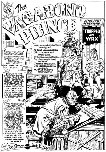
“Trapped on Wax”, art by Joe Simon

Just about everything Simon and Kirby produced was great stuff but I am sure most fans have their favorites. Previously the only superhero work I included among my favorite Simon and Kirby productions was Fighting American. Well that has changed as I now add Vagabond Prince. There are only three Vagabond Prince stories and they were all drawn by Joe Simon. Even Joe admits he is not as good an artist as Jack Kirby, but I like Joe’s art and there are other aspects of the characters he created and the stories he wrote that makes Vagabond Prince so appealing to me.

Trapped On Wax
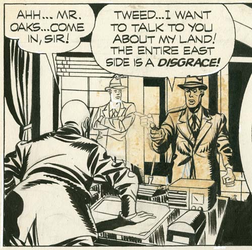
“Trapped on Wax” page 7 panel 1, art by Joe Simon with touch-up by Jack Kirby

The origin story for the Vagabond Prince, “Trapped on Wax”, has never been published in its entirety. The marking on the artwork shows that the story was initially meant for Boy Explorers #2. However that title was abruptly cancelled (as was its companion title Stuntman) because of the flood of new comic titles that occurred after paper rationing was lifted so that many of the titles never even made it into the actual newsstands racks. Harvey issued a black ink only version of Boy Explorers #2 for subscribers but that was not only much reduced in size but also in the amount of content. Not only did Vagabond Prince fail to be included in the small Boy Explorers #2 but it was never later printed in Green Hornet, Joe Palooka and Black Cat comics like most of the art left over from the cancelled Stuntman and Boy Explorers. The reason “Trapped on Wax” was not printed later was because the art was not finished. Initially the entire story was completely inked but apparently some sections were unsatisfactory. The art was done on two ply illustration board. The term “two ply” refers to the fact that there are actually two layers of surfaces suitable for use. A razor was used to cut around the parts that needed changing and the first ply was carefully pealed off. The newly exposed second ply was penciled and the outlines inked, however the full spotting was never done. You can see the results of one such unfinished correction in a panel from page 7 shown above. Observe the simple outline of the man standing in the background. Although the man of the right, the hero, was fully spotted some additional changes were being done, in this case by Jack Kirby. I wrote about this and some other changes in one of my earliest blog posts (Simon and Kirby as Editors). Because the art for “Trapped on Wax” was not finished it was still in Simon and Kirby’s possession. Joe has said to me that material published in Green Hornet, Joe Palooka and Black Cat was used without their permission. Even though only comparitively little effort would have been needed to complete “Trapped on Wax”, Simon and Kirby never would finish it.

Having escaped publication by Harvey Comics, “Trapped on Wax” was included in “Simon & Kirby Classics published by Pure Imagination in 1987. Only at that point page 9 was missing. Joe wrote a new script for the missing page and Jack penciled new art; this would be the last Simon and Kirby collaboration. This was an interesting approach to provide a complete story but since the new page was done 40 years after the original work it was not a completely satisfactory arrangement. Fortunately in the meantime someone had sent Joe a printout of the original art for the missing page 9 and Titan will be publishing the complete story for the first time in the upcoming Simon and Kirby Superheroes volume.

Humor was an important component of all of Simon and Kirby’s superhero work. However the humor was generally not directed at the hero until Joe and Jack did Fighting American (Fighting With Humor). For instance most of the humor in Stuntman was at the expense of Fred Drake (who might be described as an unknowing sidekick for Stuntman). But in Vagabond Prince the hero, Ned Oaks, is often made fun of. Not only does he make a living writing outrageously bad poetry but he sometimes seems quite clueless, as can be seen when the villains of “Trapped on Wax” first meet him:

Ned Oaks: Gentlemen, I welcome you to my domicile as a flower would great a gentle ray of sun!

Henchmen thinking: Zowie! He’s buggy all right!

Even his sidekick considers Ned Oaks a little nutty. Considering the humor I cannot help but wonder if the Vagabond Prince’s costume was purposely a little goofy.

One of the unique characteristics of the hero for Vagabond Prince is that he actually is rather poor. In “Trapped on Wax” we find him living in a run down cottage. In later stories we will see him residing in a tenement. Not only is Ned Oaks poor, but the people he defends in the stories are generally poor as well.

Next week, “The Madness of Doctor Altu”

Adventures of the Fly, the Second Issue

Adventures of the Fly #2
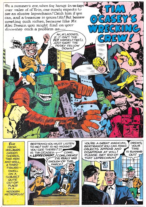
Adventures of the Fly #2 (September 1959) “Tim O’Casey’s Wrecking Crew”, pencils by unidentified artist

If a young boy can be transformed into a fully costumed adult superhero with a magic ring, why not have a leprechaun as an opponent? Not strange enough? Well then give the leprechaun some giant robots to play with. The only thing missing in this delightful story is Jack Kirby. Too bad because I am sure Jack would have added his own personal touches and transformed it into a masterpiece.

Adventures of the Fly #2
Adventures of the Fly #2 (September 1959) “One of Our Skyscrapers is Missing” page 3, pencils by Al Williamson

Al Williamson was already a talented comic artist when he did “One of Our Skyscrapers is Missing” for this issue. And I have little doubt that he did this story. The various monsters that inhabit these pages all possess the Williamson touch. If Williamson was working from layouts, he took great liberties with them. His panel layouts are the most interesting ones found in either the Shield or the Fly. Further his artwork is far superior to the other artists working on the Archie superheroes that I have reviewed so far with the sole exception of Jack Kirby. That said the art for this story is really far below his best efforts. The work Al did for Race for the Moon the previous year was much superior.

Adventures of the Fly #2
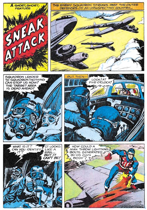
Adventures of the Fly #2 (September 1959) “Sneak Attack”, pencils by Joe Simon

“Sneak Attack” is another of the pieces that generally get attributed to Jack Kirby but were actually drawn by Joe Simon. The reason for this misattribution is a credit to Joe’s skills at mimicking Jack’s style, often with the help of plenty of swipes. The pilot with the funny head gear was swiped from Kirby’s “Hot Box” (Foxhole #2). However it shows that Joe is not just copying Kirby as the head is in full frontal view instead of the 3/4 profile that Jack drew.

Adventures of the Fly #2
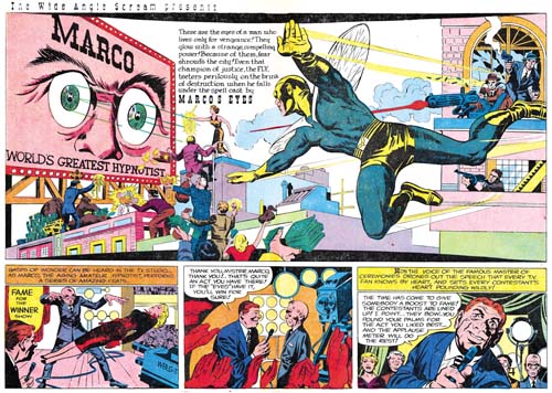
Adventures of the Fly #2 (September 1959) “Marco’s Eyes”, pencils by Jack Kirby
Larger Image

It is an old theme, but Kirby frequently returns to previous themes and improves upon them. In this case it is the idea of a stage performer using his power of hypnosis as a means of conducting crime. The earliest predecessor was probably an untitled story about sometimes called “Sando and Omar” from Captain America #1 (March 1941). “Marco’s Eyes” has some nice art and all in all a good effort, but certainly not among the better Simon and Kirby’s work. The double page splash is perhaps the weakest that S&K ever did. This is unfortunate since it is also the last the two would work on together.

Adventures of the Fly #2
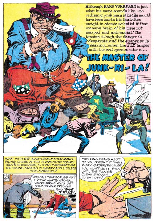
Adventures of the Fly #2 (September 1959) “The Master of Junk-Ri-La”, pencils by Jack Kirby

While I would hardly call “The Master of Junk-Ri-La a masterpiece, it is a much better work than “Marco’s Eyes”. It does however contain some humor that might not be appreciated by many modern superhero fans used to bleaker tales. For instance the villain uses a giant fly swatter against the Fly.

The two stories in Adventures of the Fly #2 would be the last collaboration between Joe Simon and Jack Kirby for many years. The Jack Kirby Checklist includes “Muggy’s Masterpiece” from Adventures of the Fly #4 but that is clearly incorrect. Even the way the Archie superheroes were created made them more of a Simon effort than a Kirby one. Still the two had worked together in one form or another for a period of about 18 years. There may have been other comic book collaborations that were longer but there were none there were better. Or at least that is my opinion. But I may be biased; after all this is the Simon and Kirby Blog.

Since this is Kirby’s last work on the Fly I thought I would briefly touch on the part that it played in the creation of Spider-Man. Others have written in great depths about this issue but here I will only provide a brief outline of the events. Joe Simon, C. C. Beck and Jack Oleck got together in 1953 or 1954 to create a new superhero. Initially the name Spiderman was considered and Joe even created a logo using that name, but in the end the character was called the Silver Spider. Joe took the initial artwork by Beck and pitched the idea to Harvey Comics but they declined to publish it. Years later Archie Comics approached Simon to create some new superheroes and Joe came up with a new Shield and the Fly. Joe retrieved Beck’s Silver Spider art work from Harvey and sent it off to Jack to use as reference when he drew most of the art for the initial issues published in 1959. In 1962 Stan Lee worked initially with Kirby to create Spider-Man but in the end turned to Steve Ditko to provide the art. The work that Kirby did on Spider-Man has never been published but Ditko later described Kirby’s version as looking like the Fly.

The main source of contention about the creation of Spider-Man concerns not so much the history as the interpretation of that history. The most common subject of disagreement is whether Stan Lee and Steve Ditko should be considered the joint creators or if Jack Kirby should be included as well. While I have provided a broad history behind the creation of Spider-Man that I believe most comic scholars would largely accept there are numerous details that scholars seem unable to agree on. Even as simple a concept as the term creator turns out to have very different meanings depending on who is using it. I will not try to advance my own opinion as to who should be credited for creating Spider-Man. I prefer to let each reader come to their own conclusions. But I find it incomprehensible how some insist on crediting Jack Kirby as a Spider-Man creator while excluding Joe Simon.

Adventures of the Fly, the First Issue


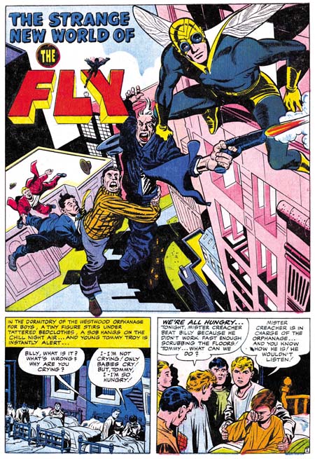
Adventures of the Fly #1 (August 1959) “The Strange New World of the Fly”, pencils by Jack Kirby

Recently I posted about Jack Kirby’s work on the origin story of Private Strong, aka the Shield. In Adventures of the Fly #1 (August 1959) Jack also had the honors of doing the same for the other new Archie hero, the Fly. Only in this case Kirby based the story on art that C. C. Beck did for the unpublished Silver Spider. Some have called the Silver Spider a Simon and Kirby creation but that simply is not true. Kirby had nothing to do with the Silver Spider which was a creation of Joe Simon, C. C. Beck and Jack Oleck. When I previously discussed the Silver Spider (The End of Simon & Kirby, Chapter 10, A Fly in the Mix) I dated this creation as 1953. To be honest I no longer remember where I got that date but it is not an unreasonable one. This would put it during the time of the Simon and Kirby collaborations but in “The Comic Book Maker” Joe writes about how the Silver Spider was created as a favor to Beck. An examination of xerox copies of the original art confirms Kirby’s absence.

Tommy Troy was an orphan like Lancelot Strong but the resemblance ends there. We meet Tommy in an orphanage but he ends up hired out to an elderly couple. Not kindly Kent-like farmers, but a mean, elderly couple with a reputation of dabbling in magic. Beck’s Silver Spider story had included a genie to add an element of humor, but Kirby has dispensed with him. However concept of a young boy who transforms into an adult superhero was Beck’s who repeated it from Captain Marvel.

Adventures of the Fly #1
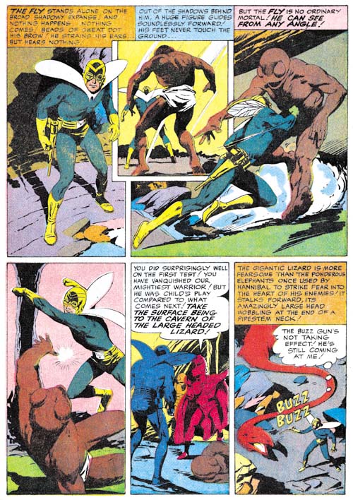
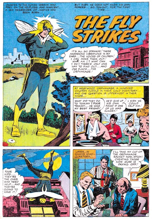
Adventures of the Fly #1 (August 1959) “The Fly Strikes”, pencils by Joe Simon

Just like in Private Strong, the origin story for the Fly is actually told in a series of separate stories. The first one ends with the Tommy Troy being given a magic ring and transforming into the Fly. The second, “The Fly Strikes”, tells of the Fly’s first combat against criminals. This second story is actually based on the end of the origin story that Beck drew.

“The Fly Strikes” is generally credited to Jack Kirby but I am not convinced. I suspect that it is another case of Joe Simon swiping from and imitating Kirby. Joe was particularly good at doing this. Note the Fly peering into the window in the second story panel. This is a swipe from Fighting American #1 (Captain America Returns). I have no indications that Kirby was working from layouts in the stories that he did for this issue. Nor do I believe Jack would bother to swipe from himself. Why would he when he could do it much faster without a swipe? So as I said I believe this story was actually done by Simon.

Adventures of the Fly #1
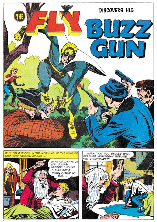
Adventures of the Fly #1 (August 1959) “Buzz Gun”, pencils by Jack Kirby

While the origin story came from Beck’s Silver Spider and the Fly’s powers seemed to be based on directives from Joe Simon, the Fly’s costume is derived from the Night Fighter, a Simon and Kirby creation that was considered for Joe and Jack’s publishing company, Mainline, but never used (Night Fighter, an Abandoned Superhero). Two characteristics stand out. One was the goggles. Similar eyewear appeared in the Black Owl from 1940 and 1941 (Simon and Kirby’s Black Owl). The presence of these goggles in two superheroes with a night theme suggests they were meant to be an aid for seeing in the dark. Of course such night vision would not be that appropriate for the Fly nor is it a power that the Fly ever used. Perhaps the eyewear was nothing more then a visual reference to the insect’s compound eyes or perhaps Jack saw no reason to remove them when he based the Fly’s costume on that of the Night Fighter.

One of the other features that the Fly inherited from the Night Fighter was a pistol of some kind. All that remains of the art for Night Fighter are two unfinished covers and neither offers any clues as to what use the pistol was put to. My guess is that it was for shooting a wire for scaling buildings such as that used by the Sandman, another superhero that Simon and Kirby worked on during the war. While a wirepoon might be a useful device for the Night Fighter it would be rather superfluous for a superhero like the Fly who is able to walk up walls. Well in “Buzz Gun” Kirby shows how the Fly’s pistol is used. It makes a noise! Oh well.


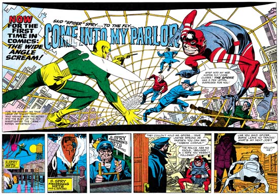
Adventures of the Fly #1 (August 1959) “Come Into My Parlor”, pencils by Jack Kirby
Larger Image

Jack Kirby’s last chapter for the origin story opens with a spectacular double page splash. The title exclaims “for the first time in comics: the wide angel scream”. Of course this really was not the first use of a double page splash a subject that I covered in a still unfinished serial post (The Wide Angle Scream). The chances are that none of the Fly readers had seen any of Simon and Kirby’s earlier uses. While Simon and Kirby did not originate the double page splash, nobody else did it better. Further by 1959 the wide splash was no longer used by anyone. I can imagine the impression the centerfold splash made for potential buyers of the comic. How could they resist. I am sure I would not have. I would have been 9 at the time but sometime around that period I had read some of the DC superhero comics. I found them boring and had given up on comics for a while. Unfortunately I never saw any of the Simon and Kirby creations.

Adventures of the Fly #1
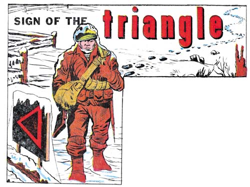
Adventures of the Fly #1 (August 1959) “Sign of the Triangle”, art by Joe Simon

The Jack Kirby Checklist includes this among the work that Kirby did for this issue but I am not convinced. To me it looks like Simon did the drawing. However this confusion is really understandable because the illustration appears to be a swipe from the cover of Foxhole #3 (February 1955) which had be drawn by Kirby. It is not an exact copy, but I do not believe Simon ever did exact copies. The inking looks like Joe did that as well.

Adventures of the Fly #1
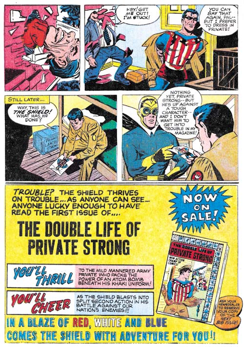
Adventures of the Fly #1 (August 1959) “The Search”, pencils by Joe Simon

I may not be confident about attributing the illustration for “Sign of the Triangle” to Simon but there seems little doubt that Joe did the two page Shield promotional piece called “The Search”. This one is full of swipes from art by Kirby. For instance the man being punched through a wall and then left hanging was from the origin story in Fighting American #1 (April 1954, Captain America Returns). Note that while Joe follows pretty closely the man stuck in the wall he has added the man’s face for the punching image which Jack had cut off by the panel edge.

Adventures of the Fly #1
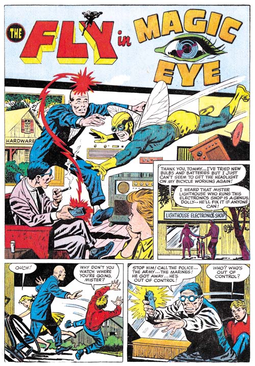
Adventures of the Fly #1 (August 1959) “Magic Eye”, pencils by George Tuska?

The final story is completely independent from the Fly origin and done by another artist, I believe it is George Tuska. I questionably attributed some work from Private Strong #2 to George as well; let us see if some of my more knowledgeable readers will agree with me on this one as well. This is another example where I do not see any obvious swipes of Kirby.

Double Life of Private Strong, the Last Issue

Double Life of Private Strong #2
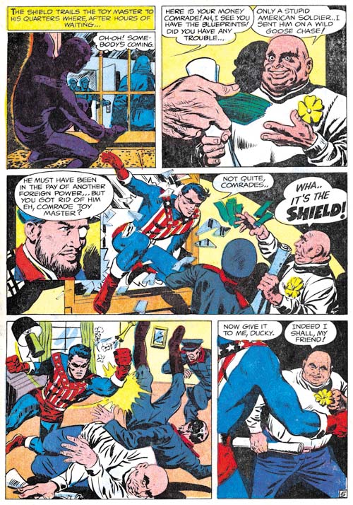
Double Life of Private Strong #2 (August 1959) “The Toy Master” page 5, art by unidentified artist

While the first issue of Double Life of Private Strong was almost completely drawn by Jack Kirby, he played a much smaller part in the second. I am not sure who drew the first story, “The Toy Master”, but he obviously was working from some sort of directions. In “The Comic Book Makers, Joe Simon writes about using Carl Burgos to create layouts. In fact Joe’s collection still includes layouts for a Fly story (Carl Burgos does the Fly). By supplying the artists with layouts, Joe was able to give the comic a distinct Kirby feel. Scattered through the art are swipes; most of them from the previous Simon and Kirby superhero, Fighting American. For instance the Shield in panel 4 of page 5 was based on a splash from Fighting American #1. Some experts have claimed that these are either stats or mechanical copies but I have disproved that by overlaying the art (The Fly, A Case Study of Swiping). Apparently all that was done was a free hand copy was created for the layout and the artist would finish it. This would provide the desired Kirby-feel to the story without making the swipe too incongruous with the rest of the art. There are other examples were the copy deviated even more from the original. I believe, for instance, that the Shield in panel 3 was swiped by the one Kirby did for the splash of “The Menace of the Micro-Men” from Private Strong #1.

Double Life of Private Strong #2
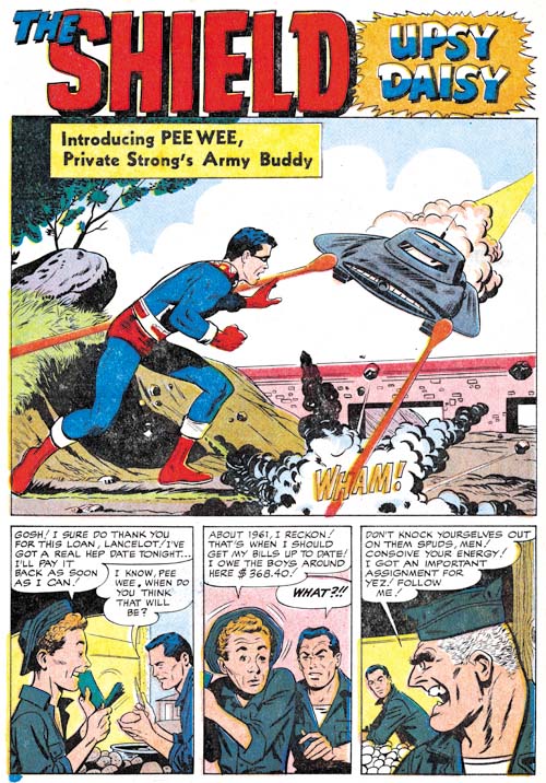
Double Life of Private Strong #2 (August 1959) “Upsy Daisy”, art by George Tuska?

I going out on a limb because I am not familiar enough with his work, but I believe “Upsy Daisy” might be the work of George Tuska. Joe Simon has written in “The Comic Book Maker” that Tuska worked on the Archie comics for him so it is not an unreasonable guess. Perhaps I missed them, but I do not spot any obvious swipes from Kirby in this story.

Double Life of Private Strong #2
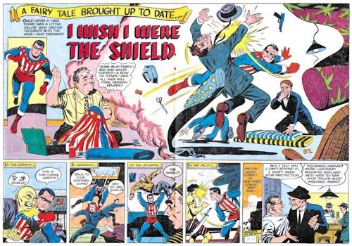
Double Life of Private Strong #2 (August 1959) “I Wish I Were the Shield”, art by George Tuska?
Larger Image

The two tier panel layout is pretty much identical to the one used for the double page splashes found in Adventures of the Fly #1 and #2. However there is no mention of “the wide angle scream” nor are the curved black bands of the top and bottom of the splash (The Wide Angle Scream, What Was Old Is New Again). Again my attribution of this story to George Tuska is by no means firm.

Here there are some examples of swiping from Kirby. For instance the Shield in the splash was based on the cover logo that first appeared on Fighting American #4 (October 1954). The presences of these swipes and the overall superiority of the story art over that for “Upsy Daisy” suggests that this story was done from layouts.

Double Life of Private Strong #2
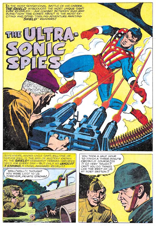
Double Life of Private Strong #2 (August 1959) “The Ultra-Sonic Spies”, art by Jack Kirby

The use of swipes was clearly an attempt to improve the look of the art not actually drawn by Kirby. But of course it was only partially successful since after all nothing beats the real thing. The single story by Kirby in this issue, “The Ultra-Sonic Spies”, just out shines all the rest of the comic. What a mixture of action and humor. Since the Shield’s alter ego, Lancelot Strong, was a private in the U.S. army, Jack was able to return to and improve upon the humor that was done years previously in Captain America. While Simon and Kirby had always preferred less powerful and more human heroes, Kirby makes exciting use the Shield’s greater power. I would say Jack was much more at ease with the Shield than he was with the Fly. What Kirby did in Private Strong prefigures more than any of his other work what was to blossom in the Marvel superhero line in a few years.

Double Life of Private Strong #2
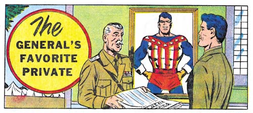
Double Life of Private Strong #2 (August 1959) “The General’s Favorite Private”, art by Joe Simon

There is a single page text piece about the Shield which tells how Lancelot Strong’s secret identity is discovered by General Smith. The story is nothing special but it contains an illustration by Joe Simon. Since the work that he did for the J. C. Penny (1947, A History Lesson) Joe drew very little comic book art. Probably the most significant work was “Deadly Doolittle” for Fighting American #6 and even that was a reworking of an earlier Sandman piece originally drawn by Kirby. After the Simon and Kirby studio broke up Joe did some more work on his own. Simon mostly did some covers but he also occasionally did an interior illustration such as the one accompanying the General Smith text story.

Double Life of Private Strong #2
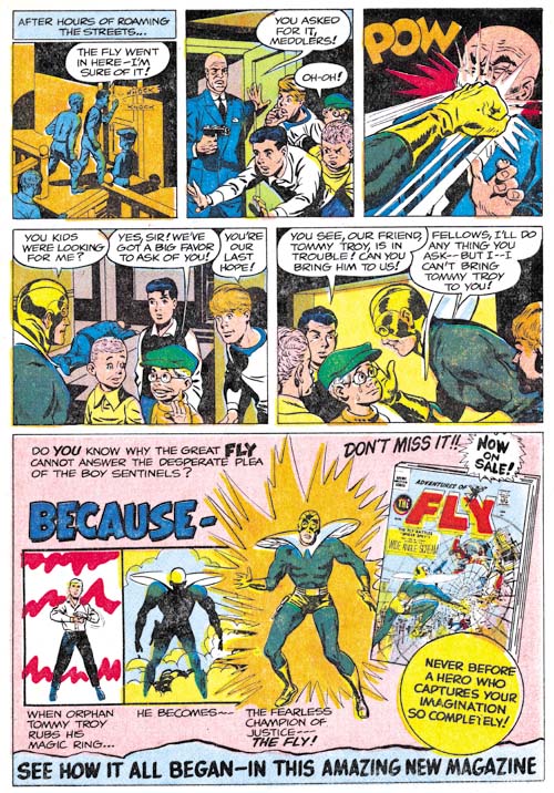
Double Life of Private Strong #2 (August 1959) “The Boy Sentinels” page 2, art by Joe Simon

For the most part one thing Joe Simon did not draw late in his career was full stories. Private Strong #2 included what is essentially an advertisement for the Fly, “The Boy Sentinels”. Should this two page piece be considered a story? What is interesting to me is that Joe makes little, if any, use of swipes from Kirby. Instead Simon drawing reflects back to the work he did for backup pieces for Stuntman and Boy Explorers, especially Vagabond Prince. The villain in the piece resembles that from “Trapped on Wax” (meant for the unpublished Boy Explorers #2), the close-up of the Fly hitting the villain seems taken from “The Madness of Doctor Altu (Black Cat #8, October 1947), and the young boys look like the one from “Death Trap De Luxe” (Black Cat #7, August 1947).

In “The Comic Book Makers” Joe writes:

Years later, I learned why John Goldwater had dropped his beloved Shield like a hot potato. DC Comic’s lawyers had sent him a cease-and-desist order which put forth the amusing claim that The Shield’s powers aped Superman’s too closely.

On the face of it this seems rather remarkable. After all the only important powers that the Shield and Superman seems to be the ability to fly and run at super fast speeds. The Fly can also, well fly, but there seems to have been no problem with that similarity. While not denying the question about some shared powers between the Shield and Superman, I would suggest there were other features that made the Shield more vulnerable to legal action than the Fly. While the Shield’s uniform was modeled on that Simon and Kirby created for Captain America, it unfortunately shared a color scheme with Superman; the same overall blue with red shorts and boots. Also regrettably the Shield’s origin story shared features with Superman’s; orphaned as a baby and raised by an elderly farming couple. All these factors probably contributed to Goldwater’s cold feet when presented with a legal challenge. After all the Shield had not yet shown whether it was a large enough money maker to warrant fighting a legal battle.

Art of Romance, Chapter 28, A Glut of Artists

(August 1954 – November 1954: Young Romance #72 – #74, Young Love #60 – #62, Young Brides #18 & #19, In Love #1 & #2)
Number of Romance Titles 1947 - 1958
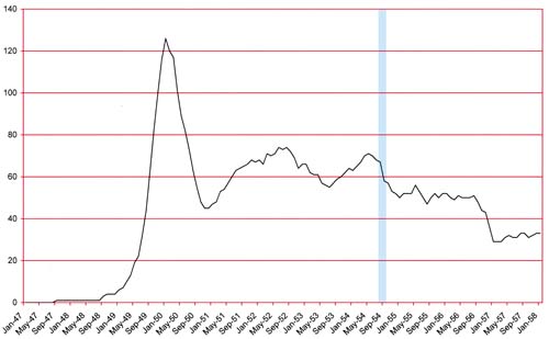
Number of Romance Titles 1947 – 1958 (the period covered in this chapter is shaded in blue)

As can be seen in the above chart romance comics had entered into a decline during this period. Did Joe Simon and Jack Kirby notice this? Had they been observant they might have for as will be shown they benefited from the failure of other titles. But then again there were always fluctuations in the number of titles and publishers so perhaps Joe and Jack were not aware that things had become very different. Or perhaps they were too caught up in their own business to notice the bigger picture. August 1954 (cover date) marked the release of Bullseye the first title for Mainline, Simon and Kirby’s own publishing company. In Love, the romance title for Mainline, would be released in September. Starting their own publishing company was a big step for Simon and Kirby but unfortunately their timing was particularly bad.

In chapter 27 I noted the appearance of some new artists in the Simon and Kirby productions (unfortunately as of yet unidentified). The art covered in the last chapter was created by 8 artists which in itself was an increase over the earlier period. I have identified 12 artists for the period covered by this chapter and that does not include unidentified artists. There are more pages of unattributed art than those by any identified artist. Frankly I have not sorted them all out but I believe that there are at least 5 or 6 artists that I cannot identify. A couple of these additions to the studio had appeared previously in Simon and Kirby productions and almost all would only provide a few pieces before disappearing from the studio. Oddly one artist, Bob McCarty, who played an important part in the two previous chapters, is completely missing in this one. However McCarty will be returning in future chapters.

The artist line-up based on their productivity was Bill Draut (42 pages), John Prentice (41 pages), Jack Kirby (25 pages), Mort Meskin (20 pages), Art Gates (19 pages) with Leonard Starr and Jo Albistur tied (12 pages). The rest of the artists provide a single story or a small number of single page features. There are 65 pages by unidentified artists but as I wrote above these were distributed among 5 or more artists.

With one exception the covers for the Prize romance titles were done by Draut and Prentice. As seen previously, some of the covers were made from stats of a splash panel (or visa versa). The one exception is the cover of Young Brides #19 (November 1954) which I have tentatively attributed to Joe Simon. This assignment is not based on art style but rather on evidence from Joe Simon’s art collection. I hope that someday I will be able to write about this cover.
In Love #1
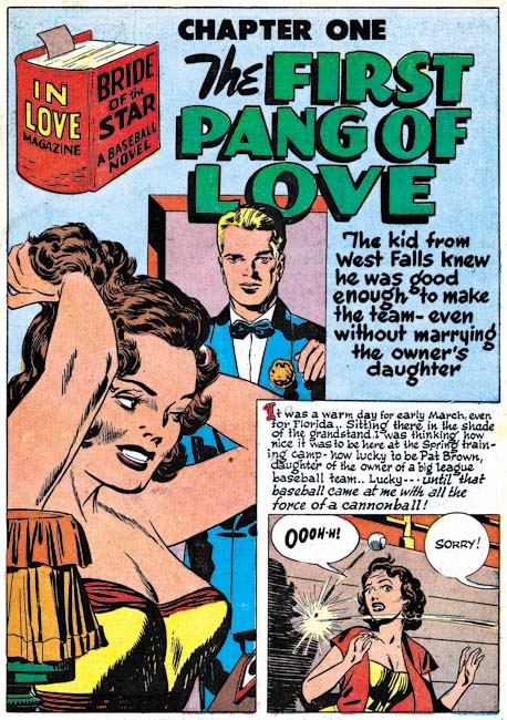
In Love #1 (September 1954) “Bride of the Star” Chapter 1 “The First Pang of Love”, art by Jack Kirby

As I promised last chapter, Jack Kirby returns to romance comics after a short absence. However he appears only in Mainline’s In Love and not in any of the Prize romance titles. Kirby’s absence from Prize romances will continue for some time. In Love was an interesting title whose “hook” was the long story contained in each issue. Kirby did all 20 pages of the art for the “Bride of the Star” from In Love #1. I will not write much about this story here because I covered it in a previous post on In Love #1.

Besides the length of the story, one of the things that distinguish In Love from the Prize romance titles is that Jack returns to full page splashes for all the three chapters. Frankly I already illustrated the best splash in my previous post but I felt I must include one of the other ones here. To be honest it is not one of Kirby’s best pieces but I feel that the splash for the other chapter to be even more inferior. But all of the story art is actually quite good.

Kirby on contributed a small part to the featured story “Marilyn’s Men” from In Love #2 (November 1954) with most of the work being done by Bill Draut. Since the post whose link I provided covers this story I will forego further comments here.

The cover for In Love #1 was one of the rare collaborations between Jack Kirby and an artist other the Joe Simon, in this case John Prentice (Jerry Robinson at the Jack Kirby Tribute Panel). Not only was the cover drawn by different artists but inked by different hands as well. Prentice’s back was clearly inked by himself and I suspect, though I am by no means certain, that Jack inked his own pencils as well.
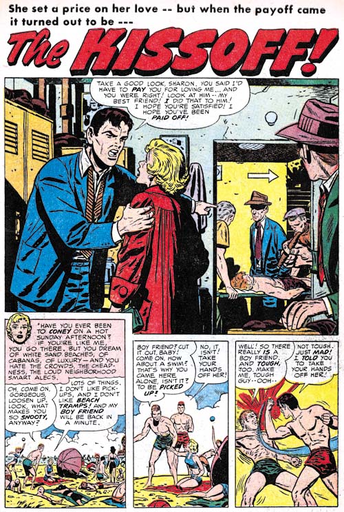
Young Romance #74
Young Romance #74 (November 1954) “The Kissoff”, art by Bill Draut

Bill Draut was the most prolific artist during this period but not by much. His recent decreased presence in S&K productions is a bit hard to understand. I once surmised that it might be due because of the work he was doing in preparation for the launch of Mainline. But on reflection there just does not seem enough work by Draut in those early issues of the Mainline comics to impact his normal work load. So I now suppose that his recent decreased contribution was due to some personal reason. Draut is one of the more consistent artists to work for Simon and Kirby but his style did not change much over the years. This makes it difficult to have new things to say about him. The same link I provided above for my post on In Love #2 goes into more detail about Draut’s work on “Marilyn’s Men”. I also did a post (Swiping Off of Kirby) about the use Bill made of art from an earlier story by Kirby.
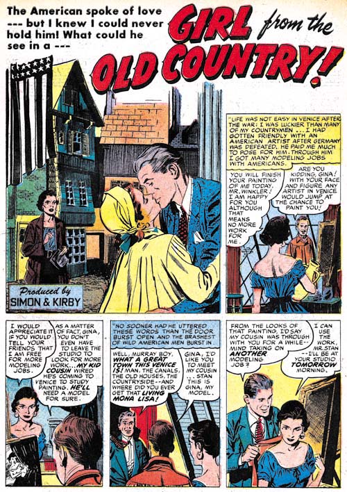
Young Romance #73
Young Romance #73 (September 1954) “Girl from the Old Country”, art by John Prentice

John Prentice was just behind Draut in productivity. This is one of the examples where a stat of the splash for this story was used to create the cover. Note that while story splashes were no longer being used in the Prize romance titles, Prentice is still providing a smaller than typical splash panel.
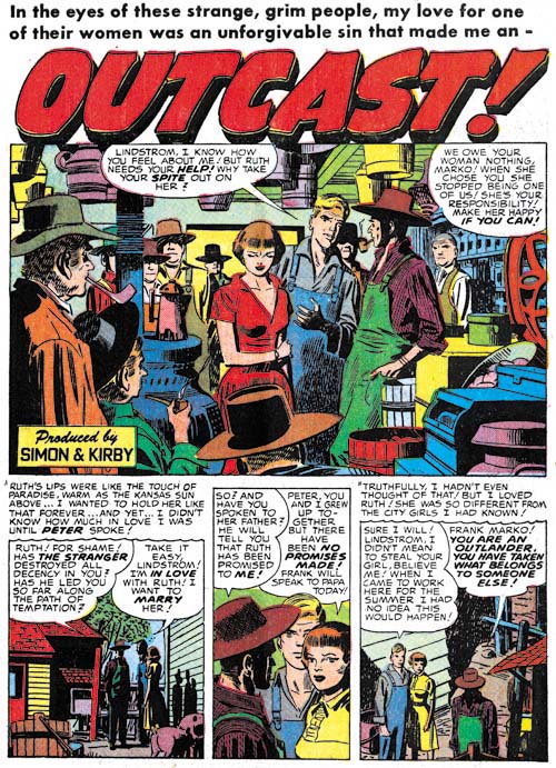
Young Love #60
Young Love #60 (August 1954) “Outcast”, art by Mort Meskin

There was an unexpected surge in productivity by Meskin in the last chapter and now there is a just as sudden drop in his output. I must admit that I am a little perplexed about what is going on with Mort. He was working for other publishers and that suggests that he was no longer working in the actual Simon and Kirby studio. But how does one explain the ups and downs since then? I have heard of discussion somewhere on the web where it has been suggested that when Meskin left the S&K studio to work in his own studio that Mort was once again plagued with difficulties in starting work on a blank page. I have no way of saying whether this is true but perhaps it would explain his varied, but often unusually low, output in Simon and Kirby productions. Even if Meskin’s productivity was poor during this period he still did some very nice work. “Outcast” is a good example of a real nice piece by Meskin (I believe he inked it as well). I previously posted on a Mort’s “After the Honey-Moon” from In Love #1 which while very short is one of his masterpieces.
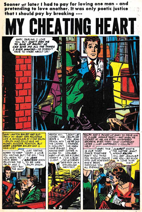
Young Brides #18
Young Brides #18 (September 1954) “My Cheating Heart”, art by Mort Meskin

“My Cheating Heart” is another great piece by Mort Meskin. I particularly like the inking in this piece. The solid blacks are used very effectively. I am pretty sure this is not Meskin’s own inking or that of George Roussos either but I cannot suggest who the inker was.
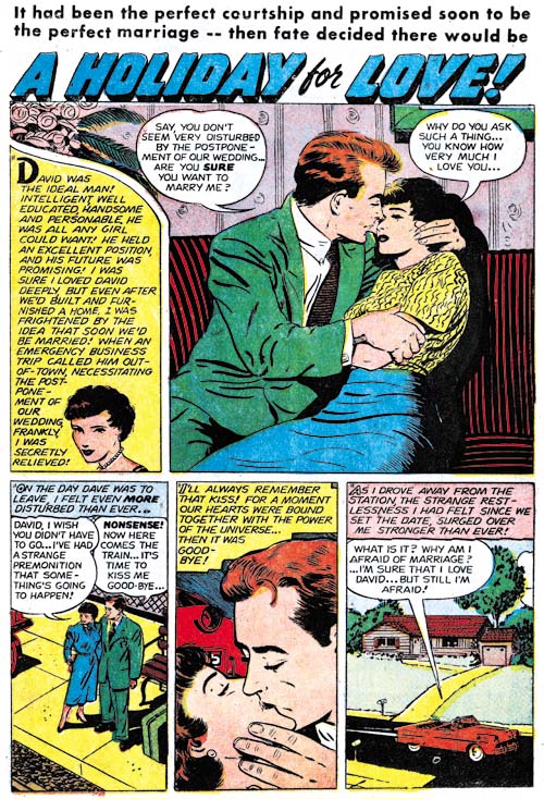
Young Romance #74
Young Romance #74 (November 1954) “A Holiday for Love”, art by Art Gates

Art Gates continue to supply numerous single page features but he is also did a few 3 page stories. At 6 pages, “A Holiday for Love” is the longest work Gates has yet done for Simon and Kirby. I cannot say that Art is one of my favorite Simon and Kirby artists but I admire the way he can do pieces like this a more cartoon-like gag features as well.
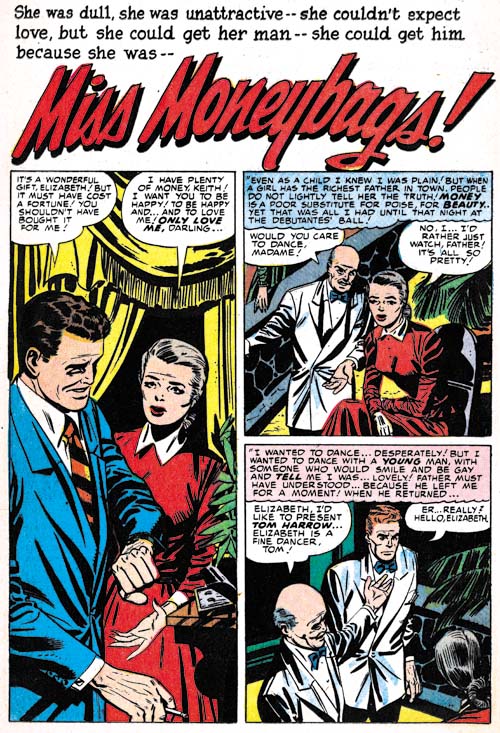
Young Love #61
Young Love #61 (September 1954) “Miss Moneybags”, art by Leonard Starr

Leonard Starr was not a new artist for Simon and Kirby productions but a returning one. He played an important part in the Prize romance titles for a little under two years ending in February 1951. His style has not changed that much during his absence and even without a signature “Miss Moneybags” (Young Love #61, September 1954) and “Cinderella’s Sisters” (Young Love #62, November 1954) were clearly done by Starr. However Leonard style had evolved somewhat so it is just as clear that this is not left over material. Although Starr was no longer using page formats that provided a series of tall and narrow panels he still had a predilection for such panels and was using alternative ways to introduce them. While it is possible that the reviews I perform for future chapters of this serial post may uncover one or two other stories by Starr, I am pretty confident that there will not be more than that. Leonard Starr would be like a number of artists from this chapter in that he made a brief appearance and then disappeared from Simon and Kirby productions. In Starr’s case he would be starting his own syndication strip, “Mary Perkins on Stage”, in a year or so.
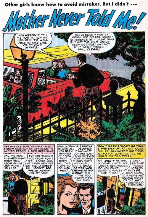
Young Love #61
Young Love #61 (September 1954) “Mother Never Told Me”, art by George Roussos?

I am by no means certain, but “Mother Never Told Me” looks like it might have been done by George Roussos. The resemblance is mostly in the men with the woman reminding a little bit like the work of Marvin Stein. But overall I believe the Roussos seems the best fit. George last appeared in a Simon and Kirby production in Black Magic #24 (May 1953). If this attribution is correct, Roussos like Starr will not appear in a future Simon and Kirby productions.
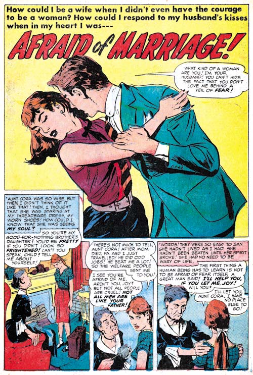
Young Romance #73
Young Romance #73 (September 1954) “Afraid of Marriage”, art by Jo Albistur

Although unsigned, “Afraid of Marriage” and “Just For Kicks” (Young Love #61, September 1954) are both clearly the work of Joaquin Albistur (he also appeared in Police Trap #1 in this same month). I had previously used Joe as the first name for this artist but it is now clear that he was an artist from Argentine (Joaquin Albistur the Same As Joe Albistur?). Joe Simon does not remember Albistur by name, but he does recollect someone from South America doing work for Simon and Kirby. Most people assume Simon was thinking of Bruno Premiani, but I believe it is even more likely that it was Albistur that Joe was recalling.

Unlike most of the new artists in this chapter, Albistur will play an important part in Simon and Kirby productions in the coming year. Jo is not well known among fans and I am not sure how much comic book work he did outside of Simon and Kirby productions. I have seen some original art from “The World Around Us” from 1961 that has been attributed to Albistur. I am not convinced but if it was his work Albistur had adopted a particularly unpleasing dry style. Despite Jo’s short time working for Simon and Kirby he is one of my favorite studio artists. His woman have an earthy beauty that I like, he had an eye for gestures, used interesting compositions and was skillful at graphically telling a story.
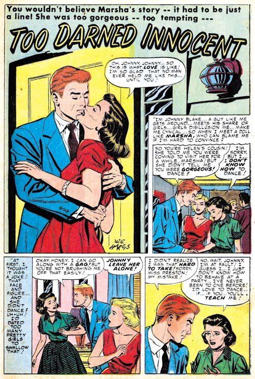
Young Love #62
Young Love #62 (November 1954) “Too Darned Innocent”, art by W. G. Hargis

There is one signed piece by W. G. Hargis, “Too Darned Innocent”. However given the number of unidentified artists appearing in Simon and Kirby productions there is the distinct possibility that other unsigned worked may have been done by Hargis during this period as well. In fact I have heard of suggestions that Hargis may have been responsible for a story in Police Trap.
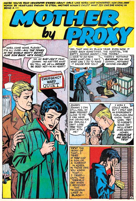
In Love #2
In Love #2 (November 1954) “Mother by Proxy”, art by Tom Scheuer

Tom Scheuer is another artist that only did one signed work for Simon and Kirby. Scheuer (who much later changed his name to Sawyer) is perhaps better known for his advertisement comic work (see For Boys Only from Those Fabulous Fifties and Comic Strip Ad Artist Tom Scheuer from Today’s Inspirations; both great blogs).

Joe Simon’s collection includes the original art for a page from this story. On the back is the name Art Sehrby, a telephone number and a street address. This raises the possibility that Simon and Kirby obtained Scheuer’s piece, and perhaps those of some other artists, from an agent.
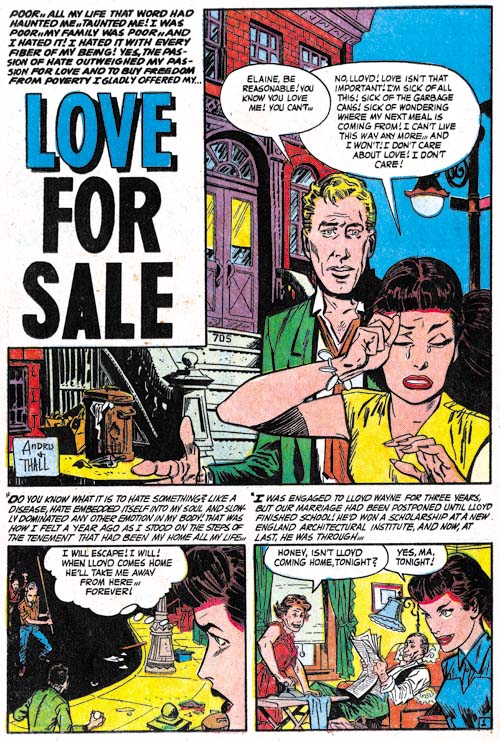
Young Brides #19
Young Brides #19 (November 1954) “Love for Sale”, pencils by Ross Andru, inks by Martin Thall

There is a story behind “Love for Sale” that has been discussed on the Kirby list but I do not believe I have written about in my blog. Mike Esposito and Ross Andru launched their own publishing company Mikeross with their earliest comic having a cover date of December 1953 (3-D Love). This then was well in advance of Simon and Kirby’s Mainline Comics whose first issue (Bullseye) came out in August.

Mikeross only published four titles (3-D Love, 3-D Romance, Get Lost and Heart and Soul. The 3-D romance titles were single issues and I suspect that their timing was a little off. The initial 3D comics sold very well but were apparently a novelty item. My understanding is that Simon and Kirby’s Captain 3-D which came out in December 1953 was already a bit late and sales were not that great. Since the Mikeross 3D romance titles have cover dates of December and January, I suspect they suffered from lower sales as well. Get Lost went to issue #3 while Heart and Soul only lasted to issue #2. Usually when a title is cancelled after just 2 or 3 issues it is a sign that something other than poor sales was involved. I suspect that the returns from their first comic, 3-D Love were so poor that the distributor pulled the plug on the whole deal.

I do not have the biography of Mike Esposito that came out a few years ago but I did have the chance to flip through it to see what he had to say about what happened next. If I remember correctly Esposito claimed that the distributor forced them to hand over their unpublished artwork to Simon and Kirby. Frankly this is a pretty suspicious claim because a distributor does not have any legal claim to the artwork. Further in my discussions with Joe Simon he has vigorously denied that it happened. Martin Thall gave an interview published in Alter Ego #52 where he stated that in order to recover some money they sold some art to Simon and Kirby and that Kirby was the one who arranged and received it. This makes a lot more sense and is the version that I accept.

The last issue of Heart and Soul was cover dated June so the next one would be expected for August. “Love for Sale” was used in Young Brides #19 (November). The timing is so perfect that there is little doubt that this story was among the art sold to Simon and Kirby. What makes that even more convincing is that the lettering was not done by Ben Oda like almost all of Simon and Kirby’s productions.

This is not Ross Andru’s first appearance in Simon and Kirby productions as a story by him appeared in May 1952 (Chapter 16) and two in May and June of 1953 (Chapter 19). Another Andru story will be seen in the next chapter which also was probably bought from the defunct Mikeross publishing company.
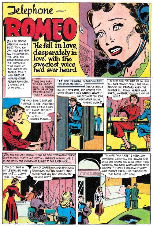
Young Brides #19
Young Brides #19 (November 1954) “Telephone Romeo”, art by unidentified artist

Since one story from Mikeross has been identified the question becomes can any others be found? Such art need not have been used right away but it is interesting that Young Brides #19 contains another story, “Telephone Romeo” that was not lettered by Ben Oda. However the letterer is not the same one that did “Love for Sale”. I have only examined the 3-D Love, 3-D Romance and Heart and Soul #1 but none of them used this artist. Actually I find Andru’s hand through most of them and I suspect Ross and Mike did all the art themselves. So it cannot be said with any certainty that “Telephone Romeo” was another piece sold by Mikeross but it can be confidently said that is was bought from some distressed publisher or artist stuck with unused art.
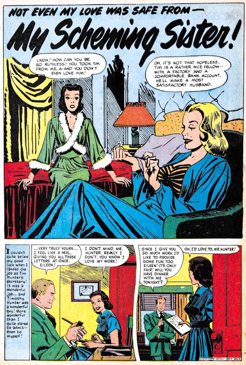
Young Love #62
Young Love #62 (November 1954) “My Scheming Sister”, art by unidentified artist

There is yet another piece, “My Scheming Sister”, with lettering clearly not done by Ben Oda. Look at the caption to the first story panel, Simon and Kirby productions did not typically use lower case letters in their captions. Once again this was a piece bought by Simon and Kirby but not necessarily from Mikeross. Whoever the artist was he was one of the better of the unknowns from this period. A smooth confident line and great characterization.
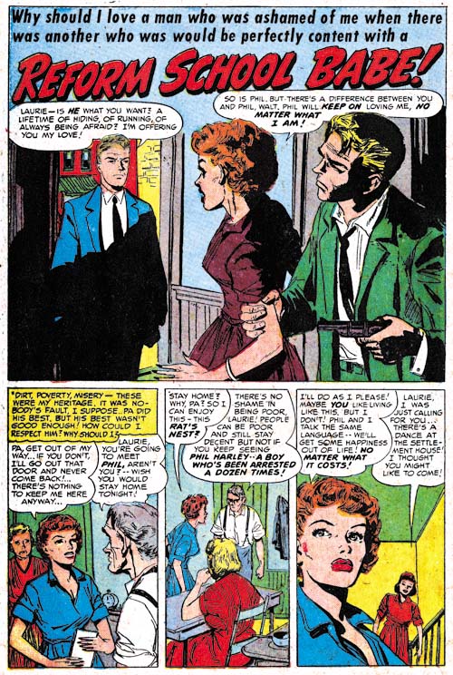
Young Romance #72
Young Romance #72 (August 1954) “Reform School Babe”, art by unidentified artist

Not all the unidentified artists were new; the one that did “Reform School Babe” had been an important contributor to Simon and Kirby productions for some months. I believe one of my commenters suggested Vince Colletta, at least for the inking, but I am not sufficiently knowledgeable about that artist/inker to hazard a guess.
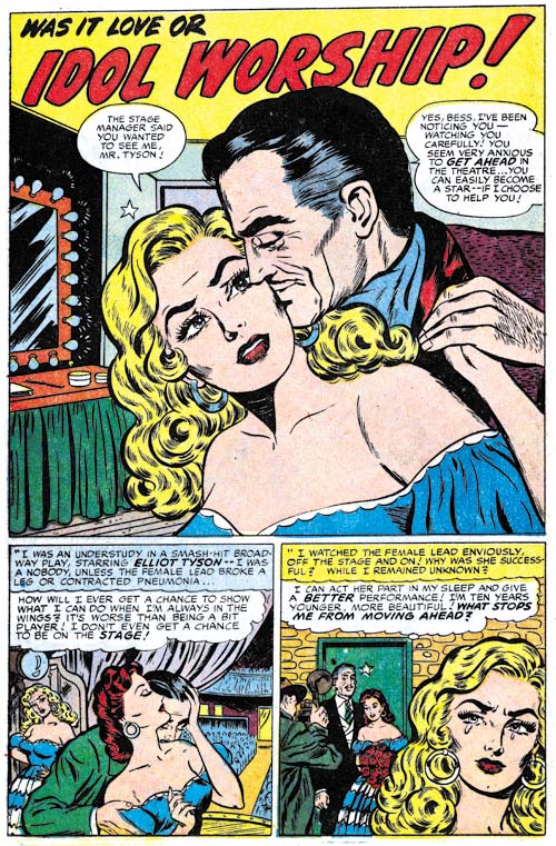
Young Romance #74
Young Romance #74 (November 1954) “Idol Worship”, art by unidentified artist

I will not be supplying examples of all the unidentified artists from these romance titles as I have not sorted them all out and anyway some are not that great. But I did want to provide an image from “Idol Worship” by one of the better artists working at this time for Simon and Kirby.

In summary, Simon and Kirby were using a number of new artists. Some like Jo Albistur would play important contribution to S&K productions; others like Tom Scheuer would make a brief appearance and not be seen again. Some may have been hired from the street but there is also the suggestion that some work may have come from an art agent. Further there is good evidence that some of the work came from the failed Mikeross publishing and perhaps other publishers as well. I have not yet done a review of Ben Oda’s lettering like I have those by Joe Simon, Jack Kirby and Howard Ferguson. I suspect a careful comparison of Ben Oda’s lettering with that used in the stories from this period will reveal others that came from romance titles that were failed. Simon and Kirby’s use of such material is not surprising because they had previously obtained art from Harvey after the love glut (Chapter 13, Romance Bottoms Out).

Chapter 1, A New Genre (YR #1 – #4)
Chapter 2, Early Artists (YR #1 – #4)
Chapter 3, The Field No Longer Their’s Alone (YR #5 – #8)
Chapter 4, An Explosion of Romance (YR #9 – #12, YL #1 – #4)
Chapter 5, New Talent (YR #9 – 12, YL #1 – #4)
Chapter 6, Love on the Range (RWR #1 – #7, WL #1 – #6)
Chapter 7, More Love on the Range (RWR #1 – #7, WL #1 – #6)
Chapter 8, Kirby on the Range? (RWR #1 – #7, WL #1 – #6)
Chapter 9, More Romance (YR #13 – #16, YL #5 – #6)
Chapter 10, The Peak of the Love Glut (YR #17 – #20, YL #7 – #8)
Chapter 11, After the Glut (YR #21 – #23, YL #9 – #10)
Chapter 12, A Smaller Studio (YR #24 – #26, YL #12 – #14)
Chapter 13, Romance Bottoms Out (YR #27 – #29, YL #15 – #17)
Chapter 14, The Third Suspect (YR #30 – #32, YL #18 – #20)
Chapter 15, The Action of Romance (YR #33 – #35, YL #21 – #23)
Chapter 16, Someone Old and Someone New (YR #36 – #38, YL #24 – #26)
Chapter 17, The Assistant (YR #39 – #41, YL #27 – #29)
Chapter 18, Meskin Takes Over (YR #42 – #44, YL #30 – #32)
Chapter 19, More Artists (YR #45 – #47, YL #33 – #35)
Chapter 20, Romance Still Matters (YR #48 – #50, YL #36 – #38, YB #1)
Chapter 21, Roussos Messes Up (YR #51 – #53, YL #39 – #41, YB #2 – 3)
Chapter 22, He’s the Man (YR #54 – #56, YL #42 – #44, YB #4)
Chapter 23, New Ways of Doing Things (YR #57 – #59, YL #45 – #47, YB #5 – #6)
Chapter 24, A New Artist (YR #60 – #62, YL #48 – #50, YB #7 – #8)
Chapter 25, More New Faces (YR #63 – #65, YLe #51 – #53, YB #9 – #11)
Chapter 26, Goodbye Jack (YR #66 – #68, YL #54 – #56, YB #12 – #14)
Chapter 27, The Return of Mort (YR #69 – #71, YL #57 – #59, YB #15 – #17)
Chapter 28, A Glut of Artists (YR #72 – #74, YL #60 – #62, YB #18 & #19, IL #1 & #2)
Chapter 29, Trouble Begins (YR #75 – #77, YL #63 – #65, YB #20 – #22, IL #3 – #5)
Chapter 30, Transition (YR #78 – #80, YL #66 – #68, YBs #23 – #25, IL #6, ILY #7)
Chapter 30, Appendix (YB #23)
Chapter 31, Kirby, Kirby and More Kirby (YR #81 – #82, YL #69 – #70, YB #26 – #27)
Chapter 32, The Kirby Beat Goes On (YR #83 – #84, YL #71 – #72, YB #28 – #29)
Chapter 33, End of an Era (YR #85 – #87, YL #73, YB #30, AFL #1)
Chapter 34, A New Prize Title (YR #88 – #91, AFL #2 – #5, PL #1 – #2)
Chapter 35, Settling In ( YR #92 – #94, AFL #6 – #8, PL #3 – #5)
Appendix, J.O. Is Joe Orlando
Chapter 36, More Kirby (YR #95 – #97, AFL #9 – #11, PL #6 – #8)
Chapter 37, Some Surprises (YR #98 – #100, AFL #12 – #14, PL #9 – #11)
Chapter 38, All Things Must End (YR #101 – #103, AFL #15 – #17, PL #12 – #14)
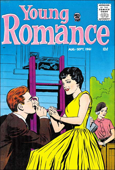
Early Lettering by Joe Simon

Like most comic book artists from the earliest period, Joe Simon lettered his own art. Actually Joe was doing lettering long before he began his career in comic books. While working as a newspaper staff artist Simon would letter his sport illustrations. Joe’s lettering for these sport drawings was quite variable even within the same individual work.

Silver Streak #2
Silver Streak #2 (January 1940) “Solar Petrol” letters by Joe Simon

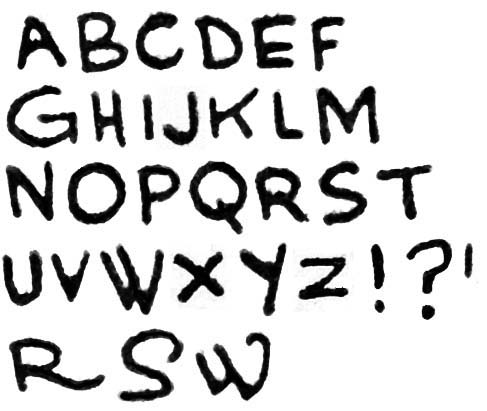
Simon’s lettering for his earliest comic book work was rather amateurish as even he admits. Letter size varied a bit in different parts of the same page as did line spacing. I tried to get most of my letter samples from “Solar Petrol” from the same regions but even so there some of this variation can be seen above. Interestingly, Simon did his ‘G’ similarly to the way Jack Kirby did it. This was just a coincidence because when Joe did “Solar Petrol”, his first published comic book story, he had not yet met Jack. While some of the other letters are not very useful in distinguishing Joe from Jack one helpful one is the letter ‘M’ where Joe’s version has vertical side strokes while Jack made his ‘M’ with slanting sides. Further Joe never gave his ‘U’ the horse-shoe shape that Kirby used. The most useful letter for spotting Simon’s hand is ‘W’. Joe did this letter in a very distinctive manner that I have not seen others use.

One of Simon’s characteristics found in his earliest lettering is the way he would occasionally embellish a letter. I provide examples for the letters ‘R’, ‘S’ and ‘W’ at the bottom of the image. It is important to note that Joe did not do this sort of embellishment often but some can found in all the early stories and are quite distinctive when found.

The samples from Silver Streak are pretty typical for Simon’s early comic book art. Similar lettering can be found in the following:

  • Daring Mystery #1 (January 1940) “The Fantastic Thriller of the Walking Corpses” (Fiery Mask)
  • Daring Mystery #2 (February 1940) “The Phantom Bullet”
  • Daring Mystery #2 (February 1940) “Trojak the Tiger Man”
  • Target #1 (February 1940) “The Case of the Black Widow Spider”
  • Amazing Man #10 (March 1940) “Ranch Dude”
  • Target #2 (March 1940) “Sabotage”

Daring Mystery #3
Daring Mystery #3 (April 1940) “Trojak” letters by Joe Simon

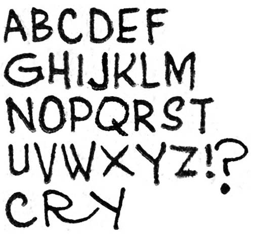
In later works Simon seemed to restrain his use of embellished letters although they still occur with some examples on the bottom line shown above. Joe changed the way he usually did the letter ‘Y’ writing it with a vertical lower stroke. However there are occasional uses of a diagonal lower stroke of the ‘Y’ with an example on the last line from Daring Mystery #3. Such mixed use of letter forms is often the sign of two different hands; one the original letterer and the other making alterations. But I do not believe that this is the case here because we will see later works where the use of the two versions of “Y” seems characteristic of Joe.

I only had the time to put together these two samples of Joe Simon’s lettering so I will be return later with some other examples.

Little Shop of Horrors, Chapter 5, New Faces

(May – July 1952, Black Magic #12 – #14)
As in Chapter 19 of The Art of Romance, Mort Meskin was the most productive artist for Black Magic drawing a total of 30 pages. Bill Draut was particularly active and draw 21 pages. The third and fourth places was held by an artists new to the studio; Bill Walton with 14 pages and Bob McCarty(?) with 10. Jack Kirby takes a surprising fifth place having provided only 9 pages. Kirby was the only artist who drew covers for Black Magic so three of those pages were covers with the remaining 6 pages from a single story. However we shall see Jack had a hand in other aspects of the title. Still it is a continuing mystery why Kirby, renown for his fast drawing, was so unproductive lately and especially during the period covered in this chapter. The rest of the art was provided by three artists each providing a single piece; George Roussos (4 pages), Al Eadeh(?) (2 pages) and 3 pages by an unidentified artist who used J. G. as initials.

Unfortunately John Prentice does not appear in any of the Black Magic issues covered in this chapter. Simon and Kirby did not use Prentice in Black Magic as much as some of the other studio artists. This certainly was not because Prentice was poor at the horror genre. Not only do I think he did a good job in Black Magic but he was clearly better than some of the artists that were used. I suspect the bias had more to do with how well Prentice did in the love titles that S&K preferred to assign him romance work.

Black Magic #13
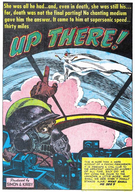
Black Magic #13 (June 1952) “Up There”, art by Jack Kirby

I always want to include at least one Kirby story in all my serial posts, but this time there is only one to choose from. Still it is a great story and was recently included in Titan’s “Best of Simon and Kirby”. Of course picking the best from Simon and Kirby’s repertoire is always a difficult decision since they did so much great stuff in all genres.

Black Magic #14
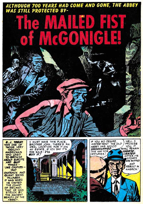
Black Magic #14 (July 1952) “The Mailed Fist of McGonigle”, art by George Rossous

I am sure I have said this before, but George Roussos is not among my favorite Simon and Kirby studio artists. His artwork is a bit too crude for my tastes. With that said I often find his use of blacks very interesting especially when he uses them in a splash such as in Black Magic #14 (July 1952) “The Mailed Fist of McGonigle”. Perhaps the greatest weakness in this particular splash is that it is easy to overlook the running figure in the background as an empty suite of armor.

Black Magic #12
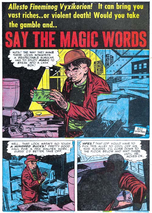
Black Magic #12 (May 1952) “Say the Magic Words”, art by Bill Walton

When I wrote Chapter 19 of the Art of Romance there was one story whose artist I could not identified but felt looked very familiar. Had I reviewed the work in this chapter of the Little Shop of Horrors I would have been known immediately who it was since both Black Magic stories by Bill Walton are signed. Fortunately all was not lost as sharp eyed Ger Apeldoorn recognized the correct attribution right away. Bill has a tendency to shorten the height of his faces and in his three quarter views to place the eyes at an angle. Walton will be making regular appearances in Simon and Kirby productions for a while so there will be amply opportunities to see examples of this work.

Black Magic #13
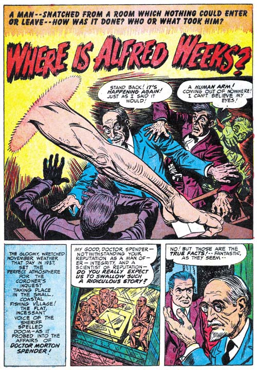
Black Magic #13 (June 1952) “Where is Alfred Weeks?”, art by Bob McCarty(?)

The June issue of Black Magic provides the first appearance of another artist that will regularly show up in Simon and Kirby productions for a time. The problem is he never signs his work and the only reason I have questionably attribute the art to Bob McCarty is because of some similarities to that artist works from 1954 (McCarty also did not sign his work but Foxhole was the only Simon and Kirby comic that provides some of the credits). However there are some differences between the art that might mean that they were not done by the same artist or that his art had evolved. One of the most distinctive features of the art in “Where is Alfred Weeks” as compared to McCarty’s art in Foxhole is the use of oversized eyes (not particularly obvious in the image I supply above). I will continue to questionably attribute this work to McCarty but I hope that I will resolve this issue, at least to my own satisfaction, as I proceed with these serial posts.

Black Magic #13
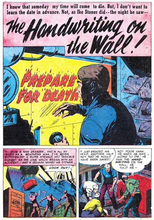
Black Magic #13 (June 1952) “The Handwriting on the Wall”, art by J. G.

“The Handwriting on the Wall” is an unsigned piece but there are some similarities to a story from Black Magic issue Black Magic #9 (“The Man in the Judge’s Chair”) that signed “J. G.”.

Black Magic #13
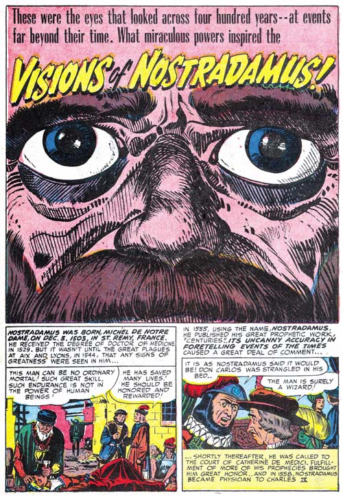
Black Magic #13 (June 1952) “Visions Of Nostradamus”, art by Jack Kirby and Al Eadeh(?)

One story, “Visions Of Nostradamus”, is by an artist that I originally thought might be Al Eadeh but I have not yet done my homework and found a contemporary signed piece by the artist to resolve the issue so I will continue to use a question mark. Ger Apeldoorn, who is much more familiar with Atlas where Eadeh also worked, seems more confident about the attribution. Eadeh(?) is a competent artist but nothing in his work that I have seen suggest the artistic talent shown in the splash. Of course that is not an acceptable reason to question whether he drew the splash (even poorer artists sometimes create a masterpiece) but the brushwork does not look like his either but does look like inking by Jack Kirby. The rather oversize eyes might seem incongruous for Kirby but similarly sized eyes appeared in a Kirby splash from Young Love #25 (September 1951, Chapter 16 of the Art of Romance).

Black Magic #13
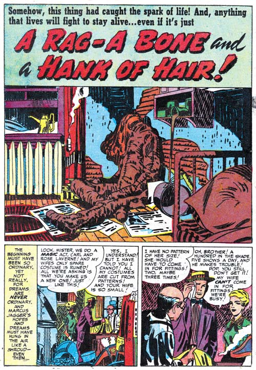
Black Magic #13 (June 1952) “A Rag, a Bone and a Hank of Hair”, art by Jack Kirby and Mort Meskin

Mort Meskin’s style is very different from Kirby’s and normally there is no problem in distinguishing the two. The story for “A Rag, A Bone And A Hank Of Hair” is obviously penciled and inked by Mort and in the past I assumed he did the splash as well. But since there are no figures in the splash, or at least human figures, this was really nothing more than an assumption. But during my review for this post I noticed the arcing of the two shadows on the wall. These are not true abstract arches but they still are a typical feature of the Studio Style inking. Now Meskin was excellent at Studio Style inking but he used that approach when inking Kirby’s pencils and generally not when inking his own work. Then I notice the inking of the oversized rag doll. The brushwork on the dummy is done with a rather blunt brush that is more typical of Kirby than Meskin. There is also a brush technique that I have not discussed before nor included in my Inking Glossary but nonetheless is an often found method used by Kirby (perhaps Joe Simon as well). Notice the simple hatching found on the lower part of the dummy’s arm (somewhat obscured by a white piece of paper). They form a shadow that is a sequence of arcs; what I think of as a scalloped edge shadow. Much of the brushwork in the splash has the sort of loose control that Kirby was so great with, but not all of the inking. The crosshatching on the cupboard is more mechanically arranged than typical of Jack but often found in Mort’s inking as can be seen in the two story panels on the bottom of the page. Also the inking of the pillow in the foreground looks more typical of Meskin particularly where closely spaced nearly parallel brushstrokes are used.

Black Magic #13
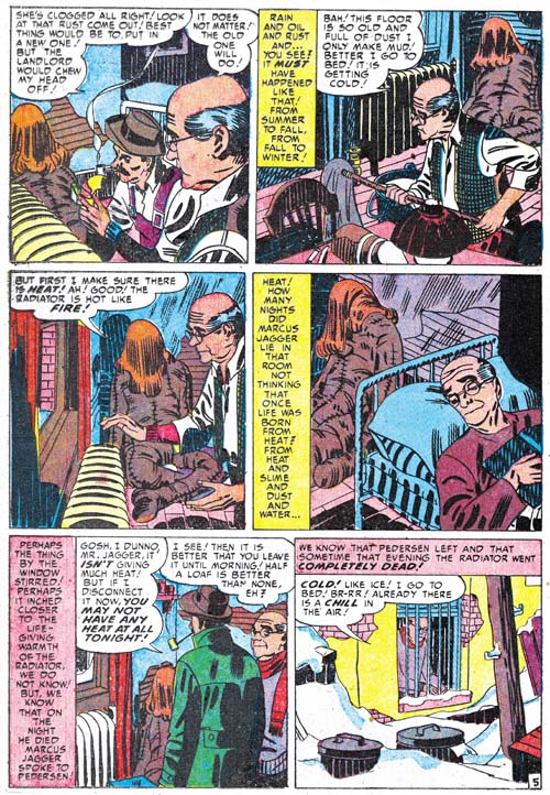
Black Magic #13 (June 1952) “A Rag, a Bone and a Hank of Hair” page 5, art by Mort Meskin

I include a story page as well so Meskin’s method of inking the large rag doll can be seen as well. Notice the brushwork is not as blunt, there are more uses of parallel ink lines, and there are no scalloped edge shadows. Even the hair is inked rather differently than Jack’s splash.

The reader might have noticed that while I have recognized Kirby’s inking, I have not said anything about the drawing. Unfortunately there is little to go on as the dummy is drawn in the same manner in the splash and the story. This might suggest that Meskin drew both but the cover is also based on this story and provides a similarly drawn dummy and there is no question that Kirby drew the cover. The only thing I can point out about the splash is the use of perspective; somehow it seems more consistent with Jack’s work than Mort’s. I fully realize that this is a very vague and subjective description but it is all I have to offer at this time. I do not know if I have convinced anyone else, but I have convinced myself that Jack was largely responsible for the splash panel.

Black Magic #12
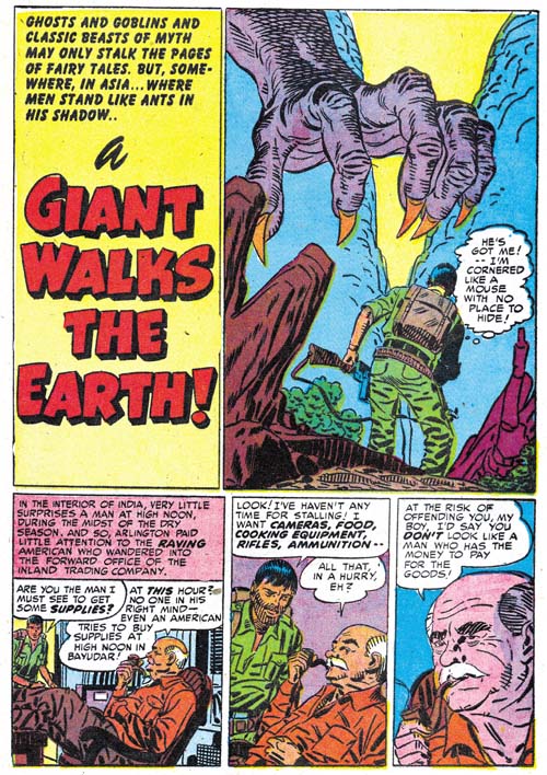
Black Magic #12 (May 1952) “A Giant Walks the Earth”, pencils by Jack Kirby, inks by Mort Meskin and Jack Kirby

Kirby drawn splashes in stories otherwise drawn by other artists are not the norm but are not that unusual either. They are rare enough that I can include all the cases I find in my serial posts. But Kirby splashes are common enough that many chapters (but not all) have examples. However it seems out of the ordinary to find so many Kirby splashes in just three issues because “A Giant Walks the Earth” appears to be another case. Again Kirby’s hand is easiest to spot in the inking. The folds on the human’s pants are typical of Jack’s brushwork; they have simple abstract shapes with no signs of the brush tip. The inking on the giant hand is done with a blunt brush more typical of Jack’s than it is of Mort’s inking. There is crosshatching on the giants forearm but note how less mechanical it is compared to the examples found in “A Rag, a Bone and a Hank of Hair”. However the inking of the foreground rocks all looks like it was done by Meskin. In fact there are some rocks in the story that are inking exactly the same manner.

Mort also clearly inked the story panels of the first page. This provides a good comparison of the two artist’s approach to inking cloth folds. At a glance they may appear the same but instead of the almost puddle like look found in Kirby’s inking, Meskin constructs folds using parallel lines with no attempt to hide the tip of the brush.

Black Magic #12
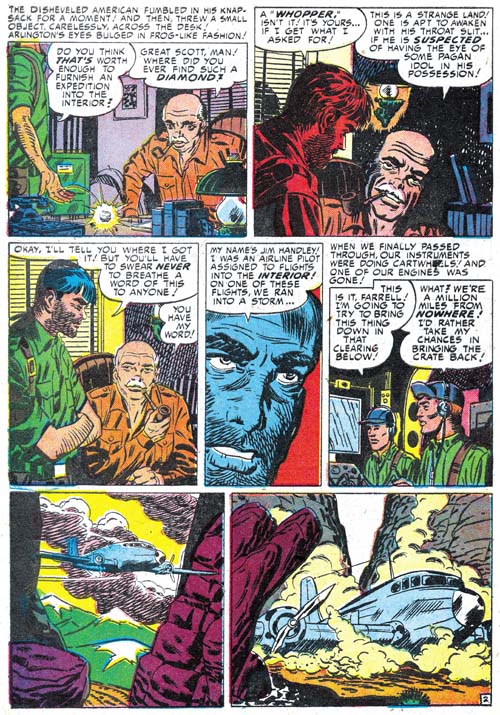
Black Magic #12 (May 1952) “A Giant Walks the Earth” page 2, art by Mort Meskin

Even though Mort is clearly inking the story panels on the splash page the art does not look like his. I provide an image of the second page so that two can be compared. The difference between the two is most obvious in the older man. So if Meskin did not draw the story panels from the first page, who did? I believe Kirby drew these as well. The end result may not look like typical Kirby art because Meskin appears to have inked them with a heavy hand. Normally Mort was quite a good inker of Kirby’s pencils and not so heavy handed but I believe in this case Mort purposely inked the first story panels this way so that they would blend better with the rest of the story.

Black Magic #13
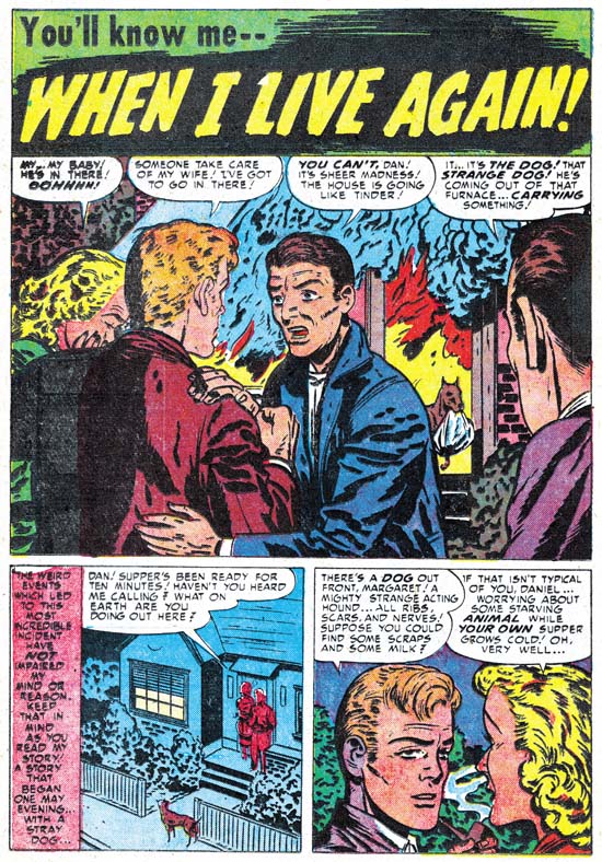
Black Magic #13 (June 1952) “When I Live Again”, art by Bill Draut

One of Bill Draut’s contributions was “When I Live Again”. Bill does his usual competent job but to be honest I doubt that I would have mentioned it because there is nothing truly unique about it. However when I reviewed I quickly realized that the plot was very familiar. So much so that I did some searching and sure enough found a similar story in Alarming Tales #1 (September 1957, “Logan’s Life”). It is more than similar stories; they were the same plot only the six pages of “When I Live Again” had been reduced to a mere two for “Logan’s Life”. According to every source I have ever seen the art for “Logan’s Life” has always unquestionably been attributed to Jack Kirby.

Black Magic #13 and Alarming Tales #1
Left Black Magic #13 (June 1952) “When I Live Again”
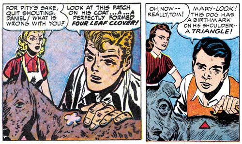
Right Alarming Tales #1 (September 1957) “Logan’s Life”

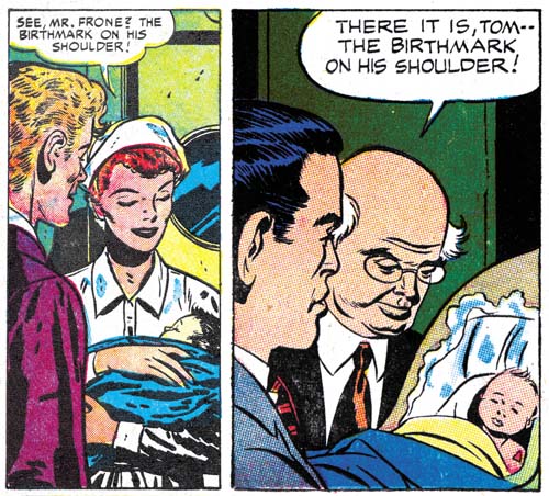
The text was re-written but the art for the story in AT #1 has clearly been swiped from Draut’s from BM #13. Of course the art was not a close copy; no one is likely to mistake the AT #1 story as done by Draut. But most of the panels in the AT #1 story were obviously based on panels for BM #13.

Black Magic #13 and Alarming Tales #1
Left Black Magic #13 (June 1952) “When I Live Again”
Right Alarming Tales #1 (September 1957) “Logan’s Life”

In fact every panel in “Logan’s Life” from AT #1 was based on one from BM #13 although as can be seen in the above images it is not always so obvious since not only has the panel been recomposed but the people portrayed are sometimes changed as well. These changes might seem superfluous but in fact the in each case the alterations made the alterations the particular panel from Draut’s layout to one like Kirby would use. In the end entire story is a convincing example of Kirby’s art. Of course it must have been convincing because as I said in the past everybody has credit Kirby with the pencils to his story.

Last week I wrote about the Red Raven cover and the Hal Foster panel it was swiped from. I have since searched through all my sources and it would seem that most who were unaware of the swipe attributed the cover to Kirby alone while all those who knew of the swipe credited to Joe Simon either alone or in combination with Jack. (There were a few who gave joint credits to all the art by Simon and Kirby.) I still attribute the Red Raven cover to Jack but in the case of “Logan’s Life” I have changed my mind and now believe it is by Simon. I had detected Joe’s hand in this story but I had previously decided it was due to the Simon being the inker. Now I realize he penciled “Logan’s Life” as well. I base this conclusion not on the fact that the story was swiped but because the similarity to another story Joe swiped for Fighting American (Jumping the Shark). The Fighting American story was swiped from a Kirby drawn Manhunter story so it may not be surprising that everybody had previously attributed it to Jack. But the source for “Logan’s Life” was by Draut and this shows how convincing a job Joe could do at mimicking Jack. Something that should always be kept in mind when trying to determine attributions for work by Simon and Kirby.

The Little Shop of Horrors, Chapter 4, Another Hit

The Little Shop of Horrors, Chapter 6, Mixed Bag

Joe Simon’s Hot Stuff

Zippy #1
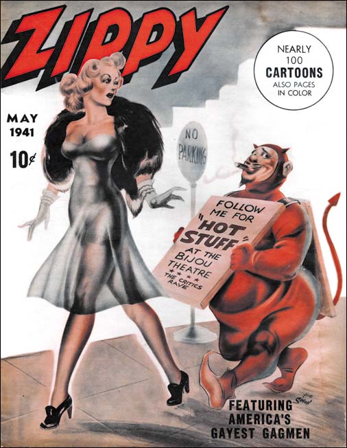
Zippy #1 (May 1941), art by Joe Simon

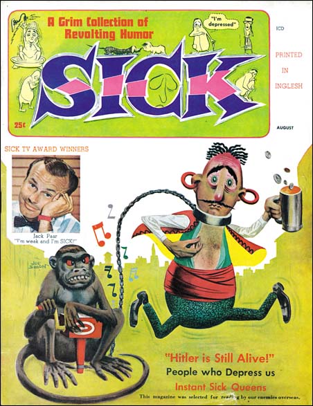
When Joe Simon was young he tried his hand in a number of different types of art work; political cartoons, sport illustration, portraits, story illustration, and oh yeah comic books. One art media Joe did not do was adult humor, that is except for the cover of Zippy #1. Here Joe provided a lecherous short man wearing a devil’s costume and an advertisement sign for Hot Stuff trailing a tall beautiful woman with a rather revealing dress. No punch line, just a visual gag that is more naughty then humorous. Joe executed the art with an air brush, a tool that he had become an expert at when he was a newspaper staff artist.

The first, and I believe only, issue of Zippy was cover dated May 1941. It was a large, tabloid size, publication. The cover reflected the work found in the interior both in subject and in size although some pages had 4 cartoons to a page. Much of the work is unsigned and based on the art styles done by a number of different cartoonists. There is nothing that today would be considered pornographic but all of a sexually suggestive humor. Back in the early 40’s, however, many would call it pornographic and such magazines sometimes brought legal difficulties to the publisher. So it is not surprising that the indicium is very short:

Zippy is published bimonthly by Manvis Distributors at Dunellen, N. J. May, 1941, Vol. 1, No. 1

Dunellen is a small community in central New Jersey that in 2000 had a population of 6823. It might seem to be an odd address for a publisher but in 1941 the town’s principal industries were R. Hoe Printing Press (manufacturer of letter presses) and Color Printing Company (owned by the W. F. Hall Printing Company of Chicago which at one time was the largest printing company in the world). Color Printing was almost certainly the printer of Zippy #1.

The subject matter is not the only thing that makes Joe’s work for Zippy unusual, the date does as well. Simon and Kirby’s Captain America was released to great success just two months before Zippy #1. Even before Captain America had made it to the newsstands, Joe and Jack had discontinued moonlighting for other publishers. Simon and Kirby must have felt they had a hit and with the promise of a share in the profits decided to concentrate their efforts to Timely alone. So why at this point would Joe decide to venture out into adult humor?

The answer is that actually Joe was not moonlighting when doing Zippy. A Google search found Manvis listed as a subsidiary of Magazine Management Company and publisher of the pulp Western Short Stories, and the comics Navy Combat and Sub-Mariner. Magazine Management was the name often used by Martin Goodman for his company that today is commonly referred to as Timely. Goodman would want to avoid legal hassles that Zippy might generate and the use of Manvis Distributors in the indicia could be nothing more then a smoke screen. Joe Simon was Timely’s first comic book editor and his handiwork can be found not just in the comics but the pulps and crime magazines as well. Joe would have been a logical choice to oversee Zippy and he had used the opportunity to put his own work on the cover.

Many years later, 1957 to be precise, Warren Kramer would create a little devil for Harvey Comics that was also called Hot Stuff. Just a coincidence? Perhaps, but in that year Joe Simon was also working for Harvey and he could have shown Harvey and Kramer one of the copies of Zippy from his collection, copies that he still has today. If so it would not have been the only time that a Simon original had inspired the creation of a popular comic book feature.

Joe Simon’s Northart Concepts Inc.

At the very start of this year I did a post on Joe Simon’s commercial work (Joe Simon’s Career in Advertising). I wrote it at the time because I thought that Joe’s work outside of comics would provide some insight into his career. Surprisingly I got some reader response requesting some more. Unfortunately I still have not scanned any of Simon’s bank illustrations which are for all practical purposes unknown to the comic book community. As far as I know the two black and white images I provided in the previous post are the only ones that have ever shown outside of their original use in advertisements. But I was scanning some more of Joe’s commercial work and thought I would include some here.

Simon did this work as a consultant and he called his company Northart Concepts Inc.


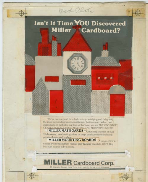
Layout for Miller Cardboard advertisement

In my previous post I included a published advertisement for Miller Cardboard. The above image is the actual layout used. What are shown in the image are a clear plastic sheet and an illustration board. The guide marks (found in the four corners) shows that the plastic sheet and illustration were not perfectly aligned when the scan was made but are close enough to be understandable. The plastic sheet is marked at the top “Red Plate”. The sheet therefore was meant to indicate the second, or color printing plate. Referring to it as the red plate is typically a term designating the magenta plate in a four color printing process. However in cases like this where only two print plates are required it was truly a red, or more precisely an orange ink. The red areas are colored transparent tape placed on the plastic sheet indicating where the red ink should go. There are two text lines pasted on the plastic and judging from the printed advertisement there was another one just above the large company name that has since fallen off. The two horizontal lines that are above and below the company title also adhere to the plastic sheet. Three of the pieces of red tape are marked with an ‘X’ to indicate that the image under them should be completely removed. The images under the other areas of red tape were meant to be retained giving those areas a texture in the printed results.

The rest of what is visible in the image above are all laid out on the illustration board. Most of the image consists of a montage of photographs of close-ups of textiles and a clock. Most of the pieces of photographs were cut to the required shape but some of the ones at the top were adjusted further by the use of black ink.


Layout for another Miller Cardboard advertisement

Joe Simon’s collection includes another layout for Miller Cardboard. In this case it was meant to be printed in black ink alone. I am not completely certain, but I do not believe the artwork was drawn by Joe; the fine but rough pen work is not typical for him. I find the removal of the tops of the three figures on the right to be a bit disturbing. The fact that this was not the original intention suggests that it came from the direction of Miller Cardboard.


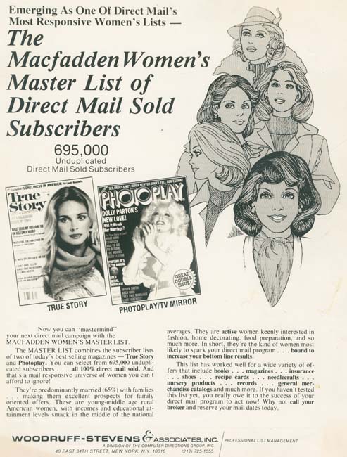
Layout for Woodruff-Stevens advertisement

Joe did lot of work for one outfit called Woodruff-Stevens. They dealt in mailing lists. Much of the work was simple layouts and not particularly exciting. However providing these layouts was a regular source of income for Simon. Woodruff-Stevens was so pleased with all the work that Joe did for them that they wanted him to become a partner but he declined to do.


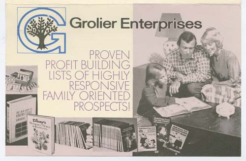
Front of brochure for Grolier Enterprises

This above brochure was for another mailing list. Actually I suspect it was just another name used by Woodruff-Stevens.


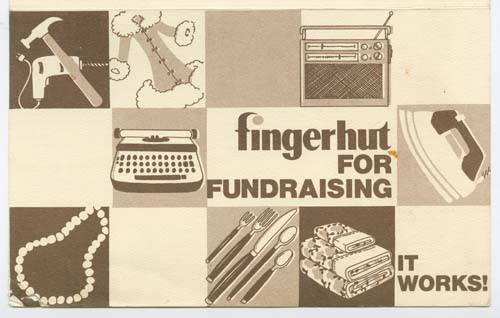
Front of brochure for Fingerhut

Another brochure for another mailing list. Again I suspect Fingerhut was just another company name used by Woodruff-Stevens.


Woodruff-Stevens Advertisement

Artwork does appear in some of the work Joe Simon did various companies. But generally speaking I do not believe Joe did the actual drawing, just the layouts.


Early stage for a Trido Research advertisement job

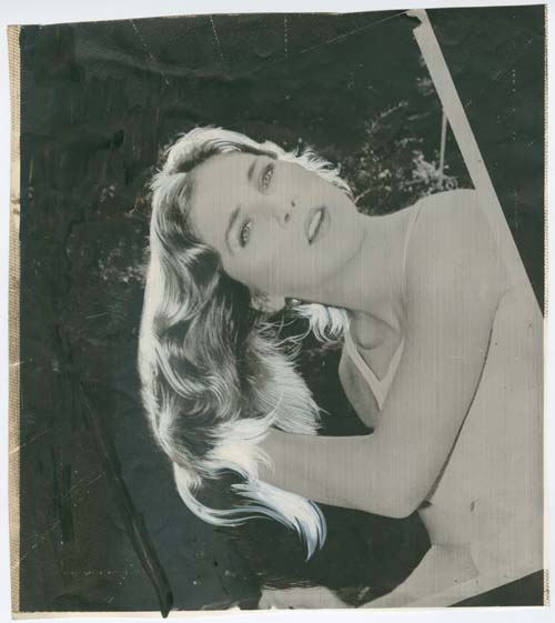
The above image is of an altered photograph. Joe had his own stat camera with which it was possible for him to make stats, film or prints. Stats are different from photographic film or prints in that they cheaply and easily produced images that were essentially black or white. I believe what was done is this case was that dot screen film was place over the original photograph and the combination shot using the stat camera onto stat film. A contact print was then made from the stat film. What looks like grey tones in the above images are actually due to the dots generated by using the dot screen. Joe then painted over the print with opaque white pigment in the hair and black ink on parts of the background. If you look carefully at the top of the image you can make out three light lines that seem to radiate from the model’s head. These lines are guide marks on the stat camera that Joe used and are frequently found in his work.


Later stage for a Trido Research advertisement job

The above image is a later stage of the same job discussed just above. Although the white pigment used in the hair in the early image had traces of grey these would not remain in this later stage. There are minor differences between this later image and the earlier one which leads me to believe that there may have been another state in between the two. Even this is not the last state as there are directions in pencil on the left margins indicating what further changes had to be made. Basically they wanted greater separation between the text and the image.


Opaque pigments on photographic image

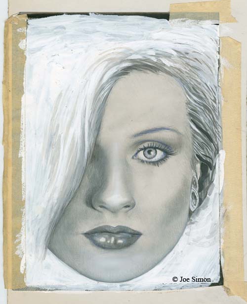
My last example for this post is an image of a woman. There is no indication what the image was intended for but it was found among Joe’s other commercial work and the image’s appearance seems most suitable for an advertisement. Joe taped a photograph onto an illustration board and then proceeded to paint onto it with opaque pigments. This was done so thoroughly that the only parts of the original photograph that can be made out are thin strips at the edges that had not been covered with paint. In its present state there is no way to tell how closely Joe followed the original photograph. The pigment was applied with a brush for the hair while the face was done using an air brush.

I have no idea how many but there were a number of comic book artists that ended up doing commercial art. For most of them, like Mort Meskin, this meant providing illustrations for advertisements. I also suspect that most ending up employed by some particular advertisement agency. Joe Simon’s commercial career was different and it mirrored his comic book career. First off Joe did not work directly for any advertisement agency but had his own consulting company instead. Simon did some illustrations the most interesting to most comic book fans would be the ones he did for Mechanics National Bank (the subject of a future post when I have had a chance to scan them). However Joe’s work ran a range from simple layouts to more complicated jobs using a stat camera. Just like in comics Joe did it all but he was his own boss.

A Great Joe Simon Inverview

I tip my hat to The Jack Kirby Comics Weblog for pointing out the great interview Christopher Irving did of Joe Simon for Graphic NYC. Joe had mentioned it to me but I had no idea what a marvelous job Irving did. I am quite critical about most interviews of Joe because they never seem to get him really engaged. Previously the only interview I recommended was Jim Amash’s for Alter Ego #76. Now I will add Christopher Irving’s as well. Do not miss it!