At the very start of this year I did a post on Joe Simon’s commercial work (Joe Simon’s Career in Advertising). I wrote it at the time because I thought that Joe’s work outside of comics would provide some insight into his career. Surprisingly I got some reader response requesting some more. Unfortunately I still have not scanned any of Simon’s bank illustrations which are for all practical purposes unknown to the comic book community. As far as I know the two black and white images I provided in the previous post are the only ones that have ever shown outside of their original use in advertisements. But I was scanning some more of Joe’s commercial work and thought I would include some here.
Simon did this work as a consultant and he called his company Northart Concepts Inc.
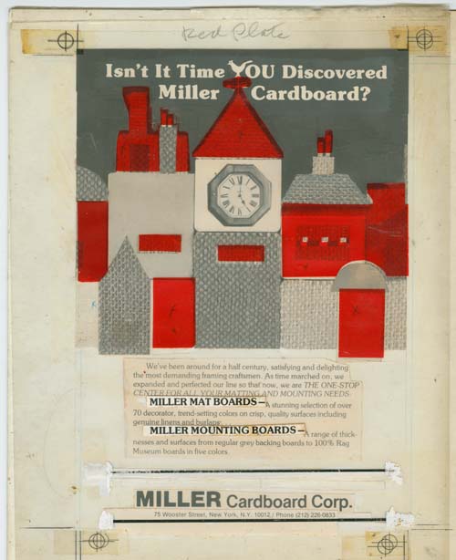
Layout for Miller Cardboard advertisement
In my previous post I included a published advertisement for Miller Cardboard. The above image is the actual layout used. What are shown in the image are a clear plastic sheet and an illustration board. The guide marks (found in the four corners) shows that the plastic sheet and illustration were not perfectly aligned when the scan was made but are close enough to be understandable. The plastic sheet is marked at the top “Red Plate”. The sheet therefore was meant to indicate the second, or color printing plate. Referring to it as the red plate is typically a term designating the magenta plate in a four color printing process. However in cases like this where only two print plates are required it was truly a red, or more precisely an orange ink. The red areas are colored transparent tape placed on the plastic sheet indicating where the red ink should go. There are two text lines pasted on the plastic and judging from the printed advertisement there was another one just above the large company name that has since fallen off. The two horizontal lines that are above and below the company title also adhere to the plastic sheet. Three of the pieces of red tape are marked with an ‘X’ to indicate that the image under them should be completely removed. The images under the other areas of red tape were meant to be retained giving those areas a texture in the printed results.
The rest of what is visible in the image above are all laid out on the illustration board. Most of the image consists of a montage of photographs of close-ups of textiles and a clock. Most of the pieces of photographs were cut to the required shape but some of the ones at the top were adjusted further by the use of black ink.

Layout for another Miller Cardboard advertisement
Joe Simon’s collection includes another layout for Miller Cardboard. In this case it was meant to be printed in black ink alone. I am not completely certain, but I do not believe the artwork was drawn by Joe; the fine but rough pen work is not typical for him. I find the removal of the tops of the three figures on the right to be a bit disturbing. The fact that this was not the original intention suggests that it came from the direction of Miller Cardboard.
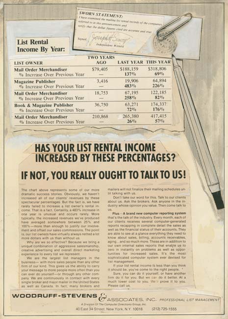
Layout for Woodruff-Stevens advertisement
Joe did lot of work for one outfit called Woodruff-Stevens. They dealt in mailing lists. Much of the work was simple layouts and not particularly exciting. However providing these layouts was a regular source of income for Simon. Woodruff-Stevens was so pleased with all the work that Joe did for them that they wanted him to become a partner but he declined to do.
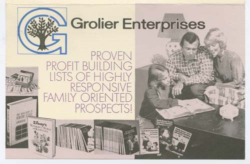
Front of brochure for Grolier Enterprises
This above brochure was for another mailing list. Actually I suspect it was just another name used by Woodruff-Stevens.
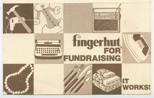
Front of brochure for Fingerhut
Another brochure for another mailing list. Again I suspect Fingerhut was just another company name used by Woodruff-Stevens.
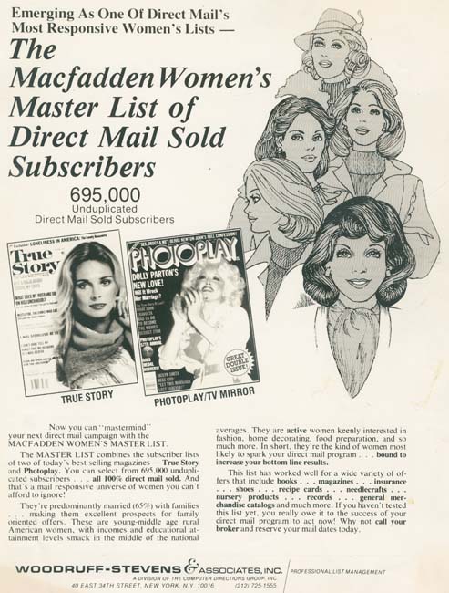
Woodruff-Stevens Advertisement
Artwork does appear in some of the work Joe Simon did various companies. But generally speaking I do not believe Joe did the actual drawing, just the layouts.
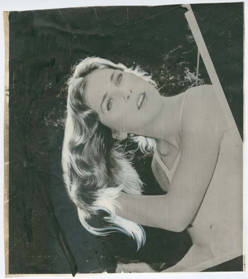
Early stage for a Trido Research advertisement job
The above image is of an altered photograph. Joe had his own stat camera with which it was possible for him to make stats, film or prints. Stats are different from photographic film or prints in that they cheaply and easily produced images that were essentially black or white. I believe what was done is this case was that dot screen film was place over the original photograph and the combination shot using the stat camera onto stat film. A contact print was then made from the stat film. What looks like grey tones in the above images are actually due to the dots generated by using the dot screen. Joe then painted over the print with opaque white pigment in the hair and black ink on parts of the background. If you look carefully at the top of the image you can make out three light lines that seem to radiate from the model’s head. These lines are guide marks on the stat camera that Joe used and are frequently found in his work.

Later stage for a Trido Research advertisement job
The above image is a later stage of the same job discussed just above. Although the white pigment used in the hair in the early image had traces of grey these would not remain in this later stage. There are minor differences between this later image and the earlier one which leads me to believe that there may have been another state in between the two. Even this is not the last state as there are directions in pencil on the left margins indicating what further changes had to be made. Basically they wanted greater separation between the text and the image.
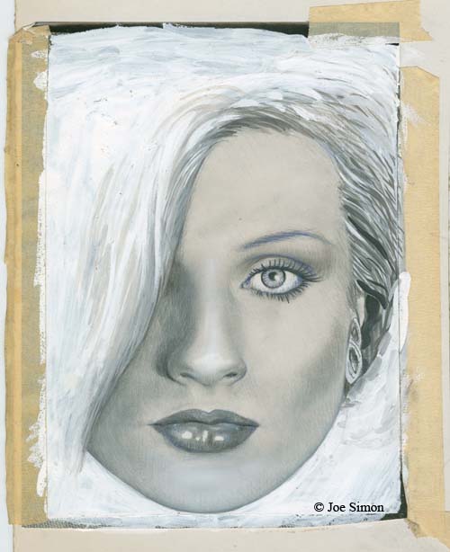
Opaque pigments on photographic image
My last example for this post is an image of a woman. There is no indication what the image was intended for but it was found among Joe’s other commercial work and the image’s appearance seems most suitable for an advertisement. Joe taped a photograph onto an illustration board and then proceeded to paint onto it with opaque pigments. This was done so thoroughly that the only parts of the original photograph that can be made out are thin strips at the edges that had not been covered with paint. In its present state there is no way to tell how closely Joe followed the original photograph. The pigment was applied with a brush for the hair while the face was done using an air brush.
I have no idea how many but there were a number of comic book artists that ended up doing commercial art. For most of them, like Mort Meskin, this meant providing illustrations for advertisements. I also suspect that most ending up employed by some particular advertisement agency. Joe Simon’s commercial career was different and it mirrored his comic book career. First off Joe did not work directly for any advertisement agency but had his own consulting company instead. Simon did some illustrations the most interesting to most comic book fans would be the ones he did for Mechanics National Bank (the subject of a future post when I have had a chance to scan them). However Joe’s work ran a range from simple layouts to more complicated jobs using a stat camera. Just like in comics Joe did it all but he was his own boss.

