My schedule is pretty crowded and so I do not have much spare time for wondering around the Internet. Fortunately some of my readers occasionally point out things that might be of interest to me. Recently my attention was directed to a post on Todd’s Blog, Logo Study: DC Romance Comics Part 1 (thanks RAB). It’s a great article on the various logos used for Young Romance.
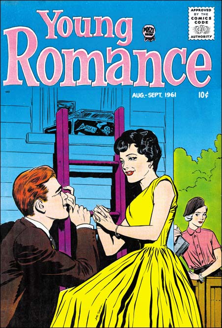
Young Romance v. 14 n. 5 (August 1961) art by Joe Simon (signed)
Todd provides a scan of the last Young Romance issue published by Prize Comics and states
I have no clue who designed it, doesn’t look like Joe Simon’s work, and I think he and Kirby had been away from the title for a while by then. Mark Evanier suggests it might have been by Ben Oda, and from the style that seems like a good guess.
However Todd is wrong to say Joe was no longer working on the title. Both Joe Simon and Jack Kirby were listed as the editors of Young Romance in the postal statements up to 1959. Jack’s last work for Young Romance was YR #103 (December 1959). The new logo for Young Romance appeared on issue #104 (February 1960) and postal statements from 1960 until 1963 listed only Joe Simon as the editor. Further Joe would do many of the covers for Young Romance. The cover for last issue that Todd uses in his post looks to me to have been drawn by Simon. I provide a scan of a Young Romance issue that is even signed by Joe.
As for Todd’s statement that the logo does not look like Joe’s, I thought I would provide some examples of other logos that might have been designed by Joe.
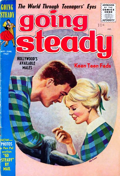
Going Steady v. 1 n. 3 (May 1960) art by Joe Simon (signed)
From 1957 to 1959 Prize was publishing All For Love, Personal Love and Young Romance. As I said above, Young Romance was edited by Joe but the other two titles were not. But in 1960 one of the partners for Prize Comics died and Joe was asked to take over all the titles. Joe cancelled All For Love and Personal Love and brought back Young Love and started a new title, Going Steady. Again the art for some of the covers for Going Steady were done by Simon. There are covers, as for example Going Steady #3, that was done by Joe using a combination of paint and air brush. Now I cannot say for sure that Joe did the logo, but as the editor he was at least involved in its selection.
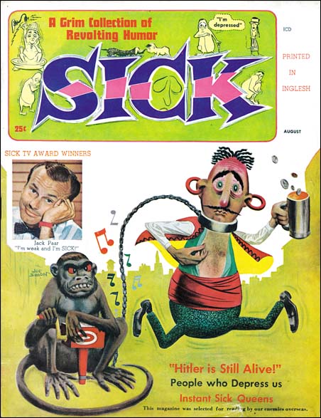
Sick #1 (August 1960) art by Joe Simon (signed)
Simon was not only asked to take over the comic lines but to come up with a humor magazine as well. And yes Sick is a clone of the tremendously popular Mad Magazine. However there were many attempts to copy Mad’s success and only Cracked had a more successful run than Sick. There was no art department at Prize so I am sure this is Joe’s design.
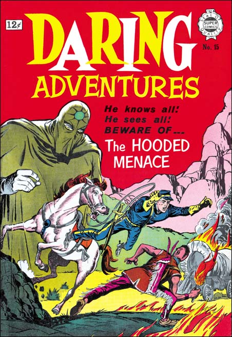
Daring Adventures #15 (1964) art by Joe Simon
In 1963 and 1964 Super Comics published some reprint material under the title Daring Adventures. However the covers for the titles all used new art. I have seen the covers for eight of the issues and there were three different logos; #9; #10, #11, #17 and #18; #12, #15 and #16. Further there is a correspondence between the logo and the cover artist. I do not know who did issue #9, but #10, #11, #17 and #18 were done by Ross Andru with #12, #15 and #16 drawn by Joe Simon. In the Comic Book Makers Joe description of the owner Israel Waldman makes it sound that Super Comics was a one man operation. Therefore it is likely that the cover artist provided the logo as well and so I credit the logo with Simon cover art to Joe himself.
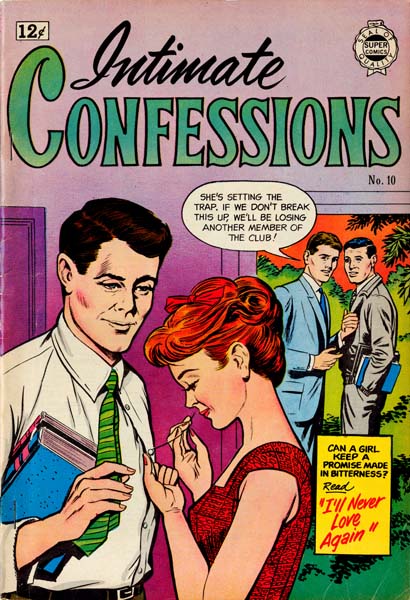
Intimate Confessions #10 (1963) art by Joe Simon
Simon provided covers for some of the other Super Comic titles as well. I have only seen a few covers for Intimate Confessions (perhaps there were only a few) so I cannot make as strong a case for who did the logo but I am still included to believe the cover artist did.
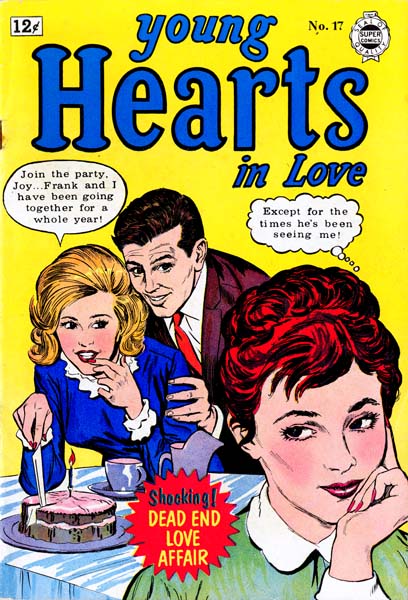
Young Hearts in Love #17 (April 1962) art by Joe Simon
Another Super Comics romance title that Simon provided cover art for was Young Hearts in Love. In this case I think we can be pretty confident that Joe created the logo because he based the design on that for the original Young Romance. An obvious choice since the Super Comic’s title was a based on the old Prize one.
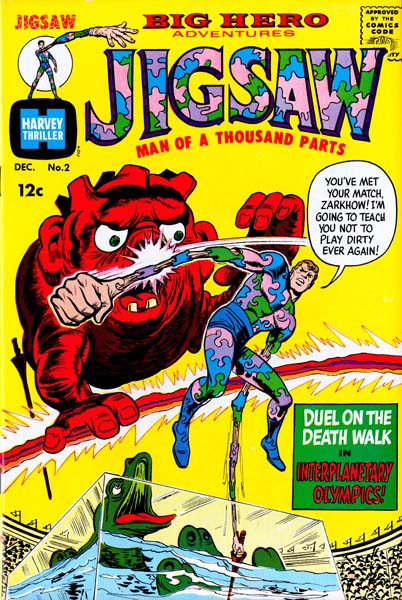
Jigsaw #2 (December 1966) art by Joe Simon?
A few years later Harvey Comics asked Joe to do some superhero titles. Once again it is hard to be sure that Joe designed the logos but as editor he certainly was at least involved in the selection.
There are other logo designs that might be attributed to Joe Simon and perhaps I will go over them someday in a future post. In my opinion the second Young Romance logo does look like Joe’s design but I will leave it to the reader to decide whether to agree with me or Todd. But by all means check out his post.


After seeing the covers on this post, and reading it, I’ve changed my blog entry. I see now that Simon was still involved as editor when that logo was created, and Mark Evanier did say he thought it was lettered by Ben Oda from a layout by Simon, so I’ve stated it that way. Thanks for the insight.
“Jigsaw #2 (December 1966) art by Joe Simon?”
Can’t be too certain about the rest of the cover (especially given Joe’s penchant for putting many hands to work on a single cover), but the main character figurework sure looks like George Tuska.
I do not know about many hands, but Joe certainly liked to combine his own work with another artist for a cover. And I believe George Tuska did work for Joe in other titles (Sick) during this period. So you could be right.