
I tip my hat to The Jack Kirby Comics Weblog for pointing out the great interview Christopher Irving did of Joe Simon for Graphic NYC. Joe had mentioned it to me but I had no idea what a marvelous job Irving did. I am quite critical about most interviews of Joe because they never seem to get him really engaged. Previously the only interview I recommended was Jim Amash’s for Alter Ego #76. Now I will add Christopher Irving’s as well. Do not miss it!
Category Archives: Simon, Joe
Fighting American, Chapter 3, Jumping the Shark
Posted in 2009/06, 6 Mainline, Artists, Fighting American, Kirby, Jack, Periods, Simon, Joe, z Archive and tagged american, fighting, Jack, Joe, Kirby, Simon
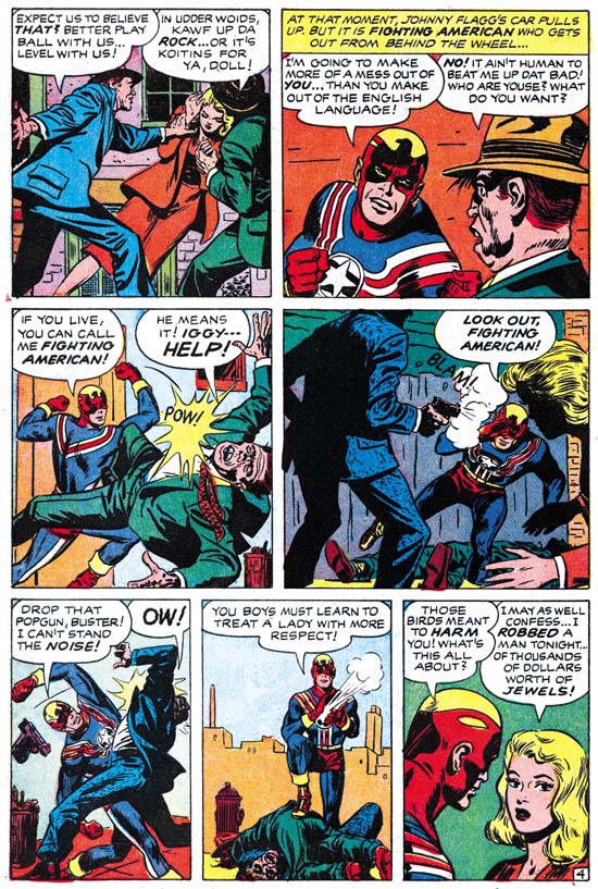
Joe Simon and Jack Kirby had launched their own publishing company, Mainline, starting with Bullseye #1 (cover date August 1954). In an uncharacteristic move, Simon and Kirby did not advertise their involvement in the Mainline titles (Bullseye, Foxhole, In Love and Police Trap). This unusual reticent was undoubtedly due to a desire to avoid conflicts, at least initially, with Prize Comics for whom Joe and Jack continued to produce comics including Fighting American. The extra work Simon and Kirby had taken on was not without consequences as there was a drop in the quantity and quality of the work drawn by Kirby. The art for the earlier issues of Fighting American was top notch but in my opinion most of the art for the issues covered in this chapter were relatively inferior (but an inferior Jack Kirby was still better then the best of most other comic book artists).

Fighting American #5 (December 1954) “Jiseppi, The Jungle Boy” page 3, art by Jack Kirby
The decline in art quality that I mentioned above does not seem to have occurred in “Jiseppi, The Jungle Boy”. This is a delightfully nonsensical tale about a jungle boy in India that speaks English with a distinct Italian accent. Actually in the end it turns out there is a perfectly logical explanation for this incongruity (okay maybe only as logical as can be expected in a comic book). As seen in the previous chapter, Simon and Kirby’s humor includes making fun of the comic’s heroes. Above we see Fighting American trying to track Jiseppi through the jungle completely oblivious to all the dangers that his quarry saves him from. I love the way that the jungle boy’s tiger speaks in stick figures.

Fighting American #5 (December 1954) “The Year Bender” page 4, art by Jack Kirby
Simon and Kirby would throw in some science fiction-fantasy into their humor as well as seen in “The Year Bender”. They travel in time is said to be about 3000 years in the past. It looks like Rome but that could not be since at 1000 BC Rome was just one of many small Italian cities and the arena games presented here would not be held for many years from then. But historical accuracy was never an important criteria for Simon and Kirby particularly if it got in the way of a good story. Check out the fun Jack had in drawing the ancient helmets; I do not believe any two head gear were drawn the same throughout the story.
As delightful a tale as this is, the decline in art quality that I mentioned is pretty obvious. It would be easy to blame the inker but Jack had some pretty poor inkers in the past but Simon and Kirby would usually rescue it by doing the final touchups.
The final panel reads:
AND THAT NEXT TRIP INTO THE PAST MAY BE COMING UP SOONER THAN SPEEDBOY SUSPECTS! YOU’LL SEE WHAT WE MEAN WHEN YOU GET THE NEXT BIG ISSUE OF FIGHTING AMERICAN!
Despite what they promised issue #6 had no time travel tale.

Fighting American #5 (December 1954) “Invisible Irving”, art by Jack Kirby
The villain for “Invisible Irving” makes use of invisible paint although oddly enough often comes off just part of his body leaving him looking like a flying head.
The tale ends with a caption:
FIGHTING AMERICAN AND SPEEDBOY HAVE A SPECIAL TREAT FOR YOU IN THE NEXT ISSUE. COME ALONG WITH THEM AS THEY UNCOVER A LOST CIVILIZATION IN “CITY BENEATH THE SEA”
Perhaps this refers to the same story mentioned at the end of “The Year Bender”. Even so “City Beneath the Sea” is a story that would never appear and as far as is known was never drawn.
Fighting American #6 (February 1955) “Deadly Doolittle” page 4, art by Joe Simon
The art for “Deadly Doolittle” is generally attributed to Jack Kirby, and with good reason since many Kirby mannerisms can be found in the story. However as I have previously pointed out (Art of Joe Simon, Chapter 11) this story is actually a rewrite of a Manhunter story (Adventure Comics #75, June 1942, “Beware Of Mr. Meek”). In “The Comic Book Makers” Joe Simon describes how he and Jack got into hot water with Prize Comics for using re-scripted old romance art. While I have never been able to trace down the specific romance work in question (not that surprising considering the thousands of romance pages that Simon and Kirby produced) this recycling of an old Manhunter story occurred about the same time and was a similar cost saving measure. Attributing the actual pencils for “Deadly Doolittle” to Joe Simon is not based on the use of swipes. Some use the false swiping criteria (non-swipe = Kirby, swipe = Simon) but it has been amply shown that Jack would swipe as well. Rather I credit Simon for this particular story because of the art, especially the woman in the last panel of page 4. Similar women can even be found in the reworked Black Magic that Joe did for DC many years later (Black Magic at DC).

Fighting American #6 (February 1955) “The Making of Fighting American”, art by Jack Kirby
Four pages of issue #6 are used for the retelling of the origin of Fighting American and Speedboy. This was all art selected from the first issue except for the splash panel. Not that the splash was new, it was originally meant as the cover for Fighting American #4.

Fighting American #6 (February 1955) “Super Khakalovitch”, art by Jack Kirby
For me “Super Khakalovitch” is where Simon and Kirby had finally jumped the shark in Fighting American. It may be just me, but I find the humor forced and the story dull. Further the story is not helped by the fact that not all the art was drawn by Jack Kirby. I judge that Jack did pages 1, 2, 4, 5, 6 and 7.

Fighting American #6 (February 1955) “Super Khakalovitch” page 8, art by unidentified artist
The other pages (3, 8, 9 and 10) were done by an artist that I have not been able to identify; he does not look like any of the artists working for Simon and Kirby at the time.
Simon and Kirby may have jumped the shark but they produced enough art for two more issues although one would not be published for years later.
The Art of Romance, Chapter 15, The Action of Romance
Posted in 2009/05, 5 Studio, Art of Romance, Artists, Draut, Bill, Kirby, Jack, Meskin, Mort, Periods, Prentice, John, Prize, Serial Posts, Simon, Joe, Stein, Marvin, z Archive and tagged Bill, Draut, Jack, Joe, John, Kirby, marvin, meskin, Mort, Prentice, Simon, stein
(May 1951 – July 1951: Young Romance #33 – #35, Young Love #21 – #23)

Number of Romance Titles 1947 – 1952 (the period covered in this chapter is shaded in blue)
Besides the two romance titles, Simon and Kirby were also producing bimonthly Black Magic (for Prize) and Boys’ Ranch (for Harvey). At this point I believe it can safely be said that Joe and Jack had little to do with the Prize crime titles. While Mort Meskin and Marvin Stein would appear in Prize comics both produced by Simon and Kirby and those that were not, they were the only artists that seemed to do so. John Severin had been another artist that worked in both the romance and crime titles but at this point the only Prize title he was working on was Prize Comics Western (also not a Simon and Kirby production).
Young Romance switched back to drawn covers for May and June (Young Love had already been using art covers). Both titles would revert to photographic covers for their July issues and would remain using photo covers until 1954. I really do not know what to make of YL consistently and YR sporadically using art covers for a period of about a year.
In a certain respect Jack Kirby was the primary studio artist during this period as in fact he was during the entire time Joe and Jack produced comics together. Except for a period in 1954 and My Date #4, Jack would provide the art for the cover of all Simon and Kirby productions that did not use a photograph. During this period Kirby would also do the lead story for all the issues of Young Romance and one for Young Love (YL #21). But if the total number of pages of art produced is used to judge who was the primary artist then Mort Meskin wins out be a large margin. For these six romance issue Jack did a total of 51 pages of art while Mort did 80. The difference is all the more striking with the knowledge that Meskin did all his own inking while Kirby did not. I will say that I feel that Meskin’s art sometimes suffers from his higher rate at producing art while Kirby always seems to provide high quality work no matter how many pages he drew. It also pays to compare Jack’s 51 pages with Bill Draut’s 36 and John Prentice’s 34 or 37 pages (the uncertainty about Prentice page count is due to the short feature “Will You Help Me?” from YL #21 which I will discuss below). Jack was still working at a high rate; it is just that Mort was even more exceptional. Marvin Stein is another contributor during this period with only 3 stories and 23 pages. There are 3 very short pieces (a total of 7 pages) that I have not been able provide artistic credits for.

Young Romance #34 (June 1951) “Old Fashioned Girl”, art by Jack Kirby
Perhaps others do not share my view, but I find Kirby’s confessional splashes powerful drawings despite their lack of action. While Kirby is generally (and quite reasonably) famous for his dynamic drawing it was a mark of his genius that he could be so effectively in such static compositions. Much of this has to do with Jack’s careful use of characterization. I have said it before but it is worth repeating, I do not agree with those who claim that Kirby did not draw beautiful women. It is true the protagonist in the splash for “Old Fashioned Girl” does not have the type of attractiveness that would be found in a beauty pageant contestant. But her frail like form has its own beauty and most importantly is totally appropriate for her antique dress style. The thing is Kirby did not draw the same women over and over but created unique individuals that were well matched to the theme of the story. The woman’s downcast eyes and the demur way she holds her hands augment the characterization. The old woman looking on and all the antique surroundings complete the picture. If all that was not enough, Jack has added a small panel that is not a story panel but another means of showing the conflict between the lady’s old fashioned ways and what was then modern society.
I feel that Jack Kirby’s romance splashes are much more interesting then the covers. I present the line art for the cover of YR #34 which is based on the “Old Fashioned Girl” story in a post above (My Two Cents). The reader can compare the two and reach their own conclusion.

Young Romance #35 (July 1951) “Temptations of a Car Hop”, art by Jack Kirby
The splash for “Temptations of a Car Hop” provides a nice contrast to the one in “Old Fashioned Girl”. The protagonist was certainly meant to represent a thoroughly modern woman, or at least what would have been modern in 1951. However 58 years later and the car-hop has disappeared a casualty of the fast food drive through. I do remember them from my younger days but none that I ever visited had such and attractive waitress wearing such a short dress.

Young Love #21 (May 1951) “All Work and No Love”, pencils by Jack Kirby inks by Marvin Stein
With all the work I am doing for Titan’s Simon and Kirby library, I have not had time to devote to investigating the various inkers of Jack Kirby’s work. Still from time to time I come across a piece that just screams a particular inker. Such is the case with “All Work and No Love”. In the splash the simplicity of the woman’s eyes and eyebrows and the slight angle they have in relation to one another leaves little doubt that Marvin Stein was involved in the inking. The same sort of eyes appears elsewhere in the story as well. Also there are some cases where the eyebrow is extended into a crease of the forehead which is a trait often found in Stein’s own art. I should point out that inking of Kirby pencils in the Simon and Kirby studio was like an assembly line with various artists taking care of different chores. So when I say Marvin Stein inked this story I am saying no more then he was the one inker of this work that I have been able to identify but there are others that I have not. In this case Marvin seems to have done the outline inking, the first step in the inking process. Note however how the spotting uses the picket fence crosshatching, drop strings and shoulder blots that are characteristics of the Studio Style inking (see my Inking Glossary for explanations of the inking terminology that I use). Stein’s inking of his own work does not use such techniques. Further Stein’s own inking was a bit rough and lacked control. It would improve greatly in future years but at this point I cannot believe he could have been the artist that did the spotting.

Young Romance #33 (May 1951) “Take a Letter, Darling” page 6, art by Mort Meskin
While I have frequently remarked how action is more often found in the romance stories Jack Kirby draws I do not want to leave the impression that action played no part in stories drawn by other studio artists. So I thought I would provide some examples. First up is a page by Mort Meskin. Meskin has his own unique and very stylized version of a slugging as can be seen in the second panel. Note in particular how the angular position of the victim’s head and how his legs are folded up beneath him. I say it is stylized both because Mort uses it over and over again and because it appears nothing like how a photograph a fight would look. I am not using the term stylized in a negative manner because I believe a comic artist job is to tell a story, not to try to produce a sequence of photorealistic images. With his technique Meskin has condensed several instants of time into one image (the victims head responding to being struck by the fist is the first instant, with the torso soon following and finally the loss of control of the legs as the effect of the knock out is completed).

Young Romance #33 (May 1951) “Not in the Act” page 8, art by Bill Draut
The second example of a fight comes from Bill Draut’s “Not in the Act”. Draut uses an interesting compositional device of presenting the fighters in depth. I am not sure where Bill got this idea but it is pretty effective. I do not believe I have seen Draut use it before so it is not as an important part of his repertoire as Meskin’s or Kirby’s more stylized slugging.

Young Love #23 (July 1951) “Cradle Robber”, art by John Prentice
The splash for “Cradle Robber” provides an example of a fight as portrayed by the more recently arrived studio artist. Actually calling it a fight is not quite correct as Prentice has chosen to present the moment just before the punch is thrown. The other thing about this splash is that it is actually a teaser as there would be no fight seen in the story. It is however the closest example of a fight that I could find by John Prentice in the period covered by this chapter.

Young Romance #35 (July 1951) “The Catskill Man-Chasers” page 8, art by Mort Meskin
Mort Meskin is famous for his use of blacks but that does not always show up in his romance art. That may in part be a result of his high rate of art production. But it may also be because for Meskin telling the story properly had become a higher priority then making interesting art. Sometimes Meskin would have the best of both worlds (story and art) as in this page from “The Catskill Man-Chasers”. For many comic artists only night scenes would get an abundance of black but here Mort uses it to make the light parts so much brighter as would be appropriate for a hot summer day by the pool. Mort also uses it in the second panel to hide in plain sight Tom, the love interest of the story. Tom’s presence in the panel is not obvious at a glance because Mort only provides a silhouette but at closer examination the pipe clearly indicates that the shadowed figure is Tom. Starting with the second panel, Meskin moves in closer and closer so that the view progresses from a crowded scene to one that focuses on just the couple. While Meskin is restricting the focus he is paradoxically increasing the use of black until in the final panel the reader can make out only a little of the faces. While Mort has obscured the features he has made the scene all the more intimate. It is a masterly orchestrated page all the more so because nobody else working for Simon and Kirby, including Kirby, worked blacks anything like this.

Young Romance #33 (May 1951) “Charity Case” page 5, art by John Prentice
Since John Prentice is a new addition to the Simon and Kirby studio it behooves me to begin to try to discredit the opinion that too many Kirby fans have that Jack supplied layouts for the various studio artists. While that is true for some of the more minor artists that Simon and Kirby occasionally used it is decidedly not true for the more common talented artists. John Prentice certainly falls in the talented group and except for a special case from years later and from outside the romance genre Prentice did not work from Kirby layouts. One piece of evidence in Prentice’s case comes from the dramatic close-ups like panel 3 in the page shown above. While Jack Kirby occasionally did close-ups they generally are not as radically cropped as Prentice often uses.

Young Love #22 (June 1951) “Cry Baby”, art by John Prentice
It was not uncommon for Studio Style inking techniques to show up in splashes of stories of the artists that otherwise were inked with other brush mannerisms. Often I suspect it was the work of Joe or Jack stepping in to touch up the art. That is not however what I judge happened to “Cry Baby”. All the major features of the studio style are present in this page if not in the splash itself; picket fence crosshatching, drop strings, abstract shadow arch and shoulder blots (see my Inking Glossary). What makes me believe this was not the work of Simon or Kirby is the way the picket fence crosshatching is done particularly on the man’s jacket. The rails are not done in the standard way of the Studio Style but match Prentice’s cloth folds. The pickets vary in both spacing and execution in ways not typical of Simon and Kirby. This leads me to believe that the spotting was actually done by Prentice himself.

Young Love #21 (May 1951) “Will You Help Me?”, art in part by John Prentice
I must admit I am uncertain what to make of “Will You Help Me?” from YL #21. The overall simplicity of the style is different then work assigned to Prentice yet the brunette has the elegant beauty so typical of John’s work. The inking of the splash panel looks like a combination of that by Prentice and another artist. The spotting of the hair is typical of Prentice’s technique but the cloth folds are not nor are the way they are arranged along the edge of her sleeve which suggests either Simon or Kirby. The inking in the first story panel all looks like it was done by Prentice. On the other hand the crosshatching in the last story panel is not typical of any of the parties considered so far. It is possible that Prentice is inking Kirby pencils but the way the brunette turns to talk to someone behind her is a common Prentice mannerism. The other possibility is that Prentice is working from Kirby layouts with which he takes liberties in some places. It could be that John did the pencils and final spotting but that the outline inking was done by someone else. At the present I am undecided except that John Prentice participated in the art in some fashion.

Young Love #23 (July 1951) “Nag, Nag, Nag”, art by Marvin Stein
I thought I would close off with an example of what Marvin Stein was doing during this period. The style is still typical of Stein’s early period but there are hints like the man in the second story panel that are typical of the style he would develop later.
Chapter 1, A New Genre (YR #1 – #4)
Chapter 2, Early Artists (YR #1 – #4)
Chapter 3, The Field No Longer Their’s Alone (YR #5 – #8)
Chapter 4, An Explosion of Romance (YR #9 – #12, YL #1 – #4)
Chapter 5, New Talent (YR #9 – 12, YL #1 – #4)
Chapter 6, Love on the Range (RWR #1 – #7, WL #1 – #6)
Chapter 7, More Love on the Range (RWR #1 – #7, WL #1 – #6)
Chapter 8, Kirby on the Range? (RWR #1 – #7, WL #1 – #6)
Chapter 9, More Romance (YR #13 – #16, YL #5 – #6)
Chapter 10, The Peak of the Love Glut (YR #17 – #20, YL #7 – #8)
Chapter 11, After the Glut (YR #21 – #23, YL #9 – #10)
Chapter 12, A Smaller Studio (YR #24 – #26, YL #12 – #14)
Chapter 13, Romance Bottoms Out (YR #27 – #29, YL #15 – #17)
Chapter 14, The Third Suspect (YR #30 – #32, YL #18 – #20)
Chapter 15, The Action of Romance (YR #33 – #35, YL #21 – #23)
Chapter 16, Someone Old and Someone New (YR #36 – #38, YL #24 – #26)
Chapter 17, The Assistant (YR #39 – #41, YL #27 – #29)
Chapter 18, Meskin Takes Over (YR #42 – #44, YL #30 – #32)
Chapter 19, More Artists (YR #45 – #47, YL #33 – #35)
Chapter 20, Romance Still Matters (YR #48 – #50, YL #36 – #38, YB #1)
Chapter 21, Roussos Messes Up (YR #51 – #53, YL #39 – #41, YB #2 – 3)
Chapter 22, He’s the Man (YR #54 – #56, YL #42 – #44, YB #4)
Chapter 23, New Ways of Doing Things (YR #57 – #59, YL #45 – #47, YB #5 – #6)
Chapter 24, A New Artist (YR #60 – #62, YL #48 – #50, YB #7 – #8)
Chapter 25, More New Faces (YR #63 – #65, YLe #51 – #53, YB #9 – #11)
Chapter 26, Goodbye Jack (YR #66 – #68, YL #54 – #56, YB #12 – #14)
Chapter 27, The Return of Mort (YR #69 – #71, YL #57 – #59, YB #15 – #17)
Chapter 28, A Glut of Artists (YR #72 – #74, YL #60 – #62, YB #18 & #19, IL #1 & #2)
Chapter 29, Trouble Begins (YR #75 – #77, YL #63 – #65, YB #20 – #22, IL #3 – #5)
Chapter 30, Transition (YR #78 – #80, YL #66 – #68, YBs #23 – #25, IL #6, ILY #7)
Chapter 30, Appendix (YB #23)
Chapter 31, Kirby, Kirby and More Kirby (YR #81 – #82, YL #69 – #70, YB #26 – #27)
Chapter 32, The Kirby Beat Goes On (YR #83 – #84, YL #71 – #72, YB #28 – #29)
Chapter 33, End of an Era (YR #85 – #87, YL #73, YB #30, AFL #1)
Chapter 34, A New Prize Title (YR #88 – #91, AFL #2 – #5, PL #1 – #2)
Chapter 35, Settling In ( YR #92 – #94, AFL #6 – #8, PL #3 – #5)
Appendix, J.O. Is Joe Orlando
Chapter 36, More Kirby (YR #95 – #97, AFL #9 – #11, PL #6 – #8)
Chapter 37, Some Surprises (YR #98 – #100, AFL #12 – #14, PL #9 – #11)
Chapter 38, All Things Must End (YR #101 – #103, AFL #15 – #17, PL #12 – #14)
Cover for Alarming Tales #2, My Third Attribution Attempt
Posted in 2009/04, 7 Freelance, Artists, Harvey, Odds & Ends, Periods, Simon, Joe, Topic, z Archive and tagged Joe, Simon
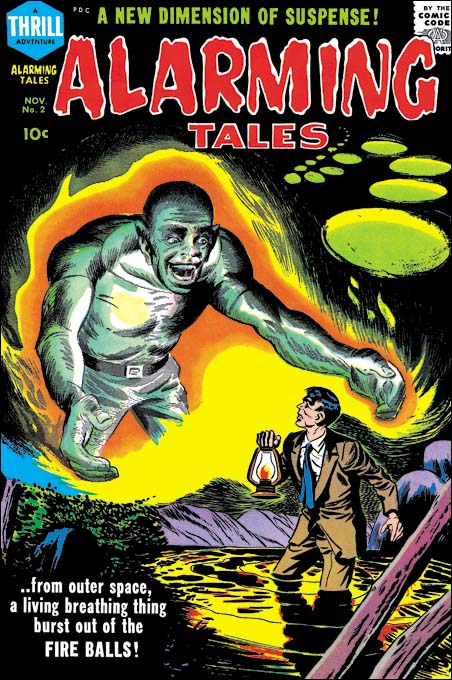
Alarming Tales #2 (November 1957)
Trying to provide the proper credit for comic book art is always filled with uncertainties in certain cases. All one can do is use what evidence is available and make the best judgment possible. The willingness to try must be joined with acceptance of the errors that will sometimes be made. Case in point, the cover for Alarming Tales #2.
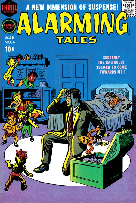
Alarming Tales #4 (March 1958), art by Joe Simon
My original take on the cover for AT #2 was that Joe Simon was the artist. Joe can be a difficult artist to identify. While he signed much of his work at the start of his career a lot of his later work lacks a signature. An even greater difficulty lies in Joe’s skill in adopting different styles. Experts have attributed some Fox covers to Lou Fine having overlooked Joe’s small signature. Joe did so good a job at mimicking Jack Kirby that much of the admittedly limited amount of work Simon did while collaborating with Kirby continues to be attributed to Jack. I do not claim to be able to identify all Joe Simon’s work; there is some late romance cover work that I do not a good understanding of and I sometimes doubt that it will ever be possible to confidently determine which Dick Tracy covers Simon ghosted. The Art of Joe Simon provides an overview of Joe’s career although I have changed my opinion about a few of the attributions in that serial post*. Among the styles Joe used was one more personal in that it does not seem to be an attempt at mimicking another artist. One of the best examples of this style can be found on the cover for Alarming Tales #4. The man in the cover for Alarming Tales #2 shares that style and for that reason I first assigned AT #2 to Joe Simon.
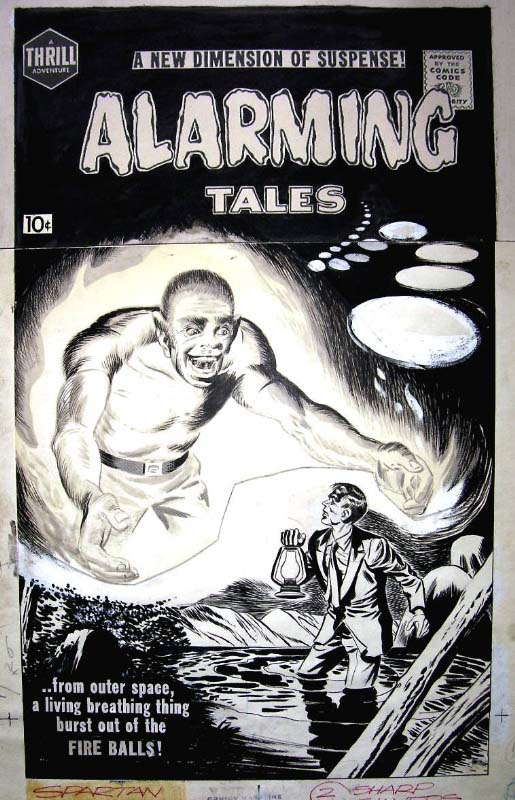
Alarming Tales #2, original art from the collection of Paul Handler
But there were problems with my original attribution of this cover to Joe Simon, the most important of which was that the spaceman look like he was done by Mort Meskin. Mort Meskin had not worked for Joe Simon since the breakup of the Simon and Kirby studio and there are no examples of Mort’s work in any Joe’s productions after that time. However when the original art for the cover surfaced I reevaluated my position. The original art clearly shows that the cover was made by joining two separate pieces of art. I therefore concluded that Joe had used an old piece of art by Mort Meskin combined with new art by his own hand. But a Simon and Meskin joint attributions was not completely satisfactory. What was the original source for the Meskin art? It was too large to be story art. The only comic that the art might have been meant for was Black Magic. Jack Kirby did all the covers for the first run of Black Magic so this left the possibility that the spaceman was originally for a splash page of a story meant for Black Magic left over from the sudden cancellation of that title.

Black Magic #5 (June 1951) “Sleep, Perchance to Die” page 3 panel 4, art by Mort Meskin
That is how my opinion stood for almost two years. Recently, however, I was reviewing some Black Magic comics when I noticed a page from Mort Meskin’s “Sleep, Perchance to Die”. The story concerns a rivalry so intense that it carried over into prophetic dreams. The protagonist was a bookish student and one of his dream involved being chases by an overgrown version of his athletic rival (but no bites from a radioactive spider). There can be no doubt that the oversized and somewhat monstrous figure was the bases for the spaceman of the Alarming Tales #2 cover. The final, and almost certainly the correct, conclusion was that Joe Simon drew the entire AT #2 cover using the panel from Meskin’s Black Magic story from 1951 as source material. While the AT #2 figure retains enough of the original that Meskin’s touch can still be recognized, a comparison between the two shows how much Simon has transformed it. This is the first case of Simon swiping from Meskin that I have seen but I am sure there are other examples yet to be found. Joe still has great admiration for Mort Meskin’s talent. The Joe Simon collection includes a group of proofs of various Meskin splash pages. No other artist received a similar treatment, not even Jack Kirby.
footnotes:
* I no longer believe Joe Simon penciled “The Woman Who Discovered America 67 Years Before Columbus” (Black Cat Mystic #60, November 1957) or the cover for The Spirit #12 (Super Comics, 1963).
Joe Simon’s House Is Up For Sale

No Joe is not being thrown out on the street; his old house at Stony Brook is currently up for sale . At $2,950,000 it is a little out of my price range (okay, okay, a lot out of my price range) but as Joe said “worth every penny”. Here is the real estate agent’s pitch:
A Rare Opportunity! A Truly Magnificent Waterfront Home In The Heart Of Stony Brook Village With Direct Access To The Water And Superior Panoramic Views In Every Season.This Property Epitomizes The Charm Of Refined Country Living While Maintaining Easy Access To All. Separate Guest Quarters Privately Situated On Property.Call For Further Details And Private Showing
The house was original built in 1910 and is therefore three years older then Joe but both have remained in great shape.


Joe Simon’s Newspaper Art
Posted in 1 Early, 2009/01, Artists, Odds & Ends, Periods, Simon, Joe, Topic, z Archive and tagged Joe, Simon
I recently wrote about Joe Simon’s newspaper career (Joe Simon, Editor) and earlier as well (Joe Simon as a Newspaper Staff Artist). I discussed how Joe did more then just sport illustrations. I never expected that someone would actually check to see if I was right. But that is exactly what Ger Apeldoorn did and he posted his initial results on his blog (previously called Those Fabulous Fifties, but now apparently unnamed). He is using microfiche copies of the Syracuse Herald, a search I also mean to do if I can ever find the time.

I am all for preserving old newspapers with techniques such as microfiche otherwise much would be lost about the history of our culture. Even so the quality leaves much to be desired. Ger attributed one illustration dated December 13, 1936 to Joe but could not find his signature. Was that because it was removed before publication, or has it been obscured by scratches on the microfiche film? In this case we are fortunate because Joe still has the original art in his collection. Ger may not have needed a signature to recognize Simon’s hand, but it is always nice to have confirmation.
Joe Simon’s Political Comics
Posted in 2009/01, 7 Freelance, Artists, Odds & Ends, Periods, Simon, Joe, Topic, z Archive and tagged Joe, Simon
Joe Simon’s book, “The Comic Book Makers” (written with Jim Simon), includes a chapter “Marty, The Unknown Writer” that discusses Joe’s work on political comic books and how it came about. As usual it is interesting reading, however no examples of the comic books were provided. I thought they might provide the subject of a further post of Joe’s work outside the standard comic book field.

“The Rockefeller Team”, art by Joe Simon, script by Martin A. Bursten
The above image is from the cover but like all examples that I provide here the covers were done on the same newsprint paper as the rest of the comic book. The individuals shown are, from left to right, Judge John P. Lomenzo, U. S. Senator Jacob K. Javits, New York Governor Nelson Alodrich Rockefeller, N. Y. Attorney General Louis J. Lefkowitz, and N. Y. Lieutenant Governor Malcolm Wilson. Actually those are the titles they had at the time, but some went on to hold other positions. For instance Nelson Rockefeller was selected to be U. S. Vice President with Gerald Ford after Richard Nixon resigned from the presidency. The comic book is undated but had to been done between 1959 when Nelson first became Governor and 1974 when he left that position to become Vice President.

“The Rockefeller Team”, art by Joe Simon, script by Martin A. Bursten
The art for all these comics was done in a realistic style which is not unexpected given the political purpose they were created for. They are all short in length having only 8 pages (including the cover). Generally the layout have the standard comic book panels, but occasionally, as shown above, a more interesting panel arrangement is presented.

“Our Friend Ken”, art by Joe Simon, script by Martin A. Bursten
The Ken of this comic is Kenneth B. Keating, U. S. Senator from 1959 until 1965 when he lost the seat to Robert F. Kennedy. This provides a narrower period for when the comic was published and Keating’s absence from “The Rockefeller Team” suggests that comic was produced after 1965.
Joe Simon is credited with the art to both of these comics while the script is by Martin A. Bursten. This is the same Bursten whose name appeared in “Mercury in the 20th Century” (Red Raven #1, August 1940) that Jack Kirby drew which previously led to the mistaken idea that the name was an alias of Jack’s. In “The Comic Book Makers” Joe explains that he did this political comic book work on a free lance basis for Bursten’s advertising and public relation firm. The name of that firm was Burstein and Newman and was located in Marty’s home in Great Neck. Both “The Rockefeller Team” and “Our Friend Ken” were produced by Country Art Studios in Woodbury, which is where Joe lived at the time.

“Solo en America, La Historia de Louis J. Lefkowitz” art by Joe Simon, script by Martin A. Bursten, translation by Dr. Carmen Marrero
Lefkowitz appears a little older then in “The Rockefeller Team” so I believe this was done even later. There are no art credits in this comic but the style is so similar to the others that I have no doubt that Joe Simon was responsible for it as well. Unfortunately I cannot read Spanish so I am unsure if this was just a translated version or if the comic was made specifically for a Hispanic reader.
These three are the only political comics by Simon that I have seen. But given their use in political campaigns their survival is even more unlikely then standard comics. These copies were all given to me by Joe himself and I have never seen examples anywhere else. But although Joe liked to keep copies of his work for his own collection that does not mean that these were the only ones he did. Perhaps others will eventually be found.
Joe Simon’s Career in Advertising
In the comments to my post on Joe Simon, Art Director Steven Brower asked whether Joe Simon worked in advertising as an art director. I did not answer Steven then because I decided it was time I wrote a little about Joe’s career outside of comics.

Interior of a folded brochure for Cyder House
There were a number of comic book artists who made the transition into advertising. Generally those that did ended up working for some advertisement agency. Joe followed a different route, he established his own company, Northart Concepts Inc., and sold his services. Much of this work was designing brochures and advertisements. This amounted to laying out art, photographs and text where the art was not his own. Perhaps not very exciting but it was bread and butter worked that supplied income.

Advertisement for Miller Cardboard
The above is an example of an ad Simon designed for Miller Cardboard. Joe created a number of advertisements for Miller. This is an interesting connection because most of the Simon and Kirby art was done on illustration boards manufactured by Miller or King. There is an ad Joe did, I believe for King, which unfortunately I cannot locate right now. In it Simon endorses the illustration board and says he used them to create comic book characters. The ad is provided with a drawing of a patriotic superhero that looks very much like, but is not identical, to Captain America.

Certificate for American Airlines
Most of Joe’s customers were small clients, too small to have their own art department. But Simon also did some work for large businesses such as American Airlines. The above is certificate Joe did. Today air travel is so common it is hard to imagine a day not that long ago where a company might give a certificate to a customer for taking a flight.

Dust Jacket for Pageant Books (missing back portion)
Joe Simon even did some book cover designs. Pageant Books is still in business today.

Auto Loan Advertisement for Mechanics National Bank
Sometimes Joe would provide the art as well. In the early ’70s Joe did a number of illustrations for Mechanics National Bank. The Internet provides information about Mechanics National Bank but this all seems about a particular bank building in Philadelphia. I believe Joe’s art was for banks in New Jersey. These are among his best work but are unknown to comic book fans. Joe still has the original art but unfortunately I have not scanned any of it yet. Instead I will use some copies Joe made of some of the ad layouts. The original art is all nicely colored but these particular layouts were done in black and white.

Advertisement for Mechanics National Bank
The Mechanics National art all uses the same character. Occasionally Joe refers to him as Forester Bill, but most commonly as Hector Protector. The name comes from a nursery rhyme:
Hector Protector was dressed all in green;
Hector Protector was sent to the Queen.
The Queen did not like him,
Nor more did the King;
So Hector Protector was sent back again.
The humor found in these Hector Protector pieces is obviously related to that found in Sick. There is, however, a greater emphasis on the odd juxtaposition of imagery; here a ship caption with his anchor, fishing rod and parrot atop of a camel in the desert.
Joe Simon, Art Director
I have previously discussed Joe Simon’s work as an art director for Timely’s detective magazines. In this post I will therefore be going over familiar ground, but I cannot resist including in my blog some further example that Tom Morehouse has kindly provided. While in my previous post I was largely about the art, this one will chiefly be concerned with layouts that do not use art.

National Detective Cases vol. 1 no. 1 (March 1941)
Joe Simon (since he is listed as the art director, I attribute the layouts to Joe) surrounds the table of contents with a collage. Note how some of the figures encroach across the content’s border. This is of course the converse of having figures extend beyond the panel boarder that Simon and Kirby made such effective use in Captain America at this time. I have seen something similar in the table of contents in a later competitor detective magazines; one wonders whether it already was a common technique in such magazines when this issue of National Detective Cases came out or whether Joe introduced this device and others followed? In any case I particularly like the way the policeman on the left seems to be peering around the content edge.

Amazing Detective Cases vol. 1 no. 3 (February 1941)
Above is another content page with a collage background. Nothing crosses the edges of the content proper but Joe gives it all a very 3-D effect by placing the contents at an angle and providing a trompe l’oeil curled top edge.

Complete Detective Cases vol. 3 no. 1 (January 1941) “I Squealed on the Red Light Boss”
But it is the opening pages of the stories that Simon provides his most interesting efforts. Pages like those in the image above can obviously be compared to the double page splashes that Simon and Kirby would in a few months do in Captain America (#6, #7, #8, #9 or #10). In some ways there are valid correspondences between the Timely detective layouts and the Captain America double page spreads. Both have designs that include a number of elements in innovative manners. For instance, both share the use of design elements such as circular fields. However the similarity between the magazine and comic spreads is not complete. The magazine layout uses some design techniques that I do not believe were ever used by Simon and Kirby in their comic book work. One of these, the placing of the start of the text at the top and almost in the center, can be explained. The equivalent in a wide splash would be putting the initial story panels in a similar location but that would not be good design because it would result in a confusing layout. This problem does not exist in the magazine layout because by its nature the text is easily distinguishable from the imagery of the rest of the layout. Another design feature for the magazine that I do not believe S&K every used in comics is the diagonally position title. In this case there was no reason why this design technique could not have been incorporated into comic books but I cannot remember any comics where Joe and Jack every used it.

National Detective Cases vol. 1 no. 1 (March 1941) “Sex Marauder and the Parked-Car Lovers”
Above is another layout with a layout with emphasis on the diagonal and the text starting at the top of the second page.

Amazing Detective Cases vol. 1 no. 3 (February 1941)
Of course layouts did sometimes include art so I will close this post with one of Jack Kirby’s best efforts for the Timely detective magazines. In “The Amazing World of Carmine Infantino” Carmine describes Kirby’s advice on how to draw a man hitting a woman:
No, try it like this: Do the scene but don’t show the people; just put the shadow on the wall. Let the reader’s imagination fill in the details.
“Love Bed Alibi” shows Jack using a shadow for somewhat different reasons. It is not so much an attempt to mitigate a violent scene as to force the viewer to go to the background shadows in order to make sense of the foreground action. It is as good a crime drawing as any Jack would do years later for Headline or Justice Traps the Guilty. The only detrimental aspect is the photo of the “bundling” bed placed on the bottom of the layout. While it is an interesting digression a more appropriate photograph should have been used.
Joe Simon, Editor
Posted in 1 Early, 2008/11, Artists, Odds & Ends, Periods, Simon, Joe, Topic, z Archive and tagged Joe, Simon
Joe Simon’s first comic book art was published in January 1940 (cover dates for Keen Detective #17, Daring Mystery #1, and Silver Streak #2). Yet just five months later he was already an editor for Fox Comics. On the face of it this was a rather dramatic rise in his career. Joe was (and still is) a talented artist but during those early days of the comic book industry there were other even more talented artists who never got further then the drawing board.
Some have attributed Joe’s success to having come from a more privilege background. Joe’s family did not live in one of the boroughs of New York City but that does not mean they were well off. Most of the time the family lived in Rochester where Joe’s father, Harry, struggled to support the family. Harry was a tailor by trade but his attempts at union organizing made finding jobs difficult. At one point the family moved to Chicago into a particularly rough neighborhood. Joe tells how at age ten he was in a fight almost every day as other boys tried to take from him what little he had. (Afterwards Harry would examine Joe’s knuckles to verify that he had given a good account of himself.) No there is nothing in Joe Simon’s background to suggest he had some advantage over his contemporaries.
Others have suggested that Joe’s college education was the reason for his quick career rise. One of the originators of this idea was, of all people, Jack Kirby. Jack should have known better. Joe did not attend any college and never received a degree.
Of course it was not just luck that Simon became an editor. Joe was obviously ambitious and a self promoter. One evidence of this can be seen in how Joe made sure to include his signature on much of his early art. Joe was not alone in being ambitious, other artists were as well. Will Eisner started as an artist before quickly seeing an opportunity of starting studio with Jerry Iger. Al Harvey started as an artist before becoming a publisher. But not all artists were so quick to try new opportunities. Perhaps if he had started earlier or had more money, Joe also would have tried setting up a studio but he did apply for the Fox editor position instead. Although not all artists were ambitious as Joe, there must have been some others who applied for the Fox editorial job. The other artist would likely have more experience in the comic book industry then Joe’s 5 short months. How did Joe manage to get the job?
Actually the experience of most, if not all, of Joe’s possible job competitors did not amount to much. It really amounted to having spent more time drawing comic books. Being a good artist, however, really was not a necessary feature of an editor. There were other tasks that an editor would need to do such as providing layouts, putting together an entire book, or interfacing with the printer or publisher. Joe had an edge up on other applicants in some of these other tasks. Previous to entering the comic book industry, Simon spent about seven years as a newspaper staff artist. “Meanwhile”, the Milton Caniff biography by Robert C. Harvey, provides a wonderful examination of his experiences as a staff artist and I am sure Joe’s was not that much different. Yes the job consisted in providing illustrations and such for the paper, but it also doing meant doing layouts, creating decorative embellishments (dingbats) and other similar choirs. It was the experience as a staff artist for a period of seven years that Joe could use to promote himself as a good candidate for the editorial position.

Acton Langslow
My thinking about Joe’s time as a staff artist was brought on by recent work that I have been doing on inventorying Joe’s personal collection. I have previously discussed some of Simon’s newspaper work. Work like sport and fiction illustrations, and political commentary cartoons. Recently I have scanned another aspect of his newspaper career, political portraits. There are 21 portraits all done on stipple board in crayon, ink and white out. Most of them are stamped on the back at the time of delivery. Unfortunately this stamp includes the day but not the year; the dates range from October 1 to 23. Some have names on the front and through the wonders of Google and the Internet I have found some of the names on a site called The Political Graveyard. Those that I have been able to identify are all politicians from Monroe County, New York. It is there fore likely that this was done while Joe was working for the Rochester Journal which according to his book, “The Comic Book Makers”, was from 1932 to 1934.
The above portrait was of Acton Langslow who, according to The Political Graveyard, was a Democrat, Candidate for New York state assembly from Monroe County 1st District in 1935. The two I selected for this post were both Democrats, but there were some Republicans as well.

Francis J. D’Amanda
Another has the name D’Amanda, which based on The Political Graveyard, was Francis J. D’Amanda a Democrat. Candidate for New York state assembly from Monroe County 3rd District, 1928, 1932; candidate for New York state attorney general, 1950; delegate to Democratic National Convention from New York, 1952 (alternate), 1956.
The manner of execution is quite interesting. The crayon (by this term I am referring to artist crayon, not those used by children) is used in a very loose manner with distinctive individual marks by the crayon. The hair and ties are done in ink using a brush with the ties being particularly rough. Yet when the original art is shrunk down in size, as it would have been for publication, the rough mannerisms disappear into an almost photographic representation. It was quite a performance by an artist who, if my dates are correct, was just out of high school.