Tag Archives: Fly

Adventures of the Fly, the Second Issue

Adventures of the Fly #2
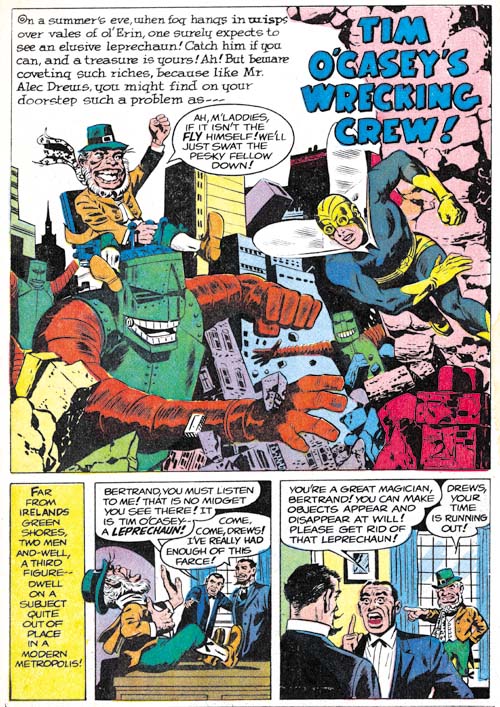
Adventures of the Fly #2 (September 1959) “Tim O’Casey’s Wrecking Crew”, pencils by unidentified artist

If a young boy can be transformed into a fully costumed adult superhero with a magic ring, why not have a leprechaun as an opponent? Not strange enough? Well then give the leprechaun some giant robots to play with. The only thing missing in this delightful story is Jack Kirby. Too bad because I am sure Jack would have added his own personal touches and transformed it into a masterpiece.
Adventures of the Fly #2
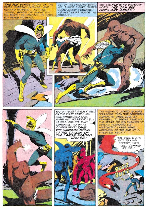
Adventures of the Fly #2 (September 1959) “One of Our Skyscrapers is Missing” page 3, pencils by Al Williamson

Al Williamson was already a talented comic artist when he did “One of Our Skyscrapers is Missing” for this issue. And I have little doubt that he did this story. The various monsters that inhabit these pages all possess the Williamson touch. If Williamson was working from layouts, he took great liberties with them. His panel layouts are the most interesting ones found in either the Shield or the Fly. Further his artwork is far superior to the other artists working on the Archie superheroes that I have reviewed so far with the sole exception of Jack Kirby. That said the art for this story is really far below his best efforts. The work Al did for Race for the Moon the previous year was much superior.
Adventures of the Fly #2
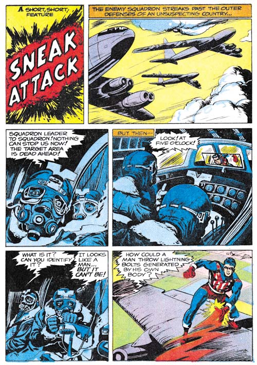
Adventures of the Fly #2 (September 1959) “Sneak Attack”, pencils by Joe Simon

“Sneak Attack” is another of the pieces that generally get attributed to Jack Kirby but were actually drawn by Joe Simon. The reason for this misattribution is a credit to Joe’s skills at mimicking Jack’s style, often with the help of plenty of swipes. The pilot with the funny head gear was swiped from Kirby’s “Hot Box” (Foxhole #2). However it shows that Joe is not just copying Kirby as the head is in full frontal view instead of the 3/4 profile that Jack drew.
Adventures of the Fly #2
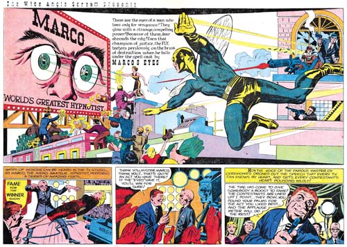
Adventures of the Fly #2 (September 1959) “Marco’s Eyes”, pencils by Jack Kirby
Larger Image

It is an old theme, but Kirby frequently returns to previous themes and improves upon them. In this case it is the idea of a stage performer using his power of hypnosis as a means of conducting crime. The earliest predecessor was probably an untitled story about sometimes called “Sando and Omar” from Captain America #1 (March 1941). “Marco’s Eyes” has some nice art and all in all a good effort, but certainly not among the better Simon and Kirby’s work. The double page splash is perhaps the weakest that S&K ever did. This is unfortunate since it is also the last the two would work on together.
Adventures of the Fly #2
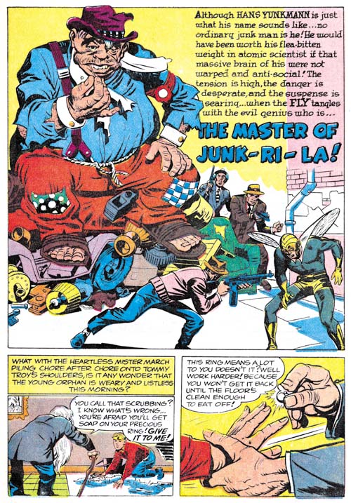
Adventures of the Fly #2 (September 1959) “The Master of Junk-Ri-La”, pencils by Jack Kirby

While I would hardly call “The Master of Junk-Ri-La a masterpiece, it is a much better work than “Marco’s Eyes”. It does however contain some humor that might not be appreciated by many modern superhero fans used to bleaker tales. For instance the villain uses a giant fly swatter against the Fly.

The two stories in Adventures of the Fly #2 would be the last collaboration between Joe Simon and Jack Kirby for many years. The Jack Kirby Checklist includes “Muggy’s Masterpiece” from Adventures of the Fly #4 but that is clearly incorrect. Even the way the Archie superheroes were created made them more of a Simon effort than a Kirby one. Still the two had worked together in one form or another for a period of about 18 years. There may have been other comic book collaborations that were longer but there were none there were better. Or at least that is my opinion. But I may be biased; after all this is the Simon and Kirby Blog.

Since this is Kirby’s last work on the Fly I thought I would briefly touch on the part that it played in the creation of Spider-Man. Others have written in great depths about this issue but here I will only provide a brief outline of the events. Joe Simon, C. C. Beck and Jack Oleck got together in 1953 or 1954 to create a new superhero. Initially the name Spiderman was considered and Joe even created a logo using that name, but in the end the character was called the Silver Spider. Joe took the initial artwork by Beck and pitched the idea to Harvey Comics but they declined to publish it. Years later Archie Comics approached Simon to create some new superheroes and Joe came up with a new Shield and the Fly. Joe retrieved Beck’s Silver Spider art work from Harvey and sent it off to Jack to use as reference when he drew most of the art for the initial issues published in 1959. In 1962 Stan Lee worked initially with Kirby to create Spider-Man but in the end turned to Steve Ditko to provide the art. The work that Kirby did on Spider-Man has never been published but Ditko later described Kirby’s version as looking like the Fly.

The main source of contention about the creation of Spider-Man concerns not so much the history as the interpretation of that history. The most common subject of disagreement is whether Stan Lee and Steve Ditko should be considered the joint creators or if Jack Kirby should be included as well. While I have provided a broad history behind the creation of Spider-Man that I believe most comic scholars would largely accept there are numerous details that scholars seem unable to agree on. Even as simple a concept as the term creator turns out to have very different meanings depending on who is using it. I will not try to advance my own opinion as to who should be credited for creating Spider-Man. I prefer to let each reader come to their own conclusions. But I find it incomprehensible how some insist on crediting Jack Kirby as a Spider-Man creator while excluding Joe Simon.

The Wide Angle Scream, What Was Old Is New Again

Sometime after the demise of Mainline, Simon and Kirby’s attempt at becoming publishers, Joe and Jack’s partnership broke up. Jack returned to being a freelance artist but whenever Joe had some comic to produce Jack would always give a hand, at least for the initial issues. In 1959 Archie Comics asked Joe Simon to produce a couple of superhero comic titles for them. For one of the new titles Joe decided to resurrect an old proposal. Years before Simon along with the artist C. C. Beck and the writer Jack Oleck had created Silver Spider. Oleck wrote some scripts and Beck drew the origin story and it was proposed to Harvey Comics but was then rejected. Joe retrieved the original art and at least one script (which he still has) from Harvey but decided, probably because of the previous rejection, the hero should be changed from the Silver Spider into the Fly. Simon asked his former partner, Jack Kirby, to draw the art for the first issue using the C. C. Beck art as the basis for the origin story. (What happened to the C. C. Beck art is a tale that I will not repeat here, suffice it to say that through no fault of Jack’s the Beck art was never returned to Joe. All Simon has now are large photocopies of the original art. You can see some images of the Silver Spider in Chapter 10 of The End of Simon and Kirby) Kirby was also apt to turn to old ideas and so he based the Fly’s costume on an unused Simon and Kirby creation, the Night Fighter. (It is not pertinent to the theme of this post, but this was not the end of the recycling of the Silver Spider as years later it played a part in the creation of Marvel’s Spider-Man.)


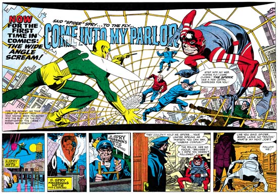
Adventures of the Fly #1 (August 1959) “Come Into My Parlor”, art by Jack Kirby
Enlarged view

The centerfold of the first issue of The Adventures of the Fly featured a double page splash with the declaration:

NOW FOR THE FIRST TIME IN COMICS: THE WIDE ANGLE SCREAM

This is of course where I have derived the name for this serial post about the Simon and Kirby wide splashes. Since Joe and Jack have been using double page spreads since Captain America #6 (September 1941), this issue of the Fly was hardly the first time for the use of this dramatic opening for a story. But in 1959 comic book readers were young and unlikely to know about the earlier comics.

The Fly splash pages are divided into two sections, the splash proper and the start of the story. At the top and bottom of the splash are two parabolic shaped borders making the image wider at the sides then in the center. The background buildings on the two sides of the splash tilt in different directions. All of this was to give the feeling of a wide angle presentation. But this was all just suggestive as a true wide angle lens would not distort the scene in these manners.

The two adversaries face off from opposites sides of the splash. The Fly seems quite at home on the Spider Spry’s web while it is the criminal cohorts of the Spider that seem to be most encumbered. The scale of the figures makes no literal sense. No realistic perspective would cause the rest of the criminals to be so much smaller then either the Fly or the Spider. The size difference is not due to any problem Kirby had with rendering perspective; he was the master of the illusion of space. Rather Jack has reverted to a pre-Renaissance technique, actually common to a great number of art cultures, were size indicates importance.

Not Jack’s best splash but still superior then most artists of the day could have produced. Some have said this was inked by Kirby but I cannot see Jack’s hand in any of the inking of these Archie comics. I doubt Joe Simon did the inking on the splash either.

Adventures of the Fly #1
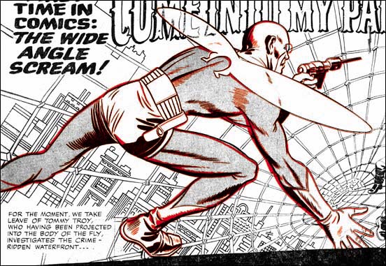
Overlay of the figure of the Fly from the cover (red) and the splash (black)

The cover for the first issue of the Fly is basically the same scene as this splash with the composition altered for the vertically oriented space. As I have shown previously, the cover is based on the splash and not the other way around. (See The Fly, A Case Study of Swiping, for further details.) First a stat was made of the splash and then cutup and reorganized for the cover. Then someone, most likely Simon, touched up some of the inking. It was all well done because cover is every bit as good a designed as the splash.

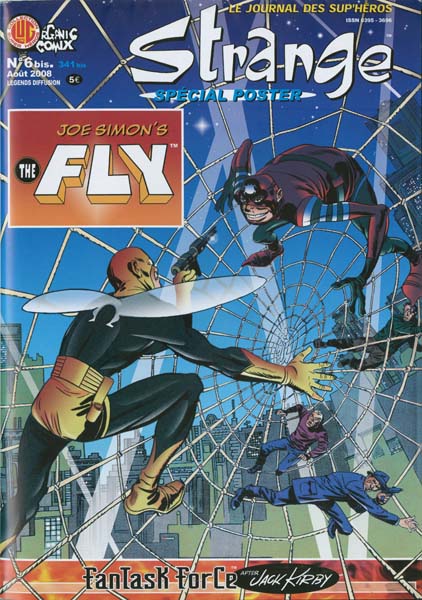
French Fly


Strange #6

The French company, Organic Comix, has released a translated reprint of “Come into My Parlor” which was first published in Adventures of the Fly #1 (August 1959). This reprint was originally meant to be released earlier under a license agreement with Archie Comics. The only problem was Archie Comics did not have the copyrights for the Fly, those belong to Joe Simon. I am not sure why such a mistake had been made since Michael Silberkleit, then chairman and publisher of Archie Comics, had previously signed an agreement acknowledging Joe’s copyright renewal of the Fly. Whatever the reasons for the error, it was straightened out and Joe gave permission for the publication of Strange #6 with some minor alterations to indicate his ownership. There even was a friendly meeting between Silberkleit and Simon during the New York Comic Con. Unfortunately Silberkleit passed away recently (August 8, 2008).

The format for Strange #6 is rather unusual; it was published as a single folded sheet. The comic unfolds nicely to allow reading of the Fly story, but when completely unfolded the backside reveals a large poster of a Kirby female costumed character. Frankly I am not familiar with this presumed superhero. I suspect it was one of the proposals Jack made late in his life. I would include an image, but the poster is much too large to be scanned.