Category Archives: Draut, Bill

The Art of Romance, Chapter 10, The Peak of the Love Glut

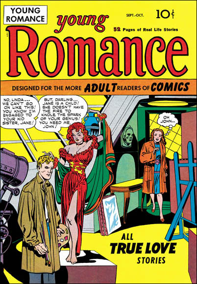
(January – April 1950: Young Romance #17 – #20, Young Love #7 – #8)


Number of Romance Titles 1947 – 1950 (the period covered in this chapter shaded in blue)

This chapter will cover the period from January to April 1950. This is the height of the love glut and the beginning of the decline in romance titles that followed. For Prize Comics the dropping of titles had not begun since the final issue of Real West Romances would come out in April. Young Romance had been and would remain a monthly. The presumably poor sales experienced by the western romance titles because of the glut was not shared by Prize’s standard love comics as Young Love became a monthly with the April issue. Frankly I am not clear what Simon and Kirby’s status was at this time with the crime titles Headline and Justice Traps the Guilty. At some point Joe and Jack seemed to have passed on the production of those titles to Prize Comics. A better understanding of exactly when that happened will hopefully be achieved as I advance further in my serial post It’s A Crime.

I have no explanation why in the last chapter Jack Kirby’s output dropped so much but now he returned to being the primary artist, at least by page count, with 6 stories and 71 pages (I am excluding illustrations for text features as they are minor works and may include recycled art.) Bill Draut, now again the second most used artist, actually had more stories but fewer pages (8 stories with 53 pages). The discrepancy is caused by the lead stories provided by Kirby have the highest page counts (13 to 15 pages). The two longest stories by artists other then Kirby were 10 and 9 pages while most were 8 pages long. As noted in the previous chapter Kirby would provide the lead story for Young Romance while Bill Draut would have the honor for Young Love. The general rule from now on will be Kirby more or less regularly providing a long lead story to Young Romance and this would be the only real distinction between the contents of Young Romance and Young Love where the lead story was generally done by other artists.

Other artists significantly trailed Kirby and Draut in page counts. The number of artists used in YR and YL drops, and the artists have been seen previously in either the standard or the western romance comics. As was true in the last chapter, Kirby did not supply layouts to any of the artists in this period. This was in contrast to the early issues where some of the less talented artists worked using Kirby layouts.


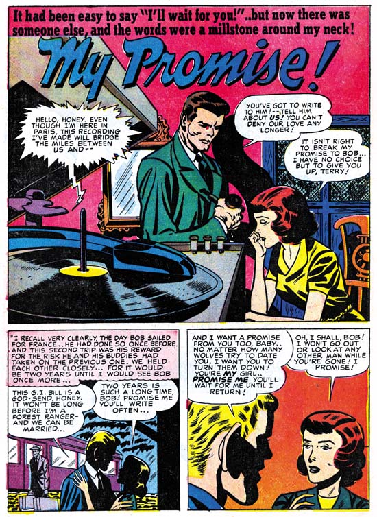
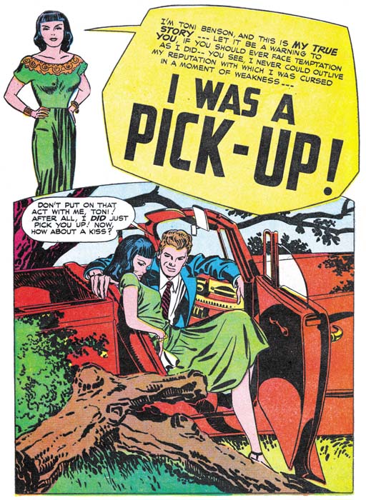
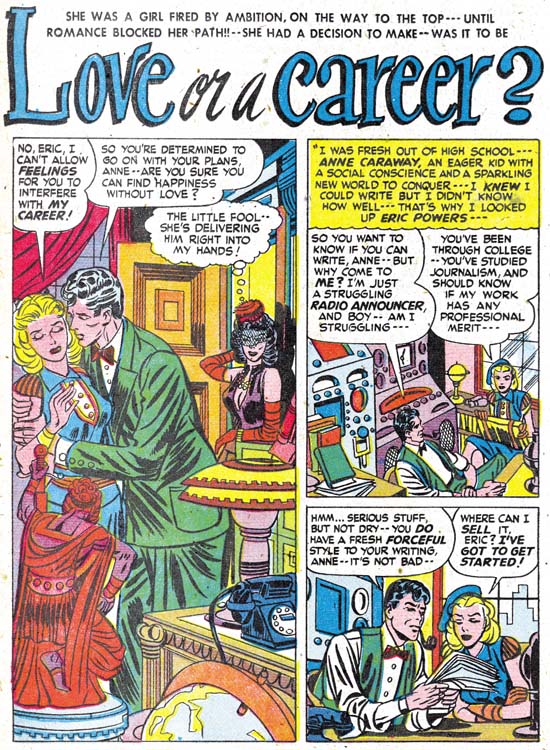
Young Romance #17 (January 1950) “The Girl Who Tempted Me”, art by Jack Kirby

Jack Kirby persists in providing exceptional splashes for his long lead stories. The use of a character introducing the story with the word balloon forming the title has become a trademark of Simon and Kirby romances. (As this splash layout will be repeatedly seen, I am going to refer to it as the confessional splash.) The very provocative splashes would be more risque then the actual story. These splashes are often very simple in composition but very effective nonetheless.


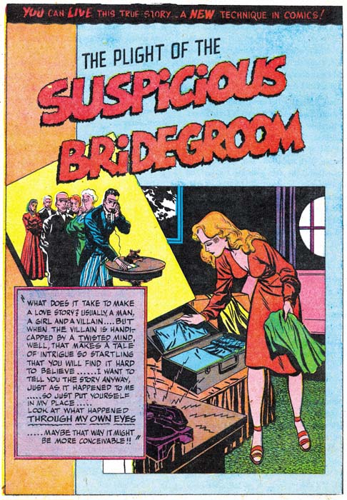
Young Romance #20 (April 1950) “Hands off Lucy”, art by Jack Kirby

Okay maybe I do not have much more to say about Kirby’s splashes, but they are so great (in my opinion) that I cannot resist including an image of another one.


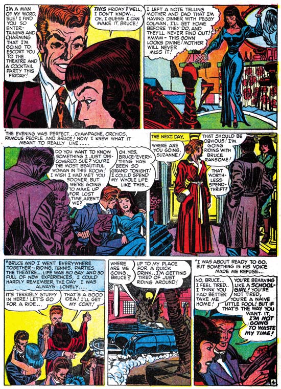
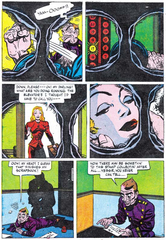
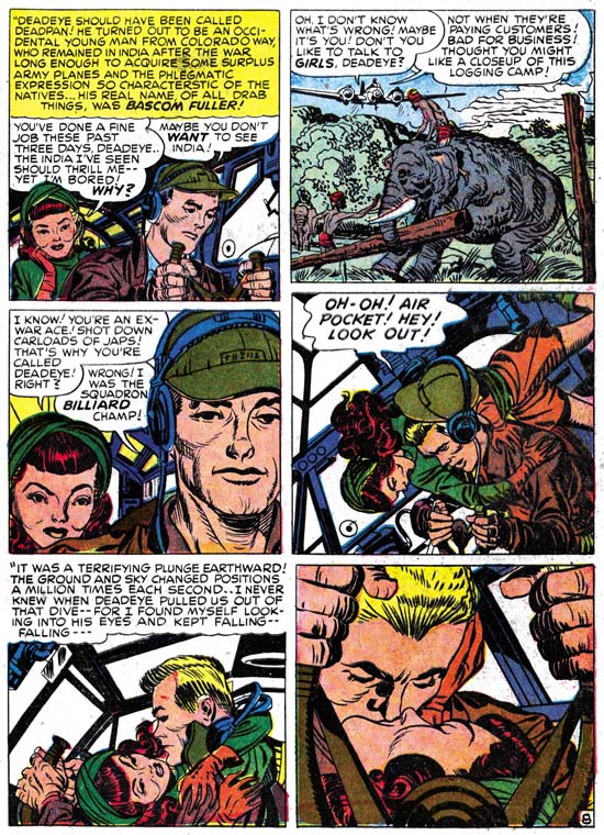
Young Romance #19 (March 1950) “That Kind of Girl” page 13, art by Jack Kirby

Of course comic books are not all about splashes, those were just the devices to entice a reader to buy the comic and read the story. Jack always considered himself as mainly a graphic story teller. Although today Kirby is primarily for his work on superheroes, he was exceptional in pretty much every genre that he worked on. Because of the unique nature of his romance stories, it is clear that Jack was not just illustrating someone else’s script. He must have been an active participant in the plotting and I am sure that he continued the long S&K tradition of changing the script as he saw fit. At this time Jack liked to give a special quality to his romance stories by adding something beyond just romance. I am not sure how the readers of Young Romance and Young Love at that time (overwhelmingly teenage girls) felt about Jack’s romances but I am convinced that if these stories were given a chance many of today’s more adult readers would find them interesting reading.

For the most part Jack has adopted a very standard page layout of three rows with two panels in each row. Kirby would occasionally depart from that pattern when the story called for it but that would be the exception. Gone were any uses of circular panels. Figures would not extend beyond a panel’s border although captions or speech balloons might. My description of Kirby’s layouts might make his work sound dry and uninspired but that is certainly not the case. Using a standard panel layout seems to allow Jack to concentrate on depicting the story. Further when the story called for an alteration in the panel layout it was then that much more effective. Kirby was a master of use of changing view points, the addition or removal of background, and even the careful accommodation of speech balloons as the above page amply shows. It was not just melodrama, it was great melodrama! (An honest appraiser would admit that was true of Kirby’s superhero work as well.)


Young Love #7 (February 1950) “The Carnival Girl”, art by Bill Draut

Bill Draut’s position as the number two artist at this time was justified. He could fill a splash panel with a cast of characters each with their own distinctive personalities. Bill was no longer used as an artist in Headline or Justice Traps the Guilty, but this was not due to any problem in handling action since in his romance art he had no problems when action needed to be depicted. Perhaps of even greater importance for love comics, his women, while stylized, are attractive. All of these talents and more are shown in the above splash. Some of Draut’s stories start with a confessional splash even though they are not lead stories. Perhaps they were originally intended as lead stories but in the end placed elsewhere in the comic. Although I have seen this happen to Draut, I do not recall a Kirby confessional splash that was not the first story.


Young Love #8 (April 1950) “Every Man I Meet” page 4, art by Bill Draut

Like Kirby, Bill Draut generally kept to a standard six panel page layout. If anything he adhered to this layout even more then Jack. Bill would vary view points to keep the visuals interesting but he was not as cinematic as some other comic book artists. Draut graphically tells his story in a straight forward and understated manner. While the reader may not always be amazed by Draut’s art he will always find an entertaining and clear story.


Young Romance #18 (February 1950) “I Own This Man”, art by Mort Meskin

Mort Meskin first solo work for Simon and Kirby appeared in the month before the time covered in this chapter. During this period Mort played no more important a roll then any of the other studio artists (excluding Kirby and Draut). He supplied 4 stories and 2 short features with a total of 32 pages of art. While his presence was not insignificant it was nothing like the prolific output that Mort would achieve in the future. Interestingly Mort was initially used only for the standard and western romance titles, his first crime work would be in the March issue of Headline. Perhaps Meskin’s artist block was not completely overcome by Joe’s strategy of placing random pencils marks so that Mort would not be faced with a blank page.

Meskin’s preference was for a first page; two thirds of which would be used for a splash panel leaving room for a single row of story panels. Most commonly it would have the layout seen in the image above. (Again, these splash page layouts are seen so often that providing them with a name seems a good idea; I will use square splash for those with the story panels arranged horizontally and vertical splash for when the story panels are arranged vertically.) While working in the Simon and Kirby studio Mort did his own inking. Generally this included spotting formed by long parallel, sometimes overlapping, groups of lines. Occasionally, as in “I Own This Man” Meskin would use picket fence crosshatching similar to that found in the Studio style. (For a more complete discussion of Mort Meskin’s inking technique see my post Kirby Inkers, Mort Meskin, for an explanation of the terms I am using to describe inking techniques see the Inking Glossary). My search of Meskin’s work prior to joining Simon and Kirby have so far failed to uncover any examples of the use of picket fence crosshatching so Mort may have adopted it up from Joe and Jack.


Young Love #8 (April 1950) “Danger, Soft Shoulder” page 8, art by Mort Meskin

Mort Meskin’s art was more subdued compared to his earlier hero genre comic art. Some of the more dramatic compositional devices would largely disappear. Techniques, such as the mass of floating heads used in the third panel of page 8 of “Danger, Soft Shoulder”, would now be the rare exception in Mort’s work. Instead, like Bill Draut, Meskin would concentrate more on graphically telling a story. Few other artists, if any, could do it better. Unfortunately for Mort Meskin’s current reputation, it is all too easy to overlook what he was doing. Also it should be admitted that Meskin’s art was not consistently at the same high level, perhaps a result from his push to achieve a high page production rate (with a corresponding income boost).


Young Romance #19 (March 1950) “The Fisherman’s Daughter” page 2, art by Mort Meskin

But it would be mistake to say that now Mort was only interested in telling a story. Mort was also a master at his use of blacks. The shadows found in the first panel of the page from “The Fisherman’s Daughter” shown above are very effective. Even when blacks are used in more limited amounts that are carefully placed to provide the most impact as can be seen elsewhere on the page and the fifth panel in particular. In a way though, Meskin’s use of whites and blacks was not separate aspect of his work. It was carefully used as one of Mort’s tools for advancing the story.

At this time Mort was also working primarily in the standard six panel page layout. But he would use other design techniques to add interest. Note the use of vertical caption boxes on the page shown above. Mort sets up a pattern of vertical captions for the left edge of the first and third panel rows, and the center of the second row. This while using horizontal captions in the second part of the first and third rows. It all provides a pattern that helps to pull the page together without being obtrusive.


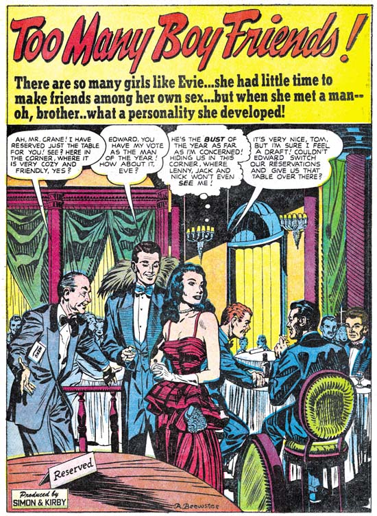
Young Romance #17 (January 1950) “Love’s Little Teacher”, art by Bruno Premiani?

I may not be able to truly show that this artist is Bruno Premiani but he is a great creator nonetheless. The splash here is unusual for him in that he provides a split scene. It is so well integrated that it is easy to overlook two separate views are presented. I have described Premiani’s women as attractive but not striking. But in the end to understand an artist’s style well enough to identify his work requires seeing enough examples. So as I continue with work on this serial post I will include further samples of the more important Simon and Kirby studio artists.


Young Romance #17 (January 1950) “Love’s Little Teacher” page 5, art by Bruno Premiani?

Bruno had an interesting drawing style but he was also, like most of S&K studio artists, adept at graphically telling a story. The page from “Love’s Little Teacher” opens with a couple’s kiss, usually more properly placed as the last panel on a page. But Premiani has other things in mind as he proceeded to show the protagonist following the advice of her cousin. Premiani indicates to the reader that the cousin is secretly scheming by the pose he provides her in the background of the final panel. Evidentially Bruno is not just following some formula but carefully brackets the cousin’s influence between the love scene in the first panel and the misguided rejection of a date in the last. I particularly like the fifth panel with the man shown calling in the caption box and the close-up of the telephone receiving the call in the actual panel. With Premiani’s careful arrangement of the towel on the leading lady, the depiction really is not very revealing but just seems so.


Young Romance #17 (January 1950) “I Want Him Back”, art by Leonard Starr

When I first entered the Simon and Kirby productions into my database I was not that familiar with Leonard Starr’s style and so it was largely stories with a signature that ended up attributed to him. Unfortunately this made Starr seem like a minor contributor since, like most Simon and Kirby studio artists, he did not sign all his art. With my current reviews and armed with a better understanding, I have been adding a number of unsigned stories as works that can be credited to Starr. I have long stressed the importance to the studio of three artists (the usual suspects: Draut, Meskin and Prentice) but there is also a second tier of artists who made an important contribution to Simon and Kirby productions but only for shorter periods of time. I would put Starr in this second tier along with artists like Premiani?, Severin, Donahue, Albistur and Brewster.

Leonard did 4 stories with 33 pages during this period. All were unsigned but with styles that are in complete agreement with contemporary signed work. Starr’s splashes were either the square or vertical layouts with, perhaps, a preference for the vertical format as seen above in “I Want Him Back”. It is the drawings of woman that I find the greatest help in identifying Starr’s work. They have an appearance that is almost frail with generous foreheads, small mouths, and narrow chins giving them a look I often describe as elfin.


Young Romance #18 (February 1950) “Mother Tags Along” page 4, art by Leonard Starr

While I would not call Starr’s splashes spectacular they were well done. But it is his story art were Leonard really shines. Like some of the other studio artists, Starr would carefully vary the view point to keep the pages interesting and the story progressing. What makes Starr unique among the S&K studio artists at this time are his panel layouts. More then any of the other artists, Starr would break from the standard page layout of three rows with two panels per row. Instead Leonard preferred to introduced, when possible, a row of three panels with an extended height. Sometimes this was achieved by switching to a page layout of two rows with three panels per row. More frequently the greater height provided for one row would be compensated by decreasing the vertical dimensions of the remaining two rows. These panel layouts did more then provide interesting pages as Starr would use it to aid the story telling. Note how in the page from “Mother Tags Along” Leonard uses the narrow panels for the meeting of the two lovers physically bringing them close together while the more horizontal panels are used the woman’s discussion with her mother allowing the distance that is possible in these panels to suggest the emotional separation between them. No other studio artist at this time made such effective use of panel shapes although Mort Meskin would soon begin to use narrow panels as well.


Young Love #7 (February 1950) “A Secret Affair” page 7, art by Vic Donahue

Vic Donahue’s contribution to the standard romances diminished in the previous chapter and this state continues here. There is a difference though; in Chapter 9 Vic work was restricted to the Nancy Hale feature which was 2 or 3 pages long. During this period the Nancy Hale feature was drawn by other artists. Instead Donahue would draw 1 story and 2 short features with a total of 10 pages which was well below artists like Meskin, Premiani? or Starr.

I have included the above story page to show that while Donahue was not as talented as some of the other studio artists; he was more varied in his panel layouts. I feel, however, that the handling of the story leaves a bit to be desired. For instance this page ends with one man’s confrontation with a rival. Since the last panel depicts such a critical moment the reader would expect the next page to show the result of this confrontation, perhaps even a fight. There was a fight of sorts, but at the start of the next page it is all over with the original man already defeated and on the ground! We really do not know anything about the scripts given to studio artists or how carefully they were expected to be followed, so I cannot say whether Donahue or the writer is responsible for this rather poor handling of what should have been a dramatic scene.


Young Love #8 (April 1950) “The Man in My Dreams”, art by John Severin and Jack Kirby

While Jack Kirby did not supply layouts for any of the artists during this period, there is at least one example of his assuming the roll of art editor. The man in the splash panel of “The Man in My Dreams” is clearly penciled by Kirby, and I believe inked as well. This is the second case of Kirby adding to or altering a splash by John Severin that I have seen (the other was in Chapter 7). If, as I believe, Kirby inked his part of the splash then most likely Kirby was correcting Severin’s finished art.

During this period Severin played a small roll in the standard romance titles. John only did 1 story and 3 features with a total of 8 pages. This is in sharp contrast to the amount of work Severin had done during this same time for the Prize western love titles.

Chapter 1, A New Genre (YR #1 – #4)
Chapter 2, Early Artists (YR #1 – #4)
Chapter 3, The Field No Longer Their’s Alone (YR #5 – #8)
Chapter 4, An Explosion of Romance (YR #9 – #12, YL #1 – #4)
Chapter 5, New Talent (YR #9 – 12, YL #1 – #4)
Chapter 6, Love on the Range (RWR #1 – #7, WL #1 – #6)
Chapter 7, More Love on the Range (RWR #1 – #7, WL #1 – #6)
Chapter 8, Kirby on the Range? (RWR #1 – #7, WL #1 – #6)
Chapter 9, More Romance (YR #13 – #16, YL #5 – #6)
Chapter 10, The Peak of the Love Glut (YR #17 – #20, YL #7 – #8)
Chapter 11, After the Glut (YR #21 – #23, YL #9 – #10)
Chapter 12, A Smaller Studio (YR #24 – #26, YL #12 – #14)
Chapter 13, Romance Bottoms Out (YR #27 – #29, YL #15 – #17)
Chapter 14, The Third Suspect (YR #30 – #32, YL #18 – #20)
Chapter 15, The Action of Romance (YR #33 – #35, YL #21 – #23)
Chapter 16, Someone Old and Someone New (YR #36 – #38, YL #24 – #26)
Chapter 17, The Assistant (YR #39 – #41, YL #27 – #29)
Chapter 18, Meskin Takes Over (YR #42 – #44, YL #30 – #32)
Chapter 19, More Artists (YR #45 – #47, YL #33 – #35)
Chapter 20, Romance Still Matters (YR #48 – #50, YL #36 – #38, YB #1)
Chapter 21, Roussos Messes Up (YR #51 – #53, YL #39 – #41, YB #2 – 3)
Chapter 22, He’s the Man (YR #54 – #56, YL #42 – #44, YB #4)
Chapter 23, New Ways of Doing Things (YR #57 – #59, YL #45 – #47, YB #5 – #6)
Chapter 24, A New Artist (YR #60 – #62, YL #48 – #50, YB #7 – #8)
Chapter 25, More New Faces (YR #63 – #65, YLe #51 – #53, YB #9 – #11)
Chapter 26, Goodbye Jack (YR #66 – #68, YL #54 – #56, YB #12 – #14)
Chapter 27, The Return of Mort (YR #69 – #71, YL #57 – #59, YB #15 – #17)
Chapter 28, A Glut of Artists (YR #72 – #74, YL #60 – #62, YB #18 & #19, IL #1 & #2)
Chapter 29, Trouble Begins (YR #75 – #77, YL #63 – #65, YB #20 – #22, IL #3 – #5)
Chapter 30, Transition (YR #78 – #80, YL #66 – #68, YBs #23 – #25, IL #6, ILY #7)
Chapter 30, Appendix (YB #23)
Chapter 31, Kirby, Kirby and More Kirby (YR #81 – #82, YL #69 – #70, YB #26 – #27)
Chapter 32, The Kirby Beat Goes On (YR #83 – #84, YL #71 – #72, YB #28 – #29)
Chapter 33, End of an Era (YR #85 – #87, YL #73, YB #30, AFL #1)
Chapter 34, A New Prize Title (YR #88 – #91, AFL #2 – #5, PL #1 – #2)
Chapter 35, Settling In ( YR #92 – #94, AFL #6 – #8, PL #3 – #5)
Appendix, J.O. Is Joe Orlando
Chapter 36, More Kirby (YR #95 – #97, AFL #9 – #11, PL #6 – #8)
Chapter 37, Some Surprises (YR #98 – #100, AFL #12 – #14, PL #9 – #11)
Chapter 38, All Things Must End (YR #101 – #103, AFL #15 – #17, PL #12 – #14)

It’s A Crime, Chapter 8, The Chinese Detective

(Charlie Chan #1 – #5; June 1948 to February 1949)

During the period covered in last chapter of It’s A Crime, Simon and Kirby were also producing another title, Charlie Chan. This title was not a pure crime genre comic but instead was based on a successful movie character. Deriving a title from the movies was out of character with either Simon and Kirby or Prize Comics, neither of which would otherwise use such licensed material. In this case it was probably due to the fact that Joe and Jack’s lawyer, Fleagle, also represented the estate of Earl Derr Biggers, Charlie Chan’s creator. I last discussed this title in a post a little over two years ago (Charlie Chan & Carmine Infantino). I should warn the reader that while that post includes images that I will not be repeating here, some of my opinions have changed.

Charlie Chan #1
Charlie Chan #1 (June 1948) “Charlie Chan” by Carmine Infantino (signed)

In a Jim Amash interview (The Jack Kirby Collector #34) Carmine Infantino describes taking on the Charlie Chan job despite the fact that he was already getting enough work from higher paying DC. He did so for the sole reason that the job offered the opportunity of working along side of Jack Kirby and Mort Meskin. Carmine specifically says that he did not do any other work for Simon and Kirby and that he never inked Kirby’s pencils. Although there was a time that I thought these statements may not have been accurate, that was due to some confusion over work that I now believe was actually done by Warren Broderick. At this point my opinion is that Carmine did not do any work for Simon and Kirby outside of the Charlie Chan title. Most of the art that Infantino provided was for Charlie Chan feature, although he did draw some backup stories as well.

Two of the stories from the first issue of Charlie Chan (the one shown above and “Land Of The Leopard Men” that was included in my previous post) have splash pages inked in the Studio style. The inking for the above splash is particularly elaborate. Previously I felt that this inking was done by Carmine himself, but I no longer believe that. Instead I feel this inking was probably done by Joe Simon. Unfortunately some current book projects that I am working on preclude my having enough spare time for a careful examination of Joe’s inking until sometime in the future. (While this is regrettable for this blog, the results of the book projects should be appreciated by Simon and Kirby fans.) Without such a study my inking attribution must be considered very provisional, but I will say that these splashes were not inked by Jack Kirby.


Charlie Chan #1 (June 1948) “The Train Robber’s Last Trip”, art by Carmine Infantino

Above is an image of the splash page to a non-Charlie Chan story by Infantino. It provides a good contrast to the Studio style inking previously shown. Carmine’s brushwork found in this page, and on many other story pages, is very different then what is seen in the Studio style splash pages. Of particularly note are the distinct methods of inking cloth folds. While it is conceivable that Studio style techniques such as picket fence crosshatching could be applied over earlier inking by Carmine, the different cloth fold inking suggests that is not the case. (see the Inking Glossary for explanations of the terms I use to describe inking techniques) Infantino’s inking of the Studio style splashes, if he did any at all, would have been limited to the outlines and not including any of the spotting.


Charlie Chan #2 (August 1948) “The Vanishing Jewel Salesman”, art by Jack Kirby (first panel) and Carmine Infantino (all the rest)

Jack Kirby drew the covers for all five Prize issues of Charlie Chan but he did not provide anything for the interiors. That is with the sole exception of the splash panel for the page above. It almost seems inappropriate to describe this panel as a splash since it is barely larger then the story panels. However the splash panel provides a preview and does not belong to the story proper. The odd shape of the panel suggests that Jack provided his contribution after Carmine had already finished the story. Despite the diminished size and lack of any action, Kirby has made an interesting scene by depicting the crisis moment; Charlie Chan’s wisdom has once again deterred his number one son from a rash move but will it be enough to save them from an armed and very aware opponent? Kirby’s inking is very reminiscent of the much later Severe style but we have seen other earlier occasions when he adopted a simpler inking style when appropriate.


Charlie Chan #1 (June 1948) “The Weasel of Wall Street”, art by Bill Draut

Carmine Infantino provided four stories for issues #1 and #2. This left only a single backup story by another artist. For Charlie Chan #1 this story would be “The Weasel of Wall Street”, by Bill Draut. At this time Bill was the second only to Jack Kirby in terms of the amount of work used by the Simon and Kirby studio so his presence in Charlie Chan is not surprising. Bill Draut tends to get overlooked today. There maybe some justification for the neglect of some of his work after the Simon and Kirby studio closed. At that time Bill modified his style to conform more closely to the type of art popular during the silver age of comics. Unfortunately, in my opinion, he lost more then he gained. But while working for Simon and Kirby, Draut produced some fine material. Look at the cast of characters in this splash. Each is individualistically portrayed and each tells their own story. It was because of work like this and his dependable nature that Bill did so much work for Joe and Jack.


Charlie Chan #2 (August 1948) “Hocus-Pocus Hearse”, art by H. Colden?

While Bill Draut was not a surprising choice for a backup story in Charlie Chan #1, the artist for “Hocus-Pocus Hearse” for issue #2 was. I identified a single story by this artist in the last chapter of It’s A Crime. There maybe more of his work to be identified, but I am pretty sure that he was never supplied a significant amount of art for the Simon and Kirby studio. There is no reason, however, to believe that the these backup stories were commissioned specifically for use in Charlie Chan. Rather they were likely just selected from the crime stories being produced at that time and could just as easily have ended up going into Headline or Justice Traps the Guilty. However the appearance of this artist in Charlie Chan came about, he still was a good choice. This splash actually gives a better idea of his style then the one I used in the last chapter. Note the faces he draws are square and massive.


Charlie Chan #2 (August 1948) “Hocus-Pocus Hearse”, signature of H. Colden?

When I reviewed the splash for “Hocus-Pocus Hearse” for this post I immediately recognized the artist and quickly turned to the last panel of the story to see if it was signed. Sure enough there was the same signature, only this time isolated from the rest of the image. I can see that my suggestion of H. Colben was clearly wrong. That looks like an ‘O’ not a ‘C’ and a ‘d’ not a ‘b’. There is also another letter in there. But I still cannot make any sense out of it. Perhaps some reader might want to try to come up with a suggestion?

Charlie Chan #3
Charlie Chan #3 (October 1948) “Charlie Chan”, art by an unidentified artist

Carmine Infantino did all the Charlie Chan stories for the first four issues, except for an untitled story from issue #3. In this I differ from my previous posting on Charlie Chan because there I included the above splash page as an example of Infantino’s work. This particular page does not offer much for or against attributing the art to Carmine. The inking looks like Studio style inking but we have seen other splashes where that was done and that might mean nothing more then Infantino was not the inker.


Charlie Chan #3 (October 1948) “Charlie Chan” page 9, art by an unidentified artist

So I have added an image of a story page. Interestingly the use of picket fence crosshatching continues throughout the story, something not seen in any of the work in Charlie Chan by Infantino. But again this could mean nothing more then someone else inking the work. What really sets this story apart is the style used for drawing the faces and the general means used in the graphical story telling. I have no idea who the artist was, other then he was not Infantino, but I wish I did. This was a very talented creator. This was, however, the only appearance of this artist in Charlie Chan.


Charlie Chan #3 (October 1948) “Keri Krane”, art by Dick Briefer

Charlie Chan #3 introduced two new features. Well perhaps one was not truly a feature being more of a genre. Issue #3 had “Hilly Billy” and “Cassidy the Movie Cop” was used in CC #4. Both of these were humor stories apparently by the same artist. Gag cartoons were not that unusual in Simon and Kirby productions but usually they were limited to one, or at most two, pages. In these cases they are 4 and 5 pages long.

The other feature was “Keri Krane” about a female owner of a detective agency. At a glance this might be mistaken for another humor genre feature. While there are humorous elements, it is by no means a gag cartoon. What it is a unique blend of crime and humor unlike anything else that I have seen in a crime comic book. For those not lucky enough to have read this gem perhaps it can best be explained by comparison of another more famous feature by the same artist, Frankenstein. When Dick Briefer first started Frankenstein it was a true horror feature but at some point it was changed to a more humorous one. Briefer had developed one of the most unique drawing styles. His drawings are deceptively in their simplicity but capable of a wide range of expression. Briefer’s Frankenstein must have been successful because he had a long run on it from Prize Comics #7 (December 1940) to Frankenstein #17 (February 1949). Further Frankenstein was the only Prize title that survived the arrival of the Simon and Kirby team. Dick’s appearance in Charlie Chan Comics at this time maybe related to the approaching termination of the Frankenstein comic. Frankenstein Comics would resume, with Dick Briefer as artist, with issue #18 (March 1952) and run until issue #33 (November 1954) when it was one of the fatalities resulting from the newly introduced Comic Code.


Charlie Chan #5 (February 1949) “Floating Mine Racket”, art by Manny Stallman?

The backup features used in Charlie Chan #3 and #4, including Briefer’s Keri Krane, were dropped for issue #5. A standard crime backup story was used to take their place, “Floating Mine Racket” by Manny Stallman. What a great splash this is. The use of floating debris and the whirlpool to form the title was undoubtedly inspired by similar compositions by Will Eisner for The Spirit. The layout with three story panels floating above and slightly overlapping the splash panel is unlike anything else seen in Simon and Kirby productions. The art has a quirky style to it that I find very appealing. There is only one problem, despite the signature this story was not done by Manny Stallman! Or at least not the same artist that signed other stories in Headline and JTTG as Manny Stallman. The style is so distinctively different that there can be no question in my mind about this. I do not know enough about Manny Stallman’s career to provide a certain answer to this enigma. I mentioned previously that Stallman’s S&K work had a style distinct from what he later did for Atlas. But “Floating Mine Racket” is even further removed from Stallman’s Atlas work. Stallman also did a couple of stories for Simon and Kirby with John Guinta. The inking of the Guinta stories seems to agree with most of the Stallman S&K work. The inking of “Floating Mine Racket” does not match the inking on the Guinta pieces. My current conclusion is that “Floating Mine Racket” was done by some artist doing ghost work for Stallman. As for the rest I will continue to credit them to Manny but there is still the possibility that he only did the inking over yet another ghost artist. This problem obviously needs further investigation.

Charlie Chan #5
Charlie Chan #5 (February 1949) “Murder On Ice”, art by Dick Briefer

While working on Charlie Chan in the Simon and Kirby studio during the day, Infantino continued to draw for DC at night. It was a grueling schedule and it took its toll. Carmine did great work but the decline in quality from the first Charlie Chan issue until his last is obvious. In the end it was too much for him and Infantino called it quits. Carmine would only draw a single Charlie Chan story for the fifth issue, “The Fox of Paris”. The other three Charlie Chan stories would be taken over by Dick Briefer. The Briefer attribution may seem surprising because it is for his work on Frankenstein that he is best known. For Charlie Chan, Dick has adopted a relatively more realistic approach then what he had used for Frankenstein or Keri Krane. A yet even more realistic example of Briefer’s art can be seen with a page from Uncanny Tales #19 (April 1954) provided by Atlas Tales. Despite his more realistic drawing and the more serious nature of the feature, Briefer’s off-beat humor tends to insert itself into the Charlie Chan stories. What could be incongruous then a skeleton dressed in a suit skating with an old lady at the Rockefeller Center rink? The skeletal figure in the splash for “Murder on Ice” does not actually appear in the story, but presented with such a delightful piece of art, who cares?


Charlie Chan #5 (February 1949) “Murder On Ice” page 2, art by Dick Briefer

The splash page, as fine a work of art as it is, really does not provide the best example of why the Charlie Chan stories from issue #5 should be credited to Dick Briefer. It is to a story page where Briefer’s hand is most evident. Dick had a distinct tendency to provide heads with a triangular form as can be seen in the Keri Krane page whose image I had provided earlier. A similar, if not so exaggerated, shape can be found in the heads on the story page shown above. The Briefer’s style for Charlie Chan retains enough of caricaturistic traits as to make it very special. There is no real humor in this page but the drawing style gives it a particular appeal. Dick’s forte may have been humor, but as can be seen his graphic story telling was top notch.


Charlie Chan #5 (February 1949) “The Dude Ranch Hold-Up”, art by Dick Briefer

I also wanted to include an action page. Briefer shows he can handle action just as well he could humor. Dick Briefer’s Charlie Chan stories really are a testament to what a great artist he was. However Charlie Chan #5 would be the final Prize issue. Years later Simon and Kirby would sell the idea to Charlton. Actually these later Charlie Chan comics could more accurately be called Joe Simon productions as Jack Kirby’s contribution seems limited to creating the cover Charlie Chan #6 (June 1955), the first Charlton issue. Some have suggested that this cover might be left over material from the Prize run. The inking of that cover is done in a blunt manner typical of what is found toward the end of the Studio style. Even the drawing looks more typical of Kirby’s work from the mid 50’s. The cover includes the presence of Burmingham Brown; a character who never appeared in the Prize Charlie Chan comics but played a very visible part in the Charlton issues. I therefore confidently conclude that the cover for CC #6 was created specifically for the Charlton comic, perhaps initially as a presentation piece used for pitching the idea to Charlton. Most of the titles that Simon and Kirby did for Charlton were carryovers from their failed Mainline publishing line. The former Mainline titles each would only last for one or two issues with the exception of Foxhole where a third issue was produced without Simon and Kirby’s involvement. Surprisingly Charlie Chan, using all new material, would last longer for a total of four issues.

Chapter 1, Promoting Crime
Chapter 2, A Revitalized Title
Chapter 3, Competing Against Themselves
Chapter 4, Crime Gets Real
Chapter 5, Making a Commitment
Chapter 6, Forgotten Artists
Chapter 7, A Studio With Many Artists

Chapter 9, Not The Same
Chapter 10, The Master and His Protege
Chapter 11, The New Team

It’s A Crime, Chapter 6, Forgotten Artists

(Justice Traps the Guilty #3 – #5, Headline #29 – #31)

Jack Kirby remains the principal artist for the six crime issues discussed in this chapter. All 6 covers were drawn by Jack as well all the lead stories. Kirby’s did 10 stories with a total of 117 pages (including the covers). However Bill Draut now assumes a more important roll becoming the second principal artist. Bill supplied 11 stories, one more then Jack, but fewer pages (81 pages). The other three artists contributed much less then either Jack or Bill. The next most prolific (A. C. Hollingsworth) drew just 3 stories with 25 total pages.


Justice Traps the Guilty #4 (May 1948) “Queen of the Speed-Ball Mob”, art by Jack Kirby

The first story consistently uses the motif of a character introducing the story with the word balloon forming the title caption. I have noticed that when a story is being narrated, it is often by a woman. Almost certainly this was because male criminals generally have fatal endings (and therefore would not be able to tell their story) while females normally survive.


Justice Traps the Guilty #3 (March 1948) “Ask Eddie Green, Consultant to Crime”, art by Jack Kirby

A motif that would occur often in Kirby’s splashes at this time was having a cast of characters make a series of statements to introduce the story. Actually it was a return to an old technique as we have seen it as far back as in Captain America. When used in a splash covering two thirds of the page, this type of design did not leave much room but in “Ask Eddie Green” Jack makes effective use of what is available by supplying a small shoot out scene. The depth of field is so narrow that the results look like a frieze. Despite the small size everything is clear and the scene is filled with interest.


Headline #30 (June 1948) “Bullet-Proof Bad Man”, art by Jack Kirby

Perhaps it is just my tastes, but I feel that Kirby’s splashes are not as exciting as before. This may have been a result of Kirby’s declining use of full page splashes. Only 3 splashes out of his 10 stories received the full page treatment. “Bullet-Proof Bad Man” provides a typical Kirby dramatic shoot out. Well not so much as gun fight as one man has only drawn his knife although it turns out this is not as unwise as it seems. It is clear that the bullet has found its mark but note how Jack seems to downplay the actual hit. The story is about a gunfighter that uses a special vest to protect himself from bullets. However I have notice that Jack seems averse to showing the actually striking of a bullet even though that is a moment he often depicts. Generally Kirby hides the action in a cloud of gun smoke. When, because of layout, that is not possible, such as above, Kirby will simply not include any impact lines.


Justice Traps the Guilty #5 (July 1948) “A Fortune in Slugs” page 6, art by Bill Draut

Bill Draut did so much romance work for Simon and Kirby that it is nice to see his efforts for the crime genre. These comics gave Bill a chance to provide more action then he would normally use in romance comics. Draut was better at adding excitement then would be expected based on his work towards the end of his career. Here on one page we find a man running, being tackled and in the final panel bludgeoned with a blackjack. All of which Bill handled quite nicely. I particularly like his use of perspective in the second panel. Draut shows the tackler flying into the page whereas Kirby would have had the action coming out toward the reader, but otherwise it was well handled.


Headline #30 (June 1948) “Menace in the Making”, art by Bill Draut

Draut’s effective use of perspective is seen again in the splash for “Menace in the Making”. The low viewing angle allows the running figure to tower over all others without seeming to be unnatural. Action was not, however, the only outlet that Bill found in the crime genre. Crime stories allowed Draut to work, to extent that romance did not, in a more cartoony style. Note the caricature that Bill has provided the irate grocery man. Such interesting but fundamentally unrealistic depictions are found often in Bill Draut’s work in Headline and Justice Traps the Guilty but rarely in Young Romance or Young Love.


Justice Traps the Guilty #3 (March 1948) “My Strangest Crime Case”, art by Bill Draut

One story drawn by Bill Draut may not be exception as far as the art is concerned, but it is unusual in that the protagonist was a female private investigator. The story reads more like something from the hero genre then a true crime story. This is not the first time that Draut drew a story about a lady detective. In 1946 Draut worked on a feature called Calamity Jane originally for Boy Explorers Comics but when that title quickly failed (due to the comic glut after the war) subsequently published in Green Hornet Comics. It is likely that “My Strangest Crime Case” was left over material from that earlier effort that, with minor revisions such as to the detective’s name, was now put to use. The art style does seem to be a better match to Draut’s earlier work then to what he was doing at this time.


Headline #29 (April 1948) “The Night of the Freak Murder”, art by Jerry Robinson and Mort Meskin

The team of Jerry Robinson and Mort Meskin continue to appear in the crime issues covered by this chapter. The work is unsigned but the similarities to the signed works by Robinson and Meskin are numerous. “The Night of the Freak Murder” is unusual for Jerry and Mort in that it has a full page splash. Generally R&M’s splashes for Simon and Kirby productions are vertical with two story panels also arranged vertically. The composition is interesting in the way it plays off the grieving women with an almost mirror image of two detectives discussing the crime. The staircase might seem odd but it was introduced as part of a pattern that confines the eye in a circular composition. None of the other splashes that Robinson and Meskin supplied to Simon and Kirby were so well composed but as I said they did not normally use a full page splash.


Headline #29 (April 1948) “The Night of the Freak Murder” page 7, art by Jerry Robinson and Mort Meskin

As I mentioned in the previous chapter, I am not sure what Jerry Robinson’s contribution was because both the pencils and the art look very much like Meskin’s work. Mort was one of the best graphic story tellers and pages like the one above suggest why he had such an impact on artists like Steve Ditko. Here on this page the same diagonal is present in every panel. The page starts with close-up then switches to a distant show and then progressively comes closer. An increasing tension is formed by the combination of increased nearness, the diagonal design and off course the fear Meskin imparts to the criminal. Nothing really happens but the page is explosive nonetheless.


Justice Traps the Guilty #4 (May 1948) “Guilty Boys”, art by Jerry Robinson and Mort Meskin

Not all of Robinson and Meskin’s splashes were vertically oriented; here is another case where they deviated from that pattern. This is a standard two thirds splash page with two story panels arrayed on the bottom. Nothing unusual in the design itself but it does allow Jerry and Mort to provide a memorable splash. Although the image seems cluttered, everything serves a purpose. Debris and damaged items abound and a row of buildings in the background all combine to show that this is a location in some slum. But the shabbily dressed musical boys are not the Newsboy Legion and this is not Suicide Slums. Here Robinson and Meskin convert the boy gang genre into crime. They are not saints and in the end are more in need of rescue then providing it.


Headline #31 (August 1948) “Perfect for Murder”, art by Charles Nicholas

Only initials were used to sign “Perfect for Murder” (Headline #31, August 1948) but I am pretty certain it was Charles Nicholas. Originally Charles Nicholas was a house name used by Fox Comics for Blue Beetle stories. Over the years the work of many different artists appeared under that name, including Jack Kirby. However there were two individuals who continued to use the name outside of Fox and who claimed to be the creator of the Blue Beetle; Charles Wotjkowski and Chuck Cuidera. There is nothing I can add to that particular question here but it was the Wotjkowski version of Charles Nicholas who worked for Simon and Kirby at this time.


Headline #31 (August 1948) “Perfect for Murder” page 3, art by Charles Nicholas

While interesting, the splash page does not present a very good idea of Nicholas’ art so I have included an image of a story page as well. Nicholas does a good job drawing this story but he never achieved great success in his career as a comic book artist. Nicholas inked the art in a very individualistic style, as particularly seen in the form lines used in panels 6 and 7 and the swirling crosshatching in panel 7. (See my Inking Glossary for an explanation of my terms.) What is not found are any traits of the Studio style inking. While Nicholas is certainly a candidate for being one of Jack Kirby’s inkers, it is hard to understand how his name has become associated to the inking of particular pieces such as “Summer Song” (Young Romance #1, September 1947). “Perfect for Murder” was the only worked for Simon and Kirby signed or initialed by Charles Nicholas but other unsigned art by him surely remains to be identified.


Headline #30 (June 1948) “Pistol-Packin’ Playgirl”, art by Alvin C. Hollingsworth

Another artist that shows up working for Simon and Kirby during this period is Alvin Carl Hollingsworth. A search of the Internet indicates that Hollingsworth was an African-American artist from New York who was born in 1928 and died in 2000. Previously he worked for Holyoke Publishing Company working on Catman. Hollingsworth was also a talented fine arts painter. Joe Simon remembers Alvin and has a high opinion of him. Joe remarked that he thought he was the only African-American working in comics at that time. This is not truly accurate since there was also Matt Baker who played an important part in the early history of comics. But Matt Baker never worked for Simon and Kirby and so Joe was not aware of him, or at least of his background.


Justice Traps the Guilty #5 (July 1948) “Held For Ransom” page 5, art by Alvin C. Hollingsworth

Hollingsworth is another of those artists whose current reputation is much lower then warranted by his talent. This is largely because he left the comic book field in the late ’50s first for syndications strips and then the fine arts. It is a recurring pattern that I have noticed that comic book artists who did not take part in the superhero revival of the 60’s and later generally do not get much attention today. I have included a story page because it provides a better example of Alvin’s strengths. Note the use of varied and unusual viewing angles.


Headline #31 (August 1948) “A Gangster Dies”, art by Warren Broderick

The Jack Kirby Checklist includes “A Gangster Dies” among the art works by Kirby. This is a bit surprising because close to the center of the splash page is Warren Broderick’s signature. Before I sound too self righteous I should add that when working on this chapter I found I had listed this story in my database twice; once as done by Broderick and the second crediting it to Kirby. I have no idea how I made the mistake in my database, but it is easy to understand why anyone who failed to notice the signature might attribute this work to Jack. Warren has obviously made a careful study of Jack’s work and has adopted, at least for his work for the S&K studio, much of Kirby’s style. Warren was not, of course, as successfully as Jack himself and there are more then enough clues to properly attribute his work even without a signature. Note for instance how in the splash Broderick uses picket fence crosshatching where the rails are cloth folds. Besides simple lines, Kirby would use drop strings and wide lines for the rails but I do not recall him ever using cloth folds. Kirby would often make expressive eyebrows but Broderick’s versions were even more exaggerated.

This is the only signed work by Warren Broderick that I have found among Simon and Kirby productions. Frankly I have forgotten about it until I reviewed for this chapter. It turns out that we have seen some of Warren’s unsigned work previously. In just the last chapter I attributed “The Killer Thought He Was Satan” (Justice Traps the Guilty #2, January 1948) as Kirby layouts finished by an unidentified artist. A comparison between it and “A Gangster Dies” leaves little doubt that it also was by Broderick. In fact I no longer believe Kirby laid it out. Yes there are parts in both stories that look very much like Kirby but there are also parts that do not. Previously I failed to follow my own advice and only noted the similarities and neglected the differences. For instance there is a panel I provided from “The Killer Thought He Was Satan” that showed a boy being shot by the villain. While the scene and the boy in particular look very much like it was done by Jack, the artist shows the bullet actually striking the boy. That is something I have yet to find Kirby doing.

Another example of Broderick’s work was “Mother Said No” (Young Romance #7, September 1948) seen in Chapter 3 of the Art of Romance. There I attributed the pencils to Jack Kirby (correctly) and the inks questionably to Carmine Infantino. The primary reason for my earlier caution was that I was bothered by Carmine’s statement in an interview that he had never inked Kirby’s pencils. While in the work for Charlie Chan, Infantino was also providing expressive eyebrows some of the other brushwork found in “Mother Said No” is more like that in Broderick’s work. Although Broderick was very good at mimicking Kirby, I find the layouts in “Mother Said No” are much too consistently like Jack’s that I still believe that Kirby did the pencils.


Headline #31 (August 1948) “A Gangster Dies” page 3, art by Warren Broderick

Broderick could mimic Kirby quite well but occasionally, such as in the first panel shown above, the similarity to Kirby’s style is very striking. This was either due to Kirby stepping in his roll as art editor and fixing up the finished art or it was the result of a careful swipe by Broderick from some Kirby art. Without the original art it is hard to be sure but I suspect the latter explanation to be the case. Once again Broderick has drawn a scene where a man is clearly hit by a bullet, something that Kirby would hide in a cloud of gun smoke.


Justice Traps the Guilty #3 (March 1948) “The Capture of Night-Club Nick”, art by Warren Broderick

Broderick did not always so carefully mimic Jack Kirby’s style. In “The Capture of Night-Club Nick” Warren has abandoned the Studio style inking. Still the influence of Kirby is clearly discernable.

I have found little in my search for more information about Warren Broderick. I queried Joe Simon about him but he did not remember Warren at all. Joe does not remember all the artists who had worked for him over the many years, but in Broderick’s case this is surprising because the one thing I had found out was that he also was African-America. Joe was clear in his memory of A. C. Hollingsworth and that Hollingsworth was the only African-American to work for Simon and Kirby. How could Joe have failed to remember, even if not by name, one other African-American comic book artist? The answer maybe found in an interview given by comic artist, Harry Harrison:

After Wally and I broke up I was working mostly for Fawcett, and I had a friend by the name of Warren Broderick, who was also in school with me, doing my penciling. He was a black guy who didn’t want to get in there and push, didn’t want to face whitey in the office. We developed a nice clear style, no great shakes, but it worked.

This suggests that Broderick may have been reluctant to deal with Simon and Kirby directly and used someone, either an agent or another artist, as a go between. Joe may never have known about Warren’s ethnicity. The irony is that, considering their dealings with Hollingsworth, Joe and Jack probably would not have cared about Warren’s background, all that was important was that he could do the work.

The GCD only has three entries for pencils attributed to Broderick and three more for inking work. Atlas Tales has about a dozen works attributed to Warren. To that I can now add three further pencils and another inking job. Now that I have a small body of work to go by, I am sure I will find more work by Broderick as I continue to review Simon and Kirby productions. Warren Broderick is truly one of the forgotten comic book artists and it is rewarding to shed a little light on his career.

Chapter 1, Promoting Crime
Chapter 2, A Revitalized Title
Chapter 3, Competing Against Themselves
Chapter 4, Crime Gets Real
Chapter 5, Making a Commitment

Chapter 7, A Studio With Many Artists
Chapter 8, The Chinese Detective
Chapter 9, Not The Same
Chapter 10, The Master and His Protege
Chapter 11, The New Team

The Art of Romance, Chapter 9, More Romance

(Young Romance #13 – #16, Young Love #5 – #6)


Chart of the number of romance titles from September 1947 to December 1950 with the period covered in this chapter marked in blue.

My discussions of Young Romance and Young Love were left off in Chapter 5 after which I then spent the next three chapters on Simon and Kirby’s two western romances titles Real West Romance and Western Love. Returning to Simon and Kirby’s purer romance titles, Young Romance was starting its third year. Previously Young Romance and the newer Young Love were both bimonthlies on an alternating schedule so that one would appear on the stands each month. With the Young Romance #13 issue (September 1949) that title would now become a monthly. The house ad announcing this new schedule declared there were three and a half million readers. An exaggeration? Perhaps, but this was the golden age of comics and readerships were much larger then found today. Taking Young Romance to monthly schedule clearly indicates that Prize was doing quite well with that title. Since the deal with Prize provided Simon and Kirby with a percentage of the sales, the creative duo were receiving great financial benefits. There was competition, however, as September 1949 was well into the start of the love glut.


Young Romance #15 (November 1949) “Back Door Love”, art by Jack Kirby

For whatever reason, Jack Kirby was not that prolific during the period covered in this chapter (September to December 1949). The covers for YR and YL were all photographs and so Jack would not be providing any covers. Kirby would supply a single story for YR #13 to #15, two for YR #16, and none for YL #5 or #6. His diminished presence in YR and YL was also true for the other Simon and Kirby titles (Headline, Justice Traps the Guilty, Real West Romance and Western Love). While Jack may not have been his usual prolific self he still was an important contributor to the two romance titles. Kirby would provide the lead story for Young Romance and while these stories may not have been as long as some from the past they still had the highest page count compared to any others in the same issue. So while there were two artists that provided more stories then Jack only one of them actually drew more pages. For the record Jack did 5 stories and 58 pages for the 6 issues. Unlike the case found in previous chapters of “The Art of Romance”, or even “Its A Crime”, I conclude that Kirby did not provide layouts to any of the other artists in these issues.

Jack provided great splashes for all the lead stories for YR #13 to #16. All made use of the motif of a character introducing the story with the word balloon forming the title. All lead stories were meant to suggest provocative themes as can be seen by their titles alone (“Sailor’s Girl”, “Runaway Bride”, “Back Door Love” and “Dance Hall Pick-Up”). Today they might seem tame but in the late ’40s they would be considered risque. I have chosen two of them as examples not only because they are the best but also because of their contrasting nature. The splash for “Back Door Love” shows a couple on one side, a large word balloon/title, and three overlapping panels crowded into another corner. The panels are not the beginning of the story, but rather provide examples of the shameful love and its emotional price the woman has to pay. The couple was inked in the standard Studio style with abundant picket fence crosshatching and drop strings (see my Inking Glossary for explanations of my terms to describe inking techniques). This was overlaid with much relatively fine simple and more complicated crosshatching; techniques not commonly found in Simon and Kirby art. The inking is meant to provide the couple with a nighttime setting which is enhanced by the colorist blocking them out in a light blue. While the woman’s face turned to the viewer (I do not understand why many do not find Kirby’s woman beautiful) the man’s remains concealed in the shadows; all in keeping with the mystery of their relationship. Not much in the way of action, but one of Kirby’s more interesting splashes nonetheless. However there is a “but”; while some like comic art with a lot of detail work, I generally do not. I find all the crosshatching in this splash gives the figures a hard edge, almost like they were carved out of stone and are not flesh and blood. A small detraction from what was otherwise a masterpiece.


Young Romance #16 (December 1949) “Dance Hall Pickup”, art by Jack Kirby

Shame was the theme for the splash of “Dance Hall Pickup” as well, but its similarity to the “Back Door Love” splash pretty much ends there. This time it is the man’s turn to be found in a shameful relationship. Nothing mysterious here, everything is in full lighting. The woman’s low cut dress, fake flowers on her belt, costume jewelry, and false eyelashes clearly mark her as the type of woman a gentleman would be uncomfortable with bringing home to meet his mother. Of course the story will reveal that the somewhat trashy appearance of the woman really hides a warm and loving heart. The inking for this splash is truly a text book example of Studio style inking. It has all the typical hallmarks; lots of picket fence crosshatching and drop strings along with an abstract arch shadow and shoulder blots for the man. No fastidious brushwork here, each stroke is boldly marked; straddling the boundary between working with others for indicating the shadows and maintaining an independent existence. Most fans are attracted to his action scenes but for me this is Kirby at his best; telling a complete story with just some simple gestures and some abstract marks.

I cannot leave this splash without pointing out the hanging curtain in the top corner. It serves no logical purpose. The windows in the back are complete bare, so why is that drapery hanging from the ceiling in the middle of a dance floor in front of a pillar? It is a mistake to look at Kirby art, or any comic book art, as if it was an attempt at rendering a truly realistic image. Elements are added for their suggestive power and how they provide visual interest. The hanging curtain is a motif that Jack will use often.


Young Romance #16 (December 1949) “The Wolves of the City”, art by Bill Draut

The largest contributor to YR #13 – #16 and YL #5 and #6 was Bill Draut. Bill did twice as many stories compared to Kirby (10 vs. 5) and 10 more pages (68 vs. 58). Bill’s strength was his clear visual story telling and his effective use of body language. The simplicity of faces drawn by Bill did not lend itself to a wide range of emotions. Perhaps that is why Draut was very careful in the poses he provided his characters. Upturn faces could portray admiration or wonderment. Thrusting the head forward and providing clenched fists would reveal a person’s anger. In the splash for “The Wolves of the City” you do not need to read the story to realize how demure and proper the lady on our right is. Hands folded on her lap and eyes cast down tell it all. Her friend has her hand on her hip, the way her head pushed forward, and even the way she holds her cigarette shows she has a harsh and sharp personality. Despite the similar profiles, she presents quite a contrast to the mother figure from the second story panel.


Young Love #6 (December 1949) “For Handsome Men Only”, art by Bruno Premiani?

The third most prolific artist for the issues cover in this chapter was possibly Bruno Premiani. I say possibly because none of the work this artist did for Simon and Kirby was signed and none of it compares well with work done for DC that has been credited to Premiani. Either the attribution of this work to Premiani is wrong or he adopted a different style for romance compared to his superhero comic book art. Whoever the artist is, and for now I continue to refer to him as Premiani, he was one of the more talented individuals to have worked for Joe and Jack. Bruno first showed up in Young Love #4 (August 1949) and would provide work to the S&K studio until December 1950). During that period of a little over a year, Simon and Kirby would include about 25 stories by Premiani. For the issues covered in this chapter, Bruno did 6 stores (one more then Kirby) for a total of 48 pages (much less then Jack’s 58 pages). One of the stories supplied by Bruno was even used for the all importing lead story (the “For Handsome Men Only” shown above). It is easy to see why Premiani was used so often. Although his woman are perhaps a little plainer then some other studio artists, they (and the men as well) seem to radiate an emotional energy. Like Draut, Premiani could make effective use of body language as well. The hands on the hip and face in profile as superficially similar to Draut’s pose in “The Wolves of the City”. But by pulling the head back and thrusting one leg forward, Bruno makes his protagonist much more alluring. In the second panel the lady ostensibly uses her hand to keep her scarf in place but the gesture is actually part of a physical withdrawal from a disappointing blind date.


Young Romance #14 (October 1949) “Nancy Hale’s Problem Clinic” page 2, art by Vic Donahue

There were a number of other artists who contributed to these issues of YR and YL but nowhere nearly as much as Draut, Kirby or Premiani. One was Vic Donahue who we have seen in previous chapters of “The Art of Romance” both for the standard romance as well as the western love titles. Vic’s work for the issues covered her has diminished and is restricted to three “Nancy Hale’s Problem Clinic” features. These are all short work of 2 or 3 pages long. There is no more I can add to my previous discussions of Donahue; his woman are attractive and Vic often provided them with a tilt to the head. Vic was careful in the inking of hair and he sometimes filled shadows with fine simple hatching. Aspects of the Studio style inking also show up in his work. The page above shows drop strings (panel 1 and 3), shoulder blots (panel 3), an abstract arch shadow (panel 6) and picket fence crosshatching (panels 4, 6 and 7). I am still undecided whether this was Joe or Jack stepping in as art editor to strengthen up the work. Alternatively is may have been Vic adopting portions of the Studio style. Joe Simon has described the inking of Kirby’s pencils as being like a factory line involving many different inkers. Although I cannot point to any specific work by Kirby that Donahue could have inked, as one of the more minor but still talented artists continually employed by S&K Vic certainly was a candidate to help in inking.


Young Love #5 (October 1949) “For Sale: One Dream”, art by Al Eadeh and John Belfi?

Another minor contributor, or rather an artist team, that we have seen before was Al Eadeh and John Belfi. The work is unsigned and my attribution provisionally, but I believe Eadeh and Belfi did “For Sale: One Dream”. While talented, Eadeh and Belfi were still among the lesser lights of the S&K studio.


Young Love #5 (October 1949) “The Love I Didn’t Want”, art by George Gregg

Signatures found in three comics (Young Love #4 and Justice Traps the Guilty #17 and 19) have allowed me to identify one of Simon and Kirby’s studio artists, George Gregg. Since then I have spotted an unsigned work in Western Love #1 and here I can add two more. Even without a signature, Gregg’s style still stands out. His art has a sort of stylized cartoony edge to it and frankly a touch of primitivism. Gregg’s often provides his characters with distinctive, but varied eyebrows. The leading ladies frequently have a pinched look to their faces. While “The Love I Didn’t Want” is no masterpiece, it is still nice to be able to assign a name to some of work produced by the Simon and Kirby studio.

Young Love #6
Young Love #6 (December 1949) “My Promise”, art by George Gregg with help from Jack Kirby in splash panel

“My Promise” is another unsigned work by George Gregg. The Jack Kirby Checklist includes the splash as being done by Kirby. While it is true man was clearly done by Jack, the rest of the splash and the story panels were by Gregg alone. This is another example of Kirby acting as art editor stepping in to help the all important splash. I believe the man in the splash was inked by Jack as well, but he is deliberately working in a simpler manner to blend in better with Gregg’s inking. Careful examination, however, will show that Jack’s brush has a subtlety that was beyond Gregg’s capabilities. The over sized ear in the second story panel was a mannerism that Kirby often fell into, particularly on work done before he went into military service (for Timely and DC). This suggests that Gregg may have been using old Simon and Kirby comics as source material for swiping.

Young Love #5
Young Love #5 (October 1949) “Too Many Boy Friends”, art by Ann Brewster

New to Simon and Kirby production is the artist Ann Brewster. S&K must have like her work because they used her first submission, “Too Many Boy Friends”, as the lead story for Young Love #5. I am not sure that “first” is the proper description. I do not believe there were any earlier works for Simon and Kirby but I am unaware of any other works by Ann from this period either. In 1955 Ann would provide a number of stories for the Prize romance titles during the time when Joe and Jack were trying to get their own publishing company, Mainline, going.

When I previously discussed this splash, I thought that this might have been delivered as pencils and inked in the S&K studio. That conclusion was largely due to the presence of Studio style inking throughout the story. However, I no longer hold that viewpoint. There appears to be at least two inkers involved. One, Ann herself, working with a fine brush and another inker, probably Joe or Jack) working with a broader, more loaded, brush. The Studio style inking was probably added later to strengthen the art.


Young Love #6 (December 1949) “The Life of the Party”, art by John Guinta and Manny Stallman

Another new team to appear was John Guinta and Manny Stallman. Fortunately the work is signed because I am completely unfamiliar with John Guinta’s work. Manny Stallman has done his own penciling for Simon and Kirby primarily in the crime titles (not yet covered by my serial post “It’s A Crime”) but also in Western Love #1 (July 1949). “The Life of the Party” is the only story that I know that they did for S&K but perhaps more will show up.

The art for Guinta and Stallman’s “The Life of the Party” is good, but I am particularly impressed by the splash panel. It actually is two splash panels as neither of the top panels belong to the story proper. Floating heads are not used often by Simon and Kirby but they do occur. However I do not recall any of theirs approaching the avalanche of heads as produced here by Guinta and Stallman. I particularly like the way they spill from the right panel into the left with the gutter bisecting two heads. While I attribute most of this to work to John and Manny, I wonder about the single head at the center bottom of the panel. It is the only head without hair and the uppermost contour looks decidedly unnatural; almost as if it was cut from some other work. I cannot help but wonder if that one head was actually done by Jack Kirby. Perhaps, though, this is due to the inking with its aspects of Studio style. This was probably done by either Joe or Jack as most of the story is inked in a different style. Again the presence of places with Studio style inking in the story probably is due to Joe or Jack stepping in to strengthen the art.


Young Romance #16 (December 1949) “His Engagement Ring”, art by Mort Meskin

Young Romance #16 marked the return of an important artist Mort Meskin. Perhaps return is not the proper word as a little over a year ago he had appeared teamed up with Jerry Robinson. In the same month of December 1949 Mort also appeared in Real West Romance #5. Joe Simon has described in his book “The Comic Book Makers” the difficulties Meskin faced overcoming the artist’s equivalent of the writer’s block. However once this problem was passed, Mort became the most prolific of the Simon and Kirby studio artists. There were periods when he out produced Jack Kirby (no small feat) despite the fact that Mort would do all his own inking while Kirby often was inked by others. During his career, Mort was much admired by many of his fellow artists including Jerry Robinson, Joe Simon and Steve Ditko. Unfortunately today he is largely overlooked among comic book fans failing even to be voted into the Will Eisner Awards’ Hall of Fame. Partly this is due to the stylized drawing that Meskin adopted. Also a lot of his later work was done for Simon and Kirby romance titles; a genre not much appreciated among today’s fans. Perhaps the most important reason was that Meskin dropped out of comics in the late ’50s and afterwards avoided any contact with fans. However Mort was one of the best graphic story tellers from the golden age of comics. Meskin’s skill in presenting a story is easy to overlook due to the unobtrusive methods he used. Probably the only thing I can say against Meskin as an artist was that his work sometimes suffered from his efforts to produce lots of work.

The splash page for “His Engagement Ring” uses a layout that Meskin typically preferred; two thirds of the page for the splash panel with two or three story panels at the bottom of the page. It is a common layout used by many artists but different from the layout most frequently used when teamed up with Robinson which had a vertical splash panel with two story panels on the right side of the page.

The December issue of Young Romance was released just a few months prior to the peak of the love glut. The rise in the number of romance titles in such a short period was nothing short of dramatic. The decline following the peak was almost as rapid when publishers found that there just was not enough room on comic racks for all the new titles.

Chapter 1, A New Genre (YR #1 – #4)
Chapter 2, Early Artists (YR #1 – #4)
Chapter 3, The Field No Longer Their’s Alone (YR #5 – #8)
Chapter 4, An Explosion of Romance (YR #9 – #12, YL #1 – #4)
Chapter 5, New Talent (YR #9 – 12, YL #1 – #4)
Chapter 6, Love on the Range (RWR #1 – #7, WL #1 – #6)
Chapter 7, More Love on the Range (RWR #1 – #7, WL #1 – #6)
Chapter 8, Kirby on the Range? (RWR #1 – #7, WL #1 – #6)
Chapter 9, More Romance (YR #13 – #16, YL #5 – #6)
Chapter 10, The Peak of the Love Glut (YR #17 – #20, YL #7 – #8)
Chapter 11, After the Glut (YR #21 – #23, YL #9 – #10)
Chapter 12, A Smaller Studio (YR #24 – #26, YL #12 – #14)
Chapter 13, Romance Bottoms Out (YR #27 – #29, YL #15 – #17)
Chapter 14, The Third Suspect (YR #30 – #32, YL #18 – #20)
Chapter 15, The Action of Romance (YR #33 – #35, YL #21 – #23)
Chapter 16, Someone Old and Someone New (YR #36 – #38, YL #24 – #26)
Chapter 17, The Assistant (YR #39 – #41, YL #27 – #29)
Chapter 18, Meskin Takes Over (YR #42 – #44, YL #30 – #32)
Chapter 19, More Artists (YR #45 – #47, YL #33 – #35)
Chapter 20, Romance Still Matters (YR #48 – #50, YL #36 – #38, YB #1)
Chapter 21, Roussos Messes Up (YR #51 – #53, YL #39 – #41, YB #2 – 3)
Chapter 22, He’s the Man (YR #54 – #56, YL #42 – #44, YB #4)
Chapter 23, New Ways of Doing Things (YR #57 – #59, YL #45 – #47, YB #5 – #6)
Chapter 24, A New Artist (YR #60 – #62, YL #48 – #50, YB #7 – #8)
Chapter 25, More New Faces (YR #63 – #65, YLe #51 – #53, YB #9 – #11)
Chapter 26, Goodbye Jack (YR #66 – #68, YL #54 – #56, YB #12 – #14)
Chapter 27, The Return of Mort (YR #69 – #71, YL #57 – #59, YB #15 – #17)
Chapter 28, A Glut of Artists (YR #72 – #74, YL #60 – #62, YB #18 & #19, IL #1 & #2)
Chapter 29, Trouble Begins (YR #75 – #77, YL #63 – #65, YB #20 – #22, IL #3 – #5)
Chapter 30, Transition (YR #78 – #80, YL #66 – #68, YBs #23 – #25, IL #6, ILY #7)
Chapter 30, Appendix (YB #23)
Chapter 31, Kirby, Kirby and More Kirby (YR #81 – #82, YL #69 – #70, YB #26 – #27)
Chapter 32, The Kirby Beat Goes On (YR #83 – #84, YL #71 – #72, YB #28 – #29)
Chapter 33, End of an Era (YR #85 – #87, YL #73, YB #30, AFL #1)
Chapter 34, A New Prize Title (YR #88 – #91, AFL #2 – #5, PL #1 – #2)
Chapter 35, Settling In ( YR #92 – #94, AFL #6 – #8, PL #3 – #5)
Appendix, J.O. Is Joe Orlando
Chapter 36, More Kirby (YR #95 – #97, AFL #9 – #11, PL #6 – #8)
Chapter 37, Some Surprises (YR #98 – #100, AFL #12 – #14, PL #9 – #11)
Chapter 38, All Things Must End (YR #101 – #103, AFL #15 – #17, PL #12 – #14)

It’s A Crime, Chapter 5, Making a Commitment

(Headline #26 – #28, Justice Traps the Guilty #1 – #1)

September 1947 (cover date) was the release of Simon and Kirby’s Young Romance. This marked a milestone for the creative duo. Previously Joe and Jack had not signed any of the work that they provided for publishers Prize or Hillman with the exception of Hillman’s My Date. Starting in September Simon and Kirby signatures would appear not only in Young Romance but in Headline Comics as well. Jack Kirby drew four stories of Headline #26 and three of those were signed. From this point on Simon and Kirby signatures would frequently be found on Kirby’s drawings for Prize Comics. Despite all the work that S&K provided to Hillman, in the end it was Prize that got Joe and Jack’s commitment. Right from the start the crime version of Headline was produced by Simon and Kirby while they never seem to have the same influence with Hillman. Surely whatever deal that Joe and Jack made with Prize must have reflected their greater control over Headline while at Hillman they had remained only marginally better then just work for hire. In the end Simon and Kirby were businessmen and it was all about the money. By early next year Simon and Kirby’s work for Hillman would end.

The crime version of Headline Comics must have been a very successful seller. After just the first four bimonthly issues Prize introduced a new crime title Justice Traps the Guilty. Simon and Kirby produced JTTG as well and there really was no difference in the contents between Headline and JTTG. Since both were bimonthly titles, effectively there would be a crime comic released by Prize each month. There must have been some difficulty because JTTG #2 should have been scheduled for December but was released in January instead; while Headline #28’s normal January release was pushed back to February.

Jack Kirby would still be the main contributor to Headline Comics and the new Justice Traps The Guilty. Jack drew 4 out of 6 stories for Headline #26 (September), but would only draw two stories each for issues #27 (November) and #28 (February). The first issue of Justice Traps the Guilty followed the Simon & Kirby’s modus operandi of starting a title with lots of Kirby; Jack penciled 6 out of the 8 stories. However with the second issue Jack returns to supplying a more modest 2 stories. Still no other artist appeared more often then Jack in these issues.


Headline #26 (September 1947) “The Life and Death of Public Enemy Number One”, art by Jack Kirby

The splash for “The Life and Death of Public Enemy Number One” uses a silhouette. There seemed to have been a flurry of the use of this device because we have seen it previously. However it would be pretty much dropped by Simon and Kirby and this may be its last use. While making the overall design of the splash more interesting, the use of silhouette diminished the impact as well.


Headline #26 (September 1947) “Bullets for The Bogus G-Man”, art by Jack Kirby

Another device used by Simon and Kirby in the early Prize crime comics was having “Red” (or “Red-Hot”) Blaze introduce the stories. While I suspect that Simon and Kirby found it a useful idea when they were promoting the idea of crime comics to Prize and for the initial in-house advertisements, in the end it just took up story panels that would had been better served for telling the actual story. “Bullets for the Bogus G-Man” may have been the last use of “Red” Blaze and even there he is only mentioned in the caption at the bottom of the splash page and never makes an actual appearance in the story.


Headline #28 (February 1948) “I Worked For the Fence”, art by Jack Kirby

One motif Simon and Kirby sometimes used for the first story was adopted from previous use in Young Romance. That is having a character introducing the story and using the word balloon as the title caption. Simon and Kirby did not use this design technique as frequently in the crime titles as they would in Young Romance but it still was an effective part of their repertoire.


Headline #27 (November 1947) “Spirit Swindlers” page 7, art by Jack Kirby

I have remarked before that circular panels was largely limited to an occasional splash page for the work that Simon and Kirby did for Hillman. For the Prize issues discussed in this chapter, Joe and Jack continued to use circular panels. What was new is that while previously almost all the Prize comic stories used circular panels in Headline #26 to #28 and JTTG #1 and #2 about half of the stories did not use round panels at all. For the stories that still featured circular panels they are used in lower proportions. For Headline #23 to #25 ratios of rounded panels to all the panels was over 16% and in one story reached 20%. Remember for a story done in the standard 6 panels per page, this would work out to an average of a semi-circular panel for each page (although they rarely were distributed so evenly). For Headline #26 to #28 and JTTG #1 and #2, when rounded panels were used they were generally used in the range of 14% to 10%. This is only a small decrease, but it seems to be consistent. In one story (“The True Life Story of Alvin Karpis” it drops to 4%. The last issue covered in this chapter (Headline #28, February 1948) did not have any rounded panels.

I have also been trying to track the evolution of the inking techniques used. Previously in Headline drop strings and abstract arch shadows, typical Studio style mannerisms, had become commonly used. Picket fence crosshatching and shoulder blots were still rare and when found are not typical in execution. (See my Inking Glossary for explanations of the terms I use to describe these techniques). In the last chapter we saw those final typical Studio style techniques show up suddenly in the Hillman crime title. The same thing happened at Prize. The earliest typical picket fence brush work for Prize that I have noticed was in “Spirit Swindlers” (see above image, particularly panels 4 and 6. There seems to be no gradual conversion of previous simple crosshatching to picket fence crosshatching; picket fence just suddenly appears. The picket fence inking shows up elsewhere in the story as well. Not every story in the same issue, however, shows the use of this most distinctive inking. Also note the shoulder blot in panels 1 and 2.


Headline #26 (September 1947) “Beyond the Law”, by unidentified artist

As mentioned above, Kirby drew 4 of the 6 stories for Headline #26. The other two stories (“Test of Death” and “Beyond the Law”) were done by the same artist. I have not been able to identify him but he also did “Murder’s Reward” and “Blind Man’s Death” from Headline #25. Ger Apeldoorn has suggested that it might be Bob McCarty. I am most familiar with McCarty’s work for S&K’s Mainline titles. The Mainline material does not resemble these four stories but that could be explained by the seven years separating the two groups of work. In any case the work in Headline #25 and #26 was done by a talented artist who played an important part in the early Headline issues. After issue #26 the artist stopped providing work to Simon and Kirby.


Justice Traps the Guilty #1 (October 1947) “G-Man Trap”, art by Bill Draut

After the mystery artist last appearance in Headline #26, his place as the most important supporting artist (after Kirby) was taken by Bill Draut. Draut’s first returned to the Simon and Kirby productions in Young Romance #1 (September 1947). From that point on Bill would be a mainstay of the S&K studio until its breakup. Draut would provide two stories each issue for Headline #27 and #28 as well as JTTG #1. In those issues Draut’s contributions of stories equal that of Jack Kirby. It is interesting to see Draut’s take on crime since so much of his output for the Simon and Kirby studio was for romance titles. Bill could be surprisingly effective with action and he also did some interesting splashes. The one for “G-Man Trap” is a good example. The use of diagonal elements makes the splash visually stimulating. However, the placement of the gun smoke and the odd pose of the shooter in the background really did not work well and diminishes what should have been an interesting confrontation. Still you have to admire Draut for the attempt made even if it was not completely successful.


Justice Traps the Guilty #1 (October 1947) “Try an FBI Test” page 2, art by Bill Draut

As I have mentioned a number of times in the past, I am convinced that Kirby did not supply layouts for Draut as some experts have suggested. Bill’s means of telling a story and his splash designs (such as the one from “G-Man Trap” shown earlier) are often different from Jack’s. There is one story, “Try an FBI Test”, that might suggest otherwise. Note the use of circular panels. These appear throughout the story and are the same form that Kirby uses. While this might suggest that Kirby did the layouts, I am not convinced. In “Try an FBI Test” the captions and word balloons frequently extend beyond the border of the circular panels which is unlike Kirby’s use where both captions and work balloons invariable are confined within the circular boundary. Nor was there any real change in the way the story is graphically told compared to other work by Draut. I believe Draut has just trying a layout technique that he previously observed Kirby using. Whatever the reason for the use of circular panels, it was a one time occurrence as I do not believe Bill would ever used it again.


Headline #28 (February 1948) “Postage Stamp Swindle”, art by Jerry Robinson and Mort Meskin

Young Romance #3 (January 1948) saw the first appearance of the Jerry Robinson and Mort Meskin team working for the Simon and Kirby studio. “Postage Stamp Swindle” (Headline #28, February 1948) was the first crime work that they did for S&K. As a team, Robinson and Meskin would only work for Joe and Jack for about seven months and provide a total of ten pieces of work. Only two of the stories are signed but the unsigned work is very consistent with those bearing signatures. Jerry and Mort had a preference for splash pages with a vertically dominated splash panel with two story panels also vertically arranged. The first page of “Postage Stamp Swindle” exaggerates that motif by placing the title over the story panels in a caption shaped like a stamp. Otherwise the splash panel usually had the shape of an inverted ‘L’.

I have been assigning the pencils to Jerry and the inks to Mort. This was due to the order that their names appear in their signature. Further the inking does predominately look like Meskin’s. Recently I have been spending some time looking over some of Meskin’s work from 1946 and 1947. I find that the work Robinson and Meskin’s supplied for Simon and Kirby look very much like the early work that Mort did on his own. So much so that I wonder what Robinson’s contribution was? I am tempted to attribute all the early unsigned art for S&K as Meskin alone and only credit the last three stories, two of which are signed, to the Robinson and Meskin team. I have two reasons for not taking that course. One is the still great similarity of the signed and unsigned work. The second is Joe Simon’s story of when Mort came to work for the Simon and Kirby studio as described in his book “The Comic Book Makers”. Joe really makes it sound like that was the first time Mort had worked for them which would not be true if Meskin was solely responsible for the work from 1948.


Headline #27 (November 1947) “The Guns of Jesse James” page 5, art by Jack Kirby and an unidentified artist

“The Guns of Jesse James” is one of those stories that at a glance were obviously done by some artist other than Jack Kirby; the drawing is just too crude. There are some places where the art, although still crude, looks like Jack’s style. The second panel in the page above is a good example. This story even uses rounded panels like those that Jack would use for some of his own stories. While it is possible that the artist was trying to mimic Kirby’s techniques, I think it more likely that he is working from rough layouts provided by Jack.


Justice Traps the Guilty #2 (January 1948) “The Killer Thought He Was Satan” page 4, art by an unidentified artist (Jack Kirby layouts?)

The possibility of rough Kirby layouts may also apply to “The Killer Thought He Was Satan”. Note in particular the second panel from page 4 shown above. In many ways the graphic story telling is even more like typical Kirby mannerisms then “The Guns of Jesse James”. Both of these stories come from a period where Kirby’s contributions had diminished and the use of layouts may have been an effort to filling the titles without using too much of Jack’s time.


Justice Traps the Guilty #2 (January 1948) “The Murdering Bender Family”, art by an unidentified artist

As I precede in future chapters of this serial post I will certainly not try to cover every unidentified artist in these titles. While I would consider most, if not all, talented some were more deserving of recognition than others. Besides there will be too many artists that I have not identified yet. In these early issues of the crime titles, however, the number of artists appearing is much more limited. So I will close with the splash page of one of mystery artists. I sure wished more of them took advantage of Simon and Kirby’s willingness to allow artists to include their signatures.

Chapter 1, Promoting Crime
Chapter 2, A Revitalized Title
Chapter 3, Competing Against Themselves
Chapter 4, Crime Gets Real

Chapter 6, Forgotten Artists
Chapter 7, A Studio With Many Artists
Chapter 8, The Chinese Detective
Chapter 9, Not The Same
Chapter 10, The Master and His Protege
Chapter 11, The New Team

The Art of Romance, Chapter 6, Love on the Range

(Real West Romance #1 – #7, Western Love #1 – #6)

The first issue of Young Romance was cover dated September 1947. The Simon and Kirby modus operandi was adhered to for that new title. That is it was a bimonthly title and initially depended greatly on the drawing talents of Jack Kirby. By all reports Young Romance sold quite well but oddly 17 months would pass before a second title, Young Love, was released. Although surprisingly lengthy, the delay itself was also typical. A new title in the same genre normally was not attempted before an indication of the success of the earlier title was confirmed. The second title followed the other aspects of the Simon and Kirby M.O. as well (that is bimonthly and lots of Kirby). Not only were the names of the two comics very similar, the same distinctive title design was used for both thereby linking the two comics in the minds of their readers. At that point there would be a Simon and Kirby love comic released every month. This situation lasted only two months before Simon and Kirby and their publisher Prize Comics began to act very uncharacteristically. April 1949 saw the release of yet another romance title, Real West Romance. Because of the way comics are produced and distributed, two months was much too short a time to show whether Young Love would be as successful as the earlier Young Romance. Even though Real West Romance was a mixed genre combination of love and western this still seems a rather bold move. Particularly bold considering that another part of the M.O. was abandoned; there was not a lot of Jack Kirby drawing in the new title. A short three months later in July yet another new title was released, Western Love. Again three months was not nearly long enough to actually determine how well Real West Romance sold. Once again Western Love did not showcase that much work drawn by Jack Kirby. Why deviate from standard practice with these new titles? More importantly, why such a commitment to the new subgenre, cowboy love?

I had often pondered about that last question, why cowboy love? Particularly since the new subgenre of western romance was not unique to Simon and Kirby either. July (three months after Real West Romance) saw the release of Romance Trail by DC, and Cowboy Love by Fawcett. These dates are much too close to be explained by one publisher trying to copy a competitor’s success. It was only the recently released book, “Love on the Racks” by Michelle Nolan that gave me the answer. Simon and Kirby came up with the original idea for romance comics by observing how popular romance pulps were. As Nolan writes in her book, western love pulps were a very successful subgenre as well. In fact one title, Ranch Romances, was published from 1924 until 1971, well past the heyday for pulps in general. Since the success that romance pulps enjoyed inspired the lucrative romance comics, would it not be expected that the western love pulps popularity might predict rewards for a comic book version? A reasonable conclusion is that Simon and Kirby believed so.


Chart of the number of Romance Titles from September 1947 until December 1950

While reading “Love on the Racks” I thought it might be desirable to come up with a graphical representation for romance comics. I decided to import into a database the information contained from “All the Romance Comics Ever Published (?)” originally compiled by Dan Stevenson. Basically I recorded the range of dates of individual romance titles and used this to graph how many romance titles were out for each month. Despite certain flaws in this method*, the final results greatly exceeded my expectations. Above is an image of the graph from the beginning of romance comics until the end of 1950. Note the delay response of publishers (including Prize) to the success of Young Romance. Also observe how more romance titles were continually added, initially gradually and then dramatically. The peak occurred at January 1950 where there were 126 romance titles out! This is followed by an almost equally dramatic decline in love titles until a low of 45 titles is reached in November 1950. Nolan terms this phenomenon the “love glut”. In those days comics were primarily sold in places like newspaper stands, drug stores and soda shops. Such locations invariably only provided a few racks for comics. Therefore the number of titles of all genres that they sold could be counted in the low dozens. No seller of comic books would be willing to stock 126 romance titles at one time. There simply were too many romance titles out. When publishers realized that they were failing to make the profits they needed a rash of cancellations followed. The biggest publisher of romance titles during the love glut was Timely. In this case Timely’s policy of trying to follow the latest trend probably lost them a lot of money. However Timely’s income was not depended solely on comics and so they seemed to have recovered quickly. The second biggest player in the love glut was Fox. Unlike Timely, Fox Comics did not have much else besides comics to fall back on and the loss from the love glut probably was the cause of Fox going into bankruptcy (again) a few months later.

In the graph that I presented above I have shaded in a light blue the period during which Prize was publishing Real West Romance and Western Love. Unmarked is the starting date for Young Love of February 1949. This suggests a possible scenario. Initially S&K/Prize was satisfied with just publishing Young Romance. However other publishers (starting with Timely and Fox) noticed Young Romance’s success and decided to launch a few romance titles of their own. Seeing that they now had competition, S&K/Prize created Young Love. Having successfully started the romance comic genre, S&K/Prize decided to throw caution to the wind and try to get a jump on the competition for a new subgenre, western romance. It is just a scenario, but it does seem to fit the timeline. The graph indicates that when Real West Romance hit the stands, competition initially was not too bad but would undergo a sudden and substantial increase. Prize was a small publisher and may therefore faced even greater difficulty in getting their new western romance comics onto the stands. Even if that was not the case, the Prize western romance comics faced the same problem with the love glut as all the other publishers. In the end Simon and Kirby’s western romance titles were cancelled like so many other victims of the love glut.

It would not be wise to put all the blame on the failure of Real West Romance and Western Love on the love glut. The romance pulps inspired the creation of love comics but they did not share the same audience. The love pulps were the equivalent of romance books of today, read primarily by women with a range of ages. On the other hand, romance comic books were overwhelmingly purchased by teenage girls. As exclaimed in one house ad by Prize for their own cowboy love comics:

HERE IT IS! ROMANCE WITH ALL THE FURY OF A ROARING SIX-GUN!

LOVE IN THE WIDE OPEN SPACES WHERE THE MOUNTAINS MEET THE SKY… RUGGED MEN AND UNTAMED WOMEN WITH LOVE IN THEIR HEARTS AND GUNS ON THEIR HIPS

This might be very appealing for a more mature reader looking for escapist reading; the sort of reader that kept western romance pulps so popular and long lasting. Teenage girls were undoubtedly looking for something not so much closer to their own lives as closer to their own hoped for future. Few wanted to be cowgirls. The love glut resulted in many cancellations, but romance comics were still popular. The 45 romance titles for November 1950 was still a respectable number of titles. It was also a local low, the number of love comics would increase although never to anything near the peak of the love glut. Romance comics survived the love glut but the western love subgenre did not. Cowboy love disappeared from the comic racks and publishers would not try it again.


Western Love #1 “Weddin’ At Red Rock” (July 1949), art by Jack Kirby

As I mention, Jack Kirby’s contribution to the western romance comics was not nearly as great as it was with previously launches of new titles. There are only a few stories from these cowboy love comics that are what I would call unadulterated Kirby; “Weddin’ At Red Rock” (WL #1), “Mail-Order Romance” (RWR #5), “Dead Ringer” and “Two Can Play The Game” (both from WL #5). These works are easily recognizable as being penciled by Jack. There are a number of other stories which do not show Kirby’s presence so clearly and about which there are differences of opinions. I will be covering those in a couple of weeks. Even including this other work, Kirby does not dominate Real West Romance and Western Love like he previously did Young Romance and Young Love. Jack’s had significantly involvement with only 11 out of a total of 66 stories. As we will see this is not much above the level as some other artists whose work appears in these titles.

Certainly some great stories were created when Kirby’s talent was put to full use. “Weddin’ At Red Rock” is only three pages long but it is a treasure. There are no gun fights, only the threat of their use. Yet the story keeps the reader’s interest. The readers are forewarned about a surprise ending and it is a promise kept, at least it was for me. Despite the lack of typical actions such as gunfights, it is a story very dependant on being a western.


Western Love #5 “Two Can Play The Game” page 4, art by Jack Kirby

“Two Can Play The Game” was another story with a surprise ending, although in this case I saw it coming. Many think of Jack Kirby as primarily an artist of the hero genre. However there is little doubt that Jack did not consider himself as restricted to one genre but as a professional artist willing and capable of tackling any subject. Actually Simon and Kirby pretty much expected all the artists working for them to be able to illustrate any story. Today there are not many fans of romance comics but Kirby’s work in love comics is no less exceptional then anything else he did. Pages like the one above from “Two Can Play the Game” convince me that however scripts were created; Kirby was somehow involved in the process. Invariably it is in the stories that Jack draws that contain the more unusual story presentations. Typically a kiss ends a romance page, or even the story, but here Jack inverts the order at starts with the kiss. Jack Kirby was famous for his graphic command of action, but he sure could put passion into a kiss as well. Having started with an embrace, Kirby then uses an interlude with another man to reveal the woman’s intentions, or lack thereof, before returning to showing her proceeding to her conquest. Would any man resist such an outfit?


Real West Romance #2 (July 1949) “Dead-Game Dude” page 4, art by Bill Draut

We saw in a previous chapter that when Kirby began to provide less for Young Romance and Young Love, it was Bill Draut who took Jack’s place as primary artist. This did not happen with the western love titles. Bill provided 8 stories out of the 66 stories. A respectable number, but by no means did Draut dominate Prize’s cowboy love. The western love subgenre did provide occasions for Bill to draw some action. It was an opportunity that would not repeated until near the end of the Simon and Kirby studio. Draut shows that he has made progress in his depiction of action as compared to what he provided a couple of years previously.  Not surprisingly Kirby had a big influence on Draut when it came to a fist fight. This can particularly be seen in the last panel of the page from “Dead-Game Dude” shown above. Bill’s command of exaggerated perspective was not the equal of Kirby, but whose was? I also suspect that Kirby would have placed the flying objects more effectively. Still it is a very dramatic depiction and provides an exciting ending for the page.


Western Love #4 (January 195) “The Girl from Ghost Town”, art by Bruno Premiani?

Above I reproduce the splash page from “The Girl from Ghost Town”. As I discussed in an earlier chapter, the question mark that I apply to the Premiani attribution is because so far I have been unable to find a convincing match with work more securely credited to Bruno. On the other hand nothing I have seen convinces me that the Premiani attribution is incorrect either. I hope someday to resolve this issue at least to my own satisfaction because I really admire this artist. Premiani, if that is whom it is, only worked for Simon and Kirby for a little over a year but during that time he consistently produced nice work. His characters seem to have liveliness to them without the use of exaggerated expressions. His woman are attractive, but in a down to earth way. This is particularly effective in these western stories. What a great cast Premiani presents in the splash panel. They form several groups and truly seem to be interacting. I love the way the can-can dancer performs on the bar for the enjoyment of some customers. Undress her even further and give her audience more modern clothes and it could be a scene in Badda-Bing from the Sopranos. The more things change, the more they stay the same. Premiani provided the art for 6 cowboy romance stories.

Note the small caption “Produced by Simon and Kirby”. This credit first appeared in Real West Romance #3 (August 1949). It would become a staple for the first story in Simon and Kirby comics. After its first appearance, it was only left out in a couple western love comics (RWR #4, RWR #7 and WL #5). It also started showing up in their standard romance comics starting with Young Romance #13 (September 1949). There it would consistently appear with very rare exceptions until Simon and Kirby launched Mainline Publishing in 1954.


Real West Romance #2 “Rough-House Annie” page 5, art by Vic Donahue

We have already encountered Vic Donahue in the pages of Young Romance and Young Love. In those titles Donahue’s contribution was largely limited to very short pieces (2 or 3 pages), at least initially. For the western romance comics Vic got more substantial stories. Generally I choose an image to include in my post that presents the artist most distinctive traits. I must admit my selection here is more for what is being depicted. “Rough-House Annie” is little more then a western “Taming of the Shrew”. I cannot help but believe that this is a case of a lack of understanding by Simon and Kirby of their readership. Would a teenage girl really enjoy the spanking of the lead female? It seems more like a male fantasy to me. Despite the reason for my selecting this page it does show some of Donahue’s characteristics. Note the carefully rendering of the woman’s hair. Also observe the use of fine simple hatching using a pen to provide the shadow cast by a hat in the fifth and sixth panels. Vic typically spots clothing folds as narrow lines. The general absence of picket fence crosshatching (see my Inking Glossary) suggests that for those occasions that it does appear that it was added by another hand.

Real West Romance and Western Love used the talents of a number of artists. Most of these artists were previously discussed in my chapters on Young Romance and Young Love, and others new to this serial post. I have covered a few of them above while leaving others to be discussed next week.

footnote:

* It is easily to imagine other data whose graphs would be better indicators of the relative popularity of romance comics over time. Unfortunately figures for print sizes or copies sold are not available, at least not for all comics over all the period. So with all its shortcomings the number of romance titles has the advantage of being data that has been obtained. There are some weaknesses to graphing this data that I was aware off before I started. I would be treating bimonthlies titles as existing on the racks even for the in-between months. That is not unreasonable because comics were generally kept of the racks for a couple of months. But it does treat monthly and bimonthly with an equality that does not seem correct. Another problem was some the title changes that some comics went through. I made no attempt at distinguishing new titles from title changes. Title changes for monthly comics had no effect, but those for bimonthly would cause a decrement in the title count during the in-between month. Quarterlies were also a problem and not only for the same difficulties discussed above about bimonthlies. Quarterlies are generally not marked by the month, but by the season. I made an arbitrary conversion of seasons to months; Spring, Summer, Fall, Winter were converted to March, June, August and December respectively. Finally some comics had neither marked with the month or the season. Fortunately these were not that common and most of them were IW/SUPER reprints from the 60’s. Despite all these flaws the graph seemed to work out quite well. I suspect the number of titles was always large enough compared to the flaws in the data (the signal to noise ratio) so that the resulting graph is surprisingly smooth.

Chapter 1, A New Genre (YR #1 – #4)
Chapter 2, Early Artists (YR #1 – #4)
Chapter 3, The Field No Longer Their’s Alone (YR #5 – #8)
Chapter 4, An Explosion of Romance (YR #9 – #12, YL #1 – #4)
Chapter 5, New Talent (YR #9 – 12, YL #1 – #4)
Chapter 6, Love on the Range (RWR #1 – #7, WL #1 – #6)
Chapter 7, More Love on the Range (RWR #1 – #7, WL #1 – #6)
Chapter 8, Kirby on the Range? (RWR #1 – #7, WL #1 – #6)
Chapter 9, More Romance (YR #13 – #16, YL #5 – #6)
Chapter 10, The Peak of the Love Glut (YR #17 – #20, YL #7 – #8)
Chapter 11, After the Glut (YR #21 – #23, YL #9 – #10)
Chapter 12, A Smaller Studio (YR #24 – #26, YL #12 – #14)
Chapter 13, Romance Bottoms Out (YR #27 – #29, YL #15 – #17)
Chapter 14, The Third Suspect (YR #30 – #32, YL #18 – #20)
Chapter 15, The Action of Romance (YR #33 – #35, YL #21 – #23)
Chapter 16, Someone Old and Someone New (YR #36 – #38, YL #24 – #26)
Chapter 17, The Assistant (YR #39 – #41, YL #27 – #29)
Chapter 18, Meskin Takes Over (YR #42 – #44, YL #30 – #32)
Chapter 19, More Artists (YR #45 – #47, YL #33 – #35)
Chapter 20, Romance Still Matters (YR #48 – #50, YL #36 – #38, YB #1)
Chapter 21, Roussos Messes Up (YR #51 – #53, YL #39 – #41, YB #2 – 3)
Chapter 22, He’s the Man (YR #54 – #56, YL #42 – #44, YB #4)
Chapter 23, New Ways of Doing Things (YR #57 – #59, YL #45 – #47, YB #5 – #6)
Chapter 24, A New Artist (YR #60 – #62, YL #48 – #50, YB #7 – #8)
Chapter 25, More New Faces (YR #63 – #65, YLe #51 – #53, YB #9 – #11)
Chapter 26, Goodbye Jack (YR #66 – #68, YL #54 – #56, YB #12 – #14)
Chapter 27, The Return of Mort (YR #69 – #71, YL #57 – #59, YB #15 – #17)
Chapter 28, A Glut of Artists (YR #72 – #74, YL #60 – #62, YB #18 & #19, IL #1 & #2)
Chapter 29, Trouble Begins (YR #75 – #77, YL #63 – #65, YB #20 – #22, IL #3 – #5)
Chapter 30, Transition (YR #78 – #80, YL #66 – #68, YBs #23 – #25, IL #6, ILY #7)
Chapter 30, Appendix (YB #23)
Chapter 31, Kirby, Kirby and More Kirby (YR #81 – #82, YL #69 – #70, YB #26 – #27)
Chapter 32, The Kirby Beat Goes On (YR #83 – #84, YL #71 – #72, YB #28 – #29)
Chapter 33, End of an Era (YR #85 – #87, YL #73, YB #30, AFL #1)
Chapter 34, A New Prize Title (YR #88 – #91, AFL #2 – #5, PL #1 – #2)
Chapter 35, Settling In ( YR #92 – #94, AFL #6 – #8, PL #3 – #5)
Appendix, J.O. Is Joe Orlando
Chapter 36, More Kirby (YR #95 – #97, AFL #9 – #11, PL #6 – #8)
Chapter 37, Some Surprises (YR #98 – #100, AFL #12 – #14, PL #9 – #11)
Chapter 38, All Things Must End (YR #101 – #103, AFL #15 – #17, PL #12 – #14)

The Art of Romance, Chapter 5, New Talent

(Young Romance #9 – #12, Young Love #1 – #4)


Young Romance #12 (July 1949) “The Man I Kept on a String”, art by Bill Draut

As discussed in the previous chapter, Bill Draut became the most prolific contributor to the Simon and Kirby romance titles within the period from Young Romance #9 (January 1949) through Young Love #4 (August 1949). Bill’s importance is also shown by the fact that for the first time a couple feature stories would be done by someone other then Jack Kirby. However with one exception (“The Plumber and Me” from Young Love #1) Bill’s stories would not be as lengthy as Jack’s would sometimes be. This is true even when it was the featured story which so far Jack had always made the longest in the comic. This was the case with “The Man I Kept on a String” which despite being the feature story is just 8 pages long. Bill’s splash for this feature story continued to use the device of a word balloon for the introduction caption and title. Was Bill just told to do this or was he supplied a layout? I just do not have a good answer to that question. The layout of this splash is unusual in having four story panels in two rows with the splash panel assuming an inverted L shape. Since that arrangement is not found in any other splashes drawn either by Bill or Jack it does not provide any suggestion as to who laid it out. Also not found in other splashes is the use of the diminished statue of the one of the figures as a visual symbol of his status. Although at this time I cannot decide on who should be credited for laying out the splash, I find the rest of these stories, and the others that Bill did during this period, to be told in his own manner and therefore not based on layouts provided by Joe or Jack.


Young Love #1 (February 1949) “Lady Luck”, art by Bill Draut

Since Draut had such an outstanding presence during this period, I though I would include another example of his work. The splash has an interesting design using a card of an ace of spades as a visual link to the title and theme of “Lady Luck”. The background for the splash panel is very unusual and I have to admit I really cannot make out what it is supposed to represent. Most splashes by Draut do not have such an emphasis on design. Again I am undecided in splashes such as “Lady Luck”, where design is so important, whether the layout was supplied to Bill or not. Before leaving this story I would like to point out the way Bill presents the adoring Ruth in the last panel of the page. This particular upward gaze with the head slightly tilted was another of those trademarks of Bill Draut.

This period marks a change in Bill’s art work, although I am not certain what if anything can be made of it. The story “Shadows” (Young Romance #10 from March 1949) would be the last work for Simon and Kirby that Bill would sign. Previous his signatures appeared on a good fraction of his work but it would never again be used for anything else Bill did for S&K productions. I am only familiar with very little of Draut’s work after the Simon and Kirby studio closed but I have never seen a signature on any of it either.


Young Romance #10 (March 1949) “Heart’s Desire”, art by Al Eadeh and John Belfi

Draut’s higher productivity during the period helped to offset Kirby’s declining presence but it was not enough to make up for it entirely. Especially since the team of Jerry Robinson and Mort Meskin were no longer contributing either. New artists, at least new for the Simon and Kirby studio, began to provide romance stories. The most important for this period may have been the team of Al Eadeh and John Belfi. Assuming I am correct in my attributions (only 2 of them were signed) Eadeh and Belfi provided 6 stories. The usual assumption in teams like this is that the first name of the signature is the penciler and the second the inker. It should be kept in mind that the division of labor was not always so complete, as for example with Robinson and Meskin where Meskin’s presence seems more then in just the inking. However Eadeh and Belfi divided up their work the same inking style was used even for the unsigned stories that I credit to them. Eadeh and Belfi’s art is not very distinctive but there are some features that help in identifying their work. Light haired woman have thin lines that do not suggest waves and curls very sensuously; often the lines of hair are almost straight even when doing a curl. The outlines for long hair vary in thickness along its length. Some men have distinctively shaped thick eyebrows.

The splash for “Heart’s Desire” has an interesting high and tilting viewpoint. This is not at all typical of their work for either splashes or the stories. I am not sure why they adopted this tilt in this case. It does allow the title and the woman’s confession to occupy the top of the panel leaving the rest with an unobstructed view. In any case it serves to make the image more interesting. I feel that the artists that did work for Simon and Kirby were usually the better ones in the business and that includes Eadeh and Belfi. They certain provided professionally done work and knew how to graphically tell a story. I do have to admit though that they really are not among my favorite S&K artists. Al Eadeh is probably best known for work he did for Timely/Atlas. John Belfi seemed to have worked for a number of outfits sometimes as penciler and other times as inker. Both Eadeh and Belfi are included in David Hajdu’s lengthy list in “The Ten-Cent Plague” of artists who did not continue working in comics “after the purge of the 1950s”.


Young Love #2 (April 1949) “Nancy Hale’s Problem Clinic”, art by Vic Donahue

Another new artist for the S&K romance comics was Vic Donahue. During this period Vic would draw four of “Nancy Hale’s Problem Clinic” a short feature, usually 2 or 3 pages long, that appeared in both Young Romance and Young Love. Although Donahue was new to the romance titles his work had previously appeared in S&K crime comics starting with Headline #32 (October 1948). Vic would be associated with Simon and Kirby for a period of about three years but he never seemed to achieve much prominence in their productions. Sometimes Vic signed with his full name with a distinctive long line after the “Vic”, other times he would only use his first name but kept that long line. Donahue can best be recognized by his attractive but not overly beautiful woman. The slight tilt of Nancy Hale’s head in the first panel above shows up from time to time in Donahue’s women. It appears that, like most S&K studio artists, Vic generally did his own inking. Much attention was paid by Donahue in the rendering of hair. At times Vic used a pen to shadow an area with very straight fine lines as can be seen on Nancy Hale’s hand in the first panel of the image above. Donahue also occasionally used picket fence crosshatching or indicate shade by strong simple hatching with a brush. While both of those techniques are typical of the Studio style of inking, Vic did not use any other brush methods from that style.

There is one interesting exception to Vic Donahue as only an artist for the Nancy Hale feature during this period and that is the featured story for Young Love #4, “In Love with a Memory”. Jack Kirby penciled and inked the splash panel while Donahue drew and inked the bottom two panels as well as the rest of the story. The story matches Vic’s Nancy Hale work and does not seem to be based on Kirby layouts.


Young Romance #11 (May 1949) “Big City Girl”, art by Leonard Starr

A number of individuals did work for Simon and Kirby who would go on to become famous comic artists. I am not saying Joe and Jack discovered these artists but they did seem to recognized talent even during its early stages of emergence. One of these is certainly Leonard Starr. Leonard only appears in one story for the romance comics that I am covering in this post but was also appearing at this time in the western romances that I will be covering in a separate chapter. The first page for “Big City Girl” is laid out with a vertical splash with two story panels on the right side. This is not a splash page layout that Jack used at this time so once again I do not believe Joe or Jack did layouts for this story. Starr is good with his visual story telling and his woman are attractive but neither compares with what would come later when in 1957 when Starr create his syndication strip On Stage (later called Mary Perkins On Stage). That strip is currently being reprinted.


Young Love #4 (August 1949) “My Strange Fear”, art by George Gregg

An unexpected benefit of preparing for this blog post was the detecting of a signature that I had previously overlooked. There on a book spine of the splash for “My Strange Fear” is the name Gregg. I had already seen a similar signature on a story from Justice Traps the Guilty #17 (August 1950) “Best Seller” but I was never able to make out the correct spelling. The signature in “My Strange Fear” is very clear and I am certain that the artist must be George Gregg. Since this is a very recent discovery for me, I do not yet know how much a part Gregg will have in Simon and Kirby productions but since his other signed work is from a year after “My Strange Fear” there is a good chance more work will be found. Some of the eyebrows are very distinctive in “My Strange Fear” so it should not be hard to recognize George’s work even when a signature is lacking. Gregg is another of those artists found on Hajdu’s list of the ’50s purge victims.


Young Love #4 (August 1949) “Two-Timer”, art by Bruno Premiani?

What can I say, sometimes I make mistakes. I had previously included “Two-Timer” in a post about John Prentice as the first work that he did for Simon and Kirby. At that time I recognized that the style was not typical of Prentice but felt that he had not yet matured into his final style. Later I came to realize that there was a body of work from August 1949 through October 1950 that was pretty consistent and distinct from John Prentice’s work which would not appear in Simon and Kirby productions until April 1951. Unfortunately none of the art by this earlier artist for Simon and Kirby was ever signed. Two stories by this artist were reprinted in “Real Love” where they were credited to Bruno Premiani. I do not know whether this was by Richard Howell, the editor of that book, or either Mark Evanier or Greg Theakston who are credited with supplying information. Nor do I know what formed the basis of that attribution. Because in cases such as this my motto is trust but verify, I have given some cursory examinations of some other comics attributed by Permiani, Tomahawk and Doom Patrol. Frankly nothing I saw convinced me that they were by the same artist. The material for DC is distinctly simpler, with much sparser inking, and the eyebrows of women are more arched. There are artists that adapt their style in relationship to the subject or genre they are working in and perhaps that is the case here. There is an excellent biography of Bruno Permiani which indicates that Bruno, born in Italy but had immigrated to Argentina, was in the U.S. during this time. For now I will be using the Premiani attribution but with a question mark to indicate my personal uncertainty.

Whether he is was truly Bruno Permiani or not, I have come to admire this studio artist greatly. Premiani only did work for Simon and Kirby for a little over a year but he contributes a fair amount of material (20 stories by my count). Bruno works in an illustrative style similar to that of John Prentice (hence my original confusion). The two can most easily be distinguished by their women; those by Prentice have a sophisticated beauty with slightly longer faces while Permiani’s women, although still attractive, are somewhat plainer with relatively straight eyebrows. Bruno had an ability to truly animate his subjects. Without using excessive poses or melodramatic rendering, Premiani’s people just seem to radiate their emotions.

I have not commented on every individual cover or story in this serial post; however I review everything for the titles belonging to a particular chapter. I try to remark on any of my attributions that might be different from credits supplied by other scholars, particularly the Jack Kirby Checklist. For those who are interested in my attributions of work not included in the serial post itself, I have added checklists for Young Romance and Young Love to the sidebar. I will be expanding these lists as new chapters The Art of Romance appear. I would prefer any comments about my attributions to be placed in the chapters of The Art of Romance where they are less likely to be overlooked.

Chapter 1, A New Genre (YR #1 – #4)
Chapter 2, Early Artists (YR #1 – #4)
Chapter 3, The Field No Longer Their’s Alone (YR #5 – #8)
Chapter 4, An Explosion of Romance (YR #9 – #12, YL #1 – #4)
Chapter 5, New Talent (YR #9 – 12, YL #1 – #4)
Chapter 6, Love on the Range (RWR #1 – #7, WL #1 – #6)
Chapter 7, More Love on the Range (RWR #1 – #7, WL #1 – #6)
Chapter 8, Kirby on the Range? (RWR #1 – #7, WL #1 – #6)
Chapter 9, More Romance (YR #13 – #16, YL #5 – #6)
Chapter 10, The Peak of the Love Glut (YR #17 – #20, YL #7 – #8)
Chapter 11, After the Glut (YR #21 – #23, YL #9 – #10)
Chapter 12, A Smaller Studio (YR #24 – #26, YL #12 – #14)
Chapter 13, Romance Bottoms Out (YR #27 – #29, YL #15 – #17)
Chapter 14, The Third Suspect (YR #30 – #32, YL #18 – #20)
Chapter 15, The Action of Romance (YR #33 – #35, YL #21 – #23)
Chapter 16, Someone Old and Someone New (YR #36 – #38, YL #24 – #26)
Chapter 17, The Assistant (YR #39 – #41, YL #27 – #29)
Chapter 18, Meskin Takes Over (YR #42 – #44, YL #30 – #32)
Chapter 19, More Artists (YR #45 – #47, YL #33 – #35)
Chapter 20, Romance Still Matters (YR #48 – #50, YL #36 – #38, YB #1)
Chapter 21, Roussos Messes Up (YR #51 – #53, YL #39 – #41, YB #2 – 3)
Chapter 22, He’s the Man (YR #54 – #56, YL #42 – #44, YB #4)
Chapter 23, New Ways of Doing Things (YR #57 – #59, YL #45 – #47, YB #5 – #6)
Chapter 24, A New Artist (YR #60 – #62, YL #48 – #50, YB #7 – #8)
Chapter 25, More New Faces (YR #63 – #65, YLe #51 – #53, YB #9 – #11)
Chapter 26, Goodbye Jack (YR #66 – #68, YL #54 – #56, YB #12 – #14)
Chapter 27, The Return of Mort (YR #69 – #71, YL #57 – #59, YB #15 – #17)
Chapter 28, A Glut of Artists (YR #72 – #74, YL #60 – #62, YB #18 & #19, IL #1 & #2)
Chapter 29, Trouble Begins (YR #75 – #77, YL #63 – #65, YB #20 – #22, IL #3 – #5)
Chapter 30, Transition (YR #78 – #80, YL #66 – #68, YBs #23 – #25, IL #6, ILY #7)
Chapter 30, Appendix (YB #23)
Chapter 31, Kirby, Kirby and More Kirby (YR #81 – #82, YL #69 – #70, YB #26 – #27)
Chapter 32, The Kirby Beat Goes On (YR #83 – #84, YL #71 – #72, YB #28 – #29)
Chapter 33, End of an Era (YR #85 – #87, YL #73, YB #30, AFL #1)
Chapter 34, A New Prize Title (YR #88 – #91, AFL #2 – #5, PL #1 – #2)
Chapter 35, Settling In ( YR #92 – #94, AFL #6 – #8, PL #3 – #5)
Appendix, J.O. Is Joe Orlando
Chapter 36, More Kirby (YR #95 – #97, AFL #9 – #11, PL #6 – #8)
Chapter 37, Some Surprises (YR #98 – #100, AFL #12 – #14, PL #9 – #11)
Chapter 38, All Things Must End (YR #101 – #103, AFL #15 – #17, PL #12 – #14)

The Art of Romance, Chapter 3, The Field No Longer Their’s Alone

(Young Romance #5 – #8)

In this chapter I will be writing about the next four issues of Young Romance (#5 to #8). For the most part this set is a continuation of the earlier issues. The main artists were same; Jack Kirby, Bill Draut and the team of Jerry Robinson and Mort Meskin. A couple of minor artists that appeared in issues #1 and #2 do not reappear, but a new one would have a contribution which I will discuss in more detail below. Young Romance is still on a bimonthly schedule. This is surprising because by now S&K and Prize were surely aware that they had a hit. When the crime genre Headline (starting with issue #23, March 1947) was a success Simon and Kirby launched Justice Traps the Guilty for Prize seven months later. Yet after over a year they neither made Young Romance a monthly nor created another title. Other publishers had not failed to notice; based on “All the Romance Comics Ever Published (?)” romance titles began to appear published by Fox (My Life #4, September 1948), Timely (My Romance #1, September), and Fawcett (Sweethearts #68, October). Perhaps Prize along with Simon and Kirby were surprised at their own success and fearful that it was just a fad.

Young Romance #8
Young Romance #8 (November 1948) “Love or Pity”, art by Jack Kirby

Jack Kirby continued to be the most prominent artist for Young Romance. Kirby did nine out of the twenty stories in these four issues, or 97 out of 177 pages. It may have been even more since as I will discuss below a tenth story may also have been penciled by Jack. Kirby would continue to create the first story in the comic. This lead story would remain the longest story in the comic with thirteen or fourteen pages while other stories would have at most nine pages. The design of the lead story splash page would continue to have a character’s speech balloon used as the title caption. I particularly like the splash for “Love or Pity”. The design is done quite well with a close-up of a couple dominating the page and another section enacting a little scene like some sort of tableau. We have seen this emphasis in design for some of Simon and Kirby’s double page splashes, but it is also to be found in a number of the smaller splashes drawn by Kirby in Young Romance. In the depiction of the large couple we only get to see the face of the woman, the man’s face and his emotions remain a mystery. The woman arches her left eyebrow, looks askance and her hand’s placement on the man’s shoulder seems tentative. All this makes her appear apprehensive and her attempt to dispel her concerns by moving closer into the man’s embrace seems to have failed. From the title caption we learn why, she is uncertain about the man’s true feelings. Many have described Kirby’s woman as not being truly beautiful but it is a criticism I do not share. I find the woman in this splash attractive enough and, more importantly, very human. While some other artists might have been able to make the woman appear even more beautiful I do not know any that are able to invest them with the same sensitivity that Kirby has. Jack does not draw Barbie dolls but rather woman whose appearance reflects their personality and emotions. I find that makes Kirby’s woman truly beautiful indeed.

The second section of the splash depicts a crowd looking disapprovingly on as the woman runs away in shame. Jack has chosen a low viewing angle so that the woman towers over the background crowd giving drama to the scene. The woman’s pose is rather unusual; she looks more like she is tripping and about to fall. Not an inappropriate metaphor for her descent into scandal. The second section is well done but its impact suffers from its diminished size. Envision this section enlarged and expanded toward the right and you can imagine what a double page romance splash might have looked like had Simon and Kirby ever done one. It is too bad they never did.

Young Romance #6
Young Romance #6 (July 1948) “Disgrace”, art by Jack Kirby

One change that seemed to have taken place from the earlier issues of Young Romance was that action no longer appeared quite as commonly in Jack Kirby’s romance stories. Not that action disappeared completely, it would always show up in more Kirby romance stories then it does in those by any of the other studio artists. “Disgrace” is a case in point. If I had to pick one Kirby romance story most likely to satisfy the general Kirby readership, this would be the one. The heroine feels trapped in a coal mining town which she detests for the violence its inhabitants so frequently adopt. Her brother has managed to escape the town but she is dismayed at his career as a prize fighter and his particularly brutal nature. She falls in love with a man only to discover that he also is a professional boxer. She cannot accept more violence in her life so she breaks it off. Later she finds to her horror that her brother and former love are scheduled to meet in the arena. Where does her loyalty lie, with her violent brother or the man she still loves? Jack Kirby is justly famous for his depiction of a punch and the fight in this story is a pure slugfest.

Young Romance #8
Young Romance #8 (November 1948) “Love Can Strike So Suddenly”, art by Jack Kirby

Kirby may have tuned down his use of action but he still looked for means to keep his stories exciting. One of his techniques was to make use of the exotic location of some of the stories. Had the splash of “Love Can Strike So Suddenly” depicted a normal local it would have seemed quite banal. All the main characters are just standing around. Even the dialog is not nearly dramatic enough to rescue this page. However by inserting his cast into a street in India, Jack has made this one of his memorable splashes. I am sure Kirby has swiped this from some source, perhaps National Geographic, but I am also certain that he has made his version far more interesting then the original. I have recently discussed this story; it is the source for a swipe used years later in Simon and Kirby’s own romance comic In Love.

Young Romance #7
Young Romance #7 (September 1948) “Mother Said No” page 4, art by Jack Kirby and Carmine Infantino?

The Jack Kirby Checklist does not include “Mother Said No” among its listings of Kirby’s work. It is easy to understand why, the man in the first panel of the page imaged above does not look he was drawn by Jack. Or does he? Kirby often drew his men with wild eyebrows but these look excessive even for Jack. But how much of these exaggerated eyebrows were in the original drawing and how much were due to the inker’s interpretation of the pencils? The layouts throughout the story look like they were done by Jack. It is hard to be sure, but once the eyebrows are ignored a lot to the drawing looks like Kirby to me.

Charlie Chan #1
Charlie Chan #1 (June 1948) “The Hit and Run Murder Case” page 9, art by Carmine Infantino

Nearly identical men’s eyebrows seen in “Mother Said No” can also be found in work that Carmine Infantino did in Charlie Chan. Compare the man in the third panel of page nine of “The Hit and Run Murder Case” shown above to the one in the first panel of the page I previously presented from “Mother Said No”. Further examples of Infantino’s work for the Simon and Kirby studio can be found in an earlier post. While the details of the eyebrows seem to match in the two stories, the proportions used in drawing the faces do not. Nor are Carmine’s layouts in Charlie Chan similar to those found in “Mother Said No”. The inking for “Mother Said No” was done in the studio style which would normally suggest Jack or Joe’s involvement. However Carmine used the studio style inking in some parts of Charlie Chan, particularly the splashes. I really need to do a more thorough comparison, but some of the spotting in “Mother Said No” does not look like it was done by either Jack or Joe. My initial conclusion is that in “Mother Said No” Carmine was inking Jack’s pencils. If that is true what is not clear is whether Kirby’s pencils were not very tight, or if instead they were overwhelmed by Carmine’s inking. In either case I am presently inclined to consider this a joint piece with Jack as the primary artist.

There is a serious problem with the analysis that I presented above because of an interview of Carmine Infantino from The Jack Kirby Collector #34. In that interview Carmine clearly said that Charlie Chan was the only work he did for Simon and Kirby, and later added that he never inked Jack’s pencils. I really want to do a more careful analysis before I am ready to contest Infantino’s statements so for now I consider my conclusions as preliminary. Hopefully a re-examination of this issue will be the subject of another post in not too distant future.

Young Romance #6
Young Romance #6 (July 1948) “Gossip”, art by Bill Draut

Kirby did not draw all the stories in YR #5 to #8; Bill Draut remained a significant contributor with seven stories out of twenty, or 52 pages out of 177. Bill’s art started to change. Gone were the splashes with an emphasis on design, I do not believe it would reappear in Draut’s work until 1954 for In Love. I suspect Joe Simon had a hand in laying out some of the earlier Draut splashes for Young Romance, but from this point on Draut would do it himself. The other change would be the appearance of more and more traits that would be typical of Draut. Note the brickwork for the fireplace in the “Gossip” splash. This is a Draut trademark that will reappear from time to time through his association with the Simon and Kirby studio. Another Draut trademark, which actually showed up before, is the brunette’s pose. Draut portrays a person’s anger by leaning the torso and thrusting the head forward, and sometimes having the person clench their fists. This is a pose not quite like any that I have seen Kirby use and it is one of the reasons that I do not believe Jack was providing layouts for Bill as some authorities have claimed.

Young Romance #5
Young Romance #5 (May 1948) “Jealousy”, art by Jerry Robinson and Mort Meskin

The final two contributors to Young Romance #5 to #8 was the team of Jerry Robinson and Mort Meskin. I attribute three stories from issues #5 and #6 to Robinson and Meskin, one of which (“The Inferior Male”) was signed. The Jack Kirby Checklist credits the splash page of “Jealousy” to Jack Kirby as inked by Joe Simon. The expressive formality of the foreground couple is not typical of Kirby. Nor are the long and simple eyebrows usually found in Simon’s inking. The only thing that suggests Kirby/Simon to me is some of the Studio style inking such as the abstract arch at the top of the wall and the picket fence crosshatching on the lower part of the woman’s dress (see inking glossary). However the “Jealousy” splash presents cloth folds created by long, narrow sweeping brush strokes, this is exactly the inking technique used by Mort Meskin. Also note the man has a type of grin that is so typical for Mort. The eyebrows found in “Jealousy” may also be found in the Robinson and Meskin work found in these early issues of Young Romance. The unusual formal pose of the couple would not be surprising for Robinson and Meskin. The only problem with a Robinson and Meskin attribution for the “Jealousy” splash is the Studio style inking which is not found in other R&M art. I think the best explanation for this discrepancy is that either Simon or Kirby in their roll as art editor stepped in to touch up the splash. I feel the splash matches the art in the rest of the story and it all should be attributed to Jerry Robinson and Mort Meskin.

July marked the last month that Robinson and Meskin art would appear in Simon and Kirby productions. Mort Meskin would return by himself over a year later, after which he would be a frequent contributor until the end of the studio. This is all very hard to reconcile with Carmine Infantino’s TJKC #34 interview where he says that he accepted the Charlie Chan job for the experience he would get by working with Kirby and Meskin. Carmine even describes Mort as working right next to Jack. Carmine’s stay was from June 1948 until February 1949 (cover dates). This does overlap Robinson and Meskin’s period (January to July 1948) but is well before Meskin’s solo return in December of 1949. I just do not find it creditable that Mort was working in the studio at a time when he and Robinson were probably producing more work for other publishers then for S&K. Would Mort and Jerry have been working separately? Would the small amount of work for S&K justify Mort’s presence in the studio? I am afraid I have to conclude that Carmine’s memory has failed him; perhaps he has mixed up the time of his presence in the studio with that of his brother Jimmy who did work for S&K at the same time as Meskin.

Chapter 1, A New Genre (YR #1 – #4)
Chapter 2, Early Artists (YR #1 – #4)
Chapter 3, The Field No Longer Their’s Alone (YR #5 – #8)
Chapter 4, An Explosion of Romance (YR #9 – #12, YL #1 – #4)
Chapter 5, New Talent (YR #9 – 12, YL #1 – #4)
Chapter 6, Love on the Range (RWR #1 – #7, WL #1 – #6)
Chapter 7, More Love on the Range (RWR #1 – #7, WL #1 – #6)
Chapter 8, Kirby on the Range? (RWR #1 – #7, WL #1 – #6)
Chapter 9, More Romance (YR #13 – #16, YL #5 – #6)
Chapter 10, The Peak of the Love Glut (YR #17 – #20, YL #7 – #8)
Chapter 11, After the Glut (YR #21 – #23, YL #9 – #10)
Chapter 12, A Smaller Studio (YR #24 – #26, YL #12 – #14)
Chapter 13, Romance Bottoms Out (YR #27 – #29, YL #15 – #17)
Chapter 14, The Third Suspect (YR #30 – #32, YL #18 – #20)
Chapter 15, The Action of Romance (YR #33 – #35, YL #21 – #23)
Chapter 16, Someone Old and Someone New (YR #36 – #38, YL #24 – #26)
Chapter 17, The Assistant (YR #39 – #41, YL #27 – #29)
Chapter 18, Meskin Takes Over (YR #42 – #44, YL #30 – #32)
Chapter 19, More Artists (YR #45 – #47, YL #33 – #35)
Chapter 20, Romance Still Matters (YR #48 – #50, YL #36 – #38, YB #1)
Chapter 21, Roussos Messes Up (YR #51 – #53, YL #39 – #41, YB #2 – 3)
Chapter 22, He’s the Man (YR #54 – #56, YL #42 – #44, YB #4)
Chapter 23, New Ways of Doing Things (YR #57 – #59, YL #45 – #47, YB #5 – #6)
Chapter 24, A New Artist (YR #60 – #62, YL #48 – #50, YB #7 – #8)
Chapter 25, More New Faces (YR #63 – #65, YLe #51 – #53, YB #9 – #11)
Chapter 26, Goodbye Jack (YR #66 – #68, YL #54 – #56, YB #12 – #14)
Chapter 27, The Return of Mort (YR #69 – #71, YL #57 – #59, YB #15 – #17)
Chapter 28, A Glut of Artists (YR #72 – #74, YL #60 – #62, YB #18 & #19, IL #1 & #2)
Chapter 29, Trouble Begins (YR #75 – #77, YL #63 – #65, YB #20 – #22, IL #3 – #5)
Chapter 30, Transition (YR #78 – #80, YL #66 – #68, YBs #23 – #25, IL #6, ILY #7)
Chapter 30, Appendix (YB #23)
Chapter 31, Kirby, Kirby and More Kirby (YR #81 – #82, YL #69 – #70, YB #26 – #27)
Chapter 32, The Kirby Beat Goes On (YR #83 – #84, YL #71 – #72, YB #28 – #29)
Chapter 33, End of an Era (YR #85 – #87, YL #73, YB #30, AFL #1)
Chapter 34, A New Prize Title (YR #88 – #91, AFL #2 – #5, PL #1 – #2)
Chapter 35, Settling In ( YR #92 – #94, AFL #6 – #8, PL #3 – #5)
Appendix, J.O. Is Joe Orlando
Chapter 36, More Kirby (YR #95 – #97, AFL #9 – #11, PL #6 – #8)
Chapter 37, Some Surprises (YR #98 – #100, AFL #12 – #14, PL #9 – #11)
Chapter 38, All Things Must End (YR #101 – #103, AFL #15 – #17, PL #12 – #14)

The Art of Romance, Chapter 2, Early Artists

(Young Romance #1 – #4)

Young Romance #1
Young Romance #1 (September), art by Jack Kirby

Simon and Kirby had a pretty consistent modus operandi for developing a new title. Basically it called for Jack Kirby providing much, if not most, of the initial art. This M.O. was adhered to with Young Romance, for the first four issues Jack drew 10 of the 20 stories. Page production rates (the number of pages of art created in a month) at the time of the release were also very high. Joe Simon has stated that before they went around to various publishers, they had already created the art for the initial issues. That way if some unscrupulous publisher liked the idea but wanted to develop it themselves, Simon and Kirby would have a head start. Therefore the high page production rates are misleading because much of the art was actually done earlier. Even so the initial art for Young Romance was rushed. Not that Jack would sacrifice drawing quality, but the inking would initially be rather simple. S&K shop inking traits such as picket fence crosshatching (see the Inking Glossary) would find limited use. The resulting inks would be reminiscent of the Austere inking style from the late fifties which developed from a similar need for increased art production. Although the inking was simpler what was done was quite beautiful, so once again quality was not sacrificed.

Young Romance #1
Young Romance #1 (September 1947) “I Was A Pick-Up”, art by Jack Kirby.

The drawing for the romance covers are generally not Jack Kirby’s finest work. Kirby’s forte was action, which was not the sort of thing appropriate for romance. Jack would compensate by using various compositional devices to keep the image visually interesting but this was not completely successful. Much of the impact these covers have is based not so much on the drawing itself as the melodrama that is being depicted. The less then graphically successful covers cannot be blamed entirely on romance genre not being conducive to Jack’s talents. Some of Kirby’s best efforts from the period can be found in romance splashes. The one for “I Was a Pick-Up”, shown above, is a great example. This splash is much more graphically interesting then the cover for the same issue. The compositions centers on the semi-reclining figure of woman. Her posture is deliberately provocative while at the same time projects her discomfort at her current predicament. Her pose is echoed in the foreground of bush and tree trunks with one of the fallen tree’s limbs repeating the lady’s bent legs. Part of the lady’s visual confinement is formed by the tree trunks, the rest is the by the arms of her not so gentleman companion and the door of the car. This composition seems so expressive and natural that is easy to overlook some logical inconsistencies. Why is the car door open? If it is for her eminent escape, why does the lady seem to lounge about as if reluctant to leave? I would say the whole point of this splash is to highlight the illogic of her situation. Part of her is fully aware that she should get out of the car but this is battled by the same temptation that lured her into becoming a “pick-up”. Although nothing explicit by today’s standards, this was steamy stuff indeed. Too proactive for a cover where it might attract the unwanted attentions of those critical of the idea of a romance comic book, but just right to attract the potential purchaser who was interested enough to open the book. Not every Kirby romance splash would be this good, but enough of them are to indicate that Kirby could do great pieces of stand alone romance art. His best romance work would just be a little too much for the cover.

Young Romance #1
Young Romance #1 (September 1947) “Suspicious Bridegroom”, art by Bill Draut.

Kirby did not pencil all the art for the initial issues of Young Romance. Of the first 20 stories, Kirby did 10 while Bill Draut provided 7. Draut had met Joe Simon in Washington during the war and had accepted Joe’s invitation to join them in New York. Bill was a talented artist but had no previous comic book experience. Even so Draut did some nice work for Simon and Kirby in titles they developed for Harvey in 1946 (Boys Explorers and Stuntman). Although some work by Bill Draut was published after that, it was all stuff left over from that quickly scrapped S&K Harvey line. One wonders what Bill did between that attempt and his appearance in Young Romance over a year later. From YR #1 on until the closing of the studio, Bill Draut would be a consistent presence in Simon and Kirby productions.

Draut was relative new to comic book work, but that did not stop him from trying to be innovating. A good example is the splash page for “Suspicious Bridegroom” shown above. The layering of the caption box and two images over a bicolor background is very effective. Particularly with the way the panel for one of the images is skewed and casts a shadow. The woman is very attractive but seems directed more to appeal to a man then a teenage girl reader. It was not unusual for Bill to present “cheesy” images of woman in his earlier efforts in the romance genre.

Young Romance #1
Young Romance #1 (September 1947) “Suspicious Bridegroom” page 7, art by Bill Draut.

Not all of Draut’s attempts at being innovation were successful. On the top of the splash page for “Suspicious Bridegroom” we find the declaration:

YOU CAN LIVE THIS TRUE STORY… A NEW TECHNIQUE IN COMICS!

The announced technique, showing up in much of the story, consists of providing the images as if view through someone’s eyes. Well that is what it was meant to be but actually it looks like a view from some sort of bizarre binoculars, what with the circular views surrounded by irregular folds (eyelids?) and numerous eyelashes. Frankly the technique is not very effective since it puts a severe limit on what can be shown in a panel. Worse yet it is actually kind of creepy and that casts a chilling effect on was meant to be a romantic scene in the fourth panel. Fortunately this innovation was not to be repeated in future work by Bill Draut or any other artist working for Simon and Kirby. Even though it was a failure, you still have to admire the daring of the attempt.

Young Romance #3
Young Romance #3 (January 1948) “Love or a Career?”, art by Jerry Robinson and Mort Meskin.

In YR #3 (“Love or a Career?”) and YR #4 (“I Love You, Frank Gerard”) are stories by another artists, or more correctly a pair of artists, Jerry Robinson and Mort Meskin. These two works are unsigned but in the same style as signed work done a few months later (see my post on the cover for My Date #4). I have not seen enough of either artist’s earlier work to be confident about how the two artists collaborated, but my suspicion is that most of the pencils were done by Robinson and Meskin did most of the inking. I am not sure how Simon and Kirby met Jerry Robinson, but Meskin was well known from the time that S&K worked for DC. There is a story of both Kirby and Meskin facing deadlines and ending up in the DC bullpen on adjacent drawing tables. Each was intent on getting their own jobs done while other artists gathered to watch two of the industries greatest and most prolific artists racing away. I have not come across any comments from Jack Kirby about Meskin, but Joe has repeatedly expressed his admiration for Mort’s work.

Now that I have introduced most of the artists from the first four issues of Young Romance, this seems to appropriate time to address a subject that I have avoided in the past, that is the question of Kirby layouts. This is a claim that many people have declared about work done by the various artists who worked for the Simon and Kirby studio. Unfortunately the use of Kirby layouts is not the only possible explanation for other artists doing Kirby-like work. Many admired Jack’s artistry so it is not surprising that they would imitate or even swipe from Kirby. From time to time Jack would also assume the job of art editor and fix up the work from other artists prior to publication (for example). One of the criteria I use to distinguish Kirby layouts from things like swipes and art editing is consistency throughout the story. Swiping and art editing will be limited to a few panels here or there, not to the entire story. But if Kirby is truly providing a layout it would be expected that he would do so for the entire story. As for distinguishing a Kirby layout from a Kirby imitator it is necessary to compare the work in question to the layouts found in contemporary Kirby stories. It is expected that Kirby would provide layouts similar to those of his own stories. While it is possible that Kirby might provide simpler layouts, it is not creditable that he would introduce techniques into a layout that he would not use himself.

Kirby uses an unusual layout for some of his splashes. It consists of a half splash along with a figure or just the head with a speech balloon that serves the place of title caption. The splash from “I Was a Pick-Up” shown earlier is an example of this layout. This layout is not used by any other artist in the first four issues. However it is not the only splash layout used by Kirby either. Careful examination shows that it is only used on for the first story in the comic. So although it is very distinctive layout, the fact that the other artists do not use it does not prove their stories were not done using Kirby layouts. Although I call this a Kirby layout I might be more accurate to ascribing it to Simon and Kirby. Both Joe and Jack have said that Joe did layouts for some covers and splashes. Did Joe consistently provide layouts? Was Joe providing layouts for Jack only early in their collaboration? At this point I do not have really firm answers for these questions. It does seem to me that many of the splashes and covers have emphasis on design found in work that Joe did prior to working with Jack and would continue to use after they broke up. However this fondness for certain types of designs disappears from Jacks work once he split from Joe. Therefore I am inclined to feel Joe provided some layout guidance to many of Jack’s covers and splashes. However nothing in the layout of Jack stories seem unique to his period of partnership with Joe, so I believe that the story layouts at this stage are Kirby’s alone.

As I previously mentioned, Bill Draut did some interesting designs for some of his splash pages in these early Young Romance issues. He used tilted panels in two of his splashes, a device that does not appear in any Kirby drawn splash from the same comics. Draut also would occasionally introduce a “sexy” or “cheesy” pose; this is something Jack was not seen to do. Bill Draut would develop his own way of telling a story which is only beginning to appear in these early romance works. Still the story layouts that he uses for these first issues of Young Romance only occasionally, if at all, remind one of Kirby. So I would conclude that there are no Kirby layouts under the Bill Draut pencils in the first four issues of Young Romance. Actually this is a conclusion that I have reached for all of Bill Draut’s work for S&K.

The opening splash panel is generally used to as a sort of comic book equivalent of a movie trailer. That is it provides a sort of condensation of what the story will be about. However the splash panel normally is not actually part of the story itself. Sometimes the entire first page is given over to the splash. Five splashes by Kirby and two by Draut from the first twenty stories are full page splashes. I am not sure that much can be deduced from the use of full page splashes, except perhaps that Kirby was more prone to use them then the other artists. Often the first page would be a combination of a splash panel and one or two story panels, and how they are laid out is informative. Kirby’s next most frequent first page arrangement, with three cases, places a single story panel in the lower right corner. That layout is not used by any of the other Young Romance artists. The other arrangement that Jack used was to restrict the splash panel to the top of the page, and provide two story panels below. This is the most common arrangement in the first four issues; Kirby did it twice, Draut five times and another artist also used it once, for a total of eight out of twenty stories. Another possible layout is for the splash panel to occupy the left while the two story panels are placed on the right. That arrangement was not used by either Kirby or Draut in the first YR comics but is used for both stories provided by Jerry Robinson and Mort Meskin. To me this strongly suggests that Jack did not provide layouts to Robinson and Meskin.

Young Romance #3
Young Romance #3 (January 1948) “Love or a Career?” page 7 panel 1, art by Jerry Robinson and Mort Meskin

As was the case with Bill Draut, the way that Robinson and Meskin present the story is not consistently like what Kirby did. One exception that might be made is provided in the above panel. Jack Kirby was justly famous for his use of exaggerated perspective. The way the man holds his hand out toward the view does remind one of Jack’s techniques. In my opinion Robinson and Meskin are not as successful in their effort as Kirby would have been, so I do not think this would be an example of Kirby stepping in as an art editor. Although Kirby did have a fondness for this sort of difficult perspective, he did not use it, or anything like it, in any of the stories that he drew for YR #1 through #4. If Jack did not use it for his own drawings, I do not think it would be likely that he would use it in layouts for other artists at that same time. Therefore I conclude that this panel is an example of Robinson and Meskin being influenced by Kirby and it is not based on Kirby layouts.

Young Romance #2
Young Romance #2 (November 1947) “Dangerous Romance”, by unidentified artist

Normally I do not associate the use of floating heads with Kirby’s covers or splashes. They were not used extensively by Kirby during the S&K period and became extremely rare after he left Joe. Simon on the other had used them on some of his covers done early in his career as well as after the split-up. Whether it is another suggestion that Joe may have been involved in laying out some of the splashes, or that Jack may have just adopted if for a period, but the use of floating heads becomes frequent in the initial Young Romance comics. Five out of ten Kirby splashes use floating heads; on the other hand this device is not used in any of the stories by Draut or Robinson and Meskin. This is another suggestion that Jack did not provide those artists with layouts. But the design technique does show up in the story “Dangerous Romance” in Young Romance #2. The story layout is similar to that Kirby would use for his own work, and this similarity is found throughout the story. The inking also seems to mimic S&K studio style. Note the abstract arc shadow in the splash, and something akin to should blots are sometimes used in the story (see the Inking Glossary for explanation of these terms). Even the penciling is reminiscent of Jack’s work. I do not believe this is an example of a heavy handed inker working over Kirby pencils. As far as I know no one has ever attributed the drawing of this story to Jack. So the conclusion I reach is that this is an example of an artist working from Kirby layouts and trying, not very successfully, to mimic Kirby as close as he was able. Unfortunately I have no idea who the artist was.

Young Romance #1
Young Romance #1 (September 1947) “Summer Song” page 6, art by Jack Kirby and an unidentified artist.

There was a time in the past that I did not believe “Summer Song” was penciled by Jack Kirby. I found that pages such as the one imaged above deviated in ways that could not be explained by some heavy handed inker. Christopher Harder (a fine S&K scholar) pointed out to me that the art seem to progress from very much like Kirby’s work in the beginning followed by work that looked less and less like Jack’s. You can see what he means be comparing the above image with another from early in the story that I provided last week in the first chapter of this serial post. I remained perplexed about the attribution of this story until one day Joe Simon showed me an article from a Marvel publication. I deeply regret not borrowing it, because I have not yet come across it again in Joe’s collection. It was an interview with an artist, I am sure it was either Joe Sinnott or John Romita. What I do remember clearly was one part where the artist describes approaching Simon and Kirby about a position they had open. The artist described the work as an in-betweener. He went on to say that Jack would draw the story pretty tightly to begin with and then get much looser and close it with some more tight pencils. The hired artist would then tighten up all in between pages and ink the whole thing. This would allow Jack to work more quickly and yet maintain some control over the final results. (Incidentally the artist interviewed said that S&K provided him with samples to work on to show how well he could do the work, but that he never followed through with it). When I read that interview I realized he was describing exactly what had been done in “Summer Song”. In fact when I reexamined the final page of the story it did look more Kirby-like then those done in the middle. It would not be accurate to call such an arrangement as Kirby layouts, Jack contribution was too much for that. Nor would it be correct to describe the other artists as just the inker, for he did much more then just ink Jack’s pencils. So I have decided to attribute the work to both artists. Unfortunately once again I have no idea who the second artist was. In The Complete Jack Kirby, Greg Theakston attributes the inking of this story to Charles Nicolas but gives no explanation how he came that that conclusion.

Chapter 1, A New Genre (YR #1 – #4)
Chapter 2, Early Artists (YR #1 – #4)
Chapter 3, The Field No Longer Their’s Alone (YR #5 – #8)
Chapter 4, An Explosion of Romance (YR #9 – #12, YL #1 – #4)
Chapter 5, New Talent (YR #9 – 12, YL #1 – #4)
Chapter 6, Love on the Range (RWR #1 – #7, WL #1 – #6)
Chapter 7, More Love on the Range (RWR #1 – #7, WL #1 – #6)
Chapter 8, Kirby on the Range? (RWR #1 – #7, WL #1 – #6)
Chapter 9, More Romance (YR #13 – #16, YL #5 – #6)
Chapter 10, The Peak of the Love Glut (YR #17 – #20, YL #7 – #8)
Chapter 11, After the Glut (YR #21 – #23, YL #9 – #10)
Chapter 12, A Smaller Studio (YR #24 – #26, YL #12 – #14)
Chapter 13, Romance Bottoms Out (YR #27 – #29, YL #15 – #17)
Chapter 14, The Third Suspect (YR #30 – #32, YL #18 – #20)
Chapter 15, The Action of Romance (YR #33 – #35, YL #21 – #23)
Chapter 16, Someone Old and Someone New (YR #36 – #38, YL #24 – #26)
Chapter 17, The Assistant (YR #39 – #41, YL #27 – #29)
Chapter 18, Meskin Takes Over (YR #42 – #44, YL #30 – #32)
Chapter 19, More Artists (YR #45 – #47, YL #33 – #35)
Chapter 20, Romance Still Matters (YR #48 – #50, YL #36 – #38, YB #1)
Chapter 21, Roussos Messes Up (YR #51 – #53, YL #39 – #41, YB #2 – 3)
Chapter 22, He’s the Man (YR #54 – #56, YL #42 – #44, YB #4)
Chapter 23, New Ways of Doing Things (YR #57 – #59, YL #45 – #47, YB #5 – #6)
Chapter 24, A New Artist (YR #60 – #62, YL #48 – #50, YB #7 – #8)
Chapter 25, More New Faces (YR #63 – #65, YLe #51 – #53, YB #9 – #11)
Chapter 26, Goodbye Jack (YR #66 – #68, YL #54 – #56, YB #12 – #14)
Chapter 27, The Return of Mort (YR #69 – #71, YL #57 – #59, YB #15 – #17)
Chapter 28, A Glut of Artists (YR #72 – #74, YL #60 – #62, YB #18 & #19, IL #1 & #2)
Chapter 29, Trouble Begins (YR #75 – #77, YL #63 – #65, YB #20 – #22, IL #3 – #5)
Chapter 30, Transition (YR #78 – #80, YL #66 – #68, YBs #23 – #25, IL #6, ILY #7)
Chapter 30, Appendix (YB #23)
Chapter 31, Kirby, Kirby and More Kirby (YR #81 – #82, YL #69 – #70, YB #26 – #27)
Chapter 32, The Kirby Beat Goes On (YR #83 – #84, YL #71 – #72, YB #28 – #29)
Chapter 33, End of an Era (YR #85 – #87, YL #73, YB #30, AFL #1)
Chapter 34, A New Prize Title (YR #88 – #91, AFL #2 – #5, PL #1 – #2)
Chapter 35, Settling In ( YR #92 – #94, AFL #6 – #8, PL #3 – #5)
Appendix, J.O. Is Joe Orlando
Chapter 36, More Kirby (YR #95 – #97, AFL #9 – #11, PL #6 – #8)
Chapter 37, Some Surprises (YR #98 – #100, AFL #12 – #14, PL #9 – #11)
Chapter 38, All Things Must End (YR #101 – #103, AFL #15 – #17, PL #12 – #14)

Swiping off of Kirby

Young Romance #8
Young Romance #8 (November 1948) “Love Can Strike So Suddenly”, art by Jack Kirby

Jack Kirby’s take on romance always seemed to have more of an emphasis on action then most other comic book artists. The above sequence from an early Young Romance is a great example of this. The dramatic plunge of the airplane after hitting an air pocket literally lands a seemingly indifferent lady onto the lap of a reluctant man. The analogy of the airplane’s occupants fall and their falling in love is presented by both the images and accompanying text. It took chance to supply the action needed to overcome the barriers each had placed before their true feelings. This sequence may have played a small part in the overall story but it was pivotal. It was also the quintessence of Kirby’s vision of romance.

In Love #2
In Love #2 (October 1954) “Marilyn’s Men” page 14 panels 5 and 6, art by Bill Draut

In Love #2
In Love #2 (October 1954) “Marilyn’s Men” page 15 panel 1, art by Bill Draut

Kirby’s predilection for action in romance stories stayed with him. Although most of the story “Marilyn’s Men” from In Love #2 was drawn by Bill Draut, I believe that much of the plotting and at least some of the scripting came from Jack. Therefore I feel that the occurrence of essentially the same three panels from Young Romance #8 was not Draut trying to pull something over on his bosses, instead Bill was just following Simon and Kirby’s direction. The premise was similar between the two stories, both involved a plane flight where the relationship between the man and woman changes during the trip. There are significant differences between the two stories as well. In YR it is an accident that breaks down the resistance of both parties, whereas with In Love the pilot’s maneuver is purposeful, showing that it was only Marilyn’s reluctance to love that had to be overcome.

Draut’s swipe is not a close copy of Kirby’s art. Most of the deviation in the art can be attributed to differences in the two stories. Unlike most of the female characters in S&K romances, Marilyn had relatively short hair. Undoubtedly this was visual shorthand for her success as a businesswoman. Unfortunately Marilyn’s shorter hair could not provide the same affect to the first panel where she first is lifted out of her seat. Draut does what he can but Kirby’s heroine had more hair to add drama with. In Kirby’s story the heroine is seated behind the pilot while Marilyn is on his side. Jack therefore can show more of the lady as she goes from her seat to the pilot’s lap. Draut must provide a more foreshortened view and even rotated the pilot in relation to the cabin so that in the end the visual logic of the first scene breaks down. In the second panel Draut has everything under control. In fact here Draut improves on Kirby’s composition by having Marilyn ending up gazing into the pilot’s face, while Kirby left her looking to the side. There is one logical peculiarity in Draut’s presentation. In the first panel Marilyn’s left arm is already on the pilot’s shoulder while his hat is just beginning to come off his head. Yet in the second panel Marilyn’s left hand holds the hat down. How did that transition happen? Jack provides the answer by using the pilot’s headset to constrain the hat’s travel. The final panel, the dramatic view of the kiss, is very similar between the two versions, but by no means identical. The pilot’s face is typical Draut and not a close copy of Kirby’s version. Bill has also added some shadows of the window frames to add even more drama to the scene. While Kirby has good control over the unusual perspective, in Draut’s rendition where is Marilyn’s nose? It does not seem possible to trace its position without violating the man’s facial structure.

In Love #2
In Love #2 (October 1954) art by Bill Draut

Jack was a master at visual storytelling so it comes as no surprise that the dramatic kiss occupies the last panel of his page. In “Marilyn’s Men” the kiss has been placed on the first panel of the page following the other two scenes. This greatly diminishes the impact of the story line. This may not have been Draut’s fault, the layout of the page suggests that the kiss panel was placed there afterwards. Perhaps editing was required to reduce the page count. That it was known then what the proper layout for this sequence was is shown in the cover where not only is the kiss the last panel, but it has also been enlarged.

The three panel sequence from Young Romance #8 hardly stands out as the most memorable panels from Kirby’s early romance work. Even so someone remembered and then used them as a reference for a comic done almost six years later.