Author Archives: Harry Mendryk

Fighting American, Chapter 1, Captain America Returns

When comic book enthusiasts discuss the golden age of comics they generally are referring to superhero comics from before and during World War II. While it is not clear, at least to me, whether there was a real connection between the war and the popularity of superheroes, there is little doubt of the relationship of the patriotic heroes and the war. Simon and Kirby did not create the first patriotic hero (that honors went to Irving Novick’s Shield) but their Captain America was such a mega-hit that it spawned a multitude of imitations. Joe and Jack only did ten issues of Captain America but what they did was so dynamic and imaginative that superhero comics were never the same. Simon and Kirby’s issues of Captain America were all done before America had entered the war but with Adolf Hitler on the covers of the first two issues there was little doubt as to who the enemy truly was. While most other superheroes had been battling criminals Captain America fought against spies and saboteurs.

After the war ended superheroes declined in popularity as other genres (in particular crime, horror and romance) became the big sellers. America was officially at peace but it was not long before tensions developed with our previous ally Russia. Tensions that became so serious that it was to be called the Cold War. The chill became particularly deep when America lost China to the Communists. Never mind that China was never America’s to lose or that the side America backed was corrupt while the Communists were popular among the Chinese population. Those explanations were considered inadequate by many Americans who felt someone was to blame. It was an all too small step from placing the blame on incompetence to declaring it was deliberate. Joe McCarthy would lead a crusade against all the communists that he said had infiltrated the U.S. government.

Captain America #76
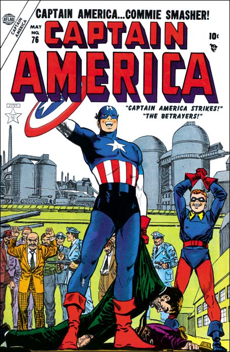
Captain America #76 (May 1954)

It would not have been hard to draw the parallels between America prior to WWII and that in the midst of the Cold War. If superheroes were popular then maybe the time had come to reintroduce them. Perhaps this was the logic behind the Atlas re-launched of the Human Torch, Sub-Mariner and Captain America in Young Men #24 (December 1953).

Fighting American #1
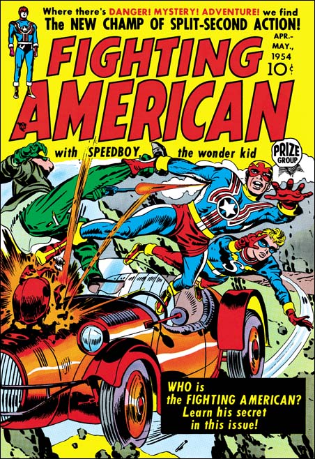
Fighting American #1 (April 1954) pencils by Jack Kirby

Did Simon and Kirby make the same comparison between the Axis and the Communist treats? Or did they notice the return of Captain America to the comic book racks? The timing is just possible as it takes three to four months to produce a comic and so the earliest cover date following YM #24 appearance would be March or April 1954. April is exactly the date that appears on the cover of Fighting American #1. Even if Simon and Kirby were not aware of the Atlas superhero revival they were well aware that nobody did Captain America better then they did and they would use the Fighting American to prove it.


Fighting American #1 (April 1954) “Break the Spy Ring” page 9, pencils by Jack Kirby

The origin story of Captain America seems little more then something for Simon and Kirby to get quickly past before going on to the stories they really wanted to tell. The origin of the Fighting American is told in only a couple of more pages but it is a much more interesting read. It is not the method that provides the two heroes with their powers is all that different it is the circumstances surrounding them. Before Captain America gets his powers we are shown suffer the humiliation of being a 4F. But that pales before what physical humiliation that the pre-Fighting American endures. The action in the Simon and Kirby Captain America may have been unlike anything seen in other comics in those days but by the time Fighting American came out Jack Kirby had taken action to a new, much higher, level. While in the origin story Captain America got to use his new powers against a single spy, the Fighting American takes on a roomful of armed opponents. I love the way Fighting American’s punches his opponent through the wall and leaves him hanging there!


Fighting American #1 (April 1954) “Baby Buzz Bombs” page 3, pencils by Jack Kirby

Even the patriotic hero’s sidekick got upgraded. Bucky became Cap’s partner by doing nothing more then discovering his secret identity at the end of the origin story. Simon and Kirby would devote an entire story, “Baby Buzz Bombs”, for the introduction of Speedboy. Yes Speedboy finds out the Fighting American’s alter ego but he also manages to save FA’s life more then once.


Fighting American #2 (June 1954) “The League of the Handsome Devils”, pencils by Jack Kirby

Communist spies were the villains for all three stories in the first issue of Fighting American, but with the second issue criminals were also fought. Was the shift from spies to criminals on purpose or were Simon and Kirby just trying to keep variety in the stories?


Fighting American #2 (June 1954) “Find the King of the Crime Syndicate”, pencils by Jack Kirby

Okay I do not have anything more to say about Fighting American confrontations with the criminal element. But I just love these two stories and wanted to include images of the great splash pages. All of the original art for “The League of the Handsome Devils” was included in Mark Evanier’s “Kirby: King of Comics”. A newly restored “Find the King of the Crime Syndicate” will be appearing in Titan’s “The Best of Simon and Kirby” which hopefully will be out in May.


Fighting American #2 (June 1954) “City of Ghouls” page 7, pencils by Jack Kirby

Even in the story from FA #2 with Communist spies as villains, Simon and Kirby would throw in a horde of ghouls. It is hard to escape the conclusion that in the end the Communists were not seen as quite the foes for the Fighting American that the Axis powers had been for Captain America.

Note the drawing of the Fighting American rising above the fight and just about to hurl an opponent. It is just one among many great panels but it would have a lasting impact. It would be swiped by Mort Meskin for a cover for Tom Corbett Space Cadet #2 (July 1955) the only example of Meskin lifting from Kirby that I am aware of. Years later Jim Steranko would use the design for a splash page in Captain America #113 (May 1969).

Simon and Kirby followed their standard modus operandi when producing the initial issues for Fighting American. That is Jack Kirby provided all the artwork for the Fighting American stories. New anthology comics might get some help from other studio artists but with titles for a new feature, like Fighting American or Boys’ Ranch, Kirby would invariably do all the important art in the first issues.

I consider the art from this period to be the best that Simon and Kirby did. I am not talking about the pencils because Jack Kirby never stopped pushing his art in new directions. Kirby fans invariably favor one period of Jack’s art but just as invariably they do not agree what period that was. What makes this particular period so appealing to me really is the inking. The Studio Style inking was at its peak and, with its combination of subtlety and boldness. It was the best inking ever applied to Kirby pencils (although Jack would later do some real nice work using the Austere Style). Some of the inking for these first two issues of Fighting American looks like it was done by Kirby himself. Kirby had been inked by some great inkers during his career but there is always something special when he inked his own pencils. But do not use the Marvel Fighting American reprint to judge. Some of it was restored from chemically bleached pages but alas some of it was done by inking on tracing paper. Hopefully Titan will be publishing a newly restored version of Fighting American in the not too distant future.

The first two issues of Fighting American were just spectacular. Nobody could do this type of action hero better then Simon and Kirby. Not only that, but their Fighting American was far in advance of what they had done years before on Captain America. Comparing these two issues of Fighting American with the contemporary version of Captain America being published by Atlas… well you just cannot compare them the Atlas Captain America seems so weak in story and art. It would appear that Simon and Kirby had set the tone for some exciting Fighting American issues to come. But wait, there at the bottom of the last page (see image above) “In the next issue – you’ll get goose pimples, when you meet POISON IVAN”. Could anyone take a villain named Poison Ivan seriously?

Fighting American, Chapter 2, Fighting with Humor

The Vigilante Rides Again

I do not know about you but I am always curious about how an artist feels about his own career. Was he happy with what he has accomplished or disappointed that he did not received deserved recognition? Even when an artist does not discuss these issues directly what he has to say is often revealing of his self evaluation. Unfortunately Mort Meskin never gave an interview and so we will probably never get a good understanding how he viewed his own work*. But if we cannot answer the more interesting question can we at least answer a lesser one; did Mort Meskin know that he had ever created a successful feature or title? With a blog about Simon and Kirby it is easy to forget that while Joe and Jack had a number of successful creations most comic book artists, no matter how talented, never did. But was there any feature created by Mort that he would have known as a success?

But how do we, or did Meskin for that matter, judge what was a success? Certainly creating a feature with its own long running comic book would be a sure sign of success. While Meskin did create Golden Lad it only ran for five issues so it was hardly a big success. Another sign of a successful feature is for it to appear on the cover of the comic. By that criterion Meskin’s Johnny Quick was a success because it appeared on the cover of More Fun Comics. However Johnny Quick only appeared on the cover a couple of times and the cover honors much more frequently went to the Green Arrow. Actually I am not a big fan of Johnny Quick, but that is my personal opinion and hardly the criteria to be used in determining if a feature like Johnny Quick was successful. Still if Johnny Quick had a limited success how about the Vigilante (of which I am a big fan)? Well no matter how popular the Vigilante was it would hardly be expected to push Superman off the cover of Action Comics. So without its own comic book and never having appeared on the cover of Action, must we admit that the Vigilante was not a success?


Action #46 (March 1942) “Crimes in Color”, art by Mort Meskin

Well I for one am not willing to accede that the Vigilante was a failure. How could I with all the great splashes that Mort Meskin created for the character. During the time Meskin worked for Simon and Kirby he rarely provided full page splashes and nothing, full page or otherwise, like the splashes for the Vigilante. They are just marvelous. I have previously shown some but I would like to present some more here. The Vigilante allowed Meskin to more frequently portray action then he would get working for Simon and Kirby or afterwards when he returned to DC. But not all Vigilante splashes can truly be said to be action scenes. Certainly the one in “Crimes in Color” cannot be called action but look how at the dramatic tension Meskin has provided. The Vigilante has been captured by the light which also provides a shadow cast by his opponent. While the Vigilante seems ready to spring into action he seems uncertain from which direction the threat will come from. His true opponent, the Rainbow Man, is presented above as a series of floating heads that show their glee at the Vigilante’s predicament.


Action #65 (October 1943) “The Bard of Banditry”, art by Mort Meskin

“The Bard of Banditry” is one of my favorite Meskin splashes. It is true that there is no action or drama, and even the Vigilante is absent! Somehow the Vigilante hanging in effigy and the laughing Bard are sufficient to make this splash work.


Action #75 (August 1944) “Blunderbuss Booty”, art by Mort Meskin

Meskin often used oversized figures in his splashes. I suppose this was done to suggest that the Vigilante would be viewed as little more then a pawn attempting to thwart some criminal mastermind’s scheme. Sometimes I feel Mort overplays it and the Vigilante ends up relegated to a trivial role in the splash. To a certain extent this is true in “Blunderbuss Booty” splash. However the tooth grins of the three oversized figures give the art an almost surrealistic touch that I find impossible to resist.

I must admit I so love the Meskin Vigilante splashes that I welcome any opportunity to display examples. I feel they prove my point that Meskin’s art is of such high quality that today the Vigilante should be judged a success. Sadly that is not the case as Mort Meskin is still an overlooked master. He even failed to be voted into the Comic Book Hall of Fame a few years ago. How much worse it would have been when Mort was penciling the feature since there were no comic conventions, Internet blogs or letter columns where fans could voice their appreciation of Meskin’s efforts. So while the splash art has been a pleasant digression to the theme for this post, they still leave us with the question whether there was anything to indicate to Mort Meskin himself that the Vigilante was a successful feature?


The Vigilante, lobby card.

Well there is another way a comic book creation can be shown to be a success, it can be transferred from the comic book page to the silver screen. The Vigilante was also serial movie in 1947. There at the beginning of each chapter on the big screen could be read “appearing in Action Comics Magazine”. Okay we are not talking about Oscar material here. Just a movie serial aimed largely at a younger audience. No great special effects but plenty of action and cliff hangers. The movie version does seem to remain largely faithful to the comic book feature, or as much as you can expect from Hollywood. The Vigilante is not only a singer as in the comic book, but he is also a movie star. The movie Vigilante also has a side kick named Stuff but he is not a Chinese youngster but an adult man (that is him on the upper left corner of the lobby card shown above).


The Vigilante, lobby card.

Do not let this above lobby card fool you. The Vigilante does take place in modern times just like in the comics. The scene is from the opening chapter of the serial and the depicted fight turns out to be a movie being filmed that Greg Sanders, the Vigilante’s alter ego, stars in. However Sanders does seems to fight as often unmasked as he does as the Vigilante. One wonders how Sanders keeps his Vigilante identity secret or why his opponents fear the Vigilante more then they do Sanders. When one minion is captured by the Vigilante but turned over to the police by Sanders why doesn’t that criminal become suspicious? Ah but I forget myself, this is a movie serial and should not be taken too seriously. With that thought firmly in mind The Vigilante can be entertaining although not always for the intended reasons.


Real Fact #10 (September 1947), art in part by Mort Meskin

While it is true that the Vigilante never appeared on the cover to Action Comics, he did make it to one cover, Real Fact Comics #10. Meskin has his own method of depicting a slugfest; different from Jack Kirby’s but very effective nonetheless. But behind the combating figures we see a movie camera crew. The caption reads “How Your Favorite Movie Serials Are Made”. This cover is not for a Vigilante story but for a feature about the very movie serial that I discussed above.


Real Fact #10 (September 1947) “How a Movie Serial is Made” page 5, art by Mort Meskin

And Mort truly is depicting the movie serial version of the Vigilante. Page five presents a number of dramatic scenes. I can verify that what is depicted in panels 1, 2 and 4 can be found in the movie. I have not finished seeing all the chapters to the serial so I cannot say whether the other panels can also be found but there are Arabs in the movie so panel 5 is quite possible. There is also a panel on page 6 depicting Stuff escaping from a burning barn inside a rolling barrel which can be found in the screen version. Not that Meskin draws the scenes shown on these pages exactly as found in the movie, his are much better presentations. I particularly get a chuckle from panel 4 where there is a man with a rifle prepared to shoot if the ape becomes too dangerous; in the movie he is clearly a man dressed in a gorilla costume.

So Mort Meskin was well aware that one of his creations, the Vigilante, had made it to the silver screen. It was a distinction that few of his fellow comic book artists ever achieved. Although we know that Mort realized he had created a very successful feature we do not know how he felt about it. Was he proud of his creation? Or was he bitter that he received no financial reward from the movie, or even a screen credit as the creator of the Vigilante? Sadly we cannot tell. Mort Meskin self evaluation remains an enigma. We must content ourselves with the art he left behind and hope that someday he will receive the recognition that he deserves.

Footnote:

* There is a story floating around the Internet told by Jack Kirby about a conversation he had with Mort Meskin. However that is an obviously apocryphal story that reveals much about Kirby and provides no reliable information about Meskin.

Simon and Kirby Blog’s Third Anniversary

It is true; my first post was on March 17, 2006. I have a tool that counts the number of visits and hits (I am not sure what the difference is between the two) and provides information about incoming links. Frankly the statistics are just of mild interest to me since my goals for blogging concern my fascination with Simon and Kirby and not a desire to write a popular blog. Had popularity been my desire I would hardly have selected such a narrow focus for my blogging. I have never paid much mind to the very low number of visits my tool indicated I was getting. Occasionally I would be surprised by some post resulting in a jump in readership. For instance in 2006 I wrote about a cover drawn by John Byrne and inked by Joe Simon. For me it was just a mildly interesting case of an unexpected collaboration, but a Byrne web site linked to it and suddenly my readership sky-rocketed. (I always found it amusing that there is so much interested in a modern artist and so little in earlier masters; John Byrne is a talented artist but honestly he is no Jack Kirby.) After a few days following one of these unexpectedly popular posts, the number of hits would drop down and return to the normally low numbers.

That is what my first two years were like, but then something strange happened. This year after a readership jump the number of visits would not quite return to the previous value. In fact I began to notice increases even without any incoming links to popular posts. Currently my number of visits is almost an order of magnitude greater then last year. Now I know that I have not suddenly become a great writer. Further my posts continue to have the same narrow, historical focus. So if it is not me then I can only conclude that what has changed is a greater public interest in Simon and Kirby. I do not have to look hard to figure out what has caused this shift in public perception, it was Mark Evanier’s book “Kirby, King of Comics”. I believe Evanier’s book has had an impact that greatly surpasses any previous publication about Jack Kirby. And an increasing interest in Kirby has meant a greater recognition for Joe Simon as well. I also want to believe that Titan’s “The Best of Simon and Kirby” (see my previous post below) will further elevate public awareness of Simon and Kirby.

When I started this blog I had not even considered how long I would write about the Simon and Kirby studio. As this blog enters its fourth year I have still only scratched the surface. If nothing else there are many chapters to go in my serial post The Art of Romance. My new serial post, The Little Shop of Horrors, has just started. Although I believe that It’s A Crime has now gone past the time when the Prize crime titles were produced by S&K it still deserves some more chapters. And I do not intend that all my future posts will be limited to those particular serial posts. There are many other fertile grounds to cover.

“The Best of Simon and Kirby”, It Is Real


Dust jacket front cover for “The Best of Simon and Kirby”

I have a busy schedule and so I have to budget my time. I had set aside a period last Saturday for doing some scans for this week’s blog post. That was the plan. That is until Steve Saffel dropped by that day with an advanced copy of Titan’s book “The Best of Simon and Kirby” (Steve is the book’s editor). Well so much for my original schedule as I spent the rest of the day pouring over my copy of this long awaited book. Good things come to those that wait. Actually this time great things came. I cannot begin to describe how pleased I am with this book.

Those readers that have followed my blog closely know that I did the art restorations for this book. So I am hardly unbiased. Still I really believe anyone who likes Simon and Kirby will want this book. This is a large book (12 1/2 by 9 1/4 inches, about the same size of Mark Evanier’s “Kirby: King of Comics”). While I have nothing against the standard archive sized books it is really nice to see Simon and Kirby art larger then life.

Jack Kirby was the master of exaggerated perspective. His figures often seem to jump right out of the page. The dust jacket uses a collage of Simon and Kirby art including the Fighting American from the cover to the second issue. All the art are from scans except for the figure of Fighting American which is fully restored. The result is Fighting American really seems to jump off the page even more. That may not seem possible but it’s true.


Actual cover for “The Best of Simon and Kirby” (in pieces because I cannot scan the entire book at one time, it is too big!)

The only thing I have against the dust jacket is that it hides the cover. When you buy this book (notice I assume the reader will buy it) be sure to remove the dust jacket in order to admire the cover. The cover is a Stuntman double page splash and it looks terrific.

Joe Simon writes an introductory. Joe’s a great writer and the introduction shows his usual flair for story telling. The book is divided into eight chapters and Mark Evanier provides a short essay for each. What can I say, nobody is more knowledgeable about Jack Kirby then Mark Evanier. I wonder if the time Mark spent as Jack’s assistant had anything to do with what a great writer he is? In any case scholarly knowledge and great writing skills make for some marvelous essays.

But let us be honest, all that is window dressing. The real reasons for buying this book are the Simon and Kirby features. There are plenty of those; 192 pages of story art and 5 covers. All, as I said above, larger then the original published size. There are plenty of smaller illustrations accompanying the essays as well. Perhaps the biggest difficulty in publishing a book called “The Best of Simon and Kirby” is picking what to include. There are so many great Simon and Kirby stories to choose from. I cannot promise that everybody’s favorite will be in this book but I can say that all were selected because of their outstanding quality. No Simon and Kirby work was excluded from consideration because it was not available for any reason. Even Marvel and DC has agreed to the inclusion of some work that they have ownership rights to. All genres are included with chapters on action heroes, science fiction, war, crime, westerns, horror, humor and romance. The period covered ranges from one of Joe Simon’s first published stories and goes up to the work Joe and Jack did on the Fly. Most of the art in this book was done by Jack Kirby with all the remaining work done by Joe Simon.

The printing has been completed. My copy of this book went by air mail but the rest of the copies are literally on a slow boat from China. The latest issue of Comic Shop News says this book will be out in April. However I have been told that it will get to Amazon in a month and a half and stores in a couple of months which would put it at May. In any case soon to be at a store near you!

The Little Shop of Horrors, Chapter 1, Expanding Their Fields

(October 1950 to February 1951, Black Magic #1 – #3)

In the early part of 1950 Simon and Kirby had established their studio and were producing comics with a relative small but generally talented group of artists. Their most important, perhaps only, product were two monthly romance titles, Young Romance and Young Love. I do not believe Joe and Jack were still producing the Prize crime titles (Headline and Justice Traps the Guilty) but if they were their involvement was minimal and coming to an end. Few of the studio artists found in the romance titles contributed to the crime titles. Further Jack Kirby would provide some cover art for the crime titles but no interior stories. Simon and Kirby’s deal with Prize for the romance titles was very lucrative but the two were always ambitious and keen to try new challenges.


Young Romance #23 (July 1950) house ad, art by Jack Kirby

The July issues of Young Romance and Young Love featured a full page house ad for a new Prize title, Black Magic. The ad does not provide a date for the first issue but it would be three months before it was released. Synopsis and titles are given for four stories all of which would be in BM #1 although “I’ll Never Sleep Again” was renamed “Last Second of Life”. The cover illustrated was never published. It is one of three versions that I am aware of (another was eventually published, with some additions, on a DC reprint comic). Despite all their efforts, in the end the cover was replaced with one based on the “My Dolly is the Devil” story. The cover title logo would also be modified when the comic was finally released.


Black Magic #2 (December 1950) “The Scorn of the Faceless People”, art by Jack Kirby

The modus operandi for new Simon and Kirby titles was for a lot of the art to have been drawn by Jack at least for the first couple of issues. This was not true for Black Magic. While Jack was the primary artist and provided more pages of art (41 pages) then the other artists (Meskin was the second most used with 24 pages) the difference was not as great as usually found in the initial issues for a new title. One explanation is provided by Mark Evanier (introduction to the DC Demon archive) where he has stated that horror was not a particular favorite of Kirby’s. I must admit I was a bit surprised by that comment since I have always found Kirby’s work in Black Magic as having the same high quality as anything else he every did for Simon and Kirby. There is another explanation for the lack in Black Magic of the typical Simon and Kirby start off and that is Jack was putting his efforts into another new title that came also out in October 1950, Boys’ Ranch. Except for some single page features and a single story from issue #3, Kirby provided all the art for the first three issues of Boys’ Ranch. Did Kirby prefer the western theme of Boys’ Ranch over the horror of Black Magic? Or was it simply that Simon and Kirby made a better deal with Harvey then with Prize? I will leave that answer to the reader. (I will not be posting on Boys’ Ranch at this time as I wrote about not too long ago: part 1 and part 2).


Black Magic #2 (December 1950) “The Scorn of the Faceless People” page 3, art by Jack Kirby

“The Scorn of the Faceless People” is a masterpiece that stands out among all the great work found in Black Magic. The dream analysis theme is unusually and would have been very much at home in a title that Simon and Kirby would produce a couple years later, Strange World of Your Dreams. This story suggests that Simon and Kirby were already feeling the influence of Mort Meskin who had a particular interest in this subject. There is much to commend the art in this story, but check out the unconventional layout of page 3. The carefully use of perspective in the splash-like panel is such that the other two panels really are not intrusive. It is a panel layout that Jack would rarely, if ever, repeat. But then again it was a measure of Kirby’s genius that he would do the unexpected and make it work. There really is nothing much happening in this page but nonetheless it is filled with drama.


Black Magic #3 (February 1951) “A Silver Bullet for Your Heart”, art by Jack Kirby

I remarked in my serial post The Art of Romance chapter 11 (covering a period just prior to this one) that the punch seemed to have gone out of Kirby’s romance splashes. I do not think that is the case for Kirby’s Black Magic splashes. “A Silver Bullet for Your Heart” is just one of many splashes throughout the Black Magic run that are just terrific. As with all truly great comic book splashes it presents the theme of the story in a single scene without, however, revealing how this dramatic point was reached or how it would be resolved (for that you were expected to buy the comic).


Black Magic #1 (October 1950) “His Father’s Footsteps”, art by Mort Meskin

While Kirby was the primary artist for Black Magic, as he usually was for Simon and Kirby productions, other studio artists did great work as well. Perhaps the most outstanding of the other studio artists was Mort Meskin. While Meskin’s romance art was first rate he seemed to particularly shine in the horror genre. Unfortunately his carefully orchestrated horror stories are often neglected by the modern audience whose main interest is in superheroes. Mort developed his own cinematic approach to graphic story telling which fully complemented the scripts.


Black Magic #1 (October 1950) “Don’t Look Now”, art by Bill Draut

Bill Draut was an important artist in the Simon and Kirby studio. Joe Simon has often remarked to me about how much he could depend on Draut. However it seems to me that Bill’s romance art was getting into a routine. It was still fine art and Bill was great at graphically telling a story but I get the feeling he was not pushing himself as much anymore. Black Magic seems to have shaken him out of that in a big way. I recently posted  an example of a full page romance splash just because it was an unusual deviation from his standard half pages splashes. Above I provide another full page splash whose merit goes way beyond the untypical splash size.


Black Magic #1 (October 1950) “My Dolly is the Devil”, art by Leonard Starr

I have discussed Leonard Starr a number of times in The Art of Romance. Starr provided great romance art for Simon and Kirby and of course he is most well known for his long running syndication strip Mary Perkins On Stage. All of which makes his “My Dolly is the Devil” that more interesting as an example of Starr’s art in another genre. Although this story is unsigned it truly was done by Leonard. The mother of the story has the pixie look that Starr used often in Simon and Kirby productions (wide forehead, widely separated eyes and narrow chin). Further the tall narrow panels that Starr preferred appear on a number of pages. A satisfying graphic story but unfortunately “My Dolly is the Devil” would be the only story that Starr ever did for Black Magic.

Note how in the light cast by the lamp transforms the doll’s hair into what looks like horns in the shadow.


Black Magic #2 (December 1950) “I’ve Seen You Before”, art by Bruno Premiani?

An ancient curse, an Egyptian mummy come back to life, a cast off lover’s cruel fate, what more could you want? I know many comic fans consider EC horror comics as the epitome of the genre but I prefer stories that are less gruesome and rely more on plot development. Bruno Premiani is another artist we have seen often in the Prize romance titles but it is nice to see his hand in another genre. Of course if this is really Premiani then he also did work for DC superheroes and westerns but that work is drawn in such a different manner it is not at all clear that they were done by the same artist. Premiani did only two stories for Black Magic and “I’ve Seen You Before” would be the last Simon and Kirby work by the artist.


Black Magic #3 (February 1951) “The Voices in the Night”, art by Marvin Stein

We have seen Marvin Stein often in Headlines, Justice Traps the Guilty and Prize Comics Western. In fact he would become a fixture in Prize publications not produced by Simon and Kirby. But he would appear in Simon and Kirby productions as well although perhaps not as frequently or so prominently placed. “The Voices in the Night” is signed and the style agrees well with other work Stein did at this time. This is not his mature style and frankly is a little bit on the primitive side. Joe Simon once remarked to me that he did not originally care that much for Marvin Stein’s art but that latter he became quite good.


Black Magic #3 (February 1951) “The World of Shadows”, art by George Roussos

I am sure that, when they were young and in a darken room, most of my readers have placed a flashlight below their face to provide eerie shadows. Well it seems many of the artists in Black Magic had done that as well. But perhaps none of them used that type of dramatic lighting as often as George Roussos. Roussos is a name we have not encountered yet in the serial posts The Art of Romance or It’s A Crime. George is perhaps most famous as a silver age inker of Jack Kirby at Marvel under the alias George Bell. “The World of Shadows” is unsigned but the art is so similar to other work with signatures that there is little question about the attribution. The artwork is a bit of a hodge-podge but I am unsure if this is due to the use of swipes or a style that has not set settled into place. In places the art clearly shows the influence of Mort Meskin whose work Roussos had inked previously. In all honesty Roussos is not among my favorite Simon and Kirby studio artists.

The Little Shop of Horrors, Chapter 2 (#4 – 6), Up and Running
The Little Shop of Horrors, Chapter 3 (#7 – 8), The Same Old Gang
The Little Shop of Horrors, Chapter 4 (#9 – 11), Another Hit
The Little Shop of Horrors, Chapter 5 (#12 – 14), New Faces
The Little Shop of Horrors, Chapter 6 (#15 – 17), Mix Bag
The Little Shop of Horrors, Chapter 7 (#18 – 20), Kirby Returns
The Little Shop of Horrors, Chapter 8 (#21 – 23), The Gang’s All Here
The Little Shop of Horrors, Chapter 9 (#24 – 26), The Party’s Ovetr
The Little Shop of Horrors, Chapter 10 (#27 – 29), A Special Visitor
The Little Shop of Horrors, Chapter 11 (#30 – 33), The End

The Art of Romance, Chapter 12, A Smaller Studio

(August – October 1950: Young Romance #24 – #26, Young Love #12 – #14)

Romance Titles to 1951
Number of Romance Titles 1947 – 1950 (the period covered in this chapter shaded in blue)

The trend of the decreasing number of romance titles that was found in the period covered in the previous chapter has continued. As far as can be judged the Prize love comics, Young Romance and Young Love, were still successful; at least enough to continue on a monthly schedule. Young Romance is now entering its third year of publication. The most obvious change is that Young Love replaced the previous photographic covers with drawn versions for the August issue and Young Romance would follow a couple months later. Frankly I am unclear what drove the use of photos on comic covers but as we will see in future chapters the use of art covers would be temporary for Young Romance and a little more extended for Young Love. Printing is somewhat more expensive for photographic covers but according to Joe Simon for the publication sizes involved the extra cost was very minimal.

I have noted in previous chapters a decrease in the number of artists used in producing YR and YL. This trend continues to the extent that a total of six artists were used in the six issues issued during the period covered in this chapter. In fact this is the first period that I have covered in this serial post where I can confidently identify all the artists involved (or as confidently as I can where Bruno Premiani is concerned). The drop in the number of contributing artists is not random; it is the less talented artists that are no longer used. Some, like George Gregg, would continue to appear in the Prize crime comics (Headline and Justice Traps the Guilty). There is one exception to dropping the less talented artists and that is John Severin. Although Severin does not show up in any of the comics from this period he has not yet been truly dropped as he will appear again in the next chapter. In any case as talented an artist on western stories that Severin was he really was not very good at romance stories. His diminished appearances in the romance titles seemed to have been offset by his work for Prize Comics Western.


Young Love #13 (September 1950) “Everybody Wants My Girl”, art by Jack Kirby

Jack Kirby would be, as he has been, the primary artist for the Prize romance titles. In these six issues he provided 4 covers, 7 stories and a total of 62 pages. Jack would do all the lead stories for Young Romance and one of them for Young Love. These lead stories would start with a confessional splash (where someone is introducing the story and their speech balloon is used for the title). All but one of the splashes would be half page designs and none of them had quite the punch as those from the earlier issues. Perhaps this is because Simon and Kirby’s creative juices were directed elsewhere but that will be discussed in a separate post.


Young Romance #24 (August 1950) “Buy Me That Man” page 14, art by Jack Kirby

Jack Kirby drew a lot of romance stories and it is clear he had a hand in plotting these stories as well. So it is not surprising that some plot devices would be used more then once. The use of an sudden plunge in a plane to throw a couple into each others arms found in YR #24 (see above) was used previously in YR #8 (November 1948 “Love Can Strike So Suddenly”, see Swiping off of Kirby). It would be found again in In Love #2 (October 1954, “Marilyn’s Men”). While Marilyn’s Men was mostly drawn by Bill Draut, Jack probably was involved in the plotting of that as well.


Young Love #14 (October 1950) “Girls like Her”, art by Mort Meskin

As with last chapter, Mort Meskin would be the second most used artist for this period drawing 14 stories with 54 pages. While the number of features is doubled that done by Kirby most of them are very short, 1 to 3 pages long. Previously these featurettes were done by a number of different artists but during this period Mort did all but two of them (the two Meskin did not do were done by Kirby). Mort would provide one of the lead features (Young Love #12).


Young Romance #24 (August 1950) “Take a Chance”, art by Mort Meskin

Although I have not found any evidence that the more talented artists working for Simon and Kirby were ever supplied layouts for the stories they drew, Joe and Jack did seem to be involved in at least the plotting of the scripts. Therefore recurring themes would also show up among other artists. The theme of a woman’s love of a racecar driver and the fear of the risks involved in that occupation can be found in “Take a Chance” shown above. It also would return many years later in a cover a story drawn by John Prentice (“Take Me as I Am”, Young Brides #14, April 1954).


Young Love #14 (October 1950) “I’ll Tell You No Lies”, art by Bill Draut

Bill Draut continues in the number three spot with 6 stories and 46 pages but as we shall see he barely holds that position. At this point Draut arrives at a style that will not change very much for the rest of the work that he would do for the Prize romance titles or for that matter Harvey’s love comics as well. I do not say that disparagingly as he has a clean style and is good at portraying body language. Bill generally uses half page splashes so I have provided an image from “I’ll Tell You No Lies” even though it is well below Draut’s usual quality.


Young Love #13 (September 1950) “Two Can Play the Game”, art by Leonard Starr

Leonard Starr was used often during this period with 6 stories and 45 pages, only one page less the Bill Draut. Starr had his own style of inking but compare the brush work between the man’s jacket and the woman’s dress in the splash for “Two Can Play the Game”. The inking on the man is typical of Starr but the picket fence crosshatching found in the dress is not. This looks like typical S&K studio style inking and suggests that either Joe or Jack did that particular spotting. I am not sure why this was done but it was not that unusual for studio style inking to appear in splashes that were otherwise inked by the artist.


Young Romance #25 (September 1950) “Out of the Running”, art by Leonard Starr

In two stories from this period (“Out of the Running” YR #25 and “Hired Wife” YR #26) Starr introduces a new type of beauty. Previously his women a pixie or elfin look to them; wide foreheads, widely separated eyes, smaller mouths and narrow chins. The pixie look can still be found in some characters in these stories but there are also women with larger eyes, smaller foreheads, and fuller lips giving them a more sultry appearance. This new type of beauty will play an important part in the syndication strip “Mary Perkins on Stage” that Starr will launch in 1957.

Note the inking on the man’s jacket in the splash panel. The shoulder blot and blunt brushwork is not typical of Starr’s inking. Once again Simon or Kirby has step in as art editor to alter the art. This splash is actually based on a stat of a blowup of a story panel. The panel chosen was one of Starr’s tall and narrow ones that had to be expanded on both sides to accommodate the more horizontal splash panel. Most of the jacket was not present in the story panel and the inking was touched up even in that portion that was original present. Although this technique of using a stat in the creation of comic book art is rarely found in Simon and Kirby productions it was a method that would be turned to when needed. I suspect that Joe and Jack were unhappy with Starr’s original splash.


Young Romance #26 (October 1950) “Hired Wife”, art by Leonard Starr

Above is the splash page for the other example of Starr’s more sultry beauty. This story is unusual in that the tall narrow panel that is found in all previous stories by Starr occurs only in the splash panel of “Hired Wife”. I am not sure what to make of this change in panel layouts but it suggests that he may have been working from someone else’s layouts. I will return to this subject in the next chapter of this serial post where we will find another example.


Young Romance #24 (August 1950) “Portrait of a Lady”, art by Bruno Premiani?

Bruno Premiani(?) has been a persistent presence in Simon and Kirby productions since August 1949. During this period Bruno provided 3 stories and 26 pages. While he did not appear as much as Kirby, Draut or Meskin what art he did was all first rate work. The romantic interest between an artist and his model is a recurring theme in Simon and Kirby productions. It is found in the very first cover for Young Romance (The First Romance Comic) and can be found many years later as well (Artist and Model). The artist and model theme appears to be particularly popular for this period since it occurs in three stories. We have previously seen Leonard Starr’s splash from “Two Can Play the Game” (see above) now we can compare it with Premiani’s version “Portrait of a Lady”. For me this is not a question of which was the better artist but rather individual interpretations from two talented practitioners of comic book art.


Young Romance #26 (October 1950) “Simpson and Delilah”, art by Bruno Premiani?

Premiani repeats the use of a dancing woman for the splash of “Simson and Delilah” (a south Pacific dancer graced “Untouched” from Young Love #10, June 1950). Although this is a repeat performance of the theme it is by no means a duplicate of the previous version.

This would be the last romance story that Bruno Premiani(?) would do for Simon and Kirby. As I have mentioned in the past this body of works were all unsigned in Simon and Kirby productions and were done in a style dissimilar to that used in art done for other companies that were signed by Premiani. While this does not disprove that the artist was Bruno Premiani it does beg the question as to why he was originally credited with this work. Although I am hesitant to fully accept Bruno Premiani as the artist (hence my use of question marks) I have no doubts as to the talent of this creator. His absence would leave a hole in the romance titles that would not be filled for some months to come.


Young Love #13 (September 1950) “The Woman Across the Hall”, art by Vic Donahue

Vic Donahue played a minor part in the romance titles of this period providing only 2 stories with 15 pages. His art is improving both in his in his ability to depict figures and to graphically tell a story. His women in particular have become more interesting largely because his use of arching eyebrows brings more emotion into their faces. My database indicates that these are Vic’s last work for Simon and Kirby but I hesitate to say that with conviction until I had a chance to more carefully review future issues. In any case I do not feel the same about Donahue’s absence then I do about Premiani’s disappearance.

Chapter 1, A New Genre (YR #1 – #4)
Chapter 2, Early Artists (YR #1 – #4)
Chapter 3, The Field No Longer Their’s Alone (YR #5 – #8)
Chapter 4, An Explosion of Romance (YR #9 – #12, YL #1 – #4)
Chapter 5, New Talent (YR #9 – 12, YL #1 – #4)
Chapter 6, Love on the Range (RWR #1 – #7, WL #1 – #6)
Chapter 7, More Love on the Range (RWR #1 – #7, WL #1 – #6)
Chapter 8, Kirby on the Range? (RWR #1 – #7, WL #1 – #6)
Chapter 9, More Romance (YR #13 – #16, YL #5 – #6)
Chapter 10, The Peak of the Love Glut (YR #17 – #20, YL #7 – #8)
Chapter 11, After the Glut (YR #21 – #23, YL #9 – #10)
Chapter 12, A Smaller Studio (YR #24 – #26, YL #12 – #14)
Chapter 13, Romance Bottoms Out (YR #27 – #29, YL #15 – #17)
Chapter 14, The Third Suspect (YR #30 – #32, YL #18 – #20)
Chapter 15, The Action of Romance (YR #33 – #35, YL #21 – #23)
Chapter 16, Someone Old and Someone New (YR #36 – #38, YL #24 – #26)
Chapter 17, The Assistant (YR #39 – #41, YL #27 – #29)
Chapter 18, Meskin Takes Over (YR #42 – #44, YL #30 – #32)
Chapter 19, More Artists (YR #45 – #47, YL #33 – #35)
Chapter 20, Romance Still Matters (YR #48 – #50, YL #36 – #38, YB #1)
Chapter 21, Roussos Messes Up (YR #51 – #53, YL #39 – #41, YB #2 – 3)
Chapter 22, He’s the Man (YR #54 – #56, YL #42 – #44, YB #4)
Chapter 23, New Ways of Doing Things (YR #57 – #59, YL #45 – #47, YB #5 – #6)
Chapter 24, A New Artist (YR #60 – #62, YL #48 – #50, YB #7 – #8)
Chapter 25, More New Faces (YR #63 – #65, YLe #51 – #53, YB #9 – #11)
Chapter 26, Goodbye Jack (YR #66 – #68, YL #54 – #56, YB #12 – #14)
Chapter 27, The Return of Mort (YR #69 – #71, YL #57 – #59, YB #15 – #17)
Chapter 28, A Glut of Artists (YR #72 – #74, YL #60 – #62, YB #18 & #19, IL #1 & #2)
Chapter 29, Trouble Begins (YR #75 – #77, YL #63 – #65, YB #20 – #22, IL #3 – #5)
Chapter 30, Transition (YR #78 – #80, YL #66 – #68, YBs #23 – #25, IL #6, ILY #7)
Chapter 30, Appendix (YB #23)
Chapter 31, Kirby, Kirby and More Kirby (YR #81 – #82, YL #69 – #70, YB #26 – #27)
Chapter 32, The Kirby Beat Goes On (YR #83 – #84, YL #71 – #72, YB #28 – #29)
Chapter 33, End of an Era (YR #85 – #87, YL #73, YB #30, AFL #1)
Chapter 34, A New Prize Title (YR #88 – #91, AFL #2 – #5, PL #1 – #2)
Chapter 35, Settling In ( YR #92 – #94, AFL #6 – #8, PL #3 – #5)
Appendix, J.O. Is Joe Orlando
Chapter 36, More Kirby (YR #95 – #97, AFL #9 – #11, PL #6 – #8)
Chapter 37, Some Surprises (YR #98 – #100, AFL #12 – #14, PL #9 – #11)
Chapter 38, All Things Must End (YR #101 – #103, AFL #15 – #17, PL #12 – #14)

The Eleventh Commandment

“Thou shall not desecrate art”. Okay maybe Moses did not forget to include the eleventh commandment on his tablets when he came down from the mount. And I will admit that most of the other commandments concerned more serious sins. Still alteration of art is truly morally wrong. This restriction may seem odd when it comes to comic books since that art often gets modified on its way through the publication process. However a point is reached when comic art is published (or not) and further modification should no longer be done. Some will say that when a person buys a piece of art he can do anything he wants with it. But the truth is no one really buys art, it is more like an extended lease. While the person may have possession of a piece of art, the expectation should be that someday, somehow, it will pass on to someone else. It is the owner’s duty and self interest to preserve the art for that eventual day.


Unpublished page art by Jerry Robinson and Mort Meskin (as published in “History of Comics” volume 1, 1970)

James Steranko’s “History of Comics” is a great resource written by a man who is both a historian and practitioner of comic books. It was published in two tabloid size volumes and is long out of print. However issues appear at conventions and sources like eBay from time to time and are well worth the search. While profusely illustrated most of the images are small in size. There are a limited number of exceptions that take full advantage of the large dimensions of the books. One of the larger illustrations in volume 1 is the source for the image shown above of a page done in pencil by Jerry Robinson and Mort Meskin.

There are good reasons why Steranko gave this image such a prominent treatment. Both artists played important parts in the history of comics. Among the many contributions by Jerry Robinson is the work he did on Batman as a ghost artist for Bob Kane. Unfortunately Mort Meskin’s importance in the history of comics is largely forgotten today but is well understood by Steranko. Hopefully a forthcoming book on Meskin may help to change his current reputation. However Mort is not completely neglected for instance Ger Apeldoorn has provided some recent posts about some of his work (for example Tom Corbett Viewmaster, Real Crime and No Kid Stuff) and there is a list group devoted to him (Mort Meskin List). Besides Robinson and Meskin’s importance to the history there is the rarity of the art. Not a lot of original art for either artist has survived from early in their careers. While they shared a studio for some time they only collaborated for a relatively short period (less then two years) so examples of their joint work would be expected to be rarer still. Original art that was unpublished and left uninked are particularly rare. Last, but certainly not least of the reasons Steranko illustrated this particular page, is the quality of the art itself.

What was this unfinished page originally intended? Meskin did some marvelous work on his creation, the Vigilante, which started as a hero feature and ended up as a western. However Robinson was never associated with the Vigilante and the young man on this page of original art was clearly not the Vigilante’s sidekick Stuff the Chinatown Kid. This page of art can also be found on the Meskin web site where it is suggested it might have originally have been meant for Prize Comics Western. The period that Robinson and Meskin are known to have collaborated was from January 1948 to August 1949 (cover dates). Prize Comics was converted to Prize Comics Western with the May 1948 issue so it certainly was a possible destination for this piece. Robinson and Meskin were doing work for Simon and Kirby during this time and although I do not believe S&K produced Prize Comics Western they may have provided Jerry and Mort a connection to the editor of that title. But Robinson and Meskin’s work never be published in any issue of PCW and the solo Meskin would not appear in the title until 1956 1955. So while nothing rules out Prize Comics as the intended comic, there is little evidence to support that suggestion.

Considering the artists, it is not surprising what a wonderful page this is. The third panel is particularly marvelous. This may be the most complex panel these artists had ever done either together or individually. The panel is framed on each side by the cutoff close-ups of two smokers. A gambling game gone wrong takes up most of the panel with onlookers filling the rest. Every little portion of the panel is filled with interesting details. The only problem is where would the speech balloons go? Actually this seems to be a difficulty with much of the page with only the second and fifth panels seeming to have room for the speech balloons. The fourth panel particularly seems to call for a balloon with no place to put it. This all suggests another possibility for this page, it may have been nothing more then a portfolio piece used to show perspective publishers what the artists were capable of doing. However in the end we are left with little more then informed speculation as to the intended purpose of this unpublished art.


Unpublished page art by Jerry Robinson and Mort Meskin (recent scan)

The image in Steranko’s book is just marvelous. Pencils are difficult to reproduce (which is why art is inked for comic book publication) but the image in “History of Comics” is clear and easy to see. Considering this was done before personal computers and scanners that was quite an accomplishment. Above is a more recent scan of the same art. While it may not be as clear as the Steranko’s image it does show some subtleties that the published image did not. Even here the image has been enhanced as the original pencils are lighter.

I had previously wondered what method Robinson and Meskin used when they collaborated on art since the final result looks like an amalgamation of their two styles. At least some of the inking appeared to have been done by Mort so the simplest explanation would be that Robinson did the pencils and Meskin the inking. But is the simplest explanation actually correct? The best way to answer this question is to examine uninked art such as the page discussed here. Most of the figures on the page look like they were done by Meskin with the exception of the woman in the third panel who looks like she was drawn by Robinson. That assessment is based on the style of the art but notice that the woman is drawn slightly darker then the rest of the figures. Remember this image is an enhanced scan and the difference is even harder to detect on the original art. The panel is so intricate and fully realized that I doubt that Meskin had simply left the woman blank for Jerry to fill in. To me this all suggests that Mort first penciled the entire page and then Jerry came in and altered portions. Robinson may have worked on parts of the art other then the woman but they are now hard to distinguish. I am not suggesting that this was the creation sequence that Robinson and Meskin used in all cases but it does suggest that the reason for their amalgamated style was the passing of the pencils from one artist to the other.

It is interesting how fully developed the drawing is on this page. Not only are all outlines clearly indicated but the required spotting is shown as well. For example the shadows cast by the post sticking out of the top of the house in the first frame and the shadows on the underside of all the hats. Even the cloth folds have the sweeping parallel lines that are characteristic of Meskin’s inking. Previously I felt the inking of the Robinson and Meskin pieces had been done by Mort, but perhaps Jerry also did some inking that is now hard to detect because the inks closely followed the pencils.

By now the reader maybe impatiently proclaiming “but what about the bottom row of panels”? What indeed. Because of the Steranko illustration we know that this row was originally uninked. Did Jerry Robinson, still very much active today, come back and resume working on the page? Or did Mort Meskin return to it before his untimely death? Unhappily neither is the case. A good comparison between the inked version and the one found in the Steranko illustration shows many discrepancies. Hairlines were altered and cloth folds moved. Even the outlines were not closely followed. While it is not completely clear in Steranko’s illustration, the boy on the extreme right of the last panel is cast in shadow with just enough traces of light patches to indicate the shape of the figure. Apparently this was all beyond the questionable talents of the inker who covers it all in solid black. It is true that since the silver age of comics inkers are often expected to add their personal touches, but this particular inker’s alterations have done nothing but deaden the art. Since he did not follow the pencils closely one wonders why the inking was done directly on the original art and not over some copy? Once he had finished the bottom row the contrast between it and the two upper rows must have been painfully obvious even to this inker and he finally halted his destruction before any more damage was done and the page become worthless. The page is now a monument to the wisdom of the Eleventh Commandment. Frankly even if the inker had been more talented he should not have attempted inking the actual pencils. A modern inker has modern sensibilities and his art could not truly recreate the type of inking that would have been done on this page had Robinson and Meskin completed it.

Bill Draut’s Demon

After Joe Simon and Jack Kirby had fulfilled their military service they could easily resumed working primarily for DC. Instead a deal was made with Harvey to produce some new titles, Stuntman and Boy Explorers. Ignoring very short features these comics included:

Stuntman #1 (April 1946)
 3 Stuntman (Kirby)
 1 Furnished Room (Draut)
Boy Explorers #1 (May 1946)
 1 Boys Explorer (Kirby)
 1 Duke of Broadway (Simon)
 1 Danny Dixon Cadet (Riley)
 1 Calamity Jane (Draut)
Stuntman #2 (June 1946)
 2 Stuntman (Kirby)
 1 Duke of Broadway (Simon)
 1 Furnished Room (Draut)

At this point both titles were cancelled, victims of the glut of new comic book titles that appeared now that wartime paper restrictions were lifted. However Harvey sent to subscribers small issues of Stuntman and Boy Explorers. These were small not only in size but also in content (only two stories) and without color printing.

Stuntman #3
 1 Stuntman (Kirby)
 1 Kid Adonis (Simon)

Boy Explorers #2
 1 Boy Explorer (Kirby)
 1 Danny Dixon Cadet (Riley)

However original art in Joe Simon’s collection indicates that a Vagabond Prince story (“Trapped in Wax”, Simon) was also originally meant to be included in Boy Explorers #2. This origin story would never be published.

Comic book art is created well before it appeared on the newsstand, so when the two titles were suddenly cancelled it would be expected that some of the art would already be completed for the unpublished issues. This would not go to waste as Harvey would include them in some of their other titles in the following year (as well as reprinting most of those from Stuntman #3 and Boy Explorers #2). These previously unpublished inventory stories included:

1 Stuntman (Kirby)
2 Duke of Broadway (Simon)
1 Vagabond Prince (Simon)
2 Kid Adonis (Simon)
1 Furnished Room (Draut)
4 The Demon (Draut)
7 Danny Dixon Cadet

The more observant reader may have noticed two anomalies in the list of inventoried stories published elsewhere by Harvey. While most features had only one or two stories there were 4 for the Demon and 7 for Danny Dixon Cadet (the subject of a future post). The Demon was also unusual in that it had never previously appeared in either Stuntman or Boy Explorers. My original reaction when I was reviewing this was that perhaps The Demon really was not a Simon and Kirby production but something that Bill Draut pitched to Harvey after the two titles were cancelled. However on further thought I considered this unlikely because the origin story was the third Demon story that Harvey published. This sort of error would have been unlikely to happen if The Demon was new feature but just the sort of thing to be expected if the Demon was just inventoried material.

I think a better explanation for the Demon anomaly would be that a third title was originally proposed. Work may have already progressed when Harvey decided to test the waters with just two titles. If there was to be a third comic book it was most likely that the Duke of Broadway would have been the title feature. The Duke’s appearance in the other two titles would have been a means of generating interest. Bill Draut’s Demon would have been a backup feature.


Black Cat #6 (July 1947) “The Midnight Killer”, art by Bill Draut

Simon met Bill Draut through a mutual friend while Joe was stationed in Washington during the war. Bill was in the marines working as a combat artist. I used to believe that Bill did not have any previous comic art experience but in fact in 1945 and 1946 he worked on the syndication strip Stony Craig. Joakim Gunnarsson has written a nice post about this with some examples (Coming Soon and Stony Craig by Bill Draut). This work would have been done while Bill was still in the marines. After fulfilling his military service, Bill accepted Joe’s invitation to join him in New York and try his hand at comic books. The work Draut provided for Stuntman and Boy Explorers was his first published comic book art

Draut’s art for the Demon, the Furnished Room and Calamity Jane along with Stony Craig was already very distinctive. Not that all the characteristics of his later work for Simon and Kirby were present but there is enough that it is easy to recognize his hand. I had previously considered Jack Kirby a big influence on Bill but the Stony Craig art clearly shows that is not strictly true. Many of the similarities between Draut and Kirby are the due to their common interest in Milton Caniff’s art.


Black Cat #6 (July 1947) “The Midnight Killer” page 7, art by Bill Draut

As I mentioned above, the origin story for the Demon was not the first one printed. This can be clearly seen from page 7 of “The Midnight Killer”. Here the judge posing as a bank thief on the run finds the costume worn at a party by the murdered victim. This device would make no sense unless it was the origin story.

Black Cat #4
Black Cat #4 (February 1947) “Double Trouble”, art by Bill Draut

Because so much of the work Bill Draut produced for Simon and Kirby would be for romance titles there is not much depiction of action in most of his art. However action plays an important part of the early work by Draut particularly in the Demon. Frankly in some cases Bill is not very effective in drawing fight scenes. In the splash for “Double Trouble” it is clear that the woman has thrown the man into the Demon. But how did she accomplish this feat, was is some sort of Judo trick or was she stronger then she looks? How was the man standing before the throw that could explain his final position? Draut’s splash is just not very convincing.


Black Cat #7 (September 1947) “Too Cold for Crime” page 4, art by Bill Draut

But it would be a mistake to conclude that Draut simply could not handle action scenes. The page shown above from “Too Cold for Crime” is a great example. While the layout is not done the way Jack Kirby would have handled it, it still is very dynamic page. The high angled view used in the first panel along with having the fight occur during a snow storm both are very graphically interesting. Unfortunately the page is marred somewhat by the colorist use of blue for both figures in the first and third panels.


Black Cat #4 (February 1947) “Double Trouble” page 8, art by Bill Draut

Although I now credit Milton Caniff with jointly influencing Bill Draut and Jack Kirby (among many other comic book artists) there are still aspects of Bill’s art in the Demon that suggests that he had lately studied Kirby’s art. The use of exaggerated perspective when depicting a fist fight is not something associated with Caniff, but it is a classic technique for Kirby. While I do not think Jack would have made the slugger in panel 4 so relatively small, the perspective of the sluggee does remind one of Kirby’s art.


Black Cat #5 (April 1947) “The Man Who Didn’t Know His Own Strength” page 9, art by Bill Draut

I will close with another action sequences. This page opens with the Demon battling his opponent only to end with the hero turning to the villain for help. Of course an unknown writer should likely be credited for this plot but Draut does a great job of graphically presenting the story. I love the way the smoke is introduced in one corner of the first panel and how the fire progressively takes over more and more of the panel until the fourth one where the Demon carrying his defeated foe is almost lost in all the smoke and flames.

The Romance of Money


The Romance of Money (1937) page 1 (cover), art by Jack Kirby

Early in his career Jack Kirby was employed by Lincoln News. There Jack worked on a number of strips for syndication but he also did the art for a give-away to be used by banks, “The Romance of Money”. Since this publication has a 1937 copyright date, some have designated it as Kirby’s first comic book work. Well I guess it all depends what the reader’s definition of a comic book is. “The Romance of Money” is a small book (5 by 6.5 inches) that is just a little larger then half the size of a normal comic book. It is only 24 pages long including the covers. The cover and all interior pages are printed on the same type of paper. The paper is not newsprint, has a nice white color and is a heavier stock then what is found in a typical comic book. The interior of the book is printed in black and white while the front and back covers also include a single color, cyan.


The Romance of Money (1937) page 5, art by Jack Kirby

The subject of this book is, not surprisingly, money. The approach taken is very similar to the old Ripley’s Believe it or Not comic strips. Except for the covers, each page presents a number of related subjects. Despite the presence of a H. T. Elmo signature, Jack Kirby did all the artwork. Horace T. Elmo was not an alias of Jack’s but rather the owner of Lincoln News. Art with his signature appears in both pocket books and comics up to at least 1957. Most of what I have seen are gag cartoons. However considering how Elmo signed work actually done by Kirby, I would be cautious about attributing to him any of the art with his signature.


The Romance of Money (1937) page 19, art by Jack Kirby

The inking in ROM is incredibly detailed, particularly considering the small size of the publication. The Elmo signature is so small that I suspect that originally a larger sized book was planned. I have never seen a comic book printed with such fine lines although I have seen numerous cases where even less detailed work failed to print properly. Either a letter press was not used or the printer was particularly skilled. The higher quality of the paper compared to that normally used in comics may have helped as well. Frankly the fine pen work is uncharacteristic of Kirby and raises the question as to whether Jack did the inking. At this point in his career it is hard to believe that Kirby would have been given the luxury of only providing the pencils. On the other hand the inking is rather poor in some places (for instance the portrait of Charles Dickens on page 19). My belief is that this is in fact Jack’s inking but he was inexperienced with the fine pen work that he was attempting (perhaps at the direction of H. T. Elmo).


The Romance of Money (1937) page 6, art by Jack Kirby

Most of the work Jack did for Lincoln News had cartoon-like imagery which can sometimes be hard to relate to his later comic book work. The more realistic style used in “The Romance of Money” makes for easier comparisons with the work from much of Jack’s career then the rest of what Jack did for Lincoln News. While Kirby had a long way to go some of his stylistic traits can already be detected. Note for example the wide strides of the running couple in the bottom scene of page 6.


The Romance of Money (1937) page 13, art by Jack Kirby

“The Romance of Money” was republished in 1942 using the same artwork. I understand that the older and later versions can be distinguished by the cover but I have heard two reports of how this can be done. One is that 1942 version used red ink for the color instead of cyan. The other explanation is that the 1942 issue uses colored paper for the cover. Unfortunately I am unable to say which explanation, if any, is the correct one.


The Romance of Money (1937) page 23, art by Jack Kirby

It’s A Crime, Chapter 11, The New Team

(Justice Traps the Guilty #13 – #23, Headline #39 – #45)

This chapter will continue the coverage of the Prize crime comics from the period December 1949 through February 1951. In the last chapter I discussed the work of Jack Kirby and Marvin Stein; this post will be concerned with some of the other artists.


Justice Traps the Guilty #17 (August 1950) “The Statue Screams”, art by Mort Meskin

While most artists associated with Simon and Kirby productions were no longer found in the Prize crime titles there are a couple of glaring exceptions. Probably the most significant artist to jointly work the crime and S&K titles was Mort Meskin. At this point Meskin had become the second most used artist for Simon and Kirby productions (Jack Kirby retained the first place position although that would not always be true in the future). Even though Kirby’s presence in Headline and Justice Traps the Guilty had greatly diminished, Mort still did not achieve the status of primary artist in those titles; he never provided a cover nor did he ever do any lead story. Still he became a frequent contributor appearing in most crime comics and sometimes showed up twice in a single issue.

The crime titles provided Meskin with more opportunities for the depiction of action then the romance art that dominated his work for Simon and Kirby. Not that the diminished use of violence hindered Mort for those occasions when he was to draw it. However Meskin’s Prize comic work had greater similarities to his romance work then it did to the hero genre stories he had previously done such as the Vigilante.


Justice Traps the Guilty #18 (September 1950) “The Way to Prison”, art by John Severin

John Severin also did art for both the crime and romance titles during this period. John is probably best known for his western and war genre comic book work. He may not have done that much crime stories for Prize, but they are very well done (I wish I could say the same thing about his S&K romance art). Not a criticism against Severin, because the same thing can be found in much of the crime comics from the 50’s, but note how well dressed the stick-up criminals are!


Headline #42 (July 1950) “Jewels of Death”, art by George Gregg

George Gregg is not in the same category as Meskin or Severin. While he previously had provided some work for the Simon and Kirby romance titles during the period covered in this chapter that was no longer the case but he would supply a small number of stories for the crime titles. “Jewels of Death” is not most typical of Gregg’s work but I still think that is the correct attribution. But what a great splash! Gregg’s females generally are rather stiff but not this native beauty. While the Prize crime titles are really pretty tame stuff by this time, they still could be quite suggestive (“we have ways of inspiring speech”).


Headline #40 (March 1950) “Counterfeit Winners”, art by Mart Bailey

I have discussed Mart Bailey previously in Prize Comics Western, a Rough History. For about a year and a half he was the primary artist for that western title. He was originally brought in to draw the movie adaptations that PCW featured when they switched to photographic covers. He remained the principal artist until the photographic covers were dropped at which point John Severin became the principal artist for the title. However Bailey continued to provide backup stories. Mart was not as important an artist in the crime titles but he did draw a number of backup stories but he never provided any art for any Simon and Kirby production. Bailey drew in a realistic style which was probably why he was used for the movie adaptations in PCW. While his art is technically fine it is a bit dry for my tastes.


Headline #45 (January 1951) “Penny Shakedown”, art by unidentified artist

There are a number of artists appearing in Headline and Justice Traps the Guilty during this period that I have not been able to identify. Frankly in most cases it is not a big loss as their art work is really not that great. However there is one story, “Penny Shakedown”, that I wish I could provide an attribution. This story is certainly one of the best from the Prize crime titles during this period. Note how in the splash panel the woman is speaking to the reader, Simon and Kirby often used this type of confessional splash design.


Headline #45 (January 1951) “Penny Shakedown” page 8, art by unidentified artist

This story is so good that I once suspected that Kirby supplied layouts. However the “cinematic” approach is not quite the same as Kirby’s. For instance in one panel the artist uses a very low viewing angle of a crowded sidewalk where the foreground consists of mostly legs and the arrest of a criminal is almost lost in the background. Not the sort of thing Jack would do.

This period, from October 1949 until January 1951, is the one that I am most uncertain about. It is clear that previously Simon and Kirby produced the Prize crime comics; basically the same artists were used in both the crime and romance titles. During this period, however, only a few artists worked both genres. Kirby did some cover art and probably provided a layout for one story. Both Mort Meskin and John Severin drew stories for both crime and romance. On the other hand, Mart Bailey was a significant presence in the crime titles and Prize Comics Western but never did any romance stories for Joe and Jack. At this time the first story of both Young Romance and Young Love always had a “produced by Simon and Kirby” credit but that cartouche never appeared in Headline or Justice Traps the Guilty. This despite Simon and Kirby’s long history of self promotion. While it may never be possible to say with certainty, in my opinion Joe and Jack were no longer producing the Prize crime titles during this period.

Whatever the reason for the changes in Headline and Justice Traps the Guilty, is was not due to poor sales. While I have no figures on the number of copies sold there are clear indications Prize was still making good money on these two titles. Why else would Justice Trap the Guilty go from a bimonthly to a monthly publication schedule with issue #18 (September 1950)? While Headline would never become a monthly, JTTG remained one until September 1955.

Chapter 1, Promoting Crime
Chapter 2, A Revitalized Title
Chapter 3, Competing Against Themselves
Chapter 4, Crime Gets Real
Chapter 5, Making a Commitment
Chapter 6, Forgotten Artists
Chapter 7, A Studio With Many Artists
Chapter 8, The Chinese Detective
Chapter 9, Not The Same
Chapter 10, The Master and His Protege