Category Archives: Serial Posts

In the Beginning, Chapter #2, Blue Bolt #2

Blue Bolt #2


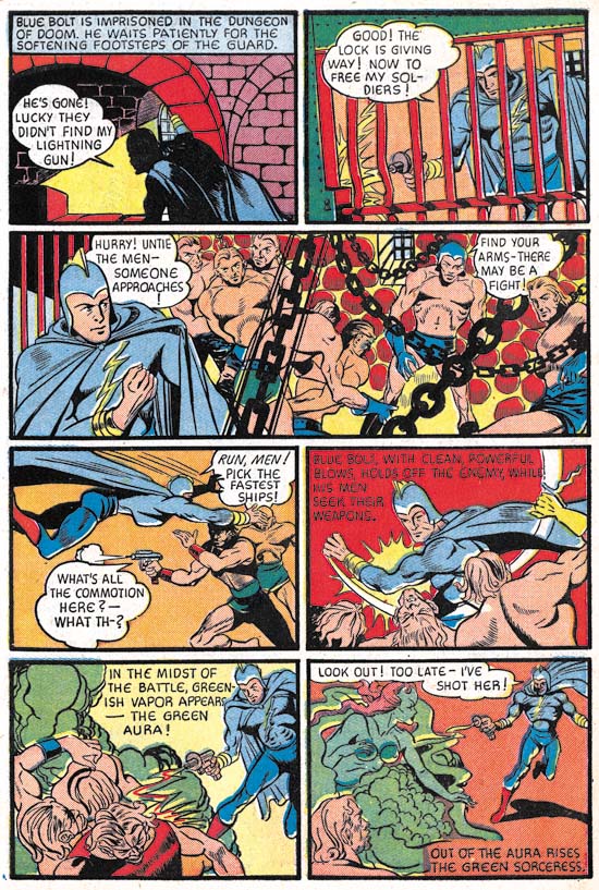
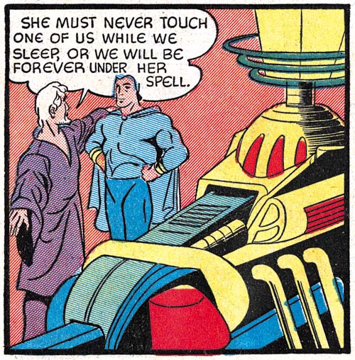
Blue Bolt #2 (July 1940) page 9, pencils and inks by Joe Simon

The story art for Blue Bolt #2 looks rather different from that from its predecessor. One reason for this is that (as mentioned in the previous chapter) the first issue was created earlier then the cover date would suggest. While Blue Bolt was drawn earlier it really was not that much earlier, probably just a matter of a few months. The difference between Simon’s art for the two stories show how rapidly he was adapting to working on comic books. The figure art has improved as well as what can be best described as his ability to graphically tell a story. There also appears to be a greater use of design. For example the interesting architecture in the first panel. Even better examples can be found in the long third panel. The wall is built with round stones giving an overall pattern to the background. Frankly this was not so successful as it gives the image a rather cluttered look. More effective are the chains which besides reflect on the imprisonment of Blue Bolt’s men add interest to the panel without disturbing what is important to the story. The chains are inked as silhouettes which removes them of the third dimension but emphasizes their function as a design element.


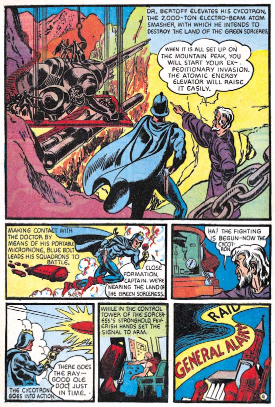
Blue Bolt #2 (July 1940) page 4, pencils and inks by Jack Kirby

The other reason that the art for Blue Bolt #2 looks so different from that in #1 is that some of it was created by Jack Kirby although only Joe Simon was given credit in the splash. In the future Kirby would be the primary penciller of Simon and Kirby productions but that was not the case here. Simon created 6 1/3 of the pages while Kirby only did 3 2/3 pages. Fractions are used in these counts because on the first page Joe did the splash while Jack did the story art. The precise tally is that Simon did pages 1 (splash only), 3 and 6 through 10 while Kirby did pages 1 (story only), 2, 4 and 5. Each artist inked his own pencils.

Note that Kirby introduces a foreground chain in the first splash-like panel but to very different effect. Here the chain is not so much a design element as a means of adding depth to the image. The chain is also carefully inked to provide it with a full dimensionality that is very different from the flat silhouettes that Simon used.


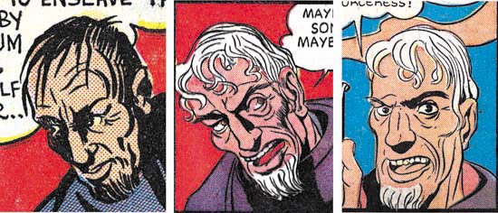
Blue Bolt #1, art by Joe Simon
Blue Bolt #2, page 10, panel 7, art by Joe Simon
Blue Bolt #2, page 1, panel 2, art by Jack Kirby

It is interesting to compare Simon’s artistic progress from Blue Bolt #1 to #2 as well as Kirby’s efforts from issue #2. I have chosen close-up of Dr. Bertoff to provide these comparisons. In BB #1 and much of BB #2 Simon portrays Dr. Bertoff as a rather “ratty” looking individual. A surprising unflattering depiction of a scientific genius. However Dr. Bertoff gets better treatment in some of Simon’s BB #2 art. Now part of this improvement can be credited to Joe’s rapid advancements as a comic book artist. However comparing Simon’s best depiction of Dr. Bertoff with that by Kirby suggests that Joe was also being influenced by Jack. Kirby was never very good at adopting other comic book artists styles but that was something that Simon was very adept at. During this time Joe was doing the cover art for the Fox Comics successfully mimicking Lou Fine. Now Joe was trying to copy Jack’s style. This was desirable because it would give stories produced by Simon and Kirby a unified look. At this early time Simon only achieved limited success at mimicking Kirby but he would greatly improve in the future.


Blue Bolt #2 (July 1940) page 3 panel 5, pencils and inks by Joe Simon

Kirby drew impressive machinery throughout his career. This can be seen even at this early stage in his career as for example the “electro-beam atom smasher” from the splash-like first panel of page 4 shown earlier. Jack did similarly impressive devices on every page of this Blue Bolt story that he drew. Machinery appeared on some of the pages that Simon did but generally more distant views less rich in details. Even in the few close-ups that Joe provided (such as the example from page 5 provided above) his versions were no match for Kirby’s more interesting depictions. It is not clear whether Kirby was given those pages to draw because they would contain such machinery or that Jack inserted such fantastic devices whenever he could.


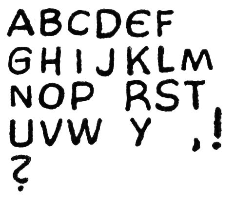
Blue Bolt #2 (July 1940) story letters by unidentified letterer

From past work that Joe Simon and Jack Kirby did it might be expected that either they would letter the pages that they drew or the lettering would be done by one of them. But neither of these likely possibilities was the case. Both Joe and Jack had very distinctive lettering styles (see Early Lettering by Joe Simon and Jack Kirby as a Letterer). But nowhere in Blue Bolt #2 can be found the unique lettering such as Joe’s ‘W’ or Jack’s ‘U’. Instead the story has one rather remarkable ‘E’, shaped like a ‘C’ with a bisected with a short horizontal stroke. I have never seen either Joe or Jack use anything quite like it. Joe’s lettering would improve in years to come and some of his more eccentric traits would become more conservative. In particular his peculiar ‘W’ would become more standardized. So while it is possible that Joe might have temporarily stopped using his more unusual ‘W’ and adopted an equally unique ‘E’ the rest of the lettering still do not look like Simon’s. The BB #2 letters seem rather squat and blocking compared to Joe’s. The ‘R’ often exhibit a curved right leg however when Joe curved that same leg it he curved it in the opposite direction. As for Kirby not only does the Blue Bolt #2 lack Jack’s horseshoe shaped ‘U’ but the manner of writing ‘K’ is also different between the two. My conclusion is that just like Simon brought Jack in to help with the art, he brought in someone else to do the lettering.


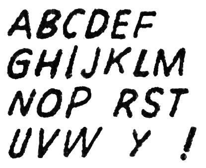
Blue Bolt #2 (July 1940) splash letters by unidentified letterer

The lettering in the splash looks different from the story lettering. Of course much of this is due to the fact that the splash lettering is slanted while in the story the letters are all very vertical. But the splash lettering also looks less squat and uses a more standard form for the ‘E’ and ‘R’ letters. There is one exception found on the last panel on page 8 where the tilted splash lettering is used for a single word. The switch in lettering could have been done to put more emphasis on the word (nowhere in the story does the letterer use the common technique of employing bold lettering to provide emphasis). But it is also possible that the tilted lettering was added later to correct some problem with the original script or lettering. Without the original art it is hard to be sure. My suspicion is that all the lettering, including the splash, was done by one individual. The main piece of evidence to support this is the form of the letter ‘G’ common to both where there is a straight vertical or near vertical segment attached to the horizontal stroke.


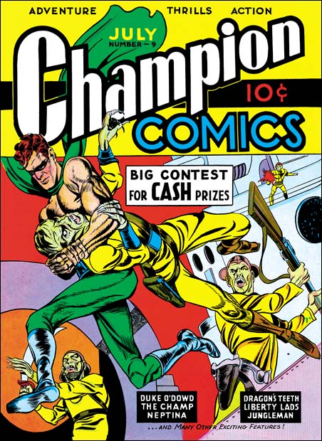
Champion Comics #9 (July 1940) art by Joe Simon and Jack Kirby

Champion Comics #9 came out the same month as Blue Bolt #2. It featured cover art that should be credited to Joe Simon and Jack Kirby. As I mentioned in the previous chapter of this serial post (Blue Bolt #1) I suspect that the Champion #8 (June 1940) cover was the first joint work by Simon and Kirby but I admit not everyone may favor that opinion. Most agree that Champion #9 was a Simon and Kirby production. It appears that Kirby was involved in at least some, if not most, of the penciling. Some have pointed out the way the sole of the runner’s foot is turned to the viewer and have credited this as a Kirby trait. However both Joe and Jack would use this device in the future. As far as I know this is the earliest occurrence of the peculiar technique and therefore it cannot be used to distinguish between the two artists. For it to be used an earlier example would have to be found used by one but not the other artist and to date I have not seen one. While the figure art has a Kirby appearance it is not completely typical of Kirby. I attribute that to Simon’s involvement in the art. The form lines on the runner’s boots look like the work of Simon but much of the rest of the inking does not look like either Joe’s or Jack’s work. So I suspect a third artist may have been involved in the inking.

In the Beginning, Chapter #1, Blue Bolt #1

I have decided to do a serial post on the first ten issues of Blue Bolt (June 1940 to March 1941). It was during this feature that the Simon and Kirby collaboration first developed. There were other comics that Joe and Jack worked on during the start of their partnership but that work was done a piece here and a piece there. However Blue Bolt was a monthly feature allowing us to examine Simon and Kirby learning to work together. But I will use this opportunity to discuss some of the other early work that the two did together or individually during that period.

The first issue of Blue Bolt is cover dated June 1940*. At that time Simon was editor for Fox Comics having started in May. Jack Kirby was also working for Fox primarily on the Blue Beetle syndication strip. Kirby previous experience had also been in syndication strips (although some ended up published in comic books) but in May Jack did some comic book art for Fox as well as moonlighting elsewhere. It surely is no coincidence that Kirby provided stories for Fox during the same month that Simon began as editor. It is even possible that Joe encouraged or even helped Jack to find work moonlighting outside of Fox as that happened at the same time.

Joe Simon had spent about seven years working as a staff artist for newspapers before entering the comic book field. His earliest published comic books were “The Fantastic Thriller of the Walking Corpses” (the Fiery Mask story for Daring Mystery #1), “Solar Patrol” and cover for Silver Streak #2 and another cover for Keen Detective Funnies #17 all cover dated January 1940. However the publication dates for Joe’s early work did not reflect very well the order that the art was actually created. Simon’s earliest comic book work appears to have been the western “Ranch Dude” but that did not appear until Amazing Man #10 from March. Joe was supplying this early work to Funnies Incorporated a shop run by Lloyd Jacquet who apparently held on to some of the stories before finding a use for them. Something similar happened to the first Blue Bolt story but for a special reason. Although Simon supplied it with no more special thought than any of the other art he did, Jacquet recognized the potential for using it for launching a new comic book title. This was quite a coup especially for someone so new to the comic book industry as Joe was. It is uncertain when the art for first Blue Bolt story was actually created but judging from the style I would say it was quite early. Of course not as early as “Ranch Dude” but not too long afterwards.


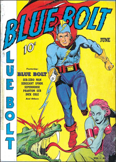
Blue Bolt #1 (June 1940), art by an unidentified artist

Since Simon had no idea about Jacquet’s intentions of using the first Blue Bolt story as the main feature of a new title, he would not have supplied cover art with the story but of course theoretically Joe could have supplied it later. Some have credit Simon for the cover art but I disagree. The style does not seem quite right to me compared to work that Simon is known to have done at that time. Further the dragons in the story have beaks while the one from the cover has a mouth more like an alligator.


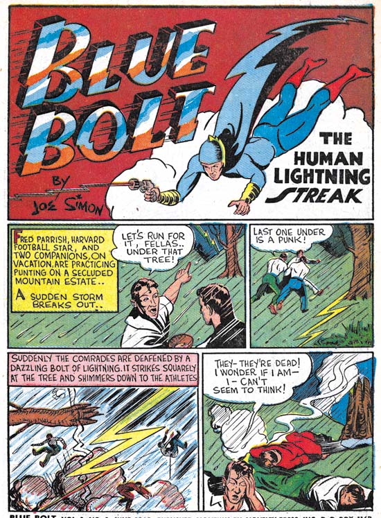
Blue Bolt #1 (June 1940), pencils, inks, script and lettering by Joe Simon

Joe Simon not only penciled the story but he inked and lettered it as well. I remember when the reprint books on Fletcher Hanks came out the introduction remarked that one of the things that made that artist special was that he did all penciling, inking and lettering the story himself. Actually that was not so unusual during the comic book industry’s earlier years. Joe provided all the art except coloring on most of his early works. That is not to say Simon was equally proficient in all aspects of the art. While unconventional and interesting, I would not describe Simon’s lettering as very good. Even today Joe feels his lettering never became truly professional. The lettering for Blue Bolt #1 is in his initial style, examples of which can be seen in my post Early Lettering by Joe Simon. Two aspects of the lettering that may seem unusual to modern readers are the use of borderless captions and the placing of some captions at the bottom of the panel. Joe was a fan of Hal Foster who used low and borderless captions in his Prince Valiant syndication strip.

The art itself is somewhat primitive. While Simon was an accomplished newspaper staff his previous work did not include sequential story telling. Further his newspaper work had been either realistic or cartoonish while comic books required something in between. So it is not surprising that Joe’s earlier art was a bit rough and the story a little weak. This was earlier in the history of comic books and the industry employed many artists whose work was not even as good as Simon’s initial efforts. We can be critical of Simon’s early work knowing what was to come but it should be remembered that the Blue Bolt character and the first story that went with it was good enough for a publisher to release a new title based on it. Something that never happened for most comic book artists and Joe’s time in the business then could be measured in months. Joe learned fast and by the time that Blue Bolt #1 was released he had already been doing covers for Fox Comics that in the past had been attributed to Lou Fine until his small signatures were found (Art by Joe Simon, Chapter 3, Working for the Fox). Even at this stage Simon was better than most comic book artists working in the industry.

One of characteristics of Joe’s early work was one that stayed with him throughout his career, his frequent use of swiping. Some of the swipes come from Prince Valiant (by Hal Foster), Flash Gordon (by Alex Raymond) and pulp art. There may have been other sources as well since some images occur multiple times in Simon’s art but the source of the swipes has not been identified. This topic has been discussed more thoroughly in the serial post Art by Joe Simon. Further discussion of Blue Bolt #1 can be found in Chapter 4, Transition.

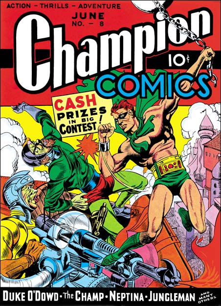
Champion Comics #8 (June 1940) art by Joe Simon and Jack Kirby?

The covers that Simon did for Fox Comics were not the only art that came out the same month as Blue Bolt #1. I have long been puzzled by the correct attributions for the cover art of Champion Comics #8 (June 1940). The art has generally been credited to Joe Simon and in the past that had been my opinion as well. But Joe had certainly met Jack Kirby by this time. The background architecture uses an unusual and varied perspective that can be found in a number of the Fox covers that Simon did but does not occur in any of Kirby’s solo efforts. The figure art is different than that found on the covers that Joe did for Fox Comics. But that is not surprising because Joe was purposely mimicking Lou Fine for Fox in order to provide continuity with the earlier covers now that Fox was no longer using Eisner and Iger to produce the comic art. Not only would Simon not have to mimic Fine for the Champion #8 cover but since it was for a different publisher it would actually be undesirable to do so. Unfortunately there are no earlier cover art by Jack Kirby to compare with Champion #8. There is something Kirby-ish about the figure art but Joe could have picked that up having seen Jack’s work. Kirby would become famous for his slugfests but the hero’s advisory falls back from the punch in a rather stiff and awkward manner that seems hard to accept as something Jack would do even at this early stage in his career.

One rather intriguing aspect of this cover is the elaborate gun. Kirby had a long history of drawing interesting and elaborate machinery. A fanciful gun also appears in the splash for Cosmic Carson story for Science Comics #4 (May 1940, see Early Jack Kirby, Chapter 2, Working for Fox). It has been suggested that the gun from Champion #8 was swiped by Simon from that Cosmic Carson splash. However it is not a close copy and the two guns are quite different. Unlike Kirby, Simon does not have a history of drawing elaborate devices. We shall in future chapters that when machinery appears in Blue Bolt it is Jack, not Joe, that provides it. It is hard for me to accept that Kirby did not have something to do with gun from Champion #8. While I still give Joe Simon most of the credit for the Champion #8 cover I now feel Jack Kirby was involved in some capacity as well. This is important because if I am right than the cover for Champion #8 would be the earliest Simon and Kirby collaboration.
Β 
footnotes:

* Like most of my posts, I am going to be using cover dates. True calendar dates for the release of the comic would be about two months earlier and for the creation of the art five or six months earlier except in special cases like Blue Bolt #1 were the art was not used for some time.

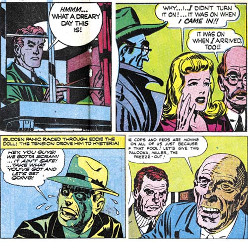
Simon and Kirby Colorists, Chapter 3, More on Prize Crime


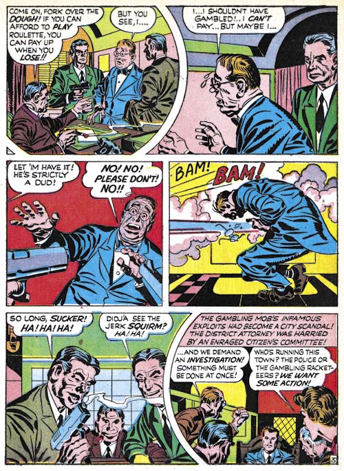
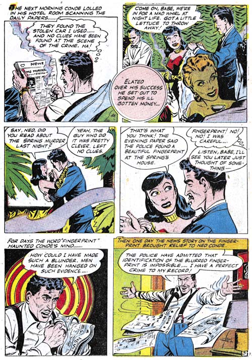
Headline #24 (May 1947) “Grim Pay-Off For The Pinball Mob” page 3, pencils and inks by Jack Kirby

There is one coloring peculiarity whose significance I am still uncertain of that appears during the early crime Headline period. It concerns the use of middle cyan (C50) as hair coloring. The limited palette available for coloring presented a problem when it came to depicting black hair. The problem was not that black was unavailable but rather that using black alone would result in a massive black with no distinction for strands of hair. The convention most comic colorists adopted to circumvent this problem was to use cyan (C) or blue (CM25) to represent black hair. Technically not truly accurate but a convention so widely used that comic book readers took it for granted. This use of cyan or blue to represent black hair is followed in most Simon and Kirby crime stories, but not all. Some stories feature the use of middle cyan (C50) instead. This unusual choice was not an accidental misread by the printer of the original color guide. The presence of pure cyan (C) on the same pages of middle cyan (C50) hair indicates that this was in fact the colorist’s intent. Nor does this seem to be an attempt at representing gray hair. While middle cyan (C50) works quite nicely as gray hair it was used primarily on people with an otherwise young appearance. Further I have not yet found a story which used middle cyan (C50) and either cyan (C) or blue (CM25) for hair coloring. What is less clear is what this use of different hair coloring signifies. Does it indicate two different colorists at work or one colorists purposely adding a little variation to his output? I am still undecided but so far I have recognized no other coloring distinctions between the stories with the two ways of indicating black hair.


Headline #26 (September 1947) “Beyond The Law” page 3, art by unidentified artist

In the previous chapter I mentioned the occasional unusual coloring of people in the early Prize crime comics. I wondered if the same special color was ever done on artwork not drawn by Jack Kirby. A search reveal only a few. I do not make much out of their scarcity as unusually colored people are pretty rare even in the Kirby drawn material. Further most of the examples are found in the earliest issues of the crime version of Headline; issues that Kirby drew most or all of the work. By the time other artists were frequently used less effort seemed to have been expended on the coloring and such unusual coloring of people was no longer done. Still the presence of unusually coloring in material not drawn by Kirby conforms with my believe that the same colorist worked on both Kirby and non-Kirby material.


Color Palette used by Prize for Headline (starting in June 1948)

In the previous chapters I discussed the coloring used in Simon and Kirby crime comics published by Hillman and Prize. Since this material was published during the same period (March to September 1947) differences in the coloring can safely be attributed to the presence of different colorists. However for the period that follows only Prize published Simon and Kirby crime comics. Under these conditions it become less certain that changes in coloring would indicate different colorists. Such changes might also indicate the evolution of a single colorist style.


Headline #30 (June 1948) “Bullet-Proof Bad Man” page 3, pencils by Jack Kirby

One coloring change that is found in the later period and does seem to be significant is the appearance of the use of pale green (C25Y25). The use of pale green (C25Y25) and pale yellow (Y25) was an important distinction between the Hillman and Prize colorists. Now pale green appears does appear in Prize crime comics but without pale yellow. Further studies are needed, but at this time I find no obvious differences between the coloring. So was this just the evolution of the style used by a single colorist or a change of colorists? I am not ready to hazard a guess at this time.

I consider these three chapters on Simon and Kirby colorists as just an initial step. Much further studies are needed. Of particular interest would be around 1954 when Simon and Kirby were producing comics for Prize and Mainline (there own publishing company). This would provide another chance to compare coloring from two different publishers from the same time period. I am not sure when, but I will be returning to this topic sometime in the future.

Simon and Kirby Colorists, Chapter 2, Early Prize Crime


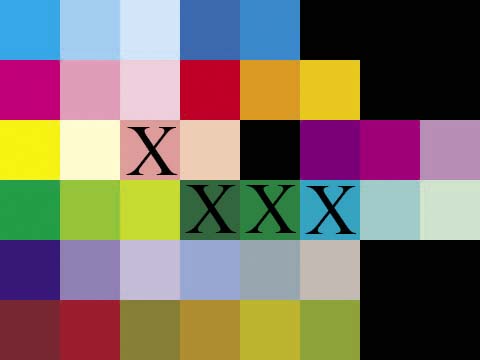
Color Palette used by Prize for Headline (March to September 1947)

C, C50, C25, CM50, CM25, X, X, X
M, M50, M25, MY, YM50, YM25, X, X
Y, Y25, M50Y25, M25Y25, X, MC50, MC25, M50C25
CY, YC50, YC25, CYM50, CYM25, CY25, C50Y25, C25Y25
CM, C50M50, C25M25, C50M25, C50M25Y25, C25M25Y25, X, X
MYC50, MYC25, YC50M50, YM50C25, YC25M25, YC50M25, X, X

In the previous chapter I discussed the coloring used by Hillman in Clue Comics and Real Clue Crime Stories. Now I will write about the coloring used in Headline Comics published by Prize during the same period (March to September 1947). To facilitate comparing the colors I have devised a standard palette of 38 colors. That is not to say that the standard palette will cover all comics published during the golden age. I may have to expand it in the future but it covers all the colors I will be discussing at this time. Hillman used 34 of the standard palette while during the same period Prize’s Headline used 30. However this is can be a bit misleading because not all the colors that Hillman used but Prize did not are really significant. In particular Hillman rarely used deep violet (CM) or red brown (MYC25) (see the previous chapter for an explanation of the terminology I am using to precisely identify the colors). However there are some colors not used by Hillman that are pretty rare in Headline; deep green (CYM50), dark green (CYM25) and emerald blue (CY25). There are two colors absent from Headline that did in fact play an important roll in the Hillman palette; pale yellow (Y25) and pale green (C25Y25).

However I do not believe that colorists can be identified by the presence of a particular color in their work. With such a limited palette available to golden age colorists it seems almost certain that more than one used pale yellow (Y25), pale green (C25Y25) or both. While the early Headline crime colorist did not use pale green (C25Y25) this color would appear in a later period, although without pale yellow (Y25).

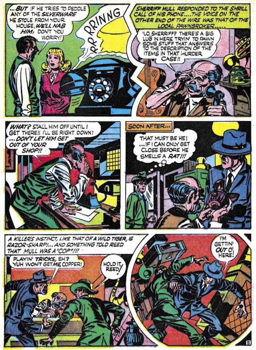
To circumvent the limitations of using just the color palette, I also compare how particular objects are colored. For example both the Hillman and Prize colorist use dark blue (CM25) for police uniforms but the Hillman colorist uses dark brown (MYC50) for the shoes and boots worn by the police while the Prize colorist uses cyan (C).


Headline #24 (May 1947) “Murder on a Wave Length” page 2, pencils by Jack Kirby

While the Hillman colorist generally uses middle green for foliage, the Prize colorist uses a greater variety of colors such as green (CY), middle green (YC50), light green (YC25) and even some very unnatural colors such as middle magenta (M50) or orange (YM50).


Headline #24 (May 1947) “Murder on a Wave Length” page 5, pencils by Jack Kirby

Furniture was coloring by the Hillman artist in a single brown or more rarely in two brown colors (usually CYM50, YC50M50, YC50M25 or YC25M25). The Prize artists often did furniture such as desk in a combination of two colors selecting from the same browns but also sometimes using some very unnatural colors as well.


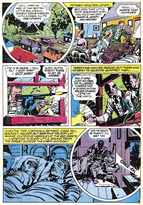
Headline #23 (March 1947) “The Last Bloody Days of Babyface Nelson” page 4, pencils by Jack Kirby

When the Hillman colorist did night scenes, such as in “Get Me the Golden Gun” (Real Clue Crime Stories v.2 n.6, August 1947 as shown in the first chapter), only the presence of the moon suggests that the story occurs in the dark otherwise the coloring is just like in the day scenes. The Prize colorist, however, did distinctive night scenes. Coloring for the night scenes is largely limited to blue colors (generally C, CM25, C and C50) or violets (C50M50 and C25M25).


Headline #24 (May 1947) “A Phantom Pulls the Trigger” page 1
Headline #24 (May 1947) “Murder on a Wave Length” page 4
Headline #25 (July 1947) “Masquerade of Eddie the Doll” page 6
Headline #26 (September 1947) “The Strange Aftermath of the Kansas City Massacre” page 4 (all pencils by Jack Kirby)

Perhaps the most distinctive trait of the early Prize crime colorist was the occasional unusual coloring of people. The effect I am referring is not the blocking out of a figure in a single color (usually light violet, C25M25) that both the Hillman and the Prize colorists would sometimes do. The Prize colorist would go much further and use very unnatural colors. The Prize colorist did not do this very often but I have never seen the Hillman colorist do it.

The period I have been discussing in this and the previous chapter was from March to September 1947 during which time Simon and Kirby produced work for both Hillman and Prize. Undoubtedly because Prize offered a better financial deal, afterwards Joe and Jack stopped working for Hillman and Prize became their almost exclusive employer (they still were providing Boy Commandos for DC). I will discuss some of the coloring done in the Headline Comics and Justice Traps the Guilty in the next chapter.

Simon and Kirby Colorists, Chapter 1, Hillman

Generally little is known about the comic book colorists during the golden age. Credits usually were not provided and while pencilers and inkers would sometimes leave signatures there was no outlet for colorists to make their contribution known. Occasionally there is documentary evidence about particular colorists but largely they remain anonymous. None the less I have begun to investigate coloring done on Simon and Kirby productions. I may not be able to identify all the colorists but I am still interested in seeing what can be learned about the effect different colorists had upon the comics.

Currently I have been examining interior coloring. Covers were typically handled by different printers than the interior pages. The special paper and attention given to covers allowed the use of colors and tonal gradations that did not appear in the interior art. Both the cover and interior art was printed using cyan, magenta, yellow and black inks (CMYK). In general, CMYK printing allows a wide range of colors to be represented. Actually not every color can be created by combinations of the CMYK inks but those that cannot are a very small part of the color spectrum and are so close to colors that can be printed by CMYK that their absence is difficult to notice.

However the interior art in comic books was printed using a very limited palette. CMYK printing achieves color tones by the amount of area the ink covers. Typically, and this will be true of all the comics I will be discussing here, interior inks were limited to three tones 100%, 50% and 25%. It is possible to use 75% ink tones but printers find it difficult to do properly with the primitive presses and poor quality paper used for comic books. I have seen 75% tones used in comic books but it is quite rare and with a special exception to be discussed below it was not done in the books I will be discussing.

There are further limitations. No tones were used for the black ink. Actually this was not too limiting because black tones, that is the grays, can be achieved using combinations of CMY inks. Another limitation is that none of the comics I will be discussing use 50% yellow. I have seen it done elsewhere but again it is very rare. With three levels of cyan and magenta, two levels of yellow and one level of black it is possible to create at most 48 colors* (including white, the absence of any ink). The palette is actually even more limited in practice since about a dozen are rarely used. Most are combinations that include 25% yellow.


Generalized Comic Color Palette

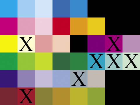
C, C50, C25, CM50, CM25, X, X, X
M, M50, M25, MY, YM50, YM25, X, X
Y, Y25, M50Y25, M25Y25, X, MC50, MC25, M50C25
CY, YC50, YC25, CYM50, CYM25, CY25, C50Y25, C25Y25
CM, C50M50, C25M25, C50M25, C50M25Y25, C25M25Y25, X, X
MYC50, MYC25, YC50M50, YM50C25, YC25M25, YC50M25, X, X

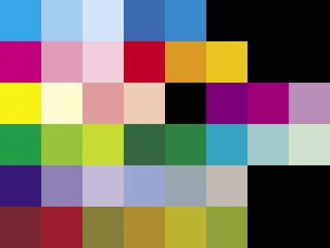
Referring to colors as, for example, 100% yellow plus 50% magenta plus 25% cyan (brown), is somewhat tiring. The industry uses a designation which I find confusing so instead I will adopt my own using the first initial followed, if not 100%, by the percentage. So my brown example would be YM50C25. I always placed them in the order of dominance or (when two inks are equally strong) the order they are found in CMY. While this is an improvement it is still too difficult to use lists of such color designations when comparing palettes used. So I have also developed a matrix to show the color palettes. I show above the standard color palette that I will be using followed by the corresponding color designations (where an X indicates an unused matrix location shown as black). If a color is not used in a particular palette it will be ‘X’ out in the matrix. The first row is for blues; the second for reds; the third row for yellows, flesh colors and purples; the fourth row for greens; the fifth row for violets and grays; and the sixth for browns and one dirty green (YC50M25). In the future I will either use some of the currently undefined matrix locations or add additional rows for colors not included in the current matrix.


Color Palette used by Hillman in Clue and Real Clue Comics.

Joe Simon has said that the coloring was the responsibility of the publisher. There was a period (cover dates March to September 1947) where Simon and Kirby were producing work for crime comics from two different publishers; Clue Comics and Real Clue Crime Stories for Hillman and Headline Comics for Prize. It would therefore be interesting to compare the coloring between the two. The Simon and Kirby work produced for Clue and its renamed title Real Clue used a more complete palette than those for Headline. The Hillman work used 38 colors (excluding black and white). But this is a little misleading because some of the colors were rarely used; deep blue (CM50), some of the purple tints (MC25 and M50C25), and red brown (MYC25).


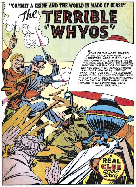
Real Clue Crime Stories v.2 n.5 (July 1947) “The Terrible Whyos”, pencils and inks by Jack Kirby

Perhaps the most distinctive feature of the Hillman palette was the common use of light yellow (Y25). We will see that this color was not used in Prize’s Headline Comics. Considering how most colors that include Y25 are avoided, it is surprising how often light yellow (Y25) was used. In one case Y25 was used for an automobile but it seems a poor choice for coloring prominent objects. However light yellow was generally used for background areas and it was surprisingly effective in making accompanying white areas stand out.

As mentioned previously, red brown (MYC25) was rarely employed but the other browns (dark MYC50, heavy YC50M50, medium YM50C25 and light YC25M25) were more frequently used. However not equally so as light brown (YC25M25) was not used nearly as commonly as the other three browns. Another not so frequently used color was dirty green (YC50M25).


Real Clue Crime Stories v.2 n.7 (September 1947) “Gang War” page 5, pencils by Jack Kirby

Besides light yellow (Y25) the only other unusual colors with frequent use from the Hillman palette are pale green (C25Y25) and dark grey (C50M25Y25). Frankly with the very limited palette available for comic books the presence or absents of particular colors are of limited use in distinguishing different colorists. Also of use is how the artists uses the colors for the different objects. For instance the Hillman colorist generally uses middle green (YC50) for foliage and only much more rarely green (CY) or pale green (C25Y25). Police uniforms are dark blue (CM25) with brown shoes or boots. Caption boxes were colored with a variety of light colors; yellow (Y), light yellow (Y25), pale green (C25Y25), light orange (YM25) and even white. Desks and chairs are usual have a single color; generally dark brown (YMC50), heavy brown (YC50M50) or light brown (YM50C25).


Real Clue Crime Stories v.2 n.5 (July 1947) “The Terrible Whyos” page 4, pencils and inks by Jack Kirby

Most golden age colorists were more concerned with providing clarity to a scene by providing the different objects with distinct colors. Realistic coloring was not a high priority. So with the Hillman colorist we get such oddities as multi-color sidewalks, pale green buildings and some really bizarre interiors. Not very realistic, but all more interesting than if a more realistic, and therefore more limited, selection of colors were used.


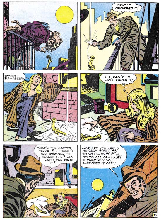
Real Clue Crime Stories v.2 n.6 August 1947) “Get Me the Golden Gun” page 13, pencils and inks by Jack Kirby

As previously mentioned, golden age colorists did not generally use graduated color tones for interior art. That is colors were restricted to mixtures of 100%, %50 or %25 of the cyan, magenta or yellow inks. But there was an exception to this rule and that was the use of simple color gradient usually to the background. The Hillman colorist made use of this varying a one ink of a color from 75% to 25%. Usually this was done rather smoothly but occasionally less care was taken. This was the sole exception that the Hillman colorist made to not using a 75% ink. The use of a starting value of 75% was not a whim. With the primitive presses used for comic books, 75% would sometimes fill in and become effectively 100%. If this happened to a gradient that started at 100% then a poor gradient would result with over much of it a pure color. With gradients starting at 75% any similar filling in would still provide a suitable gradient.

Although I have concentrated on the coloring of the Simon and Kirby pieces, the same colorists seemed to work on the stories drawn by other artists as well. The pencilers and inkers for Clue and Real Clue were used in other Hillman comics and were not the same ones that Simon and Kirby used for Prize’s Headline Comics. I therefore believe that Simon and Kirby were just supplying art to Hillman and not producing the entire comic as they were doing for Prize. I will compare the Hillman colorist to that used for Prize’s Headline Comic next week.

footnotes
* the complete comic color palette for three levels of cyan and magenta, two of yellow and a single of black. Those marked with asterisk are not shown in my standard comic palette:

KΒ Β Β Β Β Β Β  CMY25*Β Β Β Β Β  CM
C50MYΒ Β Β  C50MY25*Β Β Β  C50M
C25MYΒ Β Β  C25MY25*Β Β Β  C25M
MYΒ Β Β Β Β Β  MY25*Β Β Β Β Β Β  M
Β Β Β Β 
CM50YΒ Β Β  CM50Y25*Β Β Β  CM50
C50M50YΒ  C50M50Y25*Β  C50M50
C25M50YΒ  C25M50Y25*Β  C25M50
M50YΒ Β Β Β  M50Y25*Β Β Β Β  M50

CM25YΒ Β Β  CM25Y25*Β Β Β  CM25
C50M25YΒ  C50M25Y25Β Β  C50M25
C25M25YΒ  C25M25Y25Β Β  C25M25
M25YΒ Β Β Β  M25Y25Β Β Β Β Β  M25

CYΒ Β Β Β Β Β  CY25*Β Β Β Β Β Β  C
C50YΒ Β Β Β  C50Y25Β Β Β Β Β  C50
C25YΒ Β Β Β  C25Y25Β Β Β Β Β  C25
YΒ Β Β Β Β Β Β  Y25Β Β Β Β Β Β Β Β  W

Criminal Artist, Chapter 4, Ted Galindo

If I were writing this serial post based on the amount of material produced for the Prize crime comics, Ted Galindo would have had the third chapter ahead of Bill Draut. Although he worked on Prize crime comics for just a little over two years he was quite productive during that time. Some issues even had two stories drawn by this artist. Most of Ted’s art appeared in Justice Traps the Guilty because the other Prize title, Headline, was cancelled only two issues after Galindo started to provide work.


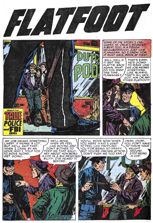
Justice Traps the Guilty #68 (November 1954) “Flatfoot”, art by Ted Galindo

Galindo’s first piece for Prize Comics was “Flatfoot” from Justice Traps the Guilty #68 (November 1954). This was even before “It’s Mutual” that he did for Foxhole #4 (April 1955). The earliest listing for Ted in the GCD is February 1955 so it is possible that “Flatfoot” is Galindo’s earliest published comic book art (or not, the GCD is a work in progress and is not always accurate). In this early piece, Ted is already an accomplished artist but has not arrived at his more distinctive style. The most significant difference is the much heavier inking. His later work would have a minimum of spotting but blacks played an important part of the art in “Flatfoot”. Ted’s predilection for splashless stories is also suggested by the rather small splash provided in this story. AlsoΒ already presentΒ isΒ Galindo’s fondness for tall narrow panels.


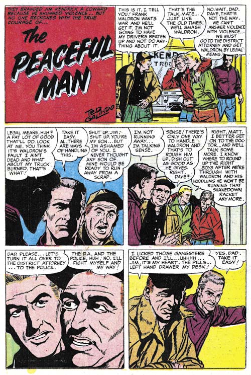
Justice Traps the Guilty #84 (December 1956) “The Peaceful Man”, art by Ted Galindo

Galindo’s JTTG #68 work was not repeated and this artist would not reappear until “Flash Cameron Investigates a Disaster” for Headline #76 (May 1956). Judging from the GCD, Galindo had worked in the interim mostly for Charlton. With his reappearance in Prize Comics, Ted had fully arrived at his familiar style. Most of his stories would not include a splash panel but would instead start with a title panel no larger than the rest of the story panels. Since most artists in the Prize crime comics used half page splashes, Galindo’s format indicates that even though Prize artists were working from a script they still had leeway in the panel layouts. His inking would be light with minimum spotting. But when he used black it was usually in relatively large areas filled with ink.


Justice Traps the Guilty #85 (February 1957) “The Coffee Man” page 3, art by Ted Galindo

One of Galindo’s strengths was his adept characterizations. The post Comic Code Prize crime comics often included sequences of talking heads. with less talented hands these sequences could become rather boring, but Galindo’s carefully handling of the viewing angle and his effective emotional portrayals keep his stories interesting. On page 3 of “The Coffee Man” You can just feel the captain’s discomfort with a disagreeable duty. Even more importantly you can see Willie’s progression from a happy attitude to sadden realization that his life has been drastically offered. No blazing guns, but still a great piece of comic book art.


Justice Traps the Guilty #87 (June 1957) “Wall Of Silence” page 6, art by Ted Galindo

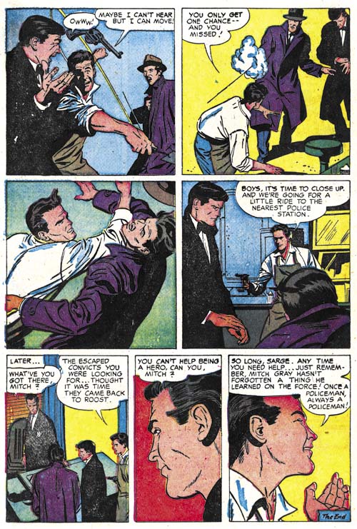
While Galindo could handle emotional portrayal he was no slouch when it came to action. As the example from “Wall of Silence” shows, this was not Kirby action. Frankly I am not sure where Galindo drew his inspiration, perhaps from Alex Raymond’s syndication strip Rip Kirby.


Justice Traps the Guilty #89 (October 1957) “The Printed Word” page 4, art by Ted Galindo

Generally Galindo’s strengths lay in his careful handling of talking heads and action, but in “The Printed Word” he shows how well he could do suspense. And it is not just page 4, the whole story is filled with effective drama. Ted’s use of blacks plays a important roll in the telling of the story. Note in particular how sinister the assailants shadowed face is in the final panel. The 50’s were important years for Alfred Hitchcock with such movies as “Strangers on a Train”, “Dial M for Murder” and “Rear Window”. I am sure Galindo was paying attention and that Hitchcock was an important influence, particularly for this story.


Justice Traps the Guilty #91 (February 1958) “G-Man Justice”, art by Ted Galindo

As I mentioned earlier, most of Galindo’s crime stories do not include a splash. “G-Man Justice” is one of the rare exceptions. During most of the later history of Justice Traps the Guilty Marvin Stein was the primary artist and would provide the cover and the lead story. But during the end of the run Stein’s prominence was replaced by other artist. This provided Galindo with the opportunity to provide a lead story. But a lead story had to have a splash and I suspect this is why Galindo provided one for “G-Man Justice”. It is not a bad job, but in all honesty it is not that great either.

Ted Galindo did a lot of romance art first for the Prize love comics not produced by Simon and Kirby (All for Love and Personal Love) and later in all the titles edited by Joe Simon alone. I have discussed this work in the final chapters of the Art of Romance (Chapters 32, 33, 34, 35, 36, 37 and 38). Galindo’s romance work was rather nice, but it is his crime art that really shines. Ted also did work for the re-launched Black Magic. Hopefully someday I will write about that title as well.

Replacing Simon and Kirby, Chapter 4, Sandman

Sometime ago I posted about the artists that replaced Joe Simon and Jack Kirby during the period that both were performing military service. (Replacing Simon and Kirby, Chapter 1, Chapter 2 and Chapter 3). My previous postings concerned the Newsboy Legion but here I am going to discuss Sandman. Unfortunately the reader will be at a greater disadvantage compared to previous chapters. While DC’s Newsboy Legion archives included work done by other artists, the Simon and Kirby Sandman Archive was limited to just Joe and Jack (at least that was DC’s intention).

To refresh the reader’s memory, while working for DC Joe and Jack realized that they would soon have to leave to perform their military duty. So they worked hard at creating an inventory that could be used while they were gone. Simon and Kirby were able to provide quite a bit of inventory but eventually it ran out.


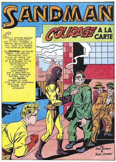
Adventure #91 (April 1944) “Courage a la Carte”, pencils by Jack Kirby

The Sandman covers and adventures that appeared before issue #91 were done by Simon and Kirby. While the splash for “Courage a la Carte” was not Joe and Jack’s finest job, I am confident that Kirby did the pencils. The most obvious give-a-way is the thug at on the right of the splash. I have no idea who the inker was but obviously it was neither Joe nor Jack. Like I said this was not their finest effort but their inventoried work often was not quite as nice as their less rushed efforts.


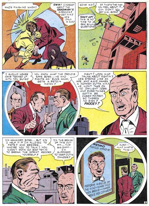
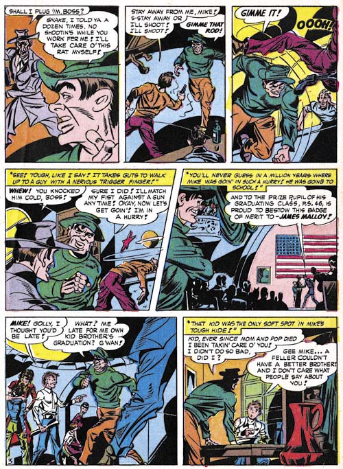
Adventure #91 (April 1944) “Courage a la Carte” page 3, pencils by Gil Kane?

But what followed the splash to “Courage a la Carte” looks pretty crude, much cruder than would be expected even for the inventory work. For good reason because it was not penciled by either Jack or Joe. Kane would have been very young at the time and even he admitted that his efforts at the time were rather poor. The attribution of this art to Gil Kane is not based on the art itself, instead I base this attribution on a statement that Gil made

I got a β€œNewsboy Legion” job to do by myself (like I had done the rest of them except they didn’t fix it up or do the splash),

So far “Courage a la Carte” and “The Lady of Linden Lane” (Star Spangled #30, March 1944) are the only stories for DC that I have seen with a Kirby splash for a story otherwise done by another artist (although I have not studied the Boy Commandos stories yet). Since the circumstances matches Gil’s remarks, I have tentatively credit him for these pieces. The two Kane stories were published at about the same time (while I use March as the cover date for Adventure #91, that title was actually a bimonthly) but were likely to have been done earlier and inventoried like the rest of Simon and Kirby’s work.

Unlike most of the Sandman art that I cover in this chapter, “Courage a la Carte” was one of the stories included in DC’s Simon and Kirby Sandman Archives. It is also listed in the Jack Kirby Checklist. But as I said above, Kirby only drew the splash.


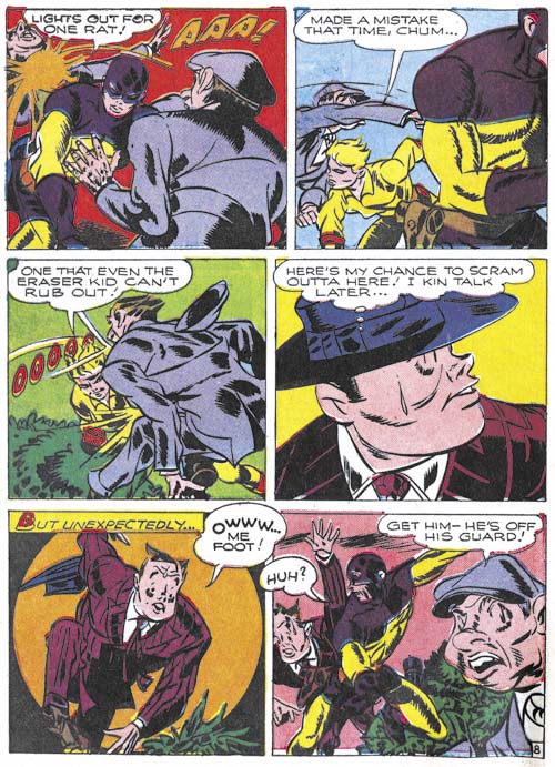
Adventure #92 (June 1944) “Tough Guy” page 3, pencils by unidentified artist

After Kane, work on Sandman was done by another artist, the same one who followed Gil on the Newsboy Legion. Earlier I had misidentified this artist as Kane but the timeline simply will not support that. Kane entered military service in April or May 1944 but work by this artist appeared until October 1945. Joe Simon suggested that this might be the Cazeneuve brothers, but I have seen enough of their work to discount them. Other suggestions have been made but I have not found them convincing either.

The work by this artist is nothing like that for Simon and Kirby but it would be a mistake to discount him. I find his art to be interesting and original. The quality varies from story to story but I have now come to believe that much of that was due to the various inkers used on his pencils.


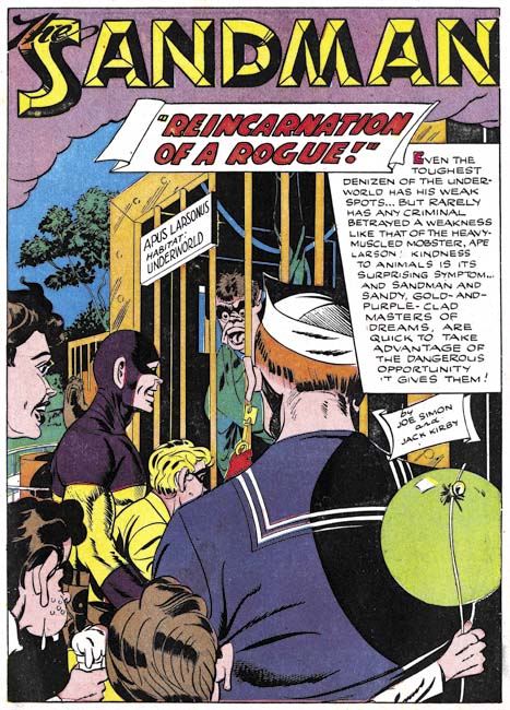
Adventure #94 (October 1944) “Reincarnation of a Rogue”, pencils by unidentified artist

The same replacement artists discussed above worked on a number of Sandman stories. The stories were still credited to Simon and Kirby but were any of their fans really fooled? I really enjoy much of his story art but find most of his splashes not all that interesting. I include above one of the better examples of his splashes.


Adventure #95 (December 1944) “The Riddle of the Rembrandt”, pencils by unidentified artist

The main replacement for Simon and Kirby had an uninterrupted run for the Newsboy Legion (Star Spangled #31 to #49, April 1944 to October 1945). But he only did three issues of the bimonthly Sandman (Adventure #92 to #94, June to October 1944) before another artist was used. Like most of the replacement artists, I really have no idea who did “The Riddle of the Rembrandt” but his talent is pretty obvious.


Adventure #97 (April 1945) “No Curtains for Cupid”, pencils by unidentified artist

The main replacement Simon and Kirby replacement returned after a single issue absence. “No Curtains for Cupid” looks rather different from the other examples I provided above. I still feel they were done by the same penciler but in my opinion much of the apparent differences can be assigned to the wide range of inkers used. Regardless of the inker, the art retains a unique style.


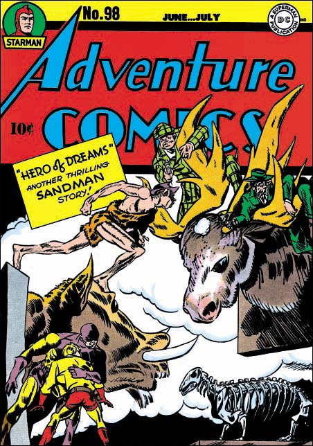
Adventure #98 (June 1945), pencils by unidentified artist

The cover to Adventure #98 was previously discussed on this blog (Not Kirby, Adventure #98). In that post I recounted a number of reasons why I felt the cover was not done by Jack Kirby but the most important of them was the manner that the caveman’s right forearm was drawn. Kirby’s anatomy was not accurate but he always made kept a solid underlying form. The form of the caveman’s forearm is broken in a manner that Jack never did. To all the reasons I previously presented I can now add another. a mirror image of the caveman figure (in more modern clothing) is also found twice on the cover of Star Spangled #45 (June 1945, Replacing Simon and Kirby, Chapter 2). This is much too much use of the same image to credit to Jack. Swiping is a much more obvious explanation.

The main replacement artist would also provide the work for Adventure #99. This means with the exception of a single issue (Adventure #95) the main replacement artist would draw Adventure #92 to #99; June 1944 to August 1945. This matches pretty well with his uninterrupted run for the Newsboy Legion.


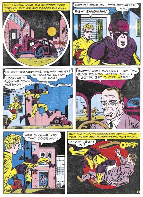
Adventure #100 (October 1945) “Sweets For Swag” page 9, pencils by unidentified artist

Jack Kirby returns to Adventure Comics with issue #100. However Kirby only provided the cover while the interior Sandman story was done by a rather inferior penciler. The primitive art for “Sweets for Swag” remind me of the work that I am now attributing to Gil Kane. In fact the main replacement artist run for the Newsboy Legion was also followed by what looks like the same artist in Star Spangled #52 (January 1946, Chapter 2). In Chapter 2 I had questionably credited it to Gil Kane but I am having second thoughts. Gil would have been entering the armed forces at the time this art was created so it seem unlikely he would have drawn it. This story is another one that was mistakenly attributed to Kirby in the DC Simon and Kirby Sandman Archives and the Jack Kirby Checklist.


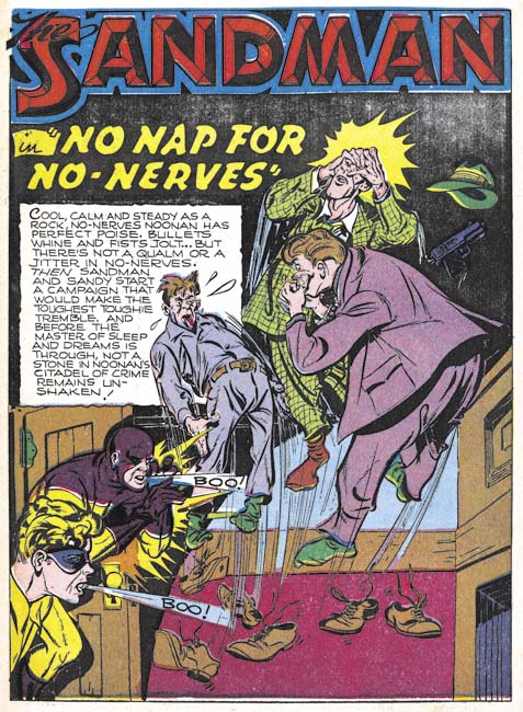
Adventure #101 (December 1945) “No Nap for No-Nerves”, pencils by unidentified artist

Once again Kirby provides a cover for Adventure #101 (December 1945) but did not draw the interior story. The artist who did do “No Nap for No-Nerves” did a good job although I got to say that in his splash Sandy and the Sandman appear to be blowing the thugs away and not scaring them out of their shoes.


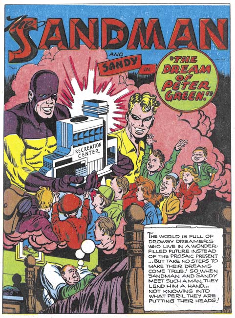
Adventure #102 (February 1946) “The Dream Of Peter Green”, pencils by Jack Kirby

With Adventure #102 Kirby is finally back to drawing both the cover and the story art. Sandman was back in safe hands and all was once again good with the world. Or that would have been the case if this was not the last Adventure issue to include the Sandman and Sandy. Yes the Sandman was replaced with Superboy and Kirby would not appear in the title again until 1958 when, without Simon, he drew Green Arrow. A convenient explanation for the sudden demise of Sandman so shortly after Kirby’s return would by that it was a reprisal to Simon and Kirby going to a competitor, Harvey Comics, to publish their Stuntman and Boy Explorers. While that would make an interesting story the timing just does not work. While Adventure #103 and Stuntman #1 would both come out in April, DC would have to have made the decision to change directions with Adventure before they were likely to have found out about Simon and Kirby’s defection.

While Simon and Kirby were away, the two titles followed a similar timeline.

  • March/April 1944 – Kirby drawn splash, rest of story by Gil Kane?
  • April/June 1944 – First story by the main replacement artist
  • June 1945 – First cover by the main replacement artist
  • August 1945 – Last story by the main replacement artist
  • September/October 1945 – First cover by the returned Kirby
  • February 1946 – First story by the returned Kirby

There remains one other feature to be considered, the Boy Commandos.

Bullseye #7, This is the End


Bullseye #7 (August 1955), pencils and inks by Jack Kirby

The bulls-eye pattern returns to the cover image for Bullseye #7. The overlapping figures creates an interesting design where the background figures are carefully framed by the foreground ones. It is always little more thanΒ guesswork when trying to credit who did what in the Simon and Kirby collaboration, in this case I suspect that Jack did the layout since this sort of careful arrangement of figures was often found in the work he produced later when working without Joe. While it is an interesting composition, it is not at all clear what is being depicted. All three individuals appear to be aiming their arrows at different targets, so it does not appear to be a shooting contest. Bullseye’s smile would be out of place for a combat usage. In any case why would a cavalry soldier be using a bow and arrow? While Simon and Kirby covers generally can be decoded to reveal a story, the cover for Bullseye #7 seems meant to be nothing more than an compelling image.


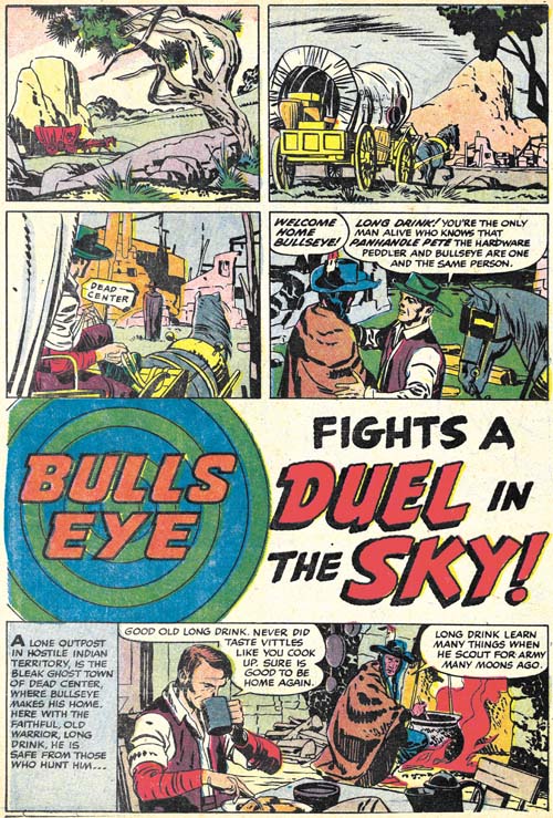
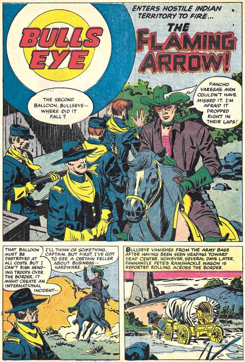
Bullseye #7 (August 1955) “Duel in the Sky”, pencils and inks by Jack Kirby

The first story, “Duel in the Sky”, has an unusual opening; no splash panel and the title occurs below two panel tiers and above another story panel. Kirby has used splash-less stories before but this one is special. The first three panels have no text and show nothing more than Bullseye’s alter-ego traveling over a western landscape. Simon and Kirby usually try to fill their stories with as much as possible so allocating the three panels used in this introduction is quite special. Obviously the introduction was considered worth it but perhaps the splash was sacrificed to make room for it (it is the only Bullseye story without a splash). This introduction shows Bullseye returning to Dead Center, his birthplace, to visit his friend Long Drink. Normally Bullseye traveled about; only in one other story (“The Ghosts of Dead Center”, Bullseye #3) does Bullseye visit Dead Center. This sort of reference to his past was unusual at that time where continuity was pretty much neglected in comic books.

Kirby always had a penchant for technology so I suspect it was his idea to include balloons in this story. The use of such a technology at that period is not unrealistic. During the civil war an attempt was made to use hot air balloons for observation. Unfortunately the balloons became a target and at least one was shot down. In any case the balloons adds interest to another Simon and Kirby masterpiece. It does not hurt either that the story ends with another fantastic Kirby fight.


Bullseye #7 (August 1955) “The Flaming Arrow”, pencils and inks by Jack Kirby

While “Duel in the Sky” has a perfectly acceptable ending, “The Flaming Arrow” picks up from there with Bullseye going off to prevent an errant balloon from falling into the hands of Mexican bandits. It is a short but rather nice piece that ends with Bullseye returning to visit Long Drink once again, the last page being a bookend to the first page of “Duel in the Sky”. In fact the same three panels, with slightly different cropping, that showed Bullseye traveling show up again.


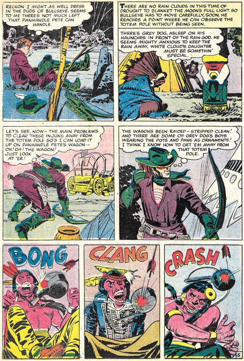
Bullseye #7 (August 1955) “The Stolen Rain God” page 5, pencils and inks by Jack Kirby

The next and what would turn out to be the final Bullseye story, “The Stolen Rain God” opens with a double page splash. I have discussed this piece of art previously in my yet to be completed serial post (The Wide Angle Scream, Almost an Afterthought). Simon and Kirby had a long history of the use of these wide splashes but there were only two created during the Mainline/Charlton period and this was the only one actually published on two pages (the other from Win A Prize #1 was rotated and printed on a single page, see the previous link).

Since I have already posted on the splash page, here I include an image of page 5. It serves as a reminder that while action was the key component of many Simon and Kirby productions, and Bullseye in particular, humor also played an important roll. The very physical humor found in the last three panels is very typical of Kirby.


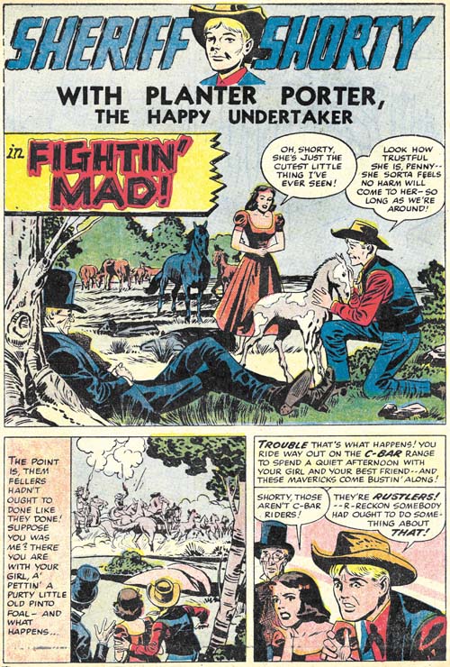
Bullseye #7 (August 1955) “Fightin’ Mad”, pencils by Jack Kirby, inks by Joe Simon?

This issues ends with a Sheriff Shorty feature drawn by Kirby. This makes Bullseye #7 the only issue from that title entirely drawn by Jack. Normally this would make issue #7 a very special comic. The Sheriff Shorty story is special alright but for the wrong reason. It is a rare example of a clunker drawn by Kirby. The action scenes are uncharacteristically poorly executed and this cannot be blamed on the inker. Further the humor does not quite work. Hey everybody can have a bad day.

None of the Mainline titles lasted very long at Charlton, theyΒ were usually terminated after two issues (except for Foxhole which lasted for a third issue but that last issue appears to have been produced by Charlton without any involvement from Simon and Kirby). Bullseye was not an exception and issue #7 would be the last. In my opinion, all the Mainline titles were special but for Kirby fans Bullseye would be the most important. None of the other Mainline titles has anywhere near as much of Kirby drawn material. The only comic from this period that does was Fighting American. Which makes it especially unfortunate that Bullseye has never been reprinted. With the resurgence of interest in Kirby, hopefully that will change in the not too distant future.

Criminal Artist, Chapter 3, Bill Draut

After Simon and Kirby stopped producing the Prize crime titles, Bill Draut did not contribute much as compared to artists previously discussed in this serial post, Marvin Stein and Mort Meskin. But he is an artist that I admire and it is nice to see him get a chance to work on a genre other than romance.


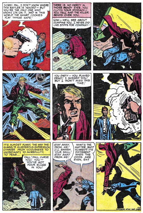
Justice Traps the Guilty #71 (February 1955) “Escape” page 3, pencils and inks by Bill Draut

Draut’s first return to the Prize crime titles occurring in Justice Traps the Guilty #71 (“Escape”, February 1955). I do not understand why Bill decided to do this piece. Draut seemed to be getting a fair amount of work from Joe and Jack so why do work for the Prize crime comics which I believed offered less money? But whatever the motivation, Draut did a nice job. I provide an example of an action sequence which Bill handles quite well. Still it does not read quite as well as say similar fight sequences by Marvin Stein. How did the hero manage to flip the attacking criminal in the last two panels?

Draut did his own inking on just about everything he did, well at least up to 60’s. His inking manner in “Escape” pretty much matches what he had been using earlier. I guess the best description would be splotchy. Not really messy but with clothing dominated by rounded areas of black and with little use of narrow smooth folds.


Headline #74 (January 1956) “Never See Morning”, pencils and inks by Bill Draut

Whatever reasons Draut had for doing “Escape” it was an isolated piece. Draut would not do any other crime work for the rest of 1955 (cover date). His return to the crime titles in 1956 is easy to explain. During that year Jack Kirby began to draw pretty much all the contents of the Prize romance comics. Since those romance titles were the main source of work for Draut, this left him much in need of other sources of income.

Draut would draw a peculiar series for Headline. The hero of the feature was a gossip columnist whose evening work at places like night clubs placed him in a position to fight crime as well. But that is not was peculiar about the feature, what was odd was that there never was anything in the title to indicate that this was a serial feature. You learned his name, Nick Kolby, in the story but it was only once mentioned in the title and even then not prominently. There seemed no reason not promote the feature as that was done for another returning feature in Headline at that time, Flash Cameron, a newspaper photographer who also fights crime. If Prize thought another newspaper crime fighter was too much, then why have not have Draut do some other type of crime fighter?


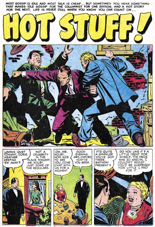
Headline #75 (March 1956) “Hot Stuff”, pencils and inks by Bill Draut

Nick Kolby could handle himself pretty well for a gossip columnist. This gave Draut a chance to do some action scenes which were something that he did not often get to do for the romance art that predominated his work for Simon and Kirby. Much earlier in his career Bill did action in some features like the Red Demon and Calamity Jane and Draut has greatly improved in his ability to draw convincing and effective action.

Draut inking seems to be changing having less of the splotchy effect with cleaner lines and an over all lighter look. Previously I had credited his style change as due to working for DC but I do not believe Bill had started with DC yet. However it was his inking style that was changing, not the way he did his pencils.


Headline #75 (March 1956) “Hot Stuff” page 4, pencils and inks by Bill Draut

“Hot Stuff” also provides and example of Draut handling an action sequence. He does it quite well although panel 5 takes a closer examination in order to figure out what the hero was doing (tripping his first pursuer). This is not quite the action choreography as used by Jack Kirby or even Marvin Stein, but Bill does have his own way of handling it.


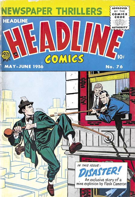
Headline #76 (May 1956), pencils and inks by Bill Draut

I used to think that Jack Kirby and Marvin Stein were the only artists who drew covers for Headline Comics. However Headline #76 (May 1956) eluded me until recently and I previously believed it was by Stein based on some low resolution scans I had seen. But when I finally got a copy I saw I had clearly been mistaken. There were Bill’s classic eyebrows and the way the bricks are clustered into isolated patches is a typical Draut technique. It is surprising that Draut instead of Stein did this cover since Marvin was the primary artist at this time. Also surprising is that Bill’s cover illustrates Flash Cameron a feature that Ted Galindo drew in this issue. Now there are any number of contingencies that we would never know about that might brought about Draut providing this cover, but I would like to suggest one possibility. Perhaps the cover was originally meant to portray Nick Kolby, a feature that Bill drew. Take away the camera and the press pass in the hat and this is a good match for Kolby. Those two features could have easily been added by Bill or another artist to convert it from Kolby to Cameron. Without the original art we will never know for sure.


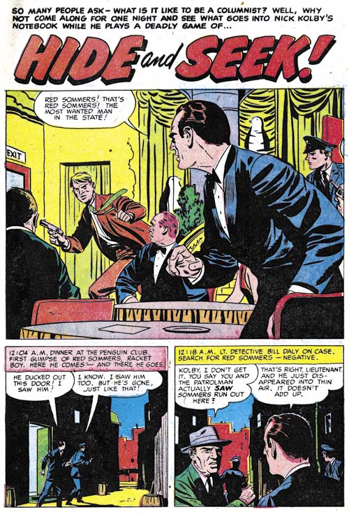
Headline #77 (September 1956) “Hide and Seek”, pencils and inks by Bill Draut

I could not resist on last example from Draut’s Nick Kolby feature. This was also Bill’s last appearance in Headline and Nick Kolby ended here as well. Since this feature was drawn by Draut and no other artist, it seems likely that Draut was involved in its creation. I never heard of Draut writing scripts but perhaps he teamed up with some writer.


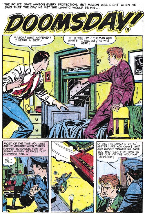
Justice Traps the Guilty #82 (May 1955) “Doomsday”, pencils and inks by Bill Draut

I do not want to convey the false impression that Bill Draut was only providing work for Headline during this period. Draut was doing work for Justice Traps the Guilty as well. However that work was for individual stories and not some continuing feature.

Art of Romance, Chapter 38, A Final Transition

(July – December 1959: Young Romance #101 – #103, All For Love #15 – #17, Personal Love #12 – #14)
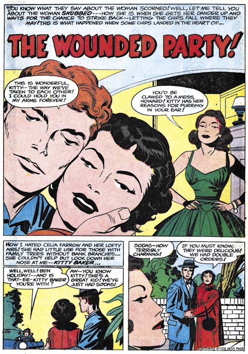
Young Romance #102
Young Romance #102 (October 1959) “The Wounded Party”, pencils and inks by Jack Kirby

Jack Kirby was comparatively busy with romance art during this period providing one cover and four stories. All really nice pieces and all but one of them inked by Kirby himself. I do not think realism was ever an appropriate description of Kirby’s art, but his work seems especially abstract during this period. Note the simplified nostrils of both the man and the woman. The bridge of the nose seems unnatural. Details such as the eyelids are often dropped. But while these are by no means realistic portrayals, they are by no means unexpressive.
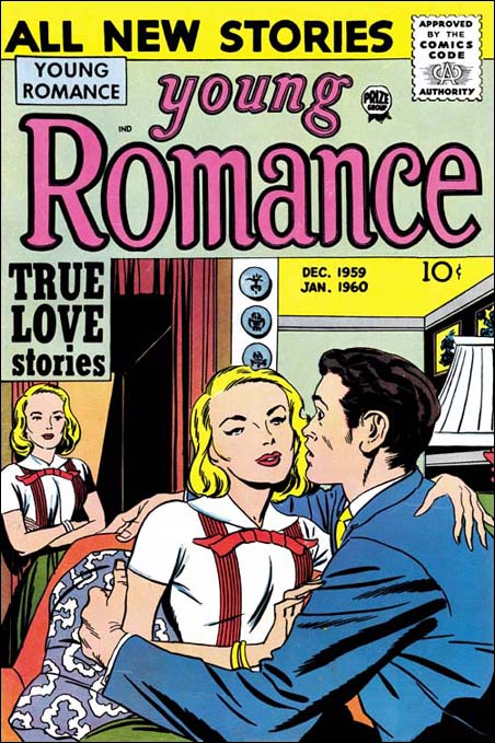

Young Romance #103 (December 1959), pencils and inks by Jack Kirby

Kirby’s last cover for Young Romance, or any Prize publication. Jack presents a nicely humorous variation on the theme of a third party looking at a romantic couple.
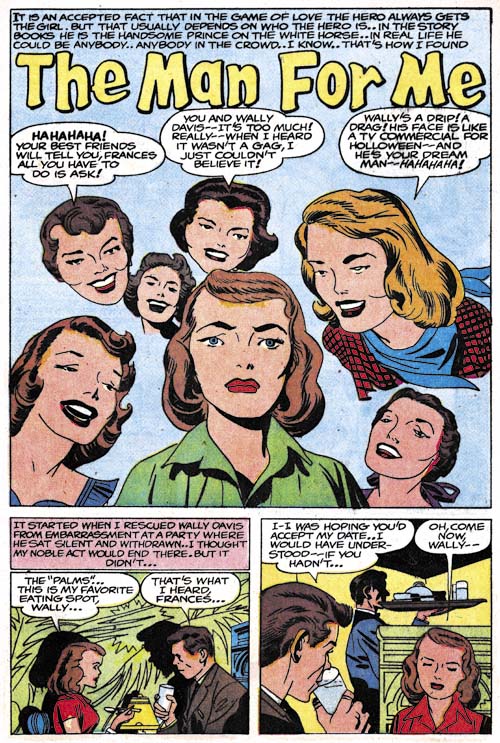
Young Romance #103
Young Romance #103 (December 1959) “The Man For Me”, pencils and inks by Jack Kirby

Floating heads are not typical for Kirby’s art, but he does turn to them every once in a while. In this case it provides good examples of how Kirby was now drawing woman. In this respect his art is at a mid-point. Earlier Jack drew woman with much variation in looks, some of which while not completely unattractive would hardly be described as beauty queens. Later in his career, most of Kirby’s woman looked alike; differing mainly in their hair and clothes styles. In the splash for “The Man For Me” there still is some variation in the faces of the woman but nowhere near as much as before. All are attractive but I wonder if many readers in 1959 would have consider these woman as truly beautiful?
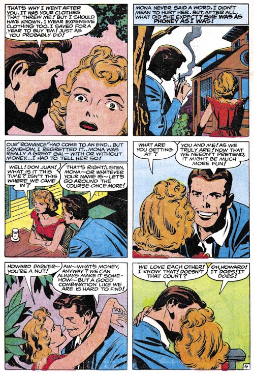
Young Romance #103
Young Romance #103 (December 1959) “Liars In Love” page 4, pencils and inks by Jack Kirby

A final example of Kirby’s romanceΒ graphic story telling. Shifting perspective, varying viewing distances, body language and facial expressions all played a part in Jack’s art. What a master.
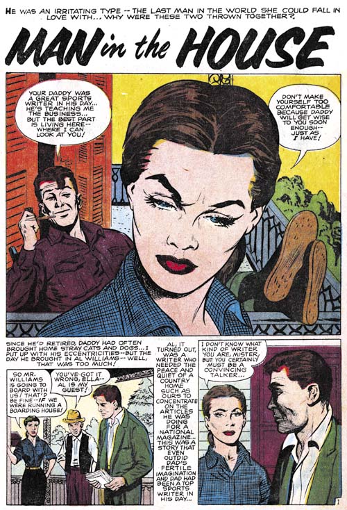
Young Romance #101
Young Romance #101 (August 1959) “Man In The House”, pencils by John Prentice, inks by Joe Simon

In the last chapter I briefly discussed a piece that looked like the work of John Prentice. The problem was that it was not nearly as well done as was typical for Prentice. I put off deciding about the attribution until this chapter where I would have four stories by the same artist to examine. While it is perfectly possible for one artist to imitate another, it is difficult if not impossible for such imitation to be consistent over an entire story, let alone a number of stories. This work must have been drawn by John Prentice. But there are some parts that look like some other artist hand, in fact like a particular artist, Joe Simon. I now believe that unlike his prior practice, Prentice only supplied pencils which Simon then inked. I have to say that as much as I admire Joe as an artist he really was not doing Prentice justice. Perhaps it was Joe’s blunt brush, which had gotten even blunter over the years. Perhaps Joe was in a rush.
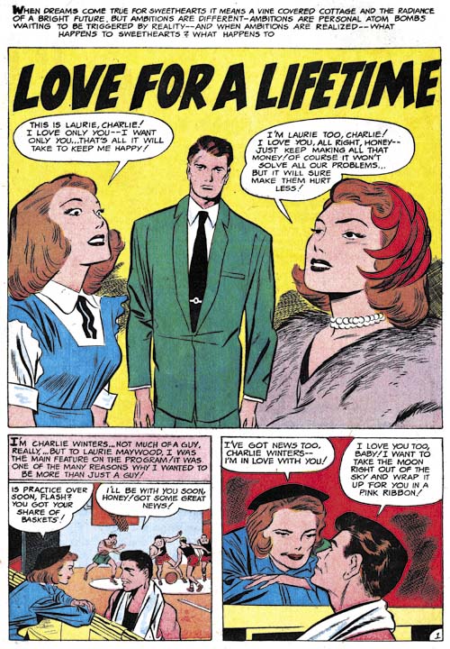
All For Love #15
All For Love #15 (August 1959) “Love For a Lifetime”, pencils by Jack Kirby

During the prior year and a half, Kirby only appeared in Young Romance. “Love for a Lifetime” is the first, and only, piece Jack did for All For Love. This was not the only example of an artist that appeared in Young Romance and either All For Love or Personal Love. I will be pointing out some other below and conclude with an explanation why this was happening. Kirby did not ink “Love for a Lifetime”. Nor was it inked by the artist who Jack used often at this time for his inking (who I believe was Marvin Stein). The inker did a good job but I have no idea who he was. This seems to be the only piece he inked for Kirby.
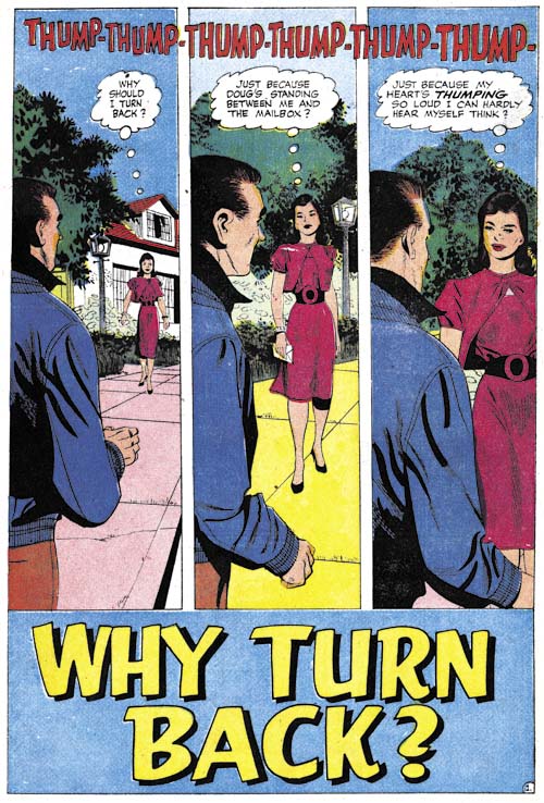
All For Love #17
All For Love #17 (December 1959) “Why Turn Back”, art by Paul Reinman

Previously Paul Reinman was another artist who frequented Young Romance but never appeared in either All For Love or Personal Love. During the period covered in this chapter, Reinman drew four stories but only one appeared in Young Romance. The others were published in All For Love.

The piece I selected as an example of Paul’s work is perhaps not the most typical of his art. But I find the art for the opening page rather nice. The tall narrow panels and the way the lady advances in each panel is very interesting. There is something a little unnatural about it all but it is still very effective.
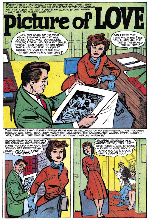
All For Love #15
All For Love #15 (August 1959) “Scheduled For Heartbreak”, art by Bob Powell

A new artist appearing in the Prize romance, or more correctly reappearing in the case of Young Romance, is Bob Powell. Powell did five stories; two for Young Romance, two for All For Love and the last for Personal Love. Hence is another example of an artist during this period appearing in all the Prize romance comics. Powell used studio assistants and his art varied quite a bit. I believe Bob had little if anything to do with some of the work attributed to him for the Harvey romance titles. Quality of the Prize romances vary but in my opinion all had significant involvement by Powell himself.
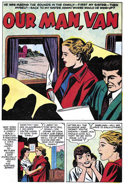
All For Love #17
All For Love #17 (December 1959) “Our Man, Van”, pencils by Bruno Premiani, inks by Joe Simon

Perhaps my biggest surprise when reviewing this period was return the of Bruno Premiani. Premiani last worked for Simon and Kirby from in 1949 and 1950. He is said to have left the United States in 1952 (in a short biography by an unknown author which no longer resides on the web) but returned in 1960. However “Our Man, Van” indicates Bruno was actually back in the U.S. around July 1959 (the proper date for creation of art with a December cover date).

Premiani, just like John Prentice, provided pencils only Which Joe Simon then inked. Again it was not the best combination. Further Bruno only did this one story (probably because he began working for the better paying DC).

I should add that earlier in this series I always included a question mark with my Premiani attributions. That was because the work for Prize looked different from what at that time I had seen by Premiani. Since then I have examined a story in DC’s Greatest Adventure that Bruno did that shows a similar drawing style. So I have now dropped off the question mark feeling confident that Premiani was indeed the correct attribution.Β 

Personal Love #12
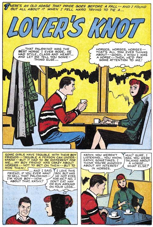
Personal Love #12 (July 1959) “Lover’s Knot”, pencils and inks by Marvin Stein

There is only a single piece during this period by Marvin Stein (same thing was reported in the last chapter). Marvin has gone further in simplifying his art. That is saying a lot since his earlier work would hardly be called complex. Stein has gone so far that I doubt I would have recognized his hand in this work had it not been for “Lost Paradise” (AFL #14, June 1959), the previous piece that he did. While his art style had changed he has not lost his skill at graphically telling a story. It would have been interesting to see where Stein’s style would end up had he continued to do comic book art but unfortunately I believe this he is last comic piece.
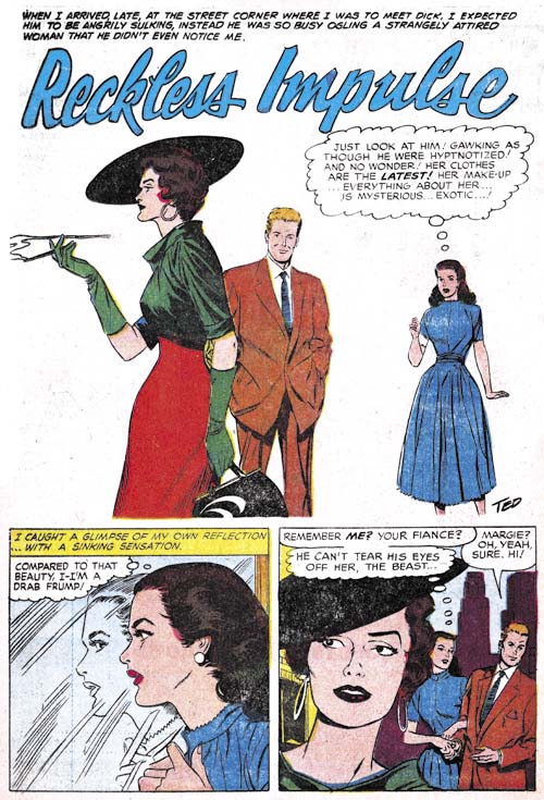
Personal Love #13
Personal Love #13 (September 1959) “Reckless Impulse”, art by Ted Galindo

While some artists were appearing in both Young Romance as well as All For Love or Personal Love, Ted Galindo was not one of them. All three stories that he did appeared in Personal Love. He really was a talented artist and among the Prize romance artists he seemed to be the one to experiment the most. For the “Reckless Impulse” splash, Ted has completely eliminated all the background as well as the panel border. The rest is very effective.
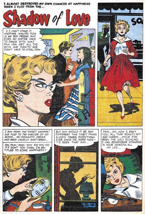
Personal Love #13
Personal Love #13 (September 1959) “Shadow of Love”, art by Joe Orlando

Yet another Orlando signature that I missed until this latest review. During this period Joe also did an unsigned piece. Orlando also seemed to like to experiment a little. The splash is actually part of the story but what is more interesting is that the second panel is higher than the splash. The three remaining panels are also tall and narrow.

Chapter Conclusion

In his book, The Comic Book Makers, Joe reports that when Mike Bleier (one of the partners for Prize Comics) died in 1960 the remaining partner, Teddy Epstein, asked Joe to take over the comics. So it is not surprising that the postal statements from 1960 until 1963 list Simon as the editor. In 1960 Joe would replace All For Love and Personal Love with a re-launched Young Love and a new title Going Steady. In the past I believed these steps were taken by Joe as soon as he began as the romance editor. This review has made me change my mind. During the previous year and a half the different artists appeared in Young Romance as compared to All For Love or Personal Love. Jack Kirby and Paul Reinman were only shown in Young Romance while Ted Galindo and Joe Orlando only worked for All For Love and Personal Love. Other artists, most unidentified, also followed this pattern. The only exception seems to have been Marvin Stein who appeared in all the Prize titles. However Jack Kirby is in the August issue of All For Love and Reinman does work for the December issue. John Prentice appears in YR #101, AFL #15, #16 and #17. Bob Powell shows up in YR #103, AFL #15 and #16, as well as PL #16. My conclusion is that Joe started as the romance editor in August when this mixing of artists began. This would mean that the 1960 date of Bleier’s death is inaccurate; that he actual died in 1959. I believe that such a error is understandable and not particularly significant.

Series Conclusion

When I started this serial post, Art of Romance, I knew it would take some time to finish. Well over two years later and with 38 chapters I have finally come to the end. Prize’s romance comics would continue from 1960 to 1963 but they were different from what came before. In his book, Joe described it as a basement operation with substantially reduced art and script costs. Most importantly for this blog, they would no longer include any involvement from Jack Kirby. In fact there would be no further Simon and Kirby collaboration of any type until many years later. I am certain I will post about the Prize romance titles under Joe Simon someday, but I am not prepared to do it now.

While for most fans, Simon and Kirby’s reputation rests on their superhero, crime, horror and similar genre, the romance genre was much more important to Joe and Jack. To put some perspective on it for the period spanned by this serial post (cover dates September 1947 to December 1959) Jack Kirby drew a total of 3855 pages of art*. At 1936 pages, romance was by far the greatest part of that work. The breakdown per genre is:

1936 romance
507 hero
459 crime
417 horror
356 western
91 humor
45 science fiction
24 war
20 anthology

There was more romance art than all the other genre combined. Once Simon and Kirby launched Young Romance, they never stop producing romance comics right up to their parting of ways at the end of 1959 (cover dates). Simon and Kirby produced no other genre continually during that period.

One of the themes of this blog is that Simon and Kirby did not only create art, they produced comics as well. Actually that is how they made most of their money. While working together, Simon and Kirby produced 7593 pages of romance art**. This included the work of a lot of different artists and since Simon and Kirby seem to encourage the creators to sign their work, this serial post was able to identify and give examples of the majority of the contributors.

I thought I was well acquainted with Simon and Kirby romance work when I started Art of Romance but I learned a lot by reviewing them sequentially. Much of the knowledge I gained concerned artist attributions but there was three more general observations as well.

Based on interviews of a couple writers that Simon and Kirby had employed, Jack was heavily involved in supplying the writers with plots. But in my opinion, Kirby subsequently had little if anything to do with the stories supplied to the other artists. However I believe something very different happened with the stories that Kirby drew himself. I find the writing of the Kirby drawn romances to be very different for the stories drawn by others. Frequently they display phrasing that to me sound very much the writing of Kirby himself. I am certain that Jack would re-write much of the scripts that he drew.

With the exception of Jack’s own art, Simon and Kirby left all inking of art to the artists themselves. That does not mean that all the other artists inked their own work but the great majority of them appeared to do so. Certain this was the case for frequent contributors Bill Draut and John Prentice. Mort Meskin’s pencils often inked his own pencils but he for a time he used George Roussos as an inker as well. I do not claim to have sorted it all out but my opinion is that Mort did almost all his own inking with a relatively small fraction inked by George. Inking of Kirby’s pencils was something very different. Joe Simon has described it as an assembly line with different inkers contributing to different parts of the same story. My observations of the actual comics supports Joe’s statements. When I identify a particular inker of Kirby’s art I am not saying that they were the only inker but rather just the only one I thought I could identify but other inkers may have been involved as well.

My final observation concerned the question of Kirby layouts for other artists; an often repeated claim. It is also one that is difficult to disprove by conventional comparisons. That is because it is hard to distinguish the difference between layouts, influence and swiping. Particularly since it often involves admittedly subjective criteria. The methodology I have found often useful was panel layouts. I would compare panel layouts from Kirby’s own work and those of other artists during the same period. After all its seems very unlikely that Kirby would adopt different panel layouts for work supplied to other artists to complete. I often found particular panel layout used by some artist over and over again. for instance during one period Leonard Starr frequently used tall narrow panels that rarely appeared in Kirby’s art. Using panel layouts I can confidently say that Kirby did not supply layouts to more important artists like Bill Draut, Mort Meskin, John Prentice, Bob McCarty and others. Kirby did appear to provide layouts for some minor and less talented artist but then the difficulty becomes distinguishing Kirby layouts that were finished and inked by the other artist from Kirby pencils just inked by another artist.

Footnotes:

* In the calculation present here I am excluding the work Kirby did for DC and Atlas after the breakup of the Simon and Kirby studio. I have included the 146 pages of Boy Commandos in the hero genre. Personally I do not consider the Boy commandos published during the time of World War II as war comics, but the post-war examples clearly do not belong in that genre.

** I am excluding from these calculations All For Love and Personal Love. As I discuss above Joe Simon may have been the editor of these titles as well for a period. However there is little reason to believe Jack Kirby had anything to do with them other than supplying a single story for All For Love.

Chapter 1, A New Genre (YR #1 – #4)
Chapter 2, Early Artists (YR #1 – #4)
Chapter 3, The Field No Longer Their’s Alone (YR #5 – #8)
Chapter 4, An Explosion of Romance (YR #9 – #12, YL #1 – #4)
Chapter 5, New Talent (YR #9 – 12, YL #1 – #4)
Chapter 6, Love on the Range (RWR #1 – #7, WL #1 – #6)
Chapter 7, More Love on the Range (RWR #1 – #7, WL #1 – #6)
Chapter 8, Kirby on the Range? (RWR #1 – #7, WL #1 – #6)
Chapter 9, More Romance (YR #13 – #16, YL #5 – #6)
Chapter 10, The Peak of the Love Glut (YR #17 – #20, YL #7 – #8)
Chapter 11, After the Glut (YR #21 – #23, YL #9 – #10)
Chapter 12, A Smaller Studio (YR #24 – #26, YL #12 – #14)
Chapter 13, Romance Bottoms Out (YR #27 – #29, YL #15 – #17)
Chapter 14, The Third Suspect (YR #30 – #32, YL #18 – #20)
Chapter 15, The Action of Romance (YR #33 – #35, YL #21 – #23)
Chapter 16, Someone Old and Someone New (YR #36 – #38, YL #24 – #26)
Chapter 17, The Assistant (YR #39 – #41, YL #27 – #29)
Chapter 18, Meskin Takes Over (YR #42 – #44, YL #30 – #32)
Chapter 19, More Artists (YR #45 – #47, YL #33 – #35)
Chapter 20, Romance Still Matters (YR #48 – #50, YL #36 – #38, YB #1)
Chapter 21, Roussos Messes Up (YR #51 – #53, YL #39 – #41, YB #2 – 3)
Chapter 22, He’s the Man (YR #54 – #56, YL #42 – #44, YB #4)
Chapter 23, New Ways of Doing Things (YR #57 – #59, YL #45 – #47, YB #5 – #6)
Chapter 24, A New Artist (YR #60 – #62, YL #48 – #50, YB #7 – #8)
Chapter 25, More New Faces (YR #63 – #65, YLe #51 – #53, YB #9 – #11)
Chapter 26, Goodbye Jack (YR #66 – #68, YL #54 – #56, YB #12 – #14)
Chapter 27, The Return of Mort (YR #69 – #71, YL #57 – #59, YB #15 – #17)
Chapter 28, A Glut of Artists (YR #72 – #74, YL #60 – #62, YB #18 & #19, IL #1 & #2)
Chapter 29, Trouble Begins (YR #75 – #77, YL #63 – #65, YB #20 – #22, IL #3 – #5)
Chapter 30, Transition (YR #78 – #80, YL #66 – #68, YBs #23 – #25, IL #6, ILY #7)
Chapter 30, Appendix (YB #23)
Chapter 31, Kirby, Kirby and More Kirby (YR #81 – #82, YL #69 – #70, YB #26 – #27)
Chapter 32, The Kirby Beat Goes On (YR #83 – #84, YL #71 – #72, YB #28 – #29)
Chapter 33, End of an Era (YR #85 – #87, YL #73, YB #30, AFL #1)
Chapter 34, A New Prize Title (YR #88 – #91, AFL #2 – #5, PL #1 – #2)
Chapter 35, Settling In ( YR #92 – #94, AFL #6 – #8, PL #3 – #5)
Appendix, J.O. Is Joe Orlando
Chapter 36, More Kirby (YR #95 – #97, AFL #9 – #11, PL #6 – #8)
Chapter 37, Some Surprises (YR #98 – #100, AFL #12 – #14, PL #9 – #11)
Chapter 38, All Things Must End (YR #101 – #103, AFL #15 – #17, PL #12 – #14)