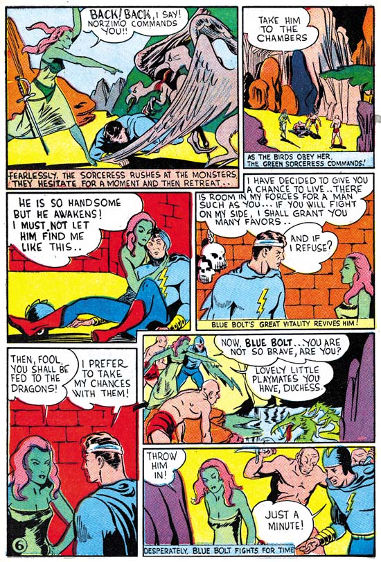
Blue Bolt #1 (June 1940) “The Human Lightning Streak” by Joe Simon (signed)
Most of the work that Joe Simon penciled having cover dates from May to July of 1940 were the Fox covers discussed in the last chapter. But Joe was still a freelance artists and he did some work for other publishers. For Novelty Press, the same publisher as Target Comics, Joe created the titled feature of a new comic, Blue Bolt. For this Simon returned to the science fiction genre, but adds a superhero to the mix. Even though this story was done at the same time as the Fox covers, Joe does not try to imitate Lou Fine here. Nor is there any reason that he should since Fine never did any work for Novelty. However the work that Joe did on the Fox covers seemed to have some affect on his style, his lines seem lighter. The previous damsel in distress now reappears as the falling Green Sorceress. Either he is copying from Silver Streak #2 cover, or I was wrong and this form was not an altered version of the appearance in the Phantom Bullet and the cover of Wonderworld #13 but instead there is another source for the swipe. Either way Joe is still using swipes.
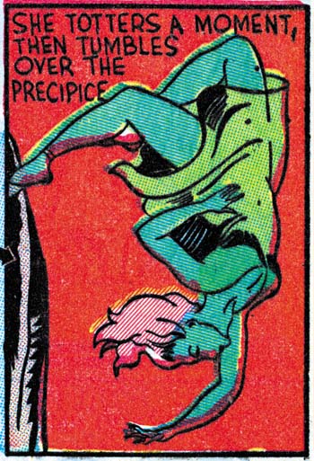
Blue Bolt #1 (June 1940) “The Human Lightning Streak” by Joe Simon (signed) (close-up of panel 4 on page 6)
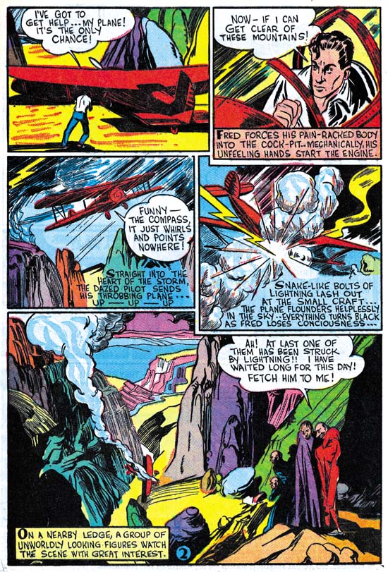
Blue Bolt #1 (June 1940) “The Human Lightning Streak” by Joe Simon (signed)
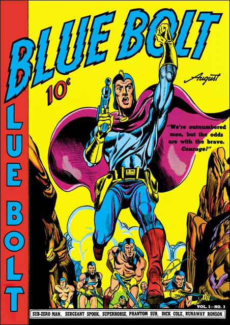
Blue Bolt #3 (August 1940) by Joe Simon
Jack Kirby joined Joe on work for Blue Bolt after the first issue, I’ll be discussing that in the next chapter. This seems the best place to present the cover for Blue Bolt #3. Despite the appearance of the Blue Bolt character on the covers to #1 and #2, issue #3 is the first time Joe would provide the art for the cover. You can tell it is by Joe by the way the eyes are done, particularly in the smaller soldiers. Also the rock formations are similar to the ones Joe did for page 2 of Blue Bolt #1 (see above). As we seen before Simon likes to emphasize the importance of the hero by enlarging him. In this case he does this by using a low view point so that perspective provides the results he wants without looking unnatural. The cover is a close copy of a panel from the story. Greg Theakston (The Complete Jack Kirby, 1917 – 1940) has attributed that page to Jack Kirby, but I do not believe he is correct. I will include a scan of the page in my next chapter. Maybe by the time I write up that post I will have changed my mind.
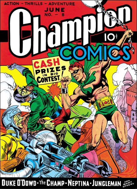
Champion #8 (June 1940) by Joe Simon
The Champion Comics title was published by Irving Manheimer. Manheimer was the president of Publisher Distributing and as the name says it was a distribution company. Printers wanted to keep their presses busy so Irving also acted as a comic publisher. That helped to keep the printers active, gave PD more items to distribute, and provided Irving some profits from the comics themselves. Joe Simon drew the cover for one of Manheimer’s title, Champion Comics #8 (June 1940). Again although Joe made no attempt to mimic Lou Fine, this cover is very different from his previous ones. Inking is finer then Joe’s earlier covers but not nearly as fine as the Fox covers he was doing. Joe uses the brush more often with bolder markings. He also is more concerned with defining forms then before. Forms are suggested by rows of close or touching brush stokes, kind of like the reverse of a highlight.
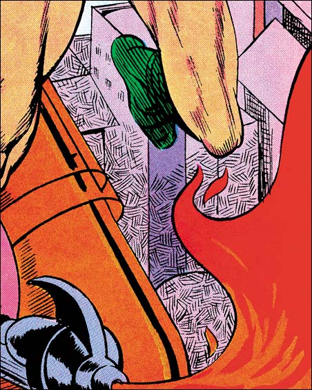
Champion #8 (June 1940) by Joe Simon (close-up)
One new inking technique appears on the bottom of the background buildings. Small areas are covered by parallel lines. Nearby areas have similar lines but at a different angle. This provides a similar tone to the entire area while giving it a mottled looked. This technique appears on a few covers that Joe is associated with over the next year or so and then disappears and does not become part of the S&K shop inking. A similar inking was used on some of Al Avison’s work where it appears for a longer time. Did Al learned it from Joe and later Joe abandoned it? Or was this an Avison trait that indicates Al inked this cover? I lean toward the former explanation because the inking of this cover is pretty good. The Fox covers show that Simon had become an accomplished inker while the earliest efforts I have seen by Avison, done even later then this cover, are not all that impressive.
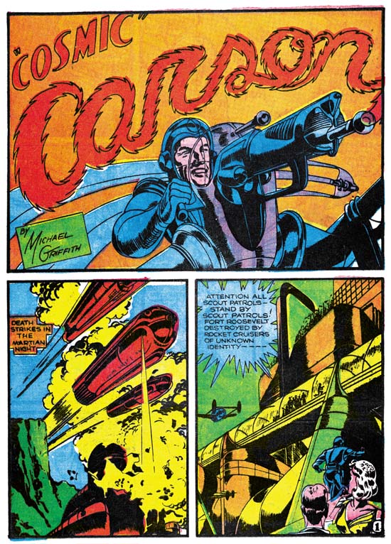
Science #4 (May 1940) “Cosmic Carson” by Jack Kirby
In the last chapter I stated I felt that the Fox covers did not show any Kirby influence. On the other hand I feel Champion #8 does. For the first time on a Simon cover we find a hero’s punch being portrayed. The villain that received this hit is shown falling backwards. This type of action scene would become a Kirby trademark. The only problem with my suggestion is that I am not aware of Jack having drawn this sort of action up to the time this cover was made. Another Kirby-like feature is the futuristic ray gun that Joe has drawn. Just the last month Jack included a similar weapon in “Cosmic Carson”. Some have called Joe’s version a swipe, but I find it so done so differently that I feel Jack’s gun was more a source of inspiration then an actual swipe.
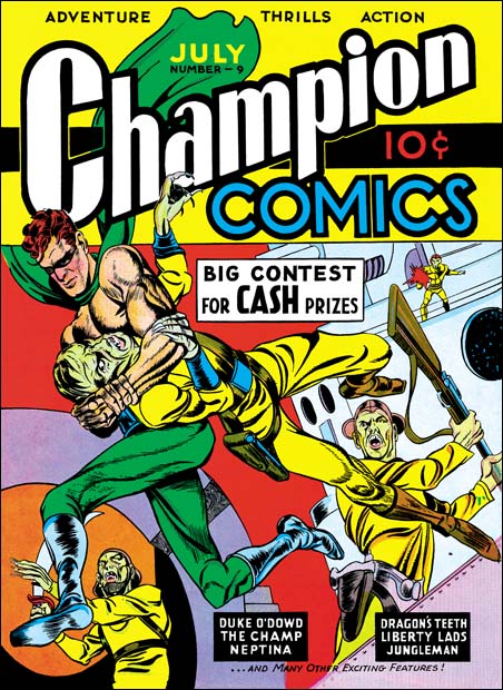
Champion #9 (July 1940) by Jack Kirby
When I first showed Joe my restorations of the covers for Champion #8 to #10, he said that he had not yet met Kirby and that he had done all of these covers. Carmine Infantino looked at Champion #10 and said that surely Jack had done it. When Joe looked again he agreed, but insisted that he (Joe) had done the other two. The hero’s more square face in Champion #9 does seems much closer to that depicted in #8 then that of #10. But the scene has more action then anything Joe had done before. Also as Greg Theakston has pointed out (The Complete Jack Kirby, 1917 – 1940) the hero is shown running with the sole of his foot turned toward the viewer. This is something Jack has already done in the Blue Beetle strip but has not yet shown up in any of Joe’s work to date. Because of these two facts I have to respectively disagree with Joe and attribute primary pencils of this cover to Kirby.
The inking of the cover is a good match to the work done on Champion #8. It even has an area with the mottled type of inking in a strip in the purple arch. The portal in the upper right is inked in the way Joe had picked up from Lou Fine leaving small irregular uninked areas. I therefore feel, as others have proposed, that this is the earliest Simon and Kirby work.
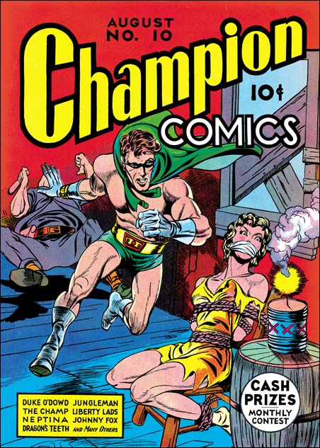
Champion #10 (August 1940) by Jack Kirby
Although previously I have made some comments about Joe Simon’s inking it was for art that I feel we can be pretty confident that Joe was doing his own inking. This series is really about Joe as a penciler. So why am I including a cover drawn by Jack Kirby? Well I believe it is important from time to time to show what Jack was doing as a comparison. Part of what this serial post is about is distinguishing Joe’s work from Jack. Besides which I do not think anyone is going to object showing some Kirby work, after all this is the Simon AND Kirby blog.
In my next chapter I will examine other work Joe Simon did in his newly formed partnership with Jack Kirby.


Hi Harry,
A couple comments. Thanks for the 2 pages from BB #1. I mentioned to you previously that I have never seen it, and wish they had included it in the Blue Bolt reprint book.
You mention that BB#3 was Joe’s first BB cover, but I think you misspoke. BB #1 has a Simon cover, with the same girl with the same blank pitiful Simon eyes!!! 😉
I had for the longest time dissagreed with Greg about Champion #8 being solo Simon. One of the reasons being that odd basketweave texturing you highlighted. This technique was used by Kirby in “the Diary of Dr. Hayward” plus on some Lincoln Syndicate gag strips. I also believed that the highly detailed work on the ray gun was beyond Simon’s skill level at the time. But over the last year or so, I have reversed my opinion, there are way too many Simon stylistic techniques to be anyone else. It was my finally seeing all the Fox covers at one time that showed me Joe’s progression.
One small error, that seems to be a common one. Joe didn’t do Blue Bolt directly for Novelty, his work, and the books were produced through Jacquet’s Funnies Inc. studio.
Whether or not the art used on the cover of BB #3, and the interior page are by Simon or Kirby, it
s still a blatant swipe from an Alex Raymond Flash Gordon panel. The helpless girl pose that you have highlighted is probably also from a Raymond panel.
Not sure what you mean by “The villain that received this hit is shown falling backwards. This type of action scene would become a Kirby trademark. The only problem with my suggestion is that I am not aware of Jack having drawn this sort of action up to the time this cover was made
Stan,
I did not misspeak. While preparing this chapter I have looked at the cover for BB #1 and compared it to other Simon work. I do not believe it was done by Joe. Could I be wrong? Sure it wouldn’t be the first time. But that is my position at this time.
As for Blue Bolt and Jacquet’s Funnies, I stand corrected. When I wrote the post I had thought that Joe had stopped working for Jacquet when he went to Fox. But when I went back to Joe’s Comic Book Maker he clearly says that he had done the BB #1 work for Jacquet prior to leaving for Fox. Of course that leaves the rest of Blue Bolt work as uncertain. I think I’ll ask Joe about them next time I see him.
As I said in my post, I have no doubts that Joe often swiped. But can you say what exactly what Alex Raymond work it was taken from?
Not sure what your not sure about 😉 The hero punching the villain so hard that he goes flying was a Kirby trademark. Others of course did it, but none as well as Jack. But when I went through work by Kirby done before the Champion #8 cover I could find no examples of it. You would expect a prior Kirby example if Joe did in fact pick up this device from Kirby as I suggested.
Hi Harry,
If the cover to BB#1 isn’t Simon, then someone at Funnies Inc. was doing a hell of a job aping him. 😉 No one did women’s eyes like Simon.
I’ll send you the Raymond source.
Blue Bolt Magazine was a Funnies account for quite a while. I don’t know if Novelty ever produced their own books.
My first post was truncated, I mentioned several panels from Blue Beetle with the villains flying backwards from the good guys’ fist. I’ll send you a few samples. Plus in Socko the Seadog, his punches were as explosive as Popeye’s!!
Stan,
It is hard to compare a cover with interior art. Therefore I compared BB #1 cover with other Simon covers that I feel more certain about. There are a number of penciling traits that are unique to this comic. Also at this period I believe Joe was doing his own inking. Again on BB #1 there are some inking techniques that I have not seen on any other Simon cover. Like I said I could be wrong but I do not feel this was done by Joe.
Thanks for your comments about Jack’s punches showing up in Blue Beetle and Socko the Seadog. I can’t say I am surprised. It did seem like Joe was adopting a Kirby device to me even though I had not seen a prior example.
I’m finding this all quite educational. Taking a good long look at the work of Simon in this period side by side with Kirby’s work, I too believe that the Champion 8 cover is by Joe Simon. It’s interesting to see all the examples of Simon’s work and I’m beginning to get a much better feel for both his style and his “fingerprint”, such as the hero overwhelming the cover.
Kirby dynamics come through full force on the Champion 10 cover. He packed a punch from the get-go, didn’t he?
Keep the lessons coming!
Nick,
Thanks for your kind words. And there is lots more to come with this serial posts. I just wish I could post more often. Unfortunately getting the images to the quality I feel is needed takes more time then I would like. Please bear with me.
I hear what you say about Champion #10. Pure Kirby and pure magic.