I disagree with the Kirby Checklist (and most scholars and experts as well) about attribution of some of the work to Jack Kirby. In most of these particular cases I believe the correct assignment would be to Joe Simon. Some of these examples look so obviously Simon to me, that I am amazed at that others cannot see it. In most cases I get no explanation as to why someone attributes something to Jack and not to Joe. As I have discussed previously, comic experts are unwilling or unable to explain their verdicts. There are some few scholars that have tried to give evidence to support their position. But in those cases what I keep hearing is that certain features look like their were done by Kirby. That is all well and good, but what I don’t hear are mentions of features that do not look like the way Simon would do them. In other words these scholars seem to be looking for evidence of Kirby involvement, but are not looking for clues to Simon’s presence. But Joe was a talented artist and through his inking of Kirby’s pencils was very familiar with his style. Joe had the ability and incentive to use things he learned from Jack and even at times to ghost Kirby.
So I would like to do another serial post, this time on art done by Joe Simon before and during the Simon and Kirby collaboration. I doubt I will change many minds about some of these (in my view) misattributions. However I do hope to bring to some a better understanding of Simon’s own style. A similar attempt on the work of Jack Kirby would be a monumental undertaking, there is just so much of it. Joe did not do that much penciling during the years of the S&K studio. So you would think that it would not be that hard to do a fairly detailed and complete analysis. But with Simon I am faced with two problems. The first is that early work by Joe was done during the golden age of comics. These comics are uncommon and generally priced very high. I simply do not have access to all of the comics that some say have work by Joe in them. What I do have for study seems to provide a good idea of Joe’s techniques. A more complete access would certainly be desirable, but I do not think it will change much the view point that I will be presenting here. The second, more serious problem, is the lack of signed work during the period of S&K collaboration. Once they teamed up, work that was signed was done so jointly as Simon and Kirby. No individually signed art was done by either Joe or Jack. So we must look elsewhere for documentation of work by Joe to form the foundation of our analysis.
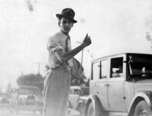
Joe Simon started his career as a newspaper artist in Rochester, NY. The work I have seen are sport illustrations. These are nicely done in a realistic style, not at all like comic book art. Simon also did a lot of touch up work using an air brush. As Joe described it to me once, if an editor felt a dress was too short in a photograph of a woman, an artist would air brush it longer. Joe became a master of the use of an air brush. But the newspaper Simon worked for shutdown, and he decided to try his luck in New York City.

Joe Simon
Joe did find work doing re-touching. But although he was good at it, it was a career he did not want to remain in. Following a suggestion, Joe tried the new comic book industry and entered the Funnies Inc. shop. Although this was a completely new experience for him, he adapted quickly and found it to his liking. In his book “The Comic Book Makers”, Joe says his first job was a seven page western. Unfortunately to my knowledge nobody has located what comic this western was published in. The first published work we do know about was done for different publishers, Lev Gleason, Centaur and Timely, and have cover dates of January 1940. Two covers and two stories, for someone who never did comics before it was an impressive start. But comics was a new industry with opportunities for the those with ambition and talent.

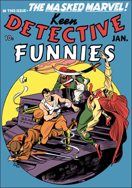
Keen Detective #17 (January 1940) by Joe Simon (signed)
For the Keen Detective cover Joe Simon has chosen a fight atop an American tank in the Arabian desert. An unusual choice since the middle east was not then the center of conflict it is today. Here Joe has trouble depicting the hero. His left arm is not convincing, nor is his left leg. Otherwise the rest of the figures are handled well. Simon’s composition works well with and complements the circular field used. The circular field works so well that I wish I could credit Joe with it. In fact this field was a trade mark of Keen Detective and was used for a number of covers before this one. However most of the artists were unable to use it as effectively as Simon did. Still I believe Joe liked the results and a circular design would reappear in some S&K covers in a couple of years. The inking looks like it was done mainly with brush. To me there really is nothing wrong with the inking. But it seems mainly to be used in deliminating the figures. What spotting there is appears mainly to have been done to provide some form to the tank, it is does not seem to aid the over all design.

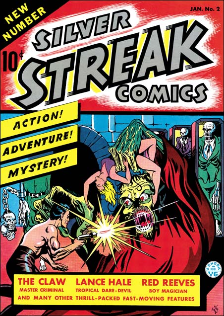
Silver Streak #2 (January 1940) by Joe Simon (signed)
For the cover of Silver Streak #2, Joe depicts the Claw, a villain with his own feature story inside. Although given a monstrous portrayal, the Claw was originally recognizably as a personification of the yellow peril. Being politically correct was not a consideration in those days before the war. But Simon has made the Claw not as an Asian monster, but instead used Frankenstein as a model. It is an exciting cover with corpses in open coffins (zombies?), a scantly dressed damsel in distress and a hero to the rescue. Remember the damsel, we shall see her again. Anatomy is not Joe’s strong point here, he does not even try to be accurate. Simon provides enough muscle lines to convince the viewer that the hero is strong in body as well as strong in character. What Simon does excel at is design, and the composition of the cover is excellent. Inking is done primarily with a brush in a bold manner. The inking is much more effective then in the previous cover.

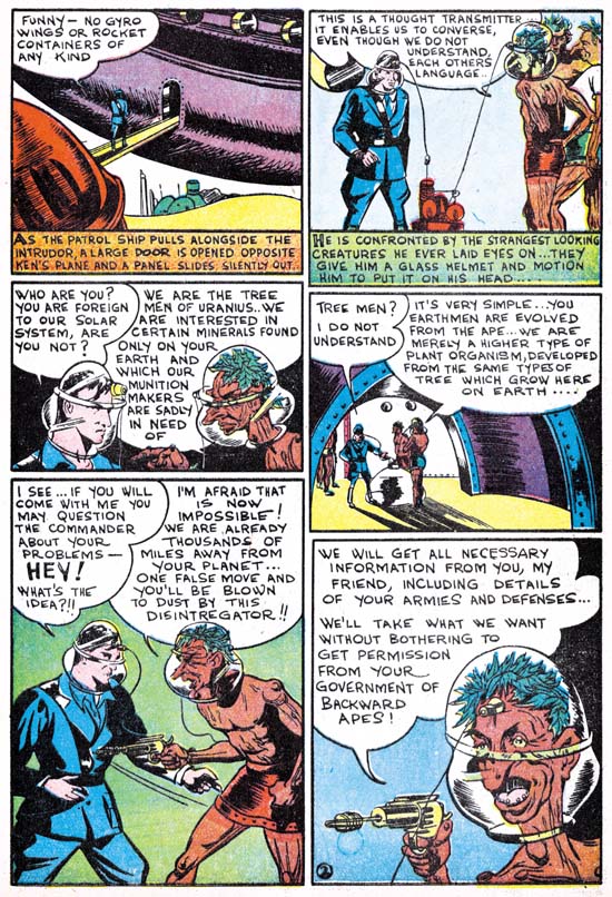
Silver Streak #2 “The Tree Men of Uranus” by Joe Simon (signed)
Joe Simon initiates a new feature, Solar Patrol. Joe liked science fiction, and it was a genre that he would turn to often. Frankly after Joe’s exciting cover work, this example of his story art is a bit of a let down. You can tell he is uncomfortable with the whole aspect of the sequential art. Simon does not seem to be satisfied with a standard panel grid and uses variously sized panels instead. Unfortunately it becomes a bit confusing and Joe sometimes had to add arrows to indicate the proper reading sequence. I suspect his panel layout was an attempt to make it all more interesting. He does not succeed here, but I think it is the forerunner of the irregularly shaped and circular panels that S&K would use in the future.
In his book Joe Simon describes learning how to draw for comic books:
Slits for eyes, unless the character was to register astonishment or horror – and then the eyes become circles. Heavier lines for the eyebrows, raised for bewilderment, slanting down toward the nose for anger. One line for the upper lip. A heavier line, indicating a shadow, constituted the lower lip.
In this story Joe seems to have followed the use of simplicity to a fault. Perhaps because of it he does not seem to be able to make panels as exciting as his covers. Even panels that by their nature should be interesting, such as the space ship destroying the enemy base, come off as rather dull. Another aspect of Joe’s adoption of simplicity is techniques he starts using in the depiction of his figures. Most obvious among them is the way Simon draws eyes. For men viewed at mid-distance Joe uses a single mark to indicate the eye itself and another for the eyebrow. He joins these two marks so that they meet at an angle, sort of like a sideways ‘V’. We will see this typical Simon technique in much of the art he did before teaming up with Jack Kirby. As for women, Simon economical penciling is too extreme leaving them with limited hair strand lines and no real feel of curls. There is a striking difference between how Joe draws the humans, and the more detailed version he provides for the tree men. I suspect that Joe may be swiping the aliens from some unknown source. Even if that is not true, we will meet a related version of the tree men again.
For another story, Simon was asked to make a character based on the use of fire such as done in the Human Torch. This might sound like a recipe for infringement except the publisher was Goodman, he already had the copyrights to the Human Torch. Joe’s response was the creation of the Fiery Mask which appeared in Daring Comics #1. Unfortunately I have no scans for this story. But if you are a Kirby diehard, you may have a copy of Greg Theakston’s “The Complete Jack Kirby, 1917 – 1940” which has a wonderful restoration of this story. Joe did a much better job with this feature then he did on Solar Patrol. Part of the reason is due to the his adding more action and interest to his panels. Greg Theakston gives another important reason by showing that Joe has done a bit of swiping from master artist Hal Foster.
Let me close this chapter with a story Simon told after dinner to Carmine Infantino, and myself. Joe talked about the cover to Red Raven #1 (August 1940). Apparently someone has recently shown that the drawing is a swipe (from Hal Foster again?). Joe grumbled that when it when it was thought to be an original work it was a Kirby, but when now that it is a swipe Simon must have done it. But after he finished this remark Carmine asked “But Joe did you use swipes?”. Joe replied “Of course I used swipes, everyone did”. (Actually the Red Raven cover was penciled by Jack, but I suspect the layout was by Joe, and not because it is a swipe). We will find that not only did Joe use swipes, he re-used them.
Chapter 2, Before Kirby
Chapter 2, Footnote
Chapter 3, Working for the Fox
Chapter 4, Transition
Chapter 4, Footnote
Chapter 5, Side by Side
Chapter 6, Jon Henri
Chapter 7, Glaven
Chapter 8, Off to War
Chapter 9, American Royalty
Chapter 10, A History Lesson
Chapter 11, The Party Is Over
Chapter 12, Covering the Fly
Chapter 13, Wrap Up
Art by Joe Simon, Appendix 1, Champ 22 Confirmed
Art by Joe Simon, Appendix 2, Daring Adventures #12
Art by Joe Simon, Appendix 3, Daring Mystery Comics #3
Art by Joe Simon, Appendix 4, Daring Adventure #16
Art by Joe Simon, Appendix 5, Harvey Hits #12
Art by Joe Simon, Appendix 6, Amazing Man #10
Art by Joe Simon, Appendix 7, The Spirit #12
Art by Joe Simon, Joe Simon as a Newspaper Staff Artist


Harry,
As someone who has disagreed with you from time to time on various covers, you make some valid points concerning art identification. One of the problems in identifying Simon’s style may be his ability to mimic other styles. Another problem are the changes that occured on covers. Simon has cut and pasted covers from time to time, leading to partial Kirby/partial Simon (or other artists).Simon certainly does have identifying traits, but I admit I need to see more and grow more confident in identifying Simon’s style.
Harry, I value your knowledge and dedication .You are doing a great job with your efforts on the Simon and Kirby Blog and I hope to learn more from your writings in the future.
Best,
Nick Caputo
Nick,
The good news is that I have found no evidence that Joe’s technique of constructing covers from assorted pieces was used during the S&K period. He seemed to have adopted it after the breakup. The bad news is that as we shall see Joe was not adverse to swiping, which in the end can have the same effect.
Joe’s adoption of different styles makes identification difficult. Hopefully I will provide enough examples to help you and others recognize his touch. But I am not immune to the problems in identify Joe’s work. The main reason I intend to end this series at the time of the breakup is that I am still struggling to identify Joe’s work afterwards. Joe adopted a new style for covers for the early 60’s Prize romances. And there is the possibility he did some of the relaunched Black Magic covers. Not to mentioned his ghosting of Dick Tracy covers.
Harry
I love Joe Simons art work on Captain America. He and Jack kirby are one of my main influences of being a comic book artist. I would like to get published someday for my work.