Tag Archives: simon and kirby

Simon and Kirby Colorists, Chapter 2, Early Prize Crime


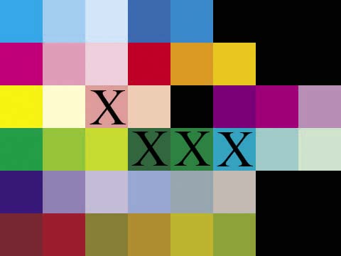
Color Palette used by Prize for Headline (March to September 1947)

C, C50, C25, CM50, CM25, X, X, X
M, M50, M25, MY, YM50, YM25, X, X
Y, Y25, M50Y25, M25Y25, X, MC50, MC25, M50C25
CY, YC50, YC25, CYM50, CYM25, CY25, C50Y25, C25Y25
CM, C50M50, C25M25, C50M25, C50M25Y25, C25M25Y25, X, X
MYC50, MYC25, YC50M50, YM50C25, YC25M25, YC50M25, X, X

In the previous chapter I discussed the coloring used by Hillman in Clue Comics and Real Clue Crime Stories. Now I will write about the coloring used in Headline Comics published by Prize during the same period (March to September 1947). To facilitate comparing the colors I have devised a standard palette of 38 colors. That is not to say that the standard palette will cover all comics published during the golden age. I may have to expand it in the future but it covers all the colors I will be discussing at this time. Hillman used 34 of the standard palette while during the same period Prize’s Headline used 30. However this is can be a bit misleading because not all the colors that Hillman used but Prize did not are really significant. In particular Hillman rarely used deep violet (CM) or red brown (MYC25) (see the previous chapter for an explanation of the terminology I am using to precisely identify the colors). However there are some colors not used by Hillman that are pretty rare in Headline; deep green (CYM50), dark green (CYM25) and emerald blue (CY25). There are two colors absent from Headline that did in fact play an important roll in the Hillman palette; pale yellow (Y25) and pale green (C25Y25).

However I do not believe that colorists can be identified by the presence of a particular color in their work. With such a limited palette available to golden age colorists it seems almost certain that more than one used pale yellow (Y25), pale green (C25Y25) or both. While the early Headline crime colorist did not use pale green (C25Y25) this color would appear in a later period, although without pale yellow (Y25).

To circumvent the limitations of using just the color palette, I also compare how particular objects are colored. For example both the Hillman and Prize colorist use dark blue (CM25) for police uniforms but the Hillman colorist uses dark brown (MYC50) for the shoes and boots worn by the police while the Prize colorist uses cyan (C).


Headline #24 (May 1947) “Murder on a Wave Length” page 2, pencils by Jack Kirby

While the Hillman colorist generally uses middle green for foliage, the Prize colorist uses a greater variety of colors such as green (CY), middle green (YC50), light green (YC25) and even some very unnatural colors such as middle magenta (M50) or orange (YM50).
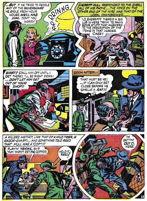

Headline #24 (May 1947) “Murder on a Wave Length” page 5, pencils by Jack Kirby

Furniture was coloring by the Hillman artist in a single brown or more rarely in two brown colors (usually CYM50, YC50M50, YC50M25 or YC25M25). The Prize artists often did furniture such as desk in a combination of two colors selecting from the same browns but also sometimes using some very unnatural colors as well.
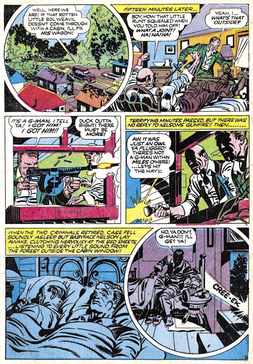

Headline #23 (March 1947) “The Last Bloody Days of Babyface Nelson” page 4, pencils by Jack Kirby

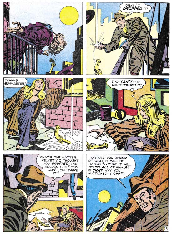
When the Hillman colorist did night scenes, such as in “Get Me the Golden Gun” (Real Clue Crime Stories v.2 n.6, August 1947 as shown in the first chapter), only the presence of the moon suggests that the story occurs in the dark otherwise the coloring is just like in the day scenes. The Prize colorist, however, did distinctive night scenes. Coloring for the night scenes is largely limited to blue colors (generally C, CM25, C and C50) or violets (C50M50 and C25M25).

Headline #24 (May 1947) “A Phantom Pulls the Trigger” page 1
Headline #24 (May 1947) “Murder on a Wave Length” page 4
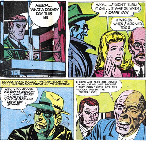
Headline #25 (July 1947) “Masquerade of Eddie the Doll” page 6
Headline #26 (September 1947) “The Strange Aftermath of the Kansas City Massacre” page 4 (all pencils by Jack Kirby)

Perhaps the most distinctive trait of the early Prize crime colorist was the occasional unusual coloring of people. The effect I am referring is not the blocking out of a figure in a single color (usually light violet, C25M25) that both the Hillman and the Prize colorists would sometimes do. The Prize colorist would go much further and use very unnatural colors. The Prize colorist did not do this very often but I have never seen the Hillman colorist do it.

The period I have been discussing in this and the previous chapter was from March to September 1947 during which time Simon and Kirby produced work for both Hillman and Prize. Undoubtedly because Prize offered a better financial deal, afterwards Joe and Jack stopped working for Hillman and Prize became their almost exclusive employer (they still were providing Boy Commandos for DC). I will discuss some of the coloring done in the Headline Comics and Justice Traps the Guilty in the next chapter.

Simon and Kirby Collector Items


Comic Heroes #4

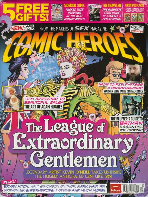
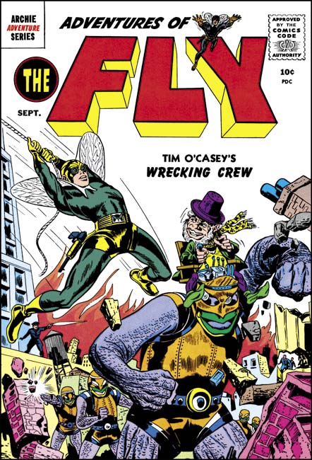
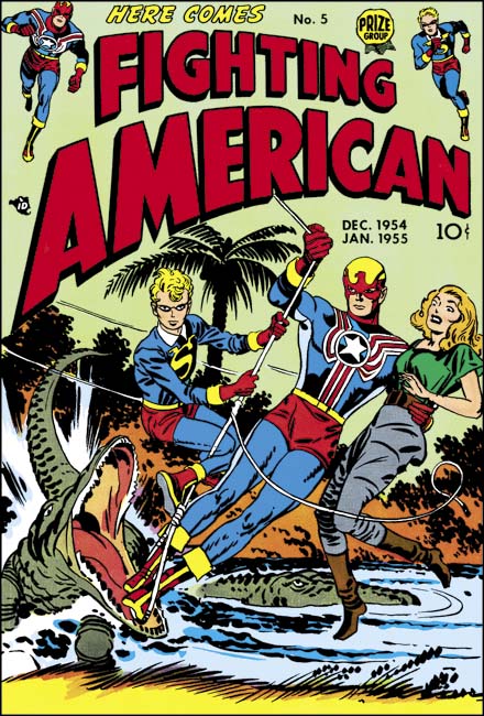
Comic Heroes #4 includes three pieces of promotion for the Titan’s “Simon and Kirby Superheroes”. In the package are three postcards using Simon and Kirby covers (the restorations of which were done by yours truly). It is a really clever use of comic book covers and they are sure to be come a collector’s item. Below I show the images used (I am too lazy to scan the actual cards but take my word they look just as good).


Adventures of the Fly #2


Fighting American #5


Stuntman #1

Simon and Kirby Colorists, Chapter 1, Hillman

Generally little is known about the comic book colorists during the golden age. Credits usually were not provided and while pencilers and inkers would sometimes leave signatures there was no outlet for colorists to make their contribution known. Occasionally there is documentary evidence about particular colorists but largely they remain anonymous. None the less I have begun to investigate coloring done on Simon and Kirby productions. I may not be able to identify all the colorists but I am still interested in seeing what can be learned about the effect different colorists had upon the comics.

Currently I have been examining interior coloring. Covers were typically handled by different printers than the interior pages. The special paper and attention given to covers allowed the use of colors and tonal gradations that did not appear in the interior art. Both the cover and interior art was printed using cyan, magenta, yellow and black inks (CMYK). In general, CMYK printing allows a wide range of colors to be represented. Actually not every color can be created by combinations of the CMYK inks but those that cannot are a very small part of the color spectrum and are so close to colors that can be printed by CMYK that their absence is difficult to notice.

However the interior art in comic books was printed using a very limited palette. CMYK printing achieves color tones by the amount of area the ink covers. Typically, and this will be true of all the comics I will be discussing here, interior inks were limited to three tones 100%, 50% and 25%. It is possible to use 75% ink tones but printers find it difficult to do properly with the primitive presses and poor quality paper used for comic books. I have seen 75% tones used in comic books but it is quite rare and with a special exception to be discussed below it was not done in the books I will be discussing.

There are further limitations. No tones were used for the black ink. Actually this was not too limiting because black tones, that is the grays, can be achieved using combinations of CMY inks. Another limitation is that none of the comics I will be discussing use 50% yellow. I have seen it done elsewhere but again it is very rare. With three levels of cyan and magenta, two levels of yellow and one level of black it is possible to create at most 48 colors* (including white, the absence of any ink). The palette is actually even more limited in practice since about a dozen are rarely used. Most are combinations that include 25% yellow.


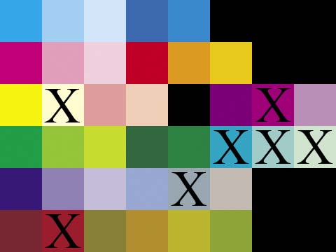
Generalized Comic Color Palette

C, C50, C25, CM50, CM25, X, X, X
M, M50, M25, MY, YM50, YM25, X, X
Y, Y25, M50Y25, M25Y25, X, MC50, MC25, M50C25
CY, YC50, YC25, CYM50, CYM25, CY25, C50Y25, C25Y25
CM, C50M50, C25M25, C50M25, C50M25Y25, C25M25Y25, X, X
MYC50, MYC25, YC50M50, YM50C25, YC25M25, YC50M25, X, X

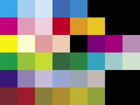
Referring to colors as, for example, 100% yellow plus 50% magenta plus 25% cyan (brown), is somewhat tiring. The industry uses a designation which I find confusing so instead I will adopt my own using the first initial followed, if not 100%, by the percentage. So my brown example would be YM50C25. I always placed them in the order of dominance or (when two inks are equally strong) the order they are found in CMY. While this is an improvement it is still too difficult to use lists of such color designations when comparing palettes used. So I have also developed a matrix to show the color palettes. I show above the standard color palette that I will be using followed by the corresponding color designations (where an X indicates an unused matrix location shown as black). If a color is not used in a particular palette it will be ‘X’ out in the matrix. The first row is for blues; the second for reds; the third row for yellows, flesh colors and purples; the fourth row for greens; the fifth row for violets and grays; and the sixth for browns and one dirty green (YC50M25). In the future I will either use some of the currently undefined matrix locations or add additional rows for colors not included in the current matrix.


Color Palette used by Hillman in Clue and Real Clue Comics.

Joe Simon has said that the coloring was the responsibility of the publisher. There was a period (cover dates March to September 1947) where Simon and Kirby were producing work for crime comics from two different publishers; Clue Comics and Real Clue Crime Stories for Hillman and Headline Comics for Prize. It would therefore be interesting to compare the coloring between the two. The Simon and Kirby work produced for Clue and its renamed title Real Clue used a more complete palette than those for Headline. The Hillman work used 38 colors (excluding black and white). But this is a little misleading because some of the colors were rarely used; deep blue (CM50), some of the purple tints (MC25 and M50C25), and red brown (MYC25).


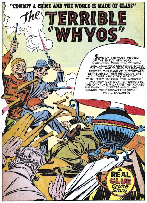
Real Clue Crime Stories v.2 n.5 (July 1947) “The Terrible Whyos”, pencils and inks by Jack Kirby

Perhaps the most distinctive feature of the Hillman palette was the common use of light yellow (Y25). We will see that this color was not used in Prize’s Headline Comics. Considering how most colors that include Y25 are avoided, it is surprising how often light yellow (Y25) was used. In one case Y25 was used for an automobile but it seems a poor choice for coloring prominent objects. However light yellow was generally used for background areas and it was surprisingly effective in making accompanying white areas stand out.

As mentioned previously, red brown (MYC25) was rarely employed but the other browns (dark MYC50, heavy YC50M50, medium YM50C25 and light YC25M25) were more frequently used. However not equally so as light brown (YC25M25) was not used nearly as commonly as the other three browns. Another not so frequently used color was dirty green (YC50M25).


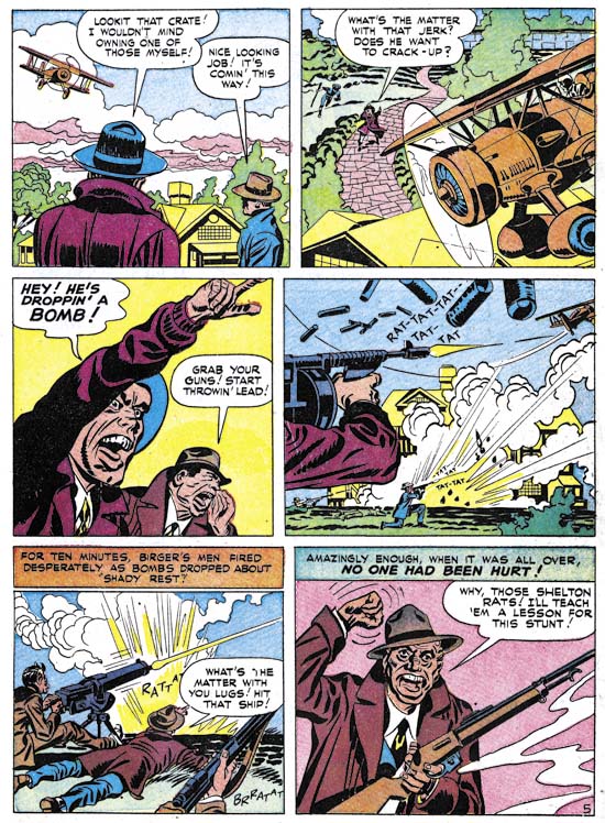
Real Clue Crime Stories v.2 n.7 (September 1947) “Gang War” page 5, pencils by Jack Kirby

Besides light yellow (Y25) the only other unusual colors with frequent use from the Hillman palette are pale green (C25Y25) and dark grey (C50M25Y25). Frankly with the very limited palette available for comic books the presence or absents of particular colors are of limited use in distinguishing different colorists. Also of use is how the artists uses the colors for the different objects. For instance the Hillman colorist generally uses middle green (YC50) for foliage and only much more rarely green (CY) or pale green (C25Y25). Police uniforms are dark blue (CM25) with brown shoes or boots. Caption boxes were colored with a variety of light colors; yellow (Y), light yellow (Y25), pale green (C25Y25), light orange (YM25) and even white. Desks and chairs are usual have a single color; generally dark brown (YMC50), heavy brown (YC50M50) or light brown (YM50C25).


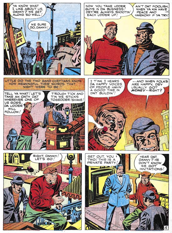
Real Clue Crime Stories v.2 n.5 (July 1947) “The Terrible Whyos” page 4, pencils and inks by Jack Kirby

Most golden age colorists were more concerned with providing clarity to a scene by providing the different objects with distinct colors. Realistic coloring was not a high priority. So with the Hillman colorist we get such oddities as multi-color sidewalks, pale green buildings and some really bizarre interiors. Not very realistic, but all more interesting than if a more realistic, and therefore more limited, selection of colors were used.


Real Clue Crime Stories v.2 n.6 August 1947) “Get Me the Golden Gun” page 13, pencils and inks by Jack Kirby

As previously mentioned, golden age colorists did not generally use graduated color tones for interior art. That is colors were restricted to mixtures of 100%, %50 or %25 of the cyan, magenta or yellow inks. But there was an exception to this rule and that was the use of simple color gradient usually to the background. The Hillman colorist made use of this varying a one ink of a color from 75% to 25%. Usually this was done rather smoothly but occasionally less care was taken. This was the sole exception that the Hillman colorist made to not using a 75% ink. The use of a starting value of 75% was not a whim. With the primitive presses used for comic books, 75% would sometimes fill in and become effectively 100%. If this happened to a gradient that started at 100% then a poor gradient would result with over much of it a pure color. With gradients starting at 75% any similar filling in would still provide a suitable gradient.

Although I have concentrated on the coloring of the Simon and Kirby pieces, the same colorists seemed to work on the stories drawn by other artists as well. The pencilers and inkers for Clue and Real Clue were used in other Hillman comics and were not the same ones that Simon and Kirby used for Prize’s Headline Comics. I therefore believe that Simon and Kirby were just supplying art to Hillman and not producing the entire comic as they were doing for Prize. I will compare the Hillman colorist to that used for Prize’s Headline Comic next week.

footnotes
* the complete comic color palette for three levels of cyan and magenta, two of yellow and a single of black. Those marked with asterisk are not shown in my standard comic palette:

K        CMY25*      CM
C50MY    C50MY25*    C50M
C25MY    C25MY25*    C25M
MY       MY25*       M
    
CM50Y    CM50Y25*    CM50
C50M50Y  C50M50Y25*  C50M50
C25M50Y  C25M50Y25*  C25M50
M50Y     M50Y25*     M50

CM25Y    CM25Y25*    CM25
C50M25Y  C50M25Y25   C50M25
C25M25Y  C25M25Y25   C25M25
M25Y     M25Y25      M25

CY       CY25*       C
C50Y     C50Y25      C50
C25Y     C25Y25      C25
Y        Y25         W