Category Archives: Simon, Joe

Joe Simon’s Opinion on “Combat Photographer”

A couple of weeks ago in my post “More Obscure Simon and Kirby”, I presented “Combat Photographer” (Real Fact #2, May 1946) which I attributed to Joe Simon. Last week I was able to show Joe this piece to get his opinion. Although he did not remember doing it, Joe was certain that it was his own work. He was particularly convinced by the title design feeling that it was typical of his style. Joe also commented on the quality of the lettering, calling it second class, and wondered if he had done it himself. Personally I doubt that since the lettering does not match very well with examples that I am sure he lettered.

More Obscure Simon and Kirby

Simon and Kirby’s new titles Stuntman (April 1946) and Boy Explorers (May) were published by their old friend Al Harvey. The decision to jump ship from DC was purely business but Liebowitz complained about not getting a chance to bid for their services. It was a decision that Joe and Jack would regret as the new titles were quickly cancelled, victims of a comic glut that followed the end of paper rationing. Jack and Joe would continue to do work for DC for their old feature Boy Commandos, but Sandman was cancelled (last S&K was Adventure #102 February 1946) and the Newsboy Legion would only last a short while longer (last S&K was Star Spangled #61 October 1946). Before this not everyone at DC was happy with how Simon and Kirby made their comics, now their critics had more ammunition to use against them. Even in the difficult times that followed, DC was either not approached or not interested in renewing their previous relationship with S&K. Because the art for comics is done months before it would be finally released it is not clear whether the work for Real Fact #2 (May) was done before or after DC found out about Simon and Kirby’s deal with Harvey.

Real Fact #2
Real Fact #2 (May 1946) “A World of Thinking Robots”, art by Jack Kirby

In the second issue of Real Fact, Jack Kirby returns to provide another short graphic article predicting the future. The prescient abilities of the scripter, whoever that was, was both good and poor at the same time. Robots are shown performing four tasks; as factory workers, secretaries, sport contestants, and house cleaners. The first two predictions can be said to becoming true today, the third is a qualified success, while the last is in its infancy at best. Robots are often encountered in a factory setting; some automobile assembly lines are famous examples. Modern software can take vocal dictation and produce pretty accurately typed text. While presently there are no robots playing football or any other human sport there are robotic tournaments that attract a small but devoted following. A robot house keeper would seem the most desirable of all but so far there has been only limited success. The one I know of is a robot that wanders around vacuuming the floor. This all sound like pretty successful predictions, except that a humanoid shaped robot is not used for any of the current examples. There are humanoid robots but so far they have not been used for any of those tasks nor is there any reason to believe they ever will be. The human form is a generalist approach; pretty good for many diverse tasks but not perfect for any. Why settle for a general factory worker when you can design more efficient one for specific tasks? As far the second part of the prediction, the idea of “thinking robots”, presently there are no Artificial Intelligent programs that come anywhere near to be described as thinking. Further those advances in the field of AI have not had much impact on robotics.

Artistically there really is not much to say about this piece. Once again I cannot help but feel that Jack would do more exciting machinery much later in his career. The inking is adequate but perhaps not too impressive. At this time I just cannot say whether this is Jack’s inking or not.

During my examination of Real Fact #2 in preparation for this post I kept being impressed by how the art for “Combat Photographer” resembled Joe Simon’s work. Initially I dismissed it as just a coincidence. As far as I know nobody has attributed this piece to Simon and while he was teamed up with Kirby, Joe did little penciling himself. Nonetheless upon repeated examinations I kept finding more things to suggest Joe Simon’s hand until I ended up convincing myself that this was his. Still I am bothered about this attribution because most new discoveries of examples of Simon’s art have often in the end been shown not to be by Joe. Perhaps I should have held off on reporting this case until further investigation and upon getting Joe’s own opinion. However in this blog I prefer to present my latest opinions which sometimes change over time. If I come to decide I have made a mistake I will post on that as well. In the mean time let me try to describe what leads me to credit this story to Joe as well as well as what evidence that does not fit so well with that attribution.

Real Fact #2
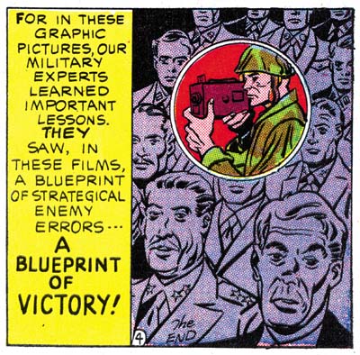
Real Fact #2 (May 1946) “Combat Photographer” page 4 panel 6, art by Joe Simon

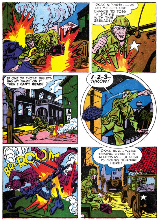
I find the manner of drawing figures matches quite well with Joe Simon BC (Before Kirby, a term that Joe uses that I find mildly humorous because of the way it reverses the normal manner of Kirby fans changing ‘C’ to ‘K’ as for example Kirby Kolor). There are examples to be found in Silver Streak #2, Target Comics #1 and #2, Daring Mystery #2, and Amazing Man #10. Note in particular how in panel 2 of page 3 (image below) the eyes and eyebrows are joined in a single angular shape; this is a typical early mannerism of Joe’s. There are also some similarities to be found in more recent work by Joe in Boys Commandos #12 and Adventure is My Career. The greatest similarity of the work closest in date to “Combat Photographer” is perhaps the cover for 48 Famous Americans (1947), but some may not find that convincing because that cover is often misattributed to Jack Kirby. At the time that Real Fact #2 was done Joe was penciling Duke of Broadway, Vagabond Prince and Kid Adonis for Harvey. For the most part those Harvey features have a somewhat different style but note the similarity of the final panel from the Real Fact #2 story (image above) with that style. There is a parallel to be found with the double page splash from Boy Explorers #1 which also combines two styles; one with a more earlier flavor and the other that predominates in Joe’s work for those Harvey features.

Real Fact #2
Real Fact #2 (May 1946) “Combat Photographer” page 3, art by Joe Simon

I am not sure whether circular panels were picked up by Jack or Joe first. It was a layout technique that both artists used in their work for Harvey. There is a perfectly good example of a circular panel on page 3 (see above). The device of extending a figure outside the panel border was typical of previous Simon and Kirby but pretty much dropped after the war. The circular panel from this story has figures that extend only slightly beyond the frame. Joe has adopted some mannerisms that seem to appear first in pencils by Kirby. Note for instance the square fist in the second panel. Another example is found in the man running in the third panel that has the sole of his foot turned toward the viewer.

Not everything about “Combat Photographer” favors attributing it to Joe Simon. My chief concern is that it is Joe’s early work that shows the greatest similarity. Part of what suggests the Simon BK work is simplicity in drawing that does not compare exactly with what Joe was doing at the same time for Harvey. Logically you would expect the greatest similarity would be among the work produced concurrently. The inking agrees with the pencils in being very simple, almost primitive. I have not done a close comparison with Simon’s inking (I will review Simon’s inking someday, I promise) but I am not convinced the brushwork here is by Joe. The layouts for “Combat Photographer” predominately uses distance shots while Joe’s Harvey work is much more varied in viewpoints. I do not consider any of this fatal to my crediting Simon for this art, but I do not want to ignore them either.

Initially I was also concerned about the odd placement of the page numbers, which is on the left side of a panel. This is very untypical for Simon and Kirby. The last panel of the story has a little “the end” written in a manner that does not look like anything I have seen from S&K. However further examination revealed that both of these features are found in other stories in Real Fact. They therefore are derived from the editor or the letterer and have no bearing on the question of the attribution of this art.

Real Fact #9
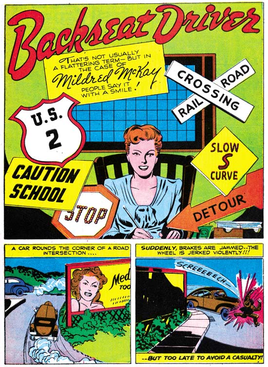
Real Fact #9 (July 1947) “Backseat Driver”, art by Jack Kirby

The next time Simon and Kirby appeared in a Real Fact was a little over a year later. That they appeared then is surprising because by this time they had already launched their version of crime genre and must have been preparing for their soon to be released romance comics. However I have never heard of Simon and Kirby turning away any work and who can tell how long DC kept this piece as inventory before using it. The story is about a lady who distressed by the number of automobile accidents decides to open a driver school. If you excuse the pun, it might not sound like a very good vehicle for Kirby’s talents but actually Jack manages to make it very interesting. On the opening page Kirby shows a pedestrian being hit by a car, only to show on the next page that the victim was literally a dummy. Other examples of actual or near accidents provide further action. For those panels that could be described as talking heads, Jack is already showing the use of varying viewpoints and distances, and the placing of main focus behind a foreground of objects or lesser important people. These visual techniques would play a big part in Kirby’s romance art where standard actions were not always appropriate. I would not call “Backseat Driver” a masterpiece but it is far from being a failure.

The art that Simon and Kirby did at that time for their crime comics was inked in the classic Studio Style with picket fence crosshatching, drop strings and abstract arches (see the Inking Glossary for explanations of these terms). Few of these inking techniques are found in “Backseat Driver”. The splash shows clothing folds that are simple spatulate shapes often attached to a thin line almost like they are leaves on a stem. The entire splash has an overall light look because of the limited use of blacks. When blacks are used they tend to flood an area. Those who have read my serial post Jack Kirby’s Austere Inking may recognize this as an excellent description of that style, this despite the fact that the Severe Style would not show up until about nine years later. However as I reported last week, Picture News #1 also has portions that could be described as a Proto-Severe Style. Not everything in this splash is fully reminiscent of the Severe Style. Some of the spatulate clothing folds are offset a little from the narrow lines. The spotting on the woman’s right breast has a feathering more typical of style used on earlier DC work. I believe the splash was inked by Jack himself but the two panels below just do not offer enough to provide a convincing inking attribution. The other three pages share with the splash an overall lightness and simplicity in the inking. However the inking does not appear as sensitive and the clothing folds do not match the manner found in the splash. I am not ready to provide inking credits for those pages but I do not think it was Kirby. It is among the other three pages that can be found some drop strings and shoulder blots.

Before Simon and Kirby crime and romance comics the duo had tried their hands in a number of categories not typically associated with them. Besides the supposedly true stories done for Picture News and Real Fact, Joe and Jack also tried teenage humor (My Date Comics and Pipsy) and kiddy humor (Lockjaw and Earl the Rich Rabbit for Punch and Judy). None of these were successful but they do show that Simon and Kirby were talented enough to give them a good try.

Joe Simon Interview and Captain America

As many of my readers probably already know, there is a lengthy interview of Joe Simon conducted by Jim Amash in the latest issue of Alter Ego (#76). I am sure it is the longest Simon interview ever published and it is filled with information that Joe has never previously revealed. In short it is the best Joe Simon interview ever, by a long shot. What I particularly appreciate is how Amash has managed to reveal the real Joe Simon, at least as I know him. Joe is a natural and entertaining story teller and that is a side no other interviewer has ever managed to bring out. My hat is off to Jim Amash, great job!

Captain America Comics #1
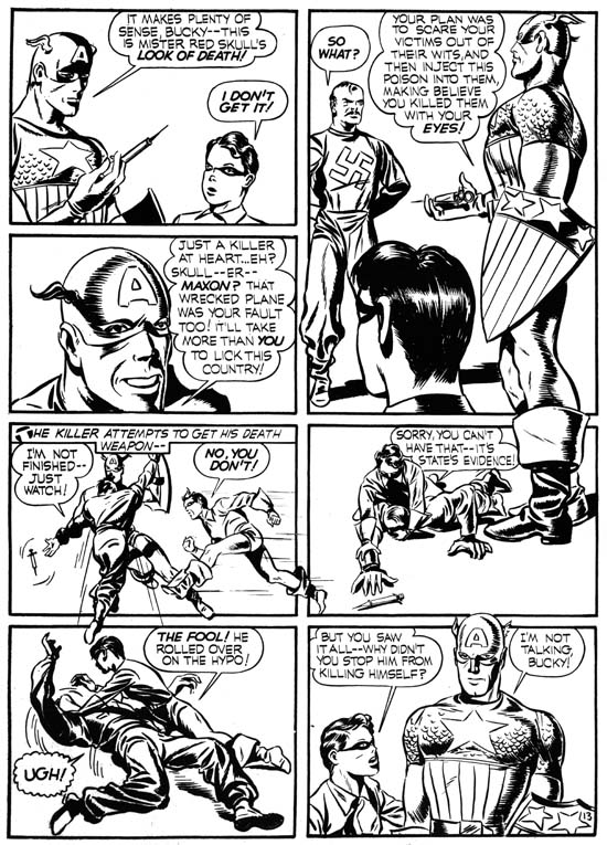
Captain America Comics #1 (March 1941) “The Riddle of the Red Skull” page 13, art by Jack Kirby

The interview is accompanied by lots of great art, although on that subject I am certainly biased. Long time readers of this blog will already have been familiar with some of it but it is nice to see even those in print. There is an image I would like to comment on, one from the Captain America #1 described as “a photocopy of the original art”. Technically that is a completely accurate description, but nonetheless I fear that it might be misleading. I wish I could say that Joe still had any original art from Cap #1; it would be quite valuable today. I am pretty confident that all the actual art from Captain America #1 has been forever lost. The source of the Alter Ego image was a flat that Joe did save. The term flat may confuse some because Joe uses it in the interview as a name for magazines printed on non-glossy paper. In the context that I am using it now, a flat is a proof made during the construction of a comic. It is an image of four pages of the comic book arranged as they will be printed on a single sheet of paper. The images of each of the four pages were made from the original art without any colors. As such, flats are the next best thing to the long perished original art. Obviously both Joe and Jack must have known that there was something special about Captain America #1 because they both saved flats from that issue and that issue alone. Joe’s collection does not contain any other flats until some of those published in making Mainline comics (from 1954). In the sixties Jack sold his Cap #1 flats to Marvel for use in their reprint “Captain America, the Classic Years.” Those flats have been the basis for all the reprints Marvel has made since of the first issue of Captain America. Since modern printing technology is much superior to that used at the time for publishing Captain America #1, you can see better reproductions of the line art by purchasing one of Marvel’s reprint today then you would get by spending thousands of dollars for an original issue.

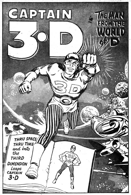
Captain 3D

I have decided to examine Simon and Kirby’s most neglected superhero, Captain 3D. So set your computer to 3D viewing. What your computer does not have the 3D view feature? Oh well, I can see most of you have not upgraded to the latest Pear computer. In that case through the magic of Photoshop I will convert scans of the Captain 3D #1 comic to restore the line art. Seriously I have never been a fan of 3D comics feeling that it is largely a gimmick where too much is lost (color) with too little gained. Besides I find it an annoyance to have to wear special glasses just to read a comic.

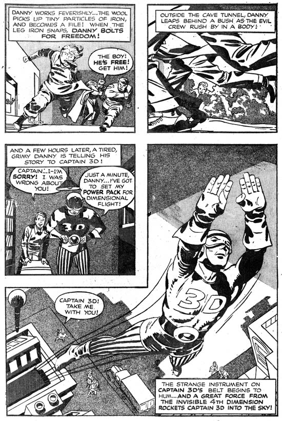
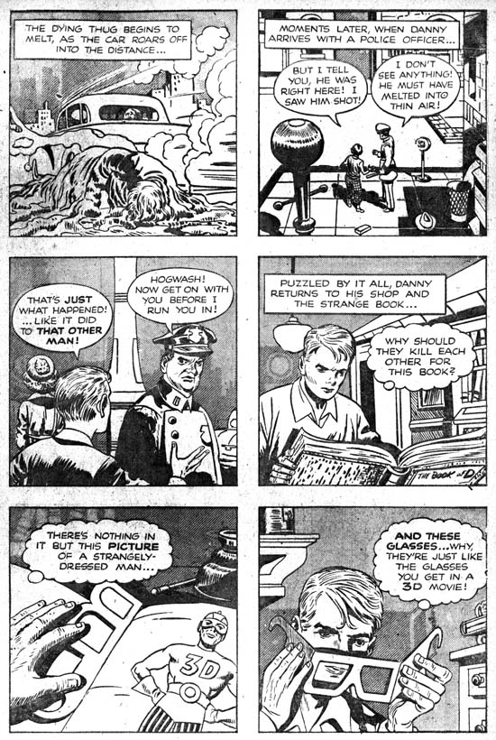
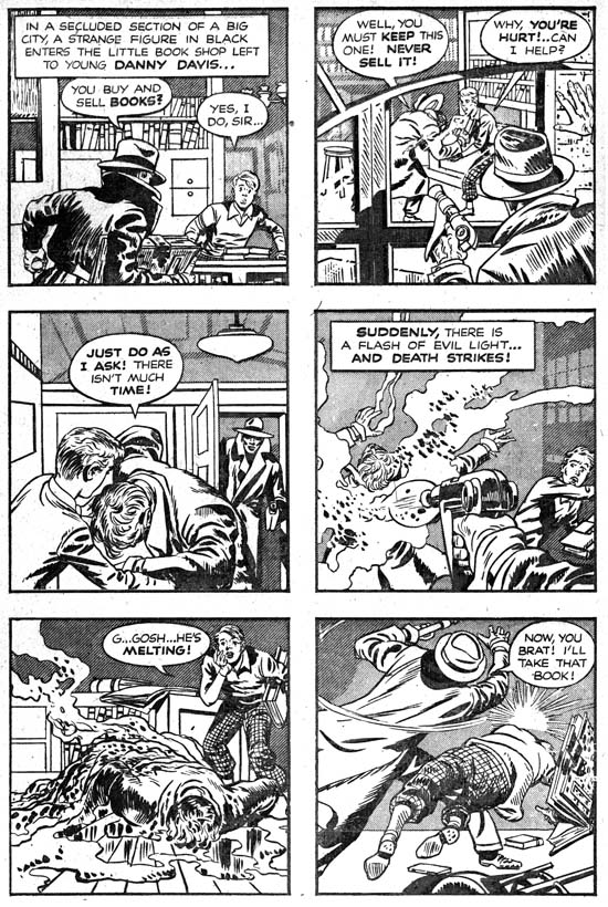
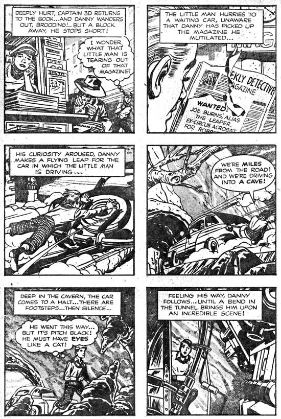
By their very nature, superheroes require a suspension of critical judgment in order to be enjoyed. I think the barrier is even higher in the case of Captain 3D due to link between the comic’s 3D gimmick and the hero’s jumping out of a book when viewed with special glasses. Along with the ability to come out of the book when needed, Captain 3D has a power pack that allows him to fly. Otherwise Cap, and he is referred to by that nickname, does not seem to have any special powers or strengths. Captain 3D’s main adversaries are the cat people. The cat people had in the past killed the rest of Cap’s people and now want to enslave mankind as well. Normally Cat people look no different from the rest of the population but when viewed with the same 3D glasses that release Captain 3D from the book, the cat people show their feline features. However Cap also fights more everyday criminals as well. Like many superhero comics of that time, Captain 3D has a young sidekick named Danny, the guardian of the book of D.

Captain 3D
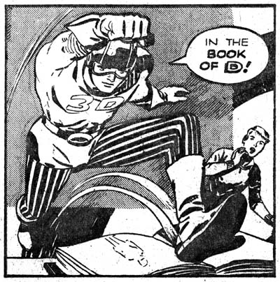
Captain 3D (December 1953) “The Man from the World of D” page 11 panel 4, pencils by Jack Kirby, inks by Mort Meskin

There is little doubt that Jack Kirby penciled all of Captain 3D #1. Perhaps more then any other comic book artist, Kirby has worked on supplying the extra dimension to comic’s flat plane. He has done so starting perhaps from his days at Timely until the very end of his career. I am not sure how he felt about 3D comics but he came to them already knowing how the images should be composed. Joe Simon’s comments about this can be found in his book “The Comic Book Makers”. There Joe’s basic premise is that the images should project out of the comic, not into. The actual art found in Captain 3D confirms Joe’s observation; there are only a few panels that project into the page. One of them is very effective despite breaking this rule; it is a composition that would be repeated years later in the comic book Battle. Late in life Jack would adopt a style where perspective would be exaggerated to such an extent as to appear unnatural. This style is exemplified by a pose the Kirby would use often where the hero jumps toward the user with one arm held straight and fist closed. Captain 3D has the earliest example of the pose that I am aware off, although without the extraordinary exaggerated perspective. After Captain 3D the pose would not be repeated for many years, but obviously it was not forgotten.

In his book Joe Simon describes Al Harvey requesting Simon and Kirby to produce a 3D book. Neither Joe, Jack nor any of the artists working for them had any experience with making such a comic before. An outside artist had come to Harvey saying he figured how to make 3D comics himself and offered to show Harvey’s people how. Harvey wanted the comic done quickly in order to cash in to what looked like a lucrative craze. As an incentive Harvey offered special rates but I sometimes wonder if Simon and Kirby had every turned down a job because they were too busy.

Joe says the Captain 3D book was created by him, Jack, Mort Meskin, Steve Ditko and “other key artists” working for the S&K studio. As I said above Jack Kirby was responsible for all the pencils. The inking is another question. Frequently the inking has been attributed to Steve Ditko by comic art dealers. Not long ago I saw one offering a page from Captain 3D as created by Steve Ditko, never even mentioning Jack Kirby’s involvement! Determining inking attributions for the Simon and Kirby studio is fraught with difficulties as inking credits were never provided. So comparison of inking methods with that used by different artists on their own work is the only technique that can provide help. There is the added difficulty in a case like Captain 3D when a number of different artists were involved on the same project. If that was not enough, the acetate used to create the 3D effect was a very unforgiving and unfamiliar material for the artists to ink on. Brush control that the artists normally exhibited cannot be expected to show up in the Captain 3D inking. Therefore it would be the risky, to say the least, to try to sort it all out. So naturally I cannot resist.

Captain 3D
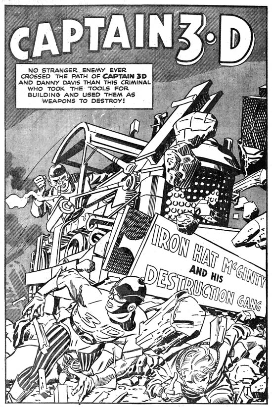
Captain 3D (December 1953) “Iron Hat McGinty and His Destruction Gang”, pencils by Jack Kirby, inks by Mort Meskin

The inker easiest to spot is Mort Meskin. I have previously discussed Mort’s inking techniques. Despite the problems acetate presented many of those techniques can be found in Captain 3D. Here the inking technique that seems to stand out the most is Meskin’s manner of doing picket fence brushwork (for explanations of some of my terms please see the Inking Glossary). Although picket fence crosshatching was part of the S&K Studio style, Mort’s can usually be distinguished by “rails” that are lines of strong but even strength, almost like wires laid down on the page. Even the “pickets” tend to be more mechanical then those by S&K. I have found picket fence brushwork in 13 pages all but 2 of which look like Meskin’s work. Mort also had a way of depicting clothing folds with multiple long parallel, sometimes overlapping, brush strokes. Perhaps because of the difficulties acetate presented, I have found this Meskin brushwork only on 4 pages. Meskin had a special way of drawing and inking eyes and eyebrows. He modified it when inking Kirby’s pencils but it sometimes still retains enough of his personal touch so that it can be recognized. In Captain 3D I found 9 pages with Meskin’s eyes. Mort occasionally would place on one side of a form a wider then normal line that also served as a sort of shadow. There is one page that has this Meskin technique. I came to notice that Meskin sometimes gave a sinuous shadow to Cap’s helmet; this can be found in 6 pages. All together I attribute 11 out of 32 pages to Mort Meskin. For those interested these are “The Man from the World of D” pages 5 and 8 to 11; “The Living Dolls” pages 2, 3 and 10; “Iron Hat McGinty and His Destruction Gang” pages 1 and 9; a figure of Captain 3D in an advertisement at the end of the book.

Captain 3D
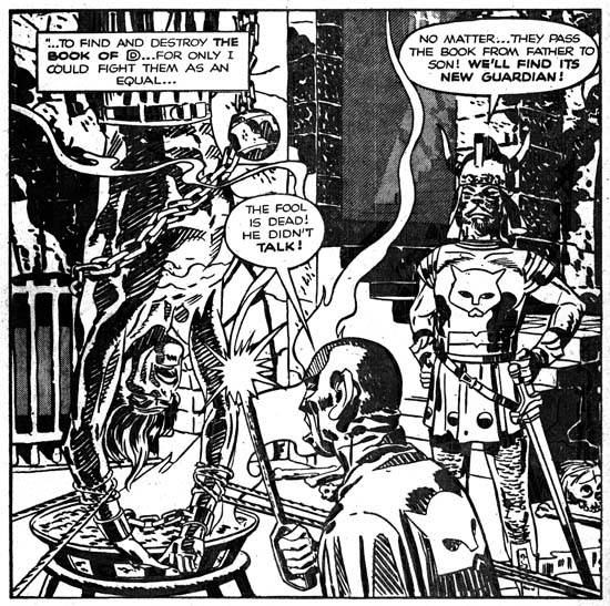
Captain 3D (December 1953) “The Man from the World of D” page 10 panel 2, pencils by Jack Kirby, inks by Mort Meskin

Mort Meskin did an outstanding job on the splash page for “Iron Hat McGinty and His Destruction Gang”. However for me the tour de force of the entire book is page 10 of the “The Man from the World of D”. You can tell Mort was struggling with the acetate surface but he still managed to create a masterpiece in the bottom, almost splash-like panel. I believe there is a reason Mort put so much effort here, this is probably the most powerful image that Simon and Kirby had every produced. I am not referring here to the graphic qualities of the image but to its subject matter. Simon and Kirby never went the extremes such as could be found in EC comics. That is not to say they avoided violence; guns, knives, whips and other weapons can be found but S&K usually refrained from making the use of these devices so obvious. The only exception to this seems to be found earlier in the Captain America art where one time they even went so far as to depict the hanging of a fake Captain America and Bucky. Even then we only see a back view of their dead bodies.

Captain 3D
Captain 3D (December 1953) “The Living Dolls” page 7, pencils and inks by Jack Kirby

The next most easy to spot inker in Captain 3D is Jack Kirby himself. Jack’s involvement to the inking should not be too much of a surprise. After all it was a rush job and Jack would finish pencils before all the inking had been completed and so would be expected to join in. What is surprising is the inking technique he adopts for Captain 3D. Kirby does not use the Studio inking brushwork that was ubiquitous of his inking at that time. Instead Jack works in a style remarkably like the Severe style that would not appear in his inking for several years hence. I think Kirby used this style because it allowed him to work more quickly and it overcame some of the difficult problems presented by inking on acetate. Missing from the Kirby inked pages are techniques like picket fence crosshatching or drop strings. Part of the Severe style is a technique of inking a clothing fold with simple elongated ovals or tapers sometimes attached to a thin line giving it the appearance of a narrow stem ending in a long leaf. This brushwork is found on two pages I attribute to Jack but only in a single panel of one of them suggesting that there Kirby was retouching another inker’s page. Kirby was an excellent inker which gave him an advantage in interpreting some of the nuances of his own pencils. The acetate undoubtedly made it difficult for Jack to achieve such subtleties. Nonetheless I feel I have detected nuances in the treatment of eyes and eyebrows that look like Kirby’s hand. Although Kirby’s brush can be confidently detected Jack did not ink much of Captain 3D. There is not much to go on but the two small heads found in the introduction look like Kirby to me. More certainly Kirby’s inking are panel 1 of page 7 of “The Man from the World of D”, page 7 of “The Living Dolls”, and page 5 of “Iron Hat McGinty and His Destruction Gang”. There are some other possible candidates that I will discuss below.


Captain 3D (December 1953) “The Man from the World of D” page 4, pencils by Jack Kirby, inks by Joe Simon

I have not yet presented to my readers a thorough examination of the inking techniques used by Joe Simon. Joe presents a particular problem in determining inking attributions. My normal methodology is to examine the inking of art penciled by the artist to find clues on how that artist might in turn ink Kirby’s pencils. Unfortunately Simon did not pencil much art during his collaboration with Kirby. Further Joe has shown himself in the past as adept at mimicking other artists’ styles. While at Fox Joe did such a great job that even experts have missed his signature on some of the covers and attributed the art to Lou Fine. Joe has also mimicked Kirby’s pencils and there is no reason to believe he would not also try to do so with Jack’s inks. Therefore what I present below should only be viewed as a preliminary assessment. Joe Simon’s brushwork was coarser then Kirby’s and in particular his clothing folds did not have the same almost puddled appearance as those Jack used in this comic. In Captain 3D 6 of the pages have a coarser brushwork that looks like Simon’s to me. Like Meskin, Simon has a way of doing eyes that can sometimes show through when inking Kirby’s pencils; 3 pages look like they have Simon’s eyes. I previously mentioned that in Captain 3D picket fence crosshatching was used by Meskin but not by Kirby. There are 2 pages that have picket fence brushwork that do not appear to be Mort’s. I feel that they were done by Simon, but it is possible that this could be misleading due to the difficulty of inking on acetate. Both Simon and Kirby used shoulder blots and these can be found among the pages I attribute to Simon. Shoulder blots do not appear on any of the pages I have credited to Meskin but they do on one that assigned to another artist to be discussed below. All total I credit Joe Simon with inking 8 pages of Captain 3D. For those interested these pages are “The Man from the World of D” pages 3 and 4; “The Living Dolls” page 2; “Iron Hat McGinty and His Destruction Gang” pages 2 to 4, 6 and 8. Keeping in mind the problems about distinguishing Simon from Kirby and the difficulties presented by working on acetate it is quite possible that some of the pages I have attributed to Simon might actually been done by Kirby. Particularly suspicious are the number of Simon pages found in the last story. Assuming that was the last story actually penciled it is just where we might expect the greatest inking contribution by Kirby.

Captain 3D
Captain 3D (December 1953) “The Man from the World of D” page 2, pencils by Jack Kirby, inks by Steve Ditko

Those keeping tally would realize that there are still a number of pages in Captain 3D that were not done by Meskin, Kirby or Simon. I believe most of them were done by the same artist. I credit them to Steve Ditko but frankly this also is very provisional. Since I have not done a careful review of Steve Ditko’s earliest efforts I really do not have a lot of inking traits to rely on. The most distinguishing feature of his inking, at least compared to Simon and Kirby studio artists, is his reliance on a pen for most of his spotting. Some fine pen work does show up in Captain 3D. However there are often brush spotting on the same pages sometimes covering over some of the pen lines. Some of this may be Ditko’s own efforts but some of it looks like Joe Simon going over and strengthening Steve’s work. The presence of a shoulder blot on one of these pages supports that suggestion. The lower part of the man’s jacket in the last panel of the page 2 of “The Man from the World of D” shows a type of feathering that I have never seen before in work produced by Simon and Kirby or artists that worked for them. Ditko also seems to have his unique touch in his way of doing eyes that shows up in Kirby’s pencils. I notice that Ditko had his own way of inking Captain 3D’s helmet. Ditko would create two simple bands or when the top band was near the peak it would be formed into a small semicircular field. All in all I assign 8 pages to Ditko; “The Man from the World of D” pages 2, 6 and 7; “The Living Dolls” pages 5, 6, 8 and 9; “Iron Hat McGinty and His Destruction Gang” page 7.

Captain 3D
Captain 3D (December 1953) “The Living Dolls” page 4, pencils by Jack Kirby, inks by unidentified artist

I am concerned that since I do not yet have a good handle on Ditko’s inking style, especially on acetate, that perhaps some of the pages assigned to him may actually been done by some other artist. There is one page (page 4 of “The Living Dolls”) that I simple am not comfortable to assigning to any of the artists that I have discussed so far. I feel this indicates there was at least one other artist inking Captain 3D but I have no idea who he was.

Captain 3D
Captain 3D (December 1953) “The Man from the World of D”, pencils by Jack Kirby, inks by Mort Meskin

I have saved for last a short discussion about the cover. The art for the cover was also used as the splash page for “The Man from the World of D”. Therefore it would have been done on acetate in order to achieve the 3D effect. It must have been a difficult task to ink on acetate carefully enough so that it could also be used for the cover. Perhaps because of that spotting is very minimal. It appears to have been done with either a pen or a fine brush. This might suggest Ditko inking but I feel it was actually done by Meskin. Meskin did not do much fine inking in the other interior art but some does show up particularly on splash pages where greater effort was made as for example the first page of “Iron Hat McGinty and His Destruction Gang”. The method used to spot the muscular forms on the cover does appear similar that used in the splash. Captain 3D on the cover also has eyes that suggest Meskin’s personal style. There are not much clothing folds but some on the upper torso are made using close parallel lines like those Meskin prefers. Finally Captain 3D’s helmet has a sinuous curve to the shadow; a device similar to what Mort used in the interior art.

The final breakdown is 12 pages inked by Meskin, 8 pages by Simon, 7 2/3 pages by Ditko, 3 1/3 pages by Kirby, and 1 by an unidentified inker. This is a little misleading because one of the pages attributed to Kirby consists only of two small heads and one of the pages credited to Meskin is an advertisement with only a single figure of Captain 3D.

In my next post I hope to discuss Captain 3D #2.

The Wide Angle Scream, American Royalty

I have decided to resurrect this old serial post. I originally started it when I had then begun to restore S&K’s double page splashes. I wanted the restoration to be on the same level that I do for covers. However that required an awful lot of effort since these splashes have twice the area of the covers and the printing quality is much inferior. Eventually the amount of work proved too excessive and other restoration projects became more important. I feel that the subject matter of the serial post is too important and should not be completely abandoned. So I return to the subject although in the future the quality of the restorations will not be quite so high. Since it has now been over a year since my last chapter, I thought I should provide a very broad summary of the previous posts.

Simon and Kirby’s use of a double page splash began with Captain America #6 (September 1941). The five Cap double page splashes had a strong emphasis on design (#6#7#8#9, and #10). The splashes would consist of three sections. One section common to all was what I called the enactment; it is a scene or tableau but is not part of the actual story. The second section is also common to all Captain America wide splashes; it consists of panels for the true start of the story. Although the third section is present in all of these splashes what it comprises of is not consistent, it can be a cast of characters, floating heads or a sort of comic book equivalent of movie trailers.

During the period that Simon and Kirby worked for DC they only produced one double page splash, that was for Boy Commandos #2 (Spring 1943). Here once again the splash was made in three sections. The enactment is present but it consists of a larger number of individuals then ever attempted in Captain America. Some organization is achieved by deploying them around the glass case containing a sleeping beauty, but even so there is so much chaos that it takes some time to sort out all that is taking place. There is also a cast of character sections. Unlike the Cap wide splashes there is no start of the story; instead the third section is given over to a large introductory text.

After returning from the war, Simon and Kirby launched Stuntman and Boy Explorers that were published by Harvey Comics. A wide splash was used with Stuntman. Only two were published but Jack had made worked on three others. The first one (Stuntman #1, April 1946, “The House of Madness”) used an unusual design, effectively two enactments laid out as large panels separated by a sweeping gutter. The second (Stuntman #2, June 1946, “The Rescue of Robin Hood”) reverted to a more standard tri-part design with sections for the title, enactment and cast of characters. Although the exposition is pretty much isolated from the rest of the splash, the title and cast of characters are nicely integrated. I also posted on one of the unpublished wide splash ( “Terror Island”). For the first time Kirby provides just one section, an enactment. There is a title, an introduction and even a floating head of the Panda, but these are subservient to the large enactment and do not achieve the status of their own section.

Because of copyright issues I do not consider it appropriate to reproduce the other two double wide Stuntman splashes. They can be found in Joe Simon’s book “The Comic Book Makers”. Both are further variations of a single large enactment section found in “Terror Island”. In one (“Jungle Lord”) Jack presents a smaller cast as compared to that for “Terror Island”. The enactment takes place in the tree tops where we find Stuntman battling a gorilla in the foreground while in the back Don Daring clings to a tree and a jungle boy makes off with Sandra Sylvan. Since the cast is smaller in the “Jungle Lord” splash as compared to “Terror Island” the action can be brought closer to the reader with dramatic results. The inking of the final wide splash (“The Evil Sons of M. LeBlanc”) was never completed, so it clearly was the last one worked on. This is another single section with Stuntman confronting three opponents. I find that the plain room in “The Evil Sons of M. LeBlanc” as compared to all the foliage of “Jungle Lord” brings greater focus and excitement to the depiction.

The Stuntman period is interesting because it marked the only time during his collaboration with Kirby that Simon did a significant stint at drawing. Early in his association with Jack, the two would draw different pages from the same story. Initially this seemed to be the working method for Captain America but quickly Jack took over all the drawing choirs for the S&K partnership. With the exception of some work done while in the Coast Guard, Joe did not seem to contribute much penciling to what was produced by S&K during the war. But while Kirby was penciling Stuntman and Boy Explorers Joe would pencil three backup features; the Duke of Broadway, the Vagabond Prince and Kid Adonis. Despite what some experts have said, these were drawn entirely by Joe except for a few small parts that Jack altered in his role as an art editor. Joe has said that Harvey kept track of the mail and that the Duke of Broadway got a better reader response then Stuntman. This was likely to be during the period after the original titles had been cancelled and Harvey was printing the unused work in comics such as Green Hornet. After the Harvey Stuntman/Boy Explorers period and until the breakup of the Simon and Kirby team, Joe’s penciling contributions would be uncommon (48 Famous Americans for J. C. Penny and “Deadly Doolittle” for Fighting American).

Boy Explorers #1
Boys Explorers #1 (May 1946) “His Highness the Duke of Broadway”, art by Joe Simon
Larger image

Joe only did one double wide splash for his Harvey features (“His Highness the Duke of Broadway” from Boy Explorers #1, May 1946). It is actually surprising that he did any considering the short lives of these titles (due to a comic book glut) and the fact that his stories are all back-up features. Like the one from Stuntman #1 a month before, this double page splash is comprised of two sections. Not that use of the same number of sections makes these two splashes truly similar. While that from Stuntman #1 is unusual in being composed of two enactments, the splash for the Duke feature is made of two familiar sections, an enactment on our left and a cast of characters on the right. The cast of characters consists of both full figures and floating heads accompanied by short captions that provide their names and a short description. At ten in number it was quite an ambitious cast, Joe obviously wanted a lot of supporting characters so as to provide the potential for much variation in his stories (unfortunately there would only be five). In this splash much of the cast are floating in front of the cityscape. Even those that are attached to the ground seem unnaturally placed because of the way they block the small avenue (surprisingly small since it is meant to be either Broadway or 42nd Street). The cityscape itself is carefully drawn so to provide an interesting background but subtlety rendered so that the cast would still stand out.

Such a large number of cast members required the use of half the splash. But this was the cast for the feature, only some of them would show up in this particular story. With such a large assemblage on the right side Joe needed something on the left to balance. His solution was to present most of the cast together solidly placed on the sidewalk. While this was a satisfactory solution as far as the composition was concerned, frankly it is not very exciting. Joe would do much better and more innovating designs for some of the regular splashes for his features. Still this double wide splash shows an emphasis on design that would disappear from the later ones by Kirby for Stuntman.

Stylistically the drawing for the splash differs from what Joe did in the story itself. Click Collins and Legal Louie are exceptions as they seem to better match what was done for the story. It still looks to me that it was penciled by Simon, only it is closer to what Joe had done previously and to what he would again do later in his career. Nothing on the splash refers to what will be found in the story. Everything is very generic, describing the feature as a whole and not this particular story. All this makes me suspect that Joe did the splash some time before as a presentation piece for the pitch he made to Harvey. Joe was not one to let all that effort to create this splash go to waste, so he appended it to the first story.

Joe Simon on CNN

I do not have cable so I knew I would not see Joe Simon’s appearance on CNN. But through the magic of YouTube I can now view it as can you.

Joe Simon, The Patriot

The Patriot #3
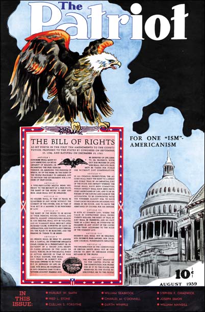
The Patriot #3 (August 1939) by Joe Simon

Today it is hard to believe that there every was much of a Nazi party in America. But in February 1939 22,000 Nazi supporters attended a rally at Madison Square Gardens. At this rally Fritz Kuhn attack the president, calling him Frank D. Rosenfeld. But the rally also attracted numerous protesters. So although the American Nazi population then was enormous by today’s standards they still a fringe group that would not have been considered patriots. Even though there was a large isolationist movement and no signs yet of the US entering the war, there was also many who could called themselves patriots and considered the Axis powers as enemies of the United States.

The Patriot #2
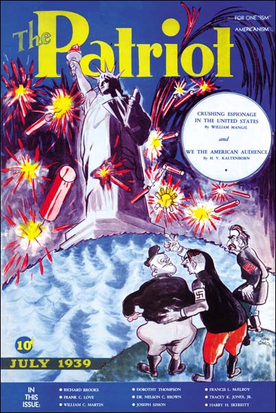
The Patriot #2 (July 1939) by Joe Simon

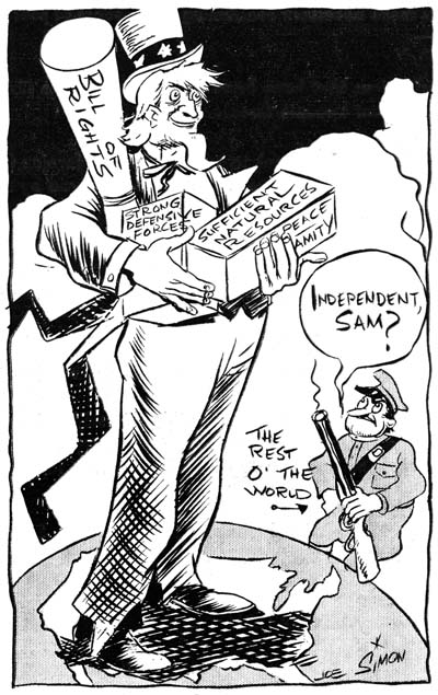
In 1939 Joe Simon was working in the newspaper business, his efforts in comic books had not yet started. Any doubts where Joe stood politically can be erased by his contribution to a publication called “The Patriot”. Joe provided that quintessential American symbol, the bald eagle, for one cover. On another he mocked the three dictatorial leaders, Adolf Hitler, Benito Mussolini, and Joseph Stalin. The Patriot was a slightly over tabloid size magazine. It was rather thin, 20 pages including the covers. There was a lot of local advertisement, so it probably had limited distribution. With a title like The Patriot one might suspect it was suitable for reader with an extreme right political philosophy. But the articles in the magazine are about extolling American scenery, products and of course freedom. Pretty tame stuff and very much centrist for the political spectrum of those days.

The Patriot #2
The Patriot #2 (July 1939) by Joe Simon

But Joe’s views were not shared by all the people he worked with. Joe got his initial start in newspapers and a lot of guidance from Adolf Edler. Adolf sometimes would tell people he had been off to a nudist colony. In reality he was off to a Nazi Bund camp. You would think Adolf’s political convictions would have problems working with someone Jewish like Joe Simon. Quite the contrary, in fact Adolf seemed to actively hire Jewish workers and got along with them quite well. Apparently Edler’s tie to the American Nazi movement was due to his fondness for his homeland. But letters he received letters from Germany told of increasing persecution of Jews. Dismayed with what he learned led him to abandon the Nazi Bund group.

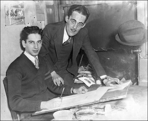
Joe Simon and Adolf Edler

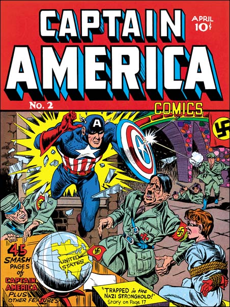
There was a lot of newspaper buyouts and closings and Joe lost his job. Joe moved to New York City and entered the comic book industry. Perhaps due to the experience he got from newspapers or perhaps just due to pure ambition, Joe rose rapidly from an artist to an art editor. When Joe and Jack Kirby created the ultimate patriotic hero, Captain America, who better to appear on the first cover as his adversary then Adolf Hitler himself. America had not yet entered the war, but there can be no question where Joe and Jack stood. Captain America Comics was a big hit, so many in the public probably agreed. In the 1954 Simon and Kirby created a new patriotic hero, the Fighting American. But times had changed and the Fighting American had a short run. S&K returned to the same thing once again in 1959 with their own version of the Shield (Secret Life of Private Strong) but this time it was cancelled due to legal threats from DC. Still the patriotic spirit did not leave Joe. In 2001 after 9/11 Joe responded by creating an altered version of the classic Captain American #1 cover. I wish I could include an image but alas because of legal questions I cannot. It shows Captain America delivering his famous punch not to Adolf Hitler but to Osama Bin Laden. Since I cannot show the 9/11 cover let me end this post with an image of the less often seen confrontation between Hitler and Captain America from the cover of issue #2.

Captain America #2
Captain America #2 (April 1940) by Jack Kirby and Joe Simon

Not Joe Simon, Daring Adventures #11 and #17

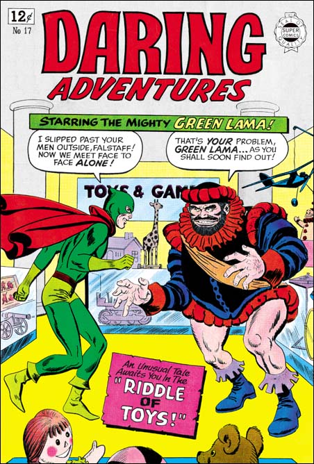
Daring Adventures #17
Daring Adventures #17 (1964) by Ross Andru and Mike Esposito?

I guess one theme of this post, at least for me, is what was I thinking? When I did my original serial post on the Art of Joe Simon, I stated that I believed Joe did the covers for Daring Adventure #10 to #17. At that time I had only seen (and restored) the cover to DA #15, but Joe had also included DA #16 in his book “The Comic Book Makers”. But I had only seen DA #9, 10, 11, 12, 17 and 18 on GCD. The images they provide are not the highest quality (it would almost seem they have a policy of excluding restored covers). Apparently I could see enough to exclude #9 and 18 from being Joe’s work. But for some reason I thought that #10, 11 and 17 might be, I just cannot remember what that reason was. After I had a chance to restore DA #12 and 16 I posted that I no longer sure that #11 and 17 were by Joe but that I wanted think about it some more (apparently I had already excluded DA #10). Well I thought some more, but I can really find nothing in DA #11 or 17 to suggest that they were Simon’s creations.

I decided to restore DA #17 anyway as I thought it might make an interesting comparison to Joe’s work at that time. Similar comparisons could be made to DA #11. The GCD attributes both of these covers to penciling by Ross Andru and inking by Mike Esposito. I am familiar with Andru’s romance work during the 50’s because some of it appeared in the Prize comics that Simon and Kirby produced. I am not knowledgeable about Andru’s later or superhero work. So I have used the GCD attribution above, with a question mark not because I think it is wrong but because I just do not know enough to make a judgment. In the rest of this post I will assume the pencil artist really was Andru. I would greatly appreciate it if there is anyone reading this who feels they are familiar enough with Ross Andru’s work to give an opinion.

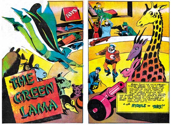
Daring Adventures #17
Daring Adventures #17 “Riddle of Toys” (reprint) by Mac Raboy
Larger Image

The first think that strikes one about DA #17 compared to Simon’s DA covers it how good the figure drawing is in DA #17. It is not that Joe is a bad figure artist, it is just that at least here Andru seems so much better. Really nice form and although the anatomy is not completely accurate the short comings really do not distract from overall affect, quite the contrary. It is a bit hard to imagine a real figure under Falstaff’s cloths. The legs are too widely separated and there does not seem to be enough room in the torso for both hips and chests. But to me these are really not truly “errors”. With these sort of distortions Ross has presented a truly marvelous and intimidating villain. Although the cover Falstaff is clearly based on the character for the reprinted story inside the comic, the Andru has created an even better version. That is no small compliment because the story was drawn by Mac Raboy, one of the greatest of the golden age artists. The Green Lama is not quite as impressive but his slimmer figure is appropriate for this particular hero. There is one unfortunate change, the Green Lama’s original hood has been modified to a face mask. That by itself is not so bad, but Ross leaves the back of the hood as a small bump which gives the hero a rather ridiculous look.

Although based on this cover I would believe that Andru was a better figure drawer then Simon, when it comes to the composition or design of the cover the reverse is true. There are some rare exceptions, but in general Joe does an very good job of laying out his covers. In DA #17 notice how all the toys in the background are scattered around the the main characters. Although this “clutter” might be more realistic, it detracts from the antagonists and the story the cover is trying to present. Joe seems much more sensitive to where he places secondary features and he makes sure that the action is well placed. Raboy’s splash shows how this could be done. Notice how the toys almost ring about villains while the Green Lama flies in as if toward a target. With all the toys you would think the image should be cluttered, but with careful arrangement it not only do the toys not detract but actually direct the eye.

As I mentioned above, Falstaff by himself is a well done threatening villain. But the pose adopted by the Green Lama is rather unfortunate. Because of him I always feel the two are dancing rather then about to enter a fight. What is the hero supposed to be doing? Whatever it is meant to be, it just is not properly done. Again this is the sort of mistake that you rarely see Joe Simon fall into.

Not Simon, Daring Mystery Comics #4

Daring Mystery #4
Daring Mystery Comics #4 (May 1940)

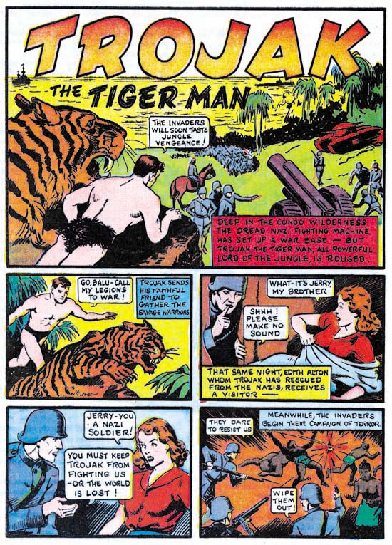
Some sources, including the GCD, attribute the feature Trojak from Daring Mystery #4 to Joe Simon. Joe had started producing covers for Fox with cover dates of May. However that would not necessarily indicate that Simon was unavailable to produce stories for Timely. Joe would create Blue Bolt which started in June so he did not work exclusively for Fox.

This particular story is not signed, that by itself is rather unusual for Joe. Before starting for Fox Joe seemed to have signed all his comic book work, including covers although he sometime used an alias. At Fox Joe did not sign all the covers, still 9 out of 16 Fox covers that he did are signed. Joe signed all stories that he drew until he teamed up with Jack Kirby. After that not every thing is signed and if there is a signature it is the joint Simon and Kirby signature. Even the Fiery Mask from Human Torch #1 (Fall 1940) which was drawn by Joe alone, is not signed. So an unsigned story by Joe published in May would be unique.

Simon had his own personal drawing style, but he mimicked other artists at times. For the Fox covers Joe copied Lou Fine’s manner since Lou had done a number of Fox covers previously. When Joe teamed up with Jack he would begin to adopt Kirby’s manner. But this Trojak story was before the Simon and Kirby team up. Further Joe was the original creator for this feature. So there would seem to be no reason for Simon to mimic any other artist. Therefore we should expect Joe’s own unique style. But that style is not found here. The depiction of the woman is the closest to Joe’s but even she can be distinguished. Simon had a technique of joining eyebrows and eyes into a single angular formation, but that also does not show up in this story. I am not sure who the artist was, but he was not Joe.

The Last Supper

Joe Simon relates a story that once when he was in a legal battle with Marvel over copyrights, a threat was made to kill off Captain America. Joe then proceeded to make a painting of Captain America’s last meal with help from his daughter Gail Simon and someone named Leonardo. The painting has a prominent place on his living room wall. You can see a larger version of the image here.

The Last Supper