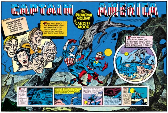
Captain America #10 (January 1942) “The Phantom Hound of Cardiff Moor”
Enlarged view
In Captain America #9 Simon and Kirby continues with an interesting variation in the use of the three compartment design. The splash pages opens on the left, the normal reading order, with a one of those case cards from Captain America’s personal files along with five floating heads. The text indicates that they may all die unless they can be saved by Captain America. However this is not like previous presentations of the various characters. Here no particulars are supplied for the possible victims, not even their names. In a way they are more reminiscent of the ring of floating heads from Cap #7. Both use the floating heads to suggest an emotional content, audio pain in Cap #7 and fear here. But the floating heads here are irregularly arranged, unlike the circular pattern in Cap #7.
The next compartment, the most important center, is used for the enactment. As usually the scene has a minimal cast, in this case Cap, Bucky and their canine foe. The large and obviously vicious hound has leapt from above at our heroes. This was an unexpected attack because Cap and Bucky are depicted off balanced. The attack is aimed at Cap who did not even have time to position his shield, he is unprotected and in dire peril. Cap and Bucky tilt in opposite directions providing an interesting X pattern. However Cap leans his head to face his opponent and his raised right arm goes opposite to leaning of the body. Caps head and right arm therefore connect with the arc of the hound. This along with Bucky’s tilt lead the eye to the right section.
A case can be made that this splash is actually a four, not a three, compartment design. I think of it as three parts because the two sections balance across the center. But the right section is not composed of floating heads, but rather consists of a single circular panel. In fact the panel provides the same character group as the enactment section, but it now includes a victim. Here we are informed that there may be more to the secret of the hound, because he also walks like a man! Sure enough, the hound is now almost man like in form and standing on two feet. The small silhouettes of Cap (identifiable by his shield) and Bucky are approaching. This panel could be interpreted as the prequel to the enactment section. But if that were true then why would the hound have caught our heroes so off guard? Because of the poses of the figures in the enactment portion and the use of a circular panel on the right the two sections are strongly connected in a oval pattern. Even the trees and rock formations lead the eye to this oval and tend to keep it there.
Towards the bottom is the third (or fourth) compartment, the start of the story. Here in smaller then usual panels we are provided with yet another presentation of the canine attack. Alone and at night a man crosses a bleak landscape, obviously the same one as presented above. We then see him alerted to and fleeing from danger, the distant approach of the hound, followed by the actual attack and death of the man. At this point any perspective purchaser should be well aware of what sort of thriller awaits him, provided he parts with his dime.
I described the enactment compartment as placed in the center of the splash. Actually only the attack occurs there, the landscape for the enactment occupies the entire double page. The floating heads, circular panel and story panels give the appearance of being pasted onto the enactment art. The story panels have lifted from the bottom and are free on both sides to help with that affect. Hence the reason for the smaller then normal story panels. To add to the impression of pasted art, the text accompanying the floating heads and round panel cast shadows. These shadows are not only over their panels but over the enactment landscape art as well. But it is best not to take this pasting too literal. On the left a limb of a background tree lies on top of the floating head panels. This despite the fact that the panel in turn lies on top off, or before, a foreground rock. I do not think this was an error. The limb could easily have been shown clearly crossing over the panel. Instead it barely overlaps the panel edge and is easy to overlook. A sort of inside joke. Further some of the floating heads are shown in front of both the text and the shadow. This gives the heads an almost 3D effect.
The double page splash was the most ambitious of all the splashes that Simon and Kirby had done for Captain America. It makes one wonder what they would have done next. Alas it was not to be as this was their last Simon and Kirby issue of Captain America. As we shall see S&K would return to the double page splash. But they would not be the complicated designs found in the Captain America comics.

