Category Archives: Artists

Bullseye #5, The Secret is Out


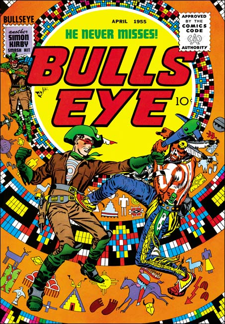
Bullseye #5 (April 1955), pencils and inks by Jack Kirby

Simon and Kirby were big self promoters. They often signed the art they created and included a “Simon and Kirby Production” label in the books that they put together for Prize Comics. Which is why it was so unusual that their names were never used in any of the earlier issues of the Mainline titles. Bullseye #5 was the first to include a stamp reading “another Simon and Kirby smash hit”. The exclusion of their names from the Mainline titles up to now was probably an attempt avoid a conflict with Prize for whom Joe and Jack continued to produce comics. I do not think it is a coincidence that the first issue with the Simon and Kirby stamp was also the one with the first postal statement in which Joe and Jack are listed as the editors. If the people at Prize had not figured out who was behind Mainline Comics before this, the gig would certainly have been up with this issue.

My favorite Simon and Kirby cover keeps changing depending on my mood, but if I were to pick the top dozen covers they would always include that for Bullseye #5. The bulls-eye pattern has played the central design element of all the title’s previous covers, but it was truly inspirational to convert it using Indian motifs. The bulls-eye now looks like some sort of flattened teepee. It is a pretty busy pattern, so the foreground is just Bullseye grappling with an Indian. The whole thing is topped of by some really beautiful inking of the figures by Jack Kirby. The image I provide has not been restored but rather was based on progressive proofs. Progressive proofs were made of the individual color plates and the sequential combinations that they would undergo during printing. This usually was done from the lighter colors to the darker ones so that proofs were made of yellow, magenta, yellow + magenta, cyan, yellow + magenta + cyan, black then the completed combination of all plates. The above image was made by scanning the individual proofs for yellow, magenta, cyan and black then overlapping them in Photoshop. No editing was needed to provide the most accurate recreation of the original Bullseye cover possible.


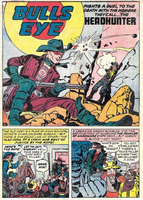
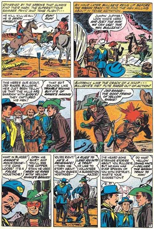
Bullseye #5 (April 1955) “Headhunter”, pencils and inks by Jack Kirby

A classic western tale of a cowboy accused of murder, a lynch mob looking to bypass justice, a bounty hunter aiming for a payoff at any price, the true killer trying to pin his crime on an innocent man, and off course Bullseye to save the day. This is the first issue of Bullseye published under the overbearing eye of the Comic Code Authority. However Bullseye was never overly violent and so the censorship does not really detract from this fine story.


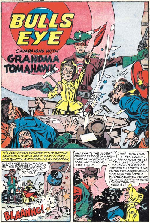
Bullseye #5 (April 1955) “Grandma Tomahawk”, pencils and inks by Jack Kirby

“Headhunter” was pure drama so Simon and Kirby backed it up with a humorous piece, “Grandma Tomahawk”. A small but spunky elder lady leads a crusade against alcohols and immorality with secret help from Bullseye. One again inked by Kirby himself except for page 2.


Bullseye #5 (April 1955) “Tough Little Varmint”, art by unidentified artist

Another humorous piece but this time drawn by an artists other than Kirby. Frankly few attributions have given me more trouble than trying to figure this piece out. There are suggestions of Mort Meskin throughout but on a whole this look so unlike his work that I very much doubt that he was the penciler. The inking is very distinct from Mort’s style as well. I played with the idea that this might be have been done by George Roussos whose work often shows Meskin’s influence. But comparing side-by-side this piece with some by Roussos shows they are very distinct. And again the inking is nothing like that by Roussos. It is very frustrating not to be able to come up with a convincing attribution because the artist clearly was very talented.


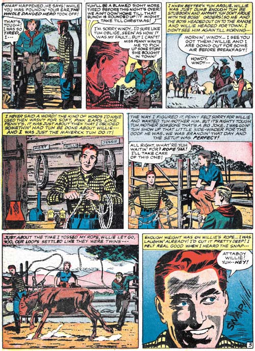
Bullseye #5 (April 1955) “Tough Little Varmint” page 3, art by unidentified artist

Mort was not that common a name so I consider the placard with that name in panel 4 as a homage to Meskin by the artist of this piece.

I do not think it is a coincidence that the leading lady of “Tough Little Varmint” and “The Adventures of Sheriff Shorty” (Bullseye #3 link 1) were both named Penny. The most likely explanation would seem to be that the scripts for both were done by the same writer.

“From Shadow to Light”, an Ode to Mort Meskin

I have previously posted an announcement for this book with a comment on how important a volume I believed it would be. Of course I had not yet seen the book at that time so now that I have the question now is did Steven Brower succeed in doing justice to a great artist like Mort Meskin? The answer is a resounding YES!

This is a large book, the paper size is 9 by 12 inches. In my opinion this is a perfect format for a project like this. Scans of printed comic books have been enlarged for better viewing and the size works nicely with the reproductions of original art. And there are a lot of both spanning Meskin’s entire career. It starts with some work that Mort did in high school. While not very exciting compared to what would follow, it still is great to see the initial efforts. I could detail all the reproductions that follow but I fear that such a list would prove too tedious while the actual art is certainly not that. But I cannot resist mentioning some of my personal favorites such as some great Vigilante splashes, amazing work for the Fighting Yank (working with Jerry Robinson), terrific Golden Lad covers and some truly beautiful romance covers for Prize Comics. While those are my favorites, what is presented is actually much fuller and thoroughly representative. It is not just isolated pages of art. While a marvelous artist, Mort Meskin was also a consummate graphic story teller. “From Shadow to Light” has a Golden Lad and a crime story; both complete and never before published.

Mort Meskin was an artist’s artist. Brower has brought together comments from some of the creators who acknowledge how important Meskin was to them personally. Artists such as Steve Ditko, Joe Kubert, Alex Toth and Mort’s sometime partner Jerry Robinson. These are not just your usual commentary, they provide discussions of Meskin’s actual working methods. I found these very revealing and they answered some questions that have been nagging me for years. Particularly the commentary by Robinson. Jerry was Mort’s collaborator on a lot of comic books. I have often wondered exactly how they worked with each other, what rolls each played. Well Robinson answers that directly. I have also wondered why so much of Meskin’s comic book art is still exists as un-inked pencils. Very surprising since at least some of it, such as a couple of pages from Treasure #12 that are reproduced in this book, had been published. Again Robinson provides the answer.

Anyone who has followed this blog should know I am a big Mort Meskin fan. He did a lot of work for Simon and Kirby and therefore appears frequently in my posts. I have even written about Mort’s prior career (Early Mort Meskin and Mort Meskin before Joining Simon and Kirby). But the Internet is not the best format for viewing Meskin’s art. You really need a book for that and Steven Brower’s “From Shadow to Light” is that book. You do not want to miss this book.

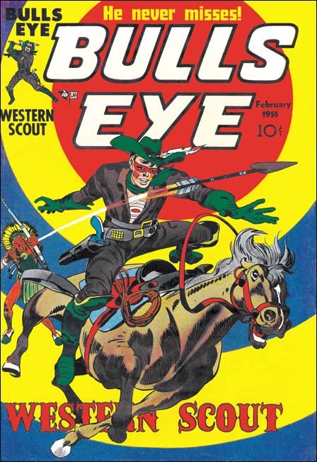
Bullseye #4


Bullseye #4 (February 1955), pencils and inks by Jack Kirby

The cover prominently includes the target in its design, as do all the Bullseye covers. The original art for this cover still exists. However apparently the top of the original art had been cut off (probably by Simon and Kirby to be recycled for another cover). In cases like that it is common that the art would be restored by adding a stat of the missing piece but in this case the entire top section was inked by hand. The restorer did a good job with the lettering but pretty much botched up the small figure of Bullseye throwing a tomahawk.

Like the last issue, this one has two Kirby penciled and inked Bullseye stories. As I mentioned before this was much more Kirby than any other Mainline title.


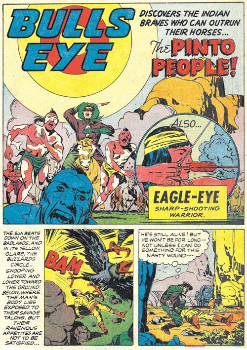
Bullseye #4 (February 1955) “The Pinto People”, pencils and inks by Jack Kirby

A wounded man seriously in need of medical attention, an Indian warrior desperately seeking a rifle, an Indian tribe that runs with their horses not on them, and two villains out for what they thought would be an easy score. This is a very imaginative but rather meandering tale. It would seem to me that this story has more of Kirby and less of Simon than usual. Some readers may like that others may not.


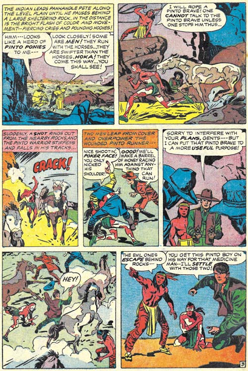
Bullseye #4 (February 1955) “The Pinto People” page 3, pencils and inks by Jack Kirby

Not only faster than their horses, the Pinto braves never stop running. You even have to lasso one down in order to have a discussion. I am not sure why they have the horses to begin with or where they are running to. For that matter where are the rest of the tribe? But the story moves so fast and the art is so terrific that chances are the reader does not even get around to be bothered with all of that.


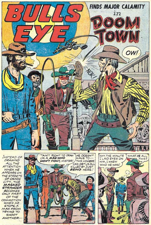
Bullseye #4 (February 1955) “Doom Town”, pencils and inks by Jack Kirby

“Doom Town” is a more classic Simon and Kirby story. Here our hero is accompanied by an unusual creation, Major Calamity. A magnet to bad luck so disastrous that people either want to kill him or flee. But Major Calamity is not the villain of the story that dishonor goes to Big Red Devlin. Only Major Calamity can save the town, with of course Bullseye’s help. What follows is pure Simon and Kirby. Plenty of action, a great fight and a touch of humor. Fortunately this story has been reprinted in “The Best of Simon and Kirby”.


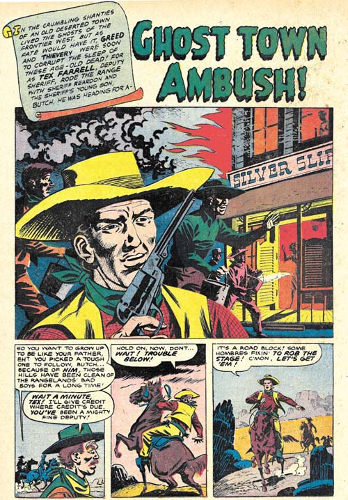
Bullseye #4 (February 1955) “Ghost Town Ambush”, art by unidentified artist

No sooner that the Sheriff Shorty feature gets introduced than its place is taken by another story. (Do not worry Sherriff Shorty will be back.) Frankly “Ghost Town Ambush” is a pretty poor replacement. I do not know who the artist is but he really is not all that good. If anything the writing is even worse. It tries to use all the cliches but nothing seems to work. A one point a villain on a horse sneaks up behind a sentry all the time saying out loud what he is doing. Boy some sentry. All in all this is surely the most forgettable story in the entire Bullseye title.


Bullseye #4 (February 1955) “Ghost Town Ambush” page 7, art by unidentified artist

Why such a clinker? Well the lettering provides a clue. That first letter in the captions is often enlarged and colored. While Howard Ferguson often used that device when working for Simon and Kirby it was not used by his replacement Ben Oda. Its appearance in “Ghost Town Ambush” suggests that this story was not actually produced by Simon and Kirby. This was the time that the comic book industry was starting to crash. Simon and Kirby picked up some

Bullseye #3, Here’s Kirby!


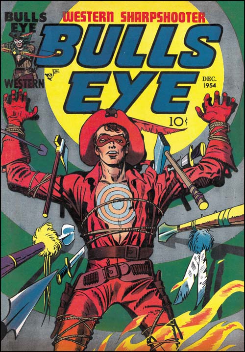
Bullseye #3 (December 1954), pencils and inks by Jack Kirby

The first two issues of Bullseye could be considered as a scaled down version of the Simon and Kirby MO; Jack drew or laid out the first issue but provided a single story for the second. However Bullseye #3 falls completely out of the pattern. There are two new Bullseye stories in the third issue and both were drawn by Kirby. All the subsequent issues of Bullseye would also have two Kirby drawn stories as well. No other Mainline title would have nearly as much Kirby involvement. Only Fighting American (a Prize title) got as much attention at that time from Jack, and even that title followed the more standard Simon and Kirby MO with less Kirby toward the end. There is little doubt that Simon and Kirby considered Bullseye their most important title at that time. Even today Joe considers Bullseye as one of his favorite comics.


Bullseye #3 (December 1954) “Devil Bird”, pencils and inks by Jack Kirby

In the 50s dinosaurs may have helped to sell comics but frankly they were difficult to make truly threatening. Back then (the 50s that is) dinosaurs were depicted as lumbering brutes dragging their tails along behind. Truly scary dinosaurs, of the Jurassic Park variety, would not be possible until years later when scientists realized that birds and mammals were better models for dinosaurs than crocodiles. Kirby bypasses all those problems by using in this story the flying reptiles pterosaur (technically not dinosaurs). Devil bird indeed. This is probably the scariest depiction of a prehistoric animal ever in the history of comics. And certainly my personal favorite Bullseye story.


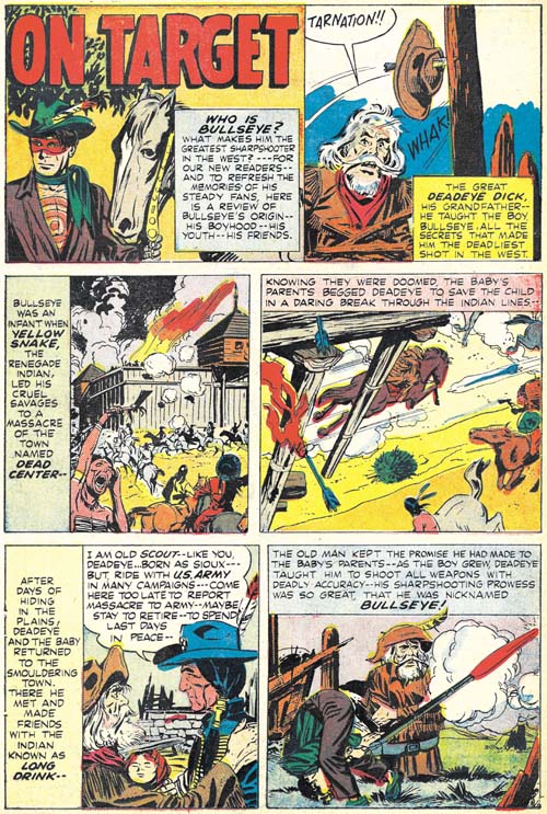
Bullseye #3 (December 1954) “On Target”, pencils by Jack Kirby and John Prentice, inks by John Prentice

Simon and Kirby decided to include in this issue a condensed version of the Bullseye origin story (they had done the same thing for Fighting American). The original art for Bullseye #1 was done on illustration board, so a razor was used to cut around desired panels and they were peeled off the board and mounted on another. This was a simple and cost effective method but the unfortunate consequence is that today most of pages the original art from Bullseye #1 are missing a panel or two.


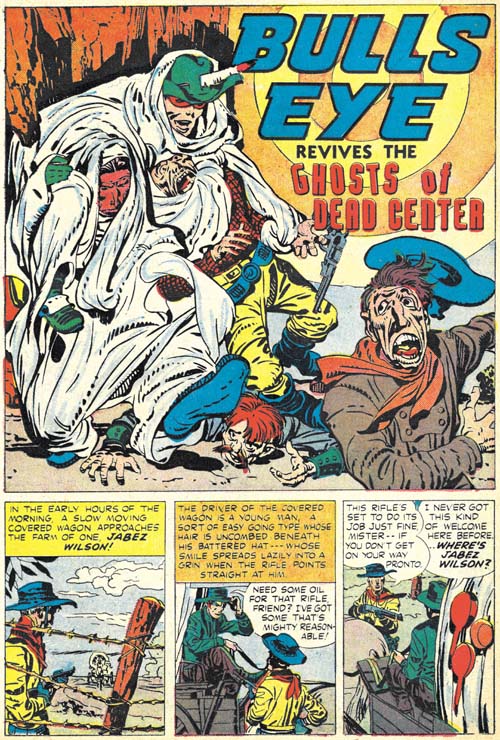
Bullseye #3 (December 1954) “The Ghosts Of Dead Center”, pencils and inks by Jack Kirby

While not truly a humorous piece, “The Ghosts of Dead Center” provides a bit a humor. There is money to be made when the railroad is built through Dead Center. Well that is once it is rid of those pesky “trespassers”. Unfortunately for those avarice villains, Bullseye has overheard their plot and even more unfortunately Dead Center is where he was raised and where his Indian friend, Long Drink, still resides. But Bullseye is just one man against many so he uses various tricks to defeat his foes. And that is where the humorous touch comes into play.

Comics from the golden age did not have anything like the concept of continuity. Once past the tale of the origin and the stories were pretty much independent. This was largely true with Simon and Kirby as well. But here at the ending of the golden age we have a story that refers back to Bullseye’s origins. Not quite like modern continuity, but much further than anyone else would use until the Marvel Universe was created in the 60’s.


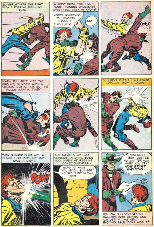
Bullseye #3 (December 1954) “The Ghosts Of Dead Center” page 7, pencils and inks by Jack Kirby

Kirby uses a 7 panel layouts for all the story pages save the last. A more standard layout would have 6 panels so the extra panel meant that none of the pages had a grid layout and some of the gutters would meander across the page. But the last page has 9 panels in a symmetrical grid arrangement. Kirby seemed to like this panel layout for his fight scenes. I feel this layout minimally distracted from the images. Kirby would also downplay or eliminate the backgrounds. Therefore all the attention is drawn to the fighting figures and the choreographed action. Nobody did this sort of thing better than Kirby.


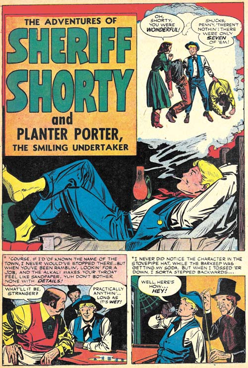
Bullseye #3 (December 1954) “The Adventures of Sheriff Shorty”, pencils and inks by Leonard Starr

With this issue Simon and Kirby would begin using a backup story that did not involve Bullseye. Leonard Starr has the honor of introducing the new feature Sheriff Shorty. The piece appears to be unsigned but hallmarks of Leonard’s hand occur all over the story art. I wrote that the piece appears to be unsigned but note the funny series of short lines along the left splash panel margin over the green pitcher. Frankly I had never noticed it before but recently I had the opportunity to conduct a careful examination of the original art. What the art shows is that white-out was used along both the right and left borders to reduce the width of the image area by a small amount. It was small but enough to cover Starr’s signature which had gone along the original panel border going from bottom up (that is as if the page had been rotated clockwise 90 degrees when he signed it). What remained of the signature was considered too unimportant to clean up. Although covered by white-out, Starr’s signature can still be made out on the original art so there is no question about the attribution.


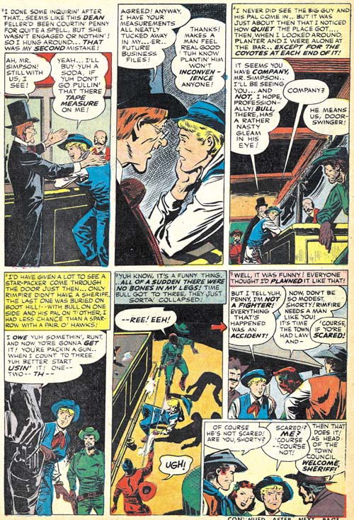
Bullseye #3 (December 1954) “The Adventures of Sheriff Shorty” page 4, pencils and inks by Leonard Starr

Starr was very fond of using tall narrow panels for work provided to Simon and Kirby. Actually he pretty much got out of the habit for his more recent romance art but narrow panels show up often in the Sheriff Shorty story. But notice the odd arrangement of this page. The last panel almost seems like an after thought and frankly a rather intrusive one at that. Here again my examinations of the original art provides an explanation. The art shows that the last panel was pasted on afterwards and panel 6 had been tall and narrow like all the other panels. Further this was not Starr’s doing. There exists another page of original art that never made it into the story. A panel was cut out of that unused art page and with some rearrangement became the last panel of page 4. This re-editing was almost certainly done by Simon and Kirby and it was the sort of thing that in the future Joe would do very often.

Bullseye #2, Western Scout


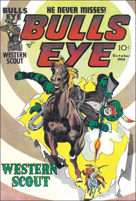
Bullseye #2 (October 1954), pencils and inks by Jack Kirby

As I discussed in the previous chapter, the previous modus operandi for Simon and Kirby was to make much use of Kirby in the initial issues of a new title and then make more frequent use of other artists for later issues. However in general the Mainline titles deviated from that pattern. The first issue of Bullseye could be viewed as a somewhat scaled down version of the original MO in that Kirby drew the first chapter and provided layouts for the other two. Unlike the first issue, Bullseye #2 was not a long story divided into chapters but instead provided three independent stories each done by a different artist. One of the surprises here was that Kirby did not do the lead story.


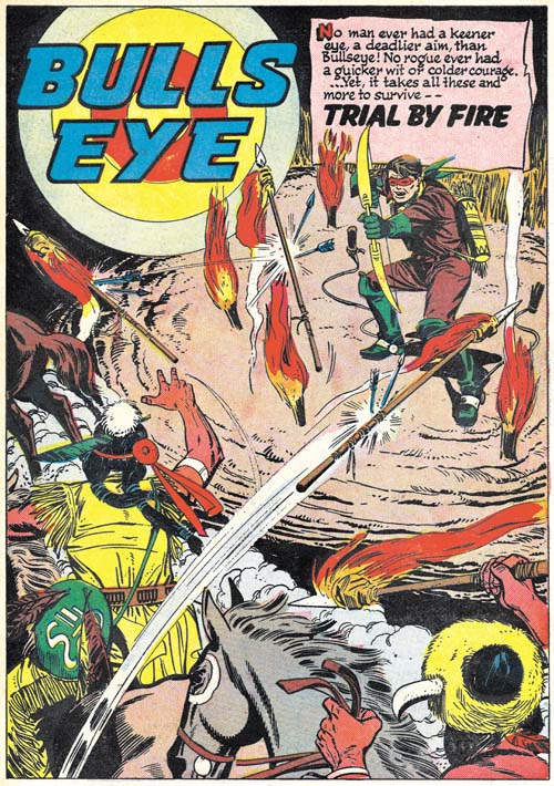
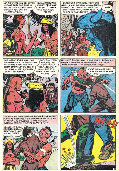
Bullseye #2 (October 1954) “Trial By Fire”, art by an unidentified artist

Simon and Kirby used a lot of different artists during this period. This was probably due to the combination of supply (comics had begun to crash resulting in a number of artists looking for work) and demand (there was a need to replace the normally prolific Kirby who was preoccupied with business matters). With such a large selection of artists to choose from, I am surprised that Joe and Jack picked this one to do the lead story “Trial By Fire”. It is not that he is a poor artist (he actually did a pretty good job on this story) but I just cannot help feel that someone else (John Prentice or Bob McCarty) could have produce a superior story. As the reader may have gathered, I have not been able to identify the artist although further research should rectify that situation. The splash may have been laid out by Jack Kirby although without seeing other work by the artist it is hard to be sure.


Bullseye #2 (October 1954) “Trial By Fire” page 6, art by an unidentified artist

While it is possible that Kirby laid out the splash, it is clear that the rest of the story was not based on Kirby layouts. I am not saying that there is anything wrong with the fight scene on page 6, but it definitely was not drawn the way Jack would have done it.


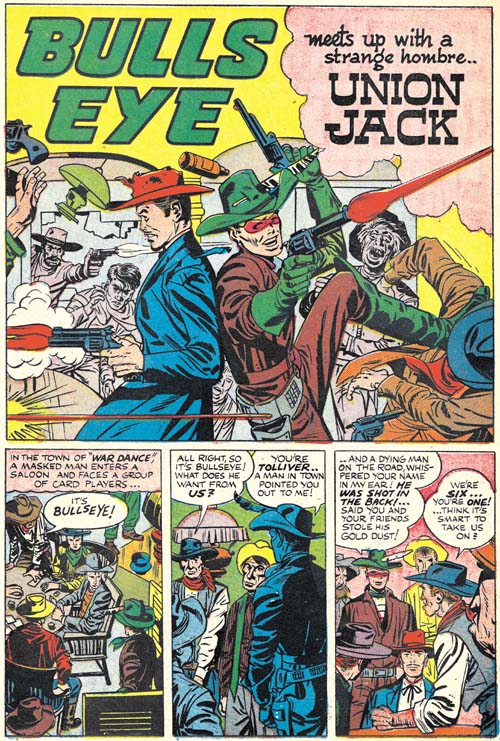
Bullseye #2 (October 1954) “Union Jack”, pencils by Jack Kirby

The splash page is a typical Kirby fanfare. What a great splash panel. Back to back, Union Jack and Bullseye take on the world, or at least the room. Bullseye even seems to be enjoying himself. The story panels are also by Jack and he use of tall narrow panels is unusual for him. The inking looks a lot like the work of John Prentice, but that would be surprising as John was not the artist for the rest of the story.


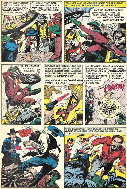
Bullseye #2 (October 1954) “Union Jack” page 2, pencils and inks by Bob McCarty

For the remainder of the story, pencil honors went to Bob McCarty. For a short period Bob had become a Simon and Kirby regular and with good reason. This story is a good example of what McCarty was capable of. His handling of action was very unlike Kirby’s, but is by no means a criticism. I am a great admirer of McCarty and this story is arguably the best piece from Bullseye by an artist other than Jack.

McCarty typically made much use of a pen in his inking but without abandoning the brush. “Union Jack” shows less of the pen work than usual but I still believe it was inked by Bob. I am not, however, convinced that Bob inked the splash page as well. McCarty never signed his work for Simon and Kirby but some of his pieces for Foxhole were provided credits.


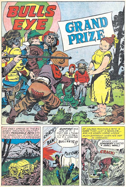
Bullseye #2 (October 1954) “Grand Prize”, pencils and inks by Jack Kirby

Humor almost always plays a part in Simon and Kirby creations but generally not so dominate a factor as found in “Grand Prize”. It is a marvelous little story with lots of purposely goofy characters and other visual humor. All the more enjoyable because Kirby supplies the inking himself. I suspect it was this emphasis on humor that explains why it was not used as the lead story, a spot normally taken by Kirby.

Bullseye #1, Simon and Kirby’s Own Western


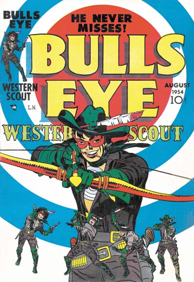
Bullseye #1 (August 1954), pencils and inks by Jack Kirby

In 1954 Simon and Kirby launched their own company which they called Mainline. For years Joe and Jack had produced comics but this time they would be publishers themselves. Mainline released four titles: Bullseye*, In Love, Foxhole and Police Trap. I have previously written about Foxhole and In Love, but had not gotten around to the other two titles. For various reasons this seems like a good time to correct that neglect. Certainly my delay in discussing Bullseye was not due to it being an inferior comic. While Foxhole remains my personal favorite of the Mainline titles, Bullseye has much to recommend it particularly for Kirby fans.

Simon and Kirby’s modus operandi for creating new titles was for Jack Kirby to provide much of the art for the initial issues with less support from Jack in latter releases. This was decidedly not the MO for the Mainline titles. The closest any of them come to the original MO was In Love where for the premier issue Jack drew the featured story, a whooping 20 pages. Kirby drew little for the second issue and while In Love #3 had a lot of Kirby almost all of it was a recycled syndication proposal strip. Kirby provided no story art for Foxhole #1 but 8 pages for Foxhole #2 and nothing thereafter until Foxhole #6. Jack provided very little for Police Trap until the final issues. Why the change in MO? It certainly was not due to any change of opinion about the value of Jack’s art. After all he would provide most of the cover art. The logical explanation is that much of Kirby’s time was required to help run the new company. I have seen a invoice submitted to Simon and Kirby during this period that deducts an advance Jack Kirby gave to the artist.

The way Simon and Kirby introduced new features changed over the years. The Captain America origin story is short and seems little more than something to get quickly out of the way so they could go with the more interesting stories. The origin story seem to become more important to Simon and Kirby over the years. With Bullseye, except for a few fillers, the entire magazine is dedicated to the origin story. The origin is told in three chapters; “The Boy”, “The Youth”, and “The Man”.


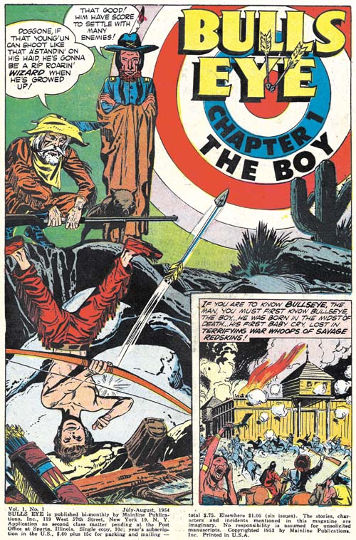
Bullseye #1 (August 1954) “Bullseye, The Boy”, pencils by Jack Kirby, inks by John Prentice

The saga starts with Bullseye’s birth during an Indian attack. The raid turns into a massacre and only the baby and his grandfather, Deadeye Dick, escape. The boy is raised by his grandfather and an old Indian scout, Long Drink. Under the old man’s tutelage, Bullseye becomes a master marksman. The Indians return and brand the boy’s chest with a target, the Bullseye mark that plays an important roll in the design of the comic covers and splashes.

The boy being an orphan is a common theme for Simon and Kirby. Previously the Newsboy Legion, the Boy Commandos and the boys of Boys’ Ranch had all been orphans. Much has been made of Kirby’s making orphans of their characters but it is good to remember that he was not the only one doing this. After all Superman, Robin and Billy Bates (Captain Marvel’s alter ego) were orphans as well.


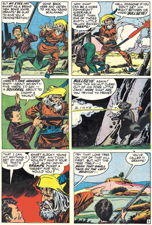
Bullseye #1 (August 1954) “Bullseye, The Boy” page 5, pencils by Jack Kirby, inks by John Prentice

The first chapter is drawn by Jack Kirby and inked by John Prentice. Well except for page 2 which is sufficiently different from the rest that I believe Prentice drew it as well. Prentice does not use the Studio style inking that was so commonly applied to Kirby’s pencils but instead John works in a manner more typical of his own work. Kirby’s art was influenced by Milton Caniff while Prentice followed the footsteps of Alex Raymond. With such disparity in styles you would think the combination of Kirby pencils and Prentice inks would be a poor mix but I think it comes off surprisingly well. Jack’s inkers during the Simon and Kirby collaboration range the gamut from horrible to amazing but I feel Prentice ranks among Kirby’s top inkers. However I do not believe John ever inked Jack’s pencils other than in this Bullseye issue.


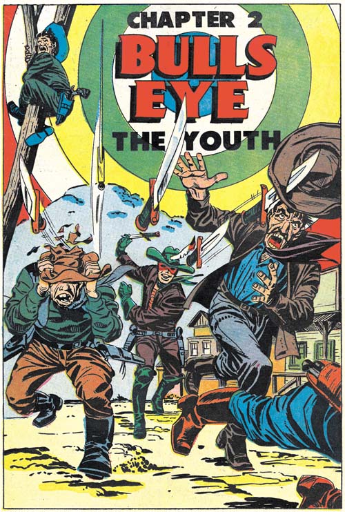
Bullseye #1 (August 1954) “Bullseye, The Youth”, pencils by Jack Kirby, inks by John Prentice

Bullseye not only the master of pistols and rifles, but in all manners of weapons that are shot or thrown. For this splash Kirby has created a classic example of exaggerated perspective. What a great combination of action and humor. John Prentice did the inking but it appears Kirby did some touch-ups (for example adding the picket fence crosshatching on the green shirt and the drop strings on the grey pants, see my Inking Glossary). Generally Simon or Kirby would ink the splash page but having Prentice do the inking provides a much better integrated chapter. John does a much better job ink the splash for this chapter than he did for the previous one.


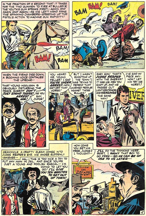
Bullseye #1 (August 1954) “Bullseye, The Youth” page 5, pencils by Jack Kirby, inks by John Prentice

The rest of the chapter following the splash page was penciled and inked by John Prentice. John does a good job, but of course I expect Kirby fans would prefer that Jack had done the honors. I have chosen one of the more uncharacteristic pages from the chapter to show above. I provide this page because it best address the question of Kirby layouts. One of the conclusions I reached in my long serial post Art of Romance was that Kirby did not generally provide layouts for stories drawn by other artists as has so often been asserted by Kirby fans in the past. When I previously showed this page in the blog (John Prentice, Usual Suspect #3) Nick Caputo pointed out that the Judge looked like a Kirby creation. I have to admit that the heavy set Judge does not look like a typical Prentice character. However I find panel 2 to be an even more convincing example of a Kirby layout. It seems so typical for Jack and I have never seen John do anything like it. So I agree that Kirby may have been providing layouts for this chapter. There are other panels that look more like Prentices’s own layouts so I suspect that either Kirby provided only a rough or incomplete layout or that Prentice felt free to modify them whenever he desired.


Bullseye #1 (August 1954) “Bullseye, The Man” page 7, pencils by Jack Kirby, inks by John Prentice

The third chapter was executed in the same manner as the previous chapter; a Kirby penciled and Prentice inked splash followed by a story drawn and inked by Prentice. Once again there are indications the Kirby provided some layouts. Panel 4 of the page shown above is a really good piece of evidence supporting a Kirby layout. While Prentice did not do a lot of action scenes during the time he worked for Simon and Kirby, what fight scenes he did looked nothing like this one. I do not recall ever seeing among Prentices’s art such a rotational slug or the way the man falls back. But both are frequently occurring motifs in Kirby’s work.

So does the fact that Kirby provided layouts of some sort for Bullseye contradict my conclusion based on the romance comics that he did not provide layouts? Not really because during the Mainline period things were done rather differently than what had previously been the norm. Typically Kirby’s contribution to the first issue of a new title would be more significant than what occurred in Bullseye. Apparently Jack was too busy with Mainline business matters to devote much time to the art. Providing layouts was the next best thing to doing drawing himself.

This begins another serial post. I am not sure yet whether I will write a separate article on each issue or combine some. While each Mainline title has its own unique qualities, Bullseye is something special. Particularly for Kirby fans.

footnotes:

* This title is most commonly called Bulls-Eye but I am not sure why. Bullseye is a name and it should be spelled in the manner used by the creators of that name. The hyphen was never used in the actually comics. On the cover and splashes the name occupies two lines so I suppose a good argument can be made that Bulls Eye should be the proper designation. That name format also appears in some of the indices, but others use the single word form, Bullseye. When the character is referred to in the actual stories he is always called Bullseye.

Happy Birthday Jack Kirby

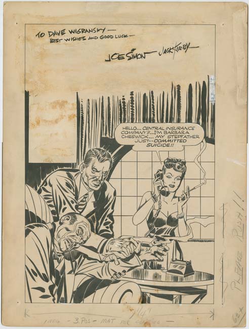
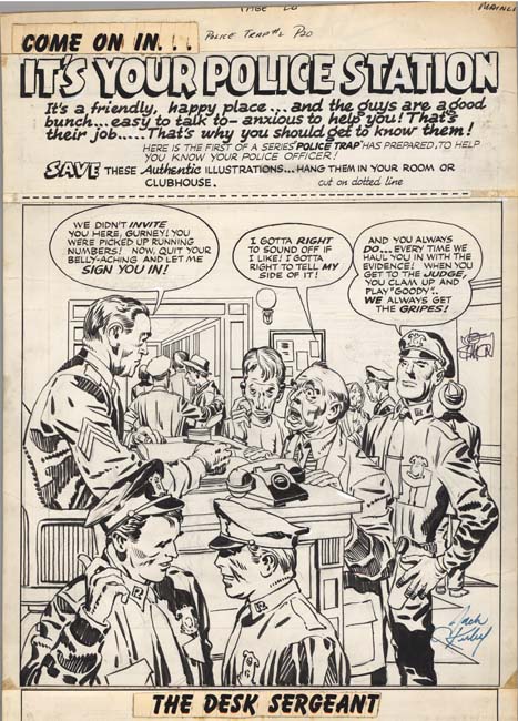
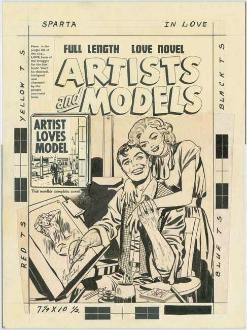
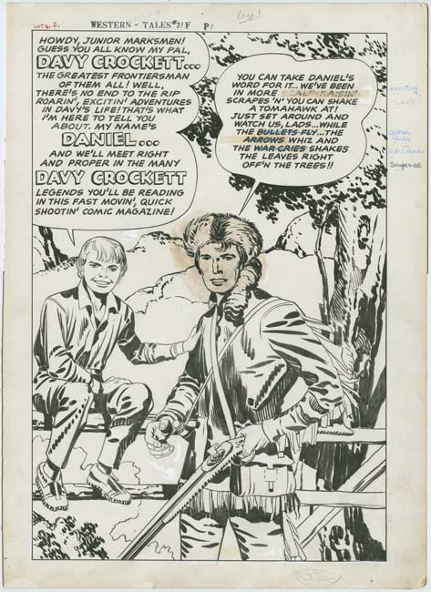
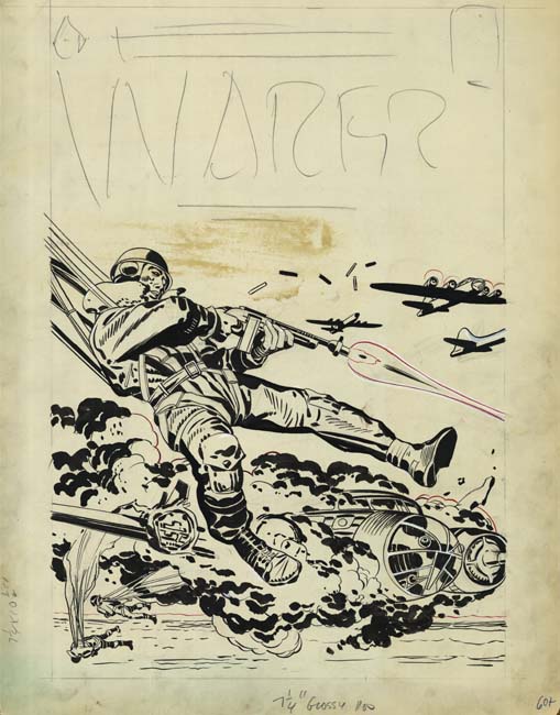
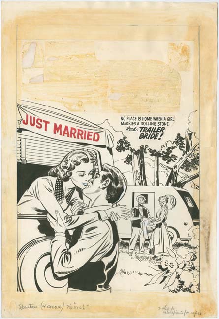
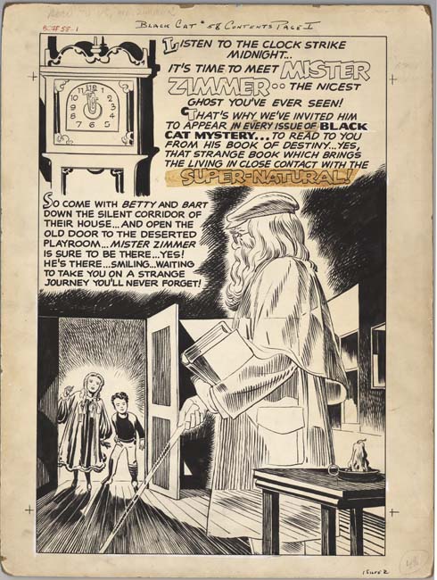
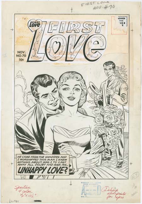
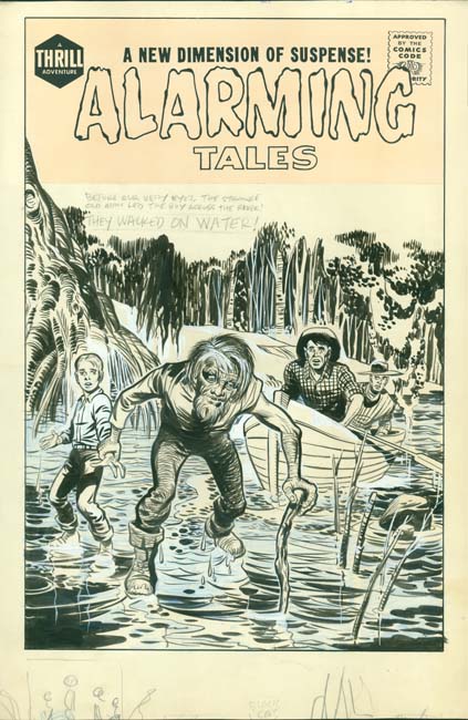
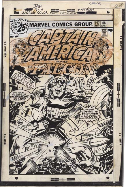
It is time to celebrate Jack Kirby’s birthday again. I can think of no better way to honor Jack than to provide some examples of his art. This time using original art. Enjoy!


Champ #20 (July 1942)


Headline #25 (July 1947)


Police Trap #2 (November 1954)


In Love #3 (January 1955)


In Love #3 (January 1955)


Win A Prize #1 (February 1955)


Western Tales #31 (October 1955)


Warfront #28 (January 1956)


Western Tales #32 (March 1956)


True Bride To Be #19 (August 1956)


Black Cat Mystic #58 (September 1956)


First Love #70 (November 1956)


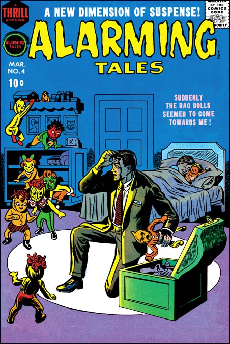
Alarming Tales #3 (March 1958) (unpublished version)


Sandman #1 (Winter 1974) (unpublished version)


Captain America #197 (May 1976)

Criminal Artist, Chapter 3, Bill Draut

After Simon and Kirby stopped producing the Prize crime titles, Bill Draut did not contribute much as compared to artists previously discussed in this serial post, Marvin Stein and Mort Meskin. But he is an artist that I admire and it is nice to see him get a chance to work on a genre other than romance.


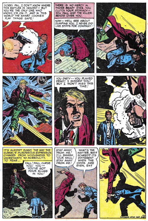
Justice Traps the Guilty #71 (February 1955) “Escape” page 3, pencils and inks by Bill Draut

Draut’s first return to the Prize crime titles occurring in Justice Traps the Guilty #71 (“Escape”, February 1955). I do not understand why Bill decided to do this piece. Draut seemed to be getting a fair amount of work from Joe and Jack so why do work for the Prize crime comics which I believed offered less money? But whatever the motivation, Draut did a nice job. I provide an example of an action sequence which Bill handles quite well. Still it does not read quite as well as say similar fight sequences by Marvin Stein. How did the hero manage to flip the attacking criminal in the last two panels?

Draut did his own inking on just about everything he did, well at least up to 60’s. His inking manner in “Escape” pretty much matches what he had been using earlier. I guess the best description would be splotchy. Not really messy but with clothing dominated by rounded areas of black and with little use of narrow smooth folds.


Headline #74 (January 1956) “Never See Morning”, pencils and inks by Bill Draut

Whatever reasons Draut had for doing “Escape” it was an isolated piece. Draut would not do any other crime work for the rest of 1955 (cover date). His return to the crime titles in 1956 is easy to explain. During that year Jack Kirby began to draw pretty much all the contents of the Prize romance comics. Since those romance titles were the main source of work for Draut, this left him much in need of other sources of income.

Draut would draw a peculiar series for Headline. The hero of the feature was a gossip columnist whose evening work at places like night clubs placed him in a position to fight crime as well. But that is not was peculiar about the feature, what was odd was that there never was anything in the title to indicate that this was a serial feature. You learned his name, Nick Kolby, in the story but it was only once mentioned in the title and even then not prominently. There seemed no reason not promote the feature as that was done for another returning feature in Headline at that time, Flash Cameron, a newspaper photographer who also fights crime. If Prize thought another newspaper crime fighter was too much, then why have not have Draut do some other type of crime fighter?


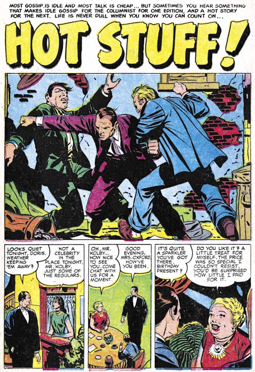
Headline #75 (March 1956) “Hot Stuff”, pencils and inks by Bill Draut

Nick Kolby could handle himself pretty well for a gossip columnist. This gave Draut a chance to do some action scenes which were something that he did not often get to do for the romance art that predominated his work for Simon and Kirby. Much earlier in his career Bill did action in some features like the Red Demon and Calamity Jane and Draut has greatly improved in his ability to draw convincing and effective action.

Draut inking seems to be changing having less of the splotchy effect with cleaner lines and an over all lighter look. Previously I had credited his style change as due to working for DC but I do not believe Bill had started with DC yet. However it was his inking style that was changing, not the way he did his pencils.


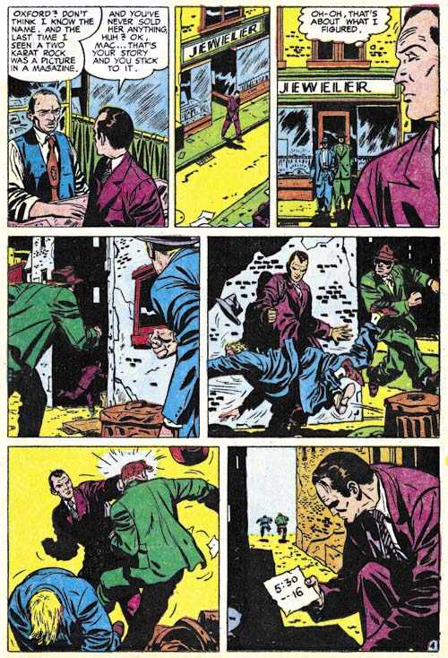
Headline #75 (March 1956) “Hot Stuff” page 4, pencils and inks by Bill Draut

“Hot Stuff” also provides and example of Draut handling an action sequence. He does it quite well although panel 5 takes a closer examination in order to figure out what the hero was doing (tripping his first pursuer). This is not quite the action choreography as used by Jack Kirby or even Marvin Stein, but Bill does have his own way of handling it.


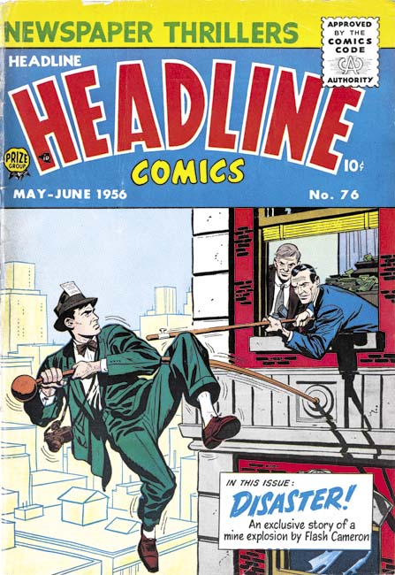
Headline #76 (May 1956), pencils and inks by Bill Draut

I used to think that Jack Kirby and Marvin Stein were the only artists who drew covers for Headline Comics. However Headline #76 (May 1956) eluded me until recently and I previously believed it was by Stein based on some low resolution scans I had seen. But when I finally got a copy I saw I had clearly been mistaken. There were Bill’s classic eyebrows and the way the bricks are clustered into isolated patches is a typical Draut technique. It is surprising that Draut instead of Stein did this cover since Marvin was the primary artist at this time. Also surprising is that Bill’s cover illustrates Flash Cameron a feature that Ted Galindo drew in this issue. Now there are any number of contingencies that we would never know about that might brought about Draut providing this cover, but I would like to suggest one possibility. Perhaps the cover was originally meant to portray Nick Kolby, a feature that Bill drew. Take away the camera and the press pass in the hat and this is a good match for Kolby. Those two features could have easily been added by Bill or another artist to convert it from Kolby to Cameron. Without the original art we will never know for sure.


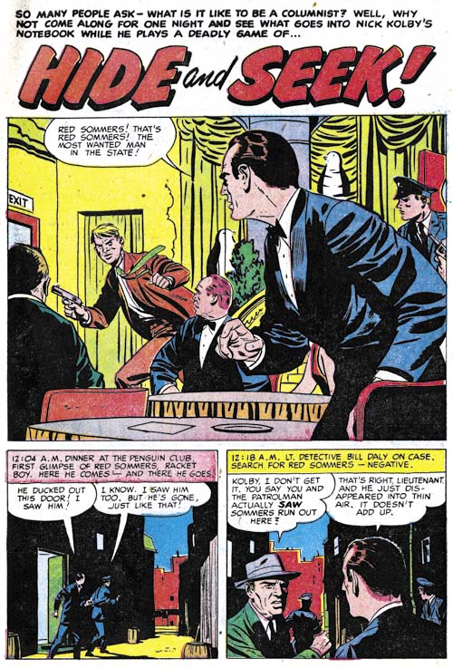
Headline #77 (September 1956) “Hide and Seek”, pencils and inks by Bill Draut

I could not resist on last example from Draut’s Nick Kolby feature. This was also Bill’s last appearance in Headline and Nick Kolby ended here as well. Since this feature was drawn by Draut and no other artist, it seems likely that Draut was involved in its creation. I never heard of Draut writing scripts but perhaps he teamed up with some writer.


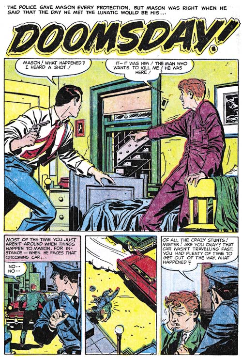
Justice Traps the Guilty #82 (May 1955) “Doomsday”, pencils and inks by Bill Draut

I do not want to convey the false impression that Bill Draut was only providing work for Headline during this period. Draut was doing work for Justice Traps the Guilty as well. However that work was for individual stories and not some continuing feature.

Art of Romance, Chapter 37, Some Surprises

(January – June 1959: Young Romance #98 – #100, All For Love #12 – #14, Personal Love #9 – #11)
Young Romance #98
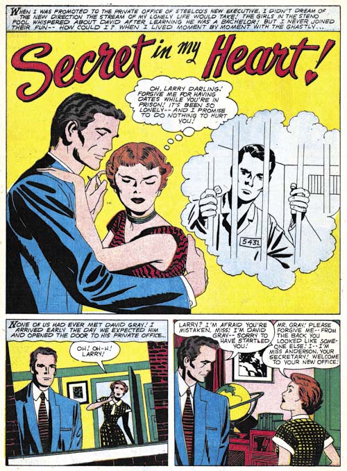
Young Romance #98 (February 1959) “Secret In My Heart”, pencils and inks by Jack Kirby

Kirby provides four stories for two issues of Young Romance (YR #98 and #99). I believe Jack inked three of the stories himself as well as the splash page for the fourth story. It is hard to be sure because some of the old inking techniques such as arched shadows (Inking Glossary) do not show up often. Further the other inker, who I believe was Marvin Stein, was doing a pretty good job matching Kirby’s work.

Note the tilted image in the first story panel. This is a bit unusual for Kirby but then again Jack was always trying something different.
Young Romance #99
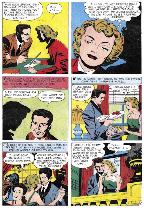
Young Romance #99 (April 1959) “Man Wanted” page 2, pencils and inks by Jack Kirby

Above is an example of the great graphical story telling Kirby was doing during this period. Jack’s drawing style has taken on a more abstract quality. Note the eyelids of the woman in the second panel. They really are not natural or realistic but are very expressive nonetheless.
Young Romance #98
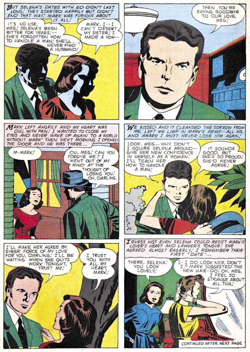
Young Romance #98 (February 1959) “A Husband for My Sister” page 3, pencils by Jack Kirby, inks by Marvin Stein

While I believe the splash page for “A Husband for My Sister” was inked by Kirby himself, the rest of the story does not look like his inking. Perhaps the most obvious difference is the shadow inking found in the first panel of page three. The inker obviously had a poor understanding of the shape of the head. Particularly grievous is the shadow around the eye of the woman. Nor would one expect the man’s lips to catch the light as it does here. I have never seen Kirby do this sort of thing but I have seen Marvin Stein do similar unnatural handling of shadows (“Tragic Circle, JTTG #75, Criminal Artists, Marvin Stein).
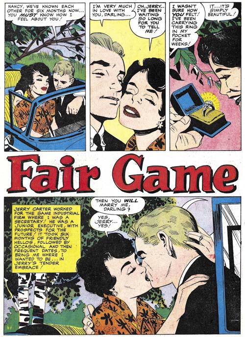
Young Romance #99
Young Romance #99 (April 1959) “Fair Game”, art by Paul Reinman

Paul Reinman was used often during this period, providing five stories for Young Romance. His abundant appearance in Young Romance and absence from All For Love and Personal Love is another indication that they titles were produced by different editors.
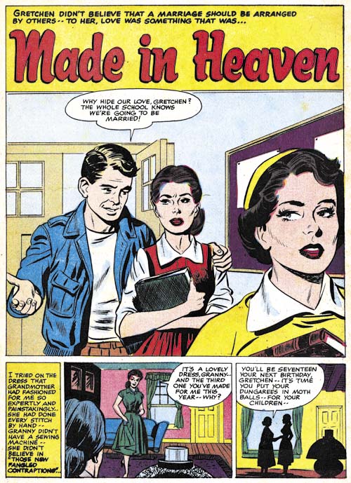
Young Romance #98
Young Romance #98 (February 1959) “Made in Heaven”, art by John Prentice?

I am not sure what to make of “Made in Heaven”. The art superficially resembles that by John Prentice but is no where nearly nicely drawn as was typical for John. At this time Prentice was primarily working on the syndication strip Rip Kirby but he may also have been doing some work for DC. Was this Prentice quickly dashing something off or was it some other artists copying John’s style? Like I said, I am not sure but I will deffer my opinion until the next chapter when I will have further examples to examine.
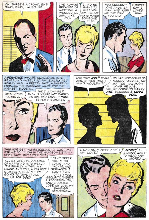
All For Love #14
All For Love #14 (June 1959) “Lost Paradise” page 4, pencils and inks by Marvin Stein

Marvin Stein only did a single story during this period. Stein had begun working for Cellomatic in 1958 so presumably his comic book work was done during his spare time. Perhaps this explains his the increasingly looser style that Marvin was using. Still “Lost Paradise” is a graphically well told story.

In the previous chapter I mentioned an unidentified artist who, like Stein, used a rather blunt brush. I wrote that this unknown artist liked to provide very thick outlines in parts. Well it looks like Stein has adopted that style as well. I still believe they are different artists because of the very different manners they drew woman.
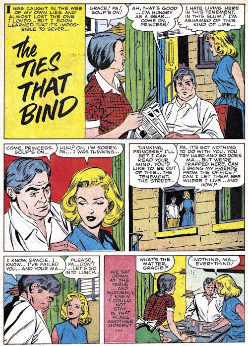
Personal Love #10
Personal Love #10 (March 1959) “The Ties That Bind”, art by Ted Galindo

Ted Galindo’s attractive work continues to show up frequently in All For Love and Personal Love. Would you call this a splashless story or one with just a reduced size splash? An unusual panel layout for Galindo or any other artist doing work for the Prize romance titles.
Personal Love #11
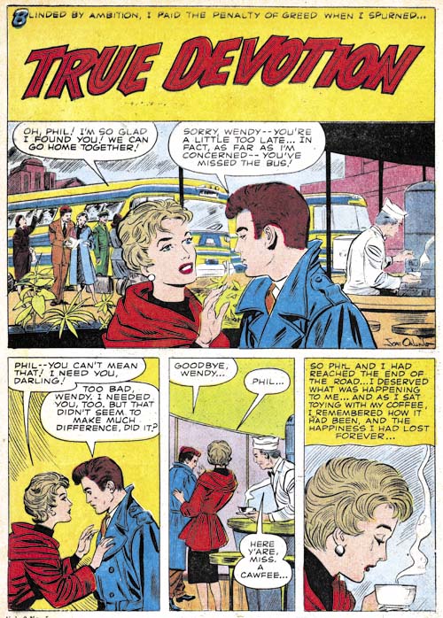
Personal Love #11 (May 1959) “True Devotion”, art by Joe Orlando

I would have saved myself much effort had I noticed before the signature on the splash for “True Devotion”. There as clear as day is Joe Orlando’s full signature. Even the letters J and O are executed in the same manner that he used on cover art for All For Love, Personal Love and Justice Traps the Guilty. No question about it all that cover art was done by Joe. Orlando was no longer providing covers but he was now drawing full stories. Besides “True Devotion” there are two other unsigned stories from this period. Considering the quality of the covers Orlando did, it is not surprising how excellent the story art was.
All For Love #14
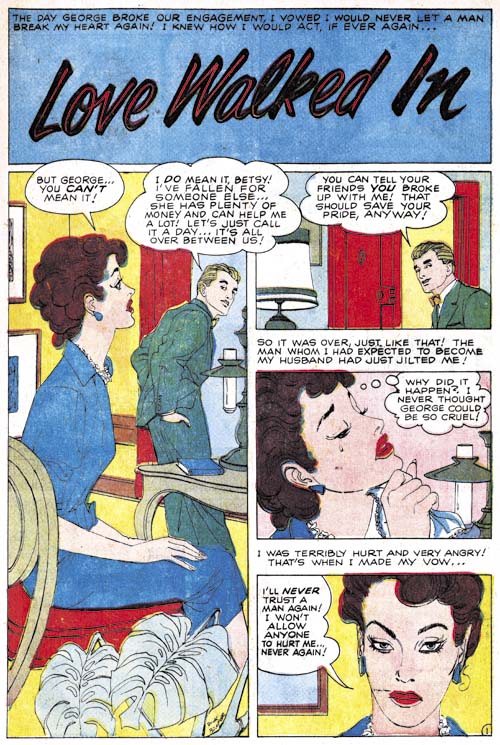
All For Love #14 (June 1959) “Love Walked In”, art by Dick Briefer

Unlike Orlando’s “True Devotion”, I had previously seen the signature on “Love Walked In” but I had misread it. So I was rather surprised when I reviewed it for this post to find the correct reading was clearly Dick Briefer. What a pleasant but unexpected find. A fortunate one as well, I doubt I would have identified Briefer as the artist without the signature. I have never seen romance art by Dick before and he does it surprisingly well. Once you know it was done by Briefer you can pick out some of his traits, particularly Briefer’s love of asymmetry. But the style on a whole is a lot more conservative and realistic than typical Briefer art especially compared to his Frankenstein.
Personal Love #11
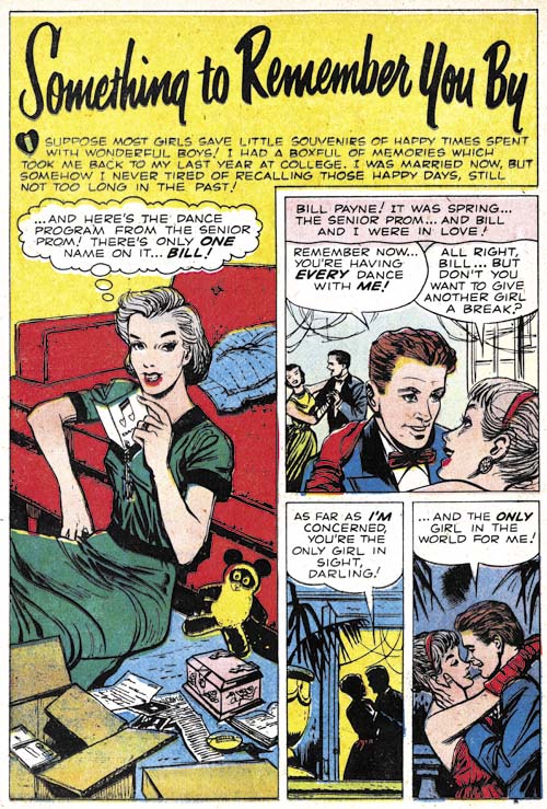
Personal Love #11 (May 1959) “Something To Remember You By” , art by Dick Briefer

Briefer also did two unsigned pieces during the period so I could not resist including another example. I really love what he does with these stories.

I thought Dick had pretty much given up work as a comic book artist after Prize’s Frankenstein was cancelled in 1954 (a casualty of the Comic Code). The GCD only lists reprints for him after that date. “Who’s Who” has him as a non-comics freelancer from 1956 to 1960, followed by advertisement art (1960 – 1972) and fine arts (1962 – 1972). But now we know he did not completely abandon comics.

Chapter 1, A New Genre (YR #1 – #4)
Chapter 2, Early Artists (YR #1 – #4)
Chapter 3, The Field No Longer Their’s Alone (YR #5 – #8)
Chapter 4, An Explosion of Romance (YR #9 – #12, YL #1 – #4)
Chapter 5, New Talent (YR #9 – 12, YL #1 – #4)
Chapter 6, Love on the Range (RWR #1 – #7, WL #1 – #6)
Chapter 7, More Love on the Range (RWR #1 – #7, WL #1 – #6)
Chapter 8, Kirby on the Range? (RWR #1 – #7, WL #1 – #6)
Chapter 9, More Romance (YR #13 – #16, YL #5 – #6)
Chapter 10, The Peak of the Love Glut (YR #17 – #20, YL #7 – #8)
Chapter 11, After the Glut (YR #21 – #23, YL #9 – #10)
Chapter 12, A Smaller Studio (YR #24 – #26, YL #12 – #14)
Chapter 13, Romance Bottoms Out (YR #27 – #29, YL #15 – #17)
Chapter 14, The Third Suspect (YR #30 – #32, YL #18 – #20)
Chapter 15, The Action of Romance (YR #33 – #35, YL #21 – #23)
Chapter 16, Someone Old and Someone New (YR #36 – #38, YL #24 – #26)
Chapter 17, The Assistant (YR #39 – #41, YL #27 – #29)
Chapter 18, Meskin Takes Over (YR #42 – #44, YL #30 – #32)
Chapter 19, More Artists (YR #45 – #47, YL #33 – #35)
Chapter 20, Romance Still Matters (YR #48 – #50, YL #36 – #38, YB #1)
Chapter 21, Roussos Messes Up (YR #51 – #53, YL #39 – #41, YB #2 – 3)
Chapter 22, He’s the Man (YR #54 – #56, YL #42 – #44, YB #4)
Chapter 23, New Ways of Doing Things (YR #57 – #59, YL #45 – #47, YB #5 – #6)
Chapter 24, A New Artist (YR #60 – #62, YL #48 – #50, YB #7 – #8)
Chapter 25, More New Faces (YR #63 – #65, YLe #51 – #53, YB #9 – #11)
Chapter 26, Goodbye Jack (YR #66 – #68, YL #54 – #56, YB #12 – #14)
Chapter 27, The Return of Mort (YR #69 – #71, YL #57 – #59, YB #15 – #17)
Chapter 28, A Glut of Artists (YR #72 – #74, YL #60 – #62, YB #18 & #19, IL #1 & #2)
Chapter 29, Trouble Begins (YR #75 – #77, YL #63 – #65, YB #20 – #22, IL #3 – #5)
Chapter 30, Transition (YR #78 – #80, YL #66 – #68, YBs #23 – #25, IL #6, ILY #7)
Chapter 30, Appendix (YB #23)
Chapter 31, Kirby, Kirby and More Kirby (YR #81 – #82, YL #69 – #70, YB #26 – #27)
Chapter 32, The Kirby Beat Goes On (YR #83 – #84, YL #71 – #72, YB #28 – #29)
Chapter 33, End of an Era (YR #85 – #87, YL #73, YB #30, AFL #1)
Chapter 34, A New Prize Title (YR #88 – #91, AFL #2 – #5, PL #1 – #2)
Chapter 35, Settling In ( YR #92 – #94, AFL #6 – #8, PL #3 – #5)
Appendix, J.O. Is Joe Orlando
Chapter 36, More Kirby (YR #95 – #97, AFL #9 – #11, PL #6 – #8)
Chapter 37, Some Surprises (YR #98 – #100, AFL #12 – #14, PL #9 – #11)
Chapter 38, All Things Must End (YR #101 – #103, AFL #15 – #17, PL #12 – #14)
Art of Romance, Chapter 36, More Kirby

(July – December 1958: Young Romance #95 – #97, All For Love #9 – #11, Personal Love #6 – #8)


Young Romance #97 (December 1958), pencils by Jack Kirby, inks by Jack and Rosalind? Kirby

Kirby drew two of the Young Romance covers during this period (he also did Young Romance #95). Both appeared to be inked by Jack as well. But note the unusual hand belonging to the contestant wearing the blue dress. When Kirby drew covers those hands found in the periphery often were just crudely sketched. Inkers were generally artists as well and they would ink Jack’s quickly drawn hands in a way to provide them with some semblance of normality. But this example from the YR #97 cover could only be described as quite amateurish. I find it hard to believe that any professional artist would have inked such a hand. That is why I suspect that Jack’s wife Rosalind provided the outline inking. It has been reported that Rosalind did help Jack with the inking at this time, most notably for DC’s Green Arrow. Some have said that her help amounted to nothing more than filling in the black areas but other believe she did some of the outline inking as well using a pen. YR #97 convinces me that the latter proposition is correct. Rosalind Kirby may have outline inked some of Jack’s other romance art from this period but I have not noticed other such obvious examples.

Young Romance #95
Young Romance #95 (August 1958) “Listening To Love” page 2, pencils and inks by Jack Kirby

The above page is a nice example of Kirby’s Austere inking. This style provided art that normally had a lighter overall look to it compared to earlier Simon and Kirby work. Yes panels 3 and 6 are filled with black but the figures are still light. Some characteristics of earlier inking remain. For example the arched shadow in panel 5 was often found in previous work. While I am a great admirer of the earlier style (which I call the Studio style), I find the Austere style rather beautiful as well.

Young Romance #97
Young Romance #97 (December 1958) “Hearts and Flowers”, pencils and inks by Jack Kirby

I personally find Kirby’s romance splashes from 1957 as among Kirby’s poorer pieces. But the splashes he did in 1958 are just great. The fact that Jack inked so many of them himself in 1958 provides part of the explanation about why they are so much better. However even pieces inked by others (such as the one from “Jealousy” from the last chapter) seem more interesting. It seems Kirby got his creative juices flowing again and began provided interesting compositions. The man in the foreground of “Hearts and Flowers” seems to block the reader’s viewpoint as well as the ladies. Her straight back pose seems to shout her feelings of being trapped. The man in the background occupies only a small part of the image but his presence at the focal point makes certain that the reader sees his disapproval of the other man’s actions. Great art, great story telling, great Kirby!

Young Romance #97
Young Romance #97 (December 1958) “Uninvited Guest” page 4, pencils and inks by Jack Kirby

I love the final romance art that Jack Kirby did for Young Romance. Most fans focus on Kirby superhero features but it is his romance work that Jack truly showed his genius. This page is a great example. While there is no action this is by no means a collection of panels of standing figures. Expression, body language and view points are all manipulated to advance the story and keep the reader interested.

Young Romance #95
Young Romance #95 (August 1958) “Hold Back The Tears”, pencils and inks by Marvin Stein

Marvin Stein is one artist that I have reevaluated over the years. Initially I was not impressed. My earlier low opinion was largely due to his early romance art which even now I do not think that all that great. It was his crime work in particular that changed my opinion (Criminal Artist, Marvin Stein). While in some ways I find his style not as conducive for the romance genre, Stein’s romance art is still very interesting.

Note the long eyebrows found on the woman in the last panel. Such exaggerated eyebrows sometimes appear in the inking of Kirby’s pencils from 1956 and 1957. That is one of the reasons I sometimes believe Stein was the inker for much of Kirby’s work during that period.

Young Romance #95
Young Romance #95 (August 1958) “Lover, Come Back”, art by unidentified artist

Some of the yet unidentified artist doing romance for Prize during this period were frankly not as good compared to those used previously. There are, however, exceptions. I particularly like the work for “Lover, Come Back”. The art appears to be based on photographic reference material and not all panels are quite as successful as those from the first page. But all the art is nicely integrated so that the swiped parts are not so noticeable. There is another story from the same issue (“A Young Man’s Fancy”) that I believe was done by the same artist. While that story also appeared to be in parts based on photographs it was not so successfully integrated. In fact the results was pretty much a disaster.

Young Romance #97
Young Romance #97 (December 1958) “The Lamb In The Grey Flannel Suit”, art by unidentified artist Paul Reinman

Another interesting but unidentified artist appearing in Young Romance. I have not noticed any other work by the same artist. Reinman did two other stories during this period and would play an important roll in futher issues of Young Romance.

All For Love #9
All For Love #9 (August 1958) “Portrait of a Broken Heart”, art by unidentified artist

This artist appears fairly frequently in All For Love and Personal Love. Like Marvin Stein, he uses a rather blunt brush for his inking. However his woman are very different from Stein’s so there should be no problems confusing the two. Unlike Stein, this artist likes to use very thick outlines in places such as in the above splash on the woman’s hair and the man’s back.

All For Love #10
All For Love #10 (October 1958) “Little Liar”, art by Ted Galindo

Ted Galindo continues to frequently appear in All For Love and Personal Love but not in Young Romance (the title still produced by Simon and Kirby). Ted provides 6 stories with most issues having one of his stories. It does not work out perfectly since Galindo appeared twice in All For Love #10 (October 1958) but not at all in Personal Love #7 (September 1958). The above page shows Ted using a tall narrow splash. While Galindo did not use such a splash panels often, tall and narrow panels do appear fairly frequently in the story pages.

Chapter 1, A New Genre (YR #1 – #4)
Chapter 2, Early Artists (YR #1 – #4)
Chapter 3, The Field No Longer Their’s Alone (YR #5 – #8)
Chapter 4, An Explosion of Romance (YR #9 – #12, YL #1 – #4)
Chapter 5, New Talent (YR #9 – 12, YL #1 – #4)
Chapter 6, Love on the Range (RWR #1 – #7, WL #1 – #6)
Chapter 7, More Love on the Range (RWR #1 – #7, WL #1 – #6)
Chapter 8, Kirby on the Range? (RWR #1 – #7, WL #1 – #6)
Chapter 9, More Romance (YR #13 – #16, YL #5 – #6)
Chapter 10, The Peak of the Love Glut (YR #17 – #20, YL #7 – #8)
Chapter 11, After the Glut (YR #21 – #23, YL #9 – #10)
Chapter 12, A Smaller Studio (YR #24 – #26, YL #12 – #14)
Chapter 13, Romance Bottoms Out (YR #27 – #29, YL #15 – #17)
Chapter 14, The Third Suspect (YR #30 – #32, YL #18 – #20)
Chapter 15, The Action of Romance (YR #33 – #35, YL #21 – #23)
Chapter 16, Someone Old and Someone New (YR #36 – #38, YL #24 – #26)
Chapter 17, The Assistant (YR #39 – #41, YL #27 – #29)
Chapter 18, Meskin Takes Over (YR #42 – #44, YL #30 – #32)
Chapter 19, More Artists (YR #45 – #47, YL #33 – #35)
Chapter 20, Romance Still Matters (YR #48 – #50, YL #36 – #38, YB #1)
Chapter 21, Roussos Messes Up (YR #51 – #53, YL #39 – #41, YB #2 – 3)
Chapter 22, He’s the Man (YR #54 – #56, YL #42 – #44, YB #4)
Chapter 23, New Ways of Doing Things (YR #57 – #59, YL #45 – #47, YB #5 – #6)
Chapter 24, A New Artist (YR #60 – #62, YL #48 – #50, YB #7 – #8)
Chapter 25, More New Faces (YR #63 – #65, YLe #51 – #53, YB #9 – #11)
Chapter 26, Goodbye Jack (YR #66 – #68, YL #54 – #56, YB #12 – #14)
Chapter 27, The Return of Mort (YR #69 – #71, YL #57 – #59, YB #15 – #17)
Chapter 28, A Glut of Artists (YR #72 – #74, YL #60 – #62, YB #18 & #19, IL #1 & #2)
Chapter 29, Trouble Begins (YR #75 – #77, YL #63 – #65, YB #20 – #22, IL #3 – #5)
Chapter 30, Transition (YR #78 – #80, YL #66 – #68, YBs #23 – #25, IL #6, ILY #7)
Chapter 30, Appendix (YB #23)
Chapter 31, Kirby, Kirby and More Kirby (YR #81 – #82, YL #69 – #70, YB #26 – #27)
Chapter 32, The Kirby Beat Goes On (YR #83 – #84, YL #71 – #72, YB #28 – #29)
Chapter 33, End of an Era (YR #85 – #87, YL #73, YB #30, AFL #1)
Chapter 34, A New Prize Title (YR #88 – #91, AFL #2 – #5, PL #1 – #2)
Chapter 35, Settling In ( YR #92 – #94, AFL #6 – #8, PL #3 – #5)
Appendix, J.O. Is Joe Orlando
Chapter 36, More Kirby (YR #95 – #97, AFL #9 – #11, PL #6 – #8)
Chapter 37, Some Surprises (YR #98 – #100, AFL #12 – #14, PL #9 – #11)
Chapter 38, All Things Must End (YR #101 – #103, AFL #15 – #17, PL #12 – #14)