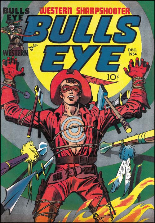
Bullseye #3 (December 1954), pencils and inks by Jack Kirby
The first two issues of Bullseye could be considered as a scaled down version of the Simon and Kirby MO; Jack drew or laid out the first issue but provided a single story for the second. However Bullseye #3 falls completely out of the pattern. There are two new Bullseye stories in the third issue and both were drawn by Kirby. All the subsequent issues of Bullseye would also have two Kirby drawn stories as well. No other Mainline title would have nearly as much Kirby involvement. Only Fighting American (a Prize title) got as much attention at that time from Jack, and even that title followed the more standard Simon and Kirby MO with less Kirby toward the end. There is little doubt that Simon and Kirby considered Bullseye their most important title at that time. Even today Joe considers Bullseye as one of his favorite comics.

Bullseye #3 (December 1954) “Devil Bird”, pencils and inks by Jack Kirby
In the 50s dinosaurs may have helped to sell comics but frankly they were difficult to make truly threatening. Back then (the 50s that is) dinosaurs were depicted as lumbering brutes dragging their tails along behind. Truly scary dinosaurs, of the Jurassic Park variety, would not be possible until years later when scientists realized that birds and mammals were better models for dinosaurs than crocodiles. Kirby bypasses all those problems by using in this story the flying reptiles pterosaur (technically not dinosaurs). Devil bird indeed. This is probably the scariest depiction of a prehistoric animal ever in the history of comics. And certainly my personal favorite Bullseye story.
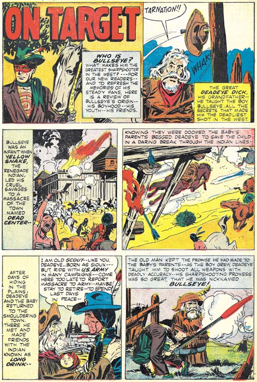
Bullseye #3 (December 1954) “On Target”, pencils by Jack Kirby and John Prentice, inks by John Prentice
Simon and Kirby decided to include in this issue a condensed version of the Bullseye origin story (they had done the same thing for Fighting American). The original art for Bullseye #1 was done on illustration board, so a razor was used to cut around desired panels and they were peeled off the board and mounted on another. This was a simple and cost effective method but the unfortunate consequence is that today most of pages the original art from Bullseye #1 are missing a panel or two.
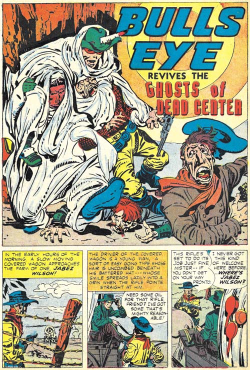
Bullseye #3 (December 1954) “The Ghosts Of Dead Center”, pencils and inks by Jack Kirby
While not truly a humorous piece, “The Ghosts of Dead Center” provides a bit a humor. There is money to be made when the railroad is built through Dead Center. Well that is once it is rid of those pesky “trespassers”. Unfortunately for those avarice villains, Bullseye has overheard their plot and even more unfortunately Dead Center is where he was raised and where his Indian friend, Long Drink, still resides. But Bullseye is just one man against many so he uses various tricks to defeat his foes. And that is where the humorous touch comes into play.
Comics from the golden age did not have anything like the concept of continuity. Once past the tale of the origin and the stories were pretty much independent. This was largely true with Simon and Kirby as well. But here at the ending of the golden age we have a story that refers back to Bullseye’s origins. Not quite like modern continuity, but much further than anyone else would use until the Marvel Universe was created in the 60’s.
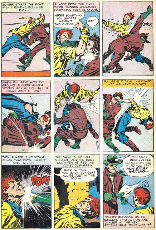
Bullseye #3 (December 1954) “The Ghosts Of Dead Center” page 7, pencils and inks by Jack Kirby
Kirby uses a 7 panel layouts for all the story pages save the last. A more standard layout would have 6 panels so the extra panel meant that none of the pages had a grid layout and some of the gutters would meander across the page. But the last page has 9 panels in a symmetrical grid arrangement. Kirby seemed to like this panel layout for his fight scenes. I feel this layout minimally distracted from the images. Kirby would also downplay or eliminate the backgrounds. Therefore all the attention is drawn to the fighting figures and the choreographed action. Nobody did this sort of thing better than Kirby.
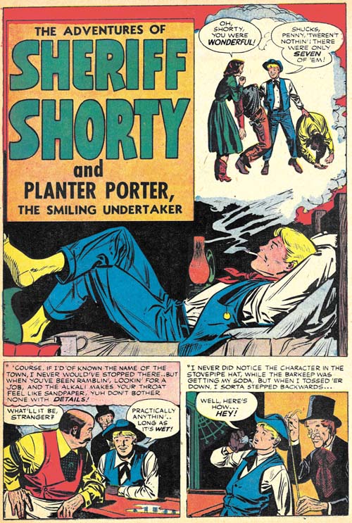
Bullseye #3 (December 1954) “The Adventures of Sheriff Shorty”, pencils and inks by Leonard Starr
With this issue Simon and Kirby would begin using a backup story that did not involve Bullseye. Leonard Starr has the honor of introducing the new feature Sheriff Shorty. The piece appears to be unsigned but hallmarks of Leonard’s hand occur all over the story art. I wrote that the piece appears to be unsigned but note the funny series of short lines along the left splash panel margin over the green pitcher. Frankly I had never noticed it before but recently I had the opportunity to conduct a careful examination of the original art. What the art shows is that white-out was used along both the right and left borders to reduce the width of the image area by a small amount. It was small but enough to cover Starr’s signature which had gone along the original panel border going from bottom up (that is as if the page had been rotated clockwise 90 degrees when he signed it). What remained of the signature was considered too unimportant to clean up. Although covered by white-out, Starr’s signature can still be made out on the original art so there is no question about the attribution.
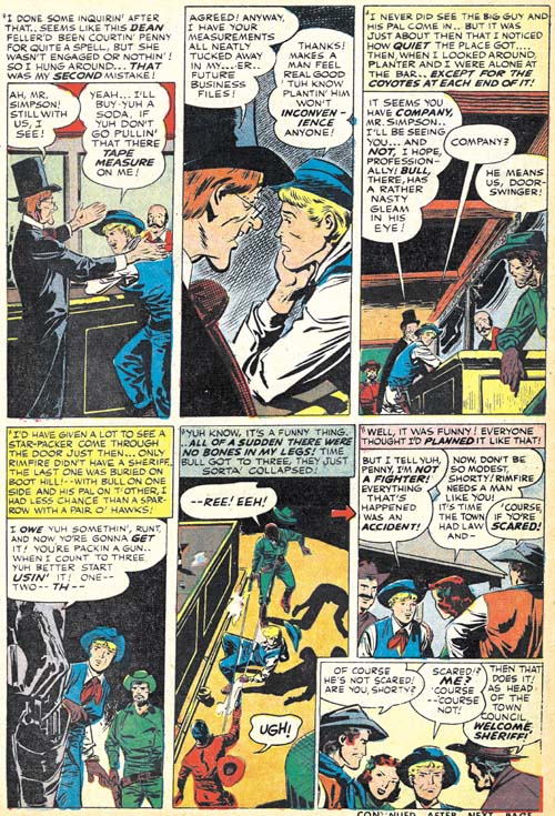
Bullseye #3 (December 1954) “The Adventures of Sheriff Shorty” page 4, pencils and inks by Leonard Starr
Starr was very fond of using tall narrow panels for work provided to Simon and Kirby. Actually he pretty much got out of the habit for his more recent romance art but narrow panels show up often in the Sheriff Shorty story. But notice the odd arrangement of this page. The last panel almost seems like an after thought and frankly a rather intrusive one at that. Here again my examinations of the original art provides an explanation. The art shows that the last panel was pasted on afterwards and panel 6 had been tall and narrow like all the other panels. Further this was not Starr’s doing. There exists another page of original art that never made it into the story. A panel was cut out of that unused art page and with some rearrangement became the last panel of page 4. This re-editing was almost certainly done by Simon and Kirby and it was the sort of thing that in the future Joe would do very often.

