Tag Archives: Kirby

Jack Kirby as a Letterer

Creator credits were pretty much never supplied before the silver age of comics. Therefore we have no good idea who the letterers actually were for a long period of comic book history. In the case of Simon and Kirby we are more fortunate because they have told us who some of the letterers were. It is only a guess but I would not be surprised if over 95% of the lettering on works created by Jack Kirby and Joe Simon up to the breakup of their collaboration can be attributed to just four artists. Actually the overwhelming percentage of it was done by just Howard Ferguson and Ben Oda. However early in their careers both Jack and Joe generally lettered the works that they drew themselves. This was not surprising because typically there was no division of labor in the earliest years of comic books and artists were expected to supply fully inked and lettered art.

For this post I will be writing about the lettering by Jack Kirby. Jack’s earliest work was not in comic books but work intended for publication in newspapers. I suspect much of this was lettered by Jack himself but I am not completely sure. For instance “The Romance of Money” (link 1) was printed as a bank give-a-way in 1937. There are some suggestions that this was Kirby’s writing but it is hard to be sure because some of his more distinctive traits from a few years later are not found.

Kirby also did some lettering in the work that he did for the Iger and Eisner studio. At this point Kirby’s lettering is very much the same as in the examples that I will provide below from a latter period. An example of Kirby lettering from that period can be found in a previous post (see A Brief Pause).

Kirby also did the lettering for the syndication strip Lightin’ and the Lone Rider. Actual I am not sure if this strip was every published in a newspaper but Greg Theakston includes some proofs in his Complete Jack Kirby 1917 – 1940. The Lone Rider strip was included in Famous Funnies however the lettering was redone by some other artist for all the early issues (Famous Funnies #62 to #65, August to December 1939, see Chapter 1 of Early Jack Kirby). Jack’s original lettering was retained for Famous Funnies #72 to #76 (July to November 1940, see Chapter 3 of Early Jack Kirby).
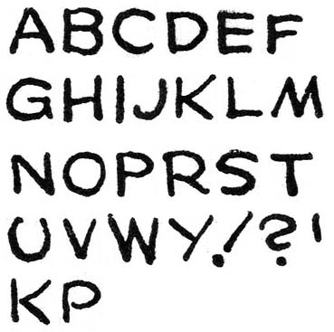
LettersBlueBeetleFebruary
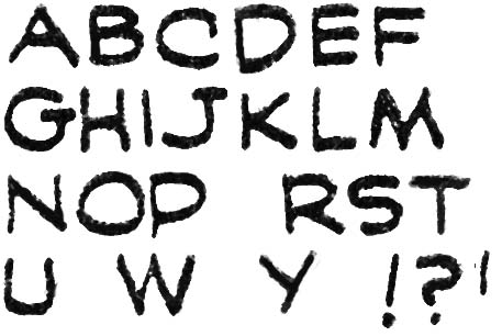
The Blue Beetle (February 1940), letters by Jack Kirby

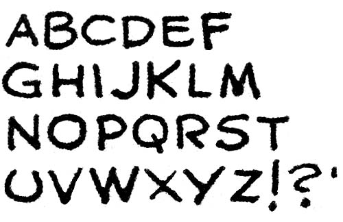
The earliest samples of Kirby’s own lettering that I will supply come from the Blue Beetle syndication strip that Jack did for Fox Comics in 1940. Others who have previously written about detecting Kirby’s lettering have placed much emphasis on his distinctive ‘U’ with its ends curved inwards in a “horseshoe” shape. Kirby’s ‘U’ is very helpful for detecting Kirby’s lettering but I have also found his ‘G’ helpful as well. Observe the small vertical stoke that drops from the lower end of the letter. The vertical stroke does not always dip below the rest of the letter but even so its straight form can often be detected. Some letters by Kirby are not so distinctive from those used by other letterers but still are useful in cases where the ‘U’ and ‘G’ are not so helpful. In particular are ‘J’ without a cross stroke at the top, ‘M’ with slopping sides, and a ‘Y’ with a diagonal lower portion. Despite the vertical characteristic of Kirby’s alphabet he nonetheless executes his exclamation point at an extreme angle. Not infrequently Kirby fails to connect the strokes that form letters and I provide examples of such a failing for ‘K’ and ‘P’ and the bottom.

For an example of Kirby lettering for the Blue Beetle please see Chapter 2 of Early Jack Kirby.
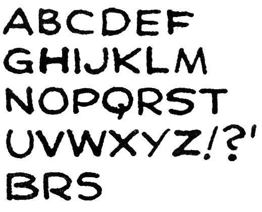
LettersPrize08
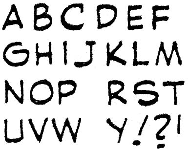
Prize Comics #8 (January 1941), letters by Jack Kirby

I provide above letters from a somewhat later period taken from the Black Owl story published in Prize Comics #8. It can be seen that little has changed in Kirby’s lettering. In fact most of the differences that can be seen between the two examples I provide are actually not due to some evolution of Kirby style but rather to the wide range of variation that occurred in the lettering of a single story. For example I show from Prize Comics #8 two versions of the letter ‘S’. I also provide two further examples of letters (‘B’ and ‘R’) where Kirby fails to connect the strokes.
Captain America #2
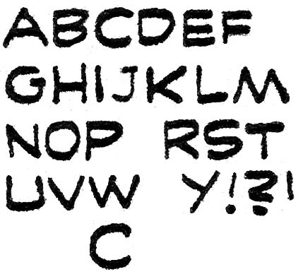
Captain America #2 (April 1941) “Hurricane”, letters by Jack Kirby

My final set of letters by Kirby come from a story that probably was the last published one he ever lettered, “Hurricane” from Captain America #2. Also published in April was “The Underground Empire” from Daring Mystery #7 but that story was probably reworked material originally done earlier for the never published Red Raven Comics #2. Again there is little changed to be observed in Kirby’s lettering. Perhaps the most significant is that Jack now provides a more vertical form to his exclamation points.

Captain America was a big success and Jack Kirby would from then on concentrate on the art and would no longer letter his stories. The period that Kirby did lettering was relatively short and I provide below all the comics that I believe he lettered. However care must be used in some of the cases because Jack’s was not the only hand involved. But I will go into that in more detail later.

Captain America (Timely (Marvel))
     1    Mar  1941   10p "Murder, Ltd."
     1    Mar  1941    6p "Stories From The Dark Ages"
     2    Apr  1941   10p "Hurricane"

Crash (Tem Publishing)
   a 1    May  1940    5p "The Solar Legion"
   a 2    June 1940    5p "The Solar Legion"
   a 3    July 1940    5p "The Solar Legion"

Daring Mystery (Timely (Marvel))
     7    Apr  1941    8p "The Underground Empire"

Famous Funnies (Eastern Color)
     72   July 1940    2p "Lightnin' and The Lone Rider"- (Kirby lettering page 2)
   a 73   Aug  1940    2p "Lightnin' and The Lone Rider"
   a 75   Oct  1940    2p "Lightnin' and The Lone Rider"
   a 76   Nov  1940    2p "Lightnin' and The Lone Rider"

Jumbo (Fiction House Magazines)
   a 1    Sept 1938    4p "The Count of Monte Cristo"
     1    Sept 1938    4p "Wilton of the West"- (Kirby letters page 4)
   a 2    Oct  1938    4p "The Count of Monte Cristo"
   a 2    Oct  1938    4p "The Diary of Dr. Hayward"- (Kirby lettering page 3)
   a 2    Oct  1938    4p "Wilton of the West"- (Kirby letters pages 3 & 4)
   a 3    Nov  1938    4p "The Diary of Dr. Hayward"
   a 3    Nov  1938    4p "Wilton of the West"

Marvel Mystery (Timely)
     13   Nov  1940    8p "The Vision"
     14   Dec  1940    7p "The Vision"
     15   Jan  1941    7p "The Vision"

Mystery Men (Fox)
   a 10   May  1940    3p "Wing Turner"

Prize (Prize)
     8    Jan  1941    6p "Black Owl"
     8    Jan  1941    6p "Ted O'Neill"

Red Raven (Timely (Marvel))
     1    Aug  1940    8p "Mercury In The 20th Century"
   s 1    Aug  1940    7p "Comet Pierce"

Romance of Money (Natamsha Publishing)
          **** 1937   24p ""- (bank give-away)

Science (Fox)
   a 4    May  1940    8p "Cosmic Carson

Wow (Fawcett)
     1    Spr  1941    7p "Mr. Scarlet"

Little Shop of Horrors, Chapter 8, The Gang’s All Here

(February 1953 – April 1953, Black Magic #21 – #23)

Just like in the romance titles from this same period, Kirby toke a commanding lead in the amount of art provided for Black Magic (24 pages). Second place fell to Al Eadeh(?) (17 pages), followed by Bill Draut (12 pages) Bob McCarty(?) (10 pages). Mort Meskin, John Prentice, George Roussos and Bill Walton all provided a single story each. There are three short works for which I have not been able to determine the artist. The romance art from this period was almost entirely done by Kirby, Draut, Meskin and Prentice with a single piece by Eadeh. It is interesting therefore that during this period McCarty, Walton and Roussos only provided work in the horror genre title.

Black Magic #21
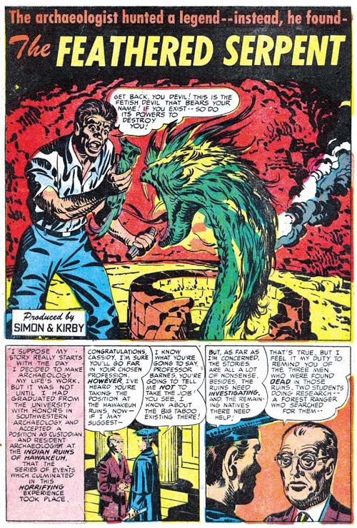
Black Magic #21 (February 1953) “The Feathered Serpent”, art by Jack Kirby

Jack Kirby was not only the most prolific Black Magic artist during this period he also did all of the most important work; all the covers and featured stories. No full page splashes but still some rather nice art. I like most of the artists who worked on Black Magic but in all honesty no one other than on Kirby was capable of making a truly interesting monster. This is not as much of a defect for the title as it might seem because few stories had monsters or demon antagonists. Black Magic was more oriented toward the supernatural and not true horror.

Black Magic #23
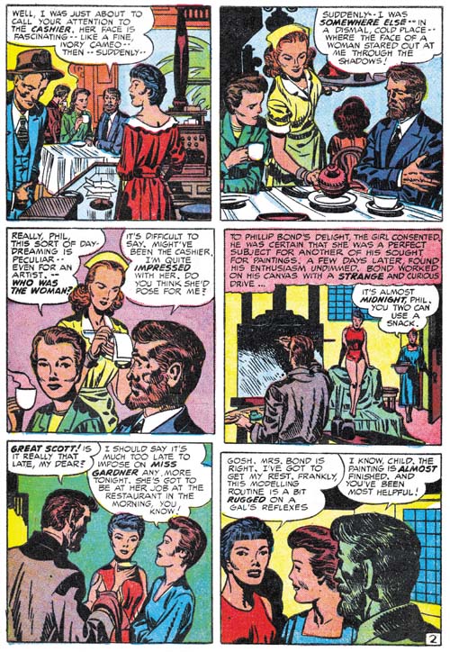
Black Magic #23 (April 1953) “Those Who Are About To Die” page 2, art by Jack Kirby

Part of Kirby’s reputation is that he really was not very good at drawing beautiful women. I have to admit I find little variation in the females that he depicted later in his career. I am not sure if Kirby was always to blame for this or if much of it was the result of “corrections” performed by some of his inkers. However during the period he worked with Joe Simon, Jack penciled quite a variety of women. The wife of the painter in “Those Who Are about to Die” is one of my favorites. Both devoted and intellectual she fits perfectly into the part she plays in the story. As far as I am concerned she is just one of the many different beautiful women Kirby drew.

Black Magic #22
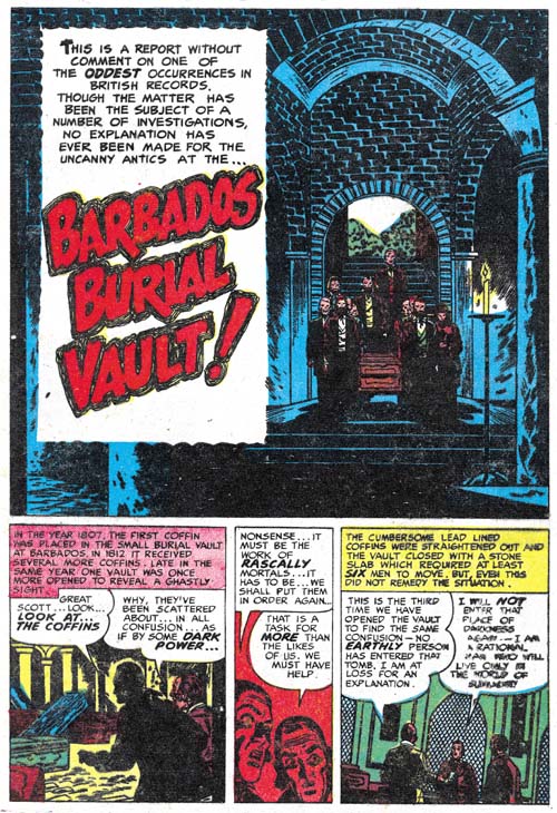
Black Magic #22 (March 1953) “Barbados Burial Vault”, art by Bill Draut

Bill Draut did more than his fair share of good splashes but perhaps his best from this period is the one from “Barbados Burial Vault”. It really does not demonstrate his talent as a penciller; the figures are all rather small and the simple architecture dominates the scene. It is Bill’s willingness to abandon his typical draftsmanship to achieve a mod is what makes this work so appealing to me. The impact is provided by the contrast of the small procession carrying the casket from the bright light of day into the dim burial vault.

Black Magic #22
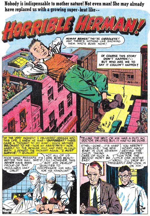
Black Magic #22 (March 1953) “Horrible Herman”, art by John Prentice

Perhaps the best story from this period was Prentice’s “Horrible Herman”. John spent most of his time when work for Simon and Kirby with doing romance stories but I feel he had a real talent for horror. Not that this was true horror but rather more of a suspense concerning a boy with great powers. No one could stop Herman, or could they?

Black Magic #23
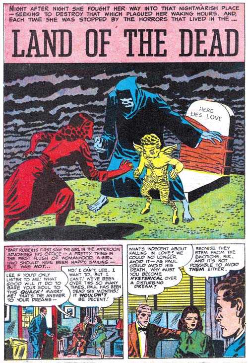
Black Magic #23 (April 1953) “Land of the Dead”, art by Mort Meskin

Mort Meskin drew some great splashes in Black Magic but perhaps none of them were more unusual than the one for “Land of the Dead”. It is not that his drawing itself was so technically superior, if anything it was a little bit below his usual work. However Mort has managed to invest this splash with a sense of other-worldliness. No speech balloons but none are required to explain the confrontation of a woman and two eerie figures that block her from a tombstone bearing the words “Here Lies Loves”. The bizarre cloud formations complete the effect imparted to the splash.

This story would have been more appropriate for the by now defunct Strange World of Your Dreams title. Not only would it have been appropriate, this story was almost certainly originally meant for the unpublished fifth issue of that title that would have been published just a few months before. A repeating feature in SWYD was “Send Us Your Dreams” with a pipe smoking Richard Temple doing the dream analysis. The same character is found in “Land of the Dead” except his name has been changed to Bart Roberts. That this was in fact just a substitution can be seen in how that name was just pasted over the older version in the caption of the first story panel (note how the name in is not aligned with the rest of the caption).

Black Magic #21
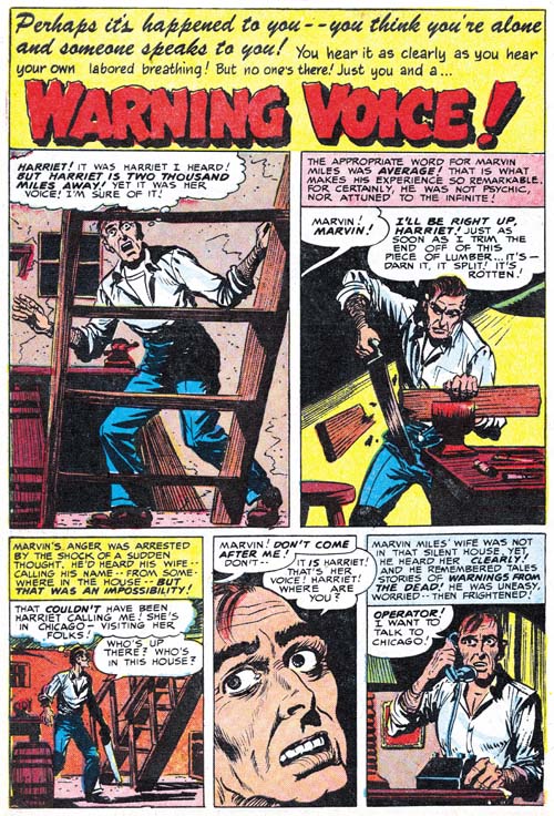
Black Magic #21 (February 1953) “Warning Voice”, art by Bob McCarty(?)

Many of the Black Magic stories from this period are rather short. “Warning Voice” is only three pages. Perhaps that is why such a small splash panel was used. The panel is hardly wider than the first story panel and at a glance could be mistaken as the first story panel. While I can see the logic behind such a small splash panel I do not feel it was a good approach due to the confusion it causes.

Note the large eyes particularly in the close-up panel. This remains the chief reason that I am not yet comfortable with the Bob McCarty attribution that I have been following.

Black Magic #21
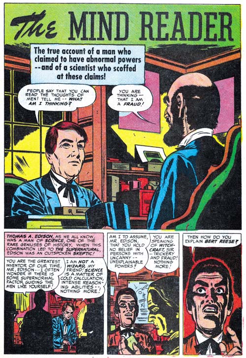
Black Magic #21 (February 1953) “The Mind Reader”, art by George Roussos

There is only a single two page story by George Roussos. Observe the Meskin influence that can be seen in the man in the last two panels. I do believe this is an influence and not an indication of actual involvement by Meskin.

Black Magic #22
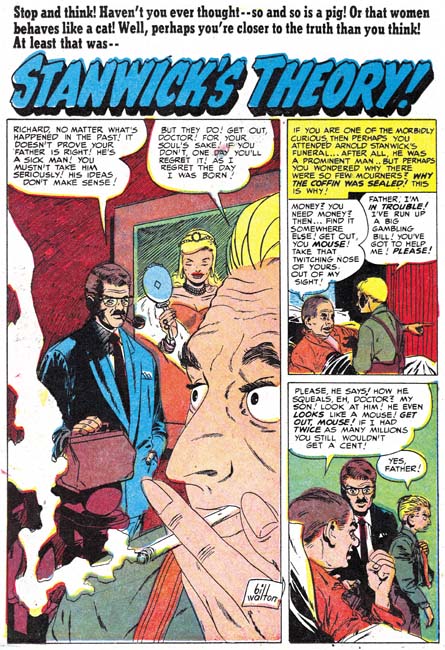
Black Magic #22 (March 1953) “Stanwick’s Theory”, art by Bill Walton

I admit than generally I am not overly fond of Bill Walton’s art. He was a competent artist but he only occasionally produces something that really grabs my attention. The splash for “Stanwick’s Theory” is a pleasant exception. In fact I really, really like this splash. The use of a tall narrow panel and extreme close-up and cropping are very effective. Even the cigarette and its smoke play an important part in the composition. This splash is not only unique for Walton it is also rather unusual for Simon and Kirby productions.

Black Magic #23
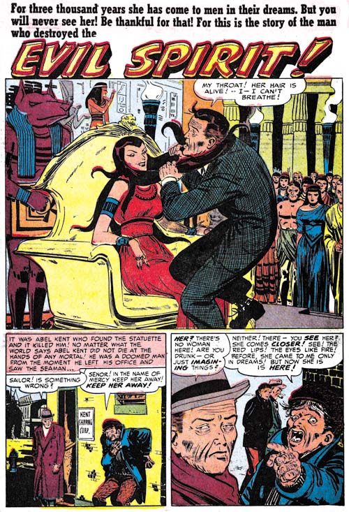
Black Magic #23 (April 1953) “Evil Spirit”, art by Al Eadeh(?)

Al Eadeh(?) really made good use of the script for “Evil Spirit”. The image of a beautiful woman using her long hair to strangle a man is certainly memorable. So memorable that years later Jack Kirby would re-use the concept for Medusa a villain (who later becomes a heroine) in the Fantastic Four comic book.

The Little Shop of Horrors, Chapter 7, Kirby Returns

The Little Shop of Horrors, Chapter 9, The Party’s Over

Art of Romance, Chapter 22, He’s the Man

(February 1953 – April 1953: Young Romance #54 – #56, Young Love #42 – #44, Young Brides #4)

Number of Romance Titles 1947 - 1954
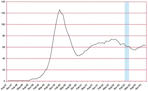
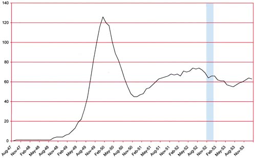
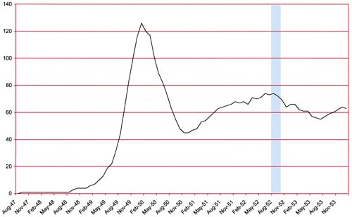
Number of Romance Titles 1947 – 1954 (the period covered in this chapter is shaded in blue)

I must admit we have entered the period of Simon and Kirby’s romance production that I find the least interesting. This is somewhat unfair because most of the artists used were doing good work. Part of the problem is that while the art was still fine it was largely done by artists we have seen for a number of years. Another contributing factor was that Simon and Kirby were having greater difficulties in coming up with new plots. There are still some stories that are real gems, but they just were not as frequent as previously. I had considered devoting longer periods of time for each chapter but I feel that by keeping on the current three month pace allows me to present more examples of work by artists that are much too overlooked today.

I have remarked in the last couple of chapters of The Art of Romance and The Little Shop of Horrors that Jack Kirby had become more productive after a long period where S&K comics depended more on other artists. While Kirby had become more prominent he still had not returned to the really dominant status he had in earlier years. That is until this period where Jack provides 62 pages of art. This is well above the second place artist who was John Prentice with 46 pages. Third place was taken by Bill Draut (38 pages) and fourth by Mort Meskin (31 pages). These four artists provide almost all the art for this period with Al Eadeh(?) drawing a single story, an unidentified artist contributing two stories and another artist, probably a studio assistant, doing three single page features. Completely absent are two artist that were pretty common presence in previous chapters; George Roussos and Bob McCarty(?).

Young Love #43
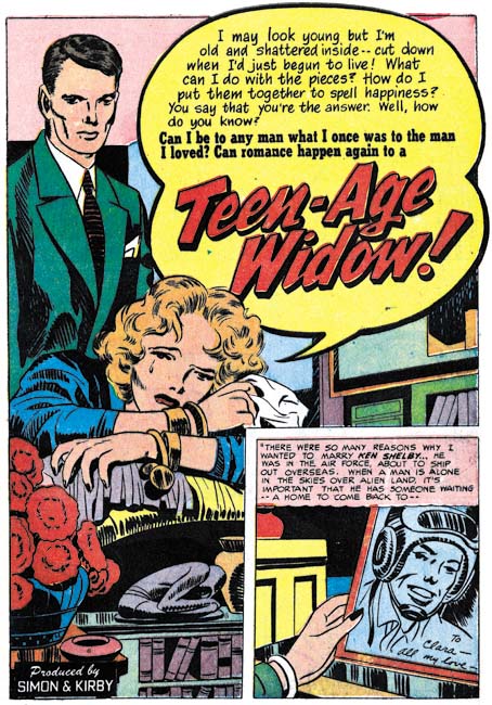
Young Love #43 (March 1953) “Teen-Aged Widow”, art by Jack Kirby

Kirby is not only back in terms of quantity of art, much of it consists of rather nice material. Four of the seven featured stories were done by Jack and one of them, “Teen-Aged Widow”, even returns to a longer length (12 pages) that had previously been typical for Kirby. The splash page for “Teen-Aged Widow” is rather nice. It is a great example of a confessional splash, what young reader of the day could have resisted such a story. Tears do not play so important a part in Simon and Kirby romances as they did in comics produced by others during the silver age. But those tears are very appropriate here. Note how the small sculpture piece in the foreground repeats the protagonists reclining posture. One odd thing is the small size of the books in the foreground. I doubt that this was meant to be taken literally but was just a consequence of the limited space available.

Young Love #43
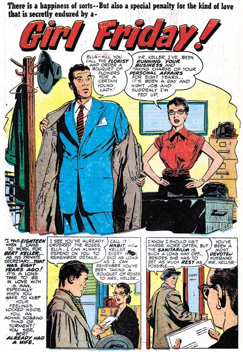
Young Love #43 (March 1953) “Girl Friday”, art by John Prentice

The work by John Prentice during this period is an exception to my lack of great enthusiasm for this period of S&K romance. This is probably due the relatively late arrival of Prentice into the Simon and Kirby production having started just two years previously. Even Meskin has been around longer (three years) while Kirby and Draut have been around since the beginning (six years ago). While Meskin has only been around one more year then Prentice he produced a lot of more work. John was generally not the most productive of the studio artists which is all the more reason to be pleasantly surprised by the amount of work he did during the period covered in this chapter.

The splash for “Girl Friday” is another of those by Prentice that eliminates the normal panel borders. Perhaps my fondness for this effect has caused me to include in my posts enough examples to mislead my readers into thinking this was Prentice’s typical approach. Actually borderless splash panels were pretty uncommon for Prentice however he did use this format more often than other studio artists.

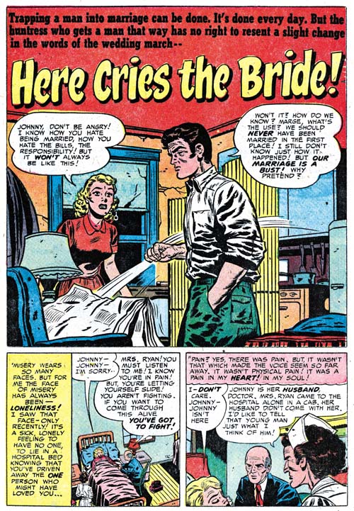
Young Brides #4
Young Brides #4 (April 1953) “Here Cries the Bride”, art by Bill Draut

Bill Draut’s romance art has not changed very much over the years. Joe Simon has remarked to me a number of times how reliable Draut was, a true professional. Bill graphically told his story in a clear manner with enough variations in viewpoints to keep the reader’s interest. Probably none of the studio artists other than Kirby made as effective use of background details in his splashes. These details probably do not mean much aesthetically but are quite important in capturing part of the story in the splash. While Draut’s style did not evolve much during the period he worked for Simon and Kirby it would undergo large changes afterwards. Although Draut’s art became more acceptable to silver age publishers unfortunately in my opinion the changes to his style were detrimental to his art.

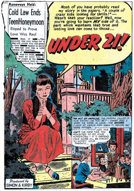
Young Brides #4
Young Brides #4 (April 1953) “Under 21”, art by Mort Meskin

I feel that the work Mort Meskin did during this period was on a whole not as good as his earlier efforts. That is not to say there were not an exceptions and “Under 21” was certainly one of those. What a great splash, perhaps Meskin’s best effort for a feature story. The wistful pose of the young lady wonderfully captures the mode of the story. The scandal suggested censored newspaper clipping was sure to attract the reader. Meskin’s placing the protagonist on a small town front porch is unexpected but rather effective. The quality of Meskin’s inking had recently been rather sporadic but here the pen and brush are fully under Mort’s competent command. Fortunately none of Meskin’s work for this chapter was inked by George Roussos. I have to admit that I find the inking by Roussos of pencils done by Meskin or Kirby to have been at best unfortunate and at worst disasters.

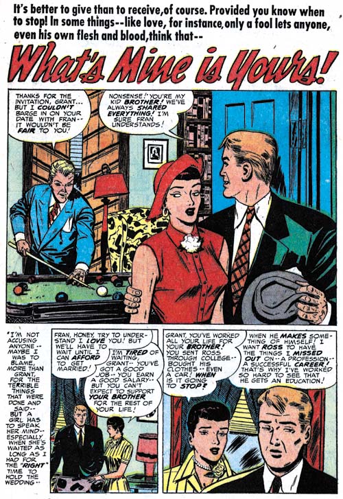
Young Love #44
Young Love #44 (April 1953) “What’s Mine Is Yours”, art by Al Eadeh?

I do not have much to say about the single story questionably attributed to Al Eadeh but I did want to include another example of his work.

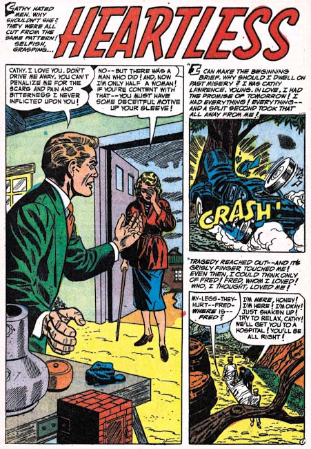
Young Romance #55
Young Romance #55 (March 1953) “Heartless”, art by unidentified artist

Two stories (“Heartless” and “The Other Woman”) by an unidentified artist occur in the same Young Romance issue. He is certainly not among my favorites but he is competent artist nonetheless.

Chapter 1, A New Genre (YR #1 – #4)
Chapter 2, Early Artists (YR #1 – #4)
Chapter 3, The Field No Longer Their’s Alone (YR #5 – #8)
Chapter 4, An Explosion of Romance (YR #9 – #12, YL #1 – #4)
Chapter 5, New Talent (YR #9 – 12, YL #1 – #4)
Chapter 6, Love on the Range (RWR #1 – #7, WL #1 – #6)
Chapter 7, More Love on the Range (RWR #1 – #7, WL #1 – #6)
Chapter 8, Kirby on the Range? (RWR #1 – #7, WL #1 – #6)
Chapter 9, More Romance (YR #13 – #16, YL #5 – #6)
Chapter 10, The Peak of the Love Glut (YR #17 – #20, YL #7 – #8)
Chapter 11, After the Glut (YR #21 – #23, YL #9 – #10)
Chapter 12, A Smaller Studio (YR #24 – #26, YL #12 – #14)
Chapter 13, Romance Bottoms Out (YR #27 – #29, YL #15 – #17)
Chapter 14, The Third Suspect (YR #30 – #32, YL #18 – #20)
Chapter 15, The Action of Romance (YR #33 – #35, YL #21 – #23)
Chapter 16, Someone Old and Someone New (YR #36 – #38, YL #24 – #26)
Chapter 17, The Assistant (YR #39 – #41, YL #27 – #29)
Chapter 18, Meskin Takes Over (YR #42 – #44, YL #30 – #32)
Chapter 19, More Artists (YR #45 – #47, YL #33 – #35)
Chapter 20, Romance Still Matters (YR #48 – #50, YL #36 – #38, YB #1)
Chapter 21, Roussos Messes Up (YR #51 – #53, YL #39 – #41, YB #2 – 3)
Chapter 22, He’s the Man (YR #54 – #56, YL #42 – #44, YB #4)
Chapter 23, New Ways of Doing Things (YR #57 – #59, YL #45 – #47, YB #5 – #6)
Chapter 24, A New Artist (YR #60 – #62, YL #48 – #50, YB #7 – #8)
Chapter 25, More New Faces (YR #63 – #65, YLe #51 – #53, YB #9 – #11)
Chapter 26, Goodbye Jack (YR #66 – #68, YL #54 – #56, YB #12 – #14)
Chapter 27, The Return of Mort (YR #69 – #71, YL #57 – #59, YB #15 – #17)
Chapter 28, A Glut of Artists (YR #72 – #74, YL #60 – #62, YB #18 & #19, IL #1 & #2)
Chapter 29, Trouble Begins (YR #75 – #77, YL #63 – #65, YB #20 – #22, IL #3 – #5)
Chapter 30, Transition (YR #78 – #80, YL #66 – #68, YBs #23 – #25, IL #6, ILY #7)
Chapter 30, Appendix (YB #23)
Chapter 31, Kirby, Kirby and More Kirby (YR #81 – #82, YL #69 – #70, YB #26 – #27)
Chapter 32, The Kirby Beat Goes On (YR #83 – #84, YL #71 – #72, YB #28 – #29)
Chapter 33, End of an Era (YR #85 – #87, YL #73, YB #30, AFL #1)
Chapter 34, A New Prize Title (YR #88 – #91, AFL #2 – #5, PL #1 – #2)
Chapter 35, Settling In ( YR #92 – #94, AFL #6 – #8, PL #3 – #5)
Appendix, J.O. Is Joe Orlando
Chapter 36, More Kirby (YR #95 – #97, AFL #9 – #11, PL #6 – #8)
Chapter 37, Some Surprises (YR #98 – #100, AFL #12 – #14, PL #9 – #11)
Chapter 38, All Things Must End (YR #101 – #103, AFL #15 – #17, PL #12 – #14)

Some Lettering by Howard Ferguson

I must admit that I have not done enough carefully studies of the lettering done on Simon and Kirby productions. I always realized the importance of the lettering, both aesthetically and historically, but there always seemed other investigations that attracted my attentions. I have decided that I will no longer postpone examining this subject. I am not going to make a serial post because my investigations will not be following the timeline. But I will group these posts under a Topic on the sidebar.

In this pursuit I like to assemble images of the letters from a single story. Of course there is always a certain amount of variation in the letters but I try to select somewhat typical examples. For these samples I only select letters from captions and balloons that are not bold or oversized.

Letters Prize Comics #7
Prize Comics #7 (December 1940) “The Black Owl”, letters by Howard Ferguson

Initially like many early artists both Joe Simon and Jack Kirby did their own lettering. When the duo was working in the Timely bullpen their work began to be lettered by Howard Ferguson. Joe is the first to admit that his own lettering was rather amateurish while he considers Howard was one of the best letters ever. I provide about some examples of his lettering from an early Black Owl story. Note the rather short vertical strokes at the bottoms of the letters ‘P’ and ‘R’. I have selected an ‘S’ that shows a lower ending that is shorter horizontally than the upper one. Actually this is a rather variable feature ranging all the way to an equal length for both the upper and lower arms. However the short lower arm for the ‘S’ can usually be easily found while the reversed almost never occurs. There are two rather distinctive letters. One of them is the ‘J’ with its rather long and flat hook. Unfortunately ‘J’ is not a common letter but when it is used it provides an easy means of spotting Ferguson’s work during this early period. A more common letter that is very useful for identifying Ferguson’s work is the ‘C’. Note the short vertical stroke that descends from the top arm of the ‘C’.

Letters Stuntman #1
Stuntman #1 (April 1946) “Killer in the Bigtop”, letters by Howard Ferguson

I am going to make a rather long time leap and provide some lettering from late in Ferguson’s career. Despite the years that separate the Black Owl story from this Stuntman work, the ‘C’ is still has that very distinctive short stroke. The ‘J’ is very much unchanged. Examples of ‘S’ with a shorter lower arm can still be found but they are not nearly as common as before. There have been some changes as for example in the ‘G’. The overall shape is the same with the horizontal stroke place rather high in the letter. But note how in the Prize #7 the horizontal line for the ‘G’ extends to the right from the lower arm while in Stuntman #1 it appears to be made from the same stroke and does not extend to the right. The ‘?’ has also been altered having a lower arm that hooks much more to the right giving the main body a look almost like a ‘2’.

Letters Green Hornet #39
Green Hornet #34, originally published as Stuntman #3 (October 1946) “Rest Camp for Criminals”, letters by Howard Ferguson

I would very much like to determine when Ferguson passed away and was no longer lettering for Simon and Kirby. Unfortunately his most distinctive earlier trait, the ‘C’ with a short vertical stroke, pretty much disappears. Occasionally a ‘C’ will have just a hint of this feature and I provide an example of one at the bottom of the samples. The ‘J’ is still distinctive but like I said it is not a common letter. The ‘P’ and ‘R’ still have short lover vertical strokes but not quite as extreme as in Prize #7. Oddly Howard has gone back to the earlier version of the ‘G’ with that small horizontal stroke to the right.

Letters Headline #24
Headline #24 (May 1947) “Trapping New England’s Chain Murderer”, letters by Howard Ferguson?

I am going to close with samples from a crime story from seven months later. There are a number of changes to be found. The ‘J’ is still distinctive but no longer has a horizontal stroke at the top. The ‘G’ reverts once again to the Stuntman form without the short horizontal stroke to the right. However the horizontal stroke no longer sits so high in the letter. The lower vertical strokes for ‘P’ and ‘R’ are not quite so short as before. The apostrophe now has a slant where previously it was always vertical. There are two big surprises. Previously the ‘M’ had been very consistent with a slant to the two outer arms and the inner junction reaching as low as the base for the two outer arms. Now the outer arms of ‘M’ are vertical and the inner junction does not always descend to the base of the letter. The other surprise is found in the letter ‘Y’. Again this letter had bee very consistent in all the earlier works having the lower portion formed by a continuation of the stroke for the right arm giving it a slant. In Headline #24 the lower portion of the ‘Y’ descends vertically.

In conclusion, while there was some variation in Ferguson’s lettering over the years for the most part it seems pretty consistent. That is except toward the end. Frankly I do not know what to make of the changes found in the lettering of “Trapping New England’s Chain Murderer”. Although I have not assembled letter examples, there are other late stories that exhibit variations. All of this work is typically credited to Ferguson but I have to say I have my doubts. However I require further studies of these works before I reject the Ferguson attributions altogether.

Little Shop of Horrors, Chapter 7, Kirby Returns

(November 1952 – January 1953, Black Magic #18 – #20)

It looks like once again I have slipped up. I meant to mention, at the appropriate time, Simon and Kirby’s new title Strange World of Your Dreams. Well the time should have been during the last chapter (Chapter 6) because the first issue of SWYD has the cover date of August 1952. I have previously debated with myself whether to include SWYD in this serial post. While SWYD shares some characteristics with the horror genre and with Black Magic in particular, the title is in other ways quite unique. In the end I had decided not to include it because I have posted on it previously (Strange World of Your Dream, strange indeed and Featured Cover, Strange World of Your Dreams #2). However those posts did not include a discussion of the work by the participating artists so I have added a checklist (Stange World of Your Dreams Checklist) which can also be found in the sidebar. It was a short-lived title which with the last issue cover dated January 1953, the month that this chapter ends with. Black Magic was successful but that does not mean that every title that Simon and Kirby came up with would be as well.

In some earlier chapters of Little Shop of Horrors I have commented on the relatively decreased roll that Jack Kirby’s played in Black Magic. However in my last chapter I remarked on his greater contribution having taken the position of the second most prolific artist. In the period covered here Jack takes the first place with 25 pages. This is really not quite as significant as it might sound because Bob McCarty(?) takes second place with only 2 less page then Jack. However the two have a substantial lead over George Roussos (14 pages). All other artists provided only minor contributions. Surprising that includes the normally prolific Mort Meskin.

Black Magic #18
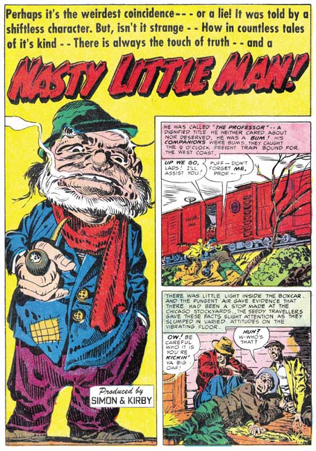
Black Magic #18 (November 1952) “Nasty Little Man”, art by Jack Kirby

Jack Kirby’s contribution to Black Magic during this period has not only increased in amount of art but also played a more prominent part; Kirby did the first, or featured, story for all three issues. One of the stories, “Nasty Little Man”, is in my opinion one of the best pieces Kirby did for Black Magic. The splash is another example of how Jack could make a masterpiece out of virtually nothing. All we are presented with is a standing man that is smoking a pipe. His large head clues us to the fact that he is the little man mentioned in the title. And what a nasty man the story shows that he is. A warning to never underestimate someone based on height.

Black Magic #20
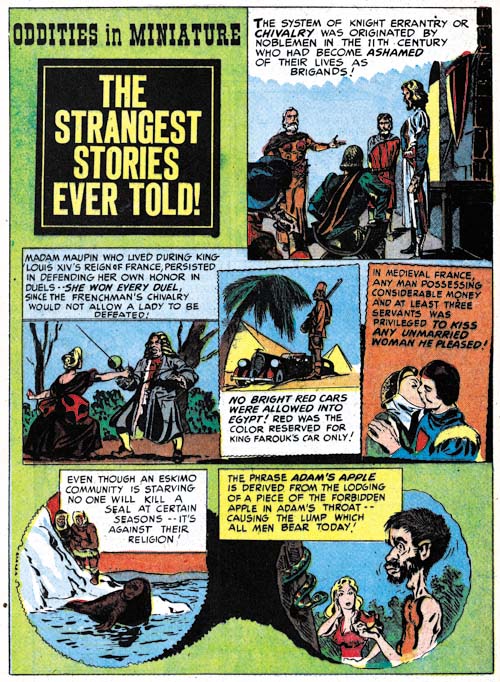
Black Magic #20 (January 1953) “The Strangest Stories Ever Told”, art by Jack Kirby

While I often highlight Kirby’s more substantial contributions it is important to realize that Jack drew rather minor works as well. Sometimes despite their short length these could be masterpieces. However occasionally these short pieces could be all too easily overlooked as was certainly the case for “The Strangest Stories Ever Told”. This work is not included in the Jack Kirby Checklist and in all honesty I had previously failed to recognize it as well. For me the most obvious clue as to the correct attribution is found in the final panel and particularly in the woman. I feel that once the rest of the panels are examined more carefully they reveal Kirby’s hand as well.

Black Magic #20
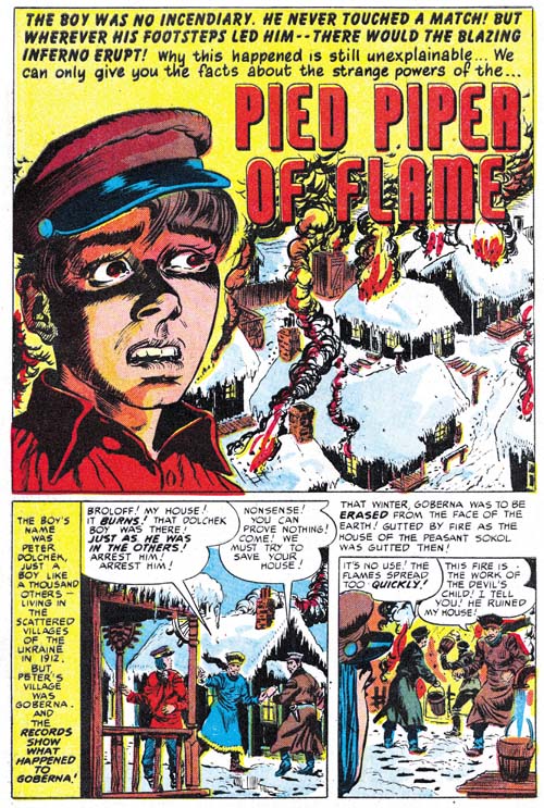
Black Magic #20 (January 1953) “Pied Piper of Flame”, art by Bob McCarty(?)

As I mentioned earlier Bob McCarty(?) plays an important part in these issues of Black Magic. I guess I find that a little surprising since the large eyes that he provides his characters of both sexes give them a rather soulful look that seems a little out of place in the horror genre. That aside, McCarty was certainly good at graphically telling the stories.

Black Magic #18
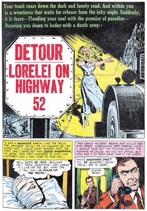
Black Magic #18 (November 1952) “Detour, Lorelei on Highway 52”, art by Bob McCarty(?) and Jack Kirby

Bob McCarty(?) may have been talented but his work was, like that of many of the studio artists, subjected to the inclusion of parts by Jack Kirby. In his perhaps unofficial roll as art editor Jack was sometimes called to touch up another artist’s work. Parts drawn by Kirby occur so often in the splash that the possibility remains that this is not so much a touching up as a preplanned activity. In “Detour, Lorelei on Highway 52” we can see Kirby’s distinctive hand in both the penciling and inking. The entire female figure was done by Kirby and his blunt inking brush can also be seen in some of the nearby road side. However all the foreground elements were inked with a finer brush presumably by McCarty. I am uncertain who did the inking of the background steep hill.

Black Magic #20
Black Magic #20 (January 1953) “Hatchet Man” page 4, art by Bill Draut

Bill Draut only did a single Black Magic story during this period. Actually it might easily be overlooked because much of the story is drawn from a more distant viewpoint. This is unusual because Draut is generally very good and using more varied viewing distance to keep the story visually interesting. Further the splash panel is one of his poorer efforts so I have decided to deviate from the normal splash page example and show a story page instead. Bill’s hand is particularly easy to spot in the fifth panel.

Black Magic #19
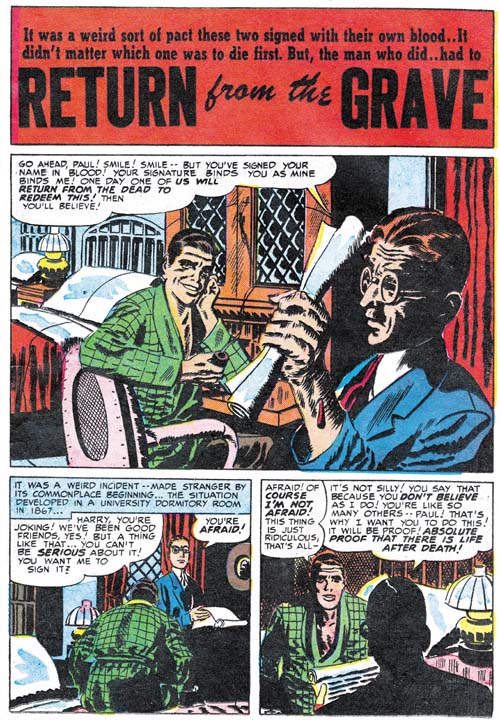
Black Magic #19 (December 1952) “Return from the Grave”, art by Mort Meskin

Mort Meskin also only provides a single story and it is also not one of his better efforts. I believe most of the fault lies in the inking. While there are some effective spotting in parts most of the inking lacks Mort’s typical control and seems a bit crude. I have not been able to come to a conclusion of whether Meskin himself did the inking or some other artist like George Roussos.

Black Magic #20
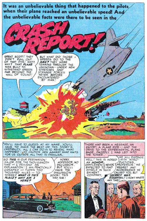
Black Magic #20 (January 1953) “Crash Report”, art by John Prentice

The most pleasant surprise is the return of John Prentice. While Prentice plays an important part in the romance titles he is much less frequently used in Black Magic. I feel John does a great job in his horror genre stories but I suspect that his romance work was so appreciated by Simon and Kirby that they preferred to assign him romance pieces.

Black Magic #19
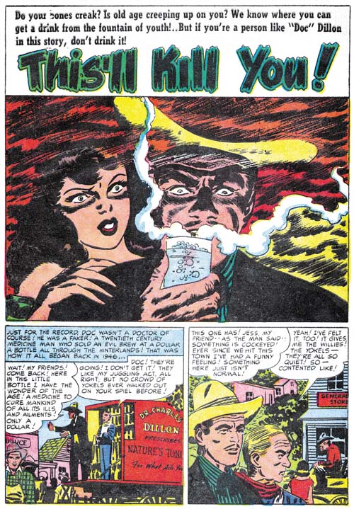
Black Magic #19 (December 1952) “This’ll Kill You”, art by George Roussos

George Roussos provides some work where some of the people have a Meskin look to them. While it is possible that Mort actually had a hand in this art, I am presently interpreting it as Meskin influencing George rather then actually working on the art. This opinion is largely based on some Meskin art that was inked by Roussos without George being so heavy handed as to make it difficult to recognize Mort’s pencils.

Black Magic #18
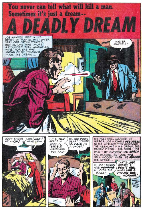
Black Magic #18 (November 1952) “A Deadly Dream”, art by J. G.

Two very short works (one and two pages) resemble the work of a still unidentified artist that signed a piece as J. G. (BM #9, February 1952, “The Man In The Judge’s Chair”). The splash for “A Deadly Dream” includes some picket fence crosshatching and some abstract arch shadow (see Inking Glossary) that are part of the Studio Style inking. Such techniques are not found elsewhere in the story and so they indicate someone, probably either Simon or Kirby, touching up the splash.

Black Magic #19
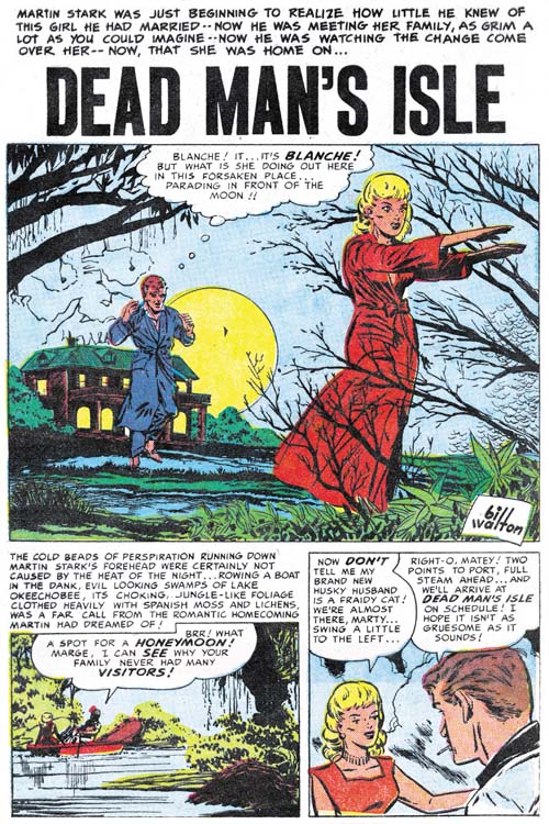
Black Magic #19 (December 1952) “Dead Man’s Isle”, art by Bill Walton

Bill Walton also provides a single story during this period. I feel there is no reason to write in more detail about this piece but I do think it helps to provide examples of all the more important artists that work for Simon and Kirby.

The Little Shop of Horrors, Chapter 1 (#1 – 3), Expanding Their Fields
The Little Shop of Horrors, Chapter 2 (#4 – 6), Up and Running
The Little Shop of Horrors, Chapter 3 (#7 – 8), The Same Old Gang
The Little Shop of Horrors, Chapter 4 (#9 – 11), Another Hit
The Little Shop of Horrors, Chapter 5 (#12 – 14), New Faces
The Little Shop of Horrors, Chapter 6 (#15 – 17), Mix Bag

The Little Shop of Horrors, Chapter 8 (#21 – 23), The Gang’s All Here
The Little Shop of Horrors, Chapter 9 (#24 – 26), The Party’s Ovetr
The Little Shop of Horrors, Chapter 10 (#27 – 29), A Special Visitor
The Little Shop of Horrors, Chapter 11 (#30 – 33), The End

Art of Romance, Chapter 21, Roussos Messes Up

(November 1952 – January 1953: Young Romance #51 – #53, Young Love #39 – #41, Young Brides #2 – 3)

Number of Romance Titles 1947 - 1954
Number of Romance Titles 1947 – 1954 (the period covered in this chapter is shaded in blue)

In the last chapter the most prolific romance artist was Bill Draut. This was somewhat of a fluke because Draut held that position only for a short time and Mort Meskin would once again regain the top position by producing 77 pages of art. However this time Mort would achieve such high page counts not by his efforts alone. Some of Mort’s art covered here was inked by George Roussos. Exactly how much is not clear as there are some works I just have not been able to decide about the inker.

Jack Kirby picks up second place with 42 pages but other artists are not far behind him. It has been some time since Jack was the dominant artist. The other two usual suspects take the next positions; Bill Draut (36 pages) and John Prentice (34 pages). Bill Walton does a surprising, for him that is, 22 pages. The other artist (George Roussos, Al Eadeh(?) and Bob McCarty(?)) provide only a small number of art pages.

Young Romance #53
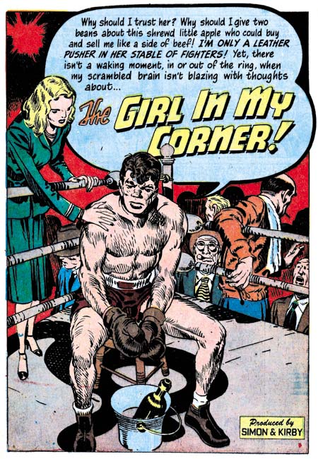
Young Romance #53 (January 1953) “That Girl in My Corner”, art by Jack Kirby

Jack Kirby may not have been as prominent a presence as he once was but he still did some incredible art. The confessional splash for “That Girl in My Corner” is a great example. What a moving figure the fighter presents; perhaps a little tired and haggard but by no means defeated. His girl presents the least interesting character of the splash but check out all the on-lookers. The background figures may not have played an important place in the splash but they are just the sort of added spice that provides the proper atmosphere.

Young Love #40
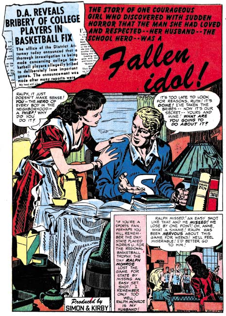
Young Love #40 (December 1952) “Fallen Idol”, art by Jack Kirby

There was a time when the first, or featured, story almost always used a confessional splash. That has changed in recent months. Of the eight comics reviewed here only one of the featured stories has a confessional splash. That is not to say that the first splash did not always get good treatment. In fact I had a hard time choosing between two of Kirby’s splashes to present here; they both were so good.

Young Brides #2
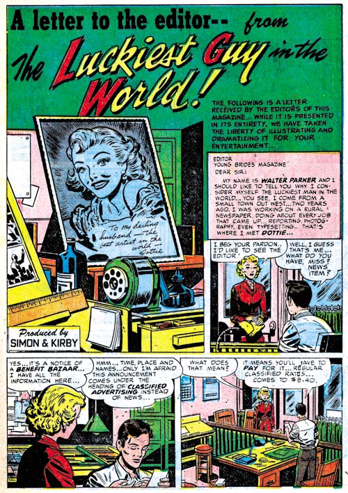
Young Brides #2 (November 1952) “The Luckiest Guy in the World”, art by Bill Draut

Another of the changes occurring to the Prize romance titles is that previously if Kirby appeared in an issue he would most likely do the feature story. This was no longer the case; Jack only did three of the eight featured stories. Three of the other featured stories were done by Bill Draut. Another change was the splash for the featured story did not always take up a full page. While in the earlier romance issues the featured story seemed chosen from the start, now more and more it seems like it was indistinguishable from any of the other stories.

At a quick glance the cluttered desk top could belong to anyone. The story is about a newspaper artist but look what is on the drawing board cut off by the left edge. Looks like comic book art to me.

Young Romance #51
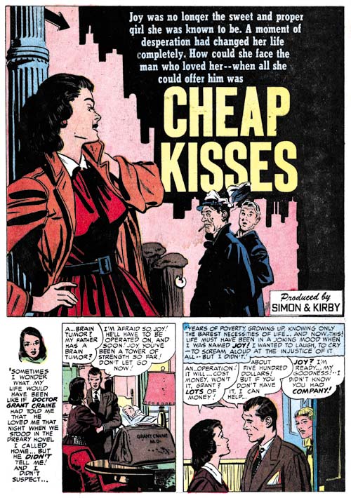
Young Romance #51 (November 1952) “Cheap Kisses”, art by John Prentice

One practice remained, the teaser. I wonder if the teenage girl readers understood the suggestion of prostitution that John Prentice’s splash provides, but I am sure any adult viewer would. Perhaps this was done on purpose to entice an adult to purchase the comic expected a lurid story. But any adult that did buy the comic was certainly doomed to disappointment. In this case the real crime that the girl did was theft.

Young Brides #2
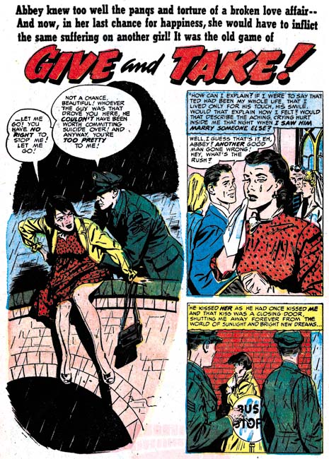
Young Brides #2 (November 1952) “Give And Take”, art by John Prentice

John Prentice would sometimes abandon a splash border. It is a technique that allows the story to stand out from the others. The theme of a man preventing a woman from suicide is one that he would draw again years later for Harvey Comics (“Paid in Full” was discussed in Kirby Imitating John Prentice). Interestingly Prentice left out the border for the splash for the Harvey story as well.

Young Romance #53
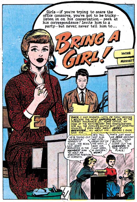
Young Romance #53 (January 1953) “Bring a Girl”, art by Bill Walton

The confessional splash is not always limited to the feature story. I believe the confessional splash for “Bring a Girl” is the only one that Bill Walton did. It is also Walton’s only full page splash for Simon and Kirby. Its uniqueness suggests that this story may originally have been intended for the feature story but got replaced by Kirby’s “Girl in My Corner” which in my opinion was a good choice. Still it is the best splash that Walton would do for Simon and Kirby. So nice that I also suspect that Walton was provided a layout, most likely by Joe Simon.

Young Love #39
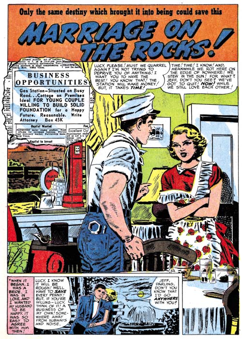
Young Love #39 (November 1952) “Marriage on the Rocks”, pencils by Mort Meskin

Some of the art by Mort Meskin for this period have been inked by a brush technique I do not remember seeing in his art before. The technique is call a split brush where by the brush is manipulated to form multiple tips. With this technique it is possible to ink parallel lines with one stroke. In the inking of “Marriage on the Rocks” this can best be seen as short strokes on the man’s shoulder. Meskin has a preference for spotting with parallel lines but in the past did them with separate brush strokes. I cannot make up my mind if this is Mort just experimenting with the split brush technique or if it indicates that another artist did the inking.

Young Love #41
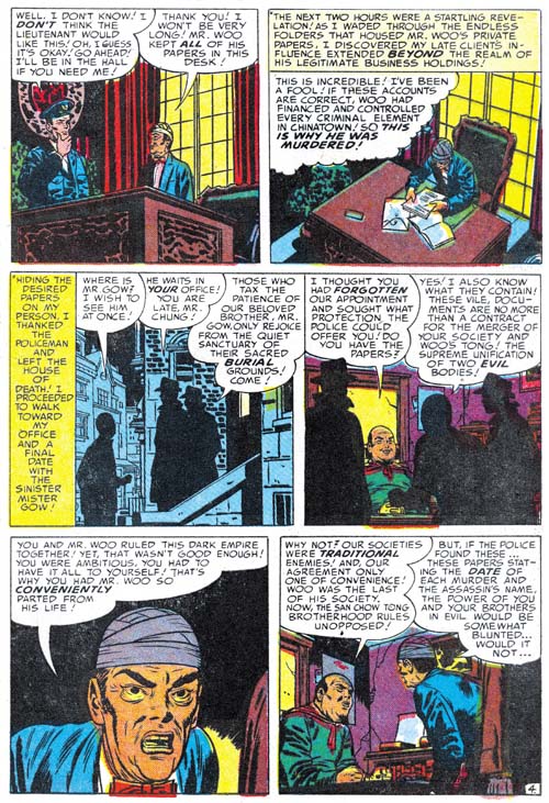
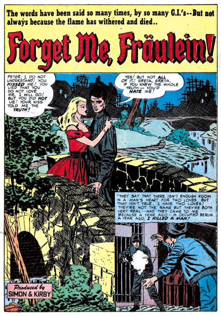
Young Love #41 (January 1953) “Forget Me, Fraulein”, pencils by Mort Meskin, inks by George Roussos

According to the Jack Kirby Checklist, “forget Me, Fraulein” was penciled by Jack Kirby and inked by Mort Meskin. The biggest problem with that is there on the right edge just above the story panel is Meskin’s signature.

Young Love #41
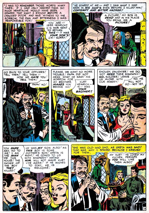
Young Love #41 (January 1953) “Forget Me, Fraulein” page 3, pencils by Mort Meskin, and inks by George Roussos

I am sure that some will still say that Kirby did the layouts, but it is clear to me that Mort was not working from layouts supplied by Jack. That is not to say Kirby did not influence Meskin, Mort had been working along side of Jack for three years and had picked up some things. The easiest clue that these are not Kirby layouts, now that it has been pointed out in a previous comment by Steven Brower (Little Shop of Horrors, Chapter 5), is the narrow depth of field. Most of the men look much more like Meskin’s than those drawn by Kirby. However there is something to the men that is a little off from typical Meskin and the Fraulein looks nothing like Mort’s.

A clue as to why this story seems so odd is found in the picket fence crosshatching (see Inking Glossary) found in panel 3. This Studio style inking technique is found nowhere else in this story. While the picket fence crosshatching does not recur elsewhere in two panels at the bottom of page 6 there can be found Kirby’s blunt inking brush. One of these panels has a man obviously drawn by Kirby. Apparently Kirby has taken on his roll as art editor and provided numerous touchups to the art.

It is unusual to find Kirby doing any corrections on Meskin’s art and never before have the corrections been so extensive. The reason becomes clear when the inking is examined more closely. Particularly revealing are the manner the cloth folds are spotted. They are not inking with the sweeping parallel brush strokes that Meskin typically uses but rather by the somewhat splotchy method employed by George Roussos.

So what has happened was that Roussos inked Meskin’s pencils in a manner very typically for George, that is to say rather poorly. Since this was going to be used for the all important feature story, Kirby had to do a surprisingly large number of touchups. In the end the story is a mixture of a majority of pieces that look like they were penciled by Meskin, a surprisingly number of parts that look like Kirby’s work and in even a few places part that look like they were drawn by Roussos. George did a great job of inking Mort’s art when both were working for DC but here in the Simon and Kirby studio Roussos just seems to do little more than mess up Meskin’s pencils.

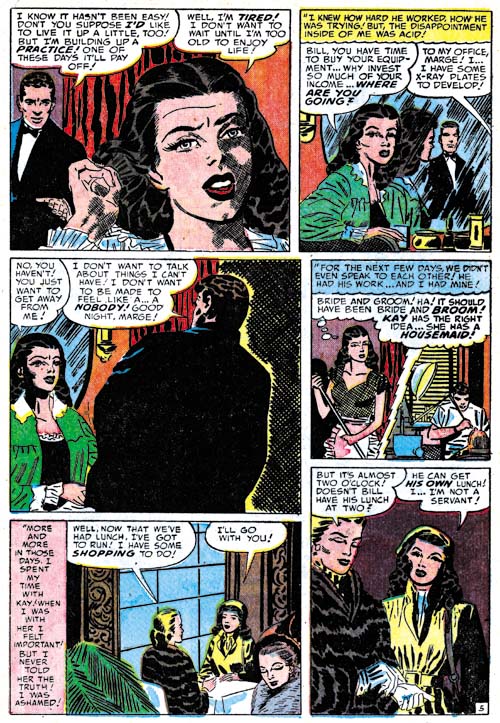
Young Brides #3
Young Brides #3 (January 1953) “Bride and Broom” page 5, pencils by Mort Meskin, inks by George Roussos

When writing about the differences between Mort Meskin’s inking and that of George Roussos I have been pointing out their different manner of spotting the cloth folds. While that is usually the easiest means that can be used to determine the correct inking credits, it is not the only why the two inkers are distinct. Both inkers have a fondness for crosshatching but Mort generally only uses it if fill up blank backgrounds while George will sometimes use it on such things as figures as shown by the woman in the first panel from the page shown above. Note how the crosshatching is fine and done at approximately right angles. That is not the manner that Meskin uses for the rare occasions that he does crosshatch a figure as for example in story he later did for Harvey (see Horrible Meskin). There the crosshatching is not so fine and the angle between the lines is much more oblique.

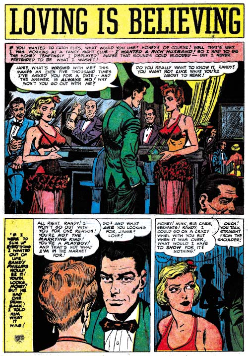
Young Love #41
Young Love #41 (January 1953) “Loving Is Believing”, art by Bob McCarty(?)

I have previously remarked about the large eyes drawn by the artist that I am questionably calling Bob McCarty. Unfortunately the images that I provided were not the best ones to show that feature so I am glad to finally be able to provide a good example, “Loving is Believing”.

Also not how the splash panel is actually the first panel of the story as well. This is not a technique that I have had occasion to comment on before. While this may be the first use of the way of presenting a story, now that it has been introduced we will be seeing it again.

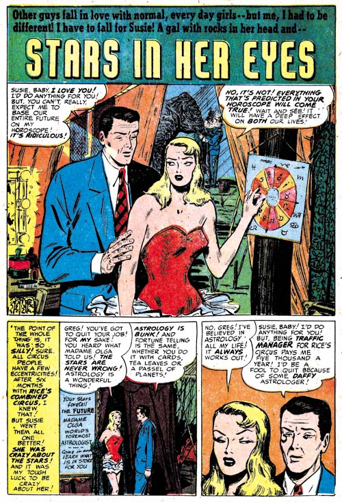
Young Romance #53
Young Romance #53 (January 1953) “Stars In Her Eyes”, art by Al Eadeh(?)

I will close with another specimen of work by Al Eadeh(?). I have not discussed this artist work in detail because I really feel his style, particularly the way he does eyes, is so distinctive that he can easily be recognized. Now all I have to do is find something with this style that he signed.

Chapter 1, A New Genre (YR #1 – #4)
Chapter 2, Early Artists (YR #1 – #4)
Chapter 3, The Field No Longer Their’s Alone (YR #5 – #8)
Chapter 4, An Explosion of Romance (YR #9 – #12, YL #1 – #4)
Chapter 5, New Talent (YR #9 – 12, YL #1 – #4)
Chapter 6, Love on the Range (RWR #1 – #7, WL #1 – #6)
Chapter 7, More Love on the Range (RWR #1 – #7, WL #1 – #6)
Chapter 8, Kirby on the Range? (RWR #1 – #7, WL #1 – #6)
Chapter 9, More Romance (YR #13 – #16, YL #5 – #6)
Chapter 10, The Peak of the Love Glut (YR #17 – #20, YL #7 – #8)
Chapter 11, After the Glut (YR #21 – #23, YL #9 – #10)
Chapter 12, A Smaller Studio (YR #24 – #26, YL #12 – #14)
Chapter 13, Romance Bottoms Out (YR #27 – #29, YL #15 – #17)
Chapter 14, The Third Suspect (YR #30 – #32, YL #18 – #20)
Chapter 15, The Action of Romance (YR #33 – #35, YL #21 – #23)
Chapter 16, Someone Old and Someone New (YR #36 – #38, YL #24 – #26)
Chapter 17, The Assistant (YR #39 – #41, YL #27 – #29)
Chapter 18, Meskin Takes Over (YR #42 – #44, YL #30 – #32)
Chapter 19, More Artists (YR #45 – #47, YL #33 – #35)
Chapter 20, Romance Still Matters (YR #48 – #50, YL #36 – #38, YB #1)
Chapter 21, Roussos Messes Up (YR #51 – #53, YL #39 – #41, YB #2 – 3)
Chapter 22, He’s the Man (YR #54 – #56, YL #42 – #44, YB #4)
Chapter 23, New Ways of Doing Things (YR #57 – #59, YL #45 – #47, YB #5 – #6)
Chapter 24, A New Artist (YR #60 – #62, YL #48 – #50, YB #7 – #8)
Chapter 25, More New Faces (YR #63 – #65, YLe #51 – #53, YB #9 – #11)
Chapter 26, Goodbye Jack (YR #66 – #68, YL #54 – #56, YB #12 – #14)
Chapter 27, The Return of Mort (YR #69 – #71, YL #57 – #59, YB #15 – #17)
Chapter 28, A Glut of Artists (YR #72 – #74, YL #60 – #62, YB #18 & #19, IL #1 & #2)
Chapter 29, Trouble Begins (YR #75 – #77, YL #63 – #65, YB #20 – #22, IL #3 – #5)
Chapter 30, Transition (YR #78 – #80, YL #66 – #68, YBs #23 – #25, IL #6, ILY #7)
Chapter 30, Appendix (YB #23)
Chapter 31, Kirby, Kirby and More Kirby (YR #81 – #82, YL #69 – #70, YB #26 – #27)
Chapter 32, The Kirby Beat Goes On (YR #83 – #84, YL #71 – #72, YB #28 – #29)
Chapter 33, End of an Era (YR #85 – #87, YL #73, YB #30, AFL #1)
Chapter 34, A New Prize Title (YR #88 – #91, AFL #2 – #5, PL #1 – #2)
Chapter 35, Settling In ( YR #92 – #94, AFL #6 – #8, PL #3 – #5)
Appendix, J.O. Is Joe Orlando
Chapter 36, More Kirby (YR #95 – #97, AFL #9 – #11, PL #6 – #8)
Chapter 37, Some Surprises (YR #98 – #100, AFL #12 – #14, PL #9 – #11)
Chapter 38, All Things Must End (YR #101 – #103, AFL #15 – #17, PL #12 – #14)

Little Shop of Horrors, Chapter 6, Mix Bag

(August – October 1952, Black Magic #15 – #17)

I normally like to start the chapters of my recent serial posts with a discussion about the amount that of the various artists contributed to the issues. Usually just a few artists, sometimes even just one, predominate. But in the Black Magic issues covered in this chapter a much more evenly distributed situation occurred. The ranking is George Roussos (19 pages), Jack Kirby (18 pages), Bob McCarty(?) (15 pages), Bill Draut (14 pages), Mort Meskin (13 pages), Bill Walton (7 pages) and Al Eadeh(?) (7 pages). While during the same period in the romance titles, Jack Kirby provided very little art, in the horror genre he takes second place. Kirby has not held that position for in any genre for some time.

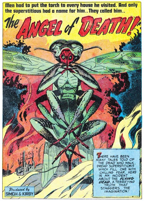
Black Magic #15
Black Magic #15 (August 1952) “The Angel of Death”, pencils by Jack Kirby

Jack Kirby’s human anatomy really was not very accurate, but his animal anatomy bordered on the fantastic. In the splash for “The Angel of Death” there appears to be a gigantic insect, but insects have six legs, not eight. Nor do any of an insect’s legs emerge from the final body segment as Kirby depicts. Despite these sorts of inaccuracies that would have caused Kirby to fail any biology class his animal creations have a special life. Even before reading the story it is certain that we would not want to meet this particular angel.

Black Magic #17
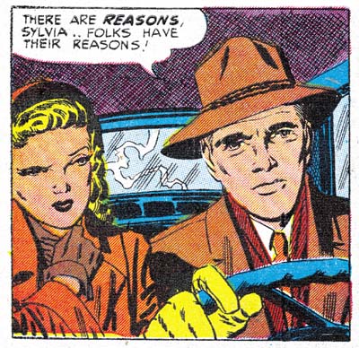
Black Magic #17 (October 1952) “Freak” panel 1, page 2, pencils by Jack Kirby, inks by George Roussos

One story in the issues covered in this chapter stands out from all the rests, but not the bests of reasons. Even though “Freak” is the featured story it frankly is a mess. The art is clearly the worse of any in these issues. Why than would it be listed in the Jack Kirby Checklist? Well actually for good reasons. Note the panel shown above. While it seems very poorly inked it clearly looks like Jack’s work. This panel, from the start of the story, is probably the most obviously one showing Kirby’s hand . However even on pages not so easily attributed to Jack the graphical story telling, the particular cinematic approach used, are his alone.

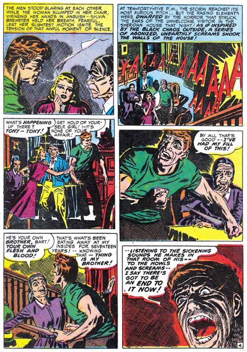
Black Magic #17
Black Magic #17 (October 1952) “Freak” page 4, pencils by Jack Kirby, inks by George Roussos

The Jack Kirby Checklist attributes the inking of this story to Mort Meskin; however the spotting is nothing like his. This can most easily be seen by the way the cloth folds are inked. Mort typically builds them up with a number of close parallel brush strokes that may overlap but usually can be detected at the ends. The cloth folds in “Freak” are nothing like that. When Mort inks Kirby pencils he usually adopts the Studio style inking. However picket fence crosshatching, drop strings or any of the other Studio style spotting techniques (see Inking Glossary) are completely absent in this story. The only reason that I can see to credit Meskin with the inking is that some of the faces have a Meskin look to them.

While Meskin is a poor match for the spotting found in “Freak” there is another artist whose inking is an exact match, George Roussos. George does cloth folds in exactly the same manner when inking his own stories. Many of the faces have a light source coming up from below. While that technique was occasionally used by other inkers, it is a common technique of Roussos.

George Roussos had a long history of inking Meskin and Meskin-like faces appear in his work from time to time. This may mean nothing more then the large influence Mort had on George’s art. On the other hand it may mean that Mort touched up parts of the story. In any case Roussos clearly did almost all the spotting for “Freaks”.

While I have attributed the pencils to Kirby this maybe another of those occasions where Jack provided nothing more than just layouts. The fact that the most Kirby-like portions are at the beginning of the story suggests that might be true. Whatever the type of pencils provided Roussos has clearly botched the job. Not only does the final result really do not do justice to Kirby, the art is actually much inferior to Roussos own work. So much for the theory that Kirby’s pencils were so good that they made a poor inker look good.

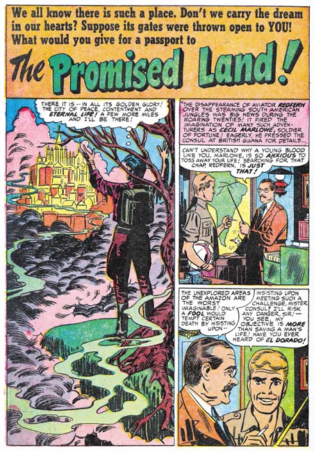
Black Magic #15
Black Magic #15 (August 1952) “The Promised Land”, art by Mort Meskin

Mort Meskin penciled two Black magic stories during this period. One, “The Promised Land”, is a nicely drawn and inked work very much up to Meskin’s high standards. There is no reason to go into detail about this work, it very much matches most of Mort’s other Black Magic efforts. While Meskin did good romance art he does seem to particularly shine in the horror genre.

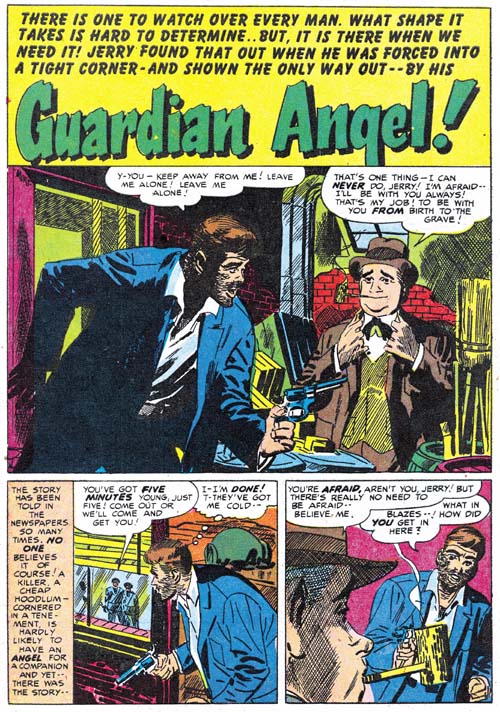
Black Magic #17
Black Magic #17 (October 1952) “Guardian Angel”, pencils by Mort Meskin, inks by George Roussos

I wish I could be as complementary about Meskin’s other contribution, “Guardian Angel”. There is a simple explanation for the disparity between the two Meskin stories from this period, “Guardian Angel” was not inked my Mort. In the chapter from The Art of Romance that covers this same period (Chapter 20) I remarked that there were some Meskin pieces that I felt were inked by George Roussos. Well Roussos’s hand is even clearer in “Guardian Angel”. This is again easiest detected by an examination of the cloth folds. They are not constructed by parallel lines as Meskin would have done but done in the same splotchy manner typical of Roussos. It would seem that having a piece inked by Roussos had unfortunate consequences at this point in time although “Guardian Angel” came off much better than “Freak”.

Black Magic #17
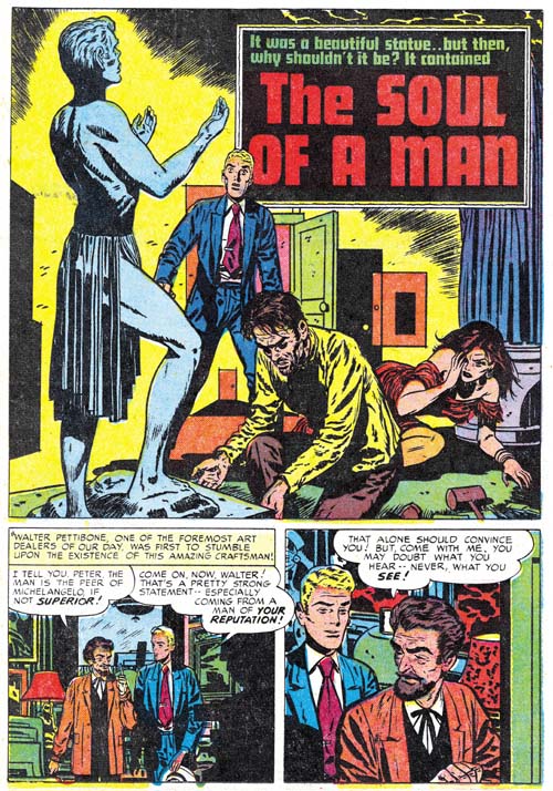
Black Magic #17 (October 1952) “The Soul of a Man”, art by Bill Draut

I never want to make it seem like Bill Draut was not doing anything worth while. His “The Soul of a Man” is particularly memorable because it includes a man physically abusing and then savagely killing a woman. Simon and Kirby were still willing to include such strong material but in a few years the Comic Code would completely eliminate such stories.

Black Magic #15
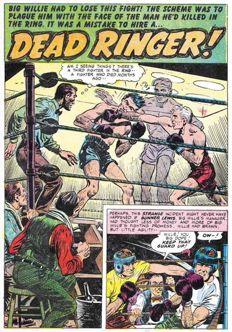
Black Magic #15 (August 1952) “Dead Ringer”, art by Bob McCarty(?)

Bob McCarty(?) has some nice work as well. No chance that Kirby provided any layouts for “Dead Ringer” because Jack certainly would not have depicted a punch like this one.

Black Magic #16
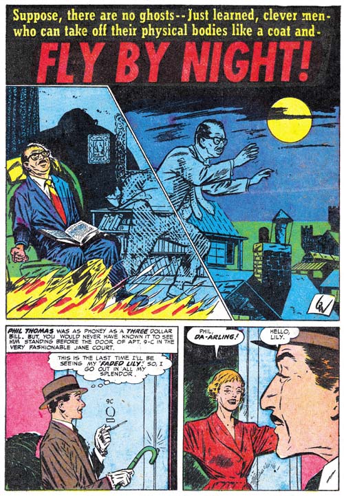
Black Magic #16 (September 1952) “Fly By Night”, art by Bill Walton

Bill Walton is not among my favorite Simon and Kirby artists but he does a nice job on the splash for “Fly by Night”. The unusual inking works quite well with the image of astral projection.

Black Magic #16
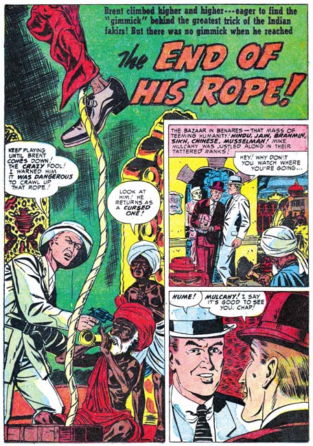
Black Magic #16 (September 1952) “The End of His Rope”, art by Al Eadeh(?)

Like Walton, Al Eadeh(?) only provides a single story. He is another artist that I am not overly fond of although he certainly competent enough.

The Little Shop of Horrors, Chapter 1 (#1 – 3), Expanding Their Fields
The Little Shop of Horrors, Chapter 2 (#4 – 6), Up and Running
The Little Shop of Horrors, Chapter 3 (#7 – 8), The Same Old Gang
The Little Shop of Horrors, Chapter 4 (#9 – 11), Another Hit
The Little Shop of Horrors, Chapter 5 (#12 – 14), New Faces

The Little Shop of Horrors, Chapter 7 (#18 – 20), Kirby Returns
The Little Shop of Horrors, Chapter 8 (#21 – 23), The Gang’s All Here
The Little Shop of Horrors, Chapter 9 (#24 – 26), The Party’s Ovetr
The Little Shop of Horrors, Chapter 10 (#27 – 29), A Special Visitor
The Little Shop of Horrors, Chapter 11 (#30 – 33), The End

Art of Romance, Chapter 20, Romance Still Matters

(August 1952 – October 1952: Young Romance #48 – #50, Young Love #36 – #38, Young Brides #1)

Number of Romance Titles 1947 - 1954
Number of Romance Titles 1947 – 1954 (the period covered in this chapter is shaded in blue)

Simon and Kirby not only created the romance genre of comics, they also made quite a bit of money from it quite well. Their agreement with Prize Comics gave Joe and Jack a share in profits but it also required them to cover all the costs of producing the art. If sales for the love comics were not sufficient, Simon and Kirby could actually loose money. However there are two indications from the period covered in this chapter that indicate that the Prize romance titles were doing quite well. One is that Young Romance reached its 50th issue. Of course there is nothing really special about the number 50 (as compared to 49 or 51) but it does make a convenient benchmark for how successful the title Young Romance was. Most of the titles created and produced by Simon and Kirby did not last past 7 issues. Young Romance, Young Love and Black Magic are among the exceptions. Justice Traps the Guilty was another title created by Joe and Jack but they did not actual produce it over most of the title’s run.

There is a second indication on how successful the Prize romance comics were. Simon and Kirby titles were typically started as bimonthlies. You can tell if a title was doing well because either it would become a monthly or a spin-off title would be made. Apparently the S&K love comics were doing well but Young Romance and Young Love were both monthly so the only option was to introduce another title, Young Brides. Young Brides would also follow Simon and Kirby’s modus operandi and begin as a bimonthly. As far as I can tell there was no difference between the contents of any of the three love comics except that Kirby would appear more often in the flagship title, Young Romance (although during the period covered in this chapter Kirby would not appear in Young Romance at all). By the way, Young Brides is another of those successful titles that would last well beyond 7 issues.

As the reader can see on the chart shown above, the new title Young Brides was released at a relative peak in the number of romance titles published. I use the tracking of the number of romance titles over time as a means of deducing the popularity of romance comics and even as an indicator for comics in general (The Real Reason for the Decline of Comics). I still do not have an adequate explanation for this relative peak and the decline that followed. Was it similar to the romance glut where publishers grew overconfident and ended up with more romance titles than the market could bear? Or was there some external factor such as the rise in criticism of comic books in some sectors of the public? Like I said, I really do not know but it does not appear that starting a new love title at this time was a poor business decision because Young Brides would go monthly a year later which is a sure sign that sales where very good even with three romance titles.

Surprisingly the most prolific artist for these seven issues was Bill Draut (59 pages). Bill is a consistent presence in Simon and Kirby productions but he is generally overshadowed by either Jack Kirby or Mort Meskin in terms of quantity. Meskin was still prolific supplying 51 pages. Other artist provided significantly less; John Prentice (29 pages), Al Eadeh(?) (24 pages), and a surprising fifth place for Jack Kirby (23 pages). Other artists (Bill Walton, Bob McCarty(?) and George Roussos would supply only single stories.

Young Love #36
Young Love #36 (August 1952) “Two-Faced Woman”, pencils by Jack Kirby

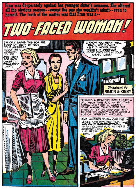
Another indication about the more reduced roll that Jack Kirby has been taking in the romance titles is that he only did one of the seven lead stories. The lead story typically starts with a confessional splash; one where one of the characters introduces the story to the reader and their speech balloon becomes the title. The confessional splash was very effective and it seems strange that Kirby did not go with it for the splash used in “Two-Faced Woman”. Frankly this splash while technically well executed just does not have much impact. The verbal exchange just does not seem to match the splash well. However the inking was by Kirby and is quite superb.

Young Brides #1
Young Brides #1 (September 1952) “Surprise, Surprise” page 5, pencils by Jack Kirby

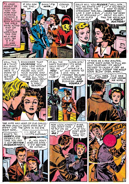
More than any of the other studio artists, Kirby always liked to add a little action to his romances. Slaps did not play a big part in Simon and Kirby productions but check out that last panel. In movies the man slapped would often hardly flinch, but this lady certainly put some muscle behind it.

Young Romance #48
Young Romance #48 (August 1952) “Love Is Poison”, art by Bill Draut

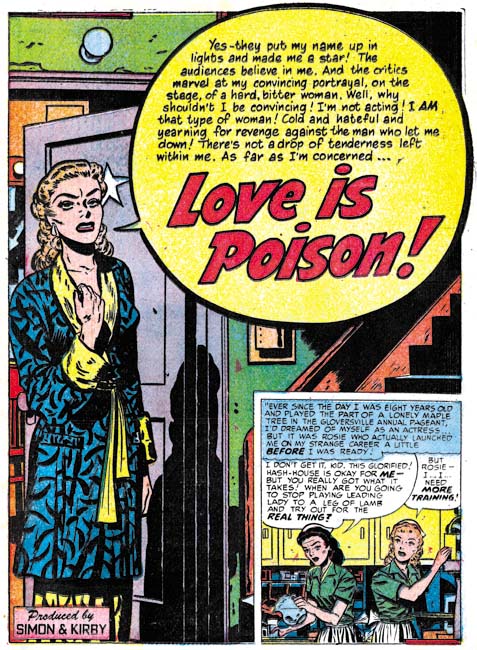
Kirby may not have used the confessional splash but it would appear with other artists. Bill Draut made some particularly good use of that splash format. In “Love is Poison” even without reading her speech we can tell she is a bitter woman. The star on the door behind her shows she is an actress but the peeling paint above her indicates that she is not appearing in a big time movie or Broadway show. Draut was second only to Kirby among the studio artists in providing such emotional portrayals.

Young Romance #50
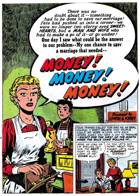
Young Romance #50 (October 1952) “Money, Money, Money”, art by Bill Draut

Draut did four of the seven lead stories and some of his splashes are so good that I wanted to include another example. The splash for “Money, Money, Money” may not have quite the impact of “Love Is Poison” but I love his portrayal of the grocery boy waiting to be paid (somehow I do not think he will get much of a tip). The inking of the upper part of the page is rather unusual for Bill.

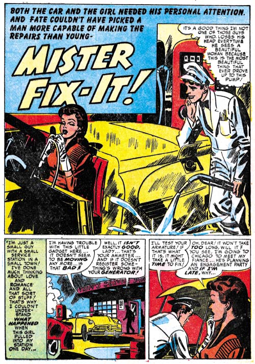
Young Love #36
Young Love #36 (August 1952) “Mister Fix-It”, art by Mort Meskin

Mort Meskin may not have drawn splashes with the emotional impact found in those by Kirby or Draut, but he was great at humor. The gas station attendant feels that he is calm and collected while he unknowingly misses the gas cap and pours the fuel on the ground. Mort did these humorous splashes so well it is small wonder that he seem to do more of them than any other studio artist.

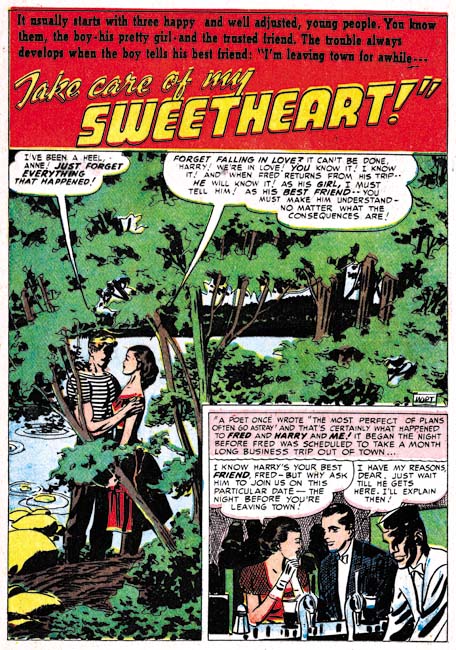
Young Love #38
Young Love #38 (October 1952) “Take Care of My Sweetheart”, pencils by Mort Meskin, inks by George Roussos?

Although I generally do not make a point of it, Mort Meskin did his own inking while working for Simon and Kirby. I say this based on an examination of the work itself and it was verified recently by a comment that Joe Simon made to me. Meskin was very productive and sometimes I feel that some of his worked suffered because of that. However some of the work in this period seems particularly poorly inked, as for example “Take Care of My Sweetheart”. This is unfortunate because the composition for the splash is rather nice. But the inking does seem rushed and the end results rather crude.

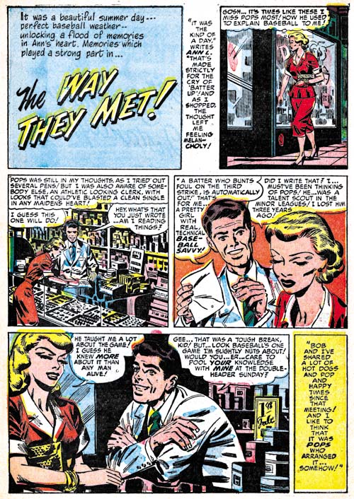
Young Romance #49
Young Romance #49 (September 1952) “The Way They Met”, pencils by Mort Meskin, inks by George Roussos?

“The Way They Met” from YR #49 is another example of uncharacteristically poor inking on a work penciled by Mort. Normally the cloth folds made from a series of narrow parallel lines are an indication that Meskin did the inking so I might attribute it all to a particularly rushed job. However while the faces have Meskin’s classic grin they also have a resemblance to those drawn by George Roussos. So I suspect what is going on is that Roussos is helping with the inking. Unlike Kirby, Meskin at least sometimes indicated the spotting in his pencils (The Eleventh Commandment) which may explain why Roussos adopted some inking techniques not found when inking his own pencils.

Young Romance #49
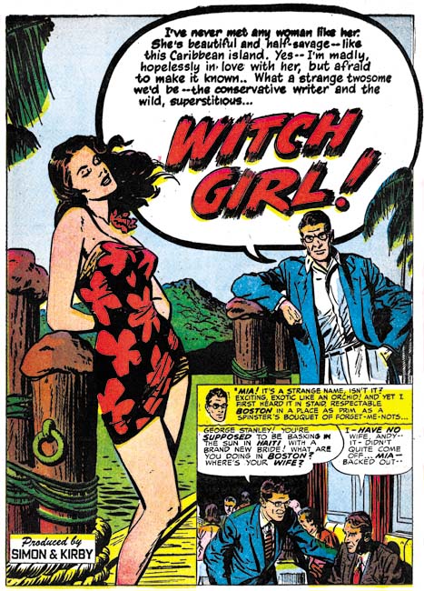
Young Romance #49 (September 1952) “Witch Girl”, art by John Prentice

The two lead features not drawn by either Draut or Kirby were done by Prentice. This is a clear sign that Simon and Kirby valued his contribution and I think with good reason. While I like the art that Kirby, Draut and Meskin were providing I think Prentice was just what was needed to provide the titles with a healthy mix of styles. “Witch Girl” uses the almost standard confessional format (John’s other lead feature, “Jay’s Protege”, does not). While Prentice might not quite have Kirby’s or Draut’s talent for the portraying of emotions, he certainly could draw beautiful women. Prentice was greatly influenced by Alex Raymond and the male character looks like Rip Kirby. This is ironic because Prentice would take over the strip after Raymond’s untimely death in 1956.

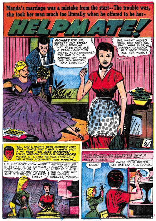
Young Love #37
Young Love #37 (September 1952) “Helpmate”, art by Bill Walton

There is a single story, “Helpmate” signed with just initials. Even if the art style was not clue enough, a comparison of those initials with Bill Walton’s signature in stories like “Say the Magic Words” (Black Magic #12, Chapter 5 of the Little Shop of Horrors) show them to be identical. Walton did work for a number of different comic publishers at the same time. He would not play a big part in Simon and Kirby productions but he would appear on and off for a couple of years.

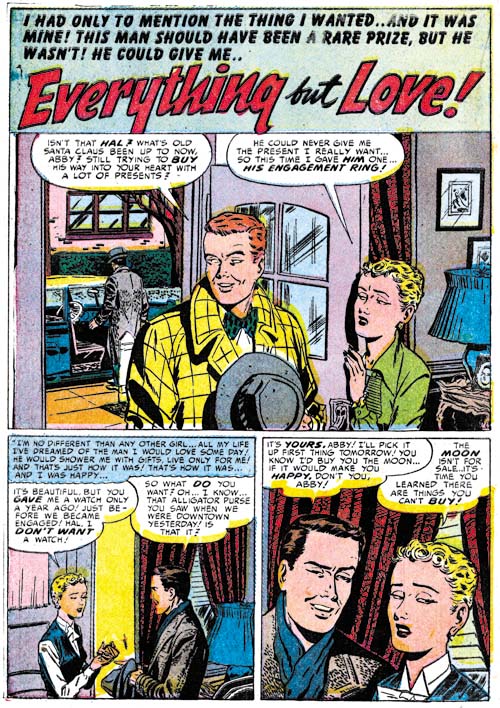
Young Romance #48
Young Romance #48 (August 1952) “Everything but Love”, art by Al Eadeh(?)

I provide another example of work that I questionably attribute to Al Eadeh. The way the artists draws eyes, particularly for women, is so distinctive that it should be relatively easy to determine if this work really was done by Eadeh once I have managed to compare it with signed work for another publisher from this period.

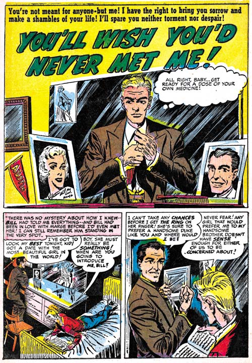
Young Romance #49
Young Romance #49 (September 1952) “You’ll Wish You’d Never Met Me”, art by Bob McCarty(?)

My problem with resolving the attribution of this work to Bob McCarty (or not) is different than with the case of Al Eadeh(?). There is some work for Foxhole that can safely be attributed to McCarty. It is just a matter of seeing whether traits that make this work like distinct from the Foxhole work change with time or remain constant. The most distinctive difference is the large eyes used in these earlier pieces as can be seen in the above page.

Chapter 1, A New Genre (YR #1 – #4)
Chapter 2, Early Artists (YR #1 – #4)
Chapter 3, The Field No Longer Their’s Alone (YR #5 – #8)
Chapter 4, An Explosion of Romance (YR #9 – #12, YL #1 – #4)
Chapter 5, New Talent (YR #9 – 12, YL #1 – #4)
Chapter 6, Love on the Range (RWR #1 – #7, WL #1 – #6)
Chapter 7, More Love on the Range (RWR #1 – #7, WL #1 – #6)
Chapter 8, Kirby on the Range? (RWR #1 – #7, WL #1 – #6)
Chapter 9, More Romance (YR #13 – #16, YL #5 – #6)
Chapter 10, The Peak of the Love Glut (YR #17 – #20, YL #7 – #8)
Chapter 11, After the Glut (YR #21 – #23, YL #9 – #10)
Chapter 12, A Smaller Studio (YR #24 – #26, YL #12 – #14)
Chapter 13, Romance Bottoms Out (YR #27 – #29, YL #15 – #17)
Chapter 14, The Third Suspect (YR #30 – #32, YL #18 – #20)
Chapter 15, The Action of Romance (YR #33 – #35, YL #21 – #23)
Chapter 16, Someone Old and Someone New (YR #36 – #38, YL #24 – #26)
Chapter 17, The Assistant (YR #39 – #41, YL #27 – #29)
Chapter 18, Meskin Takes Over (YR #42 – #44, YL #30 – #32)
Chapter 19, More Artists (YR #45 – #47, YL #33 – #35)
Chapter 20, Romance Still Matters (YR #48 – #50, YL #36 – #38, YB #1)
Chapter 21, Roussos Messes Up (YR #51 – #53, YL #39 – #41, YB #2 – 3)
Chapter 22, He’s the Man (YR #54 – #56, YL #42 – #44, YB #4)
Chapter 23, New Ways of Doing Things (YR #57 – #59, YL #45 – #47, YB #5 – #6)
Chapter 24, A New Artist (YR #60 – #62, YL #48 – #50, YB #7 – #8)
Chapter 25, More New Faces (YR #63 – #65, YLe #51 – #53, YB #9 – #11)
Chapter 26, Goodbye Jack (YR #66 – #68, YL #54 – #56, YB #12 – #14)
Chapter 27, The Return of Mort (YR #69 – #71, YL #57 – #59, YB #15 – #17)
Chapter 28, A Glut of Artists (YR #72 – #74, YL #60 – #62, YB #18 & #19, IL #1 & #2)
Chapter 29, Trouble Begins (YR #75 – #77, YL #63 – #65, YB #20 – #22, IL #3 – #5)
Chapter 30, Transition (YR #78 – #80, YL #66 – #68, YBs #23 – #25, IL #6, ILY #7)
Chapter 30, Appendix (YB #23)
Chapter 31, Kirby, Kirby and More Kirby (YR #81 – #82, YL #69 – #70, YB #26 – #27)
Chapter 32, The Kirby Beat Goes On (YR #83 – #84, YL #71 – #72, YB #28 – #29)
Chapter 33, End of an Era (YR #85 – #87, YL #73, YB #30, AFL #1)
Chapter 34, A New Prize Title (YR #88 – #91, AFL #2 – #5, PL #1 – #2)
Chapter 35, Settling In ( YR #92 – #94, AFL #6 – #8, PL #3 – #5)
Appendix, J.O. Is Joe Orlando
Chapter 36, More Kirby (YR #95 – #97, AFL #9 – #11, PL #6 – #8)
Chapter 37, Some Surprises (YR #98 – #100, AFL #12 – #14, PL #9 – #11)
Chapter 38, All Things Must End (YR #101 – #103, AFL #15 – #17, PL #12 – #14)

Little Shop of Horrors, Chapter 5, New Faces

(May – July 1952, Black Magic #12 – #14)

As in Chapter 19 of The Art of Romance, Mort Meskin was the most productive artist for Black Magic drawing a total of 30 pages. Bill Draut was particularly active and draw 21 pages. The third and fourth places was held by an artists new to the studio; Bill Walton with 14 pages and Bob McCarty(?) with 10. Jack Kirby takes a surprising fifth place having provided only 9 pages. Kirby was the only artist who drew covers for Black Magic so three of those pages were covers with the remaining 6 pages from a single story. However we shall see Jack had a hand in other aspects of the title. Still it is a continuing mystery why Kirby, renown for his fast drawing, was so unproductive lately and especially during the period covered in this chapter. The rest of the art was provided by three artists each providing a single piece; George Roussos (4 pages), Al Eadeh(?) (2 pages) and 3 pages by an unidentified artist who used J. G. as initials.

Unfortunately John Prentice does not appear in any of the Black Magic issues covered in this chapter. Simon and Kirby did not use Prentice in Black Magic as much as some of the other studio artists. This certainly was not because Prentice was poor at the horror genre. Not only do I think he did a good job in Black Magic but he was clearly better than some of the artists that were used. I suspect the bias had more to do with how well Prentice did in the love titles that S&K preferred to assign him romance work.

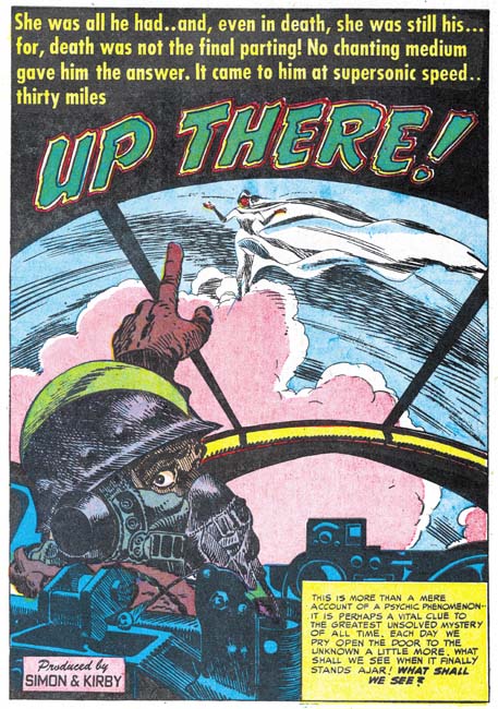
Black Magic #13
Black Magic #13 (June 1952) “Up There”, art by Jack Kirby

I always want to include at least one Kirby story in all my serial posts, but this time there is only one to choose from. Still it is a great story and was recently included in Titan’s “Best of Simon and Kirby”. Of course picking the best from Simon and Kirby’s repertoire is always a difficult decision since they did so much great stuff in all genres.

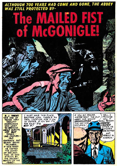
Black Magic #14
Black Magic #14 (July 1952) “The Mailed Fist of McGonigle”, art by George Rossous

I am sure I have said this before, but George Roussos is not among my favorite Simon and Kirby studio artists. His artwork is a bit too crude for my tastes. With that said I often find his use of blacks very interesting especially when he uses them in a splash such as in Black Magic #14 (July 1952) “The Mailed Fist of McGonigle”. Perhaps the greatest weakness in this particular splash is that it is easy to overlook the running figure in the background as an empty suite of armor.

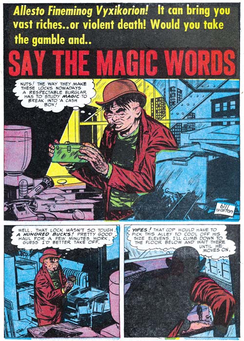
Black Magic #12
Black Magic #12 (May 1952) “Say the Magic Words”, art by Bill Walton

When I wrote Chapter 19 of the Art of Romance there was one story whose artist I could not identified but felt looked very familiar. Had I reviewed the work in this chapter of the Little Shop of Horrors I would have been known immediately who it was since both Black Magic stories by Bill Walton are signed. Fortunately all was not lost as sharp eyed Ger Apeldoorn recognized the correct attribution right away. Bill has a tendency to shorten the height of his faces and in his three quarter views to place the eyes at an angle. Walton will be making regular appearances in Simon and Kirby productions for a while so there will be amply opportunities to see examples of this work.

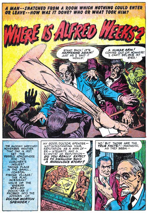
Black Magic #13
Black Magic #13 (June 1952) “Where is Alfred Weeks?”, art by Bob McCarty(?)

The June issue of Black Magic provides the first appearance of another artist that will regularly show up in Simon and Kirby productions for a time. The problem is he never signs his work and the only reason I have questionably attribute the art to Bob McCarty is because of some similarities to that artist works from 1954 (McCarty also did not sign his work but Foxhole was the only Simon and Kirby comic that provides some of the credits). However there are some differences between the art that might mean that they were not done by the same artist or that his art had evolved. One of the most distinctive features of the art in “Where is Alfred Weeks” as compared to McCarty’s art in Foxhole is the use of oversized eyes (not particularly obvious in the image I supply above). I will continue to questionably attribute this work to McCarty but I hope that I will resolve this issue, at least to my own satisfaction, as I proceed with these serial posts.

Black Magic #13
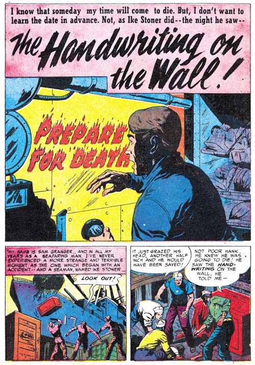
Black Magic #13 (June 1952) “The Handwriting on the Wall”, art by J. G.

“The Handwriting on the Wall” is an unsigned piece but there are some similarities to a story from Black Magic issue Black Magic #9 (“The Man in the Judge’s Chair”) that signed “J. G.”.

Black Magic #13
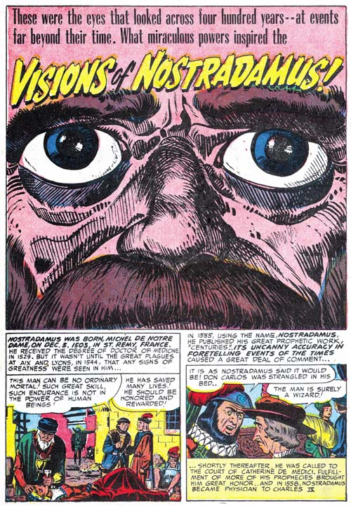
Black Magic #13 (June 1952) “Visions Of Nostradamus”, art by Jack Kirby and Al Eadeh(?)

One story, “Visions Of Nostradamus”, is by an artist that I originally thought might be Al Eadeh but I have not yet done my homework and found a contemporary signed piece by the artist to resolve the issue so I will continue to use a question mark. Ger Apeldoorn, who is much more familiar with Atlas where Eadeh also worked, seems more confident about the attribution. Eadeh(?) is a competent artist but nothing in his work that I have seen suggest the artistic talent shown in the splash. Of course that is not an acceptable reason to question whether he drew the splash (even poorer artists sometimes create a masterpiece) but the brushwork does not look like his either but does look like inking by Jack Kirby. The rather oversize eyes might seem incongruous for Kirby but similarly sized eyes appeared in a Kirby splash from Young Love #25 (September 1951, Chapter 16 of the Art of Romance).

Black Magic #13
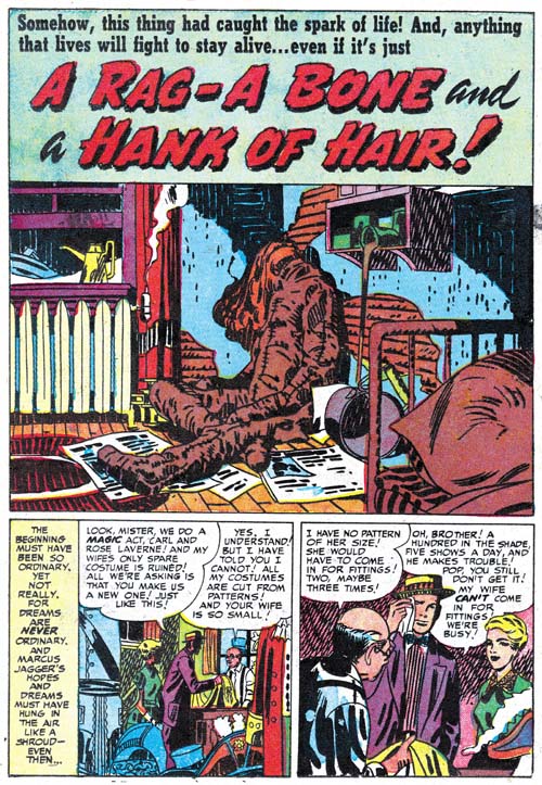
Black Magic #13 (June 1952) “A Rag, a Bone and a Hank of Hair”, art by Jack Kirby and Mort Meskin

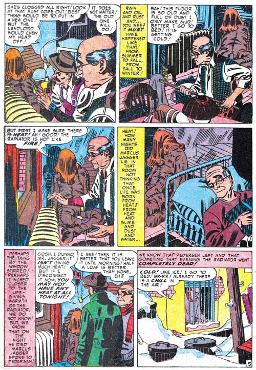
Mort Meskin’s style is very different from Kirby’s and normally there is no problem in distinguishing the two. The story for “A Rag, A Bone And A Hank Of Hair” is obviously penciled and inked by Mort and in the past I assumed he did the splash as well. But since there are no figures in the splash, or at least human figures, this was really nothing more than an assumption. But during my review for this post I noticed the arcing of the two shadows on the wall. These are not true abstract arches but they still are a typical feature of the Studio Style inking. Now Meskin was excellent at Studio Style inking but he used that approach when inking Kirby’s pencils and generally not when inking his own work. Then I notice the inking of the oversized rag doll. The brushwork on the dummy is done with a rather blunt brush that is more typical of Kirby than Meskin. There is also a brush technique that I have not discussed before nor included in my Inking Glossary but nonetheless is an often found method used by Kirby (perhaps Joe Simon as well). Notice the simple hatching found on the lower part of the dummy’s arm (somewhat obscured by a white piece of paper). They form a shadow that is a sequence of arcs; what I think of as a scalloped edge shadow. Much of the brushwork in the splash has the sort of loose control that Kirby was so great with, but not all of the inking. The crosshatching on the cupboard is more mechanically arranged than typical of Jack but often found in Mort’s inking as can be seen in the two story panels on the bottom of the page. Also the inking of the pillow in the foreground looks more typical of Meskin particularly where closely spaced nearly parallel brushstrokes are used.

Black Magic #13
Black Magic #13 (June 1952) “A Rag, a Bone and a Hank of Hair” page 5, art by Mort Meskin

I include a story page as well so Meskin’s method of inking the large rag doll can be seen as well. Notice the brushwork is not as blunt, there are more uses of parallel ink lines, and there are no scalloped edge shadows. Even the hair is inked rather differently than Jack’s splash.

The reader might have noticed that while I have recognized Kirby’s inking, I have not said anything about the drawing. Unfortunately there is little to go on as the dummy is drawn in the same manner in the splash and the story. This might suggest that Meskin drew both but the cover is also based on this story and provides a similarly drawn dummy and there is no question that Kirby drew the cover. The only thing I can point out about the splash is the use of perspective; somehow it seems more consistent with Jack’s work than Mort’s. I fully realize that this is a very vague and subjective description but it is all I have to offer at this time. I do not know if I have convinced anyone else, but I have convinced myself that Jack was largely responsible for the splash panel.

Black Magic #12
Black Magic #12 (May 1952) “A Giant Walks the Earth”, pencils by Jack Kirby, inks by Mort Meskin and Jack Kirby

Kirby drawn splashes in stories otherwise drawn by other artists are not the norm but are not that unusual either. They are rare enough that I can include all the cases I find in my serial posts. But Kirby splashes are common enough that many chapters (but not all) have examples. However it seems out of the ordinary to find so many Kirby splashes in just three issues because “A Giant Walks the Earth” appears to be another case. Again Kirby’s hand is easiest to spot in the inking. The folds on the human’s pants are typical of Jack’s brushwork; they have simple abstract shapes with no signs of the brush tip. The inking on the giant hand is done with a blunt brush more typical of Jack’s than it is of Mort’s inking. There is crosshatching on the giants forearm but note how less mechanical it is compared to the examples found in “A Rag, a Bone and a Hank of Hair”. However the inking of the foreground rocks all looks like it was done by Meskin. In fact there are some rocks in the story that are inking exactly the same manner.

Mort also clearly inked the story panels of the first page. This provides a good comparison of the two artist’s approach to inking cloth folds. At a glance they may appear the same but instead of the almost puddle like look found in Kirby’s inking, Meskin constructs folds using parallel lines with no attempt to hide the tip of the brush.

Black Magic #12
Black Magic #12 (May 1952) “A Giant Walks the Earth” page 2, art by Mort Meskin

Even though Mort is clearly inking the story panels on the splash page the art does not look like his. I provide an image of the second page so that two can be compared. The difference between the two is most obvious in the older man. So if Meskin did not draw the story panels from the first page, who did? I believe Kirby drew these as well. The end result may not look like typical Kirby art because Meskin appears to have inked them with a heavy hand. Normally Mort was quite a good inker of Kirby’s pencils and not so heavy handed but I believe in this case Mort purposely inked the first story panels this way so that they would blend better with the rest of the story.

Black Magic #13
Black Magic #13 (June 1952) “When I Live Again”, art by Bill Draut

One of Bill Draut’s contributions was “When I Live Again”. Bill does his usual competent job but to be honest I doubt that I would have mentioned it because there is nothing truly unique about it. However when I reviewed I quickly realized that the plot was very familiar. So much so that I did some searching and sure enough found a similar story in Alarming Tales #1 (September 1957, “Logan’s Life”). It is more than similar stories; they were the same plot only the six pages of “When I Live Again” had been reduced to a mere two for “Logan’s Life”. According to every source I have ever seen the art for “Logan’s Life” has always unquestionably been attributed to Jack Kirby.

Black Magic #13 and Alarming Tales #1
Left Black Magic #13 (June 1952) “When I Live Again”
Right Alarming Tales #1 (September 1957) “Logan’s Life”

The text was re-written but the art for the story in AT #1 has clearly been swiped from Draut’s from BM #13. Of course the art was not a close copy; no one is likely to mistake the AT #1 story as done by Draut. But most of the panels in the AT #1 story were obviously based on panels for BM #13.

Black Magic #13 and Alarming Tales #1
Left Black Magic #13 (June 1952) “When I Live Again”
Right Alarming Tales #1 (September 1957) “Logan’s Life”

In fact every panel in “Logan’s Life” from AT #1 was based on one from BM #13 although as can be seen in the above images it is not always so obvious since not only has the panel been recomposed but the people portrayed are sometimes changed as well. These changes might seem superfluous but in fact the in each case the alterations made the alterations the particular panel from Draut’s layout to one like Kirby would use. In the end entire story is a convincing example of Kirby’s art. Of course it must have been convincing because as I said in the past everybody has credit Kirby with the pencils to his story.

Last week I wrote about the Red Raven cover and the Hal Foster panel it was swiped from. I have since searched through all my sources and it would seem that most who were unaware of the swipe attributed the cover to Kirby alone while all those who knew of the swipe credited to Joe Simon either alone or in combination with Jack. (There were a few who gave joint credits to all the art by Simon and Kirby.) I still attribute the Red Raven cover to Jack but in the case of “Logan’s Life” I have changed my mind and now believe it is by Simon. I had detected Joe’s hand in this story but I had previously decided it was due to the Simon being the inker. Now I realize he penciled “Logan’s Life” as well. I base this conclusion not on the fact that the story was swiped but because the similarity to another story Joe swiped for Fighting American (Jumping the Shark). The Fighting American story was swiped from a Kirby drawn Manhunter story so it may not be surprising that everybody had previously attributed it to Jack. But the source for “Logan’s Life” was by Draut and this shows how convincing a job Joe could do at mimicking Jack. Something that should always be kept in mind when trying to determine attributions for work by Simon and Kirby.

The Little Shop of Horrors, Chapter 4, Another Hit

The Little Shop of Horrors, Chapter 6, Mixed Bag

Happy Birthday Jack Kirby

In honor of Jack “King” Kirby’s birthday I have decided to feature 10 of my favorite covers (although I cheated with Young Romance #17 and used a splash). Well my favorite covers today; if I were to make a list tomorrow it probably would include a different set except perhaps for Treasure #10 which always seems to be one of my favorites. Of course Jack would go on to do many great covers after the Simon and Kirby collaboration ended but I am sure others will provide examples of those (hey after all this is the Simon and Kirby Blog).


Captain America #7 (October 1941)


Green Hornet #9 (October 1942)

Boy Commandos #2
Boy Commandos #2 (Spring 1943)

Adventure #84
Adventure #84 (March 1943)


Treasure #10 (December 1946)

Headline #30
Headline #30 (June 1948)


Young Romance #17 (January 1950)


Black Magic #8 (December 1951)

Fighting American #4
Fighting American #4 (October 1954)


Foxhole #3 (February 1955)

So Happy Birthday Jack!