Category Archives: 5 Studio

It’s A Crime, Chapter 3, Competing Against Themselves

(Clue Comics vol. 2 num. 1 – 3)

The same month that the first crime version of Prize Comic’s Headline was released, Simon and Kirby also appeared in Hillman’s Clue Comics (v. 2, n. 1, March 1947). Over the rest of the year Joe and Jack would do a wide variety of work for Hillman Publications; a Caniff style adventure (“The Flying Fool” in Airboy Comics), funny animals (“Lockjaw the Alligator” and “Earl the Rich Rabbit” in Punch and Judy Comics), teenage humor (My Date Comics) and crime (Clue Comics and Real Clue Crime Comics).

Clue Comics had started out in January 1943 as a hero genre anthology. The covers featured the costumed hero, the Boy King, and the interior included features such as Nightmare and Micro Face. It must not have been very successful because it began as a monthly, switched to a being a bimonthly with issue #4 and then quarterly with issue #8 before being put on hold after issue #9 (Winter 1944). Hillman rebooted Clue Comics after the war (cover date October 1946) and introduced Gun Master as the cover feature. Gun Master gave a more crime genre feel to Clue Comics but it remained as essentially a hero anthology with Nightmare and Micro Face continuing to be included. The revamped Clue must have been successful because it started as a bimonthly but switch to being a monthly with the March 1947 issue.


Clue Comics (volume 2, number 2, April 1947), art by Dan Barry

Since the Gun Master did not wear a costume or have any super-powers, the covers for Clue very much had a crime genre feel to them. This can particularly be seen in the cover for the April issue shown above. This cover drew its inspiration from the more graphically brutal covers that some crime comics then used. The depiction of torture by electric iron certainly appeals to the more prurient tastes and goes way beyond what artists like Simon and Kirby would ever produce. The April cover is a bit exploitive and misleading as it does not represent the type of stories actually included in the comic book. Hillman would not repeat such a graphic depiction again for any cover of Clue Comics or the later Real Clue Crime Comics.


Clue Comics (volume 2, number 1, March 1947) “Gun Master”

With the March and April issues, Gun Master played an even greater roll for Clue Comics as there were now two Gun Master stories in each issue. If Gun Master’s uncannily accurate ability with a pistol were not enough to convince one that he really belongs in the hero genre then perhaps the Council of Elders will. They were mysterious robed figures who directed the Gun Master. Not the sort of story device expected to be used in a typical crime story.

I do not know who the artist was for the above splash, but despite the complete lack of any real action he has managed in any case to make it interesting. Much of the effect of the splash is due to the low viewing angle and unnatural but effective perspective. From such a low view point the sides of the buildings and lamp post should converge towards the top but diverge instead, giving the scene an other-world appearance. The architectural details enhance the strangeness of the scene which I suspect is meant to be in Europe. Perhaps the weakest element of the splash is the upper of the two dead men. The way he is prompt up on his elbows seems unstable and unexpected for a corpse.


Clue Comics (volume 2, number 1, March 1947) “Iron Lady”

A new feature, “Iron Lady”, was added to Clue Comics that both gave the comic a more crime comic feel while actually making the title untypical for that genre. “Iron Lady” was a feature about a female villain. Such an anti-hero theme had been used previously (such as The Claw) and female lead characters were also not that unusual but I am not sure if the combination had ever been done before. Her use of special gloves that gave her great strength shows once more that this really is not a crime story. Iron Lady’s appearance in Clue Comics is not her debut as I believe she appeared previously in Airboy Comics.


Clue Comics (volume 2, number 2, April 1947) “Nightmare”

The revamped Clue Comic still retained some of its older features. Nightmare appeared in the March and April issues while Micro Face showed up in the May release. Judging solely by the covers of the early issues of Clue Comics, Nightmare originally had a young sidekick who somewhere along the line had been dropped. This hero appears from the smoke of a cigar which is reminiscent of the Flame from Fox Comics or Simon and Kirby’s Vision for Timely. Micro Face has a peculiar face gear that almost looks like a welder’s mask. These two costume heroes certainly work against the crime genre look that the revamped Clue seemed to be striving for.


Clue Comics (volume 2, number 1, March 1947) “King of the Bank Robbers”, art by Jack Kirby

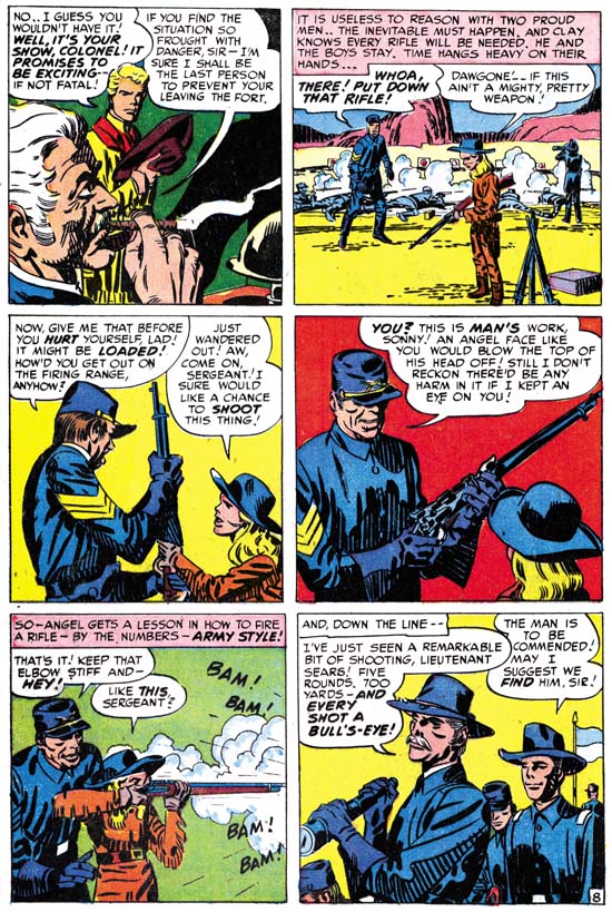
The Simon and Kirby’s contribution to the March 1947 issue of Clue was unabashedly crime genre. It was supposedly a true story and considering it was a period piece it probably was based on some real life criminal. No special powers here, just the career of a colorful criminal and his eventual downfall. Despite its short term attractions, in the end crime does not pay. The use of an oversized figure in the above splash is unusual for Jack Kirby particularly when doing crime comics. I tend to believe that when such oversized figures were used it was based in part on a Simon layout as oversized figures played a part in Joe’s art both before and after working with Jack.


Clue Comics (volume 2, number 2, April 1947) “On Stage for Murder”, art by Jack Kirby

There was only a single Simon and Kirby piece in the March issue but their presence increased as they did two stories for the April issue and three for May. The art work done in the Clue Comics seems to be indistinguishable from that appearing concurrently in Prize’s Headline. This includes the type of inking done. In the previous chapters I have described this as part of the Sculptural style. Actually the use of style names is for convenience as inking used by Simon and Kirby was continually evolving and there really were no distinct breaks in the type of inking used. To lump it all together would mean to ignore the real changes that were made, but to divide the inking too finely into different periods would just confuse the issue. As I have been reviewing the art for this and the serial post “The Art of Romance” I have been coming to the realization that although during this period Simon and Kirby have not adopted all the characteristics of the coming Studio style of inking, they also were no longer working in quite the same manner as they had used during the war. In particular there was less emphasis on what I call form lines (see my Inking Glossary for explanation of my terms). These form lines were previously very dominantly used and were the reason I gave the name to the inking the Sculptural style. I am not going to try to answer this issue now but I am still interested in how the Studio style came into being. As with the art done for Headline, that for Clue Comics does not include the common use of picket fence crosshatching or shoulder blots. However as previously seen in Headline, abstract shadow arches, another technique of the Studio style, begins to appear more frequently. A good example is the splash shown above. Another Studio style technique is the use of drop strings and that mannerism also begins to become more common.


Clue Comics (volume 2, number 3, May 1947) “Flowers for Roma”, art by Jack Kirby

Although the art used for Clue and Headline comics is pretty much the same the panel layouts are not. In my previous chapters on the crime art that Simon and Kirby produced for Prize Comics I noted that circular and semi-circular panels were used at just about the same level as previously in Stuntman and Boy Explorers. On an average this would work out to be about one round panel for every story page. The round panels are completely absent on any of the story pages that Joe and Jack did for Clue. There are two occurrences of circular panels in Clue and they both are restricted to the splash page. The circular panels on the splash page are truly story panels and so must still be considered, but even so there is a clear distinction between the panel layouts for Headline and Clue. I am just not sure what to make of that distinction.


Clue Comics (volume 2, number 2, April 1947) “The Short, Dangerous Life of Packy Smith”, art by Jack Kirby

Simon and Kirby’s contribution to Clue Comics was not limited to “true” crime stories. They also had a chance to work on Gun Master as well. Because it was the key feature for Clue Comics it is not surprising that Joe and Jack did not make any serious changes to Gun Master. Gun Master remained an uncanny marksman who continued to receive his direction from the robed Council of Elders. However Simon and Kirby did make one innovation, they tried to provide the feature with a continuing story line while previously all the Gun Master stories had been stand alone units. What Simon and Kirby did was to introduce Packy Smith a man born with “element X” in his body and as the result doomed to an early death. If that were not bad enough it turns out that element X could be used to turn Packy into a human bomb. This results into a manhunt for Packy by not only Gun Master but by the criminal element as well. In the April issue the story ends with Packy Smith disappearance after haven taken a nose dive off a bridge. In the May issue Simon and Kirby continue the tale revealing that Packy had survived the plunge. Even the ending for the second tale was clearly not meant to be the finish as not only does Packy get away again but Gun Master has obtained the phone number to the criminal mastermind behind the manhunt. Unfortunately although Gun Master would make some further appearances, Simon and Kirby never returned to the feature to continue the story. Clearly Joe and Jack were not simply following someone else’s script.


Clue Comics (volume 2, number 2, April 1947) “The Finger Man”, art by Carmine Infantino and Bernard Sachs

As previously discussed there were a number of continuing features in Clue Comics. Simon and Kirby would produce most of the remaining “true” crime stories, but not all. “The Finger Man” is one such example. Fortunately it is signed otherwise I am not sure I would have recognized Infantino’s work. Besides his silver age comics I am most familiar with the Charlie Chan Comics that Carmine drew for Simon and Kirby in 1948 and early 1949. Despite the fact that Charlie Chan was done only a little over a year later, the style Carmine used was very different then the one shown here in “The Finger Man”. It would seem that Infantino adopted a Kirby influenced style just for the work on Charlie Chan. Carmine is an excellent artist and it would be interesting how his style evolved over the years. Unfortunately Infantino only worked for Simon and Kirby that once and so my knowledge of his art is otherwise limited to occasional pieces such as this. In “The Finger Man” Carmine is inked by Bernard Sachs. Sachs was a commonly used inker at Hillman at this time and he also did some pencil work.

Like the initial Headline art that Simon and Kirby did for Prize, the duo did not provide signatures on any of the work they did on Clue. The only work for Hillman that they signed was for My Date and a single cover for Western Fighters. As I mentioned in the last chapter it was very untypical for Simon and Kirby to leave out their signature on so much work. My Date was probably their idea and nothing like it was being produced at Prize so it is not surprising that they would sign work in that title. Otherwise Joe and Jack probably did not want to make it too obvious that they were providing work for two different publishers at the same time.

My conclusion after reviewing the material is that the drifting of Clue Comics into a more truly crime comic had little, if anything, to do with Simon and Kirby. But S&K’s influence on the title seemed to increase as time went on. The May issue of Clue Comics (v. 2, n 4) was the last before the title was renamed into Real Clue Crime Comics. This was more then just a name change but that will be covered in my next chapter.

Chapter 1, Promoting Crime
Chapter 2, A Revitalized Title

Chapter 4, Crime Gets Real
Chapter 5, Making a Commitment
Chapter 6, Forgotten Artists
Chapter 7, A Studio With Many Artists
Chapter 8, The Chinese Detective
Chapter 9, Not The Same
Chapter 10, The Master and His Protege
Chapter 11, The New Team

It’s A Crime, Chapter 2, A Revitalized Title

(Headline #23 – #25)

In chapter 1 I described Prize’s comics in 1946 as tired. With the arrival of Simon and Kirby things would never be the same for that company. Their effect on Headline is obvious. With issue #23 (March 1947), the title made a sudden transition from an anthology with an emphasis on the hero genre into a crime comic. That was significant, but more important was Simon and Kirby’s effect on the entire Prize comic line. Treasure Comics #10 (December 1946), the same issue that ran the first promotional S&K crime story, would be the last bimonthly for that title. Issue #12 (Fall 1947) would be the last Treasure Comics issued. In September 1947 Simon and Kirby would introduce a new title and another genre with Young Romance. The crime version of Headline must have been a success because Simon and Kirby and Prize would start Justice Traps the Guilty in October. Wonderland, Prize’s comic of funny stories for the younger readers, would end with issue #8 (December 1947). Prize Comics, the last of Prize’s hero anthologies, would become Prize Comics Western with issue #69 (May 1948). I have no reason to believe Simon and Kirby had any direct involvement with the switch of Prize Comics to the western genre. However once Simon and Kirby showed the value of publishing the more modern comics it would not have taken a genius to come up with the idea of publishing another of those popular genre. The only one of Prize’s original titles that was unaffected was Frankenstein. In a little over a year Prize went from having a tired comic line to a more modern one. Simon and Kirby would not produce every title that Prize would publish from this point on but they would dominate the company’s output and even have influence on titles other then their own. Prize would never become a big publisher but it is clear that Simon and Kirby generated a lot of income for the company and I cannot help but doubt that the publisher would have survived much longer without their arrival.

The attribution question for the first two issues of the crime version of Headline is simple, it is Jack Kirby. It was part of Simon and Kirby’s modus operandi to start a new title with Jack penciling much, if not most, of the art. However these two issues take it to an unusual extreme in not just most but all of the art is by Kirby. Such exclusion is not part of the Simon and Kirby MO. The starting issues for Young Romance, Justice Traps the Guilty, and Boys’ Ranch would all include some work by other artists. All Kirby issues would not appear again until Fighting American (1954) and the even more exceptional case of the Young Romance, Young Love and Young Bride comics of 1956. Surely the explanation for the all Kirby Headline issues was that it was a consequence of the failure of the Stuntman and Boy Explorers titles of 1946. With the sudden termination of those titles Simon and Kirby had both the time to produce stories and the need to generate money. It was only when Joe and Jack were once again regularly producing comics that they had both the need and the ability to bring other artists into their projects.


Headline #23 (March 1947) “The Last Bloody Days of Babyface Nelson”, art by Jack Kirby

The first page of Headline would exemplify the Simon and Kirby approach to crime, at least in its beginning. There in the spotlight is Baby Face Nelson standing with his smoking machine gun over two victims. Baby Face Nelson, whose name was actually Lester Gillis, was a real person and at one time was Public Enemy Number One. The story that Simon and Kirby provide is a true one, or at least as true as any made by the entertainment media. We are told of a chance encounter on a country road of one car that included Baby Face Nelson and John Chase with another car occupied by two federal agents. In the ensuing gun fight the two agents were killed and Baby Face mortally wounded only to die later. At the end of the story we find Chase behind bars. Missing from S&K’s account are Helen Gillis, Baby Face’s wife, who was also present. Also missing was a previous encounter with another vehicle with federal agents. But the gist of the story was all there and dramatically portrayed. By today’s standards, the story is very moralistic. Baby Face Nelson is not presented in a favorable light and while his end had a certain courage it was above all shown to be the act of a brutal nature. The persistent theme of all the Simon and Kirby crime stories is shown in large letters at the bottom of the splash page, “Crime Does Not Pay”. In light of all this it is surprising that critics of crime comics at the time could not see this and would instead insist that these stories glorified the criminals.


Headline #23 (March 1947) “To My Valentine”, art by Jack Kirby

“To My Valentine” is another example of a great splash and a story based a real event. The machine gun toting cupid is a nice touch. The truth of the story as presented is debatable as no one was ever convicted of the gangland murder. Sometime later there was a gang member under custody who claimed to have taken part. However there seem to be some conflicts in his testimony as compared with that of other witnesses present on the scene (but not viewing the actually killing). In this splash there is no question about the brutal nature of the death of the gang members. What with their contorted posses and obvious bullet holes in the wall. But note the lack of bullet holes or blood on the actual victims. This is typical for Kirby who was actually restrained in his portrayal of violence. Jack would on occasion include blood in a crime scene but no where near to the amounts that could logically be expected.


Headline #24 (May 1947) “Murder on A Wave Length”, art by Jack Kirby

A lot of the splashes by Kirby for the crime genre are just masterpieces. Even though we have a good view of both the gun and the victim Kirby hides the effect of the bullet behind of a screen of gun smoke. The dramatic effect of this splash is based on the victims grimace of pain and not on the depiction of any gruesome details. The story theme of the connection of a radio broadcast to a crime is an old one for Simon and Kirby having been used in a Captain America story in 1942. Note the presence of an abstract arch shadow on the side of the radio set (see my Inking Glossary for an explanation for the inking terms I use ).


Headline #25 (July 1947) “Death Takes a Honeymoon”, art by Jack Kirby

The Simon and Kirby art for these issues of Headline made was pretty much the same as used in the promotional pieces discussed in the last chapter. Figures do not extend beyond the panel borders; a motif that S&K used frequently during their years with Timely and DC and occasionally for Stuntman and Boy Explorers as well. Page layouts still include the frequent use of non-rectangular panels. For example in “You Can’t Forget a Killer” (Headline #24) circular and semi-circular examples comprise 18% of the story panels. This is the same level of semi-circular panels as found in Stuntman. (Remember that if the all pages were the standard 6 panels with 17% there would on average be a semi-circular panel on each page). While this level of the use of semi-circular panels is typical of all the stories in Headline #23 and #24, there is a change in Headline #25. “Pay Up or Die” is the only Kirby story in Headline #25 that continues to use semi-circular panels (20%), such panels are completely absent from the other three Kirby stories.

The inking still is done in what I call the Sculptural style with some of the hallmarks of the Studio style (picket fence crosshatching and shoulder blots) are rarely found and when used it was generally not done in the soon to be typical manner. However drop strings, another characteristic feature of the Studio style, begins to become common in use. It was not abundantly used in the first crime issue of Headline but by the third it can be quite commonly and distinctively used as for example in the splash page shown above. Abstract arch shadows, another Studio style technique, also were beginning to become more frequent.


Headline #25 (July 1947) “Prophet of Death”, art by Bob Powell

For Headline #25 I can only provide the credits for one of the artists other then Kirby. “Prophet of Death” is signed, but Bob Powell’s style is so distinctive that his work in this story would have been easily recognized anyway. I am a great admirer of Powell’s work, although I am mostly familiar with the romance stories he did for Harvey Comics. Powell’s style is different from that of Kirby’s and although he is not as great an artist as Jack (who was?) he was still immensely talented. I find it ironic that here he is working for Jack and yet he is quite free to render this story in his own unique manner. Years later when he would work for Marvel, in response to Stan Lee’s desire to do art the Kirby way, Powell altered his style. In my opinion the results was most unfortunate and Bob’s late work is but a shadow of his former art.

Bob Powell was said to have done some work for Fox Comics. Perhaps Simon and Kirby first met Powell there. However I have not recognized Powell’s work in the Fox comics issued during the time Joe Simon was an editor. Most likely Bob came to Joe and Jack’s notice during the time that Simon and Kirby were first producing Stuntman and Boy Explorers for Harvey Comics. After the war Bob Powell had his own studio and Harvey was one of his important customers. Considering Powell’s obvious talent, his presence in this early Simon and Kirby production is perfectly understandable. What is surprising is that this would be the only work he did for the Simon and Kirby studio. I have no idea why that should be since Powell did not work exclusively for Harvey. After the break up of the S&K studio, there would be a number of occasions where Bob would work for Joe Simon.


Headline #25 (July 1947) “Blind Man’s Death”, art by unidentified artist

There is one other artist in Headline #25 who I have not been able to identify. Interestingly he provided two stories. This is particularly regrettable in this case because he really is an excellent artist. What a great splash page. The exaggerated perspective is not at all the way Jack Kirby would have handled it but it is very effective nonetheless. You can really feel the blind man’s predicament as he stumbles while knowing he is in danger. The murderer’s pose is very effective as well.


Headline #25 (July 1947) “Murder’s Reward” page 6, art by unidentified artist

Frankly I am not as impressed with the splash page this artist did for “Murder’s Reward”. But his talents were not limited to splash art but extended to graphic story telling as well. Again the artist presents action in a way different from Jack Kirby but he it still is very effective.

When doing these examinations I am always on the lookout for indications of whether Kirby provided layouts for the artists (a claim some have made). Often the layout of just the panels is enough to decide the issue. Both Kirby and this unidentified artist use semi-circular panels but the manner of their use differs. Kirby’s semi-circular panels are generally as large the standard panels. This artist uses circular panels that largely are about 3/4 the height of the standard panels and he then uses area above, or less commonly below, the round panel for a speech balloon or caption. (While the round panel in the page above has some of these characteristics, it is not typical of the artist’s method).

Like the promotional pieces I discussed in my last chapter, none of the Simon and Kirby pieces for Headline #23 to #25 were signed. With 3 covers and 16 stories (19 if you include the promotional stories) this is highly uncharacteristic for Joe and Jack. Why were the normally self-promoting Simon and Kirby circumspect about their contributions to Feature Publications? The answer is not hard to find because in the same month that Headline #23 was released by Prize Comics, Simon and Kirby’s work would also appear in Clue Comics, a crime genre comic by another publisher, Hillman. Simon and Kirby had no problems with working for different publishers at the same time but knew that it was best not to be too obvious about it. The Simon and Kirby work for Clue will be the subject of my next chapter.

Chapter 1, Promoting Crime

Chapter 3, Competing Against Themselves
Chapter 4, Crime Gets Real
Chapter 5, Making a Commitment
Chapter 6, Forgotten Artists
Chapter 7, A Studio With Many Artists
Chapter 8, The Chinese Detective
Chapter 9, Not The Same
Chapter 10, The Master and His Protege
Chapter 11, The New Team

It’s a Crime, Chapter 1, Promoting Crime

(Treasure #10, Prize Comics #63, Frankenstein #7)

Feature Publications, more commonly known as Prize Comics but also as Crestwood, was a relatively small company in 1946. There were five titles in their comic line all of which were bimonthlies; Frankenstein, Headline, Prize, Treasure and Wonderland. It was not just that Prize had a limited number of comic titles; Hillman for example had even fewer. Feature’s problem was more about what they were offering. Wonderland had funny stories aimed at the younger comic book readers but did not have any outstanding features. Treasure was a more general anthology again without any features that were likely to excite readers in 1946. Prize and Headline were also anthologies with an emphasis on the hero genre. Unfortunately in 1946 the popularity of superheroes was on a distinct decline. This could even be seen in Prize’s offering. During the war Yank and Doodle had been young patriotic heroes while the Owl was more of a standard crime fighting costumed hero. Yet by 1946 the two had been combined into a single feature. It was an awkward match to say the least. The only title Feature had that set them apart from other comic publishers was Frankenstein. It probably was not a great success otherwise it would not have remained a bimonthly. With the exception of Frankenstein, the best description of Prize’s comics would be tired.


Treasure #10 (December 1946) “The Treasure Keeper”, art by Dan Barry

Blame for Prize’s humdrum nature does not rest with its artists. Some talented individuals at least occasionally appeared in their comics. We have encountered Dan Barry before when I discussed My Date. The Treasure Keeper was an ongoing feature in Treasure Comics. Unfortunately I do not have access to any other issues but I do not believe Barry was always the artist. Here Barry illustrates the story a successful Russian violinist fall after his anti-Czarist efforts are discovered by the authorities. Dan does a good job with the story, or at least as good as can be expected with the script.


Treasure #10 (December 1946) “Know Your America”, art by Mort Meskin

In 1946 Mort Meskin was doing work for a number of different publishers. Was his appearance in Treasure #10 unique or are there other works by Mort to be found in early Prize comics? Meskin was certainly in good form with his contribution to this issue of Treasure. “Know Your America” was another ongoing feature. I suspect its historic nature probably did not generate a lot of reader enthusiasm even in those patriotic days following the war. Meskin manages to add excitement to what really was a rather dry script. The story page I present above is by no means unique. Note how Meskin puts action into a sequence which is really nothing more then the report to the governor about the public’s rejection of the stamp act (about 10 years prior to the revolutionary war). Mort’s command of perspective, something he is not normally known for, is clear in his depiction of the hand extending to the viewer in the third panel.


Treasure #10 (December 1946) “Tomorrow’s Murder”, art by Jack Kirby

The final story in Treasury #10 was something new for Treasure, or for any Feature comic. It was “Tomorrow’s Murder” by Simon and Kirby. New because it was the first Simon and Kirby piece to be published by Feature since a few pre-war stories. But more importantly new because it was Prize’s first true crime genre work. The crime genre itself was certainly not new as Bob Wood and Charles Biro created Crime Does Not Pay for publisher Lev Gleason in 1942. At that time Simon and Kirby may have been too busy with their entrance into the armed service to notice Wood and Biro’s new genre but after the war they could hardly have missed it. When their post-war titles, Stuntman and Boy Explorers, failed and Joe and Jack were looking for something to keep their collaboration going one of the categories they turned their attention to was the successful crime genre. Just a few months after the failure of their Harvey line (Stuntman #3 with cover date October 1946 was released as miniature comic to subscribers only) Simon and Kirby had manage to sell the crime genre concept to Prize.

“Tomorrow’s Murder” also introduced Red-Hot Blaze. Blaze was supposed to be a sort of investigative reported for Headline Comics. The results of his investigations would then be drawn up as a comic story. The splash presents the enactment of the crime as if it was being rendered on a drawing board. In the story panel we get to see the artist. The comic artist’s curly hair indicates that this was not meant to literally be a self-portrait of Jack Kirby. There was no reason to be since the comic book reading public would not have any idea what Jack looked like. Nor was “Tomorrow’s Murder” signed. However the ever present cigar shows that in Jack’s mind there truly was a connection between the real and fictional comic artist.


Treasure #10 (December 1946) house advertisement, art by Jack Kirby

The end of the “Tomorrow’s Murder” story only occupied the top with the house ad shown above taking up the rest of the page. Clearly Simon and Kirby had not just sold Prize on a single crime story, Joe and Jack had convinced them to publish a comic devoted to the genre. Headline would no longer be a general anthology. Of the titles currently being published by Prize, Headline had the most appropriately named for a crime comic. By retaining the original title name, I am sure Prize hoped that they might keep some of the former readers as well. The advertisement indicated that the switch to crime would happen in the January issue. Things did not work out as originally planned as Headline #23 would be cover dated March. When Headline #23 was finally released its cover was not the mock-up issue depicted in the house ad either. The one shown in the ad would actually be used for Headline #24.


Prize Comics #63 (March 1947) “Romania’s Strangest Killer”, art by Jack Kirby

The same month that Headline #23 was released a Simon and Kirby crime story also appeared in Prize Comics #63. In “Romania’s Strangest Killer” the placement of the splash panel at the bottom of the first page is rather unique. Of course the story panels at the top of the page are not truly part of the story. It is actually just an introduction using the theme of Red-Hot Blaze being an investigator for Headline Comics. Only this time it is a Headline editor who makes an appearance not the artist. The splash panel is very powerful showing a murdered victim in the foreground, another hanging in the mid-ground and the perpetrator exiting in the back. Part of the title is enclosed with an outline of a hatchet. It is a great design but we shall see that a lot of the Simon and Kirby crime splashes are masterpieces.

Just as with “Tomorrow’s Murder”, the last page of “Romania’s Strangest Killer” includes the same house advertisement. Well not quite the same since the text referring to the release and issue dates have been removed. Not, however, completely because although small and blurred the January – February cover date can still be made out on the small mock-up cover.


Frankenstein #7 (May, 1947) “Justice Finds A Cop Killer”, art by Jack Kirby

Two months after the actual release of the first crime version of Headline a crime story appeared in yet another Prize title. In 1946 Frankenstein as portrayed by Dick Briefer was not truly monster stories but rather belonged to the humor genre. The Simon and Kirby story “Justice Finds a Cop Killer” seems very much out of place. It is once again a Red-Hot Blaze story with the curly haired and cigar smoking artist making a reappearance. Although not a particularly impressive design the splash panel is still very dramatic largely due to Kirby’s famous exaggerated perspective. The falling policeman is so dramatic that it is easy to overlook the fact that the gun and bullet trace do not actually seem to be aimed properly.

“Justice Finds a Cop Killer” concludes with the same house ad. More specifically the dateless version that appeared in Prize Comics #63. Despite the late date (as the second crime version of Headline had appeared in this same month) the presence of the crime story in Frankenstein was part of the same promotion campaign. The only Prize comic not to receive this treatment would be Wonderland. That title was much too directed at a very young readership for a crime story to be at all appropriate or productive.

The art for these promotional stories was typical for the crime genre work that Simon and Kirby would do. Most important was the dramatic action that was Jack Kirby’s trademark. There would be a slightly greater emphasis on realism as compared to Kirby’s Stuntman and Boy Explorers but the art would otherwise very much like S&K’s previous efforts for Harvey. One hallmark of Simon and Kirby’s art for Timely and DC had been the extending parts of figures beyond the panel borders. This technique could still be found in Stuntman and Boy Explorers but not nearly as commonly as the earlier work. It would disappear completely in the crime work.

Another prominent trait of Simon and Kirby’s work for Timely and DC was the use of unusual panel shapes. Among panels with the normal straight edge others would trace a zigzag pattern. Circular or sub-circular panels would also be used in places. This use of non-rectangular panels would be continued in Stuntman and Boy Explorers. For instance “Curtain Call for Death” from Stuntman #2 (June 1946) 16% of the panels were circular or sub-circular. The number may seem small but had all the pages had the typical 6 panels (however S&K never adopted such a regimented layout) that would mean on average there was a rounded panel on each page. The promotional crime stories maintained a similar level of rounded panels. In “Tomorrow’s Murder” and “Romania’s Strangest Killer” 14% of the panels were circular or sub-circular while in “Justice Finds a Cop Killer” the ratio was 16%.

The inking was in the bold manner of what I have called the Sculptural style due to its emphasis on what I refer to as form lines that are not shadows but are used to give a sense of volume to shapes (see my Inking Glossary for explanations of my terms). The Sculptural style was previously used for the Simon and Kirby work done for DC (as for example in the Newsboy Legion stories). The use of this inking style was continued after the war. However Simon and Kirby art was never static and was always evolving. The Sculptural style used for Stuntman and Boy Explorers made use of even bolder brushwork. The individual brush marks stand out and while still indicating shadows or form they take on an expressive roll of their own. This bolder manner of the Sculptural style would be used in the early S&K crime art as well. Absent for the most part are techniques like picket fence crosshatching, drop strings, shoulder blots and abstract arch shadows. Such techniques do make rare appearances but even then are usually not done in the manner typical of the soon to appear Studio style.

Joe and Jack were heavily into self promotion. Much of the comic book art that they created was provided with a Simon and Kirby signature. The operative word is “much” as not every work they did was signed. None of the three promotional pieces I discussed above had a signature. Normally with such a small group I would not make much about that fact but as we shall see the absence of a signature was not limited to these pieces alone.

Again and again, while working on my serial post “The Art of Romance” I found myself referring to the Headline and Justice Traps the Guilty for help in questions about attributions. This is not surprising because artists that worked for the Simon and Kirby studio normally were expected to be able to handle work from any genre. I have decided that it would be beneficial to review the Simon and Kirby crime material so this will be the first of another serial post. It will not have as many chapters as “The Art of Romance” because as we will see Simon and Kirby’s involvement with the crime genre only lasted a few years.

Chapter 2, A Revitalized Title
Chapter 3, Competing Against Themselves
Chapter 4, Crime Gets Real
Chapter 5, Making a Commitment
Chapter 6, Forgotten Artists
Chapter 7, A Studio With Many Artists
Chapter 8, The Chinese Detective
Chapter 9, Not The Same
Chapter 10, The Master and His Protege
Chapter 11, The New Team

A Date Without Romance

Most of the work that Simon and Kirby did for Hillman in 1947 was for previously existing titles. The sole exception was My Date. Despite its title, My Date was not a romance comic (as I discussed previously) instead it is teenage humor and in particular an Archie-clone. Archie first appeared as a backup feature in MLJ’s Pep Comics during the war while both Joe and Jack were in military service. Archie was so successful that MLJ’s superheroes were eventually dropped and the company’s name changed to Archie Comics. 1947 found Simon and Kirby looking for a work so it is not surprising that the popular Archie would lead them to suggest teenage humor title to Hillman. Although My Date was not a romance comic it clearly was directed at teenage girls. There would be a lot of dating in My Date but no romance.


My Date #1 (July 1947) “My Date with Swifty Chase”, art by Jack Kirby

The first story in all the My Date issues would be by Simon and Kirby. Initially the feature centered on Swifty Chase a good hearted young inventor. Like Archie there is a love triangle but in this case the center of it is the beautiful Sunny Daye and Snubby Skeemer is Swifty’s rich and unscrupulous rival. The first story has quite a cast of characters as can be seen in the splash. Three of them were clearly meant for this story alone; Humphrey Hogart, his fiance actress Chandra Blake and B. O. his business manager (the three are shown in the center background of the splash). The rest seem to be meant to be re-occurring cast members. However issue #2 introduced a new character, House-Date Harry, who would quickly become the feature’s lead character while Swifty would be delegated to a supporting roll. This is the equivalent of Jughead pushing out Archie. The Swifty Chase feature would be Simon and Kirby’s only contribution to the title and only the last issue would have more then one Swifty or House-Date Harry story.

Kirby’s drawing for My Date is surprising good. I say surprising because Jack is most famous for his more realistic portrayals. Yet the Swifty Chase stories are filled with visually interesting characters all done in a more cartoony style then is typical for Kirby although not as cartoony as his work at the same time in Punch and Judy. I wish I can be as complimentary about the writing. The first story is really a masterpiece. Lots of action and funny turns of events. Having Humphrey Hobart in it also helped. Things changed with the introduction of House-Date Harry. The idea of the scheming but good hearted Harry would have been fine as one shot story line. With the recurring use of the House-Date Harry theme it becomes forced and not nearly so funny. I really cannot see Simon and Kirby being able to continue to make this feature interesting.

Incidentally, I once wrote that the first use of a pin-up by Simon and Kirby was for Boys’ Ranch. Well I was wrong. I forgot about the pin-up found in My Date #3. It depicts Harry’s new house-on-wheels. It was printed to be viewed by rotating the page but perhaps it was originally meant to be a double page pin-up.


My Date #2 (September 1947) “My Date”, art by Dan Barry

Not only was there a feature “My Date with Swifty Chase” but there was also another simply titled “My Date”. Interestingly “My Date” uses the same ribbon border on the splash page that is found in “My Date with Swifty Chase”. The premise for the feature was the supposed true stories as told to Jean Anne Marten. But after reading these stories it is clear that they are fictional. The feature “My Date” was drawn by Dan Barry in issues #1 to #3 and by an unidentified artist in the final issue. At this time Barry was doing a bit of work for Hillman including Airboy and the Heap. Besides comic books, Dan would also do syndication work on Tarzan (1947 – 1948) and Flash Gordon (1951 – 1990). Joe Simon told me that Barry did work for him during the Mainline period. Originally I thought this was on Charlie Chan but when I showed Joe that art he said it was not done by Barry. So at this point I have no idea what work Dan Barry did for Mainline. Barry seems a good enough artist but I cannot get very excited about the work he did for My Date.


My Date #1 (July 1947) “Ginny”, art by unidentified artist

Another feature in My Date is “Ginny”. Nothing particularly outstanding about this feature, it was just another teenage group. The most unusual member was a cigar smoking girl with the name of Big Bertha. (Big Bertha was a heavy gun used by the Germans during World War 1). I have no idea who the artist was but it was the same one in all four issues. In terms of drawing skills this artist really was not more exceptional then other artists in My Date (of course excluding Kirby). What really distinguishes him is his use of panel layouts. These were much more imaginative then even those by Simon and Kirby in the “Swifty Chase” stories.


My Date #1 (July 1947) “Ultra Violet” page 2, art by Jerry Robinson? and George Roussos?

Perhaps the most unique feature in My Date was “Ultra Violet”. The lead character Violet has a very active imagination. But she is no Walter Mitty, her daydreams actually affect reality. In the sequence shown above, Violet transforms into a glamorous school superintendent (that sure sounds like an oxymoron). Her actions in that roll have repercussions even after she resumes her more ordinary existence. Another daydream reveals the truth behind a musical idol (he has false teeth and wears a toupee). I rather like the fact that no explanation is given as to how she is able to achieve such transformations.

The first Ultra Violet story is unsigned. When writing in this blog I prefer to record my current opinions even when they are very tentative and in need of further investigation. Such is the case here where I feel the art looks very much like that by Jerry Robinson. You can see some of Jerry’s work with Mort Meskin in a previous post. However the art is not so well done as to suggest that Jerry inked it himself, nor is the inking by Mort Meskin. If it is by Robinson, and that still is a big if, then it may have been inked by George Roussos.


My Date #2 (September 1947) “Ultra Violet”, art by Dan Barry

The Ultra Violet features in My Date #2 and #3 were done by Dan Barry. Barry brought to the feature a more finished and elaborate style but I rather liked the original artist.


My Date #2 (September 1947) “The Rosebud Sisters”, art by Jack Keeler

My Date included stories that only appeared once. Was that intentional or were they tryouts that were judged to be unsuccessful? One unusual story was “The Rosebud Sisters”. Since the story is about a couple of elderly woman it seems very out of place in a comic devoted to teenage humor. The oddness of including this story was obvious even then since it was subtitled “Those 70-Year-Old Teen-Agers”. Fortunately the art was signed by Jack Keeler otherwise I never would have recognized it. Keeler had worked with Simon and Kirby previously having provided some 3 page Junior Genius stories for Stuntman. The Junior Genius was one of those humor strips with rather cartoony type of drawing. Keeler drew “The Rosebud Sisters” more realistically without completely loosing the cartoon-like effect.


My Date #2 (September 1947) “Lindy Hopp Dancing Lessons”, art by unidentified artist

Another curious feature is “Lindy Hopp Dancing Lessons” from My Date #2. What is unusual about it is although it clearly was not drawn by either Jack Kirby or Joe Simon it includes two characters from “My Date with Swifty Chase”. The boy in the green sweater and yellow hat is clearly Bumpy although he is referred to as Soud. Snubby Skeemer is correctly named but in this strip he will not hold a girl because when he does he breaks out in a rash. This is hardly consistent with his portrayal in the Swifty Chase stories.


My Date #3 (November 1947) “Date Snatcher”, art by unidentified artist

While recognizing My Date was not a romance comic, some have called it a proto-romance. The idea being that it lead the way to the first true romance comic book, Young Romance. Personally I do not buy that argument since I feel the best prototype was just what Joe Simon claimed, the romance pulps. Almost all of My Date was teenage humor albeit primarily aimed at a young female readership. There is some justification for a label of proto-romance for a couple of stories in My Date. “Date Snatcher” (My Date #3) and “Genius, That’s What” (My Date #4) are decidedly not humor. They both deal with relations between the sexes. However there are no kisses or expressions of love although the lead character’s sister in “Date Snatcher” does get married. Like the humor stories, there is lots of dating but no romance. Still very little would have to be changed to make these true romance stories so proto-romance seems appropriate for these particular features.


My Date #4 (January 1948) “Genius, That’s What”, art by unidentified artist

I am undecided about just what level of involvement did Simon and Kirby have with My Date. I am sure the title was Joe and Jack’s brain-child. Although not belonging to the romance genre, My Date was clearly aimed at teenage girls which was the same audience intended for the romance comic that Simon and Kirby were proposing at this time. All the covers were by Kirby except the last one which was by Jerry Robinson and Mort Meskin but that one also depicted Swifty Chase, Sunny Daye and House-Date Harry. Further the first story in the comic was always by Simon and Kirby. In fact the only art that Simon and Kirby signed for Hillman was for My Date and the Western Fighters #1 cover. All that would suggest that My Date was produced by Joe Simon and Jack Kirby. But not everything in the comic supports that thesis. Usually any new Simon and Kirby title would feature a lot of work drawn by Jack but My Date would only have one Kirby story per issue (except for My Date #4). S&K would usually provide a feature with a story title while Hillman generally only used the feature’s name and My Date followed the Hillman format. Like Sherlock Holmes’s barking dog, what is most surprising is what is not present in My Date and that is Bill Draut. Draut played an important part in earlier the Stuntman and Boy Explorers comics and would again in Young Romance but he is completely absent from My Date. The only artist that worked with Joe and Jack previously was Jack Keeler and he only shows up once. I am not sure what to say about Dan Barry. Barry appeared in a number of Hillman titles in about the same time. Did Simon and Kirby introduce Dan to Hillman or was it the other way around? I am unfamiliar with the rest of the My Date artists and do not believe any of them did work for Simon and Kirby later. All in all there is a least a suggestion the Simon and Kirby did not have the full creative control over My Date that they obviously had with titles that they produced for Prize.

Simon and Kirby Take On Kiddy Comics

After the failure of Stuntman and Boy Explorers (published by Harvey Comics) by October 1946 (cover date) Simon and Kirby had to look elsewhere to keep their partnership going. DC was not really much of an option. Simon and Kirby had pretty much burned that bridge behind them when they made the deal with Harvey. Yes they still contributed to Boy Commandos, but Sandman had been cancelled months before and the Newsboy Legion would be a few months later. Joe and Jack would eventually do work largely for two publishers, Hillman and Prize. On the face of what S&K initially produced one might predict that Hillman would be the primary source of future work. While Simon and Kirby produced a crime title for Prize (Headline) they supplied a wide variety of genre to Hillman; crime (Clue and Real Clue Crime Stories), adventure (Flying Fool in Airboy), teenage humor (My Date), and most surprising kiddy humor (Punch and Judy). Furry animal stories seem such an unlikely product for Joe and Jack. However I doubt that Simon and Kirby felt there was any genre they could not do better then most other creators.

Punch and Judy volume 1 number 4
Punch and Judy vol. 1 no. 4 (Fall 1945) “How to Make Your Own Puppets”, art by an unidentified artist

According to the Jack Kirby Checklist, the first time Kirby drew something for Hillman was for Punch and Judy in the fall of 1945. If true it would have been one of the earliest things that Jack did after the war. The earliest other post-war work was the cover for Adventure #100 (October 1945, and no I do not believe this was done before Kirby went into the Army) so the date for the early Punch and Judy piece is just possible. At this point Joe Simon was still in the Coast Guard and so any work that Jack did was done without Joe’s help. The last time I wrote about this early Punch and Judy piece I was undecided about how correct the attribution to Kirby was. Since then I come to believe that “How to Make Your Own Puppets” should be excluded from work by Kirby. The timing seems wrong. It does not seem reasonable that immediately after returning to civilian life that Jack would seek out and find a company that he had never work for previously. Instead it would have made more sense to return to DC since at that point he still had a good relationship with that company. Yes I know Kirby did work for another company Lafayette Street Corp. (Picture News #1, January 1946, “You Can’t Loose A Faithful Dog”) but that had a cover date of months later. The inking for “How to Make Your Own Puppets” was not by Kirby. And last, but certainly not least, the drawing does appear to have any distinctive Kirby traits. Now it is true that the subject matter is not typical for Jack Kirby and therefore there is less to compare with it. But it is easy to recognize Kirby’s hand in some similar work for newspapers that Kirby did early in his career as well as the later work for Punch and Judy. So the absence of Kirby traits in “How to Make Your Own Puppets” is not a good sign.


Punch and Judy volume 2, number 9 (April 1947) “Rover the Rascal”, art by Jack Kirby

So if we exclude “How to Make Your Own Puppets”, the earliest work that Simon and Kirby did for Hillman was “King of the Bank Robbers” (Clue volume 2, number 1, March 1947). The next month Joe and Jack did another crime story and their first contribution to Hillman’s Punch and Judy Comics. Punch and Judy obviously catered to a younger reader then S&K normally dealt with. The feature story was about a about a wooden puppet that was very much alive, in other words a Pinocchio clone. Other stories included talking animals. Art was very simple consisting of little more then outlines. S&K first art for Punch and Judy was “Rover the Rascal”. This was a single page humor using a humanized dog family. I am not sure whether this was the first appearance of “Rover the Rascal” but it would not appear again. The line art was a simple as that found in the rest of the comic. The humor was of the slap-stick variety, something that Kirby gravitated towards. Probably the only exceptional thing about this piece was the use of a circular panel. That was a device that was very abundantly used from Captain America to Stuntman, but in the near future would become less common. All in all “Rover the Rascal” was not a very successful piece, but it was not a failure either. It was a beginning. For the rest of the year each issue of Punch and Judy what have at least one piece by Simon and Kirby and often two.


Punch and Judy volume 3, number 2 (December 1947) “Earl the Rich Rabbit”, art by Jack Kirby

One of the stories that Simon and Kirby would do for Punch and Judy was not their own creation. “Earl the Rich Rabbit” had appeared previously. I am not sure when it was created but the GCD has an entry for it for February 1947 issue (volume2, number 7). The Wikipedia says that Tony DiPreta drew it, but it is not clear if he was the creator or even when he worked on Earl. Jack Kirby did “Earl the Rich Rabbit” three times (June, October and December 1947). As generally was the case for Punch and Judy, the art for “Earl the Rich Rabbit” was very simplistic. Little more then outlines. Even so Kirby’s personal drawing style can often be recognized. There is little in the way of spotting but the spotting that was used was often drop strings (see the Inking Glossary for an explanation of inking terms). Considering their situation it is unlikely that Simon and Kirby had any studio assistants at the time. So it is likely that the inking was done by either Jack or Joe. There is little to go on, but what little there is looks like Jack’s spotting. The outline inking is just too simple to hazard a guess. The humor is often the slap-stick that Jack preferred. The “Earl the Rich Rabbit” stories that Simon and Kirby did were nicely done and funny in places. But I cannot help but feel that Joe and Jack’s hearts were not really into it. Since it was an ongoing feature I suspect that Simon and Kirby were not given any leeway to make the type of changes that would get their creative juices flowing.


Punch and Judy volume 2, number 10 (May 1947) “Lockjaw the Alligator”, art by Jack Kirby

Simon and Kirby’s most frequent contribution to Punch and Judy was “Lockjaw the Alligator” which appeared on four occasions. Lockjaw was a S&K creation and forms an interesting contrast to “Earl the Rich Rabbit”. The art is much more substantial in Lockjaw as compared to Earl. Although still simple relative to work by Simon and Kirby in other genre, the drawing is more detailed and the inking more substantial then the other funny animal stories. Drop strings are much more evident but there are no signs of techniques such as picket fence crosshatching. Most important is that forms are given a much more three dimensional shape. As I wrote before the inking was probably done by either Joe or Jack. In the case of the above splash I suspect it was Kirby doing the spotting.


Punch and Judy volume 3, number 1 (October 1947) “Lockjaw Goes To College” page 4, art by Jack Kirby

The humor is predominately slap-stick and can get pretty ridiculous. This is not a negative criticism because you can hardly expect talking animal stories to be serious (that only changed in recent years). Lockjaw really can be a lot of fun. I could not resist including one of my favorite pages. The image of an alligator on a college date is pretty ludicrous. Lockjaw’s cloths always looked funny but never more so then this tux. The dance sequence continues onto the next page where it goes to rather extremes, but it is panel 5 that is one of my favorite pieces of Simon and Kirby humor art.

The inking of the cloth folds does not look like Kirby’s which normally would have more elongated oval (spatulate) shapes. Also the placement of the folds does not look typical for Jack. So this story was most likely inked by Joe Simon.


Punch and Judy volume 2, number 12 (July 1947) “The Mystery Crooner”, art by Jack Kirby

Simon and Kirby had one other creation used in Punch and Judy; Toby and His Band. Toby had only one appearance but the fact that it was provided with both a feature name and a story title (not done for any of the other Simon and Kirby stories in Punch and Judy) suggests a hope for it to be a continuing feature. Toby was not a funny animal story but rather belong to the teenage humor genre. The surprise is not that Simon and Kirby would try teenage humor (after all Archie was a big success) but that they would try it twice for the same publisher. My Date was a not the proto-romance that some have tried to make it but rather another teenage humor comic. The fact that the first issue of My Date and the Toby and His Band story were both released in the same month suggests that Toby may originally have been conceived for My Date.

Toby also has a more then passing resemblance to another Simon and Kirby story: “Pipsy” from Laugh #24 (September 1947) published by Archie. Only a slight change in hair style would be required to morph Toby into Pipsy. Doreen, the leading lady from “Pipsy”, even has the same ribbon in her hair as Jill does in the splash for Toby and His Band. Since “Pipsy” was published just a couple months after “The Mystery Crooner” if it was not recycled art it was at least a recycled concept.

Although Simon and Kirby started out doing a greater variety of work for Hillman then for Prize by the end of the year things were very different. It was Prize that agreed to publish Joe and Jack’s Young Romance in September. The conversion of Headline into a crime comic by S&K must have been very successful as the first Justice Traps the Guilty was released in October. The deal that Simon and Kirby made with Prize must have been very attractive, particularly the sharing of the profits for the highly successful Young Romance. Simon and Kirby’s last crime work for Hillman would appear in September, the last Fly Fool and the last work for Punch and Judy would be in December, and My Date would end in January 1948. The last Hillman work would be a cover for Western Fighters #1 (April 1948). Left over inventory?

The Boys’ Ranch Landscape Swipe

Boys' Ranch #2
Boys’ Ranch #2 (December 1950) “Lead Will Fly At Sunset”, art by Jack Kirby

In a recent post about Boys’ Ranch I wrote about what is probably the most unusual splash the Jack Kirby ever drew. The reader need not go back to my original post because I include an image of the splash above and here is what I wrote:

Not only did Boys’ Ranch include exceptional pinups, the splash pages are among the best that Jack Kirby did and that is saying a lot. Most of them are full page splashes filled with excitement. However the most unusual splash that Kirby did, not just for Boys’ Ranch but for any Simon and Kirby production, was certainly the one for “Lead Will Fly at Sunset.” Not only does it have no action, it does not even have any characters at all. That is Boys’ Ranch we see below from a distance but there is only the caption to confirm that. What we are provided with is nothing more then a landscape. Well that is a little misleading as this was drawn by Jack Kirby who shows here that he can embody a landscape with interest as well. Partly this is due to the unusual perspective Jack has depicted. In the foreground a steep trail descends to a panoramic vista. The nearby terrain is so rugged that only a few twisted trees have managed to cling to the rocks. With the extensive view it is easy to overlook the most significant inhabitant, a coyote on our left descending via the trail.

But if a reader still wants to go back to my original post here is a link.

Book of Cowboys
Illustration from “The Book of Cowboys” by Holling C. Holling

Kirby scholar and sleuth Tom Morehouse added a comment to my post:

Part of the reason this may stand out is that Jack swiped this particular landscape from The Book of Cowboys by Holling C. Holling (published in 1936).

and he kindly sent a scan of the landscape in question.

Frankly I am not at all surprised that the splash was based on a swipe as it was so unusual. Further that fact that Kirby sometimes used swipes is now too well documented (mostly by Tom) to provide any shock. The equivalent of swiping is a fundamental process in art but only comic art fans use such a derogatory term (swipe is slang for steal). I hasten to add that I believe Tom uses the term for the same reason that I do; the word is so entrenched with comic book fans and requires no explanation. Personally I find cases such as this not a source of embarrassment or condemnation, but as valuable windows into the mind of the creator. Despite my having referred to it as a swipe the splash is truly a Kirby creation and not a mere copy. Compare any detail and it will be seen that Kirby has not followed Holling’s closely. For instance Kirby has only kept one of the distant mountains and even that has been rendered in a manner suggesting that it may be a cloud. This has the effect of making the closer bluffs more dramatic then in Holling’s illustration. Also Kirby has added clumps of trees in the background in places that Holling had left rather featureless.

Although I was not surprised that Kirby swiped this splash I would never have guessed the most important change that Jack made. The most unusual aspect of the comic splash, particularly for an artist like Kirby, was the complete absence of people. It would never have occurred to me that this would not also be found in the original source of the swipe. Yet Holling has foreground figures descending the trail. The most natural expectation would have been that Jack would replace Holling’s figures with Boys’ Ranch members. Unexpectedly Kirby removed Holling’s figures entirely and introduced the lone coyote in their place. It is one of those creative leaps of a great artist that provide awe but can never be truly understood. It seems counter-intuitive, but the removal of all people has made the splash more dramatic.

That the Boys’ Ranch splash was now been shown by Tom Morehouse to be based on a swipe does not diminish it in my eyes. Quite the contrary, seeing how Kirby has used Holling’s book illustration has increased my appreciation for the splash. I may use the term swipe but in reality Jack has not stolen anything.

The Art of Romance, Chapter 8, Kirby on the Range?

(Real West Romance #1 – #7, Western Love #1 – #6)

The theme of this chapter is one that I have touched on before in relationship to some work from Young Romance. Rather then repeat myself over and over again in the examples below I will summarize my argument here. There are five basic ways that some story art might have an incomplete resemblance Jack Kirby’s work; the art may have been done by an artist that was influenced by Kirby; the artist may have swiped from Kirby; Kirby acting as an art editor may have altered another artist’s work; the inker may have deviated from the original pencils by Kirby; or Kirby did layouts that were finished by another penciler/inker. The first three can easily be distinguished from the other two by not being consistently present throughout the story. However distinguishing between the effects of a heavy handed inker or an artist working from Kirby layouts presents more of a problem. In the end it is a judgment call which is probably based in part on how the person making the call feels about the way inkers at the time went about their work. If you believe that inkers working for Simon and Kirby felt that they should impart their own vision on Kirby’s pencils (such as certainly was the case in the silver age) then you are likely attribute stories that do not look like typical Kirby to a heavy handed inker. If, like me, you doubt that an inker would take liberties on tight pencils provided by Kirby (who after all was their boss) then untypical Kirby stories would be better explained as due to an artist working from Kirby layouts. The difference between the two possibilities really is not that great because in these cases the second artist appears to have been the inker as well. Nonetheless I like to make the distinction because there really does seem to be two bodies of work. One group of work is easily identified as by Jack Kirby with all of his characteristic traits no matter who did the inking (the unadulterated Kirby). The other may not always be so readily identified and has unusual traits (unusual at least for Kirby).

I remember that during the silver age Kirby was sometimes listed as having provided layouts while another artist would get the credit for the penciling or finishing. I believe this is just as unfair as the credit Jack sometimes got for plotting while another (Stan Lee) would be credit with the writing. Plotting a story would normally be considered part of writing it just as laying out a story would generally be included in the drawing of a story. Separating plotting from writing or layouts from pencils is fundamentally unfair. In Jack Kirby’s case it is particularly egregious because some of his margin notes ended up in actual dialog and also some of his layouts would be quite tightly rendered in places. Therefore in cases where Jack provided layouts I prefer to credit the pencils to both Jack and the other artist. Unfortunately I have never been able to identify who the finishing artists were.

Real West Romance #1
Real Western Romance #1 (April 1949) “Heart Rustler”, art by Jack Kirby and unidentified artist

The Jack Kirby Checklist cites “Heart Rustler” as being inked, but not penciled, by Jack Kirby. Simon and Kirby’s business was not so much creating comic books as producing them. So it is easy to imagine circumstances where Jack Kirby could be called on to ink someone else’s pencils. I do not know about the reader, but I would love to see how Kirby would ink another artist. So I look at stories like “Heart Rustler” with much interest. However when I examined this story I was disappointed, it was clearly not inked by Jack. Yes there are some places that exhibit some features of Studio style inking. There are some abstract shadows in each panel that are created using a very blunt brush (see my Inking Glossary for explanations of the terms I use to describe inking techniques). Those in the splash panel and first story panel could even be described as having an arced edge. It is probable that Jack or Joe added them. More important are the spotting that is done in a way that Kirby would not have done it. The man blocked out in blue on the left edge of the splash panel has a hat casting a shadow formed by simple hatching; I have never seen Kirby do that. It may be a little hard to make out in the image I supplied but the lower legs of the woman in the same splash panel are shadowed with nearly vertical lines; again this is not an inking technique that Jack used. None of the clothing folds look like Jack’s brush. In fact the shoulder of the woman in the first story panel has a couple of odd blunt spots; one of which is attached to a then line as if it was a leaf on a drooping stem. Kirby would sometimes use similar blots on the edge of a limb as a way of indicating a shadow but he never placed them isolated as done by this inker. Similar problems can be found throughout the story. So I repeat Jack Kirby did not ink this story other then some possible touch ups.

Was the attribution found in the Jack Kirby Checklist just completely unreasonable? No, I think I can understand how it came to be. Look at the face of the woman in the splash. She seems to me to have a very Kirby look to her. Kirby’s hand is a bit harder to see on the rest of the page although I feel it can be seen in the armed gunman in the splash panel. I also believe I can spot Kirby’s touch in the other pages of the story. Further the entire story seems to be laid out in a manner typical for Jack Kirby. I suspect that source of the inking attribution in the Jack Kirby Checklist noted the Kirby look to the story and assumed that it was achieved by Jack inking the piece. Since the brush work itself shows that Kirby was not the inker another explanation must be advanced. The explanation I would give is that Kirby did the layouts for this story. It is apparent that when Jack did layouts the pencils would be tighter in some parts (like the face of the woman in the splash) while other places it would be rougher. Another artist would then tighten up the work and then ink it or perhaps tighten it up while inking.

Real West Romance #3
Real Western Romance #3 (August 1949) “Our Love Wore Six-Guns”, art by Jack Kirby and unidentified artist

Another story identified by the Jack Kirby Checklist as inked but not drawn by Jack Kirby is “Our Love Wore Six-Guns”. Here is a case where the inking is actually done in a manner even further from that used by Kirby then in “Heart Rustler”. Nothing looks like Studio style inking. The clothing folds are typically long and narrow very unlike what Jack was doing at this time. It may be less obvious in “Our Love Wore Six-Guns” then in “Heart Rustler” but there are some faces that look like they had the Kirby touch; for instance the woman in the page’s last panel. These Kirby-like portions occur too frequently throughout the story to be explained as either swiping by the artist or art editing by Jack. The man is just as consistently un-Kirby like in my opinion. I find it hard to believe that an inker would have produced the man’s face in this way had he been inking over tight pencils by Jack. The story layout does seem to have consistently been done in a way appropriate for Kirby. So my conclusion is once again Jack provided layouts and another artist finished and inked them. The inking style used in this story does not match that for “Heart Rustler” so I believe different artists were used for the two stories.

Western Love #2
Western Love #2 (September 1949) “Kathy and the Merchant” page 4, art by Jack Kirby and unidentified artist

To be honest I am not very impressed with either of the two artists who worked on the Kirby layouts for the two stories I discussed above. Because of the low quality of the work usually found on Kirby layouts, I believe the layouts were generally provided when Simon and Kirby felt it was necessary to employ the use of artists of lesser talent, perhaps even studio assistants. However there are exceptions such as “Kathy and the Merchant”. The group of men in panels 2 to 4 is, in my opinion, nicely done. I also do not think their higher quality was due to tighter pencils. To my eyes they have a blend of Kirby and non-Kirby elements. Page 4 is typical of the story so swiping or editing can be eliminated as explanations. I can understand if others believe that Jack did the pencils that were just inked by another, but I prefer to think that Jack supplied layouts not tight pencils. I will say that the Jack Kirby Checklist credits Joe Simon with the inking but I feel that is clearly wrong. The brushwork is much too fine in this story to be the work of Joe.

Real West Romance #4
Real Western Romance #4 (October 1949) “Perfect Cowboy” page 4, art by Jack Kirby and unidentified artist

I think “Perfect Cowboy” also falls into the category of Kirby layouts. The splash may have been particularly tighter and was not inked by the same artist as the rest of the story. The story inking is very interesting. At a glance it appears to be Studio style brushwork. Certainly that was what the inker was attempting. But this is not Joe Simon’s inking as suggested by some. The picket fence crosshatching only superficially resembles Jack or Joe’s brush. The pickets have a distinct pointed end and progressively widen through most of their length unlike the more uniform width found in Kirby, Simon or even Meskin’s use of the Studio style. I am not sure I would call it true picket fence, but simple crosshatching is applied to the dust cloud in panel 3 which is unlike anything I have seen by an inker working in the Studio style. However the most unique technique of this inker is his applying of picket fence crosshatching to the hair of the woman as best seen in the last two panels of this page. The pickets are placed in the same direction as would be expected for the hair and therefore the rails are at odds to the flow of the hair. This is all meant to suggest shadows formed on the lower parts of the waves and curls but the result is decidedly unnatural looking. I do not remember seeing this spotting of hair ever being repeated in Simon and Kirby productions.

Real West Romance #7
Real Western Romance #7 “Loves of a Navajo Princess”, art by Jack Kirby and unidentified artist

The final story that I will cover is a tough call. The two Indians in the splash panel were clearly done by Jack Kirby. The Studio style inking that the left part of the panel shows almost convinced me that this was an example of Jack as art editor fixing up the splash. However close examination showed that the same inking style was used on the rest of the splash. Actually the entire story is done in Studio style inking; picket fence crosshatching, drop strings, abstract arc shadows, the works. In fact the inking job is truly well done but it just does not look like Kirby’s brush. The biggest giveaway is the cloth folds which have a distinct tendency for elongated folds in some places and irregular blots in others. Nowhere else does the art look quite as pure Kirby as the splash but there are more then enough places that have Jack’s touch to convince me that it was his layouts. But like I said it is a tough call and I am not sure many will agree with me, certainly the Jack Kirby Checklist does not.

This chapter concludes the western romance section of The Art of Romance. I have added to my sidebar checklists for Real West Romance and Western Love. Cowboy love was an interesting experiment but it just was not a very successful one. The love glut resulted in the cancellation of a lot of romance comics including the western subgenre. However it would not be correct to blame the demise of the western romance on the love glut. Despite all the cancelled love titles there must have been enough profits during the love glut to convince at least the major publishers to continue to produce a significant number of titles. In contrast none of the publishers decided to continue the western romance titles. The effects of the love glut on the romances that Simon and Kirby produced for Prize was very divergent. Real West Romance and Western Love must not have sold well as they were cancelled just after the peak of the love glut. Young Romance and Young Love not only seemed to weather the love glut but to flourish. But that will be discussed in future chapters of The Art of Romance.

Chapter 1, A New Genre (YR #1 – #4)
Chapter 2, Early Artists (YR #1 – #4)
Chapter 3, The Field No Longer Their’s Alone (YR #5 – #8)
Chapter 4, An Explosion of Romance (YR #9 – #12, YL #1 – #4)
Chapter 5, New Talent (YR #9 – 12, YL #1 – #4)
Chapter 6, Love on the Range (RWR #1 – #7, WL #1 – #6)
Chapter 7, More Love on the Range (RWR #1 – #7, WL #1 – #6)
Chapter 8, Kirby on the Range? (RWR #1 – #7, WL #1 – #6)
Chapter 9, More Romance (YR #13 – #16, YL #5 – #6)
Chapter 10, The Peak of the Love Glut (YR #17 – #20, YL #7 – #8)
Chapter 11, After the Glut (YR #21 – #23, YL #9 – #10)
Chapter 12, A Smaller Studio (YR #24 – #26, YL #12 – #14)
Chapter 13, Romance Bottoms Out (YR #27 – #29, YL #15 – #17)
Chapter 14, The Third Suspect (YR #30 – #32, YL #18 – #20)
Chapter 15, The Action of Romance (YR #33 – #35, YL #21 – #23)
Chapter 16, Someone Old and Someone New (YR #36 – #38, YL #24 – #26)
Chapter 17, The Assistant (YR #39 – #41, YL #27 – #29)
Chapter 18, Meskin Takes Over (YR #42 – #44, YL #30 – #32)
Chapter 19, More Artists (YR #45 – #47, YL #33 – #35)
Chapter 20, Romance Still Matters (YR #48 – #50, YL #36 – #38, YB #1)
Chapter 21, Roussos Messes Up (YR #51 – #53, YL #39 – #41, YB #2 – 3)
Chapter 22, He’s the Man (YR #54 – #56, YL #42 – #44, YB #4)
Chapter 23, New Ways of Doing Things (YR #57 – #59, YL #45 – #47, YB #5 – #6)
Chapter 24, A New Artist (YR #60 – #62, YL #48 – #50, YB #7 – #8)
Chapter 25, More New Faces (YR #63 – #65, YLe #51 – #53, YB #9 – #11)
Chapter 26, Goodbye Jack (YR #66 – #68, YL #54 – #56, YB #12 – #14)
Chapter 27, The Return of Mort (YR #69 – #71, YL #57 – #59, YB #15 – #17)
Chapter 28, A Glut of Artists (YR #72 – #74, YL #60 – #62, YB #18 & #19, IL #1 & #2)
Chapter 29, Trouble Begins (YR #75 – #77, YL #63 – #65, YB #20 – #22, IL #3 – #5)
Chapter 30, Transition (YR #78 – #80, YL #66 – #68, YBs #23 – #25, IL #6, ILY #7)
Chapter 30, Appendix (YB #23)
Chapter 31, Kirby, Kirby and More Kirby (YR #81 – #82, YL #69 – #70, YB #26 – #27)
Chapter 32, The Kirby Beat Goes On (YR #83 – #84, YL #71 – #72, YB #28 – #29)
Chapter 33, End of an Era (YR #85 – #87, YL #73, YB #30, AFL #1)
Chapter 34, A New Prize Title (YR #88 – #91, AFL #2 – #5, PL #1 – #2)
Chapter 35, Settling In ( YR #92 – #94, AFL #6 – #8, PL #3 – #5)
Appendix, J.O. Is Joe Orlando
Chapter 36, More Kirby (YR #95 – #97, AFL #9 – #11, PL #6 – #8)
Chapter 37, Some Surprises (YR #98 – #100, AFL #12 – #14, PL #9 – #11)
Chapter 38, All Things Must End (YR #101 – #103, AFL #15 – #17, PL #12 – #14)

The Art of Romance, Chapter 7, More Love on the Range

(Real West Romance #1 – #7, Western Love #1 – #6)


Real Western Romance #6 (February 1950) “I’m Goin’ a’ Cortin’ Ella Mae” page 7, art Leonard Starr

Leonard Starr is most known for his syndication strip Mary Perkins on Stage. He had a long career but I suspect the work that he did in romance comics probably was more important in relationship to his success with the newspaper strip then what he did in any other genre. Starr was an important artist for Real West Romance and Western Love. No single artist dominated these titles but Leonard did more work then any other artist. Not all his work was signed, but I believe he provided 10 out of the 66 stories. Now in my last week’s post I mentioned that Kirby provided significant contributions to 11 stories. I hope to be able to show in my next post what Jack’s contribution was for these stories. For now let me say that most of the stories were not fully the work of Kirby and are dependant greatly on the efforts of other artists. Therefore I give Starr more credit for his efforts in these western love titles then even Jack Kirby.

In my choice of an example of Leonard Starr’s work I decided not to use one that emphasized his talents in romance (but you can see an example of that in Chapter 5). Instead I picked one that gives a good idea of his skill at graphic story telling. In this sequence we see the progression of Marsh’s decision to defy the male members of the Bates family, his arrival ready for action, and the tense confrontation. However in the final panel the action from an unexpected quarter provides a surprise ending for the page. It really is a nice example of Starr’s own graphic story telling. I feel that this page would almost certainly have been handled differently by Jack Kirby. I am sure that Jack would have put more humor in the final sequence by revealing the brooms handler. The point is not that Jack was a better artist (he was) but that I feel that this indicates that Kirby was not involved in laying out this story. This is not a new observation on my part and I am sure that I will repeat in often in the future. I simply have not found evidence to support the contentions of a few individuals that Jack Kirby provided layouts for many of the artists that worked for the Simon and Kirby studio. That is not to say Jack did not do layouts, but I will leave an explanation of what might seem like a contradiction for the next post.

Leonard Starr can present somewhat of a challenge in recognizing his unsigned work. His drawing can vary somewhat from panel to panel. For instance generally his women have a child-like or elfin look. But then in another panel the woman’s face will have a more normal beauty. I am not sure, but I suspect this sort of variation can be explained by Starr’s occasional use of swipes. If Leonard was doing a bit of swiping at this point in his career, and I want to emphasize I do not know this for sure, it was not from Jack Kirby. Starr already seems to have progressed to his own style of comic art and did not seem to fall under Kirby’s spell.

One final comment about Leonard Starr’s work in the Simon and Kirby western romances concerns his panel layouts. The most common page layout among the various studio artists was three rows with two panels per row. Now this was by no means invariable but it did dominate. Leonard Starr would use that panel layout as well but he had a distinct tendency to break the rows into three panels per row. He would sometimes go further and vertically compress two rows so that the other row would have distinctly tall and narrow panels. Starr would at times go even further yet and organize the page, as in the example above, into two rows of three panels per row so that all the panels would have the narrow format. Other studio artists would occasionally use narrow panels, even Kirby, but none of them as frequently as Leonard Starr.


Real Western Romance #1 (April 1949) “Wild Hoses and Ornery Gals”, art by Al Eadeh and John Belfi

I have previously written about the team of Al Eadeh and Jon Belfi in Chapter 5. They had a small but important presence in the early Young Romance and Young Love issues. So far the above story is the only one that I can credit to Eadeh and Belfi in the western romance comics. It is a safe bet because it is signed. Most artists that worked for Simon and Kirby were expected to illustrate any category of story. So the fact that I have attributed 6 stories to Eadeh and Belfi from YR and YL but only one from RWR or WL is suspicious. Either they were exceptions and were predominately assigned standard romance work, or some of the work I have credited to them in YR and YL was incorrect, or there is more work to be found in RWR and WL. There are still a number of cowboy love stories that remain unaccredited but so far I do no find any of them convincing examples of Eadeh and Belfi’s work. As I wrote before, Al and John were, like most artists who worked for Simon and Kirby, talented but were not what I would call exceptional.


Western Love #1 “The Tonto Express” (July 1949), art by George Gregg

George Gregg is one of my newer additions to identified Simon and Kirby artists. In the past I have either overlooked his signature or been unable to correctly read it. To the two works I spotted in Chapter 5 (Young Love #4 and Justice Traps the Guilty #17) I have now been able to add another “Fortune In Furs” from JTTG #19 (October 1950). The newly identified piece is another example of a signature I had previously seen but until recently was not able to correctly read. This last work is important because in it Gregg depicts some of the male characters with more complex eyebrows. Perhaps this reflects an influence from Jack Kirby who frequently provides expressive eyebrows. The manner the eyebrows are drawn in JTTG #19 has a pretty good match in “The Tonto Express” and that is one of the reasons I assigned that unsigned work to George. It is gratifying to be able to attribute more art to Gregg and I suspect I will find even more, but I am getting the impression that he only did a little work for Joe and Jack.


Western Love #5 “Lilly’s Last Stand” (March 1950), art by Mort Meskin

December 1949 marked the return of Mort Meskin in Young Romance #16 and Real West Romance #5. Mort had previously provided some work to Simon and Kirby but as part of a team with Jerry Robinson. Robinson and Meskin really did not do a lot of work for S&K but what they did was at a time that when only a small group of artists were supplying art for Young Romance. With his return as a solo artist, Mort would quickly become one of the essential members of the Simon and Kirby studio, or as I like to think of it as one of the usual suspects. Although I use the term “studio artist” most who produced art for Simon and Kirby did not actually work in the studio. Mort was one of the exceptions. As Joe Simon describes in “The Comic Book Makers”, Meskin initially had trouble executing his assignments. Simon was well aware of how talented Mort really was, so first Joe tried patience and when that was not enough he asked Mort to work in the studio. There Joe realized that Mort had a terror of the blank page, and so Joe would have somebody just marks the pages up. Some have claimed that this meant Jack was doing the layouts for Mort, but Joe insists that is not true; the pencils were nothing more then abstract marks. Having overcome his artist block, Mort went on to become a productive member. So productive, that his output exceeding Jack Kirby’s during some periods. I have long believed that Meskin inked his own work. During a conversation with Joe Simon I was told how inking was done in the studio using an assortment of people, “like a factory”. But then Joe paused, and added “except for Mort Meskin, he did all his own inking”. It is nice to have such confirmation.

What an unusual, but effective, composition Meskin provides for the splash panel of “Lilly’s Last Stand”. It depicts Lilly, acting as the sheriff, breaking up a barroom brawl. Normally a fight would be given center stage, but here Mort has placed the fighters in the background. Well, calling it background is a little misleading as all the characters share a rather narrow depth that Meskin makes look natural by using a high viewpoint. There is no true background as nothing is shown beyond the fighters. One of the fighters has been knocked down to the ground while the other advances on him with menace. Across the empty space stands the second fighter’s true opponent, Sheriff Lilly. Lilly is so much in control of the situation that she casually rests one leg on a fallen barstool. We only see the back of the heads of the on looking crowd, except for one that turns to seemingly comment to another observer but really to the reader. By his statement he is Lilly’s boyfriend and thus Meskin has presented a roll reversal of the sexes, the theme of the story. During his years with S&K Mort had a distinct preference for a two thirds of a page splashes. One reason appears to have been that it allowed him to play off the splash panel with the first couple of story panels. That is true here where the story panel shows Lilly in a very feminine dress in contrast to the sheriff outfit. Interestingly Mort provides another level to the contrast. I describe the dress as feminine but the high collar effectively hides her female anatomy while the plunging neckline of her sheriff outfit neckline reveals them. Was this a suggestion that the feminine roll was actually sexually repressive? Perhaps I am reading too much into it, but that is one of the greatest pleasures reading these stories some 50 plus years later.


Western Love #1 (July 1949) “A Gal, A Guy and a Gelding”, art by Manny Stallman

Another artist we have not encountered before in The Art of Romance is Manny Stallman. Had I been writing about Simon and Kirby’s crime comics, we would have seen Stallman’s work earlier because art signed by him began appearing there starting with Headline #22 (December 1948). The attribution of “A Gal, A Guy and a Gelding” is considered tentative and is based on the general style. The fact that it is the only unsigned work credited to Manny in my database suggests that further investigation should reveal more works by him (most artists working for S&K did not sign everything they did). I would not be surprised if crops up again when this serial post returns to discussing Young Romance and Young Love, but I have not found any more of his works in Real West Romance or Western Love. Currently my database only has 8 works by Stallman with the one in WL #1 being the last.

Despite the western theme, most stories from the western love comics are typical romance stories. There is however a greater emphasis on action found in RWR and WL as compared to YR and YL. “A Gal, A Guy and a Gelding” illustrates that quite well. Stallman shows he can handle the action well enough but he clearly did not learn how to depict a fight from Jack Kirby. Jack discovered quite early in his career that the best way to present a person slugged was to have him project toward the reader; Manny has the man fall away from us. Further the slugger seems to be unnaturally leaning towards us. Still there is no question about what is going on. Since this is first and foremost a romance story it has a typical romantic ending. Panel 5 shows that Manny was better then most of the artists in RWR and WL in providing a romantic image, I wonder why Manny was not used more often in YR or YL? As I previously said, most of these cowboy love stories are really romances and as such they typically end with a kiss. I have to laugh about the ending for “A Gal, A Guy and a Gelding” where instead there is a mutual embrace of a horse. (In all fairness, this was probably determined by the script writer).


Real Western Romance #3 (August 1949) “The Cowgirl and the Sheepherder”, art by John Severin and John Belfi

I left for last another artist not previously encountered in The Art of Romance. John Severin would pencil 10 stories for the Prize cowboy romance comics, the same number as Leonard Starr. I give Starr the credit for being the most prolific of the western romance artists because one of Severin’s pieces was a single page. Still Severin was one of the dominate artists, and he also did work for the crime and standard romances comics as well. Here in “The Cowgirl and the Sheepherder” he is inked by John Belfi. We had previously seen Belfi as teamed up with Al Eadeh. John Belfi was primarily an inker but he did occasionally do pencils. In fact just a couple of months previously he penciled a story for Justice Traps the Guilty. As far as I know this is the only S&K studio story where Belfi inked Severin. I thought it might be interesting to include a sample for comparison with Severin’s normal inker.


Real Western Romance #6 (February 1950) “Six Gun Serenade”, art by John Severin and Will Elder

Although this is my first occasion to discuss Severin in The Art of Romance, I did write about some of his much later work for Joe Simon. Therefore I may as well confess up front that I am not a fan of John Severin; I find his style too dry. However when studying comic art history it is important to separate personal tastes from the study itself. I may not care that much for Severin, but that does not change the fact that he was an important artist. I will also say that Joe Simon does not share my view; Joe greatly admires John Severin. On the occasion of the recent death of Will Elder, Joe commented how talented Severin and Elder were as a team and how each would become great in their own particular art form.

It is with Will Elder that John Severin is most often teamed up with in Simon and Kirby productions. Severin and Elder are an exception among the S&K studio artists in that their work was not evenly distributed among genre. Typically studio artists were expected to be able to work on any type of story. However Severin and Elder did very few standard romance stories while as stated above they did a good number of the western love subgenre. They also did some crime stories, but by this time the Prize crime titles were no longer being produced by Simon and Kirby. It was in western genre that Severin and Elder did the most work. My knowledge of Prize Comics Western (also not produced by S&K) is not adequate, but it does seem that Severin and Elder appeared there before showing up in other Prize titles. Further John and Will became regular artists for Prize Comics Western for a number of years.

Severin’s pencils can most easily be recognized by the very wide and square jaw that he usually gave to men. The reader can see a good example of this in the first panel of the page from “Six Gun Serenade” that I provide above. However I chose this particular page to show that John Severin was not always so dry or limited to serious westerns. Here we get a chance to see a more humorous Severin. His rendition of Phil mimicking Slim’s singing in the third art panel is just marvelous. Even better is Phil’s reaction in the sixth art panel after being slugged by Slim. Unquestionably, Severin had the ability to go beyond his normally dry manner when the occasion called for it. Unfortunately there was one thing that John did not seem very successful at and that is romance. If not for the text in the captions the reader of “Six Gun Serenade” would have no idea the couple in the last panel were in love. John Severin just did not seem to have the romantic touch. That may have been fine for these western love stories, but it may explain why Severin and Elder did so little work for Young Romance and Young Love. Still I must say that although I generally do not care for Severin’s work, there are occasions like “Six Gun Serenade” where he just bowls me over.


Western Love #4 (January 1950) “Six Gun Serenade”, art by John Severin and Will Elder, along with Jack Kirby

With all the comics that Joe Simon and Jack Kirby produced over the years, it is understandable that occasionally a story title would be repeated. Even so it is a bit surprising that “Six Gun Serenade” would be reused as a title within just a month. That is not why I have chosen to include the image above. The real reason is the figure of the wounded Dirk in the splash panel. It is clearly the work of Jack Kirby. The inking of the figure and the surrounding wall also appears to have been done by Jack. The rest of the splash and the two story panels were just as clearly done by John Severin and Will Elder. This is one of those cases of Kirby stepping in as art editor. It may not be too surprising that Severin’s original version was not considered good enough. A comparison of the figure in the splash with the one in the first panel that has just about the same pose suggests what may have been the problem.

There are a number of works in Real West Romance and Western Love that I have not been able to provide an attribution. Some are clearly done by the same artist and so I hope that eventually I should be able to figure who that artist was. There are also some that look like Jack Kirby was involved. These stories and the nature of Jack’s involvement will be discussed in next week’s conclusion to the western romance titles.

Chapter 1, A New Genre (YR #1 – #4)
Chapter 2, Early Artists (YR #1 – #4)
Chapter 3, The Field No Longer Their’s Alone (YR #5 – #8)
Chapter 4, An Explosion of Romance (YR #9 – #12, YL #1 – #4)
Chapter 5, New Talent (YR #9 – 12, YL #1 – #4)
Chapter 6, Love on the Range (RWR #1 – #7, WL #1 – #6)
Chapter 7, More Love on the Range (RWR #1 – #7, WL #1 – #6)
Chapter 8, Kirby on the Range? (RWR #1 – #7, WL #1 – #6)
Chapter 9, More Romance (YR #13 – #16, YL #5 – #6)
Chapter 10, The Peak of the Love Glut (YR #17 – #20, YL #7 – #8)
Chapter 11, After the Glut (YR #21 – #23, YL #9 – #10)
Chapter 12, A Smaller Studio (YR #24 – #26, YL #12 – #14)
Chapter 13, Romance Bottoms Out (YR #27 – #29, YL #15 – #17)
Chapter 14, The Third Suspect (YR #30 – #32, YL #18 – #20)
Chapter 15, The Action of Romance (YR #33 – #35, YL #21 – #23)
Chapter 16, Someone Old and Someone New (YR #36 – #38, YL #24 – #26)
Chapter 17, The Assistant (YR #39 – #41, YL #27 – #29)
Chapter 18, Meskin Takes Over (YR #42 – #44, YL #30 – #32)
Chapter 19, More Artists (YR #45 – #47, YL #33 – #35)
Chapter 20, Romance Still Matters (YR #48 – #50, YL #36 – #38, YB #1)
Chapter 21, Roussos Messes Up (YR #51 – #53, YL #39 – #41, YB #2 – 3)
Chapter 22, He’s the Man (YR #54 – #56, YL #42 – #44, YB #4)
Chapter 23, New Ways of Doing Things (YR #57 – #59, YL #45 – #47, YB #5 – #6)
Chapter 24, A New Artist (YR #60 – #62, YL #48 – #50, YB #7 – #8)
Chapter 25, More New Faces (YR #63 – #65, YLe #51 – #53, YB #9 – #11)
Chapter 26, Goodbye Jack (YR #66 – #68, YL #54 – #56, YB #12 – #14)
Chapter 27, The Return of Mort (YR #69 – #71, YL #57 – #59, YB #15 – #17)
Chapter 28, A Glut of Artists (YR #72 – #74, YL #60 – #62, YB #18 & #19, IL #1 & #2)
Chapter 29, Trouble Begins (YR #75 – #77, YL #63 – #65, YB #20 – #22, IL #3 – #5)
Chapter 30, Transition (YR #78 – #80, YL #66 – #68, YBs #23 – #25, IL #6, ILY #7)
Chapter 30, Appendix (YB #23)
Chapter 31, Kirby, Kirby and More Kirby (YR #81 – #82, YL #69 – #70, YB #26 – #27)
Chapter 32, The Kirby Beat Goes On (YR #83 – #84, YL #71 – #72, YB #28 – #29)
Chapter 33, End of an Era (YR #85 – #87, YL #73, YB #30, AFL #1)
Chapter 34, A New Prize Title (YR #88 – #91, AFL #2 – #5, PL #1 – #2)
Chapter 35, Settling In ( YR #92 – #94, AFL #6 – #8, PL #3 – #5)
Appendix, J.O. Is Joe Orlando
Chapter 36, More Kirby (YR #95 – #97, AFL #9 – #11, PL #6 – #8)
Chapter 37, Some Surprises (YR #98 – #100, AFL #12 – #14, PL #9 – #11)
Chapter 38, All Things Must End (YR #101 – #103, AFL #15 – #17, PL #12 – #14)

The Art of Romance, Chapter 6, Love on the Range

(Real West Romance #1 – #7, Western Love #1 – #6)

The first issue of Young Romance was cover dated September 1947. The Simon and Kirby modus operandi was adhered to for that new title. That is it was a bimonthly title and initially depended greatly on the drawing talents of Jack Kirby. By all reports Young Romance sold quite well but oddly 17 months would pass before a second title, Young Love, was released. Although surprisingly lengthy, the delay itself was also typical. A new title in the same genre normally was not attempted before an indication of the success of the earlier title was confirmed. The second title followed the other aspects of the Simon and Kirby M.O. as well (that is bimonthly and lots of Kirby). Not only were the names of the two comics very similar, the same distinctive title design was used for both thereby linking the two comics in the minds of their readers. At that point there would be a Simon and Kirby love comic released every month. This situation lasted only two months before Simon and Kirby and their publisher Prize Comics began to act very uncharacteristically. April 1949 saw the release of yet another romance title, Real West Romance. Because of the way comics are produced and distributed, two months was much too short a time to show whether Young Love would be as successful as the earlier Young Romance. Even though Real West Romance was a mixed genre combination of love and western this still seems a rather bold move. Particularly bold considering that another part of the M.O. was abandoned; there was not a lot of Jack Kirby drawing in the new title. A short three months later in July yet another new title was released, Western Love. Again three months was not nearly long enough to actually determine how well Real West Romance sold. Once again Western Love did not showcase that much work drawn by Jack Kirby. Why deviate from standard practice with these new titles? More importantly, why such a commitment to the new subgenre, cowboy love?

I had often pondered about that last question, why cowboy love? Particularly since the new subgenre of western romance was not unique to Simon and Kirby either. July (three months after Real West Romance) saw the release of Romance Trail by DC, and Cowboy Love by Fawcett. These dates are much too close to be explained by one publisher trying to copy a competitor’s success. It was only the recently released book, “Love on the Racks” by Michelle Nolan that gave me the answer. Simon and Kirby came up with the original idea for romance comics by observing how popular romance pulps were. As Nolan writes in her book, western love pulps were a very successful subgenre as well. In fact one title, Ranch Romances, was published from 1924 until 1971, well past the heyday for pulps in general. Since the success that romance pulps enjoyed inspired the lucrative romance comics, would it not be expected that the western love pulps popularity might predict rewards for a comic book version? A reasonable conclusion is that Simon and Kirby believed so.


Chart of the number of Romance Titles from September 1947 until December 1950

While reading “Love on the Racks” I thought it might be desirable to come up with a graphical representation for romance comics. I decided to import into a database the information contained from “All the Romance Comics Ever Published (?)” originally compiled by Dan Stevenson. Basically I recorded the range of dates of individual romance titles and used this to graph how many romance titles were out for each month. Despite certain flaws in this method*, the final results greatly exceeded my expectations. Above is an image of the graph from the beginning of romance comics until the end of 1950. Note the delay response of publishers (including Prize) to the success of Young Romance. Also observe how more romance titles were continually added, initially gradually and then dramatically. The peak occurred at January 1950 where there were 126 romance titles out! This is followed by an almost equally dramatic decline in love titles until a low of 45 titles is reached in November 1950. Nolan terms this phenomenon the “love glut”. In those days comics were primarily sold in places like newspaper stands, drug stores and soda shops. Such locations invariably only provided a few racks for comics. Therefore the number of titles of all genres that they sold could be counted in the low dozens. No seller of comic books would be willing to stock 126 romance titles at one time. There simply were too many romance titles out. When publishers realized that they were failing to make the profits they needed a rash of cancellations followed. The biggest publisher of romance titles during the love glut was Timely. In this case Timely’s policy of trying to follow the latest trend probably lost them a lot of money. However Timely’s income was not depended solely on comics and so they seemed to have recovered quickly. The second biggest player in the love glut was Fox. Unlike Timely, Fox Comics did not have much else besides comics to fall back on and the loss from the love glut probably was the cause of Fox going into bankruptcy (again) a few months later.

In the graph that I presented above I have shaded in a light blue the period during which Prize was publishing Real West Romance and Western Love. Unmarked is the starting date for Young Love of February 1949. This suggests a possible scenario. Initially S&K/Prize was satisfied with just publishing Young Romance. However other publishers (starting with Timely and Fox) noticed Young Romance’s success and decided to launch a few romance titles of their own. Seeing that they now had competition, S&K/Prize created Young Love. Having successfully started the romance comic genre, S&K/Prize decided to throw caution to the wind and try to get a jump on the competition for a new subgenre, western romance. It is just a scenario, but it does seem to fit the timeline. The graph indicates that when Real West Romance hit the stands, competition initially was not too bad but would undergo a sudden and substantial increase. Prize was a small publisher and may therefore faced even greater difficulty in getting their new western romance comics onto the stands. Even if that was not the case, the Prize western romance comics faced the same problem with the love glut as all the other publishers. In the end Simon and Kirby’s western romance titles were cancelled like so many other victims of the love glut.

It would not be wise to put all the blame on the failure of Real West Romance and Western Love on the love glut. The romance pulps inspired the creation of love comics but they did not share the same audience. The love pulps were the equivalent of romance books of today, read primarily by women with a range of ages. On the other hand, romance comic books were overwhelmingly purchased by teenage girls. As exclaimed in one house ad by Prize for their own cowboy love comics:

HERE IT IS! ROMANCE WITH ALL THE FURY OF A ROARING SIX-GUN!

LOVE IN THE WIDE OPEN SPACES WHERE THE MOUNTAINS MEET THE SKY… RUGGED MEN AND UNTAMED WOMEN WITH LOVE IN THEIR HEARTS AND GUNS ON THEIR HIPS

This might be very appealing for a more mature reader looking for escapist reading; the sort of reader that kept western romance pulps so popular and long lasting. Teenage girls were undoubtedly looking for something not so much closer to their own lives as closer to their own hoped for future. Few wanted to be cowgirls. The love glut resulted in many cancellations, but romance comics were still popular. The 45 romance titles for November 1950 was still a respectable number of titles. It was also a local low, the number of love comics would increase although never to anything near the peak of the love glut. Romance comics survived the love glut but the western love subgenre did not. Cowboy love disappeared from the comic racks and publishers would not try it again.


Western Love #1 “Weddin’ At Red Rock” (July 1949), art by Jack Kirby

As I mention, Jack Kirby’s contribution to the western romance comics was not nearly as great as it was with previously launches of new titles. There are only a few stories from these cowboy love comics that are what I would call unadulterated Kirby; “Weddin’ At Red Rock” (WL #1), “Mail-Order Romance” (RWR #5), “Dead Ringer” and “Two Can Play The Game” (both from WL #5). These works are easily recognizable as being penciled by Jack. There are a number of other stories which do not show Kirby’s presence so clearly and about which there are differences of opinions. I will be covering those in a couple of weeks. Even including this other work, Kirby does not dominate Real West Romance and Western Love like he previously did Young Romance and Young Love. Jack’s had significantly involvement with only 11 out of a total of 66 stories. As we will see this is not much above the level as some other artists whose work appears in these titles.

Certainly some great stories were created when Kirby’s talent was put to full use. “Weddin’ At Red Rock” is only three pages long but it is a treasure. There are no gun fights, only the threat of their use. Yet the story keeps the reader’s interest. The readers are forewarned about a surprise ending and it is a promise kept, at least it was for me. Despite the lack of typical actions such as gunfights, it is a story very dependant on being a western.


Western Love #5 “Two Can Play The Game” page 4, art by Jack Kirby

“Two Can Play The Game” was another story with a surprise ending, although in this case I saw it coming. Many think of Jack Kirby as primarily an artist of the hero genre. However there is little doubt that Jack did not consider himself as restricted to one genre but as a professional artist willing and capable of tackling any subject. Actually Simon and Kirby pretty much expected all the artists working for them to be able to illustrate any story. Today there are not many fans of romance comics but Kirby’s work in love comics is no less exceptional then anything else he did. Pages like the one above from “Two Can Play the Game” convince me that however scripts were created; Kirby was somehow involved in the process. Invariably it is in the stories that Jack draws that contain the more unusual story presentations. Typically a kiss ends a romance page, or even the story, but here Jack inverts the order at starts with the kiss. Jack Kirby was famous for his graphic command of action, but he sure could put passion into a kiss as well. Having started with an embrace, Kirby then uses an interlude with another man to reveal the woman’s intentions, or lack thereof, before returning to showing her proceeding to her conquest. Would any man resist such an outfit?


Real West Romance #2 (July 1949) “Dead-Game Dude” page 4, art by Bill Draut

We saw in a previous chapter that when Kirby began to provide less for Young Romance and Young Love, it was Bill Draut who took Jack’s place as primary artist. This did not happen with the western love titles. Bill provided 8 stories out of the 66 stories. A respectable number, but by no means did Draut dominate Prize’s cowboy love. The western love subgenre did provide occasions for Bill to draw some action. It was an opportunity that would not repeated until near the end of the Simon and Kirby studio. Draut shows that he has made progress in his depiction of action as compared to what he provided a couple of years previously.  Not surprisingly Kirby had a big influence on Draut when it came to a fist fight. This can particularly be seen in the last panel of the page from “Dead-Game Dude” shown above. Bill’s command of exaggerated perspective was not the equal of Kirby, but whose was? I also suspect that Kirby would have placed the flying objects more effectively. Still it is a very dramatic depiction and provides an exciting ending for the page.


Western Love #4 (January 195) “The Girl from Ghost Town”, art by Bruno Premiani?

Above I reproduce the splash page from “The Girl from Ghost Town”. As I discussed in an earlier chapter, the question mark that I apply to the Premiani attribution is because so far I have been unable to find a convincing match with work more securely credited to Bruno. On the other hand nothing I have seen convinces me that the Premiani attribution is incorrect either. I hope someday to resolve this issue at least to my own satisfaction because I really admire this artist. Premiani, if that is whom it is, only worked for Simon and Kirby for a little over a year but during that time he consistently produced nice work. His characters seem to have liveliness to them without the use of exaggerated expressions. His woman are attractive, but in a down to earth way. This is particularly effective in these western stories. What a great cast Premiani presents in the splash panel. They form several groups and truly seem to be interacting. I love the way the can-can dancer performs on the bar for the enjoyment of some customers. Undress her even further and give her audience more modern clothes and it could be a scene in Badda-Bing from the Sopranos. The more things change, the more they stay the same. Premiani provided the art for 6 cowboy romance stories.

Note the small caption “Produced by Simon and Kirby”. This credit first appeared in Real West Romance #3 (August 1949). It would become a staple for the first story in Simon and Kirby comics. After its first appearance, it was only left out in a couple western love comics (RWR #4, RWR #7 and WL #5). It also started showing up in their standard romance comics starting with Young Romance #13 (September 1949). There it would consistently appear with very rare exceptions until Simon and Kirby launched Mainline Publishing in 1954.


Real West Romance #2 “Rough-House Annie” page 5, art by Vic Donahue

We have already encountered Vic Donahue in the pages of Young Romance and Young Love. In those titles Donahue’s contribution was largely limited to very short pieces (2 or 3 pages), at least initially. For the western romance comics Vic got more substantial stories. Generally I choose an image to include in my post that presents the artist most distinctive traits. I must admit my selection here is more for what is being depicted. “Rough-House Annie” is little more then a western “Taming of the Shrew”. I cannot help but believe that this is a case of a lack of understanding by Simon and Kirby of their readership. Would a teenage girl really enjoy the spanking of the lead female? It seems more like a male fantasy to me. Despite the reason for my selecting this page it does show some of Donahue’s characteristics. Note the carefully rendering of the woman’s hair. Also observe the use of fine simple hatching using a pen to provide the shadow cast by a hat in the fifth and sixth panels. Vic typically spots clothing folds as narrow lines. The general absence of picket fence crosshatching (see my Inking Glossary) suggests that for those occasions that it does appear that it was added by another hand.

Real West Romance and Western Love used the talents of a number of artists. Most of these artists were previously discussed in my chapters on Young Romance and Young Love, and others new to this serial post. I have covered a few of them above while leaving others to be discussed next week.

footnote:

* It is easily to imagine other data whose graphs would be better indicators of the relative popularity of romance comics over time. Unfortunately figures for print sizes or copies sold are not available, at least not for all comics over all the period. So with all its shortcomings the number of romance titles has the advantage of being data that has been obtained. There are some weaknesses to graphing this data that I was aware off before I started. I would be treating bimonthlies titles as existing on the racks even for the in-between months. That is not unreasonable because comics were generally kept of the racks for a couple of months. But it does treat monthly and bimonthly with an equality that does not seem correct. Another problem was some the title changes that some comics went through. I made no attempt at distinguishing new titles from title changes. Title changes for monthly comics had no effect, but those for bimonthly would cause a decrement in the title count during the in-between month. Quarterlies were also a problem and not only for the same difficulties discussed above about bimonthlies. Quarterlies are generally not marked by the month, but by the season. I made an arbitrary conversion of seasons to months; Spring, Summer, Fall, Winter were converted to March, June, August and December respectively. Finally some comics had neither marked with the month or the season. Fortunately these were not that common and most of them were IW/SUPER reprints from the 60’s. Despite all these flaws the graph seemed to work out quite well. I suspect the number of titles was always large enough compared to the flaws in the data (the signal to noise ratio) so that the resulting graph is surprisingly smooth.

Chapter 1, A New Genre (YR #1 – #4)
Chapter 2, Early Artists (YR #1 – #4)
Chapter 3, The Field No Longer Their’s Alone (YR #5 – #8)
Chapter 4, An Explosion of Romance (YR #9 – #12, YL #1 – #4)
Chapter 5, New Talent (YR #9 – 12, YL #1 – #4)
Chapter 6, Love on the Range (RWR #1 – #7, WL #1 – #6)
Chapter 7, More Love on the Range (RWR #1 – #7, WL #1 – #6)
Chapter 8, Kirby on the Range? (RWR #1 – #7, WL #1 – #6)
Chapter 9, More Romance (YR #13 – #16, YL #5 – #6)
Chapter 10, The Peak of the Love Glut (YR #17 – #20, YL #7 – #8)
Chapter 11, After the Glut (YR #21 – #23, YL #9 – #10)
Chapter 12, A Smaller Studio (YR #24 – #26, YL #12 – #14)
Chapter 13, Romance Bottoms Out (YR #27 – #29, YL #15 – #17)
Chapter 14, The Third Suspect (YR #30 – #32, YL #18 – #20)
Chapter 15, The Action of Romance (YR #33 – #35, YL #21 – #23)
Chapter 16, Someone Old and Someone New (YR #36 – #38, YL #24 – #26)
Chapter 17, The Assistant (YR #39 – #41, YL #27 – #29)
Chapter 18, Meskin Takes Over (YR #42 – #44, YL #30 – #32)
Chapter 19, More Artists (YR #45 – #47, YL #33 – #35)
Chapter 20, Romance Still Matters (YR #48 – #50, YL #36 – #38, YB #1)
Chapter 21, Roussos Messes Up (YR #51 – #53, YL #39 – #41, YB #2 – 3)
Chapter 22, He’s the Man (YR #54 – #56, YL #42 – #44, YB #4)
Chapter 23, New Ways of Doing Things (YR #57 – #59, YL #45 – #47, YB #5 – #6)
Chapter 24, A New Artist (YR #60 – #62, YL #48 – #50, YB #7 – #8)
Chapter 25, More New Faces (YR #63 – #65, YLe #51 – #53, YB #9 – #11)
Chapter 26, Goodbye Jack (YR #66 – #68, YL #54 – #56, YB #12 – #14)
Chapter 27, The Return of Mort (YR #69 – #71, YL #57 – #59, YB #15 – #17)
Chapter 28, A Glut of Artists (YR #72 – #74, YL #60 – #62, YB #18 & #19, IL #1 & #2)
Chapter 29, Trouble Begins (YR #75 – #77, YL #63 – #65, YB #20 – #22, IL #3 – #5)
Chapter 30, Transition (YR #78 – #80, YL #66 – #68, YBs #23 – #25, IL #6, ILY #7)
Chapter 30, Appendix (YB #23)
Chapter 31, Kirby, Kirby and More Kirby (YR #81 – #82, YL #69 – #70, YB #26 – #27)
Chapter 32, The Kirby Beat Goes On (YR #83 – #84, YL #71 – #72, YB #28 – #29)
Chapter 33, End of an Era (YR #85 – #87, YL #73, YB #30, AFL #1)
Chapter 34, A New Prize Title (YR #88 – #91, AFL #2 – #5, PL #1 – #2)
Chapter 35, Settling In ( YR #92 – #94, AFL #6 – #8, PL #3 – #5)
Appendix, J.O. Is Joe Orlando
Chapter 36, More Kirby (YR #95 – #97, AFL #9 – #11, PL #6 – #8)
Chapter 37, Some Surprises (YR #98 – #100, AFL #12 – #14, PL #9 – #11)
Chapter 38, All Things Must End (YR #101 – #103, AFL #15 – #17, PL #12 – #14)

Boys’ Ranch, Simon and Kirby’s Most Successful Failure, Part 2

Boys’ Ranch can conveniently be separated into two groups. The first three issues featured work by Kirby (with one exception), had three stories per issue, and the stories were longer. For the final issues there is much less use of Kirby, only two stories per issue, and shorter stories. Actually each final issue had a single story, but broken into two chapters. It was part of the Simon and Kirby modus operandi to make heavy use of Kirby’s talents in the early issues of a new title and afterwards make more frequent use of other artists. For Boys’ Ranch the change seems much more dramatic then in other titles. The last three issues are good, but they are not the masterpieces that the earlier issues were.


Boys’ Ranch #4 (April 1951) “The Bugle Blows At Bloody Knife”, pencils by Jack Kirby inks by Mort Meskin

In the last three issues of Boys’ Ranch there is only one story completely penciled by Kirby, “The Bugle Blows at Bloody Knife”. However Mort Meskin does all the inking for this story other then the splash page (which looks like Kirby’s inking to me). Both “The Bugle Blows at Bloody Knife” and “I’ll Fight You for Lucy” are good references for Mort Meskins’s use of the Studio style of inking. For his own work Mort generally did not so fully use the Studio inking style and so his thorough adoption of it in Boys’ Ranch provided a more uniform appearance throughout the title. Mort’s inking is very distinctive and he was careful not to overwhelm Kirby’s pencils. Kirby characteristics such as his eyebrows are generally maintained. The two stories also provide good examples of the differences between Kirby’s way of graphically telling a story and that used by Meskin.


Boys’ Ranch #4 (April 1951) “Fight To the Finish”, art by Jack Kirby

Although Jack contributed less work for the title, care was taken for putting his efforts where they would be of the most use. One way this was done was having Jack pencil the splash page even for stories illustrated by others. With the exception of “I’ll Fight You for Lucy”, every splash in the Boys’ Ranch comics was drawn by Kirby and they are all full page splashes. What splash pages these are. “Fight to the Finish” is certainly among the best. It is a pure Kirby battle, up close and personal. To thrust the viewer into the action, Kirby creates a foreground showing only parts of some fighters. This is the same technique Jack used with a horse as seen in last weeks post and the Bullseye #7 double page splash. Here Kirby presents contrasting arms and heads. The antagonists are clearly identified by the officer sword versus tomahawk above, and below the soldier sporting a Calvary hat confronting an Indian warrior with suitable head apparel. The colorist wisely blocked the foreground elements in the same purple color. The background provides an only slightly better view of other contestants. Among some soldiers, we find Clay, Dandy and Wabash. Perhaps Angel had to be left out because even the truncated cast limited the number of Indians that could be included.


Boys’ Ranch #4 (April 1951) “How Cowboys Say It”, art by Marvin Stein

If Jack Kirby was used less in the final Boys’ Ranch issues the natural question then becomes who did the art? The Jack Kirby Checklist lists these stories as having a “Mort Meskin assist”. Well as we have seen Mort Meskin was involved with Boys’ Ranch so he certainly is a candidate to consider. The Marvel reprint volume lists the books creators as Jack Kirby, Joe Simon, Mort Meskin and Marvin Stein. So should we add Marvin Stein as a possible contributor? The earliest date that my database has for Stein is for Headline #40 (March 1950, “The Case Of Joe Andrews”). But I am not very confident of that attribution as it is unsigned and has only a passing resemblance to work by Marvin. The earliest dates for work more securely attributed to Stein would be the cover for Justice Traps the Guilty #20 (November 1950, unsigned) and “Brute Force” from JTTG #22 (January 1951, signed). These dates indicate that Marvin Stein was certainly available for work on the last issues of Boys’ Ranch. “How Cowboys Say It” was one of those single page contributions to the Boys’ Ranch title. In the panel for “Quirly” we find a cowboy viewed from above and to the side. This view along with the distinctive manner of handling the eyes and eyebrows indicates to me that this certainly was done by Marvin Stein. The inking was done in a manner typical of Stein’s work. Note the rather blunt brushwork and its often scribbly nature. Marvin did not adopt many features of the Studio style when inking his own pencils and this page from Boys’ Ranch #4 is no exception.


Boys’ Ranch #4 (April 1951) “Fight To the Finish” page 3, art by Mort Meskin? and unidentified artist

In my opinion, the story art for “Fight to the Finish” has only a passing resemblance to work by Jack Kirby. Take a look at panel 4 from page 3 (shown above). The horse’s front is angled in an opposite direction to its rider and posterior. I do not recall Kirby ever having drawn such an odd arrangement. In the first panel Dandy and Angel look much shorter as compared to Clay Duncan then either Jack Kirby or Mort Meskin drew them (although Wabash seems about right). The eyebrows, particularly in the second and third panels, have some of the angular nature typical for Mort Meskin. There are some aspects of the Studio style however the inking as a whole looks much too sloppy for Meskin.


Boys’ Ranch #5 (June 1951) “Bandits, Bullets and Wild Wild Women” page 4, art by Mort Meskin? and unidentified artist

A similar situation is found in “Bandits, Bullets and Wild Wild Women” from Boys’ Ranch #5. Once again some of the eyebrows resemble Meskin’s mannerism. There are more techniques typical of the Studio style but it is still a rather sloppy performance not at all typical for Meskin. However I have seen Marvin Stein use the same coarse picket fence as evident on the back of Wee Willie Wheehawken. Most of the drawing is rather crude but look at Willie in the fourth panel. Willie is really nicely penciled and even the inking is not badly handled. The comparison of Willie’s portrait with how crudely the rest of the page was done suggests that there may be more then one hand working on this story.


Boys’ Ranch #5 (June 1951) “Last Mail to Red Fork” page 4, art by Mort Meskin? and unidentified artist

Much of what was said previously can be applied to “Last Mail to Red Fork” as well. There is one spotting techniques that shows up more on this page then previous examples. Many of the cloth folds are constructed by multiple overlapping brushstrokes creating long narrow folds. This is a typical Meskin inking technique but its actual use here seems too poorly handled for Mort. Of particular interest is the punch thrown by Clay in the fourth panel. This is not at all the way Kirby would have done it so again I do not believe Jack even supplied the layouts. With Kirby the whole body responds when being hit with a fist, not just the head and arms as in this panel. Clay’s swing and Drapo’s response does look like Meskin’s style to me (see the page from Black Terror #23 from my last weeks post).


Boys’ Ranch #5 (June 1951) “Last Mail to Red Fork” page 6, art by Mort Meskin? and unidentified artist

One final example is from “Last Mail to Red Fork”. Here Mr. Larson from panel 4 distinctly looks like Meskin’s work and is much more carefully inked then most of the story.

So let me summarize my findings for “Fight To the Finish” (BR #4), “Last Mail To Red Fork” (BR #5), and “Bandits, Bullets and Wild Wild Women” (BR #5). In all cases the splash pages were by Jack Kirby, but he otherwise did not have any significant contributions to the art, not even providing layouts. Some of the fight scenes are done in a distinct manner that looks like the work of Mort Meskin. Mort’s touch is also apparent in some of the eyebrows. So I would say the pencils were done by Mort Meskin. Although some of the inking is done in a manner similar to Meskin’s technique on a whole it just seems too sloppy to have been Mort’s. However the inker does seem to have been following the Meskin’s directions. Could these stories have been inked by Marvin Stein? I really cannot say because Stein did not seem to use the Studio style for his own work and so I have little to compare these Boys’ Ranch inking with. So for the moment I am going to leave the question of inking attributions unresolved. But was the second artist just an inker or did he make a contribution to the drawing as well? My current inclination is to provide joint credits.


Boys’ Ranch #6 (August 1951) “Teeth for The Iron Horse” page 3, art by Jack Kirby and unidentified artist

The stories from Boys’ Ranch #6 have a much more Kirby feel to the layouts. In the page from “Teeth for the Iron Horse” shown above the discussion between Clay and Palomino in the first two panels is done in a manner that is very typical for Kirby. There seems to be a progression of art that looks the most like Kirby’s at the beginning of the story grading into work less typical for Jack. I usual take this as a sign that an artist was doing “in between” work. That is Kirby would supply a layout that would be tighter in the beginning and then getting rougher. In cases such as this I give joint credits. The inking, while still somewhat clumsy, is handled better then that found in “Fight To The Finish” (BR #4), “Last Mail To Red Fork” (BR #5), or “Bandits, Bullets And Wild Wild Women” (BR #5). The eyebrows still have the distinct Meskin angularity to them.


Boys’ Ranch #6 (August 1951) “Happy Boy Carries the Ball” page 2, art by Jack Kirby and unidentified artist

The page above from “Happy Boy Carries the Ball” has in my opinion a much more Kirby feel to it. This is particularly noticeable in gentleman in panel 5. The layout of the entire page is much more like Kirby’s then the other stories reviewed earlier. I suspect that as in “Teeth for the Iron Horse”, Kirby may have been supplying layouts that were tighter in some places then in others. I do have some reservations. The ending page of the story is really not done were well; it is not always clear what is happening. This would be very unusual for Jack as he was above all else an excellent graphic story teller. So either this work was edited with some panels removed, or the ending was not based on Kirby layouts. The original art for this story is still in Joe Simon’s collection. That is all but the last page and so cannot resolve this question. All and all, I think that joint credits should be used here as well even if I cannot say for certain who the second artist was.


Boys’ Ranch #2 (December 1950) illustration from “Jack McGregor’s Bluff”,
Boys’ Ranch #4 (April 1951) illustration from “Killer Stallion”, art for both by Jack Kirby (these illustrations were not included in Marvel’s reprint volume)

Even with the decline in the last three issues, Boys’ Ranch certainly was one of Simon and Kirby’s greatest creations. Stories were given enough length to fully develop. Some stories had themes that normally never showed up in comics. Pinups were used to an extent that would never be repeated by Simon and Kirby. With such great pinups, splashes and stories you can tell Joe and Jack gave Boys’ Ranch their all. It failed. There is no getting around it. No paper glut or a failing distributor can be used to explain it away. No matter how highly esteemed Boys’ Ranch may be today, it only lasted six issues. Having been given a year to catch on, apparently sales were too low to warrant its continuation. It was Simon and Kirby’s greatest failure.