As I am in the process of restoring the last issue for Alarming Tales I ponder the significance, if any, of the change that came over the final two books. As I previously mentioned, I find issues #5 and #6 to have an Atlas flavor to them.

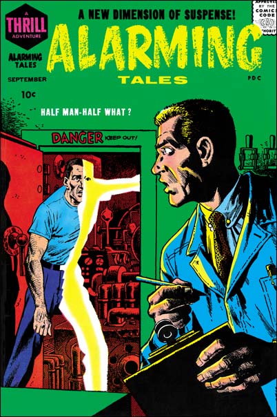
Alarming Tales #5 (September 1958) art by John Severin
An important contribution to giving AT an Atlas look is the cover artist John Severin. Well at least he is listed as the artist in GCD and some other Internet sources. Judging by some of John’s work for Atlas, such as the cover for Black Rider Rides Again #1, this seems like an accurate attribution. Although he had been only been working for Atlas for the last few years Severin had done a lot of work for them and his style was very much in tune to that publisher. Atlas seemed to prefer comic art that emphasized detail, a style I find rather dry. That is what we find for John’s rendition for the Atlas Tales #5 cover. AT #5 is over all realistic, almost illustrative, but note the fish-like mouth of the man in the foreground. Yes lots of details, look at all the machinery that can be seen through the door. But all things considered I am afraid this cover leaves me rather cold.

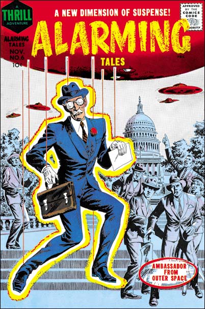
Alarming Tales #6 (November 1958) art by John Severin
John’s cover for AT #6 is even more detailed and has more figures. Generally I find this sort of art style dry and uninteresting. Not in the case of the AT #6 cover, Severin has really pulled off a great cover. Yes there is a lot of detail, but John maintains the Ambassador as the center of focus. The background figures provide just the right sort of emotional responses. With one exception, I do find the pointing man to be a bit awkward. A good deal of the success comes from the character of the Ambassador. Why would anyone think that the envoy from another planet should look like a British bureaucratic official? I do not know who came up with him, but he works.
Not to diminish Severin’s art, but part of the success of this cover is due to the colorist. All the background is done in muted blue and purple as if under the shadow cast by the flying saucer. This has the beneficial effect of playing down all the background details allowing the Ambassador to stand out even more. The background figures also show small highlights of white. I am not sure whether these highlights really make any sense but they do add interest and help prevent the figures from appearing too flat.
It was not just the cover art that leads me to say that Alarming Tales had become more Atlas-like. Some of the stories also had that flavor as well. Or at least they are rather different from previous Simon or Simon and Kirby productions. I will be writing about some of the stories in another post so I will leave it at that for now.

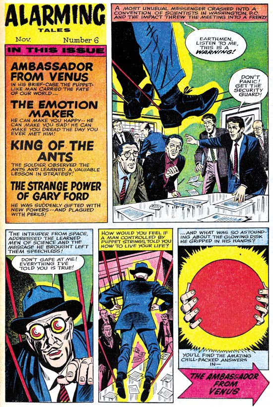
Alarming Tales #6 (November 1958) Contents page, art in part by Joe Simon
AT #5 has a postal statement, the only one found in any Alarming Tales issue, which lists Leon Harvey as the editor and nowhere mentions Joe Simon. Could the alteration that came over Alarming Tales be due to a change in editors? I am not the first to warn against an over reliance on the postal statement. I believe that often the postal statement will list some one company personal as the editor even in cases where another person may be doing the actual work. Leon Harvey is one of the owners of Harvey Comics so we maybe dealing with just that sort of case.
Although Simon did not do the covers for AT #5 or #6 he was not completely absent. I am uncertain whether Joe had any hand in the Contents page for AT #5 but he clearly worked on the Contents for AT #6. The figures in the first art panel look like they were done by Joe. I am less certain about the next two panels. The ambassador in the second panel is particularly well done and faithful to the story art. We have seen in the Harvey romance content pages that Joe could do excellent imitations of other artists. But the best examples of Joe imitations are close swipes from the story. In this portrait of the ambassador I cannot find a source from the story. In the end I am uncertain whether Joe did the whole introduction story or just the first panel. But his presence doing at least part of the contents page suggests that he was still acting as editor.
Of course if Joe Simon was still the editor why did Alarming Tales become so Atlas-like? Unfortunately I just do not have a good answer. Perhaps after the Implosion writers who had worked for Atlas took gigs elsewhere, including at Harvey. Maybe Jack Oleck was doing some of the writing for Alarming Tales. We know Oleck did some work for Atlas before the Implosion perhaps he continued to use some stylistic traits learned there. It is known that Oleck recycled stories from one publisher to another. Perhaps that was being done here, unfortunately I just do not know enough about Altas comics to say if any of their stories are too close for comfort with those in Alarming Tales.


Hi,
If you hadn’t said the contents page splash was by Joe Simon, I would have said it was by Bailey. Mind you, you are kore knowledgable about Simon’ work than I am about Bailey’s. All I know is, he did work for some of those later Harvey books and he did his own variation of the Caniff style.
Ger,
As I said in my post I am only confident about that Joe did the first art panel. The rest could have been done by Bailey, the art does match very well with the story art.
Harry