Tag Archives: Simon

It’s A Crime, Chapter 10, The Master and His Protégé

(Justice Traps the Guilty #13 – #23, Headline #39 – #45)

This chapter will cover the Prize crime comics from the period December 1949 through February 1951. This is a longer period then I have lately been using in my serial posts but it defines a period where the art and artists are consistent. Actually the period started with JTTG #12 and Headline #38 that were included in the previous chapter.


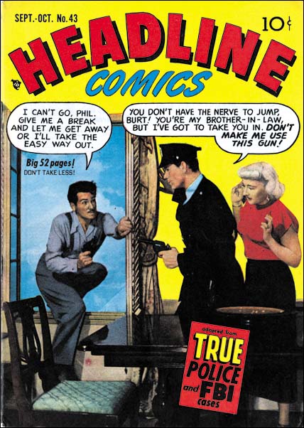
Headline #43 (September 1950)

For much of this period the covers of the crime titles used photographs. When the photo covers began some months before (Headline #36 July 1949, JTTG #12 October 1949) it is clear that Simon and Kirby had a hand in them because both are present on the cover for Headline #37 (September 1949).
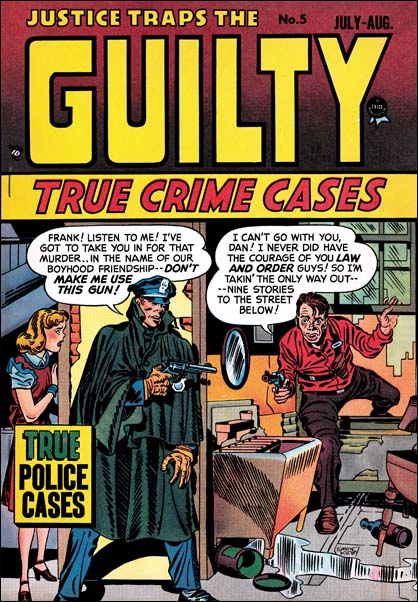

Justice Traps the Guilty #5 (July 1948), art by Jack Kirby

While neither artist shows up on any further covers, Simon and Kirby at least influenced the cover for Headline #43. The same theme appeared previously on the cover for JTTG #5 drawn by Jack Kirby. In both the criminal threatens to jump rather then allow himself to be arrested, the policeman has a personal relationship to the criminal (brother-in-law in one and old friend in the other), and a woman, presumably the criminal’s wife, looks on behind the protection provided by the cop. While the two covers have the same theme in reality they could hardly be more different. I do not know who was responsible for the switch to photo covers, but did they really believe that cheesy covers like that were better then those drawn by Kirby? What were they thinking?
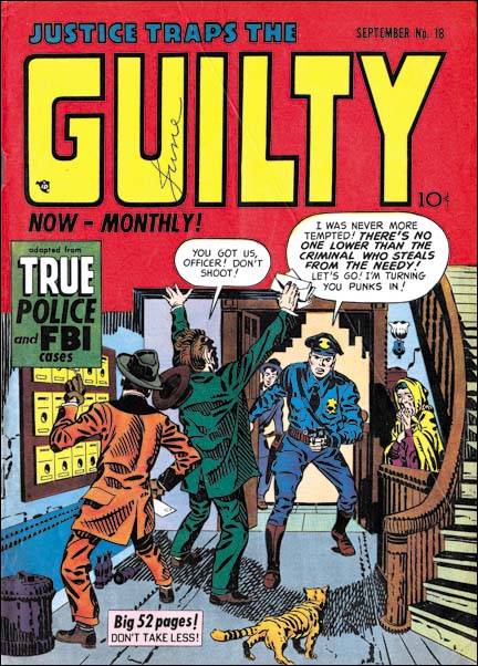

Justice Traps the Guilty #18 (September 1950), art by Jack Kirby

Eventually the use of photographic covers ended for four Prize titles. This did not happen at once but was done over a three month period. The last photo cover were Prize Comics Western #82 (July 1950), Young Love #1 (July 1950), Justice Traps the Guilty #17 (August 1950), and Headline #43 (September 1950). The western romance titles had ended prior to the drop of photo covers but interestingly Young Romance did not switch like the other titles and photo covers continued to be used until 1954 (with a couple very short lived revival of art covers; issues #26, #27, #33 and #34). Photo covers for Young Love resumed with issue #23 (July 1951) and then also continued until 1954.

When drawn covers were resumed it was Jack Kirby who provided the initial cover art. In the case of Prize Comics Western this was only for one issue (PCW #83, August 1950) before another artist (so far unidentified) took over. For Headline Kirby would produce two covers (issues #44 November 1950 and #45 January 1951). Justice Traps the Guilty got five Kirby covers (issues #18, #19, #21, #22 and #23, September 1950 to February 1951. Note that the last Kirby covers for JTTG and Headline were dated about the same time but there are over twice as many JTTG Kirby covers. This can be explained by the fact that photo covers were dropped on JTTG before Headline and JTTG was at this point a monthly title while Headline remained a bimonthly.
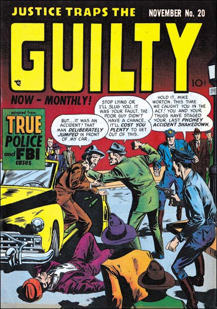

Justice Traps the Guilty #20 (November 1950), art by Marvin Stein

Perhaps the reader noticed that in the middle of all final Kirby crime covers there was one missing, JTTG #20. This cover is unsigned but clearly was not done by Jack. Instead it was done by an artist, Marvin Stein, who has not yet been discussed in this serial post, It’s a Crime, or The Art of Romance but was discussed briefly in Prize Comics Western, a Rough History. I will be writing about Stein further below but here I would like to say that my attribution of JTTG #20 is based mainly on the policemen. The head of the cop in the foreground has a shallow depth to it that is characteristic of Marvin Stein when he draws a head from slightly behind side view. Stein also has a particular visual shorthand for more distant faces that can be seen in the background policeman.
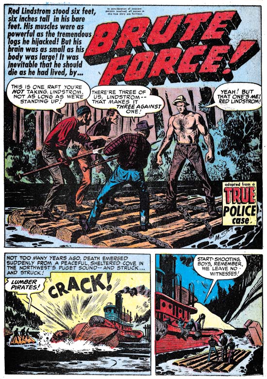

Justice Traps the Guilty #22 (January 1951) “Brute Force”, art by Marvin Stein

Marvin Stein had an extended relationship with Prize Comics but how long he was actually employed by the Simon and Kirby studio is more uncertain. When interviewed by Jim Amash (Alter Ego #76 March 2008) Joe Simon said that they traded Marvin like he was some baseball player to Crestwood (otherwise known as Prize Comics). However Stein continued to work in the Simon and Kirby studio as Prize Comics had no art department. It would be nice to know when this “trade” occurred and although I will be offering a couple of possibilities the fact none is of my suggestions seems fully satisfactory.

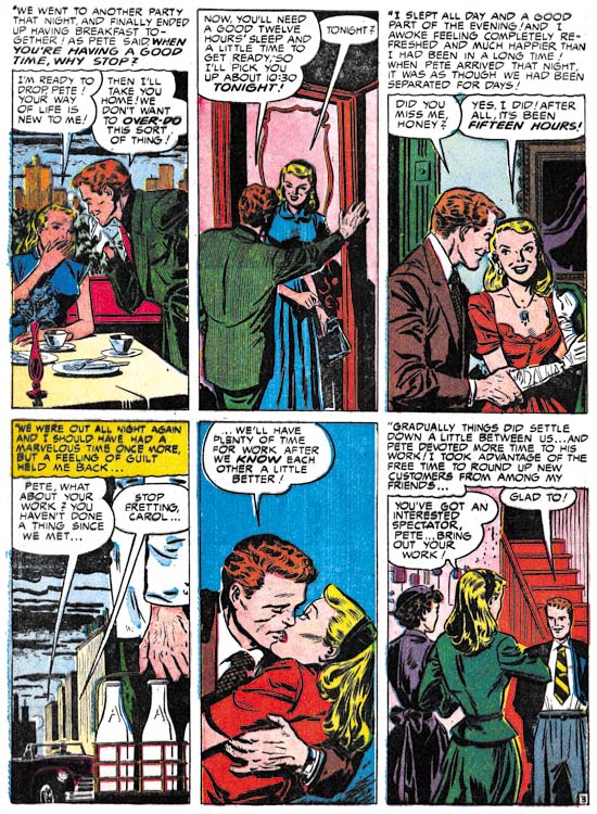
Joe Simon once said to me that initially he did not think Stein’s art was that good but later Marvin improved greatly. Marvin signed many of his work and had a distinctive style over most of his career. The earliest signed work by Marvin Stein that I am aware of is “Brute Force”. The presence of his autograph is particularly important because otherwise it would be hard to provide an attribute since it does not exhibit many of the features that make Stein’s style so distinctive. Frankly I am fully in agreement with Joe’s negative evaluation of Marvin’s early work.
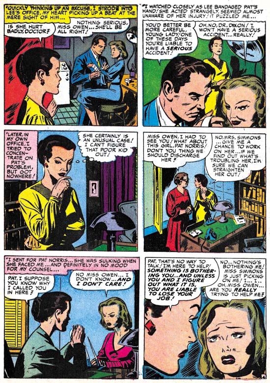

Young Love #19 (March 1951) “The Girl Who Loves Him”, art by Marvin Stein

Marvin Stein’s early work shows much variation. “The Girl Who Loves Him” was published only a couple of months after “Brute Force”. I have included this romance story here because if provides a better example of what Marvin’s early work looked like. While on a whole this early art looks different from later, and more typical, work by Stein, some of his style traits can be detected. Marvin often shows a man from above and to the side and when doing so draws them in a distinctive fashion. This can be seen in the man in the second panel. The woman in the third panel has eyebrows that extend into a thought line without much of a demarcation to distinguish the two facial features; this is also a trait often found in Stein’s later period. In particular, make note of how the woman is drawn in the second, third and fifth panels. Here Marvin’s style is different from his typical period but we will see it again in some unsigned works.
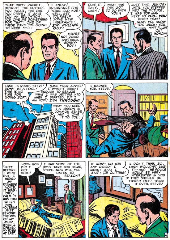

Justice Traps the Guilty #18 (September 1950) “Pirates of the Poor” page 6, art by Jack Kirby and Marvin Stein

While it is clear that during this period Jack Kirby contributed some covers, did he provide any art? Well if you believe The Jack Kirby Checklist, Jack provided two stories, one of them being “Pirates of the Poor”. I must admit that some time ago I had excluded this story from works attributable to Kirby. But one nice thing about the writing these posts that focus on specific periods is that it gives a better perspective when I review the material. There are parts of the art of this story that do look like they were done by Jack as for instance the man in the first panel. There are other parts that look like pure Marvin as in the shallow depths of the head of the men seen from behind in the second and last panels.
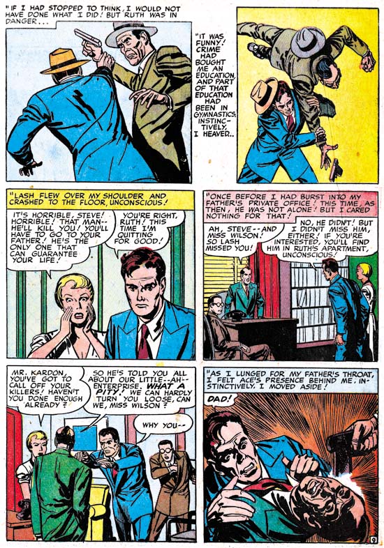

Justice Traps the Guilty #18 (September 1950) “Pirates of the Poor” page 9, art by Jack Kirby and Marvin Stein

The third panel has a distinctive Kirby touch to it and is very different from Stein’s manner of drawing either men or women at this time. For me the big giveaway is the manner of graphically telling the story. The use of “camera” angles just looks too advanced compared to other work by Stein in this period. It is, however, just the thing Kirby was so good at. But look how awkward the last two panels are, not the sort of thing you would expect from Kirby. While some may think this story was penciled by Jack and just inked by Stein I believe this is another case of Kirby providing layouts and another artist, in this case Stein, doing the finishing work and inking. In cases like this I credit the art to both artists.
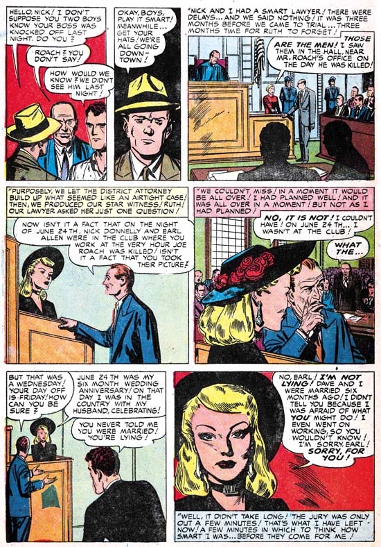

Justice Traps the Guilty #19 (October 1950) “Alibi Guy” page 7, art by Marvin Stein

The other story that The Jack Kirby Checklists credits to Jack is “Alibi Guy”. Again this is a work that for a long time I did not believe was done by Jack. Having changed my mind about “Pirates of the Poor” I gave particular attention in my review of “Alibi Guy”. In this case, however, I still believe that the pencils were not done by Kirby. All the faces look like they were drawn by Stein; the man in the second panel of page 7 is the closest any of them come to Kirby’s style. Perhaps Jack did give a hand in that panel or perhaps Marvin just swiped it. The use of viewpoints in graphically telling the story is handled rather well, but is not suspiciously well done. Nothing in the use of “camera” angles convinces me Kirby was involved in even the layouts. There really is no comparison between “Alibi Guy” and “Pirates of the Poor” and I continue to exclude “Alibi Guy” from Jack’s work.

Marvin Stein was obviously very influenced by Jack Kirby. Even when Marvin was no longer working on Simon and Kirby productions he continued to work in the studio. Which brings the question about exactly when Marvin was “traded” off by Simon and Kirby to Prize? On possible date could be at the start of this period. But we have seen that during this Kirby provide layouts to Stein in “Pirates of the Poor”. So perhaps a better date would be at the end of the period covered in this chapter, which is after February 1951. It will be the subject of a future chapter for It’s A Crime but Stein played an important part in both Headline and Justice Traps the Guilty from March 1951 on. But art by Stein was still appearing in Young Romance and Young Love throughout 1951 and he was involved in Boys’ Ranch as well which ended in August 1951. Putting the “trade” at the end of 1951 would solve that problem but by then Marvin had been fully involved in the Prize crime titles for some time so what was he being “traded” to? Perhaps it is not wise to take the trading of Marvin Stein too literally and remember Joe Simon’s saying “never let facts get in the way of a good story”.

Of course Jack Kirby and Marvin Stein were not the only artists working on Headline and Justice Traps the Guilty during this period. But that will be the subject of the next chapter of It’s A Crime.

Chapter 1, Promoting Crime
Chapter 2, A Revitalized Title
Chapter 3, Competing Against Themselves
Chapter 4, Crime Gets Real
Chapter 5, Making a Commitment
Chapter 6, Forgotten Artists
Chapter 7, A Studio With Many Artists
Chapter 8, The Chinese Detective
Chapter 9, Not The Same

Chapter 11, The New Team

More About the Comic Con Simon and Kirby Lithographs

The New York Comic Con web site has a page of show exclusives. If you scroll way down, or better yet do a search for |”Titan (1514)”, you will find the two lithographs that will be offered at the Titan booth. I previously provided images of both but those were of the restoration I made, not the final product. I looks like they did a great job.

The Art of Romance, Chapter 11, After the Glut

(May – July 1950: Young Romance #21 – #23, Young Love #9 – #11)


Number of Romance Titles 1947 – 1950 (the period covered in this chapter shaded in blue)

This chapter will cover the period from May to July 1950. This is during the rapid decline of romance titles that followed the love glut. Simon and Kirby were not immune to the effects of the over abundance of romance comics; their most recent titles, Real West Romance and Western Love had been cancelled. There were other western romance comics published during the glut as well but all ended up being terminated. Western love titles would never again be tried by any publisher. Although Joe and Jack failed with their western love titles, their standard romance titles, Young Romance and Young Love, seemed unaffected. Both titles had gone monthly during the glut and would remain so for years afterwards. The name brand recognition that Simon and Kirby’s Young Romance had achieved before the glut had allowed it to find a place on the comic racks while newer titles often never had a chance. Young Love’s similar name and logo let it join it Young Romance on the racks as well. Apparently both titles did very well during the period when other titles were rapidly disappearing.

As I discussed previously in It’s A Crime, it is unclear exactly what Simon and Kirby’s contribution was at this time for the Prize crime comics, Headline and Justice Traps the Guilty. These titles seem now to have been made on the cheap. Either Joe and Jack were doing nothing more then supplying some covers, or they were still producing them but because less money was involved they were not putting much effort into it. So Simon and Kirby’s source of income was largely based on two monthly romance titles.


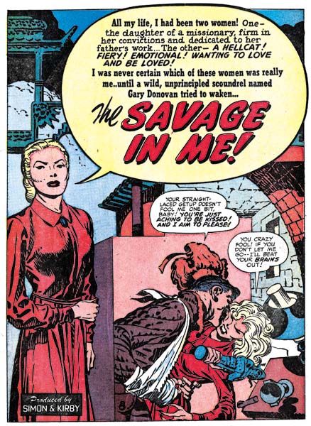
Young Romance #22 (June 1950) “The Savage in Me”, art by Jack Kirby

Jack Kirby was still the primary artist for the romance titles although still somewhat below his normal output. For the 6 issues discussed here Kirby did 6 stories for a total of 56 pages. Kirby drew no covers as they were done with photographs. Jack did all the lead stories for Young Romance and all were much longer then any of the other stories in the issues (14 or 15 pages for the lead stories as compared to 7 or 8 for the longest of the other stories. Jack’s contributions to Young Love were more limited and all the lead stories of that title were done by other artists.

For two of the lead stories Jack used full page splashes with what I describe as the confessional  splash where someone talks about the story to the reader with the word balloon used to include the title of the story. Kirby’s lead stories are still very different from stories by other studio artists. They generally are more complicated, include more action, and sometimes use exotic locations. While original writers have indicated that Jack contributed to the plotting of their stories, it is clear that Jack had even further impact on the scripting of the stories that he drew. It was just a few months short of the third anniversary of the Young Romance title, but Kirby was still putting much effort to make his stories as interesting as possible, and I may add succeeding. This was particularly true with “The Savage in Me” a tale that combines an exotic location (China), drama (the threat presented by a warlord’s army) and humor. The story was, I may add, discussed at length in an article by Kirby scholar Stan Taylor (“Simply the Best”, The Jack Kirby Quarterly #12, Spring 1999).


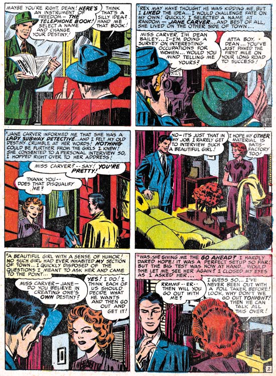
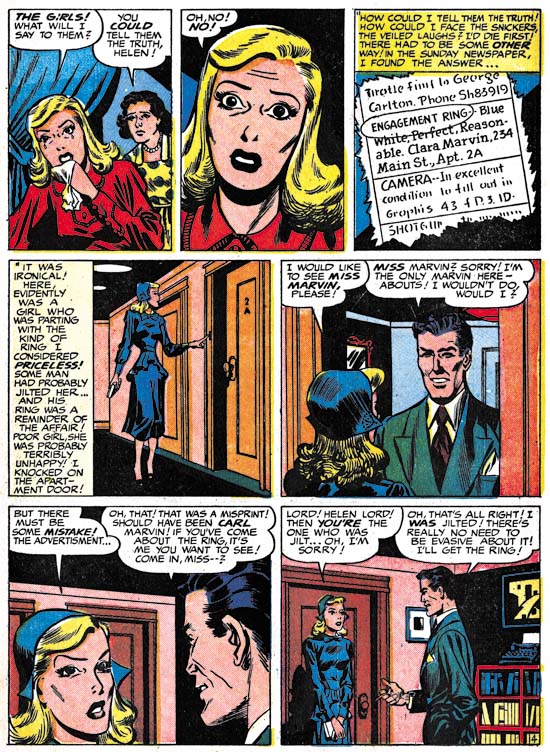
Young Love #10 (June 1950) “The Girl I Picked From the Phone Directory” page 2, pencils by Jack Kirby, inks by Mort Meskin

At a glance one story, “The Girl I Picked from the Phone Directory”, looks like it was done by Mort Meskin. Typical Meskin traits such as the woman’s eyes and for some men Mort’s characteristic grin. However the shifting viewing angles found in the story are more like Kirby’s then those used by Meskin. Further some of the people depicted have typical Kirby mannerisms such as the gesture of the man in the last panel of the above page. I have no doubt that this story was penciled by Kirby but inked by Meskin. As such it is the earliest example of Meskin inking Kirby that I am aware of. Either Mort was untypical heavy handed in his inking or Jack’s pencils were not very tight.


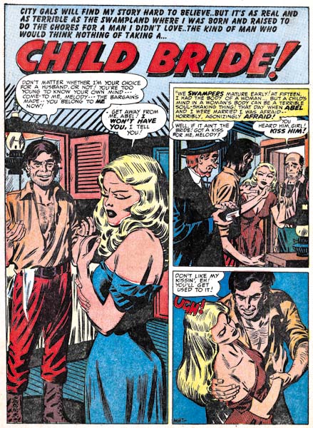
Young Romance #22 (June 1950) “Child Bride”, art by Mort Meskin

While Meskin still had not reached his high productive levels, he had now become the second most prolific artist in studio. Mort did 8 stories for a total of 50 pages. Even when Meskin provided the lead stories for Young Love #9 and #11, he still did not use a full page splash. Mort was also using vertically oriented captions, a device not typical of Kirby. While Meskin had a cinematic approach to story telling it was done differently from Jack’s. Once again I find no evidence to support the idea, promoted by some Kirby scholars, that Jack supplied layouts.


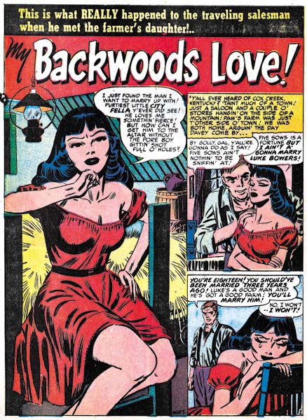
Young Love #10 (June 1950) “My Backwoods Love”, art by Mort Meskin

It maybe just a coincidence, but there seems a more abundant use of “cheesecake” poses in Mort Meskin’s work at this time; not something I normally associate with him. Further he does them quite well.


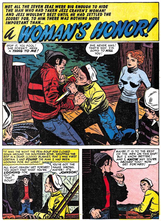
Young Romance #23 (July 1950) “A Woman’s Honor”, art by Bill Draut

Bill Draut has been displaced from his number two position by Mort Meskin. During this period Bill did 4 stories with 31 pages. Enough to secure the number three spot but still significantly less then Meskin. Bill consistently provided good art and so he continued to be an important contributor to Simon and Kirby productions.


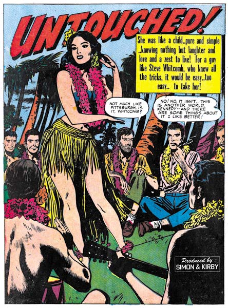
Young Love #10 (June 1950) “Untouched”, art by Bruno Premiani?

We have seen all the other important artists before, there were no changes in personnel at this time. I still have not been able to confirm that artist who did some very distinctive work for Joe and Jack was in fact Bruno Premiani. But I continue to use that attribution (with a question mark) until something convinces me otherwise. Premiani normally used half page splashes, but for the lead story that he did for Young Love #10, “Untouched”, he provided a full page splash.

By the way do not get confused by the “Produced by Simon and Kirby” credit that appears on this splash. It is not a claim by Joe and Jack that they drew this story. Rather it was used to indicate that the entire comic was put together by Simon and Kirby. It appeared on the first story of all the Simon and Kirby titles at this time (and for some time to come) regardless who actually drew the lead story.


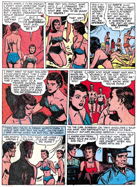
Young Love #9 (May 1950) “Carbon Copy” page 6, art by Bruno Premiani?

I guess “cheesecake” must be the theme for this chapter of Art of Romance because I could not resist including the above page from “Carbon Copy”. I do not know what the original teenage girl readers thought about this page but I certainly am not going to complain about a beach full of bikinis. Today such a scene, while enjoyable at least for the men, would not be considered remarkable. But back in 1950 it would be quite unusual at least on American beaches. For instance bikinis were banned in 1951 from use in the Miss World beauty pageant. It would not be until the early ’60s that the two piece swimsuit would become the norm in beach movies such as “How to Stuff a Wild Bikini”. Was Premiani’s page a flight of fantasy or wish fulfillment or was Bruno taking his queue from more liberal European beaches?


Young Love #10 (June 1950) “At Your Own Risk” page 3, art by Leonard Starr

Leonard Starr was another S&K studio regular who continued to appear during the period considered here. During this period he drew 3 stories with 21 pages. Starr is most easily recognized by his women that he draws with widely separated eyes, wide foreheads and narrow chins; a look I like to call elfin. Another easy way to pick him out is his use of tall narrow panels. Not every page in a story would use six narrow panels as in the example above, but other combinations of a row of tall panels with two vertically diminished panel rows are also commonly found. It is an arrangement that is not found in Kirby’s work so again claims of Kirby supplying layouts to not seem to be correct. Starr puts his tall panels to good use and it has the added benefit of allowing the talk balloons to be place out of the way of the image.


Young Romance #23 (July 1950) “Love on A Budget” page 4, art by John Severin

Previously John Severin was more a presence in the western love titles then in the standard romances. With the cancellation of the Western Love and Real West Romance the expectation might be that Severin would appear more often in Young Romance and Young Love. While John still shows up in the romance titles during this period, his participation does not appear to have increased. One explanation might be that Severin did not need the extra work since he had begun doing work for Prize Comics Western. But I do not think that is the likely explanation as PCW seemed to have been done “on the cheap” and probably did not pay as well as work for Simon and Kirby. It is more likely that Simon and Kirby just did not want to give him further work. The fact is Severin just was not that great of a romance artist. It was not that John could not draw well; it is just that he did not seem comfortable with depicting romantic scenes. He rarely, if ever, drew a kiss in his stories. The absence of true romance in Severin’s work may not have been a problem for the western love titles but it certainly was a hindrance for the standard romance. Still he did provide 19 pages of art during the period discussed in this post although none were signed and this includes a few that are questionable attributions.


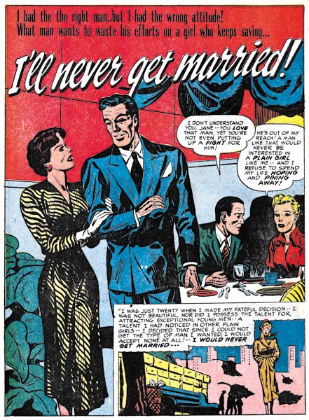
Young Love #11 (July 1950) “I’ll Never Get Married”, art by John Severin?

Included in the work I credit to John Severin is one that looks distinctively different, “I’ll Never Get Married”. Perhaps my attribution is just incorrect but I suspect what makes this story look so different from others by Severin was the inking. During this period most of John’s art was inked by Will Elder. While I do not claim to be very familiar with Elder’s inking a comparison of this story to works signed by Severin and Elder clearly shows Elder did not ink “I’ll Never Get Married”. Whoever the inker was he was not nearly as talented as Elder.


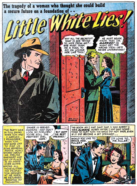
Young Love #11 (July 1950) “Little White Lies”, art by Vic Donahue

Vic Donahue is another artist that we have seen previously and continues to make an appearance. During this period Vic’s contribution consisted of 5 stories with 21 pages. This includes three “Problem Clinic” stories but they are all questionable attributions and only amount to a total of 6 pages. Donahue also provided to longer stories one of which was signed.

Unlike some earlier chapters, there are only a few stories that I have not been able to credit. Most of the artists used were therefore studio regulars.

Chapter 1, A New Genre (YR #1 – #4)
Chapter 2, Early Artists (YR #1 – #4)
Chapter 3, The Field No Longer Their’s Alone (YR #5 – #8)
Chapter 4, An Explosion of Romance (YR #9 – #12, YL #1 – #4)
Chapter 5, New Talent (YR #9 – 12, YL #1 – #4)
Chapter 6, Love on the Range (RWR #1 – #7, WL #1 – #6)
Chapter 7, More Love on the Range (RWR #1 – #7, WL #1 – #6)
Chapter 8, Kirby on the Range? (RWR #1 – #7, WL #1 – #6)
Chapter 9, More Romance (YR #13 – #16, YL #5 – #6)
Chapter 10, The Peak of the Love Glut (YR #17 – #20, YL #7 – #8)
Chapter 11, After the Glut (YR #21 – #23, YL #9 – #10)
Chapter 12, A Smaller Studio (YR #24 – #26, YL #12 – #14)
Chapter 13, Romance Bottoms Out (YR #27 – #29, YL #15 – #17)
Chapter 14, The Third Suspect (YR #30 – #32, YL #18 – #20)
Chapter 15, The Action of Romance (YR #33 – #35, YL #21 – #23)
Chapter 16, Someone Old and Someone New (YR #36 – #38, YL #24 – #26)
Chapter 17, The Assistant (YR #39 – #41, YL #27 – #29)
Chapter 18, Meskin Takes Over (YR #42 – #44, YL #30 – #32)
Chapter 19, More Artists (YR #45 – #47, YL #33 – #35)
Chapter 20, Romance Still Matters (YR #48 – #50, YL #36 – #38, YB #1)
Chapter 21, Roussos Messes Up (YR #51 – #53, YL #39 – #41, YB #2 – 3)
Chapter 22, He’s the Man (YR #54 – #56, YL #42 – #44, YB #4)
Chapter 23, New Ways of Doing Things (YR #57 – #59, YL #45 – #47, YB #5 – #6)
Chapter 24, A New Artist (YR #60 – #62, YL #48 – #50, YB #7 – #8)
Chapter 25, More New Faces (YR #63 – #65, YLe #51 – #53, YB #9 – #11)
Chapter 26, Goodbye Jack (YR #66 – #68, YL #54 – #56, YB #12 – #14)
Chapter 27, The Return of Mort (YR #69 – #71, YL #57 – #59, YB #15 – #17)
Chapter 28, A Glut of Artists (YR #72 – #74, YL #60 – #62, YB #18 & #19, IL #1 & #2)
Chapter 29, Trouble Begins (YR #75 – #77, YL #63 – #65, YB #20 – #22, IL #3 – #5)
Chapter 30, Transition (YR #78 – #80, YL #66 – #68, YBs #23 – #25, IL #6, ILY #7)
Chapter 30, Appendix (YB #23)
Chapter 31, Kirby, Kirby and More Kirby (YR #81 – #82, YL #69 – #70, YB #26 – #27)
Chapter 32, The Kirby Beat Goes On (YR #83 – #84, YL #71 – #72, YB #28 – #29)
Chapter 33, End of an Era (YR #85 – #87, YL #73, YB #30, AFL #1)
Chapter 34, A New Prize Title (YR #88 – #91, AFL #2 – #5, PL #1 – #2)
Chapter 35, Settling In ( YR #92 – #94, AFL #6 – #8, PL #3 – #5)
Appendix, J.O. Is Joe Orlando
Chapter 36, More Kirby (YR #95 – #97, AFL #9 – #11, PL #6 – #8)
Chapter 37, Some Surprises (YR #98 – #100, AFL #12 – #14, PL #9 – #11)
Chapter 38, All Things Must End (YR #101 – #103, AFL #15 – #17, PL #12 – #14)

Joe Simon at New York ComicCon 2009

As promised I have some more information about Joe Simon’s appearance at this year’s ComicCon. Joe will be doing a signing at the Titan booth on Saturday (Feb. 7) from 2:30 to 3:30. Then from 4:00 to 5:00 will be the subject of a special panel “Secret Origins of the Comic Book World”. Joe will then return for more signing at the Titan booth from 5:30 to 6:30. This is all of the Joe Simon appearances that have been announced, but if that changes I will post about that as well.


Fighting American Lithograph

Titan first book, “The Best of Simon and Kirby”, will not be released until this summer, so what will Joe be signing? Well for one thing Titan will be offering two limited editions lithographs. One will be featuring the cover from Fighting American #1 (see above) while the other will be from the splash from the story “The Girl Who Tempted Me” from Young Romance #17 (see below). I have not seen the actually lithographs but I understand that the image size will be 11 by 16 inches (Fighting American) and 11 1/2 by 16 (Young Romance). The paper size I believe will be 14 by 18 inches. The edition size of each lithograph will be limited to 100, each signed by Joe Simon and are priced at $75 a piece. The two lithographs are being made specifically for this ComicCon and have never been offered elsewhere.


Young Romance Lithograph

At this point I have to admit that my observations and opinions are completely biased, I did the restorations for these lithographs. So take that in account when I say both are just stunning. No line art recreations here, both are based on scans from the original comics; pure Simon and Kirby. Colors were carefully done to accurately restore the original colors while correcting comic book printing problems such as registration errors. What can I say I am truly pleased with how they came out. With such a small edition size I am sure that these lithographs are going to quickly become collectors items.

Titan Announces Expanded Simon and Kirby Library

The following is a press release from Titan:

THE OFFICIAL SIMON AND KIRBY

Titan to Collect the Works of Two Comic Book Legends


Titan Books Signs Exclusive Agreement to Publish Works by Comics’ Greatest Creative Team, with Full Involvement of Living Legend Joe Simon and the Jack Kirby Estate

Titan Books has expanded its publishing agreement with comic book pioneer Joe Simon, co-creator of Captain America, to launch The Official Simon and Kirby Library beginning in 2009. In addition to the previously announced volumes The Best of Simon and Kirby and The Simon and Kirby Superheroes, the library will include volumes collecting the greatest horror, detective, and romance stories ever produced by the legendary Dream Team of comics.

Joe Simon and Jack Kirby first joined forces on the superhero character Blue Bolt in 1940, and later that year created the seminal hero Captain America (soon to be featured in a major motion picture by Marvel Studios). “When Jack and I created Captain America, it sent a shock across the nation even before America had entered World War II,” Simon noted. “But that was only the beginning, and we followed it up with titles like Boy Commandos and Young Romance. They weren’t superhero books, but each one sold millions of copies.”

Beginning in summer 2009 with The Best of Simon and Kirby, Titan Books will release full-color hardcover editions featuring some of the greatest stories ever told in the graphic medium, painstakingly restored by Simon and Kirby historian Harry Mendryk. Simon himself will oversee the process, and will offer original insights and secrets from behind the scenes.

The volume will feature the team’s most famous characters, including Fighting American, Stuntman, and The Fly, as well as genre adventures from such legendary titles as Black Magic, Justice Traps the Guilty, and the industry’s first romance title, Young Romance. Through the generous support of Marvel Comics and DC Comics, The Best of Simon and Kirby will include stories featuring Captain America, The Vision, Sandman, and The Boy Commandos.

“It’s simply astonishing, the materials Joe has kept over the years,” Titan owner and publisher Nick Landau said. “It shows uncanny foresight that he retained so many rights, and preserved those wonderful stories so that today’s readers will be able to enjoy some of the finest comics ever produced.” Details on the contents and format of the books are still being determined, as Landau added, “We want to come up with editions that are as perfect as they can be.”

Simon will attend the February 2009 New York ComicCon to celebrate the launch of The Official Simon and Kirby Library, and will sign exclusive limited edition lithographs. Titan plans to release two books a year, and these will be the only editions authorized by both Joe Simon and the estate of Jack Kirby. In addition to The Official Simon and Kirby Library, Titan will publish the autobiography of Joe Simon in 2010.

Titan Books is a leading publisher of licensed entertainment. The UK’s top publisher of graphic novels and World renowned for television and film companions, including Tim Burton’s Sweeney Todd, Frank Miller and Will Eisner’s The Spirit, Watching the Watchmen by Dave Gibbons, plus the official Watchmen and Terminator: Salvation movie tie-ins. Titan Books also publishes a series of high-end art books, and biographies such as the New York Times bestselling My Boring-Ass Life: The Uncomfortably Candid Diary of Kevin Smith.

I would like to emphasize of few points found in the release. The first is that I did not write this release and was surprised to find that I was mentioned in it. I am sure I will comment further on my contribution; most likely when the first book, “The Best of Simon and Kirby”, gets released this summer.

When Titan told me they wanted to include some stories from Marvel and DC in “The Best of Simon and Kirby” I must admit I was a bit skeptical. I have never been so pleased to have been proven wrong. The release describes DC Comics and Marvel Comics support as “generous” with which I heartedly agree.

I said this before, but it is worth repeating. Both Joe Simon and the Jack Kirby estate will financially benefit from these books.

Most immediately important is that the release mentions Joe Simon will be appearing at upcoming New York ComicCon. Joe does not make many appearances so this will be a special chance for fans to meet him. I will have further announcements in the near future when his schedule becomes firmed up.

Joe Simon’s Newspaper Art

I recently wrote about Joe Simon’s newspaper career (Joe Simon, Editor) and earlier as well (Joe Simon as a Newspaper Staff Artist). I discussed how Joe did more then just sport illustrations. I never expected that someone would actually check to see if I was right. But that is exactly what Ger Apeldoorn did and he posted his initial results on his blog (previously called Those Fabulous Fifties, but now apparently unnamed). He is using microfiche copies of the Syracuse Herald, a search I also mean to do if I can ever find the time.

I am all for preserving old newspapers with techniques such as microfiche otherwise much would be lost about the history of our culture. Even so the quality leaves much to be desired. Ger attributed one illustration dated December 13, 1936 to Joe but could not find his signature. Was that because it was removed before publication, or has it been obscured by scratches on the microfiche film? In this case we are fortunate because Joe still has the original art in his collection. Ger may not have needed a signature to recognize Simon’s hand, but it is always nice to have confirmation.

Joe Simon’s Political Comics

Joe Simon’s book, “The Comic Book Makers” (written with Jim Simon), includes a chapter “Marty, The Unknown Writer” that discusses Joe’s work on political comic books and how it came about. As usual it is interesting reading, however no examples of the comic books were provided. I thought they might provide the subject of a further post of Joe’s work outside the standard comic book field.


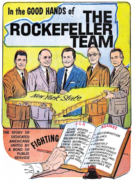
“The Rockefeller Team”, art by Joe Simon, script by Martin A. Bursten

The above image is from the cover but like all examples that I provide here the covers were done on the same newsprint paper as the rest of the comic book. The individuals shown are, from left to right, Judge John P. Lomenzo, U. S. Senator Jacob K. Javits, New York Governor Nelson Alodrich Rockefeller, N. Y. Attorney General Louis J. Lefkowitz, and N. Y. Lieutenant Governor Malcolm Wilson. Actually those are the titles they had at the time, but some went on to hold other positions. For instance Nelson Rockefeller was selected to be U. S. Vice President with Gerald Ford after Richard Nixon resigned from the presidency. The comic book is undated but had to been done between 1959 when Nelson first became Governor and 1974 when he left that position to become Vice President.


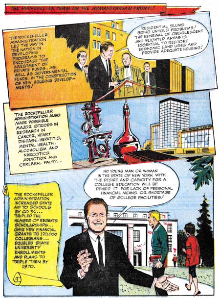
“The Rockefeller Team”, art by Joe Simon, script by Martin A. Bursten

The art for all these comics was done in a realistic style which is not unexpected given the political purpose they were created for. They are all short in length having only 8 pages (including the cover). Generally the layout have the standard comic book panels, but occasionally, as shown above, a more interesting panel arrangement is presented.


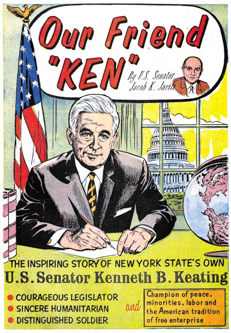
“Our Friend Ken”, art by Joe Simon, script by Martin A. Bursten

The Ken of this comic is Kenneth B. Keating, U. S. Senator from 1959 until 1965 when he lost the seat to Robert F. Kennedy. This provides a narrower period for when the comic was published and Keating’s absence from “The Rockefeller Team” suggests that comic was produced after 1965.

Joe Simon is credited with the art to both of these comics while the script is by Martin A. Bursten. This is the same Bursten whose name appeared in “Mercury in the 20th Century” (Red Raven #1, August 1940) that Jack Kirby drew which previously led to the mistaken idea that the name was an alias of Jack’s. In “The Comic Book Makers” Joe explains that he did this political comic book work on a free lance basis for Bursten’s advertising and public relation firm. The name of that firm was Burstein and Newman and was located in Marty’s home in Great Neck. Both “The Rockefeller Team” and “Our Friend Ken” were produced by Country Art Studios in Woodbury, which is where Joe lived at the time.


“Solo en America, La Historia de Louis J. Lefkowitz” art by Joe Simon, script by Martin A. Bursten, translation by Dr. Carmen Marrero

Lefkowitz appears a little older then in “The Rockefeller Team” so I believe this was done even later. There are no art credits in this comic but the style is so similar to the others that I have no doubt that Joe Simon was responsible for it as well. Unfortunately I cannot read Spanish so I am unsure if this was just a translated version or if the comic was made specifically for a Hispanic reader.

These three are the only political comics by Simon that I have seen. But given their use in political campaigns their survival is even more unlikely then standard comics. These copies were all given to me by Joe himself and I have never seen examples anywhere else. But although Joe liked to keep copies of his work for his own collection that does not mean that these were the only ones he did. Perhaps others will eventually be found.

Joe Simon’s Career in Advertising

In the comments to my post on Joe Simon, Art Director Steven Brower asked whether Joe Simon worked in advertising as an art director. I did not answer Steven then because I decided it was time I wrote a little about Joe’s career outside of comics.


Interior of a folded brochure for Cyder House

There were a number of comic book artists who made the transition into advertising. Generally those that did ended up working for some advertisement agency. Joe followed a different route, he established his own company, Northart Concepts Inc., and sold his services. Much of this work was designing brochures and advertisements. This amounted to laying out art, photographs and text where the art was not his own. Perhaps not very exciting but it was bread and butter worked that supplied income.


Advertisement for Miller Cardboard

The above is an example of an ad Simon designed for Miller Cardboard. Joe created a number of advertisements for Miller. This is an interesting connection because most of the Simon and Kirby art was done on illustration boards manufactured by Miller or King. There is an ad Joe did, I believe for King, which unfortunately I cannot locate right now. In it Simon endorses the illustration board and says he used them to create comic book characters. The ad is provided with a drawing of a patriotic superhero that looks very much like, but is not identical, to Captain America.


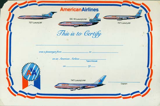
Certificate for American Airlines

Most of Joe’s customers were small clients, too small to have their own art department. But Simon also did some work for large businesses such as American Airlines. The above is certificate Joe did. Today air travel is so common it is hard to imagine a day not that long ago where a company might give a certificate to a customer for taking a flight.


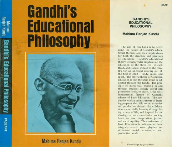
Dust Jacket for Pageant Books (missing back portion)

Joe Simon even did some book cover designs. Pageant Books is still in business today.


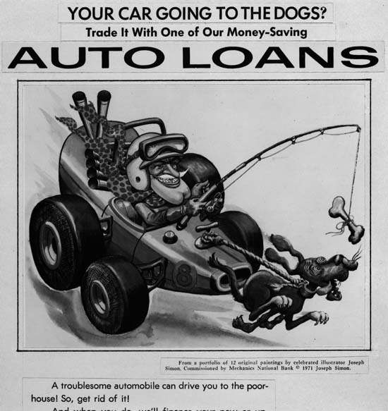
Auto Loan Advertisement for Mechanics National Bank

Sometimes Joe would provide the art as well. In the early ’70s Joe did a number of illustrations for Mechanics National Bank. The Internet provides information about Mechanics National Bank but this all seems about a particular bank building in Philadelphia. I believe Joe’s art was for banks in New Jersey. These are among his best work but are unknown to comic book fans. Joe still has the original art but unfortunately I have not scanned any of it yet. Instead I will use some copies Joe made of some of the ad layouts. The original art is all nicely colored but these particular layouts were done in black and white.


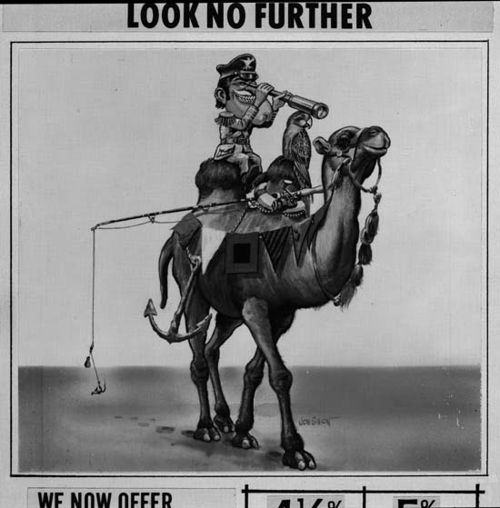
Advertisement for Mechanics National Bank

The Mechanics National art all uses the same character. Occasionally Joe refers to him as Forester Bill, but most commonly as Hector Protector. The name comes from a nursery rhyme:

Hector Protector was dressed all in green;
Hector Protector was sent to the Queen.
The Queen did not like him,
Nor more did the King;
So Hector Protector was sent back again.

The humor found in these Hector Protector pieces is obviously related to that found in Sick. There is, however, a greater emphasis on the odd juxtaposition of imagery; here a ship caption with his anchor, fishing rod and parrot atop of a camel in the desert.

The Wide Angle Scream, What Was Old Is New Again

Sometime after the demise of Mainline, Simon and Kirby’s attempt at becoming publishers, Joe and Jack’s partnership broke up. Jack returned to being a freelance artist but whenever Joe had some comic to produce Jack would always give a hand, at least for the initial issues. In 1959 Archie Comics asked Joe Simon to produce a couple of superhero comic titles for them. For one of the new titles Joe decided to resurrect an old proposal. Years before Simon along with the artist C. C. Beck and the writer Jack Oleck had created Silver Spider. Oleck wrote some scripts and Beck drew the origin story and it was proposed to Harvey Comics but was then rejected. Joe retrieved the original art and at least one script (which he still has) from Harvey but decided, probably because of the previous rejection, the hero should be changed from the Silver Spider into the Fly. Simon asked his former partner, Jack Kirby, to draw the art for the first issue using the C. C. Beck art as the basis for the origin story. (What happened to the C. C. Beck art is a tale that I will not repeat here, suffice it to say that through no fault of Jack’s the Beck art was never returned to Joe. All Simon has now are large photocopies of the original art. You can see some images of the Silver Spider in Chapter 10 of The End of Simon and Kirby) Kirby was also apt to turn to old ideas and so he based the Fly’s costume on an unused Simon and Kirby creation, the Night Fighter. (It is not pertinent to the theme of this post, but this was not the end of the recycling of the Silver Spider as years later it played a part in the creation of Marvel’s Spider-Man.)


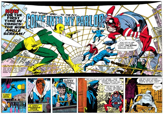
Adventures of the Fly #1 (August 1959) “Come Into My Parlor”, art by Jack Kirby
Enlarged view

The centerfold of the first issue of The Adventures of the Fly featured a double page splash with the declaration:

NOW FOR THE FIRST TIME IN COMICS: THE WIDE ANGLE SCREAM

This is of course where I have derived the name for this serial post about the Simon and Kirby wide splashes. Since Joe and Jack have been using double page spreads since Captain America #6 (September 1941), this issue of the Fly was hardly the first time for the use of this dramatic opening for a story. But in 1959 comic book readers were young and unlikely to know about the earlier comics.

The Fly splash pages are divided into two sections, the splash proper and the start of the story. At the top and bottom of the splash are two parabolic shaped borders making the image wider at the sides then in the center. The background buildings on the two sides of the splash tilt in different directions. All of this was to give the feeling of a wide angle presentation. But this was all just suggestive as a true wide angle lens would not distort the scene in these manners.

The two adversaries face off from opposites sides of the splash. The Fly seems quite at home on the Spider Spry’s web while it is the criminal cohorts of the Spider that seem to be most encumbered. The scale of the figures makes no literal sense. No realistic perspective would cause the rest of the criminals to be so much smaller then either the Fly or the Spider. The size difference is not due to any problem Kirby had with rendering perspective; he was the master of the illusion of space. Rather Jack has reverted to a pre-Renaissance technique, actually common to a great number of art cultures, were size indicates importance.

Not Jack’s best splash but still superior then most artists of the day could have produced. Some have said this was inked by Kirby but I cannot see Jack’s hand in any of the inking of these Archie comics. I doubt Joe Simon did the inking on the splash either.

Adventures of the Fly #1
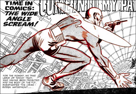
Overlay of the figure of the Fly from the cover (red) and the splash (black)

The cover for the first issue of the Fly is basically the same scene as this splash with the composition altered for the vertically oriented space. As I have shown previously, the cover is based on the splash and not the other way around. (See The Fly, A Case Study of Swiping, for further details.) First a stat was made of the splash and then cutup and reorganized for the cover. Then someone, most likely Simon, touched up some of the inking. It was all well done because cover is every bit as good a designed as the splash.

Joe Simon, Art Director

I have previously discussed Joe Simon’s work as an art director for Timely’s detective magazines. In this post I will therefore be going over familiar ground, but I cannot resist including in my blog some further example that Tom Morehouse has kindly provided. While in my previous post I was largely about the art, this one will chiefly be concerned with layouts that do not use art.


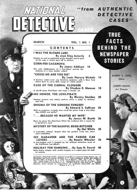
National Detective Cases vol. 1 no. 1 (March 1941)

Joe Simon (since he is listed as the art director, I attribute the layouts to Joe) surrounds the table of contents with a collage. Note how some of the figures encroach across the content’s border. This is of course the converse of having figures extend beyond the panel boarder that Simon and Kirby made such effective use in Captain America at this time. I have seen something similar in the table of contents in a later competitor detective magazines; one wonders whether it already was a common technique in such magazines when this issue of National Detective Cases came out or whether Joe introduced this device and others followed? In any case I particularly like the way the policeman on the left seems to be peering around the content edge.


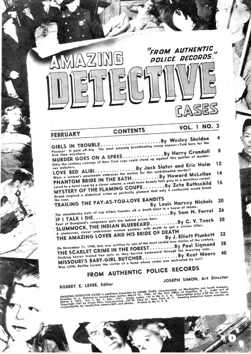
Amazing Detective Cases vol. 1 no. 3 (February 1941)

Above is another content page with a collage background. Nothing crosses the edges of the content proper but Joe gives it all a very 3-D effect by placing the contents at an angle and providing a trompe l’oeil curled top edge.


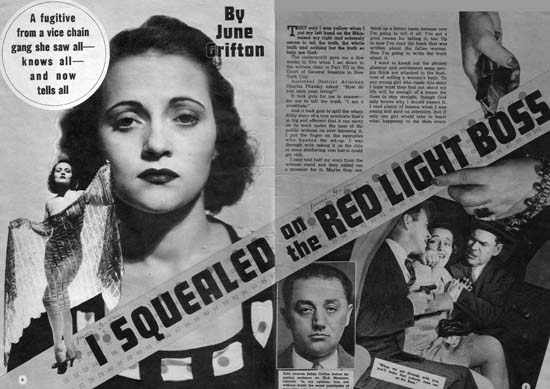
Complete Detective Cases vol. 3 no. 1 (January 1941) “I Squealed on the Red Light Boss”

But it is the opening pages of the stories that Simon provides his most interesting efforts. Pages like those in the image above can obviously be compared to the double page splashes that Simon and Kirby would in a few months do in Captain America (#6, #7, #8, #9 or #10). In some ways there are valid correspondences between the Timely detective layouts and the Captain America double page spreads. Both have designs that include a number of elements in innovative manners. For instance, both share the use of design elements such as circular fields. However the similarity between the magazine and comic spreads is not complete. The magazine layout uses some design techniques that I do not believe were ever used by Simon and Kirby in their comic book work. One of these, the placing of the start of the text at the top and almost in the center, can be explained. The equivalent in a wide splash would be putting the initial story panels in a similar location but that would not be good design because it would result in a confusing layout. This problem does not exist in the magazine layout because by its nature the text is easily distinguishable from the imagery of the rest of the layout. Another design feature for the magazine that I do not believe S&K every used in comics is the diagonally position title. In this case there was no reason why this design technique could not have been incorporated into comic books but I cannot remember any comics where Joe and Jack every used it.


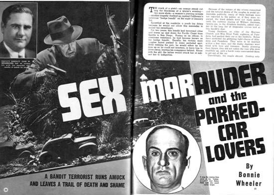
National Detective Cases vol. 1 no. 1 (March 1941) “Sex Marauder and the Parked-Car Lovers”

Above is another layout with a layout with emphasis on the diagonal and the text starting at the top of the second page.


Amazing Detective Cases vol. 1 no. 3 (February 1941)

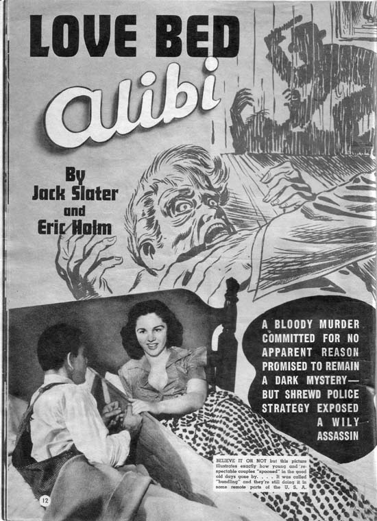
Of course layouts did sometimes include art so I will close this post with one of Jack Kirby’s best efforts for the Timely detective magazines. In “The Amazing World of Carmine Infantino” Carmine describes Kirby’s advice on how to draw a man hitting a woman:

No, try it like this: Do the scene but don’t show the people; just put the shadow on the wall. Let the reader’s imagination fill in the details.

“Love Bed Alibi” shows Jack using a shadow for somewhat different reasons. It is not so much an attempt to mitigate a violent scene as to force the viewer to go to the background shadows in order to make sense of the foreground action. It is as good a crime drawing as any Jack would do years later for Headline or Justice Traps the Guilty. The only detrimental aspect is the photo of the “bundling” bed placed on the bottom of the layout. While it is an interesting digression a more appropriate photograph should have been used.