Category Archives: Artists

The Wide Angle Scream, The Pinup

Towards the end of 1950 Simon and Kirby had some hit titles all published by Prize. For the crime genre there were Headline and Justice Traps the Guilty. Having two titles in the same genre is always a sign of a success. More important would be the Young Romance and Young Love titles for the romance genre that Joe and Jack started. However Simon and Kirby were not ones to just sit back and milk past achievements, they were always trying to produce new titles. October of 1950 would see the release of two new S&K productions. For Prize again they would release their first in the horror genre, Black Magic. That title would run for about five years and would be joined in 1952 by Strange World of Your Dreams, again an indication of success. Simon and Kirby would also release in October Boys’ Ranch, only it would be published by Harvey Comics. Boys’ Ranch is considered by many fans as one of Simon and Kirby’s greatest creations. Unfortunately it was not so well received at the time and the title only lasted six issues.

Boys’ Ranch may not have been as big a success as Joe and Jack had hoped, but it was not for lack of trying. S&K used in Boys’ Ranch some things that they had never tried before, among which were pinups. I am not sure where the idea for the pinups came but Simon and Kirby put it to good use. Each issue of Boys’ Ranch contained both introductory and centerfold pinups. Pinups are unlike splash pages since without any attachment to a story a pinup can be a self sufficient entity. In this respect they are much more like cover art except the image need not be crowded by a prominent title. As stand-alone pieces of art, The Boys’ Ranch pinups represent some of the finest work that Simon and Kirby did. With the expanse that the double page provides, the centerfold pinups are particularly effective.

Boys� Ranch #1
Boys’ Ranch #1 (October 1950) “Boys’ Ranch”, art by Jack Kirby
Larger image

The centerfold for the first issue introduces the cast and the locale. We find Tommy learning how to lasso cattle while Wabash loafs with his guitar. Angel threatens to use his marksmanship to get Wabash moving. Three sides of the image are framed with rough timber with the title hanging from the top post. The complete circumference is edged with cattle skulls, pistols and other western paraphernalia reminiscent of the bottom edge of the wide splash from Captain America #8 (November 1941). This emphasis on design, unusual in the Boys’ Ranch splashes, does not save this particular centerfold. The more distant view used is not Jack Kirby’s forte for he generally does better when he thrusts his cast into the foreground. There are lots of assorted details provided, many requiring explanations from captions, but just not enough interest to hold our attention long. This is a rare example, in my opinion, of a Kirby double page piece of art that does not come up to his usual high standards.

Boys� Ranch #2
Boys’ Ranch #2 (December 1950) “Four Massacres”, art by Jack Kirby
Larger image

Another more distant view but this time Kirby makes it more interesting by providing more to look at. It is a crowded image but because this is in a comic book and a reader would tend to view it from left to right there should have been no difficulty in finding the Boys’ Ranch characters on the far left as they enter the town. I will leave it up to my readers to ferret out all the details. This splash is filled with individuals and groups all telling their own little stories, no need for captions to explain it all. Whatever the reasons for the short comings of the wide pinup from Boys’ Ranch #1, Jack is now clearly getting into the control of this new format.

Boys� Ranch #3
Boys’ Ranch #3 (February 1951) “Social Night in Town”, art by Jack Kirby
Larger image

With “Social Night in Town” Jack Kirby is in top form; this is certainly one of his classic drawings. This is Kirby at his best, a slugfest up close and personal. I like to think of this sort of composition as Kirby’s comic book equivalent of Jackson Pollock. There is no true focus to the image as it is an all over drawing with every portion as important as any other. Jack’s mastery of exaggerated perspective allows him to make this look easy but I honestly cannot think of another comic artist who could come close to providing such an exciting fight scene. Kirby has done this sort of thing before in for example “The Villain from Valhalla” in Adventure Comics #75 (June 1942), but the wide format allows a treatment just not possible on a single page. It would sound much too dry to describe all the details but I cannot help point out Wabash clinging in relative safety high on the near center post enjoying watching all the proceedings. Relative is the operative word because note the knife sticking in the post below him and the chair flying high on the right. The theme of cowboy’s letting off steam in a bar fight may not have been a cliche in 1950 but it soon would be. Comic books could do it in a way that television or movies simple could not match no matter how hard they tried. Not that their directors would likely have noticed Kirby’s work in 1950, but they should have.

As wonderful as “Social Night in Town” is, the best was yet to come. Unfortunately that will have to be covered in the next chapter.

The Art of Romance, Chapter 3, The Field No Longer Their’s Alone

(Young Romance #5 – #8)

In this chapter I will be writing about the next four issues of Young Romance (#5 to #8). For the most part this set is a continuation of the earlier issues. The main artists were same; Jack Kirby, Bill Draut and the team of Jerry Robinson and Mort Meskin. A couple of minor artists that appeared in issues #1 and #2 do not reappear, but a new one would have a contribution which I will discuss in more detail below. Young Romance is still on a bimonthly schedule. This is surprising because by now S&K and Prize were surely aware that they had a hit. When the crime genre Headline (starting with issue #23, March 1947) was a success Simon and Kirby launched Justice Traps the Guilty for Prize seven months later. Yet after over a year they neither made Young Romance a monthly nor created another title. Other publishers had not failed to notice; based on “All the Romance Comics Ever Published (?)” romance titles began to appear published by Fox (My Life #4, September 1948), Timely (My Romance #1, September), and Fawcett (Sweethearts #68, October). Perhaps Prize along with Simon and Kirby were surprised at their own success and fearful that it was just a fad.

Young Romance #8
Young Romance #8 (November 1948) “Love or Pity”, art by Jack Kirby

Jack Kirby continued to be the most prominent artist for Young Romance. Kirby did nine out of the twenty stories in these four issues, or 97 out of 177 pages. It may have been even more since as I will discuss below a tenth story may also have been penciled by Jack. Kirby would continue to create the first story in the comic. This lead story would remain the longest story in the comic with thirteen or fourteen pages while other stories would have at most nine pages. The design of the lead story splash page would continue to have a character’s speech balloon used as the title caption. I particularly like the splash for “Love or Pity”. The design is done quite well with a close-up of a couple dominating the page and another section enacting a little scene like some sort of tableau. We have seen this emphasis in design for some of Simon and Kirby’s double page splashes, but it is also to be found in a number of the smaller splashes drawn by Kirby in Young Romance. In the depiction of the large couple we only get to see the face of the woman, the man’s face and his emotions remain a mystery. The woman arches her left eyebrow, looks askance and her hand’s placement on the man’s shoulder seems tentative. All this makes her appear apprehensive and her attempt to dispel her concerns by moving closer into the man’s embrace seems to have failed. From the title caption we learn why, she is uncertain about the man’s true feelings. Many have described Kirby’s woman as not being truly beautiful but it is a criticism I do not share. I find the woman in this splash attractive enough and, more importantly, very human. While some other artists might have been able to make the woman appear even more beautiful I do not know any that are able to invest them with the same sensitivity that Kirby has. Jack does not draw Barbie dolls but rather woman whose appearance reflects their personality and emotions. I find that makes Kirby’s woman truly beautiful indeed.

The second section of the splash depicts a crowd looking disapprovingly on as the woman runs away in shame. Jack has chosen a low viewing angle so that the woman towers over the background crowd giving drama to the scene. The woman’s pose is rather unusual; she looks more like she is tripping and about to fall. Not an inappropriate metaphor for her descent into scandal. The second section is well done but its impact suffers from its diminished size. Envision this section enlarged and expanded toward the right and you can imagine what a double page romance splash might have looked like had Simon and Kirby ever done one. It is too bad they never did.

Young Romance #6
Young Romance #6 (July 1948) “Disgrace”, art by Jack Kirby

One change that seemed to have taken place from the earlier issues of Young Romance was that action no longer appeared quite as commonly in Jack Kirby’s romance stories. Not that action disappeared completely, it would always show up in more Kirby romance stories then it does in those by any of the other studio artists. “Disgrace” is a case in point. If I had to pick one Kirby romance story most likely to satisfy the general Kirby readership, this would be the one. The heroine feels trapped in a coal mining town which she detests for the violence its inhabitants so frequently adopt. Her brother has managed to escape the town but she is dismayed at his career as a prize fighter and his particularly brutal nature. She falls in love with a man only to discover that he also is a professional boxer. She cannot accept more violence in her life so she breaks it off. Later she finds to her horror that her brother and former love are scheduled to meet in the arena. Where does her loyalty lie, with her violent brother or the man she still loves? Jack Kirby is justly famous for his depiction of a punch and the fight in this story is a pure slugfest.

Young Romance #8
Young Romance #8 (November 1948) “Love Can Strike So Suddenly”, art by Jack Kirby

Kirby may have tuned down his use of action but he still looked for means to keep his stories exciting. One of his techniques was to make use of the exotic location of some of the stories. Had the splash of “Love Can Strike So Suddenly” depicted a normal local it would have seemed quite banal. All the main characters are just standing around. Even the dialog is not nearly dramatic enough to rescue this page. However by inserting his cast into a street in India, Jack has made this one of his memorable splashes. I am sure Kirby has swiped this from some source, perhaps National Geographic, but I am also certain that he has made his version far more interesting then the original. I have recently discussed this story; it is the source for a swipe used years later in Simon and Kirby’s own romance comic In Love.

Young Romance #7
Young Romance #7 (September 1948) “Mother Said No” page 4, art by Jack Kirby and Carmine Infantino?

The Jack Kirby Checklist does not include “Mother Said No” among its listings of Kirby’s work. It is easy to understand why, the man in the first panel of the page imaged above does not look he was drawn by Jack. Or does he? Kirby often drew his men with wild eyebrows but these look excessive even for Jack. But how much of these exaggerated eyebrows were in the original drawing and how much were due to the inker’s interpretation of the pencils? The layouts throughout the story look like they were done by Jack. It is hard to be sure, but once the eyebrows are ignored a lot to the drawing looks like Kirby to me.

Charlie Chan #1
Charlie Chan #1 (June 1948) “The Hit and Run Murder Case” page 9, art by Carmine Infantino

Nearly identical men’s eyebrows seen in “Mother Said No” can also be found in work that Carmine Infantino did in Charlie Chan. Compare the man in the third panel of page nine of “The Hit and Run Murder Case” shown above to the one in the first panel of the page I previously presented from “Mother Said No”. Further examples of Infantino’s work for the Simon and Kirby studio can be found in an earlier post. While the details of the eyebrows seem to match in the two stories, the proportions used in drawing the faces do not. Nor are Carmine’s layouts in Charlie Chan similar to those found in “Mother Said No”. The inking for “Mother Said No” was done in the studio style which would normally suggest Jack or Joe’s involvement. However Carmine used the studio style inking in some parts of Charlie Chan, particularly the splashes. I really need to do a more thorough comparison, but some of the spotting in “Mother Said No” does not look like it was done by either Jack or Joe. My initial conclusion is that in “Mother Said No” Carmine was inking Jack’s pencils. If that is true what is not clear is whether Kirby’s pencils were not very tight, or if instead they were overwhelmed by Carmine’s inking. In either case I am presently inclined to consider this a joint piece with Jack as the primary artist.

There is a serious problem with the analysis that I presented above because of an interview of Carmine Infantino from The Jack Kirby Collector #34. In that interview Carmine clearly said that Charlie Chan was the only work he did for Simon and Kirby, and later added that he never inked Jack’s pencils. I really want to do a more careful analysis before I am ready to contest Infantino’s statements so for now I consider my conclusions as preliminary. Hopefully a re-examination of this issue will be the subject of another post in not too distant future.

Young Romance #6
Young Romance #6 (July 1948) “Gossip”, art by Bill Draut

Kirby did not draw all the stories in YR #5 to #8; Bill Draut remained a significant contributor with seven stories out of twenty, or 52 pages out of 177. Bill’s art started to change. Gone were the splashes with an emphasis on design, I do not believe it would reappear in Draut’s work until 1954 for In Love. I suspect Joe Simon had a hand in laying out some of the earlier Draut splashes for Young Romance, but from this point on Draut would do it himself. The other change would be the appearance of more and more traits that would be typical of Draut. Note the brickwork for the fireplace in the “Gossip” splash. This is a Draut trademark that will reappear from time to time through his association with the Simon and Kirby studio. Another Draut trademark, which actually showed up before, is the brunette’s pose. Draut portrays a person’s anger by leaning the torso and thrusting the head forward, and sometimes having the person clench their fists. This is a pose not quite like any that I have seen Kirby use and it is one of the reasons that I do not believe Jack was providing layouts for Bill as some authorities have claimed.

Young Romance #5
Young Romance #5 (May 1948) “Jealousy”, art by Jerry Robinson and Mort Meskin

The final two contributors to Young Romance #5 to #8 was the team of Jerry Robinson and Mort Meskin. I attribute three stories from issues #5 and #6 to Robinson and Meskin, one of which (“The Inferior Male”) was signed. The Jack Kirby Checklist credits the splash page of “Jealousy” to Jack Kirby as inked by Joe Simon. The expressive formality of the foreground couple is not typical of Kirby. Nor are the long and simple eyebrows usually found in Simon’s inking. The only thing that suggests Kirby/Simon to me is some of the Studio style inking such as the abstract arch at the top of the wall and the picket fence crosshatching on the lower part of the woman’s dress (see inking glossary). However the “Jealousy” splash presents cloth folds created by long, narrow sweeping brush strokes, this is exactly the inking technique used by Mort Meskin. Also note the man has a type of grin that is so typical for Mort. The eyebrows found in “Jealousy” may also be found in the Robinson and Meskin work found in these early issues of Young Romance. The unusual formal pose of the couple would not be surprising for Robinson and Meskin. The only problem with a Robinson and Meskin attribution for the “Jealousy” splash is the Studio style inking which is not found in other R&M art. I think the best explanation for this discrepancy is that either Simon or Kirby in their roll as art editor stepped in to touch up the splash. I feel the splash matches the art in the rest of the story and it all should be attributed to Jerry Robinson and Mort Meskin.

July marked the last month that Robinson and Meskin art would appear in Simon and Kirby productions. Mort Meskin would return by himself over a year later, after which he would be a frequent contributor until the end of the studio. This is all very hard to reconcile with Carmine Infantino’s TJKC #34 interview where he says that he accepted the Charlie Chan job for the experience he would get by working with Kirby and Meskin. Carmine even describes Mort as working right next to Jack. Carmine’s stay was from June 1948 until February 1949 (cover dates). This does overlap Robinson and Meskin’s period (January to July 1948) but is well before Meskin’s solo return in December of 1949. I just do not find it creditable that Mort was working in the studio at a time when he and Robinson were probably producing more work for other publishers then for S&K. Would Mort and Jerry have been working separately? Would the small amount of work for S&K justify Mort’s presence in the studio? I am afraid I have to conclude that Carmine’s memory has failed him; perhaps he has mixed up the time of his presence in the studio with that of his brother Jimmy who did work for S&K at the same time as Meskin.

Chapter 1, A New Genre (YR #1 – #4)
Chapter 2, Early Artists (YR #1 – #4)
Chapter 3, The Field No Longer Their’s Alone (YR #5 – #8)
Chapter 4, An Explosion of Romance (YR #9 – #12, YL #1 – #4)
Chapter 5, New Talent (YR #9 – 12, YL #1 – #4)
Chapter 6, Love on the Range (RWR #1 – #7, WL #1 – #6)
Chapter 7, More Love on the Range (RWR #1 – #7, WL #1 – #6)
Chapter 8, Kirby on the Range? (RWR #1 – #7, WL #1 – #6)
Chapter 9, More Romance (YR #13 – #16, YL #5 – #6)
Chapter 10, The Peak of the Love Glut (YR #17 – #20, YL #7 – #8)
Chapter 11, After the Glut (YR #21 – #23, YL #9 – #10)
Chapter 12, A Smaller Studio (YR #24 – #26, YL #12 – #14)
Chapter 13, Romance Bottoms Out (YR #27 – #29, YL #15 – #17)
Chapter 14, The Third Suspect (YR #30 – #32, YL #18 – #20)
Chapter 15, The Action of Romance (YR #33 – #35, YL #21 – #23)
Chapter 16, Someone Old and Someone New (YR #36 – #38, YL #24 – #26)
Chapter 17, The Assistant (YR #39 – #41, YL #27 – #29)
Chapter 18, Meskin Takes Over (YR #42 – #44, YL #30 – #32)
Chapter 19, More Artists (YR #45 – #47, YL #33 – #35)
Chapter 20, Romance Still Matters (YR #48 – #50, YL #36 – #38, YB #1)
Chapter 21, Roussos Messes Up (YR #51 – #53, YL #39 – #41, YB #2 – 3)
Chapter 22, He’s the Man (YR #54 – #56, YL #42 – #44, YB #4)
Chapter 23, New Ways of Doing Things (YR #57 – #59, YL #45 – #47, YB #5 – #6)
Chapter 24, A New Artist (YR #60 – #62, YL #48 – #50, YB #7 – #8)
Chapter 25, More New Faces (YR #63 – #65, YLe #51 – #53, YB #9 – #11)
Chapter 26, Goodbye Jack (YR #66 – #68, YL #54 – #56, YB #12 – #14)
Chapter 27, The Return of Mort (YR #69 – #71, YL #57 – #59, YB #15 – #17)
Chapter 28, A Glut of Artists (YR #72 – #74, YL #60 – #62, YB #18 & #19, IL #1 & #2)
Chapter 29, Trouble Begins (YR #75 – #77, YL #63 – #65, YB #20 – #22, IL #3 – #5)
Chapter 30, Transition (YR #78 – #80, YL #66 – #68, YBs #23 – #25, IL #6, ILY #7)
Chapter 30, Appendix (YB #23)
Chapter 31, Kirby, Kirby and More Kirby (YR #81 – #82, YL #69 – #70, YB #26 – #27)
Chapter 32, The Kirby Beat Goes On (YR #83 – #84, YL #71 – #72, YB #28 – #29)
Chapter 33, End of an Era (YR #85 – #87, YL #73, YB #30, AFL #1)
Chapter 34, A New Prize Title (YR #88 – #91, AFL #2 – #5, PL #1 – #2)
Chapter 35, Settling In ( YR #92 – #94, AFL #6 – #8, PL #3 – #5)
Appendix, J.O. Is Joe Orlando
Chapter 36, More Kirby (YR #95 – #97, AFL #9 – #11, PL #6 – #8)
Chapter 37, Some Surprises (YR #98 – #100, AFL #12 – #14, PL #9 – #11)
Chapter 38, All Things Must End (YR #101 – #103, AFL #15 – #17, PL #12 – #14)

The Wide Angle Scream, It’s a Crime

With the early demise of the Stuntman and Boy Explorer titles, Simon and Kirby’s next important project would be crime anthologies. Perhaps mindful that during the comic book glut it was previously existing titles that made it into the newsstand racks, Prize Comic’s Headline would be converted into a crime genre comic with issue #23 (March 1947). All the art for Headline issues #23 and #24 would be penciled by Jack Kirby, a feat that would not be repeated again until late in 1955. Most likely Simon and Kirby followed the same procedure that Joe reported as being used when launching romance comics; that is preparing the initial issues ahead of time before striking a deal with a publisher. The other thing unique about these first two crime issues of Headline was they both included double page splashes.

Headline #23
Headline #23 (March 1947) “Burned at the Stake”, art by Jack Kirby
Larger Image

Although the last published double page splashes by Simon and Kirby were designed with two or more sections, we previously saw that enactment section had taken over in three unpublished Stuntman wide splashes. This approach was continued here in “Burned at the Stake”. There is a heading across the top, the story title, an introductory caption and a round panel portrait, but these sections are all subservient to the enactment. We find four armored and armed soldiers approaching a single individual at the top of some stairs. This composition is not just happenstance. Like other Western languages, English is read from left to right and readers have become accustomed to viewing even illustrations in this direction. Placing something higher on the page also provides it with prominence. Thus in this case the eye follows the advancing soldiers from down on the left, upwards and toward the right, until it reaches the main character of the story, Guy Fawkes. Essentially the same composition was found in the enactment section for “The Rescue of Robin Hood“.  Only in this case the center of attention was not a hero as Stuntman was. Did the man mean to set off the explosives and if so would the soldiers be in time to prevent him? The double page splash was not meant to answer those questions. Quite the contrary, leaving them unanswered would hopefully entice the viewer to buy the comic book.

Headline #24
Headline #24 (May 1947) “A Phantom Pulls the Trigger”, art by Jack Kirby
Larger Image

“A Phantom Pulls the Trigger” might mistakenly be considered to be composed contrary to the normal left to right reading. It is true that the primary focus would seem to be the hooded figure on the left, the opposite of the expected location. In this case however the viewer’s progress from left to right is meant to indicate the progress of time, from the action of the firing of the pistol on the left to the affect of the killing of the people on the right. Kirby has countered the diminishing affect of placing the most important figure on the left by increasing his visual size. It is unclear whether the hooded figure is truly meant to be larger then his victims or if he is just closer to the viewer.

A section devoted to the start of the story makes a come back after last being used for the double page splash in Captain America #10 (January 1942). That this strip of panels is not an afterthought can be clearly seen by the way the hooded figure props his feet up on story panels and how the victims are firmly standing or lying upon it.

Simon and Kirby would discontinue using double page splashes in their crime genre comics. In my opinion this was not because crime did not lend itself to exciting wide splashes. I find the double page splashes from Headline #23 and #24 to be very effective and Kirby would pencil a number of single page splashes that could have benefited from a wider format. The problem I believe was due to an inherent weakness in use of the double page splash. For proper printing a wide splash must be placed as the centerfold page. With such a location the splash might be overlooked by a potential customer and thus loose its importance for inducing the purchase of the comic. But that was nothing new; it was a problem from when it was first introduced. What may have been more important was how the double page splashed affected the organization of the comic. Having a wide splash meant that a story had to start at on a particular page in the middle of the comic. This also placed restrictions on the page length for preceding stories as well. Organization of a comic book was simply easier without the wide splash. Now that Simon and Kirby was busy producing Headline and would soon be starting Young Romance, the double page splash may have been considered more trouble then it was worth. It would be a number of years before S&K would return to the wide splash, which is a shame because they did it better then anyone else. However in a few years Joe and Jack would put the centerfold to another good use. But that is a story for the next chapter.

A Timely Bonus

I am providing some comic scans for an ongoing project. I am not a liberty to discuss this venture at this time but I believe my readers will find it of interest. Although I cannot elaborate on the project I can see no harm in presenting here some of the scans. After all, my readership is very, very small while this project’s audience should be gratifyingly large. Besides which my contribution is a very minor one. The Simon and Kirby connection of the images I provide below may be tenuous (they were done well after S&K departed Timely) but they provide an interesting comparison to what I have been writing about in my recently resurrected serial post “The Wide Angle Scream“.

Captain America #16
Captain America #16 (July 1942) “The Red Skull’s Deadly Revenge”, art by Al Avison
Larger Image

While the double page splashed would continue to appear at times in Captain America after Simon and Kirby left Timely, there was no longer any emphasis on design. What I refer to as the enactment dominated the splashes while items such as the title and introduction caption were relegated to minor, often intrusive, rolls. This is especially true with “The Red Skull’s Deadly Revenge” where the title takes up so little of the splash that it can almost be missed. Nobody did Captain America as well as Kirby could, but then again Jack was in a league all by himself. The second best depicter of Captain America during the golden age of comics was without doubt Al Avison. Unarmed except for his shield, Cap confronts a host of suitably ugly and beastly adversaries. With Captain America and Bucky faced with guns, knives, a flaming arrow and even a hangman’s noose, you can tell an epic adventure will follow. It would be expected that the visually larger figures would dominate a scene. While the Red Skull and his minions appear before a muted background, Cap and Bucky are literally placed within a spotlight. The pale yellow background gives the red, white and blue of our heroes’ costumes maximum contrast and thus counters the effect of the Red Skull’s larger size. Avison also makes use of our propensity to examine even visual images from left to right. While all of their foes emphasize the right to left eye movement, Cap and Bucky face the opposite direction and our eyes are no longer directed to move further off the page. Jack Kirby showed a similar understanding in some of his wide splashes for Stuntman. That however was later, in his Captain America work Jack did not make as much use of the right to left reading that we see Avison do so often. This was not always the case for Al, his early cover work for Harvey at times showed a right to left direction (Speed #14 and Speed #16). I am not sure where Avison picked up the technique of the use of a left to right direction, but it shows that he was more then just a Kirby-want-a-be.

I really have not studied Timely artists very much. I wonder if it is even possible for someone today to become a Timely expert. The high cost of the comics would seem to prohibit accumulating enough material to properly study the art. Hopefully that will change if Marvel continues to reprint their golden age comics. Having said that I find in “The Red Skull’s Deadly Revenge” story enough traits also encountered in Avison’s previous and future work for Harvey to convince me that he also had a hand in inking this story as well.

Captain America #34
Captain America #34 (January 1944) “Invasion Mission”, art by Syd Shores
Larger Image

As I wrote above, I am not a Timely scholar, but the splash for “Invasion Mission” looks like the work of Syd Shores, probably the third best artist of the golden age Captain America. Comparisons of this splash to the one with a similar theme by Avison, “On to Berlin” leaves little question that Al was the better artist. Still Syd does a valiant job and it is another classic clash between Captain America and our country’s Nazi foes. It makes you wonder why Cap stories of such battles were not done more often during the war. I have not seen enough of Shore’s art to determine whether the left to right movement he gives to Cap and Bucky is purposeful or just happenstance. However Shores did make some poor decisions. Having an explosion near Captain America and Bucky might seem a good way to add excitement; unfortunately its real effect is to visually obscure the two heroes. We can blame the colorist, not Syd, for the biggest failure of the splash; giving the German soldier on the right a yellow suit makes him the most prominent figure of the entire double page.

Recently Marvel Comics has Bucky, known as the Winter Soldier, replace the now dead Steve Rogers as Captain America. He has an ugly new costume and more controversially carries a pistol. Some have defended the use of a gun by the new Captain America by pointing out that Bucky uses a weapon on the some covers for the original Captain America Comics. Bucky’s often use of a gun on the covers does not seem to be carried over into the interior stories, at least for those that I have seen. The splash for “Invasion Mission” is the only example I am aware of. In the actually story Bucky carries a rifle two times, but for both occasions he uses it as a club! Before we conclude that killing was abhorrent for the original Captain America it should be noted that toward the end of the story Cap and Bucky capture a German big gun and turn it against the Nazi forces. While close-ups are not provided, who can doubt the deadly effect this was meant to produce?

The Wide Angle Scream, American Royalty

I have decided to resurrect this old serial post. I originally started it when I had then begun to restore S&K’s double page splashes. I wanted the restoration to be on the same level that I do for covers. However that required an awful lot of effort since these splashes have twice the area of the covers and the printing quality is much inferior. Eventually the amount of work proved too excessive and other restoration projects became more important. I feel that the subject matter of the serial post is too important and should not be completely abandoned. So I return to the subject although in the future the quality of the restorations will not be quite so high. Since it has now been over a year since my last chapter, I thought I should provide a very broad summary of the previous posts.

Simon and Kirby’s use of a double page splash began with Captain America #6 (September 1941). The five Cap double page splashes had a strong emphasis on design (#6#7#8#9, and #10). The splashes would consist of three sections. One section common to all was what I called the enactment; it is a scene or tableau but is not part of the actual story. The second section is also common to all Captain America wide splashes; it consists of panels for the true start of the story. Although the third section is present in all of these splashes what it comprises of is not consistent, it can be a cast of characters, floating heads or a sort of comic book equivalent of movie trailers.

During the period that Simon and Kirby worked for DC they only produced one double page splash, that was for Boy Commandos #2 (Spring 1943). Here once again the splash was made in three sections. The enactment is present but it consists of a larger number of individuals then ever attempted in Captain America. Some organization is achieved by deploying them around the glass case containing a sleeping beauty, but even so there is so much chaos that it takes some time to sort out all that is taking place. There is also a cast of character sections. Unlike the Cap wide splashes there is no start of the story; instead the third section is given over to a large introductory text.

After returning from the war, Simon and Kirby launched Stuntman and Boy Explorers that were published by Harvey Comics. A wide splash was used with Stuntman. Only two were published but Jack had made worked on three others. The first one (Stuntman #1, April 1946, “The House of Madness”) used an unusual design, effectively two enactments laid out as large panels separated by a sweeping gutter. The second (Stuntman #2, June 1946, “The Rescue of Robin Hood”) reverted to a more standard tri-part design with sections for the title, enactment and cast of characters. Although the exposition is pretty much isolated from the rest of the splash, the title and cast of characters are nicely integrated. I also posted on one of the unpublished wide splash ( “Terror Island”). For the first time Kirby provides just one section, an enactment. There is a title, an introduction and even a floating head of the Panda, but these are subservient to the large enactment and do not achieve the status of their own section.

Because of copyright issues I do not consider it appropriate to reproduce the other two double wide Stuntman splashes. They can be found in Joe Simon’s book “The Comic Book Makers”. Both are further variations of a single large enactment section found in “Terror Island”. In one (“Jungle Lord”) Jack presents a smaller cast as compared to that for “Terror Island”. The enactment takes place in the tree tops where we find Stuntman battling a gorilla in the foreground while in the back Don Daring clings to a tree and a jungle boy makes off with Sandra Sylvan. Since the cast is smaller in the “Jungle Lord” splash as compared to “Terror Island” the action can be brought closer to the reader with dramatic results. The inking of the final wide splash (“The Evil Sons of M. LeBlanc”) was never completed, so it clearly was the last one worked on. This is another single section with Stuntman confronting three opponents. I find that the plain room in “The Evil Sons of M. LeBlanc” as compared to all the foliage of “Jungle Lord” brings greater focus and excitement to the depiction.

The Stuntman period is interesting because it marked the only time during his collaboration with Kirby that Simon did a significant stint at drawing. Early in his association with Jack, the two would draw different pages from the same story. Initially this seemed to be the working method for Captain America but quickly Jack took over all the drawing choirs for the S&K partnership. With the exception of some work done while in the Coast Guard, Joe did not seem to contribute much penciling to what was produced by S&K during the war. But while Kirby was penciling Stuntman and Boy Explorers Joe would pencil three backup features; the Duke of Broadway, the Vagabond Prince and Kid Adonis. Despite what some experts have said, these were drawn entirely by Joe except for a few small parts that Jack altered in his role as an art editor. Joe has said that Harvey kept track of the mail and that the Duke of Broadway got a better reader response then Stuntman. This was likely to be during the period after the original titles had been cancelled and Harvey was printing the unused work in comics such as Green Hornet. After the Harvey Stuntman/Boy Explorers period and until the breakup of the Simon and Kirby team, Joe’s penciling contributions would be uncommon (48 Famous Americans for J. C. Penny and “Deadly Doolittle” for Fighting American).

Boy Explorers #1
Boys Explorers #1 (May 1946) “His Highness the Duke of Broadway”, art by Joe Simon
Larger image

Joe only did one double wide splash for his Harvey features (“His Highness the Duke of Broadway” from Boy Explorers #1, May 1946). It is actually surprising that he did any considering the short lives of these titles (due to a comic book glut) and the fact that his stories are all back-up features. Like the one from Stuntman #1 a month before, this double page splash is comprised of two sections. Not that use of the same number of sections makes these two splashes truly similar. While that from Stuntman #1 is unusual in being composed of two enactments, the splash for the Duke feature is made of two familiar sections, an enactment on our left and a cast of characters on the right. The cast of characters consists of both full figures and floating heads accompanied by short captions that provide their names and a short description. At ten in number it was quite an ambitious cast, Joe obviously wanted a lot of supporting characters so as to provide the potential for much variation in his stories (unfortunately there would only be five). In this splash much of the cast are floating in front of the cityscape. Even those that are attached to the ground seem unnaturally placed because of the way they block the small avenue (surprisingly small since it is meant to be either Broadway or 42nd Street). The cityscape itself is carefully drawn so to provide an interesting background but subtlety rendered so that the cast would still stand out.

Such a large number of cast members required the use of half the splash. But this was the cast for the feature, only some of them would show up in this particular story. With such a large assemblage on the right side Joe needed something on the left to balance. His solution was to present most of the cast together solidly placed on the sidewalk. While this was a satisfactory solution as far as the composition was concerned, frankly it is not very exciting. Joe would do much better and more innovating designs for some of the regular splashes for his features. Still this double wide splash shows an emphasis on design that would disappear from the later ones by Kirby for Stuntman.

Stylistically the drawing for the splash differs from what Joe did in the story itself. Click Collins and Legal Louie are exceptions as they seem to better match what was done for the story. It still looks to me that it was penciled by Simon, only it is closer to what Joe had done previously and to what he would again do later in his career. Nothing on the splash refers to what will be found in the story. Everything is very generic, describing the feature as a whole and not this particular story. All this makes me suspect that Joe did the splash some time before as a presentation piece for the pitch he made to Harvey. Joe was not one to let all that effort to create this splash go to waste, so he appended it to the first story.

Al Avison Did Not Need Any Help

In my last post for The Art of Romance I discussed the question of Kirby layouts. I gave some evidence to discount the use of Kirby layouts for some of the artists. However I also gave an example where I do believe Jack did provide layouts for another unidentified artist. As that serial post progresses I hope to show that while Kirby did work up layouts to be used by some of the lesser talents, it was not a practice used with most of the comic artists that worked for S&K. This is the opposite of the conclusion one would draw based on attributions given by comic art dealers. According to the dealers Kirby provided layouts for many artists working at the time. Of those artists purportedly working from Kirby designs, perhaps none is more surprising then Al Avison. I say surprising because Avison was not even working for S&K while he was doing the work for which Kirby had supposedly provided layouts. I would have thought that fact alone would have squelched any consideration of Kirby layouts but it has not.

Captain America #12
Captain America #12 (March 1942) “Rozzo the Rebel”, art by Al Avison

Al Avison was one of the first artists that I discussed when I started this blog almost two years ago. Those posts were about the covers that Avison did for early Harvey comics (Speed #14, Speed #15, Speed #16, and Pocket #3. At the time Al was working with Simon and Kirby in the Timely bullpen. It is apparent that Kirby greatly influenced Avison yet Al’s work was still relatively crude. This changed dramatically and seemingly instantaneously when Simon and Kirby departed Timely to begin working for DC. I can only conclude that only when S&K were no longer an intimidating presence could Avison’s talent blossom forth. Avison became the chief penciller for Captain America and did some really nice stuff. Excluding Simon and Kirby, no other golden age artist did Captain America nearly as well as Avison. Unfortunately it will probably be a number of years before any of this material ever gets reprinted in Marvel Masterworks Golden Age series. However one story drawn by Avison has been reprinted in “Marvel Visionaries: Stan Lee” (“The Red Skull’s Deadly Revenge” from Captain America #16). Both Lee and Avison were on top of their form and this is the best Captain America story that I have ever read (again excluding those by Simon and Kirby). The splash to “Rozzo the Rebel” imaged above is typical of Al’s work on Cap. The nice design shows that Al learned a thing or two from Joe Simon as well. Avison emphasis for action and exaggerated perspective (particularly with Bucky) shows Jack Kirby’s influence. Still at this point in his career his assimilation of Jack’s style is not complete enough to mistakenly suggest Kirby layouts. Al’s style is a bit cartoonier then Jack’s, but I do not say that disparagingly as I am not one who believes that the more realistic comic book art is the better it is. My primary criticism of Avison’s Captain America work is that it tends to be overwrought. This is particularly true for the inking, but that was probably done by someone else, often Sid Shore.

Captain America #19
Captain America #19 (October 1942) “On To Berlin”, pencils by Al Avison, inks by Sid Shores
Larger Image

One of the Simon and Kirby trademarks that was continued by Al Avison during his turn at Captain America was the double page splash. Avison may not have been in Simon and Kirby’s league, but he could still put together exciting splashes. What could be more thrilling then Captain America leading the invasion of Europe. Well perhaps having Captain America not only storming the beach but also rescuing an allied prisoner from torture as well. When this comic was created the invasion was almost as much a fantasy as Captain America himself. Not only had the American armed forces not yet really entered the European conflict, we had suffered some serious defeats in the Pacific theater. Even so “On To Berlin” certainly captured the American spirit at that time of crisis. I have not made a careful examination of these golden age comics, but it seems to me that Avison was the primary penciller for Captain America for 1942 after which he is replaced by Syd Shores. This is not supported by the GCD which shows Avison working throughout the war years. Frankly my policy concerning the GCD is trust but verify. Since I am not able to verify some of these attributions at this time, I am not inclined to trust them. Atlas Tales shows Avison last work on Cap has a cover date January 1943. In the past I have found Atlas Tales a more reliable source and in this case they seem to be in agreement with my own understanding. Avison’s disappearance from Timely can most likely be explained as his being drafted for service, the fate of many comic book artists at that time.

All-New #13
All-New #13 (July 1946) “Crime at Floodtime”, art by Al Avison
Larger Image

Atlas Tales shows Avison returning to do work for Timely after the war. But he does not resume being the principal penciller for Captain America nor does he seem to be working exclusively for them, I think he actually did more post-war work for Harvey. Unfortunately the Harvey comics are not covered by Atlas Tales and my own resources are spotty. My impression is initially Al provided work for the Green Hornet and Boy Heroes. The image of the double page splash form All-New #13 that I show above combines both, the Green Hornet story is sandwiched between some Boy Heroes panels. I am unclear what is meant by “a radio-comic feature via television” but it did provide an excuse for a little cross-over of the two features.

All-New #15
All-New #15 (March 1947) art by Al Avison

Harvey’s All-New title suffered from the same post-war comic glut that doomed Simon and Kirby’s Stuntman and Boy Explorers. The final issue of all three would be black and white copies reduced in both size and contents. As far as I know, All-New #15 was the only time the Boy Heroes appeared on a cover. Surprising they are not present in any of the inside stories. It is Boy Heroes work like this cover that drives the suggestion of the use of Kirby layouts. Although I disagree with the conclusion I perfectly understand what it is based on. This covers has a lot of the action and exaggerated perspective that is so typical of Jack Kirby. However Kirby layouts are not the only explanation, another is simply that Avison had studied and was influenced by Jack’s style. Although parts of this particular work look very Kirby-like in layout, as an ensemble the cover suggests the influence of Alex Schomburg as well.

It is important to realize that although All-New, Stuntman and Boy Explorers were all published by Harvey, Al Avison was not working for Simon and Kirby. All-New included Joe Palooka and Green Hornet stories as well as the Boy Heroes, features that were not produced by Simon and Kirby. Nor did Al Avison’s art appear in Stuntman and Boy Explorers that were Simon and Kirby productions. Boy Heroes was part of the kid gang genre that Jack seemed so fond of, but there can be no question of any direct involvement of Joe or Jack in the creation of the Boy Heroes as they both were in military service when the feature started.

Green Hornet #35
Green Hornet #35 (September 1947) art by Al Avison

Most of the so called Kirby layouts claims are for Boy Heroes art, but Jack Kirby’s influence on Avison can also be seen in his Green Hornet work as well. The fight scene in the third panel is a great example of this. Note also the use of semicircular panels, this along with circular panels were devices that Simon and Kirby developed for Captain America but were used infrequently by S&K at the time that Avison did this art.

Unpublished Boys Heroes
Unpublished Boy Heroes, by Al Avison

Frankly although I have begun to discuss the issue of Kirby layouts and will continue to do so, I do not expect mass conversions to my way of thinking. In the case of Al Avison, Joe Simon’s art collection contains what I would describe as a smoking gun that as far as I am concerned lays this issue to rest. These are two unfinished pages of story art penciled by Avison. The one I image above is unmarked but appears to be a Boy Heroes story. Note the circular panel and a figure drawn that could be mistakenly thought to be based on a Kirby layout. The rest of the page has no art, just the panels. It would seem that Al’s working method was to initially pencil out the page as three long panels. These may then be broken up into smaller panels as the work progressed. In the image above you can see that the second tier has already been marked off as two panels while the third remains undivided. What is not found anywhere on this page are layouts of any kind. There are a few pencil marks in the second panel but these would hardly be described as layouts. I am sure Avison knew what he had begun to draw but they certainly do not represent layouts done by Kirby. As meager as these few pencillings are, the rest of the panels are completely blank.

Unpublished
Unpublished comic art, by Al Avison

I do not know what feature the other unfinished page was meant for. I do not believe it was a Boy Heroes page since the leading characters seem to be a man (Dan), a woman (Diane) and a gorilla (Bomba). It is even a better example of Kirby-like art. Dan’s slug is the most Kirby-like I have ever seen done by an artist other then Jack himself. Also some excellently done exaggerated perspective. Note Diane’s pose as she runs into the room, practically as well executed as Kirby could have done it. But once again the lower two panel tiers are completely blank, no sign of any use of layouts.

In the past I have used Photoshop adjustments to bring out things that had been erased, but when I use that technique here on these two pages of art nothing surfaces. The only conclusion to be reached is that these pages were not done using layouts. If Avison could be so effective without Kirby’s help here, there is no reason to believe any of the other art he produced at this time required Kirby layouts either. Add to that the question of why Jack would provide designs for an artist who was not even working for him? Certainly Al’s earlier work on Captain America showed he did not need such help.

Horrible Mort Meskin

By 1954 Mort Meskin had been providing work for the Simon and Kirby studio for four years. Even more important then the amount of time spent was the volume of work; Mort executed more work for S&K then any other studio artist. There were even periods that Mort’s page production rates exceeded Kirby’s who was justly famous for his productivity. Mort’s contribution went beyond volume; he played an important part in the S&K classic Boys’ Ranch (1951). It was Mort who persuaded S&K to create that unusual title Strange World of Your Dreams (1952) for which he listed as an Associate Editor. 1954 was an important year for both Meskin and S&K as well. In that year Simon and Kirby would return to the superhero genre with Fighting American published by Prize. Even more important Joe and Jack would create their own comic publishing company called Mainline. Considering Meskin’s contributions in the past, it would be expected that he would play a significant role in these projects, but he did not. Mort provided no help with Fighting American and only shows up in a few initial issues of the Mainline titles. Since Mort was creating art for the Prize romances (still being produced by Simon and Kirby) his absence from the other projects is hard to explain. 1954 was of note for Mort because it marked his return to providing art for DC. This was not an exclusive arrangement, as mentioned above Mort would continue to provide work for the Prize romances. Meskin also did one work for Harvey’s Chamber of Chills.

The hero of this story is the meek and troubled Oscar Pert. He could have been happy, if only he was not oppressed by his wife, Martha. The only important thing in life for Martha was the continual depositing of money into the bank. Everything else must be sacrificed. Oscar lost his friends when he was no longer able to pay club dues. Martha would not even let him spend a little money for milk to give a stray cat. But finally Oscar devises a new means to happiness. We see him in his cellar stealing moments away from Martha, designing some project. His increased sense of contentment is noticed by all but understood by none. That is until Martha discovers his drafting ruler and pawns it off. Apparently that is the last straw because that night Martha hears a strange ticking noise coming from the cellar. She finds a box down there and when she investigates the box’s opening the trap is set. The story ends with Oscar making his own rather gruesome deposit to the bank vault.

Chamber of Chills #24
Chamber of Chills #24 (July 1954) “Credit and Loss”, art by Mort Meskin

The story was not written by Mort, but he makes the most of it. He is at the top of his form in story telling, and that means a lot because Meskin was a consummate graphic story teller. His shifts in distance and perspective are done not just to provide variation, but as a means to advance the story itself. Take the sequence that starts the tale; a panel of a broken record introduces the theme of repetition, the next panel has advances the theme with a close-up of a woman’s nagging mouth, with the final panel a more distant shot providing an introduction to the main characters of the story and their relationship.

Chamber of Chills #24
Chamber of Chills #24 (July 1954) “Credit and Loss” page 4 panel 5, art by Mort Meskin

Mort’s art is excellent, particularly the inking. The splash panels uses the S&K studio style with bold picket fence brush work (for an explanation of this term, see the Inking Glossary). The image of the skeletal hands with ledger is not a literal summation of the story but it does effectively symbolize the theme. I cannot explain what the ruled background represents, perhaps another visual reference to a financial ledger? In any case it is a pleasing pattern as if designed by Mondrian. After the splash Meskin drops using the S&K studio style and adopts his more typical inking methods. However that is a little misleading as Mort’s inking is here much more elaborate then what he had previously been using in work that he had done for Simon and Kirby. For example Meskin typically constructed eyebrows as a couple of overlapping simple brush strokes, but for close-ups in “Credit and Loss” the eyebrows are made with numerous brushstrokes that suggest the individual hairs. Instead of simple brushing for shadows on faces, here Mort provides some careful crosshatching. Meskin even seems to take much more effort with the drawing as well. The close-ups of Oscar are some of the best portrayals that Mort has ever done. The large soulful eyes and small chin suggest his submissive character. But note how in the panel I provide above how Mort subtlety reveals Oscar’s awakened spirit of resistance.

With such a great piece of art it is a wonder that Mort Meskin did not do more work for Chamber of Chills. I really do not have the timing of Meskin’s non-S&K work down very well, but perhaps it is nothing more then having been returned to the better paying DC Mort felt no need to pursue work from Harvey. Joe Simon’s collection includes the complete original art for “Credit and Loss”, as well as some other art from the same Chamber of Chills issue. So maybe even at this early date Joe was giving Harvey a hand. If so, Simon was not passing onto Harvey excess S&K material, this story much more deserves being called horror then anything found in S&K’s own Black Magic. The tale goes beyond what Joe and Jack would have considered to be in good taste. Whatever the explanation for its unique status, “Credit and Loss” is a masterpiece. Unfortunately its presence in a rare comic means it has not been seen by many. Maybe someday it will get the reprint treatment it so richly deserves.

The Art of Romance, Chapter 2, Early Artists

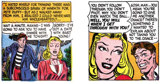
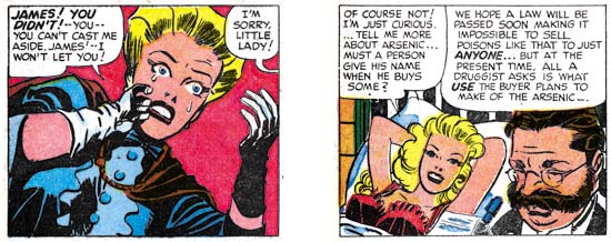
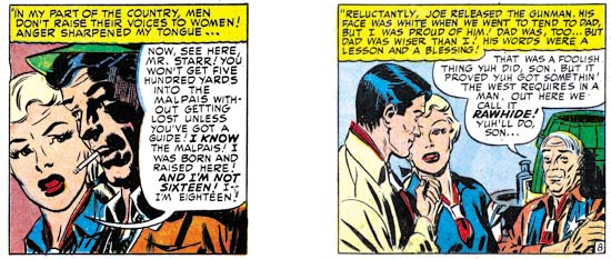
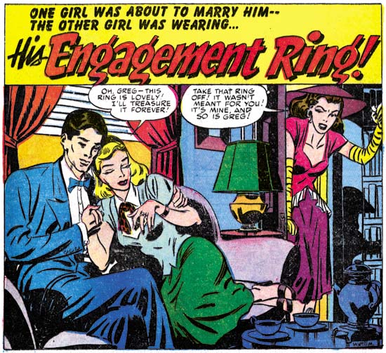
(Young Romance #1 – #4)

Young Romance #1
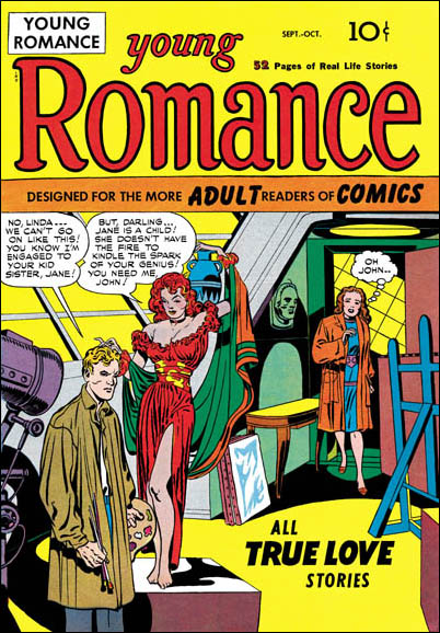
Young Romance #1 (September), art by Jack Kirby

Simon and Kirby had a pretty consistent modus operandi for developing a new title. Basically it called for Jack Kirby providing much, if not most, of the initial art. This M.O. was adhered to with Young Romance, for the first four issues Jack drew 10 of the 20 stories. Page production rates (the number of pages of art created in a month) at the time of the release were also very high. Joe Simon has stated that before they went around to various publishers, they had already created the art for the initial issues. That way if some unscrupulous publisher liked the idea but wanted to develop it themselves, Simon and Kirby would have a head start. Therefore the high page production rates are misleading because much of the art was actually done earlier. Even so the initial art for Young Romance was rushed. Not that Jack would sacrifice drawing quality, but the inking would initially be rather simple. S&K shop inking traits such as picket fence crosshatching (see the Inking Glossary) would find limited use. The resulting inks would be reminiscent of the Austere inking style from the late fifties which developed from a similar need for increased art production. Although the inking was simpler what was done was quite beautiful, so once again quality was not sacrificed.

Young Romance #1
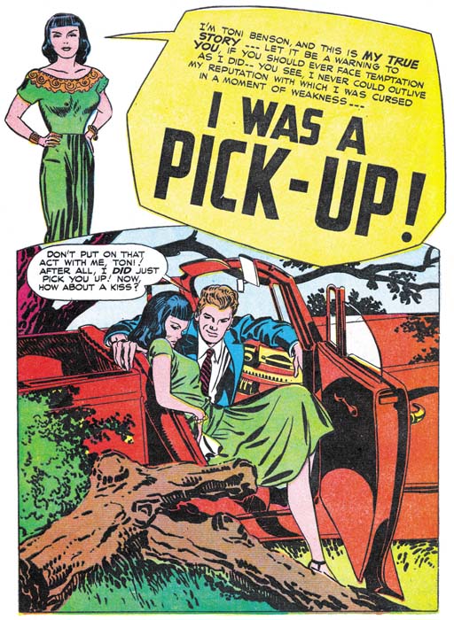
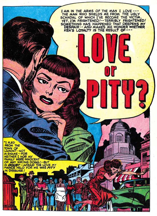
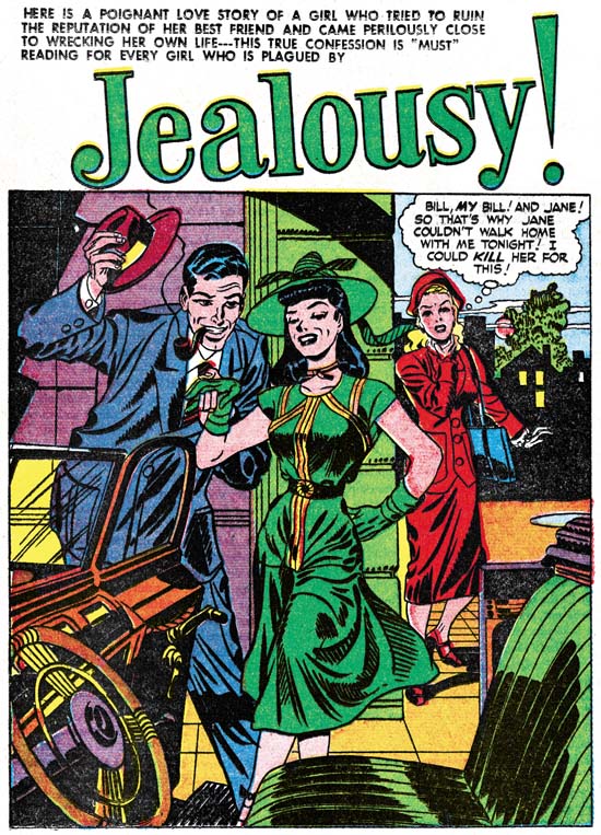
Young Romance #1 (September 1947) “I Was A Pick-Up”, art by Jack Kirby.

The drawing for the romance covers are generally not Jack Kirby’s finest work. Kirby’s forte was action, which was not the sort of thing appropriate for romance. Jack would compensate by using various compositional devices to keep the image visually interesting but this was not completely successful. Much of the impact these covers have is based not so much on the drawing itself as the melodrama that is being depicted. The less then graphically successful covers cannot be blamed entirely on romance genre not being conducive to Jack’s talents. Some of Kirby’s best efforts from the period can be found in romance splashes. The one for “I Was a Pick-Up”, shown above, is a great example. This splash is much more graphically interesting then the cover for the same issue. The compositions centers on the semi-reclining figure of woman. Her posture is deliberately provocative while at the same time projects her discomfort at her current predicament. Her pose is echoed in the foreground of bush and tree trunks with one of the fallen tree’s limbs repeating the lady’s bent legs. Part of the lady’s visual confinement is formed by the tree trunks, the rest is the by the arms of her not so gentleman companion and the door of the car. This composition seems so expressive and natural that is easy to overlook some logical inconsistencies. Why is the car door open? If it is for her eminent escape, why does the lady seem to lounge about as if reluctant to leave? I would say the whole point of this splash is to highlight the illogic of her situation. Part of her is fully aware that she should get out of the car but this is battled by the same temptation that lured her into becoming a “pick-up”. Although nothing explicit by today’s standards, this was steamy stuff indeed. Too proactive for a cover where it might attract the unwanted attentions of those critical of the idea of a romance comic book, but just right to attract the potential purchaser who was interested enough to open the book. Not every Kirby romance splash would be this good, but enough of them are to indicate that Kirby could do great pieces of stand alone romance art. His best romance work would just be a little too much for the cover.

Young Romance #1
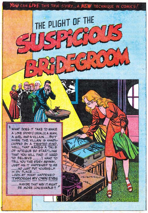
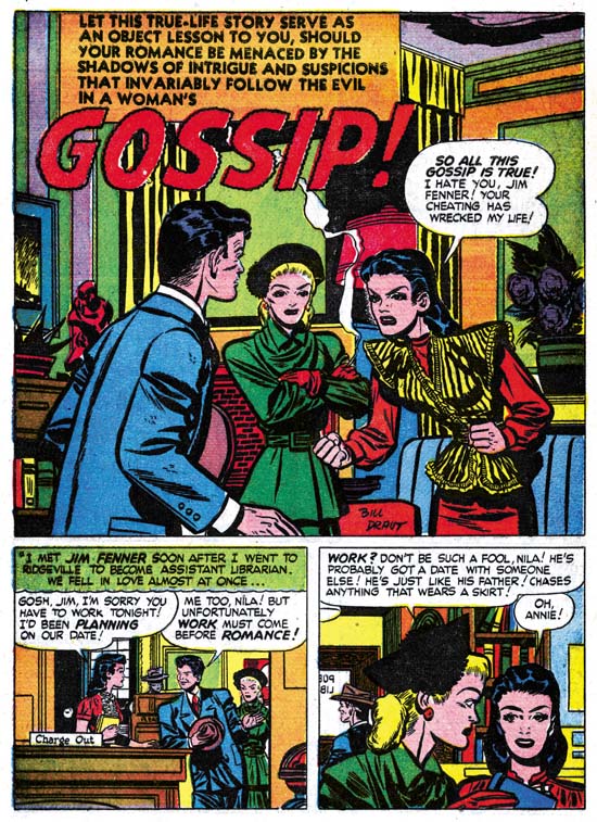
Young Romance #1 (September 1947) “Suspicious Bridegroom”, art by Bill Draut.

Kirby did not pencil all the art for the initial issues of Young Romance. Of the first 20 stories, Kirby did 10 while Bill Draut provided 7. Draut had met Joe Simon in Washington during the war and had accepted Joe’s invitation to join them in New York. Bill was a talented artist but had no previous comic book experience. Even so Draut did some nice work for Simon and Kirby in titles they developed for Harvey in 1946 (Boys Explorers and Stuntman). Although some work by Bill Draut was published after that, it was all stuff left over from that quickly scrapped S&K Harvey line. One wonders what Bill did between that attempt and his appearance in Young Romance over a year later. From YR #1 on until the closing of the studio, Bill Draut would be a consistent presence in Simon and Kirby productions.

Draut was relative new to comic book work, but that did not stop him from trying to be innovating. A good example is the splash page for “Suspicious Bridegroom” shown above. The layering of the caption box and two images over a bicolor background is very effective. Particularly with the way the panel for one of the images is skewed and casts a shadow. The woman is very attractive but seems directed more to appeal to a man then a teenage girl reader. It was not unusual for Bill to present “cheesy” images of woman in his earlier efforts in the romance genre.

Young Romance #1
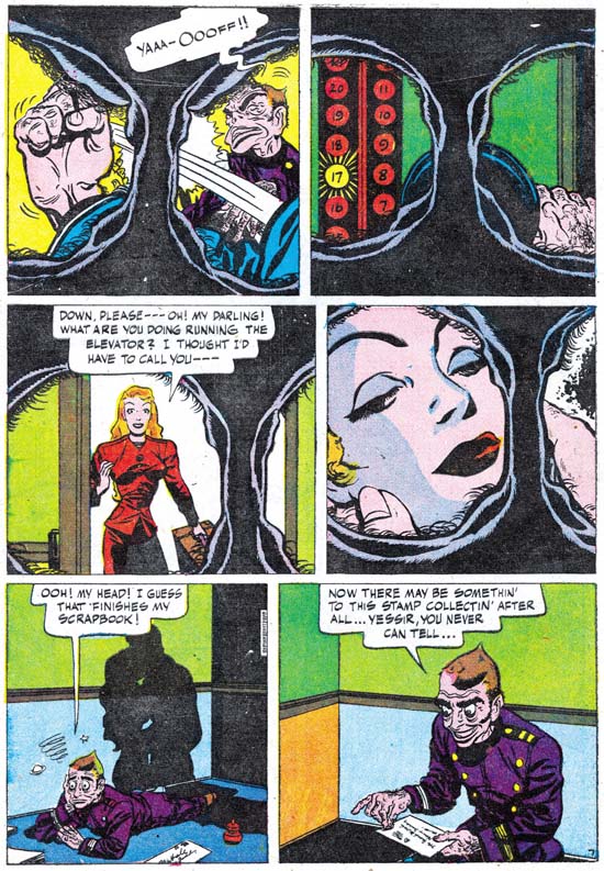
Young Romance #1 (September 1947) “Suspicious Bridegroom” page 7, art by Bill Draut.

Not all of Draut’s attempts at being innovation were successful. On the top of the splash page for “Suspicious Bridegroom” we find the declaration:

YOU CAN LIVE THIS TRUE STORY… A NEW TECHNIQUE IN COMICS!

The announced technique, showing up in much of the story, consists of providing the images as if view through someone’s eyes. Well that is what it was meant to be but actually it looks like a view from some sort of bizarre binoculars, what with the circular views surrounded by irregular folds (eyelids?) and numerous eyelashes. Frankly the technique is not very effective since it puts a severe limit on what can be shown in a panel. Worse yet it is actually kind of creepy and that casts a chilling effect on was meant to be a romantic scene in the fourth panel. Fortunately this innovation was not to be repeated in future work by Bill Draut or any other artist working for Simon and Kirby. Even though it was a failure, you still have to admire the daring of the attempt.

Young Romance #3
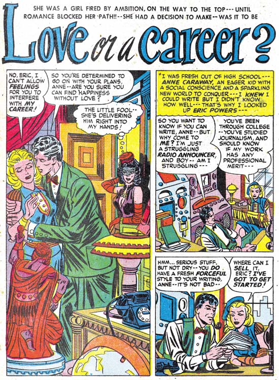
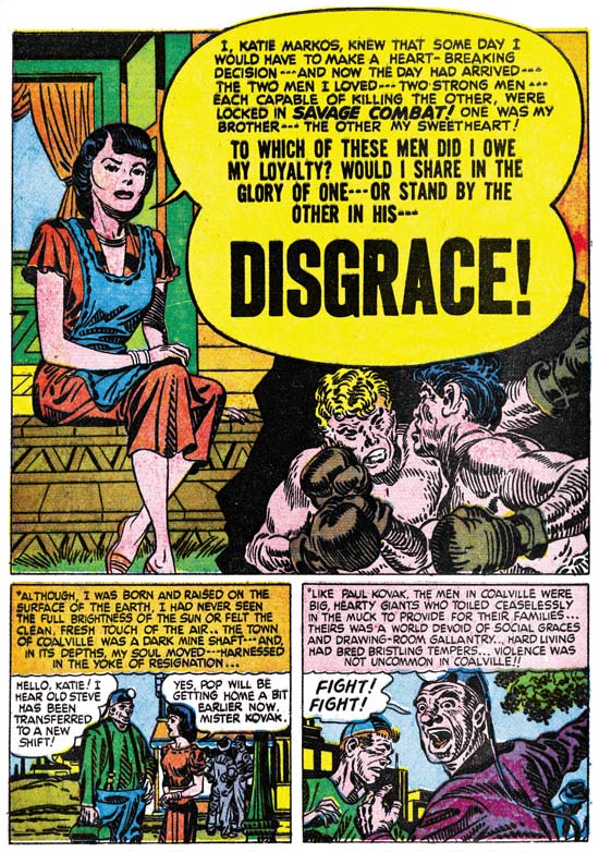
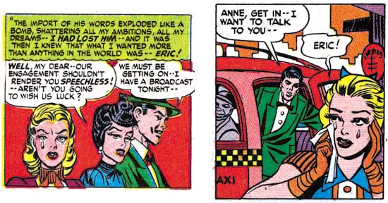
Young Romance #3 (January 1948) “Love or a Career?”, art by Jerry Robinson and Mort Meskin.

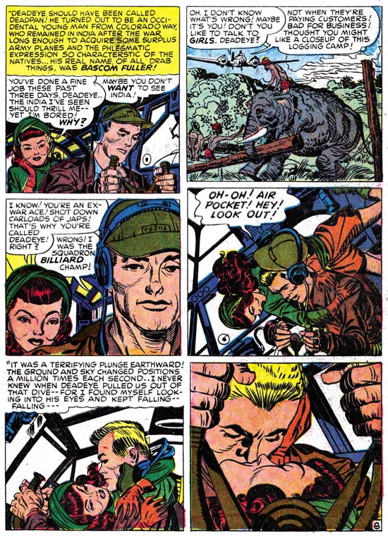
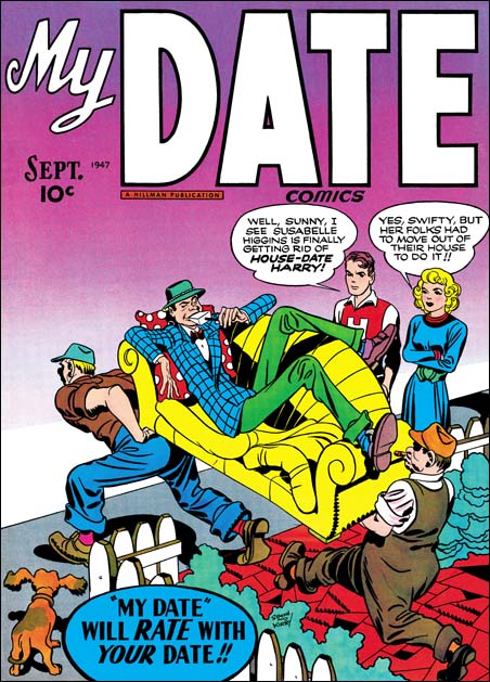
In YR #3 (“Love or a Career?”) and YR #4 (“I Love You, Frank Gerard”) are stories by another artists, or more correctly a pair of artists, Jerry Robinson and Mort Meskin. These two works are unsigned but in the same style as signed work done a few months later (see my post on the cover for My Date #4). I have not seen enough of either artist’s earlier work to be confident about how the two artists collaborated, but my suspicion is that most of the pencils were done by Robinson and Meskin did most of the inking. I am not sure how Simon and Kirby met Jerry Robinson, but Meskin was well known from the time that S&K worked for DC. There is a story of both Kirby and Meskin facing deadlines and ending up in the DC bullpen on adjacent drawing tables. Each was intent on getting their own jobs done while other artists gathered to watch two of the industries greatest and most prolific artists racing away. I have not come across any comments from Jack Kirby about Meskin, but Joe has repeatedly expressed his admiration for Mort’s work.

Now that I have introduced most of the artists from the first four issues of Young Romance, this seems to appropriate time to address a subject that I have avoided in the past, that is the question of Kirby layouts. This is a claim that many people have declared about work done by the various artists who worked for the Simon and Kirby studio. Unfortunately the use of Kirby layouts is not the only possible explanation for other artists doing Kirby-like work. Many admired Jack’s artistry so it is not surprising that they would imitate or even swipe from Kirby. From time to time Jack would also assume the job of art editor and fix up the work from other artists prior to publication (for example). One of the criteria I use to distinguish Kirby layouts from things like swipes and art editing is consistency throughout the story. Swiping and art editing will be limited to a few panels here or there, not to the entire story. But if Kirby is truly providing a layout it would be expected that he would do so for the entire story. As for distinguishing a Kirby layout from a Kirby imitator it is necessary to compare the work in question to the layouts found in contemporary Kirby stories. It is expected that Kirby would provide layouts similar to those of his own stories. While it is possible that Kirby might provide simpler layouts, it is not creditable that he would introduce techniques into a layout that he would not use himself.

Kirby uses an unusual layout for some of his splashes. It consists of a half splash along with a figure or just the head with a speech balloon that serves the place of title caption. The splash from “I Was a Pick-Up” shown earlier is an example of this layout. This layout is not used by any other artist in the first four issues. However it is not the only splash layout used by Kirby either. Careful examination shows that it is only used on for the first story in the comic. So although it is very distinctive layout, the fact that the other artists do not use it does not prove their stories were not done using Kirby layouts. Although I call this a Kirby layout I might be more accurate to ascribing it to Simon and Kirby. Both Joe and Jack have said that Joe did layouts for some covers and splashes. Did Joe consistently provide layouts? Was Joe providing layouts for Jack only early in their collaboration? At this point I do not have really firm answers for these questions. It does seem to me that many of the splashes and covers have emphasis on design found in work that Joe did prior to working with Jack and would continue to use after they broke up. However this fondness for certain types of designs disappears from Jacks work once he split from Joe. Therefore I am inclined to feel Joe provided some layout guidance to many of Jack’s covers and splashes. However nothing in the layout of Jack stories seem unique to his period of partnership with Joe, so I believe that the story layouts at this stage are Kirby’s alone.

As I previously mentioned, Bill Draut did some interesting designs for some of his splash pages in these early Young Romance issues. He used tilted panels in two of his splashes, a device that does not appear in any Kirby drawn splash from the same comics. Draut also would occasionally introduce a “sexy” or “cheesy” pose; this is something Jack was not seen to do. Bill Draut would develop his own way of telling a story which is only beginning to appear in these early romance works. Still the story layouts that he uses for these first issues of Young Romance only occasionally, if at all, remind one of Kirby. So I would conclude that there are no Kirby layouts under the Bill Draut pencils in the first four issues of Young Romance. Actually this is a conclusion that I have reached for all of Bill Draut’s work for S&K.

The opening splash panel is generally used to as a sort of comic book equivalent of a movie trailer. That is it provides a sort of condensation of what the story will be about. However the splash panel normally is not actually part of the story itself. Sometimes the entire first page is given over to the splash. Five splashes by Kirby and two by Draut from the first twenty stories are full page splashes. I am not sure that much can be deduced from the use of full page splashes, except perhaps that Kirby was more prone to use them then the other artists. Often the first page would be a combination of a splash panel and one or two story panels, and how they are laid out is informative. Kirby’s next most frequent first page arrangement, with three cases, places a single story panel in the lower right corner. That layout is not used by any of the other Young Romance artists. The other arrangement that Jack used was to restrict the splash panel to the top of the page, and provide two story panels below. This is the most common arrangement in the first four issues; Kirby did it twice, Draut five times and another artist also used it once, for a total of eight out of twenty stories. Another possible layout is for the splash panel to occupy the left while the two story panels are placed on the right. That arrangement was not used by either Kirby or Draut in the first YR comics but is used for both stories provided by Jerry Robinson and Mort Meskin. To me this strongly suggests that Jack did not provide layouts to Robinson and Meskin.

Young Romance #3
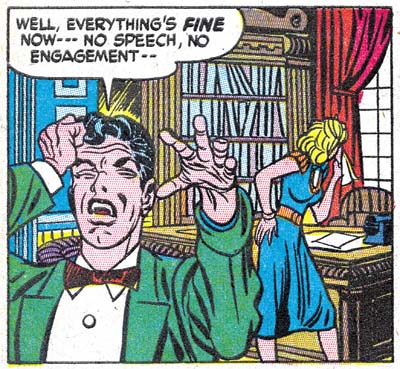
Young Romance #3 (January 1948) “Love or a Career?” page 7 panel 1, art by Jerry Robinson and Mort Meskin

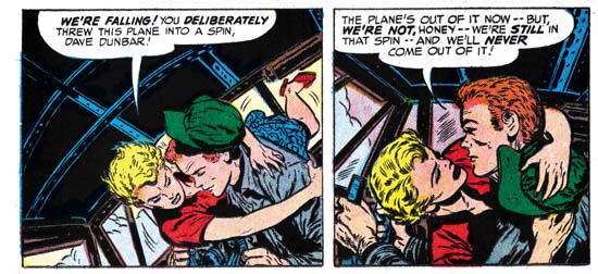
As was the case with Bill Draut, the way that Robinson and Meskin present the story is not consistently like what Kirby did. One exception that might be made is provided in the above panel. Jack Kirby was justly famous for his use of exaggerated perspective. The way the man holds his hand out toward the view does remind one of Jack’s techniques. In my opinion Robinson and Meskin are not as successful in their effort as Kirby would have been, so I do not think this would be an example of Kirby stepping in as an art editor. Although Kirby did have a fondness for this sort of difficult perspective, he did not use it, or anything like it, in any of the stories that he drew for YR #1 through #4. If Jack did not use it for his own drawings, I do not think it would be likely that he would use it in layouts for other artists at that same time. Therefore I conclude that this panel is an example of Robinson and Meskin being influenced by Kirby and it is not based on Kirby layouts.

Young Romance #2
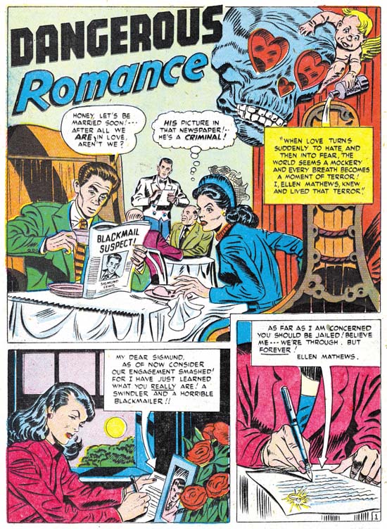
Young Romance #2 (November 1947) “Dangerous Romance”, by unidentified artist

Normally I do not associate the use of floating heads with Kirby’s covers or splashes. They were not used extensively by Kirby during the S&K period and became extremely rare after he left Joe. Simon on the other had used them on some of his covers done early in his career as well as after the split-up. Whether it is another suggestion that Joe may have been involved in laying out some of the splashes, or that Jack may have just adopted if for a period, but the use of floating heads becomes frequent in the initial Young Romance comics. Five out of ten Kirby splashes use floating heads; on the other hand this device is not used in any of the stories by Draut or Robinson and Meskin. This is another suggestion that Jack did not provide those artists with layouts. But the design technique does show up in the story “Dangerous Romance” in Young Romance #2. The story layout is similar to that Kirby would use for his own work, and this similarity is found throughout the story. The inking also seems to mimic S&K studio style. Note the abstract arc shadow in the splash, and something akin to should blots are sometimes used in the story (see the Inking Glossary for explanation of these terms). Even the penciling is reminiscent of Jack’s work. I do not believe this is an example of a heavy handed inker working over Kirby pencils. As far as I know no one has ever attributed the drawing of this story to Jack. So the conclusion I reach is that this is an example of an artist working from Kirby layouts and trying, not very successfully, to mimic Kirby as close as he was able. Unfortunately I have no idea who the artist was.

Young Romance #1
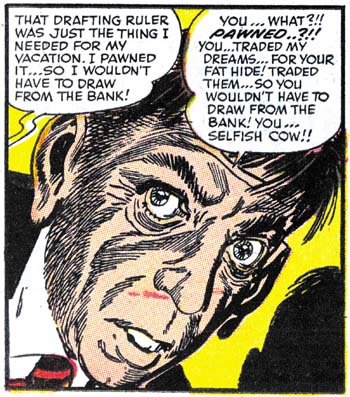
Young Romance #1 (September 1947) “Summer Song” page 6, art by Jack Kirby and an unidentified artist.

There was a time in the past that I did not believe “Summer Song” was penciled by Jack Kirby. I found that pages such as the one imaged above deviated in ways that could not be explained by some heavy handed inker. Christopher Harder (a fine S&K scholar) pointed out to me that the art seem to progress from very much like Kirby’s work in the beginning followed by work that looked less and less like Jack’s. You can see what he means be comparing the above image with another from early in the story that I provided last week in the first chapter of this serial post. I remained perplexed about the attribution of this story until one day Joe Simon showed me an article from a Marvel publication. I deeply regret not borrowing it, because I have not yet come across it again in Joe’s collection. It was an interview with an artist, I am sure it was either Joe Sinnott or John Romita. What I do remember clearly was one part where the artist describes approaching Simon and Kirby about a position they had open. The artist described the work as an in-betweener. He went on to say that Jack would draw the story pretty tightly to begin with and then get much looser and close it with some more tight pencils. The hired artist would then tighten up all in between pages and ink the whole thing. This would allow Jack to work more quickly and yet maintain some control over the final results. (Incidentally the artist interviewed said that S&K provided him with samples to work on to show how well he could do the work, but that he never followed through with it). When I read that interview I realized he was describing exactly what had been done in “Summer Song”. In fact when I reexamined the final page of the story it did look more Kirby-like then those done in the middle. It would not be accurate to call such an arrangement as Kirby layouts, Jack contribution was too much for that. Nor would it be correct to describe the other artists as just the inker, for he did much more then just ink Jack’s pencils. So I have decided to attribute the work to both artists. Unfortunately once again I have no idea who the second artist was. In The Complete Jack Kirby, Greg Theakston attributes the inking of this story to Charles Nicolas but gives no explanation how he came that that conclusion.

Chapter 1, A New Genre (YR #1 – #4)
Chapter 2, Early Artists (YR #1 – #4)
Chapter 3, The Field No Longer Their’s Alone (YR #5 – #8)
Chapter 4, An Explosion of Romance (YR #9 – #12, YL #1 – #4)
Chapter 5, New Talent (YR #9 – 12, YL #1 – #4)
Chapter 6, Love on the Range (RWR #1 – #7, WL #1 – #6)
Chapter 7, More Love on the Range (RWR #1 – #7, WL #1 – #6)
Chapter 8, Kirby on the Range? (RWR #1 – #7, WL #1 – #6)
Chapter 9, More Romance (YR #13 – #16, YL #5 – #6)
Chapter 10, The Peak of the Love Glut (YR #17 – #20, YL #7 – #8)
Chapter 11, After the Glut (YR #21 – #23, YL #9 – #10)
Chapter 12, A Smaller Studio (YR #24 – #26, YL #12 – #14)
Chapter 13, Romance Bottoms Out (YR #27 – #29, YL #15 – #17)
Chapter 14, The Third Suspect (YR #30 – #32, YL #18 – #20)
Chapter 15, The Action of Romance (YR #33 – #35, YL #21 – #23)
Chapter 16, Someone Old and Someone New (YR #36 – #38, YL #24 – #26)
Chapter 17, The Assistant (YR #39 – #41, YL #27 – #29)
Chapter 18, Meskin Takes Over (YR #42 – #44, YL #30 – #32)
Chapter 19, More Artists (YR #45 – #47, YL #33 – #35)
Chapter 20, Romance Still Matters (YR #48 – #50, YL #36 – #38, YB #1)
Chapter 21, Roussos Messes Up (YR #51 – #53, YL #39 – #41, YB #2 – 3)
Chapter 22, He’s the Man (YR #54 – #56, YL #42 – #44, YB #4)
Chapter 23, New Ways of Doing Things (YR #57 – #59, YL #45 – #47, YB #5 – #6)
Chapter 24, A New Artist (YR #60 – #62, YL #48 – #50, YB #7 – #8)
Chapter 25, More New Faces (YR #63 – #65, YLe #51 – #53, YB #9 – #11)
Chapter 26, Goodbye Jack (YR #66 – #68, YL #54 – #56, YB #12 – #14)
Chapter 27, The Return of Mort (YR #69 – #71, YL #57 – #59, YB #15 – #17)
Chapter 28, A Glut of Artists (YR #72 – #74, YL #60 – #62, YB #18 & #19, IL #1 & #2)
Chapter 29, Trouble Begins (YR #75 – #77, YL #63 – #65, YB #20 – #22, IL #3 – #5)
Chapter 30, Transition (YR #78 – #80, YL #66 – #68, YBs #23 – #25, IL #6, ILY #7)
Chapter 30, Appendix (YB #23)
Chapter 31, Kirby, Kirby and More Kirby (YR #81 – #82, YL #69 – #70, YB #26 – #27)
Chapter 32, The Kirby Beat Goes On (YR #83 – #84, YL #71 – #72, YB #28 – #29)
Chapter 33, End of an Era (YR #85 – #87, YL #73, YB #30, AFL #1)
Chapter 34, A New Prize Title (YR #88 – #91, AFL #2 – #5, PL #1 – #2)
Chapter 35, Settling In ( YR #92 – #94, AFL #6 – #8, PL #3 – #5)
Appendix, J.O. Is Joe Orlando
Chapter 36, More Kirby (YR #95 – #97, AFL #9 – #11, PL #6 – #8)
Chapter 37, Some Surprises (YR #98 – #100, AFL #12 – #14, PL #9 – #11)
Chapter 38, All Things Must End (YR #101 – #103, AFL #15 – #17, PL #12 – #14)

Swiping off of Kirby

Young Romance #8
Young Romance #8 (November 1948) “Love Can Strike So Suddenly”, art by Jack Kirby

Jack Kirby’s take on romance always seemed to have more of an emphasis on action then most other comic book artists. The above sequence from an early Young Romance is a great example of this. The dramatic plunge of the airplane after hitting an air pocket literally lands a seemingly indifferent lady onto the lap of a reluctant man. The analogy of the airplane’s occupants fall and their falling in love is presented by both the images and accompanying text. It took chance to supply the action needed to overcome the barriers each had placed before their true feelings. This sequence may have played a small part in the overall story but it was pivotal. It was also the quintessence of Kirby’s vision of romance.

In Love #2
In Love #2 (October 1954) “Marilyn’s Men” page 14 panels 5 and 6, art by Bill Draut

In Love #2
In Love #2 (October 1954) “Marilyn’s Men” page 15 panel 1, art by Bill Draut

Kirby’s predilection for action in romance stories stayed with him. Although most of the story “Marilyn’s Men” from In Love #2 was drawn by Bill Draut, I believe that much of the plotting and at least some of the scripting came from Jack. Therefore I feel that the occurrence of essentially the same three panels from Young Romance #8 was not Draut trying to pull something over on his bosses, instead Bill was just following Simon and Kirby’s direction. The premise was similar between the two stories, both involved a plane flight where the relationship between the man and woman changes during the trip. There are significant differences between the two stories as well. In YR it is an accident that breaks down the resistance of both parties, whereas with In Love the pilot’s maneuver is purposeful, showing that it was only Marilyn’s reluctance to love that had to be overcome.

Draut’s swipe is not a close copy of Kirby’s art. Most of the deviation in the art can be attributed to differences in the two stories. Unlike most of the female characters in S&K romances, Marilyn had relatively short hair. Undoubtedly this was visual shorthand for her success as a businesswoman. Unfortunately Marilyn’s shorter hair could not provide the same affect to the first panel where she first is lifted out of her seat. Draut does what he can but Kirby’s heroine had more hair to add drama with. In Kirby’s story the heroine is seated behind the pilot while Marilyn is on his side. Jack therefore can show more of the lady as she goes from her seat to the pilot’s lap. Draut must provide a more foreshortened view and even rotated the pilot in relation to the cabin so that in the end the visual logic of the first scene breaks down. In the second panel Draut has everything under control. In fact here Draut improves on Kirby’s composition by having Marilyn ending up gazing into the pilot’s face, while Kirby left her looking to the side. There is one logical peculiarity in Draut’s presentation. In the first panel Marilyn’s left arm is already on the pilot’s shoulder while his hat is just beginning to come off his head. Yet in the second panel Marilyn’s left hand holds the hat down. How did that transition happen? Jack provides the answer by using the pilot’s headset to constrain the hat’s travel. The final panel, the dramatic view of the kiss, is very similar between the two versions, but by no means identical. The pilot’s face is typical Draut and not a close copy of Kirby’s version. Bill has also added some shadows of the window frames to add even more drama to the scene. While Kirby has good control over the unusual perspective, in Draut’s rendition where is Marilyn’s nose? It does not seem possible to trace its position without violating the man’s facial structure.

In Love #2
In Love #2 (October 1954) art by Bill Draut

Jack was a master at visual storytelling so it comes as no surprise that the dramatic kiss occupies the last panel of his page. In “Marilyn’s Men” the kiss has been placed on the first panel of the page following the other two scenes. This greatly diminishes the impact of the story line. This may not have been Draut’s fault, the layout of the page suggests that the kiss panel was placed there afterwards. Perhaps editing was required to reduce the page count. That it was known then what the proper layout for this sequence was is shown in the cover where not only is the kiss the last panel, but it has also been enlarged.

The three panel sequence from Young Romance #8 hardly stands out as the most memorable panels from Kirby’s early romance work. Even so someone remembered and then used them as a reference for a comic done almost six years later.

Not Kirby, My Date #4

My Date #2
My Date #2 (September 1947) art by Jack Kirby

My Date was a short-lived comic that Simon and Kirby produced for Hillman Publications in 1947. Perhaps mislead by the comics title, some today hold the belief that My Date was the first romance comic book. As I discussed in a post on this topic (The First Romance Comic) it is not a romance comic at all but rather Simon and Kirby’s take on teenage humor modeled on the popular Archie comics. For his contributions to the title Jack Kirby drew in a more cartoonish manner appropriate for the humor content. Jack’s altered penciling was not very drastic, it remains quite easy to identify his work. For instance, Kirby trademarks such as his exaggerated perspective can be found in the covers and stories that Jack provided.

My Date #4
My Date #4 (January 1948) art by Jerry Robinson and Mort Meskin

All four My Date covers have traditionally been attributed to Jack Kirby, as for example by the Jack Kirby Checklist. I have long felt, and I am not alone in this, that the cover for My Date #4 was done by someone else. Gone are Jack’s exaggerated perspective, replaced by a relatively shallow depth of field viewed straight on. The drawing for My Date #4 is cartoonier then in the previous My Date covers. House-Date Harry looks rather different on issue #4 then on the covers for #2 and #3, or from their story art as well. The same is true for Swifty who also shows up on My Date #1 and #2 covers.

Young Romance #3
Young Romance #3 (January 1948) “Love or a Career” page 5 panel 5 and page 7 panel 4, art by Jerry Robinson and Mort Meskin

Readers of my last post on the inking of Mort Meskin may have spotted the long close and narrow brush marks that are used on the My Date #4 cover to indicate the folds of the clothing. Not all of Meskin inking traits that I previously described are found, but I am nonetheless certain that Mort was the inker. This a bit surprising because at this time Meskin was still producing work mainly for DC and his first signed work for S&K studio would not appear for months later. Young Romance #3 has the same cover date as My Date #4 and in it is the story “Love or a Career”. Unfortunately this story is unsigned but Meskin’s inking is once again quite apparent. I will explain my full attribution of this art below when I discuss the first signed works. The art for “Love or a Career” is the closest match to the MD #4 cover that I have been able to find. Consideration has to be given for the more cartoony style used for the teenage humor comic, but see how close the female character is in the two panels I have selected from YR #3 compared to Sunny of MD #4, similarly shaped face, arching eyebrows, eyes and lips.

Justice Traps the Guilty #4
Justice Traps the Guilty #4 (May 1948) “Guilty Boys” page 1 panel 3 and page 5 panel 7, art by Jerry Robinson and Mort Meskin

Some months later art very similar to YR #3 appears in “Guilty Boys” from Justice Traps the Guilty #4. This is another unsigned piece with Meskin apparently doing the inking. This crime story was appropriately rendered more realistically then My Date #4 but similarities still show up. Note the comparable button noses of the boys to Swifty and to a lesser extent House-Date Harry on MD #4. The two boys on the right in the page 1 panel has a smiling cheek line similar to that of House-Date Harry.

Young Romance #6
Young Romance #6 (July 1948) “The Inferior Male” page 7 panel 3 and page 8 panel 4, art by Jerry Robinson and Mort Meskin (signed)

Going forward two months provides two stories that bear the dual signatures of Jerry Robinson and Mort Meskin. The usual assumption is that the first signature designates the penciler and the second the inker. But I know nothing about how the Robinson and Meskin team worked so this may not be a safe assumption. Still it does look like Meskin’s inking while at least some of the figure drawing and compositions do not appear to be his. I have posted about “The Inferior Male” twice before (here and here). The correspondence between the art in YR #6 and that in YR #3 and JTTG #4 is close enough that the same artists were probably responsible for all. As seen in the above panels the female still looks like a more realistically drawn version of Sunny from the MD #4 cover.

Justice Traps the Guilty #5
Justice Traps the Guilty #5 (July 1948)”Murder Special Delivery” page 3 panel 3 and page 4 panel 1, art by Jerry Robinson and Mort Meskin (signed)

Issue #5 of Justice Traps the Guilty also has the Robinson and Meskin signature. As might be expected there is great similarities with the YR #6 that came out in the same month. But this comparison is not perfect. In JTTG #5 the female leads start to take on the more stylized look that is typical of most of Meskin’s work for S&K. But the females have not adopted the more triangular face as done later by Mort so there still is a slight resemblance to Sunny from the MD #4 cover.

Real West Romances #5
Real West Romances #5 (December 1949) “Tenderfoot In Love” page 2 panel 4 and page 8 panel 7 art by Mort Meskin (signed)

Mort Meskin would not show up again in S&K productions for over a year. By cover date of December 1949 things had clearly changed for Mort, the work would only be signed by him with no indication of any Robinson involvement. Meskin was no longer providing art for DC and this marks the start of a productive and consistent relationship with Simon and Kirby. In Real West Romances #5 the woman is drawn actually less stylized then found in the Robinson and Meskin’s piece in JTTG #5. Although not typical of Mort’s later work, the female in RWM #5 is not a very good match for that on My Date #4 either. This is largely due to the introduction of cheek bones that makes the face depart from the more simple geometry found on MD #4. Other similarities can still be found between the RWM #5 and MD #4, as for instance the old man’s eyebrows and smiling cheek line in the right panel as compared to House-Date Harry on MD #4.

Young Romance #16
Young Romance #16 (December 1949) “His Engagement Ring” page 1 splash, art by Mort Meskin (signed)

Meskin also appears during the same month in Young Romance #16. Once again Mort’s woman are not as stylized as they soon would be. but gone are the cheek bones that Mort provided woman in RWR #5. A resemblance to Sunny of MD #4 can still be seen, especially in the lady on the right of the above splash panel.

It may be a little surprising that a S&K production would have a cover drawn by an artist other then Jack Kirby. The only other non-Kirby covers were also done by Meskin along with Bill Draut, John Prentice and Ann Brewster. Those were all Prize romance covers with cover dates of 1954 and 1955, a period when Jack and Joe were busy with Mainline, their self owned publishing company. The reason Simon and Kirby made an exception for My Date #4 is most likely the same. A few months previously Simon and Kirby had launched Young Romance with Prize comics. As typical for them, most of the initial art for Young Romance was drawn by Jack. They had more recently lauched Justice Traps the Guilty. Not only was this all a lot of work for Kirby, it also was work for which S&K would have a share in the profits. Their deal with Hillman was not as good and so My Date #4 would be the last comic Simon and Kirby produced for that publisher with the exception of a single Western cover (Western Fighters #1, April 1948).