I am providing some comic scans for an ongoing project. I am not a liberty to discuss this venture at this time but I believe my readers will find it of interest. Although I cannot elaborate on the project I can see no harm in presenting here some of the scans. After all, my readership is very, very small while this project’s audience should be gratifyingly large. Besides which my contribution is a very minor one. The Simon and Kirby connection of the images I provide below may be tenuous (they were done well after S&K departed Timely) but they provide an interesting comparison to what I have been writing about in my recently resurrected serial post “The Wide Angle Scream“.

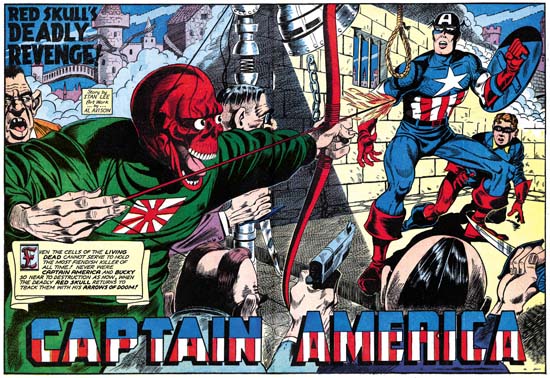
Captain America #16 (July 1942) “The Red Skull’s Deadly Revenge”, art by Al Avison
Larger Image
While the double page splashed would continue to appear at times in Captain America after Simon and Kirby left Timely, there was no longer any emphasis on design. What I refer to as the enactment dominated the splashes while items such as the title and introduction caption were relegated to minor, often intrusive, rolls. This is especially true with “The Red Skull’s Deadly Revenge” where the title takes up so little of the splash that it can almost be missed. Nobody did Captain America as well as Kirby could, but then again Jack was in a league all by himself. The second best depicter of Captain America during the golden age of comics was without doubt Al Avison. Unarmed except for his shield, Cap confronts a host of suitably ugly and beastly adversaries. With Captain America and Bucky faced with guns, knives, a flaming arrow and even a hangman’s noose, you can tell an epic adventure will follow. It would be expected that the visually larger figures would dominate a scene. While the Red Skull and his minions appear before a muted background, Cap and Bucky are literally placed within a spotlight. The pale yellow background gives the red, white and blue of our heroes’ costumes maximum contrast and thus counters the effect of the Red Skull’s larger size. Avison also makes use of our propensity to examine even visual images from left to right. While all of their foes emphasize the right to left eye movement, Cap and Bucky face the opposite direction and our eyes are no longer directed to move further off the page. Jack Kirby showed a similar understanding in some of his wide splashes for Stuntman. That however was later, in his Captain America work Jack did not make as much use of the right to left reading that we see Avison do so often. This was not always the case for Al, his early cover work for Harvey at times showed a right to left direction (Speed #14 and Speed #16). I am not sure where Avison picked up the technique of the use of a left to right direction, but it shows that he was more then just a Kirby-want-a-be.
I really have not studied Timely artists very much. I wonder if it is even possible for someone today to become a Timely expert. The high cost of the comics would seem to prohibit accumulating enough material to properly study the art. Hopefully that will change if Marvel continues to reprint their golden age comics. Having said that I find in “The Red Skull’s Deadly Revenge” story enough traits also encountered in Avison’s previous and future work for Harvey to convince me that he also had a hand in inking this story as well.

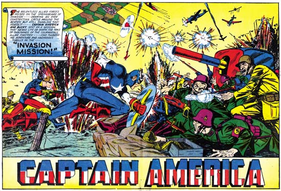
Captain America #34 (January 1944) “Invasion Mission”, art by Syd Shores
Larger Image
As I wrote above, I am not a Timely scholar, but the splash for “Invasion Mission” looks like the work of Syd Shores, probably the third best artist of the golden age Captain America. Comparisons of this splash to the one with a similar theme by Avison, “On to Berlin” leaves little question that Al was the better artist. Still Syd does a valiant job and it is another classic clash between Captain America and our country’s Nazi foes. It makes you wonder why Cap stories of such battles were not done more often during the war. I have not seen enough of Shore’s art to determine whether the left to right movement he gives to Cap and Bucky is purposeful or just happenstance. However Shores did make some poor decisions. Having an explosion near Captain America and Bucky might seem a good way to add excitement; unfortunately its real effect is to visually obscure the two heroes. We can blame the colorist, not Syd, for the biggest failure of the splash; giving the German soldier on the right a yellow suit makes him the most prominent figure of the entire double page.
Recently Marvel Comics has Bucky, known as the Winter Soldier, replace the now dead Steve Rogers as Captain America. He has an ugly new costume and more controversially carries a pistol. Some have defended the use of a gun by the new Captain America by pointing out that Bucky uses a weapon on the some covers for the original Captain America Comics. Bucky’s often use of a gun on the covers does not seem to be carried over into the interior stories, at least for those that I have seen. The splash for “Invasion Mission” is the only example I am aware of. In the actually story Bucky carries a rifle two times, but for both occasions he uses it as a club! Before we conclude that killing was abhorrent for the original Captain America it should be noted that toward the end of the story Cap and Bucky capture a German big gun and turn it against the Nazi forces. While close-ups are not provided, who can doubt the deadly effect this was meant to produce?


Why does the Red Skull have a Japanese flag on his suit? Hes a Nazi.
That is true in the Marvel Universe, but I am not sure if it is in the Timely Universe. As far as I can remember, there he was a sort of fifth columnist more anti-American than a Nazi member.