
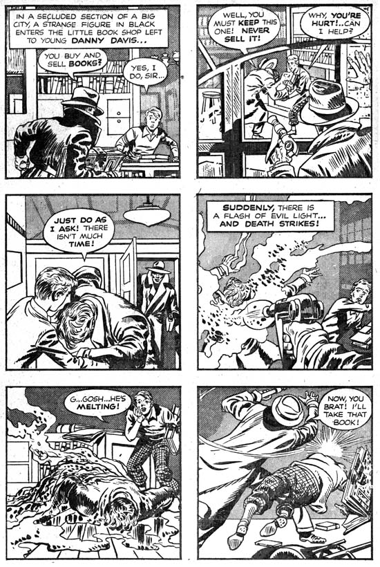
Simon and Kirby’s new titles Stuntman (April 1946) and Boy Explorers (May) were published by their old friend Al Harvey. The decision to jump ship from DC was purely business but Liebowitz complained about not getting a chance to bid for their services. It was a decision that Joe and Jack would regret as the new titles were quickly cancelled, victims of a comic glut that followed the end of paper rationing. Jack and Joe would continue to do work for DC for their old feature Boy Commandos, but Sandman was cancelled (last S&K was Adventure #102 February 1946) and the Newsboy Legion would only last a short while longer (last S&K was Star Spangled #61 October 1946). Before this not everyone at DC was happy with how Simon and Kirby made their comics, now their critics had more ammunition to use against them. Even in the difficult times that followed, DC was either not approached or not interested in renewing their previous relationship with S&K. Because the art for comics is done months before it would be finally released it is not clear whether the work for Real Fact #2 (May) was done before or after DC found out about Simon and Kirby’s deal with Harvey.
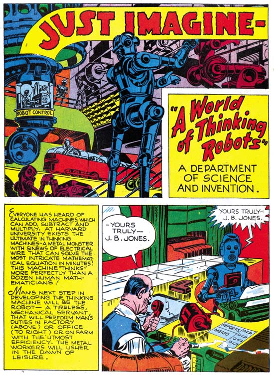
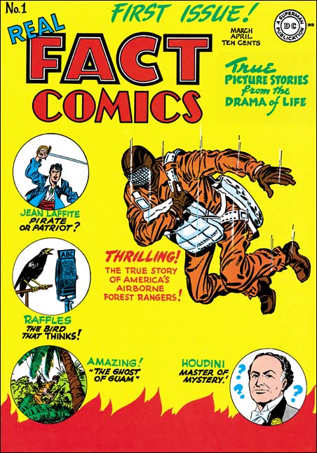
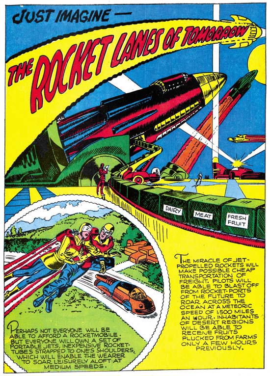
Real Fact #2 (May 1946) “A World of Thinking Robots”, art by Jack Kirby
In the second issue of Real Fact, Jack Kirby returns to provide another short graphic article predicting the future. The prescient abilities of the scripter, whoever that was, was both good and poor at the same time. Robots are shown performing four tasks; as factory workers, secretaries, sport contestants, and house cleaners. The first two predictions can be said to becoming true today, the third is a qualified success, while the last is in its infancy at best. Robots are often encountered in a factory setting; some automobile assembly lines are famous examples. Modern software can take vocal dictation and produce pretty accurately typed text. While presently there are no robots playing football or any other human sport there are robotic tournaments that attract a small but devoted following. A robot house keeper would seem the most desirable of all but so far there has been only limited success. The one I know of is a robot that wanders around vacuuming the floor. This all sound like pretty successful predictions, except that a humanoid shaped robot is not used for any of the current examples. There are humanoid robots but so far they have not been used for any of those tasks nor is there any reason to believe they ever will be. The human form is a generalist approach; pretty good for many diverse tasks but not perfect for any. Why settle for a general factory worker when you can design more efficient one for specific tasks? As far the second part of the prediction, the idea of “thinking robots”, presently there are no Artificial Intelligent programs that come anywhere near to be described as thinking. Further those advances in the field of AI have not had much impact on robotics.
Artistically there really is not much to say about this piece. Once again I cannot help but feel that Jack would do more exciting machinery much later in his career. The inking is adequate but perhaps not too impressive. At this time I just cannot say whether this is Jack’s inking or not.
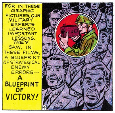
During my examination of Real Fact #2 in preparation for this post I kept being impressed by how the art for “Combat Photographer” resembled Joe Simon’s work. Initially I dismissed it as just a coincidence. As far as I know nobody has attributed this piece to Simon and while he was teamed up with Kirby, Joe did little penciling himself. Nonetheless upon repeated examinations I kept finding more things to suggest Joe Simon’s hand until I ended up convincing myself that this was his. Still I am bothered about this attribution because most new discoveries of examples of Simon’s art have often in the end been shown not to be by Joe. Perhaps I should have held off on reporting this case until further investigation and upon getting Joe’s own opinion. However in this blog I prefer to present my latest opinions which sometimes change over time. If I come to decide I have made a mistake I will post on that as well. In the mean time let me try to describe what leads me to credit this story to Joe as well as well as what evidence that does not fit so well with that attribution.
Real Fact #2 (May 1946) “Combat Photographer” page 4 panel 6, art by Joe Simon
I find the manner of drawing figures matches quite well with Joe Simon BC (Before Kirby, a term that Joe uses that I find mildly humorous because of the way it reverses the normal manner of Kirby fans changing ‘C’ to ‘K’ as for example Kirby Kolor). There are examples to be found in Silver Streak #2, Target Comics #1 and #2, Daring Mystery #2, and Amazing Man #10. Note in particular how in panel 2 of page 3 (image below) the eyes and eyebrows are joined in a single angular shape; this is a typical early mannerism of Joe’s. There are also some similarities to be found in more recent work by Joe in Boys Commandos #12 and Adventure is My Career. The greatest similarity of the work closest in date to “Combat Photographer” is perhaps the cover for 48 Famous Americans (1947), but some may not find that convincing because that cover is often misattributed to Jack Kirby. At the time that Real Fact #2 was done Joe was penciling Duke of Broadway, Vagabond Prince and Kid Adonis for Harvey. For the most part those Harvey features have a somewhat different style but note the similarity of the final panel from the Real Fact #2 story (image above) with that style. There is a parallel to be found with the double page splash from Boy Explorers #1 which also combines two styles; one with a more earlier flavor and the other that predominates in Joe’s work for those Harvey features.
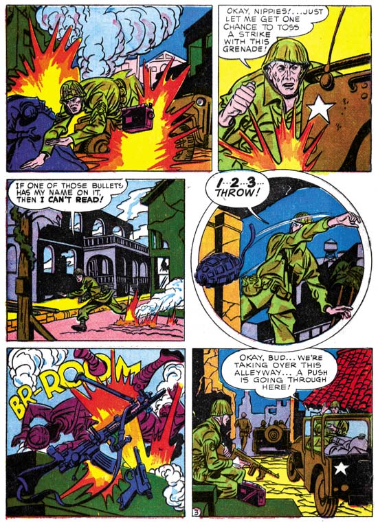
Real Fact #2 (May 1946) “Combat Photographer” page 3, art by Joe Simon
I am not sure whether circular panels were picked up by Jack or Joe first. It was a layout technique that both artists used in their work for Harvey. There is a perfectly good example of a circular panel on page 3 (see above). The device of extending a figure outside the panel border was typical of previous Simon and Kirby but pretty much dropped after the war. The circular panel from this story has figures that extend only slightly beyond the frame. Joe has adopted some mannerisms that seem to appear first in pencils by Kirby. Note for instance the square fist in the second panel. Another example is found in the man running in the third panel that has the sole of his foot turned toward the viewer.
Not everything about “Combat Photographer” favors attributing it to Joe Simon. My chief concern is that it is Joe’s early work that shows the greatest similarity. Part of what suggests the Simon BK work is simplicity in drawing that does not compare exactly with what Joe was doing at the same time for Harvey. Logically you would expect the greatest similarity would be among the work produced concurrently. The inking agrees with the pencils in being very simple, almost primitive. I have not done a close comparison with Simon’s inking (I will review Simon’s inking someday, I promise) but I am not convinced the brushwork here is by Joe. The layouts for “Combat Photographer” predominately uses distance shots while Joe’s Harvey work is much more varied in viewpoints. I do not consider any of this fatal to my crediting Simon for this art, but I do not want to ignore them either.
Initially I was also concerned about the odd placement of the page numbers, which is on the left side of a panel. This is very untypical for Simon and Kirby. The last panel of the story has a little “the end” written in a manner that does not look like anything I have seen from S&K. However further examination revealed that both of these features are found in other stories in Real Fact. They therefore are derived from the editor or the letterer and have no bearing on the question of the attribution of this art.
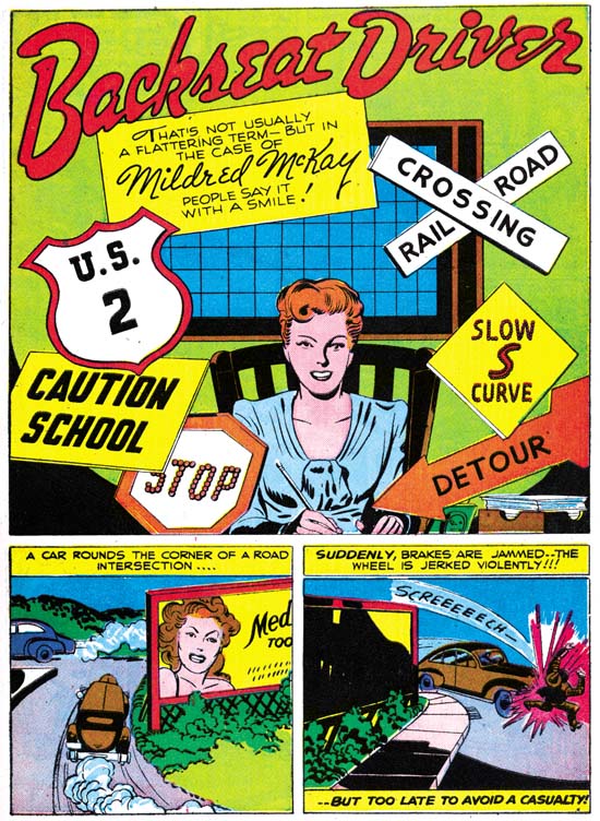
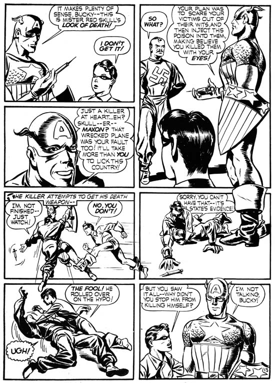
Real Fact #9 (July 1947) “Backseat Driver”, art by Jack Kirby
The next time Simon and Kirby appeared in a Real Fact was a little over a year later. That they appeared then is surprising because by this time they had already launched their version of crime genre and must have been preparing for their soon to be released romance comics. However I have never heard of Simon and Kirby turning away any work and who can tell how long DC kept this piece as inventory before using it. The story is about a lady who distressed by the number of automobile accidents decides to open a driver school. If you excuse the pun, it might not sound like a very good vehicle for Kirby’s talents but actually Jack manages to make it very interesting. On the opening page Kirby shows a pedestrian being hit by a car, only to show on the next page that the victim was literally a dummy. Other examples of actual or near accidents provide further action. For those panels that could be described as talking heads, Jack is already showing the use of varying viewpoints and distances, and the placing of main focus behind a foreground of objects or lesser important people. These visual techniques would play a big part in Kirby’s romance art where standard actions were not always appropriate. I would not call “Backseat Driver” a masterpiece but it is far from being a failure.
The art that Simon and Kirby did at that time for their crime comics was inked in the classic Studio Style with picket fence crosshatching, drop strings and abstract arches (see the Inking Glossary for explanations of these terms). Few of these inking techniques are found in “Backseat Driver”. The splash shows clothing folds that are simple spatulate shapes often attached to a thin line almost like they are leaves on a stem. The entire splash has an overall light look because of the limited use of blacks. When blacks are used they tend to flood an area. Those who have read my serial post Jack Kirby’s Austere Inking may recognize this as an excellent description of that style, this despite the fact that the Severe Style would not show up until about nine years later. However as I reported last week, Picture News #1 also has portions that could be described as a Proto-Severe Style. Not everything in this splash is fully reminiscent of the Severe Style. Some of the spatulate clothing folds are offset a little from the narrow lines. The spotting on the woman’s right breast has a feathering more typical of style used on earlier DC work. I believe the splash was inked by Jack himself but the two panels below just do not offer enough to provide a convincing inking attribution. The other three pages share with the splash an overall lightness and simplicity in the inking. However the inking does not appear as sensitive and the clothing folds do not match the manner found in the splash. I am not ready to provide inking credits for those pages but I do not think it was Kirby. It is among the other three pages that can be found some drop strings and shoulder blots.
Before Simon and Kirby crime and romance comics the duo had tried their hands in a number of categories not typically associated with them. Besides the supposedly true stories done for Picture News and Real Fact, Joe and Jack also tried teenage humor (My Date Comics and Pipsy) and kiddy humor (Lockjaw and Earl the Rich Rabbit for Punch and Judy). None of these were successful but they do show that Simon and Kirby were talented enough to give them a good try.


