
With the early demise of the Stuntman and Boy Explorer titles, Simon and Kirby’s next important project would be crime anthologies. Perhaps mindful that during the comic book glut it was previously existing titles that made it into the newsstand racks, Prize Comic’s Headline would be converted into a crime genre comic with issue #23 (March 1947). All the art for Headline issues #23 and #24 would be penciled by Jack Kirby, a feat that would not be repeated again until late in 1955. Most likely Simon and Kirby followed the same procedure that Joe reported as being used when launching romance comics; that is preparing the initial issues ahead of time before striking a deal with a publisher. The other thing unique about these first two crime issues of Headline was they both included double page splashes.

Headline #23 (March 1947) “Burned at the Stake”, art by Jack Kirby
Larger Image
Although the last published double page splashes by Simon and Kirby were designed with two or more sections, we previously saw that enactment section had taken over in three unpublished Stuntman wide splashes. This approach was continued here in “Burned at the Stake”. There is a heading across the top, the story title, an introductory caption and a round panel portrait, but these sections are all subservient to the enactment. We find four armored and armed soldiers approaching a single individual at the top of some stairs. This composition is not just happenstance. Like other Western languages, English is read from left to right and readers have become accustomed to viewing even illustrations in this direction. Placing something higher on the page also provides it with prominence. Thus in this case the eye follows the advancing soldiers from down on the left, upwards and toward the right, until it reaches the main character of the story, Guy Fawkes. Essentially the same composition was found in the enactment section for “The Rescue of Robin Hood“. Only in this case the center of attention was not a hero as Stuntman was. Did the man mean to set off the explosives and if so would the soldiers be in time to prevent him? The double page splash was not meant to answer those questions. Quite the contrary, leaving them unanswered would hopefully entice the viewer to buy the comic book.
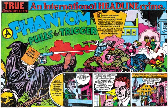
Headline #24 (May 1947) “A Phantom Pulls the Trigger”, art by Jack Kirby
Larger Image
“A Phantom Pulls the Trigger” might mistakenly be considered to be composed contrary to the normal left to right reading. It is true that the primary focus would seem to be the hooded figure on the left, the opposite of the expected location. In this case however the viewer’s progress from left to right is meant to indicate the progress of time, from the action of the firing of the pistol on the left to the affect of the killing of the people on the right. Kirby has countered the diminishing affect of placing the most important figure on the left by increasing his visual size. It is unclear whether the hooded figure is truly meant to be larger then his victims or if he is just closer to the viewer.
A section devoted to the start of the story makes a come back after last being used for the double page splash in Captain America #10 (January 1942). That this strip of panels is not an afterthought can be clearly seen by the way the hooded figure props his feet up on story panels and how the victims are firmly standing or lying upon it.
Simon and Kirby would discontinue using double page splashes in their crime genre comics. In my opinion this was not because crime did not lend itself to exciting wide splashes. I find the double page splashes from Headline #23 and #24 to be very effective and Kirby would pencil a number of single page splashes that could have benefited from a wider format. The problem I believe was due to an inherent weakness in use of the double page splash. For proper printing a wide splash must be placed as the centerfold page. With such a location the splash might be overlooked by a potential customer and thus loose its importance for inducing the purchase of the comic. But that was nothing new; it was a problem from when it was first introduced. What may have been more important was how the double page splashed affected the organization of the comic. Having a wide splash meant that a story had to start at on a particular page in the middle of the comic. This also placed restrictions on the page length for preceding stories as well. Organization of a comic book was simply easier without the wide splash. Now that Simon and Kirby was busy producing Headline and would soon be starting Young Romance, the double page splash may have been considered more trouble then it was worth. It would be a number of years before S&K would return to the wide splash, which is a shame because they did it better then anyone else. However in a few years Joe and Jack would put the centerfold to another good use. But that is a story for the next chapter.