Category Archives: Meskin, Mort

It’s A Crime, Chapter 6, Forgotten Artists

(Justice Traps the Guilty #3 – #5, Headline #29 – #31)

Jack Kirby remains the principal artist for the six crime issues discussed in this chapter. All 6 covers were drawn by Jack as well all the lead stories. Kirby’s did 10 stories with a total of 117 pages (including the covers). However Bill Draut now assumes a more important roll becoming the second principal artist. Bill supplied 11 stories, one more then Jack, but fewer pages (81 pages). The other three artists contributed much less then either Jack or Bill. The next most prolific (A. C. Hollingsworth) drew just 3 stories with 25 total pages.


Justice Traps the Guilty #4 (May 1948) “Queen of the Speed-Ball Mob”, art by Jack Kirby

The first story consistently uses the motif of a character introducing the story with the word balloon forming the title caption. I have noticed that when a story is being narrated, it is often by a woman. Almost certainly this was because male criminals generally have fatal endings (and therefore would not be able to tell their story) while females normally survive.


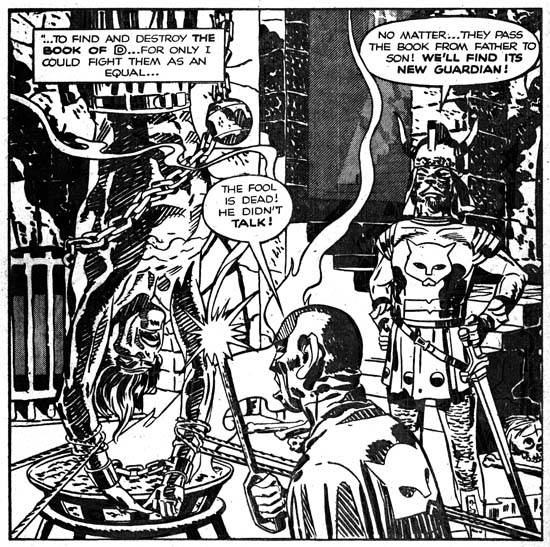
Justice Traps the Guilty #3 (March 1948) “Ask Eddie Green, Consultant to Crime”, art by Jack Kirby

A motif that would occur often in Kirby’s splashes at this time was having a cast of characters make a series of statements to introduce the story. Actually it was a return to an old technique as we have seen it as far back as in Captain America. When used in a splash covering two thirds of the page, this type of design did not leave much room but in “Ask Eddie Green” Jack makes effective use of what is available by supplying a small shoot out scene. The depth of field is so narrow that the results look like a frieze. Despite the small size everything is clear and the scene is filled with interest.


Headline #30 (June 1948) “Bullet-Proof Bad Man”, art by Jack Kirby

Perhaps it is just my tastes, but I feel that Kirby’s splashes are not as exciting as before. This may have been a result of Kirby’s declining use of full page splashes. Only 3 splashes out of his 10 stories received the full page treatment. “Bullet-Proof Bad Man” provides a typical Kirby dramatic shoot out. Well not so much as gun fight as one man has only drawn his knife although it turns out this is not as unwise as it seems. It is clear that the bullet has found its mark but note how Jack seems to downplay the actual hit. The story is about a gunfighter that uses a special vest to protect himself from bullets. However I have notice that Jack seems averse to showing the actually striking of a bullet even though that is a moment he often depicts. Generally Kirby hides the action in a cloud of gun smoke. When, because of layout, that is not possible, such as above, Kirby will simply not include any impact lines.


Justice Traps the Guilty #5 (July 1948) “A Fortune in Slugs” page 6, art by Bill Draut

Bill Draut did so much romance work for Simon and Kirby that it is nice to see his efforts for the crime genre. These comics gave Bill a chance to provide more action then he would normally use in romance comics. Draut was better at adding excitement then would be expected based on his work towards the end of his career. Here on one page we find a man running, being tackled and in the final panel bludgeoned with a blackjack. All of which Bill handled quite nicely. I particularly like his use of perspective in the second panel. Draut shows the tackler flying into the page whereas Kirby would have had the action coming out toward the reader, but otherwise it was well handled.


Headline #30 (June 1948) “Menace in the Making”, art by Bill Draut

Draut’s effective use of perspective is seen again in the splash for “Menace in the Making”. The low viewing angle allows the running figure to tower over all others without seeming to be unnatural. Action was not, however, the only outlet that Bill found in the crime genre. Crime stories allowed Draut to work, to extent that romance did not, in a more cartoony style. Note the caricature that Bill has provided the irate grocery man. Such interesting but fundamentally unrealistic depictions are found often in Bill Draut’s work in Headline and Justice Traps the Guilty but rarely in Young Romance or Young Love.


Justice Traps the Guilty #3 (March 1948) “My Strangest Crime Case”, art by Bill Draut

One story drawn by Bill Draut may not be exception as far as the art is concerned, but it is unusual in that the protagonist was a female private investigator. The story reads more like something from the hero genre then a true crime story. This is not the first time that Draut drew a story about a lady detective. In 1946 Draut worked on a feature called Calamity Jane originally for Boy Explorers Comics but when that title quickly failed (due to the comic glut after the war) subsequently published in Green Hornet Comics. It is likely that “My Strangest Crime Case” was left over material from that earlier effort that, with minor revisions such as to the detective’s name, was now put to use. The art style does seem to be a better match to Draut’s earlier work then to what he was doing at this time.


Headline #29 (April 1948) “The Night of the Freak Murder”, art by Jerry Robinson and Mort Meskin

The team of Jerry Robinson and Mort Meskin continue to appear in the crime issues covered by this chapter. The work is unsigned but the similarities to the signed works by Robinson and Meskin are numerous. “The Night of the Freak Murder” is unusual for Jerry and Mort in that it has a full page splash. Generally R&M’s splashes for Simon and Kirby productions are vertical with two story panels also arranged vertically. The composition is interesting in the way it plays off the grieving women with an almost mirror image of two detectives discussing the crime. The staircase might seem odd but it was introduced as part of a pattern that confines the eye in a circular composition. None of the other splashes that Robinson and Meskin supplied to Simon and Kirby were so well composed but as I said they did not normally use a full page splash.


Headline #29 (April 1948) “The Night of the Freak Murder” page 7, art by Jerry Robinson and Mort Meskin

As I mentioned in the previous chapter, I am not sure what Jerry Robinson’s contribution was because both the pencils and the art look very much like Meskin’s work. Mort was one of the best graphic story tellers and pages like the one above suggest why he had such an impact on artists like Steve Ditko. Here on this page the same diagonal is present in every panel. The page starts with close-up then switches to a distant show and then progressively comes closer. An increasing tension is formed by the combination of increased nearness, the diagonal design and off course the fear Meskin imparts to the criminal. Nothing really happens but the page is explosive nonetheless.


Justice Traps the Guilty #4 (May 1948) “Guilty Boys”, art by Jerry Robinson and Mort Meskin

Not all of Robinson and Meskin’s splashes were vertically oriented; here is another case where they deviated from that pattern. This is a standard two thirds splash page with two story panels arrayed on the bottom. Nothing unusual in the design itself but it does allow Jerry and Mort to provide a memorable splash. Although the image seems cluttered, everything serves a purpose. Debris and damaged items abound and a row of buildings in the background all combine to show that this is a location in some slum. But the shabbily dressed musical boys are not the Newsboy Legion and this is not Suicide Slums. Here Robinson and Meskin convert the boy gang genre into crime. They are not saints and in the end are more in need of rescue then providing it.


Headline #31 (August 1948) “Perfect for Murder”, art by Charles Nicholas

Only initials were used to sign “Perfect for Murder” (Headline #31, August 1948) but I am pretty certain it was Charles Nicholas. Originally Charles Nicholas was a house name used by Fox Comics for Blue Beetle stories. Over the years the work of many different artists appeared under that name, including Jack Kirby. However there were two individuals who continued to use the name outside of Fox and who claimed to be the creator of the Blue Beetle; Charles Wotjkowski and Chuck Cuidera. There is nothing I can add to that particular question here but it was the Wotjkowski version of Charles Nicholas who worked for Simon and Kirby at this time.


Headline #31 (August 1948) “Perfect for Murder” page 3, art by Charles Nicholas

While interesting, the splash page does not present a very good idea of Nicholas’ art so I have included an image of a story page as well. Nicholas does a good job drawing this story but he never achieved great success in his career as a comic book artist. Nicholas inked the art in a very individualistic style, as particularly seen in the form lines used in panels 6 and 7 and the swirling crosshatching in panel 7. (See my Inking Glossary for an explanation of my terms.) What is not found are any traits of the Studio style inking. While Nicholas is certainly a candidate for being one of Jack Kirby’s inkers, it is hard to understand how his name has become associated to the inking of particular pieces such as “Summer Song” (Young Romance #1, September 1947). “Perfect for Murder” was the only worked for Simon and Kirby signed or initialed by Charles Nicholas but other unsigned art by him surely remains to be identified.


Headline #30 (June 1948) “Pistol-Packin’ Playgirl”, art by Alvin C. Hollingsworth

Another artist that shows up working for Simon and Kirby during this period is Alvin Carl Hollingsworth. A search of the Internet indicates that Hollingsworth was an African-American artist from New York who was born in 1928 and died in 2000. Previously he worked for Holyoke Publishing Company working on Catman. Hollingsworth was also a talented fine arts painter. Joe Simon remembers Alvin and has a high opinion of him. Joe remarked that he thought he was the only African-American working in comics at that time. This is not truly accurate since there was also Matt Baker who played an important part in the early history of comics. But Matt Baker never worked for Simon and Kirby and so Joe was not aware of him, or at least of his background.


Justice Traps the Guilty #5 (July 1948) “Held For Ransom” page 5, art by Alvin C. Hollingsworth

Hollingsworth is another of those artists whose current reputation is much lower then warranted by his talent. This is largely because he left the comic book field in the late ’50s first for syndications strips and then the fine arts. It is a recurring pattern that I have noticed that comic book artists who did not take part in the superhero revival of the 60’s and later generally do not get much attention today. I have included a story page because it provides a better example of Alvin’s strengths. Note the use of varied and unusual viewing angles.


Headline #31 (August 1948) “A Gangster Dies”, art by Warren Broderick

The Jack Kirby Checklist includes “A Gangster Dies” among the art works by Kirby. This is a bit surprising because close to the center of the splash page is Warren Broderick’s signature. Before I sound too self righteous I should add that when working on this chapter I found I had listed this story in my database twice; once as done by Broderick and the second crediting it to Kirby. I have no idea how I made the mistake in my database, but it is easy to understand why anyone who failed to notice the signature might attribute this work to Jack. Warren has obviously made a careful study of Jack’s work and has adopted, at least for his work for the S&K studio, much of Kirby’s style. Warren was not, of course, as successfully as Jack himself and there are more then enough clues to properly attribute his work even without a signature. Note for instance how in the splash Broderick uses picket fence crosshatching where the rails are cloth folds. Besides simple lines, Kirby would use drop strings and wide lines for the rails but I do not recall him ever using cloth folds. Kirby would often make expressive eyebrows but Broderick’s versions were even more exaggerated.

This is the only signed work by Warren Broderick that I have found among Simon and Kirby productions. Frankly I have forgotten about it until I reviewed for this chapter. It turns out that we have seen some of Warren’s unsigned work previously. In just the last chapter I attributed “The Killer Thought He Was Satan” (Justice Traps the Guilty #2, January 1948) as Kirby layouts finished by an unidentified artist. A comparison between it and “A Gangster Dies” leaves little doubt that it also was by Broderick. In fact I no longer believe Kirby laid it out. Yes there are parts in both stories that look very much like Kirby but there are also parts that do not. Previously I failed to follow my own advice and only noted the similarities and neglected the differences. For instance there is a panel I provided from “The Killer Thought He Was Satan” that showed a boy being shot by the villain. While the scene and the boy in particular look very much like it was done by Jack, the artist shows the bullet actually striking the boy. That is something I have yet to find Kirby doing.

Another example of Broderick’s work was “Mother Said No” (Young Romance #7, September 1948) seen in Chapter 3 of the Art of Romance. There I attributed the pencils to Jack Kirby (correctly) and the inks questionably to Carmine Infantino. The primary reason for my earlier caution was that I was bothered by Carmine’s statement in an interview that he had never inked Kirby’s pencils. While in the work for Charlie Chan, Infantino was also providing expressive eyebrows some of the other brushwork found in “Mother Said No” is more like that in Broderick’s work. Although Broderick was very good at mimicking Kirby, I find the layouts in “Mother Said No” are much too consistently like Jack’s that I still believe that Kirby did the pencils.


Headline #31 (August 1948) “A Gangster Dies” page 3, art by Warren Broderick

Broderick could mimic Kirby quite well but occasionally, such as in the first panel shown above, the similarity to Kirby’s style is very striking. This was either due to Kirby stepping in his roll as art editor and fixing up the finished art or it was the result of a careful swipe by Broderick from some Kirby art. Without the original art it is hard to be sure but I suspect the latter explanation to be the case. Once again Broderick has drawn a scene where a man is clearly hit by a bullet, something that Kirby would hide in a cloud of gun smoke.


Justice Traps the Guilty #3 (March 1948) “The Capture of Night-Club Nick”, art by Warren Broderick

Broderick did not always so carefully mimic Jack Kirby’s style. In “The Capture of Night-Club Nick” Warren has abandoned the Studio style inking. Still the influence of Kirby is clearly discernable.

I have found little in my search for more information about Warren Broderick. I queried Joe Simon about him but he did not remember Warren at all. Joe does not remember all the artists who had worked for him over the many years, but in Broderick’s case this is surprising because the one thing I had found out was that he also was African-America. Joe was clear in his memory of A. C. Hollingsworth and that Hollingsworth was the only African-American to work for Simon and Kirby. How could Joe have failed to remember, even if not by name, one other African-American comic book artist? The answer maybe found in an interview given by comic artist, Harry Harrison:

After Wally and I broke up I was working mostly for Fawcett, and I had a friend by the name of Warren Broderick, who was also in school with me, doing my penciling. He was a black guy who didn’t want to get in there and push, didn’t want to face whitey in the office. We developed a nice clear style, no great shakes, but it worked.

This suggests that Broderick may have been reluctant to deal with Simon and Kirby directly and used someone, either an agent or another artist, as a go between. Joe may never have known about Warren’s ethnicity. The irony is that, considering their dealings with Hollingsworth, Joe and Jack probably would not have cared about Warren’s background, all that was important was that he could do the work.

The GCD only has three entries for pencils attributed to Broderick and three more for inking work. Atlas Tales has about a dozen works attributed to Warren. To that I can now add three further pencils and another inking job. Now that I have a small body of work to go by, I am sure I will find more work by Broderick as I continue to review Simon and Kirby productions. Warren Broderick is truly one of the forgotten comic book artists and it is rewarding to shed a little light on his career.

Chapter 1, Promoting Crime
Chapter 2, A Revitalized Title
Chapter 3, Competing Against Themselves
Chapter 4, Crime Gets Real
Chapter 5, Making a Commitment

Chapter 7, A Studio With Many Artists
Chapter 8, The Chinese Detective
Chapter 9, Not The Same
Chapter 10, The Master and His Protege
Chapter 11, The New Team

The Art of Romance, Chapter 9, More Romance

(Young Romance #13 – #16, Young Love #5 – #6)


Chart of the number of romance titles from September 1947 to December 1950 with the period covered in this chapter marked in blue.

My discussions of Young Romance and Young Love were left off in Chapter 5 after which I then spent the next three chapters on Simon and Kirby’s two western romances titles Real West Romance and Western Love. Returning to Simon and Kirby’s purer romance titles, Young Romance was starting its third year. Previously Young Romance and the newer Young Love were both bimonthlies on an alternating schedule so that one would appear on the stands each month. With the Young Romance #13 issue (September 1949) that title would now become a monthly. The house ad announcing this new schedule declared there were three and a half million readers. An exaggeration? Perhaps, but this was the golden age of comics and readerships were much larger then found today. Taking Young Romance to monthly schedule clearly indicates that Prize was doing quite well with that title. Since the deal with Prize provided Simon and Kirby with a percentage of the sales, the creative duo were receiving great financial benefits. There was competition, however, as September 1949 was well into the start of the love glut.


Young Romance #15 (November 1949) “Back Door Love”, art by Jack Kirby

For whatever reason, Jack Kirby was not that prolific during the period covered in this chapter (September to December 1949). The covers for YR and YL were all photographs and so Jack would not be providing any covers. Kirby would supply a single story for YR #13 to #15, two for YR #16, and none for YL #5 or #6. His diminished presence in YR and YL was also true for the other Simon and Kirby titles (Headline, Justice Traps the Guilty, Real West Romance and Western Love). While Jack may not have been his usual prolific self he still was an important contributor to the two romance titles. Kirby would provide the lead story for Young Romance and while these stories may not have been as long as some from the past they still had the highest page count compared to any others in the same issue. So while there were two artists that provided more stories then Jack only one of them actually drew more pages. For the record Jack did 5 stories and 58 pages for the 6 issues. Unlike the case found in previous chapters of “The Art of Romance”, or even “Its A Crime”, I conclude that Kirby did not provide layouts to any of the other artists in these issues.

Jack provided great splashes for all the lead stories for YR #13 to #16. All made use of the motif of a character introducing the story with the word balloon forming the title. All lead stories were meant to suggest provocative themes as can be seen by their titles alone (“Sailor’s Girl”, “Runaway Bride”, “Back Door Love” and “Dance Hall Pick-Up”). Today they might seem tame but in the late ’40s they would be considered risque. I have chosen two of them as examples not only because they are the best but also because of their contrasting nature. The splash for “Back Door Love” shows a couple on one side, a large word balloon/title, and three overlapping panels crowded into another corner. The panels are not the beginning of the story, but rather provide examples of the shameful love and its emotional price the woman has to pay. The couple was inked in the standard Studio style with abundant picket fence crosshatching and drop strings (see my Inking Glossary for explanations of my terms to describe inking techniques). This was overlaid with much relatively fine simple and more complicated crosshatching; techniques not commonly found in Simon and Kirby art. The inking is meant to provide the couple with a nighttime setting which is enhanced by the colorist blocking them out in a light blue. While the woman’s face turned to the viewer (I do not understand why many do not find Kirby’s woman beautiful) the man’s remains concealed in the shadows; all in keeping with the mystery of their relationship. Not much in the way of action, but one of Kirby’s more interesting splashes nonetheless. However there is a “but”; while some like comic art with a lot of detail work, I generally do not. I find all the crosshatching in this splash gives the figures a hard edge, almost like they were carved out of stone and are not flesh and blood. A small detraction from what was otherwise a masterpiece.


Young Romance #16 (December 1949) “Dance Hall Pickup”, art by Jack Kirby

Shame was the theme for the splash of “Dance Hall Pickup” as well, but its similarity to the “Back Door Love” splash pretty much ends there. This time it is the man’s turn to be found in a shameful relationship. Nothing mysterious here, everything is in full lighting. The woman’s low cut dress, fake flowers on her belt, costume jewelry, and false eyelashes clearly mark her as the type of woman a gentleman would be uncomfortable with bringing home to meet his mother. Of course the story will reveal that the somewhat trashy appearance of the woman really hides a warm and loving heart. The inking for this splash is truly a text book example of Studio style inking. It has all the typical hallmarks; lots of picket fence crosshatching and drop strings along with an abstract arch shadow and shoulder blots for the man. No fastidious brushwork here, each stroke is boldly marked; straddling the boundary between working with others for indicating the shadows and maintaining an independent existence. Most fans are attracted to his action scenes but for me this is Kirby at his best; telling a complete story with just some simple gestures and some abstract marks.

I cannot leave this splash without pointing out the hanging curtain in the top corner. It serves no logical purpose. The windows in the back are complete bare, so why is that drapery hanging from the ceiling in the middle of a dance floor in front of a pillar? It is a mistake to look at Kirby art, or any comic book art, as if it was an attempt at rendering a truly realistic image. Elements are added for their suggestive power and how they provide visual interest. The hanging curtain is a motif that Jack will use often.


Young Romance #16 (December 1949) “The Wolves of the City”, art by Bill Draut

The largest contributor to YR #13 – #16 and YL #5 and #6 was Bill Draut. Bill did twice as many stories compared to Kirby (10 vs. 5) and 10 more pages (68 vs. 58). Bill’s strength was his clear visual story telling and his effective use of body language. The simplicity of faces drawn by Bill did not lend itself to a wide range of emotions. Perhaps that is why Draut was very careful in the poses he provided his characters. Upturn faces could portray admiration or wonderment. Thrusting the head forward and providing clenched fists would reveal a person’s anger. In the splash for “The Wolves of the City” you do not need to read the story to realize how demure and proper the lady on our right is. Hands folded on her lap and eyes cast down tell it all. Her friend has her hand on her hip, the way her head pushed forward, and even the way she holds her cigarette shows she has a harsh and sharp personality. Despite the similar profiles, she presents quite a contrast to the mother figure from the second story panel.


Young Love #6 (December 1949) “For Handsome Men Only”, art by Bruno Premiani?

The third most prolific artist for the issues cover in this chapter was possibly Bruno Premiani. I say possibly because none of the work this artist did for Simon and Kirby was signed and none of it compares well with work done for DC that has been credited to Premiani. Either the attribution of this work to Premiani is wrong or he adopted a different style for romance compared to his superhero comic book art. Whoever the artist is, and for now I continue to refer to him as Premiani, he was one of the more talented individuals to have worked for Joe and Jack. Bruno first showed up in Young Love #4 (August 1949) and would provide work to the S&K studio until December 1950). During that period of a little over a year, Simon and Kirby would include about 25 stories by Premiani. For the issues covered in this chapter, Bruno did 6 stores (one more then Kirby) for a total of 48 pages (much less then Jack’s 58 pages). One of the stories supplied by Bruno was even used for the all importing lead story (the “For Handsome Men Only” shown above). It is easy to see why Premiani was used so often. Although his woman are perhaps a little plainer then some other studio artists, they (and the men as well) seem to radiate an emotional energy. Like Draut, Premiani could make effective use of body language as well. The hands on the hip and face in profile as superficially similar to Draut’s pose in “The Wolves of the City”. But by pulling the head back and thrusting one leg forward, Bruno makes his protagonist much more alluring. In the second panel the lady ostensibly uses her hand to keep her scarf in place but the gesture is actually part of a physical withdrawal from a disappointing blind date.


Young Romance #14 (October 1949) “Nancy Hale’s Problem Clinic” page 2, art by Vic Donahue

There were a number of other artists who contributed to these issues of YR and YL but nowhere nearly as much as Draut, Kirby or Premiani. One was Vic Donahue who we have seen in previous chapters of “The Art of Romance” both for the standard romance as well as the western love titles. Vic’s work for the issues covered her has diminished and is restricted to three “Nancy Hale’s Problem Clinic” features. These are all short work of 2 or 3 pages long. There is no more I can add to my previous discussions of Donahue; his woman are attractive and Vic often provided them with a tilt to the head. Vic was careful in the inking of hair and he sometimes filled shadows with fine simple hatching. Aspects of the Studio style inking also show up in his work. The page above shows drop strings (panel 1 and 3), shoulder blots (panel 3), an abstract arch shadow (panel 6) and picket fence crosshatching (panels 4, 6 and 7). I am still undecided whether this was Joe or Jack stepping in as art editor to strengthen up the work. Alternatively is may have been Vic adopting portions of the Studio style. Joe Simon has described the inking of Kirby’s pencils as being like a factory line involving many different inkers. Although I cannot point to any specific work by Kirby that Donahue could have inked, as one of the more minor but still talented artists continually employed by S&K Vic certainly was a candidate to help in inking.


Young Love #5 (October 1949) “For Sale: One Dream”, art by Al Eadeh and John Belfi?

Another minor contributor, or rather an artist team, that we have seen before was Al Eadeh and John Belfi. The work is unsigned and my attribution provisionally, but I believe Eadeh and Belfi did “For Sale: One Dream”. While talented, Eadeh and Belfi were still among the lesser lights of the S&K studio.


Young Love #5 (October 1949) “The Love I Didn’t Want”, art by George Gregg

Signatures found in three comics (Young Love #4 and Justice Traps the Guilty #17 and 19) have allowed me to identify one of Simon and Kirby’s studio artists, George Gregg. Since then I have spotted an unsigned work in Western Love #1 and here I can add two more. Even without a signature, Gregg’s style still stands out. His art has a sort of stylized cartoony edge to it and frankly a touch of primitivism. Gregg’s often provides his characters with distinctive, but varied eyebrows. The leading ladies frequently have a pinched look to their faces. While “The Love I Didn’t Want” is no masterpiece, it is still nice to be able to assign a name to some of work produced by the Simon and Kirby studio.

Young Love #6
Young Love #6 (December 1949) “My Promise”, art by George Gregg with help from Jack Kirby in splash panel

“My Promise” is another unsigned work by George Gregg. The Jack Kirby Checklist includes the splash as being done by Kirby. While it is true man was clearly done by Jack, the rest of the splash and the story panels were by Gregg alone. This is another example of Kirby acting as art editor stepping in to help the all important splash. I believe the man in the splash was inked by Jack as well, but he is deliberately working in a simpler manner to blend in better with Gregg’s inking. Careful examination, however, will show that Jack’s brush has a subtlety that was beyond Gregg’s capabilities. The over sized ear in the second story panel was a mannerism that Kirby often fell into, particularly on work done before he went into military service (for Timely and DC). This suggests that Gregg may have been using old Simon and Kirby comics as source material for swiping.

Young Love #5
Young Love #5 (October 1949) “Too Many Boy Friends”, art by Ann Brewster

New to Simon and Kirby production is the artist Ann Brewster. S&K must have like her work because they used her first submission, “Too Many Boy Friends”, as the lead story for Young Love #5. I am not sure that “first” is the proper description. I do not believe there were any earlier works for Simon and Kirby but I am unaware of any other works by Ann from this period either. In 1955 Ann would provide a number of stories for the Prize romance titles during the time when Joe and Jack were trying to get their own publishing company, Mainline, going.

When I previously discussed this splash, I thought that this might have been delivered as pencils and inked in the S&K studio. That conclusion was largely due to the presence of Studio style inking throughout the story. However, I no longer hold that viewpoint. There appears to be at least two inkers involved. One, Ann herself, working with a fine brush and another inker, probably Joe or Jack) working with a broader, more loaded, brush. The Studio style inking was probably added later to strengthen the art.


Young Love #6 (December 1949) “The Life of the Party”, art by John Guinta and Manny Stallman

Another new team to appear was John Guinta and Manny Stallman. Fortunately the work is signed because I am completely unfamiliar with John Guinta’s work. Manny Stallman has done his own penciling for Simon and Kirby primarily in the crime titles (not yet covered by my serial post “It’s A Crime”) but also in Western Love #1 (July 1949). “The Life of the Party” is the only story that I know that they did for S&K but perhaps more will show up.

The art for Guinta and Stallman’s “The Life of the Party” is good, but I am particularly impressed by the splash panel. It actually is two splash panels as neither of the top panels belong to the story proper. Floating heads are not used often by Simon and Kirby but they do occur. However I do not recall any of theirs approaching the avalanche of heads as produced here by Guinta and Stallman. I particularly like the way they spill from the right panel into the left with the gutter bisecting two heads. While I attribute most of this to work to John and Manny, I wonder about the single head at the center bottom of the panel. It is the only head without hair and the uppermost contour looks decidedly unnatural; almost as if it was cut from some other work. I cannot help but wonder if that one head was actually done by Jack Kirby. Perhaps, though, this is due to the inking with its aspects of Studio style. This was probably done by either Joe or Jack as most of the story is inked in a different style. Again the presence of places with Studio style inking in the story probably is due to Joe or Jack stepping in to strengthen the art.


Young Romance #16 (December 1949) “His Engagement Ring”, art by Mort Meskin

Young Romance #16 marked the return of an important artist Mort Meskin. Perhaps return is not the proper word as a little over a year ago he had appeared teamed up with Jerry Robinson. In the same month of December 1949 Mort also appeared in Real West Romance #5. Joe Simon has described in his book “The Comic Book Makers” the difficulties Meskin faced overcoming the artist’s equivalent of the writer’s block. However once this problem was passed, Mort became the most prolific of the Simon and Kirby studio artists. There were periods when he out produced Jack Kirby (no small feat) despite the fact that Mort would do all his own inking while Kirby often was inked by others. During his career, Mort was much admired by many of his fellow artists including Jerry Robinson, Joe Simon and Steve Ditko. Unfortunately today he is largely overlooked among comic book fans failing even to be voted into the Will Eisner Awards’ Hall of Fame. Partly this is due to the stylized drawing that Meskin adopted. Also a lot of his later work was done for Simon and Kirby romance titles; a genre not much appreciated among today’s fans. Perhaps the most important reason was that Meskin dropped out of comics in the late ’50s and afterwards avoided any contact with fans. However Mort was one of the best graphic story tellers from the golden age of comics. Meskin’s skill in presenting a story is easy to overlook due to the unobtrusive methods he used. Probably the only thing I can say against Meskin as an artist was that his work sometimes suffered from his efforts to produce lots of work.

The splash page for “His Engagement Ring” uses a layout that Meskin typically preferred; two thirds of the page for the splash panel with two or three story panels at the bottom of the page. It is a common layout used by many artists but different from the layout most frequently used when teamed up with Robinson which had a vertical splash panel with two story panels on the right side of the page.

The December issue of Young Romance was released just a few months prior to the peak of the love glut. The rise in the number of romance titles in such a short period was nothing short of dramatic. The decline following the peak was almost as rapid when publishers found that there just was not enough room on comic racks for all the new titles.

Chapter 1, A New Genre (YR #1 – #4)
Chapter 2, Early Artists (YR #1 – #4)
Chapter 3, The Field No Longer Their’s Alone (YR #5 – #8)
Chapter 4, An Explosion of Romance (YR #9 – #12, YL #1 – #4)
Chapter 5, New Talent (YR #9 – 12, YL #1 – #4)
Chapter 6, Love on the Range (RWR #1 – #7, WL #1 – #6)
Chapter 7, More Love on the Range (RWR #1 – #7, WL #1 – #6)
Chapter 8, Kirby on the Range? (RWR #1 – #7, WL #1 – #6)
Chapter 9, More Romance (YR #13 – #16, YL #5 – #6)
Chapter 10, The Peak of the Love Glut (YR #17 – #20, YL #7 – #8)
Chapter 11, After the Glut (YR #21 – #23, YL #9 – #10)
Chapter 12, A Smaller Studio (YR #24 – #26, YL #12 – #14)
Chapter 13, Romance Bottoms Out (YR #27 – #29, YL #15 – #17)
Chapter 14, The Third Suspect (YR #30 – #32, YL #18 – #20)
Chapter 15, The Action of Romance (YR #33 – #35, YL #21 – #23)
Chapter 16, Someone Old and Someone New (YR #36 – #38, YL #24 – #26)
Chapter 17, The Assistant (YR #39 – #41, YL #27 – #29)
Chapter 18, Meskin Takes Over (YR #42 – #44, YL #30 – #32)
Chapter 19, More Artists (YR #45 – #47, YL #33 – #35)
Chapter 20, Romance Still Matters (YR #48 – #50, YL #36 – #38, YB #1)
Chapter 21, Roussos Messes Up (YR #51 – #53, YL #39 – #41, YB #2 – 3)
Chapter 22, He’s the Man (YR #54 – #56, YL #42 – #44, YB #4)
Chapter 23, New Ways of Doing Things (YR #57 – #59, YL #45 – #47, YB #5 – #6)
Chapter 24, A New Artist (YR #60 – #62, YL #48 – #50, YB #7 – #8)
Chapter 25, More New Faces (YR #63 – #65, YLe #51 – #53, YB #9 – #11)
Chapter 26, Goodbye Jack (YR #66 – #68, YL #54 – #56, YB #12 – #14)
Chapter 27, The Return of Mort (YR #69 – #71, YL #57 – #59, YB #15 – #17)
Chapter 28, A Glut of Artists (YR #72 – #74, YL #60 – #62, YB #18 & #19, IL #1 & #2)
Chapter 29, Trouble Begins (YR #75 – #77, YL #63 – #65, YB #20 – #22, IL #3 – #5)
Chapter 30, Transition (YR #78 – #80, YL #66 – #68, YBs #23 – #25, IL #6, ILY #7)
Chapter 30, Appendix (YB #23)
Chapter 31, Kirby, Kirby and More Kirby (YR #81 – #82, YL #69 – #70, YB #26 – #27)
Chapter 32, The Kirby Beat Goes On (YR #83 – #84, YL #71 – #72, YB #28 – #29)
Chapter 33, End of an Era (YR #85 – #87, YL #73, YB #30, AFL #1)
Chapter 34, A New Prize Title (YR #88 – #91, AFL #2 – #5, PL #1 – #2)
Chapter 35, Settling In ( YR #92 – #94, AFL #6 – #8, PL #3 – #5)
Appendix, J.O. Is Joe Orlando
Chapter 36, More Kirby (YR #95 – #97, AFL #9 – #11, PL #6 – #8)
Chapter 37, Some Surprises (YR #98 – #100, AFL #12 – #14, PL #9 – #11)
Chapter 38, All Things Must End (YR #101 – #103, AFL #15 – #17, PL #12 – #14)

It’s A Crime, Chapter 5, Making a Commitment

(Headline #26 – #28, Justice Traps the Guilty #1 – #1)

September 1947 (cover date) was the release of Simon and Kirby’s Young Romance. This marked a milestone for the creative duo. Previously Joe and Jack had not signed any of the work that they provided for publishers Prize or Hillman with the exception of Hillman’s My Date. Starting in September Simon and Kirby signatures would appear not only in Young Romance but in Headline Comics as well. Jack Kirby drew four stories of Headline #26 and three of those were signed. From this point on Simon and Kirby signatures would frequently be found on Kirby’s drawings for Prize Comics. Despite all the work that S&K provided to Hillman, in the end it was Prize that got Joe and Jack’s commitment. Right from the start the crime version of Headline was produced by Simon and Kirby while they never seem to have the same influence with Hillman. Surely whatever deal that Joe and Jack made with Prize must have reflected their greater control over Headline while at Hillman they had remained only marginally better then just work for hire. In the end Simon and Kirby were businessmen and it was all about the money. By early next year Simon and Kirby’s work for Hillman would end.

The crime version of Headline Comics must have been a very successful seller. After just the first four bimonthly issues Prize introduced a new crime title Justice Traps the Guilty. Simon and Kirby produced JTTG as well and there really was no difference in the contents between Headline and JTTG. Since both were bimonthly titles, effectively there would be a crime comic released by Prize each month. There must have been some difficulty because JTTG #2 should have been scheduled for December but was released in January instead; while Headline #28’s normal January release was pushed back to February.

Jack Kirby would still be the main contributor to Headline Comics and the new Justice Traps The Guilty. Jack drew 4 out of 6 stories for Headline #26 (September), but would only draw two stories each for issues #27 (November) and #28 (February). The first issue of Justice Traps the Guilty followed the Simon & Kirby’s modus operandi of starting a title with lots of Kirby; Jack penciled 6 out of the 8 stories. However with the second issue Jack returns to supplying a more modest 2 stories. Still no other artist appeared more often then Jack in these issues.


Headline #26 (September 1947) “The Life and Death of Public Enemy Number One”, art by Jack Kirby

The splash for “The Life and Death of Public Enemy Number One” uses a silhouette. There seemed to have been a flurry of the use of this device because we have seen it previously. However it would be pretty much dropped by Simon and Kirby and this may be its last use. While making the overall design of the splash more interesting, the use of silhouette diminished the impact as well.


Headline #26 (September 1947) “Bullets for The Bogus G-Man”, art by Jack Kirby

Another device used by Simon and Kirby in the early Prize crime comics was having “Red” (or “Red-Hot”) Blaze introduce the stories. While I suspect that Simon and Kirby found it a useful idea when they were promoting the idea of crime comics to Prize and for the initial in-house advertisements, in the end it just took up story panels that would had been better served for telling the actual story. “Bullets for the Bogus G-Man” may have been the last use of “Red” Blaze and even there he is only mentioned in the caption at the bottom of the splash page and never makes an actual appearance in the story.


Headline #28 (February 1948) “I Worked For the Fence”, art by Jack Kirby

One motif Simon and Kirby sometimes used for the first story was adopted from previous use in Young Romance. That is having a character introducing the story and using the word balloon as the title caption. Simon and Kirby did not use this design technique as frequently in the crime titles as they would in Young Romance but it still was an effective part of their repertoire.


Headline #27 (November 1947) “Spirit Swindlers” page 7, art by Jack Kirby

I have remarked before that circular panels was largely limited to an occasional splash page for the work that Simon and Kirby did for Hillman. For the Prize issues discussed in this chapter, Joe and Jack continued to use circular panels. What was new is that while previously almost all the Prize comic stories used circular panels in Headline #26 to #28 and JTTG #1 and #2 about half of the stories did not use round panels at all. For the stories that still featured circular panels they are used in lower proportions. For Headline #23 to #25 ratios of rounded panels to all the panels was over 16% and in one story reached 20%. Remember for a story done in the standard 6 panels per page, this would work out to an average of a semi-circular panel for each page (although they rarely were distributed so evenly). For Headline #26 to #28 and JTTG #1 and #2, when rounded panels were used they were generally used in the range of 14% to 10%. This is only a small decrease, but it seems to be consistent. In one story (“The True Life Story of Alvin Karpis” it drops to 4%. The last issue covered in this chapter (Headline #28, February 1948) did not have any rounded panels.

I have also been trying to track the evolution of the inking techniques used. Previously in Headline drop strings and abstract arch shadows, typical Studio style mannerisms, had become commonly used. Picket fence crosshatching and shoulder blots were still rare and when found are not typical in execution. (See my Inking Glossary for explanations of the terms I use to describe these techniques). In the last chapter we saw those final typical Studio style techniques show up suddenly in the Hillman crime title. The same thing happened at Prize. The earliest typical picket fence brush work for Prize that I have noticed was in “Spirit Swindlers” (see above image, particularly panels 4 and 6. There seems to be no gradual conversion of previous simple crosshatching to picket fence crosshatching; picket fence just suddenly appears. The picket fence inking shows up elsewhere in the story as well. Not every story in the same issue, however, shows the use of this most distinctive inking. Also note the shoulder blot in panels 1 and 2.


Headline #26 (September 1947) “Beyond the Law”, by unidentified artist

As mentioned above, Kirby drew 4 of the 6 stories for Headline #26. The other two stories (“Test of Death” and “Beyond the Law”) were done by the same artist. I have not been able to identify him but he also did “Murder’s Reward” and “Blind Man’s Death” from Headline #25. Ger Apeldoorn has suggested that it might be Bob McCarty. I am most familiar with McCarty’s work for S&K’s Mainline titles. The Mainline material does not resemble these four stories but that could be explained by the seven years separating the two groups of work. In any case the work in Headline #25 and #26 was done by a talented artist who played an important part in the early Headline issues. After issue #26 the artist stopped providing work to Simon and Kirby.


Justice Traps the Guilty #1 (October 1947) “G-Man Trap”, art by Bill Draut

After the mystery artist last appearance in Headline #26, his place as the most important supporting artist (after Kirby) was taken by Bill Draut. Draut’s first returned to the Simon and Kirby productions in Young Romance #1 (September 1947). From that point on Bill would be a mainstay of the S&K studio until its breakup. Draut would provide two stories each issue for Headline #27 and #28 as well as JTTG #1. In those issues Draut’s contributions of stories equal that of Jack Kirby. It is interesting to see Draut’s take on crime since so much of his output for the Simon and Kirby studio was for romance titles. Bill could be surprisingly effective with action and he also did some interesting splashes. The one for “G-Man Trap” is a good example. The use of diagonal elements makes the splash visually stimulating. However, the placement of the gun smoke and the odd pose of the shooter in the background really did not work well and diminishes what should have been an interesting confrontation. Still you have to admire Draut for the attempt made even if it was not completely successful.


Justice Traps the Guilty #1 (October 1947) “Try an FBI Test” page 2, art by Bill Draut

As I have mentioned a number of times in the past, I am convinced that Kirby did not supply layouts for Draut as some experts have suggested. Bill’s means of telling a story and his splash designs (such as the one from “G-Man Trap” shown earlier) are often different from Jack’s. There is one story, “Try an FBI Test”, that might suggest otherwise. Note the use of circular panels. These appear throughout the story and are the same form that Kirby uses. While this might suggest that Kirby did the layouts, I am not convinced. In “Try an FBI Test” the captions and word balloons frequently extend beyond the border of the circular panels which is unlike Kirby’s use where both captions and work balloons invariable are confined within the circular boundary. Nor was there any real change in the way the story is graphically told compared to other work by Draut. I believe Draut has just trying a layout technique that he previously observed Kirby using. Whatever the reason for the use of circular panels, it was a one time occurrence as I do not believe Bill would ever used it again.


Headline #28 (February 1948) “Postage Stamp Swindle”, art by Jerry Robinson and Mort Meskin

Young Romance #3 (January 1948) saw the first appearance of the Jerry Robinson and Mort Meskin team working for the Simon and Kirby studio. “Postage Stamp Swindle” (Headline #28, February 1948) was the first crime work that they did for S&K. As a team, Robinson and Meskin would only work for Joe and Jack for about seven months and provide a total of ten pieces of work. Only two of the stories are signed but the unsigned work is very consistent with those bearing signatures. Jerry and Mort had a preference for splash pages with a vertically dominated splash panel with two story panels also vertically arranged. The first page of “Postage Stamp Swindle” exaggerates that motif by placing the title over the story panels in a caption shaped like a stamp. Otherwise the splash panel usually had the shape of an inverted ‘L’.

I have been assigning the pencils to Jerry and the inks to Mort. This was due to the order that their names appear in their signature. Further the inking does predominately look like Meskin’s. Recently I have been spending some time looking over some of Meskin’s work from 1946 and 1947. I find that the work Robinson and Meskin’s supplied for Simon and Kirby look very much like the early work that Mort did on his own. So much so that I wonder what Robinson’s contribution was? I am tempted to attribute all the early unsigned art for S&K as Meskin alone and only credit the last three stories, two of which are signed, to the Robinson and Meskin team. I have two reasons for not taking that course. One is the still great similarity of the signed and unsigned work. The second is Joe Simon’s story of when Mort came to work for the Simon and Kirby studio as described in his book “The Comic Book Makers”. Joe really makes it sound like that was the first time Mort had worked for them which would not be true if Meskin was solely responsible for the work from 1948.


Headline #27 (November 1947) “The Guns of Jesse James” page 5, art by Jack Kirby and an unidentified artist

“The Guns of Jesse James” is one of those stories that at a glance were obviously done by some artist other than Jack Kirby; the drawing is just too crude. There are some places where the art, although still crude, looks like Jack’s style. The second panel in the page above is a good example. This story even uses rounded panels like those that Jack would use for some of his own stories. While it is possible that the artist was trying to mimic Kirby’s techniques, I think it more likely that he is working from rough layouts provided by Jack.


Justice Traps the Guilty #2 (January 1948) “The Killer Thought He Was Satan” page 4, art by an unidentified artist (Jack Kirby layouts?)

The possibility of rough Kirby layouts may also apply to “The Killer Thought He Was Satan”. Note in particular the second panel from page 4 shown above. In many ways the graphic story telling is even more like typical Kirby mannerisms then “The Guns of Jesse James”. Both of these stories come from a period where Kirby’s contributions had diminished and the use of layouts may have been an effort to filling the titles without using too much of Jack’s time.


Justice Traps the Guilty #2 (January 1948) “The Murdering Bender Family”, art by an unidentified artist

As I precede in future chapters of this serial post I will certainly not try to cover every unidentified artist in these titles. While I would consider most, if not all, talented some were more deserving of recognition than others. Besides there will be too many artists that I have not identified yet. In these early issues of the crime titles, however, the number of artists appearing is much more limited. So I will close with the splash page of one of mystery artists. I sure wished more of them took advantage of Simon and Kirby’s willingness to allow artists to include their signatures.

Chapter 1, Promoting Crime
Chapter 2, A Revitalized Title
Chapter 3, Competing Against Themselves
Chapter 4, Crime Gets Real

Chapter 6, Forgotten Artists
Chapter 7, A Studio With Many Artists
Chapter 8, The Chinese Detective
Chapter 9, Not The Same
Chapter 10, The Master and His Protege
Chapter 11, The New Team

Historical Treasures


Treasure Comics #12 (Fall 1947), art by Dan Barry

In a recent post I included a brief discussion of Mort Meskin’s contribution to Treasure Comics #10 (December 1946) published by Prize Comics (It’s a Crime, Chapter 1, Promoting Crime). Mort’s piece was for a historical feature called “Know Your America”. I wondered at the time whether Meskin had provided other work for Prize. The answer to my question is yes for I have found that Mort also did the “Know Your America” feature for Treasure Comics #12 (Fall 1947). At this point Simon and Kirby were already producing Headline and Young Romance for Prize but I see nothing in Treasure Comics #12 to suggest that Joe and Jack had anything to do with it. I do not believe any of the artists from TC #12 would do work for the Simon and Kirby studio. That is excluding Dan Barry whose future roll for Simon and Kirby I still have not worked out. Dan Barry’s cover has nothing to do with the theme of this post but it is so nice I could not resist including an image of it. (Who else ever did a man lassoing a black leopard from the back of an elephant (the circus version of a rodeo)?


Treasure Comics #12 (Fall 1947) “Know Your America” page 5, art by Mort Meskin

This time Mort depicts events from the start of the Revolutionary War. The subject provides much more in the way of action then Meskin had in the story he did previously in Treasure Comics #10. Even with what should have been better material I cannot help but feel that Meskin just was not as successful as in his earlier effort. The close-up shots were not always done as well, although there are exceptions such as the first panel in the page shown above. I feel the greatest problem came from the distant shots that included groups of people. The individual actions portrayed seem to be overwhelmed by the settings. Still even an inferior work by Meskin is superior to the best efforts of most of his contemporaries.


Treasure Comics #12 (Fall 1947) “Know Your America”, art by Mort Meskin

There is a bit of a mystery connected with the art for this particular story. The Meskin family has two pages of uninked pencils from the first two pages of the same story. Unfortunately I cannot provide a link directly to the particular pieces but only to the home of the Meskin site provided by the family. Following the Original Comic Art link and then select the third thumbnail from the left in the top row. The page on the left is the same as the splash that I provide above. There are no significant differences between the penciled versus the published versions. The biggest alteration is the leaves of some of the trees. Why did Mort abandon the Meskin family page only to carefully repeat it for the published version? Or was the inking done on tracing paper or through the use of a light box? If so why? It is a conundrum for which I have no solution to offer.


Treasure Comics #8 (August 1946) “Know Your America”, art by Frank Frazetta

Since Mort Meskin did the “Know Your America” feature for TC #10 and #12 it is possible that he did the feature for TC #11 as well. But what about prior issues? It can now be said that Meskin did not do “Know Your America” for TC #8 as that was signed by another artist, Frank Frazetta. I am certain that there would a lot of people, including myself, who would not have identified Frazetta as the artist had this story been unsigned. It is a fascinating piece from early in Frank’s career. It is hard to believe it is the same artist who only a few years later would produce very polished comic book art.

The Art of Romance, Chapter 7, More Love on the Range

(Real West Romance #1 – #7, Western Love #1 – #6)


Real Western Romance #6 (February 1950) “I’m Goin’ a’ Cortin’ Ella Mae” page 7, art Leonard Starr

Leonard Starr is most known for his syndication strip Mary Perkins on Stage. He had a long career but I suspect the work that he did in romance comics probably was more important in relationship to his success with the newspaper strip then what he did in any other genre. Starr was an important artist for Real West Romance and Western Love. No single artist dominated these titles but Leonard did more work then any other artist. Not all his work was signed, but I believe he provided 10 out of the 66 stories. Now in my last week’s post I mentioned that Kirby provided significant contributions to 11 stories. I hope to be able to show in my next post what Jack’s contribution was for these stories. For now let me say that most of the stories were not fully the work of Kirby and are dependant greatly on the efforts of other artists. Therefore I give Starr more credit for his efforts in these western love titles then even Jack Kirby.

In my choice of an example of Leonard Starr’s work I decided not to use one that emphasized his talents in romance (but you can see an example of that in Chapter 5). Instead I picked one that gives a good idea of his skill at graphic story telling. In this sequence we see the progression of Marsh’s decision to defy the male members of the Bates family, his arrival ready for action, and the tense confrontation. However in the final panel the action from an unexpected quarter provides a surprise ending for the page. It really is a nice example of Starr’s own graphic story telling. I feel that this page would almost certainly have been handled differently by Jack Kirby. I am sure that Jack would have put more humor in the final sequence by revealing the brooms handler. The point is not that Jack was a better artist (he was) but that I feel that this indicates that Kirby was not involved in laying out this story. This is not a new observation on my part and I am sure that I will repeat in often in the future. I simply have not found evidence to support the contentions of a few individuals that Jack Kirby provided layouts for many of the artists that worked for the Simon and Kirby studio. That is not to say Jack did not do layouts, but I will leave an explanation of what might seem like a contradiction for the next post.

Leonard Starr can present somewhat of a challenge in recognizing his unsigned work. His drawing can vary somewhat from panel to panel. For instance generally his women have a child-like or elfin look. But then in another panel the woman’s face will have a more normal beauty. I am not sure, but I suspect this sort of variation can be explained by Starr’s occasional use of swipes. If Leonard was doing a bit of swiping at this point in his career, and I want to emphasize I do not know this for sure, it was not from Jack Kirby. Starr already seems to have progressed to his own style of comic art and did not seem to fall under Kirby’s spell.

One final comment about Leonard Starr’s work in the Simon and Kirby western romances concerns his panel layouts. The most common page layout among the various studio artists was three rows with two panels per row. Now this was by no means invariable but it did dominate. Leonard Starr would use that panel layout as well but he had a distinct tendency to break the rows into three panels per row. He would sometimes go further and vertically compress two rows so that the other row would have distinctly tall and narrow panels. Starr would at times go even further yet and organize the page, as in the example above, into two rows of three panels per row so that all the panels would have the narrow format. Other studio artists would occasionally use narrow panels, even Kirby, but none of them as frequently as Leonard Starr.


Real Western Romance #1 (April 1949) “Wild Hoses and Ornery Gals”, art by Al Eadeh and John Belfi

I have previously written about the team of Al Eadeh and Jon Belfi in Chapter 5. They had a small but important presence in the early Young Romance and Young Love issues. So far the above story is the only one that I can credit to Eadeh and Belfi in the western romance comics. It is a safe bet because it is signed. Most artists that worked for Simon and Kirby were expected to illustrate any category of story. So the fact that I have attributed 6 stories to Eadeh and Belfi from YR and YL but only one from RWR or WL is suspicious. Either they were exceptions and were predominately assigned standard romance work, or some of the work I have credited to them in YR and YL was incorrect, or there is more work to be found in RWR and WL. There are still a number of cowboy love stories that remain unaccredited but so far I do no find any of them convincing examples of Eadeh and Belfi’s work. As I wrote before, Al and John were, like most artists who worked for Simon and Kirby, talented but were not what I would call exceptional.


Western Love #1 “The Tonto Express” (July 1949), art by George Gregg

George Gregg is one of my newer additions to identified Simon and Kirby artists. In the past I have either overlooked his signature or been unable to correctly read it. To the two works I spotted in Chapter 5 (Young Love #4 and Justice Traps the Guilty #17) I have now been able to add another “Fortune In Furs” from JTTG #19 (October 1950). The newly identified piece is another example of a signature I had previously seen but until recently was not able to correctly read. This last work is important because in it Gregg depicts some of the male characters with more complex eyebrows. Perhaps this reflects an influence from Jack Kirby who frequently provides expressive eyebrows. The manner the eyebrows are drawn in JTTG #19 has a pretty good match in “The Tonto Express” and that is one of the reasons I assigned that unsigned work to George. It is gratifying to be able to attribute more art to Gregg and I suspect I will find even more, but I am getting the impression that he only did a little work for Joe and Jack.


Western Love #5 “Lilly’s Last Stand” (March 1950), art by Mort Meskin

December 1949 marked the return of Mort Meskin in Young Romance #16 and Real West Romance #5. Mort had previously provided some work to Simon and Kirby but as part of a team with Jerry Robinson. Robinson and Meskin really did not do a lot of work for S&K but what they did was at a time that when only a small group of artists were supplying art for Young Romance. With his return as a solo artist, Mort would quickly become one of the essential members of the Simon and Kirby studio, or as I like to think of it as one of the usual suspects. Although I use the term “studio artist” most who produced art for Simon and Kirby did not actually work in the studio. Mort was one of the exceptions. As Joe Simon describes in “The Comic Book Makers”, Meskin initially had trouble executing his assignments. Simon was well aware of how talented Mort really was, so first Joe tried patience and when that was not enough he asked Mort to work in the studio. There Joe realized that Mort had a terror of the blank page, and so Joe would have somebody just marks the pages up. Some have claimed that this meant Jack was doing the layouts for Mort, but Joe insists that is not true; the pencils were nothing more then abstract marks. Having overcome his artist block, Mort went on to become a productive member. So productive, that his output exceeding Jack Kirby’s during some periods. I have long believed that Meskin inked his own work. During a conversation with Joe Simon I was told how inking was done in the studio using an assortment of people, “like a factory”. But then Joe paused, and added “except for Mort Meskin, he did all his own inking”. It is nice to have such confirmation.

What an unusual, but effective, composition Meskin provides for the splash panel of “Lilly’s Last Stand”. It depicts Lilly, acting as the sheriff, breaking up a barroom brawl. Normally a fight would be given center stage, but here Mort has placed the fighters in the background. Well, calling it background is a little misleading as all the characters share a rather narrow depth that Meskin makes look natural by using a high viewpoint. There is no true background as nothing is shown beyond the fighters. One of the fighters has been knocked down to the ground while the other advances on him with menace. Across the empty space stands the second fighter’s true opponent, Sheriff Lilly. Lilly is so much in control of the situation that she casually rests one leg on a fallen barstool. We only see the back of the heads of the on looking crowd, except for one that turns to seemingly comment to another observer but really to the reader. By his statement he is Lilly’s boyfriend and thus Meskin has presented a roll reversal of the sexes, the theme of the story. During his years with S&K Mort had a distinct preference for a two thirds of a page splashes. One reason appears to have been that it allowed him to play off the splash panel with the first couple of story panels. That is true here where the story panel shows Lilly in a very feminine dress in contrast to the sheriff outfit. Interestingly Mort provides another level to the contrast. I describe the dress as feminine but the high collar effectively hides her female anatomy while the plunging neckline of her sheriff outfit neckline reveals them. Was this a suggestion that the feminine roll was actually sexually repressive? Perhaps I am reading too much into it, but that is one of the greatest pleasures reading these stories some 50 plus years later.


Western Love #1 (July 1949) “A Gal, A Guy and a Gelding”, art by Manny Stallman

Another artist we have not encountered before in The Art of Romance is Manny Stallman. Had I been writing about Simon and Kirby’s crime comics, we would have seen Stallman’s work earlier because art signed by him began appearing there starting with Headline #22 (December 1948). The attribution of “A Gal, A Guy and a Gelding” is considered tentative and is based on the general style. The fact that it is the only unsigned work credited to Manny in my database suggests that further investigation should reveal more works by him (most artists working for S&K did not sign everything they did). I would not be surprised if crops up again when this serial post returns to discussing Young Romance and Young Love, but I have not found any more of his works in Real West Romance or Western Love. Currently my database only has 8 works by Stallman with the one in WL #1 being the last.

Despite the western theme, most stories from the western love comics are typical romance stories. There is however a greater emphasis on action found in RWR and WL as compared to YR and YL. “A Gal, A Guy and a Gelding” illustrates that quite well. Stallman shows he can handle the action well enough but he clearly did not learn how to depict a fight from Jack Kirby. Jack discovered quite early in his career that the best way to present a person slugged was to have him project toward the reader; Manny has the man fall away from us. Further the slugger seems to be unnaturally leaning towards us. Still there is no question about what is going on. Since this is first and foremost a romance story it has a typical romantic ending. Panel 5 shows that Manny was better then most of the artists in RWR and WL in providing a romantic image, I wonder why Manny was not used more often in YR or YL? As I previously said, most of these cowboy love stories are really romances and as such they typically end with a kiss. I have to laugh about the ending for “A Gal, A Guy and a Gelding” where instead there is a mutual embrace of a horse. (In all fairness, this was probably determined by the script writer).


Real Western Romance #3 (August 1949) “The Cowgirl and the Sheepherder”, art by John Severin and John Belfi

I left for last another artist not previously encountered in The Art of Romance. John Severin would pencil 10 stories for the Prize cowboy romance comics, the same number as Leonard Starr. I give Starr the credit for being the most prolific of the western romance artists because one of Severin’s pieces was a single page. Still Severin was one of the dominate artists, and he also did work for the crime and standard romances comics as well. Here in “The Cowgirl and the Sheepherder” he is inked by John Belfi. We had previously seen Belfi as teamed up with Al Eadeh. John Belfi was primarily an inker but he did occasionally do pencils. In fact just a couple of months previously he penciled a story for Justice Traps the Guilty. As far as I know this is the only S&K studio story where Belfi inked Severin. I thought it might be interesting to include a sample for comparison with Severin’s normal inker.


Real Western Romance #6 (February 1950) “Six Gun Serenade”, art by John Severin and Will Elder

Although this is my first occasion to discuss Severin in The Art of Romance, I did write about some of his much later work for Joe Simon. Therefore I may as well confess up front that I am not a fan of John Severin; I find his style too dry. However when studying comic art history it is important to separate personal tastes from the study itself. I may not care that much for Severin, but that does not change the fact that he was an important artist. I will also say that Joe Simon does not share my view; Joe greatly admires John Severin. On the occasion of the recent death of Will Elder, Joe commented how talented Severin and Elder were as a team and how each would become great in their own particular art form.

It is with Will Elder that John Severin is most often teamed up with in Simon and Kirby productions. Severin and Elder are an exception among the S&K studio artists in that their work was not evenly distributed among genre. Typically studio artists were expected to be able to work on any type of story. However Severin and Elder did very few standard romance stories while as stated above they did a good number of the western love subgenre. They also did some crime stories, but by this time the Prize crime titles were no longer being produced by Simon and Kirby. It was in western genre that Severin and Elder did the most work. My knowledge of Prize Comics Western (also not produced by S&K) is not adequate, but it does seem that Severin and Elder appeared there before showing up in other Prize titles. Further John and Will became regular artists for Prize Comics Western for a number of years.

Severin’s pencils can most easily be recognized by the very wide and square jaw that he usually gave to men. The reader can see a good example of this in the first panel of the page from “Six Gun Serenade” that I provide above. However I chose this particular page to show that John Severin was not always so dry or limited to serious westerns. Here we get a chance to see a more humorous Severin. His rendition of Phil mimicking Slim’s singing in the third art panel is just marvelous. Even better is Phil’s reaction in the sixth art panel after being slugged by Slim. Unquestionably, Severin had the ability to go beyond his normally dry manner when the occasion called for it. Unfortunately there was one thing that John did not seem very successful at and that is romance. If not for the text in the captions the reader of “Six Gun Serenade” would have no idea the couple in the last panel were in love. John Severin just did not seem to have the romantic touch. That may have been fine for these western love stories, but it may explain why Severin and Elder did so little work for Young Romance and Young Love. Still I must say that although I generally do not care for Severin’s work, there are occasions like “Six Gun Serenade” where he just bowls me over.


Western Love #4 (January 1950) “Six Gun Serenade”, art by John Severin and Will Elder, along with Jack Kirby

With all the comics that Joe Simon and Jack Kirby produced over the years, it is understandable that occasionally a story title would be repeated. Even so it is a bit surprising that “Six Gun Serenade” would be reused as a title within just a month. That is not why I have chosen to include the image above. The real reason is the figure of the wounded Dirk in the splash panel. It is clearly the work of Jack Kirby. The inking of the figure and the surrounding wall also appears to have been done by Jack. The rest of the splash and the two story panels were just as clearly done by John Severin and Will Elder. This is one of those cases of Kirby stepping in as art editor. It may not be too surprising that Severin’s original version was not considered good enough. A comparison of the figure in the splash with the one in the first panel that has just about the same pose suggests what may have been the problem.

There are a number of works in Real West Romance and Western Love that I have not been able to provide an attribution. Some are clearly done by the same artist and so I hope that eventually I should be able to figure who that artist was. There are also some that look like Jack Kirby was involved. These stories and the nature of Jack’s involvement will be discussed in next week’s conclusion to the western romance titles.

Chapter 1, A New Genre (YR #1 – #4)
Chapter 2, Early Artists (YR #1 – #4)
Chapter 3, The Field No Longer Their’s Alone (YR #5 – #8)
Chapter 4, An Explosion of Romance (YR #9 – #12, YL #1 – #4)
Chapter 5, New Talent (YR #9 – 12, YL #1 – #4)
Chapter 6, Love on the Range (RWR #1 – #7, WL #1 – #6)
Chapter 7, More Love on the Range (RWR #1 – #7, WL #1 – #6)
Chapter 8, Kirby on the Range? (RWR #1 – #7, WL #1 – #6)
Chapter 9, More Romance (YR #13 – #16, YL #5 – #6)
Chapter 10, The Peak of the Love Glut (YR #17 – #20, YL #7 – #8)
Chapter 11, After the Glut (YR #21 – #23, YL #9 – #10)
Chapter 12, A Smaller Studio (YR #24 – #26, YL #12 – #14)
Chapter 13, Romance Bottoms Out (YR #27 – #29, YL #15 – #17)
Chapter 14, The Third Suspect (YR #30 – #32, YL #18 – #20)
Chapter 15, The Action of Romance (YR #33 – #35, YL #21 – #23)
Chapter 16, Someone Old and Someone New (YR #36 – #38, YL #24 – #26)
Chapter 17, The Assistant (YR #39 – #41, YL #27 – #29)
Chapter 18, Meskin Takes Over (YR #42 – #44, YL #30 – #32)
Chapter 19, More Artists (YR #45 – #47, YL #33 – #35)
Chapter 20, Romance Still Matters (YR #48 – #50, YL #36 – #38, YB #1)
Chapter 21, Roussos Messes Up (YR #51 – #53, YL #39 – #41, YB #2 – 3)
Chapter 22, He’s the Man (YR #54 – #56, YL #42 – #44, YB #4)
Chapter 23, New Ways of Doing Things (YR #57 – #59, YL #45 – #47, YB #5 – #6)
Chapter 24, A New Artist (YR #60 – #62, YL #48 – #50, YB #7 – #8)
Chapter 25, More New Faces (YR #63 – #65, YLe #51 – #53, YB #9 – #11)
Chapter 26, Goodbye Jack (YR #66 – #68, YL #54 – #56, YB #12 – #14)
Chapter 27, The Return of Mort (YR #69 – #71, YL #57 – #59, YB #15 – #17)
Chapter 28, A Glut of Artists (YR #72 – #74, YL #60 – #62, YB #18 & #19, IL #1 & #2)
Chapter 29, Trouble Begins (YR #75 – #77, YL #63 – #65, YB #20 – #22, IL #3 – #5)
Chapter 30, Transition (YR #78 – #80, YL #66 – #68, YBs #23 – #25, IL #6, ILY #7)
Chapter 30, Appendix (YB #23)
Chapter 31, Kirby, Kirby and More Kirby (YR #81 – #82, YL #69 – #70, YB #26 – #27)
Chapter 32, The Kirby Beat Goes On (YR #83 – #84, YL #71 – #72, YB #28 – #29)
Chapter 33, End of an Era (YR #85 – #87, YL #73, YB #30, AFL #1)
Chapter 34, A New Prize Title (YR #88 – #91, AFL #2 – #5, PL #1 – #2)
Chapter 35, Settling In ( YR #92 – #94, AFL #6 – #8, PL #3 – #5)
Appendix, J.O. Is Joe Orlando
Chapter 36, More Kirby (YR #95 – #97, AFL #9 – #11, PL #6 – #8)
Chapter 37, Some Surprises (YR #98 – #100, AFL #12 – #14, PL #9 – #11)
Chapter 38, All Things Must End (YR #101 – #103, AFL #15 – #17, PL #12 – #14)

Boys’ Ranch, Simon and Kirby’s Most Successful Failure, Part 2

Boys’ Ranch can conveniently be separated into two groups. The first three issues featured work by Kirby (with one exception), had three stories per issue, and the stories were longer. For the final issues there is much less use of Kirby, only two stories per issue, and shorter stories. Actually each final issue had a single story, but broken into two chapters. It was part of the Simon and Kirby modus operandi to make heavy use of Kirby’s talents in the early issues of a new title and afterwards make more frequent use of other artists. For Boys’ Ranch the change seems much more dramatic then in other titles. The last three issues are good, but they are not the masterpieces that the earlier issues were.


Boys’ Ranch #4 (April 1951) “The Bugle Blows At Bloody Knife”, pencils by Jack Kirby inks by Mort Meskin

In the last three issues of Boys’ Ranch there is only one story completely penciled by Kirby, “The Bugle Blows at Bloody Knife”. However Mort Meskin does all the inking for this story other then the splash page (which looks like Kirby’s inking to me). Both “The Bugle Blows at Bloody Knife” and “I’ll Fight You for Lucy” are good references for Mort Meskins’s use of the Studio style of inking. For his own work Mort generally did not so fully use the Studio inking style and so his thorough adoption of it in Boys’ Ranch provided a more uniform appearance throughout the title. Mort’s inking is very distinctive and he was careful not to overwhelm Kirby’s pencils. Kirby characteristics such as his eyebrows are generally maintained. The two stories also provide good examples of the differences between Kirby’s way of graphically telling a story and that used by Meskin.


Boys’ Ranch #4 (April 1951) “Fight To the Finish”, art by Jack Kirby

Although Jack contributed less work for the title, care was taken for putting his efforts where they would be of the most use. One way this was done was having Jack pencil the splash page even for stories illustrated by others. With the exception of “I’ll Fight You for Lucy”, every splash in the Boys’ Ranch comics was drawn by Kirby and they are all full page splashes. What splash pages these are. “Fight to the Finish” is certainly among the best. It is a pure Kirby battle, up close and personal. To thrust the viewer into the action, Kirby creates a foreground showing only parts of some fighters. This is the same technique Jack used with a horse as seen in last weeks post and the Bullseye #7 double page splash. Here Kirby presents contrasting arms and heads. The antagonists are clearly identified by the officer sword versus tomahawk above, and below the soldier sporting a Calvary hat confronting an Indian warrior with suitable head apparel. The colorist wisely blocked the foreground elements in the same purple color. The background provides an only slightly better view of other contestants. Among some soldiers, we find Clay, Dandy and Wabash. Perhaps Angel had to be left out because even the truncated cast limited the number of Indians that could be included.


Boys’ Ranch #4 (April 1951) “How Cowboys Say It”, art by Marvin Stein

If Jack Kirby was used less in the final Boys’ Ranch issues the natural question then becomes who did the art? The Jack Kirby Checklist lists these stories as having a “Mort Meskin assist”. Well as we have seen Mort Meskin was involved with Boys’ Ranch so he certainly is a candidate to consider. The Marvel reprint volume lists the books creators as Jack Kirby, Joe Simon, Mort Meskin and Marvin Stein. So should we add Marvin Stein as a possible contributor? The earliest date that my database has for Stein is for Headline #40 (March 1950, “The Case Of Joe Andrews”). But I am not very confident of that attribution as it is unsigned and has only a passing resemblance to work by Marvin. The earliest dates for work more securely attributed to Stein would be the cover for Justice Traps the Guilty #20 (November 1950, unsigned) and “Brute Force” from JTTG #22 (January 1951, signed). These dates indicate that Marvin Stein was certainly available for work on the last issues of Boys’ Ranch. “How Cowboys Say It” was one of those single page contributions to the Boys’ Ranch title. In the panel for “Quirly” we find a cowboy viewed from above and to the side. This view along with the distinctive manner of handling the eyes and eyebrows indicates to me that this certainly was done by Marvin Stein. The inking was done in a manner typical of Stein’s work. Note the rather blunt brushwork and its often scribbly nature. Marvin did not adopt many features of the Studio style when inking his own pencils and this page from Boys’ Ranch #4 is no exception.


Boys’ Ranch #4 (April 1951) “Fight To the Finish” page 3, art by Mort Meskin? and unidentified artist

In my opinion, the story art for “Fight to the Finish” has only a passing resemblance to work by Jack Kirby. Take a look at panel 4 from page 3 (shown above). The horse’s front is angled in an opposite direction to its rider and posterior. I do not recall Kirby ever having drawn such an odd arrangement. In the first panel Dandy and Angel look much shorter as compared to Clay Duncan then either Jack Kirby or Mort Meskin drew them (although Wabash seems about right). The eyebrows, particularly in the second and third panels, have some of the angular nature typical for Mort Meskin. There are some aspects of the Studio style however the inking as a whole looks much too sloppy for Meskin.


Boys’ Ranch #5 (June 1951) “Bandits, Bullets and Wild Wild Women” page 4, art by Mort Meskin? and unidentified artist

A similar situation is found in “Bandits, Bullets and Wild Wild Women” from Boys’ Ranch #5. Once again some of the eyebrows resemble Meskin’s mannerism. There are more techniques typical of the Studio style but it is still a rather sloppy performance not at all typical for Meskin. However I have seen Marvin Stein use the same coarse picket fence as evident on the back of Wee Willie Wheehawken. Most of the drawing is rather crude but look at Willie in the fourth panel. Willie is really nicely penciled and even the inking is not badly handled. The comparison of Willie’s portrait with how crudely the rest of the page was done suggests that there may be more then one hand working on this story.


Boys’ Ranch #5 (June 1951) “Last Mail to Red Fork” page 4, art by Mort Meskin? and unidentified artist

Much of what was said previously can be applied to “Last Mail to Red Fork” as well. There is one spotting techniques that shows up more on this page then previous examples. Many of the cloth folds are constructed by multiple overlapping brushstrokes creating long narrow folds. This is a typical Meskin inking technique but its actual use here seems too poorly handled for Mort. Of particular interest is the punch thrown by Clay in the fourth panel. This is not at all the way Kirby would have done it so again I do not believe Jack even supplied the layouts. With Kirby the whole body responds when being hit with a fist, not just the head and arms as in this panel. Clay’s swing and Drapo’s response does look like Meskin’s style to me (see the page from Black Terror #23 from my last weeks post).


Boys’ Ranch #5 (June 1951) “Last Mail to Red Fork” page 6, art by Mort Meskin? and unidentified artist

One final example is from “Last Mail to Red Fork”. Here Mr. Larson from panel 4 distinctly looks like Meskin’s work and is much more carefully inked then most of the story.

So let me summarize my findings for “Fight To the Finish” (BR #4), “Last Mail To Red Fork” (BR #5), and “Bandits, Bullets and Wild Wild Women” (BR #5). In all cases the splash pages were by Jack Kirby, but he otherwise did not have any significant contributions to the art, not even providing layouts. Some of the fight scenes are done in a distinct manner that looks like the work of Mort Meskin. Mort’s touch is also apparent in some of the eyebrows. So I would say the pencils were done by Mort Meskin. Although some of the inking is done in a manner similar to Meskin’s technique on a whole it just seems too sloppy to have been Mort’s. However the inker does seem to have been following the Meskin’s directions. Could these stories have been inked by Marvin Stein? I really cannot say because Stein did not seem to use the Studio style for his own work and so I have little to compare these Boys’ Ranch inking with. So for the moment I am going to leave the question of inking attributions unresolved. But was the second artist just an inker or did he make a contribution to the drawing as well? My current inclination is to provide joint credits.


Boys’ Ranch #6 (August 1951) “Teeth for The Iron Horse” page 3, art by Jack Kirby and unidentified artist

The stories from Boys’ Ranch #6 have a much more Kirby feel to the layouts. In the page from “Teeth for the Iron Horse” shown above the discussion between Clay and Palomino in the first two panels is done in a manner that is very typical for Kirby. There seems to be a progression of art that looks the most like Kirby’s at the beginning of the story grading into work less typical for Jack. I usual take this as a sign that an artist was doing “in between” work. That is Kirby would supply a layout that would be tighter in the beginning and then getting rougher. In cases such as this I give joint credits. The inking, while still somewhat clumsy, is handled better then that found in “Fight To The Finish” (BR #4), “Last Mail To Red Fork” (BR #5), or “Bandits, Bullets And Wild Wild Women” (BR #5). The eyebrows still have the distinct Meskin angularity to them.


Boys’ Ranch #6 (August 1951) “Happy Boy Carries the Ball” page 2, art by Jack Kirby and unidentified artist

The page above from “Happy Boy Carries the Ball” has in my opinion a much more Kirby feel to it. This is particularly noticeable in gentleman in panel 5. The layout of the entire page is much more like Kirby’s then the other stories reviewed earlier. I suspect that as in “Teeth for the Iron Horse”, Kirby may have been supplying layouts that were tighter in some places then in others. I do have some reservations. The ending page of the story is really not done were well; it is not always clear what is happening. This would be very unusual for Jack as he was above all else an excellent graphic story teller. So either this work was edited with some panels removed, or the ending was not based on Kirby layouts. The original art for this story is still in Joe Simon’s collection. That is all but the last page and so cannot resolve this question. All and all, I think that joint credits should be used here as well even if I cannot say for certain who the second artist was.


Boys’ Ranch #2 (December 1950) illustration from “Jack McGregor’s Bluff”,
Boys’ Ranch #4 (April 1951) illustration from “Killer Stallion”, art for both by Jack Kirby (these illustrations were not included in Marvel’s reprint volume)

Even with the decline in the last three issues, Boys’ Ranch certainly was one of Simon and Kirby’s greatest creations. Stories were given enough length to fully develop. Some stories had themes that normally never showed up in comics. Pinups were used to an extent that would never be repeated by Simon and Kirby. With such great pinups, splashes and stories you can tell Joe and Jack gave Boys’ Ranch their all. It failed. There is no getting around it. No paper glut or a failing distributor can be used to explain it away. No matter how highly esteemed Boys’ Ranch may be today, it only lasted six issues. Having been given a year to catch on, apparently sales were too low to warrant its continuation. It was Simon and Kirby’s greatest failure.

Boys’ Ranch, Simon and Kirby’s Most Successful Failure, Part 1

I have long held off discussing Boys’ Ranch since with so much written about that title I feared I would have little new to add. Today Boys’ Ranch is probably one of the most popular Simon and Kirby post-war creations. There is good reason for this modern esteem as the title has much to commend it; action, humor and lots of Kirby. Nothing has done more to keep the Simon and Kirby brand name alive as Marvel’s Boys’ Ranch and Fighting American reprint volumes. Although published in 1992 these volumes are still readily available in the resale market at reasonable prices. Of the two, the Boys’ Ranch volume most accurately reflects the original published comic books. Harvey’s reprinting of Boys’ Ranch stories occurred prior to the establishment of the Comic Code and so the art and stories did not suffer from censorial abuse. I have examined the comics and the Marvel reprint side by side and so far the only changes I have detected were a very few coloring alterations. Unfortunately Harvey reprinted Fighting American during the Comic Code’s reign and the Marvel volume makes use of Harvey’s reprinted version. Mark Evanier’s “Jack Kirby, King of Comics” provides an example from the Fighting American of the removal of an ice pick from one panel leaving an attack without a weapon. All is not completely well for the Marvel reprint volume as a few pages of general interest fillers have been dropped. These single page graphic articles were not drawn by Kirby so many readers will not have lost much. The more hardcore Kirby fans will regret the absence of the text stories some of which had included illustrations by Jack.


Boys’ Ranch #2 (December 1950) pinup, art by Jack Kirby

I have not completely ignored Boys’ Ranch in the Simon and Kirby Blog. Recently I have included the double page pinups from this title in a couple of chapters of my serial post “The Wide Angle Scream” (here and here). The use of pinups, both single and double page, was something new for Simon and Kirby. Each issue of Boys’ Ranch would have a single page pinup at the beginning of the book along with the centerfold pinup. Such extensive use of pinups would not be repeated in any other Simon and Kirby production. The pinups are not only numerous, they are also consistently of high quality. I would be hard pressed to pick the best one. I do want to provide an example and so choose one that provides the best portrait of the main cast of characters. Boys’ Ranch is not just a western, it is also belongs to the boy gang genre so favored by Simon and Kirby. There are significant parallels between the Boys’ Ranch gang and say the Newsboy Legion. Most S&K gangs have one adult member to act as a type of guardian. Clay Duncan does that part and although he lacks a secret identity he does have his own unique origin. One constant in S&K boy gangs is a handsome character that the readers can relate to; in Boys’ Ranch this is Dandy. There is always a gang member to take on the humorous aspects. Often this individual has some regional identification. This role is taken by Wabash who plays a southern hillbilly. The other two main characters are unusual members of this particular gang. Wee Willie Weehawken (I guess New Jersey seemed to be out west to New Yorkers Joe and Jack) was different in being a second humorous member and in being an adult although otherwise treated as another gang member. The most unique member of them all was Angel. Most Simon and Kirby kid gangs included one intellectual but I guess Simon and Kirby felt that such a character would be out of place out west. Instead Angle is sharp shooter with a bit of a temper. The 50s were a time with great emphasis on conformity and Angel’s long hair was definitely a distinction. Not included in the splash was another cast character, Palomino. Her place at Boys’ Ranch was often obscured but she would play important rolls. One was to help shape Clay’s image. Her obvious love for Clay was used to promote him as a hero figure. This also allowed Clay to be disinclined to actively return her affections thereby showing to his young readership that he as a real man’s man (at least by the criteria of youthful readers at that time). When Clay and the boys would go off to some adventure Clay would pointed tell Palomino that she could not come as it was too dangerous for girls. She would reluctantly agree only to following them anyway and save the day at some critical point. Action heroines were not unheard of but generally not used by Simon and Kirby whose women normally play the roll of victims. Palomino is a refreshing exception. Another minor player in Boys’ Ranch is the diminutive and silent Indian, Happy Boy.


Boys’ Ranch #2 (December 1950) “Lead Will Fly At Sunset”, art by Jack Kirby

Not only did Boys’ Ranch include exceptional pinups, the splash pages are among the best that Jack Kirby did and that is saying a lot. Most of them are full page splashes filled with excitement. However the most unusual splash that Kirby did, not just for Boys’ Ranch but for any Simon and Kirby production, was certainly the one for “Lead Will Fly at Sunset”. Not only does it have no action, it does not even have any characters at all. That is Boys’ Ranch we see below from a distance but there is only the caption to confirm that. What we are provided with is nothing more then a landscape. Well that is a little misleading as this was drawn by Jack Kirby who shows here that he can embody a landscape with interest as well. Partly this is due to the unusual perspective Jack has depicted. In the foreground a steep trail descends to a panoramic vista. The nearby terrain is so rugged that only a few twisted trees have managed to cling to the rocks. With the extensive view it is easy to overlook the most significant inhabitant, a coyote on our left descending via the trail.


Boys’ Ranch #1 (October 1950) “The Man Who Hated Boys” page 14, art by Jack Kirby

When Simon and Kirby created Captain America their origin story was only 8 pages long. Only one other Captain America story from the first issue was shorter while the rest were substantially longer. The Red Skull story had twice as many pages as the origin story. The origin was clearly something to get over with as quickly as possible so as to get into the adventures. With the work that Simon and Kirby did for DC and Harvey (Stuntman and Boy Explorers) the origin story was a much more successful story by itself. None of the other Joe and Jack’s origin stories compares with what they did for Boys’ Ranch. It is not just that “The Man Who Hated Boys” is 17 pages long, it is also how S&K weaved the story. Unlike the first Newsboy Legion story, the members of the boy gang are not introduced as a unit. The reader is first shown Dandy and Wabash meeting while Clay Duncan and Angel make their appearances later. All the character introductions are all mixed in with typical Simon and Kirby action. As for example page 14 shown above. Previously Clay, Dandy and Wabash had been pinned down by Indians. At the start of this page we find Angle arriving on horse back with some other reinforcements. Other creators might be satisfied with having the arriving party drive off the Indians, but not Simon and Kirby. We find in the last panel the fight has become the way Kirby preferred, up close and personal. Let me digress for a moment to point out how in the first panel only the mouth and knee of the closest horse is depicted. Kirby would use the same device years later in Bullseye #7 (August 1955). “The Man Who Hated Boys” was a justifiably lengthy introduction but even it does not present all the cast of characters. “Meet Wee Willie Weehawken” would introduce that character and other stories would bring in Palomino and Happy Boy. There would also be a separate origin story for Clay Duncan. Never before had Simon and Kirby invested so much in the backgrounds for the characters of a feature. I am sure this is one of the characteristics that make Boys’ Ranch so appealing for today’s reader.


Boys’ Ranch #3 (February 1951) “Mother Delilah”, art by Jack Kirby

If a poll was conducted on what was the best Simon and Kirby story ever, I have little doubt that “Mother Delilah” would be chosen by a wide margin. It certainly deserves such a distinction. Jack Kirby’s pencils are superb and the inking is consistently both sensitive and powerful. The writing is just exceptional and was given plenty of space to fully accomplish its plot and theme (at 20 pages it is the longest Boys’ Ranch story). The theme, well it is literally biblical in nature. The characters and their motivations have a complexity that is rarely seen in comic books even today.


Boys’ Ranch #3 (February 1951) “Mother Delilah” page 7, art by Jack Kirby

Clay’s rejection of the advances of the saloon girl Delilah leads her to a vow of vengeance. It is through Angel that Delilah seeks to get her revenge. Angel, the story’s main protagonist, is shown to be more then a sharp-shooter with a temper. His bravado is depicted as hiding a longing for a family he has long lost. Even at this level “Mother Delilah” offers more then most comic book stories. However the story goes on to show Delilah as torn between here need to strike back at Clay Duncan and her horror at what this was leading her to do to Angel.


Boys’ Ranch #3 (February 1951) “Mother Delilah” page 2, art by Jack Kirby

Angel and Delilah could have been enough for the story, but the writer choose to include some other cast members as well. There is one, Curley Yager, whose own villainy acts as a foil to that shown by Delilah. Who is the most evil? Curley who, without any thought, treats anyone weaker then himself as a target for his assaults? Or Delilah who realizes the evil she will inflict on Angel but proceeds anyway? Delilah’s self-sacrifice at the story’s end provides the answer as she receives a redemption that Curley could never achieve.

My favorite character plays a minor part in the plot but is of great importance to the story nonetheless; it is Virgil Underwood. His name suggests the classics of Imperial Rome but the part he plays is that of the chorus from Greek tragedy. He is always there to reflect on the action of others.


Boys’ Ranch #3 (February 1951) “Mother Delilah” page 15, art by Jack Kirby

Jack Kirby always thought of himself as primarily a story teller. For many fans his greatest works were the many brawls that he staged. It is true that Kirby was the master of the action sequence. However what amazes me time and time again is how Kirby could handle other types of story lines. Angel, shorn of both hair and pistols, encounters a crowd previously fearful of his sharp-shooter talents. The treatment he receives initially is meant more to humiliate him then to cause bodily harm. Yet before the harassment of Angel goes even further it is suddenly terminated. At first all that is seen are firing guns but that panel is followed by one showing the quick departure of the mob and the arrival of Wabash, Dandy and Clay. The page ends with Dandy and Wabash in the foreground with their backs to the shattered Angel and the comforting Clay. Dandy and Wabash mean to avoid Angel loosing more face then he all ready has, while sheltering him from the views of others, including the readers. It is a very poignant end to the sequence. Who, other then Jack Kirby, ever presented pages like this one?


Boys’ Ranch #3 (February 1951) “I’ll Fight You for Lucy”, art by Mort Meskin

For some few exceptions, the first three issues of Boys’ Ranch is all Kirby art. One departure is the single pages about western subjects. These are pages such as how to make moccasins, how to spin a rope or how to ride a horse. Some art dealers claim these were done by Mort Meskin using Kirby layouts. I agree that Meskin did many of them but I doubt very much Jack had anything to do with it. The art for all of them is rather stiff and I suspect are based on some photographs or illustrations. There is also a short section in Boys’ Ranch #1, “Introducing the Kid Cowboys”, that was clearly drawn and inked by Mort Meskin. The most important exception to the all Kirby nature of issues 1 to 3 is “I’ll Fight You for Lucy”. This story is usually credited as Kirby pencils and Meskin inks. There is no question that Meskin did the inking, but I find the layouts and pencils all look like Mort’s work. It is interesting that this is the only Boys’ Ranch story that does not begin with a full page splash. The splash panel is also unusual in how the characters are all placed together in a compact group on the left side. This would have been an unusually arrangement for Kirby who usually composed his figures to spread out and occupy all available space.


Boys’ Ranch #3 (February 1951) “I’ll Fight You for Lucy” page 5, art by Mort Meskin

Perhaps the most convincing evidence that this story was not drawn or even laid out by Jack Kirby is the fight scenes. Kirby was justly famous for his slug-fests but the fight from “I’ll Fight You for Lucy” (see above) does not show Jack’s characteristic style. For the later part of his career Mort Meskin did not draw much hero genre comics and so did not do many fight scenes. There are some brawls in the unpublished Captain 3-D #2 story but unfortunately the one image I used in my post about that story is not the best match for the fight from “I’ll Fight You for Lucy”. Better comparisons can be found by turning to work that Mort did earlier. Compare the Boys’ Ranch page with a page from Black Terror #23 (see below) by the team of Jerry Robinson and Mort Meskin. Usually when comic art has two signatures the first often indicates the penciler and the last the inker. The division of labor used by Robinson and Meskin seems to have been more complicated. (As, of course, it was for Simon and Kirby)


Black Terror #23 (June 1948) “Danger In The Air” page 3, art by Jerry Robinson and Mort Meskin

The modus operandi for Simon and Kirby seems to have been to heavily use Kirby in the initial issues for a title and afterwards have other artists do more of the work. This was the case for Boys’ Ranch where the final three issues use Kirby in some interesting variations. That will be the subject of next weeks post.

Captain 3-D #2

As discussed in my last post, an artist approached Al Harvey saying that he had figured out a way to make 3-D comics. With this process Harvey comics would produce 3-D Dolly, Funny 3-D, Adventures in 3-D and True 3D and Captain 3-D. The first two belonged to the funny animal genre intended for a very young audience while the next two were non-superhero adventure comics. Unfortunately for Harvey it turned out that the artist had not figured out the 3D process himself as he claimed but instead picked it up while he had worked for St. John Publications. I am not at all sure whether St. John had sufficient reason to legally complain but complain he did. The process St. John used was originally developed by Joe Kurbert, Norman Maurer and Lenny Maurer (the last two are brothers) having previously seen some European magazines with 3-D photos. However when they sought a patent they found that someone else had previously applied for one. Without a patent I just do not believe that they had any legal recourse against Harvey. To complicate things further, the original patent became involved in a court case between Bill Gaines (EC) and St. John. Probably none of the legal questions mattered much to Al Harvey because it turned out that 3D comics were not so much a craze as a fad. The very first 3-D comics were big sellers but sales dramatically dropped after the initial issues. Faced with disappointing sales and the legal questions, Al Harvey discontinued publishing further 3D comics.

The cancellation of 3D comic titles was sudden but work had already begun on Captain 3-D #2. We know Jack Kirby had completed a cover because it shows up in an advertisement in Adventures in 3-D. The cover was based on a nine paged story that had been drawn by Mort Meskin but remained uninked. I believe the story was already penciled when Jack did the cover because the cover is derived from a panel on the last page. Unfortunately the title for the story was not provided on the surviving pages of art. The inking would have been done on several layers of acetate. The splash panel of the first page already had pencil markings indicating how parts of the image were to be distributed on the different acetate layers. The markings are numerical from 1 (deepest) to 4 (closest) and the letter ‘B’. The ‘B’ layer was where the panel borders would be placed. For some reason there are no marking for layer 3, perhaps it would be the same layer as ‘B’. The layer markings are only found in the splash panel and not on the two story panels from the same page or from any of the other pages in the story. Presumably that was as far the process had gotten when the cancellation was announced.

Perhaps a short discussion about a few of the technical aspects of 3D comics would be in order here. The 3-D glasses have a different color filter over each eye and the comics are printed in two different colors. The result is that each eye only sees the art printed in one of the two colors. As mentioned previously the original art is inked on acetate. These layers are shifted sideways in relationship to each other when preparing the different color printing plates. The layer of acetate representing the closest plane would be shifted the most while more distant layers would be shifted less. The result is that the art printed by the two colors is not identical and when viewed through the 3-D glasses provide the sensation of depth. To prevent the shifting planes of one panel from interfering with another, a wider then normal gutter is provided between panels. To account for the sideways shifting of the acetate every panel that Meskin drew in this story has an image then extents outside the panel on the left. That was an artifact of the process and would not be seen in the final printed comic. Because the process involves shifting the acetate layers only sideways most art in Meskin’s story do not extend beyond the top or bottom margins of the panels. There are many panels however where some of the art does go beyond the lower panel edge. This is not an artifact as it was meant to be seen in the printed comic providing an even greater sense of depth. Surprising this technique was not used in Captain 3-D #1 despite the fact that Jack Kirby had used it in regular comics such as Captain America.

Captain 3-D #2
Captain 3-D #2 (unpublished) page 6, art by Mort Meskin

Mort Meskin’s talent has largely been ignored in recent years. In 2006 Meskin was nominated for Eisner Hall of Fame but failed to be voted in. While some fans still appreciate the comics he did during the war most dismiss the work that Mort did for Simon and Kirby and afterwards. However it was not Meskin’s talent that changed but rather the type of stories that he worked on. The crime, romance and horror genre that dominated Mort’s later years just did not call for the same story depictions that his earlier superhero provided. This Captain 3-D story by Meskin shows that not only could he still do superheroes, he was probably better at it then he had ever been before. Mort’s handling of action is just superb as is his control of perspective which is very important for a 3-D comic. It is very informative to compare Mort’s perspective with that used by Jack. Kirby is a master at perspective but a comparison with Meskin’s work highlights just how artificial Jack’s was. This is not a criticism of Kirby, far from it. Jack’s distortions of perspective gave his art an impact that I have never seen with any other comic book artist. While not possessing Jack’s exaggerated perspective, Meskin’s more natural approach is still more exciting then any other artist I can think of. It is a pity that issue #2 was never published. Who knows perhaps Meskin’s later career may have been different. In Golden-Age Men of Mystery #15 Bill Black quotes Greg Theakston’s tale of showing copies of Meskin’s Captain 3-D story to Steve Ditko. Ditko’s reaction leaves little doubt as to how highly Meskin was in Steve’s esteem. I am not surprised because I have always felt that Mort Meskin had a large influence on Ditko’s art.

Most of the art for Meskin story can be found in Golden-Age Men of Mystery #15 (only the first page is missing). I will provide a synopsis of the story in the comments section of this post so as not to spoil it for anyone who wants to check it out for themselves. The surprising thing about the story is how much it differs from those in Captain 3-D #1 or any other Simon and Kirby production. Nowhere in the story do we find the Book of D that Cap was supposed to spend his time when not fighting crime or the cat people. The story opens up with Captain 3-D and Denny in a cab! Cap enters a boat race to give someone a lesson; his conflict with criminals was an unexpected consequence. A new use of Captain 3-D’s power pack is revealed. The story ends with a type of humor not normally found in S&K productions. All of this convinces me that if Meskin did not write the script himself, he modified it substantially. I have long considered that Kirby did this all the time, the romance stories Jack drew are very different then other artists in the same titles. However up to now I have never thought of Meskin doing this as well. Something I will keep in mind as I continue with my “Art of Romance” serial post.

Kirby Museum Post Original Art from Captain 3-D

Rand Hoppe has posted seven images of page 10 from “The Man from the World of D” story in the Jack Kirby Museum. This page inked by Mort Meskin includes the large panel that I feel is the masterpiece of the book. It is really great to see how the images were distributed over the different acetate layers. It is definately worth of visit to the Jack Kirby Museum, then again the Museum is always worth a visit!

PS. I had a little trouble going from page to page using the “next” link but found that if I first choose the “full size” link first before using the “next” it worked.

Captain 3D

I have decided to examine Simon and Kirby’s most neglected superhero, Captain 3D. So set your computer to 3D viewing. What your computer does not have the 3D view feature? Oh well, I can see most of you have not upgraded to the latest Pear computer. In that case through the magic of Photoshop I will convert scans of the Captain 3D #1 comic to restore the line art. Seriously I have never been a fan of 3D comics feeling that it is largely a gimmick where too much is lost (color) with too little gained. Besides I find it an annoyance to have to wear special glasses just to read a comic.

By their very nature, superheroes require a suspension of critical judgment in order to be enjoyed. I think the barrier is even higher in the case of Captain 3D due to link between the comic’s 3D gimmick and the hero’s jumping out of a book when viewed with special glasses. Along with the ability to come out of the book when needed, Captain 3D has a power pack that allows him to fly. Otherwise Cap, and he is referred to by that nickname, does not seem to have any special powers or strengths. Captain 3D’s main adversaries are the cat people. The cat people had in the past killed the rest of Cap’s people and now want to enslave mankind as well. Normally Cat people look no different from the rest of the population but when viewed with the same 3D glasses that release Captain 3D from the book, the cat people show their feline features. However Cap also fights more everyday criminals as well. Like many superhero comics of that time, Captain 3D has a young sidekick named Danny, the guardian of the book of D.

Captain 3D
Captain 3D (December 1953) “The Man from the World of D” page 11 panel 4, pencils by Jack Kirby, inks by Mort Meskin

There is little doubt that Jack Kirby penciled all of Captain 3D #1. Perhaps more then any other comic book artist, Kirby has worked on supplying the extra dimension to comic’s flat plane. He has done so starting perhaps from his days at Timely until the very end of his career. I am not sure how he felt about 3D comics but he came to them already knowing how the images should be composed. Joe Simon’s comments about this can be found in his book “The Comic Book Makers”. There Joe’s basic premise is that the images should project out of the comic, not into. The actual art found in Captain 3D confirms Joe’s observation; there are only a few panels that project into the page. One of them is very effective despite breaking this rule; it is a composition that would be repeated years later in the comic book Battle. Late in life Jack would adopt a style where perspective would be exaggerated to such an extent as to appear unnatural. This style is exemplified by a pose the Kirby would use often where the hero jumps toward the user with one arm held straight and fist closed. Captain 3D has the earliest example of the pose that I am aware off, although without the extraordinary exaggerated perspective. After Captain 3D the pose would not be repeated for many years, but obviously it was not forgotten.

In his book Joe Simon describes Al Harvey requesting Simon and Kirby to produce a 3D book. Neither Joe, Jack nor any of the artists working for them had any experience with making such a comic before. An outside artist had come to Harvey saying he figured how to make 3D comics himself and offered to show Harvey’s people how. Harvey wanted the comic done quickly in order to cash in to what looked like a lucrative craze. As an incentive Harvey offered special rates but I sometimes wonder if Simon and Kirby had every turned down a job because they were too busy.

Joe says the Captain 3D book was created by him, Jack, Mort Meskin, Steve Ditko and “other key artists” working for the S&K studio. As I said above Jack Kirby was responsible for all the pencils. The inking is another question. Frequently the inking has been attributed to Steve Ditko by comic art dealers. Not long ago I saw one offering a page from Captain 3D as created by Steve Ditko, never even mentioning Jack Kirby’s involvement! Determining inking attributions for the Simon and Kirby studio is fraught with difficulties as inking credits were never provided. So comparison of inking methods with that used by different artists on their own work is the only technique that can provide help. There is the added difficulty in a case like Captain 3D when a number of different artists were involved on the same project. If that was not enough, the acetate used to create the 3D effect was a very unforgiving and unfamiliar material for the artists to ink on. Brush control that the artists normally exhibited cannot be expected to show up in the Captain 3D inking. Therefore it would be the risky, to say the least, to try to sort it all out. So naturally I cannot resist.

Captain 3D
Captain 3D (December 1953) “Iron Hat McGinty and His Destruction Gang”, pencils by Jack Kirby, inks by Mort Meskin

The inker easiest to spot is Mort Meskin. I have previously discussed Mort’s inking techniques. Despite the problems acetate presented many of those techniques can be found in Captain 3D. Here the inking technique that seems to stand out the most is Meskin’s manner of doing picket fence brushwork (for explanations of some of my terms please see the Inking Glossary). Although picket fence crosshatching was part of the S&K Studio style, Mort’s can usually be distinguished by “rails” that are lines of strong but even strength, almost like wires laid down on the page. Even the “pickets” tend to be more mechanical then those by S&K. I have found picket fence brushwork in 13 pages all but 2 of which look like Meskin’s work. Mort also had a way of depicting clothing folds with multiple long parallel, sometimes overlapping, brush strokes. Perhaps because of the difficulties acetate presented, I have found this Meskin brushwork only on 4 pages. Meskin had a special way of drawing and inking eyes and eyebrows. He modified it when inking Kirby’s pencils but it sometimes still retains enough of his personal touch so that it can be recognized. In Captain 3D I found 9 pages with Meskin’s eyes. Mort occasionally would place on one side of a form a wider then normal line that also served as a sort of shadow. There is one page that has this Meskin technique. I came to notice that Meskin sometimes gave a sinuous shadow to Cap’s helmet; this can be found in 6 pages. All together I attribute 11 out of 32 pages to Mort Meskin. For those interested these are “The Man from the World of D” pages 5 and 8 to 11; “The Living Dolls” pages 2, 3 and 10; “Iron Hat McGinty and His Destruction Gang” pages 1 and 9; a figure of Captain 3D in an advertisement at the end of the book.

Captain 3D
Captain 3D (December 1953) “The Man from the World of D” page 10 panel 2, pencils by Jack Kirby, inks by Mort Meskin

Mort Meskin did an outstanding job on the splash page for “Iron Hat McGinty and His Destruction Gang”. However for me the tour de force of the entire book is page 10 of the “The Man from the World of D”. You can tell Mort was struggling with the acetate surface but he still managed to create a masterpiece in the bottom, almost splash-like panel. I believe there is a reason Mort put so much effort here, this is probably the most powerful image that Simon and Kirby had every produced. I am not referring here to the graphic qualities of the image but to its subject matter. Simon and Kirby never went the extremes such as could be found in EC comics. That is not to say they avoided violence; guns, knives, whips and other weapons can be found but S&K usually refrained from making the use of these devices so obvious. The only exception to this seems to be found earlier in the Captain America art where one time they even went so far as to depict the hanging of a fake Captain America and Bucky. Even then we only see a back view of their dead bodies.

Captain 3D
Captain 3D (December 1953) “The Living Dolls” page 7, pencils and inks by Jack Kirby

The next most easy to spot inker in Captain 3D is Jack Kirby himself. Jack’s involvement to the inking should not be too much of a surprise. After all it was a rush job and Jack would finish pencils before all the inking had been completed and so would be expected to join in. What is surprising is the inking technique he adopts for Captain 3D. Kirby does not use the Studio inking brushwork that was ubiquitous of his inking at that time. Instead Jack works in a style remarkably like the Severe style that would not appear in his inking for several years hence. I think Kirby used this style because it allowed him to work more quickly and it overcame some of the difficult problems presented by inking on acetate. Missing from the Kirby inked pages are techniques like picket fence crosshatching or drop strings. Part of the Severe style is a technique of inking a clothing fold with simple elongated ovals or tapers sometimes attached to a thin line giving it the appearance of a narrow stem ending in a long leaf. This brushwork is found on two pages I attribute to Jack but only in a single panel of one of them suggesting that there Kirby was retouching another inker’s page. Kirby was an excellent inker which gave him an advantage in interpreting some of the nuances of his own pencils. The acetate undoubtedly made it difficult for Jack to achieve such subtleties. Nonetheless I feel I have detected nuances in the treatment of eyes and eyebrows that look like Kirby’s hand. Although Kirby’s brush can be confidently detected Jack did not ink much of Captain 3D. There is not much to go on but the two small heads found in the introduction look like Kirby to me. More certainly Kirby’s inking are panel 1 of page 7 of “The Man from the World of D”, page 7 of “The Living Dolls”, and page 5 of “Iron Hat McGinty and His Destruction Gang”. There are some other possible candidates that I will discuss below.


Captain 3D (December 1953) “The Man from the World of D” page 4, pencils by Jack Kirby, inks by Joe Simon

I have not yet presented to my readers a thorough examination of the inking techniques used by Joe Simon. Joe presents a particular problem in determining inking attributions. My normal methodology is to examine the inking of art penciled by the artist to find clues on how that artist might in turn ink Kirby’s pencils. Unfortunately Simon did not pencil much art during his collaboration with Kirby. Further Joe has shown himself in the past as adept at mimicking other artists’ styles. While at Fox Joe did such a great job that even experts have missed his signature on some of the covers and attributed the art to Lou Fine. Joe has also mimicked Kirby’s pencils and there is no reason to believe he would not also try to do so with Jack’s inks. Therefore what I present below should only be viewed as a preliminary assessment. Joe Simon’s brushwork was coarser then Kirby’s and in particular his clothing folds did not have the same almost puddled appearance as those Jack used in this comic. In Captain 3D 6 of the pages have a coarser brushwork that looks like Simon’s to me. Like Meskin, Simon has a way of doing eyes that can sometimes show through when inking Kirby’s pencils; 3 pages look like they have Simon’s eyes. I previously mentioned that in Captain 3D picket fence crosshatching was used by Meskin but not by Kirby. There are 2 pages that have picket fence brushwork that do not appear to be Mort’s. I feel that they were done by Simon, but it is possible that this could be misleading due to the difficulty of inking on acetate. Both Simon and Kirby used shoulder blots and these can be found among the pages I attribute to Simon. Shoulder blots do not appear on any of the pages I have credited to Meskin but they do on one that assigned to another artist to be discussed below. All total I credit Joe Simon with inking 8 pages of Captain 3D. For those interested these pages are “The Man from the World of D” pages 3 and 4; “The Living Dolls” page 2; “Iron Hat McGinty and His Destruction Gang” pages 2 to 4, 6 and 8. Keeping in mind the problems about distinguishing Simon from Kirby and the difficulties presented by working on acetate it is quite possible that some of the pages I have attributed to Simon might actually been done by Kirby. Particularly suspicious are the number of Simon pages found in the last story. Assuming that was the last story actually penciled it is just where we might expect the greatest inking contribution by Kirby.

Captain 3D
Captain 3D (December 1953) “The Man from the World of D” page 2, pencils by Jack Kirby, inks by Steve Ditko

Those keeping tally would realize that there are still a number of pages in Captain 3D that were not done by Meskin, Kirby or Simon. I believe most of them were done by the same artist. I credit them to Steve Ditko but frankly this also is very provisional. Since I have not done a careful review of Steve Ditko’s earliest efforts I really do not have a lot of inking traits to rely on. The most distinguishing feature of his inking, at least compared to Simon and Kirby studio artists, is his reliance on a pen for most of his spotting. Some fine pen work does show up in Captain 3D. However there are often brush spotting on the same pages sometimes covering over some of the pen lines. Some of this may be Ditko’s own efforts but some of it looks like Joe Simon going over and strengthening Steve’s work. The presence of a shoulder blot on one of these pages supports that suggestion. The lower part of the man’s jacket in the last panel of the page 2 of “The Man from the World of D” shows a type of feathering that I have never seen before in work produced by Simon and Kirby or artists that worked for them. Ditko also seems to have his unique touch in his way of doing eyes that shows up in Kirby’s pencils. I notice that Ditko had his own way of inking Captain 3D’s helmet. Ditko would create two simple bands or when the top band was near the peak it would be formed into a small semicircular field. All in all I assign 8 pages to Ditko; “The Man from the World of D” pages 2, 6 and 7; “The Living Dolls” pages 5, 6, 8 and 9; “Iron Hat McGinty and His Destruction Gang” page 7.

Captain 3D
Captain 3D (December 1953) “The Living Dolls” page 4, pencils by Jack Kirby, inks by unidentified artist

I am concerned that since I do not yet have a good handle on Ditko’s inking style, especially on acetate, that perhaps some of the pages assigned to him may actually been done by some other artist. There is one page (page 4 of “The Living Dolls”) that I simple am not comfortable to assigning to any of the artists that I have discussed so far. I feel this indicates there was at least one other artist inking Captain 3D but I have no idea who he was.

Captain 3D
Captain 3D (December 1953) “The Man from the World of D”, pencils by Jack Kirby, inks by Mort Meskin

I have saved for last a short discussion about the cover. The art for the cover was also used as the splash page for “The Man from the World of D”. Therefore it would have been done on acetate in order to achieve the 3D effect. It must have been a difficult task to ink on acetate carefully enough so that it could also be used for the cover. Perhaps because of that spotting is very minimal. It appears to have been done with either a pen or a fine brush. This might suggest Ditko inking but I feel it was actually done by Meskin. Meskin did not do much fine inking in the other interior art but some does show up particularly on splash pages where greater effort was made as for example the first page of “Iron Hat McGinty and His Destruction Gang”. The method used to spot the muscular forms on the cover does appear similar that used in the splash. Captain 3D on the cover also has eyes that suggest Meskin’s personal style. There are not much clothing folds but some on the upper torso are made using close parallel lines like those Meskin prefers. Finally Captain 3D’s helmet has a sinuous curve to the shadow; a device similar to what Mort used in the interior art.

The final breakdown is 12 pages inked by Meskin, 8 pages by Simon, 7 2/3 pages by Ditko, 3 1/3 pages by Kirby, and 1 by an unidentified inker. This is a little misleading because one of the pages attributed to Kirby consists only of two small heads and one of the pages credited to Meskin is an advertisement with only a single figure of Captain 3D.

In my next post I hope to discuss Captain 3D #2.