Category Archives: z Archive

The Romance of Money


The Romance of Money (1937) page 1 (cover), art by Jack Kirby

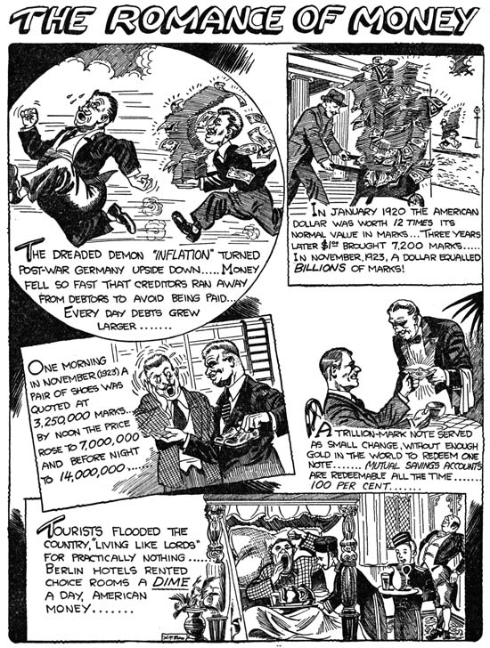
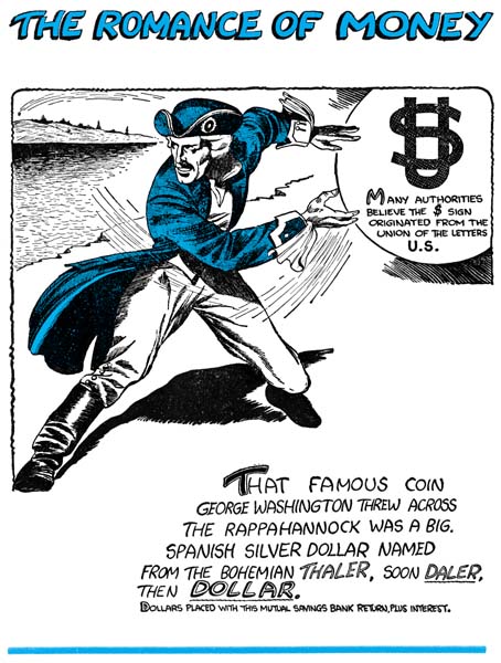
Early in his career Jack Kirby was employed by Lincoln News. There Jack worked on a number of strips for syndication but he also did the art for a give-away to be used by banks, “The Romance of Money”. Since this publication has a 1937 copyright date, some have designated it as Kirby’s first comic book work. Well I guess it all depends what the reader’s definition of a comic book is. “The Romance of Money” is a small book (5 by 6.5 inches) that is just a little larger then half the size of a normal comic book. It is only 24 pages long including the covers. The cover and all interior pages are printed on the same type of paper. The paper is not newsprint, has a nice white color and is a heavier stock then what is found in a typical comic book. The interior of the book is printed in black and white while the front and back covers also include a single color, cyan.


The Romance of Money (1937) page 5, art by Jack Kirby

The subject of this book is, not surprisingly, money. The approach taken is very similar to the old Ripley’s Believe it or Not comic strips. Except for the covers, each page presents a number of related subjects. Despite the presence of a H. T. Elmo signature, Jack Kirby did all the artwork. Horace T. Elmo was not an alias of Jack’s but rather the owner of Lincoln News. Art with his signature appears in both pocket books and comics up to at least 1957. Most of what I have seen are gag cartoons. However considering how Elmo signed work actually done by Kirby, I would be cautious about attributing to him any of the art with his signature.


The Romance of Money (1937) page 19, art by Jack Kirby

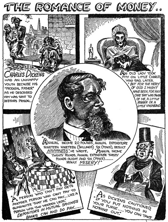
The inking in ROM is incredibly detailed, particularly considering the small size of the publication. The Elmo signature is so small that I suspect that originally a larger sized book was planned. I have never seen a comic book printed with such fine lines although I have seen numerous cases where even less detailed work failed to print properly. Either a letter press was not used or the printer was particularly skilled. The higher quality of the paper compared to that normally used in comics may have helped as well. Frankly the fine pen work is uncharacteristic of Kirby and raises the question as to whether Jack did the inking. At this point in his career it is hard to believe that Kirby would have been given the luxury of only providing the pencils. On the other hand the inking is rather poor in some places (for instance the portrait of Charles Dickens on page 19). My belief is that this is in fact Jack’s inking but he was inexperienced with the fine pen work that he was attempting (perhaps at the direction of H. T. Elmo).


The Romance of Money (1937) page 6, art by Jack Kirby

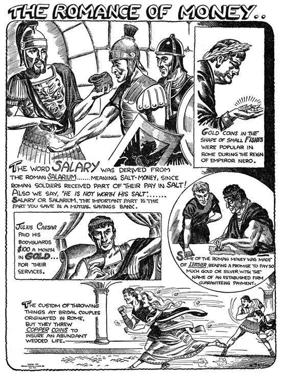
Most of the work Jack did for Lincoln News had cartoon-like imagery which can sometimes be hard to relate to his later comic book work. The more realistic style used in “The Romance of Money” makes for easier comparisons with the work from much of Jack’s career then the rest of what Jack did for Lincoln News. While Kirby had a long way to go some of his stylistic traits can already be detected. Note for example the wide strides of the running couple in the bottom scene of page 6.


The Romance of Money (1937) page 13, art by Jack Kirby

“The Romance of Money” was republished in 1942 using the same artwork. I understand that the older and later versions can be distinguished by the cover but I have heard two reports of how this can be done. One is that 1942 version used red ink for the color instead of cyan. The other explanation is that the 1942 issue uses colored paper for the cover. Unfortunately I am unable to say which explanation, if any, is the correct one.


The Romance of Money (1937) page 23, art by Jack Kirby

It’s A Crime, Chapter 11, The New Team

(Justice Traps the Guilty #13 – #23, Headline #39 – #45)

This chapter will continue the coverage of the Prize crime comics from the period December 1949 through February 1951. In the last chapter I discussed the work of Jack Kirby and Marvin Stein; this post will be concerned with some of the other artists.


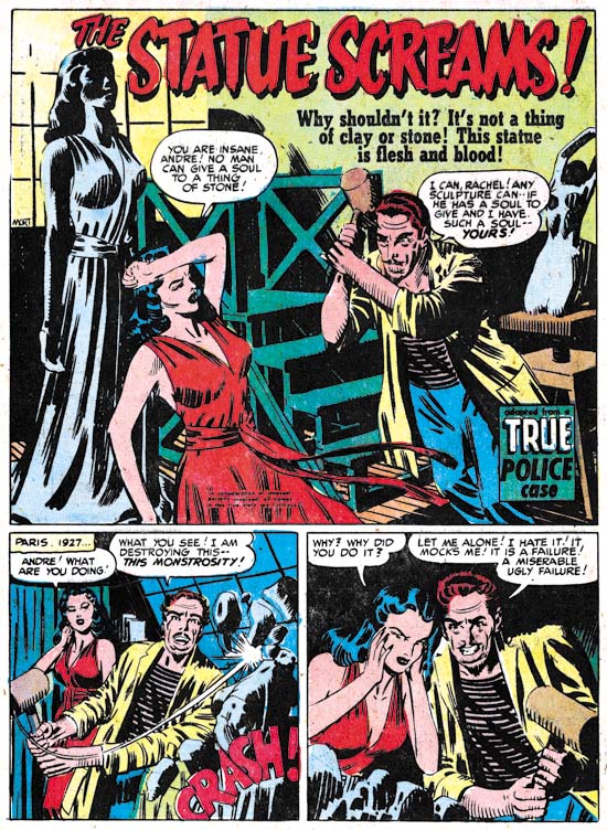
Justice Traps the Guilty #17 (August 1950) “The Statue Screams”, art by Mort Meskin

While most artists associated with Simon and Kirby productions were no longer found in the Prize crime titles there are a couple of glaring exceptions. Probably the most significant artist to jointly work the crime and S&K titles was Mort Meskin. At this point Meskin had become the second most used artist for Simon and Kirby productions (Jack Kirby retained the first place position although that would not always be true in the future). Even though Kirby’s presence in Headline and Justice Traps the Guilty had greatly diminished, Mort still did not achieve the status of primary artist in those titles; he never provided a cover nor did he ever do any lead story. Still he became a frequent contributor appearing in most crime comics and sometimes showed up twice in a single issue.

The crime titles provided Meskin with more opportunities for the depiction of action then the romance art that dominated his work for Simon and Kirby. Not that the diminished use of violence hindered Mort for those occasions when he was to draw it. However Meskin’s Prize comic work had greater similarities to his romance work then it did to the hero genre stories he had previously done such as the Vigilante.


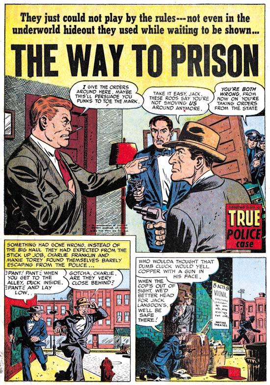
Justice Traps the Guilty #18 (September 1950) “The Way to Prison”, art by John Severin

John Severin also did art for both the crime and romance titles during this period. John is probably best known for his western and war genre comic book work. He may not have done that much crime stories for Prize, but they are very well done (I wish I could say the same thing about his S&K romance art). Not a criticism against Severin, because the same thing can be found in much of the crime comics from the 50’s, but note how well dressed the stick-up criminals are!


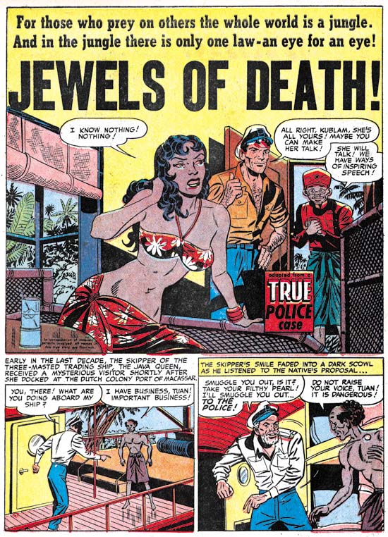
Headline #42 (July 1950) “Jewels of Death”, art by George Gregg

George Gregg is not in the same category as Meskin or Severin. While he previously had provided some work for the Simon and Kirby romance titles during the period covered in this chapter that was no longer the case but he would supply a small number of stories for the crime titles. “Jewels of Death” is not most typical of Gregg’s work but I still think that is the correct attribution. But what a great splash! Gregg’s females generally are rather stiff but not this native beauty. While the Prize crime titles are really pretty tame stuff by this time, they still could be quite suggestive (“we have ways of inspiring speech”).


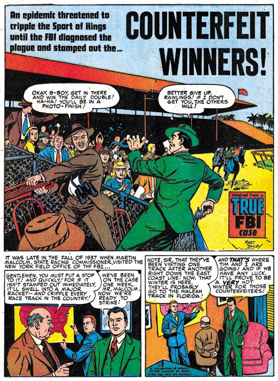
Headline #40 (March 1950) “Counterfeit Winners”, art by Mart Bailey

I have discussed Mart Bailey previously in Prize Comics Western, a Rough History. For about a year and a half he was the primary artist for that western title. He was originally brought in to draw the movie adaptations that PCW featured when they switched to photographic covers. He remained the principal artist until the photographic covers were dropped at which point John Severin became the principal artist for the title. However Bailey continued to provide backup stories. Mart was not as important an artist in the crime titles but he did draw a number of backup stories but he never provided any art for any Simon and Kirby production. Bailey drew in a realistic style which was probably why he was used for the movie adaptations in PCW. While his art is technically fine it is a bit dry for my tastes.


Headline #45 (January 1951) “Penny Shakedown”, art by unidentified artist

There are a number of artists appearing in Headline and Justice Traps the Guilty during this period that I have not been able to identify. Frankly in most cases it is not a big loss as their art work is really not that great. However there is one story, “Penny Shakedown”, that I wish I could provide an attribution. This story is certainly one of the best from the Prize crime titles during this period. Note how in the splash panel the woman is speaking to the reader, Simon and Kirby often used this type of confessional splash design.


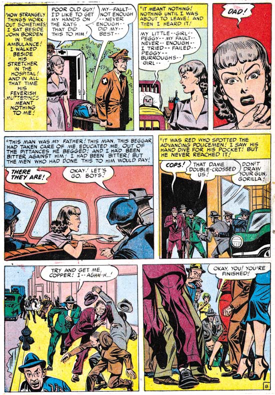
Headline #45 (January 1951) “Penny Shakedown” page 8, art by unidentified artist

This story is so good that I once suspected that Kirby supplied layouts. However the “cinematic” approach is not quite the same as Kirby’s. For instance in one panel the artist uses a very low viewing angle of a crowded sidewalk where the foreground consists of mostly legs and the arrest of a criminal is almost lost in the background. Not the sort of thing Jack would do.

This period, from October 1949 until January 1951, is the one that I am most uncertain about. It is clear that previously Simon and Kirby produced the Prize crime comics; basically the same artists were used in both the crime and romance titles. During this period, however, only a few artists worked both genres. Kirby did some cover art and probably provided a layout for one story. Both Mort Meskin and John Severin drew stories for both crime and romance. On the other hand, Mart Bailey was a significant presence in the crime titles and Prize Comics Western but never did any romance stories for Joe and Jack. At this time the first story of both Young Romance and Young Love always had a “produced by Simon and Kirby” credit but that cartouche never appeared in Headline or Justice Traps the Guilty. This despite Simon and Kirby’s long history of self promotion. While it may never be possible to say with certainty, in my opinion Joe and Jack were no longer producing the Prize crime titles during this period.

Whatever the reason for the changes in Headline and Justice Traps the Guilty, is was not due to poor sales. While I have no figures on the number of copies sold there are clear indications Prize was still making good money on these two titles. Why else would Justice Trap the Guilty go from a bimonthly to a monthly publication schedule with issue #18 (September 1950)? While Headline would never become a monthly, JTTG remained one until September 1955.

Chapter 1, Promoting Crime
Chapter 2, A Revitalized Title
Chapter 3, Competing Against Themselves
Chapter 4, Crime Gets Real
Chapter 5, Making a Commitment
Chapter 6, Forgotten Artists
Chapter 7, A Studio With Many Artists
Chapter 8, The Chinese Detective
Chapter 9, Not The Same
Chapter 10, The Master and His Protege

It’s A Crime, Chapter 10, The Master and His Protégé

(Justice Traps the Guilty #13 – #23, Headline #39 – #45)

This chapter will cover the Prize crime comics from the period December 1949 through February 1951. This is a longer period then I have lately been using in my serial posts but it defines a period where the art and artists are consistent. Actually the period started with JTTG #12 and Headline #38 that were included in the previous chapter.


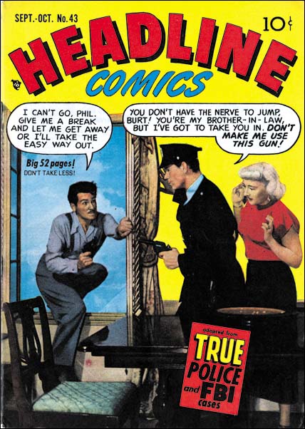
Headline #43 (September 1950)

For much of this period the covers of the crime titles used photographs. When the photo covers began some months before (Headline #36 July 1949, JTTG #12 October 1949) it is clear that Simon and Kirby had a hand in them because both are present on the cover for Headline #37 (September 1949).


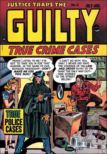
Justice Traps the Guilty #5 (July 1948), art by Jack Kirby

While neither artist shows up on any further covers, Simon and Kirby at least influenced the cover for Headline #43. The same theme appeared previously on the cover for JTTG #5 drawn by Jack Kirby. In both the criminal threatens to jump rather then allow himself to be arrested, the policeman has a personal relationship to the criminal (brother-in-law in one and old friend in the other), and a woman, presumably the criminal’s wife, looks on behind the protection provided by the cop. While the two covers have the same theme in reality they could hardly be more different. I do not know who was responsible for the switch to photo covers, but did they really believe that cheesy covers like that were better then those drawn by Kirby? What were they thinking?


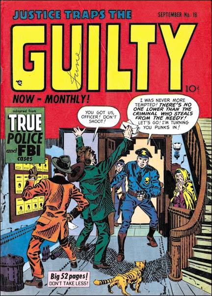
Justice Traps the Guilty #18 (September 1950), art by Jack Kirby

Eventually the use of photographic covers ended for four Prize titles. This did not happen at once but was done over a three month period. The last photo cover were Prize Comics Western #82 (July 1950), Young Love #1 (July 1950), Justice Traps the Guilty #17 (August 1950), and Headline #43 (September 1950). The western romance titles had ended prior to the drop of photo covers but interestingly Young Romance did not switch like the other titles and photo covers continued to be used until 1954 (with a couple very short lived revival of art covers; issues #26, #27, #33 and #34). Photo covers for Young Love resumed with issue #23 (July 1951) and then also continued until 1954.

When drawn covers were resumed it was Jack Kirby who provided the initial cover art. In the case of Prize Comics Western this was only for one issue (PCW #83, August 1950) before another artist (so far unidentified) took over. For Headline Kirby would produce two covers (issues #44 November 1950 and #45 January 1951). Justice Traps the Guilty got five Kirby covers (issues #18, #19, #21, #22 and #23, September 1950 to February 1951. Note that the last Kirby covers for JTTG and Headline were dated about the same time but there are over twice as many JTTG Kirby covers. This can be explained by the fact that photo covers were dropped on JTTG before Headline and JTTG was at this point a monthly title while Headline remained a bimonthly.


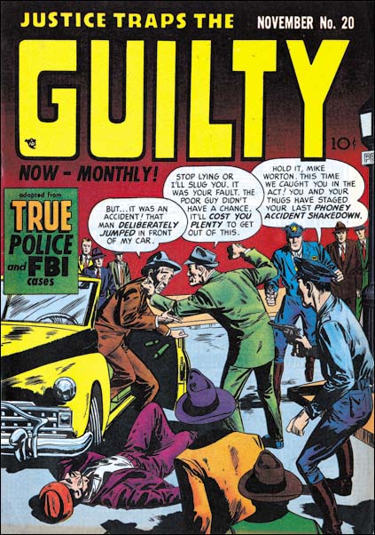
Justice Traps the Guilty #20 (November 1950), art by Marvin Stein

Perhaps the reader noticed that in the middle of all final Kirby crime covers there was one missing, JTTG #20. This cover is unsigned but clearly was not done by Jack. Instead it was done by an artist, Marvin Stein, who has not yet been discussed in this serial post, It’s a Crime, or The Art of Romance but was discussed briefly in Prize Comics Western, a Rough History. I will be writing about Stein further below but here I would like to say that my attribution of JTTG #20 is based mainly on the policemen. The head of the cop in the foreground has a shallow depth to it that is characteristic of Marvin Stein when he draws a head from slightly behind side view. Stein also has a particular visual shorthand for more distant faces that can be seen in the background policeman.


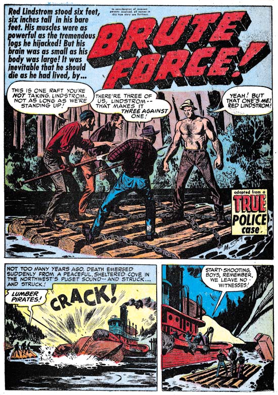
Justice Traps the Guilty #22 (January 1951) “Brute Force”, art by Marvin Stein

Marvin Stein had an extended relationship with Prize Comics but how long he was actually employed by the Simon and Kirby studio is more uncertain. When interviewed by Jim Amash (Alter Ego #76 March 2008) Joe Simon said that they traded Marvin like he was some baseball player to Crestwood (otherwise known as Prize Comics). However Stein continued to work in the Simon and Kirby studio as Prize Comics had no art department. It would be nice to know when this “trade” occurred and although I will be offering a couple of possibilities the fact none is of my suggestions seems fully satisfactory.

Joe Simon once said to me that initially he did not think Stein’s art was that good but later Marvin improved greatly. Marvin signed many of his work and had a distinctive style over most of his career. The earliest signed work by Marvin Stein that I am aware of is “Brute Force”. The presence of his autograph is particularly important because otherwise it would be hard to provide an attribute since it does not exhibit many of the features that make Stein’s style so distinctive. Frankly I am fully in agreement with Joe’s negative evaluation of Marvin’s early work.


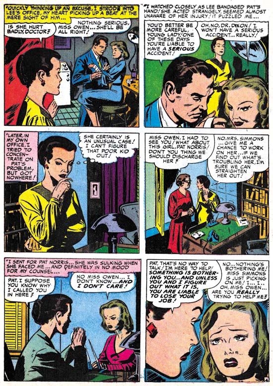
Young Love #19 (March 1951) “The Girl Who Loves Him”, art by Marvin Stein

Marvin Stein’s early work shows much variation. “The Girl Who Loves Him” was published only a couple of months after “Brute Force”. I have included this romance story here because if provides a better example of what Marvin’s early work looked like. While on a whole this early art looks different from later, and more typical, work by Stein, some of his style traits can be detected. Marvin often shows a man from above and to the side and when doing so draws them in a distinctive fashion. This can be seen in the man in the second panel. The woman in the third panel has eyebrows that extend into a thought line without much of a demarcation to distinguish the two facial features; this is also a trait often found in Stein’s later period. In particular, make note of how the woman is drawn in the second, third and fifth panels. Here Marvin’s style is different from his typical period but we will see it again in some unsigned works.


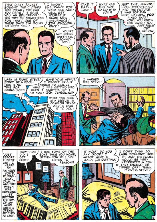
Justice Traps the Guilty #18 (September 1950) “Pirates of the Poor” page 6, art by Jack Kirby and Marvin Stein

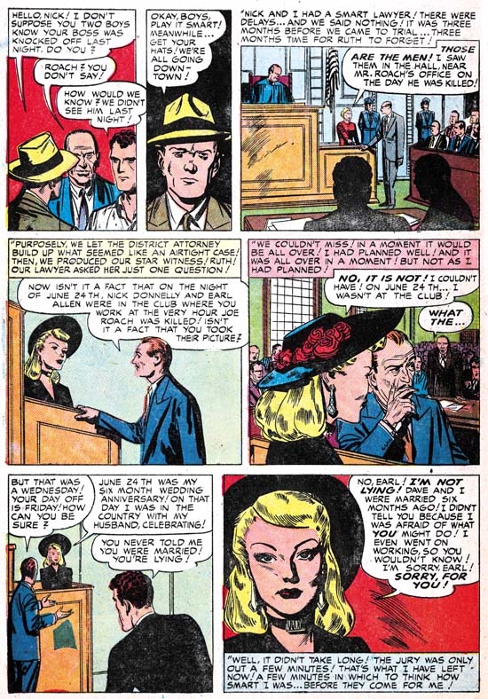
While it is clear that during this period Jack Kirby contributed some covers, did he provide any art? Well if you believe The Jack Kirby Checklist, Jack provided two stories, one of them being “Pirates of the Poor”. I must admit that some time ago I had excluded this story from works attributable to Kirby. But one nice thing about the writing these posts that focus on specific periods is that it gives a better perspective when I review the material. There are parts of the art of this story that do look like they were done by Jack as for instance the man in the first panel. There are other parts that look like pure Marvin as in the shallow depths of the head of the men seen from behind in the second and last panels.


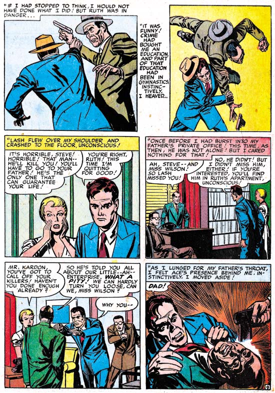
Justice Traps the Guilty #18 (September 1950) “Pirates of the Poor” page 9, art by Jack Kirby and Marvin Stein

The third panel has a distinctive Kirby touch to it and is very different from Stein’s manner of drawing either men or women at this time. For me the big giveaway is the manner of graphically telling the story. The use of “camera” angles just looks too advanced compared to other work by Stein in this period. It is, however, just the thing Kirby was so good at. But look how awkward the last two panels are, not the sort of thing you would expect from Kirby. While some may think this story was penciled by Jack and just inked by Stein I believe this is another case of Kirby providing layouts and another artist, in this case Stein, doing the finishing work and inking. In cases like this I credit the art to both artists.


Justice Traps the Guilty #19 (October 1950) “Alibi Guy” page 7, art by Marvin Stein

The other story that The Jack Kirby Checklists credits to Jack is “Alibi Guy”. Again this is a work that for a long time I did not believe was done by Jack. Having changed my mind about “Pirates of the Poor” I gave particular attention in my review of “Alibi Guy”. In this case, however, I still believe that the pencils were not done by Kirby. All the faces look like they were drawn by Stein; the man in the second panel of page 7 is the closest any of them come to Kirby’s style. Perhaps Jack did give a hand in that panel or perhaps Marvin just swiped it. The use of viewpoints in graphically telling the story is handled rather well, but is not suspiciously well done. Nothing in the use of “camera” angles convinces me Kirby was involved in even the layouts. There really is no comparison between “Alibi Guy” and “Pirates of the Poor” and I continue to exclude “Alibi Guy” from Jack’s work.

Marvin Stein was obviously very influenced by Jack Kirby. Even when Marvin was no longer working on Simon and Kirby productions he continued to work in the studio. Which brings the question about exactly when Marvin was “traded” off by Simon and Kirby to Prize? On possible date could be at the start of this period. But we have seen that during this Kirby provide layouts to Stein in “Pirates of the Poor”. So perhaps a better date would be at the end of the period covered in this chapter, which is after February 1951. It will be the subject of a future chapter for It’s A Crime but Stein played an important part in both Headline and Justice Traps the Guilty from March 1951 on. But art by Stein was still appearing in Young Romance and Young Love throughout 1951 and he was involved in Boys’ Ranch as well which ended in August 1951. Putting the “trade” at the end of 1951 would solve that problem but by then Marvin had been fully involved in the Prize crime titles for some time so what was he being “traded” to? Perhaps it is not wise to take the trading of Marvin Stein too literally and remember Joe Simon’s saying “never let facts get in the way of a good story”.

Of course Jack Kirby and Marvin Stein were not the only artists working on Headline and Justice Traps the Guilty during this period. But that will be the subject of the next chapter of It’s A Crime.

Chapter 1, Promoting Crime
Chapter 2, A Revitalized Title
Chapter 3, Competing Against Themselves
Chapter 4, Crime Gets Real
Chapter 5, Making a Commitment
Chapter 6, Forgotten Artists
Chapter 7, A Studio With Many Artists
Chapter 8, The Chinese Detective
Chapter 9, Not The Same

Chapter 11, The New Team

More About the Comic Con Simon and Kirby Lithographs

The New York Comic Con web site has a page of show exclusives. If you scroll way down, or better yet do a search for |”Titan (1514)”, you will find the two lithographs that will be offered at the Titan booth. I previously provided images of both but those were of the restoration I made, not the final product. I looks like they did a great job.

The Art of Romance, Chapter 11, After the Glut

(May – July 1950: Young Romance #21 – #23, Young Love #9 – #11)


Number of Romance Titles 1947 – 1950 (the period covered in this chapter shaded in blue)

This chapter will cover the period from May to July 1950. This is during the rapid decline of romance titles that followed the love glut. Simon and Kirby were not immune to the effects of the over abundance of romance comics; their most recent titles, Real West Romance and Western Love had been cancelled. There were other western romance comics published during the glut as well but all ended up being terminated. Western love titles would never again be tried by any publisher. Although Joe and Jack failed with their western love titles, their standard romance titles, Young Romance and Young Love, seemed unaffected. Both titles had gone monthly during the glut and would remain so for years afterwards. The name brand recognition that Simon and Kirby’s Young Romance had achieved before the glut had allowed it to find a place on the comic racks while newer titles often never had a chance. Young Love’s similar name and logo let it join it Young Romance on the racks as well. Apparently both titles did very well during the period when other titles were rapidly disappearing.

As I discussed previously in It’s A Crime, it is unclear exactly what Simon and Kirby’s contribution was at this time for the Prize crime comics, Headline and Justice Traps the Guilty. These titles seem now to have been made on the cheap. Either Joe and Jack were doing nothing more then supplying some covers, or they were still producing them but because less money was involved they were not putting much effort into it. So Simon and Kirby’s source of income was largely based on two monthly romance titles.
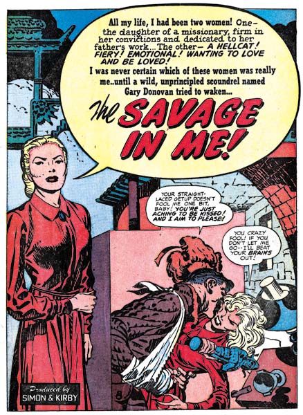

Young Romance #22 (June 1950) “The Savage in Me”, art by Jack Kirby

Jack Kirby was still the primary artist for the romance titles although still somewhat below his normal output. For the 6 issues discussed here Kirby did 6 stories for a total of 56 pages. Kirby drew no covers as they were done with photographs. Jack did all the lead stories for Young Romance and all were much longer then any of the other stories in the issues (14 or 15 pages for the lead stories as compared to 7 or 8 for the longest of the other stories. Jack’s contributions to Young Love were more limited and all the lead stories of that title were done by other artists.

For two of the lead stories Jack used full page splashes with what I describe as the confessional  splash where someone talks about the story to the reader with the word balloon used to include the title of the story. Kirby’s lead stories are still very different from stories by other studio artists. They generally are more complicated, include more action, and sometimes use exotic locations. While original writers have indicated that Jack contributed to the plotting of their stories, it is clear that Jack had even further impact on the scripting of the stories that he drew. It was just a few months short of the third anniversary of the Young Romance title, but Kirby was still putting much effort to make his stories as interesting as possible, and I may add succeeding. This was particularly true with “The Savage in Me” a tale that combines an exotic location (China), drama (the threat presented by a warlord’s army) and humor. The story was, I may add, discussed at length in an article by Kirby scholar Stan Taylor (“Simply the Best”, The Jack Kirby Quarterly #12, Spring 1999).
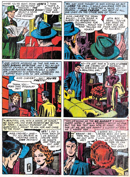

Young Love #10 (June 1950) “The Girl I Picked From the Phone Directory” page 2, pencils by Jack Kirby, inks by Mort Meskin

At a glance one story, “The Girl I Picked from the Phone Directory”, looks like it was done by Mort Meskin. Typical Meskin traits such as the woman’s eyes and for some men Mort’s characteristic grin. However the shifting viewing angles found in the story are more like Kirby’s then those used by Meskin. Further some of the people depicted have typical Kirby mannerisms such as the gesture of the man in the last panel of the above page. I have no doubt that this story was penciled by Kirby but inked by Meskin. As such it is the earliest example of Meskin inking Kirby that I am aware of. Either Mort was untypical heavy handed in his inking or Jack’s pencils were not very tight.
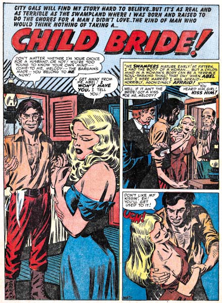

Young Romance #22 (June 1950) “Child Bride”, art by Mort Meskin

While Meskin still had not reached his high productive levels, he had now become the second most prolific artist in studio. Mort did 8 stories for a total of 50 pages. Even when Meskin provided the lead stories for Young Love #9 and #11, he still did not use a full page splash. Mort was also using vertically oriented captions, a device not typical of Kirby. While Meskin had a cinematic approach to story telling it was done differently from Jack’s. Once again I find no evidence to support the idea, promoted by some Kirby scholars, that Jack supplied layouts.
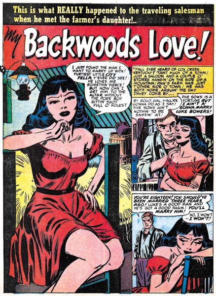

Young Love #10 (June 1950) “My Backwoods Love”, art by Mort Meskin

It maybe just a coincidence, but there seems a more abundant use of “cheesecake” poses in Mort Meskin’s work at this time; not something I normally associate with him. Further he does them quite well.
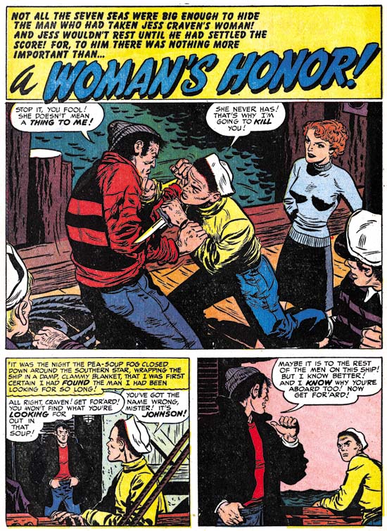

Young Romance #23 (July 1950) “A Woman’s Honor”, art by Bill Draut

Bill Draut has been displaced from his number two position by Mort Meskin. During this period Bill did 4 stories with 31 pages. Enough to secure the number three spot but still significantly less then Meskin. Bill consistently provided good art and so he continued to be an important contributor to Simon and Kirby productions.
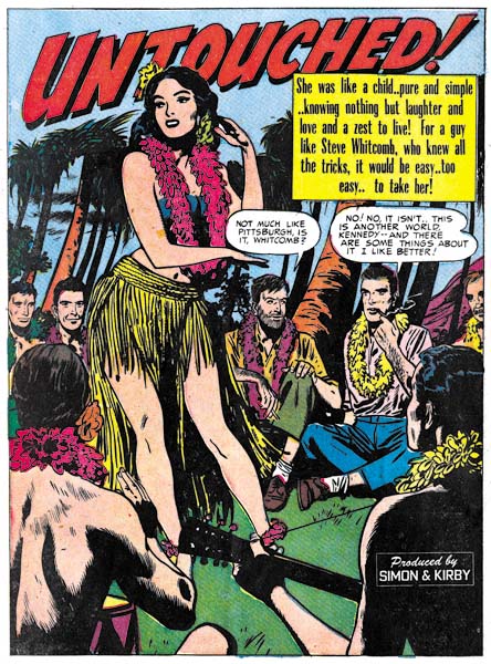

Young Love #10 (June 1950) “Untouched”, art by Bruno Premiani?

We have seen all the other important artists before, there were no changes in personnel at this time. I still have not been able to confirm that artist who did some very distinctive work for Joe and Jack was in fact Bruno Premiani. But I continue to use that attribution (with a question mark) until something convinces me otherwise. Premiani normally used half page splashes, but for the lead story that he did for Young Love #10, “Untouched”, he provided a full page splash.

By the way do not get confused by the “Produced by Simon and Kirby” credit that appears on this splash. It is not a claim by Joe and Jack that they drew this story. Rather it was used to indicate that the entire comic was put together by Simon and Kirby. It appeared on the first story of all the Simon and Kirby titles at this time (and for some time to come) regardless who actually drew the lead story.
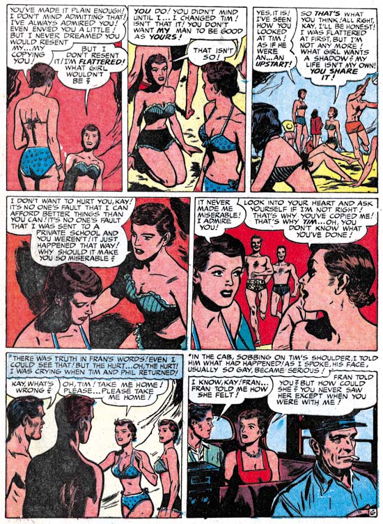

Young Love #9 (May 1950) “Carbon Copy” page 6, art by Bruno Premiani?

I guess “cheesecake” must be the theme for this chapter of Art of Romance because I could not resist including the above page from “Carbon Copy”. I do not know what the original teenage girl readers thought about this page but I certainly am not going to complain about a beach full of bikinis. Today such a scene, while enjoyable at least for the men, would not be considered remarkable. But back in 1950 it would be quite unusual at least on American beaches. For instance bikinis were banned in 1951 from use in the Miss World beauty pageant. It would not be until the early ’60s that the two piece swimsuit would become the norm in beach movies such as “How to Stuff a Wild Bikini”. Was Premiani’s page a flight of fantasy or wish fulfillment or was Bruno taking his queue from more liberal European beaches?
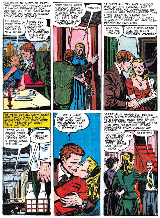

Young Love #10 (June 1950) “At Your Own Risk” page 3, art by Leonard Starr

Leonard Starr was another S&K studio regular who continued to appear during the period considered here. During this period he drew 3 stories with 21 pages. Starr is most easily recognized by his women that he draws with widely separated eyes, wide foreheads and narrow chins; a look I like to call elfin. Another easy way to pick him out is his use of tall narrow panels. Not every page in a story would use six narrow panels as in the example above, but other combinations of a row of tall panels with two vertically diminished panel rows are also commonly found. It is an arrangement that is not found in Kirby’s work so again claims of Kirby supplying layouts to not seem to be correct. Starr puts his tall panels to good use and it has the added benefit of allowing the talk balloons to be place out of the way of the image.
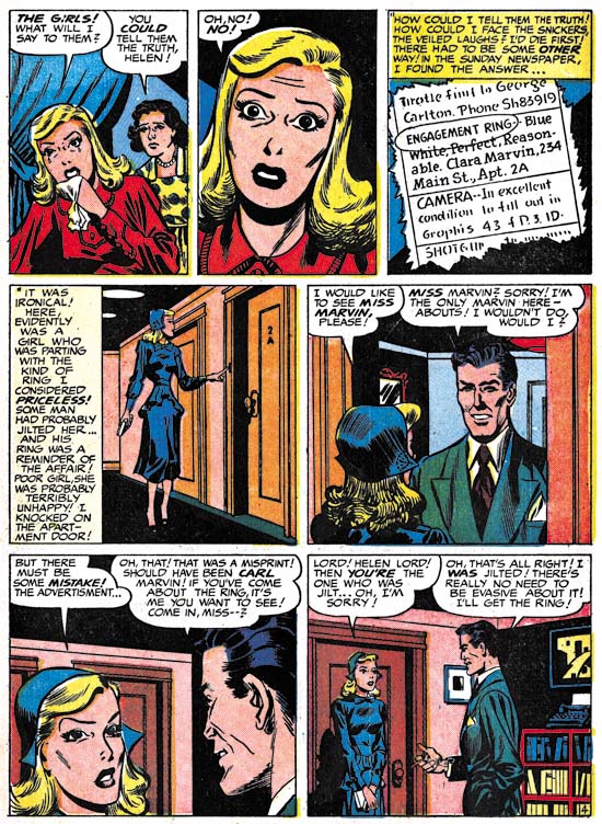

Young Romance #23 (July 1950) “Love on A Budget” page 4, art by John Severin

Previously John Severin was more a presence in the western love titles then in the standard romances. With the cancellation of the Western Love and Real West Romance the expectation might be that Severin would appear more often in Young Romance and Young Love. While John still shows up in the romance titles during this period, his participation does not appear to have increased. One explanation might be that Severin did not need the extra work since he had begun doing work for Prize Comics Western. But I do not think that is the likely explanation as PCW seemed to have been done “on the cheap” and probably did not pay as well as work for Simon and Kirby. It is more likely that Simon and Kirby just did not want to give him further work. The fact is Severin just was not that great of a romance artist. It was not that John could not draw well; it is just that he did not seem comfortable with depicting romantic scenes. He rarely, if ever, drew a kiss in his stories. The absence of true romance in Severin’s work may not have been a problem for the western love titles but it certainly was a hindrance for the standard romance. Still he did provide 19 pages of art during the period discussed in this post although none were signed and this includes a few that are questionable attributions.
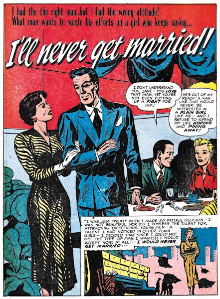

Young Love #11 (July 1950) “I’ll Never Get Married”, art by John Severin?

Included in the work I credit to John Severin is one that looks distinctively different, “I’ll Never Get Married”. Perhaps my attribution is just incorrect but I suspect what makes this story look so different from others by Severin was the inking. During this period most of John’s art was inked by Will Elder. While I do not claim to be very familiar with Elder’s inking a comparison of this story to works signed by Severin and Elder clearly shows Elder did not ink “I’ll Never Get Married”. Whoever the inker was he was not nearly as talented as Elder.
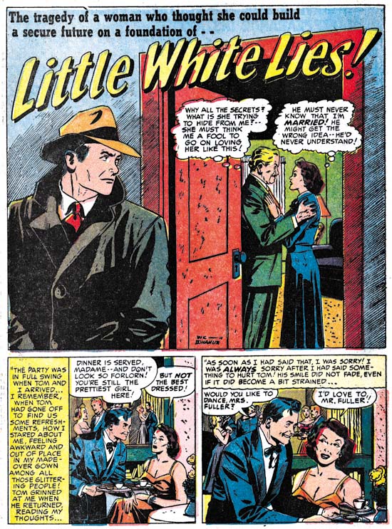

Young Love #11 (July 1950) “Little White Lies”, art by Vic Donahue

Vic Donahue is another artist that we have seen previously and continues to make an appearance. During this period Vic’s contribution consisted of 5 stories with 21 pages. This includes three “Problem Clinic” stories but they are all questionable attributions and only amount to a total of 6 pages. Donahue also provided to longer stories one of which was signed.

Unlike some earlier chapters, there are only a few stories that I have not been able to credit. Most of the artists used were therefore studio regulars.

Chapter 1, A New Genre (YR #1 – #4)
Chapter 2, Early Artists (YR #1 – #4)
Chapter 3, The Field No Longer Their’s Alone (YR #5 – #8)
Chapter 4, An Explosion of Romance (YR #9 – #12, YL #1 – #4)
Chapter 5, New Talent (YR #9 – 12, YL #1 – #4)
Chapter 6, Love on the Range (RWR #1 – #7, WL #1 – #6)
Chapter 7, More Love on the Range (RWR #1 – #7, WL #1 – #6)
Chapter 8, Kirby on the Range? (RWR #1 – #7, WL #1 – #6)
Chapter 9, More Romance (YR #13 – #16, YL #5 – #6)
Chapter 10, The Peak of the Love Glut (YR #17 – #20, YL #7 – #8)
Chapter 11, After the Glut (YR #21 – #23, YL #9 – #10)
Chapter 12, A Smaller Studio (YR #24 – #26, YL #12 – #14)
Chapter 13, Romance Bottoms Out (YR #27 – #29, YL #15 – #17)
Chapter 14, The Third Suspect (YR #30 – #32, YL #18 – #20)
Chapter 15, The Action of Romance (YR #33 – #35, YL #21 – #23)
Chapter 16, Someone Old and Someone New (YR #36 – #38, YL #24 – #26)
Chapter 17, The Assistant (YR #39 – #41, YL #27 – #29)
Chapter 18, Meskin Takes Over (YR #42 – #44, YL #30 – #32)
Chapter 19, More Artists (YR #45 – #47, YL #33 – #35)
Chapter 20, Romance Still Matters (YR #48 – #50, YL #36 – #38, YB #1)
Chapter 21, Roussos Messes Up (YR #51 – #53, YL #39 – #41, YB #2 – 3)
Chapter 22, He’s the Man (YR #54 – #56, YL #42 – #44, YB #4)
Chapter 23, New Ways of Doing Things (YR #57 – #59, YL #45 – #47, YB #5 – #6)
Chapter 24, A New Artist (YR #60 – #62, YL #48 – #50, YB #7 – #8)
Chapter 25, More New Faces (YR #63 – #65, YLe #51 – #53, YB #9 – #11)
Chapter 26, Goodbye Jack (YR #66 – #68, YL #54 – #56, YB #12 – #14)
Chapter 27, The Return of Mort (YR #69 – #71, YL #57 – #59, YB #15 – #17)
Chapter 28, A Glut of Artists (YR #72 – #74, YL #60 – #62, YB #18 & #19, IL #1 & #2)
Chapter 29, Trouble Begins (YR #75 – #77, YL #63 – #65, YB #20 – #22, IL #3 – #5)
Chapter 30, Transition (YR #78 – #80, YL #66 – #68, YBs #23 – #25, IL #6, ILY #7)
Chapter 30, Appendix (YB #23)
Chapter 31, Kirby, Kirby and More Kirby (YR #81 – #82, YL #69 – #70, YB #26 – #27)
Chapter 32, The Kirby Beat Goes On (YR #83 – #84, YL #71 – #72, YB #28 – #29)
Chapter 33, End of an Era (YR #85 – #87, YL #73, YB #30, AFL #1)
Chapter 34, A New Prize Title (YR #88 – #91, AFL #2 – #5, PL #1 – #2)
Chapter 35, Settling In ( YR #92 – #94, AFL #6 – #8, PL #3 – #5)
Appendix, J.O. Is Joe Orlando
Chapter 36, More Kirby (YR #95 – #97, AFL #9 – #11, PL #6 – #8)
Chapter 37, Some Surprises (YR #98 – #100, AFL #12 – #14, PL #9 – #11)
Chapter 38, All Things Must End (YR #101 – #103, AFL #15 – #17, PL #12 – #14)
Joe Simon at New York ComicCon 2009

As promised I have some more information about Joe Simon’s appearance at this year’s ComicCon. Joe will be doing a signing at the Titan booth on Saturday (Feb. 7) from 2:30 to 3:30. Then from 4:00 to 5:00 will be the subject of a special panel “Secret Origins of the Comic Book World”. Joe will then return for more signing at the Titan booth from 5:30 to 6:30. This is all of the Joe Simon appearances that have been announced, but if that changes I will post about that as well.


Fighting American Lithograph

Titan first book, “The Best of Simon and Kirby”, will not be released until this summer, so what will Joe be signing? Well for one thing Titan will be offering two limited editions lithographs. One will be featuring the cover from Fighting American #1 (see above) while the other will be from the splash from the story “The Girl Who Tempted Me” from Young Romance #17 (see below). I have not seen the actually lithographs but I understand that the image size will be 11 by 16 inches (Fighting American) and 11 1/2 by 16 (Young Romance). The paper size I believe will be 14 by 18 inches. The edition size of each lithograph will be limited to 100, each signed by Joe Simon and are priced at $75 a piece. The two lithographs are being made specifically for this ComicCon and have never been offered elsewhere.


Young Romance Lithograph

At this point I have to admit that my observations and opinions are completely biased, I did the restorations for these lithographs. So take that in account when I say both are just stunning. No line art recreations here, both are based on scans from the original comics; pure Simon and Kirby. Colors were carefully done to accurately restore the original colors while correcting comic book printing problems such as registration errors. What can I say I am truly pleased with how they came out. With such a small edition size I am sure that these lithographs are going to quickly become collectors items.

Black Magic at DC

It has been some time since I posted about Black Magic. The last, and only, blog entry solely about the title was almost three years ago (The Old Black Magic). I hope to begin posting more about it in the near future but today I would like to write about the nine Black Magic reprint comics that DC published between November 1973 and May 1975. These show up frequently on eBay and at comic conventions and generally are still reasonably priced. Given the value placed today on even poor copies of the original Black Magic series the DC reprints may seem like a cost effective alternative. They may be as long as the purchaser is aware of what he is getting.


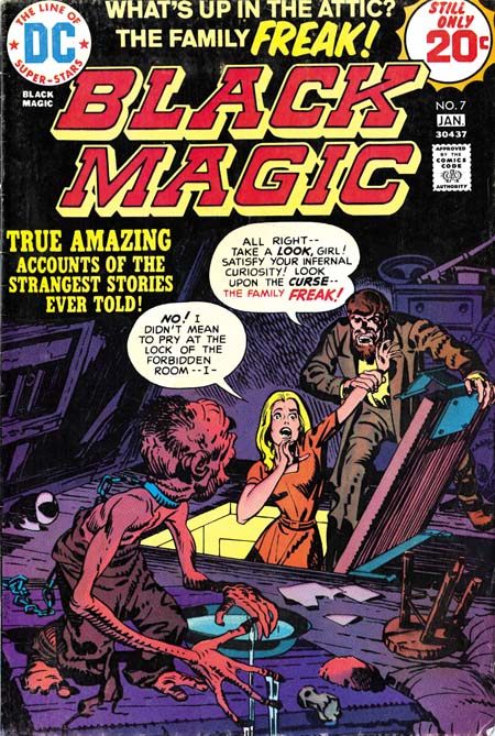
Black Magic #11 (April 1952) by Jack Kirby (on left)
DC Black Magic #6 (November 1974) by Jerry Grandenetti (on right)
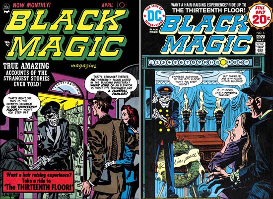
Larger image of Black Magic #11
Larger image of DC Black Magic #6

Seven of the covers of the DC reprints were penciled by Jerry Grandenetti and inked by Craig Flessel. Actually my crediting of the inking to Flessel is not based on any study but from conversations with Joe Simon. Joe told me that Craig did a lot of work for him at the time. When I asked what work that was Joe said he used Flessel to do Grandenetti’s inking but he did not identify any work in particular. Most of the covers, like issue #6 shown above were reinterpretations of the covers that were originally done by Jack Kirby. Today it sounds like an odd thing to do but when the reprints were published most readers probably had not seen any of the original Black Magic comics. Three of the coves were original compositions by Grandenetti based on reprinted stories. Frankly Jerry’s reinterpretations are better then his own more fully original covers.


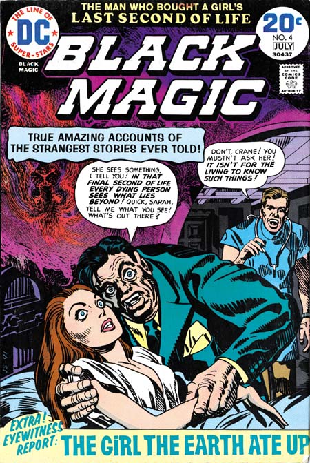
DC Black Magic #4 (July 1974)

One of the covers used for DC’s Black Magic reprints was one never published before. There are at least three versions of this image that Simon and Kirby intended for the first Black Magic cover. I guess in the end they were not satisfied with any of the versions and used a story about an evil doll as the basis for the published cover. The version used for DC issue #4 was altered slightly by the odd inclusion of an upside down lion in the upper left. I really do not know what to make of it. It seems so out of place with Simon’s typical designs and the art does not seem to match Grandenetti’s style either.


DC Black Magic #7 (January 1975)

The other Kirby cover appeared on DC issue #7 but originally on Black Magic #17 (October 1952). It was a great choice it was one of the best from the entire Black Magic series. But look at that woman’s face, that does not look like Kirby! In fact it does not match the original version and looks like the work of Joe Simon.


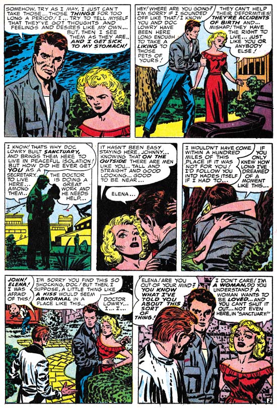
Black Magic #29 (March 1954) “The Greatest Horror of Them All” page 2, art by Jack Kirby

I have heard it from many people, Kirby did not draw beautiful women. It is a remark that I truly do not understand, at least for the period of the Simon and Kirby collaboration. Granted the lady in the first panel of the image above leaves much to be desired but surely as depicted in panel 4 she would be described as pretty? Even in the last panel where she is overwhelmed by emotions, I would hardly call her unattractive.


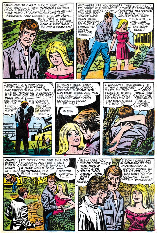
DC Black Magic #1 (November 1973) “The Greatest Horror of Them All” page 2, art by Jack Kirby and Joe Simon

Surprisingly Joe Simon shares the same general opinion. In the earlier issues of the DC reprints he replaced Jack’s woman with a creation of his own. Is it truly an improvement? Well the first panel came out better and I leave it up to the reader whether which version of panel 4 is the most attractive. However in the last panel Joe has completely lost the emotion. It is in conveying the emotions of woman that Kirby is truly at his best and that, for me, is why his females are truly beautiful.


“The Angel of Death” panel from page 6, art by Jack Kirby
Black Magic #15 (August 1952) top
DC Black Magic #3 (May 1974) bottom

A careful observer may have noticed that the two pages of “The Greatest Horror of Them All” are not identical even when Joe was not purposely changing the art. There are subtle differences in the inking as well. The art presented in the DC reprints was not made from bleached comic pages. Simon probably knew even then how to remove the color from old comic books. But the bleaching process does not completely remove the color and more importantly the copiers need to provide a quality finish to the process were not yet commonly available in the early ’70s. Instead I believe Joe worked with a technique that I know he used earlier in the Harvey reprints of Fighting American. He re-inked the art on tracing pages over blown up copies the original, but probably bleached, comic book pages. Generally Simon was very careful to trace the original brushstrokes, but sometimes, such as the panel from “The Angel of Death” he did not do so. It may seem surprising that Joe, who had done so much inking over Kirby’s pencils, would have trouble re-inking the reprints, but the use of tracing paper obscures the art in a way that working on the original pencils did not.

Also not that panel from the DC reprint is higher then the original. Oddly this was due to the smaller size of the comics in the ’70s as compared to the ’50s. The size difference is not in the height but in the width of the page. The art in the DC was slightly reduced in size to accommodate the narrower page. To avoid an overly large top and bottom margins some panels were extended in a vertical direction. There in a small strip of art that was not present in the original comics. Expanding the panels was only done in the earlier DC issues. Later the Black Magic title that appeared at the top of the page was replaced with a larger version that was also moved further from the panels. This fixed the problem of the over sized top and bottom margins without the extra work involving in adding the new art to the extended panels.


“The Girl Who Walked on Water” page 6, art by Jack Kirby

The examples I have provided of the re-inking are really the extremes. Most of the art was recreated well enough that only a close examination reveals the differences. But starting in DC issue #6 and completely dominating issues #7 to #9, are some completely heavy handed re-inking. Even without comparison to the original Black Magic stories it is easy to see something is wrong. Look at the inking in the bottom panel from “The Girl Who Walked on Water”; it looks more like a wood cut then the work of a brush. The sudden appearance of this type of inking convinces me that Joe was not the re-inker. He had handed off the work to less skillful hands with rather disastrous results.


“The Clock”, panel from page 6, art by Jack Kirby
Black Magic #2 (December 1950) top
DC Black Magic #7 (January 1975) bottom

It is like watching a train wreck. I just cannot help myself from providing another comparison between the “woodcut” inking and the masterly studio style inking of the original.


Black Magic #32 (September 1954) “Maniac” page 5, art by Jack Kirby

So far I have been describing the art, but were the stories changed when DC reprinted them? There is good reason to expect that they might have been as the original Black Magic was produced before the creation of the Comic Code Authority. In fact one aim of the Comic Code was to eliminate horror comics completely. In this they succeeded and Black Magic was one of the casualties. But after awhile the Code was relaxed slightly and Prize resurrected the Black Magic title in 1957 this time with the help of Joe Simon alone. Although the title was brought back the content could not be, the Comic Code would not allow it. However by the ’70s the Code had been relaxed even further. In fact horror comics were in a period of popularity. It was still tame stuff compared to what was done pre-Code at say EC, but at least it was permissible to have stories about vampires, werewolves and other monsters. It is an indicator about how relaxed the Comic Code had become in the ’70s as well as how comparatively tame the original Black Magic series were in the early ’50s that I have only found a single case of a story changed for the DC reprint. This was the total elimination of page 5 of the story “Maniac” along with some minor modifications to the captions of the next page to accommodate the sudden leap in the story.

So are the DC Black Magic comics a relatively cheap replacement for the much more expensive Prize Comics version? Yes if all you want is a good read. But if you want to study the art closely the reprints are simply not the thing to examine. The best description of the process used in making the reprints is recreation. In discussions about the art recreations in recent Marvel reprints many have pointed back to the technique that Simon used as justification for similar methods used today. This is ironic because while Simon was limited by the primitive technology then available, today we have computers, scanners and quality printing.

I have created a checklist for the DC Black Magic that includes references to the original source. It is available in the sidebar as well.

Titan Announces Expanded Simon and Kirby Library

The following is a press release from Titan:

THE OFFICIAL SIMON AND KIRBY

Titan to Collect the Works of Two Comic Book Legends


Titan Books Signs Exclusive Agreement to Publish Works by Comics’ Greatest Creative Team, with Full Involvement of Living Legend Joe Simon and the Jack Kirby Estate

Titan Books has expanded its publishing agreement with comic book pioneer Joe Simon, co-creator of Captain America, to launch The Official Simon and Kirby Library beginning in 2009. In addition to the previously announced volumes The Best of Simon and Kirby and The Simon and Kirby Superheroes, the library will include volumes collecting the greatest horror, detective, and romance stories ever produced by the legendary Dream Team of comics.

Joe Simon and Jack Kirby first joined forces on the superhero character Blue Bolt in 1940, and later that year created the seminal hero Captain America (soon to be featured in a major motion picture by Marvel Studios). “When Jack and I created Captain America, it sent a shock across the nation even before America had entered World War II,” Simon noted. “But that was only the beginning, and we followed it up with titles like Boy Commandos and Young Romance. They weren’t superhero books, but each one sold millions of copies.”

Beginning in summer 2009 with The Best of Simon and Kirby, Titan Books will release full-color hardcover editions featuring some of the greatest stories ever told in the graphic medium, painstakingly restored by Simon and Kirby historian Harry Mendryk. Simon himself will oversee the process, and will offer original insights and secrets from behind the scenes.

The volume will feature the team’s most famous characters, including Fighting American, Stuntman, and The Fly, as well as genre adventures from such legendary titles as Black Magic, Justice Traps the Guilty, and the industry’s first romance title, Young Romance. Through the generous support of Marvel Comics and DC Comics, The Best of Simon and Kirby will include stories featuring Captain America, The Vision, Sandman, and The Boy Commandos.

“It’s simply astonishing, the materials Joe has kept over the years,” Titan owner and publisher Nick Landau said. “It shows uncanny foresight that he retained so many rights, and preserved those wonderful stories so that today’s readers will be able to enjoy some of the finest comics ever produced.” Details on the contents and format of the books are still being determined, as Landau added, “We want to come up with editions that are as perfect as they can be.”

Simon will attend the February 2009 New York ComicCon to celebrate the launch of The Official Simon and Kirby Library, and will sign exclusive limited edition lithographs. Titan plans to release two books a year, and these will be the only editions authorized by both Joe Simon and the estate of Jack Kirby. In addition to The Official Simon and Kirby Library, Titan will publish the autobiography of Joe Simon in 2010.

Titan Books is a leading publisher of licensed entertainment. The UK’s top publisher of graphic novels and World renowned for television and film companions, including Tim Burton’s Sweeney Todd, Frank Miller and Will Eisner’s The Spirit, Watching the Watchmen by Dave Gibbons, plus the official Watchmen and Terminator: Salvation movie tie-ins. Titan Books also publishes a series of high-end art books, and biographies such as the New York Times bestselling My Boring-Ass Life: The Uncomfortably Candid Diary of Kevin Smith.

I would like to emphasize of few points found in the release. The first is that I did not write this release and was surprised to find that I was mentioned in it. I am sure I will comment further on my contribution; most likely when the first book, “The Best of Simon and Kirby”, gets released this summer.

When Titan told me they wanted to include some stories from Marvel and DC in “The Best of Simon and Kirby” I must admit I was a bit skeptical. I have never been so pleased to have been proven wrong. The release describes DC Comics and Marvel Comics support as “generous” with which I heartedly agree.

I said this before, but it is worth repeating. Both Joe Simon and the Jack Kirby estate will financially benefit from these books.

Most immediately important is that the release mentions Joe Simon will be appearing at upcoming New York ComicCon. Joe does not make many appearances so this will be a special chance for fans to meet him. I will have further announcements in the near future when his schedule becomes firmed up.

Jest Laffs


Jumbo Comics #2 (October 1938) “Jest Laffs”

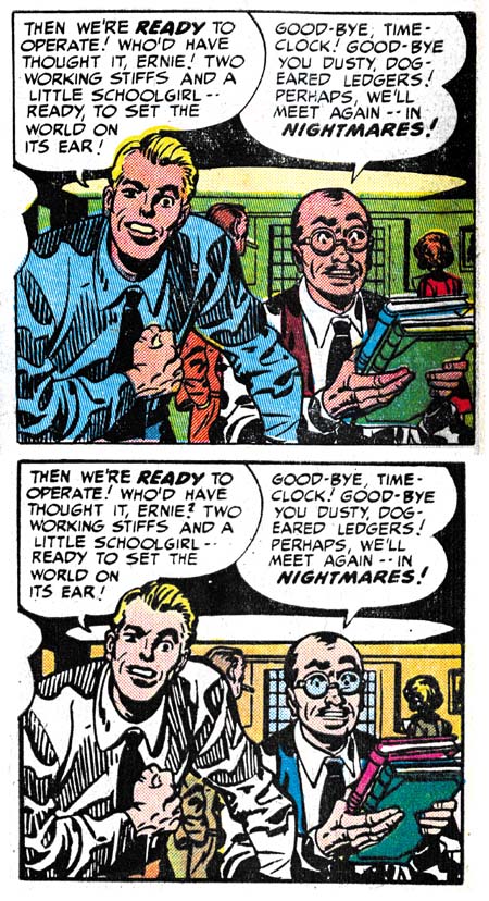
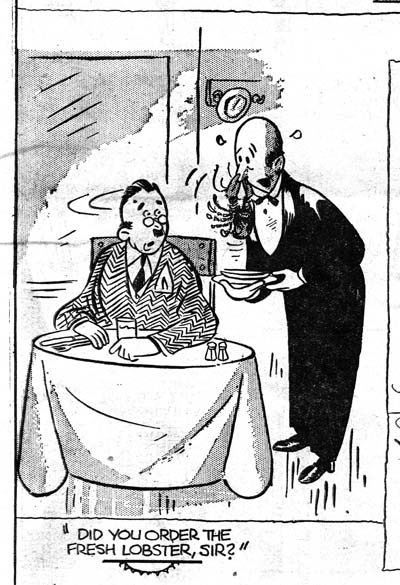
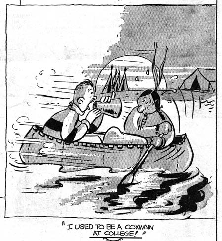
A few posts ago I present the image of the gag cartoon of a burglar from Jumbo Comics #1. Kirby scholar Stan Taylor had suggested that it may have been done by Jack Kirby. The cartoon was from page called Jest Laffs. Jest Laffs also appears in Jumbo Comics #2 and two of the cartoons there look like they were done by the same artist as the burglar from JC #1. There are a number of features that are shared, some more important then others. The use of darker regions with a raggy edge or the way the mouth is often placed off to the side of the face. I find the manner of depicting the nose and ears to be particularly interesting. It is in minor details like that individual artists often provide distinct mannerisms.


Jumbo Comics #2 (Octoer 1938) “Jest Laffs”

While the Jest Laffs page in JC #1 provides no credits, the title in JC #2 gives a Bob Kane attribution. There are other gags in the Jest Laffs page in both issues that are done in other styles. This could mean they were actually done by other artists. Or it could mean that Bob Kane adapted his style to one appropriate for the particular gag. After all Kane’s Peter Pupp, also in Jumbo Comics, was very done in a different style than his Batman.

I do not know enough about Bob Kane’s work to say whether any of it shows the same distinctive ears and noses found in the gag cartoons. It does not show up in Peter Pupp but that could just be due to the different nature between Peter Pupp and Jest Laffs. I have also examined much of Jack Kirby’s early cartoon work and could not find those distinctive ears and noses in any of it; including the one Jack did of a burglar.

For me this does not provide a definitive answer to the question of who did these particular gag cartoons but it does mean the Bob Kane should be considered along with Jack Kirby. Jack Kirby only appeared in the first three issues of Jumbo Comics. Although I have seen later issues, I was not examining them in relation to this question. If there are issues later then JC #3 with Jest Laffs gags that share the same traits then I doubt that Jack Kirby would have been the artist, if they stop with JC #3 then that would be another piece of evidence that they were done by Jack.

Joe Simon’s Newspaper Art

I recently wrote about Joe Simon’s newspaper career (Joe Simon, Editor) and earlier as well (Joe Simon as a Newspaper Staff Artist). I discussed how Joe did more then just sport illustrations. I never expected that someone would actually check to see if I was right. But that is exactly what Ger Apeldoorn did and he posted his initial results on his blog (previously called Those Fabulous Fifties, but now apparently unnamed). He is using microfiche copies of the Syracuse Herald, a search I also mean to do if I can ever find the time.

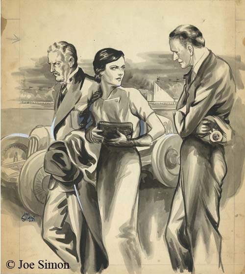
I am all for preserving old newspapers with techniques such as microfiche otherwise much would be lost about the history of our culture. Even so the quality leaves much to be desired. Ger attributed one illustration dated December 13, 1936 to Joe but could not find his signature. Was that because it was removed before publication, or has it been obscured by scratches on the microfiche film? In this case we are fortunate because Joe still has the original art in his collection. Ger may not have needed a signature to recognize Simon’s hand, but it is always nice to have confirmation.