Category Archives: Topic

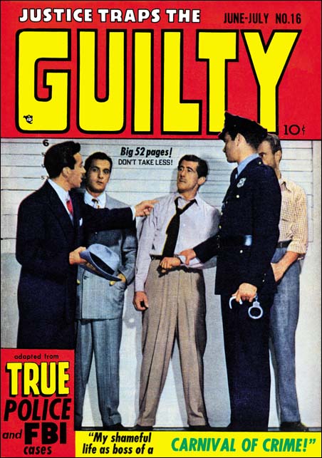
Justice Traps the Guilty #16 (June 1950)

Justice Traps the Guilty #16
Justice Traps the Guilty #16 (June 1950)

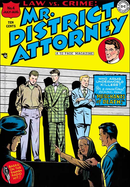
In the comments to my last post, “Lineup”, scholar Stan Taylor mentions another lineup cover, Justice Traps the Guilty #16 (June 1950). The crime genre was very popular at that time so I would not be at all surprised if police lineups showed up on other comic book covers as well. Although JTTG #16 was also published by Prize, it is clear that Marvin Stein’s model was Mr. District Attorney #4.

Stan questions why some comic books used such photographs. I have always believed the reason was one that Stan provided himself, that is to make the comic look more like a pulp magazine and hopefully attract more adult readers. I am with Stan, I prefer artist drawn covers to these photo versions but modern tastes are not likely to be a good reflection of those for potential buyers then at the newsstands.

It is not clear what would have been cheaper, having an artist draw and ink a cover, or use a photograph. Most cover photos were not made by the comic book producers themselves but rather supplied by an agency. I believe the chief aim of those agencies was the promotion of various actors and actresses. So it was probably the matching of some already existing publicity shot with the needs of some comic book title. Having their client appear on a comic book cover may have been viewed as more important then the financial gain for selling the photo. In any case the possible extra cost for the photograph was spread out over large print runs and therefore may not been viewed as too important. That was what Joe told me about the extra printing costs that photographic covers incurred.

The Lineup

Justice Traps the Guilty #56
Justice Traps the Guilty #56 (November 1953), art by Marvin Stein

The cover for Justice Traps the Guilty #56 is probably Marvin Stein’s most famous piece of comic book art. It has been reproduced in Joe Simon’s book “The Comic Book Makers” and “The Art of Jack Kirby” by Ray Wyman, Jr. (in fact my restoration above was made using the same comic book found in the Wyman’s book). The cover’s fame rests not so much on its artistic value but on the people portrayed in the police lineup. Here as the suspects we find starting from our left Ben Oda (Simon and Kirby’s letterer), Joe Simon, Joe Genalo (Prize editor), Mort Meskin and Jack Kirby. This was, of course, an inside joke because none of these individuals were actually criminals, nor were they likely to be recognized by the public. Most of the members of the lineup are people that have previously been discussed in this blog and should need no further introduction with the exception of Joe Genalo. Joe Genalo was working for Prize as an editor, not for Simon and Kirby. Annual postal statements may not be relied on completely but the one in Headline’s March 1953 issue shows Joe Genalo as editor (unfortunately I do not have the equivalent one for Justice Traps the Guilty). Genalo is again listed as editor in the postal statements found in the March 1954 issues of both Headline and Justice Traps the Guilty. The identification of the person in the line up as Joe Genalo is based on Joe Simon in “The Comic Book Makers”; however there is a problem with this. In a photo taken of the Simon and Kirby studio, there is a person that Joe also has named as Joe Genalo. The presence of Jimmy Infantino in the photograph indicates that it was probably taken in 1951. The photo “Genalo” does not wear glasses and is much younger then the man on Marvin Stein’s cover even though only a couple of years separate the two. It would be expected that the man portrayed by Stein would be someone important to Marvin’s work and that certainly would suggest that it truly was Joe Genalo in the lineup. I therefore believe that Joe’s photo identification is incorrect.

Mr. District Attorney #4
Mr. District Attorney #4 (July 1948), art by Win Mortimer

Stein’s police lineup was not the only one to appear on the front of a comic book. The similarity between the covers for Justice Traps the Guilty #56 and Mr. District Attorney #4 are striking. Both show the police and a female in the foreground with the lineup in the background higher up on a stage. Further the female for both is on the right pointing out a suspect on the left. Examples like this one are generally referred to in comic book discussions as swipes. It is also examples like this that are the reason I so thoroughly hate that term. I use it only because it is so entrenched in discussions about comic book artists and their art. Among many comic book fans the term swipe is used as a condemnation. However deriving art based on some previous art is not something unique to comic books. The same thing is done in the fine arts without all the negative associations. No one accuses Michelangelo of swiping from Donatello. If the reader wants to think that Marvin Stein swiped his cover from Win Mortimer that is fine. Just note that although the idea may have originated with Mortimer, nothing in Stein’s cover is a close copy of Mortimer’s work. Kudos for Mortimer for coming up with the idea, but kudos for Stein for using it to make something of his own.

As far as I know Win Mortimer never worked for Simon and Kirby and therefore I am not too familiar with his work. In my opinion a good piece of cover art should tell a story and Mortimer certain does that with his cover. An elderly woman points out one of the boys in the lineup while she looks back fearfully to a man in a suit, presumable the District Attorney. Mr. DA rests his hand on her shoulder to provide reassurance. At first glance the boys in the lineup do not appear to be criminal types, everybody seems so clean cut. But that is deceptive because it is based on today’s standards. The boy in the center of the line has a plaid suit with wide lapels and a lavender bow tie. At the time this was hardly considered conservative fashion and despite lacking baggy pants suggested the zoot suit. Zoot suits were infamous during the war and often identified in the minds of the public with Latino gangs. The boy on our right is more conservatively dressed but has a toothy squint that suggests he is not your normal teenager either. However even after a more extended examination, there seems little to suggest that the suspect on our left is not a clean cut American boy. The fact that his response to the lady’s identification is to hang his head in shame supports that notion. The question is what crime could such a seemingly nice boy have committed that lead him to this lineup? Unfortunately this is one shortcoming to Mortimer’s cover as no clue is provided as to his offense, nor is there an interior story to enlighten us. The cover is a little dry for my tastes but an excellent piece of comic book art nonetheless.

I frequently remark in this blog that one should not compare artists that worked for S&K to Jack Kirby. I do so not only as a warning to my readers, but as an admonition to myself. Kirby is such an outstanding talent that the shadow that he casts tends to obscure other artists. I guess that is what happened to me with Stein’s JTTG #56 cover. Previously I found it interesting for the people portrayed but considered it as not having much artistic merit. Having compared it to Mr. District Attorney #4, I now realize it has much to commend it. We may know no more specifics about the crime then with Mortimer’s cover, but no reason to question the woman’s accusation. As depicted on the cover, Simon clenches his fists, turns to face the woman and sneers something (probably “why you little…). Nor are there any doubts as to the criminal nature of the rest of the lineup. Oda has the cold hard stare of a gunman, Genola’s poorly fitting jacket makes him look like head of some small extortionist gang, Mort has the appearance of a bookie, and Jack, despite his size, could be a small time thug. Marvin Stein has also done a much better job of composing the image. In Mortimer’s cover the foreground and background figures are only connected by the woman’s gesture. However Stein raises the foreground figures up, added a figure, and arranges them in a ‘U’ shape. This all provides a strong visual link to the lineup. Another weakness on Mortimer’s cover is how the woman’s backward glance at the District Attorney directs our vision away from the image. Stein places the DA on the other side of the woman so that she now faces into the image; I find that a very satisfactory solution. Finally Stein uses a spotlight on the lineup which provides an arching shadow giving more focus to the image then Mortimer’s more photographic like approach. I am sure Stein picked up this use of an arch from Jack Kirby who used arcs frequently. All in all Marvin Stein has provided an excellent reinterpretation of Mortimer’s original concept.

The Art of Romance, Chapter 3, The Field No Longer Their’s Alone

(Young Romance #5 – #8)

In this chapter I will be writing about the next four issues of Young Romance (#5 to #8). For the most part this set is a continuation of the earlier issues. The main artists were same; Jack Kirby, Bill Draut and the team of Jerry Robinson and Mort Meskin. A couple of minor artists that appeared in issues #1 and #2 do not reappear, but a new one would have a contribution which I will discuss in more detail below. Young Romance is still on a bimonthly schedule. This is surprising because by now S&K and Prize were surely aware that they had a hit. When the crime genre Headline (starting with issue #23, March 1947) was a success Simon and Kirby launched Justice Traps the Guilty for Prize seven months later. Yet after over a year they neither made Young Romance a monthly nor created another title. Other publishers had not failed to notice; based on “All the Romance Comics Ever Published (?)” romance titles began to appear published by Fox (My Life #4, September 1948), Timely (My Romance #1, September), and Fawcett (Sweethearts #68, October). Perhaps Prize along with Simon and Kirby were surprised at their own success and fearful that it was just a fad.
Young Romance #8
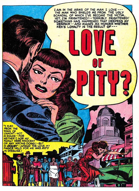
Young Romance #8 (November 1948) “Love or Pity”, art by Jack Kirby

Jack Kirby continued to be the most prominent artist for Young Romance. Kirby did nine out of the twenty stories in these four issues, or 97 out of 177 pages. It may have been even more since as I will discuss below a tenth story may also have been penciled by Jack. Kirby would continue to create the first story in the comic. This lead story would remain the longest story in the comic with thirteen or fourteen pages while other stories would have at most nine pages. The design of the lead story splash page would continue to have a character’s speech balloon used as the title caption. I particularly like the splash for “Love or Pity”. The design is done quite well with a close-up of a couple dominating the page and another section enacting a little scene like some sort of tableau. We have seen this emphasis in design for some of Simon and Kirby’s double page splashes, but it is also to be found in a number of the smaller splashes drawn by Kirby in Young Romance. In the depiction of the large couple we only get to see the face of the woman, the man’s face and his emotions remain a mystery. The woman arches her left eyebrow, looks askance and her hand’s placement on the man’s shoulder seems tentative. All this makes her appear apprehensive and her attempt to dispel her concerns by moving closer into the man’s embrace seems to have failed. From the title caption we learn why, she is uncertain about the man’s true feelings. Many have described Kirby’s woman as not being truly beautiful but it is a criticism I do not share. I find the woman in this splash attractive enough and, more importantly, very human. While some other artists might have been able to make the woman appear even more beautiful I do not know any that are able to invest them with the same sensitivity that Kirby has. Jack does not draw Barbie dolls but rather woman whose appearance reflects their personality and emotions. I find that makes Kirby’s woman truly beautiful indeed.

The second section of the splash depicts a crowd looking disapprovingly on as the woman runs away in shame. Jack has chosen a low viewing angle so that the woman towers over the background crowd giving drama to the scene. The woman’s pose is rather unusual; she looks more like she is tripping and about to fall. Not an inappropriate metaphor for her descent into scandal. The second section is well done but its impact suffers from its diminished size. Envision this section enlarged and expanded toward the right and you can imagine what a double page romance splash might have looked like had Simon and Kirby ever done one. It is too bad they never did.
Young Romance #6
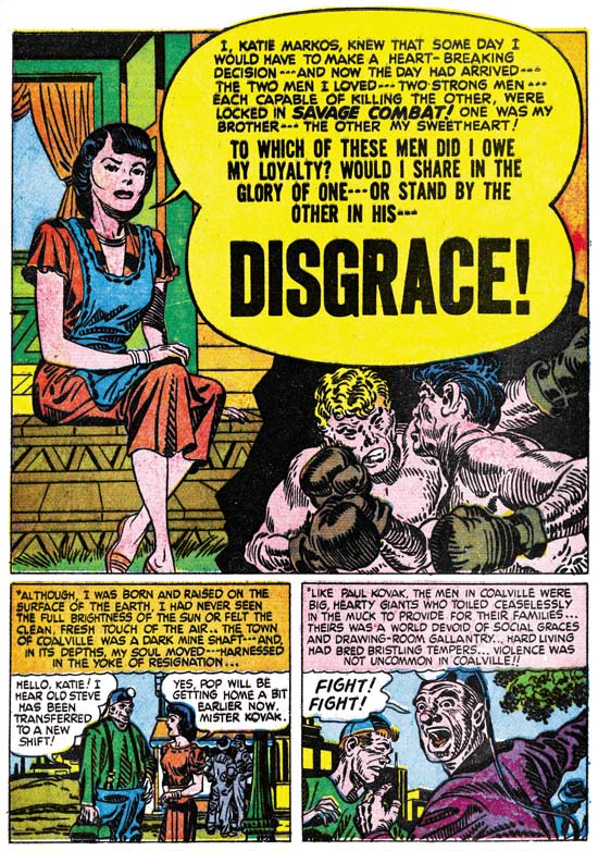
Young Romance #6 (July 1948) “Disgrace”, art by Jack Kirby

One change that seemed to have taken place from the earlier issues of Young Romance was that action no longer appeared quite as commonly in Jack Kirby’s romance stories. Not that action disappeared completely, it would always show up in more Kirby romance stories then it does in those by any of the other studio artists. “Disgrace” is a case in point. If I had to pick one Kirby romance story most likely to satisfy the general Kirby readership, this would be the one. The heroine feels trapped in a coal mining town which she detests for the violence its inhabitants so frequently adopt. Her brother has managed to escape the town but she is dismayed at his career as a prize fighter and his particularly brutal nature. She falls in love with a man only to discover that he also is a professional boxer. She cannot accept more violence in her life so she breaks it off. Later she finds to her horror that her brother and former love are scheduled to meet in the arena. Where does her loyalty lie, with her violent brother or the man she still loves? Jack Kirby is justly famous for his depiction of a punch and the fight in this story is a pure slugfest.
Young Romance #8
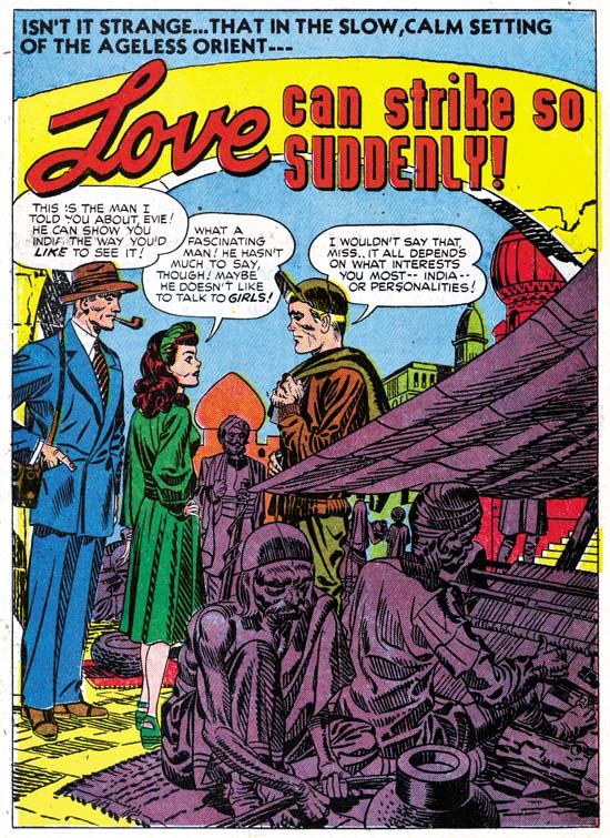
Young Romance #8 (November 1948) “Love Can Strike So Suddenly”, art by Jack Kirby

Kirby may have tuned down his use of action but he still looked for means to keep his stories exciting. One of his techniques was to make use of the exotic location of some of the stories. Had the splash of “Love Can Strike So Suddenly” depicted a normal local it would have seemed quite banal. All the main characters are just standing around. Even the dialog is not nearly dramatic enough to rescue this page. However by inserting his cast into a street in India, Jack has made this one of his memorable splashes. I am sure Kirby has swiped this from some source, perhaps National Geographic, but I am also certain that he has made his version far more interesting then the original. I have recently discussed this story; it is the source for a swipe used years later in Simon and Kirby’s own romance comic In Love.
Young Romance #7
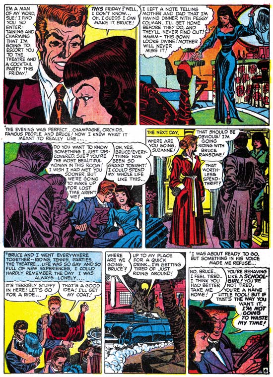
Young Romance #7 (September 1948) “Mother Said No” page 4, art by Jack Kirby and Carmine Infantino?

The Jack Kirby Checklist does not include “Mother Said No” among its listings of Kirby’s work. It is easy to understand why, the man in the first panel of the page imaged above does not look he was drawn by Jack. Or does he? Kirby often drew his men with wild eyebrows but these look excessive even for Jack. But how much of these exaggerated eyebrows were in the original drawing and how much were due to the inker’s interpretation of the pencils? The layouts throughout the story look like they were done by Jack. It is hard to be sure, but once the eyebrows are ignored a lot to the drawing looks like Kirby to me.
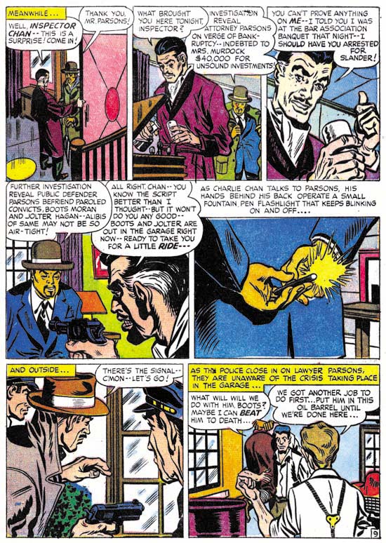
Charlie Chan #1
Charlie Chan #1 (June 1948) “The Hit and Run Murder Case” page 9, art by Carmine Infantino

Nearly identical men’s eyebrows seen in “Mother Said No” can also be found in work that Carmine Infantino did in Charlie Chan. Compare the man in the third panel of page nine of “The Hit and Run Murder Case” shown above to the one in the first panel of the page I previously presented from “Mother Said No”. Further examples of Infantino’s work for the Simon and Kirby studio can be found in an earlier post. While the details of the eyebrows seem to match in the two stories, the proportions used in drawing the faces do not. Nor are Carmine’s layouts in Charlie Chan similar to those found in “Mother Said No”. The inking for “Mother Said No” was done in the studio style which would normally suggest Jack or Joe’s involvement. However Carmine used the studio style inking in some parts of Charlie Chan, particularly the splashes. I really need to do a more thorough comparison, but some of the spotting in “Mother Said No” does not look like it was done by either Jack or Joe. My initial conclusion is that in “Mother Said No” Carmine was inking Jack’s pencils. If that is true what is not clear is whether Kirby’s pencils were not very tight, or if instead they were overwhelmed by Carmine’s inking. In either case I am presently inclined to consider this a joint piece with Jack as the primary artist.

There is a serious problem with the analysis that I presented above because of an interview of Carmine Infantino from The Jack Kirby Collector #34. In that interview Carmine clearly said that Charlie Chan was the only work he did for Simon and Kirby, and later added that he never inked Jack’s pencils. I really want to do a more careful analysis before I am ready to contest Infantino’s statements so for now I consider my conclusions as preliminary. Hopefully a re-examination of this issue will be the subject of another post in not too distant future.
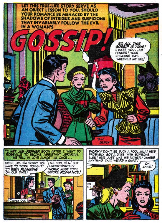
Young Romance #6
Young Romance #6 (July 1948) “Gossip”, art by Bill Draut

Kirby did not draw all the stories in YR #5 to #8; Bill Draut remained a significant contributor with seven stories out of twenty, or 52 pages out of 177. Bill’s art started to change. Gone were the splashes with an emphasis on design, I do not believe it would reappear in Draut’s work until 1954 for In Love. I suspect Joe Simon had a hand in laying out some of the earlier Draut splashes for Young Romance, but from this point on Draut would do it himself. The other change would be the appearance of more and more traits that would be typical of Draut. Note the brickwork for the fireplace in the “Gossip” splash. This is a Draut trademark that will reappear from time to time through his association with the Simon and Kirby studio. Another Draut trademark, which actually showed up before, is the brunette’s pose. Draut portrays a person’s anger by leaning the torso and thrusting the head forward, and sometimes having the person clench their fists. This is a pose not quite like any that I have seen Kirby use and it is one of the reasons that I do not believe Jack was providing layouts for Bill as some authorities have claimed.
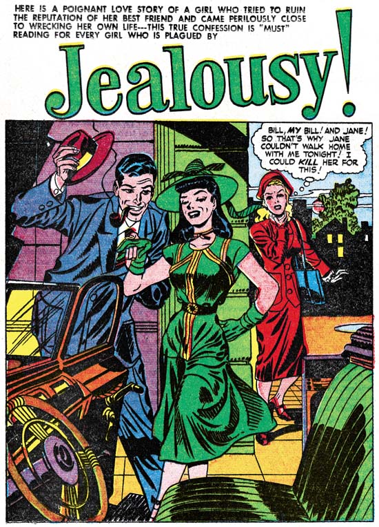
Young Romance #5
Young Romance #5 (May 1948) “Jealousy”, art by Jerry Robinson and Mort Meskin

The final two contributors to Young Romance #5 to #8 was the team of Jerry Robinson and Mort Meskin. I attribute three stories from issues #5 and #6 to Robinson and Meskin, one of which (“The Inferior Male”) was signed. The Jack Kirby Checklist credits the splash page of “Jealousy” to Jack Kirby as inked by Joe Simon. The expressive formality of the foreground couple is not typical of Kirby. Nor are the long and simple eyebrows usually found in Simon’s inking. The only thing that suggests Kirby/Simon to me is some of the Studio style inking such as the abstract arch at the top of the wall and the picket fence crosshatching on the lower part of the woman’s dress (see inking glossary). However the “Jealousy” splash presents cloth folds created by long, narrow sweeping brush strokes, this is exactly the inking technique used by Mort Meskin. Also note the man has a type of grin that is so typical for Mort. The eyebrows found in “Jealousy” may also be found in the Robinson and Meskin work found in these early issues of Young Romance. The unusual formal pose of the couple would not be surprising for Robinson and Meskin. The only problem with a Robinson and Meskin attribution for the “Jealousy” splash is the Studio style inking which is not found in other R&M art. I think the best explanation for this discrepancy is that either Simon or Kirby in their roll as art editor stepped in to touch up the splash. I feel the splash matches the art in the rest of the story and it all should be attributed to Jerry Robinson and Mort Meskin.

July marked the last month that Robinson and Meskin art would appear in Simon and Kirby productions. Mort Meskin would return by himself over a year later, after which he would be a frequent contributor until the end of the studio. This is all very hard to reconcile with Carmine Infantino’s TJKC #34 interview where he says that he accepted the Charlie Chan job for the experience he would get by working with Kirby and Meskin. Carmine even describes Mort as working right next to Jack. Carmine’s stay was from June 1948 until February 1949 (cover dates). This does overlap Robinson and Meskin’s period (January to July 1948) but is well before Meskin’s solo return in December of 1949. I just do not find it creditable that Mort was working in the studio at a time when he and Robinson were probably producing more work for other publishers then for S&K. Would Mort and Jerry have been working separately? Would the small amount of work for S&K justify Mort’s presence in the studio? I am afraid I have to conclude that Carmine’s memory has failed him; perhaps he has mixed up the time of his presence in the studio with that of his brother Jimmy who did work for S&K at the same time as Meskin.

Chapter 1, A New Genre (YR #1 – #4)
Chapter 2, Early Artists (YR #1 – #4)
Chapter 3, The Field No Longer Their’s Alone (YR #5 – #8)
Chapter 4, An Explosion of Romance (YR #9 – #12, YL #1 – #4)
Chapter 5, New Talent (YR #9 – 12, YL #1 – #4)
Chapter 6, Love on the Range (RWR #1 – #7, WL #1 – #6)
Chapter 7, More Love on the Range (RWR #1 – #7, WL #1 – #6)
Chapter 8, Kirby on the Range? (RWR #1 – #7, WL #1 – #6)
Chapter 9, More Romance (YR #13 – #16, YL #5 – #6)
Chapter 10, The Peak of the Love Glut (YR #17 – #20, YL #7 – #8)
Chapter 11, After the Glut (YR #21 – #23, YL #9 – #10)
Chapter 12, A Smaller Studio (YR #24 – #26, YL #12 – #14)
Chapter 13, Romance Bottoms Out (YR #27 – #29, YL #15 – #17)
Chapter 14, The Third Suspect (YR #30 – #32, YL #18 – #20)
Chapter 15, The Action of Romance (YR #33 – #35, YL #21 – #23)
Chapter 16, Someone Old and Someone New (YR #36 – #38, YL #24 – #26)
Chapter 17, The Assistant (YR #39 – #41, YL #27 – #29)
Chapter 18, Meskin Takes Over (YR #42 – #44, YL #30 – #32)
Chapter 19, More Artists (YR #45 – #47, YL #33 – #35)
Chapter 20, Romance Still Matters (YR #48 – #50, YL #36 – #38, YB #1)
Chapter 21, Roussos Messes Up (YR #51 – #53, YL #39 – #41, YB #2 – 3)
Chapter 22, He’s the Man (YR #54 – #56, YL #42 – #44, YB #4)
Chapter 23, New Ways of Doing Things (YR #57 – #59, YL #45 – #47, YB #5 – #6)
Chapter 24, A New Artist (YR #60 – #62, YL #48 – #50, YB #7 – #8)
Chapter 25, More New Faces (YR #63 – #65, YLe #51 – #53, YB #9 – #11)
Chapter 26, Goodbye Jack (YR #66 – #68, YL #54 – #56, YB #12 – #14)
Chapter 27, The Return of Mort (YR #69 – #71, YL #57 – #59, YB #15 – #17)
Chapter 28, A Glut of Artists (YR #72 – #74, YL #60 – #62, YB #18 & #19, IL #1 & #2)
Chapter 29, Trouble Begins (YR #75 – #77, YL #63 – #65, YB #20 – #22, IL #3 – #5)
Chapter 30, Transition (YR #78 – #80, YL #66 – #68, YBs #23 – #25, IL #6, ILY #7)
Chapter 30, Appendix (YB #23)
Chapter 31, Kirby, Kirby and More Kirby (YR #81 – #82, YL #69 – #70, YB #26 – #27)
Chapter 32, The Kirby Beat Goes On (YR #83 – #84, YL #71 – #72, YB #28 – #29)
Chapter 33, End of an Era (YR #85 – #87, YL #73, YB #30, AFL #1)
Chapter 34, A New Prize Title (YR #88 – #91, AFL #2 – #5, PL #1 – #2)
Chapter 35, Settling In ( YR #92 – #94, AFL #6 – #8, PL #3 – #5)
Appendix, J.O. Is Joe Orlando
Chapter 36, More Kirby (YR #95 – #97, AFL #9 – #11, PL #6 – #8)
Chapter 37, Some Surprises (YR #98 – #100, AFL #12 – #14, PL #9 – #11)
Chapter 38, All Things Must End (YR #101 – #103, AFL #15 – #17, PL #12 – #14)
A Timely Bonus

I am providing some comic scans for an ongoing project. I am not a liberty to discuss this venture at this time but I believe my readers will find it of interest. Although I cannot elaborate on the project I can see no harm in presenting here some of the scans. After all, my readership is very, very small while this project’s audience should be gratifyingly large. Besides which my contribution is a very minor one. The Simon and Kirby connection of the images I provide below may be tenuous (they were done well after S&K departed Timely) but they provide an interesting comparison to what I have been writing about in my recently resurrected serial post “The Wide Angle Scream“.

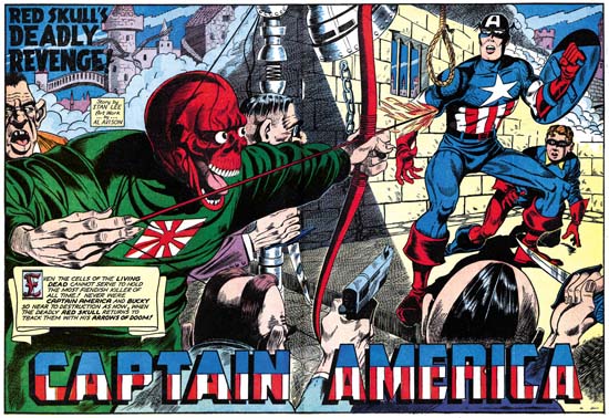
Captain America #16
Captain America #16 (July 1942) “The Red Skull’s Deadly Revenge”, art by Al Avison
Larger Image

While the double page splashed would continue to appear at times in Captain America after Simon and Kirby left Timely, there was no longer any emphasis on design. What I refer to as the enactment dominated the splashes while items such as the title and introduction caption were relegated to minor, often intrusive, rolls. This is especially true with “The Red Skull’s Deadly Revenge” where the title takes up so little of the splash that it can almost be missed. Nobody did Captain America as well as Kirby could, but then again Jack was in a league all by himself. The second best depicter of Captain America during the golden age of comics was without doubt Al Avison. Unarmed except for his shield, Cap confronts a host of suitably ugly and beastly adversaries. With Captain America and Bucky faced with guns, knives, a flaming arrow and even a hangman’s noose, you can tell an epic adventure will follow. It would be expected that the visually larger figures would dominate a scene. While the Red Skull and his minions appear before a muted background, Cap and Bucky are literally placed within a spotlight. The pale yellow background gives the red, white and blue of our heroes’ costumes maximum contrast and thus counters the effect of the Red Skull’s larger size. Avison also makes use of our propensity to examine even visual images from left to right. While all of their foes emphasize the right to left eye movement, Cap and Bucky face the opposite direction and our eyes are no longer directed to move further off the page. Jack Kirby showed a similar understanding in some of his wide splashes for Stuntman. That however was later, in his Captain America work Jack did not make as much use of the right to left reading that we see Avison do so often. This was not always the case for Al, his early cover work for Harvey at times showed a right to left direction (Speed #14 and Speed #16). I am not sure where Avison picked up the technique of the use of a left to right direction, but it shows that he was more then just a Kirby-want-a-be.

I really have not studied Timely artists very much. I wonder if it is even possible for someone today to become a Timely expert. The high cost of the comics would seem to prohibit accumulating enough material to properly study the art. Hopefully that will change if Marvel continues to reprint their golden age comics. Having said that I find in “The Red Skull’s Deadly Revenge” story enough traits also encountered in Avison’s previous and future work for Harvey to convince me that he also had a hand in inking this story as well.

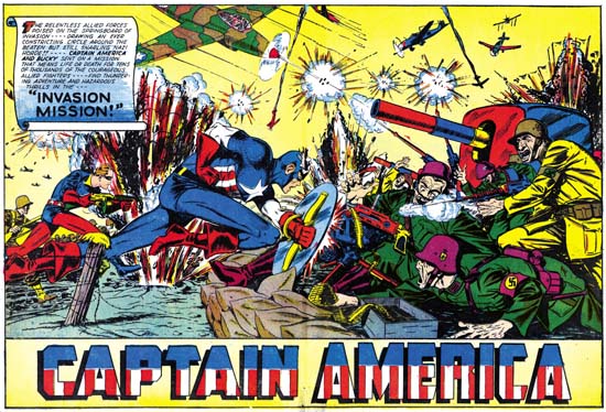
Captain America #34
Captain America #34 (January 1944) “Invasion Mission”, art by Syd Shores
Larger Image

As I wrote above, I am not a Timely scholar, but the splash for “Invasion Mission” looks like the work of Syd Shores, probably the third best artist of the golden age Captain America. Comparisons of this splash to the one with a similar theme by Avison, “On to Berlin” leaves little question that Al was the better artist. Still Syd does a valiant job and it is another classic clash between Captain America and our country’s Nazi foes. It makes you wonder why Cap stories of such battles were not done more often during the war. I have not seen enough of Shore’s art to determine whether the left to right movement he gives to Cap and Bucky is purposeful or just happenstance. However Shores did make some poor decisions. Having an explosion near Captain America and Bucky might seem a good way to add excitement; unfortunately its real effect is to visually obscure the two heroes. We can blame the colorist, not Syd, for the biggest failure of the splash; giving the German soldier on the right a yellow suit makes him the most prominent figure of the entire double page.

Recently Marvel Comics has Bucky, known as the Winter Soldier, replace the now dead Steve Rogers as Captain America. He has an ugly new costume and more controversially carries a pistol. Some have defended the use of a gun by the new Captain America by pointing out that Bucky uses a weapon on the some covers for the original Captain America Comics. Bucky’s often use of a gun on the covers does not seem to be carried over into the interior stories, at least for those that I have seen. The splash for “Invasion Mission” is the only example I am aware of. In the actually story Bucky carries a rifle two times, but for both occasions he uses it as a club! Before we conclude that killing was abhorrent for the original Captain America it should be noted that toward the end of the story Cap and Bucky capture a German big gun and turn it against the Nazi forces. While close-ups are not provided, who can doubt the deadly effect this was meant to produce?

Horrible Mort Meskin

By 1954 Mort Meskin had been providing work for the Simon and Kirby studio for four years. Even more important then the amount of time spent was the volume of work; Mort executed more work for S&K then any other studio artist. There were even periods that Mort’s page production rates exceeded Kirby’s who was justly famous for his productivity. Mort’s contribution went beyond volume; he played an important part in the S&K classic Boys’ Ranch (1951). It was Mort who persuaded S&K to create that unusual title Strange World of Your Dreams (1952) for which he listed as an Associate Editor. 1954 was an important year for both Meskin and S&K as well. In that year Simon and Kirby would return to the superhero genre with Fighting American published by Prize. Even more important Joe and Jack would create their own comic publishing company called Mainline. Considering Meskin’s contributions in the past, it would be expected that he would play a significant role in these projects, but he did not. Mort provided no help with Fighting American and only shows up in a few initial issues of the Mainline titles. Since Mort was creating art for the Prize romances (still being produced by Simon and Kirby) his absence from the other projects is hard to explain. 1954 was of note for Mort because it marked his return to providing art for DC. This was not an exclusive arrangement, as mentioned above Mort would continue to provide work for the Prize romances. Meskin also did one work for Harvey’s Chamber of Chills.

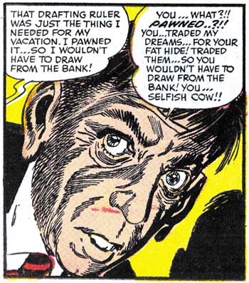
The hero of this story is the meek and troubled Oscar Pert. He could have been happy, if only he was not oppressed by his wife, Martha. The only important thing in life for Martha was the continual depositing of money into the bank. Everything else must be sacrificed. Oscar lost his friends when he was no longer able to pay club dues. Martha would not even let him spend a little money for milk to give a stray cat. But finally Oscar devises a new means to happiness. We see him in his cellar stealing moments away from Martha, designing some project. His increased sense of contentment is noticed by all but understood by none. That is until Martha discovers his drafting ruler and pawns it off. Apparently that is the last straw because that night Martha hears a strange ticking noise coming from the cellar. She finds a box down there and when she investigates the box’s opening the trap is set. The story ends with Oscar making his own rather gruesome deposit to the bank vault.

Chamber of Chills #24
Chamber of Chills #24 (July 1954) “Credit and Loss”, art by Mort Meskin

The story was not written by Mort, but he makes the most of it. He is at the top of his form in story telling, and that means a lot because Meskin was a consummate graphic story teller. His shifts in distance and perspective are done not just to provide variation, but as a means to advance the story itself. Take the sequence that starts the tale; a panel of a broken record introduces the theme of repetition, the next panel has advances the theme with a close-up of a woman’s nagging mouth, with the final panel a more distant shot providing an introduction to the main characters of the story and their relationship.

Chamber of Chills #24
Chamber of Chills #24 (July 1954) “Credit and Loss” page 4 panel 5, art by Mort Meskin

Mort’s art is excellent, particularly the inking. The splash panels uses the S&K studio style with bold picket fence brush work (for an explanation of this term, see the Inking Glossary). The image of the skeletal hands with ledger is not a literal summation of the story but it does effectively symbolize the theme. I cannot explain what the ruled background represents, perhaps another visual reference to a financial ledger? In any case it is a pleasing pattern as if designed by Mondrian. After the splash Meskin drops using the S&K studio style and adopts his more typical inking methods. However that is a little misleading as Mort’s inking is here much more elaborate then what he had previously been using in work that he had done for Simon and Kirby. For example Meskin typically constructed eyebrows as a couple of overlapping simple brush strokes, but for close-ups in “Credit and Loss” the eyebrows are made with numerous brushstrokes that suggest the individual hairs. Instead of simple brushing for shadows on faces, here Mort provides some careful crosshatching. Meskin even seems to take much more effort with the drawing as well. The close-ups of Oscar are some of the best portrayals that Mort has ever done. The large soulful eyes and small chin suggest his submissive character. But note how in the panel I provide above how Mort subtlety reveals Oscar’s awakened spirit of resistance.

With such a great piece of art it is a wonder that Mort Meskin did not do more work for Chamber of Chills. I really do not have the timing of Meskin’s non-S&K work down very well, but perhaps it is nothing more then having been returned to the better paying DC Mort felt no need to pursue work from Harvey. Joe Simon’s collection includes the complete original art for “Credit and Loss”, as well as some other art from the same Chamber of Chills issue. So maybe even at this early date Joe was giving Harvey a hand. If so, Simon was not passing onto Harvey excess S&K material, this story much more deserves being called horror then anything found in S&K’s own Black Magic. The tale goes beyond what Joe and Jack would have considered to be in good taste. Whatever the explanation for its unique status, “Credit and Loss” is a masterpiece. Unfortunately its presence in a rare comic means it has not been seen by many. Maybe someday it will get the reprint treatment it so richly deserves.

Fletcher Hanks, Forgotten Genius?

I will be right up front about it, this post is about a comic book artist who has at best a tenuous connection to the subject matter of this blog, which is Simon and Kirby. There is a link to Simon and Kirby because some of the Fletcher’s work was published by Fox Comics from December 1939 to March 1941, which overlaps the period when Joe Simon was Fox’s editor (May to July 1940). As I am sure the reader will see, there really is little to suggest that there was any influence in either direction between Fletcher Hanks and Joe Simon or Jack Kirby.

Unless my readers have seen the recent book “I Shall Destroy All the Civilized Planets!” edited by Paul Karasik, I suspect they will be wondering who the heck is Fletcher Hanks? That certainly was my reaction when I first saw Karasik’s book. As mentioned above, Hanks worked during the early years of the comic book industry, and he did so only on backup stories for smaller publishers. None of the features he created and worked on every achieved anything close to prominence. That explains the forgotten from the title for this post, but the genius part? Well Paul Karasik has described Hanks as “utter, utter genius”, a “visionary genius” and “one of the greatest cartoonists of the 20th century”. High praise indeed, but is it justified?

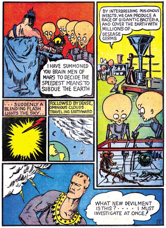
Fantastic #6
Fantastic Comics #6 (May 1940) The Super Wizard Stardust page 2, by Fletcher Hanks

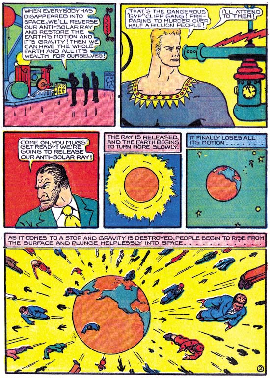
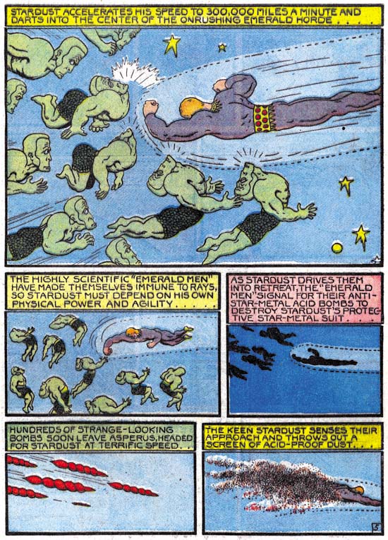
At a glance, Fletcher’s work might be overlooked as just another of the numerous artists who plied their trade during the earlier part of the golden age of comic. Like many of these artists, Hanks drawing is crude with minimal background detailing. This is a misleading impression, a more careful examination reveals with startling and haunting imagery. A giant spider attaching an elephant, the human race rocketing into space as earth’s gravity has been disabled, a superheroine’s beautiful face transforming into one with hideous skull like features. Again and again Hanks shows a vision that is startling and unique. Some of his other forgotten peers have their moments, but none of them as consistent as Fletcher Hanks.

Fantastic #7
Fantastic Comics #7 (June 1940) The Super Wizard Stardust page 2, by Fletcher Hanks

Even the stories Hanks presents are different form others of the period. The standard hero plot could be summarized as bad guys start executing some diabolical plot, the good guy arrives to save the day and the hero leaves the defeated bad guys for the authorities to handle. Fletcher’s plot summary would be: the hero detects the bad guys plotting, the bad guys unleashed plans have devastating results until the hero arrives to save the day and personally submit the bad guys to some unusual punishment. Hanks’ plotting is therefore refreshingly different, but unfortunately his repetitious use dulls its effectiveness. Fletcher rigid adherence to this plot line sometimes becomes perplexingly illogical. In the Stardust feature the hero resides on a distant star so while his unique monitoring allows him detect the nefarious plots as they are being planned he must still travel great distances to reach earth. This explains why the evil plans are initiated before Stardust can arrive to set things right. Another of his features was Fantomah, Mystery Woman of the Jungle. She also seems able to detect the plans of evil doers, yet despite her great powers and more local presence never seems to stop those plans before they begin. Hanks’ commitment to his standard plot seems so steadfast that he is unable to avoid such illogical story lines. The only way Fletcher seems to be able to break out of his standard plot is when certain elements are simply not appropriate for his hero. One story in the book is about a lumberjack, for such a more human hero there can be no possibility of using special devices to overhear the villain’s planning, it would not be appropriate for the hero to use fantastic powers to overcome the enemy, nor should an unusual retribution play a part, and so Hanks’ lumberman story becomes the more standard hero plot.

Fantastic #8
Fantastic Comics #8 (July 1940) The Super Wizard Stardust page 2, by Fletcher Hanks

The features that constitute most of Fletcher Hanks’ oeuvre are the Stardust and Fantomah stories that were mentioned above. These heroes have such great powers that the defeat of the enemy is never in question. This was a problem with Superman as well, and once people see these superheroes can do, one wonders why any bad guy would even consider risking crossing their path. Stardust and Fantomah are so powerful that they are not really human but demigods instead. With such a godlike nature it is small wonder that they deal out punishment themselves. And what punishment, it would seem that Fletcher spent as much time devising the punishment as he did on the crime itself. The punishment becomes one of the most rewarding aspects of Hanks’ story telling.

There is much that I have praised about Fletcher Hanks in what I have written above, so do I consider him a genius? Not at all, not even close. I reserve my greatest praise for those who wield their art to provide things that amaze me and yet always seem to remain in control of their talent. For instance, Jack Kirby’s art seems fueled with a wild creative force that drives him to excellence. But no matter how close to the surface that wild urge comes, I always feel it is Jack in control of his creative force and not the other way around. This is not the case for Fletcher Hanks. Although some aspects of his art are very imaginative, for other things, such as his plotting, Hanks seems unable to break out of the most obvious constraints. Some of the impact his most startling illustrations is derived from the repeated use of certain elements. The minimalist artists have shown that such repetition can be visually very powerful. But such repetition also reminds me of the work of Charles Crumb, Robert’s brother. Charles’ work is disturbing, when viewed it is quickly apparent that it is the work of a disturbed mind. Charles Crumb’s use of repeating elements seem more the result of a compelling obsession rather then something that he had any control over. I find a similar effect, although to a lesser extent, in Fletcher Hanks’ art as well. Paul Karasik’s research has provided the clue to help with the explanation, Fletcher Hanks was an abusive alcoholic. I once knew a man with what I judge to have been a similar personality. The man’s abuse was never directed at me, almost certainly because my father was one of the few individuals he feared. The man I am recalling was not an artist but he had an amazing mind. When he was not in a mean mode he was a fascinating person to talk to. Some of his concepts were quite brilliant although perhaps not always true. Like Hanks, certain of his thinking seemed trapped in ways that I think were clear to others but I am sure he never truly understood. He could no more escape them then he could the alcohol that lead to so much misery for the people around him. Would I have made the association between Fletcher Hanks’ alcoholism and his art if Karasik had not revealed it? I do not know, but now that the link has been made I cannot banish it.

There is one aspect of Karasik’s comments about Hanks that really bothers me. Karasik puts much emphasis on the fact that Hanks’ did all the work himself; the writing, drawing, inking and lettering. He is critical of the “assembly line” method he ascribes to most of comic book work where these different jobs were executed by different individuals. This concept that all the truly great artists are those who create the work by themselves can be found in the fine arts as well, but it is by no means a universal opinion. Although I recognize the importance an artist own hand may bring to a work of art, I am unwilling to limit my esteem to such art. To do so would mean rejecting things such as Japanese wood block prints or even Renaissance painting. What bothers me is not so much as the difference of opinion about this subject between Karasik and myself, as much as how it demonstrates Karasik’s ignorance of comic book history. The fact is during the time Hanks worked on comics it was not at all unusual for the creator to perform all creative aspects. At the start of the boom that followed the release of Superman with Action Comics #1, it was the norm for an artist to write, draw, ink and letters a story himself. The earliest work by Jack Kirby or Joe Simon was done this way as well. The only difference for Fletcher was that he was not working in comics afterwards when the single writer/artist became the exception not the rule.

I may not consider Fetcher Hanks a genius, but I agree with Karasik that his work should not be enjoyed as some sort of campy entertainment. It is powerful stuff and quite worthy of being read. Karasik has done a great service in raising Fletcher Hanks from forgotten obscurity, I fully recommend “I Shall Destroy All the Civilized Planets”. At $20 it is a steal, the original comics are so rare that I doubt you could find a single one of them, no matter how beat up, at that price. The contents are not at all cheap. The stories are nicely restored scans from original comics using a technique to clean them up that is similar (if not identical) to the one I use. The results are printed on flat paper and are absolutely gorgeous. I think they are better done then the “Terry and the Pirates” reprint that I recently positively commented on. I have long felt that this was the way to reprint old comic material. I wonder if Marvel and DC will ever wake up abandon their method of bleaching and recoloring.

There is a special bonus found in this book, Paul Karasik provides an afterword about Fletcher Hanks. Not your ordinary afterword, but a graphic story instead about Karasik’s research of Fletcher Hanks and what he learns. It is a well written and drawn short story that is almost worth the price of the book by itself. Karasik has admitted to not being very productive but this afterword indicates that is not due to a lack of talent. I intend to try to locate some of his earlier efforts and hope he exerts himself more as a graphic storyteller in the future.

Swiping off of Kirby

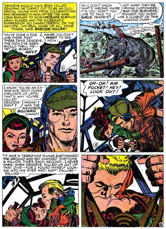
Young Romance #8
Young Romance #8 (November 1948) “Love Can Strike So Suddenly”, art by Jack Kirby

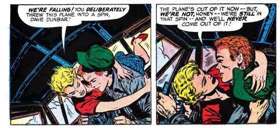
Jack Kirby’s take on romance always seemed to have more of an emphasis on action then most other comic book artists. The above sequence from an early Young Romance is a great example of this. The dramatic plunge of the airplane after hitting an air pocket literally lands a seemingly indifferent lady onto the lap of a reluctant man. The analogy of the airplane’s occupants fall and their falling in love is presented by both the images and accompanying text. It took chance to supply the action needed to overcome the barriers each had placed before their true feelings. This sequence may have played a small part in the overall story but it was pivotal. It was also the quintessence of Kirby’s vision of romance.

In Love #2
In Love #2 (October 1954) “Marilyn’s Men” page 14 panels 5 and 6, art by Bill Draut

In Love #2
In Love #2 (October 1954) “Marilyn’s Men” page 15 panel 1, art by Bill Draut

Kirby’s predilection for action in romance stories stayed with him. Although most of the story “Marilyn’s Men” from In Love #2 was drawn by Bill Draut, I believe that much of the plotting and at least some of the scripting came from Jack. Therefore I feel that the occurrence of essentially the same three panels from Young Romance #8 was not Draut trying to pull something over on his bosses, instead Bill was just following Simon and Kirby’s direction. The premise was similar between the two stories, both involved a plane flight where the relationship between the man and woman changes during the trip. There are significant differences between the two stories as well. In YR it is an accident that breaks down the resistance of both parties, whereas with In Love the pilot’s maneuver is purposeful, showing that it was only Marilyn’s reluctance to love that had to be overcome.

Draut’s swipe is not a close copy of Kirby’s art. Most of the deviation in the art can be attributed to differences in the two stories. Unlike most of the female characters in S&K romances, Marilyn had relatively short hair. Undoubtedly this was visual shorthand for her success as a businesswoman. Unfortunately Marilyn’s shorter hair could not provide the same affect to the first panel where she first is lifted out of her seat. Draut does what he can but Kirby’s heroine had more hair to add drama with. In Kirby’s story the heroine is seated behind the pilot while Marilyn is on his side. Jack therefore can show more of the lady as she goes from her seat to the pilot’s lap. Draut must provide a more foreshortened view and even rotated the pilot in relation to the cabin so that in the end the visual logic of the first scene breaks down. In the second panel Draut has everything under control. In fact here Draut improves on Kirby’s composition by having Marilyn ending up gazing into the pilot’s face, while Kirby left her looking to the side. There is one logical peculiarity in Draut’s presentation. In the first panel Marilyn’s left arm is already on the pilot’s shoulder while his hat is just beginning to come off his head. Yet in the second panel Marilyn’s left hand holds the hat down. How did that transition happen? Jack provides the answer by using the pilot’s headset to constrain the hat’s travel. The final panel, the dramatic view of the kiss, is very similar between the two versions, but by no means identical. The pilot’s face is typical Draut and not a close copy of Kirby’s version. Bill has also added some shadows of the window frames to add even more drama to the scene. While Kirby has good control over the unusual perspective, in Draut’s rendition where is Marilyn’s nose? It does not seem possible to trace its position without violating the man’s facial structure.

In Love #2
In Love #2 (October 1954) art by Bill Draut

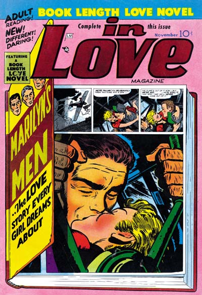
Jack was a master at visual storytelling so it comes as no surprise that the dramatic kiss occupies the last panel of his page. In “Marilyn’s Men” the kiss has been placed on the first panel of the page following the other two scenes. This greatly diminishes the impact of the story line. This may not have been Draut’s fault, the layout of the page suggests that the kiss panel was placed there afterwards. Perhaps editing was required to reduce the page count. That it was known then what the proper layout for this sequence was is shown in the cover where not only is the kiss the last panel, but it has also been enlarged.

The three panel sequence from Young Romance #8 hardly stands out as the most memorable panels from Kirby’s early romance work. Even so someone remembered and then used them as a reference for a comic done almost six years later.

Not Kirby, My Date #4

My Date #2
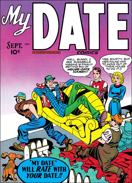
My Date #2 (September 1947) art by Jack Kirby

My Date was a short-lived comic that Simon and Kirby produced for Hillman Publications in 1947. Perhaps mislead by the comics title, some today hold the belief that My Date was the first romance comic book. As I discussed in a post on this topic (The First Romance Comic) it is not a romance comic at all but rather Simon and Kirby’s take on teenage humor modeled on the popular Archie comics. For his contributions to the title Jack Kirby drew in a more cartoonish manner appropriate for the humor content. Jack’s altered penciling was not very drastic, it remains quite easy to identify his work. For instance, Kirby trademarks such as his exaggerated perspective can be found in the covers and stories that Jack provided.

My Date #4
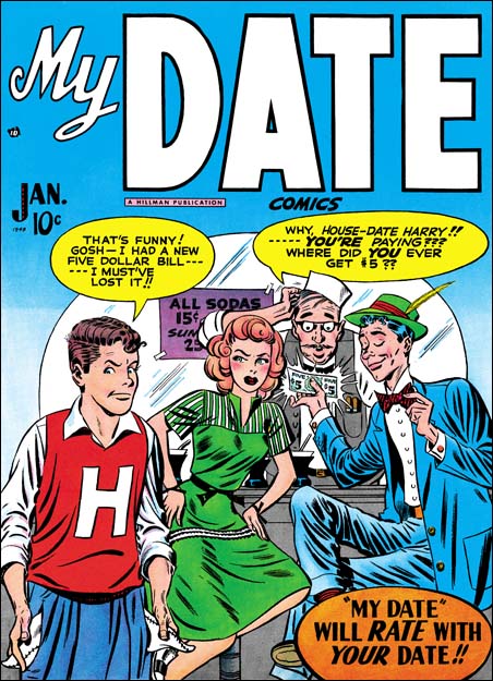
My Date #4 (January 1948) art by Jerry Robinson and Mort Meskin

All four My Date covers have traditionally been attributed to Jack Kirby, as for example by the Jack Kirby Checklist. I have long felt, and I am not alone in this, that the cover for My Date #4 was done by someone else. Gone are Jack’s exaggerated perspective, replaced by a relatively shallow depth of field viewed straight on. The drawing for My Date #4 is cartoonier then in the previous My Date covers. House-Date Harry looks rather different on issue #4 then on the covers for #2 and #3, or from their story art as well. The same is true for Swifty who also shows up on My Date #1 and #2 covers.

Young Romance #3
Young Romance #3 (January 1948) “Love or a Career” page 5 panel 5 and page 7 panel 4, art by Jerry Robinson and Mort Meskin

Readers of my last post on the inking of Mort Meskin may have spotted the long close and narrow brush marks that are used on the My Date #4 cover to indicate the folds of the clothing. Not all of Meskin inking traits that I previously described are found, but I am nonetheless certain that Mort was the inker. This a bit surprising because at this time Meskin was still producing work mainly for DC and his first signed work for S&K studio would not appear for months later. Young Romance #3 has the same cover date as My Date #4 and in it is the story “Love or a Career”. Unfortunately this story is unsigned but Meskin’s inking is once again quite apparent. I will explain my full attribution of this art below when I discuss the first signed works. The art for “Love or a Career” is the closest match to the MD #4 cover that I have been able to find. Consideration has to be given for the more cartoony style used for the teenage humor comic, but see how close the female character is in the two panels I have selected from YR #3 compared to Sunny of MD #4, similarly shaped face, arching eyebrows, eyes and lips.

Justice Traps the Guilty #4
Justice Traps the Guilty #4 (May 1948) “Guilty Boys” page 1 panel 3 and page 5 panel 7, art by Jerry Robinson and Mort Meskin

Some months later art very similar to YR #3 appears in “Guilty Boys” from Justice Traps the Guilty #4. This is another unsigned piece with Meskin apparently doing the inking. This crime story was appropriately rendered more realistically then My Date #4 but similarities still show up. Note the comparable button noses of the boys to Swifty and to a lesser extent House-Date Harry on MD #4. The two boys on the right in the page 1 panel has a smiling cheek line similar to that of House-Date Harry.

Young Romance #6
Young Romance #6 (July 1948) “The Inferior Male” page 7 panel 3 and page 8 panel 4, art by Jerry Robinson and Mort Meskin (signed)

Going forward two months provides two stories that bear the dual signatures of Jerry Robinson and Mort Meskin. The usual assumption is that the first signature designates the penciler and the second the inker. But I know nothing about how the Robinson and Meskin team worked so this may not be a safe assumption. Still it does look like Meskin’s inking while at least some of the figure drawing and compositions do not appear to be his. I have posted about “The Inferior Male” twice before (here and here). The correspondence between the art in YR #6 and that in YR #3 and JTTG #4 is close enough that the same artists were probably responsible for all. As seen in the above panels the female still looks like a more realistically drawn version of Sunny from the MD #4 cover.

Justice Traps the Guilty #5
Justice Traps the Guilty #5 (July 1948)”Murder Special Delivery” page 3 panel 3 and page 4 panel 1, art by Jerry Robinson and Mort Meskin (signed)

Issue #5 of Justice Traps the Guilty also has the Robinson and Meskin signature. As might be expected there is great similarities with the YR #6 that came out in the same month. But this comparison is not perfect. In JTTG #5 the female leads start to take on the more stylized look that is typical of most of Meskin’s work for S&K. But the females have not adopted the more triangular face as done later by Mort so there still is a slight resemblance to Sunny from the MD #4 cover.

Real West Romances #5
Real West Romances #5 (December 1949) “Tenderfoot In Love” page 2 panel 4 and page 8 panel 7 art by Mort Meskin (signed)

Mort Meskin would not show up again in S&K productions for over a year. By cover date of December 1949 things had clearly changed for Mort, the work would only be signed by him with no indication of any Robinson involvement. Meskin was no longer providing art for DC and this marks the start of a productive and consistent relationship with Simon and Kirby. In Real West Romances #5 the woman is drawn actually less stylized then found in the Robinson and Meskin’s piece in JTTG #5. Although not typical of Mort’s later work, the female in RWM #5 is not a very good match for that on My Date #4 either. This is largely due to the introduction of cheek bones that makes the face depart from the more simple geometry found on MD #4. Other similarities can still be found between the RWM #5 and MD #4, as for instance the old man’s eyebrows and smiling cheek line in the right panel as compared to House-Date Harry on MD #4.

Young Romance #16
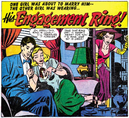
Young Romance #16 (December 1949) “His Engagement Ring” page 1 splash, art by Mort Meskin (signed)

Meskin also appears during the same month in Young Romance #16. Once again Mort’s woman are not as stylized as they soon would be. but gone are the cheek bones that Mort provided woman in RWR #5. A resemblance to Sunny of MD #4 can still be seen, especially in the lady on the right of the above splash panel.

It may be a little surprising that a S&K production would have a cover drawn by an artist other then Jack Kirby. The only other non-Kirby covers were also done by Meskin along with Bill Draut, John Prentice and Ann Brewster. Those were all Prize romance covers with cover dates of 1954 and 1955, a period when Jack and Joe were busy with Mainline, their self owned publishing company. The reason Simon and Kirby made an exception for My Date #4 is most likely the same. A few months previously Simon and Kirby had launched Young Romance with Prize comics. As typical for them, most of the initial art for Young Romance was drawn by Jack. They had more recently lauched Justice Traps the Guilty. Not only was this all a lot of work for Kirby, it also was work for which S&K would have a share in the profits. Their deal with Hillman was not as good and so My Date #4 would be the last comic Simon and Kirby produced for that publisher with the exception of a single Western cover (Western Fighters #1, April 1948).

Alternate Versions of the Alarming Tales #3 Cover

Alarming Tales #3
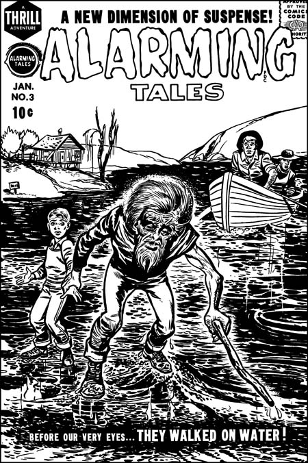
Alarming Tales #3 (January 1958) restored art, by Joe Simon

A recurring theme in my posts is how well Joe Simon could mimic Jack Kirby. This has resulted in a number of pieces that Joe did becoming attributed to Jack. Do not get me wrong, the overwhelming number of the items in the Jack Kirby Checklist are correctly attributed. Still there are a small number of entrees that are wrong and it is important to try to correct those mistakes. I would like to say that my study of Joe Simon’s art has enabled me to spot all the attribution errors that others have made. I would like to say that but it would not be completely true. A case in point is the cover for Alarming Tales #3. I provide an image of the restored line art to this cover above, a color version can be seen in a previous post.

In the past I have followed the Jack Kirby Checklist in saying Kirby did this cover. Not everyone agreed, for one sharp eyed Nick Caputo demurred. I was not completely satisfied with the Kirby attribution because I knew of the existence of another version of the cover art. It seemed to me that a comparison of the two would probably resolve the credit issue. As I hope to show in this post, that has turned out to be the case.Alarming Tales #3
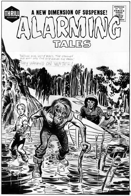
Unused original art for Alarming Tales #3, by Jack Kirby.

I provide an image of the unused version above. A note of caution when comparing the two versions. The unused one is original art and therefore has not been subjected to the blurring and loss of details that are the results of the printing process, all of which the published version has been subjected to. Also the title on the original art is a recent addition. The presence of penciled text indicates the decision to come up with new cover art was made before title stats would have been applied to the original.The derivation of the final cover from the unpublished version is obvious, both have the same cast of characters in about the same positions. The greatest difference is the backgrounds. Not only has the background been completely changed, it has been pushed much further back in the released cover. A closer examination reveals that the people are not identical. The size of the old man has been increased while the relative size of the boy and, even more so, the men in the boat has been reduced. The old man’s head has been enlarged and the position of his left arm has been shifted. The details of all figures have been changed. Curiously the boy’s pants have been given a stripe like those worn by the USPS mail carriers. My original suspicion that reworked stats of the first cover were used to construct the final state was incorrect.I think most readers will agree with me that the original art is more beautiful then the final cover. So why spend the time and effort to replace it? The answer to this riddle is that the purpose of a comic book cover is to entice a viewer to purchase it. To do so it must stand out from the rest of the comics on the rack. The problem with the original version is that the old man is overwhelmed by the background. By simplifying and pushing the other elements back, the old man and his feat of walking on water becomes more obvious and dramatic. It is a question of design taking priority over artistry.

Alarming Tales #3
Close-up of the old man by Jack Kirby and the Joe Simon rendition.

Because the compositions of the two versions are so similar, we must look at the details in order to arrive at the correct attributions. Although not a standard part of Kirby’s repertoire, the old man of the first state seems to be not only his pencils but his inking as well. There are subtleties that his copyist is unable or unwilling to capture. Some of the alterations do seem on purpose, in the final state the old man has been made older and more frail. In doing so the published version has lost the quiet dignity and resolve that the original old man possessed.

Alarming Tales #3
Close-up of the young boy by Jack Kirby and the Joe Simon version

Personally I do not find much in the final state of the old man to suggest who was responsible. For an answer to that question I turn to a close-up of the young boy. Once again the original version seems to have Kirby’s touch all over it. Some of Jack’s style has been preserved in the published interpretation but purposeful alterations have been made as well. Frankly in Kirby’s hands the boy has been given a somewhat dim witted response to his predicament. The copyist on the other hand has widen the boys eyes, raised his eyebrows and furrowed his forehead. All this gives the boy a more intelligent and surprised reaction to being lead by the old man over water. It is the boy’s eyebrows that convince me that the copyist is Joe Simon. Similar eyebrows crop up often in Joe’s work going back as far as the cover for Champ #19 (June 1942) .

The men in the boat are typical Kirby creations. Unfortunately it is hard to compare the two versions because in the published one they have been reduced in size and their finer features lost by the reproduction process.

I mentioned above that I believe Jack Kirby inked his own pencils for the unused Alarming Tales #1 cover. That is not surprising because AT #1 is a comic where Jack did most of the work, including the inking. When I previously discussed the inking in AT #1 I found some of it similar to the standard Studio style while others were closer to the Austere style. On a whole I felt the material was transitional between those two Kirby inking methods. The inking style exhibited on the unused cover is a bit of an anomaly. It is true that the bow of the boat exhibits what looks like typical picket fence brushwork (see the Inking Glossary). It should be noted that it is unusual for the rails of a picket fence inking to depict literal objects like it does here with the bow edges. A better example of typical Kirby brushwork can be found in the folds of the boy’s shirt. They exhibit the tendency to be flatter then the underlying form that was common for Kirby at this time. The form lines on the tree on the left side of the image also look like Jack’s. But other inking methods used are very unusual for Jack, in particular the form lines on the old man’s pants. I do not recall Kirby ever doing something like that before.

Also unusual about the inking is the abundant use of white-out. Although Kirby was a bold inker his control was so great that he usually had to make few adjustments with white-out. Actually some of the white-out on the unused cover were not mistakes at all. Many of the trees in the background and some of the branches in the water were actually created by white-out. The old man’s hair was done by a combination of standard inking and the use of white-out. But mistakes were corrected, for instance the edges of the drooping fronds left of center on the top were worked over. Some earth lines in the background and a water stain on the upper part of the boat were removed. I am not sure what to make of Jack removing the bottom of the boy’s shoes. Perhaps it was done to indicate that he the lacked the old man’s confidence and so could not tread as lightly over the water surface? A most surprising correction is found in the depiction of the water, much of what now looks white has abundant use of white out. The white-out does not completely hide the underlying inking and judging from their faint markings the water surface was originally much darker.

Despite all the features that are not usually found in Jack Kirby’s inking, I find the combination of boldness and control so characteristic of his work that I am pretty confident to credit him with the inking. The published cover shows Joe Simon equally bold with his use of the brush but without the same nuance of control exhibited by Kirby. It is interesting that Joe made the water surface very dark, just the thing that Jack spent so much effort to remove from his own version.

I love comparing different artists’ versions of the same subject. It is not a question of trying to determine who the better artist is. What I find interesting are the different decisions each artist made and what the reasons for those decisions were.