Joe: When is Comicon?Harry: April.
Joe: April! I’ll be a 110 by then!
Category Archives: Topic
The Early Sandman
 <
<
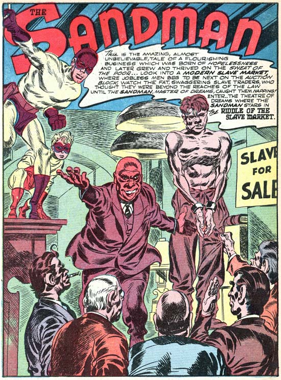
Adventure #72 (March 1942) “Riddle Of The Slave Market”, art by Jack Kirby
Joe Simon has said that when, along with Jack, he arrived at DC their first jobs was ghosting for others. In the past Joe had shown he could be pretty good at mimicking comic artists, some of his Fox covers have been attributed to Lou Fine by comic book experts despite the presence of Joe’s signature. Joe and Jack both worked on a Captain Marvel special which on a whole is a pretty good job of ghosting. However careful attention reveals Jack’s touch on the Captain Marvel job despite the simplicity of the art work. So far no one has identified any of the ghosting jobs that Simon and Kirby did for DC. The first Simon and Kirby piece that we do know about was a Sandman story that appeared in Adventure Comics #72 (March 1942). No question of ghosting here, Simon and Kirby not only signed the piece they infused it with the exciting art and dynamic story telling that characterized all their creations. The only thing is Sandman was not their creation, not even the version with the new purple and yellow costume and a young sidekick named Sandy. This updated Sandman started a couple of issues before. Unfortunately I have never had the opportunity to examine those two pre-S&K issues. Simon and Kirby may not have changed the costumes, but I suspect a fuller comparison would reveal other modifications.
At this point Joe and Jack were pretty comfortable with what it took to make an interesting comic. One reason for the ease that Simon and Kirby seem to have in taking over someone else’s title was its similarity to their previous gig, Captain America. Both titles had a hero whose powers, while exceptional, would not be considered unnatural. Both included a young sidekick so that, as Joe would describe it, the hero would have someone to talk to. Finally neither hero would use weapons such as a gun. Sandman and Sandy did carry what looked like a pistol but actually was what they called a wirepoon, used to attach a wire so that the heroes could easily ascend buildings, it was never fired at their foes. It should be noted that S&K would not adhere to these traits throughout their career. Most S&K heroes do not have what one would normally describe as super-powers, but there are certainly enough exceptions. I would say most S&K heroes did not have a sidekick, but again there are enough young partners to made this a weak generalization. As we saw in Manhunter Joe and Jack could come up with sidekick stand-ins if they felt the need. Perhaps the strongest S&K trait was the hero’s lack of firearms. Only two heroes had a firearm, Night Fighter (intended for their own company Mainline) and the Fly (whose costume seems based on Night Fighter and so probably inherited the gun from that source). Since Night Fighter was never published we do not know if it was a true gun, it could have been another wirepoon to help, along with special suction boots, scale buildings. The Fly had no need for a wirepoon (he could fly) and so it was his buzz gun (used to stun his advisories). Of course I am excluding the cross-genre Bulls-Eye, although it may properly be considered part of the hero genre, a western without guns, well that would just be silly.
Captain America was not a perfect prototype for how Simon and Kirby would do Sandman. The most important difference was that since Captain America was a patriotic hero most of his opponents were spies. Without a patriotic costume, Sandman would have to have other foes. That was not a serious problem because crime was the staple of comic book and Joe and Jack would show themselves quite capable of supplying a steady stream of colorful lawbreakers. The thing that gave Simon and Kirby the greatest difficulty was non-iconic nature of Sandman. Ideally comic superheroes are meant to be iconic figures, or avatars, the embodiment of a quality or theme. The original Sandman had a pistol that released a sleeping gas and so Sandman was a very apt name. With the sleeping gas discarded and its pistol replaced with a wirepoon, the name Sandman lost its original significance. Simon and Kirby tried to make up for this lost in a number of ways. One was a bit of a poem that they would often use, usually either at the start or end of a story:
There is no land beyond the law
Where tyrants rule with unshakeable power,
It’s a dreame from which the Evil wake
Too face their fate … their terrifying hour
I wish I knew more about this unusual poem. Was it used previously by Sandman’s earlier creators, or did Simon and Kirby introduce it? More importantly what was the origin of this rhyme? The obsolete spelling of the word dreame suggests it may come from English literature. Then again it may just be the work of a very clever comic book writer. I suspect the former but I have not been able to uncover the source.
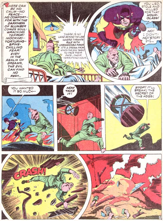
Adventure #79 (October 1942) “Footprints in the Sands of Time” page 2, art by Jack Kirby
Another justification for the name Sandman was the concept that the criminals were so frightened Sandman that he would haunt their dreams. A nightmares of the Sandman had by a crook was depicted in Adventure #79 (see image above). In “A Drama in Dreams” (Adventure #81, December 1942) an actor has taken the place of Sandman’s alter ego, Wesley Dodds. His deception was not perfect until he talks in his sleep:
Wesly: You can’t pin anything on me! Help! The Sandman … Don’t let him get me!
Sandy: Why — only criminals have dreams like that — but not Wes Dodds.
Dreams and sleep play other small parts in Sandman stories. In “The Lady and the Champ” (Adventure #83, February 1943) sleeping with a piece of wedding cake under the pillow apparently results in two strangers dreaming of each other. In “The Man Who Couldn’t Sleep” (Adventure #80, November 1942) a rich man’s insomnia leads him to a life of crime. Other sleep references can be found, such as Sandman commenting on their fighting crime at night while others are asleep. Sandman may not have had any special powers, but that did stop S&K from including the sleep theme into their stories in an attempt to justify their hero’s name.
Just as Sandman and Sandy did not have an real superpowers, neither did their opponents. Most would be have nothing special about them above their criminal behavior. That really was not a problem because Joe and Jack knew how to make a story exciting. Sometimes S&K would suggest their villains had powers which by the end of the story would be shown to be illusionary. In the “The Villain from Valhalla” (Adventure #75, June 1942) we are presented with the god Thor whose leads a Viking raid against New York City. Even the character’s thought balloons lead us to believe he is truly Thor, as a car approaches the treasure laden Thor he thinks:
HMMMMM. A QUEER CHARIOT THAT! .. BUT “MJOLNAR” CAN OVERCOME IT!
But in the end he turns out to be nothing more then “a clever and brutal killer” named “Fairy Tales” Fenton. His metallurgy expertise provides his gang with bullet proof clothing. The destructive hammer
AN ELECTRICAL MASTERPIECE! IT CAN SEND ENOUGH VOLTAGE INTO THE STRONGEST STEEL TO BLOW IT TO PIECES
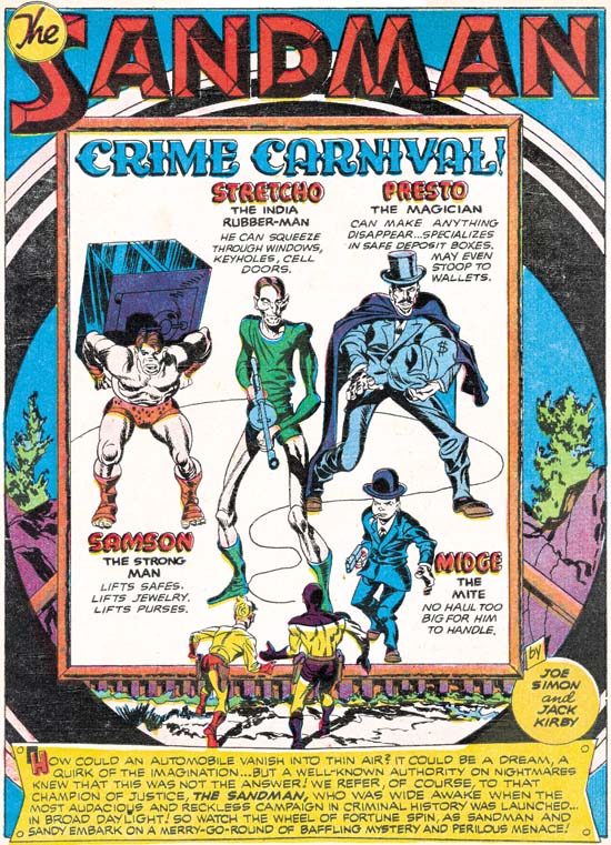
Adventure #84 (March 1943) “Crime Carnival” page 1, art by Jack Kirby
Another faker was the carnival magician in “The Miracle Maker” (Adventure #78, September 1942). His magic tricks were used to hide his criminal acts. Sandman and Sandy are not fooled and catch him at his tricks. Simon and Kirby seem to have a propensity for using carnivals as a source of criminals. Previously at Timely they had done “Case #2: Sando and Omar” (Captain America #1, March 1941) and “Captain America and the Ringmaster Of Death” (Captain America #5, August 1941). “Crime Carnival” became a prime example for Sandman. Why carnivals? I suspect it has to do with the fact that the readers would be familiar with the world of circus performers and freaks. It was populated with people who could have abilities beyond those of normal people, yet be familiar enough that the readers would not wonder how they got those powers. Provided that S&K did not go too far, which they never seemed to do. When Strecho reaches through the bars to grab the money bags from a bank desk, is his arm length truly increasing, or is he just taking advantage of his thin but tall frame? From the angle that Kirby draws it is hard to be sure.
The only villain in the earlier Sandman stories that is shown receiving powers that he did not originally have was in “The Man Who Knew All the Answers” (Adventure #74, May 1942). Here we find a scientist using a device to generate vibrations that develop his unused brain cells.
KNOWLEDGE! VAST KNOWLEDGE! … I CAN FEEL IT POURING ….. INTO MY BRAIN ….. OPENENING .. UNLOCKING THE NATURAL … AND SUPERNATURAL!
Afterwards when encountering the janitor he questions him about getting a new job. The janitor is shocked, he has told nobody about it. Deductions like a super-Sherlock or ESP? No explanation is given and for the rest of the story the only power he exhibits is great intelligence.
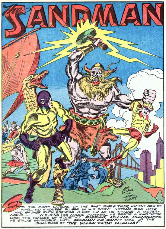
Adventure #75 (June 1942) “The villain from Valhalla” page 1, art by Jack Kirby
In my opinion it was with the work that Simon and Kirby did for DC (as well as the Harvey covers) that they forged their unique art style. The key ingredient that had previously been missing was their special bold inking style. There had been occasional hints of it in the Captain America Comics, but S&K would consistently use it from this point on. I suspect that the larger crew at Timely was the reason that it did not evolve at that time. At least initially at DC all of the art was produced by Jack and Joe which facilitated the developing of their inking style. Still this is not the Studio inking style I wrote about in my serial post on Jack Kirby’s Austere Inking. There are things that look like abstract arcs (see the Inking Glossary ) but they black area never seems to form a band with both the upper and lower boundaries tracing an arc, something often seen in the typical Studio style. Crosshatching sometimes is reminiscent of picket fence brushwork as for example on the torso of Thor in the above splash page. But the pickets are thin and slanted at an angle while the rails are actually further crosshatching.
Other changes occurred in the art from what was done on Captain America. The more extreme irregular panel shapes had been abandoned. Round and irregularly shaped panels would still be common, but ones with a multiple zigzagging border would no longer be used. The most important change would be the panel layout. The predominant format on Captain America had the panels laid out in four rows and two columns. The same layout was initially continued when Simon and Kirby worked at DC. But beginning with Adventure #78 (September 1942) three rows and two columns began to be the most common layout. The transition was not sudden or complete, there are a number of stories that have both layouts. But eventually four rows would become rare and most variations would be having some rows with three panels.
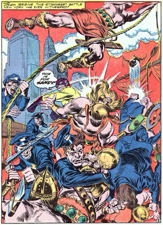
Adventure #75 (June 1942) “The villain from Valhalla” page 8, art by Jack Kirby
I cannot finishes discussing the earlier Sandman comics without writing about one of my favorite splashes, the one from “The Villain from Valhalla”. In a previous encounter with Thor and his Viking horde, Sandman and the police had been soundly defeated with Sandy hospitalized. Now they are determined to even the score. Most Simon and Kirby splashes were limited to the first page, but this fight required the an entire story page. Besides Thor’s hammer we find the villains armed with a spear and a battle ax. Yet the good guys face this solely with their fists, none of the police draw their guns. The composition is Kirby’s comic book equivalent of Jackson Pollack. Most of the page is a tangle of arms and bodies where extra viewing time is required to reveal what is going on. Jack is not even content to leave the skyline with the Chrysler building alone, surmounting it with a rope swinging Viking. Jack’s confidence in the impact of the splash is so great that he is throws in a piece of his personal humor, a policeman’s powerful slug sends a Viking’s helmet on an upward trajectory. Frankly the caption
THEN BEGINS THE STRANGEST BATTLE NEW YORK HAS EVER WITNESSED!
seems superfluous and Sandman’s battle cry
THIS IS FOR SANDY!
was all that was needed.
Green Hornet #8, Another Harvey Cover
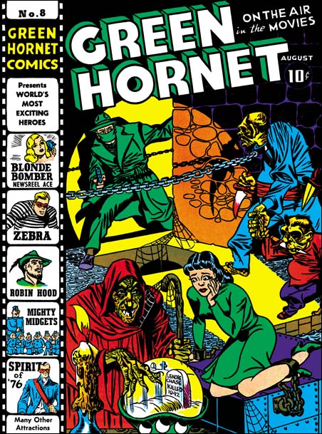
Green Hornet #8 (August 1942), art by Joe Simon
When I started this blog, one of my projects was to review the covers that Al Avison, Joe Simon and Jack Kirby did for early Harvey comics. I love cover art and these early Harvey covers have some of the best work that Simon and Kirby did during that period. Unfortunately these are rare comics and generally in poor shape making restoration difficult. During the first eight months of my bloggin I was able to post on twenty Harvey covers, but a few remained to be restored and reviewed. Speed #23 presents some formidable restoration challenges. Every so often I take a look at it, however so far I just have not felt ready to take in on. I would love to write a better review of Champ #22, but I do not have a good enough of a scan to do a proper restoration. That was also the problem with Green Hornet #8, at least up to now. Now after a year, I am finally able to add another chapter to my writing on the Harvey covers.
Harvey covers can be divided into two time groups. The first were for the pocket sized comics that Al Harvey first published. The cover art was drawn by Al Avison or Joe Simon. Jack Kirby did not do any of them despite the fact that all three were involved with creating Captain America comics at that same time. Coincidentally the pocket sized Harvey comics ended at the same time as Simon and Kirby’s termination at Timely. This was followed by a gap of a few months and then Harvey started publication again, this time using the standard comic book size. Avison no longer supplied any covers, he was probably too busy doing Captain America for Timely now that Simon and Kirby were gone. Simon would draw some Harvey covers, but most were done by Jack Kirby. Oddly Joe Simon was responsible for three covers done in one short period of time; Champ #22 and Speed #22 (September) and Green Hornet #8 (August). Green Hornet was a bimonthly. Although Joe had done Champ #19 and Speed #19 (both June) in a Kirby style, the later trio of covers did not seem to reflect much influence from Jack.
It would appear that for Green Hornet #8 Joe resorted to the use of swiping that was so prevalent in the start of his comic book career. I cannot supply the source, but I am sure the witch was swiped from someplace. The captive young lady has a Will Eisner look to me. The Spirit had been published as a newspaper insert for some time so Joe was certainly aware of it. However my search through the DC archive editions has failed to reveal any possible sources for the lady on Simon’s cover. The Green Hornet’s two opponents look like Simon creations. Note their similarity of their checks and jowls with that found in the Hitler from Speed #21 (August), the smaller villain from Champ #19 (June), and the sketch of Hitler in a Zoot suit. Yes Joe used swipes for this cover, as he so often did, yet he has created a very original composition.
The cover tells a story, as just about all Joe Simon covers do. A lady is held captive, terrified of the future revealed in a crystal ball by a truly gruesome witch. But the background shows the Green Hornet arriving to the rescue. But our hero must be careful to negotiate the obstacles separating himself from the damsel in distress, a pit at his feet and a chain stretching across his path. As we follow the Green Hornet’s eyes we find it is no ordinary chain as it ends with a collar on what is the not quite human equivalent of a guard dog. A very effective guard indeed as shown by his blood stained knife. The guard is intent on preventing the Green Hornet from interfering while his diminutive companion’s concentration remains on fulfilling the crystal ball’s prediction of the woman’s fate.
Simon makes effective use of props to heighten the drama. A drip covered candle provides an eerie touch to the scene, it is a device that Simon and Kirby would introduce often for such an effect. A spot light seems come from someplace low off our field of vision. It is a very selective spot light indeed, no shadows are cast by the legs of the two subhuman figures. However shadows are cast by the hand held knife, the chain and the Green Hornet himself. All the shadows that would provide drama to the scene, as always realism is not as important as telling the story. The spot light also aids the composition, diagonally dividing the two darker fields occupied by the villains. The captive is not in the spot light but is highlighted by it, visually connecting her to the hero. It may not have anything to do with Joe, but the colorist use of a green dress also effectively links the damsel with the hero.
Joe Simon may not have been as talented a penciler as Jack Kirby, and some will say that he depended too much on the use of swipes. When it came to laying out a cover and making it tell a story, few at the time were his equal. Green Hornet #8 was truly a thrilling cover. But Joe was not content with just drama, he also included humor, albeit a dark humor. There is a similar touch of black humor in Joe’s cover for Champ #19. Here Simon scatters cob webs about the place as part of the effort to give a dungy look to the scene. How many artists would then turn around and attach webbing from the staff to the witch herself? My favorite piece of humor in this piece is how the beastly guard leads his small partner by the hand, as if he is taking part in a “take your child to work” day. This type of humor is an early manifestation that would fully blossom when Joe was editor of Sick magazine.
In order to the receive lower mailing costs for literature, comic books had to include a text story. Often not much effort seemed to be given to this story, as a young comic book reader I never read them. Harvey comics had an interesting approach to the text stories, as some of their covers declared:
READ the THRILLING Story behind the COVER — INSIDE —
What is interesting about the text story for Green Hornet #8 is not what it adds to the understanding of the cover, rather how it deviates. In the story the lady is held captive in a building across the street from the offices where the Green Hornet’s alter ego works as a newspaper reporter. Nothing in the story suggests that woman was held in the sort of dungeon that the cover portrays. Rather the story describes her place of confinement as a small room adorn to look like a fortune telling shop. In the story there is a fortune teller whose crystal ball reveals a fatal future for the beautiful captive, but without an indication that the soothsayer was an ugly witch. The short tale includes two “toughs” without giving the impression that they were almost subhuman. Neither is described in the story as small as the one shown on the cover depiction. Nor does the story mention the use of knives by the toughs. I find it hard to believe that an author presented with a copy of this exotic cover art would have written this more mundane story. More likely Joe Simon received the finished story and, realizing that the cover would have to be more exciting if it was going to sell the comic, spiced it up.
Quote
Captain America with a pop gun, who thinks of these things?
Sandman Revisited
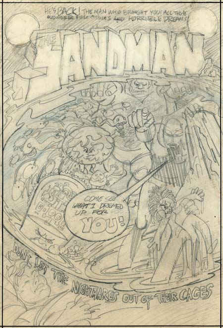
Sandman cover rough by Jerry Grandenetti
A few months ago I posted on a cover rough that Jerry Grandenetti did for the 1974 version of the Sandman. Kris Brownlow provided an image from an old eBay listing which, to put it kindly, was of a rather poor quality (the eBay lister’s fault, not Kris’s). Happily I have been able to obtain the original piece through the help of Scotty Moore.
The better image of the Grandenetti cover is welcome indeed. Now we can make out the text from the top of the cover:
HE’S BACK! THE MAN WHO BROUGHT YOU ALL THOSE WONDERFUL STORIES AND HORRIBLE DREAMS
This obviously refers to the golden age version of the Sandman that Simon and Kirby produced. Potential readers would likely have been aware of that Sandman from reprints that had appeared in the back of the various New Gods titles.
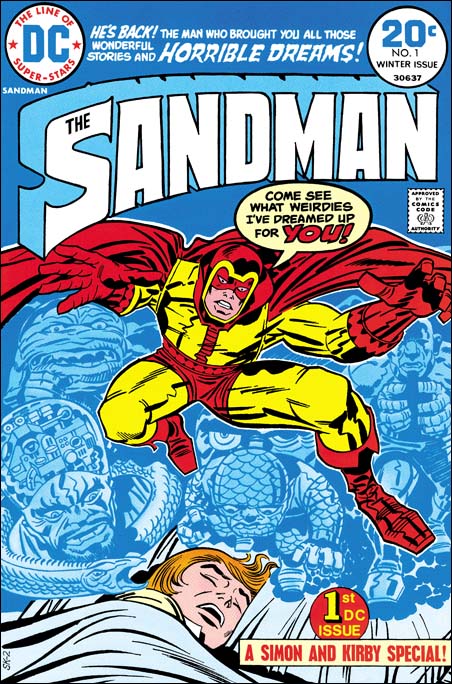
Sandman #1 (Winter 1974) art by Jack Kirby
Now that it is possible to have a good understanding of the cover rough, it is clear that there is a correspondence between Grandenetti’s rendition and Jack Kirby’s published version. I previously pointed out that the machine head guy on the lower left was common to both. Also the group of snakes became represented by a single serpent. Now it can be seen that other figures correspond as well. The small man a little left of center on the cover rough becomes the scaly man on the bottom of the dream scene on the published cover. Also a little left of center is a figure whose body is nothing more then a circular head with small face surrounded by a rough or folded skin. In Kirby’s drawing the face becomes larger to encompass the entire head, but the folded skin and lack of a true body leave little doubt that it represents the same figure. Grandenetti’s muscle man on the upper right was retained by Kirby although the arms, originally in a Frankenstein pose, were changed to bring the hands together. Grandenetti had a number of circles with multiple legs (spiders?) on the left, which Jack did not made use of. Further Jack dropped the arm holding the doll and added a mysterious and threatening set of eyes. Of course the most important change is that Grandenettis’s Sandman had been delegated to the side almost lost among the dream figures. Kirby instead placed Sandman front and center using his signature exaggerated perspective. There is no doubt in my mind now that Jack saw either this Grandenetti cover or, less likely, yet another version of it.
This is convincing evidence that the bronze age Sandman was originally a Joe Simon concept. At that time Joe had been doing a number of projects for DC. Simon would be the creator and writer while another artist, generally Grandenetti, would do the art. Originally Sandman was going to be nothing more then another comic that Simon would produce for DC. However remembering the success of the golden age Sandman, Carmine Infantino probably twisted Kirby’s arm to got him to team up once again with Joe. But Jack had a long period of creating and writing material without getting the proper credit and had only recently been able to escape that fate. Now he was thrust back to teaming up with another and, worse yet, working on someone else’s concept. Despite the success of the new Sandman, Jack would not, in all likelihood refused to, continue his collaboration with Joe. Thus a Sandman was the first comic that the Simon and Kirby teamed did for DC and it would turn out the last not only for DC but anyone else as well.
The resurfacing of the Grandenetti cover is very fortuitous as I was planning to sometime in the next few weeks to post on the golden age Simon and Kirby Sandman. If that is not enough Sandman for you, I will also post sometime soon on a question I was asked by Scotty Moore about what was used as the basis for the inking of the published version of the Sandman #1 cover.
The back of the Grandenetti cover draft has some enigmatic text:
I’VE GOT IT, JUST
WHAT YOU DEMANDED
THE CASH –
THE LOOT –
THE/A COOL
MILLION
An idea for a crime comic proposal?
Quote
Joe: I think I am going to have to start being serious.
Harry: After all these years, why start now?
Joe Simon as a Newspaper Staff Artist
Despite what has been said by what would normally be considered reliable sources such as Jack Kirby, Joe Simon did not go to college. Instead Joe used what experience he gained during his high school years to get himself a job after graduation as an artist assistant for the Rochester Journal American. Later he would go on to work for the Syracuse Herald. Much of what Simon learned during his time as a newspaper staff artist would serve him well during his career. The skill he developed with the air brush (for retouching photographs) would be used years later for creating the covers for Sick (a Mad-clone humor magazine). Joe became quite proficient in all manners of things needed in the publication of art. I am sure that this experience had a lot to do with why Joe was able to advance so quickly when he later entered the comic book industry.
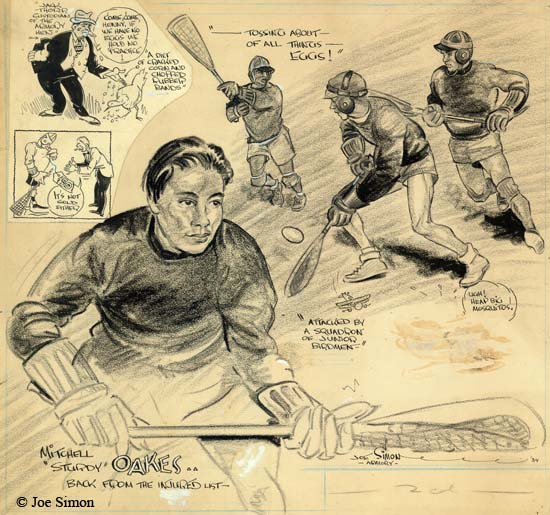
Sport Illustration by Joe Simon (1934)
However Simon’s experience was not limited to production, he would provide illustrations as well. Much of this was sports illustrations such as the example I provide above. This piece, as well as most of Joe’s sport illustrations, was done on stipple board. These boards had a textured surface that allowed pencils to be easily transferred to printing plates. The art was created in a size larger then the intended published version, with measurements provided in terms of the number of columns. Joe says that at the time a column was two inches wide. The above illustration therefore would be 10 inches wide in the actual newspaper. This piece originally had two paste-ups added, one of which has since been lost. The art on the remaining paste-up does not appear to be Joe’s work.
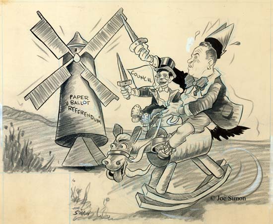
Political Cartoon by Joe Simon
According to Greg Theakston (The Complete Jack Kirby) and even Joe himself (The Comic Book Maker), sport illustrations were pretty much all that Simon did. However Joe’s own collection indicates that was not the case, Joe did political cartoons as well. In the example I provide above (a four column or eight inch piece) Joe takes on a local political issue. I have no idea what the “Paper Ballot ‘Referendum'” is all about, but there is little doubt that Simon had a low opinion of the portrayed politician. The windmill brings to mind the futile quest from Don Quixote. Our politician will fare no better since he is on a rocking horse, but I love the way Joe cannot resist providing a very animated horse’s head. The council is degraded even further, being depicted as a Charlie McCarthy dummy under the politician’s control.
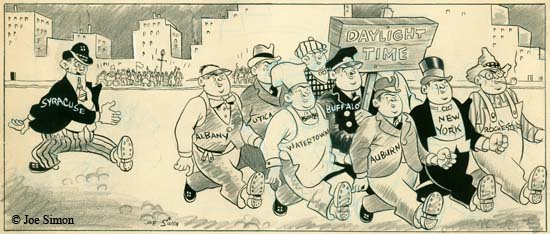
Political Cartoon by Joe Simon
Some of the other political cartoons still in Joe’s personal collection concern Daylight Savings Time. Apparently Syracuse was one of the few local communities not to adopt the time change. Joe depicts a parade being viewed by the public. A small group of Daylight Time supporters proudly march together, each individual representing a different New York locality. Syracuse trails behind, out of step and goofy looking. There can be little doubt that Joe was calling to Syracuse to adopt the Daylight Savings Time.
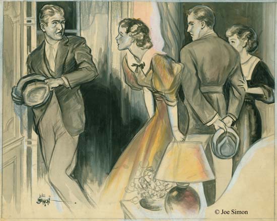
Fiction Illustration by Joe Simon
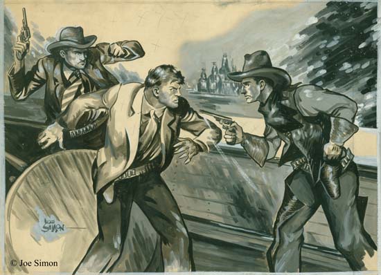
If we can use his collection to judge by, Joe did do a fair amount of political cartoons, just not as many as his sports illustrations. Joe Simon also at least occasionally contributed illustrations for fictional pieces. I must admit I am a little surprised at this. I was well aware that previously newspapers would often include fictional stories but I had thought that practice had been discontinued by the time Joe was doing newspaper work. Joe used a different media for this work, the three examples from his collection were all done using ink, gouache and, in the case above, some watercolor on illustration board. Because the result is more painterly, more effort must have been made to prepare them for printing. Perhaps they were used in a magazine insert were higher quality photographs would also be used. As in pulp magazines, these fictional illustrations would often include a caption. The board for the above illustration has on it in Joe’s handwriting:
“IT’S VERY SIMPLE” MARTIN SAID, “I’M GOING TO MARRY LYNN”
Fiction Illustration by Joe Simon
The first example of fiction illustrated that I provided was done in a style that is unusual for Simon. The second example that I show above, as well as another work in Joe’s collection, are immediately recognizable as Simon pieces. Despite the difference in media, the characters look very much like those in Joe Simon’s early comic book work. Not only that but in these two pieces Joe also used his own features for one of the men in the scene. Perhaps it is just a coincidence, but in each case it was as the man whose quick draw gains control of the situation. In an earlier post I had suggested that Bill Everett was the source for a technique that Joe adopted of combining eyebrows and eyelids as one angular feature. This illustration work shows that I was wrong, Joe was already using pretty much the same technique before starting his comic book career. Regrettably there is no caption on the above illustration. Still I think we can be pretty certain that our quick drawing cowboy is the hero of the piece. Despite some pretty badly drawn hands, it is a exciting piece of art. Perhaps not as polished as other illustrators might do, but just the sort of thing that work well when Joe began doing comic books. The published piece would have looked a bit different. Simon marked with penciled ‘X’s the background, the counter top and parts of the center man’s jacket. This is a indication to the printer to fill theses areas with black.
Joe thought he did these fiction illustrations in the mid ’30’s, at which time he would have been in his early 20’s. That is a little surprising since Joe’s character in the paintings looks older. This might suggest that this work was actually done in the late ’30’s. Or it just might be that Joe purposely or unconsciously added a little weight to the face giving it an older look.
All indications are that Joe was doing quite well in his career as a newspaper artist. However there was a change going on with local papers were being bought up and consolidated. That included the one Joe worked for, and so he was out of a job. I suppose Simon could have moved and tried to get work in another community’s paper. However there was a shrinking supply of such possibilities and increasing number of competitors for the jobs. But I think more important was that Joe was ambitious. So he moved to New York and, as they say, the rest was history.
Really Bad Clowns
20th Century Danny Boy has been on a roll lately providing a series of interviews with assorted comic book artists. His latest is Alan Kupperberg. I have to admit there is a rather large period from when I stopped reading comics as a young man until I started with them once again. Some of what happened in between I have since picked up on, some of it I am still ignorant about. I have heard of Evil Clown comics but have no first hand experience with them. Frankly I find some of the art that Danny provides somewhat offensive (so be forewarned) but there is no denying Kupperberg’s talent.
The idea of a (morally) bad clown was not new, others have used it as well. There is something about the juxtaposition of a funny costume and an evil nature. It was not a big part of the Simon and Kirby repertoire, but Joe and Jack did use it. And of course anything that Simon and Kirby did, they did very well indeed.
Green Hornet #7 (June 1942), art by Jack Kirby and Joe Simon
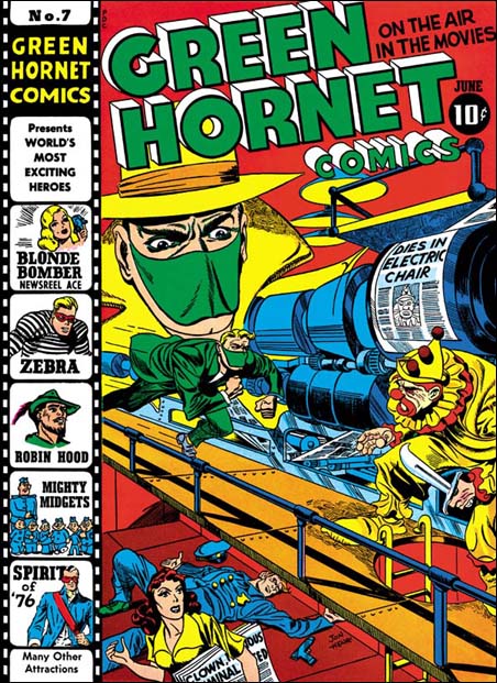
I am thinking particularly about the cover for Green Hornet #7 (June 1942) that Joe and Jack did for Harvey Comics. I have already posted on this cover but Danny’s blog has brought it back to mind. This was a joint effort, Jack did most of the pencils but Joe drew the large floating head. The signature says Jon Henri, but do not let that fool you. Henry is Joe Simon’s middle name and Joe was so fond of the name Jon that he gave it, with that unusual spelling, to his first son. I am still uncertain about who did the inking, but my suspicions are that it was done by Al Avison. I like my original description of this piece of art so I am just going to repeat it.
I love the way Simon and Kirby make a cover tell a story. The Green Hornet is rushing to attach a killer clown. If the clown carrying a wicked knife wasn’t enough, the lady on the lower level carries a newspaper with headlines that are hard to make out completely but clearly includes “CLOWN … CRIMINAL …”. Behind her is a fallen policeman, his gun laying at his side, clearly the Green Hornet will be taking on one tough clown. The press above is printing the front page for the latest edition declaring “DIES IN ELECTRIC CHAIR” with a picture of the clown, obviously printed ahead of time because the clown escaped before facing his execution. The Green Hornet had better be careful because this clown has nothing to loose.
Poking Fun at Adolf
Captain America #2 (April 1941) “Trapped in the Nazi Stronghold”, art by Jack Kirby
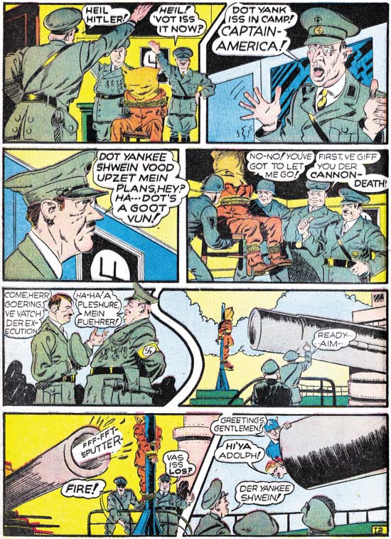
Simon and Kirby really hit it big with Captain America. I am sure an important reason about why it became such a large selling comic was the cover. The U.S. was not yet in the war but there were still many who could appreciate a depiction of Captain America slugging Adolp Hitler. What fictional villain could compare with the evil of the all too real Hitler? But brute force was not the only means that Simon and Kirby would use to take Hitler down a peg or two, humor was used as well. It should be obvious from the image above that S&K portrayed Hitler as somewhat of a buffoon.
Speed #16 (January 1942), art by Al Avison
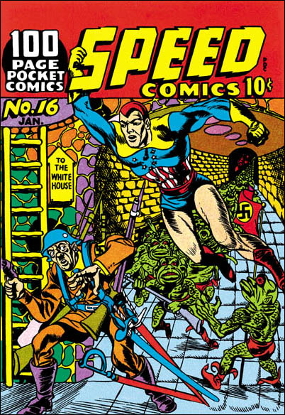
Of course once Hitler graced the pages of Simon and Kirby comics, other artists would use Adolf as well. Al Avison had a special advantage, he was one of the crew working for Joe at Timely. Al even drew some Captain America stories. Avison’s efforts never made it into Cap comics, they were recycled as the Patriot in USA #1. (Other then Kirby, the only artist to draw Captain America in the early issues was Simon.) Avison also did some work for Harvey Comics and you tell he learned a lot from Jack. For the cover of Speed #16 Al provides Hitler leading an attack on the White House. Armed with a gun, four rifles and four swords, Avison has also makes Hitler out to be a buffoon. But Avison has overplayed his hand, Adolf and his army are so ridiculous that they hardly seem a threat to Captain Freedom.
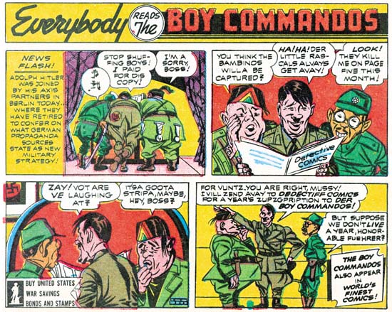
Adventure #83 (February 1943) house ad at the end of a Sandman story, by Jack Kirby
Just because Joe and Jack left Timely and Captain America does not mean that they stopped making fun of Adolf Hitler. Far from it. The original Axis of Evil was jokingly portrayed in a house ad for the Boy Commandos. Only four panels but that is all S&K need. I guess the Axis leaders were the original Three Stooges.
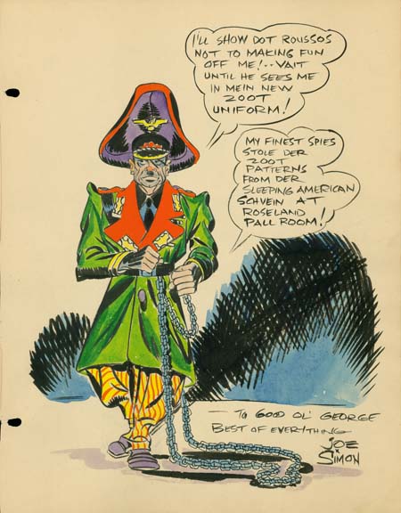
Sketch for George Roussos by Joe Simon (1942)
The above sketch is one of the reasons I have been thinking of Adolf Hitler lately. It is undated but it was from the same George Roussos sketch book that included a drawing by Jack Kirby dated as 1942. Further Joe would shortly be joining the Coast Guard during which I doubt that Roussos would have the opportunity to have Joe add something to his sketch book.
George Roussos was not only a talented artist, he was also an early fanboy. He had some of the greatest talents of the day provide drawings for his book. What a treasure it was. I say was because it recently has been disassembled and the individual pages auctioned off. It is a shame that it was not published before it was taken apart. If you are willing to register with Heritage Auction Galleries you can see the work by searching their Auction Results Archives under original art for George Roussos. Joe’s entry is not dated, but it must have been done about the same time as Jack’s, 1942.
Joe Simon has his own particular brand of visual humor of which this is a very early example. What could be more incongruous then Adolf Hitler in a Zoot suit? Where did he every come up with that? I have no idea. But this sort of irreverent humor would show up again when Joe produced the Mad-close magazine called Sick. In fact it still shows up in the art that he produces today.
I remember years ago someone criticizing Mel Brooks for his movie The Producers. They asked me how anyone could find something funny in Adolf Hitler. Make no mistake about it, Hitler was a monster, the most evil person of our century. We should never forgive or forget the horrible things he did. That however is not enough. There are people who will try to praise Hitler for some of those very awful things. So we must add ridicule on top of our scorn. That is something Joe Simon still understands very well.
Joe Simon’s Correct Age
Mark Evanier wrote a nice post about Joe Simon’s birthday. But Mark got it wrong when he gave Joe’s age as 92. Well let me set the story straight, Joe is now 94 years young. When I last talked to Joe he commented:
I’m telling everybody that I am 95. I mean what kind of number is 94? No, 95 is a much better number. I’m going to say I’m 95.
Is it any wonder that people get confused about Joe’s age? I love Joe, but I always try to remember he favorite piece of advice:
Never let the facts get in the way of a good story.

