Tag Archives: Jack

The Art of Romance, Chapter 12, A Smaller Studio

(August – October 1950: Young Romance #24 – #26, Young Love #12 – #14)

Romance Titles to 1951
Number of Romance Titles 1947 – 1950 (the period covered in this chapter shaded in blue)

The trend of the decreasing number of romance titles that was found in the period covered in the previous chapter has continued. As far as can be judged the Prize love comics, Young Romance and Young Love, were still successful; at least enough to continue on a monthly schedule. Young Romance is now entering its third year of publication. The most obvious change is that Young Love replaced the previous photographic covers with drawn versions for the August issue and Young Romance would follow a couple months later. Frankly I am unclear what drove the use of photos on comic covers but as we will see in future chapters the use of art covers would be temporary for Young Romance and a little more extended for Young Love. Printing is somewhat more expensive for photographic covers but according to Joe Simon for the publication sizes involved the extra cost was very minimal.

I have noted in previous chapters a decrease in the number of artists used in producing YR and YL. This trend continues to the extent that a total of six artists were used in the six issues issued during the period covered in this chapter. In fact this is the first period that I have covered in this serial post where I can confidently identify all the artists involved (or as confidently as I can where Bruno Premiani is concerned). The drop in the number of contributing artists is not random; it is the less talented artists that are no longer used. Some, like George Gregg, would continue to appear in the Prize crime comics (Headline and Justice Traps the Guilty). There is one exception to dropping the less talented artists and that is John Severin. Although Severin does not show up in any of the comics from this period he has not yet been truly dropped as he will appear again in the next chapter. In any case as talented an artist on western stories that Severin was he really was not very good at romance stories. His diminished appearances in the romance titles seemed to have been offset by his work for Prize Comics Western.


Young Love #13 (September 1950) “Everybody Wants My Girl”, art by Jack Kirby

Jack Kirby would be, as he has been, the primary artist for the Prize romance titles. In these six issues he provided 4 covers, 7 stories and a total of 62 pages. Jack would do all the lead stories for Young Romance and one of them for Young Love. These lead stories would start with a confessional splash (where someone is introducing the story and their speech balloon is used for the title). All but one of the splashes would be half page designs and none of them had quite the punch as those from the earlier issues. Perhaps this is because Simon and Kirby’s creative juices were directed elsewhere but that will be discussed in a separate post.


Young Romance #24 (August 1950) “Buy Me That Man” page 14, art by Jack Kirby

Jack Kirby drew a lot of romance stories and it is clear he had a hand in plotting these stories as well. So it is not surprising that some plot devices would be used more then once. The use of an sudden plunge in a plane to throw a couple into each others arms found in YR #24 (see above) was used previously in YR #8 (November 1948 “Love Can Strike So Suddenly”, see Swiping off of Kirby). It would be found again in In Love #2 (October 1954, “Marilyn’s Men”). While Marilyn’s Men was mostly drawn by Bill Draut, Jack probably was involved in the plotting of that as well.


Young Love #14 (October 1950) “Girls like Her”, art by Mort Meskin

As with last chapter, Mort Meskin would be the second most used artist for this period drawing 14 stories with 54 pages. While the number of features is doubled that done by Kirby most of them are very short, 1 to 3 pages long. Previously these featurettes were done by a number of different artists but during this period Mort did all but two of them (the two Meskin did not do were done by Kirby). Mort would provide one of the lead features (Young Love #12).


Young Romance #24 (August 1950) “Take a Chance”, art by Mort Meskin

Although I have not found any evidence that the more talented artists working for Simon and Kirby were ever supplied layouts for the stories they drew, Joe and Jack did seem to be involved in at least the plotting of the scripts. Therefore recurring themes would also show up among other artists. The theme of a woman’s love of a racecar driver and the fear of the risks involved in that occupation can be found in “Take a Chance” shown above. It also would return many years later in a cover a story drawn by John Prentice (“Take Me as I Am”, Young Brides #14, April 1954).


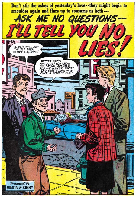
Young Love #14 (October 1950) “I’ll Tell You No Lies”, art by Bill Draut

Bill Draut continues in the number three spot with 6 stories and 46 pages but as we shall see he barely holds that position. At this point Draut arrives at a style that will not change very much for the rest of the work that he would do for the Prize romance titles or for that matter Harvey’s love comics as well. I do not say that disparagingly as he has a clean style and is good at portraying body language. Bill generally uses half page splashes so I have provided an image from “I’ll Tell You No Lies” even though it is well below Draut’s usual quality.


Young Love #13 (September 1950) “Two Can Play the Game”, art by Leonard Starr

Leonard Starr was used often during this period with 6 stories and 45 pages, only one page less the Bill Draut. Starr had his own style of inking but compare the brush work between the man’s jacket and the woman’s dress in the splash for “Two Can Play the Game”. The inking on the man is typical of Starr but the picket fence crosshatching found in the dress is not. This looks like typical S&K studio style inking and suggests that either Joe or Jack did that particular spotting. I am not sure why this was done but it was not that unusual for studio style inking to appear in splashes that were otherwise inked by the artist.


Young Romance #25 (September 1950) “Out of the Running”, art by Leonard Starr

In two stories from this period (“Out of the Running” YR #25 and “Hired Wife” YR #26) Starr introduces a new type of beauty. Previously his women a pixie or elfin look to them; wide foreheads, widely separated eyes, smaller mouths and narrow chins. The pixie look can still be found in some characters in these stories but there are also women with larger eyes, smaller foreheads, and fuller lips giving them a more sultry appearance. This new type of beauty will play an important part in the syndication strip “Mary Perkins on Stage” that Starr will launch in 1957.

Note the inking on the man’s jacket in the splash panel. The shoulder blot and blunt brushwork is not typical of Starr’s inking. Once again Simon or Kirby has step in as art editor to alter the art. This splash is actually based on a stat of a blowup of a story panel. The panel chosen was one of Starr’s tall and narrow ones that had to be expanded on both sides to accommodate the more horizontal splash panel. Most of the jacket was not present in the story panel and the inking was touched up even in that portion that was original present. Although this technique of using a stat in the creation of comic book art is rarely found in Simon and Kirby productions it was a method that would be turned to when needed. I suspect that Joe and Jack were unhappy with Starr’s original splash.


Young Romance #26 (October 1950) “Hired Wife”, art by Leonard Starr

Above is the splash page for the other example of Starr’s more sultry beauty. This story is unusual in that the tall narrow panel that is found in all previous stories by Starr occurs only in the splash panel of “Hired Wife”. I am not sure what to make of this change in panel layouts but it suggests that he may have been working from someone else’s layouts. I will return to this subject in the next chapter of this serial post where we will find another example.


Young Romance #24 (August 1950) “Portrait of a Lady”, art by Bruno Premiani?

Bruno Premiani(?) has been a persistent presence in Simon and Kirby productions since August 1949. During this period Bruno provided 3 stories and 26 pages. While he did not appear as much as Kirby, Draut or Meskin what art he did was all first rate work. The romantic interest between an artist and his model is a recurring theme in Simon and Kirby productions. It is found in the very first cover for Young Romance (The First Romance Comic) and can be found many years later as well (Artist and Model). The artist and model theme appears to be particularly popular for this period since it occurs in three stories. We have previously seen Leonard Starr’s splash from “Two Can Play the Game” (see above) now we can compare it with Premiani’s version “Portrait of a Lady”. For me this is not a question of which was the better artist but rather individual interpretations from two talented practitioners of comic book art.


Young Romance #26 (October 1950) “Simpson and Delilah”, art by Bruno Premiani?

Premiani repeats the use of a dancing woman for the splash of “Simson and Delilah” (a south Pacific dancer graced “Untouched” from Young Love #10, June 1950). Although this is a repeat performance of the theme it is by no means a duplicate of the previous version.

This would be the last romance story that Bruno Premiani(?) would do for Simon and Kirby. As I have mentioned in the past this body of works were all unsigned in Simon and Kirby productions and were done in a style dissimilar to that used in art done for other companies that were signed by Premiani. While this does not disprove that the artist was Bruno Premiani it does beg the question as to why he was originally credited with this work. Although I am hesitant to fully accept Bruno Premiani as the artist (hence my use of question marks) I have no doubts as to the talent of this creator. His absence would leave a hole in the romance titles that would not be filled for some months to come.


Young Love #13 (September 1950) “The Woman Across the Hall”, art by Vic Donahue

Vic Donahue played a minor part in the romance titles of this period providing only 2 stories with 15 pages. His art is improving both in his in his ability to depict figures and to graphically tell a story. His women in particular have become more interesting largely because his use of arching eyebrows brings more emotion into their faces. My database indicates that these are Vic’s last work for Simon and Kirby but I hesitate to say that with conviction until I had a chance to more carefully review future issues. In any case I do not feel the same about Donahue’s absence then I do about Premiani’s disappearance.

Chapter 1, A New Genre (YR #1 – #4)
Chapter 2, Early Artists (YR #1 – #4)
Chapter 3, The Field No Longer Their’s Alone (YR #5 – #8)
Chapter 4, An Explosion of Romance (YR #9 – #12, YL #1 – #4)
Chapter 5, New Talent (YR #9 – 12, YL #1 – #4)
Chapter 6, Love on the Range (RWR #1 – #7, WL #1 – #6)
Chapter 7, More Love on the Range (RWR #1 – #7, WL #1 – #6)
Chapter 8, Kirby on the Range? (RWR #1 – #7, WL #1 – #6)
Chapter 9, More Romance (YR #13 – #16, YL #5 – #6)
Chapter 10, The Peak of the Love Glut (YR #17 – #20, YL #7 – #8)
Chapter 11, After the Glut (YR #21 – #23, YL #9 – #10)
Chapter 12, A Smaller Studio (YR #24 – #26, YL #12 – #14)
Chapter 13, Romance Bottoms Out (YR #27 – #29, YL #15 – #17)
Chapter 14, The Third Suspect (YR #30 – #32, YL #18 – #20)
Chapter 15, The Action of Romance (YR #33 – #35, YL #21 – #23)
Chapter 16, Someone Old and Someone New (YR #36 – #38, YL #24 – #26)
Chapter 17, The Assistant (YR #39 – #41, YL #27 – #29)
Chapter 18, Meskin Takes Over (YR #42 – #44, YL #30 – #32)
Chapter 19, More Artists (YR #45 – #47, YL #33 – #35)
Chapter 20, Romance Still Matters (YR #48 – #50, YL #36 – #38, YB #1)
Chapter 21, Roussos Messes Up (YR #51 – #53, YL #39 – #41, YB #2 – 3)
Chapter 22, He’s the Man (YR #54 – #56, YL #42 – #44, YB #4)
Chapter 23, New Ways of Doing Things (YR #57 – #59, YL #45 – #47, YB #5 – #6)
Chapter 24, A New Artist (YR #60 – #62, YL #48 – #50, YB #7 – #8)
Chapter 25, More New Faces (YR #63 – #65, YLe #51 – #53, YB #9 – #11)
Chapter 26, Goodbye Jack (YR #66 – #68, YL #54 – #56, YB #12 – #14)
Chapter 27, The Return of Mort (YR #69 – #71, YL #57 – #59, YB #15 – #17)
Chapter 28, A Glut of Artists (YR #72 – #74, YL #60 – #62, YB #18 & #19, IL #1 & #2)
Chapter 29, Trouble Begins (YR #75 – #77, YL #63 – #65, YB #20 – #22, IL #3 – #5)
Chapter 30, Transition (YR #78 – #80, YL #66 – #68, YBs #23 – #25, IL #6, ILY #7)
Chapter 30, Appendix (YB #23)
Chapter 31, Kirby, Kirby and More Kirby (YR #81 – #82, YL #69 – #70, YB #26 – #27)
Chapter 32, The Kirby Beat Goes On (YR #83 – #84, YL #71 – #72, YB #28 – #29)
Chapter 33, End of an Era (YR #85 – #87, YL #73, YB #30, AFL #1)
Chapter 34, A New Prize Title (YR #88 – #91, AFL #2 – #5, PL #1 – #2)
Chapter 35, Settling In ( YR #92 – #94, AFL #6 – #8, PL #3 – #5)
Appendix, J.O. Is Joe Orlando
Chapter 36, More Kirby (YR #95 – #97, AFL #9 – #11, PL #6 – #8)
Chapter 37, Some Surprises (YR #98 – #100, AFL #12 – #14, PL #9 – #11)
Chapter 38, All Things Must End (YR #101 – #103, AFL #15 – #17, PL #12 – #14)

The Romance of Money


The Romance of Money (1937) page 1 (cover), art by Jack Kirby

Early in his career Jack Kirby was employed by Lincoln News. There Jack worked on a number of strips for syndication but he also did the art for a give-away to be used by banks, “The Romance of Money”. Since this publication has a 1937 copyright date, some have designated it as Kirby’s first comic book work. Well I guess it all depends what the reader’s definition of a comic book is. “The Romance of Money” is a small book (5 by 6.5 inches) that is just a little larger then half the size of a normal comic book. It is only 24 pages long including the covers. The cover and all interior pages are printed on the same type of paper. The paper is not newsprint, has a nice white color and is a heavier stock then what is found in a typical comic book. The interior of the book is printed in black and white while the front and back covers also include a single color, cyan.


The Romance of Money (1937) page 5, art by Jack Kirby

The subject of this book is, not surprisingly, money. The approach taken is very similar to the old Ripley’s Believe it or Not comic strips. Except for the covers, each page presents a number of related subjects. Despite the presence of a H. T. Elmo signature, Jack Kirby did all the artwork. Horace T. Elmo was not an alias of Jack’s but rather the owner of Lincoln News. Art with his signature appears in both pocket books and comics up to at least 1957. Most of what I have seen are gag cartoons. However considering how Elmo signed work actually done by Kirby, I would be cautious about attributing to him any of the art with his signature.


The Romance of Money (1937) page 19, art by Jack Kirby

The inking in ROM is incredibly detailed, particularly considering the small size of the publication. The Elmo signature is so small that I suspect that originally a larger sized book was planned. I have never seen a comic book printed with such fine lines although I have seen numerous cases where even less detailed work failed to print properly. Either a letter press was not used or the printer was particularly skilled. The higher quality of the paper compared to that normally used in comics may have helped as well. Frankly the fine pen work is uncharacteristic of Kirby and raises the question as to whether Jack did the inking. At this point in his career it is hard to believe that Kirby would have been given the luxury of only providing the pencils. On the other hand the inking is rather poor in some places (for instance the portrait of Charles Dickens on page 19). My belief is that this is in fact Jack’s inking but he was inexperienced with the fine pen work that he was attempting (perhaps at the direction of H. T. Elmo).


The Romance of Money (1937) page 6, art by Jack Kirby

Most of the work Jack did for Lincoln News had cartoon-like imagery which can sometimes be hard to relate to his later comic book work. The more realistic style used in “The Romance of Money” makes for easier comparisons with the work from much of Jack’s career then the rest of what Jack did for Lincoln News. While Kirby had a long way to go some of his stylistic traits can already be detected. Note for example the wide strides of the running couple in the bottom scene of page 6.


The Romance of Money (1937) page 13, art by Jack Kirby

“The Romance of Money” was republished in 1942 using the same artwork. I understand that the older and later versions can be distinguished by the cover but I have heard two reports of how this can be done. One is that 1942 version used red ink for the color instead of cyan. The other explanation is that the 1942 issue uses colored paper for the cover. Unfortunately I am unable to say which explanation, if any, is the correct one.


The Romance of Money (1937) page 23, art by Jack Kirby

It’s A Crime, Chapter 10, The Master and His Protégé

(Justice Traps the Guilty #13 – #23, Headline #39 – #45)

This chapter will cover the Prize crime comics from the period December 1949 through February 1951. This is a longer period then I have lately been using in my serial posts but it defines a period where the art and artists are consistent. Actually the period started with JTTG #12 and Headline #38 that were included in the previous chapter.


Headline #43 (September 1950)

For much of this period the covers of the crime titles used photographs. When the photo covers began some months before (Headline #36 July 1949, JTTG #12 October 1949) it is clear that Simon and Kirby had a hand in them because both are present on the cover for Headline #37 (September 1949).


Justice Traps the Guilty #5 (July 1948), art by Jack Kirby

While neither artist shows up on any further covers, Simon and Kirby at least influenced the cover for Headline #43. The same theme appeared previously on the cover for JTTG #5 drawn by Jack Kirby. In both the criminal threatens to jump rather then allow himself to be arrested, the policeman has a personal relationship to the criminal (brother-in-law in one and old friend in the other), and a woman, presumably the criminal’s wife, looks on behind the protection provided by the cop. While the two covers have the same theme in reality they could hardly be more different. I do not know who was responsible for the switch to photo covers, but did they really believe that cheesy covers like that were better then those drawn by Kirby? What were they thinking?


Justice Traps the Guilty #18 (September 1950), art by Jack Kirby

Eventually the use of photographic covers ended for four Prize titles. This did not happen at once but was done over a three month period. The last photo cover were Prize Comics Western #82 (July 1950), Young Love #1 (July 1950), Justice Traps the Guilty #17 (August 1950), and Headline #43 (September 1950). The western romance titles had ended prior to the drop of photo covers but interestingly Young Romance did not switch like the other titles and photo covers continued to be used until 1954 (with a couple very short lived revival of art covers; issues #26, #27, #33 and #34). Photo covers for Young Love resumed with issue #23 (July 1951) and then also continued until 1954.

When drawn covers were resumed it was Jack Kirby who provided the initial cover art. In the case of Prize Comics Western this was only for one issue (PCW #83, August 1950) before another artist (so far unidentified) took over. For Headline Kirby would produce two covers (issues #44 November 1950 and #45 January 1951). Justice Traps the Guilty got five Kirby covers (issues #18, #19, #21, #22 and #23, September 1950 to February 1951. Note that the last Kirby covers for JTTG and Headline were dated about the same time but there are over twice as many JTTG Kirby covers. This can be explained by the fact that photo covers were dropped on JTTG before Headline and JTTG was at this point a monthly title while Headline remained a bimonthly.


Justice Traps the Guilty #20 (November 1950), art by Marvin Stein

Perhaps the reader noticed that in the middle of all final Kirby crime covers there was one missing, JTTG #20. This cover is unsigned but clearly was not done by Jack. Instead it was done by an artist, Marvin Stein, who has not yet been discussed in this serial post, It’s a Crime, or The Art of Romance but was discussed briefly in Prize Comics Western, a Rough History. I will be writing about Stein further below but here I would like to say that my attribution of JTTG #20 is based mainly on the policemen. The head of the cop in the foreground has a shallow depth to it that is characteristic of Marvin Stein when he draws a head from slightly behind side view. Stein also has a particular visual shorthand for more distant faces that can be seen in the background policeman.


Justice Traps the Guilty #22 (January 1951) “Brute Force”, art by Marvin Stein

Marvin Stein had an extended relationship with Prize Comics but how long he was actually employed by the Simon and Kirby studio is more uncertain. When interviewed by Jim Amash (Alter Ego #76 March 2008) Joe Simon said that they traded Marvin like he was some baseball player to Crestwood (otherwise known as Prize Comics). However Stein continued to work in the Simon and Kirby studio as Prize Comics had no art department. It would be nice to know when this “trade” occurred and although I will be offering a couple of possibilities the fact none is of my suggestions seems fully satisfactory.

Joe Simon once said to me that initially he did not think Stein’s art was that good but later Marvin improved greatly. Marvin signed many of his work and had a distinctive style over most of his career. The earliest signed work by Marvin Stein that I am aware of is “Brute Force”. The presence of his autograph is particularly important because otherwise it would be hard to provide an attribute since it does not exhibit many of the features that make Stein’s style so distinctive. Frankly I am fully in agreement with Joe’s negative evaluation of Marvin’s early work.


Young Love #19 (March 1951) “The Girl Who Loves Him”, art by Marvin Stein

Marvin Stein’s early work shows much variation. “The Girl Who Loves Him” was published only a couple of months after “Brute Force”. I have included this romance story here because if provides a better example of what Marvin’s early work looked like. While on a whole this early art looks different from later, and more typical, work by Stein, some of his style traits can be detected. Marvin often shows a man from above and to the side and when doing so draws them in a distinctive fashion. This can be seen in the man in the second panel. The woman in the third panel has eyebrows that extend into a thought line without much of a demarcation to distinguish the two facial features; this is also a trait often found in Stein’s later period. In particular, make note of how the woman is drawn in the second, third and fifth panels. Here Marvin’s style is different from his typical period but we will see it again in some unsigned works.


Justice Traps the Guilty #18 (September 1950) “Pirates of the Poor” page 6, art by Jack Kirby and Marvin Stein

While it is clear that during this period Jack Kirby contributed some covers, did he provide any art? Well if you believe The Jack Kirby Checklist, Jack provided two stories, one of them being “Pirates of the Poor”. I must admit that some time ago I had excluded this story from works attributable to Kirby. But one nice thing about the writing these posts that focus on specific periods is that it gives a better perspective when I review the material. There are parts of the art of this story that do look like they were done by Jack as for instance the man in the first panel. There are other parts that look like pure Marvin as in the shallow depths of the head of the men seen from behind in the second and last panels.


Justice Traps the Guilty #18 (September 1950) “Pirates of the Poor” page 9, art by Jack Kirby and Marvin Stein

The third panel has a distinctive Kirby touch to it and is very different from Stein’s manner of drawing either men or women at this time. For me the big giveaway is the manner of graphically telling the story. The use of “camera” angles just looks too advanced compared to other work by Stein in this period. It is, however, just the thing Kirby was so good at. But look how awkward the last two panels are, not the sort of thing you would expect from Kirby. While some may think this story was penciled by Jack and just inked by Stein I believe this is another case of Kirby providing layouts and another artist, in this case Stein, doing the finishing work and inking. In cases like this I credit the art to both artists.


Justice Traps the Guilty #19 (October 1950) “Alibi Guy” page 7, art by Marvin Stein

The other story that The Jack Kirby Checklists credits to Jack is “Alibi Guy”. Again this is a work that for a long time I did not believe was done by Jack. Having changed my mind about “Pirates of the Poor” I gave particular attention in my review of “Alibi Guy”. In this case, however, I still believe that the pencils were not done by Kirby. All the faces look like they were drawn by Stein; the man in the second panel of page 7 is the closest any of them come to Kirby’s style. Perhaps Jack did give a hand in that panel or perhaps Marvin just swiped it. The use of viewpoints in graphically telling the story is handled rather well, but is not suspiciously well done. Nothing in the use of “camera” angles convinces me Kirby was involved in even the layouts. There really is no comparison between “Alibi Guy” and “Pirates of the Poor” and I continue to exclude “Alibi Guy” from Jack’s work.

Marvin Stein was obviously very influenced by Jack Kirby. Even when Marvin was no longer working on Simon and Kirby productions he continued to work in the studio. Which brings the question about exactly when Marvin was “traded” off by Simon and Kirby to Prize? On possible date could be at the start of this period. But we have seen that during this Kirby provide layouts to Stein in “Pirates of the Poor”. So perhaps a better date would be at the end of the period covered in this chapter, which is after February 1951. It will be the subject of a future chapter for It’s A Crime but Stein played an important part in both Headline and Justice Traps the Guilty from March 1951 on. But art by Stein was still appearing in Young Romance and Young Love throughout 1951 and he was involved in Boys’ Ranch as well which ended in August 1951. Putting the “trade” at the end of 1951 would solve that problem but by then Marvin had been fully involved in the Prize crime titles for some time so what was he being “traded” to? Perhaps it is not wise to take the trading of Marvin Stein too literally and remember Joe Simon’s saying “never let facts get in the way of a good story”.

Of course Jack Kirby and Marvin Stein were not the only artists working on Headline and Justice Traps the Guilty during this period. But that will be the subject of the next chapter of It’s A Crime.

Chapter 1, Promoting Crime
Chapter 2, A Revitalized Title
Chapter 3, Competing Against Themselves
Chapter 4, Crime Gets Real
Chapter 5, Making a Commitment
Chapter 6, Forgotten Artists
Chapter 7, A Studio With Many Artists
Chapter 8, The Chinese Detective
Chapter 9, Not The Same

Chapter 11, The New Team

Titan Announces Expanded Simon and Kirby Library

The following is a press release from Titan:

THE OFFICIAL SIMON AND KIRBY

Titan to Collect the Works of Two Comic Book Legends


Titan Books Signs Exclusive Agreement to Publish Works by Comics’ Greatest Creative Team, with Full Involvement of Living Legend Joe Simon and the Jack Kirby Estate

Titan Books has expanded its publishing agreement with comic book pioneer Joe Simon, co-creator of Captain America, to launch The Official Simon and Kirby Library beginning in 2009. In addition to the previously announced volumes The Best of Simon and Kirby and The Simon and Kirby Superheroes, the library will include volumes collecting the greatest horror, detective, and romance stories ever produced by the legendary Dream Team of comics.

Joe Simon and Jack Kirby first joined forces on the superhero character Blue Bolt in 1940, and later that year created the seminal hero Captain America (soon to be featured in a major motion picture by Marvel Studios). “When Jack and I created Captain America, it sent a shock across the nation even before America had entered World War II,” Simon noted. “But that was only the beginning, and we followed it up with titles like Boy Commandos and Young Romance. They weren’t superhero books, but each one sold millions of copies.”

Beginning in summer 2009 with The Best of Simon and Kirby, Titan Books will release full-color hardcover editions featuring some of the greatest stories ever told in the graphic medium, painstakingly restored by Simon and Kirby historian Harry Mendryk. Simon himself will oversee the process, and will offer original insights and secrets from behind the scenes.

The volume will feature the team’s most famous characters, including Fighting American, Stuntman, and The Fly, as well as genre adventures from such legendary titles as Black Magic, Justice Traps the Guilty, and the industry’s first romance title, Young Romance. Through the generous support of Marvel Comics and DC Comics, The Best of Simon and Kirby will include stories featuring Captain America, The Vision, Sandman, and The Boy Commandos.

“It’s simply astonishing, the materials Joe has kept over the years,” Titan owner and publisher Nick Landau said. “It shows uncanny foresight that he retained so many rights, and preserved those wonderful stories so that today’s readers will be able to enjoy some of the finest comics ever produced.” Details on the contents and format of the books are still being determined, as Landau added, “We want to come up with editions that are as perfect as they can be.”

Simon will attend the February 2009 New York ComicCon to celebrate the launch of The Official Simon and Kirby Library, and will sign exclusive limited edition lithographs. Titan plans to release two books a year, and these will be the only editions authorized by both Joe Simon and the estate of Jack Kirby. In addition to The Official Simon and Kirby Library, Titan will publish the autobiography of Joe Simon in 2010.

Titan Books is a leading publisher of licensed entertainment. The UK’s top publisher of graphic novels and World renowned for television and film companions, including Tim Burton’s Sweeney Todd, Frank Miller and Will Eisner’s The Spirit, Watching the Watchmen by Dave Gibbons, plus the official Watchmen and Terminator: Salvation movie tie-ins. Titan Books also publishes a series of high-end art books, and biographies such as the New York Times bestselling My Boring-Ass Life: The Uncomfortably Candid Diary of Kevin Smith.

I would like to emphasize of few points found in the release. The first is that I did not write this release and was surprised to find that I was mentioned in it. I am sure I will comment further on my contribution; most likely when the first book, “The Best of Simon and Kirby”, gets released this summer.

When Titan told me they wanted to include some stories from Marvel and DC in “The Best of Simon and Kirby” I must admit I was a bit skeptical. I have never been so pleased to have been proven wrong. The release describes DC Comics and Marvel Comics support as “generous” with which I heartedly agree.

I said this before, but it is worth repeating. Both Joe Simon and the Jack Kirby estate will financially benefit from these books.

Most immediately important is that the release mentions Joe Simon will be appearing at upcoming New York ComicCon. Joe does not make many appearances so this will be a special chance for fans to meet him. I will have further announcements in the near future when his schedule becomes firmed up.

Jest Laffs


Jumbo Comics #2 (October 1938) “Jest Laffs”

A few posts ago I present the image of the gag cartoon of a burglar from Jumbo Comics #1. Kirby scholar Stan Taylor had suggested that it may have been done by Jack Kirby. The cartoon was from page called Jest Laffs. Jest Laffs also appears in Jumbo Comics #2 and two of the cartoons there look like they were done by the same artist as the burglar from JC #1. There are a number of features that are shared, some more important then others. The use of darker regions with a raggy edge or the way the mouth is often placed off to the side of the face. I find the manner of depicting the nose and ears to be particularly interesting. It is in minor details like that individual artists often provide distinct mannerisms.


Jumbo Comics #2 (Octoer 1938) “Jest Laffs”

While the Jest Laffs page in JC #1 provides no credits, the title in JC #2 gives a Bob Kane attribution. There are other gags in the Jest Laffs page in both issues that are done in other styles. This could mean they were actually done by other artists. Or it could mean that Bob Kane adapted his style to one appropriate for the particular gag. After all Kane’s Peter Pupp, also in Jumbo Comics, was very done in a different style than his Batman.

I do not know enough about Bob Kane’s work to say whether any of it shows the same distinctive ears and noses found in the gag cartoons. It does not show up in Peter Pupp but that could just be due to the different nature between Peter Pupp and Jest Laffs. I have also examined much of Jack Kirby’s early cartoon work and could not find those distinctive ears and noses in any of it; including the one Jack did of a burglar.

For me this does not provide a definitive answer to the question of who did these particular gag cartoons but it does mean the Bob Kane should be considered along with Jack Kirby. Jack Kirby only appeared in the first three issues of Jumbo Comics. Although I have seen later issues, I was not examining them in relation to this question. If there are issues later then JC #3 with Jest Laffs gags that share the same traits then I doubt that Jack Kirby would have been the artist, if they stop with JC #3 then that would be another piece of evidence that they were done by Jack.

A Brief Pause

The deadline for a Simon and Kirby project I am working on is approaching. It is a deadline I fully intend to meet. Unfortunately that means I really do not have time for much of a post this week, but I will return next week to more typical postings. However I did not want to leave my visitors without anything to look at…


“The Diary of Dr. Hayward” by Jack Kirby

This is one of the works that Kirby did for the Eisner and Iger studio. I believe it appeared in Jumbo Comics #3 (November 1938) but my scan is from a sales print. The existence of such sales prints indicates that despite Will Eisner later comments, the main objective of the studio he formed with Jerry Iger was to market new syndication strips. Their appearance in titles such as Jumbo Comics was just a means of generating income in the mean time. The Eisner and Iger studio did later provide art specifically created for comic book, most famously for Marvel Mystery #1 Wonder Comics #1.

This particular strip is unusual for Kirby. In most of the work that Jack did for Eisner and Iger the backgrounds were uninked white or used a simple grey tone dot screen. In this case Kirby uses a variety of background inking. It would seem that he is experimenting on the effects of the different techniques. Most of these inking methods would not become part of Kirby’s inking style in the years to come.

Jumbo Comics Addendum, Kirby Or Not?


Jumbo Comics #1 (September 1938)

Stan Taylor mentioned this gag cartoon that he believed was by Jack Kirby. I have to admit I do not share his opinion, but I thought I would include an image so everyone can see it. Identifying early work by Jack Kirby can be particularly troublesome and opinions can be expected to differ.

Jumbo Comics


Jumbo Comics #1 (September 1938) Jumbo, the mascot

Will Eisner and Jerry Iger teamed up in 1936 or 1937 to become one of the first studios to provide complete comic book packages to publishers. Previously comic books were largely reprint compilations of newspaper syndication strips. Years later Will Eisner said that he believed there would not be enough syndications material available to meet the rising demand for comic books and so there would be a market for new material created specifically for comic books. That may have been true but one of Eisner and Iger’s packages Jumbo Comics #1 (September 1938) published by Fiction House was actually composed of syndication strips. I have no idea on how many of the strips from Jumbo Comics #1 had previously appeared in newspapers but at least some of them had been printed in the British magazine Wags. Others may have truly been new creations but in a format showed that they were meant for syndication strips.

Jumbo Comics certainly lived up to its name as it was printed in what is called tabloid size (10.5 by 14.25 inches). Except for the cover, no color was used. Perhaps to compensate for the lack of color, the paper used came in two tones; one the normal “white” and the other dyed a pinkish color. (I have removed the page color from all images presented in this post.) All pages followed the same format. There would be a title panel that would normally occupy the entire top of the page although sometimes a single story panel might be included. Below would be three or four rows of panels with three panels per row (occasionally two panels would be combined to form a longer one). While there would be three or four pages provided for each title, all pages would have the same format including the title.


Jumbo Comics #1 (September 1938) “Hawks of the Sea” by Will Eisner

Will Eisner was very conscious about the small size of his operation. While Eisner was involved in many aspects in the making of the strips found in Jumbo Comics but, his name appears on none of them. However, in the title “Hawks of the Sea” is credited to Willis Rensie; Rensie is Eisner spell backwards. This is years before his famous work on the Spirit, but here Eisner is already an accomplished comic artist. Note Eisner’s dramatic use of sifting perspective. As we will see, a number of the artists appearing in Jumbo Comics who would later achieve great fame but none of them supplied art at that time with quite the quality as found in “Hawks of the Sea”.


Jumbo Comics #1 (September 1938) “Bobby” by Jerry Iger

“Bobby” is credited to S. M. Iger, but surely that must be an alias for Jerry Iger. Iger was supposed to have been the salesman of the Eisner & Iger partnership, but here he shows how talented artist he was as well. Or it would if we can be sure that this piece was actually done by Jerry. In an interview (The Jack Kirby Collector #16) Eisner said that Iger was not a good artist but he could letter. Was this sour grapes about a former partner or realistic evaluation? I have no way of knowing. It all depends on whether “Bobby” was really done by Iger.


Jumbo Comics #1 (September 1938) “Peter Pupp” by Bob Kane

Bob Kane was a high school friend of Will Eisner, so his presence in Jumbo Comics is not surprising. Batman did not debut until May 1939 so Kane almost certainly did not yet have his studio of ghost artists that he became famous for in later years. I have always found the earliest Batman art, presumably done by Kane, as stiff and rather unappealing. Because of that “Peter Pupp” is quite a surprise. Granted it is of the funny animal and not the hero genre but it shows a suppleness totally absent from Batman. Mickey Mouse would seem to be an obvious inspiration for this strip. I particularly find amusing how the villain’s minion sports Mickey Mouse ears.


Jumbo Comics #1 (September 1938) “The Count of Monte Cristo” by Jack Kirby

Jack Kirby has said that his first published comic book work be for Wild Boy Magazine, although I do not believe anyone has been able to confirm that. The earliest work that can be confirmed is probably “The Count of Monte Cristo” which appeared in the British magazine Wags in March 1938. These Kirby strips were used again in Jumbo Comics #1. The name Jack Kirby was one he adopted later while his birth name was Jacob Kurtzberg but in this strip he signed his name as Jack Curtiss. By any name this was a far cry from the work Jack would do in just a few years. Even though Kirby’s art would progress much further, his art in Jumbo Comics shows that he already was a very gifted artist, better then most of his peers.


Jumbo Comics #1 (September 1938) “The Diary of Dr. Hayward” by Jack Kirby

Jack also drew “The Diary of Dr. Hayward” this time under the name Curt Davis. While “The Count of Monte Cristo” was based on the book by Alenandre Dumas, the Dr. Hayward strip was all new writing. It is hard to be sure, but the plot seems to be similar to those Jack would write later and so I credit the scripting here to Kirby as well. Without the classic trappings of “The Count of Montet Cristo”, Jack seems quite comfortable both in art and script with the more science fiction story of Dr. Hayward. A handsome hero, a mad scientist and body switching it all provides a setting for a morality tale about good versus evil.


Jumbo Comics #1 (September 1938) “Wilton of the West” by Jack Kirby

It would seem two strips were not enough for the already prolific Kirby as he did a western as well but this time without signing it. It is here that we can see that while Kirby had a way to go before he reached his full potential, he already had developed his predilection for slugfests. The smashing blow depicted in panel 6 is done in a manner far from his signature style but it still embodies Kirby’s enthusiasm. He may not have mastered his use of exaggerated perspective but look how Jack has in panel 7 the hero bend at the torso while thrusting his face forward so that no neck is seen. It is the beginnings of a pose that would become Jack’s trademark.


Jumbo Comics #1 (September 1938) “Sheena Queen of the Jungle” by Mort Meskin

Of all the strips present in Jumbo Comics, the most enduring was “Sheena Queen of the Jungle”. It would eventually dominate the long running Jumbo Comic (1938 to 1953) as well as achieving its own title. Sheena even became a television show (1955) and a movie (1984). The title block credits Sheena to W. Morgan Thomas but this was just one of the pseudonyms adopted by Will Eisner to hide the small size of his studio staff. For the Sheena strips in the Jumbo Comics the artist was Mort Meskin as can be seen by the signature in the final panel. This is the earliest published work by Meskin that I am aware of. While not as polished as Will Eisner or Jack Kirby, Mort’s art already has an energy to it. Look how he composes the figures of the armed natives in panel 6 all on the left side of the panel and on the right in panel 8. Over and over in these strips you can see Meskin’s concerns about how to graphically tell a story. It may be the start of his professional career, but Mort already had his own unique vision.


Jumbo Comics #1 (September 1938) “The Hunchback of Notre Dame” by Dick Briefer

It is hard to recognize some of the artists appearing in Jumbo Comics when you are only familiar with their later work. This is especially true with the first strip of “The Hunchback of Notre Dame” by Dick Briefer. What makes this particular strip so unlike some familiar work by Briefer is mainly the detailed pen work so different from the simpler and more fluid inking found much later in Briefer’s Frankenstein. One thing to note is that while the other artists reviewed in this post had adopted a very grid-like panel layout, Dick’s use of caption boxes and panels breaks from that familiar rigid pattern.


Jumbo Comics #1 (September 1938) “The Hunchback of Notre Dame” by Dick Briefer

The fine inking was abandoned immediately after the first strip and the results make it much easier to recognize Briefer’s participation. I choose to use the fifth strip but in terms of technique it does not differ from the second. But what a great page! While Dick is no longer using the same captions he still deviates from a grid panel layout. Note how the fifth panel was extended vertically down into and how the last panel really is two panels in the same boarder separated by a caption.

There are other strips in Jumbo Comics #1 done by talented artists that are unsigned. Considering the pretenses Eisner maintained of a larger shop there is a good possibility that they some were made by Eisner himself deceptively adopting another style. Or perhaps assigning the finishing or inking to a different artist. I am sure Eisner provided direction to all the artists working for him but I am just as certain that did not include laying out the art. Each of the artists reviewed here had their own unique manner of graphically telling the story which would not have been true if they were working from layouts. It is amazing to see so much talent, albeit in its earliest flowering, in one comic book. Jack Kirby would be also included in Jumbo Comics #2 and #3 for his work on “The Diary of Dr. Hayward” and “Wilton of the West”. Mort Meskin would work on “Sheena Queen of the Jungle” even longer (at least until issue #5). Bob Kane and Dick Briefer would also make further appearances. Eventually Jumbo Comics would abandon its oversize format and adopt a more standard comic book content but for a while it was a most unusual comic book.

The Wide Angle Scream, What Was Old Is New Again

Sometime after the demise of Mainline, Simon and Kirby’s attempt at becoming publishers, Joe and Jack’s partnership broke up. Jack returned to being a freelance artist but whenever Joe had some comic to produce Jack would always give a hand, at least for the initial issues. In 1959 Archie Comics asked Joe Simon to produce a couple of superhero comic titles for them. For one of the new titles Joe decided to resurrect an old proposal. Years before Simon along with the artist C. C. Beck and the writer Jack Oleck had created Silver Spider. Oleck wrote some scripts and Beck drew the origin story and it was proposed to Harvey Comics but was then rejected. Joe retrieved the original art and at least one script (which he still has) from Harvey but decided, probably because of the previous rejection, the hero should be changed from the Silver Spider into the Fly. Simon asked his former partner, Jack Kirby, to draw the art for the first issue using the C. C. Beck art as the basis for the origin story. (What happened to the C. C. Beck art is a tale that I will not repeat here, suffice it to say that through no fault of Jack’s the Beck art was never returned to Joe. All Simon has now are large photocopies of the original art. You can see some images of the Silver Spider in Chapter 10 of The End of Simon and Kirby) Kirby was also apt to turn to old ideas and so he based the Fly’s costume on an unused Simon and Kirby creation, the Night Fighter. (It is not pertinent to the theme of this post, but this was not the end of the recycling of the Silver Spider as years later it played a part in the creation of Marvel’s Spider-Man.)


Adventures of the Fly #1 (August 1959) “Come Into My Parlor”, art by Jack Kirby
Enlarged view

The centerfold of the first issue of The Adventures of the Fly featured a double page splash with the declaration:

NOW FOR THE FIRST TIME IN COMICS: THE WIDE ANGLE SCREAM

This is of course where I have derived the name for this serial post about the Simon and Kirby wide splashes. Since Joe and Jack have been using double page spreads since Captain America #6 (September 1941), this issue of the Fly was hardly the first time for the use of this dramatic opening for a story. But in 1959 comic book readers were young and unlikely to know about the earlier comics.

The Fly splash pages are divided into two sections, the splash proper and the start of the story. At the top and bottom of the splash are two parabolic shaped borders making the image wider at the sides then in the center. The background buildings on the two sides of the splash tilt in different directions. All of this was to give the feeling of a wide angle presentation. But this was all just suggestive as a true wide angle lens would not distort the scene in these manners.

The two adversaries face off from opposites sides of the splash. The Fly seems quite at home on the Spider Spry’s web while it is the criminal cohorts of the Spider that seem to be most encumbered. The scale of the figures makes no literal sense. No realistic perspective would cause the rest of the criminals to be so much smaller then either the Fly or the Spider. The size difference is not due to any problem Kirby had with rendering perspective; he was the master of the illusion of space. Rather Jack has reverted to a pre-Renaissance technique, actually common to a great number of art cultures, were size indicates importance.

Not Jack’s best splash but still superior then most artists of the day could have produced. Some have said this was inked by Kirby but I cannot see Jack’s hand in any of the inking of these Archie comics. I doubt Joe Simon did the inking on the splash either.

Adventures of the Fly #1
Overlay of the figure of the Fly from the cover (red) and the splash (black)

The cover for the first issue of the Fly is basically the same scene as this splash with the composition altered for the vertically oriented space. As I have shown previously, the cover is based on the splash and not the other way around. (See The Fly, A Case Study of Swiping, for further details.) First a stat was made of the splash and then cutup and reorganized for the cover. Then someone, most likely Simon, touched up some of the inking. It was all well done because cover is every bit as good a designed as the splash.

Tiger 21

Joe Simon’s personal collection includes two large illustration boards of an unfinished syndication proposal, Tiger 21. The art on each board is composed of a long title section (empty on one of them) and three rows of panels each row nominally with four panels. They therefore were intended for use in the Sunday comics section. The work was never completed; the outlines for the panels, captions and word balloons were all inked and the lettering finished however all the pencils remain uninked. In the upper left corner of each board, outside of the actually art area, are the numbers 1 and 4 which represent the individual page numbers.

This posting is by no means the first report of Simon and Kirby’s Tiger 21. John Morrow wrote an article about them in The Jack Kirby Collector #15 (April 1997). Morrow discussed six pages but the illustrations he provides indicate that he worked with copies, probably stats, of the original art. However the copies were made the process had difficulty in reproducing the pencils. John provides an outline of the story which I will not repeat here. If interested you read it in Google Books. Basically Tiger 21 is science fiction about adventures in space. There was also a concept presentation piece for Tiger 21 that was included in Kirby Unleashed and Volume 2 of the Jack Kirby Treasury has a full page reproduction (page 5), again apparently from a second generation copy, of the original art.

Simon and Kirby were apt to recycle syndication proposals into comic books. I previously discussed the work they did in turning the strip “Inky” into “Artist Loves Model” published in In Love #3 (December 1954). Joe and Jack also transformed a Tiger 21 story (not one of those reported in TJKC #15) into “Homecoming: Year 3000” for Fighting American #4 (October 1954). The Fighting American only appears at the start and the end while the rest of the story is given over to Tiger 21’s Starman Zero.


Tiger 21, page 1, panel 11, art by Jack Kirby

Starman’s appearance in Fighting American was somewhat apt as the two shared a similar origin. Both involved the use of a machine to transfer the mind from one body to another. In Fighting American it was the mind from a frail body into that of his recently deceased brother. For Starman Zero it was into a synthetic body much more durable then that of a human.


Tiger 21, page 4, panel 3, art by Jack Kirby

The artwork is quite well done in tight pencils which can be very light in certain areas. As was his practice during this period, Jack provided only lines with nothing to indicate how the spotting should be done. Cloth folds were indicated by simple lines and it was up to the inker on how to interpret them. Shadows and inking techniques were all left to the inker as well.


Tiger 21, page 4, panel 9, art by Jack Kirby

The pencils are very bold with lots of effective use of exaggerated perspectives. The best comparison that can be made is art that Kirby did toward the end of the Simon and Kirby studio for titles like Foxhole. This would suggest a dating to the mid ’50s. This is at odds with John Morrow’s article which assigned Tiger 21 to the late ’40s. The best way to resolve this issue would be the lettering. Howard Ferguson was Simon and Kirby’s first letterer while later this job was done by Ben Oda. I must admit I have not done a careful study of the lettering but that for Tiger 21 seems to match that used for Stuntman and Boy Explorers which were presumably done by Ferguson. Based just on a casual examination and therefore quite possibly in error, it seems to me that the switch of Ferguson lettering to that by Oda seemed to occur in early 1950. Therefore, admittedly with much uncertainty, a late 40’s date seems the most likely.

Although in his article John Morrow wrote that the title of the newspaper strip was Starman Zero, the first art page clearly shows it was actually Tiger 21. The oddly named title refers to a distant star that, in the strip, is reachable via something called the time jump. Tiger 21 was also the name of a television science fiction show that Kirby proposed to NBC in the early ’50s. For the television version, Tiger 21 was the name of the hero’s space ship. NBC eventually picked up another show instead called “Man In Space” that starred William Landigan.