Police Trap #3 (January 1955), pencils and inks by Jack Kirby
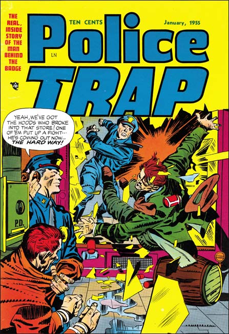
The cover for Police Trap #3 departed from the more serene covers used for the first two issues. Instead PT #3 was a typically well done Kirby slugfest. Such dramatic punches were often found in Simon and Kirby stories but rarely appeared on the crime covers. I can think of only one other case (Headline #45, January 1951) and that one was not nearly as nicely done as this cover. There was another cover considered for issue #3 but in the end never used. The alternative cover featured some motorcycle policeman and while a good cover it was not nearly as dramatic as this one.

Police Trap #3 (January 1955), “Hick Cop”, art by W. E. Hargis
It is always nice when an artist signs his work. Otherwise it becomes difficult to determine attributions since credits were not usually provided. There was also another signed S&K production piece by William Hargis (Young Love #62, October 1954, “Too Darned Innocent” ). I really need to do some careful comparison with some of the other unattributed pieces from this period as it is likely there exists some unsigned pieces by Hargis as well. Still it appears that Hargis only worked for Joe and Jack during a short period. Most of his work at this time seemed to have been for Quality Comics.
A number of artists appeared for a short time in Simon and Kirby productions from this period. Most were not that impressive but Hargis was an exception. He graphically tells the story well and has a pleasing drawing style. Hargis uses details to provide insight into his characters. I love the way that the sheriff has a hole in the sole of his shoe in the first story panel.

Police Trap #3 (January 1955), “The Mountie”, pencils and inks by Joaquin Albistur
Albistur is one of my favorite S&K artists from this period. “The Mountie” is a typical example of his talent. The mounted policemen have disappeared from most American cities but still have a presence, although diminished, in New York City. I have not seen any in the last few months but I would regularly hear them go down my street. It is not at all clear to me whether horses are an effective police tool but they certainly make for great public relations. Whenever I see them they always attract photographers and animal lovers.

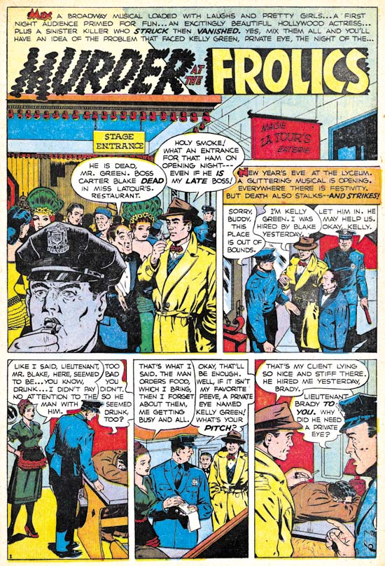
Police Trap #3 (January 1955), “Murder At The Frolics”, art by an unidentified artist
AS I have said, there were a number of artists that worked a short time for Joe and Jack during this period. Of course I wish I could identify them all but for academic reasons as frankly many were little more than adequate. The biggest problem with this particular artist is that his figures tend to be a bit stiff as, for instance, in the last panel of this page.

Police Trap #3 (January 1955), “Tough Beat”, pencils and inks by Bill Draut
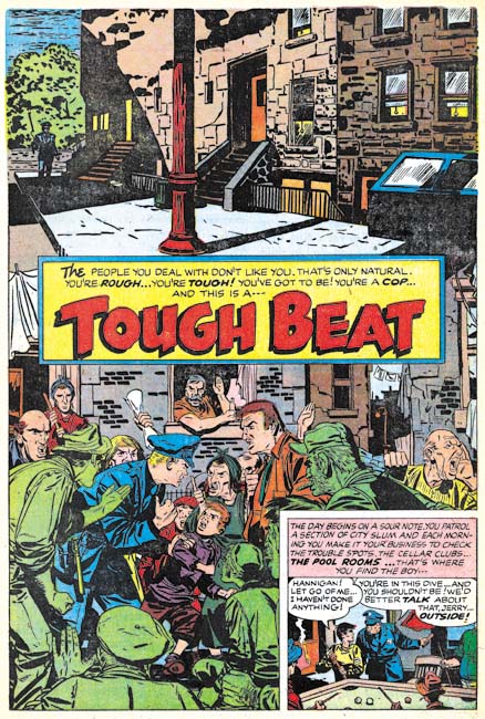
I really like Bill Draut’s art, at least while he worked for Simon and Kirby. But this particular splash page has got to be one of my favorites. Generally Bill did not do full page splashes and in a way this is not one either. What Draut has done was combine two splashes separated by the title caption. The top shows a deserted neighborhood with only a single policeman in the background. Very simple but lovingly handled with great attention to the tenement buildings. The bottom seems pure chaos but actually is not. Helped by nice work by the colorist, the lower splash focuses on the confrontation between a cop and some locals seemingly concerning some youth the policeman has apprehended. Bill has provided an interesting and varied crowd. The juxtaposition of the quiet and noisy street scenes makes the page all that more interesting.

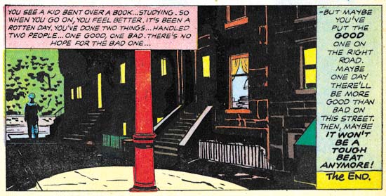
Police Trap #3 (January 1955), “Tough Beat” last panel of page 6, pencils and inks by Bill Draut
I have seen the original art for “Tough Beat” and the upper portion of the splash page, the quiet street scene, was inked on tracing paper. I found this puzzling until I noticed the last panel of the story was the same street scene with different inking. Apparently Draut placed the tracing paper over the final panel and used it as a guide for working on the upper part of the splash page. Faster than manually copying the art onto the actual illustration board while the use of tracing paper would be undetectable in the final printed version.

