
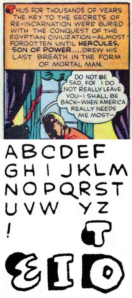
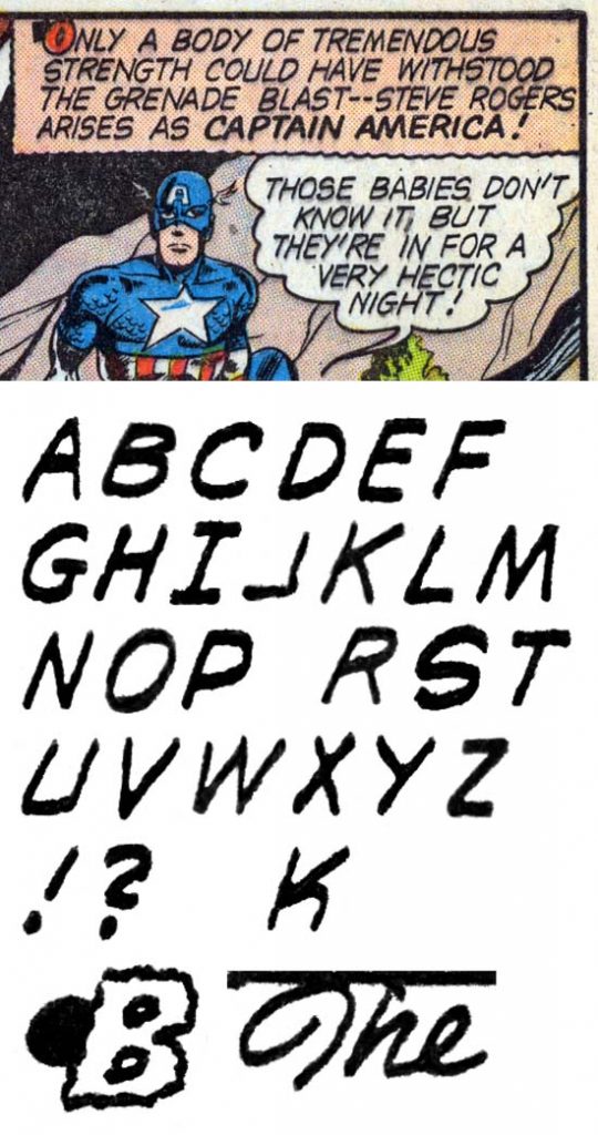
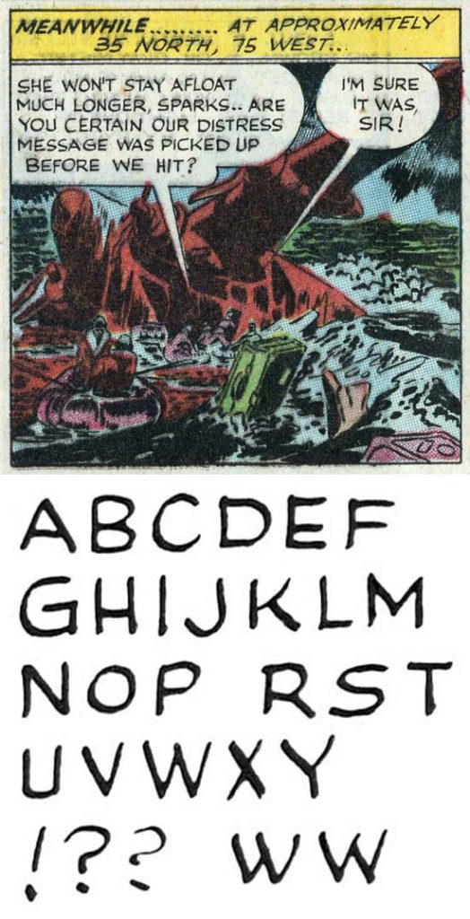
Daring Mystery #6 (September 1940) “Introducing Marvel Boy” pages 1-3 by Howard Ferguson
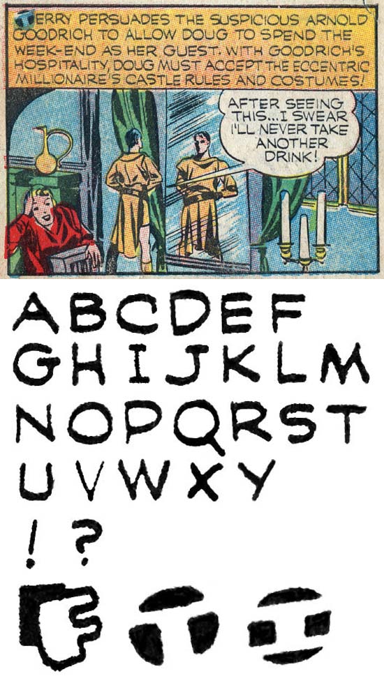
Joe Simon became the first editor for the company now called Marvel but referred to as Timely during the golden age of comics. Jack Kirby joined him as the chief artist in the bullpen that was established. Simon used a number of letterers for the comic features that he edited but clearly Howard Ferguson was his favorite. It is easy to understand why, Ferguson’s lettering is clear and easy to read with consistent line spacing. The earliest lettering I attribute to Ferguson were all cover dated September 1940 (“The Human Torch” and “Terry Vance” in Marvel Mystery #11, along with “Introducing Marvel Boy” in Daring Mystery #6). Here I will discuss Ferguson’s lettering for Daring Mystery #6 as it can more clearly attributed to him. Still the form of the letters used has not achieved his final characteristics. Note the lack of serifs for ‘I’ and ‘J’ and the way the lower diagonal limb of ‘K’ intersects with the upper diagonal stroke and not the vertical one. However the most telling feature of Ferguson letters has already has already appeared; the small vertical serif provided to the upper end of the letter ‘C’. There are some limitations to using the serifed ‘C’ to identify lettering as by Ferguson but during the period covered by this chapter Howard always employed this type of ‘C’. While the ‘J’ lacks serifs, it has long and gently curved horizontal portion but there are some other letterers who use the same ‘J’. Also present are Ferguson’s frequent and effective use of drop caps. Note that letters are the standard form in the captions and balloons, even when bold lettering is used. At this stage Ferguson did not use italics.
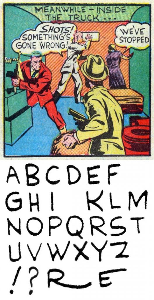
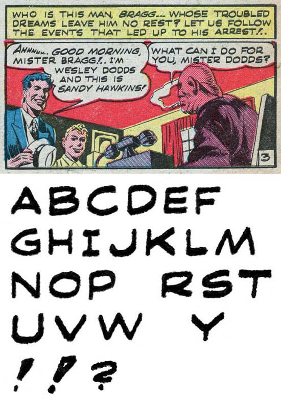
Daring Mystery #6 (September 1940) “Introducing Marvel Boy” pages 4-10 by Joe Simon
Ferguson did not do most of the lettering for “Introducing Marvel Boy”, that was done by Joe Simon. Simon’s lettering has now become more professional but still exhibits the occasional flare such as the examples shown in the last line of this letter set. His distinctive ‘W’ is still found, as is the ‘M’ with vertical outside strokes and a small vertical bar to ‘G’.
Marvel Mystery #11 (September 1940) “Human Torch” by Howard Ferguson
While Ferguson’s Daring Mystery #6 lettering has already been discussed I feel I have to back-track a little to explain why I attribute the lettering from “The Human Torch” and “Terry Lance” from Marvel Mystery #11 to Ferguson. The lack of a serif on ‘C’ might seem to disqualify such an attribution. However the drop caps are the forms that typically appear in Howard’s lettering. Outline, shadow, geometric and negative drops caps never appeared in Timely comics prior to Ferguson. Afterwards other letterers picked up these forms. So while I would caution using only drop caps to identify Ferguson lettering, for the Marvel Mystery #11 work I feel comfortable with using them for that purspos. The lack of a serif on ‘C’ may be interpreted as the Marvel Mystery #11 having actually preceded Ferguson’s work on Daring Mystery #6.
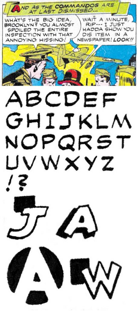
Blue Bolt #6 (November 1940) “Blue Bolt” pages 1-6 by Howard Ferguson
Howard Ferguson continued to improve as seen in Blue Bolt #6. He as now adopted a ‘K’ where the lower diagonal stroke meets the upper one at or near the vertical bar. However his ‘I’ and “J’ still lack serifs.
Prize Comics #7 (December 1940) “The Black Owl” by Howard Ferguson
Ferguson has now added serifs to ‘I’ and ‘J’. There also appears in ‘G’ a small serif formed by the horizontal bar extending a little to the right. Howard has now arrived at his standard lettering, at least for the period covered by this chapter.
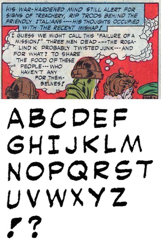
Captain America #1 (March 1941) “Case #2: Sando and Omar” by Howard Ferguson
Here Ferguson has returned to his older form for ‘K’ with the lower diagonal intersecting the upper diagonal. However even in this feature there appear some letter ‘K’ where the upper and lower strokes both meet the vertical bar. Oddly the letter ‘R’ has also been changed with the diagonal stroke intersecting the curving stroke and not the vertical bar as Ferguson had done previously. I am not bothered by these differences because overall the lettering seems to be Howard’s, even with his serifed ‘C’. This changes would disappear soon in future issues of Captain America. One important change that would last is that the captions are now italicized. Although not appearing in the example provided above, bold lettering would also be done in italics but not consistently in this particular feature.
Captain America #2 (April 1941) “Hurricane” by Jack Kirby
Jack Kirby was doing a bit more lettering than Joe Simon. This was done for the new features such as the Vision, Hurricane and Tuk the Caveboy. As these features went on, Jack would no longer do the lettering even when he was still doing the penciling. This might suggest that these features were largely the effort of Kirby without Simon. However that was also once suggested in another new feature with Kirby lettering, Mr. Scarlett for Wow Comics #1 (Spring 1941). But in that feature there was at least one small section that has Simon lettering including his characteristic ‘W’. Showing that Joe was involved in the initial Mr. Scarlett at least in an editorial role and is a reminder that even when Simon’s participation in Simon and Kirby productions are not obvious that does not mean he did not provide a significant contribution.
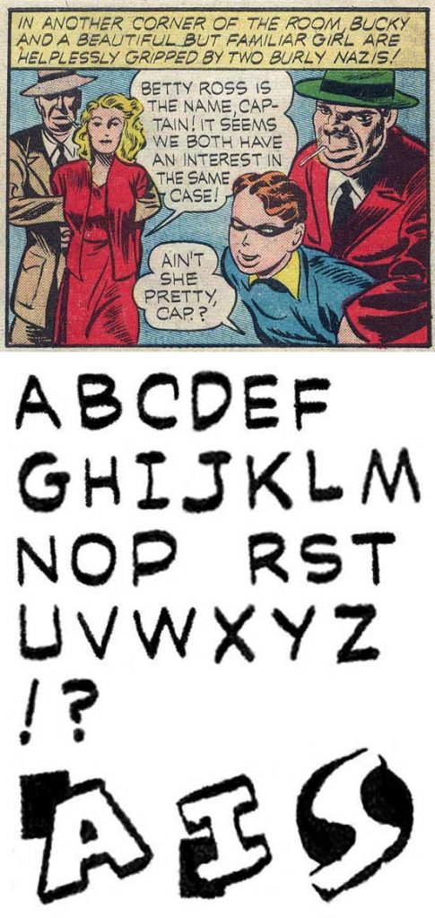
Captain America #3 (May 1941) “Tuk, Cave-Boy” by Clem
Joe Simon used an assortment of letterers for such Timely titles as Marvel Mystery but generally Howard Ferguson was the go to guy for lettering Captain America. However even in such as important title as Captain America (where Joe and Jack were supposed to be sharing some of the profits) other letterers were used. It is not too surprising that Kirby would do the lettering for “Hurricane” from Captain America #2. What is surprising is that the three Captain America stories for that issue were all lettered by someone else. I gave him the nickname Clem. Clem is one of the reasons that I earlier stated that there were limitations to using a serifed ‘C’ to identify Ferguson lettering. Clem does use a ‘C’ with serif but his the horizontal stroke for ‘G’ does not extend to the right to form a serif. The lower horizontal part of ‘J’ is shorter and more curved. Clem uses the style of ‘M’ where the outer strokes are vertical and a ‘R’ where the diagonal arm is attached to the curved portion. While his ‘I’ has serifs when used as an isolated first person singular, it lacks serifs when used in contractions such as “I’LL”. The stroke used in the exclamation point (‘!’) expands in width going from bottom to top. While Clem does use some shadow and negative drop caps, they are not quite the same form as those done by Ferguson. Having said all that I have to admit there is a lot of variability to the lettering for the Captain America #2 that I am attributing to Clem. I have not been able to make up my mind whether another letterer was involved. Nor am I completely sure that I am correct to attribute the lettering to Clem and not to Ferguson. The main reason I do so is that typical Ferguson lettering appears in Marvel Mystery #18 cover dated the same month.
Clem would do the lettering for a handful of Simon and Kirby features, some questionably. In an often repeated pattern he would then disappear.
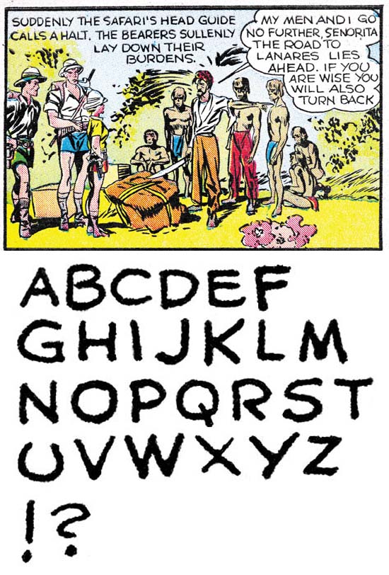
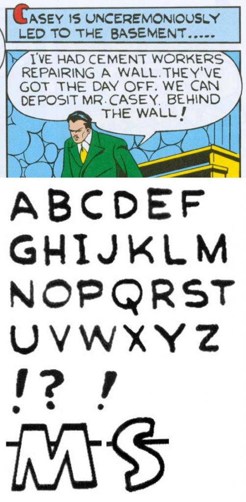
Captain America #3 (May 1941) “The Return of the Red Skull” by Charlie
Kirby would do the lettering for the short one shot feature “Amazing Spy Adventure” while Ferguson would letter Tuk the Cave-Boy in Captain America #3. However once again the three Captain America stories for that issue were all lettered by someone else. I gave him the nickname Charlie but that is not important because after the work he did on Captain America #3, we never see him again. Charlie’s lettering tends to be narrower than letterers such as Ferguson. His ‘I’ has serifs but his ‘J’ does not. The lower horizontal part of ‘J’ is short. He makes occasional use of outline drop caps with only a single use of a negative drop cap.
Marvel Mystery #25 (November 1941) “The Patriot” by Clem?
Clem may also have been the letterer for the Patriot story from Marvel Mystery #25 (November 1941). However the serif on ‘C’ is no longer found and the expanding width to the exclamation point is not always so obvious. Further the only drop caps used are of the outline type and they are more mechanically done and always extend into the gutter between panels. One other, perhaps not important, difference is that serifs are added to all first person singular ‘I’ even those used in contractions such as “I’LL”. Otherwise the lettering is quite similar to what Clem used in Captain America #2 and #3.

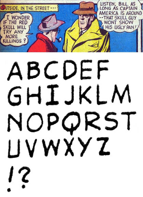
Captain America #9 (December 1941) “The White Death” by Howard Ferguson
I wanted to provide an example of Howard Ferguson lettering from near the end of Simon and Kirby’s stay at Timely. This will serve for comparison with work done when Howard returned to Simon and Kirby employ after Timely. Largely the lettering is unchanged from Ferguson’s earlier effort except for the question mark (‘?’) which has taken on more of the shape of ‘S’.
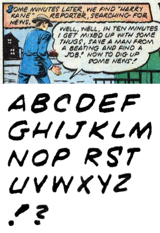
Captain America #9 (December 1941) “Hurricane” pages 1-4 by Sam
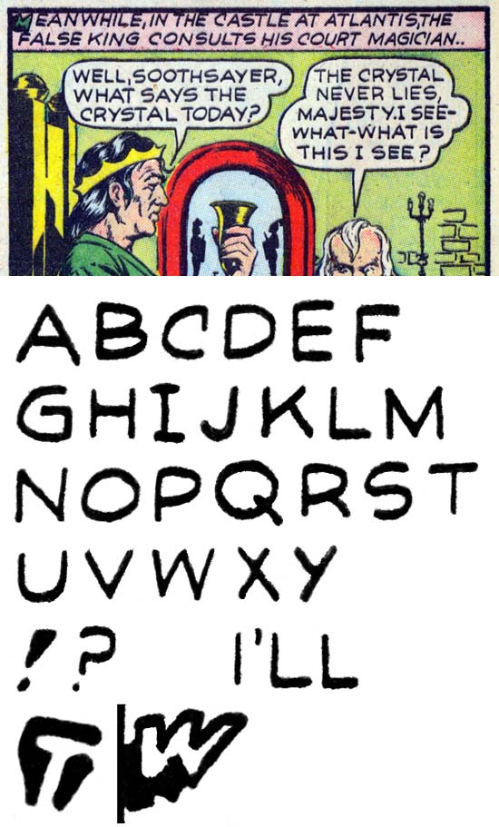
Another letterer would appear in later Captain America issues starting with the Farther Time feature from Captain America #7 (October 1941) who I have given the nickname Sam. Sam is unusual in that all his lettering is done in italics. While other letterers have used italics for bold lettering or within captions, it is rare to see it in plain balloon lettering. Sam is another reason to use a serifed ‘C’ with caution. A serifed ‘C’ is unusual and its uses by Sam and Clem suggests a copying from Ferguson. Sam can be distinguished from Howard by ‘G’ where the horizontal stroke extends more to the right than the left whereas Ferguson generally has this stroke extending more to the left. Sam shares with Clem and angular exclamation point. But the feature most useful in recognizing Sam’s lettering is his unique ‘S’ with a serif attached to the upper end. Sam would employ outline drop caps but not much else.
Captain America #10 (January 1942) “Hotel of Horror” by Howard Ferguson
Captain America #10 (January 1942) “Spy Ambush” by Howard Ferguson.
As I discussed, all lettering done in italics is rather unusual. However Sam was not the only letterer to employ it. Italic lettering is also found in Captain America #10 and the Vision story from Marvel Mystery #27 both cover dated January 1942. Despite the italics the lettering looks like typical Ferguson work even having ‘C’ with a small serif. This January work would be the last Howard would do for Timely. When Simon and Kirby decamped from Timely, Ferguson did likewise.
Adventure Comics #72 (March 1942) “The Riddle of the Slave Market” by Xavier
When Simon and Kirby began producing work for DC it might be expected that they would turn to Howard Ferguson to do their lettering. Instead they used a new letterer who I have nicknamed Xavier. One explanation for this might have been that Joe and Jack would be using a DC letterer, but I have not found any lettering done by Xavier for DC in any feature other than those done by Simon and Kirby. The more significant features of Xavier’s lettering are long but curved lower portion of ‘J’, the lack of serif on ‘J’, ‘K’ with the lower diagonal attached to the upper diagonal and ‘M’ with vertical outer strokes. Even more important is the form of ‘Y’ with a vertical lower stroke. The exclamation point expands in width similar to that used earlier by Clem but the differences in the other letters seem too great to be from the same person. Xavier lettering would dominate in Simon and Kirby’s DC work until September.
Detective Comics #81 (November 1943) “Yankee Doodle Dynamite” by Howard Ferguson
Howard Ferguson returns to working for Simon and Kirby in September (cover date) and from that point he is the dominate letterer for Simon and Kirby’s DC productions. His lettering has not really changed since the Timely work except a serif has now been added to ‘J’. There are frequent use of typical Ferguson drop caps and the occasional banner caption (see the example above). I have not mentioned banner captions before but Ferguson started using them in Marvel Mystery #18 (April 1941).
Detective Comics #82 (December 1943) “The Romance of Rip Carter” by Xavier
While Ferguson once again became the main Simon and Kirby letterer, Xavier still did some lettering for them. There are even some cases where Ferguson and Xavier lettered the same feature such as in some of the chapters for Boy Commandos #4 (Fall 1943). Xavier adopts the same form for ‘Y’ that Ferguson and others used. But Xavier does not add a serif to ‘C’, his ‘J’ remains without a serif and with a more curved lower portion and exclamation points still exhibit an angular form. Further the question mark was changed to having a vertical aspect to the lower part of the main stroke.
Adventure Is My Career (1945) by Joe Simon
Both Joe and Jack left DC to performed their military service. Towards the end of his tour of duty in the Coast Guard, Joe did some comic book work which he lettered himself. Three short features were done that were used in Boy Commandos and World’s Finest. More substantial was the comic book “Adventure Is My Career”. There Joe’s lettering has become more professional. The letter ‘M’ continues to be written with vertical outer strokes and ‘G’ with a small but distinct vertical stroke. Surprisingly most ‘W’ letters are done in a more typical fashion, but every so often Joe slips and uses his more personal ‘W’ and even its mirror image .
Lettering S&K Chapter 1 The Beginning
Lettering S&K Chapter 3 Return from the War
Lettering S&K Chapter 4 The Prize Monopoly
Lettering S&K Chapter 5 Mainline and the Studio End
Lettering S&K Chapter 6 Post Studio
Lettering S&K Chapter 7 Conclusion
Lettering Checklists:
Alias
Draut, Bill
Ferguson, Howard
Kirby, Jack
Oda, Ben
Simon, Joe
Pingback: Lettering S&K Chapter 1 The Beginning | Simon and Kirby
Pingback: Lettering S&K Chapter 3 Return from the War | Simon and Kirby
Pingback: Lettering S&K Chapter 4 The Oda Monopoly | Simon and Kirby
Pingback: Lettering S&K Chapter 6 Post Studio | Simon and Kirby
Pingback: Lettering S&K Chapter 5 Mainline and the Studio End | Simon and Kirby