For the most part pinups did not play an imported role in the Simon and Kirby repertoire. The most import exception was Boys’ Ranch where double page and inside cover pinups were present in each issue. Other than those from Boys’ Ranch there were only two other pinups that I can think of. One appeared in Win A Prize #1 (February 1955). I have discussed that one previously (The Wide Angle Scream, Almost an Afterthought). While I would not dismiss out of hand Joe’s explanation that the piece was originally meant for Captain America #11, there are a number of details that suggest a later date. Therefore the genesis behind that piece of art remains an unresolved issue.

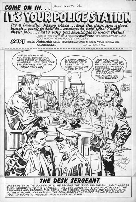
Police Trap #2 (November 1954) “It’s Your Police Station”, pencils and inks by Jack Kirby
The other Simon and Kirby pinup appeared in Police Trap #2 (November 1954). It is a great pinup with a marvelous cast of characters. Each person depicted in the foreground was given a distinct personality. A complete story is presented in this single panel with the added touch of Simon and Kirby humor. Kirby not only drew the art but did the inking as well. I believe it is one of the relatively few pieces that Jack also did the outline inking, a job normally assigned to others.
The top caption declares this is the first of series of Police Trap pinups of various police officers. However no further pinups were ever placed in the subsequent issues. Nor were pinups found in any other Mainline titles (Win A Prize was published by Charlton). The natural question is why this one?

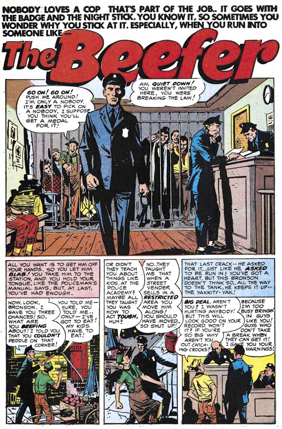
Police Trap #1 (September 1954) “The Beefer”, pencils and inks by Joaquin Albistur
The explanation can be found in the first issue of Police Trap. That issue contains the story “The Beefer” with art by Jo Albistur. Albistur was from Argentina and seems only to have worked in the United States for brief period. His time working for Simon and Kirby lasted a little over a year but it was very productive period for him. Frankly I am unimpressed by some of the art I have seen that he did for other comic book publishers but he is one of may favorite Simon and Kirby artists. “The Beefer” opens with constant complaining of an arrested street peddler. Kirby would often create a cover based on a story from the same issue but illustrated by another artist. The similarity between “It’s Your Police Station” and “The Beefer” indicates that is what happened here and this pinup was originally intended as the cover for Police Trap #1.

Police Trap #2 (November 1954) “It’s Your Police Station”, pencils and inks by Jack Kirby, original art
The original art for this pinup still exists. It is very unusual for work by Simon and Kirby in that art was constructed from three pieces. The top caption, the art, and the bottom caption are on different illustration boards taped together on the back. In the future Joe Simon would frequently construct art from various separate sources but up to this point such techniques were rarely used. The explanation in this case is that since the art was initially meant for a cover the original top probably had the comic book title. Probably as an expediency this was just cut off. Since Joe and Jack often recycled their work this title may have been used for some other cover. The original art for some of the Police Trap covers still exist and it would be It would be interesting to see if any of them were constructed from two pieces of illustration board. The original bottom of the art was probably not sufficient for the desired caption so it was trimmed as well.

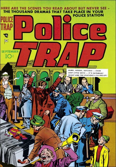
Police Trap #1 (September 1954) “The Beefer”, pencils and inks by Jack Kirby
The Police Trap #1 cover that was published in place of “It’s Your Police Station” is certainly a fine piece of Simon and Kirby art. The portrayed scene shows a multitude of characters each carefully handled. The caption actually seems a little superfluous since the art is all that seems to be needed to tells the individual stories. Yes, this is cover art at its very best. That is not to say that the art for “It’s Your Police Station” was any bit inferior. The most distinct disadvantage for the pinup had was that it was very specific to a single story, “The Beefer”. While Simon and Kirby often took that approach to a cover, they undoubtedly considered that the new comic should be launched with a cover that reflected on the theme of the title and not a particular story. With all the criticism cast at crime comics, Simon and Kirby wanted to emphasize that the police were subject of this new comic not the criminals. This police centric theme is superbly provided by the published cover.


Wasn’t this image not also one of those Tom Morehouse showed to have been made from a painting? Like the western splash with the gnarled tree in front?
I believe Morehouse showed that the Police Trap #1 cover was a swipe but I do not remember the source or how closely Kirby copied it.