A number of years ago I wrote about my skepticism about the many fans who believe they can identify numerous works that Jack Kirby supposedly colored (Kirby Kolor, A Kirby Myth). But Kirby did sometimes color work as for instance some of his later presentation pieces done to promote some of his many ideas. Jack also colored some of the original art he had (see What If Kirby for a scan of a Kirby colored double page splash from Boys’ Ranch #4). Oddly Kirby colored some original art that he did not draw most notably a couple of covers by John Severin (True Kirby Kolors and Joe Simon Too).

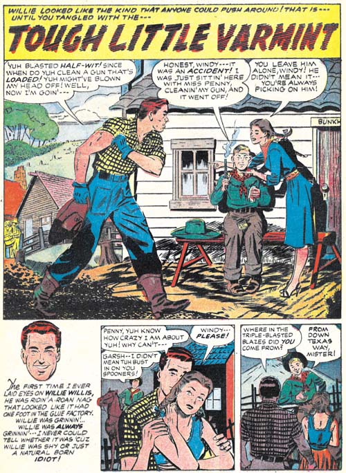
Bullseye #5 (April 1955) “Tough Little Varmint”, original art with involvement by Mort Meskin?, coloring by Jack Kirby
Kirby also colored another artist’s work. In this case the determination of who the original artist was is somewhat problematical. Parts of the art looks similar to work by Mort Meskin. My latest thought is that Mort was actually involved in the work but I am uncertain as to exactly what that involvement was. The inking does not appear to have been by Mort, or by his most frequent inker George Roussos. While some of the pencils look like Mort’s work (although perhaps modified somewhat by the inker) there are some other parts that do not. My current guess is that “Tough Little Varmint” was a group effort but that Meskin was part of that group.

Bullseye #5 (April 1955) “Tough Little Varmint”, art with involvement by Mort Meskin?
The coloring of the original art was not part of the typical process used in producing a comic book. Normally color guides were made using silver prints taken photographically from the original art. A comparison of the current state of the original art and the published comic book shows they are quite different. The type of coloring shown on the original art would not have been suitable for the comic books of the day. Generally speaking comic book interior art was printed with a limited set of colors as flat areas of color without any gradations. Earlier comic books sometimes included simple gradation of a background color but that technique had been largely given up by the time Bullseye #5 was published. Complicated tonal effects such as exhibited in Kirby’s coloring would not have been attempted for the interior of a comic book.
The original art for the splash page is from Joe Simon’s collection. It may seem odd that I am attributing the coloring to Jack Kirby for a piece in Joe’s collection. There is an explanation how this came about but for now let it suffice that this piece had been in Kirby’s possession for many years after the breakup of the Simon and Kirby studio and was only returned to Joe relatively late but while Jack was still alive.

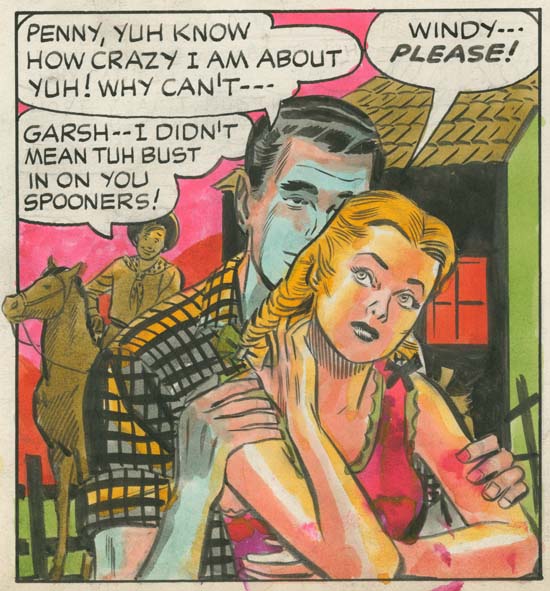
Bullseye #5 (April 1955) “Tough Little Varmint” page 2, original art with involvement by Mort Meskin?, coloring by Jack Kirby (image provided by Steven Brower)
It seems odd that Jack colored the splash page for “Tough Little Varmint” but odder still that he colored the second page as well. This page had remained in the Kirby estate until fairly recently. Simon’s collection includes the original art for the rest of this story but none of it was colored. Most of the coloring that Jack did on original art seems to have been for display purposes. But I doubt that was the reason that he colored two pages from “Tough Little Varmint”. Not that there is anything wrong with the art but with all the art that Kirby had there was much more material available that would be much more suitable for hanging up in his house.

Bullseye #5 (April 1955) “Tough Little Varmint”, original art with involvement by Mort Meskin?, coloring by Jack Kirby
The coloring was applied quickly but with control. Most of it appears to be done using dyes. Dyes are convenient since they are not opaque and therefore would not obscure the original inking. However dyes can fade with age particularly when exposed to light without proper protection. The colors on these two pages seem quite fresh so I suspect that neither of them were displayed for any significant length of time. Most of the coloring is rather interesting. but I have to admit that I find the bluish shadow effect on the man from the second story panel rather unnerving.

