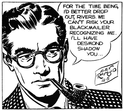
Rip Kirby (12/5/46) art by Alex Raymond
Syndication strips had a great influence on comic book artists. The newspaper comics developed before comic books were widely read and their creators (at least with the more popular strips) were big money earners. Milton Caniff probably had the greatest impact on comic book artists either directly or indirectly. This was particularly true of the Simon and Kirby studio where most artists, including Jack Kirby, grew up reading Caniff’s Terry and the Pirates and had adopted much from Caniff’s style. However he was not the only influential strip artist, another was Alex Raymond. Raymond grew to fame with his earlier Jungle Jim, Secret Agent X-9 and especially Flash Gordon. However Alex’s most important work was, in my opinion, Rip Kirby.
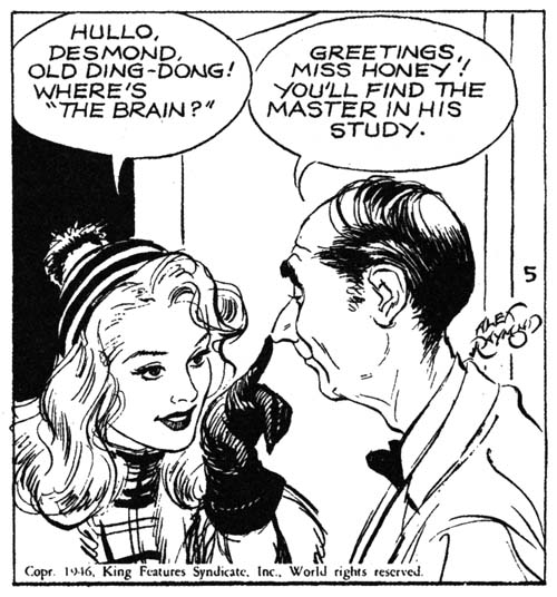
Rip Kirby (3/5/46) art by Alex Raymond
Raymond had a long successful run on Flash Gordon before he volunteered for the Marines during World War II. When he returned from service he found that King Features, his syndication company, had contracted Flash Gordon to another artist. I always thought that companies were required to give returning veterans their original jobs but it turns out that was only true if they had been drafted, not if they had volunteered for service. I guess it was just another example of no good deed goes unpunished. King offered Raymond to create a new feature and the result was Rip Kirby. Some good did come out of this as Raymond not only received a large percentage of the profits but owned the rights to the strip as well. Rip Kirby was immensely popular and became the fastest selling syndication strip.
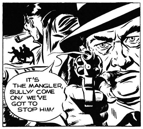
Rip Kirby (10/25/46) art by Alex Raymond
Some have described the art of Rip Kirby as photo-realistic. Frankly this is not an accurate description at all. True realism in the panel size used in newspaper comics would have made the strips difficult to follow. Raymond carefully worked his realism to keep his characters easy to recognize and expressive as well. Many comic artists that have attempted this sort of realism only ended creating rather dry art. Not Raymond, his lines seem natural and relaxed and his designs always interesting.
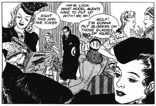
Rip Kirby (3/12/46) art by Alex Raymond
Alex Raymond did not have nearly the influence on comic book art as Milton Caniff. This might have been just a greater appreciation to Caniff’s more cartoon-like approach, but the difficulty of adopting Raymond’s greater realism may have been a factor as well. Still some artists were clearly influenced by Raymond. I have mentioned in my recent post on The Art of Romance that Simon and Kirby studio artist Bob McCarty had in 1953 developed a style seemingly influenced by Raymond’s art. John Prentice was even more of a follower of Raymond. Raymond’s approach to Rip Kirby was something that would work quite well in romance stories that Prentice was often asked to do. Prentice’s romance work was so successful that I believe Simon and Kirby preferred to give him love assignments more so then work for Black Magic (although I feel he was quite good at that as well). John Prentice was so adept at Raymond’s approach that after Alex’s untimely death in 1956 John became his replacement on Rip Kirby. While I do not claim Prentice was as good an artist as Raymond, I feel fans have sadly underappreciated Prentice’s work on Rip Kirby. Raymond was a tough act to follow but I feel no one could have done it better then Prentice.
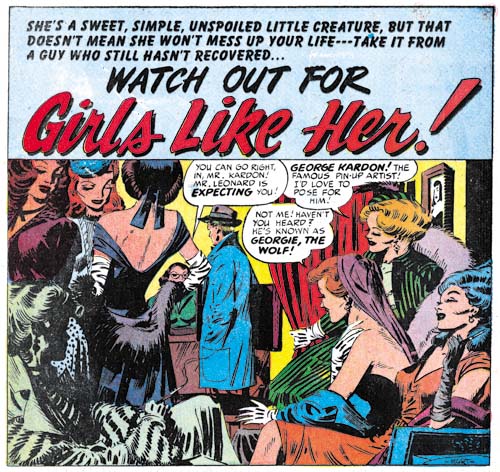
Young Love #14 (October 1946) “Girls like Her”, art by Mort Meskin
While Alex Raymond’s influence Bob McCarty and John Prentice was not unexpected I was surprised to find clear evidence of his impact on another artist. Of all the artists working for Simon and Kirby I would think Mort Meskin was the furthest from Raymond’s approach. Meskin had developed a stylized style that superficially seems quite different from Raymond’s more realistic manner. However I realized I had been underestimating Mort Meskin when I saw a panel from the Rip Kirby strip of March 10, 1946. The scene depicts Rip Kirby entering a model agency but while that is the true subject of the panel the entire foreground is occupied by some of the agency’s models. A similar composition, but by no means an identical one, was used by Meskin for “Girls like Her” (Young Love #14, October 1950). Obviously Meskin is not copying Raymond’s piece but clearly that was the original inspiration for his splash. Once again we view a man entering a modeling agency but only through a foreground of an array of models. There are telling differences. While some of Raymond’s models are actual doing something (reading a magazine or having a conversation) all off Meskin’s models look like just lounging around as if in some modern day harem. Raymond’s models seemed attired in the latest (for 1946) manner (I understand Raymond had a consultant keep him abreast of the latest fashions) but while the clothing of Meskin’s models is imaginative it does not seem realistic. Meskin has placed all his models in a rather confined space while Raymond’s models are arranged with a much greater depth of field. Meskin was obviously inspired by Raymond but created his own unique piece of art.
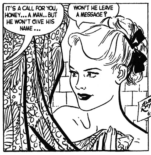
Rip Kirby (6/19/48) art by Alex Raymond
I am happy to say that IDW will be reprinting the entire run of Raymond’s Rip Kirby. The first volume covering 1946 to 1948 is already out and the second volume should be released in March. The volumes are said to be based on syndication proofs of the original strips. The quality of the reproduction in the first volume varies a little bit but is always much better then I would expect if it was reproduced from actual newspaper strips (newspaper printing is as bad as that used on comic books). Rip Kirby was a daily strip so there are no color pages. All of the volume is printed on real nice flat paper (I do not understand why some people prefer glossy paper). The book’s width is greater then its height which is admittedly awkward for storing on a shelf but makes for much better reading. IDW does such a nice job on their reprints and I cannot recommend their Rip Kirby too highly.
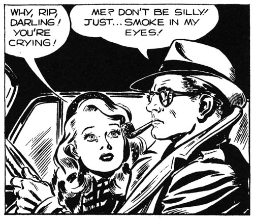
Rip Kirby (12/13/46) art by Alex Raymond


Nice find Harry vis-à-vis Raymond and Meskin. While Raymond’s feels more posed, Meskin’s I think is really unique in that the first character to speak is partially obscured. A very unusual opening splash.