Category Archives: Serial Posts

Art by Joe Simon, Chapter 7, Glaven

There were three Harvey comics from the same period as the Jon Henri covers that I did not include in my last chapter; Champ #22 (September 1942), Speed #22 (September) and Green Hornet #8 (August). To me they always seemed to be very different and previously I did not consider them as done by Simon and Kirby. However Speed #22 is included in the Jack Kirby Checklist and I understand that recently some have attributed Champ #22 to Joe Simon. I still say these three covers are stylistically distinct from the Jon Henri covers, but I now realize I erred in not believing them as work by Joe Simon.

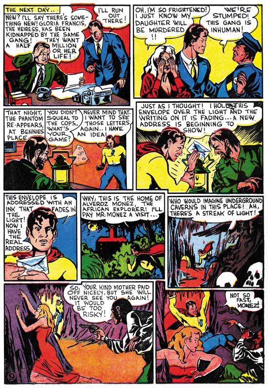
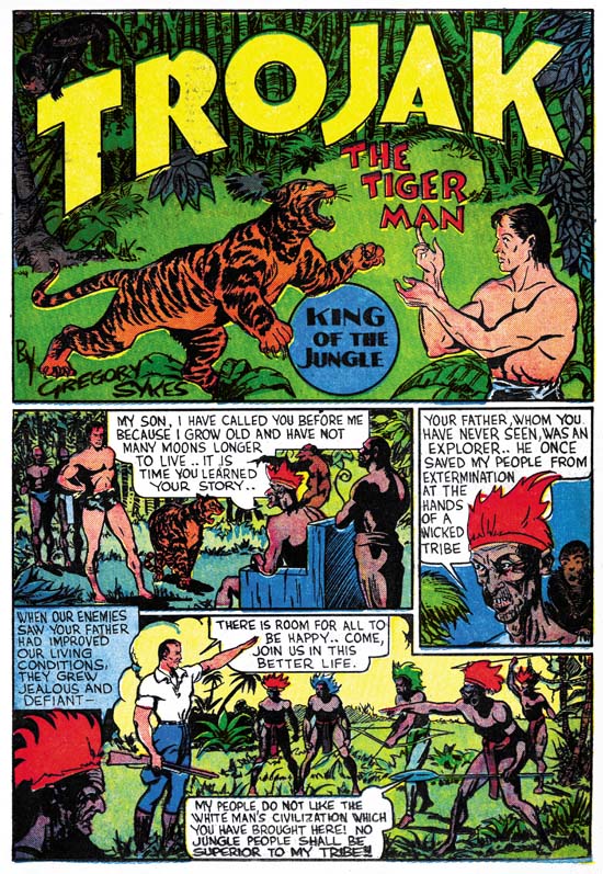
In a footnote to chapter 2, I mentioned providing to Joe Simon copies of my restoration of two stories from Daring Mystery #2 (February 1940). One was signed as Gregory Sykes and Joe revealed that in high school he and his friends sometimes used another name and his was Gregory G. Sykes. But the conversation did not end there. Joe also said that as a comic book artist he thought he had used three pseudonyms. He knew two of them (Jon Henri and Gregory Sykes) but could not recall the third so he felt he might have been mistaken. As Joe did not remember these Daring Mystery stories at all, he began to read them with much interest. At one point Joe stopped and chuckled, he said that in the Phantom Bullet story he had used the name Nelson Glaven for one of the characters. Nelson Glaven was the alternate name for Ned Gibman, one of his high school friends. I did not say anything, but I immediately recognized the name Glaven.

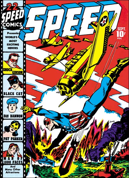
The cover to Speed #22 was signed Glaven. I had never talked to Joe about this cover since I had already decided (incorrectly) that he did not do it. Still I always had thought it was an excellent piece of comic art and had wanted to know more about the artist. However my search for more information on Glaven always came up empty and I had concluded it was a pseudonym. Now Joe has provided the information to link him to the Glaven alias. Actually I should have known better when I previously felt that Speed #22 was the wrong style for Joe Simon. I have been saying for some time that Joe could and did adopt different styles.
Speed #22
Speed #22 (September 1942) by Joe Simon (signed Glaven)

Speed #22 is a great cover. The planes diving out of formation leading to a similarly diving Captain Freedom and then to a bomb is very effective. This sort of formal device and the more static layout it provides is not the sort of thing usually found in covers by Simon and Kirby. But Joe did experiment with different compositions from time to time and this apparently is an example of that. This cover is so different from other work by Simon that I cannot provide any drawing features to link this particular cover to Joe. However the inking is done with a brush in a manner very much like the inking of some of the Jon Henri covers, particularly the form lines on the airplanes and the boots.

Unfortunately I do not have scans for the covers of Champ #22 or Green Hornet #8. The Grand Comic Book Database (GCD) does have scans but I do not think it would be good web etiquette for me to link to the images directly so let me provide a link to the GCD. It might be easier to follow what I say if you open up some new windows and use them to get the images for Champ #22 and Green Hornet #8. Don’t worry, I’ll wait for you to get back.
Champ #22 signature
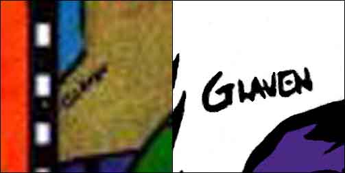
Champ #22 (September 1942) close-up of signature with close-up of Speed #22 for comparison

Unfortunately the GCD scan is has too low a resolution to clearly read it. I provide a blowup of the GCD scan and one from Speed #22 for comparison. I think Champ #22 may also been signed Glaven but it is hard to be sure. This issue is unique among the Champ covers we have examined in that the Human Meteor has replaced the Liberty Lads. The cover has the appearance of being constructed from a number of different swipes. The hooded foe in the lower right corner came from Lou Fine’s Wonderworld #7 cover. I do not have my own scan of that cover, but Comicartville does.

The lady being thrown into the pool seems unnatural. Her hair and general pose looks more like she is lying down rather then falling. I am sure she was taken from someplace. I cannot identify other swipes but that is not to say there were not any. The Human Meteor and his young sidekick both have large ears that are not quite placed on the head correctly. This unusual treatment of ears viewed from the back is also a characteristic of Jack Kirby at this time. But the anatomy and pose of the Human Meteor just does not otherwise look like Jack’s work. I am not bothered by Joe’s use of swipes, what is important is the story the cover tells. Unlike most of Joe’s covers, I am not at all clear what is supposed to be going on here. Is the Human Meteor attacking the hooded villains or trying to catch the falling woman? What type of sling-shot does the sidekick have and what is he doing with it? Have the heroes interrupted some evil ritual or did the villain push the woman into the pool as a response to the sudden appearance of the Human Meteor? It is this failure to clearly tell the story that for me makes this one of the Joe Simon’s poorer efforts.

Is the cover to Green Hornet #8 (August 1942) also by Joe? The two villains on the right are crudely done, but their cheeks and jowls remind me of the of the members of the circle on Speed #21 (except for the clown) which I have already attributed to Simon. Once again there seems to be signs of swiping. Although I cannot provide any source, the damsel in distress looks an awful lot like she was originally done by Will Eisner. Although not among my favorite Simon covers, it is an improvement over Champ #22. Here is a story that can be easily read. A crystal ball predicts a dim future for the chained woman. A fiendish pair was advancing with drawn daggers to insure the prediction would come true. That is until they were interrupted by our hero. The Green Hornet will save the day, assuming he is careful where he takes his next step. I like the touches of humor. The fiends arrive holding hands with the smaller one carrying his knife in his mouth. The cobwebs show up not only on the walls and floors, but also connects the robed figure to his staff. I guess my biggest problem with this cover is not that he swiped the figure of the woman, but that it appears that Joe changed her so little.

Simon and Kirby would do the last of these Harvey cover in October (Green Hornet #9). I do not accept Green Hornet #10 as a Simon and Kirby piece. Perhaps they became too busy to do any more. S&K were very successful at DC but with the war on they knew that sooner or later they would be drafted. Joe’s solo work during this war time period will be discussed in the next chapter.

Art by Joe Simon, Chapter 6, Jon Henri

Art by Joe Simon, Appendix 1, Champ 22 Confirmed

Art by Joe Simon, Chapter 6, Jon Henri

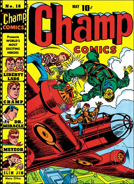
Champ #18
Champ #18 (May 1942) by Jack Kirby (signed Jon Henri)

Starting with a cover date of April 1942 and ending in October are a series of 13 Harvey covers that were obviously done by Simon and Kirby (Speed #17 to #21 and #23; Champ #18 to #21 and #23; and Green Hornet #7 and #9). I say obvious, because they were done at the same time as S&K were producing work for DC and all this work show Simon and Kirby forging their own unique style. But none of the Harvey covers are signed by Joe or Jack. Instead some bear the signature of Jon Henri. Joe has said that he came up with this name. Henry is Joe’s middle name and he liked Jon so much that one of his son’s has it as a middle name. But the presence of the Jon Henri’s signature on some Harvey covers that clearly were penciled by Jack Kirby indicates that this name could not be a pseudonym for Joe Simon alone.

In fact the Jack Kirby Checklist and most experts and scholars credit all of these covers to Jack Kirby. I will be presenting my case for attributing some of the covers to Simon below. Previously we have seen Joe and Jack work on different pages for the same story. In doing so Joe adjusted his style to try to mimic Jack’s. But that work is of limited use to us since in the work for Harvey and DC, Simon and Kirby has already progressed well beyond what they did for Timely. Unfortunately the best comparisons to be made with work by Joe Simon is for material we have not discussed yet. So I will ask you dear reader to try to keep an open mind until I presented some of that evidence in future chapters.

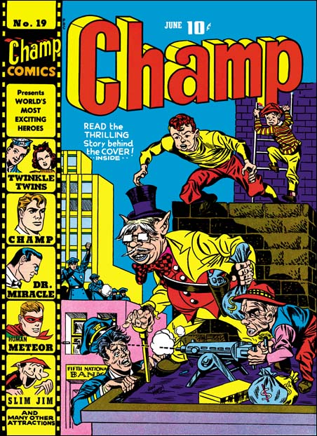
Chame #19
Champ #19 (June 1942) by Joe Simon (signed Jon Henri)

I believe I can see two different artists at work among these Harvey covers. But care must be taken that we do not fall into the trap of crediting the best covers to Jack and the poorer ones to Joe. What we want to look for is differences in style and leave aside for now any value judgments. All the Champ covers in question illustrate the Liberty Lads. But how this young duo are portrayed is not consistent. For four of the five covers the Lads are depicted as young teenagers. But one one cover (Champ #19) the Liberty Lads seem to be a little younger. In my series of posting of the Harvey covers I have already examined Champ #20 and Champ #21 and you can look at those postings for their images. But here I am going to compare Champ #18 to Champ #19.

One thing to note is the exaggerated perspective used for the Japanese just hit by one of the Liberty Labs on the Champ #18 cover. Jack Kirby was the master at this almost 3D effect and although others tried to imitate Jack I do not believe I have ever seen anyone completely succeed. So when I see such a successful job as on Champ #18 (and also on Champ #20 and #23) I feel pretty confident that Jack Kirby was responsible. The one Liberty Lad about to leap on Champ #19 is not quite an exaggerated perspective (although still rather well done). But the lack of exaggerated perspective does not mean it was not done by Jack.

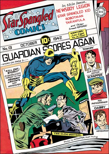
Star Spangled #13
Star Spangled #13 (October 1942) by Jack Kirby

The Liberty Lads on Champ #19 are not only younger they also look familiar. That is because they seemed based on Gabby and Scrapper from the Newsboy Legion. Although in the past it was generally believed that Kirby did not swipe, more recently examples of Kirby swipes have been well documented particularly by Tom Morehouse in TJKC. But why would Jack have to swipe the Liberty Lads on Champ #19 but not on the other four covers? To me the Liberty Lads swipes are more likely to be evidence of Joe’s involvement then Jack. One features that suggests Kirby is the square fist of the policeman on the far roof. Square fists are easily recognized manner used by Jack. But it is so obviously that there is little doubt that Joe Simon would see it also and it would not be hard for Joe to adopt it himself. But note the stiff, straight arm of that same policeman, that does not look like Jack’s work.

By this period Joe Simon has advanced beyond the use of just two expressions that he had learned when he started comic book work (as described in The Comic Book Makers and quoted in Chapter 1 of this series of posts). But there are some expressions that Joe uses more frequently then Jack. One is having both eyebrows raising as they approach the midline. The policeman trying to climb onto the roof in Champ #19 is a good example of this eyebrow rendition.

The master criminal and his diminutive partner on Champ #19 are rather unique. To me they more represent the visual humor that Joe will later show in features like the Duke of Broadway then the type of humor Jack would do. Actually the cover as a whole seems more humorous then suspenseful.

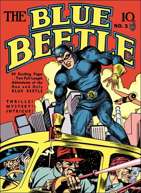
For me Champ #19 is one of those covers that looks so much like the work of Joe Simon that I am amazed that others do not see it. If in the end you do not agree with my attribution of this cover, I doubt you will find convincing any of the other Harvey covers I credit to Joe. The next best example of Simon work would be the Speed #21 (August 1942) that I posted on recently. Here the only Kirby-like feature that I find is the clown’s pointing hand. Everything else looks like Simon’s work to me. The device of an oversized hero is something I associate with Simon more then with Kirby. We have already seen Joe use this in the Blue Beetle #2 cover. Similarly the use of floating heads I believe is more typical of Joe. The style these floating heads seem to be Joe’s, especially the square ness of the jaws.

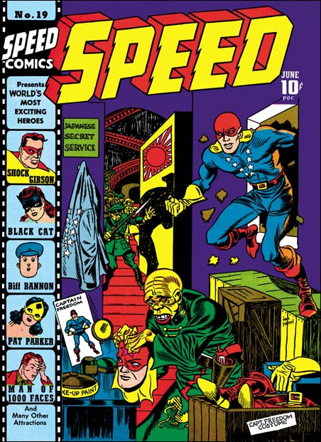
Speed #19
Speed #19 (June 1942) by Joe Simon (signed Jon Henri)

Another candidate for Simon work is the cover for Speed #19 (June 1942). The Japanese impersonator has the peaked eyebrows that Joe seems to favor. Captain Freedom has Jack’s square fist, but as I mentioned before I do not believe this is a reliable feature for distinguishing between Joe and Jack. I find the arriving Japanese soldiers look more like Simon’s hand. But frankly although I attribute this cover to Joe, it is not with the certainty that I feel for Champ #19 or Speed #21. The only other Speed cover I suspect may have been done by Simon is Speed #23 and that is without much confidence at all. I have not yet restored that cover so I will leave my reasons for saying it was done by Joe for a future post in my Harvey cover topic.

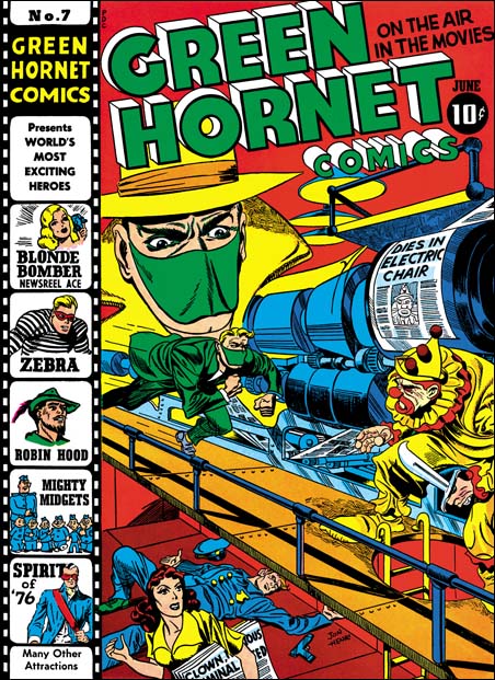
Green Hornet #7
Green Hornet #7 (June 1942) by Jack Kirby and Joe Simon

The covers for both Green Hornet #7 and #9 seem to have been done primarily by Jack Kirby. But on GH #7 there is a floating head. Because of the mask and hat, only the eyes are visible. To me they look like they were done by Simon. It seems that enlargement and floating heads are devices used at times by Joe but not by Jack.

Some readers may have noticed that I did not include Champ #22, Speed #22 or Green Hornet #8 in my list of Simon and Kirby Harvey covers. These covers have characteristics that set them apart from the Jon Henri group. We will examine these three covers along with new information I have obtained from a recent conversation with Joe Simon in the next chapter.

Art by Joe Simon, Chapter 5, Side by Side

Art by Joe Simon, Chapter 7, Glaven

Art by Joe Simon, Chapter 5, Side by Side

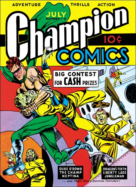
In the previous chapter I described the cover Champion #9 (July 1940) as the first joint work by Simon and Kirby. In the same month the two also worked on the title story for Blue Bolt #2. But their working method for Blue Bolt was different then the Champion #9 cover where Jack did the pencils and Joe did the inking. For Blue Bolt Joe and Jack would each work on different pages of the same story. This was probably an expedience that allowed a story to be completed in a shorter period of time. Working jointly on different pages would be a practice that Joe and Jack would use for a time before Kirby ended up doing nearly all the drawing.

Even Joe agrees that Jack was an exceptional artist. But it would be a mistake to attribute the good pages to Kirby and the poorer ones to Joe. Frankly I believe that this is an error that some experts have fallen into. Instead we should look for features that are characteristic of the particular artists. There are some devices that Kirby used often like a bad guy sailing through space from the hero’s punch, or the use of exaggerated perspective on a figure. Simon, or anyone else trying to copy Kirby, would include these but would not do it as successfully as Jack. Other Kirby traits, such as square fists or finger tips are all too easily copied and should not be relied upon. Finding Joe’s touch can be a bit more difficult. But there are some traits that crop up both in these pages and the work that Joe did before.

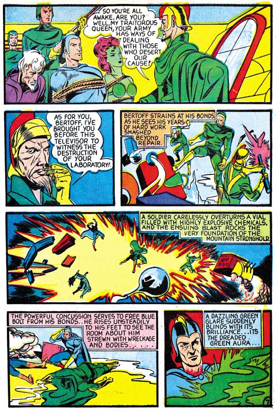
Blue Bolt #3
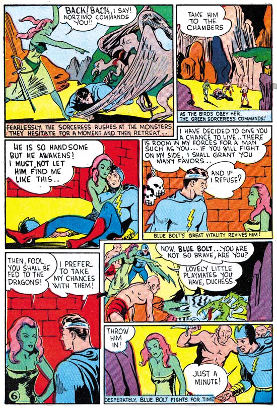
Blue Bolt #3 (June 1940) “The Green Sorceress Reforms” page 7 by Jack Kirby

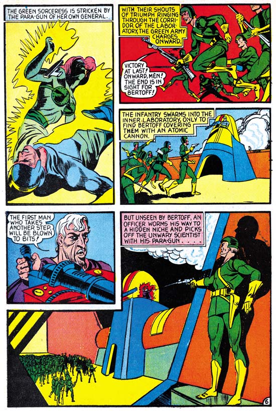
Blue Bolt #3
Blue Bolt #3 (June 1940) “The Green Sorceress Reforms” page 6 by Joe Simon

With both Jack and Joe working on different pages of the same stories it is understandable that there would be adjustments made so that the final product would have a more uniform look. We do find Joe beginning to change his drawing style to be more like Jack’s. In Blue Bolt #1 Dr. Bertoff has a scruffy look but when Kirby drew him he had was more nobler. As we see in the above images from Blue Bolt #3 Joe began to draw the Doctor more like Jack did. What we do not see in these jointly drawn Blue Bolts is any attempt by Jack to adjust his style to conform more to that of Joe Simon.

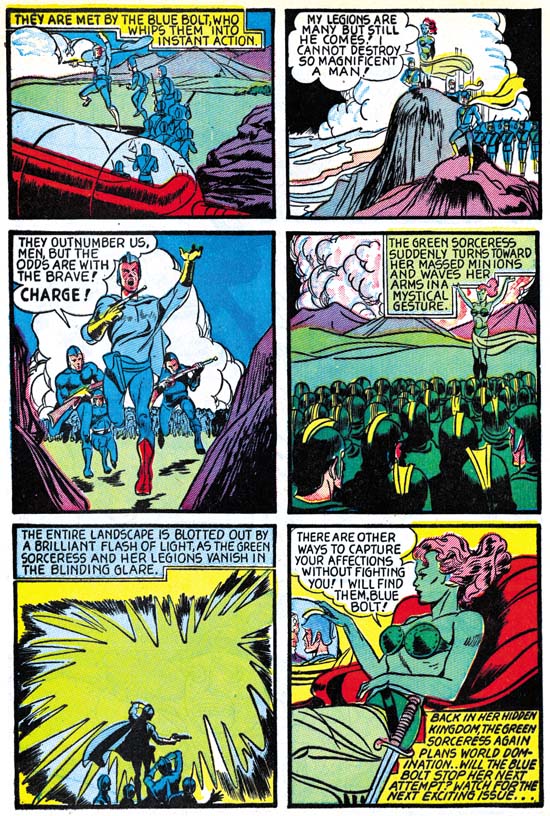
Blue Bolt #3
Blue Bolt #3 (June 1940) “The Green Sorceress Reforms” page 10 by Joe Simon

In the previous chapter I mentioned page 10 as having a panel that seems to have been the source for the cover of issue #3. I also said that although Greg Theakston (The Complete Jack Kirby, 1917 – 1940) attribute this page to Kirby, I was not so sure. Now that that I look at it again I still believe that this page was penciled by Simon. But I say this not as a criticism of Greg, but as an example of the problems faced when trying give credit for these pages. Often there really is not enough distinctive traits on a single page to make a confident attribution. In this case I find the rock formations more like Joe did in Blue Bolt #1 then those by Jack. The eyes of the attaching soldiers seem to be in the classic angle style that Joe used.

Daring Mystery #6
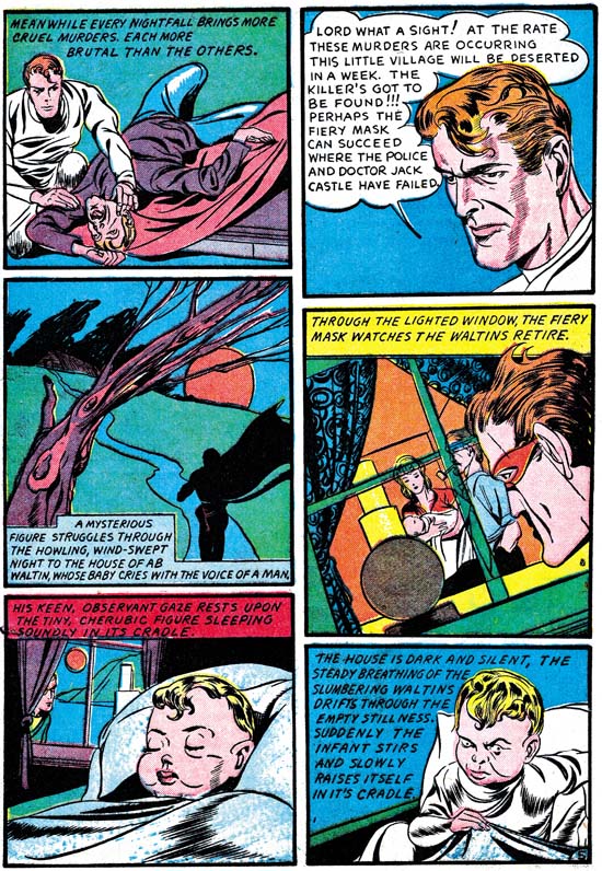
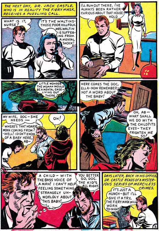
Daring Mystery #6 (September 1940) “The Legion of the Doomed” page 5 by Jack Kirby

Daring Mystery #6
Daring Mystery #6 (September 1940) “The Legion of the Doomed” page 3 by Joe Simon

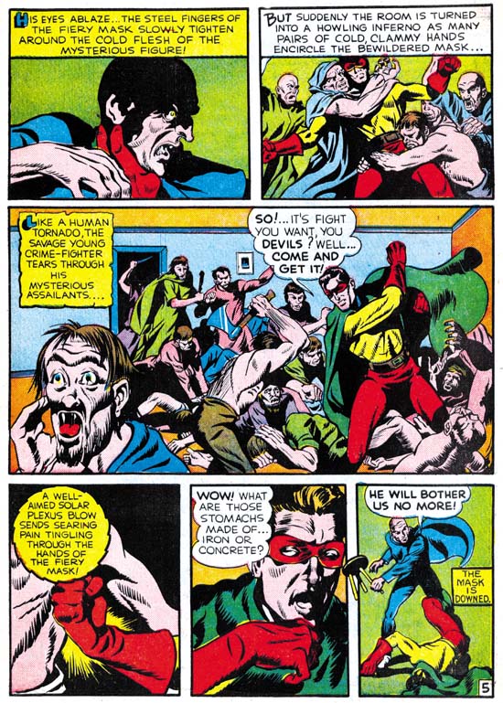
From the Fiery Mask story from Daring Mystery #6 we find further examples of Joe adjusting his work to appear more like Jack’s. However certain Simon traits such as the angular eye/eyebrow construction can still be seen. Look at the unmasked hero from panel 2 of page 5 by Jack and compare it with the version on panel 6 of Page 3. I believe this shows that Joe is starting to get pretty good at mimicking Jack. Of course it is possible that Jack did some work on a page otherwise done by Joe. In cases like this I do not know how to be certain.

Daring Mystery #6
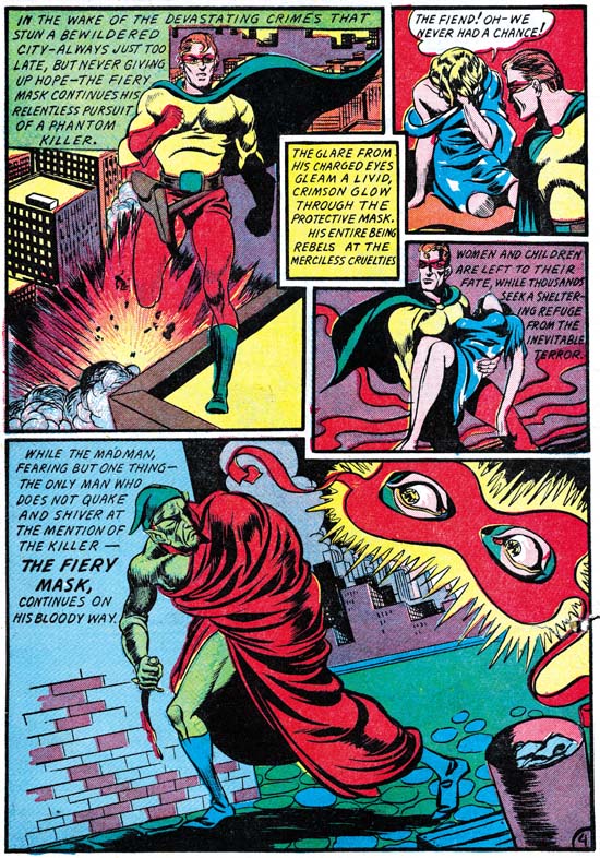
Daring Mystery #6 (September 1940) “The Legion of the Doomed” page 4 by Joe Simon

Page 4 of Daring Mystery #6 is interesting as an example of how often Joe would use swipes. Scholar Stan Taylor has sent me some scans from Flash Gordon by Alex Raymond. From these it can clearly be seen that three of the four panels of this page have swipes from Raymond’s Flash Gordon. I posted one of them in my footnote to my last chapter. Because of the differences between the cover of Blue Bolt #3 and Raymond’s panel of Flash Gordon running, it might be unclear whether Joe really used it as the source. But the similarity between Raymond’s work and the running man on this page leaves no doubt that Joe used this particular Flash Gordon example for swiping. The scans provided by Stan show the same exact poses as those Joe did on this page. But in none of these cases does Joe copy the details from Raymond. For example Joe’s demon is just an ordinary man when done by Raymond. Although there are some examples in the Fiery Mask story from Daring Mystery #1 where Simon was particularly close to his Hal Foster source material, generally Joe simplifies and alters the original. There does not seem to be any attempt by Simon to make himself out to be another Hal Foster or Alex Raymond. Some are critical of any comic artist that uses swipes, I do not share that opinion in all cases. With Joe it only bothers me when his copying does not integrate properly, which unfortunately in these early years is sometimes the case.

Also of interest from page 4 of DM #6 is panel 5. This almost splash-like panel has a large floating mash with eyes. This is a varient of the floating heads that Joe Simon would use from time to time. As I have said before this sort of thing does not seem to be something that Jack favored.

Captain America #1
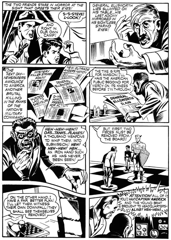
Captain America #1 (March 1941) page 7 by Jack Kirby

Captain America #1
Captain America #1 (March 1941) page 3 by Joe Simon

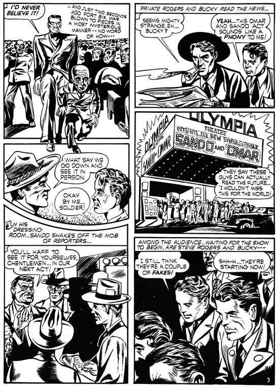
Generally in this blog I prefer to use images taken from the comics or from original art. Very little original art of Captain America by Simon and Kirby still exists. I suspect that no art from CA #1 has survived. But Joe has copies of the flats from the first Captain America issue. Flats were made from the original art without color with each flat showing the four pages laid out as they would be printed on one side of sheet of paper. They are the next best thing to the original art so I could not resist using them as my examples both Joe and Jack’s penciling from this comic classic.

Work on Captain America included the use of a number of assistants. Among the task that these extra hands provided was helping with the inking. This introduces even more variation to the look of the art above that caused by joint penciling work by Joe and Jack. Perhaps because of these new inker or maybe because Joe is better at mimicking Jack, but some of the Simon touches such as those angular eyes have disappeared. However there are other distinctive traits used by Simon. For instance look at Bucky in panel 3 of page 3 of the Sando and Omar story. Notice how his lower face projects, I think of it as a muzzle affect. This will sometimes be seen again in Joe’s work for children and occasionally women. But Jack does not give his children the same sort of muzzle.

Captain America #1
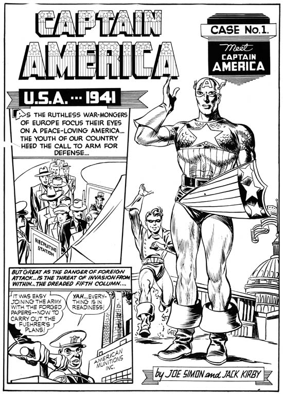
Captain America #1 (March 1941) “Introducing Captain America” page 1 by Jack Kirby and Joe Simon

Pretty much the entire origin story of Captain America was drawn by Kirby. But I feel that there is one exception, the large standing figure of Cap on the first page. I find the square-ish face and the pose in general to agree with Joe Simon’s style. Even the inking seems different from that of the rest of the story. But the figure of the running Bucky has all the Kirby touches.

Target #10
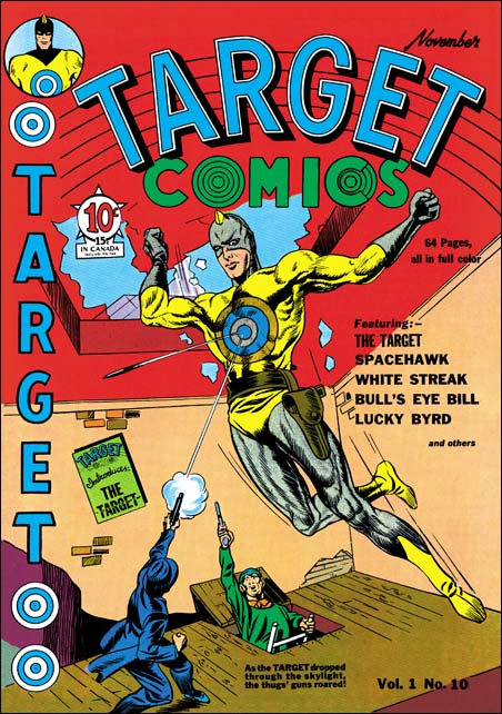
Target Comics #10 (November 1940) by Joe Simon

Although Joe may not have penciled any stories during the time period we are examining here, he did some covers. There was a time that many attributed the cover for Target #10 (November 1940) to Jack Kirby. Now I believe it is generally recognized that this cover was actually done by Joe Simon. Like a number of Simon and Kirby covers from this period, the central figure of the Target is more finely inked then the background figures. This cover illustrates a common practice that Joe often followed, distorting reality in order to better tell the story. Joe presents the Target further forward then the skylight he had just crashed through. This was undoubtedly done to make the hero the largest and most important figure of the cover. The criminals under attack are still towards the back where logically any bullets they shot would not be able to bounce off of the front of the Target’s chest as depicted. I admire these sort of pictorial distortions, too much adherence to realism and logic can detract from a comic book cover. Having said that, Target #10 is not among my favorite Simon covers. One problem I have with it was probably not Joe’s fault, the colorist used red for most of the broken skylight where it should have been white with purple streaks. This makes it more difficult to recognize that the Target has crashed through the skylight. A more serious problem is the rather distorted perspective to the room that detracts unnecessarily from the subject of the cover. But the major drawback is the hero seems posed more to offer himself as a target then to be attacking the villains.

Pocket Comics #1
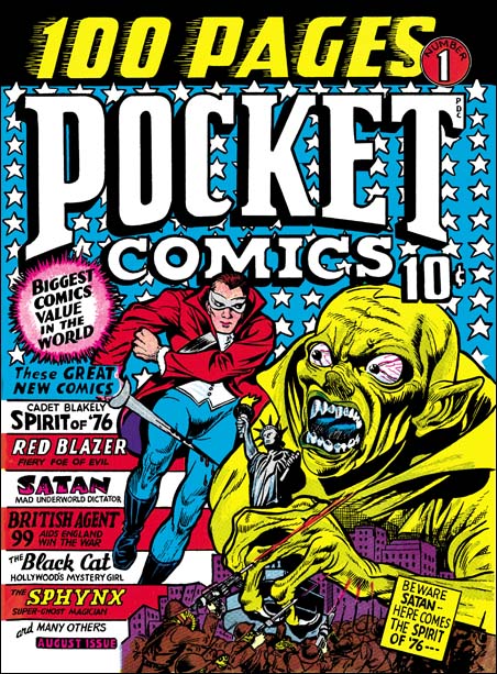
Pocket Comics #1 (August 1941) by Joe Simon

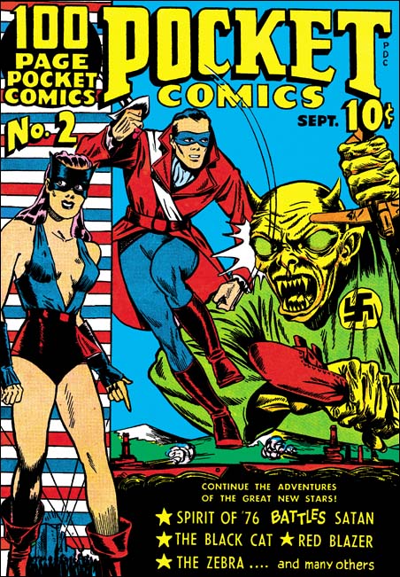
The Target #10 was prior to Simon and Kirby’s work on Captain America. Several months after the start of Captain America Joe Simon began to provide some covers for Al Harvey’s new Pocket Comics (#1, #2 and #4). These covers are unsigned but Simon has stated that he did #1 among others. Although Pocket #1 is in a different style from earlier covers, once before we have seen Simon change styles and we will see him do it again in the future. The three covers are so similar to one another that there is little doubt that they were done by the same artist. The drawing of the face for the Spirit of 76 has the same square jaw as some of Simon’s previous work. Attribution of these covers to Joe Simon seems reasonable given the evidence we have.

For Pocket #1 (August 1941) Simon uses a small area very effectively. Satan, a villain with his own feature in the comic, towers over and threatens New York City. He is attached by an army, but their small size leaves little doubt that they will not be very effective. Indeed Satan’s attention is drawn to the approaching, and also oversized, patriotic hero the Spirit of ’76. As in other of Joe’s covers, size is used as an indication of importance and is not meant to be literal. The depiction of Satan owes more to previous covers by Joe (Silver Streak #2 and Wonderworld #13) then it does to the villain’s appearance in the story.

Pocket Comics #2
Pocket Comics #2 (September 1941) by Joe Simon

The cover for Pocket #2 follows the same formula as used in #1. A large Satan is attached by a diminutive and ineffective force (in this case a navy), while the oversized Spirit of ’76 comes to the rescue. Also included is another scene with an oversized Black Cat. This really is not a bad cover but when compared to its predecessor it looks inferior. Despite having more area to work with Simon’s drawing is simpler. The changes to Satan may make him more like the character in the story but they also unfortunately make him seem less threatening. Finally the Spirit of ’76 has a running pose that suggests he is not truly running toward Satan.

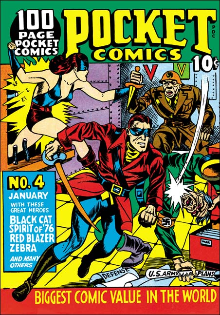
Pocket Comics #4
Pocket Comics #4 (January 1942) by Joe Simon

Joe’s contribution to the cover of the last issue of Pocket Comics is one of his masterpieces. On the face of it looks like Simon has turned to a realistic depiction for the Spirt of ’76 and the Black Cat. But has he really? The hero strikes down a foe, but how could that be since the Nazi is behind the Spirit of ’76 who is running forward? The Black Cat smashes through the bars of a window in the center of the room to prevent another Nazi from stabbing the patriotic hero in the back. But could the heroine entering in the middle of the room really be able to grab the arm of a foe towards the back? But Joe could not have told this story as effectively if he had adhered to a more realistic presentation. The inking, which I believe to be by Joe, is bold and assured. There is some crosshatching like the Fox covers, but most of the inking was done using a brush.

Simon and Kirby’s association with Timely, and Captain America in particular, would end and they would begin to work for DC. But there was a gap of a few months before S&K would appear in Adventure and Star Spangled. Coincidentally Al Harvey’s pocket sized comics books venture would fail at the same time because their small size made them too easily stolen. It would also take a few months before Harvey would return with normal sized comics. Some of the covers for the relaunched Harvey line will be the subject of my next chapter.

Art by Joe Simon, Chapter 4, Footnote

Art by Joe Simon, Chapter 6, Jon Henri

Art by Joe Simon, Chapter 4, Footnote

FG pose 3 ed
Flash Gordon (7/3/38) by Alex Raymond

Stan Taylor has sent me some scans of panels from Flash Gordon done by Alex Raymond. Four of these have figures that so closely match work by Joe Simon as to leave no doubt that they were used as sources for swiping. I include one here because it is such a good example of Joe’s working method. For the cover of Blue Bolt #3 Joe made significant changes but we shall see later that he used this same figure again this time with only a little modification.

Please excuse the odd coloring on this image. Stan remarked to me about the similarity of the holster but his scan was a little dark for me to see it. So I did some Photoshop adjustments to make it clearer. But these adjustments brought out artifacts of the jpeg compression used. The original does not have all the odd rectangular color areas.

Art by Joe Simon, Chapter 4, Transition

Art by Joe Simon, Chapter 5, Side by Side

Art by Joe Simon, Chapter 4, Transition

Blue Bolt #1
Blue Bolt #1 (June 1940) “The Human Lightning Streak” by Joe Simon (signed)

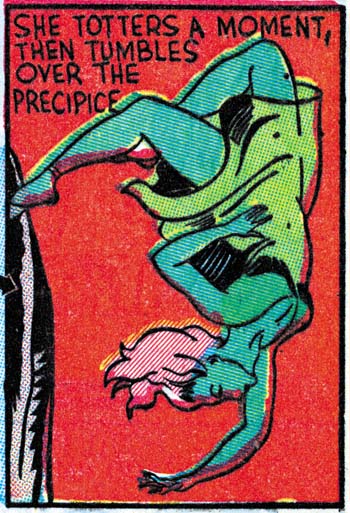
Most of the work that Joe Simon penciled having cover dates from May to July of 1940 were the Fox covers discussed in the last chapter. But Joe was still a freelance artists and he did some work for other publishers. For Novelty Press, the same publisher as Target Comics, Joe created the titled feature of a new comic, Blue Bolt. For this Simon returned to the science fiction genre, but adds a superhero to the mix. Even though this story was done at the same time as the Fox covers, Joe does not try to imitate Lou Fine here. Nor is there any reason that he should since Fine never did any work for Novelty. However the work that Joe did on the Fox covers seemed to have some affect on his style, his lines seem lighter. The previous damsel in distress now reappears as the falling Green Sorceress. Either he is copying from Silver Streak #2 cover, or I was wrong and this form was not an altered version of the appearance in the Phantom Bullet and the cover of Wonderworld #13 but instead there is another source for the swipe. Either way Joe is still using swipes.

Blue Bolt #1
Blue Bolt #1 (June 1940) “The Human Lightning Streak” by Joe Simon (signed) (close-up of panel 4 on page 6)

Blue Bolt #1
Blue Bolt #1 (June 1940) “The Human Lightning Streak” by Joe Simon (signed)

Blue Bolt #3
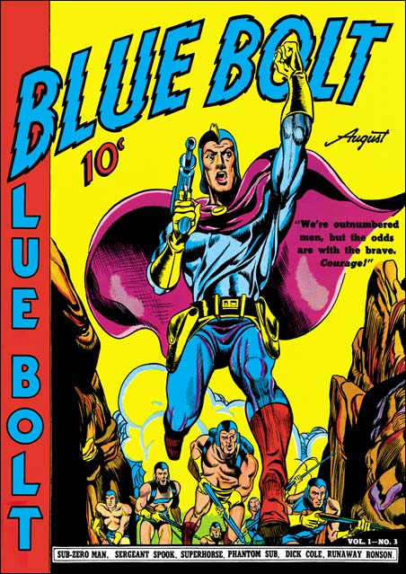
Blue Bolt #3 (August 1940) by Joe Simon

Jack Kirby joined Joe on work for Blue Bolt after the first issue, I’ll be discussing that in the next chapter. This seems the best place to present the cover for Blue Bolt #3. Despite the appearance of the Blue Bolt character on the covers to #1 and #2, issue #3 is the first time Joe would provide the art for the cover. You can tell it is by Joe by the way the eyes are done, particularly in the smaller soldiers. Also the rock formations are similar to the ones Joe did for page 2 of Blue Bolt #1 (see above). As we seen before Simon likes to emphasize the importance of the hero by enlarging him. In this case he does this by using a low view point so that perspective provides the results he wants without looking unnatural. The cover is a close copy of a panel from the story. Greg Theakston (The Complete Jack Kirby, 1917 – 1940) has attributed that page to Jack Kirby, but I do not believe he is correct. I will include a scan of the page in my next chapter. Maybe by the time I write up that post I will have changed my mind.

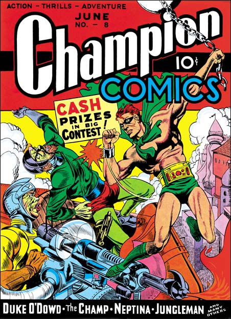
Champion #8
Champion #8 (June 1940) by Joe Simon

The Champion Comics title was published by Irving Manheimer. Manheimer was the president of Publisher Distributing and as the name says it was a distribution company. Printers wanted to keep their presses busy so Irving also acted as a comic publisher. That helped to keep the printers active, gave PD more items to distribute, and provided Irving some profits from the comics themselves. Joe Simon drew the cover for one of Manheimer’s title, Champion Comics #8 (June 1940). Again although Joe made no attempt to mimic Lou Fine, this cover is very different from his previous ones. Inking is finer then Joe’s earlier covers but not nearly as fine as the Fox covers he was doing. Joe uses the brush more often with bolder markings. He also is more concerned with defining forms then before. Forms are suggested by rows of close or touching brush stokes, kind of like the reverse of a highlight.

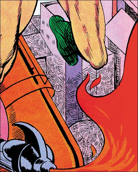
Champion #8
Champion #8 (June 1940) by Joe Simon (close-up)

One new inking technique appears on the bottom of the background buildings. Small areas are covered by parallel lines. Nearby areas have similar lines but at a different angle. This provides a similar tone to the entire area while giving it a mottled looked. This technique appears on a few covers that Joe is associated with over the next year or so and then disappears and does not become part of the S&K shop inking. A similar inking was used on some of Al Avison’s work where it appears for a longer time. Did Al learned it from Joe and later Joe abandoned it? Or was this an Avison trait that indicates Al inked this cover? I lean toward the former explanation because the inking of this cover is pretty good. The Fox covers show that Simon had become an accomplished inker while the earliest efforts I have seen by Avison, done even later then this cover, are not all that impressive.

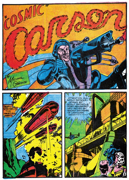
Science #4
Science #4 (May 1940) “Cosmic Carson” by Jack Kirby

In the last chapter I stated I felt that the Fox covers did not show any Kirby influence. On the other hand I feel Champion #8 does. For the first time on a Simon cover we find a hero’s punch being portrayed. The villain that received this hit is shown falling backwards. This type of action scene would become a Kirby trademark. The only problem with my suggestion is that I am not aware of Jack having drawn this sort of action up to the time this cover was made. Another Kirby-like feature is the futuristic ray gun that Joe has drawn. Just the last month Jack included a similar weapon in “Cosmic Carson”. Some have called Joe’s version a swipe, but I find it so done so differently that I feel Jack’s gun was more a source of inspiration then an actual swipe.

Champion #9
Champion #9 (July 1940) by Jack Kirby

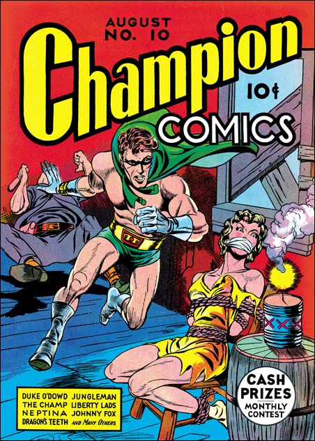
When I first showed Joe my restorations of the covers for Champion #8 to #10, he said that he had not yet met Kirby and that he had done all of these covers. Carmine Infantino looked at Champion #10 and said that surely Jack had done it. When Joe looked again he agreed, but insisted that he (Joe) had done the other two. The hero’s more square face in Champion #9 does seems much closer to that depicted in #8 then that of #10. But the scene has more action then anything Joe had done before. Also as Greg Theakston has pointed out (The Complete Jack Kirby, 1917 – 1940) the hero is shown running with the sole of his foot turned toward the viewer. This is something Jack has already done in the Blue Beetle strip but has not yet shown up in any of Joe’s work to date. Because of these two facts I have to respectively disagree with Joe and attribute primary pencils of this cover to Kirby.

The inking of the cover is a good match to the work done on Champion #8. It even has an area with the mottled type of inking in a strip in the purple arch. The portal in the upper right is inked in the way Joe had picked up from Lou Fine leaving small irregular uninked areas. I therefore feel, as others have proposed, that this is the earliest Simon and Kirby work.

Champion #10
Champion #10 (August 1940) by Jack Kirby

Although previously I have made some comments about Joe Simon’s inking it was for art that I feel we can be pretty confident that Joe was doing his own inking. This series is really about Joe as a penciler. So why am I including a cover drawn by Jack Kirby? Well I believe it is important from time to time to show what Jack was doing as a comparison. Part of what this serial post is about is distinguishing Joe’s work from Jack. Besides which I do not think anyone is going to object showing some Kirby work, after all this is the Simon AND Kirby blog.

In my next chapter I will examine other work Joe Simon did in his newly formed partnership with Jack Kirby.

Art by Joe Simon, Chapter 3, Working for the Fox

Art by Joe Simon, Chapter 4, Footnote

Art by Joe Simon, Chapter 3, Working for the Fox

Fantastic Comics #7
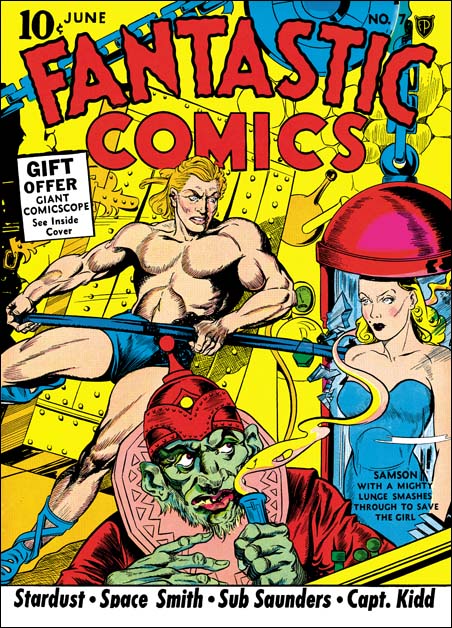
Fantastic Comics #7 (June 1940) by Joe Simon (signed)

Originally Fox comics were produced by the Eisner-Iger shop, with Lou Fine doing many of the covers. But the owner Victor Fox apparently had little scruples and asked the shop to come up with a superhero based on the popular Superman. Out of this work came Wonderman. Superman was big money for the publisher DC, so it is not surprising that they took Fox to court over this imitation. Victor Fox’s initial strategy was to get Eisner-Iger to say they came up with the idea for Wonderman on their own. It may not seem surprising today, but times were tough then and it must have been difficult for Eisner-Iger to refuse to take the blame. But it may not have been just a moral stand for Eisner-Iger. Any lawsuit initiated by DC against their shop would almost certainly have driven them out of business regardless of the outcome. With the failure of Victor’s initial strategy, it would appear he did not have a very good replacement idea. Fox lost the court case on April 7, 1939. The Eisner-Iger’s Wonderman testimony lead quickly to a end of their business relationship with Fox. At least by December 2 when an ad appeared in the NY Times, Victor Fox was looking for artists to provide work for his comics. The above summary is largely based on an excellent history by Jon Berk first published in Comic Book Marketplace #107. Berk has further expanded it into a web version. It is a superb piece of scholarly writing that my summation just does not give justice to. I heartedly recommend a visit.

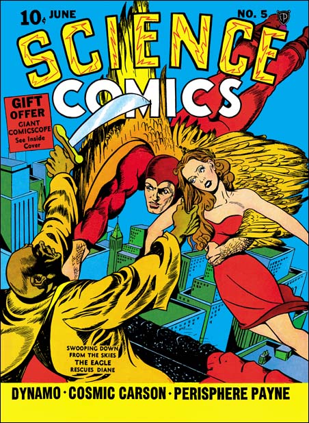
Science Comics #5
Science Comics #5 (June 1940) by Joe Simon

Joe Simon was one of the artists to answer Fox’s ads. But Joe got more then an artist position, he became the editor although on a freelance basis. This may seem surprising considering that Joe had not been in the comic book business for very long when he got this job. But then again the industry was still very young. One of the things Joe did as editor was to personally draw most covers. Previously many of the covers had been done by Lou Fine, the last cover by Fine would be Weird #2 (April 1940). Lou Fine did incredibly beautiful and exciting covers that certainly helped in the success of those comics. As editor Simon wanted that success to continue and so in the covers he created Joe copied Fine’s style. Simon did this so well that for years experts have been attributing some of Joe’s covers to Lou. In fact a recent volume of Lou Fine reprints includes a checklist that has some of the Simon covers listed as work by Fine. Fortunately Joe signed many of the covers, but the signature were small and easily overlooked. Actually once you start comparing these signed Simon covers with the rest, it really is not that difficult to pick out even the unsigned Simon covers. But the experts apparently were used to searching out Fine’s stylistic features without realizing that if they could see those features someone like Simon could also.

Fantastic #7 closeup
Fantastic #7 (June 1940) by Joe Simon (close-up)

One important thing Joe did for these covers was to adopt Fine’s use of a pen for intricate spotting. Joe did not abandon his use of a brush completely but when he did use a brush it was generally done in a much finer way. Joe copied from Fine the use of crosshatching. Now in areas that Simon wanted a shadow he might use crosshatching instead of flooding the area with black. But the pen lines in some this crosshatching were done without the aid of a ruler and the lines are not perfectly straight. The result is a crosshatching that I think of as a cheese cloth pattern. A good example is the shadow behind Samson from the Fantastic #7 cover. Note that in this example the shadow if rather abstract, it does not show a the same shape as Samson. Instead the shadow has wavy edge with an overall arch. Abstract arched shadows, without the wavy edge, would be a trademark of the S&K studio inking style in later years. Crosshatching an area would also show up in S&K inking later, but usually not so finely done. However the use of cheese cloth crosshatching appears to be limited to this time period.

Science #5 closeup
Science Comics #5 (June 1940) by Joe Simon (close-up)

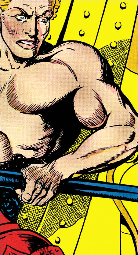
Joe begins to use a crosshatching technique I think of as picket fence. Two long lines following a similar path are intersected at a right angle with regularly spaced shorter lines. The arms of the villain in the Science #5 cover is a good example. Once again in later years we will find picket fence crosshatching done in a bolder manner as part of the S&K shop inking technique.

Science #5 closeup
Science Comics #5 (June 1940) by Joe Simon (close-up)

Another Fine procedure copied was a special way of inking shadowed areas. Instead of flooding the area completely with ink, Joe would irregularly crisscross the area with brush marks. When enough of this sort of brushing was done the end result would be an area mostly black but with small irregularly shaped areas without ink. When looking at just the line art this type of spotting can look rather sloppy. On the printed cover these areas are filled generally with blue or purple, occasionally with the ground color. This gives the shadowed area a texture that is really very effective. This spotting technique, and some variations of it, would be used in S&K inking for a number of years before eventually being abandoned.

Wonderworld #13
Wonderworld Comics #13 (May 1940) by Joe Simon (signed)

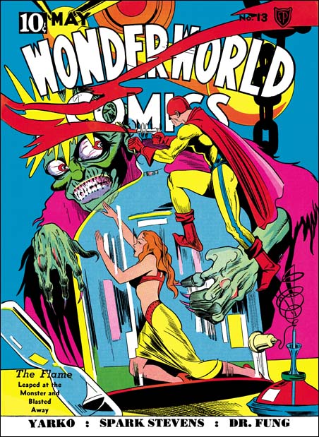
Some of the Simon Fox covers seem (at least to me) to be successful attempts at producing a Lou Fine-like composition. Wonderworld #13 is a good example. The monster looks like it could have been done by Fine. I do not know of any Fine cover that one could say Joe swiped this monster from. But Wonderworld #7 does have monsters that could have served as a template. Joe also seems to have added elements from his Silver Streak #2 cover, particularly the hands. As for the figure of the Flame, again I do not know of any particular source that Joe swiped, but I would not rule it out either. There are some covers not too dissimilar in pose that Joe might just have adapted. The whole ensemble is put together in a manner not unlike covers by Lou Fine.

Damsel in distress
Silver Streak #2, Daring Mystery #2, Wonderworld #13 all by Joe Simon (close-ups)

Look at the bottled female on Wonderworld #13 and compare her to the cover of the Silver Streak #2 and a panel from Phantom Bullet in Daring Mystery #2. Joe obviously like the source material as this is the third time he swiped it. But also notice that Joe is not at all adverse to making changes. Simon swipes seem to range from pretty close copies to the much altered.

Blue Beetle #2
Blue Beetle #2 (May 1940) by Joe Simon

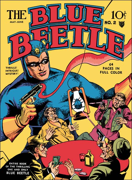
Although Joe seemed to produce layouts that look like they could have been done by Lou Fine, he also did some with features I would not expect Fine to have used. In the cover for Blue Beetle #2 (above) Simon draws the hero much larger then the rest of the figures. This is not to be taken literally, no powers of growth are being suggested for the Blue Beetle. The use of size to indicate importance is not a technique used much in western art since the Renaissance. However it is a common in the art of many other cultures. I know of no example of Lou Fine doing this, but Joe would return to oversized representations of the hero from time to time.

Blue Beetle #3
Blue Beetle #3 (July 1940) by Joe Simon

Blue Beetle #3 exemplifies another feature that Simon would use but Fine probably would not, exaggerated, or in this case distorted, perspective. Joe preferred to show buildings not with their sides all parallel, but with sides going to some common vanish point. In most cases this was used when the view point was up high looking down. In that case Joe’s common vanish point provides an exaggerated perspective that gives a dramatic depth to the image. On the cover of Blue Beetle #3, the vanish point is below while the viewer is looking at the sides of the building. This results in an impossible perspective. I have no doubt that Joe was fully aware that this was inaccurate. Later we will see other examples of techniques Joe used that were not literally correct but provided pictorial interest. In the case of exaggerated perspective Joe is doing something very different then what Jack Kirby would do. Jack would put his figures in exaggerated perspective but seemed to have little interest in doing it to his buildings.

Fantastic #7 closeup
Fantastic #7 (June 1940) by Joe Simon (close-up)

Because Joe gives more detail in the Fox covers, some of the stylistic features seen in his prior work do not occur. However Joe still seems to be having trouble in drawing a woman’s long hair. He now provides more lines but he still has difficulty depicting curls. Generally on these covers Joe will indicate a curl with a crescent or circular outline. It is better then not indicating a curl at all but still gives the hair an unnatural appearance.

Joe only worked for Victor Fox a short time. Over a period of three months he did 16 covers (cover dates May to July). He probably left Funnies Inc when he began to work for Fox. But Joe still did some work during this period for other publishers, that will be examined in the next chapter. It was while Simon was at Fox that he first met Jack Kirby. Jack had done some small comic book features and was currently doing Blue Beetle syndication strips. Unfortunately Jack had not yet done any comic book covers. Nonetheless Kirby had developed into good artist. As far as I can detect, none of the work that Joe Simon did for Fox shows any Kirby influence. But Joe did seem to notice Jack’s talent and that will also be touched on in the next chapter.
Art by Joe Simon, Appendix 3, Daring Mystery Comics #3

Art by Joe Simon, Chapter 4, Transition

Art By Joe Simon, Chapter 2, Footnote

During a visit I gave Joe Simon copies of my restoration of the two stories in Daring Mystery #2. He had completely forgotten about both of them. Before he had begun to look at them I mentioned that he had signed one of them using a different name. Joe stopped and said “I bet you I know what name I used, Gregory G. Sykes”. Boy was I surprised, if he couldn’t remember the stories how could he remember the pseudonym? Sure he added a middle initial, but otherwise he got it right. Joe explained that in that in high school he and his friends sometimes used another name, his was Gregory G. Sykes.

He especially could not get over the ice bullets from the Phantom Bullets. As for Turjak Joe coyly wondered where he got that idea from. I went along with it and pointed out the subtitle “King of the Jungle”. Joe chuckled and admitted that as a kid he often went to the library to read Tarzan and had been a big fan.

Art by Joe Simon, Chapter 2, Before Kirby

Art by Joe Simon, Appendix 3, Daring Mystery Comics #3

Art By Joe Simon, Chapter 2, Before Kirby

The GCD lists Joe Simon as the artist for Solar Patrol in Silver Steak #3 (February 1940) and renamed as Planet Patrol in SS #4 (March 1940). I have not seen either so I cannot verify this attribution. Still the timing and Joe’s frequent signing of his work makes it likely to be correct.

Target #1
Target Comics #1 (February 1940) “The Case of the Black Widow Spider” by Joe Simon (signed)

In February titles we also find Joe Simon starting a feature in Target Comics #1 (Novelty Press) called T-Men. He does a similar job to the one he did in the tree man story for Solar Patrol. One important difference is that although he still does not use the standard panel layout, his deviation from a strict grid are small and there is never any question about the proper reading sequence. The story is a little better then the Solar Patrol one, but it is without the improvements shown in his Fiery Mask story for Timely. This may be just Joe still trying to adjust to a new art media. However I suspect that the T-Man story may have actually been done at about the same time as Solar Patrol but the publication of it was delayed. This is the first part of a two part story. But the way the first part ends leads me to wonder whether if it was originally meant to be two parts. The ending seems abrupt and not like a planned cliffhanger. When the story continues in the next issue it is quickly wrapped up in a few panels. My suspicion is that the story was originally eight pages. Either this is not the length the publisher asked for, or a length change was required later. In either case Joe did a little fixing to make it a seven page story with a “to be continued”. But when Joe returned to the story for the next issue he knew he wanted to have a half page splash and he wanted to proceed with the new story line. So he cut panels from the former eight page and pasted on the new page. If I am correct this is the earliest example of Joe using cut and paste as an editorial method, a technique that he would use throughout the rest of his career.

Daring Mystery #2
Daring Mystery #2 (February 1940) “Phantom Bullet” by Joe Simon (signed)

The Fiery Mask did not reappear in the second issue of Daring Mystery. Instead Joe launched two new features. The first was Phantom Bullet. The hero has a gun that shots ice bullets. The idea being that after the ice bullet has done its work it melts, leaving the police without a clue. This was a hero? Although Joe still has a way to go, he has made progress in his comic artistry. Like last month’s Fiery Mask, this one has a pretty good story and the art work shows improvement. But Simon is still doing simplified drawing and his trademark angled eye/eyebrow remain. But his style seems consistent throughout the story. You might think that this was an indication that Joe did not do any swiping here, but you would be wrong. Take the kidnapped lady in panel 8 of page 9, rotate her until she is upside down, take a mirror image, and move her arms a bit and presto change-o she becomes the damsel in distress from the cover of Silver Streak #2. I said you would see her again. Guess what, Joe is still not finished with her.

Daring Mystery #2
Daring Mystery #2 (February 1940) “Trojak” by Joe Simon (signed Gregory Sykes)

Another new feature for Daring Mystery #2 was a Tarzan clone called Trojak. This one is signed by Gregory Sykes. But don’t bother searching GCD or any other database for Sykes because you will not find any other trace of him. The way the “by” is written on the title panel, the similar ‘S’, the same style of page numbering, and the art style in Phantom Bullet and Trojak leaves no doubt that were both done by Joe Simon. Joe had so far shown a desire to promote himself, why not on Trojak as well? In all likelihood Joe was worried that Goodman would not want two stories by the same artist in one comic. I looked through the GCD listings for Daring Mystery in search for any other possible pseudonyms. I did find a couple of names that sounded suspicious; Maurice Gutwirth and George Kapitan. But further searching showed that they both actually were legitimate artists with a long record of comic book work. So Gregory Sykes seems a rare example of Simon using a pseudonym.

Daring Mystery #2
Daring Mystery #2 (February 1940) “Trojak” by Joe Simon (signed Gregory Sykes)

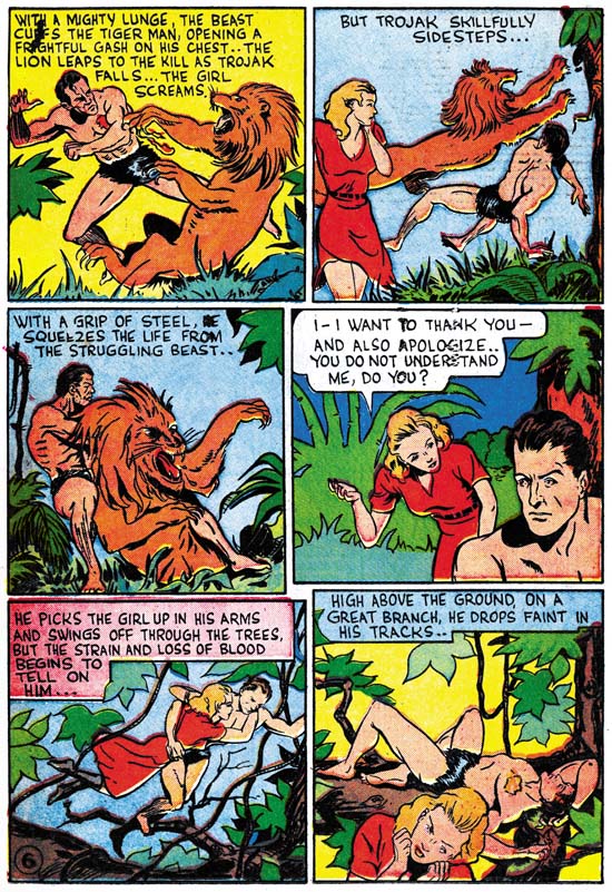
Although stylistically similar to Phantom Bullet, the art in the Trojak story looks better. A lot of this has to do with all the action that was possible with Trojak and a jungle full of animals. The style is pretty uniform throughout the story except some of the natives look more developed. Sure enough, doesn’t the chief in panel 3 of the splash page look like the tree man from Solar Patrol? I wonder what the original source looked like?

The GCD does list Joe Simon as the artists for Trojak in Daring Mystery #3 (April 1940), #4 (May) and #5 (June). The date for #3 seems reasonable, those for #4 and #5 less so, but still possible. Daring Mystery #6 (September) includes art by Jack Kirby and so postdates this chapter.
Target #2
Target Comics #2 (March 1940) “Sabotage” by Joe Simon (signed)

As mentioned previously the T-Men in this issue starts by wrapping up the story line from the previous issue. Although handled much too quickly, the way the villain gets his just desserts is really quite funny. Hopefully someday this story will be reprinted. The art for the wrap up is a good match for what was done in the Target #1. However the rest of the story is done in a style that closely matches the stories in Daring Mystery #2 from the previous month. Joe uses larger page number in a circular field, exactly the same as in Daring Mystery #2. Further evidence that the publication of the work Joe did for Target was delayed a month compared to other titles.

The GCD lists Joe Simon as doing the T-Men feature in Target #3 (April 1940) but that one is signed Ben Thompson and was done in a different style. Ben Thompson has a history of doing comics at this time so I do not think it is a pseudonym. The GCD also list Simon as the artist for T-Men in Target #4 (May 1940). However I have not seen that issue.

Human Torch #2
Human Torch #2 (1) (Fall 1940) “The Strange Case of the Bloodless Corpses” by Joe Simon

The first issue of the Human Torch was number 2 because Timely took over the numbering from Red Raven. With the high prices of key golden age comics, like the Human Torch #2, we are fortunate that Marvel has reprinted it recently. Red Raven #1 is cover dated September 1940, so the Human Torch #2 clearly comes after Joe and Jack met. But the Fiery Mask story in this issue was done by Joe Simon alone in a style similar to that he used before meeting Jack. This story is included here because I suspect that it might have been done earlier then its publication date would indicate. For those of you that have Greg Theakston’s “The Complete Jack Kirby, 1917-1940” compare the panel by Hal Foster of a man hollering with the one in the left corner of panel 3. Once more it appears that Joe is swiping from the same source material more then once.

In these first two chapters we saw Joe Simon adopt his own style. Yes there are variations due to Joe developing his skill, and there are also differences due to Joe’s swiping. But careful examination for Joe’s style can provide attributions even when the work is not signed. I could say that armed with this knowledge we are now prepared to identify all of Simon’s early work. I could say that, but it would not be true. In our next chapter we will see Joe adopt an entirely different style.

Art by Joe Simon, Appendix 6, Amazing Man #10

Art by Joe Simon, Chapter 2, Footnote

Art By Joe Simon, Chapter 1, In The Beginning

I disagree with the Kirby Checklist (and most scholars and experts as well) about attribution of some of the work to Jack Kirby. In most of these particular cases I believe the correct assignment would be to Joe Simon. Some of these examples look so obviously Simon to me, that I am amazed at that others cannot see it. In most cases I get no explanation as to why someone attributes something to Jack and not to Joe. As I have discussed previously, comic experts are unwilling or unable to explain their verdicts. There are some few scholars that have tried to give evidence to support their position. But in those cases what I keep hearing is that certain features look like their were done by Kirby. That is all well and good, but what I don’t hear are mentions of features that do not look like the way Simon would do them. In other words these scholars seem to be looking for evidence of Kirby involvement, but are not looking for clues to Simon’s presence. But Joe was a talented artist and through his inking of Kirby’s pencils was very familiar with his style. Joe had the ability and incentive to use things he learned from Jack and even at times to ghost Kirby.

So I would like to do another serial post, this time on art done by Joe Simon before and during the Simon and Kirby collaboration. I doubt I will change many minds about some of these (in my view) misattributions. However I do hope to bring to some a better understanding of Simon’s own style. A similar attempt on the work of Jack Kirby would be a monumental undertaking, there is just so much of it. Joe did not do that much penciling during the years of the S&K studio. So you would think that it would not be that hard to do a fairly detailed and complete analysis. But with Simon I am faced with two problems. The first is that early work by Joe was done during the golden age of comics. These comics are uncommon and generally priced very high. I simply do not have access to all of the comics that some say have work by Joe in them. What I do have for study seems to provide a good idea of Joe’s techniques. A more complete access would certainly be desirable, but I do not think it will change much the view point that I will be presenting here. The second, more serious problem, is the lack of signed work during the period of S&K collaboration. Once they teamed up, work that was signed was done so jointly as Simon and Kirby. No individually signed art was done by either Joe or Jack. So we must look elsewhere for documentation of work by Joe to form the foundation of our analysis.

Joe Simon started his career as a newspaper artist in Rochester, NY. The work I have seen are sport illustrations. These are nicely done in a realistic style, not at all like comic book art. Simon also did a lot of touch up work using an air brush. As Joe described it to me once, if an editor felt a dress was too short in a photograph of a woman, an artist would air brush it longer. Joe became a master of the use of an air brush. But the newspaper Simon worked for shutdown, and he decided to try his luck in New York City.

Joe Simon
Joe Simon

Joe did find work doing re-touching. But although he was good at it, it was a career he did not want to remain in. Following a suggestion, Joe tried the new comic book industry and entered the Funnies Inc. shop. Although this was a completely new experience for him, he adapted quickly and found it to his liking. In his book “The Comic Book Makers”, Joe says his first job was a seven page western. Unfortunately to my knowledge nobody has located what comic this western was published in. The first published work we do know about was done for different publishers, Lev Gleason, Centaur and Timely, and have cover dates of January 1940. Two covers and two stories, for someone who never did comics before it was an impressive start. But comics was a new industry with opportunities for the those with ambition and talent.

Keen Detective #17
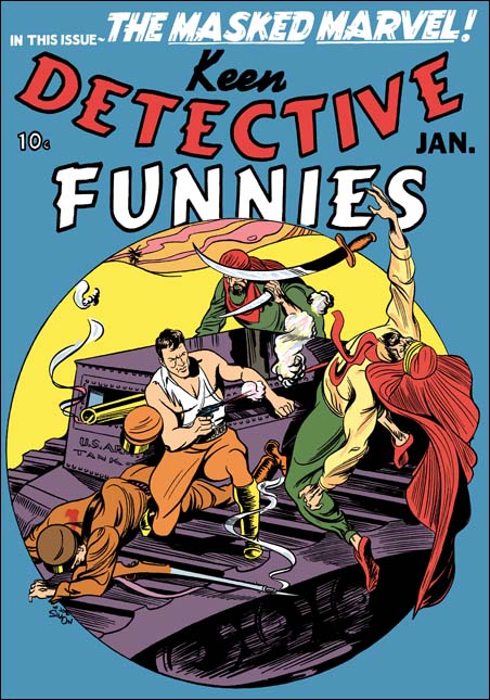
Keen Detective #17 (January 1940) by Joe Simon (signed)

For the Keen Detective cover Joe Simon has chosen a fight atop an American tank in the Arabian desert. An unusual choice since the middle east was not then the center of conflict it is today. Here Joe has trouble depicting the hero. His left arm is not convincing, nor is his left leg. Otherwise the rest of the figures are handled well. Simon’s composition works well with and complements the circular field used. The circular field works so well that I wish I could credit Joe with it. In fact this field was a trade mark of Keen Detective and was used for a number of covers before this one. However most of the artists were unable to use it as effectively as Simon did. Still I believe Joe liked the results and a circular design would reappear in some S&K covers in a couple of years. The inking looks like it was done mainly with brush. To me there really is nothing wrong with the inking. But it seems mainly to be used in deliminating the figures. What spotting there is appears mainly to have been done to provide some form to the tank, it is does not seem to aid the over all design.

Silver Streak #2
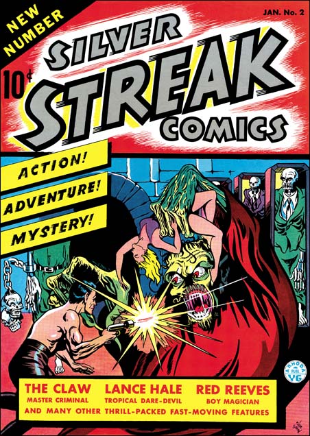
Silver Streak #2 (January 1940) by Joe Simon (signed)

For the cover of Silver Streak #2, Joe depicts the Claw, a villain with his own feature story inside. Although given a monstrous portrayal, the Claw was originally recognizably as a personification of the yellow peril. Being politically correct was not a consideration in those days before the war. But Simon has made the Claw not as an Asian monster, but instead used Frankenstein as a model. It is an exciting cover with corpses in open coffins (zombies?), a scantly dressed damsel in distress and a hero to the rescue. Remember the damsel, we shall see her again. Anatomy is not Joe’s strong point here, he does not even try to be accurate. Simon provides enough muscle lines to convince the viewer that the hero is strong in body as well as strong in character. What Simon does excel at is design, and the composition of the cover is excellent. Inking is done primarily with a brush in a bold manner. The inking is much more effective then in the previous cover.
SS #2
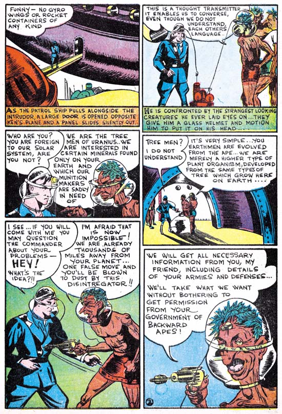
Silver Streak #2 “The Tree Men of Uranus” by Joe Simon (signed)

Joe Simon initiates a new feature, Solar Patrol. Joe liked science fiction, and it was a genre that he would turn to often. Frankly after Joe’s exciting cover work, this example of his story art is a bit of a let down. You can tell he is uncomfortable with the whole aspect of the sequential art. Simon does not seem to be satisfied with a standard panel grid and uses variously sized panels instead. Unfortunately it becomes a bit confusing and Joe sometimes had to add arrows to indicate the proper reading sequence. I suspect his panel layout was an attempt to make it all more interesting. He does not succeed here, but I think it is the forerunner of the irregularly shaped and circular panels that S&K would use in the future.
In his book Joe Simon describes learning how to draw for comic books:

Slits for eyes, unless the character was to register astonishment or horror – and then the eyes become circles. Heavier lines for the eyebrows, raised for bewilderment, slanting down toward the nose for anger. One line for the upper lip. A heavier line, indicating a shadow, constituted the lower lip.

In this story Joe seems to have followed the use of simplicity to a fault. Perhaps because of it he does not seem to be able to make panels as exciting as his covers. Even panels that by their nature should be interesting, such as the space ship destroying the enemy base, come off as rather dull. Another aspect of Joe’s adoption of simplicity is techniques he starts using in the depiction of his figures. Most obvious among them is the way Simon draws eyes. For men viewed at mid-distance Joe uses a single mark to indicate the eye itself and another for the eyebrow. He joins these two marks so that they meet at an angle, sort of like a sideways ‘V’. We will see this typical Simon technique in much of the art he did before teaming up with Jack Kirby. As for women, Simon economical penciling is too extreme leaving them with limited hair strand lines and no real feel of curls. There is a striking difference between how Joe draws the humans, and the more detailed version he provides for the tree men. I suspect that Joe may be swiping the aliens from some unknown source. Even if that is not true, we will meet a related version of the tree men again.

For another story, Simon was asked to make a character based on the use of fire such as done in the Human Torch. This might sound like a recipe for infringement except the publisher was Goodman, he already had the copyrights to the Human Torch. Joe’s response was the creation of the Fiery Mask which appeared in Daring Comics #1. Unfortunately I have no scans for this story. But if you are a Kirby diehard, you may have a copy of Greg Theakston’s “The Complete Jack Kirby, 1917 – 1940” which has a wonderful restoration of this story. Joe did a much better job with this feature then he did on Solar Patrol. Part of the reason is due to the his adding more action and interest to his panels. Greg Theakston gives another important reason by showing that Joe has done a bit of swiping from master artist Hal Foster.

Let me close this chapter with a story Simon told after dinner to Carmine Infantino, and myself. Joe talked about the cover to Red Raven #1 (August 1940). Apparently someone has recently shown that the drawing is a swipe (from Hal Foster again?). Joe grumbled that when it when it was thought to be an original work it was a Kirby, but when now that it is a swipe Simon must have done it. But after he finished this remark Carmine asked “But Joe did you use swipes?”. Joe replied “Of course I used swipes, everyone did”. (Actually the Red Raven cover was penciled by Jack, but I suspect the layout was by Joe, and not because it is a swipe). We will find that not only did Joe use swipes, he re-used them.

Chapter 2, Before Kirby
Chapter 2, Footnote
Chapter 3, Working for the Fox
Chapter 4, Transition
Chapter 4, Footnote
Chapter 5, Side by Side
Chapter 6, Jon Henri
Chapter 7, Glaven
Chapter 8, Off to War
Chapter 9, American Royalty
Chapter 10, A History Lesson
Chapter 11, The Party Is Over
Chapter 12, Covering the Fly
Chapter 13, Wrap Up
Art by Joe Simon, Appendix 1, Champ 22 Confirmed
Art by Joe Simon, Appendix 2, Daring Adventures #12
Art by Joe Simon, Appendix 3, Daring Mystery Comics #3
Art by Joe Simon, Appendix 4, Daring Adventure #16
Art by Joe Simon, Appendix 5, Harvey Hits #12
Art by Joe Simon, Appendix 6, Amazing Man #10
Art by Joe Simon, Appendix 7, The Spirit #12
Art by Joe Simon, Joe Simon as a Newspaper Staff Artist

The End of Simon & Kirby, Epilog

Originally I was going to provide a summary of the events from the end of the Simon and Kirby collaboration. Instead I think it maybe more helpful to provide a time line (see below). But I do want to say something about the end of the partnership. Unlike my discussions in previous chapters, here I will be using calendar, not cover, dates. For me the final years of the Simon and Kirby team unfolded in a three stage process. The first was the end of the studio, probably sometime in 1955 between February (last release of Mainline comics ) and August (when Kirby returned to working in the Prize romance titles). After this the two continued to collaborate on projects, but the way they worked was not the same. The next stage was when Jack began to do freelance work around April 1956. With that, Simon and Kirby projects became just one of Jack’s commitments. Finally came the canceling of Alarming Tales and Race For The Moon after October 1958. From this point on Jack would give a hand on Joe’s projects, but they would not really be Simon and Kirby productions.

I would not be surprised if there were some hard feelings between Joe and Jack after the failure of Mainline. After all both had invested a lot of time and money. But if there were any bad sentiments they were not strong enough to prevent the two from working together. For every project that Simon got Harvey to do, Jack always came through with enough material to fill at least the initial issues. Everything leads me to believe that if any of those projects had been successful enough, Joe and Jack would have truly rejoined and opened another studio. But without any hits and with the need to support their families, there really was no way that they could renew the collaboration that they had in the past.

Would the collaboration have lasted if they had never started Mainline? Well Joe says that they invested a lot of their own money into that venture. Had they not lost that investment there would have a more resources to fall back on during this difficult period. But Prize still had its problems. How long could the team have weathered the canceling of titles and the lowering of profits? Although in the end Prize survived, it was a diminished company. The only way the S&K studio could continue would be to find new work. But that is exactly what Joe had tried to do after Mainline’s failure. Why would things have been any different without Mainline? With the shrinking of the comic book market during this period there was less opportunities left for a studio like Simon and Kirby’s. Even without Mainline, I am sure that Joe and Jack would still have had to go their separate ways in the end.

This series of posts was based primarily on the comics themselves and my own data base. I will list what few references I used after the Time Line. Among them is the paper by Thomas Lammer, which provided the dating for the Atlas Implosion. Although Tom’s work appeared in Alter Ego (volume 3, #49), I used his expanded self published version. I cannot think of a finer scholarly work of comic book history. If you don’t have a copy already, I strongly recommend you get one from Tom. He still has copies and are available for $12 (US & Canada) order from tlammers@new.rr.com.

My viewpoint about the events I covered here has been shaped by discussions with others. Unfortunately my memory is not good enough to always remember where credit belongs. But the Kirby List has a number of knowledgeable people and often spirited debates. But I would like to particularly thank the fine scholar Stan Taylor who I believe was the one who pointed out the oddly shaped panels in the initial Challengers. He also helped me clear up my confusion about Young Love caused by duplication in volume numbering. Also of great importance to me have been the email exchanges I have had with Christopher Harder. Christopher is not only one of the finest Simon and Kirby scholars, he shares with me, dare I say, a love of the Simon and Kirby romance comics.

Time Line
 (Month given within parenthesis is the cover date)
1953
 December (February)
 Young Brides #13 (Prize, last photo cover for Prize)
1954
 January (March)
 Young Romance #67 (Prize, Kirby work stops appearing
 in Prize romances)
 February (April)
 Fighting American #1 (Prize)
 April (June)
 Senate committee questions Bill Gaines (5/22 & 5/23)
 May (July)
 Young Bride #17 (Prize, last monthly)
 June (August)
 Bullseye #1 (first Mainline)
 July (September)
 Young Romance #73 (Prize, S&K production credits in Prize stop)
 Young Love #61 (Prize, S&K production credits in Prize stop)
 Black Magic #32 (Prize, S&K production credits in Prize stop)
 August (October)
 Frankenstein Comics #33 (Prize, last issue)
 September (November)
 Black Magic #33 (Prize, title stops, will resume in 1957)
 October (December)
 Comic Code Authority created (10/26).
 Young Romance #80 (Prize, last monthly)
 Young Love #63 (Prize, last monthly)
 December (February)
 Witches Western Tales #29 (Harvey, with Boys' Ranch reprints)
 Thrills of Tomorrow #19 (Harvey, with Stuntman reprints)
 Win A Prize #1 (Charlton)
1955
 January (March)
 Police Trap #4 (Mainline, first with Comic Code stamp)
 February (April)
 Bullseye #5 (last as Mainline)
 Foxhole #4 (last as Mainline)
 Young Romance #81 (Prize, first bimonthly)
 Young Love #64 (Prize, first bimonthly)
 Witches Western Tales #30 (Harvey, with Boys' Ranch reprints)
 Win A Prize #2 (Charlton)
 Fighting American #7 (Prize, last issue)
 Young Love #64 (Prize, return of S&K production credit)
 March (May)
 In Love #5 (Charlton, first of former Mainline titles to be released
 by Charlton)
 April (June)
 Charlie Chan #6 (Charlton, formerly by Prize in 1948 and 1949)

 May (July)
 I Love You #7 (Charlton, continuing from In Love numbering)
 July (September)
 Police Tray #6 (Charlton, last of former Mainline titles to be
 released by Charlton)
 August (October)
 Western Tales #31 (Harvey, with new S&K material)
 Young Romance #79 (Prize, Kirby work returns to Prize romance)
 October (December)
 Young Romance #80 (Prize, start of all-Kirby Prize romances, last
 S&K production credit)
 Charlie Chan #9 (Charlton, last issue)
 November (January)
 Hi-School Romance #47 (Harvey, first John Prentice for Harvey
 romance)
 Warfront #28 (Harvey, Kirby cover)
 Black Cat Mystery #57 (Harvey)
 December (February)
 Hi-School Romance #48 (Harvey, start of Bill Draut for Harvey
 romance)
1956
 January (March)
 Love Problems And Advice #38 (Harvey, start of Kirby covers for
 Harvey romance)
 Western Tales #32 (Harvey, Simon cover)
 May (July)
 Western Tales #33 (Harvey, last issue)
 Warfront #29 (Harvey, Kirby cover)
 July (September)
 Leader News goes bankrupt
 Prize Comics Western #119 (Prize, last issue)
 Black Cat Mystic #58 (Harvey)
 September (November)
 Young Brides #30 (Prize, last issue)
 Battleground #14 (Atlas, first Kirby work for Atlas)
 October (December)
 Young Romance #85 (Prize, last all Kirby)
 Young Love #73 (Prize, Young Love stops, last all Kirby)
 Hi-School Romance #58 (Harvey, last Kirby Harvey romance cover)
 Yellow Claw #2 (Atlas, First Kirby work for Yellow Claw)
 December (February)
 Showcase #6 (DC, start of Kirby for DC, first Challengers of the
 Unknown)
1957
 February (April)
 All For Love v1 n1 (Prize, new romance title, not produced by S&K)
 Yellow Claw #4 (Atlas, last issue)
 March (May)
 Love Problems And Advice #45 (Harvey, last Bill Draut and John
 Prentice for Harvey romance)
 July (September)
 Alarming Tales #1 (Harvey)
 Black Cat Mystic #59 (Harvey)
 Black Magic #34 (Prize, restart of title)
 Personal Love v1 n1 (Prize, new romance title, not produced by S&K)
 October (December)
 Russia launches Sputnik 1 (10/4)
1958
 January (March)
 Race For The Moon #1 (Harvey)
 Alarming Tales #4 (Harvey, last with Kirby)
 Black Cat Mystic #62 (Harvey, series stops)
 February (April)
 Justice Traps the Guilty #92 (Prize, last issue)
 July (September)
 Race For the Moon #2 (Harvey)
 September (November)
 Sky Masters syndication starts (9/8)
 Race For The Moon #3 (Harvey, last issue)
 Alarming Tales #6 (Harvey, last issue)
1959
 February (April)
 Sky Masters Sunday strip starts (2/8)
 Young Romance #99 (Prize, last time Simon and Kirby listed
 as editors)
 All For Love v3 n2 (Prize, includes story by Kirby)
 April (June)
 Double Life Of Private Strong #1 (Archie)
 Challengers of the Unknown #8 (DC, last Kirby for DC)
 June (August)
 Adventures of the Fly #1
 Double Life of Private Strong #2 (Archie, last issue)
 July (September)
 Personal Love v3 n2 (Prize, last issue, title changes to Going Steady)

 October (December)
 Young Romance #103 (Prize, last Kirby in Young Romance)
 All For Love v3 n4 (Prize, last issue, title changes to Young Love)
 November (January)
 Adventure of the Fly #4 (Archie, last produced by Joe Simon)
 Going Steady v3 n3 (Prize, first issue, title was Personal Love)
 December (February)
 Young Love #74 (Prize, Young Love restarts uses volume number
 from All For Love)
1960
 February (April)
 Sky Masters Sunday strip ends (2/14)
 April (June)
 Young Romance #106 (Prize, first Joe Simon alone listed as editor)
 June (August)
 Sick #1 (Crestwood [Prize], produced by Joe Simon)
 July (September)
 Going Steady v4 n1 (Prize, last issue)
1961
 February (April)
 Sky Masters end (2/25)
 September (November)
 Black Magic #50 (Prize, last issue)
1963
 February (April)
 Young Romance #117 (Prize, last time Simon listed as editor)
 April (June)
 Young Romance #124 (Prize, last issue by Prize)
 Young Love #94 (Prize, last issue by Prize)

Bibliography

Cooke, Jon B. “The Story Behind Skymasters”, The Jack Kirby Collector #15

Lammers, Thomas G., “Tales of the Implosion: A Detailed Look at the 1957 ‘Atlas Implosion’ and its Effects on Comic Books” (revised and expanded from article in Alter Ego vol. 3, no. 49

Simon, Joe and Jim Simon, “The Comic Book Makers”

Chapter 10, A Fly in the Mix

Chapter 1, The Beginning of the End