Category Archives: Serial Posts

The Wide Angle Scream, Captain America #7

Captain America #7
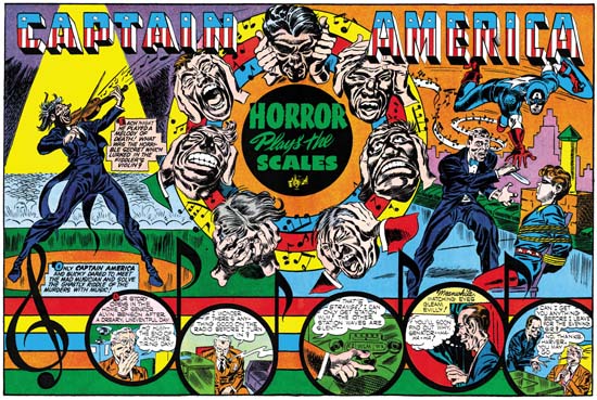
Captain America #7 (October 1941) “Horror Plays the Scales”
Larger Image

Simon and Kirby have completely mastered the double page splash with Cap #7. The important center is now occupied by the title “Horror Plays the Scales” and a ring of floating heads. Perhaps you remember me saying that floating heads and oversize figures were devices that Jack Kirby did not use often on covers but were devices that Joe Simon used for covers throughout his career. The Captain America covers did not use either floating heads or oversized figures but both devices appear in the splashes. On this splash the floating heads are obviously under torture with most trying to cover their ears. Behind them is are multicolor rings with musical notes floating about.

If the title and floating heads do not make it obvious about the nefarious use of music, the scene of the splash does. It is divided by the central design into left and right sections. On the left is a violin maestro in the thralls of playing his instrument. The musical notes that he is generating are shown flying up toward the right. The eye follows these notes into the top of the rings of the central design. The eye then follows the stream of musical notes that enters the right section of the scene. The musical notes stream then wraps around the head of a man. Now is revealed what effect the maestros music is having. The man, obviously in a trance, advances with a knife toward Bucky who is tied up on a chair. But Captain America descends from above to save the day. I have no idea where Cap leaped from. While the left section shows a music hall, the right section takes place on a city roof top.

Along the bottom of the splash is the start of the actual story. Unlike what was done in Cap #6, the story section in Cap #7 is well integrated with the rest of the splash. The background to the story panels has strips like the scales of music notation. These scales are given various colors that give them a visual connection to the color rings behind the floating heads. On the left is a musical symbol, I am afraid I am ignorant about music so I do not know what it is called. Following this symbol are a row of musical notes. The round part of the notes are actually the panels of the story.

For me this is perhaps the most interesting design of the Captain America double splashes. That is not to say that the rest are not successful, only that Simon and Kirby would experiment with other different designs.

The Wide Angle Scream, Captain America #6

Captain America #6
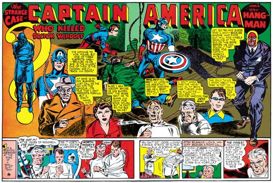
Captain America #6 (September 1941) “Who Killed Doctor Vardoff”
Larger Image

I do not think Simon and Kirby invented the double page splash. I seem to remember an earlier example in a Kazar story in Marvel Mystery Comics and I make no claim that was the earliest either. Using the centerfold for such a purpose would seem natural for anyone aware of how a comic was made. Because of the vagaries that occur in the folding and stapling of a comic only in the centerfold could a publisher be sure to get a good double spread without registration problems. No I doubt that S&K were the first to do a double splash, but I do not think anyone else at that time did as many or as well.

S&K already had produced a number of comics before their first double splash. In those previous comics are really terrific examples of single page splashes. So it should be no surprise that their first attempt at a wide splash (Captain America #6) would be so successfully done. In it Joe and Jack integrate a scene as well as a caste of characters. The scene occupies only a relatively small portion of the splash, but it is in the center and so commands attention. We find Captain America and Bucky over the victim of a hanging. Although the victim is now on the ground, the noose is still around his neck and the rest of the rope goes up to the top of the splash and then the end drops back down. But the heads of the characters, even the deceased, are turned to our right where the masked hangman stands holding another noose in both hands. Oddly the shadow that he castes also holds a noose but in just one hand.

The noose’s rope that the hangman holds trails along the lower part of the splash visually connecting the various characters arrayed in a broad ‘U’ shape. Besides Bucky and Cap we find a scientist (the victim), a lab assistant, a mob moll (with her cigarette in her mouth as she speaks, a sure sign that she is not respectable), and a mysterious man (whose monocle and cigarette holder indicate that he is a nefarious foreigner). As the eye follows the rope to our left side in ascends until it is covered by a large question mark. But where the rope disappears is well placed because the eye follows the upper part of the question mark until the rope reappears and the victim is portrayed hanging.

Below the splash are a row of story panels. The splash was used to catch the browser’s eye, while the story panels would get him interested in the story. That way when the newsstand owner called “you buying or what? this ain’t no library” hopefully the reader would have become involved enough to purchase the comic. S&K extend the splash panel’s edges to enclose the story panels also. This attempt to integrate the splash and the story panels is the greatest weakness of this double page. In the future Simon and Kirby would use other means to overcome this defect.

The first double page splash already has some features that we will see in others. Often these wide splashes do not just provide a scene but something more complex. It is not just that this sort of thing takes advantage of the greater width, it actually could not be done effectively on a single page. What is presented in the splash is a well integrated “story”. However like some the Harvey covers that I have written about previously, there are logical inconsistencies in what is presented. The Hangman and his shadow holding the noose differently. The victim shown three times, once on the ground surrounded by Captain America and Bucky, also still hanging on the left side and finally as one of the characters describing himself. But like those Harvey covers I really do not consider these true defects. The splash is not meant to be a snap shot, instead variously timed events are represented together. Everything is well placed to provide a sort of condensed story, without the ending of course!

One Goofy Cover

Captain America #197
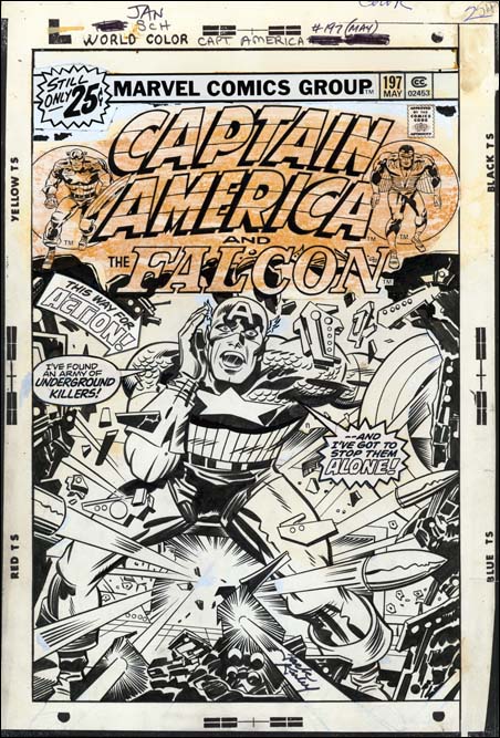
Captain America #197 (May 1976) by Jack Kirby (original art)

Jack Kirby did some goofy things from time to time. I always got a chuckle out of the cover for Captain America #197. Cap faces the viewer in a hail of bullets and exclaims “I’ve found an army of underground killers! .. and I’ve got to stop them alone!”. Well of course if he is alone, who is he yelling to? This was done in 1976 and Jack was artist, writer and editor. So you would expect that this was Jack’s doing.

Recently The Jack Kirby Museum has made available to members xeroxes of the pencils for some Captain America art done by Jack. If you are not a member maybe you should consider joining. I say this not really because of the chance to see some great Kirby pencils. Nor because the Kirby Museum hosts my blog. Those are good reasons I guess but I feel you should support the museum as they are one of the few organizations out there actively promoting the study of Jack Kirby. With member support they have done great things but with continuing support I am sure that is only the beginning.

Anyway because it is a member’s only viewing I cannot link to the pencil version of Cap #197 that they have. But I hope it is alright if I were to quote what Cap says on the pencils which is “This way for action!! I’ve found an underground army of desperate killers”. Not as punchy as the final version but not at all goofy.

All the blurbs on the cover are paste ups on the original art. The pencils had been completely inked, even in places that later were covered by the blurbs. Jack’s penciled word balloon was not inked and the space it had occupied was inked with the same wreck that is found along all the edges. I guess it is possible that Jack changed his mind in the last minute about what should be in the blurbs. But I really suspect that someone at Marvel decided to make changes even though Kirby was supposed to be editor. “This way for action” was removed from Cap’s speech and placed in an arrow and Cap’s exclamation was rewritten somewhat. Just one more example of the lack of respect by some at Marvel at that time for Jack’s efforts.

Even though I now feel that Cap’s speech was not Kirby’s fault, I have to admit I like it. It is good for comic art to be goofy at times.

The Art of Joe Simon, Appendix 1, Champ #22 Confirmed

Champ #22
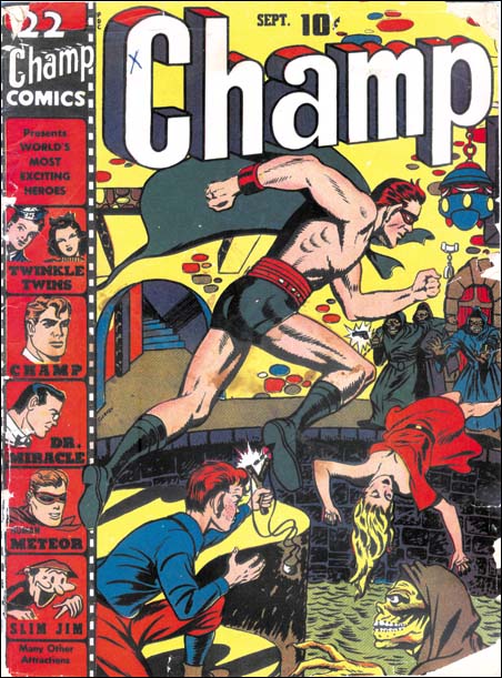
Champ #22 (September 1942) by Joe Simon (signed Glaven)

When I last wrote about the cover to Champ #22 (Art by Joe Simon, Chapter 7, Glaven) all I had was a very low resolution scan from GCD. At that time I attributed it to Joe Simon because I suspected that the signature would be the same as on Speed #22 which was signed Glaven. Nelson Glaven was the alternate name for Ned Gibman, one of Joe Simon’s high school friends.

Well Terry O’Neill of Terry’s Comics was kind enough to send a scan of the cover. The resolution is too low for me to do my standard restoration so please excuse my use of an only slightly corrected cover. But the resolution is not too low to clearly show that the signature is in fact Glaven. So an attribution to Joe Simon is pretty certain.

Art by Joe Simon, Chapter 7, Glaven

Art by Joe Simon, Chapter 8, Off to War

The Art of Joe Simon, Chapter 12, Covering the Fly

When I “completed” my recent serial post “The Art of Joe Simon” Stan Taylor pointed out that I had left out Joe’s work on the Archie series “The Adventures of the Fly”. What a slipup! I have renumbered the chapters so that this one gets in the proper sequence. The stories are obviously the work of a number of different artists. Sorting out who did what would be a Herculean task which I am not prepare to venture into at this time. But I get the impression that Joe did little, if any, of the actual interior art. However Joe was involved in all the covers. In fact the Fly covers supply a full range of Simon’s working methods.

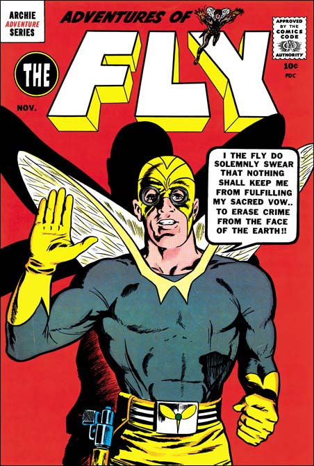
I included an image for the cover for Fly #1 (August 1959) in Chapter 10 of “The End of Simon & Kirby”. This cover was made from stats of the double page splash by Jack Kirby, the various parts rearranged to fit the cover properly. I say the cover was made from the splash and not the other way around because the original art for the splash still exists and it includes no stats. It is not certain, but Joe was probably responsible for the physical construction of the cover. Of course that does not take away credit and Jack Kirby should be regarded as the primary penciler for this cover.

Adventures of the Fly #2
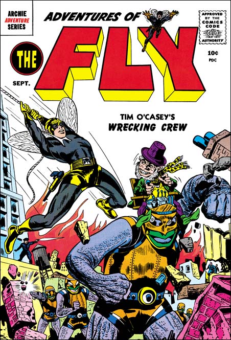
Adventures of the Fly #2 (September 1959) part by Joe Simon

The cover for Fly #2 (September 1959) is generally attributed to Jack Kirby. But I believe Simon put it together using different sources. Joe did the figure of the Fly swiping the pose from Captain America #7. I do not believe that Joe drew the diminutive robot operator it looks like he was done by the same artist that did the interior story and is not a swipe. The robots on the cover however are done in a very different manner then the story. It could have been done by a different artist but it seems unlikely. The operator and the robot fit together so well it is hard to believe that different artist could have done them.

Adventures of the Fly #3
Adventures of the Fly #3 (November 1959) by Joe Simon

With the third Fly cover Joe appears to turn to a more standard penciling approach. It is not possible to prove swiping was not used. Nevertheless the pose seems to be original and not a copy. Joe told me once that he used himself as a model drawing in front of a mirror.

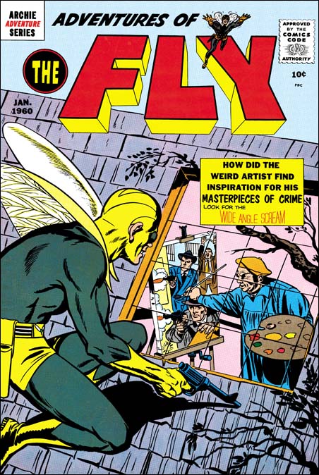
Adventures of the Fly #4
Adventures of the Fly #4 (January 1960) by Joe Simon

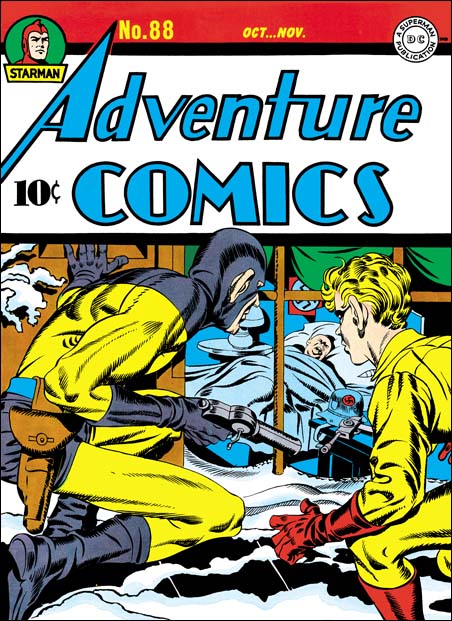
For the cover of the last Fly comic that he produced, Joe turned to what was for him a more standard technique. That is doing the entire cover and turning to swipes for portions of it. The source for figure of the Fly was the Sandman from the cover of Adventure #88 (see below). As by his normal practice, Joe did not do a close copy, but altered it to suit his purpose. The pose is adjusted slightly, largely because Sandman was squatting on a flat ground while the Fly is on a slanted roof. But the position of the right arm was also modified. Joe also corrected Sandman’s ears which Jack had made oversized as he so commonly did at that time. In the end even though the source was Adventure #88 the finished product was all Joe’s. I cannot say if there are any other swipes on this cover, but I would not rule it out. At this stage in his career, Joe is very adept at what he does and this is a nicely designed cover. Yes swiping was used but it is so well done that we know about it only by comparing it to the source material (Adventure #88). Otherwise there is nothing about the cover that gives it away.

Adventure #88
Adventure #88 (October 1943) by Jack Kirby

Art by Joe Simon, Chapter 11, The Party Is Over

Art by Joe Simon, Chapter 13, Wrap Up

Art by Joe Simon, Chapter 13, Wrap Up

When I started this serial post on Joe Simon’s art, I outlined for myself what topics I was going to cover. Initially my plan was to end about the time of the Simon and Kirby breakup. I wanted to avoid the final part of Joe’s career as a comic artist because frankly I do not have a very good handle on all of it. But in the end I have decided to discuss what little I know and admit my ignorance. Joe writes about this part of his career in his book “The Comic Book Makers”. But if you are not careful, it is easy to come away from a reading of what he says with the idea that this was an unimportant part of his career. The fact is the covers Joe drew after the breakup of Simon and Kirby outnumbers what he did earlier.

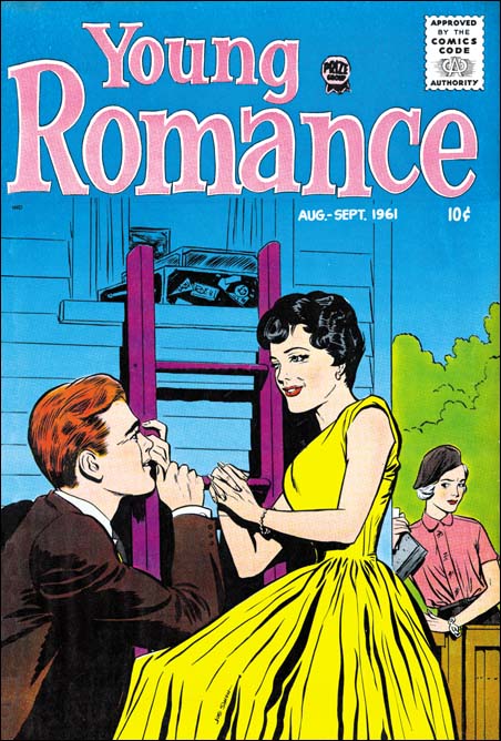
Young Romance v14 n5
Young Romance v14 n5 (August 1961) by Joe Simon (signed)

With the exception of one publication (Sick), most of what Joe did after S&K was unsigned and for low budget titles. Outside of Sick, the above Young Romance cover is the only signed late work by Joe Simon that I am aware of. Joe was the editor for some of the Prize comics (Young Love, Young Romance and Black Magic) towards the end of those titles. In Chapter 9 of “The End of Simon and Kirby” I had included an image of another of Joe’s Prize work Young Love #77 (August 1960). As I said in the beginning of this post I do not have a very good handle of Joe’s style, that is particularly true with these romances. I believe there are other Young Love and Young Romance covers by Joe. Although I have not located a convincing example yet, I strongly suspect that Joe also did some covers for the relaunched Black Magic series.

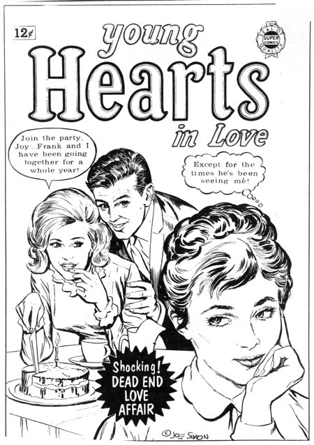
Young Hearts #17
Young Hearts In Love #17 (from proof) by Joe Simon

Joe Simon also did cover work for Super Comics. That publisher would buy art from failed comic books and reprint the material with new covers. In his book Joe describes selling them some of the S&K Mainline comics. Super Comics had a lot of different titles but were probably not big sellers and I do not have access to very many of them. The above image of Young Hearts #17 is from a proof in Joe’s collection. Notice the similarity of the title lettering to that originally used for Young Love and Young Romance. Joe also did the cover for Young Hearts #18.

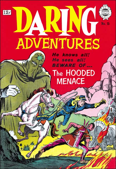
Daring Adventures #15
Daring Adventure #15 (1964) by Joe Simon

But Joe not only did romance covers for Super Comics, he also did some superheroes. I believe he did the covers for Daring Adventures #10 to #17 (1963 and 1964). For these Joe used the rather simple style we saw before in Alarming Tales #4. But notice on DA #15 the Kirby-ish leaping figure. Also note the use of the oversized figure, in this case of the villain, that we have seen Simon use all the way back on his work on Blue Beetle for Fox Comics. Joe also did the cover for The Spirit #12 (1964) where unexpectedly the Spirit is attacking a foe with the villain’s own robot.

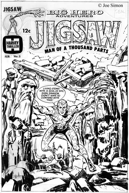
Jigsaw #3
Jigsaw #3 (unpublished, from original art) by Joe Simon

From 1965 until 1967 Joe did some editorial work for Harvey Comics on some, mostly superhero, titles. I do not believe he did any of the stories, but Joe did supply some of the covers. Perhaps because they were done for his long time friend’s company, I feel Joe put more effort into them then he did on the Super Comics covers. Although Simon still mostly worked in the simpler drawing and inking style, in the cover for Jigsaw #3 he returned to a bold inking not much removed from the old S&K shop style. Joe commented to me that he thought he had copied the Jigsaw figure from the splash page of the story. But I am unable to confirm that since Jigsaw #3 was never published.

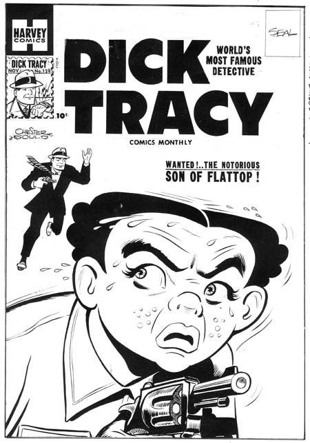
Dick Tracy #129
Dick Tracy #129 (from proof) by Joe Simon

But the late 60’s covers were not the only ones Joe did for Harvey. Earlier he also did some Dick Tracy covers. Determining which ones is a bit of a problem. Joe was essentially ghosting on these covers, adopting the rather simple and stylized drawing of the original newspaper strips. To make it even more difficult Al Avison was also doing some of these covers at about the same time. The above proof is from Joe’s collection so we can be pretty certain it was done by him.

Harvey Hits
Harvey Hits Magazine (from proof) by Joe Simon

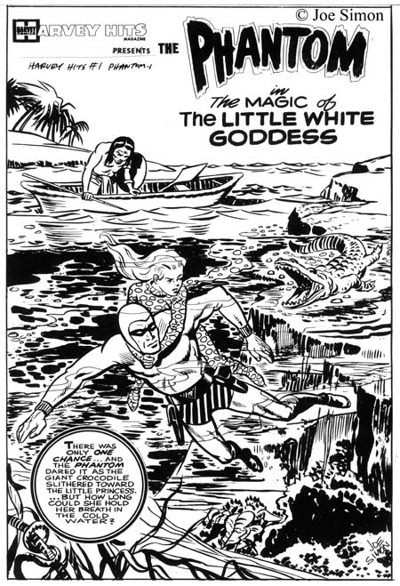
Simon also did some Phantom covers for Harvey. Here he did not have to copy another’s style. To me they seem like standard Simon art for after the S&K breakup and do not at all suggest work by Jack Kirby. But apparently there must be something in them to suggest Jack, because dealers often credit Kirby for these covers.

Sick #69
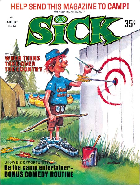
Sick #69 (August 1969) by Joe Simon

However it is the covers to Sick Magazine that comprises most of the art work Joe did after Simon and Kirby. Joe was editor for this Mad imitation for a number of years (1960 to 1968) during which he did many of the covers but even afterwards he continued to supply cover art. In this work Joe let loose his visual humor and he obviously put much effort into these covers.

Well that wraps up my serial post on the Art of Joe Simon. I have added a checklist but like all my checklists it is a work in progress. Joe was a talented artist, better them most people give him credit for. Unfortunately that talent, particularly his talent for adopting different styles, has led many experts and scholars to attribute some of his works to other artists. Over and over again I get the uncomfortable feeling that critics have used quality of the work as a means of distinguishing between artists; if a page is good Kirby must have done it, otherwise it was done by Simon. I feel this is a flawed technique and the proper way to determine artistic credit is to examine a piece of work for the traits of the individual artists. It is also to keep in mind that when one artists tries to mimic another that some traits are easy to copy and should not be relied upon. Other features are more unique to one artists and are harder for another artist to duplicate; these are the ones useful for attributions. I did not do this serial post with the idea of convincing everyone of the correctness of the work I credit to Simon. But it would be great if I could help move the problem of attributions toward a discussion of the evidence from the art itself and away from the simple credit declarations that the experts are so fond of.

Art by Joe Simon, Chapter 12, Covering the Fly

Art by Joe Simon, Appendix 2, Daring Adventures #12

Art by Joe Simon, Chapter 11, The Party Is Over

After “48 Famous Americans” S&K entered a period of abundant work mainly producing crime, horror and romance genre comics. As far as I can tell, Joe did not pencil anything during this period. I say that rather hesitantly. While working on my serial post “The End of Simon and Kirby” I reexamined a lot of S&K material. Suddenly I realize one story that I always thought as drawn by Kirby and was listed in the Jack Kirby Checklist had actually been done by Joe Simon. It seemed pretty obvious and I was quite surprised that I did not notice it before. I will discuss this story below but the point is if I had missed that work by Simon I might have missed others.

Adventure #75
Adventure #75 (June 1942) “Beware of Mr. Meek” by Jack Kirby

Fighting American #6
Fighting American #6 February 1955) “Deadly Doolittle” by Joe Simon

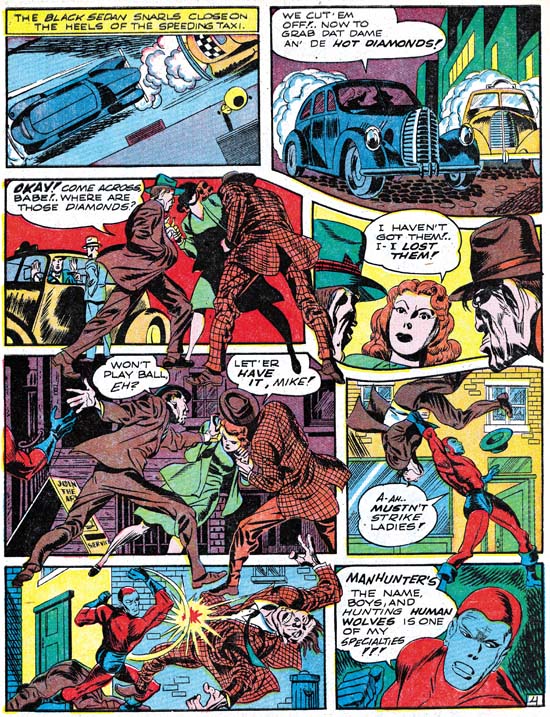
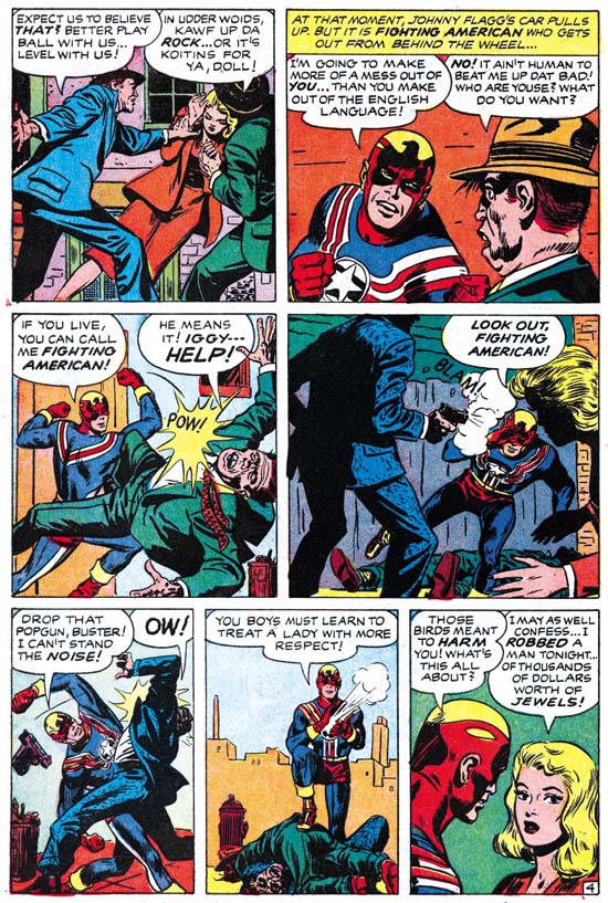
When we approach the end of the Simon and Kirby collaboration, work penciled by Joe reappears. However in some cases saying Joe is the artist depends on you think what makes someone the creator of a piece. In his book “The Comic Book Makers” Joe describes an incident where S&K got caught by Prize for reusing old romance art with new scripting. So far I have not found the stories that Joe is talking about. But in Fighting American #6 (February 1955) there is a story “Deadly Doolittle” that clearly was redone from “Beware of Mr. Meek” a Manhunter story from Adventure #75 (June 1942). But the FA story was not made by reworking stats from the older comic to change the uniforms, rather the entire story was redrawn. Much of this was done to remove some older layout techniques that Simon and Kirby no longer used. Early in their collaboration parts of figures would frequently extend well beyond the panel edges entering other panels. The FA story was redrawn so that things remained in their panels. But this was not done by just eliminating the parts outside of the original panels but by recomposing the panel instead. I find Simon’s touch in all of this work. It is particularly interesting to see Joe redo some of Jack’s classic socko punches. Joe tries valiantly but does not quite succeed in capturing Jack’s effect. I find a lot of Simon touch in this story and all the Kirby effects seem to be transmitted through Joe’s sensibilities.

Cockeyed #4
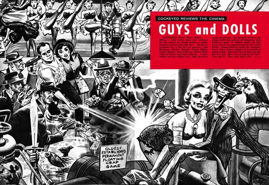
Cockeyed #4 (April 1956) “Guys and Dolls” by Joe Simon
Enlarged view

The last piece of worked signed jointly as Simon and Kirby is the unusual “Guys and Dolls” that appeared in the Mad-takeoff Cockeyed #4 (April 1956). This is included in the Jack Kirby Checklist, although I really cannot say why. The art looks much closer to cover work that Joe would do later for Sick then anything I have seen Jack do. Further the visual humor looks like Joe’s and does not seem to match Jack’s humor work. For me the most convincing evidence is that this works appears to have been done with an air brush. Joe Simon was a master with this tool having learned it while working for a newspaper at the beginning of his career. He would return to using it for not only the Sick covers but also for some of his advertisement work. I have seen nothing that indicates Jack had done any air brush art.

Alarming Tales #1
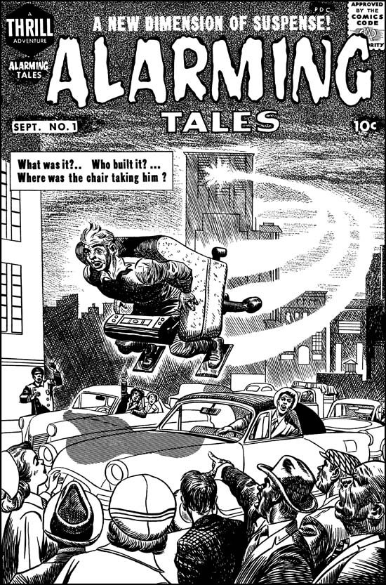
Alarming Tales #1 (September 1957) by Joe Simon

I doubt many would say that the figure in the flying chair and the background from the cover of Alarming Tales #1 (September 1957) were done by Jack Kirby. I clearly see Joe’s touch and believe he did this cover. But I can see why many see Kirby’s presence in the bottom part of the cover. I feel Joe did this portion also but he is swiping or mimicking Jack for parts of it. I presented a color image in a chapter of the “End of Simon and Kirby”. But the coloring makes it difficult to clearly see the figures, so above I provide a restoration of the line art. To me the lady on the left and the man looking out of his car seem to a have Kirby look to them. But the man pointing (third from right) and the man on the far right look more like the work of Simon.

Black Cat #60
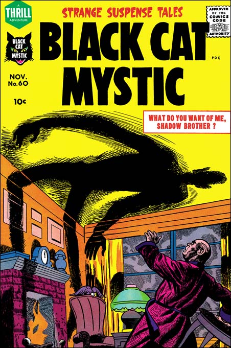
Black Cat Mystic #60 (November 1957) by Joe Simon

Not long after Alarming Tales #1, Joe did a cover for Black Cat Mystic #60 (November 1957). Notice the similarity of the man with the two from the AT #1 cover.

Black Cat #60
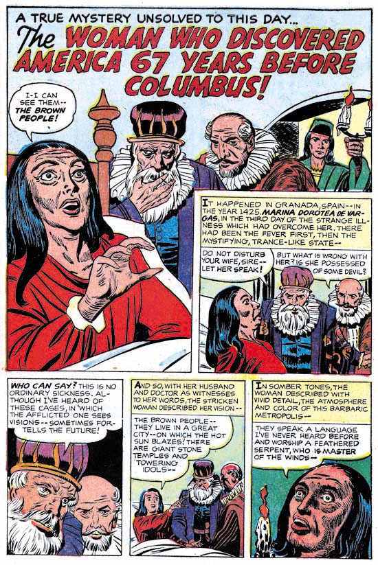
Black Cat Mystic #60 (November 1957) “The Woman Who Discovered America 67 Years Before Columbus” by Joe Simon

Black Cat Mystic #60 has the story drawn by Joe Simon that I mentioned at the beginning of this post. This short (2 pages) story is listed in the Jack Kirby Checklist, but as I said I now disagree with that attribution. We have in this work Joe mimicking Jack quite successfully. The men have a Kirby-ish look but a careful examination of the eyebrows reveal the more simple form that Simon preferred. The woman also comes from a Kirby source, such as some of the unused covers for Black Magic #1. But the woman’s eyes give away the fact that this was Joe’s pencil work. The hand of the woman in the splash panel is not drawn the way that Kirby would have done it. I am sure some will say that some panels of the second page of the Mayans were done by Jack. But I suspect even this includes subjects that were drawn from art history sources that both Joe and Jack used.

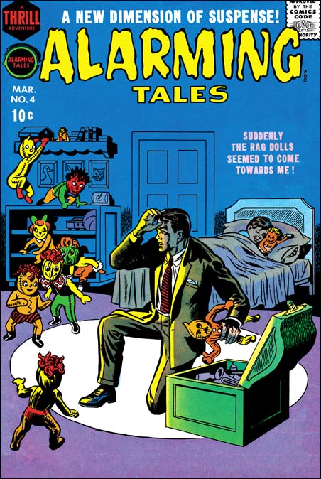
Alarming Tales #4
Alarming Tales #4 (March 1958) by Joe Simon

Covers begin to appear at this time where Joe seems to abandon any attempt of mimicking Kirby. I provide an image of Alarming Tales #4 (March 1958) as an example. Here we find a simpler style of drawing and inking that Joe will often use from here on. Once again Joe has adopts a new style.

Art by Joe Simon, Chapter 10, A History Lesson

Art by Joe Simon, Chapter 12, Covering the Fly

Art by Joe Simon, Chapter 10, A History Lesson

I would now like to discuss another piece of work where I find so much that indicates that it was drawn by Joe Simon that I just do not understand why so many still credit it to Jack Kirby. Some explain the lack of Kirby touches as due to his discomfort with portraiture. I wonder why they do not have second thoughts about this explanation? In the recent Jack Kirby Collector #46 there are some portrait examples that Jack did later along with the photographs from which they were based. Typical Kirby touches, such as in his eyebrows are easily seen. Further “48 Famous Americans” includes story panels where Jack should have been very much at ease. Given this evidence it is difficult to accept the alleged Kirby portrait discomfort as a valid explanation.

During my visits to Joe I am really interested in hearing what Joe has to say and I am not concerned about convincing him of my opinions. I therefore never expressed to Joe my belief that he was responsible for this comic. However at one point Joe stated an interest in what Jack Kirby stuff had been reprinted recently. During one visit I brought some newer Kirby reprint books. Joe did not have much to say about any of it until he came across one with some pages from “48 Famous Americans”. At that point he exclaimed with exasperation “But I did all of that, Jack had nothing to do with it”. Despite his reputation, I have not found Joe as someone who always claims credit. I have provided Joe with a lot of restored Simon and Kirby material but only occasionally does Joe say he penciled a particular piece. I offer Joe’s statement as evidence, not proof. But I feel the art itself provides all that is needed to credit Joe Simon with this work.
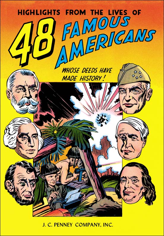
48 Famous Americans
48 Famous Americans (1947) by Joe Simon

Look closely at the reporter in the foxhole. To me he looks like he was done by Simon, particularly the eyes. The use of floating heads is something we have seen from Joe before. In fact I am really at a loss to point to any Kirby like features on the cover.
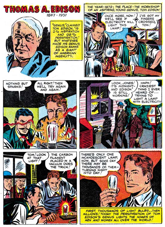
48 Famous Americans, Thomas A. Edison
48 Famous Americans (1947) “Thomas A. Edison” by Joe Simon

One of the benefits to doing serial posts like this one is that it gives me a chance review work that I may not have looked at for some time. I have always felt that Joe was the penciler for 48 Famous Americans. But when I reexamined the comic again for this post I was surprised about how many more indications of Simon’s touch I could find. For instance I remarked in Chapter 5 that while working together with Jack Kirby on Captain America, Joe’s discontinued his use of combining the eyebrow and the eye into a single angular formation. Well this comic shows that statement to have not been completely correct. Here Joe frequently returns to the use of angular eyes as can be seen in panels 2, 3 and 5 of the Thomas A. Edison page. In my last chapter I remarked that Joe seemed to have a tendency to draw the hero with a long face only during the time that he worked on the Duke of Broadway, the Vagabond Prince and Kid Adonis (1946). Well in the 48 Famous Americans the long square face shows up occasionally as for example in the last Edison panel.
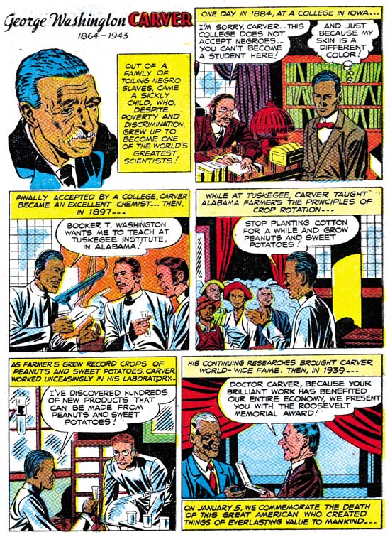
48 Famous Americans, George Washington Carver
48 Famous Americans (1947) “George Washington Carver” by Joe Simon

George Washington Carver is another page with typical Simon features. The angular eyes show up in panels 2 and 4, the long face with a square jaw in panel 3. Although I did not have a chance to post an image of it, the skewed eyes found in the first page of the Fiery Mask story of Daring Mystery #6 (September 1940) also occurs in the first, Carver portrait panel.
48 Famous Americans, Jack Dempsey
48 Famous Americans (1947) “Jack Dempsey” by Joe Simon

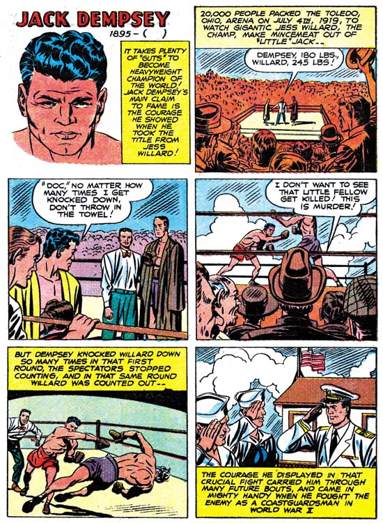
We can only guess who made the choices as to which 48 Americans to include in this giveaway comic. I am sure the company that paid for this comic had something to say about including James Cash Penney. Sport figures do not play a big part in those selected. If famous sport people were going to be used, I can understand the selection of Lou (Henry Louis) Gehrig. But was Jack Dempsey really that obvious of a choice? Was it a coincidence that Joe Simon served in the Coast Guard during the war and, as shown in panel 6, Jack Dempsey did also?

I think Joe did a good job presenting the various short histories. I paricularly like Joe’s knockout punch in panel 5. But although I enjoy Joe’s story telling I often feel that Jack Kirby would have done it differently. Jack had a special affection for socko punches and did them in way that no other artist seemed able to duplicate. I like Joe’s falling Willard but I am also sure Jack would have done it very differently.
48 Famous Americans, Paul Revere
48 Famous Americans (1947) “Paul Revere” by Joe Simon

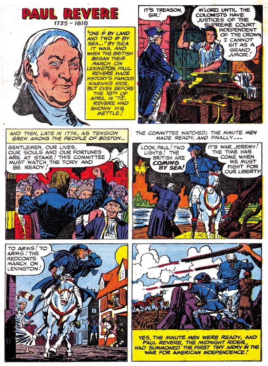
The Paul Revere page is another one that should have presented opportunities for Kirby, had he been the penciler, to provide his unique touch. But for the most part I do not find Kirby’s fingerprints here. The riding Revere of panel 5 is done really nicely, but not at all like the covers for Bullseye #2 or #4 or Boys’ Ranch #6. The only thing that reminds me of Kirby on this page, or for that matter one of the few in the entire comic, is the figure of the man with the lantern in panel 5. Frankly that is not too distinctive and I find a lot more Simon touches such as in panel 3.
48 Famous Americans, Nathan Hale
48 Famous Americans (1947) “Nathan Hale” by Joe Simon

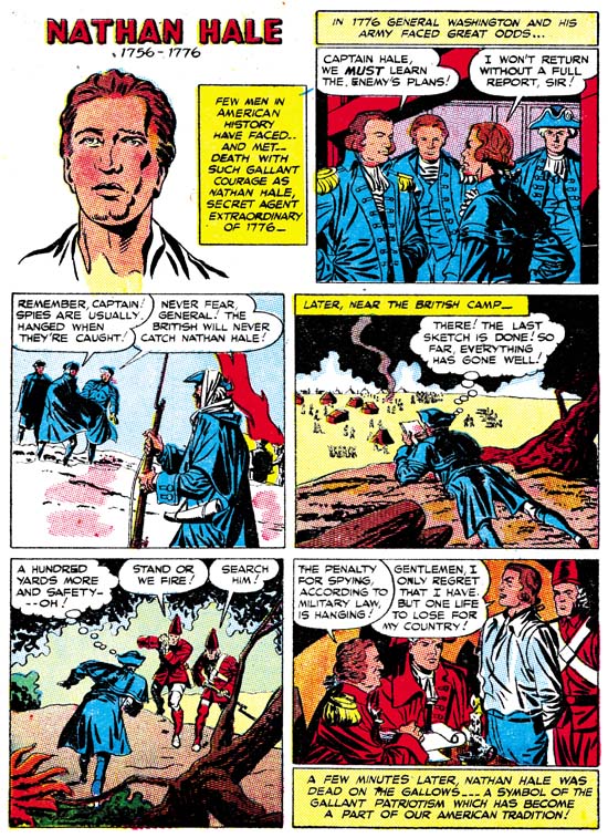
I thought I would provide yet another page, Nathan Hale, which I would have thought would have provided Jack Kirby the chance to add his own personal vision, that is had he actually been the artist. But again although I find drawing that looks like it was done by Joe Simon, I do not find examples that indicate Jack’s involvement.
48 Famous Americans, Stephen Foster
48 Famous Americans (1947) “Stephen Foster” by Joe Simon

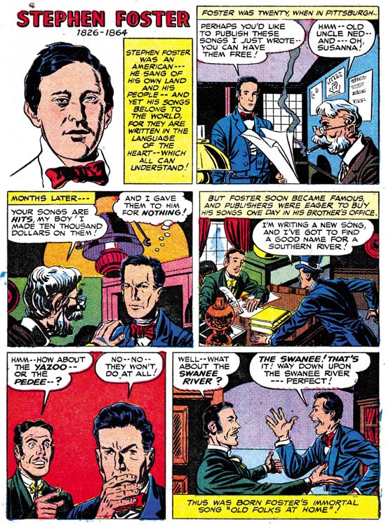
The socko punches are not the only Kirby trademark. Jack was also fond of expressive eyebrows. As I mentioned at the start of this post examples of Jack’s portraits provided by The Jack Kirby Collector show these Kirby eyebrows. But in 48 Famous Americans I do not find these special eyebrows. The only example I found was that of the man on the right in panel 5 of the Foster page. But I got to say this is hardly a convincing example of Kirby eyebrow. Another Kirby trait is his exaggerated perspective. One of his famous use of this occurs in depicting a hand pointing. It is one of those drawing techniques that other artists do not seem able to duplicate. The pointing hand for of the man in panel 5 is simply not drawn the way Jack would have done it.

When I choose images for this blog I try to select scans that provide good examples of whatever point I am trying to make. So yes I did go through 48 Famous Americans looking for pages that looked the most like they were done by Joe Simon. But I also included pages that should have provided subjects that I would have expected Jack to shine in. But in all these Kirby favorable scenes what I find reminds me more of Joe Simon. I also looked for pages that I thought look the most like possible Kirby efforts. I did find some, besides the ones I mentioned above look at the old man in panels 2 and 3 of the Foster page. I am not saying these examples were drawn by Kirby, only that they look like they could have. Frankly considering Joe’s often use of swiping I would have expected even more Kirby-ish drawing then I actually found. To repeat what I said at the start of this chapter, I find the 48 Famous Americans to looks so consistently like the effort of Joe Simon that I really do not understand why so many people attribute it to Jack Kirby.

Art by Joe Simon, Chapter 9, American Royalty

Art by Joe Simon, Chapter 11, The Party Is Over
Art by Joe Simon, Chapter 9, American Royalty

After his military service Joe Simon rejoined Jack Kirby. But rather then just resume working for DC, the two wanted to find a better deal and produce entire comics. S&K made an agreement with Al Harvey to create two new titles, Stuntman and Boy Explorers. Jack did the penciling for the title features while back up features were penciled by artists like Bill Draut and Ken Riley. Joe Simon would also provide some additional features; the Duke of Broadway, Vagabond Prince, and Kid Adonis. Unfortunately this all happened during a post-war comic glut and both new titles would be cancelled. Boy Explorers #2 and Stuntman #3 would be sent to subscribers only and would be reduced in size as well as content. The origin story for Vagabond Prince initially meant for Boy Explorers #2 would not see print until the 80’s. Although these titles were cancelled there seems to have been some unused material left. Harvey would publish these stories about a year later in Black Cat and Green Hornet comics.

Joe Simon has always said that he drew all the stories for these three features himself. However some have attributed parts or all of some stories to Jack Kirby. For me this is another group of work that so thoroughly looks like Joe’s effort I am amazed that there is any question about it. Joe is drawing in a Kirby-like style, but I would not say he is really mimicking Jack. Simon has his own visual humor that turns up often in these stories. Features like the hero’s square jaw that we have seen before reappear here. But again I ask the reader to look for traits belonging to Joe or Jack and not to judge something as Jack’s solely because of how good a page is.
Stuntman #2
Stuntman #2 (June 1946) introduction page by Jack Kirby

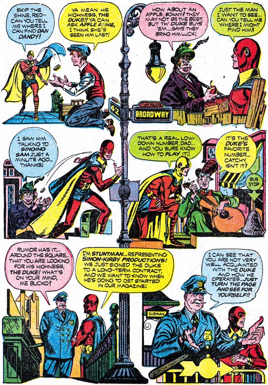
There is a rather interesting page by Jack showing Stuntman asking various characters from the Duke of Broadway feature where the Duke himself was. It is therefore useful in showing how Kirby would do the Duke’s cast. As would be expected they are similar to those from the actual story, but careful examination reveals differences.

Boy Explorers #1
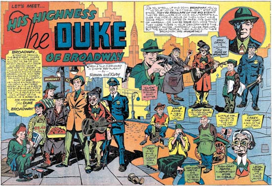
Boy Explorers #1 (May 1946) “The Duke of Broadway” by Joe Simon
Enlarged image

The art for double page splash seems more finished and in a different style then the rest of the story. It do not think this is because some other artist did the splash. Rather I believe Joe drew it first as a presentation piece and therefore spent more time polishing it up.

Black Cat #6
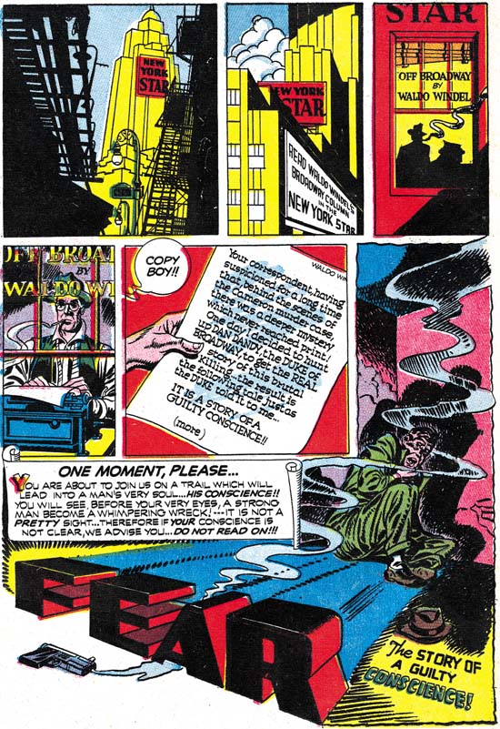
Black Cat #6 (June 1947) “Fear” by Joe Simon

I could be wrong but I feel that although early in his career Jack Kirby paid a lot of attention to what artists like Hal Foster and Alex Raymond were doing, later Jack seemed to stop looking at other comic artists. That is not to say Kirby gave up using swipes and otherwise finding sources of inspiration. Just that Jack would now turn to photos, paintings and similar fields outside sequential art. Joe Simon on the other hand did seem to keep an eye on what other comic book artists were doing. The above splash page from “Fear” (actually one of two splash pages for this same story) is an example of this. Here Joe gives response to the innovative splash pages that Will Eisner had been doing in his newspaper section comic book the Spirit. Again some have attributed this page to Kirby. But a close look at the figures indicates that this is Joe’s work.

Black Cat #7
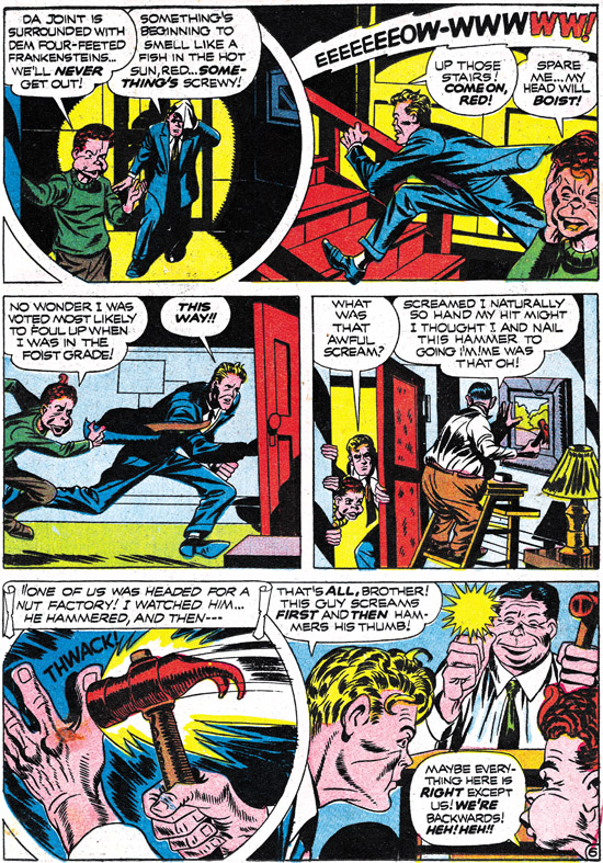
Black Cat #7 (August 1947) “Topsy Turvy Tavern” by Joe Simon

Some of the Simon touches we saw early in his career are no longer used at this point, such as the drawing the eye and eyebrow as one angular unit. But in Captain America #1 we saw Joe draw Bucky with a sort of muzzle. In “Topsy Turvy Tavern” the Duke is accompanied with a young boy who Joe draws with the same sort of projecting lower face. Also note the running figure with his sole turned toward the reader. This is a typical Kirby trait but as we saw in our last chapter Simon has adopted it as can be seen in his work on Adventures Is My Career.

Black Cat #5
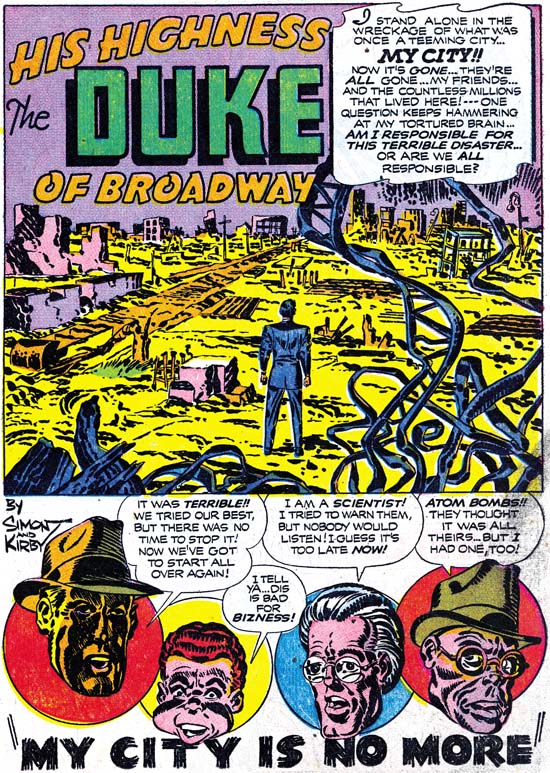
Black Cat #5 (April 1947) “My City Is No More” by Joe Simon

There are pages from “My City Is No More” that some have attributed to Kirby. Yes some of these pages are very effective and the story on a whole is a masterpiece. But when I look at the drawing of the faces and figures it pretty much looks like the work of Joe Simon. Although I cannot find examples for some of the non-figurative drawing (particular the explosions) from Simon’s prior work, I know of nothing similar from Kirby’s past either. I cannot help but be suspicious that some assign these pages to Kirby just because they look so good. But because the non-figurative drawing does not seem to provide evidence, I prefer to base my attributions on the figurative work, and that seems to have been done by Joe.

The splash page I provided above does have one of the few convincing examples of some Kirby effort in these particular features. I am sure that the floating head of the villain (extreme right) was done by Jack. Joe did the villain in the rest of the story differently, with a longer face. Was Jack stepping in to correct some problem? I have previously posted on Joe and Jack as editors and part of that post included an example of Jack touching up a panel from a Vagabond Prince story. Unfortunately it is not possible to reach a valid conclusion about this here when we are dealing with the printed results, only the original art might provide the answer. It is possible, but not at all clear, that Jack might have had a hand in the floating head of the scientist (second from the right). The other two floating heads were clearly done by Joe. In these stories Joe has a tendency to draw the hero not only with a square jaw but also a rather long face. The Duke in this story, including this floating head, is an extreme example of this. Simon drawing the hero with long faces seem to be restricted to this period and does not recur.

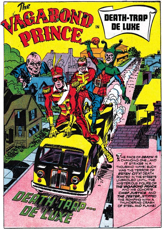
I have provided examples for this chapter from the Duke of Broadway stories. Stylistically the Vagabond Prince and the Kid Adonis stories are not at all different. So let me close this chapter with a page of another of America’s royalty. Note the use of oversized figures.

Black Cat #7
Black Cat #7 (August 1947) “Death Trap De Luxe” by Joe Simon

Art by Joe Simon, Chapter 8, Off to War

Art by Joe Simon, Chapter 10, A History Lesson

Art by Joe Simon, Chapter 8, Off to War

Star Spangled #21
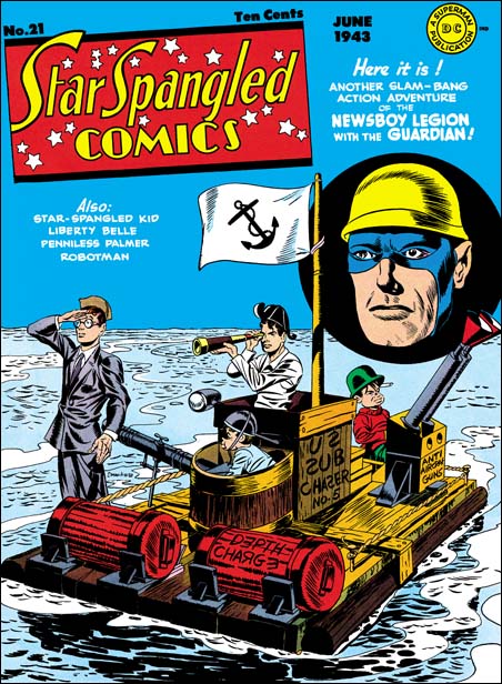
Star Spangled #21 (June 1943) by Jack Kirby and Joe Simon

Joe Simon and Jack Kirby seemed to have been very successful working for DC. But there was a war on and they knew that sooner or later they would be drafted. They responded by going into hyper drive, producing stories and covers that could be published while they were in the service. Art produced during this time varied widely in quality. It would also appear that a variety of inkers were used. Most of this work seemed to have been penciled by Jack Kirby. However I suspect that some of it was penciled by someone else, perhaps Simon. Maybe the best example is from the cover to Star Spangled #21 (June 1943). The main image of the Newsboy Legion has a number of touches that look very much like the work of Kirby. But the floating head of the Guardian seems to have been done by Simon, particularly with his square jaw. Unfortunately the best examples to compare it with come from after the war. As for the rest of the examples I consider of questionable attribution, with the rush job that S&K were doing and the different inkers used, perhaps it would be unwise to try to resolve these credits right now.

Boy Commandos #12
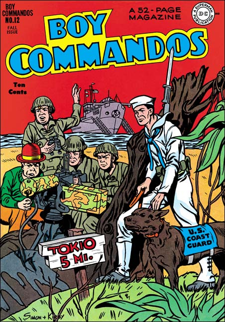
Boy Commandos #12 (Fall 1945) by Joe Simon

What is really needed is some reference material that can be attributed to Joe based on independent evidence. Unfortunately while Joe and Jack collaborated neither one signed their efforts except at times jointly as Simon and Kirby. The next best thing to a signature appears to be found in Boy Commandos #12 (Fall 1945). During the war there were lots of comic covers and stories that depict the Navy or the Army Air Force, but the Coast Guard got little attention. Yet for BC #12 both the cover and an inside story highlighted the Coast Guard. Joe Simon’s war time service was done in the U.S. Coast Guard. There can be little doubt that these were created when Joe was in service. Since Jack was in the Army in Europe at that time, Joe must have done the penciling. When I presented Joe with a number of Boy Commandos cover restorations, he singled out BC #12 as one he did while serving in Washington DC. Joe said he did not ink it, which is easy to believe given its odd inking, particularly in the tree stump. Even so you can get an idea about how close Joe’s Boy Commandos could be to Jack’s efforts. Still there are differences between the two, particularly in the eyebrows. Note that Joe signed this cover as done by Simon and Kirby. Joe said he knew Jack would understand. Later when returning to work from the service before Joe, Jack would return the favor.

Boy Commandos #12
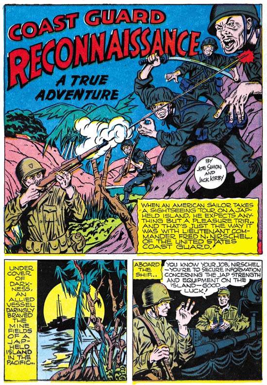
Boy Commandos #12 (Fall 1945) “Coast Guard Reconnaissance” by Joe Simon

The interior feature “Coast Guard Reconnaissance” provides interesting examples of Simon’s work. Since it is not a Boy Commandos story, Joe had no reason to try to mimic Kirby.

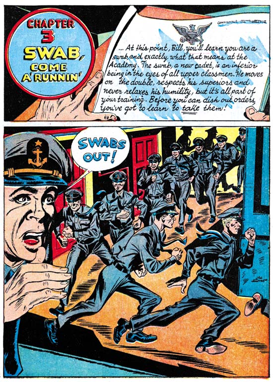
Adventure Is My Career
Adventure Is My Career (1945) page 15 by Joe Simon

But Boys Commando #12 is not the only comic work Simon did about the Coast Guard. Joe created an entire comic book for the U.S. Coast Guard called Adventure Is My Career. Here we are on even firmer ground because Joe gets a credit line and again Jack could not have been involved. No attempt is made here to copy Kirby, and no reason that such an effort should have been made. Even so some Kirby traits show up. On page 15 Joe draws a running figure with his sole turned toward the viewer. This is a device that Jack often used, we saw it before on the cover to Champion #9. Adventure Is My Career is a comic that is rarely seen. But it gives a good idea of what Joe could do when he was away from Jack. So let me close with another page.

Adventure Is My Career
Adventure Is My Career (1945) page 7 by Joe Simon

Art by Joe Simon, Appendix 1, Champ 22 Confirmed

Art by Joe Simon, Chapter 9, American Royalty