Tag Archives: Jack Kirby

Little Shop of Horrors, Chapter 11, The End

(May 1954 – November 1954, Black Magic #30 – #33)

This final chapter of the serial post Little Shop of Horrors occupies the same time period as Chapter 27 and Chapter 28 of the Art of Romance. Black Magic mirrors, on a smaller scale, what happened at the same time in the Simon and Kirby romance titles. Basically there was an influx of art by artists new to Simon and Kirby productions. This can be shown by the fact that there were 58 pages by indentified artists and 45 pages by new unidentified artists. However there is one significant difference, so far I have not detected any Black Magic stories that looked like they were originally meant for another publisher.

The four identified artists were Jack Kirby (33 pages), Mort Meskin (17 pages), Bill Draut (4 pages) and Al Eadeh (4 pages). While during most of the Simon and Kirby collaboration it was typical for Kirby to be the most featured artist, during this period it was surprising indeed. It was during this time that Joe and Jack setup their own publishing company, Mainline, and Jack’s contributions as a penciller plummeted. Jack drew relatively little for the romance, western, or crime genre all of which were produced by Simon and Kirby. However at the same time Kirby was a consistent presence in superhero and horror. Mark Evanier has remarked that horror was not one of Kirby’s favorites but at least during this period that does not seem to be at all true.
Black Magic #31
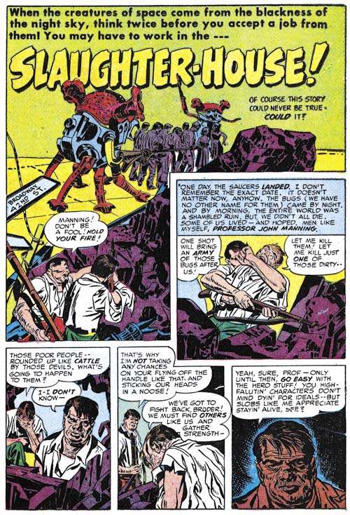
Black Magic #31 (July 1954) “Slaughter-House”, pencils by Jack Kirby

There were more science fiction stories toward the end of the Black Magic run. Kirby would often use such stories, as he did in some of the romance genre stories, as social commentary. “Slaughter-House” may seem to be a classic monster story but it is not. It is actually about the extremes people will take in order to try to survive in an impossible situation. This story was greatly influenced by stories that came out of the Nazi death camps. The Nazis might not have been bug-eyed monsters but their death camps forced desperate people to the extremes.

The splash panel is actually part of the story a technique that was commonly used in the period covered in the last chapter. Another typical feature that this splash shares with those from previous issues was its smaller size. Larger more standard splash would return in the last issues of Black Magic.
Black Magic #32
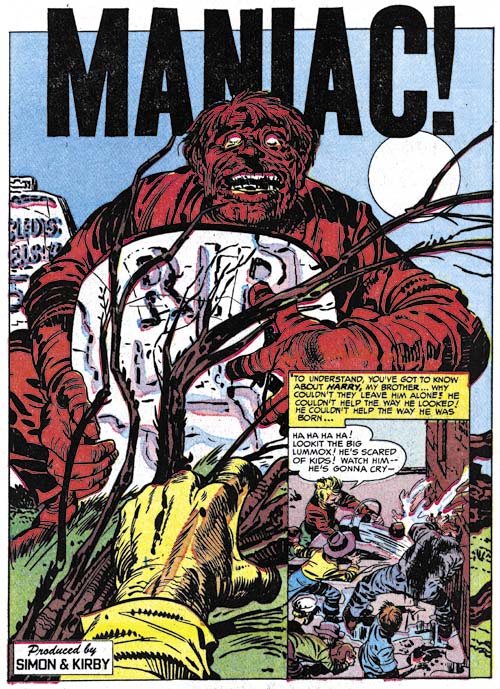
Black Magic #32 (September 1954) “Maniac”, pencils by Jack Kirby

A more standard splash is found in “Maniac” but note the odd design where the title extends beyond the splash border.
Black Magic #33
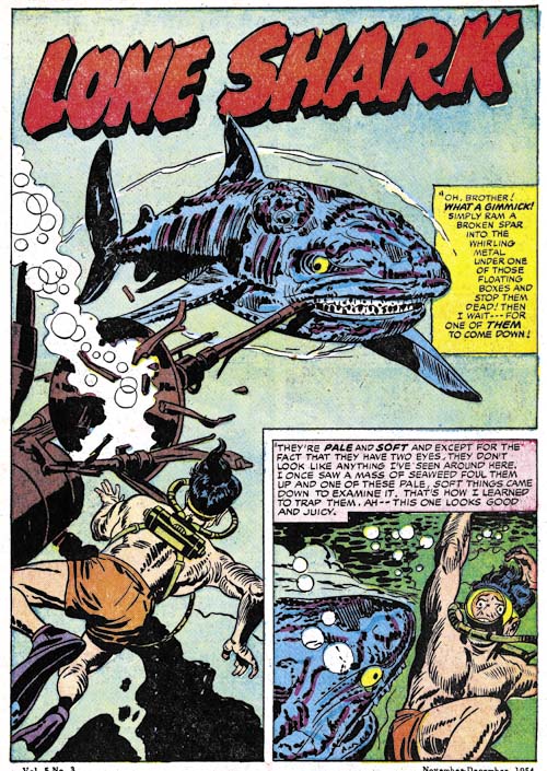
Black Magic #33 (November 1954) “Lone Shark”, pencils by Jack Kirby

While keeping a large splash, Kirby has returned to using it as part of the story. Jack did this so well that it is easy to assume this is a standard splash. However the first story panel makes no sense without the splash.
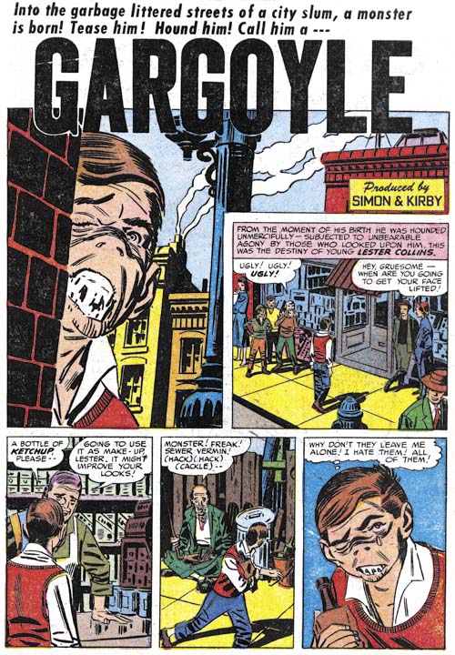
Black Magic #31
Black Magic #31 (July 1954) “Gargoyle”, art by Mort Meskin

Mort Meskin seemed to have a particular interest in the horror genre. While I am a great admirer of his work, I find his attempts to depict gruesome things not all that successful. This might seem to be a fatal defect for a horror artist but Mort is so good at graphically telling a story that it really is not much of a problem. I have to wonder what Meskin’s drawing of the protagonist’s mouth is meant to represent.
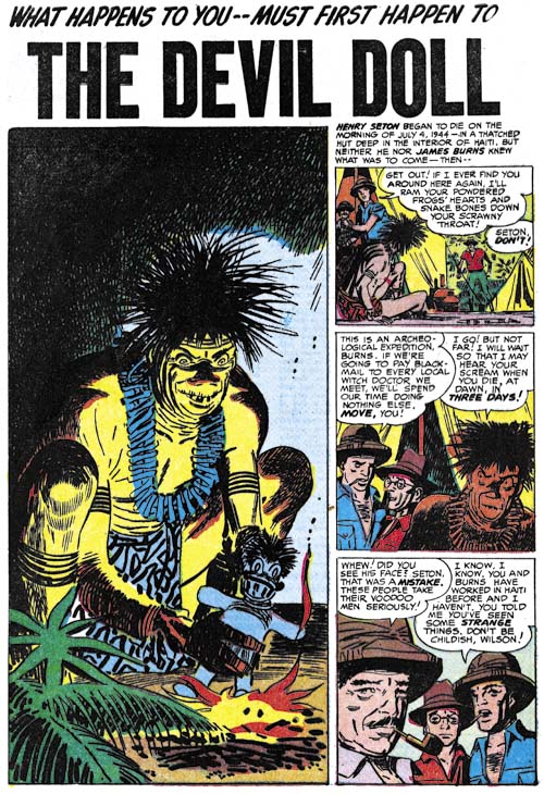
Black Magic #32
Black Magic #32 (September 1954) “The Devil Doll”, art by Mort Meskin

While I do not find the character in “Gargoyle” to be truly gruesome the witch doctor in “The Devil Doll” puts a chill down my spine. This has got to be one of his most successful efforts in drawing a truly disturbing character.
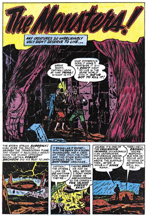
Black Magic #32
Black Magic #32 (September 1954) “The Monsters”, art by Bill Draut

Bill Draut has not appeared very often in Black Magic in the more recent issues. This must have been by design as Bill was playing an important roll in the romance comics at this same time. I admit that while I feel Draut does quite well in his horror stories his romance art is much more successful.
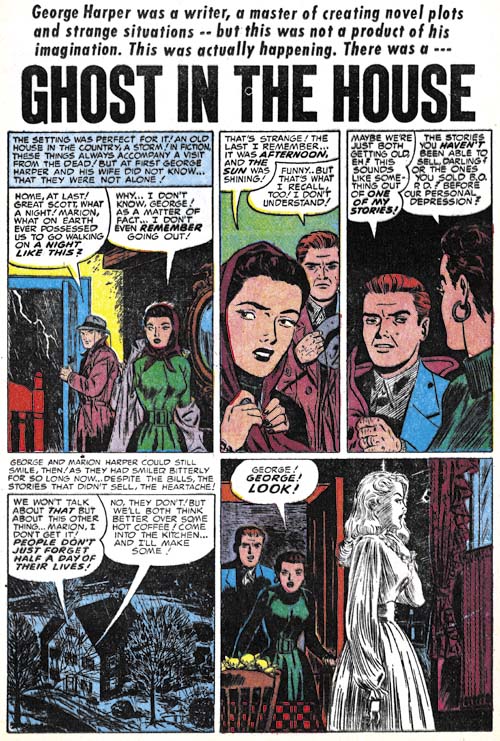
Black Magic #30
Black Magic #30 (May 1954) “Ghost in the House”, art by Al Eadeh

It is interesting how the art of Al Eadeh shows a slow but steady improvement over the years. His earliest work for Simon and Kirby is rather stiff but that characteristic disappears in his later work. “Ghost in the House” is probable his most successful piece for Simon and Kirby. Unfortunately it is also seems to be his last for that team.
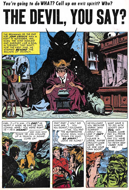
Black Magic #30
Black Magic #30 (May 1954) “The Devil, You Say?”, art by unidentified artist

What a terrific splash is found in “The Devil, You Say?”. I cannot identify the artist and frankly the rest of the story art is not nearly as good.
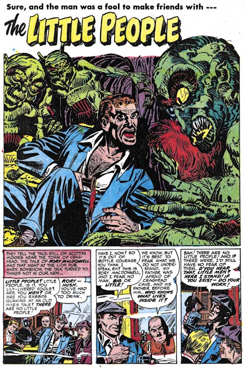
Black Magic #32
Black Magic #32 (September 1954) “The Little People”, art by unidentified artist

Another unidentified artist. As I mentioned above, there seems to have been an influx of new artists in Simon and Kirby productions. I cannot get very enthusiastic about most of them, but the artist who did “The Little People” was pretty good.

Issue #32 marked the end of the first run of Black Magic. Initially Black Magic had been popular enough to warrant a monthly release schedule. However for the last year it had been a bi-monthly schedule. Certainly the quality of the stories or the artists that drew them had not changed so why had it become unpopular enough to discontinue? While I cannot completely dismiss that it was just a victim of changing tastes the timing suggests that the problem most likely came from another source. This was the time there was a decline in comics across the board initiated largely by Dr. Wertham (The Real Reason for the Decline of Comics). While Dr. Wertham condemned pretty much all comics, he and other critics were particularly negative about the crime and horror genre. While in reality the contents of Black Magic were mild compared to those horror comics released by other publishers, at that time critics were not too discerning; the title alone made Black Magic a target. The rising public criticism influenced many newsstands to stop selling some of the more objectionable titles.

Black Magic would return in a few years and perhaps I will someday post about the second run. Except for a single story by Steve Ditko, none of the better artists involved with the first run of Black Magic returned for the second one. Joe Simon would be the editor of the reincarnated title but he has described it as being done on the cheap. As a business model this might have been a smart approach but it did result in a serious decline in quality.

Most fans of horror comics cite the EC titles as the best of the genre. That may be a true assessment if gruesome art is what is desired, but if the reader wants more tasteful art and more interesting stories than the Simon and Kirby Black Magic cannot be beat.

The Little Shop of Horrors, Chapter 1 (#1 – 3), Expanding Their Fields
The Little Shop of Horrors, Chapter 2 (#4 – 6), Up and Running
The Little Shop of Horrors, Chapter 3 (#7 – 8), The Same Old Gang
The Little Shop of Horrors, Chapter 4 (#9 – 11), Another Hit
The Little Shop of Horrors, Chapter 5 (#12 – 14), New Faces
The Little Shop of Horrors, Chapter 6 (#15 – 17), Mix Bag
The Little Shop of Horrors, Chapter 7 (#18 – 20), Kirby Returns
The Little Shop of Horrors, Chapter 8 (#21 – 23), The Gang’s All Here
The Little Shop of Horrors, Chapter 9 (#24 – 26), The Party’s Ovetr
The Little Shop of Horrors, Chapter 10 (#27 – 29), A Special Visitor

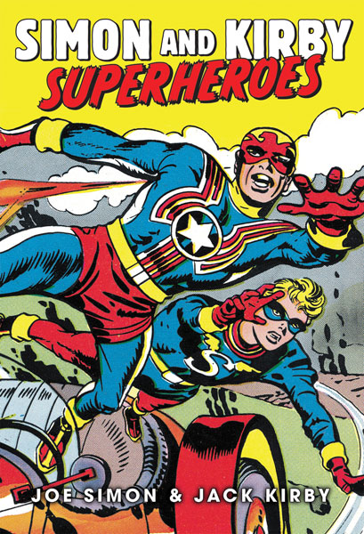
Simon and Kirby Superheroes

Simon and Kirby Superheroes

The reader might think that my big event for last weekend was the Eisner nomination for “The Best of Simon and Kirby”. As great and unexpected as that was it was far from the most significant event. No, my big event was completing the final pages for “Simon and Kirby Superheroes”.

Doing the art restoration for that book was an arduous and lengthy process. It began about a year ago at a time when Titan had not yet made a decision about the contents of the book. Normally I would not want to begin such a project without a clearly defined plan but I was assured that no matter what the book would include Fighting American. It turned out there was good reason for the indecision. Originally the superheroes were to be done in two volumes but Titan had found a way to publish it as a single book but at a cost that will be a lot less than the two separate volumes.

While the prospect of 480 pages of Simon and Kirby should warm the heart of any fan, I must admit it left mine filled with trepidation. How could I come up with a schedule for so much work with such a wide range of restoration challenges? Well I just did the best I could. It turned out that for about a half a year I was able to meet my schedule. Then unfortunately I encountered some restoration problems that seriously threw me out of the schedule. I eventually figured out techniques that allowed me to handle similar problems in a much faster manner but I was never able to recover the slipped time. So in the end my restoration went much beyond the original plan. I am happy to say that Titan believes it can recover from my lateness and still get “Simon and Kirby Superheroes” out with the same release date which is late summer or early fall (Amazon is still listing it as October 12). I am also told that Titan hopes to have advanced copies available for those lucky enough to attend this year’s San Diego show.

And what a book “Simon and Kirby Superheroes” will be! The size will be about 7 1/2 by 11 inches. This is the same size as Marvel’s old Visionary line of books which should be able to reproduce the art in its original dimensions. And while my restoration took longer than any of us would have liked this had no impact whatsoever on the quality of the results. In fact I am certain that the reader will find it superior to the work in “The Best of Simon and Kirby”. When I worked on BoSK the Captain America story was about the last thing I did. It was done using original flats (proofs of the line art) that Joe Simon had kept all these years. I was so please with the results that I resolved to make use of that technique whenever I could. It means extra work but the results are worth it.

As for the contents it will be all the superheroes that either Jack Kirby or Joe Simon drew that are not owned by either Marvel or DC. Specifically that means:

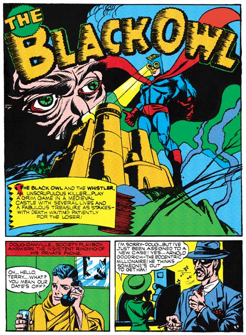
  • The Black Owl
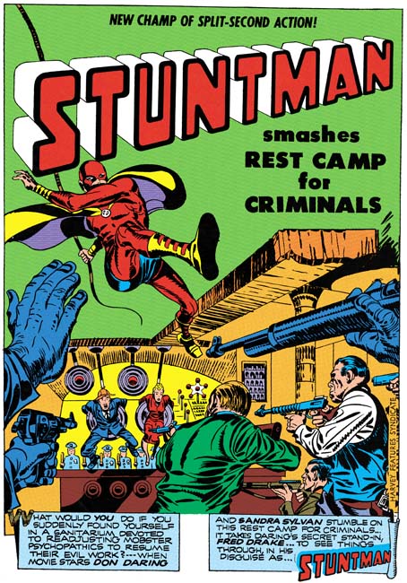
  • Stuntman
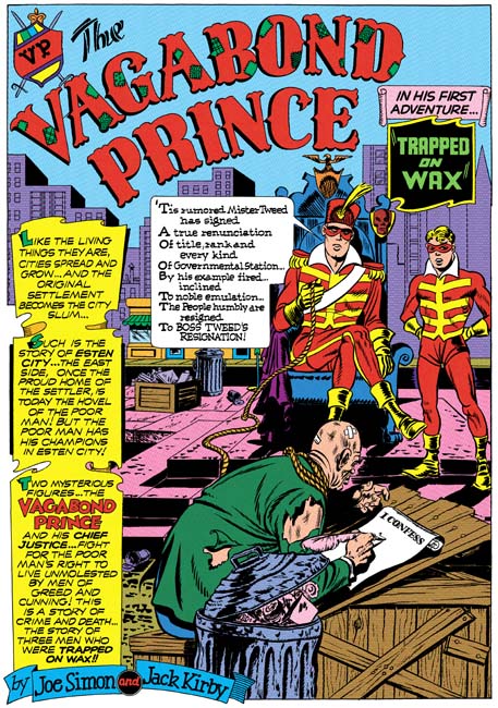
  • Vagabond Prince
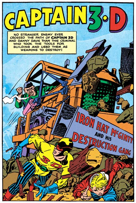
  • Captain 3-D
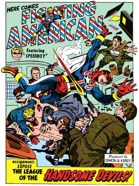
  • Fighting American
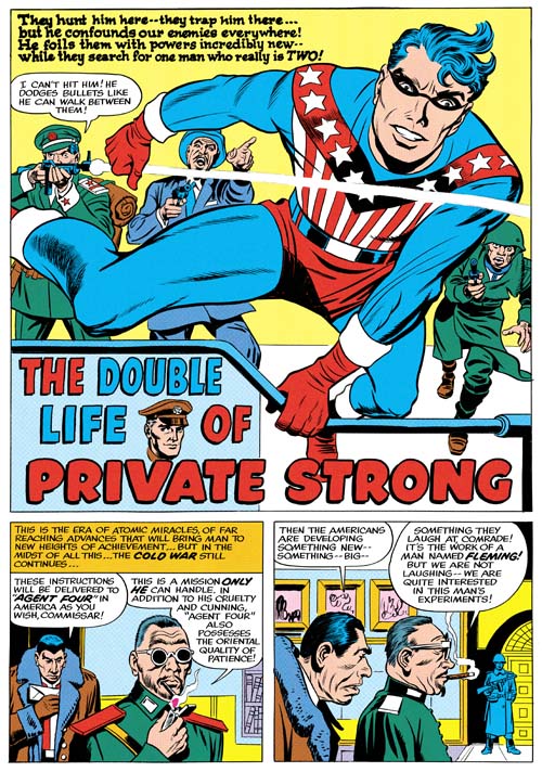
  • The Shield (Private Strong)
  • The Fly

Simon and Kirby Superheroes

The Black Owl was among Simon and Kirby’s earliest superhero work. Only Marvel Boy and the Vision for Timely predate the Black Owl, and even then only be a few months. Simon and Kirby’s Black Owl shows the beginnings of some of their trademarks that made Captain America such a success. (Simon and Kirby’s Black Owl)

Simon and Kirby Superheroes

I have not written solely about Stuntman for some time, but only because I posted on it early in my blog (Stuntman). What can I say, Stuntman is filled with great art, action and humor. Of course Titan’s upcoming book will have all the published Stuntman stories but as a special treat it will also include the previously unpublished “Jungle Lord”; this thanks to the help of John Morrow (of The Jack Kirby Collector fame). The sudden cancellation of Stuntman left “Jungle Lord” without the finishing spotting but all the lettering and the outline inking were completed. As an additional bonus, two of the Stuntman stories were restored from original flats from the Simon collection. While every effort was made to restore all the scans to the best possible quality you simply cannot beat line art from flats or original art.
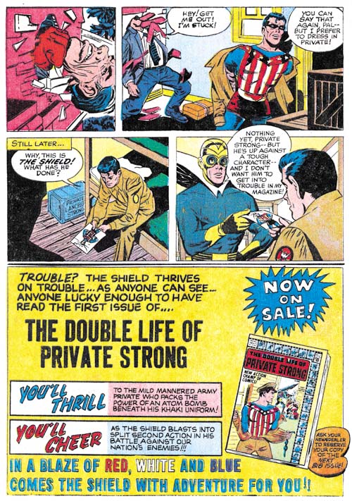
Simon and Kirby Superheroes

Many fans have underestimated Joe Simon’s talents as a penciler. Hopefully “Simon and Kirby Superheroes” will enlighten them. All three Vagabond Prince tales will be included one of which (“Trapped on Wax”) has never been published in its entirety. “Trapped on Wax” was restored from the original art and the other two stories from original flats. Harvey Comic’s of Vagabond Prince were exceedingly poor (even for Harvey) so Titan’s versions will be really special. (Vagabond Prince, Trapped on Wax, The Madness of Doctor Altu, and Death-Trap De Luxe)

Simon and Kirby Superheroes

Not surprisingly, Captain 3-D #1 has never been reprinted. Originally it posed a problem for Titan as well. What would they do, offer the book with 3D glasses? The solution I offered was to drop the 3D effect and restore it to the line art. After all Jack Kirby’s perspective was so effective it did not need the 3D gimmick. I have also colored the material in a manner consistent with methods used in other Simon and Kirby productions. Captain 3-D was inked by an array of artists including the Steve Ditko at the start of his career. Now readers will be able to judge for themselves who inked what; you can get my take on this subject in my post Captain 3D.

Simon and Kirby Superheroes

Titan’s book will contain all the original Fighting American stories, not just those with art by Simon and Kirby. It will include Simon’s cover for Harvey Fighting American #2 and the George Tuska drawn “The Mad Inker” neither of which have been published before. “The Mad Inker” is missing the splash page but this does not seem to affect the story which is otherwise complete. Marvel reprinted Fighting American in 1989 but a good portion of it was what Marvel now terms reconstructed art. In “Simon and Kirby Superheroes” you will get nothing but pure Simon and Kirby.

Simon and Kirby Superheroes

Most of Private Strong and all of the Fly stories were restored from original art. I even got permission from Titan to re-master “Come into My Parlor” which appeared in “The Best of Simon and Kirby”. Not that the restoration in BoSK was that bad but the restoration from original art is just so much more special.

There is an introduction by Neil Gaiman. I do not think that for anyone who has read Gaiman’s Sandman series would be surprised that he is a big Simon and Kirby fan. I have to say the fact that Gaiman was going to do the introduction for this book impressed my niece more than anything else concerning the projects I have worked on. There are also a couple of short essays by Jim Simon. I have not read Jim’s contribution but judging by the introduction Jim wrote for Marvel’s Boys’ Ranch reprint I am looking forward to what he has to say.

Future volumes of Titan’s Simon and Kirby library will include great material. But I do not think any of them will so thoroughly cover Simon and Kirby’s collaboration. “Simon and Kirby Superheroes” spans from some of their earliest work together until nearly their last (only the retro Sandman for DC was a latter collaboration).

PS
It has been implied on the Internet that some of my recent posts have used restorations from “Simon and Kirby Superheroes”. That simply is not true. However, all the images I have used in this entry are from Titan’s upcoming book. Unfortunately the low resolution of images used for the Internet does not give them justice. The reader will have to buy the book to get the full impact. You will not regret it.

“The Best of Simon and Kirby” Nominated for an Eisner Award

The Eisner Award nominations have been announced and they include:

Best Archival Collection/Project — Comic Books

  • The Best of Simon & Kirby, by Joe Simon and Jack Kirby, edited by Steve Saffel (Titan Books)
  • Blazing Combat, by Archie Goodwin et al., edited by Gary Groth (Fantagraphics)
  • Humbug, by Harvey Kurtzman et al., edited by Gary Groth (Fantagraphics)
  • The Rocketeer: The Complete Adventures deluxe edition, by Dave Stevens, edited by Scott Dunbier (IDW)
  • The TOON Treasury of Classic Children’s Comics, edited by Art Spiegelman and Francoise Mouly (Abrams ComicArts/Toon)

What a pleasant surprise but what strong competition. I have heard of Humbug and The TOON Treasury but have never had the chance to examine them. But my collection includes Blazing Combat and The Rocketeer and they are both incredibly beautiful and important books. So I am not holding expectations that The Best of Simon and Kirby will actually win. It is just great to have played a part on a book that has received the recognition that such a nomination entails.

Questions on Some Inking in Adventures of the Fly

I have recently posted on the initial issues of the Adventures of the Fly (here and here). There are still unidentified artists that penciled those issues (and more in the two Fly issues that followed). Identifying inkers is an even bigger challenged particularly because I am not that familiar with the brushwork of most of the possible inkers. However I recently noticed some inking in the Adventures of the Fly that was very familiar.

Adventures of the Fly #2
Adventures of the Fly #2 (September 1959) “Sneak Attack” page 2 (part), pencils by Jack Kirby

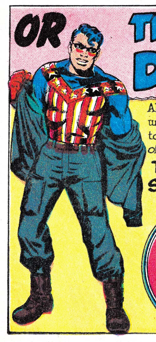
When I last wrote about “Sneak Attack” I attributed the pencils to Joe Simon. Well that was not the complete attribution. The bottom of the second page was an advertisement for the other Archie superhero comic, Double Life of Private Strong. The only art the ad contains is a standing figure of Private Strong changing into the Shield. It seems clear that the art was drawn by Jack Kirby. It is odd that the story and ad were done by different artists. I have studied the original art from Joe Simon’s collection and I can assure the reader that no cut and paste was performed to accomplish this.

The inking for the ad was really nicely done but unfortunately the details of which are obscured by rather poor printing. It is hard to see but the inner sides of both thighs were inked using picket fence crosshatching (Inking Glossary). The good news is that in the upcoming Simon and Kirby Superheroes volume from Titan “Sneak Attack” and the other stories I will be discussing here will be restored from the original art. Similarly robust picket fence brushwork was one of the characteristics of what I refer to as the Studio Style inking used during the Simon and Kirby collaboration. Not only did both Joe and Jack use this technique at that time but Mort Meskin did as well. I think, however, we can dismiss Meskin as the possible inker for the ad because he was no longer working with either Kirby or Simon and the inking here is a bit more spontaneous than was normal for Mort.

Adventures of the Fly #2
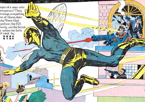
Adventures of the Fly #2 (September 1959) “Marco’s Eyes” splash (part), pencils by Jack Kirby

The spotting of the large figure of the Fly in the double page splash for “Marco’s Eyes is more finely worked than typical for either Simon or Kirby although either of them was certainly capable of it. Actually it is more finely worked than the inking found in any of the Fly art. So far I have not identified any brushwork in the figure that helps in determining an inking attribution.

Adventures of the Fly #2
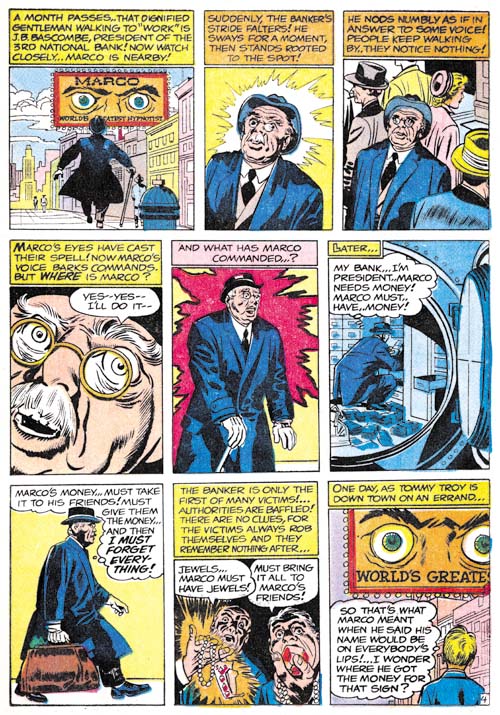
Adventures of the Fly #2 (September 1959) “Marco’s Eyes” page 4, pencils by Jack Kirby

The story art for “Marco’s Eyes” shows an important characteristic that was typical of Studio style inking, what I refer to as shoulder blots (Inking Glossary). It is prominently shown in panels 2, 3 and 5 from page 4 but occurs elsewhere in the story as well. Numerous inkers have provided their shoulders with shadows but shoulder blots are distinct in that they occur on both shoulders regardless of how a shadow would expect to be cast. So far I have only seen Joe Simon and Jack Kirby make use of shoulder blots in their inking.

Adventures of the Fly #2
Adventures of the Fly #2 (September 1959) “The Master of Junk-Ri-La” page 2, pencils by Jack Kirby

There are no shoulder blots in “The Master of Junk-Ri-La” unless the shadow in panel 4 from page 2 is counted as one (but I am not inclined to do so). There are, however, a number of examples of course picket fence crosshatching. The first panel from page 2 shows a scallop pattern to the shadow on the boy’s arm. This scallop inking frequently showed up in Kirby’s inking. But the inking of the eyes and eyebrows of the boy look very much like the work of Simon.

Adventures of the Fly #1
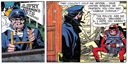
Adventures of the Fly #1 (August 1959) “Come Into My Parlor” story panels 3 and 4 from the double page splash, pencils by Jack Kirby

The double page splash and accompanying story panels of “Come Into My Parlor” also contains what looks like Studio style inking. Particularly note the spotting of the sailor from story panels 3 and 4. Observe the two cloth folds on the man’s shoulder in panel 4. These cloth folds show no indication of the tip of the brush which is a technique that was typical of Kirby’s inking. I am less convinced about the inking of the rest of the story. It should be kept in mind that it was common during the Simon and Kirby collaboration for Kirby to be involved with the spotting of the splash and leave the rest of the story to other inkers.

Studio style inking techniques are not limited to the four stories that I have discussed here. But their occurrence elsewhere in the first two issues of Adventures of the Fly seems limited to what looks like touch-ups of the work by other inkers. Such touch-up were almost certainly the work of Simon since Kirby was then a freelancer working from his house.

I only become confident about inking attributions after I have “lived” with them for some time. However it is my policy to present my current views in this blog even if they are likely to be subject to change. At this time I believe “The Master of Junk-Ri-La” was inked by Joe Simon. I am also fairly certain that Jack Kirby inked the splash pages of “Come Into My Parlor”. I am less confident about the inking attributions for the ad from “Sneak Attack” or “Marco’s Eyes”. I currently am crediting Kirby for that inking but I am bother about the frequent appearance of the tip of the brush in the inking which previously was not typical for Kirby although it was for Simon.

Replacing Simon and Kirby, Chapter 1, The Newsboy Legion

While Simon and Kirby were working for DC they knew that at some time they both would be entering military service. To prepare for this the two went into hyper drive and started generating an inventory for DC to use while they were gone. This was very successful and Simon and Kirby covers and stories appeared long after Joe and Jack were working for Uncle Sam. But the inventory was not large enough to last until Simon and Kirby were back from helping to protect our country. By early 1944 (cover dates) there were no more Simon and Kirby story art left.

The question of Simon and Kirby’s replacement came back to my attention recently while reading DC’s Simon and Kirby Sandman archive. There were two stories in it that were listed as being done by Joe and Jack but to me looked like they were actually by some other artist (“Courage a la Carte”, Adventure #91, April 1944 and “Sweets for Swag”, Adventure #100, October 1945). The issue came up again when I recently obtained a copy of DC’s Simon and Kirby Newsboy Legion archive. For the Newsboy Legion volume, DC decided to include material that clearly was not drawn by Simon and Kirby. The replacement artist for most of the Newsboy Legion was credited in the DC volume as Gil Kane. It is an attribution that I have used previously as well. However when I talked with Joe Simon about this he insisted that Gil Kane was not the artist and suggested that it was the brothers Arturo and Luis Cazeneuve.

Simon and Kirby’s replacements was a subject that I have always meant to investigate a little further. This will be the start of another serial post. It will be a bit more erratic than most of my serial posts because I am not going to do this in a strictly chronological order. Instead I will begin with several chapters examining the Newsboy Legion, then look at Sandman and finally cover the Boy Commandos.

Star Spangled #29
Star Spangled #29 (February 1944) “Cabbages and Comics”, pencils by Jack Kirby

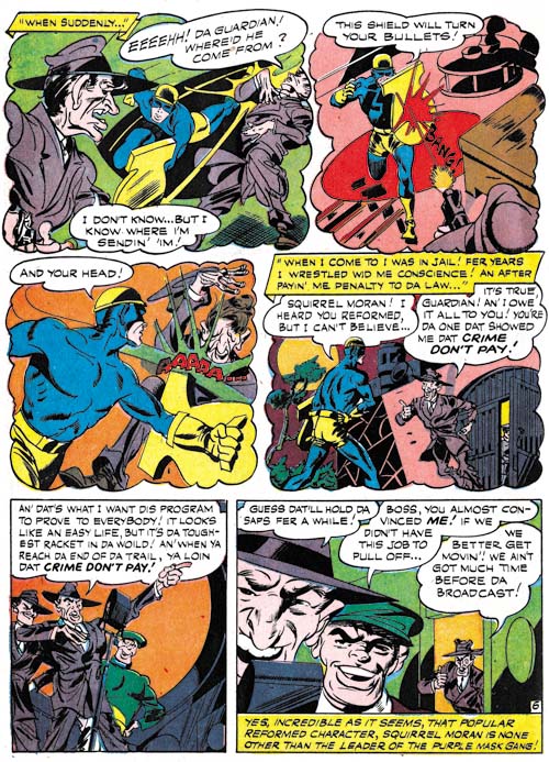
I will start with the Newsboy Legion because the work covered in this chapter can all be found in DC’s recent archive volume. Thus the reader will be able to view more examples than I can provide in this blog. The first story I will remark on is what I believe to be the last published complete Newsboy Legion story by Simon and Kirby before they went off into military service. Because of the push to create inventory and the use of other hands in the inking, the art by this time was not quite as good as early in the Newsboy Legion run. But even poorer quality Simon and Kirby art is still much better than what most other artists were doing. And while many artists might try to imitate Kirby’s dynamic art they were unable to keep it up page after page. In short I have no doubt that this story is in fact a Simon and Kirby production.

The Jack Kirby Collector (issue #21) published an interview with Gil Kane. Two of Kane’s answers are particularly pertinent to this discussion:

TJKC: What were your job duties with S&K?

Gil: Mine was penciling. I would try to turn out a job every week or so. [They were] 12-page stories. I was copying-tracing-Jack’s work.

TJKC: What happened when Simon & Kirby went into the service? What happened to you?

Gil: I got a “Newsboy Legion” job to do by myself (like I had done the rest of them except they didn’t fix it up or do the splash), but when I walked through the door with the finished job, they said, “You’re fired.” They didn’t even look at the work. I really was lousy and I was out! At that point, I was about seventeen and I worked for Continental Comics for a guy named Temmerson. (I penciled and Carmine Infantino inked.) But that only lasted until I went into the Army.

There are a couple of really significant points in Gil’s short answers. Kane describes having previously done work that Simon and Kirby fixed up or provided the splash. Now it is possible that Gil Kane had something to do with earlier stories such as “Cabbages and Comics” but if so it was only in a minor capacity. Kane may have done things like help with the inking but I am sure that Kirby was the penciler.

Star Spangled #30
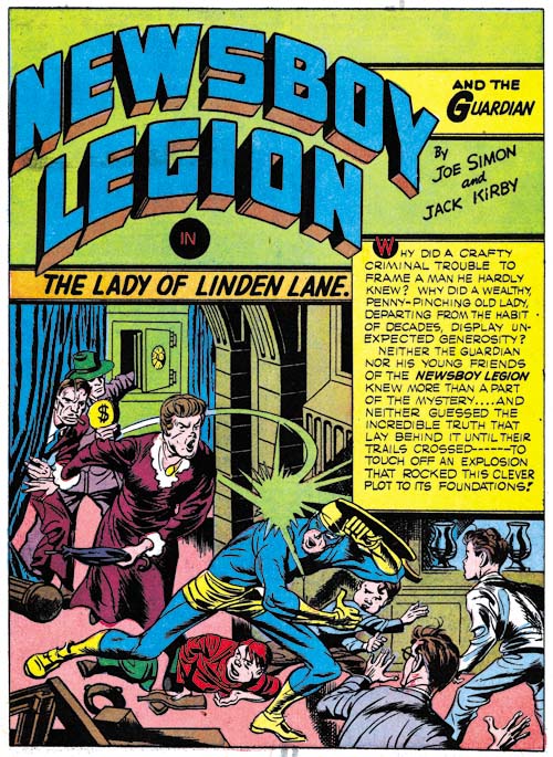
Star Spangled #30 (March 1944) “The Lady of Linden Lane”, pencils by Jack Kirby

There is no sign of Gil Kane, or any other artist other than Simon and Kirby, in the splash for “The Lady of Linden Lane” (Star Spangled #30, March 1944). It is a great splash with plenty of action and a little bit of humor with the normally fearless Guardian trying to duck from the blows of an elderly lady. The hoods in the background are a typical Simon and Kirby feature. This was inventoried material and so perhaps was executed in a hurry, but it still is great comic book art. Joe entered the Coast Guards before Jack went into military service so some of the inventory art may have been done by Kirby without Simon. However there is no reason to believe that DC published the inventoried art in the same order that Joe and Jack produced it. Nor are there any signs that I can find that distinguish this story from others there were done by both Simon and Kirby.

Star Spangled #30
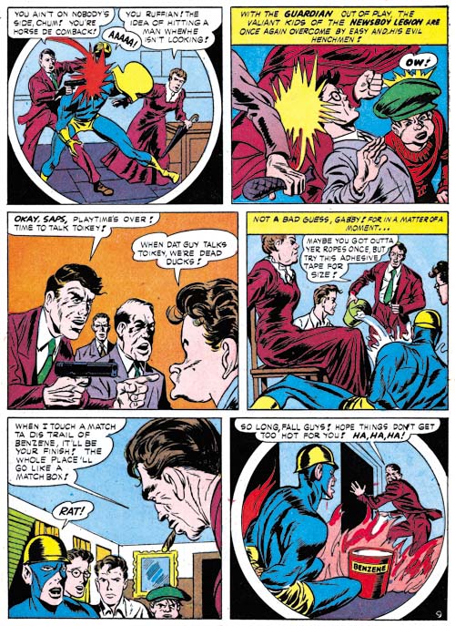
Star Spangled #30 (March 1944) “The Lady of Linden Lane” page 9, art by Gil Kane?

While the splash for “The Lady of Linden Lane” is work that can be attributed convincingly to Simon and Kirby, the rest of the story is not. The art is crude and stilted. There are parts that really do look like Kirby’s pencils but they appear to be swipes. For instance the cigar smoker in panel 5 of page 9 (shown above) is shown in the type of perspective that Kirby favored however it appears to be based on Guardian from the cover of Star Spangled #26 (November 1943).

Star Spangled #8 and #30
left Star Spangled #8 (May 1942) “Last Mile Alley” page 13 panel 2, pencils by Jack Kirby
right Star Spangled #30 (March 1944) “The Lady of Linden Lane” page 7 panel 5, art by Gil Kane?

An even more obvious swipe can be found in the figures of Snapper and Gabby shown above. Unlike my previous example this is a close swipe showing only minor alterations. Kirby did swipe on occasion but one thing I have never seen him do was swipe from himself. Jack did have some favorite poses that he often repeated but they are always done with such variation that it seems clear that he is not copying any previous drawing. Simon did swipe from Kirby, in fact rather often. But Joe was a good artist in his own right and his art is much better than this crudely drawn story. Further I can detect none of Simon’s drawing style in “The Lady of Linden Lane”. While I am not familiar enough with the work of Arturo or Luis Cazeneuve to confidently spot their work, what I have seen is much better than these crude drawings. The combination of a Kirby drawn splash with story done by another artist fits very well the interview reply that Kane gave. Add to that the use of swipes and Kane’s admitted poor artistry (he was 16 at the time). So assuming that there is at least some truth to his statements I am questionably attributing the story art for “The Lady of Linden Lane” to Gil Kane. The one problem with this attribution is that there is only one Newsboy Legion story that fits this description while Kane statement suggests he did multiple works in this fashion.

Star Spangled #31
Star Spangled #31 (April 1944) “Questions, Please” page 6, art by unidentified artist

The next issue of Star Spangled Comics had a very different Newsboy Legion story. No clear sign of Simon and Kirby here, neither in the splash or the story art. Nor is this the same artist that produced the story art from “The Lady of Linden Lane” I must admit that I have slighted this artist in the past. His more “cartoony” approach gives the impression that he could be considered an “anti-Simon & Kirby”. But it would be a mistake to dismiss this artist. Put aside any comparisons to Joe and Jack and I am sure the reader will see this is a rather interesting and talented artist. Sure his faces and figures are exaggerated but they are full of life. He makes good use of varying the point of view. He seems to purposely distort background scenery giving it an almost cubist look. This artist may be rather bizarre but he is definitely not boring. I will cover this artist in more detail in the next chapter of this serial post.

But who is this artist? In the past I, and at least some others, have thought this was Gil Kane. Now I attributing “The Lady of Linden Lane” to Gil Kane but is there any other reason to reject Kane as the replacement artist for “Questions, Please” and other Newsboy Legion stories? Actually there is. Gil Kane went into the army shortly after his 18th birthday and he spent 19 months in service. Since he was born on April 6, 1926 that would mean he was in the army sometime about April or May 1944. However, as we will see in the next chapter, this replacement artist would provide work up to Star Spangled #49 (October 1945). This is well into the time that Kane was doing military service. Unlike Simon and Kirby, I doubt that DC would consider the replacement artist important enough to provide an inventory of works to use while he was gone. So it can be said with good confidence that Gil Kane was not the primary Simon and Kirby replacement artist.

But what about Joe Simon’s suggestion of the Cazeneuve brothers? I prefer to put off trying to answer that question until the next chapter where I will review more of the primary replacement artist’s Newsboy Legion work.

Joe Simon and the Newsboy Legion Archives

The Newsboy Legion, volume 1

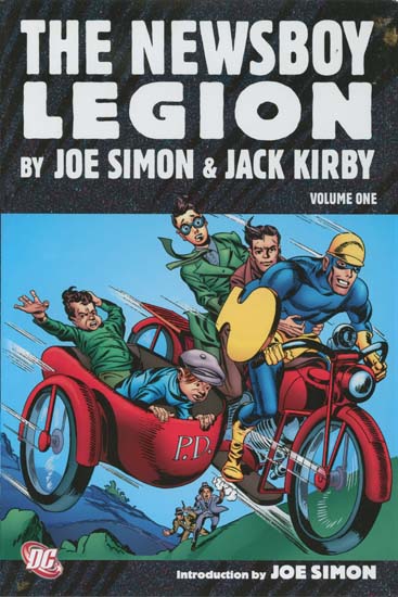
During a recent visit to Joe Simon I picked up a copy of DC’s “The Newsboy Legion by Joe Simon and Jack Kirby” volume 1. This post will not be an unbiased review as I was one of the contributors having provided all the covers. I have been extremely busy with restorations for “Simon and Kirby Superheroes” but I had previously scanned and cleaned up these Star Spangled covers so providing them to DC did impact my commitment with Titan. The covers are generally not what I would call full restorations but I think they came out rather well. The restoration of the stories was done by others (Rick Keene and Mike Montagna) and is even better than the work done for “Simon and Kirby’s Sandman”. I know there are some who are critical of DC’s approach but I am not one of them. I am pleased to see that only Marvel continues to follow the outdated technique of art “reconstruction” (a code word for recreation).

This first volume covers the work that appeared in Star Spangled issues #7 to #32 (April 1942 to May 1944). Joe and Jack provided DC with a handsome inventory before they went into military service. Because of that inventory this volume is almost exclusively work by Simon and Kirby with only three stories and a single cover drawn by other artists.

There are some aspects about this archive that I am less satisfied with. Mainly the smaller dimensions of the book requires that the art must be slightly reduced in size with narrow the gutters and margins. This was true for the Sandman archive as well. But I suspect this was all done to keep the cost of the book low. The dust jacket shows re-colored Simon and Kirby art. I am not a fan of the use of modern coloring on gold and silver age comic art. The line art was made for the type coloring and printing that it originally received. I have not seen any examples of the successful use of modern coloring applied to older art. But hey it is just the dust jacket and it is the contents of the book that really count.

A particular appeal feature of this reprint is the introduction written by Joe Simon. It seems so obvious a choice that I do not know why Joe is not asked to do more of these. Joe is a great writer and this is another of his fascinating essays. I will not discuss the contents at this time so the reader will just have to buy the book. But it does cover a wide range of the history that lies behind the Newsboy Legion.

Simon and Kirby’s Captain America was so innovative that it changed the comic book industry. However it was at DC that the Simon and Kirby collaboration really jelled. Which is why I am so pleased that DC will be reprinting so much of this important material. There should be a volume two for the Newsboy Legion and DC has announced the first Boy Command volume as coming out in November. Simon and Kirby fans live in exciting times.

More Kirby Krackle

Tales of the Unexpected #18
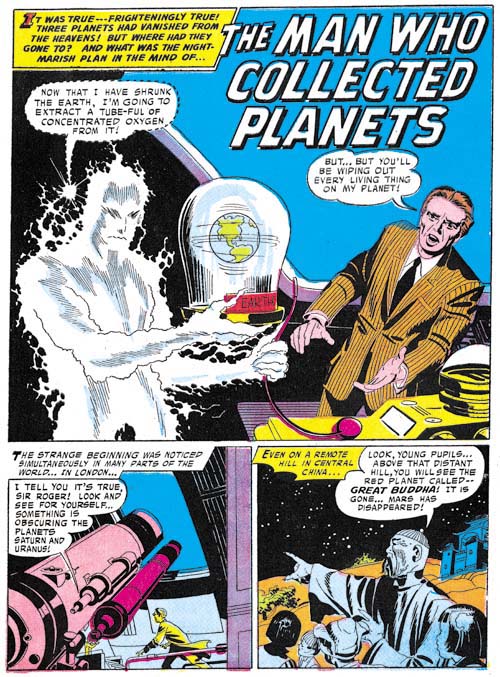
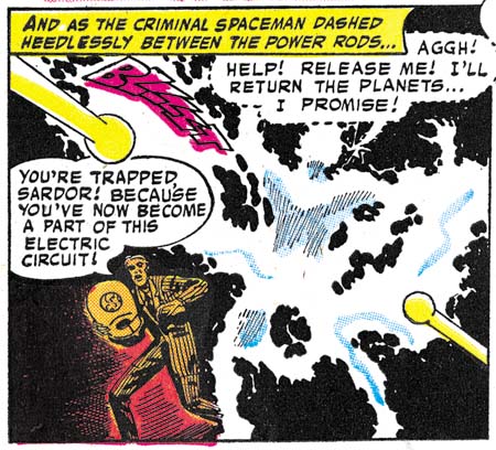
Tales of the Unexpected #18 (October 1957) “The Man Who Collected Planets”, art by Jack Kirby

In a comment to my previous post (Kirby Krackle) Ger Apeldoorn remarked on the existence of another Kirby Krackle prototype. Unfortunately Ger was unable to provide the specific comic that it appeared in. Perhaps he meant the one that was recently brought to my attention (thanks CL), “The Man Who Collected Planets” from Tales of the Unexpected #18 (October 1957). The Kirby Krackle prototype also appears on the cover (which Kirby did as well) but I find the splash page a better example of this technique. I have previously dismissed some of the supposed Kirby Krackle prototypes (based on techniques used to indicate smoke), but how does this new (for me) contender stack up? Well it is composed of rounded (but not circular) spots, there is a tendency to form clusters, they are meant to depict energy (although more of a simmering than a high energy) and there is a cosmic connection (he is after all an alien). So while it is not perfect Kirby Krackle it is so close to the real thing that it makes a perfect prototype.

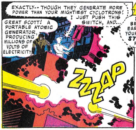
When I wrote a serial post on Kirby’s Austere and related inking styles I included a chapter on his DC work (Jack Kirby’s Austere Inking, Chapter 7). Unfortunately at the time I had access to a limited portion of that work and so I could only make some provisional conclusions. Now I am able to examine a much better selection of Kirby’s DC material but I have yet to do a careful review so my observations must still be considered as tentative. My belief is that the art for “The Man Who Collected Planets” as well of the cover was inked by Jack Kirby himself. Perhaps the best indications that this was Kirby’s inking can be found in the last panel of the image provided above. Observe the rather blunt but well controlled brushwork, the scalloped inking pattern own the man’s shoulder and the use of short brushwork arranged into strings. So the credit, if the reader accepts this as a true Kirby Krackle prototype, belongs to Kirby.

Tales of the Unexpected #18
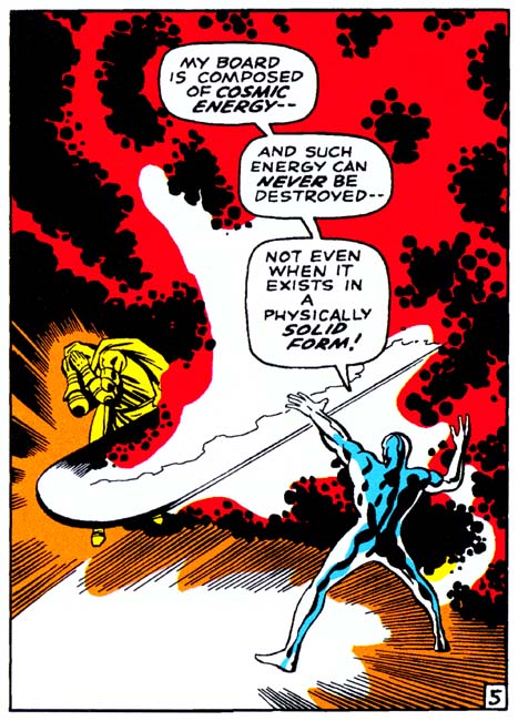
Tales of the Unexpected #18 (October 1957) “The Man Who Collected Planets” page 3 panel 5, art by Jack Kirby

As I described above, the Kirby Krackle prototype surrounding the alien figure is used to describe a simmering energy and not the high energy that true Kirby Krackle depicts. The lower energy level drawn by Jack is quite appropriate for his subject. However the story includes art where much higher energy levels are shown, as for example the panel from page 3 shown above. As can be seen this Kirby Krackle prototype is even closer to the real thing. The dots are more irregular in size and they form more obvious clusters. Personally I cannot see how anyone could claim this is not a perfectly good prototype from which true Krackle was developed.

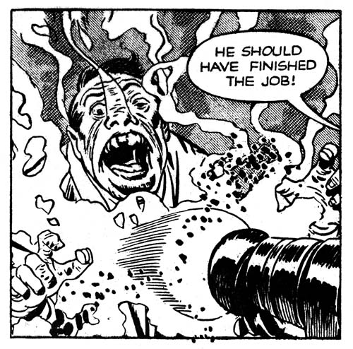
Tales of the Unexpected #18
Tales of the Unexpected #18 (October 1957) “The Man Who Collected Planets” page 5 panel 5, art by Jack Kirby

I cannot resist providing another panel to show that my previous example of the Kirby Krackle prototype was no accident. While I fully accept this as a prototype, that by no means negates my claim that the example I provided from Captain 3-D (Kirby Krackle) was a Krackle prototype. Far from it, I believe it only strengthens my claim. The DC example is just what would be expected as a step intermediate between the earlier Captain 3-D (1954) and the full blown Krackle that Jack started using in 1968. Only small changes needed to go from the primitive version from Captain 3-D to the better (but still not perfect) version in the DC story. This means that I still maintain that Joe Simon was probably responsible for originating what would later become called Kirby Krackle.

Kirby Krackle

Fantastic Four #57
Fantastic Four #57 (December 1966) “Enter, Dr. Doom” page 5 panel 4, pencils by Jack Kirby, inks by Joe Sinnott (from the Marvel Omnibus)

There is a virtual cottage industry around identifying some aspect of Jack Kirby’s artistry and naming it with a word starting with the letter ‘K’ (better yet if the chosen word actually starts with a ‘C’). I find such terms annoyingly cute and even worse some have rather vacuous foundations (see Kirby Kolor, A Kirby Myth and Kirby Kolors, Revisited). There is one such term, Kirby Krackle, which is so entrenched in comic literature that I feel that it must be accepted. No matter how grating the name, Kirby Krackle really does describe an important aspect found in much of Jack’s later work.

Kirby’s art for Marvel Comics in the 60’s began to show clusters of round dots depicting enormous but not necessarily directed energy, often of a cosmic nature. Shane Foley wrote an excellent article on Kirby Krackle (Kracklin’ Kirby, Jack Kirby Collector #33) were he traces the appearance of this device. Because of the manner that the work was created, many experts have claimed that Kirby’s inker Joe Sinnott actually came up with the device and Kirby liked what he saw and adopted it.

Of course there are Kirby fans that were unwilling to accept any of Jack’s techniques as originating anywhere other than from the King himself. And so the race was on to find Kirby Krackle precursors in earlier work by Jack to prove that the idea came from him and not Sinnott. Frankly I find the the examples I have seen of the supposed Kirby Krackle prototypes to be less then convincing. Most are inking techniques that were used to depict smoke. These prototypes have four strikes against them. They do not take the shape of round dots, they do not form clusters, they are not used to depict high energy, and there are no intermediate examples that show they evolved into true Kirby Krackle. With so many points against them these so called prototypes can be discarded from serious consideration.

Captain 3-D #1
Captain 3-D #1 (December 1953) “The Man from the World of D”, page 3 panel 6, pencils by Jack Kirby, inks by Joe Simon

I would like to suggest yet another Kirby Krackle prototype. One found in the work that Kirby drew for Captain 3-D (December 1953). Besides the panel shown above, another example can be found from page 2 of the same story used in an earlier post (Captain 3D). Now I am not claiming these are true Kirby Krackle. Here dashes rather then dots are used and the dashes do not quite cluster as closely as in true Kirby Krackle, but it would not take much to make the change from the prototype to the real thing. Further the prototype is used to depict true energy; in fact there is a cosmic connection in that the weapon is called a gamma ray gun.

Unfortunately there is a problem for those Kirby fans who would like to use Captain 3-D Kirby Krackle prototype as proof that the idea came from Jack himself. These pages were not inked by Kirby. Worse yet, during the Simon and Kirby collaboration Jack did not indicate spotting in his pencils. Kirby drawings were line drawings only and it was up to the inker to determine the spotting. Joe Simon was the inker for page 3. Page 2 was inked by Steve Ditko but with touch-ups by Simon. I really cannot say for certain who inked the Kirby Krackle prototype on page 2 but since it is done in the same manner as page 3 I credit it to Joe as well. But somehow I do not think comic fans are going to begin calling this technique Simon Snackle.

Adventures of the Fly, the Second Issue

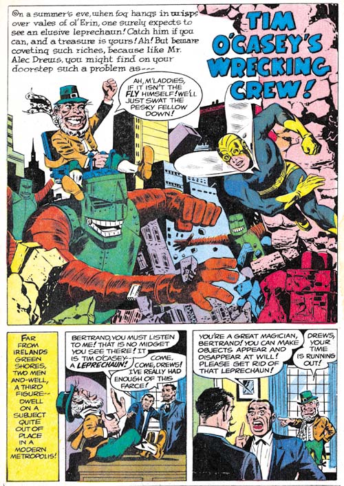
Adventures of the Fly #2
Adventures of the Fly #2 (September 1959) “Tim O’Casey’s Wrecking Crew”, pencils by unidentified artist

If a young boy can be transformed into a fully costumed adult superhero with a magic ring, why not have a leprechaun as an opponent? Not strange enough? Well then give the leprechaun some giant robots to play with. The only thing missing in this delightful story is Jack Kirby. Too bad because I am sure Jack would have added his own personal touches and transformed it into a masterpiece.

Adventures of the Fly #2
Adventures of the Fly #2 (September 1959) “One of Our Skyscrapers is Missing” page 3, pencils by Al Williamson

Al Williamson was already a talented comic artist when he did “One of Our Skyscrapers is Missing” for this issue. And I have little doubt that he did this story. The various monsters that inhabit these pages all possess the Williamson touch. If Williamson was working from layouts, he took great liberties with them. His panel layouts are the most interesting ones found in either the Shield or the Fly. Further his artwork is far superior to the other artists working on the Archie superheroes that I have reviewed so far with the sole exception of Jack Kirby. That said the art for this story is really far below his best efforts. The work Al did for Race for the Moon the previous year was much superior.

Adventures of the Fly #2
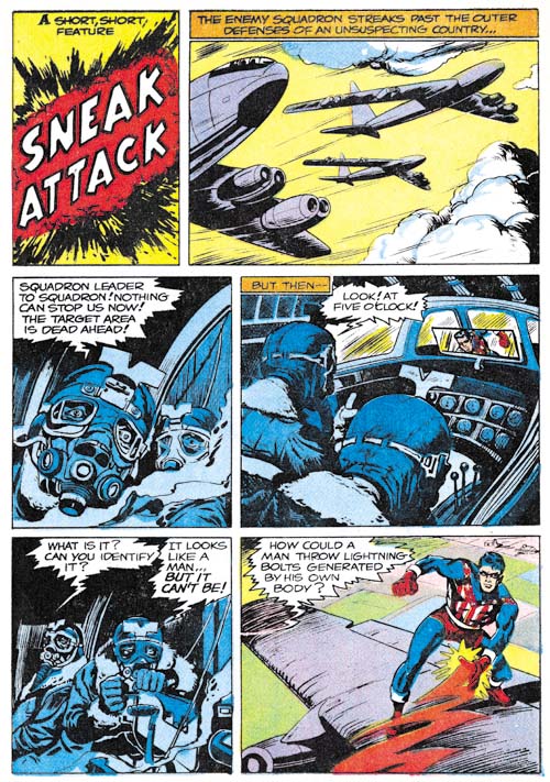
Adventures of the Fly #2 (September 1959) “Sneak Attack”, pencils by Joe Simon

“Sneak Attack” is another of the pieces that generally get attributed to Jack Kirby but were actually drawn by Joe Simon. The reason for this misattribution is a credit to Joe’s skills at mimicking Jack’s style, often with the help of plenty of swipes. The pilot with the funny head gear was swiped from Kirby’s “Hot Box” (Foxhole #2). However it shows that Joe is not just copying Kirby as the head is in full frontal view instead of the 3/4 profile that Jack drew.

Adventures of the Fly #2
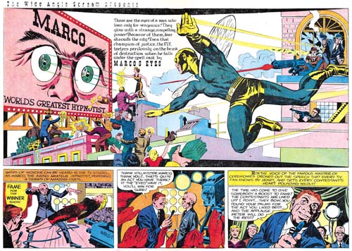
Adventures of the Fly #2 (September 1959) “Marco’s Eyes”, pencils by Jack Kirby
Larger Image

It is an old theme, but Kirby frequently returns to previous themes and improves upon them. In this case it is the idea of a stage performer using his power of hypnosis as a means of conducting crime. The earliest predecessor was probably an untitled story about sometimes called “Sando and Omar” from Captain America #1 (March 1941). “Marco’s Eyes” has some nice art and all in all a good effort, but certainly not among the better Simon and Kirby’s work. The double page splash is perhaps the weakest that S&K ever did. This is unfortunate since it is also the last the two would work on together.

Adventures of the Fly #2
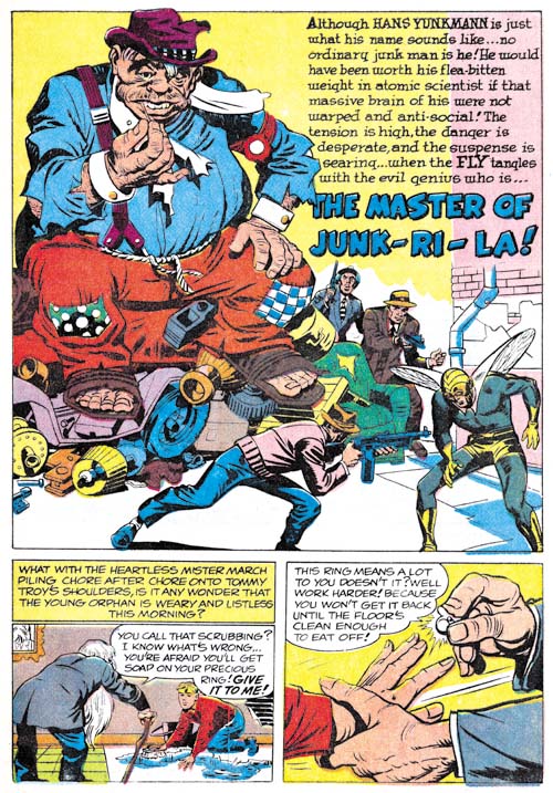
Adventures of the Fly #2 (September 1959) “The Master of Junk-Ri-La”, pencils by Jack Kirby

While I would hardly call “The Master of Junk-Ri-La a masterpiece, it is a much better work than “Marco’s Eyes”. It does however contain some humor that might not be appreciated by many modern superhero fans used to bleaker tales. For instance the villain uses a giant fly swatter against the Fly.

The two stories in Adventures of the Fly #2 would be the last collaboration between Joe Simon and Jack Kirby for many years. The Jack Kirby Checklist includes “Muggy’s Masterpiece” from Adventures of the Fly #4 but that is clearly incorrect. Even the way the Archie superheroes were created made them more of a Simon effort than a Kirby one. Still the two had worked together in one form or another for a period of about 18 years. There may have been other comic book collaborations that were longer but there were none there were better. Or at least that is my opinion. But I may be biased; after all this is the Simon and Kirby Blog.

Since this is Kirby’s last work on the Fly I thought I would briefly touch on the part that it played in the creation of Spider-Man. Others have written in great depths about this issue but here I will only provide a brief outline of the events. Joe Simon, C. C. Beck and Jack Oleck got together in 1953 or 1954 to create a new superhero. Initially the name Spiderman was considered and Joe even created a logo using that name, but in the end the character was called the Silver Spider. Joe took the initial artwork by Beck and pitched the idea to Harvey Comics but they declined to publish it. Years later Archie Comics approached Simon to create some new superheroes and Joe came up with a new Shield and the Fly. Joe retrieved Beck’s Silver Spider art work from Harvey and sent it off to Jack to use as reference when he drew most of the art for the initial issues published in 1959. In 1962 Stan Lee worked initially with Kirby to create Spider-Man but in the end turned to Steve Ditko to provide the art. The work that Kirby did on Spider-Man has never been published but Ditko later described Kirby’s version as looking like the Fly.

The main source of contention about the creation of Spider-Man concerns not so much the history as the interpretation of that history. The most common subject of disagreement is whether Stan Lee and Steve Ditko should be considered the joint creators or if Jack Kirby should be included as well. While I have provided a broad history behind the creation of Spider-Man that I believe most comic scholars would largely accept there are numerous details that scholars seem unable to agree on. Even as simple a concept as the term creator turns out to have very different meanings depending on who is using it. I will not try to advance my own opinion as to who should be credited for creating Spider-Man. I prefer to let each reader come to their own conclusions. But I find it incomprehensible how some insist on crediting Jack Kirby as a Spider-Man creator while excluding Joe Simon.

Adventures of the Fly, the First Issue


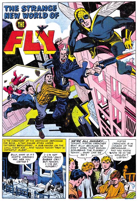
Adventures of the Fly #1 (August 1959) “The Strange New World of the Fly”, pencils by Jack Kirby

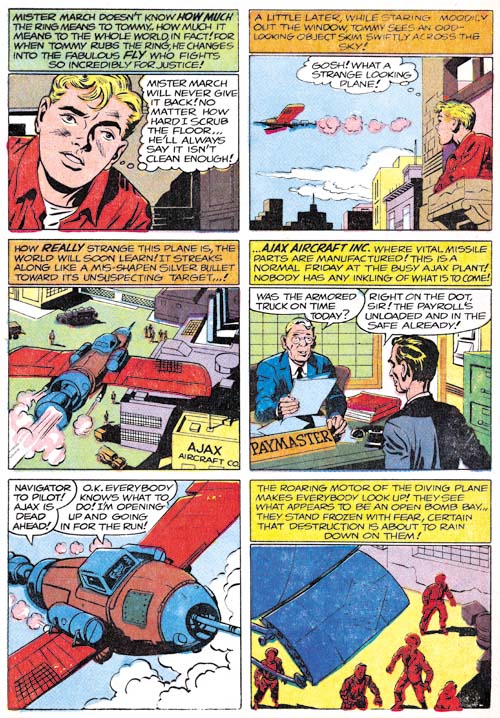
Recently I posted about Jack Kirby’s work on the origin story of Private Strong, aka the Shield. In Adventures of the Fly #1 (August 1959) Jack also had the honors of doing the same for the other new Archie hero, the Fly. Only in this case Kirby based the story on art that C. C. Beck did for the unpublished Silver Spider. Some have called the Silver Spider a Simon and Kirby creation but that simply is not true. Kirby had nothing to do with the Silver Spider which was a creation of Joe Simon, C. C. Beck and Jack Oleck. When I previously discussed the Silver Spider (The End of Simon & Kirby, Chapter 10, A Fly in the Mix) I dated this creation as 1953. To be honest I no longer remember where I got that date but it is not an unreasonable one. This would put it during the time of the Simon and Kirby collaborations but in “The Comic Book Maker” Joe writes about how the Silver Spider was created as a favor to Beck. An examination of xerox copies of the original art confirms Kirby’s absence.

Tommy Troy was an orphan like Lancelot Strong but the resemblance ends there. We meet Tommy in an orphanage but he ends up hired out to an elderly couple. Not kindly Kent-like farmers, but a mean, elderly couple with a reputation of dabbling in magic. Beck’s Silver Spider story had included a genie to add an element of humor, but Kirby has dispensed with him. However concept of a young boy who transforms into an adult superhero was Beck’s who repeated it from Captain Marvel.

Adventures of the Fly #1
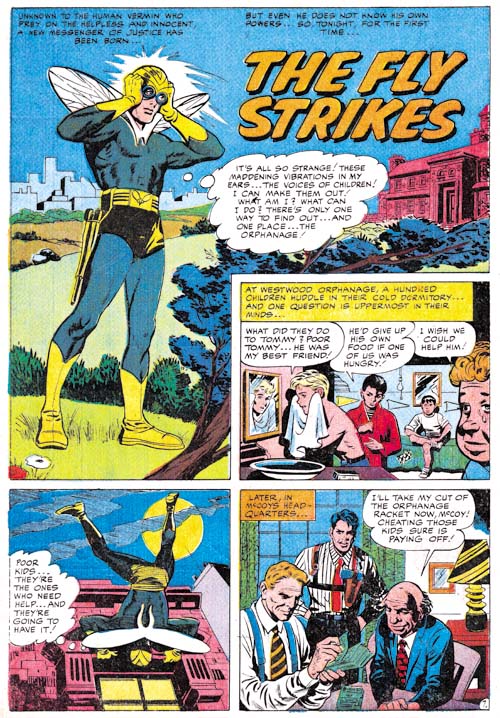
Adventures of the Fly #1 (August 1959) “The Fly Strikes”, pencils by Joe Simon

Just like in Private Strong, the origin story for the Fly is actually told in a series of separate stories. The first one ends with the Tommy Troy being given a magic ring and transforming into the Fly. The second, “The Fly Strikes”, tells of the Fly’s first combat against criminals. This second story is actually based on the end of the origin story that Beck drew.

“The Fly Strikes” is generally credited to Jack Kirby but I am not convinced. I suspect that it is another case of Joe Simon swiping from and imitating Kirby. Joe was particularly good at doing this. Note the Fly peering into the window in the second story panel. This is a swipe from Fighting American #1 (Captain America Returns). I have no indications that Kirby was working from layouts in the stories that he did for this issue. Nor do I believe Jack would bother to swipe from himself. Why would he when he could do it much faster without a swipe? So as I said I believe this story was actually done by Simon.

Adventures of the Fly #1
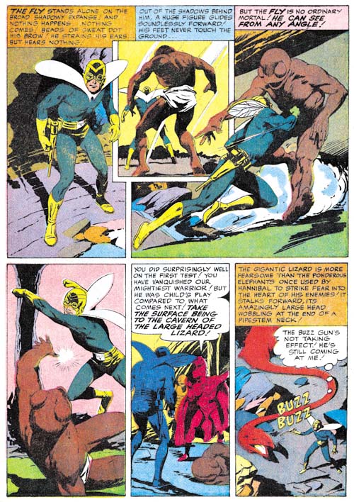
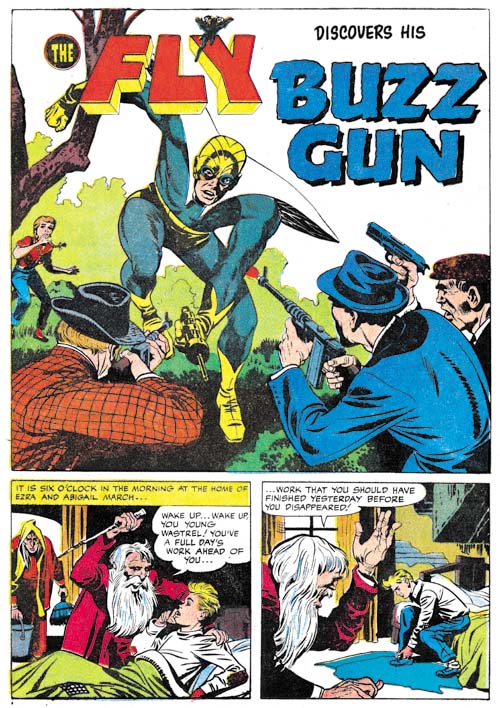
Adventures of the Fly #1 (August 1959) “Buzz Gun”, pencils by Jack Kirby

While the origin story came from Beck’s Silver Spider and the Fly’s powers seemed to be based on directives from Joe Simon, the Fly’s costume is derived from the Night Fighter, a Simon and Kirby creation that was considered for Joe and Jack’s publishing company, Mainline, but never used (Night Fighter, an Abandoned Superhero). Two characteristics stand out. One was the goggles. Similar eyewear appeared in the Black Owl from 1940 and 1941 (Simon and Kirby’s Black Owl). The presence of these goggles in two superheroes with a night theme suggests they were meant to be an aid for seeing in the dark. Of course such night vision would not be that appropriate for the Fly nor is it a power that the Fly ever used. Perhaps the eyewear was nothing more then a visual reference to the insect’s compound eyes or perhaps Jack saw no reason to remove them when he based the Fly’s costume on that of the Night Fighter.

One of the other features that the Fly inherited from the Night Fighter was a pistol of some kind. All that remains of the art for Night Fighter are two unfinished covers and neither offers any clues as to what use the pistol was put to. My guess is that it was for shooting a wire for scaling buildings such as that used by the Sandman, another superhero that Simon and Kirby worked on during the war. While a wirepoon might be a useful device for the Night Fighter it would be rather superfluous for a superhero like the Fly who is able to walk up walls. Well in “Buzz Gun” Kirby shows how the Fly’s pistol is used. It makes a noise! Oh well.


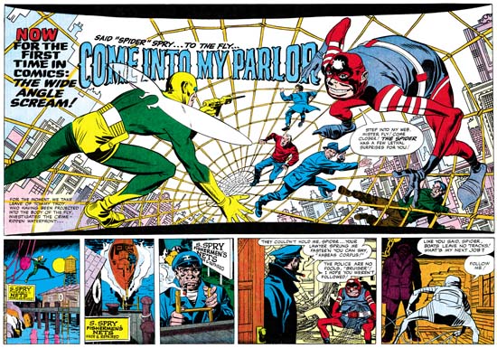
Adventures of the Fly #1 (August 1959) “Come Into My Parlor”, pencils by Jack Kirby
Larger Image

Jack Kirby’s last chapter for the origin story opens with a spectacular double page splash. The title exclaims “for the first time in comics: the wide angel scream”. Of course this really was not the first use of a double page splash a subject that I covered in a still unfinished serial post (The Wide Angle Scream). The chances are that none of the Fly readers had seen any of Simon and Kirby’s earlier uses. While Simon and Kirby did not originate the double page splash, nobody else did it better. Further by 1959 the wide splash was no longer used by anyone. I can imagine the impression the centerfold splash made for potential buyers of the comic. How could they resist. I am sure I would not have. I would have been 9 at the time but sometime around that period I had read some of the DC superhero comics. I found them boring and had given up on comics for a while. Unfortunately I never saw any of the Simon and Kirby creations.

Adventures of the Fly #1
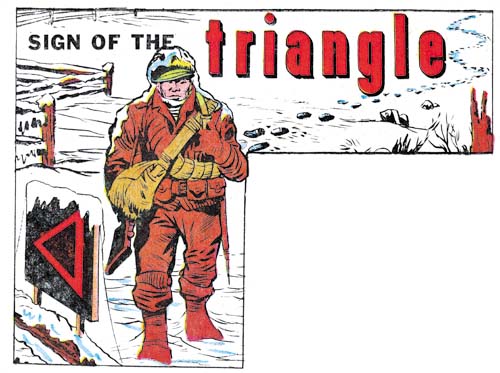
Adventures of the Fly #1 (August 1959) “Sign of the Triangle”, art by Joe Simon

The Jack Kirby Checklist includes this among the work that Kirby did for this issue but I am not convinced. To me it looks like Simon did the drawing. However this confusion is really understandable because the illustration appears to be a swipe from the cover of Foxhole #3 (February 1955) which had be drawn by Kirby. It is not an exact copy, but I do not believe Simon ever did exact copies. The inking looks like Joe did that as well.

Adventures of the Fly #1
Adventures of the Fly #1 (August 1959) “The Search”, pencils by Joe Simon

I may not be confident about attributing the illustration for “Sign of the Triangle” to Simon but there seems little doubt that Joe did the two page Shield promotional piece called “The Search”. This one is full of swipes from art by Kirby. For instance the man being punched through a wall and then left hanging was from the origin story in Fighting American #1 (April 1954, Captain America Returns). Note that while Joe follows pretty closely the man stuck in the wall he has added the man’s face for the punching image which Jack had cut off by the panel edge.

Adventures of the Fly #1
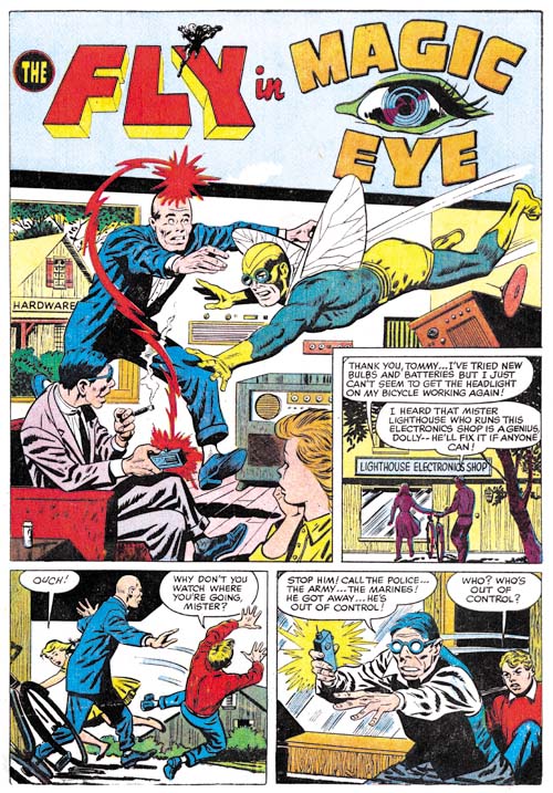
Adventures of the Fly #1 (August 1959) “Magic Eye”, pencils by George Tuska?

The final story is completely independent from the Fly origin and done by another artist, I believe it is George Tuska. I questionably attributed some work from Private Strong #2 to George as well; let us see if some of my more knowledgeable readers will agree with me on this one as well. This is another example where I do not see any obvious swipes of Kirby.