Tag Archives: Jack Kirby

Double Life of Private Strong, the Last Issue

Double Life of Private Strong #2
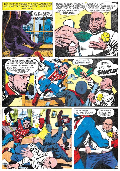
Double Life of Private Strong #2 (August 1959) “The Toy Master” page 5, art by unidentified artist

While the first issue of Double Life of Private Strong was almost completely drawn by Jack Kirby, he played a much smaller part in the second. I am not sure who drew the first story, “The Toy Master”, but he obviously was working from some sort of directions. In “The Comic Book Makers, Joe Simon writes about using Carl Burgos to create layouts. In fact Joe’s collection still includes layouts for a Fly story (Carl Burgos does the Fly). By supplying the artists with layouts, Joe was able to give the comic a distinct Kirby feel. Scattered through the art are swipes; most of them from the previous Simon and Kirby superhero, Fighting American. For instance the Shield in panel 4 of page 5 was based on a splash from Fighting American #1. Some experts have claimed that these are either stats or mechanical copies but I have disproved that by overlaying the art (The Fly, A Case Study of Swiping). Apparently all that was done was a free hand copy was created for the layout and the artist would finish it. This would provide the desired Kirby-feel to the story without making the swipe too incongruous with the rest of the art. There are other examples were the copy deviated even more from the original. I believe, for instance, that the Shield in panel 3 was swiped by the one Kirby did for the splash of “The Menace of the Micro-Men” from Private Strong #1.
Double Life of Private Strong #2
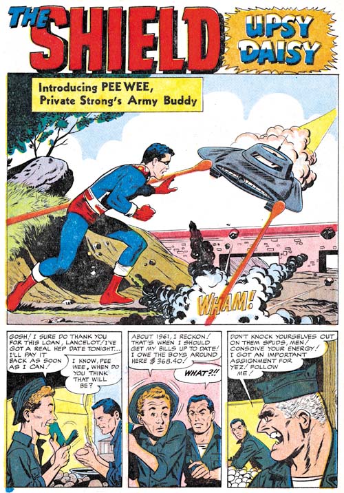
Double Life of Private Strong #2 (August 1959) “Upsy Daisy”, art by George Tuska?

I going out on a limb because I am not familiar enough with his work, but I believe “Upsy Daisy” might be the work of George Tuska. Joe Simon has written in “The Comic Book Maker” that Tuska worked on the Archie comics for him so it is not an unreasonable guess. Perhaps I missed them, but I do not spot any obvious swipes from Kirby in this story.
Double Life of Private Strong #2
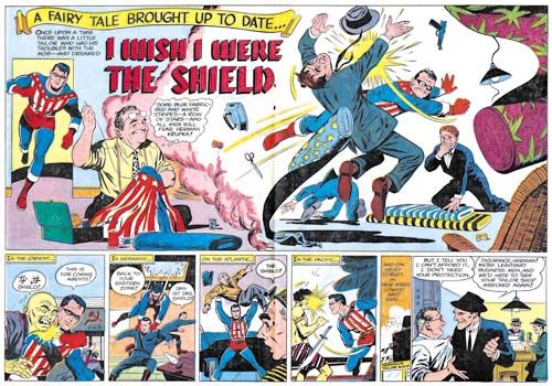
Double Life of Private Strong #2 (August 1959) “I Wish I Were the Shield”, art by George Tuska?
Larger Image

The two tier panel layout is pretty much identical to the one used for the double page splashes found in Adventures of the Fly #1 and #2. However there is no mention of “the wide angle scream” nor are the curved black bands of the top and bottom of the splash (The Wide Angle Scream, What Was Old Is New Again). Again my attribution of this story to George Tuska is by no means firm.

Here there are some examples of swiping from Kirby. For instance the Shield in the splash was based on the cover logo that first appeared on Fighting American #4 (October 1954). The presences of these swipes and the overall superiority of the story art over that for “Upsy Daisy” suggests that this story was done from layouts.
Double Life of Private Strong #2
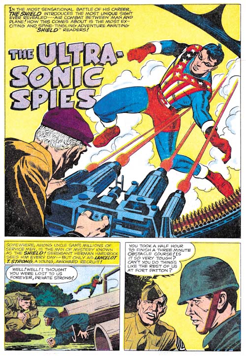
Double Life of Private Strong #2 (August 1959) “The Ultra-Sonic Spies”, art by Jack Kirby

The use of swipes was clearly an attempt to improve the look of the art not actually drawn by Kirby. But of course it was only partially successful since after all nothing beats the real thing. The single story by Kirby in this issue, “The Ultra-Sonic Spies”, just out shines all the rest of the comic. What a mixture of action and humor. Since the Shield’s alter ego, Lancelot Strong, was a private in the U.S. army, Jack was able to return to and improve upon the humor that was done years previously in Captain America. While Simon and Kirby had always preferred less powerful and more human heroes, Kirby makes exciting use the Shield’s greater power. I would say Jack was much more at ease with the Shield than he was with the Fly. What Kirby did in Private Strong prefigures more than any of his other work what was to blossom in the Marvel superhero line in a few years.
Double Life of Private Strong #2
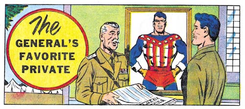
Double Life of Private Strong #2 (August 1959) “The General’s Favorite Private”, art by Joe Simon

There is a single page text piece about the Shield which tells how Lancelot Strong’s secret identity is discovered by General Smith. The story is nothing special but it contains an illustration by Joe Simon. Since the work that he did for the J. C. Penny (1947, A History Lesson) Joe drew very little comic book art. Probably the most significant work was “Deadly Doolittle” for Fighting American #6 and even that was a reworking of an earlier Sandman piece originally drawn by Kirby. After the Simon and Kirby studio broke up Joe did some more work on his own. Simon mostly did some covers but he also occasionally did an interior illustration such as the one accompanying the General Smith text story.
Double Life of Private Strong #2
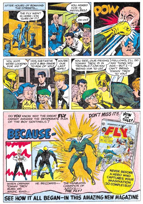
Double Life of Private Strong #2 (August 1959) “The Boy Sentinels” page 2, art by Joe Simon

For the most part one thing Joe Simon did not draw late in his career was full stories. Private Strong #2 included what is essentially an advertisement for the Fly, “The Boy Sentinels”. Should this two page piece be considered a story? What is interesting to me is that Joe makes little, if any, use of swipes from Kirby. Instead Simon drawing reflects back to the work he did for backup pieces for Stuntman and Boy Explorers, especially Vagabond Prince. The villain in the piece resembles that from “Trapped on Wax” (meant for the unpublished Boy Explorers #2), the close-up of the Fly hitting the villain seems taken from “The Madness of Doctor Altu (Black Cat #8, October 1947), and the young boys look like the one from “Death Trap De Luxe” (Black Cat #7, August 1947).

In “The Comic Book Makers” Joe writes:

Years later, I learned why John Goldwater had dropped his beloved Shield like a hot potato. DC Comic’s lawyers had sent him a cease-and-desist order which put forth the amusing claim that The Shield’s powers aped Superman’s too closely.

On the face of it this seems rather remarkable. After all the only important powers that the Shield and Superman seems to be the ability to fly and run at super fast speeds. The Fly can also, well fly, but there seems to have been no problem with that similarity. While not denying the question about some shared powers between the Shield and Superman, I would suggest there were other features that made the Shield more vulnerable to legal action than the Fly. While the Shield’s uniform was modeled on that Simon and Kirby created for Captain America, it unfortunately shared a color scheme with Superman; the same overall blue with red shorts and boots. Also regrettably the Shield’s origin story shared features with Superman’s; orphaned as a baby and raised by an elderly farming couple. All these factors probably contributed to Goldwater’s cold feet when presented with a legal challenge. After all the Shield had not yet shown whether it was a large enough money maker to warrant fighting a legal battle.

Not Kirby, My Date #4

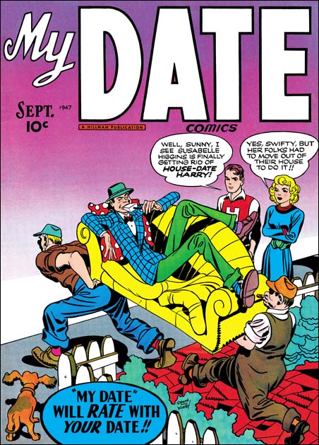
My Date #2
My Date #2 (September 1947) art by Jack Kirby

My Date was a short-lived comic that Simon and Kirby produced for Hillman Publications in 1947. Perhaps mislead by the comics title, some today hold the belief that My Date was the first romance comic book. As I discussed in a post on this topic (The First Romance Comic) it is not a romance comic at all but rather Simon and Kirby’s take on teenage humor modeled on the popular Archie comics. For his contributions to the title Jack Kirby drew in a more cartoonish manner appropriate for the humor content. Jack’s altered penciling was not very drastic, it remains quite easy to identify his work. For instance, Kirby trademarks such as his exaggerated perspective can be found in the covers and stories that Jack provided.

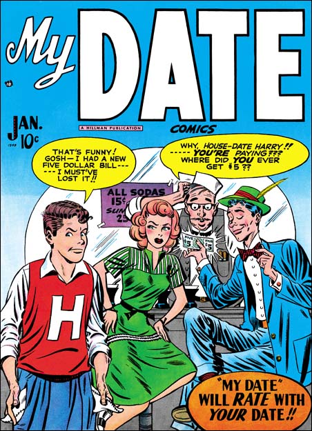
My Date #4
My Date #4 (January 1948) art by Jerry Robinson and Mort Meskin

All four My Date covers have traditionally been attributed to Jack Kirby, as for example by the Jack Kirby Checklist. I have long felt, and I am not alone in this, that the cover for My Date #4 was done by someone else. Gone are Jack’s exaggerated perspective, replaced by a relatively shallow depth of field viewed straight on. The drawing for My Date #4 is cartoonier then in the previous My Date covers. House-Date Harry looks rather different on issue #4 then on the covers for #2 and #3, or from their story art as well. The same is true for Swifty who also shows up on My Date #1 and #2 covers.

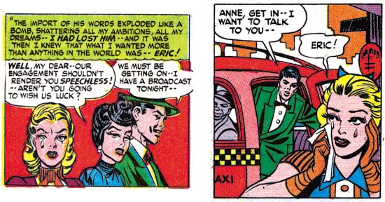
Young Romance #3
Young Romance #3 (January 1948) “Love or a Career” page 5 panel 5 and page 7 panel 4, art by Jerry Robinson and Mort Meskin

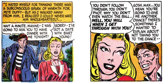
Readers of my last post on the inking of Mort Meskin may have spotted the long close and narrow brush marks that are used on the My Date #4 cover to indicate the folds of the clothing. Not all of Meskin inking traits that I previously described are found, but I am nonetheless certain that Mort was the inker. This a bit surprising because at this time Meskin was still producing work mainly for DC and his first signed work for S&K studio would not appear for months later. Young Romance #3 has the same cover date as My Date #4 and in it is the story “Love or a Career”. Unfortunately this story is unsigned but Meskin’s inking is once again quite apparent. I will explain my full attribution of this art below when I discuss the first signed works. The art for “Love or a Career” is the closest match to the MD #4 cover that I have been able to find. Consideration has to be given for the more cartoony style used for the teenage humor comic, but see how close the female character is in the two panels I have selected from YR #3 compared to Sunny of MD #4, similarly shaped face, arching eyebrows, eyes and lips.

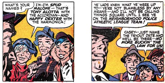
Justice Traps the Guilty #4
Justice Traps the Guilty #4 (May 1948) “Guilty Boys” page 1 panel 3 and page 5 panel 7, art by Jerry Robinson and Mort Meskin

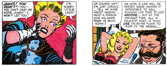
Some months later art very similar to YR #3 appears in “Guilty Boys” from Justice Traps the Guilty #4. This is another unsigned piece with Meskin apparently doing the inking. This crime story was appropriately rendered more realistically then My Date #4 but similarities still show up. Note the comparable button noses of the boys to Swifty and to a lesser extent House-Date Harry on MD #4. The two boys on the right in the page 1 panel has a smiling cheek line similar to that of House-Date Harry.

Young Romance #6
Young Romance #6 (July 1948) “The Inferior Male” page 7 panel 3 and page 8 panel 4, art by Jerry Robinson and Mort Meskin (signed)

Going forward two months provides two stories that bear the dual signatures of Jerry Robinson and Mort Meskin. The usual assumption is that the first signature designates the penciler and the second the inker. But I know nothing about how the Robinson and Meskin team worked so this may not be a safe assumption. Still it does look like Meskin’s inking while at least some of the figure drawing and compositions do not appear to be his. I have posted about “The Inferior Male” twice before (here and here). The correspondence between the art in YR #6 and that in YR #3 and JTTG #4 is close enough that the same artists were probably responsible for all. As seen in the above panels the female still looks like a more realistically drawn version of Sunny from the MD #4 cover.

Justice Traps the Guilty #5
Justice Traps the Guilty #5 (July 1948)”Murder Special Delivery” page 3 panel 3 and page 4 panel 1, art by Jerry Robinson and Mort Meskin (signed)

Issue #5 of Justice Traps the Guilty also has the Robinson and Meskin signature. As might be expected there is great similarities with the YR #6 that came out in the same month. But this comparison is not perfect. In JTTG #5 the female leads start to take on the more stylized look that is typical of most of Meskin’s work for S&K. But the females have not adopted the more triangular face as done later by Mort so there still is a slight resemblance to Sunny from the MD #4 cover.

Real West Romances #5
Real West Romances #5 (December 1949) “Tenderfoot In Love” page 2 panel 4 and page 8 panel 7 art by Mort Meskin (signed)

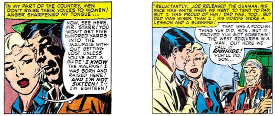
Mort Meskin would not show up again in S&K productions for over a year. By cover date of December 1949 things had clearly changed for Mort, the work would only be signed by him with no indication of any Robinson involvement. Meskin was no longer providing art for DC and this marks the start of a productive and consistent relationship with Simon and Kirby. In Real West Romances #5 the woman is drawn actually less stylized then found in the Robinson and Meskin’s piece in JTTG #5. Although not typical of Mort’s later work, the female in RWM #5 is not a very good match for that on My Date #4 either. This is largely due to the introduction of cheek bones that makes the face depart from the more simple geometry found on MD #4. Other similarities can still be found between the RWM #5 and MD #4, as for instance the old man’s eyebrows and smiling cheek line in the right panel as compared to House-Date Harry on MD #4.

Young Romance #16
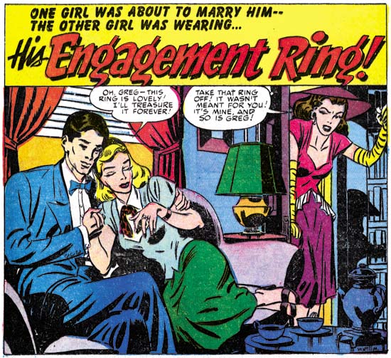
Young Romance #16 (December 1949) “His Engagement Ring” page 1 splash, art by Mort Meskin (signed)

Meskin also appears during the same month in Young Romance #16. Once again Mort’s woman are not as stylized as they soon would be. but gone are the cheek bones that Mort provided woman in RWR #5. A resemblance to Sunny of MD #4 can still be seen, especially in the lady on the right of the above splash panel.

It may be a little surprising that a S&K production would have a cover drawn by an artist other then Jack Kirby. The only other non-Kirby covers were also done by Meskin along with Bill Draut, John Prentice and Ann Brewster. Those were all Prize romance covers with cover dates of 1954 and 1955, a period when Jack and Joe were busy with Mainline, their self owned publishing company. The reason Simon and Kirby made an exception for My Date #4 is most likely the same. A few months previously Simon and Kirby had launched Young Romance with Prize comics. As typical for them, most of the initial art for Young Romance was drawn by Jack. They had more recently lauched Justice Traps the Guilty. Not only was this all a lot of work for Kirby, it also was work for which S&K would have a share in the profits. Their deal with Hillman was not as good and so My Date #4 would be the last comic Simon and Kirby produced for that publisher with the exception of a single Western cover (Western Fighters #1, April 1948).

Kirby Inkers, Mort Meskin

Jack Kirby had a lot of different inkers throughout his long and productive career. During the time of Jack’s collaboration with Joe Simon, most of his inkers were also artists that worked for the S&K studio. Mort Meskin, for one, had a extended and fruitful association with Simon and Kirby. The earliest S&K production that included a Meskin signature was “The Inferior Male” from Young Romance #6 (July 1948) (see previous posts here and here). That particular piece was also signed by Jerry Robinson, the usual assumption is that the first signature (in this case Robinson) was the penciler and the second (Meskin) was the inker. Here support is found in that at least some of the pencils do not appear to by Mort, while the inking is typical of his work that follows. The first work to be signed by Meskin alone came over a year later with “His Engagement Ring” (Young Romance #16, December 1949). There is an even earlier work then both of these that Meskin at least participated in (“Love Or A Career” in Young Romance #3 January 1948). To be honest I am holding back some information that I want to be the subject of my next week’s post. Although Mort’s earlier work for Simon and Kirby was sporadic, from 1950 on he became the most prolific of the studio artists. During this time Meskin’s output may have even exceeded Jack Kirby’s.

Young Romance #18
Young Romance #18 (February 1950) “I Own This Man”, pencils and inks by Mort Meskin

I provide above a splash by Meskin from early in his association with Simon and Kirby. It gives examples of a number of Mort’s spotting techniques. Mort’s most common brush method, actually used much more frequently than apparent in this splash, is to describe clothing folds by using two or more narrow brush lines in close or overlapping paths. These can be found in the pressman’s blue jacket. Note how what the original individual brush strokes are sometimes revealed at the ends of the folds. Another Mort inking style was to often distinctly outline shadows. Once again this splash does not provide the best examples but two of them are present one near the center of the wrestling mat while the other is near Mort’s signature. The wrestlers give Meskin the opportunity to do some real nice simple hatching. The lines vary from thin to quite bold. Often one and occasionally two lines are used to delimit a hatching area. This type of brushing technique is very reminiscent of the S&K Studio style picket fence work. (See the inking glossary for an explanation of my inking terms such as simple hatching and picket fence). I do not know enough about Meskin’s prior inking to say whether this is typical of his work at the time or if this shows he was influenced by the Studio style. The dark spot on the reporter’s right shoulder are suggestive of the Studio style’s shoulder blot. That is misleading as Mort always seems to use these in a way to suggest realistic shadows while in the Studio style they generally appear on both shoulders without any natural explanation.

Young Romance #37
Young Romance #37 (September 1951) “Just to be Near Him” page 2 panel 1, pencils and inks by Mort Meskin

Although it maybe debatable whether my first image represents true Studio style brushwork, later work can certainly be called that. In the above image the pickets of the picket fence inking have become bold and the rails more consistently applied. Mort would sometimes also use standard crosshatching, as seen on our far left and on the lower part of the woman’s dress. When doing so, he would frequently place the crossing lines at an acute angle so that the white spaces are elongated.

Young Romance #29
Young Romance #29 (January 1951) “Diagnosis: Love” page 5 panel 3, pencils and inks by Mort Meskin

The above panel provides a better example of Meskin’s penchant for outlining shadows. That the boldly brushed dark spot on the center man’s jacket is a shadow can be seen by the presence of the profile of a nose. Mort would occasionally have a dark shadow trace a path down one side of a figure, such as the man on our left.

Justice Traps the Guilty #56
Justice Traps the Guilty #56 (November 1953) “G-Man Payoff” page 5 panel 6, pencils and inks by Mort Meskin

When artists both draw and ink their own work the two art stages will sometimes reinforce one another. That is what I believe happened with the eyebrows that Mort gave his men. These eyebrows are inked with a method similar to how Meskin handled clothing folds, two or three narrow overlapping brush strokes would trace the path of the eyebrow. This resulted in eyebrows that were wide, simple and made somewhat angular turns. As we will see below, Mort became so entrenched in inking eyebrows this way that it could affected how he inked Kirby’s pencils.

The above panel also shows how Meskin would sometimes fill in part of a blank background with crosshatching. As is generally the case, here his lines meet at an acute angle, not at right angles some other inkers prefer.

Young Romance #30
Young Romance #30 (February 1951) “My Lord and Master” page 3 panel 1, pencils and inks by Mort Meskin

Sometimes Mort will use his brushwork to create a side of a figure that is both a narrow shadow and a wide outline. This does not show up often, but is very distinctive when it does. I am sure further study of Meskin’s abundant output will show other inking techniques that while not common can be useful in determining attributions.

Young Love #68
Young Love #68 (December 1955), pencils and inks by Mort Meskin

Covers are important for the sale of a comic and the higher quality paper allows a superior printing. Therefore artists take more care in the creating artwork for covers. However the S&K studio artists usually did not get a chance to provide cover art, Jack Kirby would do all cover art when a photograph was not used. But when Simon and Kirby launched their own publication company, Mainline, Jack was so busy that for a year the covers for the Prize romance titles would be done by other artists, including Mort Meskin. On none of his romance covers would Mort use picket fence patterns or any of the other traits of S&K Studio style inking. For the spotting on Young Love #68 Mort relied mostly on his use of narrow brush strokes. Note how on YL #68 the back of the man’s jacket and pants has that narrow shadow or wide outline that we saw before.

Mort Meskin was such a prolific artist that the possibility of the use of assistants has to be considered. In preparation for writing this post I reviewed a lot of Mort’s work from 1950 to 1956, there is so much work that I did not have the time to review it all. This review confirmed my previous conviction, Mort had little if any assistance in inking his art. Almost all the spotting looked like it was done by the same hand.

Some of Meskin’s inking techniques are not limited to him alone. The use of narrow, often overlapping brush strokes can also be found in stories by George Roussos as well. This is not too surprising since Mort and George worked together in the late 40’s. The narrow brush strokes were not the only think George picked up from Mort, a lot of his penciling was clearly influenced by Meskin as well. Nonetheless Roussos did not adopt all Mort’s inking techniques so the two can be distinguished. However a discussion about Roussos will have to await another post. I will say that I have yet to find an example of Roussos inking Kirby (that is until the Silver Age).

Boys’ Ranch #4
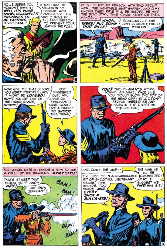
Boys’ Ranch #4 (April 1951) “The Bugle Blows at Bloody Knife” page 8, pencils by Jack Kirby, inks by Mort Meskin

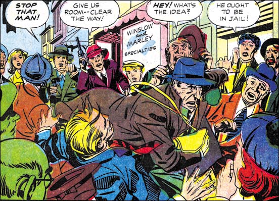
The Jack Kirby Checklist attributes most of the inking in the classic Boys’ Ranch to Joe Simon. Actually it is not hard to recognize Mort Meskin’s inking in much, if not most, of it, particularly after the first couple of issues. The biggest difficulty I faced with choosing an example of Mort inking Kirby from Boys’ Ranch was that I believe Mort was the penciler for at least some of the work in that title that has generally been credited to Jack. But the drawing in “The Bugle Blows at Bloody Knife” looks so much like Kirby’s that I am confident that he was the penciler. I am equally as confident that Meskin did the inking. Note the narrow clothing folds in panels 3, 4, 5 and 6. See how the shadows have a strong outline, most obvious in panel 4, but can even be found on the officer’s forehead in panel 1. The back of the soldier in panel 3 could be described as either a narrow shadow or wide outline. The eyebrows in panel 1 and 6 are simple with angular turns. All of these are typical Meskin traits.

Police Trap #6
Police Trap #6 (September 1955) “Only the Guilty Run”, page 1, pencils by Jack Kirby, inks by Mort Meskin

The two gun carrying detectives in the background are so typical of Jack Kirby that he must have been the penciler. At a glance the inking appears typical S&K Studio style. But note how the clothing folds are long and narrow. The final giveaway is the thief’s eyebrows are simple with angular turns. There is little doubt that this is another example of Meskin inking Kirby.

Western Tales #32
Western Tales #32 (March 1956), pencils by Jack Kirby, inks by Mort Meskin

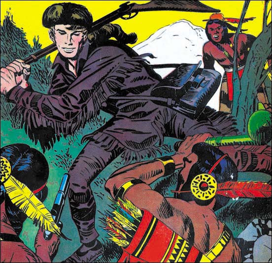
My final image is the cover of Western Tales #32. This work was not included in the Jack Kirby Checklist. The last time I posted on it I attributed both the pencils and inks to Joe Simon. The fact that it was not Kirby’s inking and the stiffness of the Indians (especially the one in the right foreground) suggested to me that Joe might be responsible. After all Simon has shown himself to be excellent at mimicking Kirby. However Crockett’s pose seems more dynamic then what Joe has ever done without using swipes, and it was just the sort of thing that Jack was so good at. Perhaps the awkward pose of the Indian on the right was due to the limited area left over from Davy’s figure. As for the inking it simply is not Kirby’s work. Note the long and narrow clothing folds, Davy’s angular eyebrows, and the way his back is outlined by a narrow shadow. None of these are Kirby traits but all are characteristic of Mort Meskin’s inking. This magnificently inked cover shows that Mort had complete mastery of the S&K Studio style. Mort’s brushwork has the same sort of bold confidence that Jack and Joe also possessed. Although it may not be a reliable enough trait to rely on in determining attributions, Meskin’s brush does seem a little more mechanical then either Simon’s or Kirby’s.

A few months after Western Tales #32 Meskin would stop providing work to Simon and Kirby. If the GCD is correct, Mort had actually returned to working for DC a couple of years earlier. Now having left S&K, DC would become Mort’s main source of income until he abandoned the comic book industry. Meskin’s final DC period overlaps Jack Kirby’s time there, however none of Kirby’s DC work that I have seen was inked by Mort.

I have not made a thorough examination of Jack Kirby’s work for the purpose of determining what ones were inked by Mort Meskin. I want to hold off on that effort until I review some more S&K artist/inkers. So far the only other one I have posted on was Marvin Stein.

Alternate Versions of the Alarming Tales #3 Cover

Alarming Tales #3
Alarming Tales #3 (January 1958) restored art, by Joe Simon

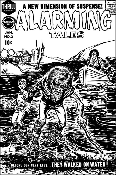
A recurring theme in my posts is how well Joe Simon could mimic Jack Kirby. This has resulted in a number of pieces that Joe did becoming attributed to Jack. Do not get me wrong, the overwhelming number of the items in the Jack Kirby Checklist are correctly attributed. Still there are a small number of entrees that are wrong and it is important to try to correct those mistakes. I would like to say that my study of Joe Simon’s art has enabled me to spot all the attribution errors that others have made. I would like to say that but it would not be completely true. A case in point is the cover for Alarming Tales #3. I provide an image of the restored line art to this cover above, a color version can be seen in a previous post.

In the past I have followed the Jack Kirby Checklist in saying Kirby did this cover. Not everyone agreed, for one sharp eyed Nick Caputo demurred. I was not completely satisfied with the Kirby attribution because I knew of the existence of another version of the cover art. It seemed to me that a comparison of the two would probably resolve the credit issue. As I hope to show in this post, that has turned out to be the case.Alarming Tales #3
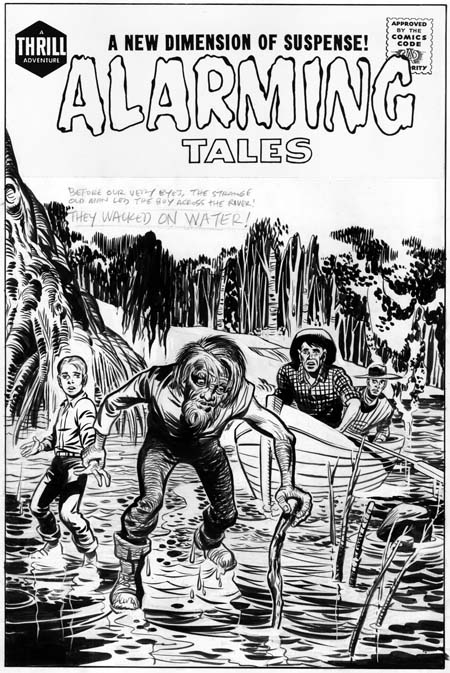
Unused original art for Alarming Tales #3, by Jack Kirby.

I provide an image of the unused version above. A note of caution when comparing the two versions. The unused one is original art and therefore has not been subjected to the blurring and loss of details that are the results of the printing process, all of which the published version has been subjected to. Also the title on the original art is a recent addition. The presence of penciled text indicates the decision to come up with new cover art was made before title stats would have been applied to the original.The derivation of the final cover from the unpublished version is obvious, both have the same cast of characters in about the same positions. The greatest difference is the backgrounds. Not only has the background been completely changed, it has been pushed much further back in the released cover. A closer examination reveals that the people are not identical. The size of the old man has been increased while the relative size of the boy and, even more so, the men in the boat has been reduced. The old man’s head has been enlarged and the position of his left arm has been shifted. The details of all figures have been changed. Curiously the boy’s pants have been given a stripe like those worn by the USPS mail carriers. My original suspicion that reworked stats of the first cover were used to construct the final state was incorrect.I think most readers will agree with me that the original art is more beautiful then the final cover. So why spend the time and effort to replace it? The answer to this riddle is that the purpose of a comic book cover is to entice a viewer to purchase it. To do so it must stand out from the rest of the comics on the rack. The problem with the original version is that the old man is overwhelmed by the background. By simplifying and pushing the other elements back, the old man and his feat of walking on water becomes more obvious and dramatic. It is a question of design taking priority over artistry.

Alarming Tales #3
Close-up of the old man by Jack Kirby and the Joe Simon rendition.

Because the compositions of the two versions are so similar, we must look at the details in order to arrive at the correct attributions. Although not a standard part of Kirby’s repertoire, the old man of the first state seems to be not only his pencils but his inking as well. There are subtleties that his copyist is unable or unwilling to capture. Some of the alterations do seem on purpose, in the final state the old man has been made older and more frail. In doing so the published version has lost the quiet dignity and resolve that the original old man possessed.

Alarming Tales #3
Close-up of the young boy by Jack Kirby and the Joe Simon version

Personally I do not find much in the final state of the old man to suggest who was responsible. For an answer to that question I turn to a close-up of the young boy. Once again the original version seems to have Kirby’s touch all over it. Some of Jack’s style has been preserved in the published interpretation but purposeful alterations have been made as well. Frankly in Kirby’s hands the boy has been given a somewhat dim witted response to his predicament. The copyist on the other hand has widen the boys eyes, raised his eyebrows and furrowed his forehead. All this gives the boy a more intelligent and surprised reaction to being lead by the old man over water. It is the boy’s eyebrows that convince me that the copyist is Joe Simon. Similar eyebrows crop up often in Joe’s work going back as far as the cover for Champ #19 (June 1942) .

The men in the boat are typical Kirby creations. Unfortunately it is hard to compare the two versions because in the published one they have been reduced in size and their finer features lost by the reproduction process.

I mentioned above that I believe Jack Kirby inked his own pencils for the unused Alarming Tales #1 cover. That is not surprising because AT #1 is a comic where Jack did most of the work, including the inking. When I previously discussed the inking in AT #1 I found some of it similar to the standard Studio style while others were closer to the Austere style. On a whole I felt the material was transitional between those two Kirby inking methods. The inking style exhibited on the unused cover is a bit of an anomaly. It is true that the bow of the boat exhibits what looks like typical picket fence brushwork (see the Inking Glossary). It should be noted that it is unusual for the rails of a picket fence inking to depict literal objects like it does here with the bow edges. A better example of typical Kirby brushwork can be found in the folds of the boy’s shirt. They exhibit the tendency to be flatter then the underlying form that was common for Kirby at this time. The form lines on the tree on the left side of the image also look like Jack’s. But other inking methods used are very unusual for Jack, in particular the form lines on the old man’s pants. I do not recall Kirby ever doing something like that before.

Also unusual about the inking is the abundant use of white-out. Although Kirby was a bold inker his control was so great that he usually had to make few adjustments with white-out. Actually some of the white-out on the unused cover were not mistakes at all. Many of the trees in the background and some of the branches in the water were actually created by white-out. The old man’s hair was done by a combination of standard inking and the use of white-out. But mistakes were corrected, for instance the edges of the drooping fronds left of center on the top were worked over. Some earth lines in the background and a water stain on the upper part of the boat were removed. I am not sure what to make of Jack removing the bottom of the boy’s shoes. Perhaps it was done to indicate that he the lacked the old man’s confidence and so could not tread as lightly over the water surface? A most surprising correction is found in the depiction of the water, much of what now looks white has abundant use of white out. The white-out does not completely hide the underlying inking and judging from their faint markings the water surface was originally much darker.

Despite all the features that are not usually found in Jack Kirby’s inking, I find the combination of boldness and control so characteristic of his work that I am pretty confident to credit him with the inking. The published cover shows Joe Simon equally bold with his use of the brush but without the same nuance of control exhibited by Kirby. It is interesting that Joe made the water surface very dark, just the thing that Jack spent so much effort to remove from his own version.

I love comparing different artists’ versions of the same subject. It is not a question of trying to determine who the better artist is. What I find interesting are the different decisions each artist made and what the reasons for those decisions were.

The Early Sandman

Adventure Comics #72<
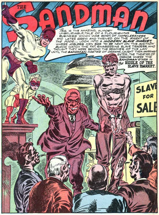
Adventure #72 (March 1942) “Riddle Of The Slave Market”, art by Jack Kirby

Joe Simon has said that when, along with Jack, he arrived at DC their first jobs was ghosting for others. In the past Joe had shown he could be pretty good at mimicking comic artists, some of his Fox covers have been attributed to Lou Fine by comic book experts despite the presence of Joe’s signature. Joe and Jack both worked on a Captain Marvel special which on a whole is a pretty good job of ghosting. However careful attention reveals Jack’s touch on the Captain Marvel job despite the simplicity of the art work. So far no one has identified any of the ghosting jobs that Simon and Kirby did for DC. The first Simon and Kirby piece that we do know about was a Sandman story that appeared in Adventure Comics #72 (March 1942). No question of ghosting here, Simon and Kirby not only signed the piece they infused it with the exciting art and dynamic story telling that characterized all their creations. The only thing is Sandman was not their creation, not even the version with the new purple and yellow costume and a young sidekick named Sandy. This updated Sandman started a couple of issues before. Unfortunately I have never had the opportunity to examine those two pre-S&K issues. Simon and Kirby may not have changed the costumes, but I suspect a fuller comparison would reveal other modifications.

At this point Joe and Jack were pretty comfortable with what it took to make an interesting comic. One reason for the ease that Simon and Kirby seem to have in taking over someone else’s title was its similarity to their previous gig, Captain America. Both titles had a hero whose powers, while exceptional, would not be considered unnatural. Both included a young sidekick so that, as Joe would describe it, the hero would have someone to talk to. Finally neither hero would use weapons such as a gun. Sandman and Sandy did carry what looked like a pistol but actually was what they called a wirepoon, used to attach a wire so that the heroes could easily ascend buildings, it was never fired at their foes. It should be noted that S&K would not adhere to these traits throughout their career. Most S&K heroes do not have what one would normally describe as super-powers, but there are certainly enough exceptions. I would say most S&K heroes did not have a sidekick, but again there are enough young partners to made this a weak generalization. As we saw in Manhunter Joe and Jack could come up with sidekick stand-ins if they felt the need. Perhaps the strongest S&K trait was the hero’s lack of firearms. Only two heroes had a firearm, Night Fighter (intended for their own company Mainline) and the Fly (whose costume seems based on Night Fighter and so probably inherited the gun from that source). Since Night Fighter was never published we do not know if it was a true gun, it could have been another wirepoon to help, along with special suction boots, scale buildings. The Fly had no need for a wirepoon (he could fly) and so it was his buzz gun (used to stun his advisories). Of course I am excluding the cross-genre Bulls-Eye, although it may properly be considered part of the hero genre, a western without guns, well that would just be silly.

Captain America was not a perfect prototype for how Simon and Kirby would do Sandman. The most important difference was that since Captain America was a patriotic hero most of his opponents were spies. Without a patriotic costume, Sandman would have to have other foes. That was not a serious problem because crime was the staple of comic book and Joe and Jack would show themselves quite capable of supplying a steady stream of colorful lawbreakers. The thing that gave Simon and Kirby the greatest difficulty was non-iconic nature of Sandman. Ideally comic superheroes are meant to be iconic figures, or avatars, the embodiment of a quality or theme. The original Sandman had a pistol that released a sleeping gas and so Sandman was a very apt name. With the sleeping gas discarded and its pistol replaced with a wirepoon, the name Sandman lost its original significance. Simon and Kirby tried to make up for this lost in a number of ways. One was a bit of a poem that they would often use, usually either at the start or end of a story:

There is no land beyond the law
Where tyrants rule with unshakeable power,
It’s a dreame from which the Evil wake
Too face their fate … their terrifying hour

I wish I knew more about this unusual poem. Was it used previously by Sandman’s earlier creators, or did Simon and Kirby introduce it? More importantly what was the origin of this rhyme? The obsolete spelling of the word dreame suggests it may come from English literature. Then again it may just be the work of a very clever comic book writer. I suspect the former but I have not been able to uncover the source.

Adventure Comics #79
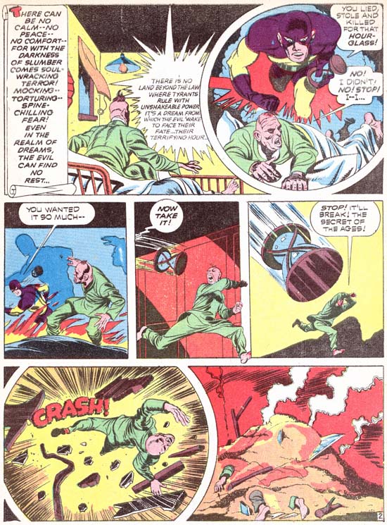
Adventure #79 (October 1942) “Footprints in the Sands of Time” page 2, art by Jack Kirby

Another justification for the name Sandman was the concept that the criminals were so frightened Sandman that he would haunt their dreams. A nightmares of the Sandman had by a crook was depicted in Adventure #79 (see image above). In “A Drama in Dreams” (Adventure #81, December 1942) an actor has taken the place of Sandman’s alter ego, Wesley Dodds. His deception was not perfect until he talks in his sleep:

Wesly: You can’t pin anything on me! Help! The Sandman … Don’t let him get me!

Sandy: Why — only criminals have dreams like that — but not Wes Dodds.

Dreams and sleep play other small parts in Sandman stories. In “The Lady and the Champ” (Adventure #83, February 1943) sleeping with a piece of wedding cake under the pillow apparently results in two strangers dreaming of each other. In “The Man Who Couldn’t Sleep” (Adventure #80, November 1942) a rich man’s insomnia leads him to a life of crime. Other sleep references can be found, such as Sandman commenting on their fighting crime at night while others are asleep. Sandman may not have had any special powers, but that did stop S&K from including the sleep theme into their stories in an attempt to justify their hero’s name.

Just as Sandman and Sandy did not have an real superpowers, neither did their opponents. Most would be have nothing special about them above their criminal behavior. That really was not a problem because Joe and Jack knew how to make a story exciting. Sometimes S&K would suggest their villains had powers which by the end of the story would be shown to be illusionary. In the “The Villain from Valhalla” (Adventure #75, June 1942) we are presented with the god Thor whose leads a Viking raid against New York City. Even the character’s thought balloons lead us to believe he is truly Thor, as a car approaches the treasure laden Thor he thinks:

HMMMMM. A QUEER CHARIOT THAT! .. BUT “MJOLNAR” CAN OVERCOME IT!

But in the end he turns out to be nothing more then “a clever and brutal killer” named “Fairy Tales” Fenton. His metallurgy expertise provides his gang with bullet proof clothing. The destructive hammer

AN ELECTRICAL MASTERPIECE! IT CAN SEND ENOUGH VOLTAGE INTO THE STRONGEST STEEL TO BLOW IT TO PIECES

Adventure Comics #84
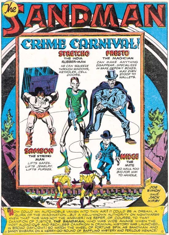
Adventure #84 (March 1943) “Crime Carnival” page 1, art by Jack Kirby

Another faker was the carnival magician in “The Miracle Maker” (Adventure #78, September 1942). His magic tricks were used to hide his criminal acts. Sandman and Sandy are not fooled and catch him at his tricks. Simon and Kirby seem to have a propensity for using carnivals as a source of criminals. Previously at Timely they had done “Case #2: Sando and Omar” (Captain America #1, March 1941) and “Captain America and the Ringmaster Of Death” (Captain America #5, August 1941). “Crime Carnival” became a prime example for Sandman. Why carnivals? I suspect it has to do with the fact that the readers would be familiar with the world of circus performers and freaks. It was populated with people who could have abilities beyond those of normal people, yet be familiar enough that the readers would not wonder how they got those powers. Provided that S&K did not go too far, which they never seemed to do. When Strecho reaches through the bars to grab the money bags from a bank desk, is his arm length truly increasing, or is he just taking advantage of his thin but tall frame? From the angle that Kirby draws it is hard to be sure.

The only villain in the earlier Sandman stories that is shown receiving powers that he did not originally have was in “The Man Who Knew All the Answers” (Adventure #74, May 1942). Here we find a scientist using a device to generate vibrations that develop his unused brain cells.

KNOWLEDGE! VAST KNOWLEDGE! … I CAN FEEL IT POURING ….. INTO MY BRAIN ….. OPENENING .. UNLOCKING THE NATURAL … AND SUPERNATURAL!

Afterwards when encountering the janitor he questions him about getting a new job. The janitor is shocked, he has told nobody about it. Deductions like a super-Sherlock or ESP? No explanation is given and for the rest of the story the only power he exhibits is great intelligence.

Adventure Comics #75
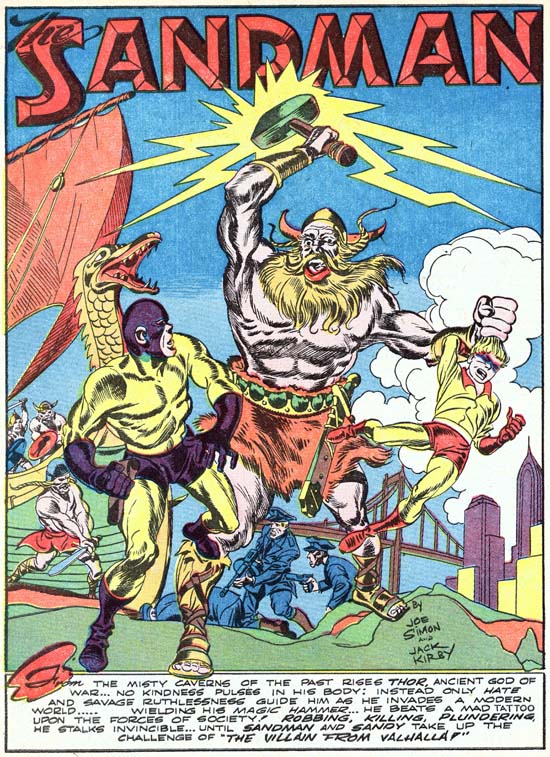
Adventure #75 (June 1942) “The villain from Valhalla” page 1, art by Jack Kirby

In my opinion it was with the work that Simon and Kirby did for DC (as well as the Harvey covers) that they forged their unique art style. The key ingredient that had previously been missing was their special bold inking style. There had been occasional hints of it in the Captain America Comics, but S&K would consistently use it from this point on. I suspect that the larger crew at Timely was the reason that it did not evolve at that time. At least initially at DC all of the art was produced by Jack and Joe which facilitated the developing of their inking style. Still this is not the Studio inking style I wrote about in my serial post on Jack Kirby’s Austere Inking. There are things that look like abstract arcs (see the Inking Glossary ) but they black area never seems to form a band with both the upper and lower boundaries tracing an arc, something often seen in the typical Studio style. Crosshatching sometimes is reminiscent of picket fence brushwork as for example on the torso of Thor in the above splash page. But the pickets are thin and slanted at an angle while the rails are actually further crosshatching.

Other changes occurred in the art from what was done on Captain America. The more extreme irregular panel shapes had been abandoned. Round and irregularly shaped panels would still be common, but ones with a multiple zigzagging border would no longer be used. The most important change would be the panel layout. The predominant format on Captain America had the panels laid out in four rows and two columns. The same layout was initially continued when Simon and Kirby worked at DC. But beginning with Adventure #78 (September 1942) three rows and two columns began to be the most common layout. The transition was not sudden or complete, there are a number of stories that have both layouts. But eventually four rows would become rare and most variations would be having some rows with three panels.

Adventure Comics #75
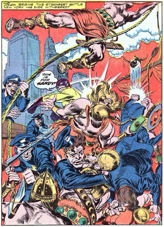
Adventure #75 (June 1942) “The villain from Valhalla” page 8, art by Jack Kirby

I cannot finishes discussing the earlier Sandman comics without writing about one of my favorite splashes, the one from “The Villain from Valhalla”. In a previous encounter with Thor and his Viking horde, Sandman and the police had been soundly defeated with Sandy hospitalized. Now they are determined to even the score. Most Simon and Kirby splashes were limited to the first page, but this fight required the an entire story page. Besides Thor’s hammer we find the villains armed with a spear and a battle ax. Yet the good guys face this solely with their fists, none of the police draw their guns. The composition is Kirby’s comic book equivalent of Jackson Pollack. Most of the page is a tangle of arms and bodies where extra viewing time is required to reveal what is going on. Jack is not even content to leave the skyline with the Chrysler building alone, surmounting it with a rope swinging Viking. Jack’s confidence in the impact of the splash is so great that he is throws in a piece of his personal humor, a policeman’s powerful slug sends a Viking’s helmet on an upward trajectory. Frankly the caption

THEN BEGINS THE STRANGEST BATTLE NEW YORK HAS EVER WITNESSED!

seems superfluous and Sandman’s battle cry

THIS IS FOR SANDY!

was all that was needed.

Another Pre-Implosion Atlas Kirby

Quick Trigger Western #16
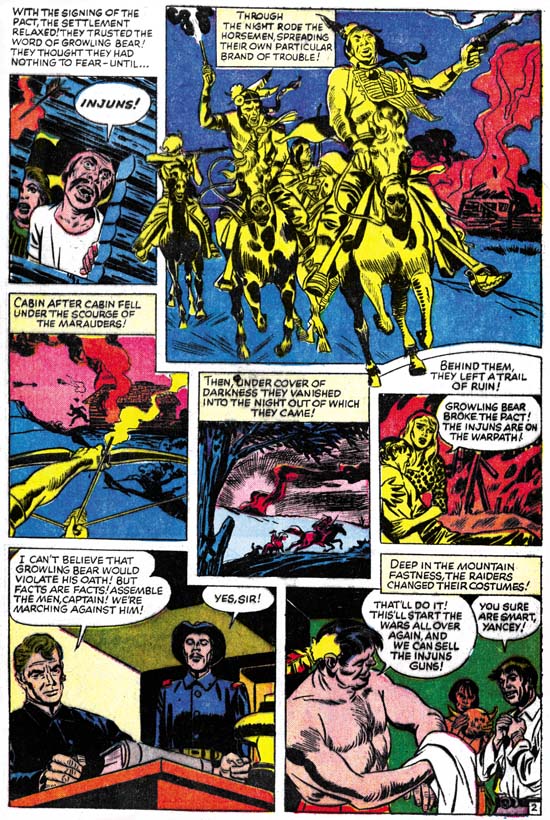
Quick Trigger Western #16 (February 1957) “The Vengeance Of Growling Bear” page 2 pencils by Jack Kirby

A peace treaty with the Indians threatens the business of gun dealing. To prevent the unwanted peace, the dealers dress up as Indians and raid the community, leaving death and destruction in their path. The Indian leader, Growling Bear, uncovers the truth. His reputation is enough that when the gun dealers realize that he is on to them, their plot unravels before war is resumed.

I must confess I am a bit underwhelmed by this story. Jack’s pencils are good in comparison to other Atlas artists, but then again I have a low opinion of much of the art done at the time for Atlas. In comparison to the rest of Kirby’s oeuvre, this story art is one of his lesser efforts. Nothing particularly wrong, just not as exciting as most of what Kirby did. The writing does not help either. Again it is not that the writing is bad, just that not very exciting either.

One of the reasons that I find Jack’s pre-Implosion work for Atlas so fascinating is the level of control that he appeared to have. Even so Jack did not seem to consistently have full creative leeway. That seems to have been the case here. Unlike many pre-Implosion pieces, the inking was not by Jack, but it may have been inked under his direction. Most of the brushwork is fine and lacking Kirby’s style. But look at the second panel of page 2 (image above), the horse’s leg on our far right has a bold use of a row of dashes. This technique does not occur elsewhere in the story but is part of Kirby’s brush vocabulary (see the similar drop string in the inking glossary). It would appear that Kirby reviewed and touched up the primary inker’s efforts. The writing does not seem to be Jack’s either. The plot, where white men masquerade as Indians, was used previously by Simon and Kirby. So Kirby may have had a hand in the plotting. Then again I remember that plot from some old movies (although I cannot recall which ones) so perhaps it was just a common theme. In any case general plots are easily picked up by other writers and therefore are a poor use in determining attributions.

Now with “The Vengeance Of Growling Bear” I have had a chance to review all Kirby’s work that Atlas published before the Implosion. This consists of 20 stories. Jack did the inking for 16 of them, an impressive proportion. Because credits were not provided, determining the writer is a particular risky business. None the less the writing for 15 of the stories suggest to me that Kirby may have been involved. This amount of creative control by Kirby is in stark contrast to post-Implosion. I know some disagree with me, but I find no examples of post-Implosion writing by Kirby, that is until late in his career. As far as I know, Kirby did not do any inking after the Implosion either until the cover for Fantasy Masterpieces #4 in 1966. Nick Caputo has suggested that Kirby inked some other later covers, but I have not seen this evidence yet.

Battleground #14 (November 1956)
“Mine Field” Kirby inks
Astonishing #56 (December 1956)
“Afraid to Dream” Kirby inks and writing
Strange Tales of the Unusual #7 (December 1956)
“Poker Face” Kirby inks
Yellow Claw #2 (December 1956)
“Concentratet On Chaos” Kirby inks and writing
“The Mystery Of Cabin 361” Kirby inks and writing
“The Yellow Claw” Kirby inks and writing
“Temu-jai, The Golden Goliath” Kirby inks and writing
Quick Trigger Western #16 (February 1957)
“The Vengeance of Growling Bear” Kirby inks and writing
Yellow Claw #3 (February 1957)
“The Microscopic Army” Kirby inks and writing
“UFO, The Lighting Man” Kirby inks and writing
“The Yellow Claw Captured” Kirby inks and writing
“Sleeping City” Kirby inks and writing
Yellow Claw #4 (April 1957)
“The Living Shadows” Kirby writing
“The Screemies” Kirby writing
“Five Million Sleepwalkers” Kirby writing
“The Yellow Claw and the Thought Master” Kirby writing
Black Rider Rides Again #1 (September 1957)
“Legend Of The Black Rider” Kirby inks
“Duel At Dawn” Kirby inks
“Treachery At Hangman’s Bridge” Kirby inks
Two-Gun Western #12 (September 1957)
“No Man Can Outdraw Him” Kirby inks and writing

Job numbers indicate that there are three works that may have actually been done before the Implosion but not published until afterwards. These appear to have intended for the never released Black Rider Rides Again #2. I have not seen two of them, but the one I have seen was was not inked by Jack, and I doubt if he wrote it either.

Gunsmoke Western #47 (July 1958)
“Trouble In Leadville”
Gunsmoke Western #51 (March 1959)
“The Raiders Strike”
Kid Colt Outlaw #86 (September 1959)
“Meeting At Midnight”

Sandman Revisited

Sandman #1 cover rough
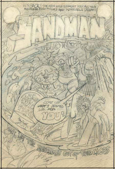
Sandman cover rough by Jerry Grandenetti

A few months ago I posted on a cover rough that Jerry Grandenetti did for the 1974 version of the Sandman. Kris Brownlow provided an image from an old eBay listing which, to put it kindly, was of a rather poor quality (the eBay lister’s fault, not Kris’s). Happily I have been able to obtain the original piece through the help of Scotty Moore.

The better image of the Grandenetti cover is welcome indeed. Now we can make out the text from the top of the cover:

HE’S BACK! THE MAN WHO BROUGHT YOU ALL THOSE WONDERFUL STORIES AND HORRIBLE DREAMS

This obviously refers to the golden age version of the Sandman that Simon and Kirby produced. Potential readers would likely have been aware of that Sandman from reprints that had appeared in the back of the various New Gods titles.

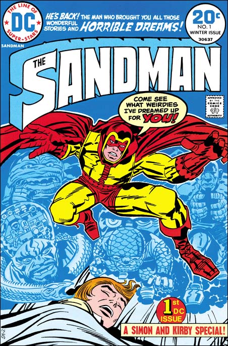
Sandman #1
Sandman #1 (Winter 1974) art by Jack Kirby

Now that it is possible to have a good understanding of the cover rough, it is clear that there is a correspondence between Grandenetti’s rendition and Jack Kirby’s published version. I previously pointed out that the machine head guy on the lower left was common to both. Also the group of snakes became represented by a single serpent. Now it can be seen that other figures correspond as well. The small man a little left of center on the cover rough becomes the scaly man on the bottom of the dream scene on the published cover. Also a little left of center is a figure whose body is nothing more then a circular head with small face surrounded by a rough or folded skin. In Kirby’s drawing the face becomes larger to encompass the entire head, but the folded skin and lack of a true body leave little doubt that it represents the same figure. Grandenetti’s muscle man on the upper right was retained by Kirby although the arms, originally in a Frankenstein pose, were changed to bring the hands together. Grandenetti had a number of circles with multiple legs (spiders?) on the left, which Jack did not made use of. Further Jack dropped the arm holding the doll and added a mysterious and threatening set of eyes. Of course the most important change is that Grandenettis’s Sandman had been delegated to the side almost lost among the dream figures. Kirby instead placed Sandman front and center using his signature exaggerated perspective. There is no doubt in my mind now that Jack saw either this Grandenetti cover or, less likely, yet another version of it.

This is convincing evidence that the bronze age Sandman was originally a Joe Simon concept. At that time Joe had been doing a number of projects for DC. Simon would be the creator and writer while another artist, generally Grandenetti, would do the art. Originally Sandman was going to be nothing more then another comic that Simon would produce for DC. However remembering the success of the golden age Sandman, Carmine Infantino probably twisted Kirby’s arm to got him to team up once again with Joe. But Jack had a long period of creating and writing material without getting the proper credit and had only recently been able to escape that fate. Now he was thrust back to teaming up with another and, worse yet, working on someone else’s concept. Despite the success of the new Sandman, Jack would not, in all likelihood refused to, continue his collaboration with Joe. Thus a Sandman was the first comic that the Simon and Kirby teamed did for DC and it would turn out the last not only for DC but anyone else as well.

The resurfacing of the Grandenetti cover is very fortuitous as I was planning to sometime in the next few weeks to post on the golden age Simon and Kirby Sandman. If that is not enough Sandman for you, I will also post sometime soon on a question I was asked by Scotty Moore about what was used as the basis for the inking of the published version of the Sandman #1 cover.

The back of the Grandenetti cover draft has some enigmatic text:

I’VE GOT IT, JUST
WHAT YOU DEMANDED
THE CASH –
THE LOOT –
THE/A COOL
MILLION

An idea for a crime comic proposal?

Poking Fun at Adolf

Captain America #2
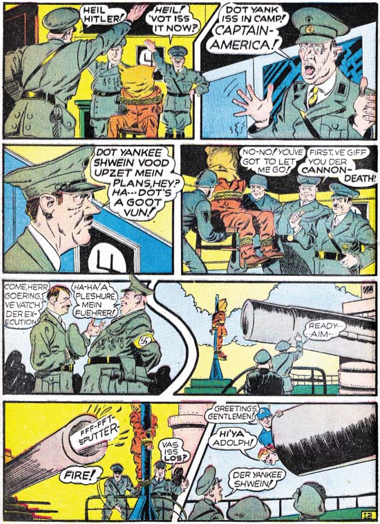
Captain America #2 (April 1941) “Trapped in the Nazi Stronghold”, art by Jack Kirby

Simon and Kirby really hit it big with Captain America. I am sure an important reason about why it became such a large selling comic was the cover. The U.S. was not yet in the war but there were still many who could appreciate a depiction of Captain America slugging Adolp Hitler. What fictional villain could compare with the evil of the all too real Hitler? But brute force was not the only means that Simon and Kirby would use to take Hitler down a peg or two, humor was used as well. It should be obvious from the image above that S&K portrayed Hitler as somewhat of a buffoon.

Speed Comics #16
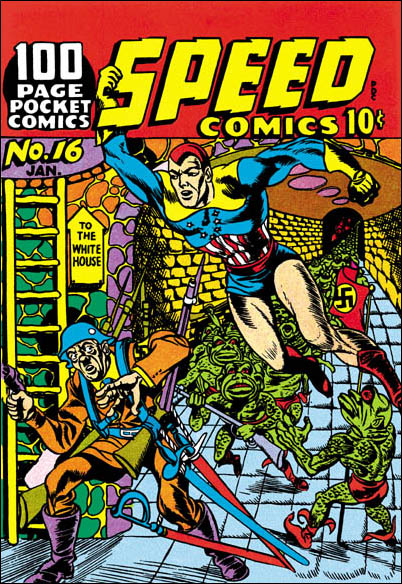
Speed #16 (January 1942), art by Al Avison

Of course once Hitler graced the pages of Simon and Kirby comics, other artists would use Adolf as well. Al Avison had a special advantage, he was one of the crew working for Joe at Timely. Al even drew some Captain America stories. Avison’s efforts never made it into Cap comics, they were recycled as the Patriot in USA #1. (Other then Kirby, the only artist to draw Captain America in the early issues was Simon.) Avison also did some work for Harvey Comics and you tell he learned a lot from Jack. For the cover of Speed #16 Al provides Hitler leading an attack on the White House. Armed with a gun, four rifles and four swords, Avison has also makes Hitler out to be a buffoon. But Avison has overplayed his hand, Adolf and his army are so ridiculous that they hardly seem a threat to Captain Freedom.

Adventure #83
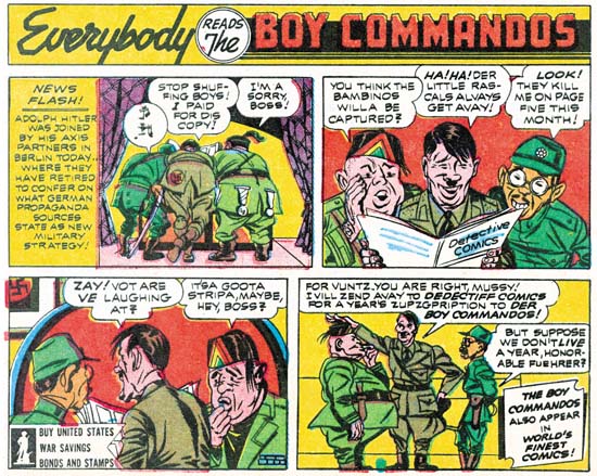
Adventure #83 (February 1943) house ad at the end of a Sandman story, by Jack Kirby

Just because Joe and Jack left Timely and Captain America does not mean that they stopped making fun of Adolf Hitler. Far from it. The original Axis of Evil was jokingly portrayed in a house ad for the Boy Commandos. Only four panels but that is all S&K need. I guess the Axis leaders were the original Three Stooges.

Joe Simon
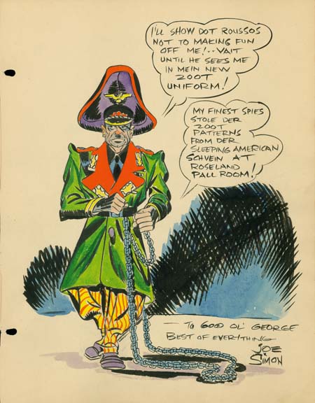
Sketch for George Roussos by Joe Simon (1942)

The above sketch is one of the reasons I have been thinking of Adolf Hitler lately. It is undated but it was from the same George Roussos sketch book that included a drawing by Jack Kirby dated as 1942. Further Joe would shortly be joining the Coast Guard during which I doubt that Roussos would have the opportunity to have Joe add something to his sketch book.

George Roussos was not only a talented artist, he was also an early fanboy. He had some of the greatest talents of the day provide drawings for his book. What a treasure it was. I say was because it recently has been disassembled and the individual pages auctioned off. It is a shame that it was not published before it was taken apart. If you are willing to register with Heritage Auction Galleries you can see the work by searching their Auction Results Archives under original art for George Roussos. Joe’s entry is not dated, but it must have been done about the same time as Jack’s, 1942.

Joe Simon has his own particular brand of visual humor of which this is a very early example. What could be more incongruous then Adolf Hitler in a Zoot suit? Where did he every come up with that? I have no idea. But this sort of irreverent humor would show up again when Joe produced the Mad-close magazine called Sick. In fact it still shows up in the art that he produces today.

I remember years ago someone criticizing Mel Brooks for his movie The Producers. They asked me how anyone could find something funny in Adolf Hitler. Make no mistake about it, Hitler was a monster, the most evil person of our century. We should never forgive or forget the horrible things he did. That however is not enough. There are people who will try to praise Hitler for some of those very awful things. So we must add ridicule on top of our scorn. That is something Joe Simon still understands very well.

Artist Loves Model, the Editing of Strips into a Comic

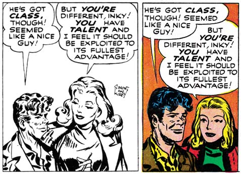
I recently posted on the “Artist Loves Model” story from In Love #3 (December 1954). I appended a note to my blog entry where I admitted forgetting about a post by Bob on the Jack Kirby Weblog about the syndicated strip version of the story. Recently I received a copy of Buried Treasures v1 #2 which includes strips of this syndicate strip proposal. I have compared, panel by panel, the strips to the comic book story. I wrote out all the difference as an aid to my understanding what was done. Just in case anyone wants a blow by blow description I have posted the details. Here I will summarize what was done to convert the syndication strips into the comic book story.

The strips opens with Mayor La Flower. We will never see again, he is just one of Cobb’s fans reading his “Old Man Spry” to his juvenile radio audience. This beginning leaves little doubt that there were no earlier strips. The strips end abruptly with Inky going off to confront Donna Dreame about her illicit dealings. Only the comic book version of the story provides the confrontation. But the book story includes a romance angle between Donna and Inky that was not a part of the syndication strips. Had it been drawn, the confrontation scene for the syndication strips would have been very different. Personally I doubt that Simon and Kirby produced any more strips, as a syndication proposal it would have been better for the story to be open ended.

The most significant difference between the strip and the comic book versions is the number of art panels that never made it into the comic book story. 43 out of 142 strip panels failed this transition. The first panel from the strip that made it into the comic book was the first one on the sixth strip. This means that 20 earlier panels were discarded. Before the first story page of the comic book was completed a further 4 syndicate panels would be dropped. Thus most of the ignored strip panels come from the start of the story. The remaining unused strip panels do not seem randomly distributed among the comic book pages. One group is associated with the first and second meeting between Inky and Donna Dreame (8 skipped panels for pages 8 to 10). The next story arc with a number of unused panels concerns Donna Dreame’s hatching her scheme with Half-tone (page 12 with 5 unused panels). The next dropped set of panels combines Half-tone arriving at Donna’s place with his first meeting with Inky (page 13 with 4 unused panels). More importantly the section dropped off concerns Half-tone and Donna coming back from a night on the town. Considering the love angle between Inky and Donna that was part of the comic book story this strip was particularly inappropriate. There are a few single skipped strip panels in other parts of the comic book story.

Why so many unused strip panels? At 18 pages “Artist Loves Model” is the shortest of the In Love “novel length” feature stories. “Bride of the Star” had 20 pages and “Marilyn’s Men” had 19. It is possible that the length of these stories was dictated by the number of pages that the backup stories would require and not the other way around. However it seems more likely that strip panels were not used simply because they were not necessary. Even without the extra panels, the comic book version of the story reads just as well as the syndication strips. The only negative effect of the dropping of strip panels is the lengthy caption found on the splash page of the comic book. Even Joe Simon criticized it when he recently viewed the splash page. However the wordy caption probably was considered preferable to the 20 art panels it replaces. That would have added over 2 pages without significantly helping the story.

It does seem that the initial intent was to include more of the early syndicate strips in the comic book story. In my earlier post I mentioned an used page of art in Joe Simon’s collection. This page was made from some of the panels from the third strip. I was incorrect with my original suggestion that this art page was discarded because it was taking the story into a different direction. I erred due to my misidentifying one of the characters as Jack Hill (because I was working from memory). Now it seems to me that this page was abandoned in order to condensed the story’s beginning even further.

In Love #3
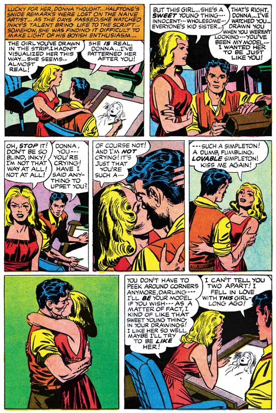
In Love #3 (December 1954) “Artist Loves Model” page 14, pencils by Jack Kirby inks by Joe Simon

Art that did not seem to exist in the syndication strips was added to the comic book. The new art is found in two sections. One is the story arc where Donna Dreame finds out that Inky has used her as a model for one of the characters in the strip they are collaborating on (page 14). A more substantial addition occurs at the very end of the story starting from when Inky confronts Donna Dreame about her dishonest dealings (page 16 through 18). What is significant about these additions is that they concern the romance between Inky and Donna. This romance played no part of the original syndication strip and was added to convert the story for inclusion in a romance comic book title.
In Love #3
Syndication strip 13 panel 4, art by Jack Kirby from Buried Treasures v1 n2
In Love #3 (December 1954) “Artist Loves Model” page 5 panel 5, art by Jack Kirby

In Love #3
Syndication strip 11 panel 4, art by Jack Kirby from Buried Treasures v1 n2
In Love #3 (December 1954) “Artist Loves Model” page 4 panel 6, art by Jack Kirby

Not all the syndicate panels that did make it into the comic book did so unmodified. The overwhelming majority of strip panels were square. When inserting strip panels into the story 41 of them had their shape altered. 30 panels where horizontally truncated, 10 horizontally extended, and 3 vertically truncated. One of the horizontally expanded panels was used to make a splash panel. This splash was overlaid with another panel so that its shape was no longer rectangular. The new art that was added to expanded panels was kept pretty simple and consisted mostly of backgrounds. Much of the horizontal truncations were done simply by clipping the art. In 2 panels this resulted in the complete elimination of one of two original figures. In 7 occasions where the panel was narrowed horizontally, a character was shifted so as not to be significantly truncated. This explains the unusual cut up nature that I found on Joe’s unused art page. Cutting a strip panel into pieces allowed adjustments to the final shape of the panel for the comic book. It appears that this was done even in cases where in the end the square panel was retained.

In Love #3
Syndication strip 22 panel 2, art by Jack Kirby from Buried Treasures v1 n2
In Love #3 (December 1954) “Artist Loves Model” page 9 panel 3, art by Jack Kirby and Joe Simon

I was not completely accurate above about all the syndicate strip panels that made it into the comic book. Actually I found 14 panels where the art was redrawn either wholly or in part. None of these alterations changed who was portrayed or significantly modified the pose. Most of the time Donna Dreame was redrawn (12 panels), Inky was the only other character to be modified (4 panels). In the syndicate story Inky was portrayed as shorter then most of the other characters. With his short stature and pugnacious nature, I cannot help but feel that Jack Kirby made Inky into a sort of alter ego. The size difference between Inky and Donna may have been fine for the syndicate strips. But this created a problem when romance between the two was added for the comic book, it just would not do to have love between a tall woman and a short man. So in 4 panels Inky was redrawn to be taller. That the romance angle was the reason for this adjustment is shown by the fact that Inky is still shown as shorter then Jack Hill.

In Love #3
Syndication strip 22 panel 3, art by Jack Kirby from Buried Treasures v1 n2
In Love #3 (December 1954) “Artist Loves Model” page 9 panel 4, art by Joe Simon

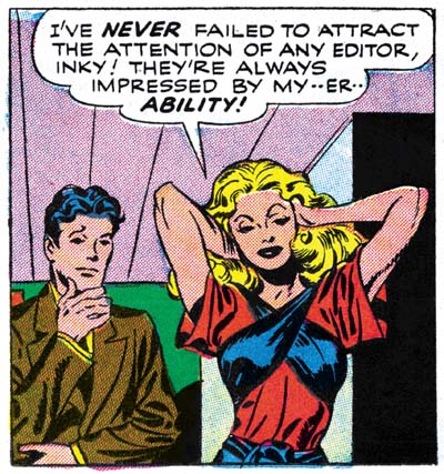
Donna Dreame was altered in a couple of panels as part of the change to reduce her height relative to Inky. That does not explain most of the times that Donna was redrawn. I believe it that these other alterations were done to make Donna more conventionally attractive. Joe Simon once remarked to me that Kirby’s women were not very beautiful, but who cared since Jack drew such great stories. That is a view shared by many others, including Kirby fans. Some have even described Kirby’s woman as ugly. (I hasten to add that I do not share these views and someday I will write a post on why that is.) Joe Simon redrew many of Jack’s women when DC republished some of the old Black Magic stories. Thankfully not all of Jack’s drawings of Donna were redone. This is particular fortunate in the case of a panel which is one of the most sensuous images Kirby ever drew (see image below). Sometimes only Donna’s hair was redone, in these cases the hair was simplified. Kirby used “wild hair” as an indication of a “wild woman”, the hair changes seemed to be done to “tame” Donna a bit.

In Love #3
In Love #3 (December 1954) “Artist Loves Model” page 10 panel 3, art by Jack Kirby

All Simon and Kirby signatures were removed. Other art differences between the syndication strips and the comic book are rarer. Four panels have additions to the background. In two further cases a black band with featuring was added to the top of the panel. All occurrences of Donna’s use of a cigarette holder were removed. Most surprising is a name change, Inky Spotts of the syndication strips became Inky Wells for the comic book. Both names are the sort of appropriate naming that Simon and Kirby often used. It is hard to understand why in the end Wells was considered so much better as to warrant the re-lettering needed to alter the story.

Script changes were not at all extensive. I have noted only two word balloon whose text was modified. One caption from the syndicate strips was deleted and another one rewritten. A caption was added to one comic book panel and most significantly 6 caption panels were added to the book version. None of these affected the plot. All caption additions or alterations seem to have been done just to improve the reading.

Since I have explained the what and the why of the changes made to transform the syndication strips into the comic book story, the question remaining is who was responsible? The syndicate strips had all been drawn by Jack Kirby and much, if not all, of the inking looks like his as well. As for the original syndication scripting, although other writers may have contributed, some of it seems written by Jack. The pencils for the new splash page for the comic book was by Kirby but I believe it was inked by Joe Simon. The same very coarse picket fence inking also shows up in the second splash (page 10) where extending the original syndicate panel resulted in the addition of some art. The art added to the other expanded panels also appears to be inked by Joe. The redrawing of Donna and Inky for the comic also looks like it was done by Joe. Some of the writing for the new or altered captions read like Simon’s effort. However some of the other writing is more “flowery” then typical for Joe, so either he was purposely pushing himself in that direction, or another writer was also involved in the re-scripting. The new art was clearly penciled by Jack but looks different from the rest of the story because Joe did the inking. All in all it would appear that Simon was responsible for editing the syndication strips into the final comic book form with Jack providing newly required art.

Simon and Kirby did a surprisingly number of syndication proposals. Almost all of them consisted of a relatively small number of strips with un-inked pencils. Yet the syndicate “Artists and Models” consists of 36 strips all of which were inked. More significantly, samples were made by George Matthew Adams Syndicate. It is hard to escape the conclusion that “Artists and Models” was considered as the S&K syndication proposal most likely to succeed. The strips do tell a great story and it is one of Simon and Kirby’s best efforts. But I have to agree with Bob of the Jack Kirby Weblog, that it is hard to believe that a comic strip artist could be the basis of enough good stories to keep a syndication strip going for years.

Battleground, Jack Kirby’s Return to Atlas

Battleground #14
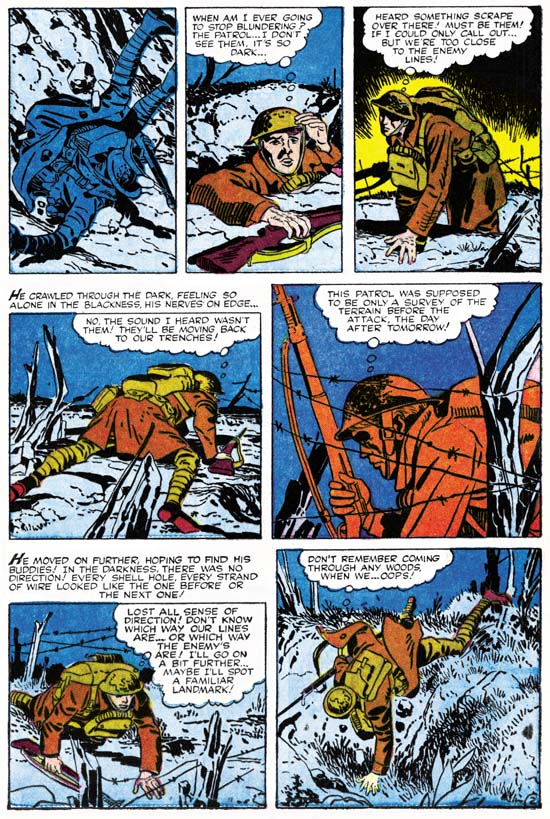
Battleground #14 (November, 1956) “Mine Field” page 2 pencils and inks by Jack Kirby

Jack Kirby turned to freelancing when the Simon and Kirby studio failed. Battleground #14 (November 1956) was the first of his freelance jobs to be published. It also marked Kirby’s return to a company that he left almost 15 years before. Jack probably still remembered Goodman’s unfulfilled promise of royalties for Captain America, but Kirby had a family to support and so had to swallow his pride. His reentry job was a short five page war story called “Mine Field”. The job should have been easy for Jack, only a couple of years before Kirby drew, wrote and edited for Foxhole, a war comic for Simon and Kirby’s own publishing company called Mainline. One story for that title, “Hot Box”, was only two pages long and Jack still managed to make it a masterpiece.

“Mine Field” is a simple tale. A somewhat bumbler of a soldier gets separated from his outfit during a night patrol. He becomes lost in the dark and by daybreak finds himself close to the enemy’s position. From his observations he realizes the Germans plans to lure the Americans into a mine field. Upon dark the soldier rearranges the German marker and finds the way back with the outfit. The table has turned and the enemy falls into their own trap. It is a good story, just not one that plays on what would normally be considered Kirby’s strengths. Jack likes his war action up close and personal and that is not what this story is about, although Jack does manage to sneak in some typical Kirby action in the last panel. But it is because the story does not have a lot of action that it provides a showcase for how good an artist Kirby was. I provide an example page above. Note that there really is not a lot happening on this page. We find the hapless soldier fall into a shell hole and his unsuccessful attempt to find his comrades. Yet by altering the view point and careful use of the landscape Jack manages to make it all interesting. Kirby is able to do this throughout the story. This sort of low action story may not have been the best vehicle for Jack, but he still managed to make it look easy.
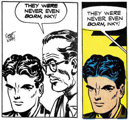
Jack’s pencils are always at their best when inked by his greatest inker, Kirby himself. For this story Jack’s inked in a manner which I referred to as the S&K Studio style. That style is categorized by bold brushwork and some unusual techniques. In the image I provide above, note the use of the picket fence pattern (see inking glossary) in the second and fifth panels. By itself there is nothing unusual about Jack’s inking in the Studio style, he had often used it in the past. What is surprising is that this style appeared in a work at this late date. At this time Jack had adopted a similar style but with a finer brush for Prize romance covers or a simpler style without techniques like the picket fence brushing for romance story art. However the inking in “Mine Field” does show one important trait agreeing with both the Fine Studio and Austere styles. Spotting has been downplayed giving the entire art a lighter look. Black areas tend to be limited coverage but when used are done by filling the area with ink. The inking for this story was not as masterful as Jack would shortly do for Atlas in Yellow Claw #2 and #3. However in its own understated way it is a beautiful job without any signs of rushing and loss of control found in “Afraid To Dream” that Kirby also did in the next month.

I have already remarked above how the plot for “Mine Field” was not typical for Kirby. I also find that the actual text writing does not have Kirby’s “voice”. Jack’s writing usually includes exclamations that are a little over the top. I find none of that quality in the script for “Mine Field”. Therefore I do not believe that Jack had much to do with the writing for this story and that he was working from a script supplied by Atlas. This sets this story apart from most pre-Implosion Atlas work which either Kirby seemed to have a lot of control over the writing (Yellow Claw, “Afraid to Dream”, “No Man Can Outdraw Him” and “Pokerface”) or at least some input to the plot (Black Rider Rides Again).

Battleground #14
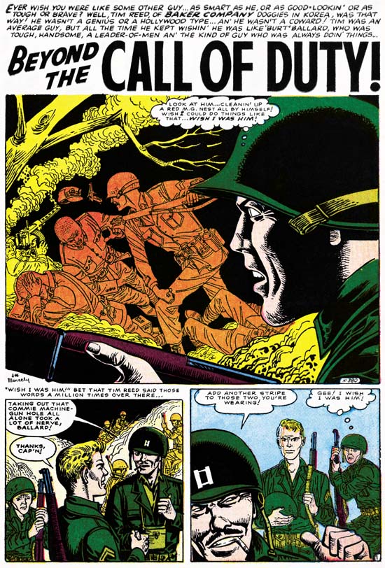
Battleground #14 (November, 1956) “Beyond the Call of Duty” art by Joe Maneely

In my posts for this blog I generally avoid comparing other artists to Jack Kirby. It really is not fair and can result in overlooking the special talents these comic book artists possessed. Effectively Atlas made just such a comparison between Jack Kirby and Joe Maneely and judged Maneely as the better artist. Presumably this judgment was made by Stan Lee and it continued as long as Joe Maneely was alive. It was Joe that was the most frequent Atlas cover artist while Jack did not even get to do the covers for comic books titles where he did all the interior story art. In Battleground #14 Joe got the most important first story while Jack’s contribution was delegated towards the back. But this does not seem to reflect the actual merits of the two stories. Maneely is working from a script with much more action then what Kirby had. For a war title this should almost insure a more interesting story, yet Kirby’s piece is a much better read. Maneely just does not seem to know how to make the action exciting. Under Joe’s hands all of the artwork seems dry and unmoving. Even today there are those who say Joe Maneely was a great artist. I just do not understand exactly what they feel Maneely did so well.