Donahue, Vic


(February 1954 – April 1954: Young Romance #66 – #68, Young Love #54 – #56, Young Brides #12 – #14)

Number of Romance Titles 1947 - 1954
Number of Romance Titles 1947 – 1954 (the period covered in this chapter is shaded in blue)

Simon and Kirby started using photographic covers for their romance comics in April 1949. There were short periods when they reverted back to graphic covers but beginning in May 1951 for Young Romance and July 1951 for Young Love all the romance covers used photographs. Now after three years they suddenly switched back to drawn covers; Young Brides #13 (March 1954) would be their last photographic cover. Why the switch? Unfortunately I do not have a clue.

An even bigger surprise was that Jack Kirby would not draw any of these romance covers. Up to this point there was only one comic produced by Simon and Kirby with a cover drawn by another artist (My Date #4, September 1947, drawn by Mort Meskin and Jerry Robinson). Other artists will be provided covers for the Prize romances for some time. The artists that appeared on the covers were the same ones that dominated the interiors; for the most part that would be Bill Draut, Mort Meskin and John Prentice.

For approximately the last year Kirby was producing much more of the Prize romance art then any other artist. That was not particularly surprising because that was typical for the Simon and Kirby studio. However there had been a period when Mort Meskin produced most of the love art. Now once again Kirby’s output dropped. The line up for the period covered in this chapter is Bob McCarty (50 pages), John Prentice (49 pages), Bill Draut (44 pages), Mort Meskin (37 pages) and Jack Kirby (25 pages) with some very minor contributions by some other artists. Not only was there a dramatic drop in Kirby contribution he did not appear in any of the April issues and would not again for some time to come.

A Simon and Kirby production without Kirby art is a rare thing. A run of Simon and Kirby comics without Kirby was simply unprecedented. And make no mistake these are Simon and Kirby comics. As we will see the same artist will provide work for these Kirby-lacking issues that had been used previously. Further the first interior page would continue to use the cartouche declaring it “A Simon and Kirby Production”. While I do not have an explanation for the switch to photographic covers, I do believe I can provide a good reason for Kirby’s absence. Simon and Kirby would launch a new Prize title Fighting American in April (cover date). Even more significant the first Mainline comic, Bullseye, would appear in July. With Mainline Simon and Kirby would become publishers themselves. Most of the Fighting American art was drawn by Jack but he his contributions to the Mainline titles (Bullseye, In Love, Police Trap and Foxhole) would be relatively low. Many people believe that Kirby did the art while Simon handled the business but the reality is that both Jack and Joe did whatever had to be done to get the comics out. I am sure some of these more mundane but essential business needs kept Kirby from the drawing board.

One thing that did not change about the Prize romance titles was the story format. With just a couple exceptions the features start with a story splash (a splash that is actually part of the story) or no splash at all. Full page splashes continue to be missing.

Young Brides #12
Young Brides #12 (February 1954) “Big Baby”, art by Jack Kirby

I thought I would present Kirby’s farewell (at least for now) from the Prize romance comics with a bang. Jack always had a tendency to introduce action into his romance stories. Kirby is also famous for his fights were everything goes flying. Well this is not fight but the only things not rushing through the air are the irate husband and his frightened wife. One of the things that attract me to Simon and Kirby romance comics, besides the great art, is how well they reflect the times. It is a view of 50’s culture as if it was an ant stuck in a piece of amber. The husband’s uncontrolled temper is portrayed as the title says, a “Big Baby”. But today he would just be considered (quite rightly) as abusive. However Simon and Kirby were well aware of the danger in the husbands rage as he learns his lesson when his temper turns on some pet birds. The wife says “these were only birds, tomorrow it might be human beings”.

Note the odd panel shape that Kirby uses for the splash. At this time it was actually one that he preferred but not often used by the other studio artists. The upper right corner might be a “dead zone” but Jack manages to create a diagonal in the lower portion of the splash that connects it to the right side. The second panel hardly seems to intrude at all.


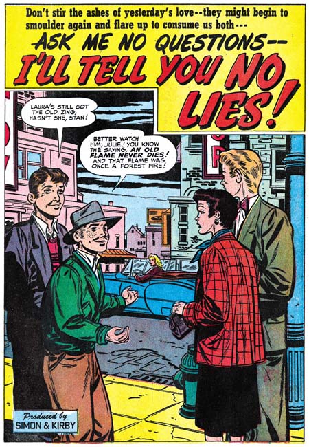
Young Love #55 (March 1954) “Love War”, art by Jack Kirby

Another action splash by Jack Kirby. Note the same odd panel shape although this time Kirby did not successfully connect the upper right with the rest of the image. This is also one of the few true splashes from the period covered by this chapter. The fight scene does not lead into the story but serves the more tradition purpose of providing a preview. And what an unusual story this is. Usually when Jack inserts violence into a romance story it is the men who fight but in “Love War” we get lots of female on female violence.


Young Love #55 (March 1954), art by John Prentice

As mentioned above, the cover art was not provided by Kirby. Of the five drawn covers from March and April three of them illustrated a story from the interior. For the Young Love #55 cover John Prentice’s drawing is based on the story that Kirby did, “Love War”. Simon and Kirby always kept the more controversial images inside and this is no exceptions. Still Prentice makes it quite clear where his scene is heading for. As the man says “this party’s getting rough”.

Young Love #56
Young Love #56 (April 1954), art by Mort Meskin

One of the covers (Young Romance #67) is unrelated to any story within. The same could be said for Meskin’s cover for Young Love #56. It is clear that was not the original intent as the depicted scene clearly relates to the title provided in the caption, “Two Sisters, One Man”. However a story with that title not only does not appear inside it would never be published by Simon and Kirby. Further none of the April issues had a story involving a sibling love triangle. Whatever happened to “Two Sisters, One Man”?

Young Brides #14
Young Brides #14 (April 1954) “Faithless”, art by Mort Meskin

Don’t get me wrong, I like Meskin’s romance work. But I do regret that Mort never did any more action packed stories like those he drew during the war, features like the Vigilante and Johnny Quick. It is not much of a splash, perhaps it should not be called a splash at all, but it shows that the old Mort still had what it took to do action. Just a couple of running kids but probably better then anybody actually doing superheroes at this time except, of course, for Jack Kirby.

Young Love #56
Young Love #56 (April 1954) “Lola’s Other Life”, art by Mort Meskin

For various reasons I guess I am going to provide a bit more of Meskin’s work then usual but he is such a great artist anyway. The story’s protagonist, Lola, lives a double life which Meskin highlights with his splash. Remember this is a period where most features start with a story splash so this was a bit of a deviation.
 
Young Love #56
Young Love #56 (April 1954) “Lola’s Other Life”
left panel from page 2,
right panel from page 3, art by Mort Meskin

While the splash is interesting in itself, but the real reason I want to post about this story is that Mort repeats the splash posses in the story as well. Can an artist be said to swipe from himself? But look closely at the positions of things like the arms and the reader will see that these are in fact redrawn and not just stats. While the use of stats would be common in work that Joe Simon did years later, I have not been able to find any examples from the Simon and Kirby collaboration up to this point in time. Stats were added expense and had to be sent out of the studio to be made. It was easier and quicker to just draw the art. The one important exception was the stats used for cover titles. Even then the stats were generally removed from old cover art and recycled onto new ones.

Young Romance #68
Young Romance #68 (April 1954) “The Man I Couldn’t Have”, art by Mort Meskin

Another great Meskin splash but note that here he uses the same inverted ‘L’ shaped splash that Kirby prefers. Unfortunately he does not really pull it off since the upper right corner does not visually connect with the rest of the splash. Probably the only reason Mort used this panel shape was the room it provided for the speech balloons.

Young Romance #68
Young Romance #68 (April 1954) “The Man I Couldn’t Have” page 4, pencils by Mort Meskin

The first two pages of “The Man I Couldn’t Have” looked like they were inked by Meskin himself. But not the rest of the story. I have no idea who this inker is but his inking certainly has given Meskin’s pencils a rather unique look. While I prefer Meskin’s own inking, this unknown inker is rather interesting and much better then George Roussos inks. Page 3 has a more intermediate look to the inking. I think this was done on purpose to make the switch in distinct styles less jarring to the reader.

Young Romance #66
Young Romance #66 (February 1954) “Fools Rush In”, art by Bill Draut

While “Fools Rush In” has story splash so prevalent in the more recent Prize romance comics, Draut was able to provide a more standard size splash. While I find the story splashes and splash-less stories interesting, I must admit to missing the more traditional splashes. There seem to be more deviations to the type of splashes used during the period covered in this chapter. Perhaps this is a hint that Simon and Kirby are moving away from their more recent approach.

Young Romance #68
Young Romance #68 (April 1954) “High Class Trash”, art by John Prentice

Even Prentice gets a chance to provide a tradition splash. Recently he had been mainly doing splash-less stories. This is another of the borderless splashes that John did from time to time. It is a simple device but I think it gives his art a special touch.

Young Brides #13
Young Brides #13 (March 1954) “Little Coquette”, art by Bob McCarty

Bob McCarty gets a chance to provide some action in his splash. McCarty’s art provide an interesting and effective fight scene. Not the way Kirby would have done it but I think it is rather successful.

Bob supplies cover art for Young Romance #68 which is based on the “High Class Trash” story that Prentice did for that issue. This would be one of the few exceptions of a Prize romance cover done from this period by an artist other then Draut, Meskin or Prentice.

Young Love #54
Young Love #54 (February 1954) “Kisses For a Stranger”, art by Vic Donahue?

There are a few stories done by other artists most of which I cannot identify. I think I can attribute “Kisses for a Stranger” to Vic Donahue. Donahue last appeared in Young Love #13 (September 1950) so he has been missing for some time. While this does look like Donahue’s work it seems a rather poor piece of art considering the quality of work Vic was doing four years ago. Perhaps Donahue was just doing a rush job.

Young Love #54
Young Love #54 (February 1954) “Love Me, Love My Family”, art by unidentified artist

Usually I only include examples of the unidentified artists if they were sufficiently talented. Unfortunately “Love Me, Love My Family” does not fall into the more talented category. But look at the inking. A blunt brush and shoulder blots are not typical inking techniques for most artists. While not all the inking in the story is done in this manner it does show up in places. I believe this story was touched up, in this case by Joe Simon.

Young Love #56
Young Love #56 (April 1954) “Too Young To Love”, art by Art Gates

Single page features were often done by less talented artists who were probably studio assistants. However now one artist would appear that specialized in these often overlooked stories. Art Gates not only did typical comic art but also gag strips. Fortunately he often signed his work but in the last panel.

The Art of Romance, Chapter 25, More New Faces

The Art of Romance, Chapter 27, The Return of Mort

(August 1951 – October 1951: Young Romance #36 – #38, Young Love #24 – #26)


Number of Romance Titles 1947 – 1952 (the period covered in this chapter is shaded in blue)

Despite the fact that today many fans point to Boys’ Ranch as one of Simon and Kirby best efforts it was at the time a commercial failure. The last issue of Boys’ Ranch would have an August cover date. After that Joe and Jack would only be working on the two monthly romance titles and the bimonthly Black Magic all of them for Prize Comics. Young Romance entered its fourth year and I believe both romance titles were still selling very well.

Jack Kirby is legendary for the amount of work he could produce. While there were periods during the Simon and Kirby collaboration that support that legend there are other times that do not. In the previous chapter Meskin replaced Kirby as the most productive studio artist. During the period covered in this chapter Meskin has maintained the first place position but now Bill Draut has replaced Jack for the second place. For the romance titles Meskin produced 64, Draut 49, and Kirby 45 pages. Adding the work for Black Magic only increases the disparity (Meskin 78, Draut 67 and Kirby 60 pages). Mort Meskin was famous for his productivity but Bill Draut was not. The difference is all the more striking when it is considered that Meskin and Draut were doing all there own inking while Kirby was not.

Another indication of Jack’s decreased involvement in the art from this period is that Bill Draut did the lead story for Young Romance #36. While it was not unusual for the first story of Young Love to be done by artists other then Kirby, Young Romance was the flagship title and up to now Jack almost always provided the lead story. The single previous exception was for YR #12 (July 1949) and Draut was the feature artist on that occasion as well.

I cannot offer any explanation for Kirby’s decreased page production. If his time was occupied with trying to develop something new it did not come to fruition. But it must be remembered that Jack was a boss and his income depended on the how good sales were for the S&K titles not on how many pages of art he drew. His decreased output could be due to nothing more then attention to some personal issues.

Most of the rest of the romance work was done by two artists; John Prentice with 25 pages and Marvin Stein with 24 pages. Three other artists supplied single stories. Two of them will be discussed below and the third has not been identified but only provided a single page.


Young Romance #38 (October 1951) “Family Trouble”, art by Jack Kirby

While his page count has dropped the quality of Jack Kirby’s work had not suffered. He still drew great splashes and his stories were still unique compared to other studio artists (suggesting that Jack was rewriting the scripts while he was drawing them). This uniqueness was often the result of placing more action into the story, something that Kirby excelled at. But as I have pointed out before, Jack also excelled at comic book art that did not rely on action. His romance splash panels are often examples of this. The splash for “Family Trouble” uses the soliloquy format that is so typical of Kirby’s lead stories. The word balloon that introduces the story provides the plot of young lovers facing family disapproval but does not explain the basis of their problem other then age. Kirby presents the couple passing through a gate carrying their luggage presumable off to start their new life together. The sign on the entrance indicates they are leaving the servant’s quarters and therefore theirs is a romance that breaks the class boundary between the rich and their servants. The man seems calmed but resolved while the woman seems more resolute. At a glance this splash is nothing more the two standing figures but Jack embodies an entire story in it. Of course the viewer is expected to be enticed to read the story to get the full explanation.


Young Love #25 (September 1951) “My Old Flame”, art by Jack Kirby

Kirby’s splashes are almost always interesting but occasionally they are quite unique. Given Joe Simon’s long history of innovative designs I suspect he provided layouts for many of Jack’s covers and splashes but even if that is true it still took a genius like Kirby to make them work so well. Here while riding a train a man pauses from reading his book to reflect on a past relationship. Normally the splash would be expected to show a head shot or half figure of the former love object. Instead we are provided with just a close-up of a set of eyes seeming arising behind the man; a compositional device that is much more effective in capturing the man’s mood.


Young Romance #36 (August 1951) “Yesterday’s Romance”, art by Bill Draut

“Yesterday’s Romance” was the lead story for YR #36 that Bill did instead of Jack. It is an unusual story for any romance title because it main characters are all in their advanced years. Draut does a good job of capturing the offbeat nature of the story in his splash. The odd thing about this piece is that usually the lead story used the soliloquy format where the protagonist’s speech balloon tells what the story is about and provides the title. Bill has used that soliloquy splash before so he was aware of Simon and Kirby’s preference for using that splash format for the lead story.


Young Romance #36 (August 1951) “Married In Haste”, art by Bill Draut

While “Yesterday’s Romance” failed to make use of the soliloquy splash it appears in the same issue in “Married in Haste”. This suggests that “Married in Haste” was originally meant to be the lead story but its place was taken by “Yesterday’s Romance” after the art was completed. Bill does a good job with the soliloquy splash and as any good splash it succeeds in its roll as the story’s preview. It may not be fair but it is constructive to compare the splash for “Married in Haste” with Kirby’s “Family Trouble” (shown above). Both do well at having the splash background support the story needed although it is not clear how much of this was the result of the artist and how much came from the writer. I describe the comparison as unfair because Kirby is such a great artist the comparison will tend to make Draut’s work poorer then the excellent art it really is. But the comparison is useful because it highlights the nuanced emotions Kirby gives his characters compared to the more static ones that Draut provides. While Kirby is justly famous for the exciting action the work he did for romance pushed him to be equally adept at portraying more subtle emotions.


Young Love #24 (August 1951) “Native Wedding”, art by Mort Meskin

The splash for Meskin’s “Native Wedding” is reminiscent of the one Bruno Premiani did some time ago for YR #10 (June 1950, see chapter 11 of The Art of Romance). One obvious difference is that Meskin is uncharacteristic in his use of busy brushwork found throughout the splash. Normally this would result in the image loosing focus but somehow Mort pulls it off. Mort also takes care to make the camp fire scene occur at night providing the nearby faces shadowed from below as appropriate for the position of the fire. The dancer’s back is also appropriately shadowed.


Young Love #26 (October 1951) “Let’s Keep It Gay” page 5, art by Mort Meskin

For a couple of pages of “Let’s Keep It Gay” Meskin adopts and 2 rows by 3 columns panel layout. This results in tall narrow panels that Mort put to good use especially in the second panel of page 5. This panel layout was one that previously Leonard Starr was fond of using so one wonders if perhaps Meskin picked it up from him. Starr also used a 3 rows by 3 panel layout where he would decrease the height of two rows so that the remaining row would have similarly tall panels. Starr’s modified 3 by 3 panel layout did not seem to be one the Meskin picked up on.

I particularly like how the bottom row starts with the couple in the foreground and a TV studio as the background, then Mort comes in for a close-up without the studio background, before ending by once again pushing the couple into the background of the studio. Careful manipulation of point of view was an important aspect of Meskin’s art during this period providing his stories with what could be described as a cinematic approach.


Young Romance #38 (October 1951) “One Tragic Mistake”, art by John Prentice

John Prentice has become a regular presence in Simon and Kirby productions, especially the romance comics. In the last chapter I provided an example where Prentice seemed to be adopting some of the Studio Style inking techniques. Although it was possible it could have been Joe or Jack touching up John’s work the picket fence crosshatching (see my Inking Glossary for explanations of some of my inking terminology) my opinion was and still is that it was the work of John himself. For the splash page of “One Tragic Mistake” we find a more typical Prentice inking. Note in particular his method of doing cloth folds. They are not the spatulate or oval shape typical of Kirby but tend to be long with roughly parallel edges and with a more or less flat and sometimes slanted ends. John also has a fondness for long sweeping cloth folds. Note the inking of the man’s shoulder. At a glance this might be mistaken for a Studio Style shoulder blot but see how it appears on only one of the shoulders and is clearly integrated with the shadow on the side of the face. With Joe or Jack I am never sure if shoulder blots were meant to indicate shadows or the turn of the form but Prentice always seems quite clear with his intent.


Young Romance #38 (October 1951) “One Tragic Mistake” page 8, art by John Prentice

While the splash page to this story looks like typical Prentice inking other pages seem to be a combination of his own inking techniques and the Studio Style. Most of the cloth folds are done in Prentice’s typical brush work but note the abstract arch shadows (panels 1, 2 and 4), picket fence crosshatching (panels 3 and 4) and shoulder blot (panel 6). Only drop strings appear to be missing. Panel 6 truly has shoulder blots because they appear on both shoulders while a shadow would only be appropriate foe the man’s right side. While I am not certain that the picket fence crosshatching was not by John, the abstract arches are so untypical for Prentice that I believe this is Joe or Jack stepping to do some touching up.


Young Love #24 (August 1951) “Don’t Tell On Me” page 2, art by John Prentice

A page from another Prentice story from the same period provides a more typical example of Prentice inking. Again note the cloth folds some of which are long and sweeping and few could be called oval or spatulate in shape. There are some arching shadows that might suggest the Studio Style. But the round shape in the first panel is not abstract at all but is clearly meant to be the moon. The arc of the left side of the second panel is meant to be the entrance to an arched hallway. The shadow on the right side seems to be the light of the window falling on the darken exterior. Almost all applications of large areas of ink appear to be intended as realistic shadows. There is some picket fence crosshatching that again does not look typical of the brush work of either Kirby or Simon. However note the picket fence crosshatching of the last panel. The pure black area on the man’s left shoulder seems an appropriate shadow but then the picket fence crosshatching on the opposite side does not. Since I have found both Simon and Kirby touching up other artists works distinguishing between their efforts and that of the original artists adopting Studio Style techniques can be a difficult conundrum. In John Prentice’s case I am still undecided. The distinction becomes important when trying to detect Prentice’s hand in the inking of work by Jack Kirby. Some have suggested that John was the inker for some of Kirby’s art and he certainly is a candidate for that type of work.


Young Love #24 (August 1951) “Left At the Alter”, art by Marvin Stein

Previously I have had mixed feelings about Marvin Stein and in particular felt his romance art was little more then adequate. Even in the last chapter I noted his presence and gave an example image but did not provide more detailed examination. However Marvin had been working hard at improving his art and although signs of improvement have been noted before now his efforts really seems to bare fruit during this period. Marvin developed a style for his crime and western work that owed much to what he learned from Jack Kirby. For that more action oriented art Stein also developed an inking style that was blunt but well controlled; a style very suitable for the genre it was used on. Neither the pencil nor inking style would be very appropriate for romance work so instead Marvin used a more refined style for both. Not only was the bold inking brush restrained but Marvin sometimes used a pen to create crosshatching. His figure drawing has improved but he still retains one of his earlier trademark tendencies to give his woman eyes that are set at an angle with each other.


Young Love #25 (September 1951) “Alice Finds Her Wonderland”, art by Marvin Stein

The splash for “Alice Finds Her Wonderland” is so special I could not resist including it. The Alice in Wonderland cast was probable requested by the script writer although the wonderland that Alice desires in the story did not include these delightful characters. Having seen much of Marvin Steins work in the romance, crime, western and horror genres it is quite a pleasure to see him so successful at a more cartoon-like drawing.


Young Romance #36 (August 1951) “Just Good Friends”, art by Vic Donahue

Vic Donahue has not made an appearance in a Simon and Kirby production for almost a year (last seen in YL #13, September 1950, see Chapter 11 of The Art of Romance). Even then I remarked that his art had been improving. Apparently that improvement has progressed so far that I almost did not recognize him in “Just Good Friends”. Even though this piece is unsigned enough of Vic’s mannerisms remain to credit Vic with this story such as the tilt he often gives the heads of females or the way he occasionally reverts to fine pen work often as simple hatching. Vic also appeared in this same month in Black Magic #6 (Chapter 2 of the Little Shop of Horrors) in a signed piece but I have to admit I did not find that work particularly appealing.


Young Love #26 (October 1951) “Polly Wants a Boy Friend”, art by Ross Andru

I am always impressed by the number of talented comic book artists that had worked for Simon and Kirby at one time or another. Some like Bill Draut, Mort Meskin and John Prentice did extended stays. Others like Leonard Starr and John Severin worked for more limited durations but provided their share of work during that time. Yet others made brief appearances and only did a few pieces for instance Bernie Krigstein and Steve Ditko. Ross Andru belongs in the last category.

I must admit that I am not that knowledgeable about Ross Andru’s history. Most fans are probably familiar with him for the work he did many years later on Amazing Spider-Man. Andru was clearly an enterprising individual who formed his own company on three occasions. The earliest was in 1951 when he and Mike Esposito created MR Publications. I am not clear exactly what the nature of this company was. Some have said it was a comic publishing company in which case Andru and Esposito were three years ahead of Simon and Kirby’s Mainline (although Al Harvey was much earlier then them all). However I have been unable to determine what comic titles they published. If MR Publications was actually producing comic books for another publisher to release then Simon and Kirby had been doing that for years (and Will Eisner doing it still earlier). MR Publications was short lived and it would be interesting to determine the timing of that company or its demise and the appearance of Andru’s in Simon and Kirby productions.

“Polly Wants a Boy Friend” is typical romance work by Andru. The sort of wistful expression with tilted head of the woman in the center of the splash panel can be found in some signed pieces from a few years later. The man in the last panel of the page was also a dead giveaway of Andru’s style. Although unsigned I have not doubt about the correct attribution of this story. My database indicates Ross will appear in a couple more Simon and Kirby romances in the near future and again under different circumstances in 1954. Considering that Andru’s earlier pieces for Joe and Jack are unsigned there is also the possibility I will find more as my reviews progress.

The Art of Romance, Chapter 15, The Action of Romance

The Art of Romance, Chapter 17, The Assistant

(April to August 1951, Black Magic #4 – #6)

Black Magic #4 to #6 were released during the same period as Boys’ Ranch #4 to #6 (for Harvey Comics). Both titles were bimonthlies which mean that the greatest amount of work produced by the Simon and Kirby studio was for Young Romance and Young Love both of which were monthlies. This is not at all unusual for while Simon and Kirby are most famous for their superheroes most of the work they did during their collaboration was for love comics.

The period discussed in this chapter roughly corresponds with chapter 15 of my serial post The Art of Romance.

While Jack Kirby did all the covers for Black Magic (as he would throughout the first run) in terms of the number of pages drawn he was not the primary artist for Black Magic like he was in the earlier issues. That honors now went to Mort Meskin who did 37 pages compared to Jack’s 17 pages. Even Bill Draut with 18 pages of art did more then Kirby. But even Bill was not the second most prolific artist in the issues covered; surprisingly that would go to the newcomer George Roussos who did 20 pages. Vic Donahue who has been absent from Simon and Kirby productions for some months does a single 5 page story. John Prentice is new to the studio and only provides a single 7 page story. Two stories remain without attributions but one of them is a single page feature.


Black Magic #4 (April 1951) “Voodoo on Tenth Avenue”, art by Jack Kirby

Kirby has scaled back on his splash for his only large piece for Black Magic. Still even with half a page Jack could get a lot of impact. It is amazing how Kirby has managed to make the woman both beautiful and evil; no haggard witch here is just a cold and angry heart. What a text book example of the use of abstract arch shadows (see my Inking Glossary). I count 6 of them in this small splash.


Black Magic #5 (June 1951) “The World of Spirits”, art by Jack Kirby

While Kirby’s other contribution to Black Magic #4 to #6 were very short pieces one of them, “The World of Spirits” is not to be neglected. It is a small masterpiece. It is one of those cases where Jack, so famous for his action, has managed to make exciting art out of nothing more then talking heads. Part of what makes a page like the one shown above so vital is how Kirby changes the expressions in every panel. Since the characters are all past their youth Jack can push his already exaggerated eyebrows to much advantage. The inking is also superb. I am not one to automatically attribute good inking jobs to Kirby but the way the spotting is done on the white shirt in the splash and the use of bold cloth folds make me believe that at least much of the spotting was done by Jack himself. A lot of the times these very short pieces just did not seem to get the same attention from the various studio artists as they gave to the more substantial stories. But not Kirby; some of his greatest masterpieces are short stories such as this one.


Black Magic #4 (April 1951) “The Dead Don’t Really Die”, art by Mort Meskin

I am afraid I am giving short shift to Mort Meskin by only including one example despite the fact that he produced far more work then any other artist. This certainly does not reflect on the quality of the work that Mort was producing; Meskin’s Black Magic work is among the best that he ever did. I admit that Mort did some great work for DC after leaving the Simon and Kirby studio but that unfortunately was done under the severely detrimental effects of Comic Code censoring.

I have selected this particular splash page because of its unusual design. Not that the half page splash is so visually different but the fact that the splash panel is actually the first story panel. Typically splash panels are used as the comic book equivalent of a movie trailer; they provide a sort of a synopsis of the story to entice the reader. I do not remember a story splash panel being used in any prior Simon and Kirby production. The use of this device in “The Dead Don’t Really Die” is still pretty much an isolated case but it would become very typical of Simon and Kirby romance comics in the future.


Black Magic #4 (April 1951) “The Jonah”, art by Bill Draut

Black Magic seems to have given Bill Draut the confidence to draw the type of characters that had all but disappeared from his romance work. You normally would not see something like the sailor with the white hat in Bill’s love stories at this time. The splash panel is also something not to be seen in a romance work. How seedy can you get? Beat up trash cans, littered bottles and yeah I am sure that man in the background is just asking directions from the woman. Note the building on our right; the way the bricks are roughly inked as solid black is a mannerism often used by Draut.


Black Magic #5 (June 1951) “Justice for the Dead”, art by John Prentice

I am not sure why but John Prentice did not seem to do as much work for Black Magic as compared to what he did for the romance titles. It certainly is not because he did a poor job on them; quite the contrary. “Justice for the Dead” is a typical Black Magic piece but with a crime slant that shows that John would have made a great crime comic book artist. He had previously worked for Hillman so perhaps he had done some drawing in that genre there. The GCD lists Prentice as also having worked in Gang Busters and Mr. District Attorney for DC but I have not yet verified that. Years later John would do some work for Simon and Kirby’s Police Trap and later yet take over the syndication detective strip Rip Kirby. My knowledge of John Prentice work outside of the Simon and Kirby studio is sadly incomplete but I am working on rectifying that defect.


Black Magic #5 (June 1951) “The Face from The Future”, art by George Roussos

BM #3 (February) marked the earliest appearance of pencils by George Roussos in a Simon and Kirby production. Despite having two stories in that BM #5 and one in the next issue, it is odd that Roussos has not yet appeared in either Young Romance or Young Love. Since George did a lot of inking and was well known to Joe and Jack there is the possibility that he has help with inking Kirby’s work prior to this but I have seen nothing that confirms that conjecture. That Simon and Kirby both knew Roussos is indicated by a sketches both did for him in 1942 (Joe did Hitler in a zoot suite (Poking Fun at Hitler) and Jack did the Boy Commands (A Belated Happy Birthday to Jack Kirby). George also knew Mort Meskin and had inked some of Mort’s work for DC (Early Mort Meskin).

As often happens in Simon and Kirby productions, George Roussos’ splash for “The Face from the Future” uses some inking technique that seemed borrowed from the Studio Style inking. In this case we find picket fence crosshatching (Inking Glossary) on the hooded figure and a rounded shadow in the upper right corner. However it is clearly Roussos doing the inking and not Joe or Jack touching it up. While there is classical picket fence crosshatching on the right ghostly figure it changes as it proceeds to the left and becomes an inking technique not found in the Studio Style. There the shadow is built with short strokes that initially look like the pickets from the picket fence crosshatching but without the rails. The rounded shadow in the upper corner has a ragged edge that again is not typical of the way it usually is done in the Studio Style.


Black Magic #6 (August 1951) “The Girl the Earth Ate Up”, art by George Roussos

George does such a great job on the splash for “The Girl the Earth Ate Up” I could not resist including it. Do not get me wrong Roussos pencils and inking are on the crude side but his use of blacks makes it really work.


Black Magic #6 (August 1951) “A Wolf That Hummed a Nursery Rhyme”, art by Vic Donahue

Vic Donahue has not been appearing in Simon and Kirby productions for a while and this is the only work that I have assigned to him for 1951. It is an odd story and it allows Vic to draw the type of characters that would not have been appropriate for romance work. Even so I just cannot get enthusiastic about Donahue’s effort. Vic was one of the lesser talents in the Simon and Kirby studio and now that all three of the usual suspects (Bill Draut, Mort Meskin and John Prentice) are present Donahue will rarely appear again if at all (my database has no more entries for him after this one).


Black Magic #5 (June 1951) “Follow Me”, art by unidentified artist

There is one Black Magic artist from this period that I have not been able to identify but he does a nice job on “Follow Me”. Good characterization, excellent inking and good graphic story telling.

The Little Shop of Horrors, Chapter 1, Expanding Their Fields

The Little Shop of Horrors, Chapter 3, The Same Old Gang

(August – October 1950: Young Romance #24 – #26, Young Love #12 – #14)

Romance Titles to 1951
Number of Romance Titles 1947 – 1950 (the period covered in this chapter shaded in blue)

The trend of the decreasing number of romance titles that was found in the period covered in the previous chapter has continued. As far as can be judged the Prize love comics, Young Romance and Young Love, were still successful; at least enough to continue on a monthly schedule. Young Romance is now entering its third year of publication. The most obvious change is that Young Love replaced the previous photographic covers with drawn versions for the August issue and Young Romance would follow a couple months later. Frankly I am unclear what drove the use of photos on comic covers but as we will see in future chapters the use of art covers would be temporary for Young Romance and a little more extended for Young Love. Printing is somewhat more expensive for photographic covers but according to Joe Simon for the publication sizes involved the extra cost was very minimal.

I have noted in previous chapters a decrease in the number of artists used in producing YR and YL. This trend continues to the extent that a total of six artists were used in the six issues issued during the period covered in this chapter. In fact this is the first period that I have covered in this serial post where I can confidently identify all the artists involved (or as confidently as I can where Bruno Premiani is concerned). The drop in the number of contributing artists is not random; it is the less talented artists that are no longer used. Some, like George Gregg, would continue to appear in the Prize crime comics (Headline and Justice Traps the Guilty). There is one exception to dropping the less talented artists and that is John Severin. Although Severin does not show up in any of the comics from this period he has not yet been truly dropped as he will appear again in the next chapter. In any case as talented an artist on western stories that Severin was he really was not very good at romance stories. His diminished appearances in the romance titles seemed to have been offset by his work for Prize Comics Western.


Young Love #13 (September 1950) “Everybody Wants My Girl”, art by Jack Kirby

Jack Kirby would be, as he has been, the primary artist for the Prize romance titles. In these six issues he provided 4 covers, 7 stories and a total of 62 pages. Jack would do all the lead stories for Young Romance and one of them for Young Love. These lead stories would start with a soliloquy splash (where someone is introducing the story and their speech balloon is used for the title). All but one of the splashes would be half page designs and none of them had quite the punch as those from the earlier issues. Perhaps this is because Simon and Kirby’s creative juices were directed elsewhere but that will be discussed in a separate post.


Young Romance #24 (August 1950) “Buy Me That Man” page 14, art by Jack Kirby

Jack Kirby drew a lot of romance stories and it is clear he had a hand in plotting these stories as well. So it is not surprising that some plot devices would be used more then once. The use of an sudden plunge in a plane to throw a couple into each others arms found in YR #24 (see above) was used previously in YR #8 (November 1948 “Love Can Strike So Suddenly”, see Swiping off of Kirby). It would be found again in In Love #2 (October 1954, “Marilyn’s Men”). While Marilyn’s Men was mostly drawn by Bill Draut, Jack probably was involved in the plotting of that as well.


Young Love #14 (October 1950) “Girls like Her”, art by Mort Meskin

As with last chapter, Mort Meskin would be the second most used artist for this period drawing 14 stories with 54 pages. While the number of features is doubled that done by Kirby most of them are very short, 1 to 3 pages long. Previously these featurettes were done by a number of different artists but during this period Mort did all but two of them (the two Meskin did not do were done by Kirby). Mort would provide one of the lead features (Young Love #12).


Young Romance #24 (August 1950) “Take a Chance”, art by Mort Meskin

Although I have not found any evidence that the more talented artists working for Simon and Kirby were ever supplied layouts for the stories they drew, Joe and Jack did seem to be involved in at least the plotting of the scripts. Therefore recurring themes would also show up among other artists. The theme of a woman’s love of a racecar driver and the fear of the risks involved in that occupation can be found in “Take a Chance” shown above. It also would return many years later in a cover a story drawn by John Prentice (”Take Me as I Am”, Young Brides #14, April 1954).


Young Love #14 (October 1950) “I’ll Tell You No Lies”, art by Bill Draut

Bill Draut continues in the number three spot with 6 stories and 46 pages but as we shall see he barely holds that position. At this point Draut arrives at a style that will not change very much for the rest of the work that he would do for the Prize romance titles or for that matter Harvey’s love comics as well. I do not say that disparagingly as he has a clean style and is good at portraying body language. Bill generally uses half page splashes so I have provided an image from “I’ll Tell You No Lies” even though it is well below Draut’s usual quality.


Young Love #13 (September 1950) “Two Can Play the Game”, art by Leonard Starr

Leonard Starr was used often during this period with 6 stories and 45 pages, only one page less the Bill Draut. Starr had his own style of inking but compare the brush work between the man’s jacket and the woman’s dress in the splash for “Two Can Play the Game”. The inking on the man is typical of Starr but the picket fence crosshatching found in the dress is not. This looks like typical S&K studio style inking and suggests that either Joe or Jack did that particular spotting. I am not sure why this was done but it was not that unusual for studio style inking to appear in splashes that were otherwise inked by the artist.


Young Romance #25 (September 1950) “Out of the Running”, art by Leonard Starr

In two stories from this period (”Out of the Running” YR #25 and “Hired Wife” YR #26) Starr introduces a new type of beauty. Previously his women a pixie or elfin look to them; wide foreheads, widely separated eyes, smaller mouths and narrow chins. The pixie look can still be found in some characters in these stories but there are also women with larger eyes, smaller foreheads, and fuller lips giving them a more sultry appearance. This new type of beauty will play an important part in the syndication strip “Mary Perkins on Stage” that Starr will launch in 1957.

Note the inking on the man’s jacket in the splash panel. The shoulder blot and blunt brushwork is not typical of Starr’s inking. Once again Simon or Kirby has step in as art editor to alter the art. This splash is actually based on a stat of a blowup of a story panel. The panel chosen was one of Starr’s tall and narrow ones that had to be expanded on both sides to accommodate the more horizontal splash panel. Most of the jacket was not present in the story panel and the inking was touched up even in that portion that was original present. Although this technique of using a stat in the creation of comic book art is rarely found in Simon and Kirby productions it was a method that would be turned to when needed. I suspect that Joe and Jack were unhappy with Starr’s original splash.


Young Romance #26 (October 1950) “Hired Wife”, art by Leonard Starr

Above is the splash page for the other example of Starr’s more sultry beauty. This story is unusual in that the tall narrow panel that is found in all previous stories by Starr occurs only in the splash panel of “Hired Wife”. I am not sure what to make of this change in panel layouts but it suggests that he may have been working from someone else’s layouts. I will return to this subject in the next chapter of this serial post where we will find another example.
 

Young Romance #24 (August 1950) “Portrait of a Lady”, art by Bruno Premiani?

Bruno Premiani(?) has been a persistent presence in Simon and Kirby productions since August 1949. During this period Bruno provided 3 stories and 26 pages. While he did not appear as much as Kirby, Draut or Meskin what art he did was all first rate work. The romantic interest between an artist and his model is a recurring theme in Simon and Kirby productions. It is found in the very first cover for Young Romance (The First Romance Comic) and can be found many years later as well (Artist and Model). The artist and model theme appears to be particularly popular for this period since it occurs in three stories. We have previously seen Leonard Starr’s splash from “Two Can Play the Game” (see above) now we can compare it with Premiani’s version “Portrait of a Lady”. For me this is not a question of which was the better artist but rather individual interpretations from two talented practitioners of comic book art.


Young Romance #26 (October 1950) “Simpson and Delilah”, art by Bruno Premiani?

Premiani repeats the use of a dancing woman for the splash of “Simson and Delilah” (a south Pacific dancer graced “Untouched” from Young Love #10, June 1950). Although this is a repeat performance of the theme it is by no means a duplicate of the previous version.

This would be the last romance story that Bruno Premiani(?) would do for Simon and Kirby. As I have mentioned in the past this body of works were all unsigned in Simon and Kirby productions and were done in a style dissimilar to that used in art done for other companies that were signed by Premiani. While this does not disprove that the artist was Bruno Premiani it does beg the question as to why he was originally credited with this work. Although I am hesitant to fully accept Bruno Premiani as the artist (hence my use of question marks) I have no doubts as to the talent of this creator. His absence would leave a hole in the romance titles that would not be filled for some months to come.


Young Love #13 (September 1950) “The Woman Across the Hall”, art by Vic Donahue

Vic Donahue played a minor part in the romance titles of this period providing only 2 stories with 15 pages. His art is improving both in his in his ability to depict figures and to graphically tell a story. His women in particular have become more interesting largely because his use of arching eyebrows brings more emotion into their faces. My database indicates that these are Vic’s last work for Simon and Kirby but I hesitate to say that with conviction until I had a chance to more carefully review future issues. In any case I do not feel the same about Donahue’s absence then I do about Premiani’s disappearance.

The Art of Romance, Chapter 11, After the Glut

The Art of Romance, Chapter 13, Romance Bottoms Out

(May – July 1950: Young Romance #21 – #23, Young Love #9 – #11)


Number of Romance Titles 1947 – 1950 (the period covered in this chapter shaded in blue)

This chapter will cover the period from May to July 1950. This is during the rapid decline of romance titles that followed the love glut. Simon and Kirby were not immune to the effects of the over abundance of romance comics; their most recent titles, Real West Romance and Western Love had been cancelled. There were other western romance comics published during the glut as well but all ended up being terminated. Western love titles would never again be tried by any publisher. Although Joe and Jack failed with their western love titles, their standard romance titles, Young Romance and Young Love, seemed unaffected. Both titles had gone monthly during the glut and would remain so for years afterwards. The name brand recognition that Simon and Kirby’s Young Romance had achieved before the glut had allowed it to find a place on the comic racks while newer titles often never had a chance. Young Love’s similar name and logo let it join it Young Romance on the racks as well. Apparently both titles did very well during the period when other titles were rapidly disappearing.

As I discussed previously in It’s A Crime, it is unclear exactly what Simon and Kirby’s contribution was at this time for the Prize crime comics, Headline and Justice Traps the Guilty. These titles seem now to have been made on the cheap. Either Joe and Jack were doing nothing more then supplying some covers, or they were still producing them but because less money was involved they were not putting much effort into it. So Simon and Kirby’s source of income was largely based on two monthly romance titles.


Young Romance #22 (June 1950) “The Savage in Me”, art by Jack Kirby

Jack Kirby was still the primary artist for the romance titles although still somewhat below his normal output. For the 6 issues discussed here Kirby did 6 stories for a total of 56 pages. Kirby drew no covers as they were done with photographs. Jack did all the lead stories for Young Romance and all were much longer then any of the other stories in the issues (14 or 15 pages for the lead stories as compared to 7 or 8 for the longest of the other stories. Jack’s contributions to Young Love were more limited and all the lead stories of that title were done by other artists.

For two of the lead stories Jack used full page splashes with what I describe as the soliloquy splash where someone talks about the story to the reader with the word balloon used to include the title of the story. Kirby’s lead stories are still very different from stories by other studio artists. They generally are more complicated, include more action, and sometimes use exotic locations. While original writers have indicated that Jack contributed to the plotting of their stories, it is clear that Jack had even further impact on the scripting of the stories that he drew. It was just a few months short of the third anniversary of the Young Romance title, but Kirby was still putting much effort to make his stories as interesting as possible, and I may add succeeding. This was particularly true with “The Savage in Me” a tale that combines an exotic location (China), drama (the threat presented by a warlord’s army) and humor. The story was, I may add, discussed at length in an article by Kirby scholar Stan Taylor (”Simply the Best”, The Jack Kirby Quarterly #12, Spring 1999).


Young Love #10 (June 1950) “The Girl I Picked From the Phone Directory” page 2, pencils by Jack Kirby, inks by Mort Meskin

At a glance one story, “The Girl I Picked from the Phone Directory”, looks like it was done by Mort Meskin. Typical Meskin traits such as the woman’s eyes and for some men Mort’s characteristic grin. However the shifting viewing angles found in the story are more like Kirby’s then those used by Meskin. Further some of the people depicted have typical Kirby mannerisms such as the gesture of the man in the last panel of the above page. I have no doubt that this story was penciled by Kirby but inked by Meskin. As such it is the earliest example of Meskin inking Kirby that I am aware of. Either Mort was untypical heavy handed in his inking or Jack’s pencils were not very tight.


Young Romance #22 (June 1950) “Child Bride”, art by Mort Meskin

While Meskin still had not reached his high productive levels, he had now become the second most prolific artist in studio. Mort did 8 stories for a total of 50 pages. Even when Meskin provided the lead stories for Young Love #9 and #11, he still did not use a full page splash. Mort was also using vertically oriented captions, a device not typical of Kirby. While Meskin had a cinematic approach to story telling it was done differently from Jack’s. Once again I find no evidence to support the idea, promoted by some Kirby scholars, that Jack supplied layouts.


Young Love #10 (June 1950) “My Backwoods Love”, art by Mort Meskin

It maybe just a coincidence, but there seems a more abundant use of “cheesecake” poses in Mort Meskin’s work at this time; not something I normally associate with him. Further he does them quite well.


Young Romance #23 (July 1950) “A Woman’s Honor”, art by Bill Draut

Bill Draut has been displaced from his number two position by Mort Meskin. During this period Bill did 4 stories with 31 pages. Enough to secure the number three spot but still significantly less then Meskin. Bill consistently provided good art and so he continued to be an important contributor to Simon and Kirby productions.


Young Love #10 (June 1950) “Untouched”, art by Bruno Premiani?

We have seen all the other important artists before, there were no changes in personnel at this time. I still have not been able to confirm that artist who did some very distinctive work for Joe and Jack was in fact Bruno Premiani. But I continue to use that attribution (with a question mark) until something convinces me otherwise. Premiani normally used half page splashes, but for the lead story that he did for Young Love #10, “Untouched”, he provided a full page splash.

By the way do not get confused by the “Produced by Simon and Kirby” credit that appears on this splash. It is not a claim by Joe and Jack that they drew this story. Rather it was used to indicate that the entire comic was put together by Simon and Kirby. It appeared on the first story of all the Simon and Kirby titles at this time (and for some time to come) regardless who actually drew the lead story.


Young Love #9 (May 1950) “Carbon Copy” page 6, art by Bruno Premiani?

I guess “cheesecake” must be the theme for this chapter of Art of Romance because I could not resist including the above page from “Carbon Copy”. I do not know what the original teenage girl readers thought about this page but I certainly am not going to complain about a beach full of bikinis. Today such a scene, while enjoyable at least for the men, would not be considered remarkable. But back in 1950 it would be quite unusual at least on American beaches. For instance bikinis were banned in 1951 from use in the Miss World beauty pageant. It would not be until the early ’60s that the two piece swimsuit would become the norm in beach movies such as “How to Stuff a Wild Bikini”. Was Premiani’s page a flight of fantasy or wish fulfillment or was Bruno taking his queue from more liberal European beaches?


Young Love #10 (June 1950) “At Your Own Risk” page 3, art by Leonard Starr

Leonard Starr was another S&K studio regular who continued to appear during the period considered here. During this period he drew 3 stories with 21 pages. Starr is most easily recognized by his women that he draws with widely separated eyes, wide foreheads and narrow chins; a look I like to call elfin. Another easy way to pick him out is his use of tall narrow panels. Not every page in a story would use six narrow panels as in the example above, but other combinations of a row of tall panels with two vertically diminished panel rows are also commonly found. It is an arrangement that is not found in Kirby’s work so again claims of Kirby supplying layouts to not seem to be correct. Starr puts his tall panels to good use and it has the added benefit of allowing the talk balloons to be place out of the way of the image.


Young Romance #23 (July 1950) “Love on A Budget” page 4, art by John Severin

Previously John Severin was more a presence in the western love titles then in the standard romances. With the cancellation of the Western Love and Real West Romance the expectation might be that Severin would appear more often in Young Romance and Young Love. While John still shows up in the romance titles during this period, his participation does not appear to have increased. One explanation might be that Severin did not need the extra work since he had begun doing work for Prize Comics Western. But I do not think that is the likely explanation as PCW seemed to have been done “on the cheap” and probably did not pay as well as work for Simon and Kirby. It is more likely that Simon and Kirby just did not want to give him further work. The fact is Severin just was not that great of a romance artist. It was not that John could not draw well; it is just that he did not seem comfortable with depicting romantic scenes. He rarely, if ever, drew a kiss in his stories. The absence of true romance in Severin’s work may not have been a problem for the western love titles but it certainly was a hindrance for the standard romance. Still he did provide 19 pages of art during the period discussed in this post although none were signed and this includes a few that are questionable attributions. 


Young Love #11 (July 1950) “I’ll Never Get Married”, art by John Severin?

Included in the work I credit to John Severin is one that looks distinctively different, “I’ll Never Get Married”. Perhaps my attribution is just incorrect but I suspect what makes this story look so different from others by Severin was the inking. During this period most of John’s art was inked by Will Elder. While I do not claim to be very familiar with Elder’s inking a comparison of this story to works signed by Severin and Elder clearly shows Elder did not ink “I’ll Never Get Married”. Whoever the inker was he was not nearly as talented as Elder.


Young Love #11 (July 1950) “Little White Lies”, art by Vic Donahue

Vic Donahue is another artist that we have seen previously and continues to make an appearance. During this period Vic’s contribution consisted of 5 stories with 21 pages. This includes three “Problem Clinic” stories but they are all questionable attributions and only amount to a total of 6 pages. Donahue also provided to longer stories one of which was signed.

Unlike some earlier chapters, there are only a few stories that I have not been able to credit. Most of the artists used were therefore studio regulars.

The Art of Romance, Chapter 10, The Peak of the Love Glut

The Art of Romance, Chapter 12, A Smaller Studio

Next Page »