While my main interest in Mort Meskin concerns the art that he did for the Simon and Kirby studio, he also did some great work both before and after that. I thought a brief examination of his earlier efforts might prove interesting. Unfortunately I can only provide a very unbalanced outline of Mort’s initial career as I have a very limited access to the comics that he appeared in. But even a flawed outline of Meskin’s early art can be useful especially since Mort Meskin has been overlooked by most of today’s comic book fans and little of his work has been reprinted.
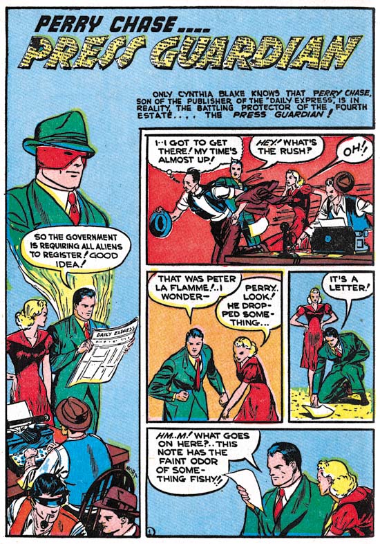
Pep Comics #11 (January 1941) “Press Guardian”, art by Mort Meskin
The earliest work by Meskin that I can provide comes from Pep Comics #11 (January 1941). Meskin had already been working at comic books for a couple of years so this is by no means among his earliest efforts. It is a very different Meskin found here as there are no signs of the typical traits that can be found throughout most of Mort’s career; traits such as the very distinctive grin he often provided to male characters. The vertical splash layout for the Press Guardian is one that Meskin would later use particularly when working with Jerry Robinson. However Mort’s handling of the story panels makes this layout distinctive from his later uses of the vertical splash. Here Meskin uses three story panels instead of the more typical two. In fact they could more properly be called three rows as there are two panels in the second row and the undivided rows now have wider panels. This arrangement gives most of the room on the page to the story panels but Mort puts what space is available for the splash to good use.
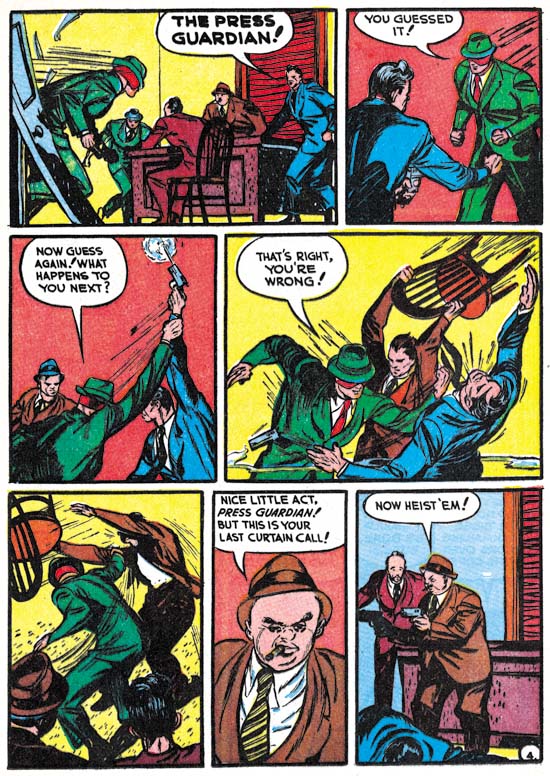
Pep Comics #11 (January 1941) “Press Guardian” page 4, art by Mort Meskin
It is in the story art that the difference between the very early Mort Meskin and his later efforts is most apparent. Almost the entire story is shown from distant view points where either the entire figures are shown or at least the upper half of the figures. Examples such as panel 6 from page 4 where the view gets close enough to provide facial details are the rare exceptions. True close-ups are nonexistent. The “cinematic” approach that would be so important to Meskin’s later art it not to be found in these earlier stories. Within his more limited control of view point, Meskin could still graphically tell a good story. While his figures may, at times, be a little stiff, Meskin included some nice action sequences.
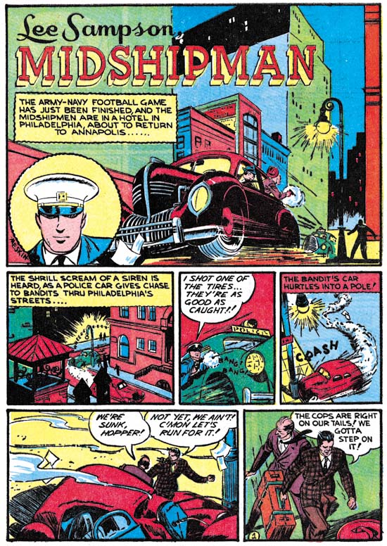
Pep Comics #11 (January 1941) “Midshipman”, art by Mort Meskin
The Press Guardian story was signed simply as Mort. There can be no question that this was indeed Meskin because that name was signed to the “Midshipman” feature from the same issue. While the layout for the splash page is different, otherwise the art style is the same. I wish I had more of this very early Mort Meskin to show; it would be interesting to see how and when his more typical style developed.
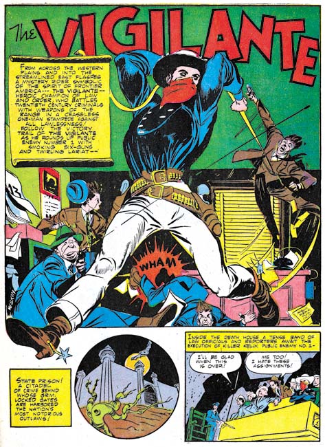
Action Comics #42 (November 1941) “The Vigilante”, art by Mort Meskin
It was just ten months later from Pep Comics #11 when Mort Meskin’s first work for DC appeared. While his work in Pep #11 showed promise, Meskin’s Vigilante for Action Comics #42 was promised fulfilled. The splash was signed, but a signature really is not required to identify this work. Meskin’s unique hand can be seen all over the story. But those readers only familiar with his work for Simon and Kirby or his later efforts for DC horror comics might find this early Meskin surprising. It is full of action and exciting artwork. While the DC Archive volumes have included all the Superman stories from these early issues of Action Comics, few of the Vigilante stories have ever been reprinted. This is certainly not a reflection of artistic value as Meskin’s Vigilante work is greatly superior to anything else being published by DC at the time. Well that is excepting the work that Simon and Kirby were doing for DC and that has not received the archive treatment either.
While the Vigilante’s dress might suggest that it was a western, they were contemporary stories (at least initially) and the western garb is the Vigilante’s costume. The Vigilante has no special powers; just an uncanny skill with his pistol and his rope. Initially the Vigilante worked alone, but he soon picked up a sidekick, Stuff the Chinatown Kid.
What happened to Mort between Pep #11 and Action #42 to cause such a dramatic change in his art? I really do not have enough of his early art to say, but I would like to submit a hypothesis. It is nothing more then a guess that would need more investigation before it could even be called a theory. I wonder if the change that Meskin underwent was a response to the release of Simon and Kirby’s Captain America? The timing is right since Captain America Comics #1 came out in March 1941. Mort’s Vigilante art uses figures extending past the panel borders, circular panels, exaggerated perspective, and dynamic slugfests all of which were favorite devices of Simon and Kirby found in Captain America. If there is any truth to this hypothesis, Meskin was not copying Kirby’s art but would instead put his own interpretations of all those techniques.
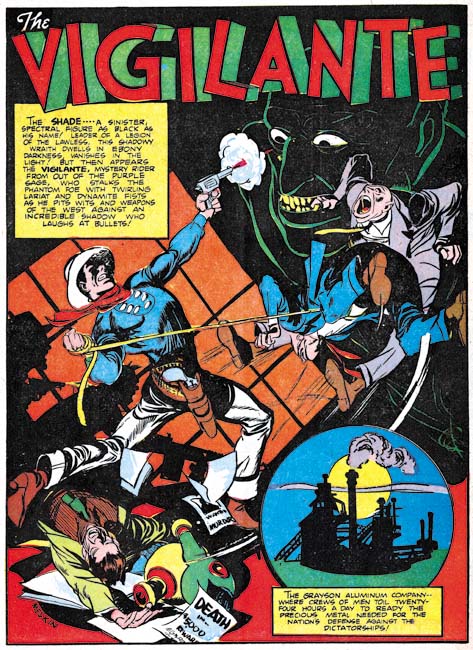
Action Comics #43 (December 1941) “The Vigilante”, art by Mort Meskin
Meskin’s Vigilante splashes could be quite intricate. Here we find the Vigilante lassoing two criminals while simultaneously shooting at the image of his current nemesis, the Shade. A vanquished foe lies at his feet while shadows on the wall behind him reveal two other gun carrying opponents. There is a lot going on but Mort’s presentation is perfectly clear.
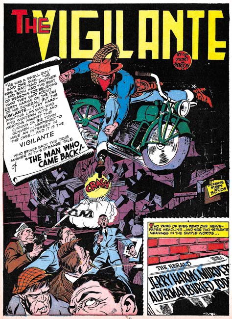
Action Comics #50 (July 1942) “The Man Who Came Back”, art by Mort Meskin
The motorcycle is a clear reminder that the Vigilante is not a western, but instead belongs in the hero genre. Here part of a man’s face is clipped off by the panel’s border. This is a very effective technique Meskin would use often but it is not typically used by Simon and Kirby so Mort probably picked it up elsewhere.
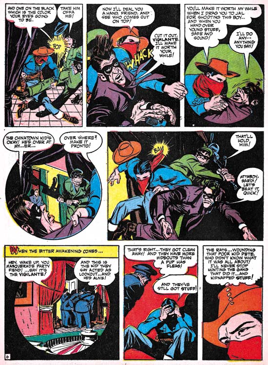
Action Comics #50 (July 1942) “The Man Who Came Back” page 6, art by Mort Meskin
This is a good example of a story page in that it shows many of traits of Mort Meskin during this period. The most obvious feature is Mort’s great handling of the action. While he may, or may not have, drawn inspiration from Kirby’s slugfest, Mort’s handling of the fight scene is very different from Jack’s. Another technique that stands out is his use of circular panels. Again this could have been derived from Simon and Kirby but Meskin’s circular panels are very different. While Simon and Kirby’s circular panels would typically expand as far as the space allowed leaving isolated corner pieces, Meskin’s circular panels are usually smaller and fully embedded in the rectangular panel. There are also several examples of faces cropped by the edge of the panels (panel 4 and most noticeably the last panel). Mort makes effective use of this device. In fact the use of shifting view points and viewing distance, the cinematic effects, play an important part of Mort’s comic book art from this period on.

Action Comics #56 (January 1943) “Melody of Menace”, art by Mort Meskin and George Roussos
I really do not know enough about Mort’s early DC work to say whether he was doing his own inking or not. It certainly was not inked in the manner typically used in Mort’s Simon and Kirby work. Some of his later DC work has dual signatures which indicate that in at least these cases another artist did the inking. Perhaps the most commonly used and most talented of these inkers was George Roussos. It is obvious from work that Roussos later did for Simon and Kirby that his own art was very much influenced by Meskin.

More Fun Comics #85 (November 1942) “The Jest of Jason Biltwell”, art by Mort Meskin and Cliff Young
The Vigilante was not the only regular feature that Mort Meskin did for DC comics. He also drew Johnny Quick which appeared in Adventure and More Fun Comics. Much has been made of the fact that Meskin was the first to provide multiple images to indicate fast action. Previously only speed lines were provided to suggest rapid movements. While I would not want to diminish this technical innovation by Mort, his manipulation of view points and viewing distance were much more significant. For “The Jest of Jason Biltwell” Meskin was inked by Cliff Young.
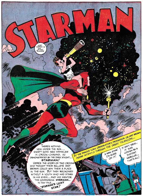
Adventure Comics #81 (December 1942) “Starman’s Lucky Star”, art by Mort Meskin and George “Inky” Roussos
Mort Meskin would also occasionally pencil other stories. For example Mort drew a couple of Starman stories for Adventure Comics. I had previously provided an image from the Starman splash from Adventures #82 and now I provide an image from Adventure #81 above.
My original plan was to write about Mort Meskin’s pre-Simon and Kirby work in a single post. Since I do not have enough examples to provide a more thorough examination of Meskin’s early art, one post should have been sufficient. However I must admit I was seduced by Meskin’s DC splashes and could not resist including a number of examples. I do prefer his graphic story telling for Simon and Kirby productions but Mort did not use full page splashes during that period. The closest that Mort came to these early splashes where some covers he did for Young Brides and Young Love in 1954 and 1955. Those covers are really nice and some are pure masterpieces of comic book art, but the earlier splashes provide a side of Meskin that I have seen no place else. So I extend my coverage and conclude it next week with a brief survey of Mort Meskin’s work that he did after the war. I will also be providing a few examples by Jerry Robinson as well.


Harry,
Thanks for sharing. Meskin’s work is outstanding and its a shame that so much if his work has not been reprinted.
Over at Meskin.net there are a few samples of Mort Meskin’s pulp illustrations from 1941 that do show his ‘typical style’ in my view.
The DC books are notoriously expensive to get, so I have had to rely on accidental finds, but what I have seen of The Vigilante and Johnny Quick looks great. If you plan to cover Meskin and Robinson’s work for their later own books (like Atoma) you can contact me to see if I have new scans for you. Unfortunately, I do not have my Meskin stories indexed, escept for the stuff he did at Timely in the mid-fifties. I do have plenty of Robinson’s work from 1948 to 1954. Some of his best work, I always say.
Harry,
What wonderful early Meskin art! Just great to see. A few points on your commentary. I agree that it was most likely the early S & K Caps influenced Mort, indeed there are some who believe he actually worked on some of the early issues, although I personally havent yet explored that possibility. But the other tremendous influence, which reveals itself in the unusual POVs and cropping, was the release of Citizen Kane, in May 1941. Mort is said to have seen it 14 times. Also, the self-contained circular panels are similar to the ones being done on Batman just prior, by Kane and Robinson.
Joe Kubert inked Mort on Vigilante when Joe was still a teenager, among Joe’s earliest comic work.
Steven,
I doubt that Meskin worked on any of the early Captain America comics, I am sure Joe Simon would have remembered him if he did. As for a Citizen Kane influence, I am sure you are correct. The influence of film on Mort is so apparent that I have taken to using the term cinematic to describe his use of view points and view distance. Thanks for the tip about similar circular panels being used in Batman.
Harry
It was Doc V. who brought up Mort working on the early Caps with S & K, and others concurred, saying his hand shows through in a few panels, but if this is true I am surprised as you are. I am not sure which issues they are talking about.