(Charlie Chan #1 – #5; June 1948 to February 1949)
During the period covered in last chapter of It’s A Crime, Simon and Kirby were also producing another title, Charlie Chan. This title was not a pure crime genre comic but instead was based on a successful movie character. Deriving a title from the movies was out of character with either Simon and Kirby or Prize Comics, neither of which would otherwise use such licensed material. In this case it was probably due to the fact that Joe and Jack’s lawyer, Fleagle, also represented the estate of Earl Derr Biggers, Charlie Chan’s creator. I last discussed this title in a post a little over two years ago (Charlie Chan & Carmine Infantino). I should warn the reader that while that post includes images that I will not be repeating here, some of my opinions have changed.
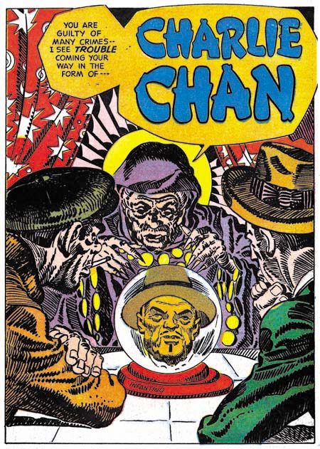
Charlie Chan #1 (June 1948) “Charlie Chan” by Carmine Infantino (signed)
In a Jim Amash interview (The Jack Kirby Collector #34) Carmine Infantino describes taking on the Charlie Chan job despite the fact that he was already getting enough work from higher paying DC. He did so for the sole reason that the job offered the opportunity of working along side of Jack Kirby and Mort Meskin. Carmine specifically says that he did not do any other work for Simon and Kirby and that he never inked Kirby’s pencils. Although there was a time that I thought these statements may not have been accurate, that was due to some confusion over work that I now believe was actually done by Warren Broderick. At this point my opinion is that Carmine did not do any work for Simon and Kirby outside of the Charlie Chan title. Most of the art that Infantino provided was for Charlie Chan feature, although he did draw some backup stories as well.
Two of the stories from the first issue of Charlie Chan (the one shown above and “Land Of The Leopard Men” that was included in my previous post) have splash pages inked in the Studio style. The inking for the above splash is particularly elaborate. Previously I felt that this inking was done by Carmine himself, but I no longer believe that. Instead I feel this inking was probably done by Joe Simon. Unfortunately some current book projects that I am working on preclude my having enough spare time for a careful examination of Joe’s inking until sometime in the future. (While this is regrettable for this blog, the results of the book projects should be appreciated by Simon and Kirby fans.) Without such a study my inking attribution must be considered very provisional, but I will say that these splashes were not inked by Jack Kirby.
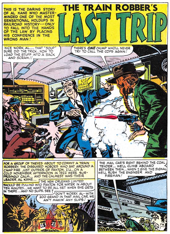
Charlie Chan #1 (June 1948) “The Train Robber’s Last Trip”, art by Carmine Infantino
Above is an image of the splash page to a non-Charlie Chan story by Infantino. It provides a good contrast to the Studio style inking previously shown. Carmine’s brushwork found in this page, and on many other story pages, is very different then what is seen in the Studio style splash pages. Of particularly note are the distinct methods of inking cloth folds. While it is conceivable that Studio style techniques such as picket fence crosshatching could be applied over earlier inking by Carmine, the different cloth fold inking suggests that is not the case. (see the Inking Glossary for explanations of the terms I use to describe inking techniques) Infantino’s inking of the Studio style splashes, if he did any at all, would have been limited to the outlines and not including any of the spotting.
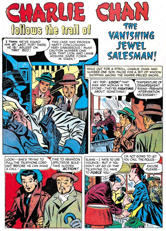
Charlie Chan #2 (August 1948) “The Vanishing Jewel Salesman”, art by Jack Kirby (first panel) and Carmine Infantino (all the rest)
Jack Kirby drew the covers for all five Prize issues of Charlie Chan but he did not provide anything for the interiors. That is with the sole exception of the splash panel for the page above. It almost seems inappropriate to describe this panel as a splash since it is barely larger then the story panels. However the splash panel provides a preview and does not belong to the story proper. The odd shape of the panel suggests that Jack provided his contribution after Carmine had already finished the story. Despite the diminished size and lack of any action, Kirby has made an interesting scene by depicting the crisis moment; Charlie Chan’s wisdom has once again deterred his number one son from a rash move but will it be enough to save them from an armed and very aware opponent? Kirby’s inking is very reminiscent of the much later Severe style but we have seen other earlier occasions when he adopted a simpler inking style when appropriate.
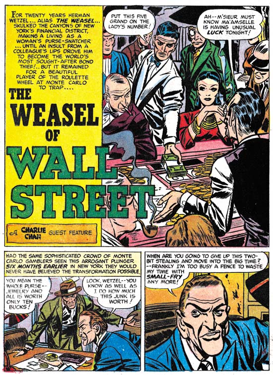
Charlie Chan #1 (June 1948) “The Weasel of Wall Street”, art by Bill Draut
Carmine Infantino provided four stories for issues #1 and #2. This left only a single backup story by another artist. For Charlie Chan #1 this story would be “The Weasel of Wall Street”, by Bill Draut. At this time Bill was the second only to Jack Kirby in terms of the amount of work used by the Simon and Kirby studio so his presence in Charlie Chan is not surprising. Bill Draut tends to get overlooked today. There maybe some justification for the neglect of some of his work after the Simon and Kirby studio closed. At that time Bill modified his style to conform more closely to the type of art popular during the silver age of comics. Unfortunately, in my opinion, he lost more then he gained. But while working for Simon and Kirby, Draut produced some fine material. Look at the cast of characters in this splash. Each is individualistically portrayed and each tells their own story. It was because of work like this and his dependable nature that Bill did so much work for Joe and Jack.
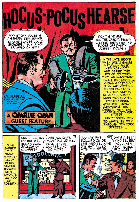
Charlie Chan #2 (August 1948) “Hocus-Pocus Hearse”, art by H. Colden?
While Bill Draut was not a surprising choice for a backup story in Charlie Chan #1, the artist for “Hocus-Pocus Hearse” for issue #2 was. I identified a single story by this artist in the last chapter of It’s A Crime. There maybe more of his work to be identified, but I am pretty sure that he was never supplied a significant amount of art for the Simon and Kirby studio. There is no reason, however, to believe that the these backup stories were commissioned specifically for use in Charlie Chan. Rather they were likely just selected from the crime stories being produced at that time and could just as easily have ended up going into Headline or Justice Traps the Guilty. However the appearance of this artist in Charlie Chan came about, he still was a good choice. This splash actually gives a better idea of his style then the one I used in the last chapter. Note the faces he draws are square and massive.
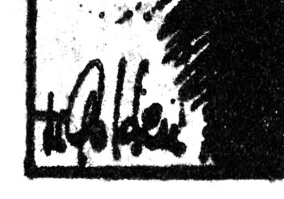
Charlie Chan #2 (August 1948) “Hocus-Pocus Hearse”, signature of H. Colden?
When I reviewed the splash for “Hocus-Pocus Hearse” for this post I immediately recognized the artist and quickly turned to the last panel of the story to see if it was signed. Sure enough there was the same signature, only this time isolated from the rest of the image. I can see that my suggestion of H. Colben was clearly wrong. That looks like an ‘O’ not a ‘C’ and a ‘d’ not a ‘b’. There is also another letter in there. But I still cannot make any sense out of it. Perhaps some reader might want to try to come up with a suggestion?
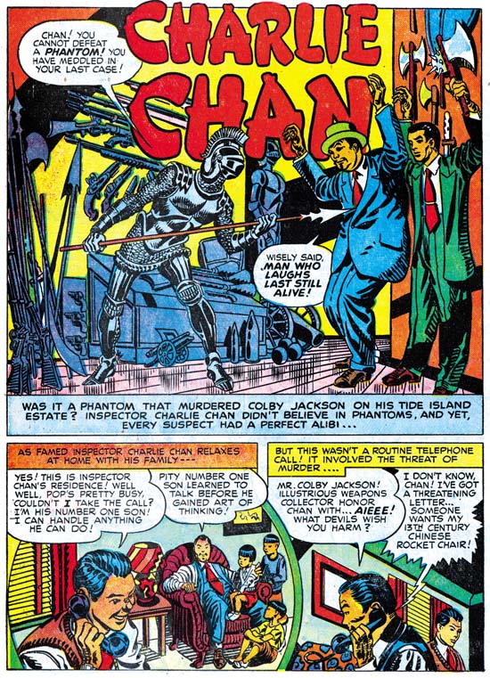
Charlie Chan #3 (October 1948) “Charlie Chan”, art by an unidentified artist
Carmine Infantino did all the Charlie Chan stories for the first four issues, except for an untitled story from issue #3. In this I differ from my previous posting on Charlie Chan because there I included the above splash page as an example of Infantino’s work. This particular page does not offer much for or against attributing the art to Carmine. The inking looks like Studio style inking but we have seen other splashes where that was done and that might mean nothing more then Infantino was not the inker.
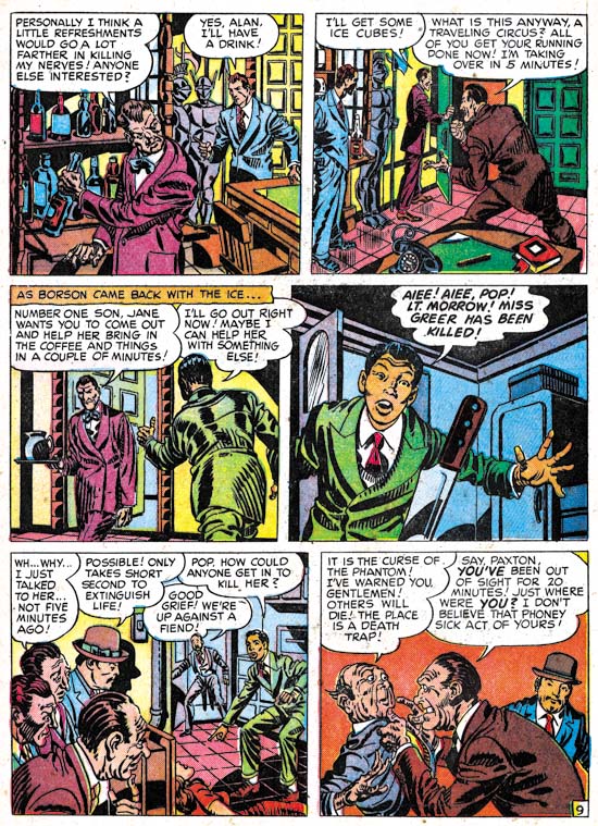
Charlie Chan #3 (October 1948) “Charlie Chan” page 9, art by an unidentified artist
So I have added an image of a story page. Interestingly the use of picket fence crosshatching continues throughout the story, something not seen in any of the work in Charlie Chan by Infantino. But again this could mean nothing more then someone else inking the work. What really sets this story apart is the style used for drawing the faces and the general means used in the graphical story telling. I have no idea who the artist was, other then he was not Infantino, but I wish I did. This was a very talented creator. This was, however, the only appearance of this artist in Charlie Chan.
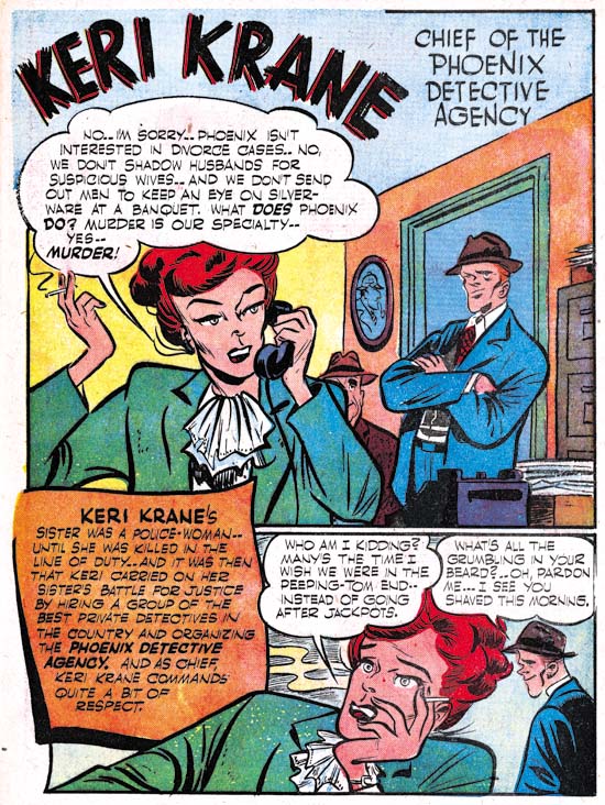
Charlie Chan #3 (October 1948) “Keri Krane”, art by Dick Briefer
Charlie Chan #3 introduced two new features. Well perhaps one was not truly a feature being more of a genre. Issue #3 had “Hilly Billy” and “Cassidy the Movie Cop” was used in CC #4. Both of these were humor stories apparently by the same artist. Gag cartoons were not that unusual in Simon and Kirby productions but usually they were limited to one, or at most two, pages. In these cases they are 4 and 5 pages long.
The other feature was “Keri Krane” about a female owner of a detective agency. At a glance this might be mistaken for another humor genre feature. While there are humorous elements, it is by no means a gag cartoon. What it is a unique blend of crime and humor unlike anything else that I have seen in a crime comic book. For those not lucky enough to have read this gem perhaps it can best be explained by comparison of another more famous feature by the same artist, Frankenstein. When Dick Briefer first started Frankenstein it was a true horror feature but at some point it was changed to a more humorous one. Briefer had developed one of the most unique drawing styles. His drawings are deceptively in their simplicity but capable of a wide range of expression. Briefer’s Frankenstein must have been successful because he had a long run on it from Prize Comics #7 (December 1940) to Frankenstein #17 (February 1949). Further Frankenstein was the only Prize title that survived the arrival of the Simon and Kirby team. Dick’s appearance in Charlie Chan Comics at this time maybe related to the approaching termination of the Frankenstein comic. Frankenstein Comics would resume, with Dick Briefer as artist, with issue #18 (March 1952) and run until issue #33 (November 1954) when it was one of the fatalities resulting from the newly introduced Comic Code.
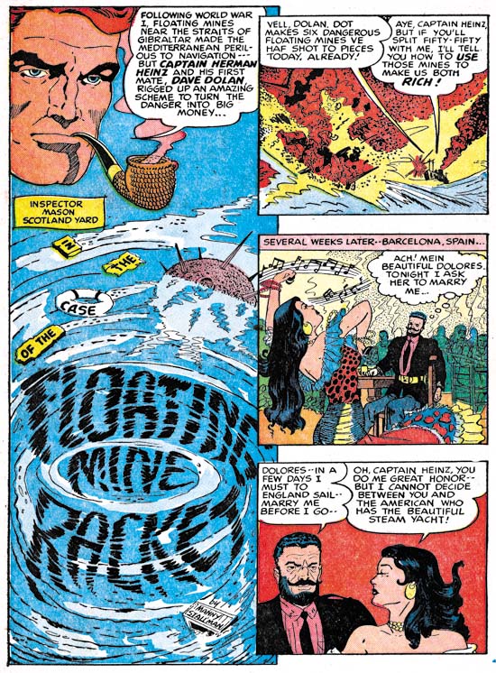
Charlie Chan #5 (February 1949) “Floating Mine Racket”, art by Manny Stallman?
The backup features used in Charlie Chan #3 and #4, including Briefer’s Keri Krane, were dropped for issue #5. A standard crime backup story was used to take their place, “Floating Mine Racket” by Manny Stallman. What a great splash this is. The use of floating debris and the whirlpool to form the title was undoubtedly inspired by similar compositions by Will Eisner for The Spirit. The layout with three story panels floating above and slightly overlapping the splash panel is unlike anything else seen in Simon and Kirby productions. The art has a quirky style to it that I find very appealing. There is only one problem, despite the signature this story was not done by Manny Stallman! Or at least not the same artist that signed other stories in Headline and JTTG as Manny Stallman. The style is so distinctively different that there can be no question in my mind about this. I do not know enough about Manny Stallman’s career to provide a certain answer to this enigma. I mentioned previously that Stallman’s S&K work had a style distinct from what he later did for Atlas. But “Floating Mine Racket” is even further removed from Stallman’s Atlas work. Stallman also did a couple of stories for Simon and Kirby with John Guinta. The inking of the Guinta stories seems to agree with most of the Stallman S&K work. The inking of “Floating Mine Racket” does not match the inking on the Guinta pieces. My current conclusion is that “Floating Mine Racket” was done by some artist doing ghost work for Stallman. As for the rest I will continue to credit them to Manny but there is still the possibility that he only did the inking over yet another ghost artist. This problem obviously needs further investigation.
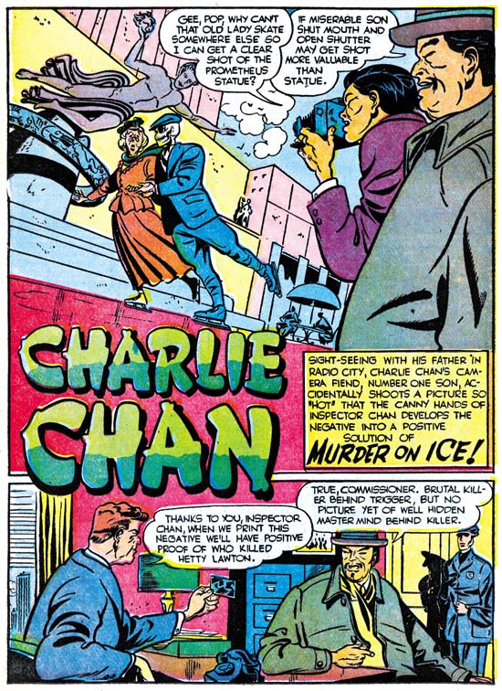
Charlie Chan #5 (February 1949) “Murder On Ice”, art by Dick Briefer
While working on Charlie Chan in the Simon and Kirby studio during the day, Infantino continued to draw for DC at night. It was a grueling schedule and it took its toll. Carmine did great work but the decline in quality from the first Charlie Chan issue until his last is obvious. In the end it was too much for him and Infantino called it quits. Carmine would only draw a single Charlie Chan story for the fifth issue, “The Fox of Paris”. The other three Charlie Chan stories would be taken over by Dick Briefer. The Briefer attribution may seem surprising because it is for his work on Frankenstein that he is best known. For Charlie Chan, Dick has adopted a relatively more realistic approach then what he had used for Frankenstein or Keri Krane. A yet even more realistic example of Briefer’s art can be seen with a page from Uncanny Tales #19 (April 1954) provided by Atlas Tales. Despite his more realistic drawing and the more serious nature of the feature, Briefer’s off-beat humor tends to insert itself into the Charlie Chan stories. What could be incongruous then a skeleton dressed in a suit skating with an old lady at the Rockefeller Center rink? The skeletal figure in the splash for “Murder on Ice” does not actually appear in the story, but presented with such a delightful piece of art, who cares?
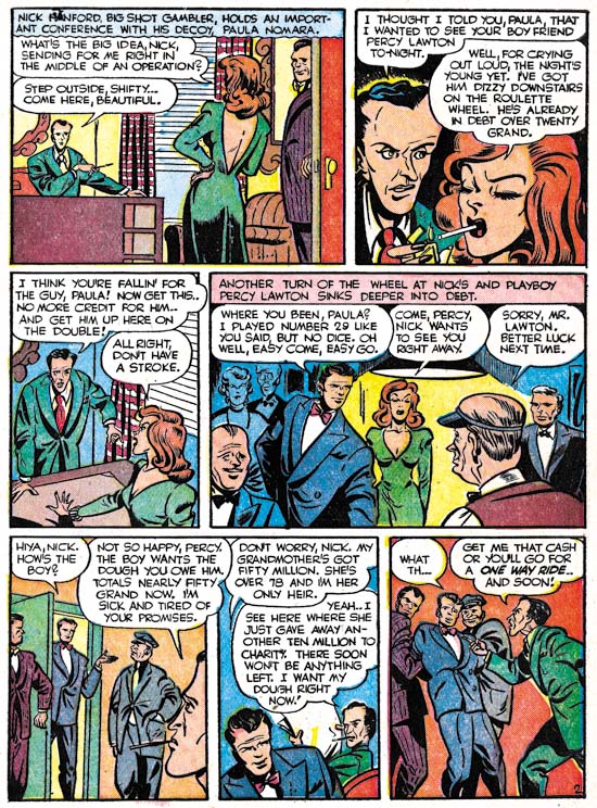
Charlie Chan #5 (February 1949) “Murder On Ice” page 2, art by Dick Briefer
The splash page, as fine a work of art as it is, really does not provide the best example of why the Charlie Chan stories from issue #5 should be credited to Dick Briefer. It is to a story page where Briefer’s hand is most evident. Dick had a distinct tendency to provide heads with a triangular form as can be seen in the Keri Krane page whose image I had provided earlier. A similar, if not so exaggerated, shape can be found in the heads on the story page shown above. The Briefer’s style for Charlie Chan retains enough of caricaturistic traits as to make it very special. There is no real humor in this page but the drawing style gives it a particular appeal. Dick’s forte may have been humor, but as can be seen his graphic story telling was top notch.
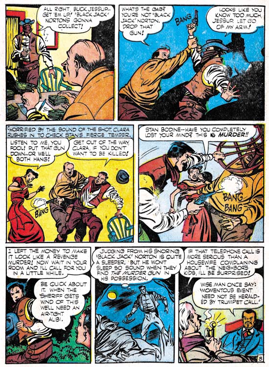
Charlie Chan #5 (February 1949) “The Dude Ranch Hold-Up”, art by Dick Briefer
I also wanted to include an action page. Briefer shows he can handle action just as well he could humor. Dick Briefer’s Charlie Chan stories really are a testament to what a great artist he was. However Charlie Chan #5 would be the final Prize issue. Years later Simon and Kirby would sell the idea to Charlton. Actually these later Charlie Chan comics could more accurately be called Joe Simon productions as Jack Kirby’s contribution seems limited to creating the cover Charlie Chan #6 (June 1955), the first Charlton issue. Some have suggested that this cover might be left over material from the Prize run. The inking of that cover is done in a blunt manner typical of what is found toward the end of the Studio style. Even the drawing looks more typical of Kirby’s work from the mid 50’s. The cover includes the presence of Burmingham Brown; a character who never appeared in the Prize Charlie Chan comics but played a very visible part in the Charlton issues. I therefore confidently conclude that the cover for CC #6 was created specifically for the Charlton comic, perhaps initially as a presentation piece used for pitching the idea to Charlton. Most of the titles that Simon and Kirby did for Charlton were carryovers from their failed Mainline publishing line. The former Mainline titles each would only last for one or two issues with the exception of Foxhole where a third issue was produced without Simon and Kirby’s involvement. Surprisingly Charlie Chan, using all new material, would last longer for a total of four issues.
Chapter 1, Promoting Crime
Chapter 2, A Revitalized Title
Chapter 3, Competing Against Themselves
Chapter 4, Crime Gets Real
Chapter 5, Making a Commitment
Chapter 6, Forgotten Artists
Chapter 7, A Studio With Many Artists
Chapter 9, Not The Same
Chapter 10, The Master and His Protege
Chapter 11, The New Team


Great post again. As for Colden… the art doesn’t suggest anything to me, except te feeling I have seen it before (in other Prize titles?). The signature suggests that it could also be Goldfarb, maybe working solo here. But he is and Ed, not a Henry or Hank.
As for Stallman, I don’t know. The fancifulness of the art is similar to stuff Ben benulis did, but I don’t know if they ever worked together. For a good handle of Stallman’s art you should lso have a look at his earliest stuff for Atlas. It had a similar line to this piece. He used to sign his name very small. There must be some samples on Atlas Tales and there is at least one story in the Marvel Materwoks rerpint of Strange Tales #1-10.
Harry, thanks for the look at a series that I knew almost nothing about. It’s especially nice to see more non-Frankenstein art by Briefer.
Ger,
I have looked at Atlas Tales and as I said in my post the Altas art looks different from either of the two styles I find in the Prize comics. I have also seen a Stallman story in Captain Aero which at a glance looks more like the Atlas material. As for Benulis, that is an interesting suggestion but I am only familiar with his later work. I am sure all the evidence is trying to tell us something, I am just not sure what that is.
Scott,
Briefer’s presence in Charlie Chan certainly was a fortunate, if short lived event. Obviously there is more non-Frankenstein work out there because Briefer must have been doing work during the period from March 1952 to November 1954 during which Prize stopped publishing Frankenstein Comics.
Hi Harry,
As always an interesting and informative post. In regards to the first Charlie Chan splash signed by Infantino, is it possible Simon or Kirby provided a layout or design for that splash? It looks a little too confident to me and I don’t think it’s only due to the possible Simon inks. The characters have a weight and fluidity that one associates with Simon and Kirby. If Infantino was able to copy Simon and Kirby’s style so effortlessly at this point then why do the other Infantino splashes look so much weaker in comparison?
Possible Simon and Kirby layouts? It is always possible. The question should be is there anything that truly suggests it. I say this because I have found many work by studio artists used layouts distinct from those used by Kirby, while I have seen few that looked convincingly like Kirby layouts. To me it sounds like you are playing the quality card, if it looks good it must be because of Kirby. For me that is a non-starter, I try to look for something more. And I do not find it in this splash. The features are more caricaturistic then Kirby would do it and very much like Infantino’s style. So if Kirby supplied layouts they would have to have been very rough. So rough that I do not see how Kirby’s hand could be detected.
Harry,
I defer to you in this period of comic book exploration, but my basis was not on the quality of the page but the art in comparison to Infantino’s other, concurrent work on Charlie Chan. I may be wrong about my theory and would have to see more of Infantino’s work on the title, but judging by the examples shown here I would not easily ID Infantino on that splash page if a signature did not appear. And, as you have noted with Manny Stallman, even that is not positive proof.
Nick,
You say that your basis was not quality, but so far the distinctive characters that you have offered confidence, weight and fluidity which sound like quality judgments to me. Every artist has his good days and his bad days. Quality varies. But artist will tend to repeat how they handle what otherwise would be considered unimportant details of the drawing. It is those aspects that should be used in trying to determine attributions.
Often in single cases like this, it is difficult to prove or disprove whether Kirby supplied layouts to a studio artist. Depending on how rough a layout there maybe little evidence left to judge by. But when looking at larger samplings I believe a pattern emerges. I find many cases were the splash layout, or the panel layouts, or some pose was one generally not used by Kirby. There are much fewer cases where the layout looks like Kirby’s. Perhaps even more important then the low number of Kirby layouts found, are that they involved less frequently used artists and not the studio regulars. So for me the generalization, or what is sometimes referred to as the null hypothesis, is that Kirby did not supply layouts for the regular studio artists. That does not mean I deny the possibility that Kirby ever did such layouts, but that the burden of proof rests on the case for Kirby layouts. When for a particular example I cannot find good evidence that Kirby in fact supplied layouts, then I conclude he did not. And as I said before, I do not accept quality assessments as good evidence. In the case of this Charlie Chan splash I find no style or layout technique that indicates it was more likely done by Kirby then Infantino while I do find some evidence to the contrary. Therefore I do not attribute either the layout or pencils to Kirby.
Hi, I had reason to go back to this post, when I cam across a set of scans for issue #1, 3 and 4. First thing I saw here… I don’t know why I disagreed wih the Stallman attribution… since it is signed in the first panel!
Secondly, although I agree with you that Carmine Infantino did many of these stories, I have several notes.
First of all, there seems to be a very overpowerin ginker at work here. In some stories he mixes with Infantino very well. Since these are the stories Infantino signed, I wonder if he did those themselves or used one of his ‘regular’ inkers, such as Leonard Starr. For a sample, go to timebulleteer.wordpress.com/tag/the-heap/, and look at the second story. But as the splashes of those stories were obviously done by someone at the studio (possibly Joe Simon, as you say – not my area of expertise) one would think that the rest of the inking would have been done there as well.
Secondly, some of the later stories do not seem to have been drawn by Infantino to me. There’s one in #3 (secondstory) that is even signed CN. And the secon dstory of #4 looks like it could have been pencilled by Bill Draut before being overwhelmed by the inker.
Thirdly, it seems to me this inker is responsible for some of the unidentified art we have found in this period. He is the scalloped hand, button nose inker of some of those early unidentified western stories. Maybe even, if he is so overpowering, he could have been working with Broderick on some of those.
Since Mr. Starr is still with us and drawingbeautiful covers for the Mary Perkins reprin books, I will write his publisher Charles Pelto (or Jim Amash) to see if he can ask him if he remembers doing Charlie Chan…
I was well aware of the CN monogram and perhaps it means it was not done by Infantino. But that is not necessarily true. The monogram could be the initials of the first name of the penciller (Carmine) and the inker. Or it could have been a been a deliberate attempt to hide the fact he was still working for S&K (at some point Infantino would start, or is it returned, to also work at DC). The point is that unless the monogram can point to another artist whose work looks like a better match for these stories I am going to base my attribution on the only good evidence I have, that is the art.
I also do not see any sign of Draut in the art. Nor does any of the inking look like Starr’s. But by all means try to check with Starr on that.