Category Archives: 7 Freelance

Strange Tale Indeed

Strange Tales of the Unusual #7
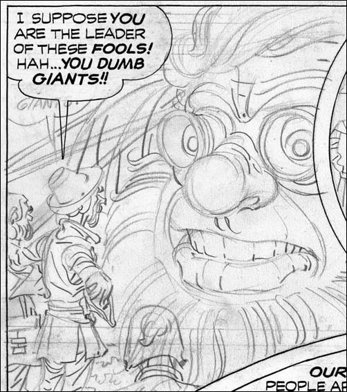
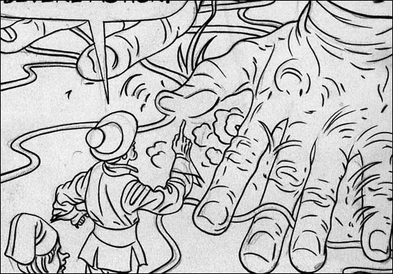
Strange Tales of the Unusual #7 (December 1956) “Poker Face” page 1 pencils by Jack Kirby

A giant alien arrives in an odd cylindrical spaceship. Without any attempt to hide, he makes visits all over the world. People’s responses vary, the Russians fire with all their available weapons, most citizens of Indian hide in the bushes but a few approach closely, New Yorkers gawk but quickly get bored and return home. But it seems that no matter how the people of earth react, the alien completely ignores them and just goes about his business. Only nobody can figure out what he is doing. He just seems to go everywhere with his weird gadgets. The answer to the riddle is provided at the end and of course it is an unexpected explanation.

When I was young I remember reading some DC comics, Superman, Batman, the Flash and so on. What I remember most about them was how boring they were. My DC phase did not last long and was never very intense. I then progressed to Marvel pre-hero fantasy, which was still filled with stories very much like “Poker Face”. I remember enjoying them very much for a while. Eventually I got tired of the formula. It may sound strange but I found the use of a surprise ending repetitious after a while. So I drifted out of comics. But later I somehow stumbled on an early Fantastic Four (probably FF #4) and I was hooked, a confirmed Marvel junkie.

This is another of those pre-Implosion Atlas where Kirby inked his own pencils. As described in Chapter 6 of “Jack Kirby’s Austere Inking” the spotting was a pared down version of the formerly used Studio style. Jettisoned from that older style were brush techniques like drop strings and picket fences. New to the inking was the use of a pen, often in parallel lines to provide grays.

Jack Kirby’s Austere Inking, Chapter 6, Atlas

Towards the end of 1956 (I am using comic book cover dates throughout this serial post) Jack Kirby began to do freelance work for Atlas and DC. This did not mean the end of Simon and Kirby productions but their working relationship must have changed. Although Joe Simon took part in presenting the Challengers of the Unknown to DC he was not involved in any of the actual freelance work that Jack did for DC or Atlas.

Among the earliest of the work Jack did for Atlas was the Yellow Claw. He started with issue #2 and therefore did not have anything to do with the title’s creation. Nonetheless Kirby clearly had a lot of control on the contents of the issues he did (#2 to #4). The stories are nothing like those from YC #1 and are pure Kirby. As I said in Chapter 7 for my serial post of The End of Simon and Kirby, I consider These Yellow Claw work by Kirby to be nothing short of masterpieces. The issues of interest for this serial post on Kirby’s inking are YC #2 and #3, in those issues Jack did his own inking. Whereas YC #4 was inked by someone else, with pretty horrendous results.

Yellow Claw #2
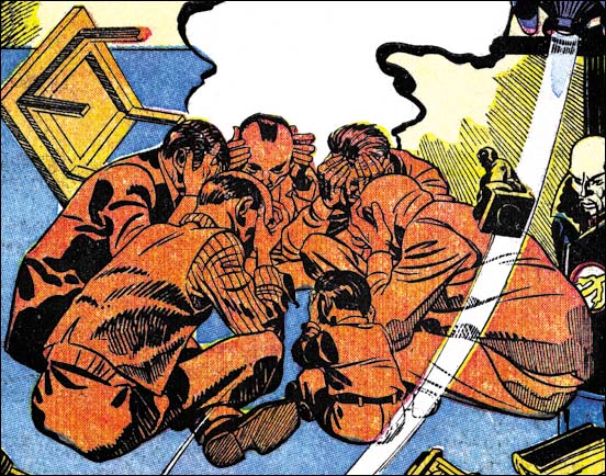
Yellow Claw #2 (December 1956) “Concentrate On Chaos” splash panel from page 1 pencils and inks by Jack Kirby

If you have been following my serial blog on Kirby’s inking styles this splash should be recognized as a Fine Studio spotting. Jack had used pretty much the same method in some of the Prize romance covers earlier in the year. The Studio Style had been a mainstay of S&K for about a decade. Not that it was entirely static but if anything it evolved into even bolder effects. I cannot say why, but in a short time Jack transformed it. Going from coarse to a finer lines may not seem like much, but it had a big effect on the final image. New here to Jacks inking was the use of a pen, previously all spotting was done using a brush. It was a pen that now did all the pickets of the picket fence patterns. Even further from the standard Studio Style was the use of a pen to just provide grays, such on the sole of the foot.

Yellow Claw #2
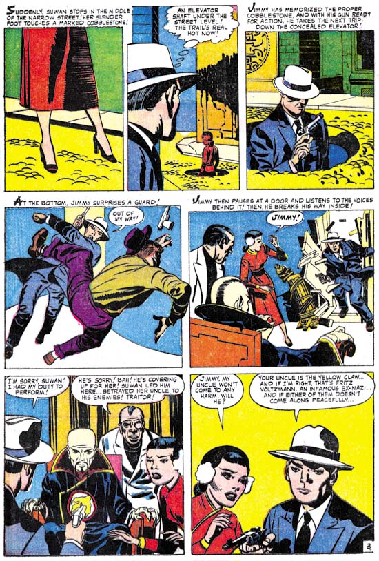
Yellow Claw #2 (December 1956) “The Yellow Claw” page 3 pencils and inks by Jack Kirby

Not all the work in Yellow Claw used pen work and picket fences. These techniques take greater effort and more time. As can be expected it was in the regular story panels where the finer work was sometimes abandoned. When that happened, as for example page 3 from the story “The Yellow Claw” (see above) the results look very much like the Austere Style. A lighter look, black areas often made by flooding an area with ink and simple spatulate cloth folds. Note the presence of shoulder blots, this is a quintessential Kirby trademark although possibly used by Joe Simon as well.

Yellow Claw #3
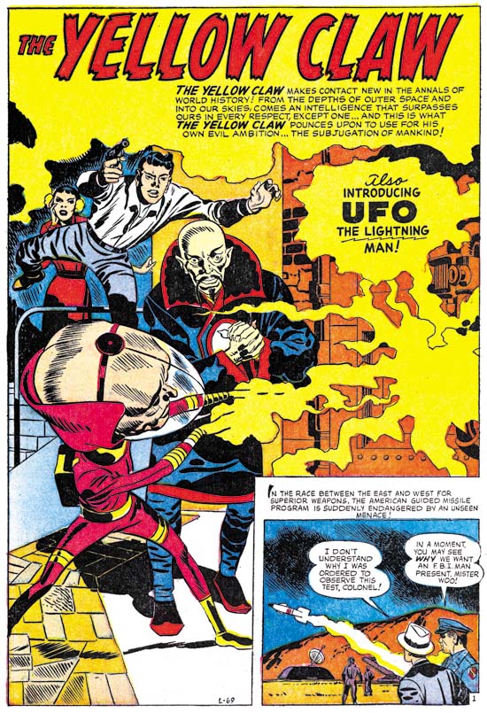
Yellow Claw #3 (February 1957) “UFO, The Lighting Man” page 1 pencils and inks by Jack Kirby

But Austere Style inking was not limited to Yellow Claw story panels. Look at the above splash from YC #3. Although the use of a pen is still evident what is missing are typical Studio Style brushworks such as drop strings or picket fences. Ignoring the use of the pen, the actual brushwork looks like very typical Austere style.

Yellow Claw #3
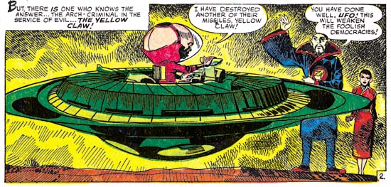
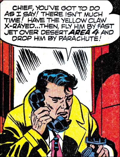
Yellow Claw #3 (February 1957) “UFO, The Lighting Man” page 2 panel 6 pencils and inks by Jack Kirby

The last panel on page 6 shows that pen work could also appear in the story art as well.

Yellow Claw #3
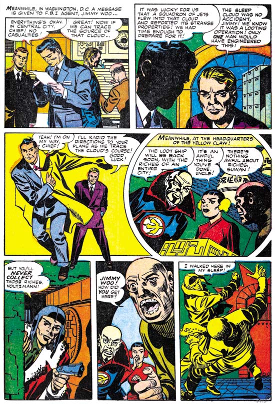
Yellow Claw #3 (February 1957) “Sleeping City” page 4 pencils and inks by Jack Kirby

Another example of mostly Austere type of inking on a story page. But look at the last panel with Fine Studio style using pen.

Yellow Claw #3
Yellow Claw #3 (February 1957) “The Yellow Claw Captured” page 4 panel 1 pencils and inks by Jack Kirby

I wanted to end my examination of Kirby’s Yellow Claw inking with a panel showing spotting technique that is a holdover from the standard Studio style. This is what I call the abstract arch shadow. It was not used nearly as often as some of the other inking methods that I have discussed. But it has a long history of use and given enough pages any work done in the Studio style is bound to have examples of abstract arch shadows. This is another inking method that I have not seen used outside of Simon and Kirby (or just Kirby) productions. Like shoulder blots, I do not quite get what abstract arch shadows are supposed to represent. Nonetheless when present they can be important components of the composition and make the page more interesting.

Asonishing #56
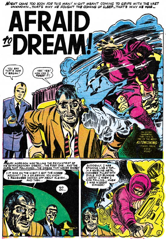
Astonishing #56 (December 1956) “Afraid To Dream” page 1 pencils and inks by Jack Kirby

I previously discussed this work. Looking over it again for this serial post I still conclude that the spotting looks like Jack Kirby’s work. It is another example of his Fine Studio style. That is not to say that it is as nice an inking job as Jack’s work in Yellow Claw. Instead the inking looks a little rushed.

Also done at this time was “Poker Face” published in Strange Tales of the Unusual #7. I will be posting an image of that story in an accompanying post. As for the inking it is typical Austere style along with occasional pen work. This job was as nicely done, if not so elaborate, as Jack’s Yellow Claw inking.

In a comment to another of my posts Ger Apeldoorn advanced his hypothesis that “Afraid To Dream” and “Poker Face” may have been originally been Simon and Kirby productions created for Harvey’s Black Cat Mystic. As I mentioned in the previous chapter, Black Cat Mystic had an incredibly bad schedule with long periods between issues. Ger suggestion is that due to that schedule Jack took the work to Atlas instead. Without a doubt either of these two stories would have fit quite well with the others that S&K did for Black Cat. The only thing that bothers me about this thesis is that the inking on these two stories, particularly the use of a pen, fit better in with the rest of Kirby’s Atlas work then they do for his Black Cat jobs. Still the inking could have been done or modified after the decision to change venues. Anyway Ger’s suggestion is intriguing.

Black Rider Rides Again #1
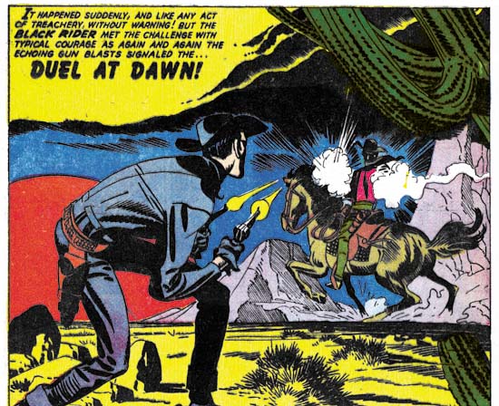
Black Rider Rides Again #1 (September 1957) “Duel At Dawn” splash panel from page 1 pencils and inks by Jack Kirby

When recently I posted on Black Rider Rides Again #1 I had concluded that the pen work was added to the art after it was delivered to Atlas. Now that I have reviewed the Yellow Claw work I feel I have to withdraw my previous opinion. The pen work in Black Rider matches what was done in Yellow Claw. In YC there can be no question that the pen work was part of the original inking, it is so perfectly integrated with the rest of the spotting. This use of a pen still bothers me. It seems so out of place from the days of the Simon and Kirby studio, I cannot recall his using a pen before. I will return to this issue next week in my chapter on freelance work done for DC.

Black Rider Rides Again #1
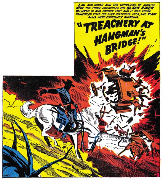
Black Rider Rides Again #1 (September 1957) “Treachery At Hangman’s Bridge” splash panel from page 1 pencils and inks by Jack Kirby

Other then the use of pen, the rest of the spotting for Black Rider is a good match for the Austere style. There is not much use of drop strings or picket fences. Well that is generally, Jack did use a modified drop string to texture the cactus in the “Duel At Dawn” splash panel. When dramatic effects called for it (such as the Hangman’s Bridge splash above), the image would be rather dark. Still over all the art has a light look that is decreased only partly by the use of a pen.

Black Rider Rides Again #1
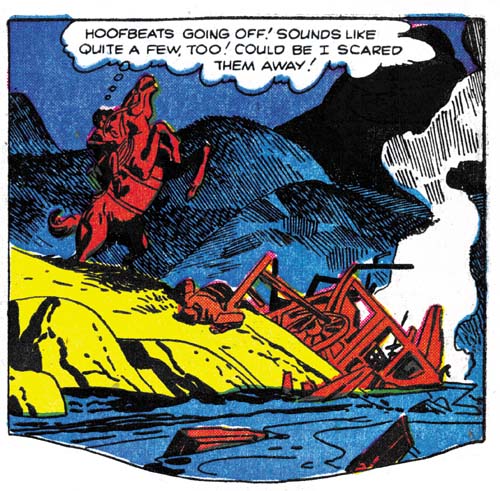
Black Rider Rides Again #1 (September 1957) “Treachery At Hangman’s Bridge” page 2 panel 2 pencils and inks by Jack Kirby

Sometimes I feel the pen work is effective, sometimes intrusive. Oddly sometimes I find it both. In the second panel on page 2 of the Hangman’s Bridge story the contrast between the Austere brush work in the foreground and the use of pen in the background gives depth to the image. Unfortunately it also distracts from the drama provided by Black Rider’s rearing horse.

Two-Gun Western #12
Two-Gun Western #12 (September 1957) “No Man Can Outdraw Him” splash panel from page 1 pencils and inks by Jack Kirby

This is another story that I have posted on recently. Here Jack provides a pure Austere inking. Very minimal brushwork without any of the more complicated techniques. Next to Yellow Claw, this is my favorite Kirby piece from this period. I cannot say if Kirby did the writing, but it is a great story. The figures are more elongated then typical for Kirby, a trait also found in Black Rider. This and the matching inking gives the art an almost expressionistic look which Jack puts to good use.

So far all the Kirby inking Kirby pieces I have seen that were done for Atlas were all pre-Implosion. Kirby did not ink even some with job numbers that indicate they were made before the Implosion but were published afterwards. I am not very knowledgeable about Atlas so perhaps Kirby did some inking later that I have not seen. But it sure looks like Kirby stopped inking for Atlas after the Implosion.

Jack Kirby’s Austere Inking, Chapter 1, Introduction
Jack Kirby’s Austere Inking, Chapter 2, Mainline
Jack Kirby’s Austere Inking, Chapter 3, A Lot of Romance
Jack Kirby’s Austere Inking, Chapter 4, Prize Covers
Jack Kirby’s Austere Inking, Chapter 5, Harvey

Jack Kirby’s Austere Inking, Chapter 7, DC
Jack Kirby’s Austere Inking, Chapter 8, More Harvey
Jack Kirby’s Austere Inking, Chapter 9, More Prize
Jack Kirby’s Austere Inking, A Checklist and a Glossary

other post with Kirby inking Kirby:

Strange Tale Indeed
Battleground, Jack Kirby’s Return to Atlas
Captain 3D

Jack Kirby Swiping From Bill Draut

First Love #68
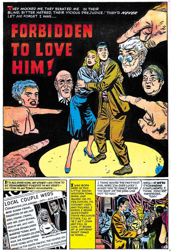
First Love #68 (September 1956) “Forbidden To Love Him”, page 1, pencils and inks by Bill Draut

A young lady meets a man at a dance and quickly falls in love. Early in the relationship the man tells the woman that he is an Indian. The lady is surprised and then ashamed at her response. She loves him and wants to marry him. On her return home she finds her parents waiting. They have heard from neighbors that her date was an Indian and they insists she stop seeing him. Of course she refuses and the conflict at home continues. The man gives a speech at a bond rally before the entire town. It is revealed that he is a war hero. He gives an impassioned speech about the importance of foreigners in the history of America and the true meaning of freedom. The town is ashamed about their treatment of the man and the couple wed with everyone’s approval.

The story of “Forbidden To Love Him” is based in Oklahoma and the chief character is an Indian. Nevertheless it is hard not to a consider this story a more universal condemnation of the racial or ethnic intolerance in much of America during the 50’s. It is a topic that Simon and Kirby had touched on in “Different” (Young Romance #30, February 1951). But their version was much more circumvent and not nearly as bold as this story. “Forbidden To Love Him” may have been a little heavy handed but it effectively highlighted the hypocrisy involved.

First Love #68
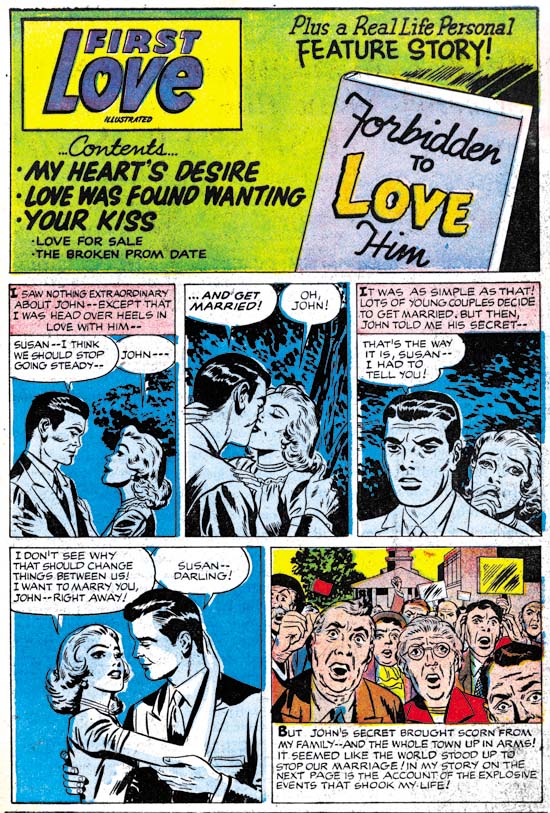
First Love #68 (September 1956) contents page, pencils by Jack Kirby, inks by Jack Kirby?

As with FL #69 we have a contents page with an introductory story that at a casual glance could appear to be the work of Bill Draut. In FL #69 the story was a sort of prequel to the feature story. Here in FL #68 it is more like the comic equivalent of a movie trailer. We have less to work with in determining the correct attribution because in four panels all we have are the couple with limited background. Still once you ignore the Draut style eyebrows Kirby characteristics keep popping out. The poses for panels 3 and 4 look particularly like Kirby’s and not the way Draut would have done it. I am discounting Joe Simon’s as the penciller because FL #69 provided examples of both Joe and Jack copying Draut. The art in FL #68 contents page matches Kirby’s version of Draut then it does Simon’s.

First Love #68
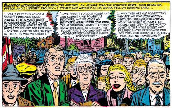
First Love #68 (September 1956) “Forbidden To Love Him”, page 5 panel 1, pencils and inks by Bill Draut

The last panel of the introduction story is more complicated and provides more clues as to Kirby’s involvement. In places Jack seems to forget that he is supposed to be imitating Draut and some faces look like pure Kirby. What is particularly surprising about this panel is that it is a swipe from one that Bill did in the story. Bill’s original depicted the crowd’s shame as the man revealed his wartime heroism. Jack has converted the scene to town’s anger about the coming marriage. But there is no mistaking the derivation because the lady’s father and mother have the same positions. The bride-to-be herself was left out by Jack because it would not have been appropriate for her to share the town’s anger. It is interesting to compare Bill and Jack’s approach to the crowd. Bill provides more people and arranges them to regularly diminish in size as we go from front to back. Jack draws fewer individuals and we are less aware of the size of the crowd because we cannot see the back. By doing this Kirby is able to provide clearer representation of the emotions for the people he does shows. In the comments to FL #69 Stan Taylor correctly remarked how the architecture looked like Kirby’s. This panel in FL #68 does not provide as many buildings but it still is interesting to compare Jack’s method to how Bill handle’s architecture.

Jack Kirby’s Austere Inking, Chapter 5, Harvey

While Jack Kirby was almost single handedly penciling all the Prize romance comics (see previous chapter) Joe Simon seems to have been doing some editorial work for Harvey. I say “seems” because I have no firm evidence to indicate when Joe started doing this work. Joe’s collection still includes some proofs of Harvey romance content pages. Also Bill Draut and John Prentice, long time Simon and Kirby artists, both start appearing in the Harvey romances at this time. Perhaps related to Joe’s editorial work, Jack would also provide some covers for Warfront and the romance titles. Harvey would also publish Western Tales (#31 to #33) and Black Cat Mystic (#58 to #60) which appear to be actual Simon and Kirby productions.
Warfront #28
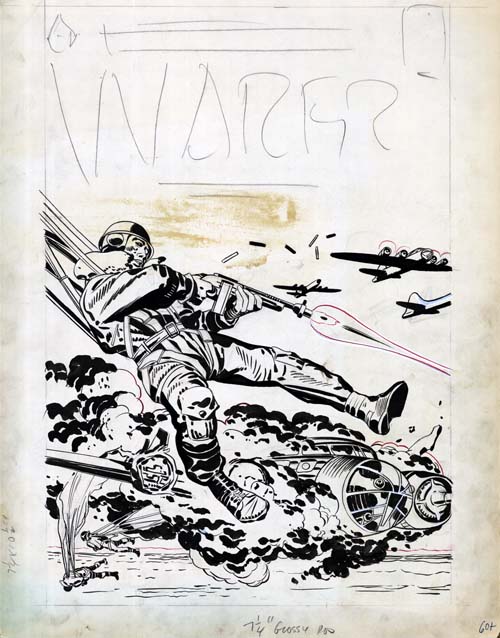
Warfront #28 (January 1956) original art, pencils and inks by Jack Kirby

The inking on this cover is done in typical Studio style manner by Kirby. Not much in the way of picket fences but lots of variants of drop strings. Particularly convincing are the negative folds on the paratrooper’s right lower leg. What is not quite so certain is whether this art was originally meant for the cover of Warfront #28. The plane engulfed in flames was modeled (by no means a close copy) from a panel in “Hot Box”, a story that appeared in Foxhole #2 (December 1954). This suggests the possibility that this art was originally meant to be the cover for Foxhole #2. Certainly the penciling and inking are both good matches for some of the Foxhole covers such as issues #2, #3 or #5. However we saw in chapters 3 and 4 that early in 1956 Jack would still do a typical Studio style inking. With only four months separating the last Foxhole issue from Warfront #28, I am not sure we much we can deduce from the stylistic similarities.
Warfront #29
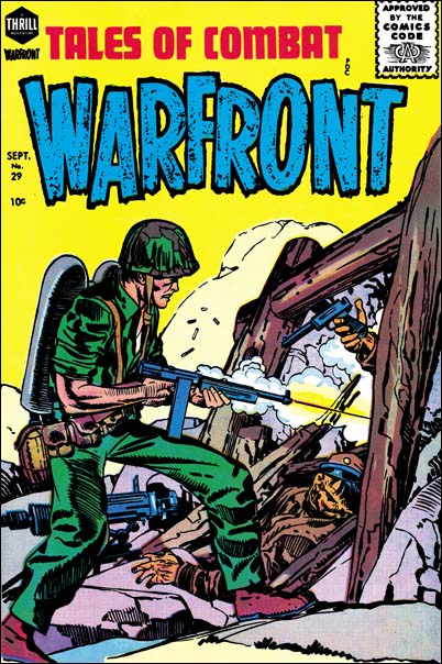
Warfront #29 (July 1956) pencils and inks by Jack Kirby and Joe Simon?

Jack did the pencils and inks for much of the Warfront #29 cover. Excluded is the torso where both the penciling and inking seems to have been done by another hand. I previously discussed this cover in my serial post on the End of Simon and Kirby. There I concluded that originally the man held a flame thrower but had been reworked to avoid problems with the Comic Code. Since Jack did not do the reworking, the most likely candidate would be Joe Simon. The parts I think were inked by Jack were done in typical Studio manner.

The Jack Kirby Checklist, and some comic scholars attribute the cover drawing of Warfront #30 (September 1957) and #34 (September 1957) to Jack. I disagree with those attributions. But as far as I can remember no one has claimed that Kirby did the inking for these covers. Therefore they need not concern us here.
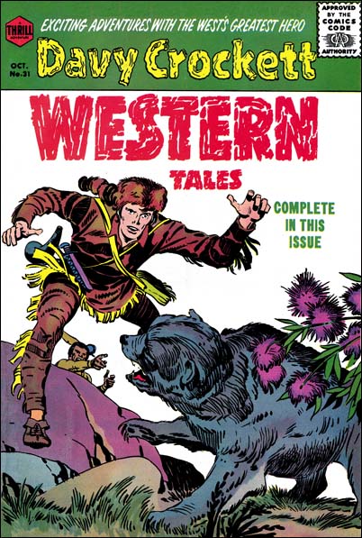
Western Tales #31
Western Tales #31 (October 1955) pencils and inks by Jack Kirby

With the end of the Mainline/Charlton S&K would want to produce new material to take their place. But what was likely to sell during these troubled times in the comic industry? Well it did not take an expert to figure this out, at that time it must have seemed that all the kids were wearing coon skin hats. Walt Disney had aired “Davy Crockett, King of the Wild Frontier” in three episodes (December 15, 1954, January 26, 1955 and February 23, 1955. The response, at least among young boys, was overwhelming. For comic book publishers, what was especially attractive about Davy Crockett was that he was a historical figure and therefore not subject to copyright or trademark protection.

Probably the only thing unusual about these Western Tales issues was how much Kirby was in them. Actually this really was not too surprising as it was the modus operandi of S&K when launching a new title. Not all of it was new, also included in each issue was a reprint story from Boys’ Ranch. The new art was typical Simon and Kirby and used Studio Style inking. This is what would be expected judging from what we have seen for the Prize romances at that time.
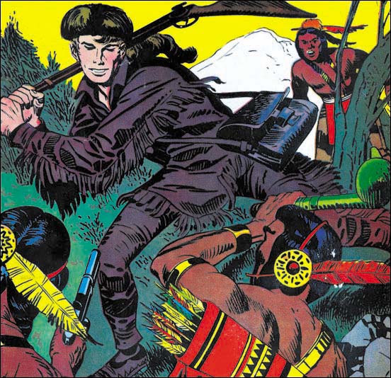
Western Tales #32
Western Tales #32 (March 1956) pencils and inks by Joe Simon

Although Kirby did pretty much all the new art for Western Tales, I believe the cover for WT #32 was penciled and inked by Joe Simon. A comparison with WT #31 shows that Joe did a pretty good job with the Studio Style. Nice picket fence and drop string work. The spot inking on Davy’s right leg seems a little different then Jacks, particularly the negative folds.
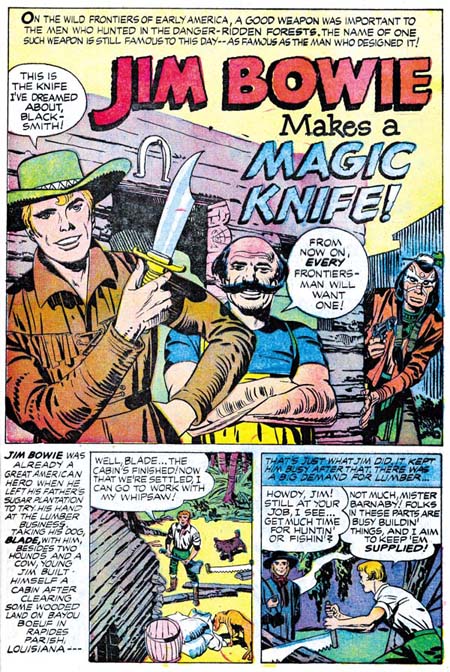
Western Tales #33
Western Tales #33 (July 1956) “Jim Bowie Makes A Magic Knife” page 1 pencils and inks by Jack Kirby

A comic on Davy Crockett might have seem very topical and free from legal hassles. The only problem was that it was obvious to other publishers as well. By the time WT #31 hit the stands there was already numerous competitors doing Davy Crockett material. Not only that but one of them was Dell who had the Disney franchise and could use a photo cover of Fess Parker, the actor from the Disney TV shows. To avoid the competition, a changed seemed in order. So the new hero for WT #33 was Jim Bowie. There was a television show for Bowie as well, but it did not air until September 7, 1956. Much too late to be any influence on Simon and Kirby. Even the movie “The First Texan” was probably too late as well (June 1956). But S&K were well aware of the Alamo, they included a double page splash on it in an issue of Boys’ Ranch. So Jim Bowie was in all likelihood just an obvious choice for a new hero.

There is a marked similarity of the art in WT #33 as compared to issues #31 and #32. This is a little surprising because by July the Prize romances were showing frequent use of the Austere Style. In WT #33 all the inking continued to use the Studio Style. With the long time between Western Tales issues I cannot help but wonder if the art was done earlier then the July cover date would indicate.
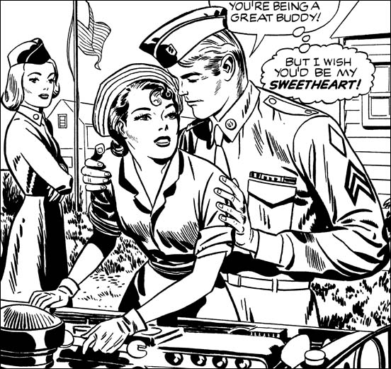
Love Problems and Advice #38
Love Problems and Advice #38 (March 1956) restored line art, pencils and inks by Jack Kirby

As if doing almost all the art for the Prize romance titles was not enough of that genre for Jack, he would also do some of the covers for the Harvey romances. Although Kirby used the Studio Style for Harvey’s Warfront and Western Tales covers, he never used it for the romance covers. None of the covers have picket fences, and even drop strings get limited use. Actually the Harvey covers are not good matches for the Austere Style either. I would give Jack’s Harvey inking a name except there are still some unresolved issues as I will discuss below.

The inking for Love Problems and Advice #38 cover is probably the one I am feel most sure about attributing to Jack Kirby. Although on a whole not in true Studio Style it does have some similarities. The way the modified drop strings are handled is the same as in the Studio Style. The clothing folds are done in a similar manner as well. New, at least for Jack, are the roughly parallel lines that cover some areas. Jack had done something similar, as for instance in the Warfront #28 cover shown above. But for Warfront #28 the lines are bold in keeping with the Studio Style. In Love Problems #38 the lines are finer, although I would still hesitate to describe them as truly fine. There are some areas flooding with black as in the Austere method, but the overall image does not have the lightness typical of that style.
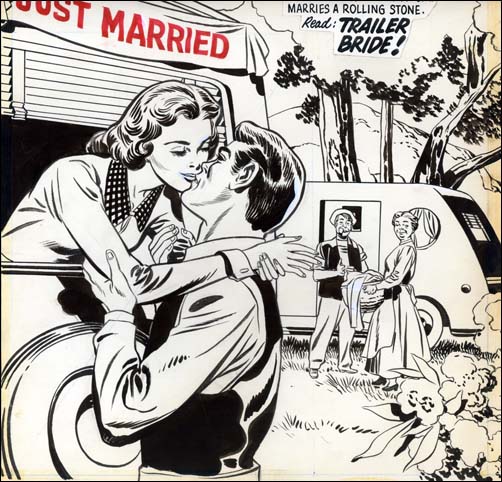
True Bride-To-Be #19
True Bride-To-Be #19 (August 1956) original art, pencils by Jack Kirby inks by Joe Simon

Many, probably most, of the Harvey romance covers were not inked by Kirby. The one from True Brides-To-Be #19 that I show above is a good example of inking by another artist. Jack did indicate the folds for the clothing in the pencils so once again we find a bunching up of folds in the elbow and shoulder regions. The inker has also picked up of Jack’s flooding of ink in certain areas. But the treatment of the blacks on the man’s jacket do look a little unnatural. I am not certain, but the way the elbow folds are handled remind me of some work Simon did later so I attribute the inking of this cover to Joe.
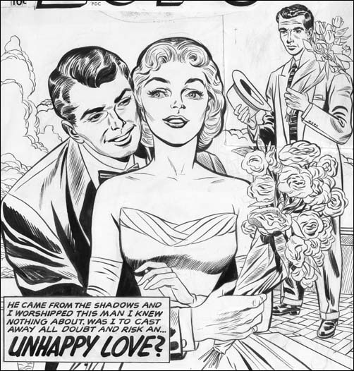
First Love #70
First Love #70 (November 1956) pencils by Jack Kirby inks by Jack Kirby and Bill Draut?

The line inking of the First Love #70 cover remind me of Kirby. The spotting is a more questionable issue. Much of the gray of the image is created by the use of fine parallel lines. These lines are similar to those found in Love Problems #38 only finer. It could very well be that this could reflect the same move to finer brush work that we found on some of the Prize romance covers. That was in fact the conclusion that I previously reached. While reviewing the matter for this serial post I have come to a different opinion. Note the man in the background, he seems to be treated to a different spotting style. That did not bother me before because this man was a late addition. His upper part was done on a piece of paper that was pasted over previous art. The paste has held so the original art is not visible but by using a strong light from behind it looks like his place used to be occupied by the side of a house. Anyway the spotting on the man in the background reminds me of Bill Draut’s work. Bill would sometime use fine parallel lines. Compare the lines on the jacket collar of the man in the front with some of the brush work for an unpublished cover by Bill Draut shown below. Perhaps he was responsible for the spotting of the whole cover. I now think Bill did most of the spotting but I still feel outline inking of the couple were done by Jack.

The story gets more complicated. There may be two hands involved in the spotting. The first one did all the fine work that I described. The second came in later and strengthen certain areas on the man’s arm and in his hair. This was done with a very bold and assured brush. You can still make out an area on the arm where this was done with a sort of coarse picket fence brush work. If Jack was the first inker then I suspect the touch up work was by Joe Simon. The need for such strengthening is more likely seen by someone other then the original artist. If Draut was the initial spotter then Jack probably did the correction.
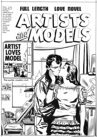
Artists and Models
Artists and Models unpublished cover from about December 1954 pencils and inks by Bill Draut

The Black Cat titles present a difficulty to any chronological analysis. Harvey’s support seemed to be lukewarm to publishing Simon and Kirby productions. Four to five months separate the Western Tales issues described above. That was bad, but Black Cat was much worse. Black Cat Mystery #57 is cover dated January 1956, Black Cat Mystic #58 is September of the same year. Black Cat Mystic #59 was not released until a year later (September 1957). With such long periods between releases who can be sure when the art was actually done. I will leave of a discussion of Black Cat Mystic #59 until a future chapter, but we shall see that stylistically BCM #59 was very much like BCM #58.
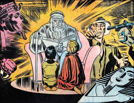
Black Cat Mystic #58
Black Cat Mystic #58 (September 1956) “Read To Us Mr. Zimmer” splash panel from page 1 pencils and inks by Jack Kirby

Jack drew and inked the cover for Black Cat Mystery #57 (January 1956). Considering the cover date it is not surprising that it was done in a typical Studio style, although without the use of picket fence brush work. Similar Studio style inking is found even in Black Cat Mystic #58 despite the late September date as can be seen in the splash panel above.
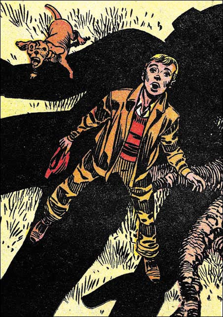
Black Cat Mystic #58
Black Cat Mystic #58 (September 1956) “Gismo” splash panel from page 1 pencils and inks by Jack Kirby

But not too much should be made about the absence of picket fences in the Mr. Zimmer splash. Elsewhere in the comic very typical use of picket fences can be found as for instance the splash to “Gismo”. It is a perfectly good example of typical Studio style brush work.
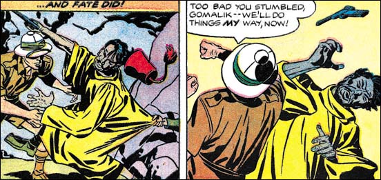
Black Cat Mystic #58
Black Cat Mystic #58 (September 1956) “Read To Us Mr. Zimmer” panels 4 and 5 from page 4 pencils and inks by Jack Kirby

However some of the art for BCM #58 does begin to look like Austere inking, particularly when you get into the story panels. So what should be made about this combination of Studio and Austere style inking? Considering the late date for this title it is surprising that Studio style seems predominant. I suspect that some of the art was create earlier. But since some Austere inking can be found I do not believe the all the art was done right after BCM #57 and then held until Harvey was ready to publish.

Jack Kirby’s Austere Inking, Chapter 1, Introduction
Jack Kirby’s Austere Inking, Chapter 2, Mainline
Jack Kirby’s Austere Inking, Chapter 3, A Lot of Romance
Jack Kirby’s Austere Inking, Chapter 4, Prize Covers

Jack Kirby’s Austere Inking, Chapter 6, Atlas
Jack Kirby’s Austere Inking, Chapter 7, DC
Jack Kirby’s Austere Inking, Chapter 8, More Harvey
Jack Kirby’s Austere Inking, Chapter 9, More Prize
Jack Kirby’s Austere Inking, A Checklist and a Glossary

other post with Kirby inking Kirby:

Strange Tale Indeed
Battleground, Jack Kirby’s Return to Atlas
Captain 3D
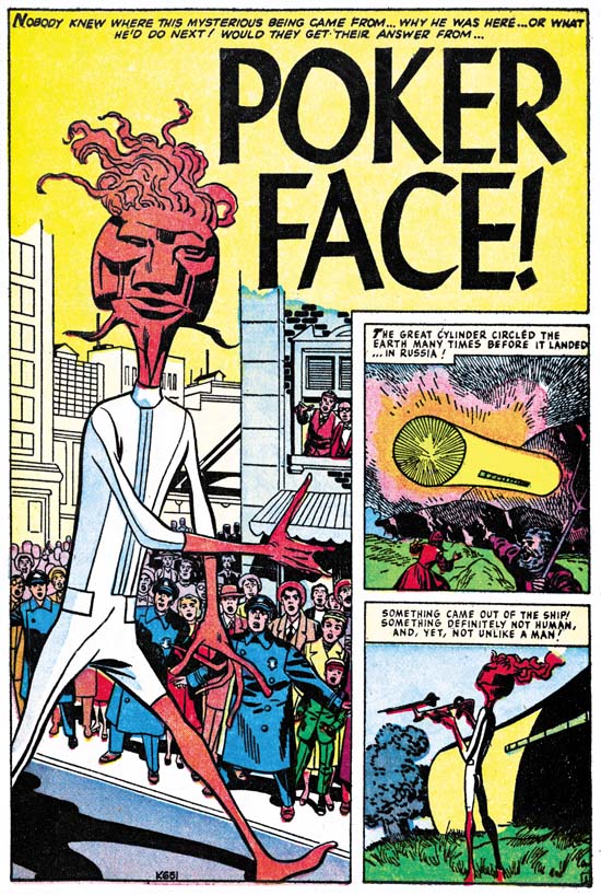
Bill Draut And His Imitator, Jack Kirby

First Love #69
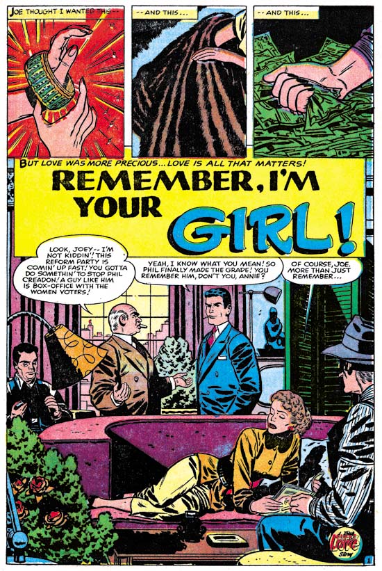
First Love #69 (October 1956) “Remember, I’m Your Girl”, page 1, pencils and inks by Bill Draut

With the period having 1956 cover dates Kirby was pretty much the only artist working on the Prize romance titles (Young Romance, Young Love and Young Brides). During this time Bill Draut and John Prentice who had previously been doing work for those titles began to appear regularly in the Harvey romance books instead. “Remember, I’m Your Girl” is typical of the work Draut did for Harvey. Bill still had an distinct style particularly characterized by simple but prominent eyebrows.

This a story about a man (Joe), his sister (Annie), and a former friend (Phil). Joe is now a successful politician and his sister is enjoying the financial fruits of that success. There is an approaching election and his position is being threatened by Phil, a rival candidate. Years before all three were good friends so Joe asks Annie to reconnect with Phil in order to find some weakness. His sister refuses but runs into Phil by accident and a romance develops. Joe wins the election but the sister continues her romance. When Joe confronts Annie to choose between her previous financial rewards or the rival, she chooses Phil.

First Love #69
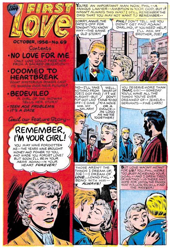
First Love #69 (October 1956) contents page, pencils by Jack Kirby and Joe Simon, inks by Joe Simon?

Joe Simon was probably working for Harvey as an editor at this time. I generally do not consider works such as “Remember, I’m Your Girl” as Simon and Kirby productions. The format and length match Harvey romance stories from well before Joe’s time as Harvey editor. However something unusual happened in FL #68 and FL #69. Generally Harvey romances has a content page with at most a portion of the splash for each story. In FL #68 and #69 the content pages had a short original art that served as an introduction to the featured story.

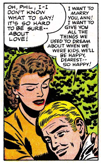
For First Love #69 the feature story was Bill Draut’s “Remember, I’m Your Girl”. The same characters that appear in the feature story are presented here. The text makes it clear that the trio are shown in the earlier days while they were all still friends. A casual glance at the introduction story could result in attributing it to Bill as well. What particularly stands out are the simple but prominent eyebrows, which as I said was a Draut trait. A close examination reveals that the faces are not quite like Draut would do them, particularly in the story panels. There is not much to go but the spot inking does not look like Draut’s either. But I do not think it is just the case of some other artist inking Draut’s pencils. The layouts in the introduction story are not quite like Bill’s.

It is the layouts that provide a suggestion who the real artist was. In the first panel Joe is shown lighting up a cigarette. This is a typical Kirby theme and pose. In panels 2 to 4 the main speakers are placed in the front while those not speaking are placed in the background. This is a typical Kirby layout. Even the way Annie looks over Phil’s shoulder as they embrace is a typical Kirby pose. Although the artist tried to draw the characters like Bill Draut did he really could not completely adopt Bill’s more stylized pencils. Keeping in mind that he is imitating Draut, a close look at the faces suggests Kirby was the penciler.

First Love #69
First Love #69 (October 1956) “Remember, I’m Your Girl”, page 4 panel 1, pencils and inks by Bill Draut

In the past I have often warned about using some Kirby-esque features for attributing a work to Jack. Joe Simon was also familiar with Kirby’s techniques and was pretty good at mimicking most of them. If you ignore the attempt to copy Draut’s style, the number of Kirby-isms seems rather high even for Joe. But look at the drawing of Annie that appears in the bottom of the contents panel. It appears to be the done by yet another artist. A search of the actual story shows that the contents drawing was swiped the first panel of page 4. It would seem to be a reasonable deduction that Joe Simon did the contents drawing. If that is true then he was not have been responsible for the penciling of the introduction story.

The possibility of Kirby ghosting another artist was brought up recently by Bob H. in a comment to All-Star Western #99. I do not know if what Jack did for FL #69 introduction story would properly be called ghosting. It was not a case of fooling the editor, Joe was also involved in copying Draut on the content page. Nor was Draut a regular artist recognized by the reading public. Harvey romances are all unsigned and the artist used for the feature story would change. This was just a case of trying to maintain visual continuity between the contents page and the feature story. Imitating another artist was not something Jack did very often. Although his Draut was not perfect, it was good enough to fool many.

Jack Kirby’s Austere Inking, Chapter 4, Prize Covers

Simon and Kirby always seem to put special effort into their covers. So it is on the covers that we are most likely to find the use of techniques such as picket fence or drop strings. In the last chapter we saw how in the Prize romance interior art these Studio Style methods disappeared by the end of 1956. What occurred on the covers was a bit more complicated.

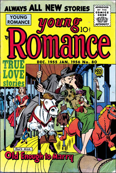
Young Romance #80
Young Romance #80 (December 1955) pencils and inks by Jack Kirby

The YR #80 cover was the first cover that Jack did upon returning to working on Prize romances. At first look one might believe that Kirby had immediately jumped into the Austere Style. Nowhere do we find any picket fence brush work and only a limited use of a drop string like technique. However the absence or limited use of these special brush work was probably due to how complicated the image was. Without the colors this becomes a difficult image to read. Because the surface was already so busy it would have been difficult to add picket fences. So the absence of picket fences can be misleading. What spotting there is more closely resembles the use in the Studio style. Later in this post I will present another cover truly done in the Austere inking which will highlight the difference between that style and what was done for YR #80.

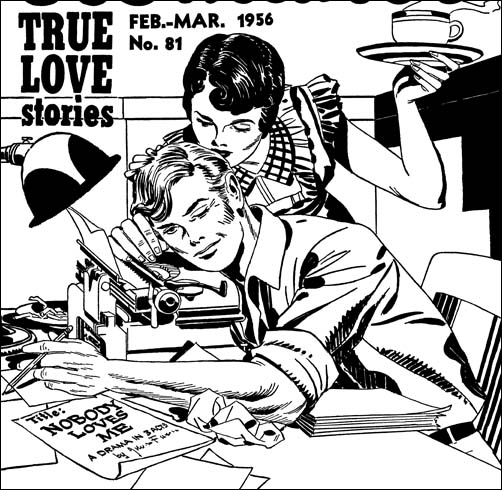
Young Romance #81
Young Romance #81 (February 1956) restored line art, pencils and inks by Jack Kirby

YR #81 is an cover inked by Jack not long after his returned to working on the Prize romances. In the previous chapter I gave examples from the interior art of this same issue for both Studio and Austere style inking. The cover seems a good example of Studio style work. In fact if you did not know what was coming it would be easy to overlook the ways that it deviates from previous work in this style. The picket fence patterns are done every so slightly in a finer manner. Some of the spatulate cloth folds on the man’s shoulder seem more typical of the Austere style. Note how they just seem to attach themselves to fine ink lines almost like they were leaves. Also there are some fine form lines used in the man’s forearm. The entire image has a lighter look to it without being anywhere near as light as the true Austere inking. But I want to repeat that none of this would be particularly surprising except in view of what is to come.

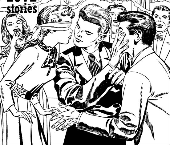
Young Romance #82
Young Romance #82 (April 1956) restored line art, pencils and inks by Jack Kirby

Jack’s next cover for Young Romance looks rather different from the standard Studio style. It has the overall lighter look typical of an Austere piece. Yes there are blacks but they have been concentrated on the young man at the center. Elsewhere most of the spotting is rather sparse. In many respects it is a good candidate for showing the evolution from Studio to Austere inking. But look at all the drop strings and picket fences. It is not their presence that is surprising is the fact that they are now done with much finer brushings. This is the start of what I am going to refer to as the Fine Studio style. It might not warrant a special designation if it was limited to these Prize romance covers. However we are going to encounter it again when Kirby begins freelancing with Atlas.

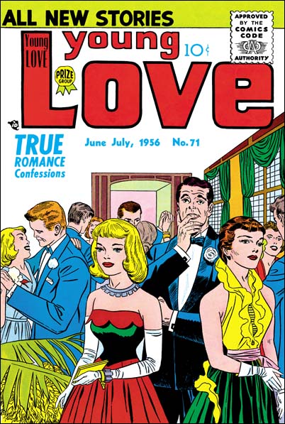
Young Love #71
Young Love #71 (June 1956) pencils and inks by Jack Kirby

About midway through the year, Jack provides a cover that can easily be said to be done in the Austere style. Note the lighter look and the simpler treatment of clothing folds. When blacks are used they tend to flood the area as in the jacket of the man or the woman’s blouse. The ink lines are so fine that I originally thought they were done using a pen. However I have seen the original art for this cover in Joe Simon’s collection and it shows that a brush was used. Note how the folds in the jacket of the man dancing on our left seem concentrated in the elbow and shoulder regions leaving the other areas of the arm relatively plain. Although a complicated image with lots of background figures, this cover still looks very typical of the Austere style. It makes a good contrast to the Studio style used on the cover for YR #80 that I showed in the start of this chapter.

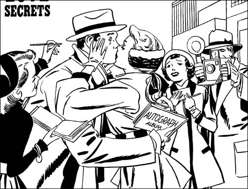
Young Brides #29
Young Brides #29 (September 1956) restored line art, pencils and inks by Jack Kirby

This is excellent example of Jack Kirby’s Austere style in inking a cover. The over all image has a very light appearance. Black is used, here in the blouse and hat of the lady on our left, by flooding the area with ink. Some of the brush work looks like a modified drop string but are for the most part done in an overlapping manner forming a ragged line.

Once again I cannot restrain myself from commenting about the art. The cover shows some celebrity surprised while signing an autograph by a kiss from an adoring fan. Very charming. But you can still see the celebrity signing the autograph book. So how did the attractive lady get into his arms? Of course she could not if we tried to interpret this cover as if it was done by a camera. But this is not a photograph nor should it try to act like one. Although not logical as a frozen moment in time, this cover makes perfect sense when view as presenting a story. Had it been more logical the story would probably have been less clear.

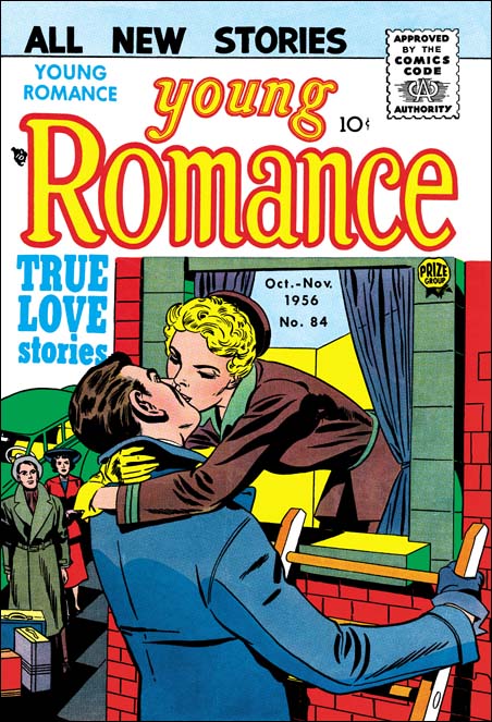
Young Romance #84
Young Romance #84 (October 1956) pencils by Jack Kirby inks by Bill Draut

This serial post is about Kirby inking Kirby. Still during this year Jack did not ink all of his pencils. So I like to include examples of other inkers of his drawings. The above image of YR #84 looks like it was inked by Bill Draut. It is interesting to see how Draut’s inking also has the lighter quality present in the Austere Style. While Kirby’s pencils did not provide any guides to the spotting, it did indicate where things like clothing folds should be placed. The more limited use of such folds gives the image the lighter look. Spotting was still up to the inker as indicated by Draut’s different handling of the woman’s jacket.

Jack Kirby’s Austere Inking, Chapter 1, Introduction
Jack Kirby’s Austere Inking, Chapter 2, Mainline
Jack Kirby’s Austere Inking, Chapter 3, A Lot of Romance

Jack Kirby’s Austere Inking, Chapter 5, Harvey
Jack Kirby’s Austere Inking, Chapter 6, Atlas
Jack Kirby’s Austere Inking, Chapter 7, DC
Jack Kirby’s Austere Inking, Chapter 8, More Harvey
Jack Kirby’s Austere Inking, Chapter 9, More Prize
Jack Kirby’s Austere Inking, A Checklist and a Glossary

other post with Kirby inking Kirby:

Strange Tale Indeed
Battleground, Jack Kirby’s Return to Atlas
Captain 3D

The Black Rider Rides Again, And Again

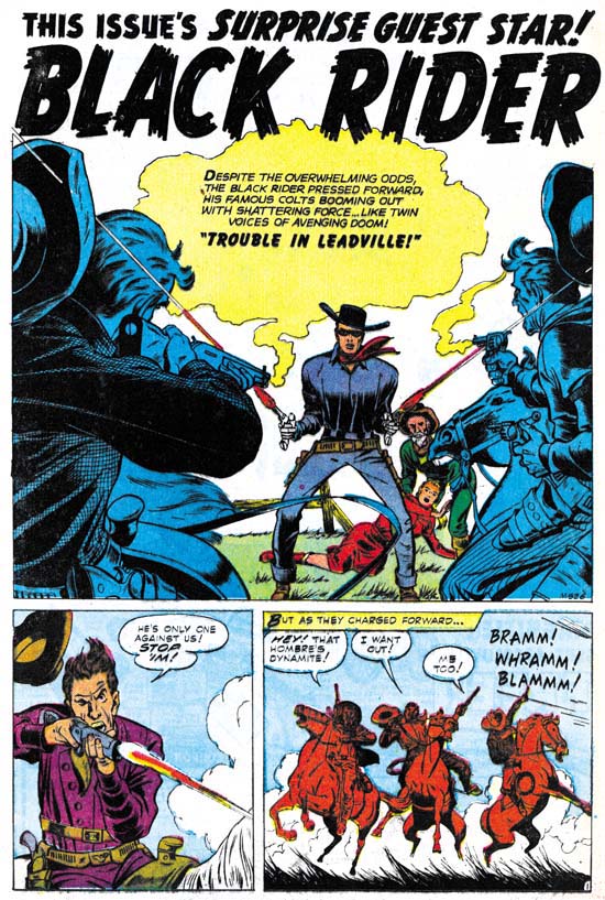
Gunsmoke Western #47
Gunsmode Western #47 (July 1958) “Trouble In Leadville” page 1 pencils by Jack Kirby

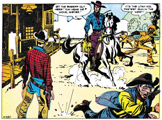
Like “The Raiders Strike” in Gunsmoke Western #51 this Black Rider story with an “M” job number is probably inventory left over from before the Atlas Implosion. One reason that I have been reviewing some of Kirby’s work that might have been done before the Implosion is the hope of finding more examples of Kirby inking Kirby. Alas GW #47 is not inked by Jack but instead looks like the same inker as GW #51. I check Atlas Tales and they do not list the inker for GW #47. Because I forgot to do so in my previous post, I also check Atlas Tales for GW #51 and they list Dick Ayers as the inker. A check of GCD gives Ayers as the inker of both stories, but surprisingly says Dick also penciled “Trouble In Leadville”. Sigh, what can I say, the GCD is such a mixer of accurate and, in this case, widely off mark attributions. Anyway I really do not know enough about Ayers to voice an opinion on the inking attribution. Whoever the inker for GW #47, he did a good job and did not overwhelm Jack’s pencils. As with GW #51, I feel that inker’s more detailed style is a poor match for Kirby’s pencils. Jack’s pencils in these Black Rider stories are stylized and the inker’s style make the figures look somewhat freakish. It may seem odd to say the inker did a good job but a poor match for Kirby’s pencils. With Black Rider Rides Again #1 I felt that Kirby’s inks complimented his pencils. Jack’s pencils would suffer from any inker not following that style, which would be pretty much any other inker. That being the case the most one could expect is that at least the line inking be sensitive to Jack’s pencils.

In the very beginning of “Trouble In Leadville” the Black Rider is involved in a shoot out against a number of opponents. He proves too much for them and the ride away. We then find that he has saved Marie (the recurring female character) and her father from Dan Basset’s gang. The gang came asking a lot of questions about Leadville and became angry when the pair refused to answer. Suspicious that the gang was up to no good the Black Rider tries to go after them but the trail goes cold. But he asks Marie to go to the sheriff and warn him about the gang’s presence. Back in town and having resumed his identity as the local doctor, we find out the sheriff has left with a posse. Basset and his gang arrive to find the town is unprotected and make for the bank. But the doctor does a quick change to the Black Rider and saves the day.

I have to admit I am really not a big fan of these Black Rider stories. Of course Kirby’s art is nice but the stories themselves leave a lot to be desired. They seem very formalistic. The stories often seem to start with action where either the Black Rider prevents the bad guys from whatever they are doing but is unable to capture them, or the Black Rider arrives too late to and the bad guys are already gone. The Black Rider resumes his identity as the town doctor. Later when the bad guys show up, he dons his Black Rider outfit and almost effortlessly saves the day. The repetitive nature of the plots indicates to me that they were not by Kirby who, if anything, had an overly active imagination.

Jack Kirby’s Austere Inking, Chapter 3, A Lot of Romance

I coined the term Austere Style because in its purist form the inking is characterized by a lack of embellishments. However Kirby’s inking after the failure of the Mainline titles was not limited to an evolution into a simpler method of inking. Jack used other inking techniques as well. Although the title of this serial post is “Jack Kirby’s Austere Inking”, I will also be covering Kirby’s other inking styles. In an effort to keep this discussion from getting too confusion I will be divide the material with 1956 cover dates into three chapters. This one will concentrate on the interior art for the Prize romances. The next chapter will be about the Prize romance covers. Chapter 5 will be on work Jack did for Harvey.

It would be really nice to know when the S&K studio actually disbanded. I covered this issue in my End of Simon and Kirby serial post and I have not changed my beliefs. The earliest possible date for the end of the studio would be February 1955 (cover date) with the last publication by Mainline. The latest possible date would be December 1956 when Jack’s first freelance work was released. My preference would be shortly after October 1955 when the last S&K work was published by Charlton. If true this would mean all the work done by Jack during cover date 1956 was executed at home.

Once Jack began working in his own house I doubt finances would have allowed him to have an assistant. In theory Joe might have been available to do the line inking. But that would mean the art would have to go from Jack, to the letterer, to Joe and back to Jack. It would make much more sense for whoever did the spot inking to do the outline work as well. This would mean the work would have a single inker, very much like what was already typical in the industry.

Whatever the status of the S&K studio, from October 1955 until February 1956 Jack’s work would only be published by Prize and Harvey. While Mainline and Charlton titles were running Jack did not do any work for the Prize romance comics. Afterwards not only did Jack return to providing work for Young Romance, Young Love and Young Brides, he would pretty much draw the entire issues. This was unusual to say the least. Except for the first few issues of Young Romance, Jack would generally only provide the romances with one or two stories, sometimes none. For about the entire cover date for 1956 Jack would do 58 out of 65 stories and all the covers. The deal that Simon and Kirby had made with Prize was that S&K would pay all costs for producing the art in return for a share of the profits. By doing all the penciling himself, Kirby would save on overhead costs and therefore increase earnings. It is also possible that Jack was hoping to revitalize the Prize romance comics which seem to have been doing poorly. These are not mutually exclusive explanations.

Young Love #69
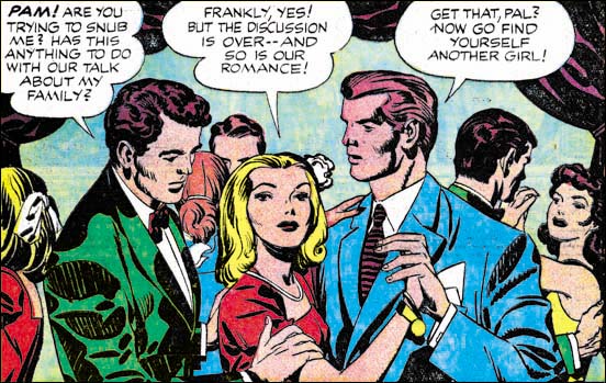
Young Love #69 (February 1956) “How’s The Family” page 1 splash panel pencils and inks by Jack Kirby

The interior art for the Prize romances provides the most uncomplicated examples of the transition from the S&K Studio inking to the Austere Style. Early in the year there can be found a number of typical Studio inking. The splash panel from “How’s The Family” is a perfect example of the Studio Style. Lots of picket fence and drop strings and even a collar blot. Note the drapery along the top of the panel. Although providing a very dark tone it was made using very broad ink areas that still leave areas without ink. We shall see later that with the Austere inking this sort of dark areas will be more often made by completely flooding with ink. All of the standard Studio Style inking techniques combine to give the entire image a darker tone. The only hint of things to come is the handling of the drop strings. In this splash the drops are overlapped so as to construct a continuous line. This type of drop string was used previously but it was not then the predominant technique but it would become so in the future.

Young Love #69
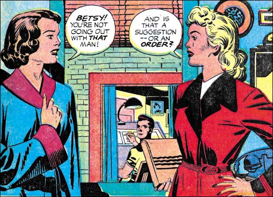
Young Love #69 (February 1956) “Secrets Of The Girls Next Door” page 1 splash panel pencils and inks by Jack Kirby

This splash panel is from the same issue as “How’s The Family” and it provides another good example of the S&K Studio Style of inking. Note the use of elongated drop strings and also picket fence brush work on the sleeves of the lady on our left. Elsewhere there a typical spatulate and frond shaped clothing folds. There does seem to be a more sparing use of ink in the panel that gives the splash a lighter look. This is also typical of much of the inking early in 1956. But it is hard to place too much significance on this lightness because there was always some variation in the amount of ink used.

Young Romance #81
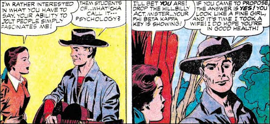
Young Romance 81 (February 1956) “A Match For Linda” panels from page 3 pencils and inks by Jack Kirby

Much of the art from early in the year was done with S&K Studio inking. But there are also some work that begins to have a simpler and lighter look. “A Match For Linda” provides a good example of a lighter inking. In this case picket fence and drop strings are both abandoned throughout the story. The lightness of the first panel can be attributed to the fact that there is no background. While the second panel has a background very little spotting was applied to it.

Young Romance #81
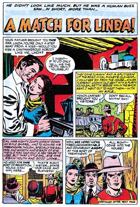
Young Romance 81 (February 1956) “A Match For Linda” page 1 pencils by Jack Kirby and inks by Bill Draut.

When I had previously discussed the inking of “A Match For Linda” in Chapter 5 of The End of Simon and Kirby I had concluded that Bill Draut had done the outline inking and Jack the spotting. I now realize that that is not quite correct. Bill Draut did the entire inking, both line and spotting, for pages 1 and 5. Jack seemed to have done all of the inking for pages 2 to 4. If you look at the cloth folding of the man in the splash page they are done in a manner quite unlike what Kirby was doing and more in line with Draut’s brush work. Draut’s cloth folds have a rough appearance because they show the remnants of closely spaced lines from which they developed. On the other hand the contours of Kirby’s cloth folds are smooth almost as if the ink was not brushed on but poured. YR #81 is one of the few issues with something not done by Kirby, “He Had Only Me” by Bill Draut. I suspect that when Bill dropped off his artwork, Jack gave him some inking to do. Because Jack was doing almost all the artwork for the Prize romances, artists like Draut who had previously provided work for those titles were probably happy to get any work from S&K that they could.

Young Brides #27
Young Brides #27 (March 1956) “Good Marriage” splash panel from page 1, pencils and inks by Jack Kirby

The “Good Marriage” splash is another example of progress made toward the Austere Style. So much so that it deserves to be called Austere rather then Studio Style. Without the picket fences, and with a limited use of drop strings the art has the lightness typical of this style. That is not to say that blacks were not present. When black areas are used they generally are done by flooding an area with ink, as for instance the ceiling in the above image.

I know that this serial post is about Jack’s inking technique but I just cannot pass this splash with a comment about the art in general. What a great composition, the way the three couples are placed serial across the panel with increasing depths. Kirby is renown for his exciting artwork, but this very simple panel shows that he could do very subtle art when he wanted. Jack was a master of providing just the correct amount of detail with faces in a crowd. Note how nicely Kirby gives each character with their own emotions using small nuances in their eyes, eyebrows and mouths. It is just things like this splash that make me appreciate Kirby inking Kirby. I am sure some of the magic qualities of this splash would have been lost under some other inker’s brush.

Young Romance #84
Your Romance #84 (October 1956) “Poison Ivy” from page 2 pencils and inks by Jack Kirby

By the time we get toward the end of the year pretty much all typical features of the Studio Style disappear. Everything now seems done in the Austere Style. The panel shown above from “Poison Ivy” is a great example. No drop strings or picket fences. The folds of the clothing are simple and the entire image looks light. Note the effective use of negative folds on his left arm. I believe that one of the reasons that Jack adopted this inking style was because it took less time. Well it might have speeded up the inking process but that by no ways means the art was rushed. What a great characterization Jack gives the soda-jerk here and throughout the story.

Young Romance #84
Your Romance #84 (October 1956) “Much Ado About Love” splash panel from page 1 pencils and inks by Jack Kirby and Joe Simon?

I am as confident as I can get about the inking attributions for the images I have provided in this chapter so far. I am not as sure about my last image the splash panel from “Much Ado About Love”. Most of the inking seems to be by Jack using simple and broad clothing folds. In contrast is the torso of the lady in the red dress where narrow folds prevail. There is not much to go on, but I believe the other inker was Joe Simon. I include this image because it is a good example of a change in the rendering of the folds on sleeves. Notice how there are a number of folds in the elbow region and again near the shoulder. The rest of the arm is plain without any folds, if you ignore the single longitudinal fold on the upper arm. This sort of arrangement of sleeve folds will become predominant. This may represent a adjustment in Jack’s penciling resulting from his new Austere inking.

I started this chapter with a splash that depicted drapery along the top of the panel. In conformity with the S&K Studio Style of inking that drapery was depicted with broadly inked folds that still left strips of “white”. A similar drapery is found on the top of “Much Ado About Love” only now the area is completely flooded with black and no folds are indicated. This is typical of the Austere Style. The interior art for the Prize romance comics provides a relatively simple progression from the Studio to the Austere inking. There is some variation but it all falls somewhere in the spectrum between the two styles. In the next chapter on the cover art for the Prize romances we shall see the influence of another style not hinted at in the interior art.

Jack Kirby’s Austere Inking, Chapter 1, Introduction
Jack Kirby’s Austere Inking, Chapter 2, Mainline

Jack Kirby’s Austere Inking, Chapter 4, Prize Covers
Jack Kirby’s Austere Inking, Chapter 5, Harvey
Jack Kirby’s Austere Inking, Chapter 6, Atlas
Jack Kirby’s Austere Inking, Chapter 7, DC
Jack Kirby’s Austere Inking, Chapter 8, More Harvey
Jack Kirby’s Austere Inking, Chapter 9, More Prize
Jack Kirby’s Austere Inking, A Checklist and a Glossary

other post with Kirby inking Kirby:

Strange Tale Indeed
Battleground, Jack Kirby’s Return to Atlas
Captain 3D

The Black Rider Rides Again, Again

Gunsmoke Western #51
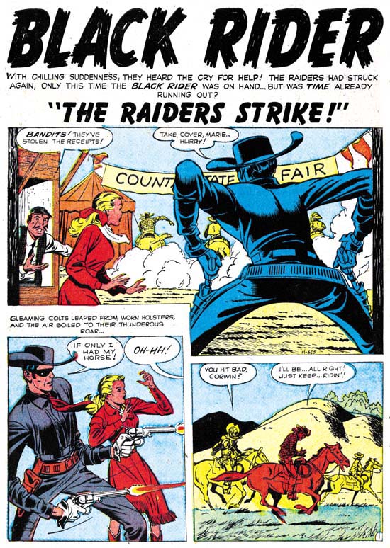
Gunsmode Western #51 (march 1959) “The Raiders Strike” page 1 art by Jack Kirby

I recently posted on the Black Rider Rides Again #1 that Jack Kirby did for Atlas prior to the Implosion. I find this period fascinating because the work Jack did seems a mixture of material that he had a good deal of creative control and others which he did not. Jack’s efforts after the Implosion seem to me to decidedly fall in the latter category. Tom Lammers in his “Tales of the Implosion” discusses job numbers and the existence of an inventory of pre-Implosion work that was published after the Implosion. Among these are work with a job number starting with an “M”. This would include “The Raiders Strike” from Gunsmoke Western #51 (March 1959). Actually job numbers are not the only reason to believe that this story was pre-Implosion. Three Black Rider stories were published after the Implosion as back-up features. This is just the right number for a Black Rider Rides Again #2 but that title and did not survive the Implosion.

“The Raiders Strike” is very much like the older Black Rider stories. A gang of thieves rob the receipts from a county fair. The Black Rider is present and manages to wound one, but is without his horse so he cannot follow. Still he vows to recover the money. Resuming his secret identity as the local doctor he frets that since he has no lead he will be unable to fulfill his promise. Some of the thieves arrive and take the doctor at gun point to treat their wounded partner. The doctor is hit after he performs his services. When he recovers he pursues the gang as the Black Rider. He catches up with the thieves and of course recovers the money.

This is a repeated plot with the Black Rider wounding a villain, the doctor tending the wounds, followed by the Black Rider saving the day. In my opinion, the writing style does not sound like Kirby did it. That Jack probably was not the writer is not too surprising. I did not believe he was the scripter for the earlier stories either.

The big difference between this and the earlier Black Rider stories is that Kirby was not the inker. This inker provides a more detailed and realistic inking then Jack’s. Unfortunately I find it a poor marriage between the pencils and inks. Jack drew this Western and “No Man Can Outdraw Him” with a elongated figure style. This seemed quite interesting to me when inked by Jack’s more abstract Austere Style (the subject of a current serial post). This story’s more realistic inking sometimes makes the figures come off rather freakish looking. Still the inker was sensitive to many of Kirby’s nuances and he does not overwhelm the pencils.

Jack Kirby’s Austere Inking, Chapter 1, Introduction

Most of the work by Jack Kirby that people admire they only know second hand. They know Kirby inked by Dick Ayers, or Kirby inked by Joe Sinnott, or Kirby inked by Mike Royer, and so on. By its very nature this means we are seeing various artists’ interpretations of Kirby’s pencils. Even in his late years when Jack pencil’s provided indications of how the spotting should be done and inkers tried to be faithful to the pencils, it is still an inker’s interpretation. This is the state of affairs during Jack’s more recent career when he did extremely little inking.

Earlier, during the Simon and Kirby years, things were very different. Most, if not all, of the S&K studio artists inked their own work. The inking style for each artist seem unique and consistent. Most did not produce enough output to support heavy use of assistants. Mort Meskin was more prolific so perhaps he was an exception. However for Jack Kirby we have some eye witnesses such as Martin Thall who have reported group inking sessions at the S&K studio. Examinations of the finished product adds support to this because often different hands seem involved. However other observers such as Carmine Infantino have reported Kirby providing the final inking touches to his own work. Who inked what is often the subject of contentious debate since the comics do not provide credits and comic book experts rarely provide explanations for their attributions. Someday I may wade in with my own inking attributions, and even explain why, but this is not that day.

After the breakup of the S&K Studio Jack began to do freelance work. We find Kirby work published by DC, Atlas and Prize. Among the early freelance period I see some consistencies in the inking that indicate one hand at work, I think we can rule out Joe Simon since there is no evidence that he ever did any work at this time for DC or Atlas. Further the style is dissimilar to the inking found on some of Simon’s own work of the period. Nor does the inking style match that by artists who in the past did work for S&K such as Mort Meskin, Bill Draut or Marvin Stein. The spotting is done with enough talent that I think we can rule out some new, unknown inker. Besides which although at times Jack might have been doing enough penciling to support an inking assistant this changed. Kirby began to supply DC and Atlas with just penciled art with the publisher assigning the inking to others. After that this inking style only appears in Prize’s Young Romance and that was not enough work for Jack to support any inking help. My conclusion is that this inking style was Kirby doing his own inking. As such it provides a rare opportunity to see Kirby first hand.

I have mentioned this inking style previously. Once when I was discussing the break up of Simon and Kirby. Again more recently when I posted on The Black Rider Rides Again. I think it might be interesting to examine the evolution of this inking style. To do so I needed to give it some sort of designation. I thought of referring to it as Kirby’s late inking style but I suspect that is too confusing. The inking may be late in his inking career since it was the last style that Jack used while he still commonly had a hand in inking his own work. But Kirby had a long career and using a term such as “late” to describe a period that ended in 1959 just seems inappropriate. So I am going to call it Kirby’s Austere Style of inking because of its typical lack of embellishments.

To understand the development of the Austere Style is really helps to go back to what it evolved from. I think the best place to start is toward the end of the Simon and Kirby studio. But like an old adage, to tell that story I have to tell another story. I need to describe how inking of Kirby pencils was done in the S&K studio. This is a very different topic from who did the inking.

Pages of S&K art went through distinct stages. These stages are known because sometimes comics book titles were unexpectedly cancelled. When this happened work on future issues was already in progress. Work on any of these cancelled titles would immediately stopped no matter what stage it was in. Sometimes the art could be salvaged for other projects, but not always. Not a lot of these unfinished pages survived but what has tells a consistent story.

The first stage was, of course, the penciling. This included rough placement for the work balloons and captions. Some covers in this stage have been published in The Jack Kirby Collector. But the rough placing of balloons can be observed even when a page has advanced to further stages because it often was not completely erased.

Unpublished Boy Explorers
Boys Explorers (unpublished) art by Jack Kirby

Next the lettering was done along with inking of the word balloons and the panel borders. It is in this stage that most unfinished pages are found and it is the stage that I can provide an image. Note that Kirby’s pencils are still uninked. Jack’s drawing is pretty tight but he does not shown any indication of how blacks are to be arranged. Outlines are provided and the folds of the clothing is indicated by simple lines. On one hand the inker was given clear indications of where ink lines should be applied. On the other hand application of black areas, what is called spotting, was completely left up to the inker.

Unpublished Boy Explorers
Boys Explorers (unpublished) art by Jack Kirby

For the third stage line inking was done. Since for the most part Kirby’s pencils were tight this required little more then the ability to carefully follow Jack’s lines. This meant that finesse with the inking pen or brush was more important then artistic ability. I suspect that often the outline inking was done by studio assistants and after the studio breakup even by Kirby’s wife Roz. Sometimes there seems to have been no real attempt to adjust the width of the inked lines. In the example I provide above it is almost as if the outlines were made by bending wire. If the outline required any emphasis it could be introduced in the next stage. We shall see in the next chapter that a more artistic inking of the outlines would sometimes be done.

The final stage, known as spotting, supplied the blacks to the image. As remarked above there really was nothing in the pencils to indicate how this should be done. For good results a talented inker would be required. But it is a simplification to call this one stage. Particular spotting chores, such as foliage or backgrounds, could be assigned to different artists. However there did not seem to be any fixed procedure for how or by whom this was done. Jack, Joe or both could do the final touch ups.

S&K studio inking was a different thing altogether then how inking was handled in the Silver Age and beyond. Then the penciler’s work was handed over to another artist who would provide all the inking. Under such a system it makes sense to say a particular piece was drawn by Jack Kirby and inked by say Dick Ayers. Unfortunately people apply the same terminology to Simon and Kirby art. When they say a Kirby piece was inked by say Joe Simon what do they really mean? That the Joe did all the work, both outline and spotting? Or that he did just the spotting? Or could it be that Joe’s did some spotting along with others? Generally I try to be specific about what type of inking I am talking about.

Jack Kirby’s Austere Inking, Chapter 2, Mainline
Jack Kirby’s Austere Inking, Chapter 3, A Lot of Romance
Jack Kirby’s Austere Inking, Chapter 4, Prize Covers
Jack Kirby’s Austere Inking, Chapter 5, Harvey
Jack Kirby’s Austere Inking, Chapter 6, Atlas
Jack Kirby’s Austere Inking, Chapter 7, DC
Jack Kirby’s Austere Inking, Chapter 8, More Harvey
Jack Kirby’s Austere Inking, Chapter 9, More Prize
Jack Kirby’s Austere Inking, A Checklist and a Glossary

other post with Kirby inking Kirby:

Strange Tale Indeed
Battleground, Jack Kirby’s Return to Atlas
Captain 3D