Category Archives: 7 Freelance

Battle Kirby

Recently I posted in some details on Foxhole, Simon and Kirby’s own war comic book. I thought it might be fun to examine some of the work in this genre that Kirby did later in his career. In this post I will look at a couple of stories from Battle, an Atlas title.

Kirby’s work for Atlas as a freelancer was interrupted by the Implosion. Thomas G. Lammers has a marvelous paper called “Tales of the Implosion”. I use the self published version (if you are interested in getting your own copy email Tom at tlammers@new.rr.com). Tom points out that some of the work after the Implosion was from a sort of inventory. He indicates that for Battle new work started to appear with issue #62 (February 1959). By the time Kirby work appears in Battle #67 (December) the comic is produced entirely from new material. The job numbers allow us to distinguish newly produced work from pre-Implosion inventory. All the Kirby battle stories have job numbers starting with T which allows us to say that they are all post-Implosion creations.
Battle #65
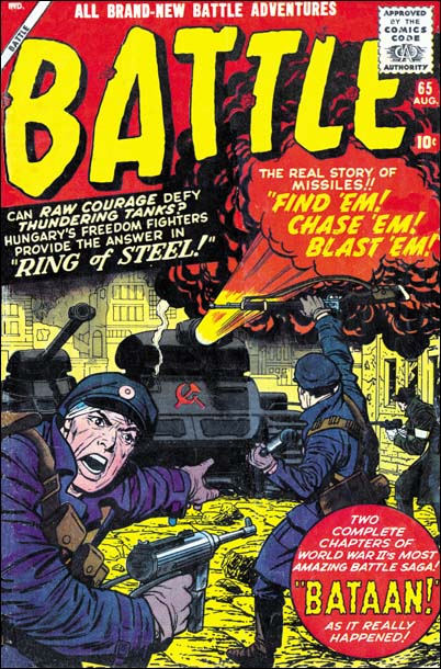
Battle #65 (August 1959) cover by Jack Kirby

Although Kirby may not have had as much control over his work for Atlas after the Implosion, at least he started to produce covers. The covers that Jack did for Atlas/Marvel varied greatly in quality. Some of that variation is of course due to Jack himself. However for me most of it is due to the various inkers used. Some were more sensitive to Kirby’s pencils, others tended to overwhelm them. Cover layouts for Jack’s Atlas/Marvel period are generally quite different then produced under the Simon and Kirby collaboration. The questions is was this new look really Kirby’s or could it have been due to his working from someone else’s layouts?

I am not going to try to provide a blanket answer. Jack would do a lot of covers for Atlas/Marvel and I suspect the answer to who was responsible for the layouts may have varied. Instead I will focus on the covers Jack did for Battle and use issue #65 as an example. Note the fighter on our left and how he seems to be looking out of the page calling for reinforcements. This is a device that Jack used earlier in his career when depicting combat. Now at the time the combat included superheroes or kid gangs but the general concept was the same. An example of this compositional technique is Champ #23 (October 1942). This is an effective device as it acts to place the viewer as part of the action. Sometimes this can be a bit paradoxical as Jack would sometimes portray a foe as the caller which would place the viewer as one of the enemies. This device was later abandoned by Simon and Kirby. Now part of this can be explained as due to WWII being over. But when S&K produced Foxhole Jack penciled all the covers and he never returned to using the calling figure.

Not only does Battle #65 use this calling soldier device, but it also shows up on issues #66 and #67. When we look at earlier Battle covers although we find soldiers looking out toward the viewer none of them are calling out. Therefore I would suggests that this figure was Kirby’s. On all the Battle covers that use this calling figure it plays an important part of the total composition. I consider it a good indication that Kirby is responsible for these layouts.

It is interesting to observe that once more Jack has turned to using a technique from early in his career. We previously observed circular panels and figures extending past panel borders. Those two techniques resurfaced in Challengers of the Unknown, The Yellow Claw and the Black Rider Rides Again. However in those cases the technique would be dropped after a short period of use, perhaps because the publishers felt it was too old fashion. This fate did not happen to the calling figure device. Jack would not use it frequently but he would occasionally use it throughout his career. The goofy Captain America #197 (May 1976) is a good example.
Battle #65
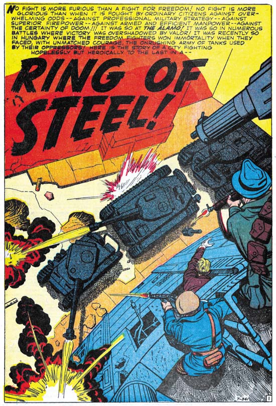
Battle #65 (August 1959) “Ring of Steel” art by Jack Kirby

1959 found the U.S. in the grips of the Cold War. The Hungarian Revolt had occurred less then three years before. “Ring of Steel” does not include the start of the rebellion, when a student protest escalated to the point that the Communist government in Hungary was deposed and the Russians expelled. Instead the comic story begins with the reports of Russian tanks grouping outside the city. When the Russians enter the city the citizens fight desperately to keep their freedom. Of course in the end they are defeated by the overwhelming force sent against them.

I was rather young when the Hungarian Revolt toke place. and was raised during the height of the Cold War. My father’s side of my family was Polish with relatives still living under the Communist regime. With my background it is not at all surprising how moving I find “Ring of Steel”. Still even an inspiring story needs a good writer to be truly effective. I feel the author of “Ring of Steel” did an excellent job. For example page four has three rows of panels with two or three panels per row. Each row starts with how the patriots would fight the Russians. Each row would then end with the unfortunate results of those attempts. The same caption is used on the last panel of all the rows, “… against hopeless odds”. Very good scripting. I wish I could credit Jack Kirby with this writing. Frankly it just does not read like his work to me. Particularly things like page four sound more like something from a writer then a visual artist.

A good comic book story needs more then just good writing. It requires great art as well. Of course with Jack Kirby as the artist, the great art in the story is not much of a surprise. I do not know the inker, Silver Age inkers are not an area that I am knowledgeable about. I can say that Jack did not ink this job himself. Whoever the inker was he did a good job. He did not attempt to “correct” Kirby’s pencil nor did he overpower them.

I want to take particular note about the splash page whose image I provide above. Jack was famous for his use of exaggerated perspectives. Still there is something unusual about this splash. In “The Comic Book Makers” Joe Simon describes the proper way to create art for 3D comics. Joe’s prescription is that the art should project out to the user, not into the page. Well Jack generally followed that rule not just for 3D art but whenever he used his special perspective. Early in his career Kirby did not follow that procedure, he developed it as he gained experience. For this splash he completely disregards this canon, but with good reason. The perspective directs us from the freedom fighters with their small arms down to the object of their assault, the massive power of the Russian tanks. In doing so Jack not only condenses all the action into a tightly knitted scene, but also makes the viewer feel as if he is participating in the fight. Kirby’s cover on the same theme (see image above), wonderful though it is, pales by comparison to the splash. What a masterpiece.
Battle #67
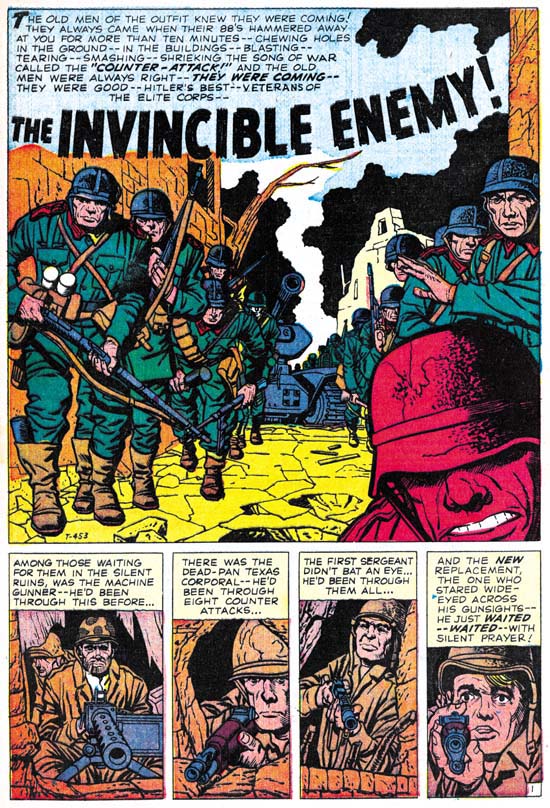
Battle #67 (December 1959) “The Invincible Enemy” art by Jack Kirby

The main character of “The Invincible Enemy” is a new replacement, but some other battle hardened soldiers play secondary roles. They are part of a force trying to hold a town from some elite German forces. The replacement is clearly frightened and when the German counter attack begins he initially freezes up. Prompted by his sergeant he then joins the fray but it is the more experienced fighters that take the lead. One by one these fighters succumb to the Nazi onslaught. The replacement is suddenly filled with fury and becomes a one man assault team. He not only overcomes the German soldiers that attach him, but also takes out a tank. By the time his fury is extinguished, the fight is over and the German counter attach has failed.

This story reminded me a lot of “The Replacement” from Foxhole #2 (December 1954) drawn by Bill Draut. Both concerned an inexperienced replacement and an intense German attack. There are important differences between the two. The replacement is really the only character for the Foxhole story. We are shown some of the “veterans” but none of them stand out or take any significant part of the story. While in the Battle story there are three other soldiers that are unidentified and play a part in the tale. Draut’s replacement fights heroically but you never get the impression that he is any different from the other soldiers in his unit. With Kirby the rest of the unit is defeated while the replacement becomes a sort of super-soldier. In some ways “The Invincible Enemy” is “The Replacement” on steroids. Having said all this, for me it really is not a case of one story being better then the other. Each has their own theme and flavor and I think both are superb works of comic book art. Jack Kirby was a better artist, but Bill Draut’s efforts should not be dismissed.

Jack has once more supplied excellent art. Again Kirby is not inking his own work. After the Atlas Implosion and outside of the late Prize romances, Kirby inking Kirby would be very rare occurrences. Here the inker does a great job and does not overwhelm Jack’s pencils.

You can tell that Kirby and the writer are making great efforts to provide high impact while skirting the Comic Code. The best example of this it the fate of the machine gunner. At the start of the fight we see a German soldier throw a grenade. In the next panel The caption accompanying the violent explosion says that the machine gunner was driven back to another position. But in the following panel we see the German soldiers storming into opening. At their feet on one side are the upturned legs of the machine gun while on the other side a pair of boots are visible and they show that the gunner is face down. Clearly indicating the machine gunners new position actual is. Despite the fierce fighting this is the only death depicted.

Jack did other work for the Battle. The two stories that I discuss here are my favorite, but by no means do I denigrate his other work for this title. All of them are great examples of what Kirby could do. As for the other artists whose creations appear in Battle, well they really are outside of the focus of this blog since they never worked for Simon and Kirby. Still there is some worth while stories here besides those by Kirby. Marvel has been reprinting some of their older material. This effort has largely been focus on their superheroes. But a few volume of their “monster” and western comics have been reprinted. Perhaps, just maybe, someday Battle might be reprinted. I think it would be worth it. Hey a fellow can dream can’t he?

The Black Rider, Another Early Westerns by Jack Kirby

Black Rider Rides Again #1
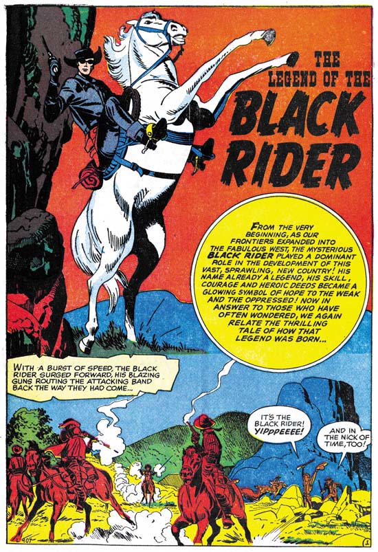
Black Rider Rides Again #1 (September 1957) “The Legend of the Black Rider” page 1 art by Jack Kirby

The Black Rider was a western costume hero along the lines of the Lone Ranger. Apparently his first appearance was All Winners Western #2 (Winter 1948). Black Rider Rides Again #1 reintroduces the hero after a lengthy hiatus. Therefore the first story provides information about his origin. We learn that as a very young man our hero’s family was killed by an outlaw. When he was older he tracked down the outlaw and killed him in a gunfight. At his trial he threw himself on the mercy of the court, which gave him probation. The judge then helped him to become a doctor. Doc started his profession during a dispute between some ranchers and rustlers. Doc refuses to help, saying he is not a fighting man. In the end he finds he cannot ignore what is happening, so he puts on a black suit and a mask and saves the day.

The origin story told in the legend has many similarities to that of Bulls-eye, a Simon and Kirby creation. In both the hero’s family is massacred, the hero becomes phenomenal with a gun, maintains a secret identity that projects a unheroic personality, and adopts a mask when performing his heroic exploits. The first appearance of the Black Mask was in 1948, very much earlier then that of Bulls-eye in 1954. However the origin of Black Mask as described by Jess Nevins at A Guide to Marvel’s Pre-FF #1 Heroes sounds like it might be a little different. There is no mention of the death of Black Rider’s family. The circumstances involving the shootout that gets the young hero before a court are vague with no mention of a revenge killing. It sounds that the Black Rider may have been retconned slightly in this relauch attempt.

Black Rider Rides Again #1
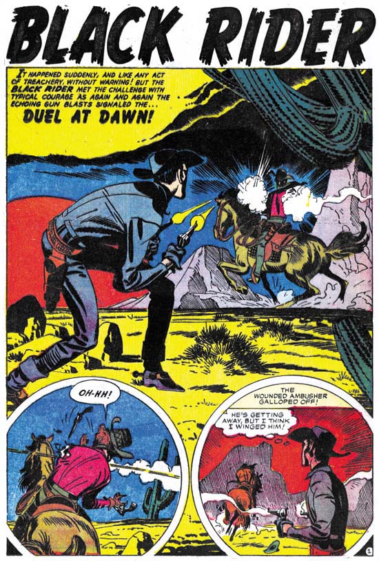
Black Rider Rides Again #1 (September 1957) “Duel At Dawn” page 1 art by Jack Kirby

We enter the story as the Black Rider responds to an ambush attempt. He manages to wound the attacker but did not get a chance to identify him. Back home and back to being a doctor, a man comes in with a wound from a accident with barbed wire. Or so he says, the Doc recognizes it as a bullet wound. Later the Black Rider visits the man who under questioning admitted to having been offered money to ambush him. Before the man was able to say who offered the money, he is shoot. Once again our hero takes on the role as the Doc and saves the man’s life. Now the man will not say who is responsible. While recovering his assailant returns to finish the job, but of course the Black Rider saves the day.

Black Rider Rides Again #1
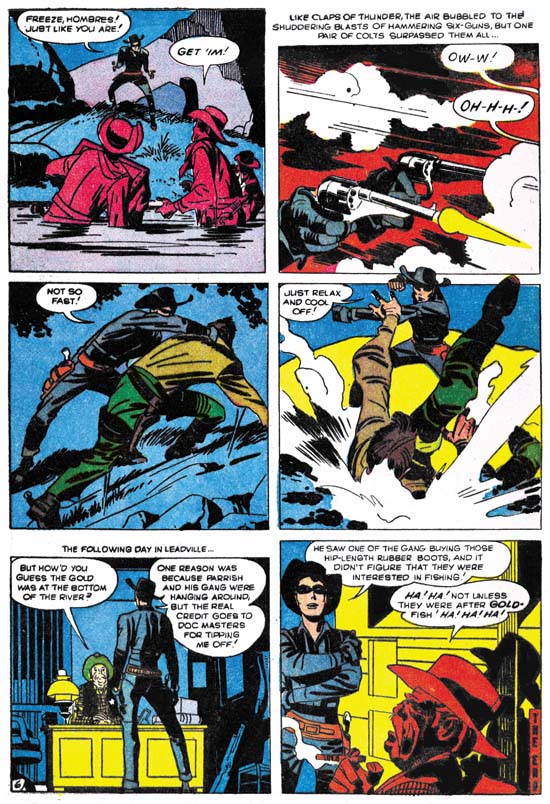
Black Rider Rides Again #1 (September 1957) “Treachery At Hangman’s Bridge” page 6 art by Jack Kirby

The midnight stage coach gets blown up but the Black Rider is nearby and arrives quickly. But not soon enough because he hears The thieves departing. Our hero changes his identity to become the Doc in order the help the wounded. The sheriff finds some men in the area but no sign of the stolen gold so he has to let them go. Doc keeps his eye on them and follows one who purchased supplies. Another change and the Black Rider surprises the thieves as the attempt to recover the stolen gold from the river.

These are not bad stories, but somehow I really cannot get that enthusiastic about them. The Black Rider is a little too successful. When he arrives he saves the day with no real effort. It is never quite clear why the Black Rider must hide his real identify. The rancher’s beautiful daughter’s interest in the Black Rider but not the Doc is a little too contrived. While Jack may have had something to do with retconned origin, on a whole I do not find many convincing Kirby-isms. If Jack was involve with the writing, his more personal touches were edited out.

The art is rather nice with lots of fist fights, blazing guns, galloping horses, and exaggerated perspectives. Just the sort of things that you would expect from a Kirby western. Maybe it is mostly the inking, which I will discuss below, but this comic has more of a Simon and Kirby look then a Lee and Kirby one. Still no matter what your favorite Kirby period was, it is hard to imagine that you will not find something to appreciate in the art. There are also some interesting aspects to the panel layouts. Often figures extend beyond the panel edges. That sort of technique was more commonly used during the earlier days of Simon and Kirby most noticeably in the Captain America stories. But it was used much more sparingly if at all towards the end of the S&K collaboration. Another trait from Black Rider that was frequently used early on but abandoned later is the use of round panels. Interestingly circular panels also occur some of the initial Challengers of the Unknown stories done several months before.

Most of the inking is very much like what we found previously in “No Man Could Outdraw Him”. There generally is no crosshatching, spotting is more limited giving the art a light look, but when black is introduced it generally is produced by flooding an area with ink. In some ways it is very reminiscent of S&K shop style inking. In particular the way that black areas are used in the overall design. Conversely the lack of crosshatching is very unlike the S&K shop style of inking. As I said before I believe Jack developed this austere style of inking after the Simon and Kirby studio had disbanded. It allowed Jack to ink more quickly yet still provide a beautiful and effective job.

Although most of the inking appears to have been done by Jack himself, there are parts that look different. Some areas have been spotted using closely spaced lines, sometimes laid down using a straight edge other times by free hand. Generally the lines are roughly parallel, but occasionally there are some areas of true crosshatching. These lines appear to have been done using a pen, while most of the Kirby inking seems to have been done with a brush.

The splash page for “Duel At Dawn” (see above) provides some good examples of what I am talking about. Most of the inking is the severe style that I attribute to Kirby. But take a look at the mountain in the left part of the right story panel. The lines seem weak and the mountain seems mushy. Not only does it not look like Kirby’s work but the mountain itself seems to detract from the art. The line spotting of the mountains in the splash panel itself seem different and look more like Kirby’s hand. But most of the fine line inking in this book look like the panel version.

Black Rider Rides Again #1
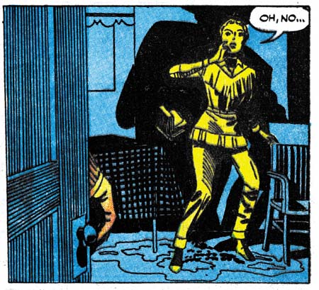
Black Rider Rides Again #1 (September 1957) “Duel At Dawn” page 5 panel 4 art by Jack Kirby

Above I give an example of the use of ruled lines for spotting. For me this use is less objectionable then things like in the hills because it does not change the overall design. But it still seems unnecessary. I believe that this fine pen inking not only was not by Jack, but it was not done under his direction either. I suspect that it was added after the art was delivered to Atlas.

In the past I have remarked that Jack seemed to have a good level of control of the work that he did for pre-Implosion Atlas. But that does not seem to be the case for Black Rider Rides Again #1. If Jack had been involved in the writing, it has been strongly edited. The pencil work is all Jack but the inking is not.

Black Rider Rides Again #1
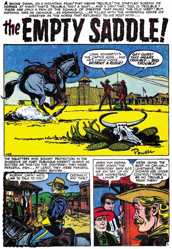
Black Rider Rides Again #1 (September 1957) “The Empty Saddle” page 1 art by Bob Powell

Besides the Kirby Black Rider stories, this comic also includes a short non-Black Rider story drawn by Bob Powell. Now Powell was a very prolific artist and I have only seen a small fraction of his work. I know it is not what he is famous for, but he did some gorgeous art for various Harvey romances. Everything I have seen by him has always impressed me. That is up to now. I got to say I really do not care for the art done in this particular story. Still it is a nice splash panel.

Black Rider Rides Again #1
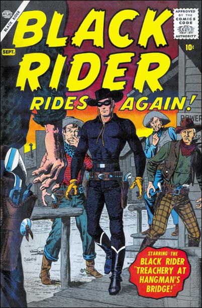
Black Rider Rides Again #1 (September 1957) cover art by John Severin

Jack Kirby only did a small amount of work for Atlas prior to the Implosion, my database shows 20 stories. What Jack did not do was any covers. I find it surprising that even though Kirby would do all the main stories for Yellow Claw and Black Rider Rides Again, someone else would do the covers. For Black Rider it was John Severin. I guess I really am supposed to say what a fine artist John was. But in all honesty I find most of what he did in this period rather dry. For me this cover is one of his better efforts.

With A Little Help From My Friends

I admit it, when I post about the work that Jack Kirby did after the breakup of the S&K studio I am getting into an area that I really do not have a lot of expertise. But what Jack did during S&K is important to understanding what he afterwards, and visa versa. Further I really feel I have something to contribute in areas such as Kirby’s style of inking his own work. However when it comes to things like DC editors, artists and inkers I am really at a loss. Fortunately I had a couple commenters provide some useful information to a recent post of mine.

I did not respond to Nick Caputo in the comments but I did email him offline to ask him to review the entire Kirby story in All-Star Western #99. When Nick did so this is what he had to say:

I took a look at the All Star Western story and, comparing it to the other stories in that issue which I believe Giella inked (“The Double Life of Sherrif Trigger, pencilled by Carmine Infantino and “Duel of the Twin Indians” penciller unknown, as well as the cover pencilled by Gil Kane) I would credit the majority, if not entire, Kirby story to Frank Giacoia inking. Giacoia has a sharper line than Giella and his faces are more defined. There is also some different techniques used on figures and backgrounds (for instance, the lines on the rocks on page 5, panel 2). While it’s possible that Giella did some background work in places, I see more Giacoia here than Giella.

Bob H. also felt that Giocoia was the inker for this story. But he also added an interesting observation:

… given that it was the only story Kirby did for Julius Schwartz’s editorial stable, where Giacoia was a regular, and the “Foley of the Fighting 5th” was an ongoing feature, this was probably more of a ghosting job for Kirby, which is probably why a lot of his tendencies are repressed. Kirby did similar ghosting for Giacoia on some “Johnny Reb” comic strips in the same period.

Well like I said I do not know much about DC at this period, but Bob’s suggestion that Jack was ghosting makes complete sense.

So my thanks to both Nick Caputo and Bob H. for their contributions.

Two Early Westerns by Jack Kirby

Both Joe Simon and Jack Kirby had drawn some Western comic stories at the start of their careers. After their team up, Simon and Kirby would return to this genre but would combine it with others. Boys’ Ranch was Western plus boy gang and Bullseye added costumed hero to the mix. Simon and Kirby would even produce comics that joined the romance with the Western genre. As for pure Westerns, the only work Simon and Kirby did was some covers. After the break up of the Simon and Kirby collaboration, Jack began doing freelance work for both DC and Atlas, some of which included Westerns. I thought it might be interesting to examine some examples from early in Jack’s freelance period.

All-Star Western #99
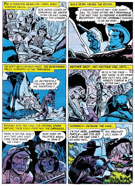
All-Star Western #99 (February 1958) “The Ambush At Smoke Canyon” page 5 art by Jack Kirby

I am going to do this backwards and start with the later of the two stories. “The Ambush At Smoke Canyon” was published by DC with a cover date of February 1958. The six page story begins with the return of a scout’s horse to Fort Desolation without the scout himself. Realizing that something is amiss but with most of the force away on detail, Lt. Dan Foley goes out alone to try to follow the horse’s trail. Foley finds the scout pinned down by some Pawnee. Dan sneaks past the attackers and finds the scout wounded but not badly. Dan convinces the scout to sneak out and use his (Dan’s) horse to get help. Meanwhile Dan lures the Pawnee into a cave and traps them there until help arrives.

I got to say this is not that great a story. Does it seem reasonable that not only was Dan able to sneak past the Pawnee but that the scout was then able to sneak back out again? Even the method Foley uses to lure the Indians into the cave seems more contrived then ingenious. All and all a rather forgettable story.

However Jack Kirby has rescued otherwise uninspiring stories just by the visual excitement that he can add. Unfortunately that is not the case for this story. In fact a quick glance at the art might leave one unsure that it was done by Jack. I believe Kirby did the art, the two Indians of panel 5 of page 5 (see above image) look to me to be good evidence of Kirby’s pencil. There are some other examples in the story as well. But why does Kirby’s involvement seem so unobvious? One reason is a recurring problem now that Jack was freelancing. More and more in the future someone else would ink Kirby’s pencils. At times, and I think this is one of them, the inker seems to deliberately mask some of Jack’s eccentricities and make art look more like the house style. Whether the inker of this story was trying to correct Kirby or just was not talented enough, his overbearing inking has done a great disservice to the art.

Sometimes no matter how poor the inking, Jack’s powerful drawing would shine through. I do not know why that did not happen here. The layouts are not very interesting. There is little use of some of Kirby’s favorite techniques such as exaggerated perspective. Much of the action is from a distance, while Kirby usually favored his action up close and personal. Even the one fight scene included was handled rather poorly. I may not be able to explain why Kirby’s art in this case was one of his more forgettable efforts, but clearly freelance work did not always provide the best circumstances for Jack’s art.

Two-Gun Western #12
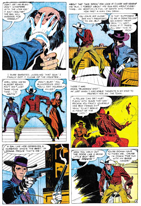
Two-Gun Western #12 (September 1957) art by Jack Kirby “No Man Can Outdraw Him” page 3 art by Jack Kirby

The next Kirby Western we will examine is a five page one done for Atlas with a cover date of September 1957. It tells about the arrival of a gunslinger into a small town. He is “the fastest gun in the west” and no one in the town is anywhere near his match. Therefore the Gunslinger is largely unopposed when he orders people about and takes what he wants. That is until he becomes interested in a beautiful girl.

Two-Gun Western #12 was one of the last comics published before the Atlas Implosion. Like other work for Atlas prior to this event, in “No Man Can Outdraw Him” Kirby seems to have a lot of control over the content. I can not say for sure whether he did the script, but there is something about some of the dialog that is has that slightly over the top quality that Kirby so often used.

The inking looks very different from what Jack for recent work in Yellow Claw (December 1956 and February 1957) or Astonishing #56 (December 1956). For those prior works Jack had adapted the Simon and Kirby house inking style. This style makes use of a special type of crosshatching using a brush instead of a pen. Common to the S&K house style are a set of long roughly parallel lines intersected by a series of shorter lines which I like to think of as a picket fence design. Another technique is the use of a row of tear shaped dots. Kirby used this style for the early Atlas work I mentioned but modified it by using a finer brush. However none of this is found in “No Man Can Outdraw Him”. In that story there really is no crosshatching of any kind. Instead spotting is used more sparingly so that the art has a light look to it. When larger dark areas are introduce they tend to be made by completely flooding an area with ink.

Despite the different styles used between these stories I think it would be a mistake to discount Kirby as the inker for the Two-Gun Western story. Look at the forearm of the gunslinger in the fifth panel of the image I provide above. Notice how the nearest portion is made from a couple of closely placed black strips followed by a larger area of black taking up the rest of the forearm. This same sort of technique for spotting clothing became common around the time of the Mainline titles such as Foxhole. A good example can be seen in the lower leg of the paratrooper in the cover for Warfront #28 cover dated January 1956. This concept of modifying the S&K studio inking style but dropping crosshatching and simplifying the spotting can also be seen in other Kirby works of about this period. For instance in “Town Full Of Babies” (Black Cat Mystic #60, November 1957). I have also previously remarked on this showing up in the all Kirby Prize romances that Jack did staring about November 1955 and going to December 1956). Kirby would evolve the style even further in the late Young Romance (starting about February 1958 and ending with December 1959). I believe that Kirby found the inking technique he used for Yellow Claw too time consuming. His inking therefore evolved into a quicker style. But the style was not just faster, Jack was much too good an artist to settle for that. Instead he used it to great advantage to give his art a stylized or abstract look.

Jack’s drawing seems to adjust to his new inking style, it also adopts a more stylized look. Jack’s figures often take on exaggerated but very expressive posses. Sometimes this results in some strange distortions such as the small torso of the hero in the second panel shown above. For Kirby it was always about depicting the story and giving his figures life, never about being anatomically accurate.

In short “No Man Can Outdraw Him” is a small masterpiece. It did not provide Jack Kirby’s wild imagination an outlet like he had in Yellow Claw but otherwise it shows what Kirby could do when he had control over what his work. The reverse, which is when Jack lost that control, is shown in “The Ambush At Smokey Canyon” that I started this post with. In all fairness these two are extreme examples, there was a whole lot of middle ground that Jack would occupy in later years. Still it brings to mind two “what ifs”. What if Kirby had continued to ink his own work for the Challengers of the Unknown? Wally Wood’s inking is very beautiful but I cannot help but think it would be more expressive had Kirby used his new style on it. Or what if Atlas never imploded? Kirby seem to have more freedom before the Implosion then after. Who knows what sort of masterpieces Jack might otherwise have produced for Atlas?

You can never provide real answers for such “what if” questions. All we can do is enjoy what was actually done. Unfortunately most of Jack Kirby’s pre-Implosion work for Atlas are obscure and have not been reprinted. However I have one other Kirby Western to discuss but that will have to wait for another post.

An Astonishing Jack Kirby Story

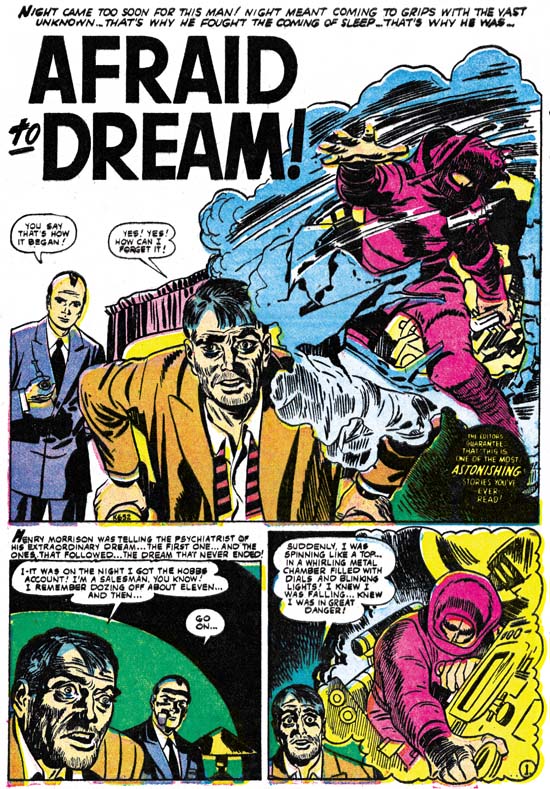
Astonishing #56
Astonishing #56 (December 1956) “Afraid To Dream” page 1 by Jack Kirby

It was mid 1956 and the Simon and Kirby studio had failed. Jack Kirby would help Joe Simon with some projects that if successful might bring the team back together again (in the end they did not). But in the mean time Jack had turned to freelance work in order to support his family. Jack was trying to sell DC on a new title that he and Joe Simon and developed called Challengers of the Unknown. Jack had also taken on some work from Atlas. It was a company he had worked for many years ago when it was called Timely. On that occasion Timely had failed to deliver of their promise of a share of the profits from S&K’s creation Captain America. If that was not bad enough, as Atlas they did not pay their artists all that well. But none of that really mattered because Jack simply needed the work.

Kirby took over all the story art for Yellow Claw #2 (December 1956). I have previously posted about this comic and I consider Jack’s Yellow Claw work for issues #2 and #3 to be some of his best effort. It appears that Jack did all the work himself; writing, penciling and inking. Of course since it is Kirby the penciling is great, but the real treat is to be able to see Jack inking his own art.

For the same month as Yellow Claw #2, Jack would do a four page story for Astonishing #56 call “Afraid To Dream”. It concerns a man who has trouble sleeping. His nights are disturbed by a continuing nightmare. In his dream a man crashes in a spaceship on a hostile world. It is night and the world is filled with numerous perils that the injured man must transverse in order to get to safety. But the spaceman must reach his destination soon for when day arrives the planet’s surface becomes too hot for him to survive. Jack has done other stories with vignettes showing the journey of some individual. Therefore I am confident that Jack also wrote “Afraid To Dream”.

Like YC #2, Kirby also inked his own pencils. The inking uses the S&K studio style of spotting only with a finer brush. Finer that is compared to previous S&K productions but still probably too extreme for DC. It is interesting to compare this Atlas work with the spotting that Jack had been doing the past year for Prize romance comics. At a glance these two inking techniques might appear quite distinct. The Prize romances have limited use of spotting and when spotting is used it generally floods an area with black. While for Atlas Jack did a lot of spotting (using a finer version of the S&K house style) and would rarely flood an area with black. However for Atlas Kirby would often cover a large area with closely arranged S&K style inking. These larger dark area are shape similarly as the flooded areas of the 1956 Prize romances. The differences between the two approaches is probably related to the jobs. During the previous year Jack had been doing the penciling for pretty much the entire line of Prize romances. Jack had help, at least at times, with the outline inking but he did the spotting himself. Considering the amount of work he was doing he wanted to keep the inking to a minimum and so avoided the S&K style hatching. When an a black area was needed, flooding it with inking would be quickest. With Atlas Jack probably wanted to impress Stan and the readers. So it was back to S&K style shop hatching but applying it with a finer touch. Jack may have been hoping that his work Atlas might lead not to just work as a penciler but to producing the comics like he had previously in the S&K studio.

The difference between the true masterpiece and the rest is often surprisingly small. The spotting that Jack did for YC #2 and #3 is just amazing. Although the inking done for “Afraid To Dream” uses a similar approach somehow it just does not achieve the same results. It feels a bit rushed to me and just slightly off. Not much, so it is still enjoyable, but not achieving the masterpiece status.

“Afraid To Dream” is just four pages long and it is hardly one of Jack’s greatest work. Still the story is enjoyable and it is nice to see what Jack could do by himself. Kirby seemed to have a lot of control over what he did for Atlas at this time. Jack would loose that control for the work that he would shortly do for DC. However conditions at Atlas would in the not distant future change dramatically with the event called the Atlas Implosion. Kirby would return to doing freelance work after the Implosion, but working conditions would not be the same. After that Jack would be penciler only, writing and inking would be done by others.

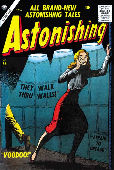
Astonishing #56
Astonishing #56 (December 1956) by Joe Maneely

Jack may have been welcomed back to Atlas but he was not Stan Lee’s number one artist. Stan’s bright eye boy was Joe Maneely. Maneely was fast and he used detailed inking. Stan turned to him time and again for the most important covers or stories. The early death of Joe Maneely in 1958 probably had more impact on the future of Marvel Comics then even the Atlas Implosion. What would Fantastic Four #1 have been like if it was drawn by Maneely and not Kirby? Or what about Spiderman with Maneely instead of Ditko? Of course this sort of “what ifs” can never be truly be answered. I must confess I find Maneely to be the antithesis of what I seek in a comic book artist. To me his art is extremely dry and overwrought. I have no doubt that if he was the artist for the Fantastic Four I would never had become a Marvel junkie.

Featured Cover, Boys’ Ranch #2

Boys' Ranch #2
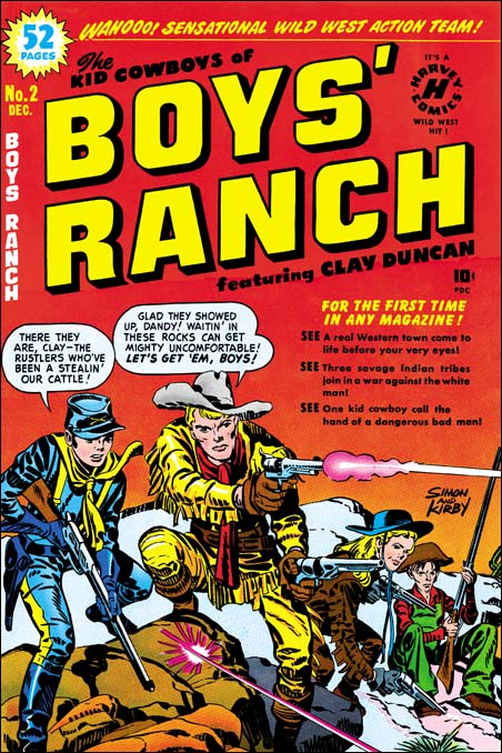
Boys’ Ranch #2 (December 1950) by Jack Kirby

I have to admit that Boys’ Ranch along with Fighting American get short shift here in the Simon and Kirby blog. This is not because I feel that they are inferior work, quite the contrary. Much of what appears in this blog are the result of scanning and restoration work that I have been doing. I want to restore all the Simon and Kirby work. In all honestly it will be a long time, if ever, for such an effort to be completed. Boys’ Ranch and Fighting American have already been reprinted by Marvel, therefore they are low on my list of scanning to be done. I do have a particular love for Simon and Kirby covers and I take particular care in cover restorations. So you can expect that from time to time I will post on Boys’ Ranch and Fighting American covers.

Actually the covers from Boys’ Ranch are special in that all are really great covers. This is pretty unusual for Simon and Kirby productions. Well I guess you can say that all the Stuntman and Boy Explorers covers are all really fine but those were really short lived titles. Fighting American, Foxhole, Bulls Eye, Police Trap and In Love had great covers but the final covers just were not the same quality as the initial ones. The reason for the short comings of the final covers for these titles is that they were done when the Simon and Kirby studio was going through difficult times and would shortly disband. Because it was produced in the middle of the Simon and Kirby collaboration, Boys’ Ranch did not suffer from that problem.

The cover for Boys’ Ranch #2 puts special emphasis on Dandy and Clay Duncan but Angel and Wabash play their part as well. As first glance it might appear that we are looking at one moment in time, sort of like an illustration of a snap-shot. That however cannot be farther from the truth. The text in the balloons indicate that our heroes have been waiting to catch some cattle rustlers. Dandy has announced the arrival of the rustlers and is in the middle of rising up to fire his rifle. Clay has already begun firing. I am not quite sure about Angel. He appears to be rising up like Dandy but on the other hand is that smoke coming out of his right pistol? Wabash sits as if he is still waiting with no sign that he is even aware that their quarry has arrived. Although Clay may be in the midst of firing the first shot their prey has already returned fire with the bullet ricocheting off the rocks at Dandy and Clay’s feet.

Boys’ Ranch was published by Harvey and Joe Simon has said that S&K did not do the coloring for the comics they produced. Well whoever the colorist was he did a particularly nice job here. I especially like the use of graduated tones and highlights on Dandy and Clay Duncan. The red background grades to yellow near the horizon. This gives the impression of an approaching dawn and that our gang has been waiting all night. The colorist has shown in the left foreground that he is quite capable of effectively coloring rock formations. However he has wisely chosen to color the background rocks a neutral grey so that all our heroes stand out. Jack Kirby drew a great cover and the colorist made it even better.

Featured Cover, Fighting American #3

Fighting American #3
Fighting American #3 (August 1954) by Jack Kirby

In a comment recently, Mike made a request for post on Fighting American. Well it happens that I just finished restoring the cover to Fighting American #3. The first two issues of FA were pretty much the standard action hero format. Fighting America and Speedboy were Simon and Kirby’s remake of their own patriotic heroes Captain America and Bucky. Atlas Comics had recently brought out a cold war version of Captain America along with the Human Torch and Sub-Mariner. However the times had changed and despite Joe McCarthy, or perhaps because of him, the public did not consider the Communists as quite the same threat as the Nazis. Atlas Comic’s Captain America did not last long but Simon and Kirby adjusted to the times. With issue #3, Fighting American adopted a more humorous approach. Yes the Commies were still the villains, but nobody was meant to take Poison Ivan and Hotsky Trotski seriously.

Simon and Kirby Meet the Shield

I am doing a guest blog posting tonight at Comics Should Be Good called Simon and Kirby Meet the Shield. Check it out.

Featured Cover, Adventures of the Fly #1

Adventures of the Fly #1
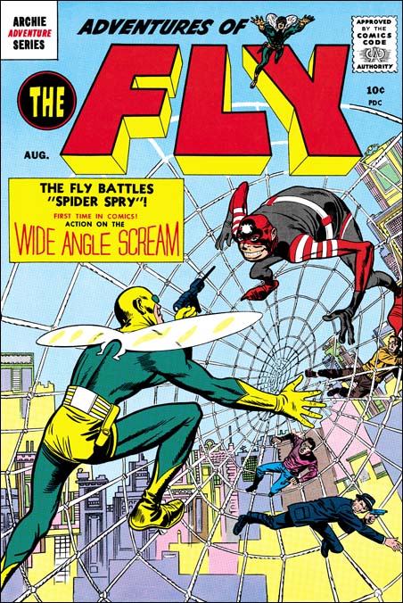
Adventures of the Fly #1 (April 1954) by Jack Kirby

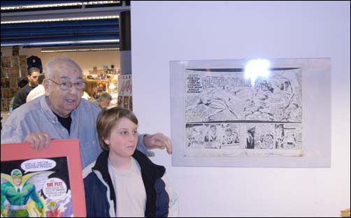
One of my contestents in my recent contest picked The Adventures of the Fly #1 as their favorite Simon and Kirby cover. I have previously written about Adventures of the Fly in Chapter 10 of The End of Simon and Kirby. There my main conclusion was that the Fly comics were not true Simon and Kirby productions. Joe seemed the main driving force in constructing these comics and he made use of other artists besides Jack. Having said this I hasten to add that Jack seemed to be primarily responsible for the final appearance of the Fly. The costume is very different from the Silver Spider by C. C. Beck whose story was the basis for the creation of the Fly. Rather the Fly seems largely based on Night Fighter, an unused creation that was probably originally considered for S&K’s publishing company Mainline. Although the origin story for the Fly was largely based on Beck’s penciled version that Joe provided Jack, the other stories Jack did seem to be his own. Included in one was a double page splash. The original art for this wide splash is still in Joe’s personal collection. It a beautiful piece of work with no signs of any cut and paste. That being the case along with the fact that the splash has one extra figure, the cover must somehow be based on the splash.

Joe Simon and Fly splash
Photo of Joe Simon with splash page at Big Apple Con (4/3/04)

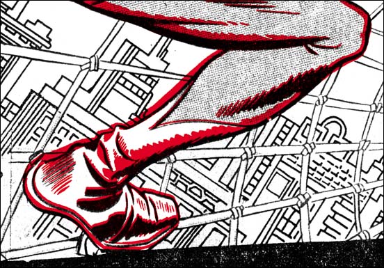
As far as I know the original art for the cover no longer exists. This is unfortunate because it might provide hints what method was used to transfer the art from the splash and rearrange it for the cover. As pointed out by Kirby scholar Stan Taylor the Fly comics contain a number of swipes from figures originally drawn by Kirby. Some of the original art for these still exist and clearly they were not done by using stats or any similar photocopying device. However when the line art for the Fly on the cover is compared to the splash page much of the inking, including some rather fine spotting, is the same. There does not appear to be any inking present on the splash that is absent on the cover. On the other hand the cover Fly has some spotting that does not appear on the splash. In particular the outlines have been made thicker on the cover. A lot of the lines for the web and the background do not actually touch the figure. I present a close-up of the cover line art (red) over the splash. The alignment and size adjustment are not perfect but it should give you the idea. From all this I have little doubt that Jack did the splash page, it was inked (not by Kirby), then Joe had some stats made, assembled the cover, and finally retouched and expanded the inking. Joe had previously used stats to help create covers, but for the Fly #1 cover it was a much more intricate procedure.

Adventures of the Fly #1
Part of the splash overlaid with the cover line art (in red)

Featured Cover, Boys’ Ranch #4

Boys' Ranch #4
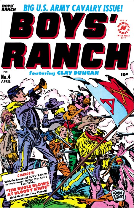
Boys’ Ranch (April 1951) by Jack Kirby

I lament so often about the fact that various Simon and Kirby productions have not been reprinted that is nice to be able to write about Boys’ Ranch. Although there are other comics I sure wish would be available again, if I had to pick a single S&K title as most worthy of the reprint honor it would be Boys’ Ranch. Fortunately Marvel already has published it in a nice volume. It is out of print but shows up often on eBay and at comic conventions. It has not gotten too pricey and deserves to be in the library of any Kirby fan. Not all Simon and Kirby productions were actually drawn by Jack as the studio used a number of talented artists. However a lot of Boys’ Ranch truly was penciled by Kirby, although not as much as claimed by many authorities. We can blame the failure of Stuntman and Boy Explorers on the comic glut. The downfall of the Mainline titles can be laid at the anti-comic sentiments among many adults at that time. For Boys’ Ranch we have no similar explanations and we must accept the fact that they just did not sell well enough. That reflects on the times not, in my opinion, the product.

Boys’ Ranch followed the general practice of S&K productions in having Jack Kirby pencil all the covers for the title. As far as I am concerned not a single cover for the title is anything short of a masterpiece. I am not sure how I would manage to pick my favorite, but one of my Featured Cover Contests participants did and he choose issue #4. With a main cast of three boys and an adult it is not an easy achievement to give them all prominence on a cover. But then add some soldiers and Indians to the mix and it might be an insurmountable task for many artists. But Jack was not a typical comic book artist and he overcomes these challenges with such ease as to make the viewer unaware how hard it really is. What exciting action Jack has provided. Although only four Indians are actually presented we are made aware of the fierce struggle that is occurring. One soldier is on his back, obviously seriously wounded, while another continues fighting but is unable to stand. A third soldier in the background has entered hand to hand combat with an Indian foe and appears about to loose. This is all in midst of a cloud of smoke from all the shooting. It all brings to mind Custer’s last battle. Actually in the cover for issue #4 one boy, Dandy, does get special treatment. He appears prominently on the left while the other three form a triangle on the right. Dandy stands pausing from his firing to blow the bugle. This is the reason for his prominence because it is a reference to the story title “The Bugle Blows as Bloody Knife”. Our heroes are defiant but will they face an end similar to Custer? Of course originally you were meant to buy the comic to find out. I will give a subtle hint, the Boys’ Ranch title ran for two more issues.