In my last chapter I described the penciling and inking stages that the art went through in the Simon and Kirby studio. Now I would like to provide some examples of the S&K studio style of inking from when they were creating comics for Mainline, their own publishing company. This is the inking style from which Kirby’s Austere Style developed. Artistically, Simon and Kirby were at their peak. Jack’s penciling was bold and assured. Spotting, particularly when done by Kirby, had both nuanced and muscle. The development of the S&K shop style was probably greatly influenced by the poor printing processes used for comics at the time. Fine inking techniques such as the standard crosshatching could look great on the original art. Yet when these same fine inking was printed it often fail to fully print leaving the area unnaturally light. Or it might fill with ink resulting in large black splotches. But it would have to be a truly bad printing to completely ruin S&K shop inking.
Because I want to describe the evolution of Jack’s Austere Style, I want to provide examples that I believe Jack did the spotting. The rub is that there is not a single Simon and Kirby piece of art that provides credits identifying the inker. It is hard enough to recognize individual hands involved in the inking, how do you go about applying actual names to these hands? I have asked people who provide inking attributions for the S&K period how they got around this difficulty, but I have never received a good answer. One person seriously suggested using intuition!
Well here is my solution to this naming problem. In my last chapter I summarized why I believe Jack was the actual inker for the Austere Style. Working my way backwards from that style to earlier inking works I then picked out works that looked like they were done by the same hand. If I am correct to attribute the Austere Style to Jack, then I am probably also correct about the earlier work. I realize that my readers may not yet have a good idea of what the Austere Style is like but hopefully they will be the end of this serial post.
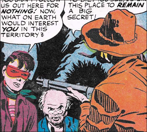
Bullseye #3 (December 1954) from “Devil Bird” page 5, pencils and inks by Jack Kirby
One spotting technique frequently used in the S&K studio style is what I refer to as picket fence pattern. Two lines following a roughly (sometimes very roughly) parallel tract are connected by a series of more or less evenly spaced lines. The upper arm of the rifle holder in the image above shows what I mean. This inking technique is not too common outside of the S&K studio. But I have seen other artist use it as for example Will Eisner. Its use in the S&K studio style is unusual in the thickness of the lines used for the pickets.
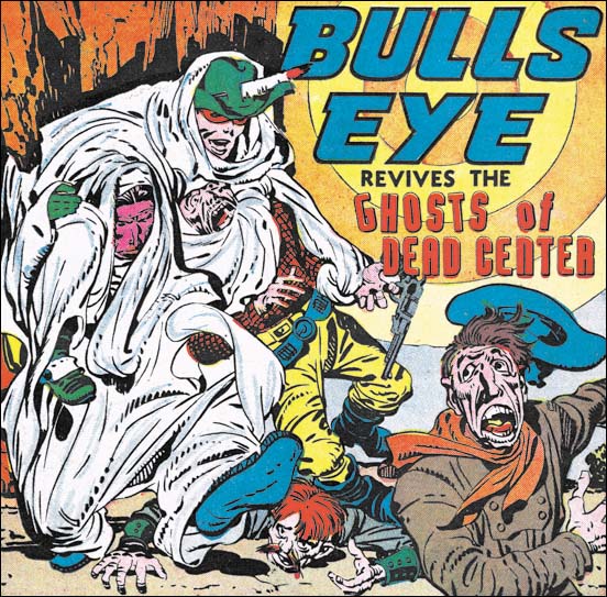
Bullseye #3 (December 1954) from “Ghosts of Dead Center” page 1, pencils and inks by Jack Kirby
A row of short dashes, or as I like to refer to them as a string of drops, is common in the studio inking. The size of the drops often varies along the string. As the size varies they occasionally become more like short lines then drops. Sometimes the string of drops is placed on top of a simple line and sometimes not. The Bullseye splash (see above image) provides good examples of some of these variations.
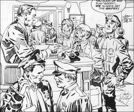
Police Trap #2 (November 1954) “Desk Sergeant” from the original art, pencils and inks by Jack Kirby
I wanted to provide another example of the studio style and its use of the techniques I have been describing. Generally inking was more elaborate when done for a cover or a full page splash. The inking for “Desk Sergeant” is, in my opinion, particularly nice. I just love the way the inking provides bold statements in the use of picket fence and drop strings brush work while still being very sensitive to facial features. Although I have been describing some of the brush patterns used in the S&K studio style it is important to remember that these were not restricted techniques. Note how some of the picket fences have one rail that is not a line but rather a drop string.
In my last chapter I provided an example of outline inking done with very uniform lines as if made by bending a wire. These simple lines could later be modified by adding thickness in parts. The outlines in “Desk Sergeant” are very variable but this was probably done that way right from the start. Note the sleeve in the area of the wrist in the man on our lower left. The outline disappears for short distances. Because there is no whiteout used, we can be sure this reflects the original state of the outline. The outline work so matches the rest of the inking that I believe Jack did both line and spot inking in this splash.
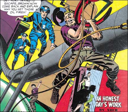
Police Trap #4 (March 1955) cover pencils and inks by Jack Kirby
Picket fence and drop strings are not always used especially in the case of panel art. They are most effective when used on a large image such as a cover or a close-up in story art. Otherwise more simple inking patterns are used. The folds in clothing are variations of simple patterns. Many of the smaller folds are recorded as simple spatulate shapes. With an increase in size and length they assume a shape like the frond of a palm leaf. Or the spatulate form can be increased in size without lengthening to become a sort of rounded rectangle. The spatulate and frond shapes often bend slightly to suggest the form of the underlying figure. The above image from the cover for Police Trap #4 gives some good examples of spatulates, fronds and rectoids as well as showing how they morph into one another.
The Police Trap #4 cover also shows a technique that had become more frequent. This is the careful placement of a number of rectoids near one another leaving only small strips of white between. This is used to suggest the clothing folds in areas of shadow. The lower right leg of the man handing from the hock is a good example of this which I call negative folds.
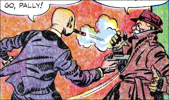
Win A Prize #1 (February 1955) from “That Giveaway Guy” page 2, pencils and inks by Jack Kirby
The above image of a close up from Win A Prize #1 provides further examples of both picket fences and drop strings. The shoulders of man on our left features another spotting technique which I think of as a collar blot. I “get” the picket fence and drop string, they are means of suggesting grays in a black and white world of pure ink. Similarly the spatulate and frond shapes are used to suggest the shadows cast be folds in the clothes. But I am not clear at just what the collar blot is meant to portray. Unlike the other brush methods, I have only seen the collar blot used in S&K productions. I refer to it as a blot, but actually it is not at all unusually for the shape to be formed by ink strips that are kind of like the pickets only wider leaving very narrow white strips in between.
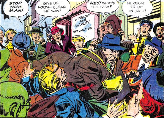
Police Trap #6 (September 1955) from “Only The Guilty Run” page 1, pencils by Jack Kirby and inks by Mort Meskin
All the examples that I have provided above are ones that I believe that Kirby did at least the spot inking. But I do not want to leave the impression that this inking style was used by Jack alone. I refer to it as the S&K studio style because it was used by other inkers as well when working on Kirby pencils. The image I provide above is from a half page splash panel. The pencils look like Kirby’s and I do not mean just the layouts. Even the fine details have Jack’s “fingerprints”. Look at the pointing hand of the of the man that yells “stop that man”. Although the faces look like they were drawn by Kirby they also suggest Mort Meskin, particularly the face of the running thief. I am sure Mort did the outline inking.
But what about the spot inking? A close examination of the spotting convinces me that it was not done by Kirby. The picket fence seems very meticulous while Jack’s usually has a more spontaneous feel. Some of the clothing folds are narrower then Jack would use for the same length. Also look at the use of negative folds on the left arm of the guy with the blue jacket. It is the same type of handling that the leg from the Police Trap #4 cover shown earlier. It is hard to put into words, but the “Only The Guilty Run” version does seems more mechanical and less convincing then those done by Kirby.
Having come to the conclusion that the spot inking was not done by Kirby I end up with that same problem of applying a name to that inking hand. I do not feel that this is the place to explore this matter nor have I conducted my own careful check. I will say that currently I suspect that the spotting was done by Mesking as well. The actual attribution of the spotter is not that important for this post. The point I am trying to make now with “Only The Guilty Run” is that the S&K studio style was not used solely by Jack.
Police Trap #6 was the last of the Simon and Kirby Mainline titles to be published. All the studio style of inking from this period is pretty consistent. This style continued afterwards, as for instance Western Tales #31 (October 1955) and #32 (March 1956). However starting in 1956 works appear where the inking style began to be change. This will be the subject of my next chapter.
Jack Kirby’s Austere Inking, Chapter 1, Introduction
Jack Kirby’s Austere Inking, Chapter 3, A Lot of Romance
Jack Kirby’s Austere Inking, Chapter 4, Prize Covers
Jack Kirby’s Austere Inking, Chapter 5, Harvey
Jack Kirby’s Austere Inking, Chapter 6, Atlas
Jack Kirby’s Austere Inking, Chapter 7, DC
Jack Kirby’s Austere Inking, Chapter 8, More Harvey
Jack Kirby’s Austere Inking, Chapter 9, More Prize
Jack Kirby’s Austere Inking, A Checklist and a Glossary
other post with Kirby inking Kirby:
Strange Tale Indeed
Battleground, Jack Kirby’s Return to Atlas
Captain 3D

