I coined the term Austere Style because in its purist form the inking is characterized by a lack of embellishments. However Kirby’s inking after the failure of the Mainline titles was not limited to an evolution into a simpler method of inking. Jack used other inking techniques as well. Although the title of this serial post is “Jack Kirby’s Austere Inking”, I will also be covering Kirby’s other inking styles. In an effort to keep this discussion from getting too confusion I will be divide the material with 1956 cover dates into three chapters. This one will concentrate on the interior art for the Prize romances. The next chapter will be about the Prize romance covers. Chapter 5 will be on work Jack did for Harvey.
It would be really nice to know when the S&K studio actually disbanded. I covered this issue in my End of Simon and Kirby serial post and I have not changed my beliefs. The earliest possible date for the end of the studio would be February 1955 (cover date) with the last publication by Mainline. The latest possible date would be December 1956 when Jack’s first freelance work was released. My preference would be shortly after October 1955 when the last S&K work was published by Charlton. If true this would mean all the work done by Jack during cover date 1956 was executed at home.
Once Jack began working in his own house I doubt finances would have allowed him to have an assistant. In theory Joe might have been available to do the line inking. But that would mean the art would have to go from Jack, to the letterer, to Joe and back to Jack. It would make much more sense for whoever did the spot inking to do the outline work as well. This would mean the work would have a single inker, very much like what was already typical in the industry.
Whatever the status of the S&K studio, from October 1955 until February 1956 Jack’s work would only be published by Prize and Harvey. While Mainline and Charlton titles were running Jack did not do any work for the Prize romance comics. Afterwards not only did Jack return to providing work for Young Romance, Young Love and Young Brides, he would pretty much draw the entire issues. This was unusual to say the least. Except for the first few issues of Young Romance, Jack would generally only provide the romances with one or two stories, sometimes none. For about the entire cover date for 1956 Jack would do 58 out of 65 stories and all the covers. The deal that Simon and Kirby had made with Prize was that S&K would pay all costs for producing the art in return for a share of the profits. By doing all the penciling himself, Kirby would save on overhead costs and therefore increase earnings. It is also possible that Jack was hoping to revitalize the Prize romance comics which seem to have been doing poorly. These are not mutually exclusive explanations.
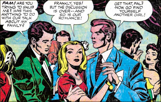
Young Love #69 (February 1956) “How’s The Family” page 1 splash panel pencils and inks by Jack Kirby
The interior art for the Prize romances provides the most uncomplicated examples of the transition from the S&K Studio inking to the Austere Style. Early in the year there can be found a number of typical Studio inking. The splash panel from “How’s The Family” is a perfect example of the Studio Style. Lots of picket fence and drop strings and even a collar blot. Note the drapery along the top of the panel. Although providing a very dark tone it was made using very broad ink areas that still leave areas without ink. We shall see later that with the Austere inking this sort of dark areas will be more often made by completely flooding with ink. All of the standard Studio Style inking techniques combine to give the entire image a darker tone. The only hint of things to come is the handling of the drop strings. In this splash the drops are overlapped so as to construct a continuous line. This type of drop string was used previously but it was not then the predominant technique but it would become so in the future.
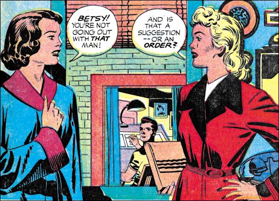
Young Love #69 (February 1956) “Secrets Of The Girls Next Door” page 1 splash panel pencils and inks by Jack Kirby
This splash panel is from the same issue as “How’s The Family” and it provides another good example of the S&K Studio Style of inking. Note the use of elongated drop strings and also picket fence brush work on the sleeves of the lady on our left. Elsewhere there a typical spatulate and frond shaped clothing folds. There does seem to be a more sparing use of ink in the panel that gives the splash a lighter look. This is also typical of much of the inking early in 1956. But it is hard to place too much significance on this lightness because there was always some variation in the amount of ink used.
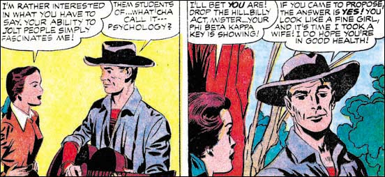
Young Romance 81 (February 1956) “A Match For Linda” panels from page 3 pencils and inks by Jack Kirby
Much of the art from early in the year was done with S&K Studio inking. But there are also some work that begins to have a simpler and lighter look. “A Match For Linda” provides a good example of a lighter inking. In this case picket fence and drop strings are both abandoned throughout the story. The lightness of the first panel can be attributed to the fact that there is no background. While the second panel has a background very little spotting was applied to it.
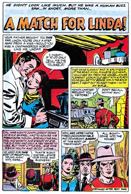
Young Romance 81 (February 1956) “A Match For Linda” page 1 pencils by Jack Kirby and inks by Bill Draut.
When I had previously discussed the inking of “A Match For Linda” in Chapter 5 of The End of Simon and Kirby I had concluded that Bill Draut had done the outline inking and Jack the spotting. I now realize that that is not quite correct. Bill Draut did the entire inking, both line and spotting, for pages 1 and 5. Jack seemed to have done all of the inking for pages 2 to 4. If you look at the cloth folding of the man in the splash page they are done in a manner quite unlike what Kirby was doing and more in line with Draut’s brush work. Draut’s cloth folds have a rough appearance because they show the remnants of closely spaced lines from which they developed. On the other hand the contours of Kirby’s cloth folds are smooth almost as if the ink was not brushed on but poured. YR #81 is one of the few issues with something not done by Kirby, “He Had Only Me” by Bill Draut. I suspect that when Bill dropped off his artwork, Jack gave him some inking to do. Because Jack was doing almost all the artwork for the Prize romances, artists like Draut who had previously provided work for those titles were probably happy to get any work from S&K that they could.
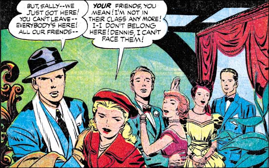
Young Brides #27 (March 1956) “Good Marriage” splash panel from page 1, pencils and inks by Jack Kirby
The “Good Marriage” splash is another example of progress made toward the Austere Style. So much so that it deserves to be called Austere rather then Studio Style. Without the picket fences, and with a limited use of drop strings the art has the lightness typical of this style. That is not to say that blacks were not present. When black areas are used they generally are done by flooding an area with ink, as for instance the ceiling in the above image.
I know that this serial post is about Jack’s inking technique but I just cannot pass this splash with a comment about the art in general. What a great composition, the way the three couples are placed serial across the panel with increasing depths. Kirby is renown for his exciting artwork, but this very simple panel shows that he could do very subtle art when he wanted. Jack was a master of providing just the correct amount of detail with faces in a crowd. Note how nicely Kirby gives each character with their own emotions using small nuances in their eyes, eyebrows and mouths. It is just things like this splash that make me appreciate Kirby inking Kirby. I am sure some of the magic qualities of this splash would have been lost under some other inker’s brush.
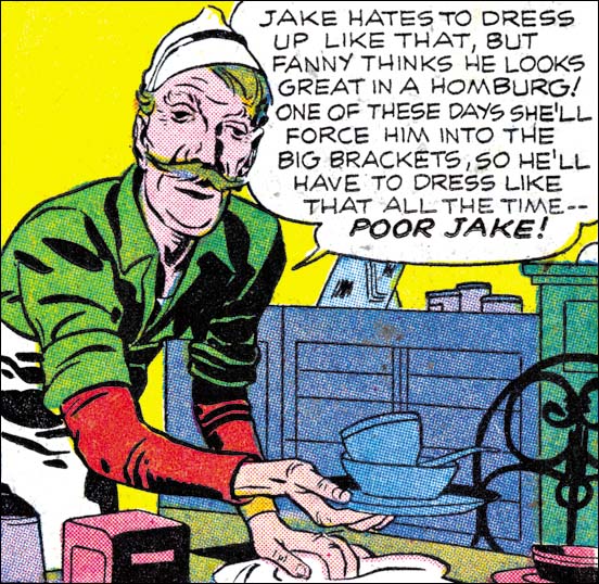
Your Romance #84 (October 1956) “Poison Ivy” from page 2 pencils and inks by Jack Kirby
By the time we get toward the end of the year pretty much all typical features of the Studio Style disappear. Everything now seems done in the Austere Style. The panel shown above from “Poison Ivy” is a great example. No drop strings or picket fences. The folds of the clothing are simple and the entire image looks light. Note the effective use of negative folds on his left arm. I believe that one of the reasons that Jack adopted this inking style was because it took less time. Well it might have speeded up the inking process but that by no ways means the art was rushed. What a great characterization Jack gives the soda-jerk here and throughout the story.
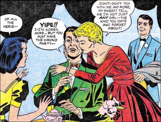
Your Romance #84 (October 1956) “Much Ado About Love” splash panel from page 1 pencils and inks by Jack Kirby and Joe Simon?
I am as confident as I can get about the inking attributions for the images I have provided in this chapter so far. I am not as sure about my last image the splash panel from “Much Ado About Love”. Most of the inking seems to be by Jack using simple and broad clothing folds. In contrast is the torso of the lady in the red dress where narrow folds prevail. There is not much to go on, but I believe the other inker was Joe Simon. I include this image because it is a good example of a change in the rendering of the folds on sleeves. Notice how there are a number of folds in the elbow region and again near the shoulder. The rest of the arm is plain without any folds, if you ignore the single longitudinal fold on the upper arm. This sort of arrangement of sleeve folds will become predominant. This may represent a adjustment in Jack’s penciling resulting from his new Austere inking.
I started this chapter with a splash that depicted drapery along the top of the panel. In conformity with the S&K Studio Style of inking that drapery was depicted with broadly inked folds that still left strips of “white”. A similar drapery is found on the top of “Much Ado About Love” only now the area is completely flooded with black and no folds are indicated. This is typical of the Austere Style. The interior art for the Prize romance comics provides a relatively simple progression from the Studio to the Austere inking. There is some variation but it all falls somewhere in the spectrum between the two styles. In the next chapter on the cover art for the Prize romances we shall see the influence of another style not hinted at in the interior art.
Jack Kirby’s Austere Inking, Chapter 1, Introduction
Jack Kirby’s Austere Inking, Chapter 2, Mainline
Jack Kirby’s Austere Inking, Chapter 4, Prize Covers
Jack Kirby’s Austere Inking, Chapter 5, Harvey
Jack Kirby’s Austere Inking, Chapter 6, Atlas
Jack Kirby’s Austere Inking, Chapter 7, DC
Jack Kirby’s Austere Inking, Chapter 8, More Harvey
Jack Kirby’s Austere Inking, Chapter 9, More Prize
Jack Kirby’s Austere Inking, A Checklist and a Glossary
other post with Kirby inking Kirby:
Strange Tale Indeed
Battleground, Jack Kirby’s Return to Atlas
Captain 3D


Hi Harry,
Another fine post. Lots of areas to talk about so I’ll break it into several responses.
You wrote:
>”It would be really nice to know when the S&K studio actually disbanded. I covered this issue in my End of Simon and Kirby serial post and I have not changed my beliefs. The earliest possible date for the end of the studio would be February 1955 (cover date) with the last publication by Mainline. The latest possible date would be December 1956 when Jacks first freelance work was released. My preference would be shortly after October 1955 when the last S&K work was published by Charlton. If true this would mean all the work done by Jack during cover date 1956 was executed at home.”